02
Designing For Humanity.
Empathy and experiences.
Everyone has a different story. Everyone comes from different places and has different experiences, different needs, different challenges, and different influences. Even within one family, two siblings who have lived together their whole lives can have different perspectives on the same topic or the same event they experienced together.
Think about the different experiences that can be had with the use of hand dryers in a public restroom. Some are embellished with signs that explain the environmental impact of using the hand dryer versus towels, an important consideration for many people. Now let’s change perspectives and let’s think about hand dryers from the point of view of a child who has a sensory processing disorder. The unexpected loud sound of the dryer can cause heightened anxiety, especially when they are in a stall where they are not able to see the dryer. The impact of this experience could create such negative feelings that they could become fearful of ever using public restrooms again. Just from these two examples, you can see the variety of different needs and passions of humans in a single environment. Imagine how this can expand and grow as you observe, listen, ask, and embrace the perspectives of a diverse group of people about their experiences using hand dryers in public restrooms.

CONCEPT PROJECT FOR REIMAGINING GENDER-NEUTRAL & ACCESSIBLE BATHROOM ICONOGRAPHY. DESIGNER: A Wörtz
Design is amazing. It has the power to communicate on so many levels. But to make sure it is effectively communicating, you need to learn more about the people who will be using the things you design. Who are you designing for? Though this may change throughout the life of a design, one thing that will stay constant is the need for human connection. Design needs to be human.
What we do has an effect on other people. The moment you think that it doesn’t you are not doing your job as a designer. Empathy through understanding and respecting different people’s points of view is essential to making effective design. If you think that you are already empathetic and know all this, then I encourage you to explore it even more. There is always room to bring more empathy to your work.
Jacinda Walker, Founder and Creative Director of designExplorr, explains the need for cultural empathy: “There is a cultural component to design that you need to respect. You need to take a moment to acknowledge you are not the first person to put letters on the page. Think and remember that there may be other solutions from cultures all over the world.”
Design allows you to learn and explore new topics with every project. Even if you think you know all about the topic you are designing for, research anyway. Put your assumptions aside. There was a month when I was working at a design studio where I was researching everything from airfield guidance signage to air compressors to how to fight hunger in a local community. To be able to do your job effectively, you need to do a lot of continuous learning to become more proficient about the topics and audience you are designing for.
It is important to note that across varying design jobs, I have been asked about my stand on abortion, on the promotion of tobacco products, and on making dramatic changes to photographs. It was made clear that my answers would determine if I would be given the project to work on. No matter what the project, stay true to yourself. You have a responsibility to be aware of the impact of what you create. “We need to fear the consequences of our work more than we love the cleverness of our ideas,” Mike Monteiro advises in his article A Designer’s Code of Ethics. A reminder that design has power, and you want to make sure that the work you do aligns with your values.
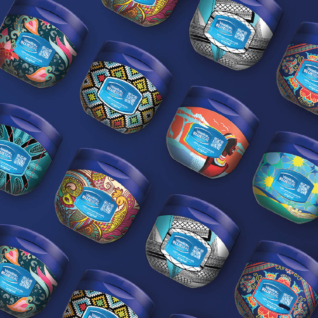
THE VASELINE® HEALING PROJECT — JOURNEY OF A JAR. DESIGN: 1HQ USA 1hqglobal.com, MANAGING DIRECTOR: Laura Wade, CREATIVE DIRECTOR: Ben Glotzer, ASSOCIATE CREATIVE DIRECTOR: Kate Rascoe, DESIGNER: Nancy Brogden, CLIENT: Unilever, BRAND: Vaseline, GLOBAL BRAND VICE PRESIDENT: Kathleen Dunlop, SENIOR BRAND MANAGER: Pragati Ruia, GLOBAL ASSOCIATE BRAND MANAGER / INNOVATION: Simon Rosen, https://healingproject.vaseline.us/global FILMOGRAPHY: Animl – Animl.co.uk, WRITER/DIRECTOR: Richard Neville
1HQ USA designed a series of 12 Limited Edition original designs. The Vaseline® Healing Project is in partnership with Direct Relief, an international medical aid organization. Representing South Africa (Gauteng, Eastern Cape, and KwaZulu-Natal), India, Jordan, Kenya, Indonesia, and China, each design aims to help bring to life their heritage through vibrant colors, scenery, and patterns inspired by abstract illustrations that reflect the country’s and community’s individual styles. When viewed together, they show the impact that the product has globally.
Get curious about the why.
How many designers does it take to screw in a light bulb? Seriously, how many do you think? If you said one, that is incorrect. If you said two, that is incorrect. If you said any number without asking for more information, then that is incorrect. The correct answer is: Why? Why do we need the light? Why are they changing the light bulb? How high is the light? What is the space used for (as the amount of light can change the experience)? What time of day is the space most commonly used? If you haven’t shopped for light bulbs recently, with all the different choices available, you really need these answers to even begin to choose the bulb.
As a designer, people come to you and ask for help solving a problem. You can’t help them if you don’t know why they need the problem solved. What was the driving force behind their need for change? To be most effective at helping them, you need to ask more questions, do research, and challenge your own assumptions—the things you think you already know. It is in those places where you will often find something surprising and unexpected. Sometimes you find that the problem they asked you to solve isn’t the problem at all, and there is a deeper problem. Good thing you asked why. Sometimes someone comes to you and asks for a specific result, such as “I would like you to design a billboard for this campaign.” You could just simply set off and learn about the campaign, and make the best design you could create for a highway billboard sign. But how will you know if that sign has done its job if you don’t know what the purpose is? What if, instead, you asked why? Why this campaign, why a billboard? It is even good to ask, Why choose me for this design work? If they had a reason to hire you based off of other work you did or your experience with the topic—or whatever the reason—it is helpful to know that. Often people choose a medium because that is what they know or have used in the past, but that doesn’t mean it is the most effective place for the message. Digging deeper into the root of their decision can help you see if it is the best solution or not. Who are they trying to communicate with? What is their message? Do those things align? You need to explore the message, the audience, and the company’s or organization’s story to determine the most effective medium for them to communicate with their audience.
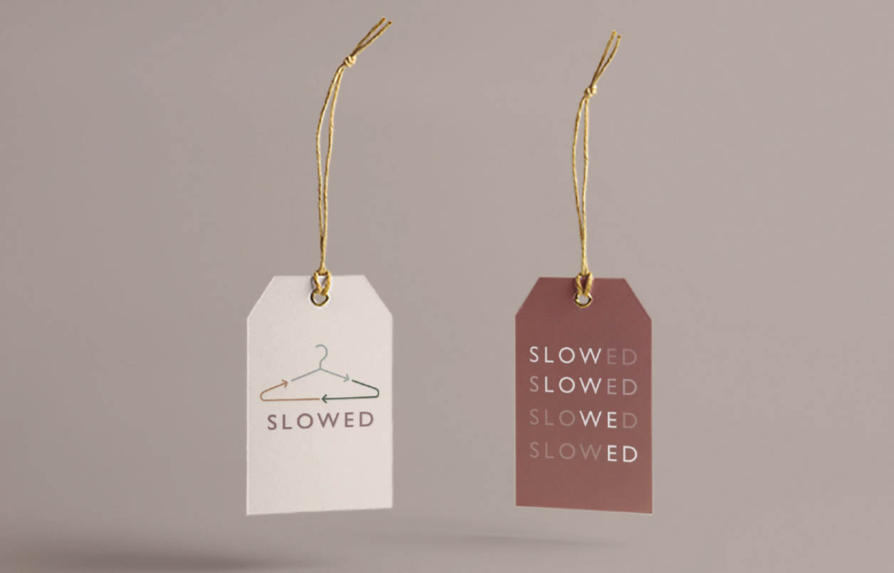
SLOWED SLOW FASHION CAMPAIGN, LABEL TAG. DESIGN & CONCEPT: Yeni Cho Two-sided label tag and campaign website for slow fashion.
SLOWED is a sustainability campaign that aims to spread awareness to an issue that is widespread, yet not practiced well. There are many ways to be sustainable with clothes, and this project’s challenge was to shed light on the practice of “slow fashion.” The name also combines four principles of the campaign: 1. SLOW: Practice sustainability through slow fashion, 2. LOW: Lower your carbon footprint by reducing waste, 3. WE: Share your SLOWED lifestyle—this is a group effort, 4. ED: Educate yourself and others about slow fashion.

People often think they know what they want, and they push that presumption on you as the designer. But you truly can’t design something if you don’t know what the purpose of it is. That is the difference between just making something look good versus make it functional. There are a million ways you could design something, but what makes it effective or even good is reliant on one thing: if it solves the problem you set out to solve. Your success metric.
If you get in the car without knowing where you are going or why you are going there, then how will you ever arrive? Sure, you can and will end up somewhere, but then what? But if you get in the car knowing you have to get food for dinner, now you have your why. There are still things to figure out, but your goal is set. Do you want to prepare the meal yourself or have it prepared for you? Do you want to eat at home or out? How much time do you have? What is your budget? When you answer these questions, you can then determine the best place to go to get food for dinner. If you don’t spend the necessary time exploring and ideating, then everything else that follows will be essentially directionless.
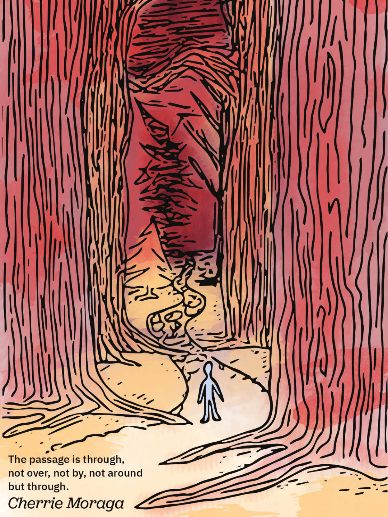
ORIGINAL ILLUSTRATION OF A CHERRÍE MORAGA QUOTE. DESIGNER & ILLUSTRATOR: Bridget Slomian Feminist activism is a deeply personal, emotional, and raw practice. This work looks to dispel the idea of beautiful, aesthetic, facetious feminism, through the reflection of difficult themes creating an end product that alludes to the challenges of activism. 4"x6" postcard, #1 of a series of 9.
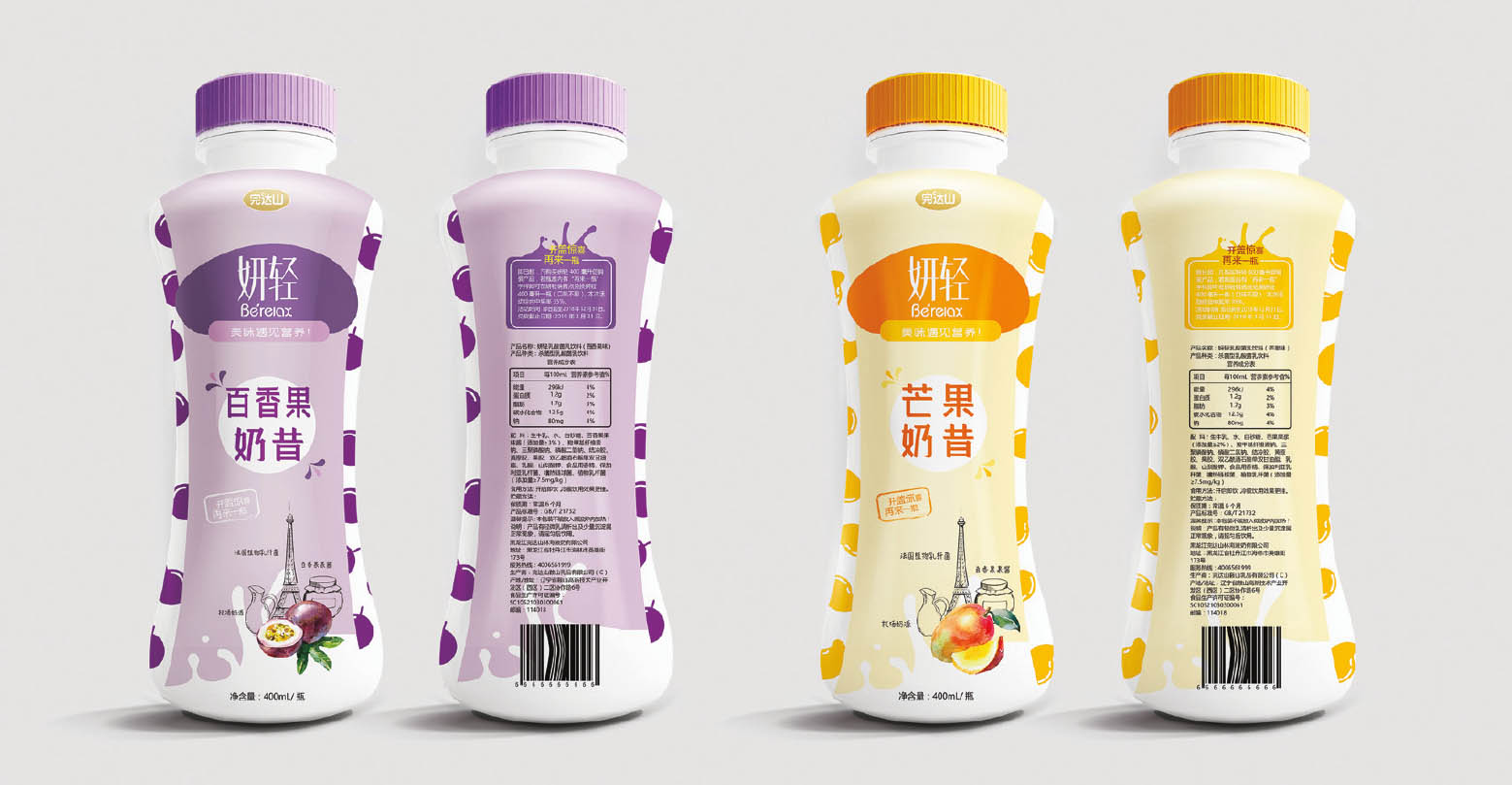
WONDERSON PASSIONFRUIT AND MANGO FLAVORED MILK BEVERAGE. DESIGNER: Yilin Zhou The ergonomics of the bottle were designed so the product could be held easier as well as to resemble the curves of a slim woman. This product targets women ages 20–35 who want to live a healthy lifestyle.
The worst part of the design process is staring at a blank page. Whether that is a sketchbook or your computer screen, that emptiness should be full of possibilities but, without a direction, the unknown becomes intimidating. The solution? In that space, write out why you are doing this work. Set that as your goal and keep it as your vision throughout the process. It will also instantly get rid of the intimidation of the empty page.
The user and the designer.
We often only ask questions about the things we don’t know. For example, if you weren’t sure of the time, you could ask someone around you or check a clock yourself. But if you know what time it is, why would you ask, right? Similarly, if you think you already know everything you need to know about a user, you may think you don’t need to ask any questions. However, this is actually the time when you should be asking the most questions. As a designer, you don’t want to assume anything about a user. Ask questions and be prepared to really hear the answers. They may surprise you.
ANOTHER LENS. DESIGNER: Meredith Schomburg, CREATIVE & MARKETING LEAD: Sola Biu, LEAD RESEARCHER: Anne Diaz A collaborative project by Airbnb Design and News Deeply. https://airbnb.design/anotherlens
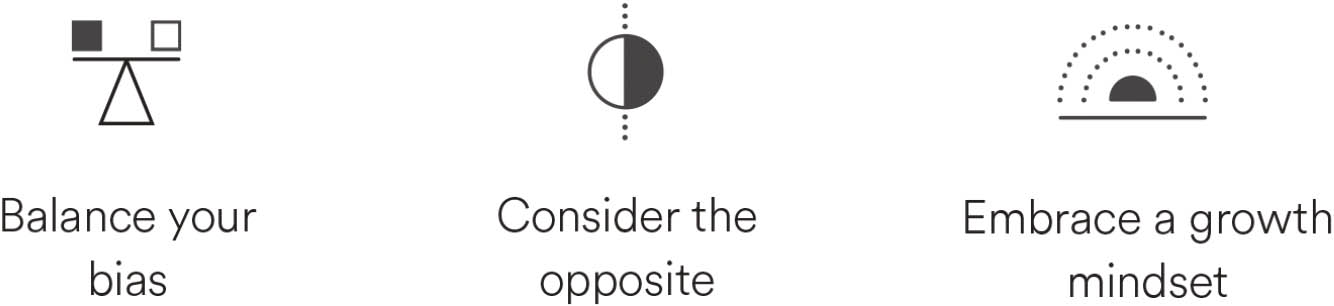
In order to design inclusively for users, we need to confront the idea that each of us has a bias. Jacinda Walker explains, “When you have the what? or huh? moment, that is your bias talking from a place of lack of information. We all have a bias. How you act with that bias is what you need to understand.” When something unexpected happens that goes against the information you know to be true, it stops you in your tracks. That discovery you make is you overcoming your natural human bias.
It is typical to include yourself and your own experiences and abilities as the baseline for your user. However, that approach only works if the users are people just like you and only you. It is more likely that you will need to put aside who you are as the designer and focus on what the user needs. All humans are unique, with different abilities, needs, and experiences. There is no normal. Even one person’s abilities and needs can change, either temporarily or permanently. To make your design more inclusive, you need to “balance your bias, consider the opposite, and embrace a growth mindset,” as laid out in the Another Lens tool created as a collaboration by Airbnb Design and News Deeply teams.
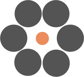

These two center orange circles are the exact same size. This visual phenomenon is known as the Ebbinghaus illusion. Consider for a moment: if our own minds can perceive the same exact shape in two different ways due to different influences, then think about how these influences can change the way we perceive information. If we remove those influences—our biases—we can see their similarity clearly. Here are the circles again, shown without any outside influences. If you feel the need to go back and check the previous page, you are not alone. This is called confirmation bias: when you seek validity for your own hypothesis while recalling, searching, or interpreting information. You use everything you know to try to prove that what you assume is actually correct. Or in this case, you will try to show that those circles are different sizes, and you will favor any information that proves you are correct.
![]()
![]()
Consider how you would go about designing a product for someone who is blind. You may have immediate assumptions about how they would experience your design. However, there is a wide range of visual impairments. This means that any initial thoughts and presumptions may be inaccurate. The best way to check this? Ask them. Even more importantly, listen. There is a reason you have two ears but only one mouth.
As you consider how to create accessible experiences for a wide range of users, the goal is to make your design work for as many different people as you can. While not everyone who interacts with your design may have a visual impairment, consider a persona spectrum. In her book Mismatch, Kat Holmes describes this spectrum by looking at a range of limitations, starting with permanent, then temporary, and finally, situational. Some users may be legally blind, which is permanent. But some users may have reduced vision due to an eye surgery, which is temporary while they heal. Some users may have trouble seeing because of the bright sun in their eyes, which is situational and will change when the sun goes behind the clouds or they put sunglasses on. By considering this full spectrum of personas and making conscious design choices to accommodate their needs, you end up making both smarter design decisions and a design that is more accessible to a wider audience. When you find yourself in a situation where you are restricted in some way, even if only temporarily, then you too will appreciate the things that a designer did to make an experience a little bit easier for you. Even in designing a book, consideration for contrast of the type on the background will allow readers who like to read before bed—typically a lower light setting—the ability to do so with less strain on their eyes.
When you are working on a design, I challenge you to not only consider how you can adjust the design to make it more inclusive, but to go a step further and ask yourself who you are leaving out with your design as you create it. As Kat Holmes explains, “Designing for inclusion starts with recognizing exclusion.” If you only provide a visual experience or only an auditory experience, this creates exclusion. By offering both, you make it more accessible.

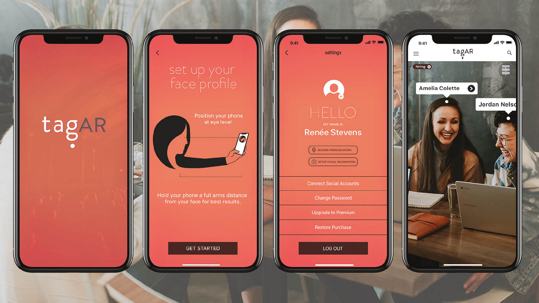
tagAR. DESIGNER & FOUNDER: Renée Stevens
A mobile application that helps you never forget a name again by displaying augmented name tags above the people around you. The concept for this application was to assist those with dyslexia by providing both auditory and visual representations of people’s names accessible within the app. www.tagar.media
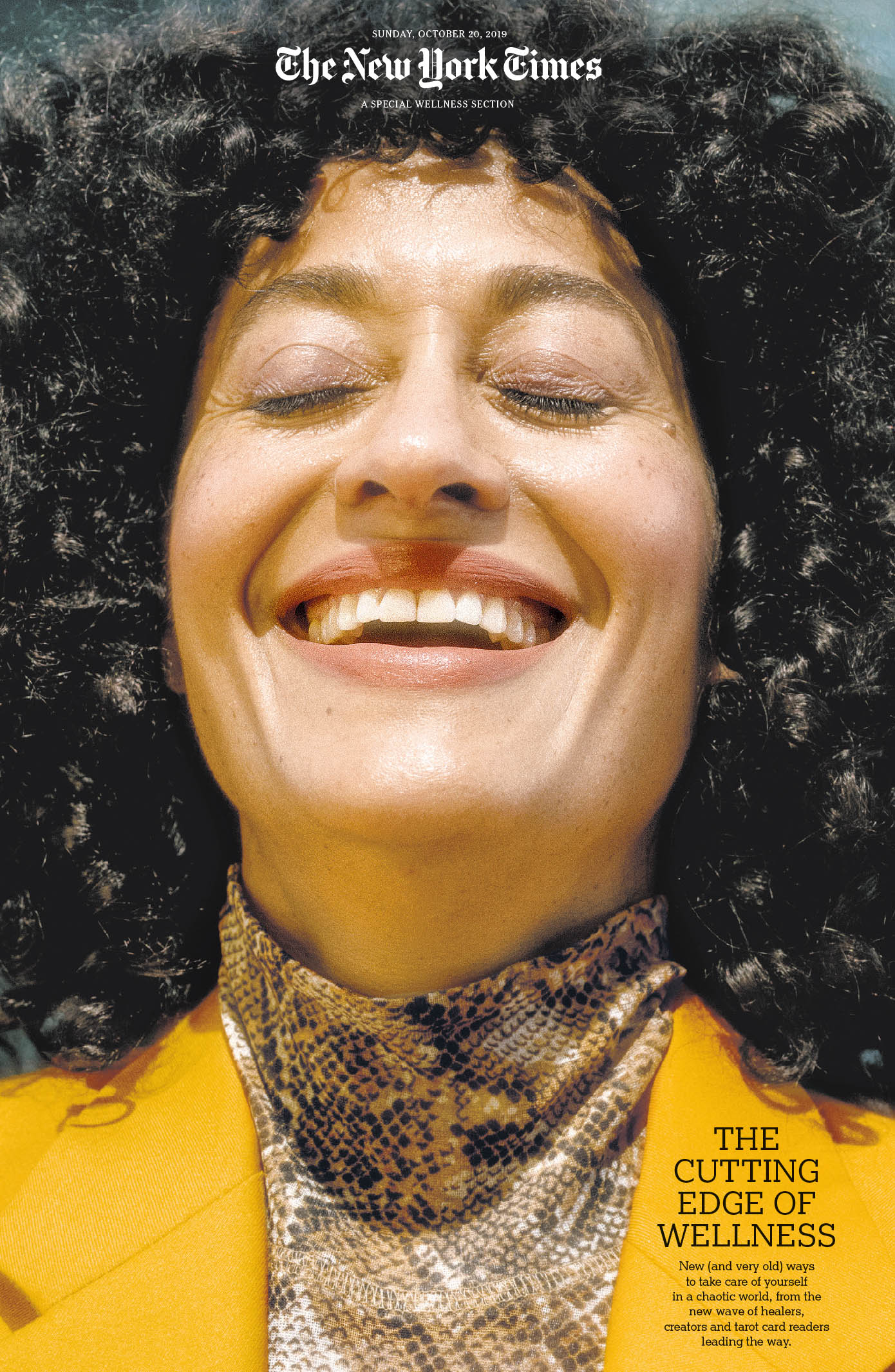
AMY HARRITY FOR THE NEW YORK TIMES
Tracee Ellis Ross, an actress on “black-ish” and executive producer on “mixed-ish,” fights back against the “weird anxieties” that can come with getting older.
SPECIAL WELLNESS SECTION COVER. DESIGN DIRECTOR: Shannon Robertson, DEPUTY DESIGN DIRECTOR: Jeff Glendenning, ART DIRECTOR: Tonya Douraghy, DESIGNER: Felicia Vasquez, EDITORS: Monica Drake, Joanna Nikas, Dan Saltzstein, Choire Sicha, PRINT EDITORS: Eric Dyer, Mike Flam, PHOTO EDITOR: Sarah Eckinger, Eve Lyons, Jeanne Noonan-DelMundo, Laura O’Neill, PHOTOGRAPHER: Amy Harrity The New York Times editorial and art departments looked at a range of portraits of Ms. Ross as well as comps for a still life concept. The art department felt strongly that the portrait with Ms. Ross’s radiant smile and closed eyes was a perfect choice to say wellness. However, there was concern that using a photo of a typically unflattering angle would result in negative feedback once published. There were many conversations about this image, and the team considered other portraits as well as the still life option. In the end, they proceeded with this image feeling confident in-house that Ms. Ross expressed that wellness mood we all want. The other important conversation was wanting the image to feel bright but to be respectful of skin tone for a woman of color and not get too light. A few rounds with the imaging team and they achieved a cover we were all pleased with. 12"x22"
