07
Emotional Design.
Understanding color and mood.
Think of how it feels to just sit there and watch a fire in a wood stove or at a campfire. The warm colors dance and mesmerize. Colors convey emotions that evoke feelings and a state of mind. They hold memories. They create a mood and tone. In a film, the use of light and color can signify the genre of the movie and the mood of a particular scene. Bright, energetic colors allude to a happier, more comedic storyline, while dark, monochromatic colors evoke a sense of mystery or drama.
Color is both science and art. Science helps you understand what color actually is. Color is different wavelengths of light. You can only see color if there is light. When light hits an object, such as a flower, all of the colors are absorbed into the object except one, which reflects off the object; our brain then perceives the color that our eyes receive. So if we see a red apple, what that means is that the red wavelength of light is being reflected off the object to our eye and our brain tells us, red. This is called the additive color model. Along with our eyes, anything that uses light to create an image uses this color model, including screens, televisions, and projectors. This model uses three colors: red, green, and blue (RGB). The more light you have, the brighter the colors become. When red, green, and blue light overlaps, it creates white. When you are working on a computer or designing for digital media, you will be working with the RGB color model (also known as a color space, which refers to the colors that can be reproduced or displayed in a medium).
additive color is color created through the mixing of light.
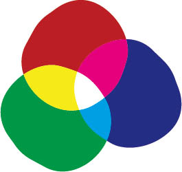
RGB color model: Additive
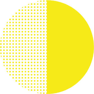
Alternatively, there is a pigment-based color model for colors that you see created on physical surfaces. This is called the subtractive color model. It works just as you may have learned when mixing paints in your youth. When we print something on a printer, it uses four colors: cyan, magenta, yellow, and key/black (CMYK). The term key comes from the plate that is used in the offset printing process. In this process, the key plate, which prints black ink, prints first and prints registration marks so that, as the other color plates are individually added, they all line up correctly. Whenever you are working with print-based design, work with the CMYK color model.
subtractive color is color created through reflected light, both transparent and opaque.

CMYK color model: Subtractive
These models work in different ways, so it’s important that you design with an understanding of the medium you’re working in. If you are designing a website, make sure everything uses the RGB color model. Similarly, any images you download or view from a website will also be in RGB. When you are designing business cards or a poster, work within the CMYK color space. Each color space reproduces colors differently. If you have ever had the experience of looking at something on the screen and liking the way the colors looked, but then not being happy with the colors in the printed piece, then you know firsthand how differently colors can be rendered. Make sure your color mode is set correctly on your file. There is a translation that has to occur when you go from light-based color to pigment-based color. There may not always be a perfect solution. This inspired the creation of the Pantone Matching System—Pantone’s own numbering system, swatches, and pre-mixed inks that a commercial printer can use to ensure consistency of color in the printing process. Consistency of color is essential for branding. You need to make sure everyone is using the correct hue, every time, for every piece of printed collateral. Every time a company hires someone and needs to order new business cards, they can use their Pantone color to make sure the color is always the same. This, of course, comes with a premium cost, and it is priced per color—which is one of the reasons why businesses tend to use a limited color palette.
It may seem backwards initially, but at the start of a project you do need to consider how you are going to use color at the end of your process so that you can set up your workspaces correctly. Once you have this set up, you then can choose which colors you will use in your design. To properly select and define the properties of each color, we use the HSB (hue, saturation, brightness) model. This model is used within the color picker windows of common design software to aid in the color selection. Think of these as steps: First choose the hue, or the name of the color, such as blue. But with so many variations of blue, you often need a more specific name. Baby blue, aqua, navy, indigo, and robin’s egg are all different hue names, offering more clarity than just blue. Then you can adjust your saturation, which refers to the chroma of the color, or the color in its purist form. A fully saturated color is the color’s most intense state. To desaturate a color, add gray to it. The more gray added, the softer the tone of the color, making it less pure. Then, finally, you can choose the brightness. This is the addition of white to create a tint or black to create a shade. The more white you add to a color, the brighter it becomes. The more black you add to the color, the darker it becomes. You will need to adjust this as needed to ensure proper contrast in your color choices.
hue is the name of the color.
saturation is how pure a color is. Gray desaturates a color.
brightness is how dark or light a color is. Tints adds white and shades add black.
We feel color, just as we feel temperature; selecting a warm or cool color changes the dynamic of the design. Colors affect the way we perceive information. Even if you don’t select colors intentionally, they will still be communicating a message and mood. A vibrant red sets a different mood than a desaturated red. This is the art of color: how you select and use color and the relationship it has with the elements of a design.
EMOTIONS & MEANINGS of color
Color associations are cultural agreements; their meanings vary around the world.

RED
![]() love, passion, energy, power, strength, excitement, desire, confidence, comfort, warmth
love, passion, energy, power, strength, excitement, desire, confidence, comfort, warmth
![]() danger, warning, anger
danger, warning, anger
CULTURAL MEANINGS:
East Asia: marriage, prosperity
India: purity, spirituality
Nigeria: aggression, vitality
Egypt: luck

ORANGE
![]() courage, confidence, autumn, creativity, friendliness, success, activity, uniqueness, vibrancy
courage, confidence, autumn, creativity, friendliness, success, activity, uniqueness, vibrancy
![]() ignorance, loudness, trendiness
ignorance, loudness, trendiness
CULTURAL MEANINGS:
Netherlands: Dutch royal family
Colombia: fertility
Buddhism: monk’s robes
YELLOW
![]() brightness, sunniness, energy, warmth, happiness, joy, wisdom, attention, optimism, cheerfulness
brightness, sunniness, energy, warmth, happiness, joy, wisdom, attention, optimism, cheerfulness
![]() caution, instability, frustration
caution, instability, frustration
CULTURAL MEANINGS:
Germany: envy
Egypt: happiness, good fortune

GREEN
![]() nature, growth, freshness, newness, money, fertility, healing, earth, harmony, honesty, youth
nature, growth, freshness, newness, money, fertility, healing, earth, harmony, honesty, youth
![]() envy, greed, jealousy
envy, greed, jealousy
CULTURAL MEANINGS:
Mexico: independence
Indonesia: the forbidden

BLUE
![]() tranquility, loyalty, trust, intelligence, calming, peacefulness, responsibility, reliability, tranquility
tranquility, loyalty, trust, intelligence, calming, peacefulness, responsibility, reliability, tranquility
![]() sadness, depression, coldness
sadness, depression, coldness
CULTURAL MEANINGS:
Turkey & Greece: evil repellence
Ukraine: good health
Hinduism: love, divine joy

PURPLE
![]() royalty, spirituality, luxury, wisdom, ambition, inspiration, wealth, rank
royalty, spirituality, luxury, wisdom, ambition, inspiration, wealth, rank
![]() mystery, exaggeration, excess
mystery, exaggeration, excess
CULTURAL MEANINGS:
France: freedom, peace
Brazil & Thailand: mourning
Catholicism: penitence

BROWN
![]() friendliness, earth, longevity, conservatism, trustworthiness, comfort
friendliness, earth, longevity, conservatism, trustworthiness, comfort
![]() conservatism, predictability
conservatism, predictability
CULTURAL MEANINGS:
Middle East: comfort
Colombia: discouraging of sales
Asia: horoscopes
BLACK
![]() strength, formality, power, authority, sophistication, seriousness, night
strength, formality, power, authority, sophistication, seriousness, night
![]() fear, mourning, mystery
fear, mourning, mystery
CULTURAL MEANINGS:
Middle East: rebirth, mourning
Japan: night, unknown, mystery
Brazil: sophistication, authority

WHITE
![]() innocence, purity, freshness, cleanliness, lightness, simplicity, truth, perfection, purity
innocence, purity, freshness, cleanliness, lightness, simplicity, truth, perfection, purity
![]() emptiness, isolation, fragility
emptiness, isolation, fragility
CULTURAL MEANINGS:
China & Korea: death, bad luck
Peru: angels, good health
Ireland: leisure, sports, peace
GRAY
![]() graceful, sleek, glamorous, balance, maturity, intelligence, security
graceful, sleek, glamorous, balance, maturity, intelligence, security
![]() sadness, indecision, dullness
sadness, indecision, dullness
CULTURAL MEANINGS:
Native American: honor, friendship
East Asia: helpfulness
Visual fluidity.
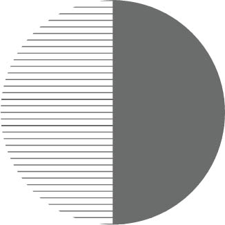
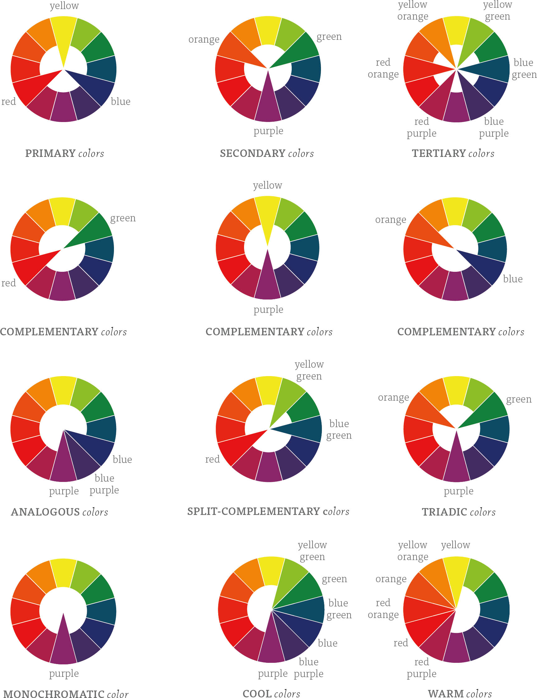
You will often need to use more than one color in your design. Color relationships require careful consideration, as the way colors interact with one another can create unexpected results. To start, let’s review the color wheel. The first version of the color wheel is credited to Sir Issac Newton in 1704 and was created through his system of using music notes to denote different colors. Inspired by this notion, your goal in choosing color combinations is to create visual harmony or dissonance in your design through the creation of rhythm and pace. Colors close to each other on the wheel have a more harmonious relationship, whereas colors opposite each other on the wheel have more contrast and dissonance.
How many colors are optimal to use in a system? Use only what you need. The more colors you add, the more relationships you create, and the more complicated and challenging the system becomes. Two or three colors can be okay. But proceed with caution if you go with four or more colors. Not only will the color relationships be difficult to manage, but often clients will want to use a minimum number of colors to keep printing costs within budget. Use colors in similar ways (similarity) to help improve our understanding of groups (proximity). If you have all the headings on a page in the same color and style, they will become familiar to the user, and as such will increase the ease of use of the product.
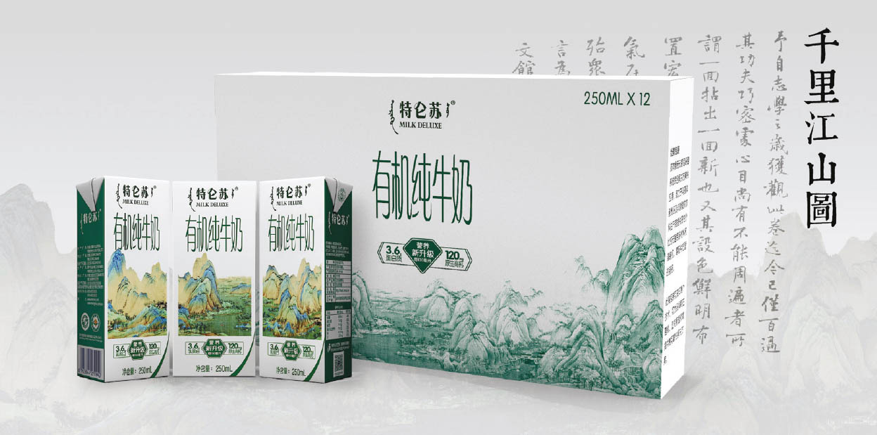
MENGNIU NEW YEAR GIFT BOX. DESIGNER: Yilin Zhou Mengniu, one of the biggest diary brands in China, collaborated with the Palace Museum to create a Chinese New Year gift box. By scanning the QR code on the side of the carton, the customer can learn more about the painting and do their puzzle online with their friends. This design uses an analogous color scheme to create a calming and organic message.
COLOR WHEEL understanding color relationships

GEOMETRIC JUNGLE. DESIGNER: Katie Lazar A geometric jungle using only two complementary colors, and shapes that were created out of only circles and squares.
Color contrast is important for accessibility of content in your design. When selecting more than one color, you have to make sure that there is enough contrast between the background color and the foreground color, especially with type. To test this for print, you can use some built-in features that computer programs provide. For example, Adobe Illustrator has a proof setup option that allows you to proof your design for both protanopia (reduced sensitivity to red light) and deuteranopia (reduced sensitivity to green light) color-blindness or color vision deficiency. For screen and web-based work, there are some great online resources such as www.colorsafe.co which ensures that your color combinations meet the Web Content Accessibility Guideline (WCAG) standards.

DESIGN SEEDS COLOR PALETTES. DESIGNER: Jessica Colaluca, COMPANY: Design Seeds® Creating color palettes inspired by images. The company’s slogan is “For all who love to color.” The company is an international community who share a passion for nature’s beauty, wanderlust, and discovering inspiration in unexpected captures. www.design-seeds.com

FIESTA GRÁFICA. MICHEL BOUVET ET SES AMIS D’AMÉRIQUE LATINE. DESIGNER: Michel Bouvet, CLIENT: Maison de l’Amérique Latine/Paris This poster involved redesigning a Mayan symbol and creating original typography inspired by the vernacular alphabets in Latin America for the title. The designer wanted to use a graphic symbol of the pre-Hispanic period. The design is held together using an energetic complementary color scheme.
Define the story structure.
We are natural storytellers; humans have been telling stories longer than we have been writing. Stories are visual and they are emotional. So, of course, they directly connect with creating emotional and visual designs. How people experience your design becomes the story. However, a lot of what will connect and draw people into your design is the narrative. Every story, as you see in the traditional hero’s journey story structure that presents the emotional arc, starts with someone being presented with a challenge. Your design shouldn’t be the challenge, but rather should be the catalyst that helps the user overcome the challenge. In a typical story structure, the characters, the environment, and the variable of time all contribute to the way the story unfolds. Somewhere along the way, the hero is presented with an opportunity to overcome the challenge. In many stories, the hero prevails, and the overall goal is achieved. Of course, not all stories end that way, but in design, you are setting out to solve a problem, so it should be a goal that your story ends with some type of resolution.
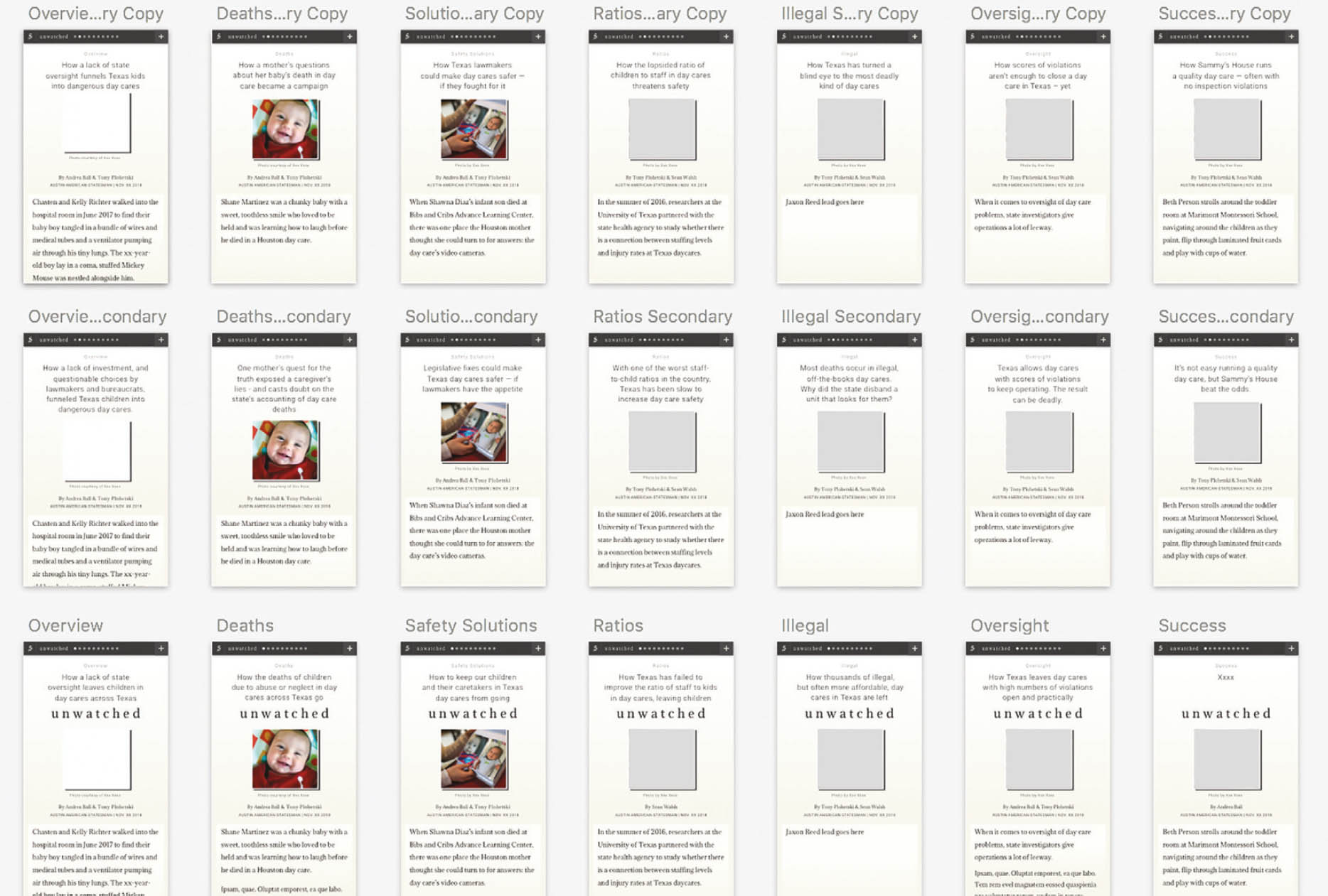
DIGITAL SKETCHES FOR UNWATCHED. PRODUCT DESIGNER: Mara Corbett, PROJECT DEVELOPMENT: Tyson Bird Yearlong American-Statesman investigation into Texas daycare facilities. In the sketch, you can see how each of the 12 stories is formatted to potentially be the introductory story.
No piece of “Unwatched” is flashy, but with 479,001,600 ways to move through this package, it’s dynamic. Specifically, any of the 12 stories in the package could function as a main bar. Working in collaboration with the reporting team, they wrote each story a “project summary” that outlines the scope of the work and the investigation findings, which you would traditionally read in a main bar. Using cookies, which allow them to recognize returning visitors, the first “Unwatched” story you visit becomes your personal main bar with the “project summary,” the series title, and the first spot in your queue. Every other story will know to hide the summary and rearrange your queue based on what you click next. This design solution allows readers to read what they want first online, and move from there as they please.
To communicate in the most effective way, you need to connect at an emotional level. Emotion is about being human. You can’t be fully human without emotion. Design that lacks emotion likely lacks story, which means it also lacks in communication, and as a result lacks in effective problem solving. To effectively include a story in your design, first map out the emotional journey. What will people be feeling when they first interact with your design, what might they feel in the middle of the experience, and what do you hope they feel at the end? If people have a positive experience with your design, they will feel empowered and their curiosity will be engaged. If they have a negative experience, they will aim to protect themselves, by disengaging with your design and trying not to repeat their mistakes. Oftentimes this means never again using the product you designed. If they have no other choice but to use it, then the dread of their first experience will carry with them during their future interactions. Storytelling is a framework that connects users to your designs. Using themes, plots, characters, and rhythm, you can help connect the product with the experience. As the designer, you are the guide who shows and tells them the story. Empower the users of your designs to see themselves as the hero in the journey.

FREE RODNEY CAMPAIGN. PROJECT DIRECTOR: Ken Harper, ILLUSTRATOR: Chase Walker, VIDEO TEAM: Jim Tuttle, Jessica Suarez, and Kristina Subsara Publisher and editor of the Liberian newspaper FrontPage Africa, Rodney Sieh was sent to jail for publishing a government report on corruption. In response, the team created a website, video, online petition, T-shirt, and letter-writing campaign to free Sieh from jail.