 25 min.
09
Meaningful Experiences.
More than a user and an interface.
Here is the truth about problem solving: the solutions are all around you. To find them, you need to speak with and contextually observe behaviors of people who experience the problem you are trying to solve: the users. This is what human-centered design is about. You focus on the needs of the user who is interacting with the product. There are many roles that designers have within the field of user experience (UX) design. The overall goal of UX design is to explore how users feel about the interaction in an effort to create better experiences. Therefore, success is determined based on how well you create a good feeling with the user. These feelings also connect with the product or service the user is interacting with. If they have a positive experience interacting with a mobile application for an airline, they will feel more connected to that airline, and as a result, they will be more likely to fly with them again in the future. On the other hand, if they are frustrated with the app, then they will connect that feeling to the airline, and it could change their brand loyalty as a result.
UX design focuses on creating the ideal experience for using a service or product.
When you pick up a pen to write something down, the goal is to apply ink to paper. In this example, the pen is the interface, and the ease of use, how much the ink smudges, the way the pen feels in hand—those are all part of the user experience. Within user experience, there are seven factors that make up what Peter Morville calls the “User Experience Honeycomb,” which helps us understand and create value with UX design. Here is the breakdown of each one:
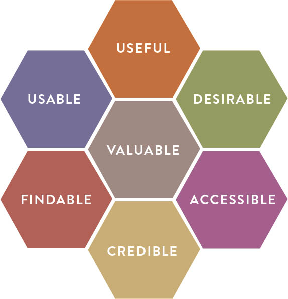
USER EXPERIENCE HONEYCOMB CREATOR: Peter Morville
A diagram of the user experience, which aims to advance the conversation of information architecture beyond usabilty. It can also allow each facet to be evaluated singularly to transform the process.
1. Useful
For something to be useful, it needs to function and fulfill the purpose for which it was designed. If you are shopping online and the site doesn’t list the products that are sold or you have trouble loading the content, then simply put, the site is not useful.
2. Usable
Usability is directly evaluated by determining if the product can be used to achieve the user’s goal. It is also directly connected to ease of use and satisfaction for the user. If you are shopping online and you are not able to create an account—a necessity to purchase anything—then the app will not be usable for you. As a user, you would not be very satisfied because your goal was not met.
3. Findable
Findability is just as it sounds: it looks at the ability and ease of finding something. There is nothing more frustrating than going to the store for something and not being able to find it. In this case, findability relies on the system of organization at the store and also the tools they have available to assist you. If you go to the store to buy tape and you can’t find it, you search for signs, look for a map, try to figure out the layout of the store, or you look for an employee there to assist you. Each of these things helps you, the user, to find tape. When shopping online, the search bar, search filters, site organization, and site navigation all help the user find what they are looking for. For many users, the online search function is the preferred way of searching, so many brick-and-mortar shops have incorporated a mobile app and kiosks to allow the user to search for products within their store. Many have also added pickup options so the product can be purchased ahead of time and will be waiting for the user when they arrive, making the entire experience as easy as possible.
4. Credible
Credibility is connected to trust. If a user can’t trust a product, then they will abandon it and go find one that they can trust. Every experience you have shopping at a store contributes to your feelings about the store’s credibility and trustworthiness. If you go to a store where people really know their product and can answer every question you have, then you are going to trust that they know what they are talking about and you will most likely buy from them. Credibility is also built into online shopping sites such as Amazon’s Q&A section and product reviews.
5. Accessible
Accessibility is about making sure that people with different abilities can access information and/or use a product. Too often, this is something that is not addressed until the end of the process, or it is left out completely. Considerations should be made for those who have a situational, temporary, or permanent limitation such as deafness, being hard of hearing, blindness, low vision, or color-blindness; or have a cognitive disorder such as autism spectrum disorder, dyslexia, ADD, or another disability. If someone has a vision impairment and they are using a screen reader to shop online, they won’t be able to find and buy what they want if the site is not accessible. Having a hierarchy system for the page content, as well as adding alternative text to describe the information communicated by the site’s images, can go a long way toward making the experience more accessible. Even something relatively simple, such as allowing people to easily increase the point size of type on a site without having to search for it, will improve the accessibility for those with low vision.
6. Desirable
Desirability is connected to our emotions, specifically, envy. If we see something we like, we do what we can to get it. This is especially the case with luxury brands; it is not enough that a product, such as a watch, will work and tell time. It’s about how wearing and using the watch makes the user feel. Desirability is what makes a user long for one product or brand over another.
7. Valuable
The center of the honeycomb is powered by the value a product delivers. This works two ways: it should add value for both the user and the creator. If people find value in a product, they will buy it. If people buy it, the business makes a profit. In terms of problem solving, the bigger the problem that the product solves, the higher the value it will have to the user. If the cost of the product is lower than the cost the user would otherwise need to pay (whether in money or time) to solve the problem, then they will purchase it because they see the value, or the return on investment, from their purchase.
It is essential to have a diverse team working on an experience; it allows you to utilize everyone’s different perspectives to create and offer the most holistic user experiences. If you only have people who come from the same background and experience as yourself, then you likely won’t be able to create a robust experience that satisfies the needs of a diverse representation of users.
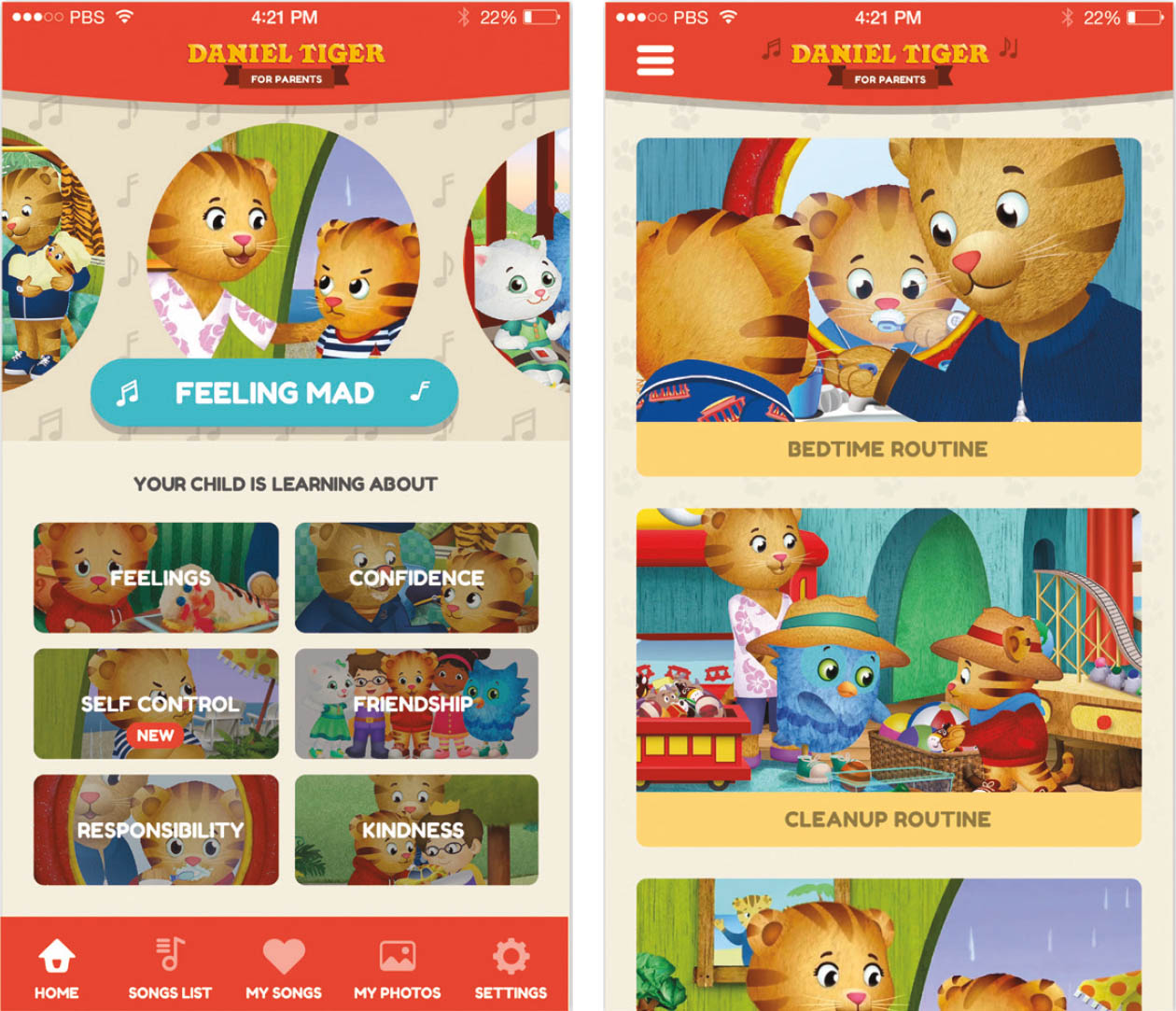
TWO CONCEPTS FOR HOME SCREEN AND NAVIGATION. UX LEAD: JP Arsenault, CLIENT: Fred Rodgers Productions and PBS KIDS The concept on the left was preferred by participants.
WHY:
This project was aimed at designing an app for parents of young children—especially from low-income communities—that would help them find, play, and share social-emotional strategies to help them in their daily parenting challenges. These strategies are presented in the form of short songs sung by the characters of the popular animated series “Daniel Tiger’s Neighborhood.”
HOW:
Fred Rogers Productions and PBS KIDS provided the team with the idea and a list of strategies to include in the app. With a small team of designers, developers, and researchers, a list of key constraints were generated to be addressed: one-handed navigation, flexible search, offline availability of content, quick access to frequently used songs, and multilingual support. The app was organized into four main parts: home screen, strategy lists with search, strategy detail page, and global navigation. After sketching, designing, and prototyping various approaches to these, two were settled on. They were brought to life in prototype form and then six couples were asked to try each, with questions like, “Which navigation style makes the most sense to you?,” “What does this heart icon mean to you?,” and other questions that helped narrow the approaches down to a single direction, which was further refined after launch based on search term and content usage analytics.
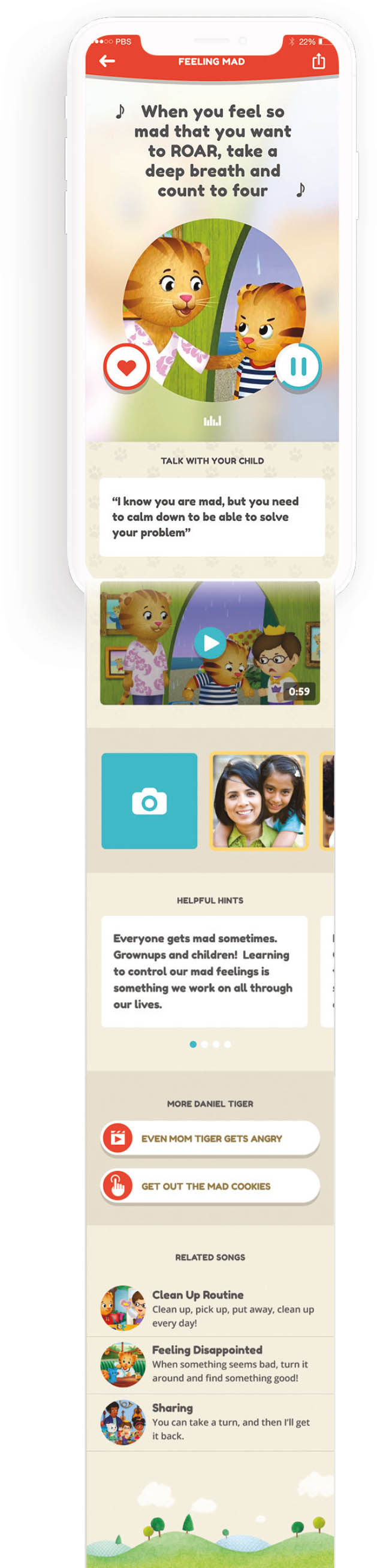
FULL STRATEGY PAGE WITH OPTIMIZED CONTENT PLACEMENT. UX LEAD: JP Arsenault
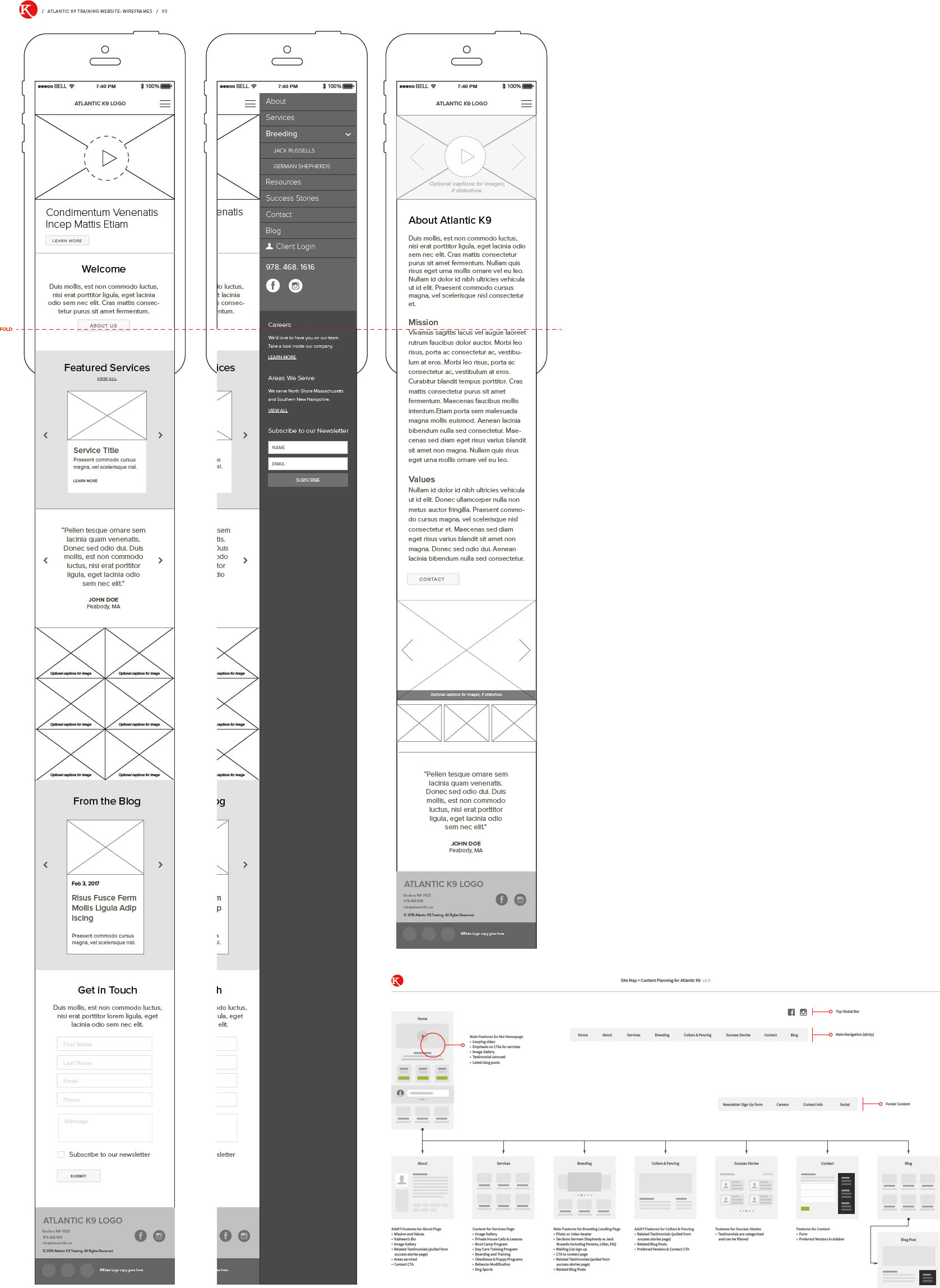
ATLANTIC K9 WIREFRAME & SITEMAP. DESIGNER: Bonnie Brunner
A look at the sitemap and wireframing stages of a project before the final design has been implemented.
The user experience is different from the user interface (UI); in the earlier example discussing writing, the pen is the user interface. The interface is what the user interacts with to accomplish the goal they set out to achieve. The user interface is part of the user experience; they work closely together to ensure that the interaction between the user and the design is successful. UX and UI often go hand in hand; the work from the UX research will help direct the functions and structure of the UI, based on an understanding of the user’s needs.
UI design is the visual style of the space where users interact with a design.
Experience the journey.
Before going on a trip or navigating somewhere unfamiliar, it is common to first look at a map to help guide you to where you want to go. If you didn’t have a clear direction where you were heading, how would you even begin? This would most likely lead to frustration and confusion. The same concept is used when creating an experience for the user. In order to help people navigate through something you create, you first need to know where they want to go and what goals they have. This process is called journey mapping. In essence, this is mapping out the story. And just like a story, it has a beginning, middle, and end.
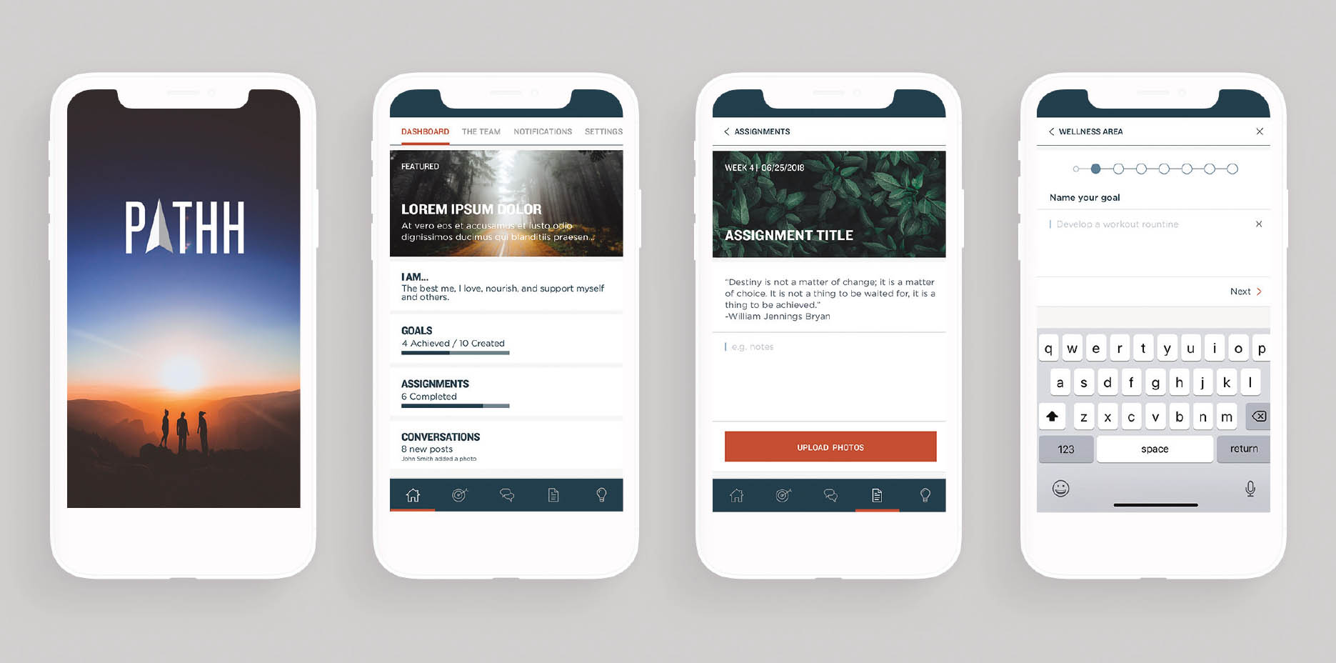
BOULDER CREST RETREAT APP. PRODUCT DESIGNER: Megan Soule Boulder Crest Retreat needed a way to continue its Pathways Program for veterans after their in-person seven-day retreat. Fjord DC partnered with BCR to design and develop a mobile application that would connect veterans, their team, and coaches to each other and the Pathways Program once they returned home.

IDENTIFYING THE USER FLOW. PHOTOGRAPHER: Alvaro Reyes Exploring the user journey through an app with yarn and pins to map the full user flow.
To begin, we need to observe and research the user and their journey to identify what we know about them and their experience. It is important to go through this journey yourself, experiencing it for yourself, so you can empathize with the user. What do they experience during their journey? What do they see, hear, and touch? What decisions do they need to make, and how do they make them? Add this to your map. What happens at the end of their journey? How do they react? As you write or draw this out, highlight any key observations that stood out about the journey and add specific notes to them. You can even color-code these items to identify categories of information such as pain points or decisions, or to just add context. The complexity of a journey map depends on the complexity of the journey. If the user has a pretty straightforward path to follow, the map might be quite simple. If you are mapping out a checkout system to be included at tables in restaurants, with just that one feature, then the journey is fairly uncomplicated, and the map will reflect that. However, the more features and personalization you add, such as customizing their orders to meet dietary restrictions, the more complex the map will be as a result. The more decisions that a user has to make during their journey, the more complex the map.
The intention of the map is to provide a visual that offers you clarity on what the experience looks like. Once the whole experience is drawn out, highlight any pain points: areas that have the potential to be improved through design and user experience. If a big pain point of ordering food is in customization of the order, then this is an area that can be explored further to find a better solution.
As you go through the full journey map, create a set of user personas to see how the experience changes for different kinds of users.

SAMPLE USER PERSONA. CONCEPT DESIGN: Renée Stevens
This will also help you identify additional pain point areas for improvement. The overall goal of the journey map is to capture how things currently happen, and to show that sequentially. Then you capture and explore opportunities to make the experience better. It is important to create different user personas to explore how the journey could be improved for a diverse number of users.
Solving problems of the everyday.
Think about the interfaces that surround us every day. Though an interface tends to imply being highly technical, it doesn’t have to be. A door handle is the interface that allows us to interact with the door to open and close it. The shape of the handle tells us how we should expect to interact with it. The use of additional elements such as arrows and guiding words help direct those who behave differently. While doors vary in complexity and function, the concept is the same, and this similarity of function helps to create a system.

CELBREA—LIVE BY CHOICE NOT BY CHANCE. CLIENT: Welwaze Medical, DESIGN: 1HQ USA, MANAGING DIRECTOR: Laura Wade, CREATIVE DIRECTOR: Ben Glotzer, ASSOCIATE CREATIVE DIRECTOR: Kate Rascoe 1HQ USA created the brand identity for Celbrea TMD, which will be the first fully integrated breast health monitoring system—bringing together a breast thermal sensor device and a powerful app. It will be used by physicians as an adjunct to routine physical examination including palpation, mammography, and other established procedures for the detection of breast disease.
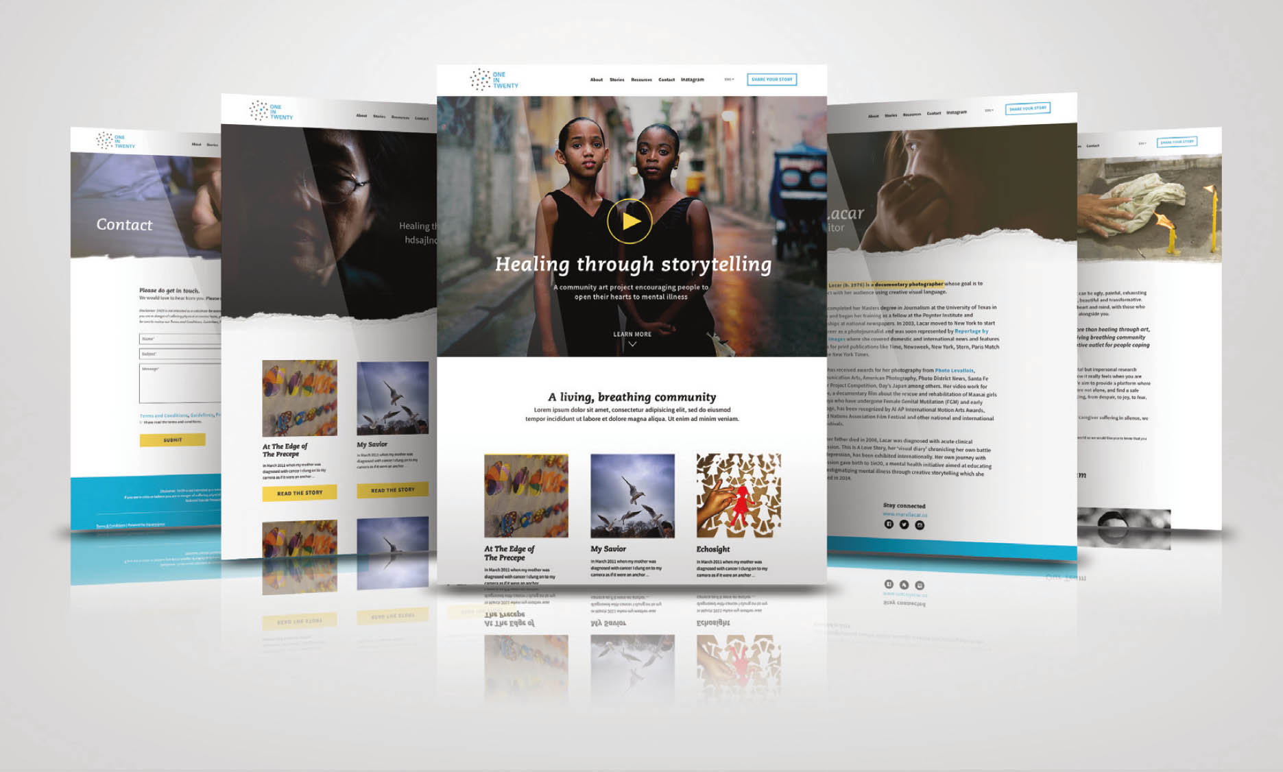
ONE IN TWENTY WEBSITE. DESIGN TEAM: Pixels & Print Design Workshop Team, PHOTOGRAPHY: Marvi Lacar, Kerry Payne, and Rena Effendi, FOUNDER: Marvi Lacar More than an awareness campaign, more than healing through art, more than stigma fighters, One in Twenty is a living, breathing community offering validation, support, and a creative outlet for people coping with and surviving mental illness. This design was created during the design workshop, Pixels & Print.
We also use an interface to interact with computer devices and software. Computers are all around us. The obvious ones are those with screens. However, devices such as cameras, credit cards, key fobs, coffee machines, microwaves, thermostats, and vending machines are all computers we interact with. There is also an increasing number of wearable and external computers that sense the spaces around us, which increases the number of potential interfaces in our environment—for example, sensors on walls and ceilings to identify where someone is in the room.
Interacting with a computer is not really an intuitive process, which is why an interface is created. To make the process less intimidating to users, designers reference experiences that users have in their analog world to help make the digital experience more familiar. For example, using folders for files on your computer or throwing files into the trash to delete them are two ways that designers connect the digital world to our analog lives. When designing a user interface, the goal for the designer is that the user’s interaction with the interface is completely intuitive—in the words of Steve Krug, “Don’t make me think.” If the user has to spend too much time thinking about how to use an interface, they will get frustrated and will likely not return to the site, product, or app again.
Additionally, building a semantic structure within the design helps in multiple ways. First, it helps you organize the content. This creates consistency among the use of different headings within the content. When a user sees the same style, type, color, and other formatting used for a heading, they will associate those similar styles together. This makes reading and navigating the content more familiar and increases the ease of use. Second, it makes the type more accessible to machines, such as screen readers. By using a correct semantic markup, the information is easier to access for those who do not have the ability to view all of the content visually. Third, this content is easier to find. Whether searching a site or using a third-party search engine, the content from a website is discovered more easily when you have a proper semantic structure in place. At minimum, here are the elements you want to identify in your style sheets and character styles:
semantic markup reinforces the meaning of the content in HTML for information on a website.
h1: Heading 1: This is the tag that will include the most emphasized text on a page. This should be used for the content that you want the eye to see first, such as section headers, dividers, and titles.
h2: Heading 2: This is for your subheaders. They are more prominent than body copy, but secondary to the main h1 text. These are good for subheadings or any content that closely relates to h1.
h3: Heading 3: Continuing in the same pattern, this is third in terms of hierarchy and still more prominent than the main body text. The h3 and other subsequent heading tags can also be used for emphasis in the type or to help distinguish nonparagraph structures.
You can have up to six levels of section headings, but only use what you need. This will keep the content simpler and easier to navigate. h1 is the highest section level and h6 is the lowest.
p: Paragraph: This is the main body content and is the style for the bulk of the type on the page—the main article content or the descriptive text. It is, as the name suggests, presented in paragraph forms.
alt text: Alternative Text: The goal of alt text is to provide a textual description of the visual information being conveyed in an image. This should be a sentence or two, and it doesn’t need to identify that it is an image or video; your semantic markup will do that. For any digital media, including websites, mobile applications, presentations, and even PDF files, be sure to add alt text for all images.

Example alt text for the image above could be: silhouette of person standing on rock near the ocean at sunset.
Captioning and transcripts: For sound recordings that are reliant on only one sense, such as hearing, to receive the content, captioning needs to be available. For audio-based media, such as a podcast, the full transcript should be provided as an alternative to the audio delivery.

OUTERNETS ONPLATFORM. DESIGN DIRECTOR & UI/UX DESIGNER: Maxx Berkowitz, BACKGROUND ILLUSTRATION: Cecil Dunston
Storefront displays are often static, repetitive, and irrelevant to passersby. The design goal was to answer this question: How can content creators and managers gain more control over storefront window displays in a way that encourages a more fun, immersive, and curated experience throughout the day? This is an analytics page from a cloud-based system that allows managers to schedule and manage networks of interactive displays. The LoopGroup allows you to schedule a linear loop of content, as well as dynamically triggered content based on variables such as age, weather, and the number of people in front of a display.
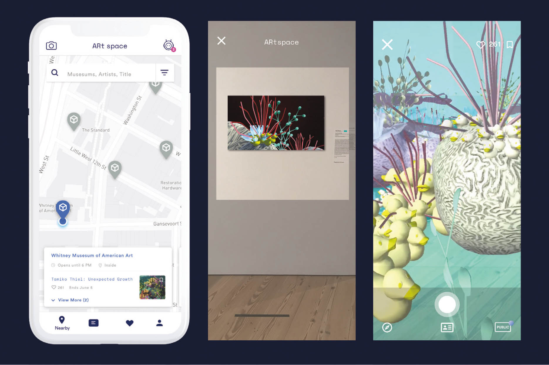
ART SPACE. PRODUCT DESIGNER: Sara Wong ARt space is a creative project exploring the interactions between current museum spaces and mobile device usage. The goal is to help foster deeper thought and conversation in museums and galleries using augmented reality.
DESIGN CHALLENGE:
Create a journey map for an activity from your daily life. Be sure to choose something where you can observe others in the environment so you can identify their pain points, as well as be able to ask them questions about their experience. This could be something as simple as ordering coffee or more complex such as riding public transportation. Draw out the whole journey from beginning to end. Then go back, analyze the data, and identify the pain points—that’s where there are opportunities for design problem solving.