03
Expressive Typography.
Designing from the inside out.
What was the very first thing you did when you woke up this morning? Like many, I checked my clock and saw that it was way too early for my daughter to be waking me up. If you woke up with an alarm, checked the time, or checked your phone, then, like me, you started your day off in the best way. It started with typography.
typography is the art and technique of arranging type to make written language legible, readable, and effective when displayed. It is made up of letters, numbers, and symbols.
Typography is everywhere. In fact, you may not realize how prevalent it is and how often you rely on it. I challenge you to start to pay attention to your morning routine and notice all the places where type exists to ease your use of a product or help communicate important information. It is on your toothpaste and shampoo bottles, on your clothing labels, and on the packaging of your coffee (reading the word caffeinated gets me through the brewing process). It helps you in wayfinding to your next destination by metro, bus, car, bike, or foot—signs and maps need effective typography to help direct us to our destination. If done effectively, you may not even notice the typography all around you. Once you start to pay attention, though, it is like a contagious disease, and you can’t un-notice all the type that surrounds you. You are welcome.
What defines type is the styling and design of each character. You have seen these characters since you began to read and write. Your brain may identify it—“This is the letter A”—and then not notice anything else. But if you really look at the letter as a shape or, even better, multiple shapes, curves, and lines, then you can start to see beyond your initial first impression. Keep looking. You start to see variations of thicks and thins, you start to see pointy finishing strokes and smooth curves. You may start to see patterns or repeated angles and curves. Keep looking.
Look within the letter. Pay attention to the shape around and inside the letter versus the letter itself. Here is where it gets really exciting. The letter itself may define and help us identify the character, but the negative shapes and space around the letter are where the design comes to life. Notice the shape in the center of the letter a that looks like a raindrop and the space below the top curve that looks like the toe bed of a boot in the kicking position. It is within these spaces where the letter gets energized and relationships start to form.


It is rare in a design that you will only have one letter to work with, so what happens when you bring another letter into the mix? You get more negative spaces that all need careful and precise attention. Looking at the addition of the lowercase b next to the a, you now have a relationship. The way the space is formed between the curve on the right side of the a and the straight left side of the b is unique to those two letters in that specific typeface. If the letters become too close, the tail on the bottom of the a will start to bump into the b. If they become too far apart, they will start to disassociate with one another and become two separate letters again.
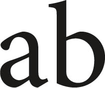
As a designer you are able to define the relationship between two letters, which is called kerning. Often you are seeking a peaceful balance to help make a word easier to read. The shape between the a and b is different from the shape between the b and c, which means that each combination of letters needs its own optical spacing to balance the difference so that, as a group, they hold together to form a word. At first this may seem like a daunting task, but realize that this optical kerning, achieved by adjusting the spacing between characters, is usually only needed for display type—which is type that is used at a large size. Examples of this include headings, logos, and usually the first type you see within a design. For smaller type, such as body copy and paragraph type, you can use a metric kerning setting, where a layout program (such as Adobe InDesign) will mathematically and automatically space out the type. The larger the type, the larger the spacing between the type becomes, and thus the more attention you need to give the kerning to find an optical balance.
kerning is the space between two letters.
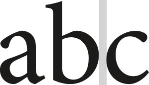
Tracking, on the other hand, can be applied to a whole word, a whole line, a whole paragraph, or even a whole document of type. Increasing the tracking, also called letter spacing, opens up the type, giving it more space between characters. Depending on the overall width of the typeface you are using, you may find a need to increase the tracking to make it easier to read the type. Decreasing the spacing between letters can create a bit of visual tension, which can be used as a stylistic choice or to create a closer relationship between the letters. This approach is often used effectively on logos and nameplates on magazines. If you use all caps or small caps, tracking is needed to pad the space between all those uppercase letter forms.
tracking is the space between two or more letters.

Spacing between the letters helps us read the word as a unit, and it also helps elevate the story and themes communicated beyond the words on the page. If you look at some example logos, you can see how the adjustment of just the tracking changes the overall message. FedEx and Crate and Barrel both use tight tracking to make a solid statement that is bold and full of energy. On the other hand, the United States Postal Service and companies like West Elm have loose tracking, which communicates a softer, more approachable statement. The West Elm logotype has an especially luxurious feel, which was achieved by providing ample space for each of the characters. This creates a nice story within the word, which influences the way you feel about and perceive the brand without even realizing it. It is also worth noting that the use of upper- and lowercase letters changes the message and tone for each of these logotypes. It is in these details where you can start to see the power of design.
How do you choose a typeface?
First, to answer that, there needs to be clarification on the difference between a typeface and a font. A typeface is what you see. A font is what you use. Think of a typeface almost like a family’s last name. There may be many people in a family with that last name. Let’s assume they are genetically related—they have consistent and distinct defining characteristics. Within that family everyone has different sizes and weights, just like fonts. Commonly known typefaces are Helvetica, Times New Roman, Courier, Garamond, Baskerville, Minion, and Futura. To name the font, you would be specific, for example, Helvetica Bold 24 pt. When you use a computer, you actually will be using the font, which is the digital file that needs to be installed and activated on your computer to then use it. If you think of it in terms of music, you listen to a song, but to play it on your computer or device, you need the .mp4 file. The same idea is at play here. To use typefaces digitally, you need to install each of the fonts within that typeface on your computer. The lines of distinction between the use of the terms typeface and font have been blurred by the use of computer programs, which only refer to fonts.
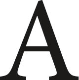
serif typefaces have finishing strokes on the baseline of the letter.
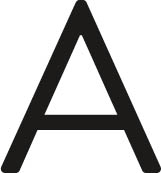
sans serif typeface means without serifs.
When you are looking for a typeface beyond what came preinstalled on your computer, you will likely find yourself online browsing type foundry websites. The first decision you should consider is the font weight and size you’ll need. This is important for a few reasons. First, not all typefaces are made the same. Some feature expansive font formats, such as Univers, which offers 21 fonts ranging in weights and widths. However, some typefaces are only available with one font option, which is frequent with very styled typefaces. Second, typographers, who design typefaces, are so good at what they do that they intentionally design the type to work well in certain situations, which means they may be less ideal in others. For example, Georgia was designed to be displayed on a screen, and therefore, is very readable even at a small size on screens. Other type, such as Didot, was designed to be used as display type at larger sizes. It wouldn’t work well at a small size in print or especially on a screen. In recent years, typographers have worked to update this face to adjust for the different point sizes now available through digital use. With typefaces, you get what you pay for. Though some typefaces are offered for free, it is part of your job to observe font licensing rules for every face you select. Options include subscription-based licensing, personal licenses, commercial licenses, multi-user licenses, mobile and web licenses, and others based on what foundry you are working with. Be sure to research where and how you are able to use the fonts you download and install. Navigating the licensing is important to do before starting a project so you can make sure to communicate any associated costs with a client if you are working with one. More on this in chapter 12.
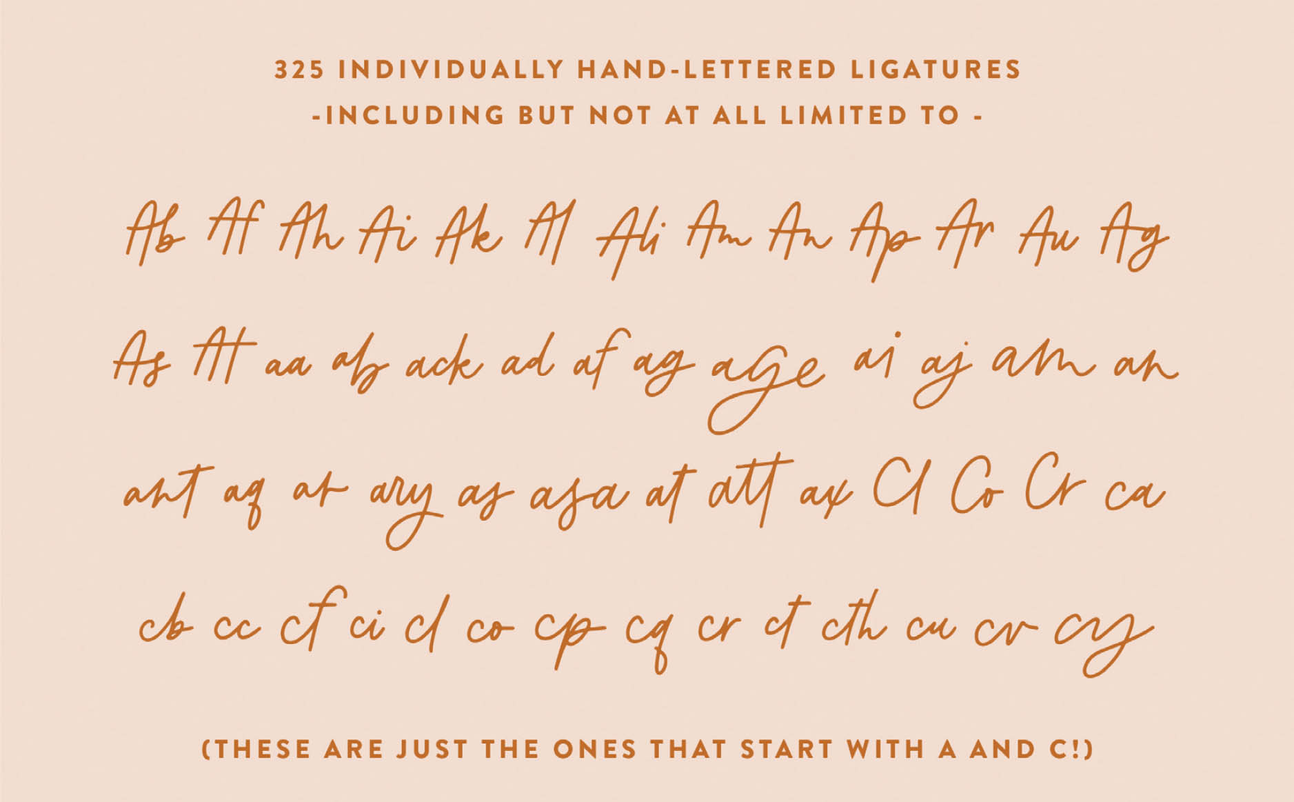
MERITOCRACY FONT BY UP UP CREATIVE. TYPE DESIGNER, FOUNDRY OWNER: Julie Green The key to making Meritocracy as authentically hand-lettered-seeming as possible was to introduce plenty of variety. The typeface includes over 900 glyphs, every single one of which was individually hand drawn. It includes hundreds of individually drawn ligatures and contextual alternates. The type also includes coded OpenType features to create pseudo-randomization and to make selecting ligatures and alternates as easy as possible, enabling end users to do less work to create surprisingly varied and hand-lettered-looking type treatments. The end result is that users can type a sentence that might have six instances of lowercase a, and each and every instance of the letter a can potentially look different from the others, moving far away from the uniformity of traditional typography.

glyphs are individual characters within a font, including special characters and punctuation.
ligatures are letters joined together to form one glyph or character, usually needed for features that overlap.
www.myfonts.com/fonts/upup-creative/meritocracy
With all the type options available today, you may feel overwhelmed. You don’t have to be. Massimo Vignelli is a legendary designer with an impressive career including designing the original logos for American Airlines, IBM, and Knoll, and he is known for designing the subway map for New York City and the National Park Service’s Unigrid system. He is also known for using only six typefaces throughout his career: Helvetica, Garamond, Bodoni, Century Expanded, Futura, and Times Roman. While you likely could use more typefaces in just one project, just know that you don’t have to.
So, how do you choose a typeface? Here are some considerations:
Function: Typefaces are designed specifically for different type sizes, displays, printing types, and products. Pick the right one for the job.
Style: Match the style of your message with the style of the type.
Classifications: Type is categorized into different type styles. Start by first narrowing down to a specific category.
History and Associations: Each typeface has a story and a past. Even new typefaces are inspired from somewhere and have a purpose in mind. Do a little research.
Choosing a typeface is about finding a balance between aesthetics and practicality. Still need clarity? Let’s deep dive into each of these options.
Read what I meant, not what I said.
Type is categorized into different styles and classifications. When you visit a type foundry website or a font collection site, the first decision you often have to make is choosing a classification. Options include serif, sans serif (without serifs), slab serif, script, blackletter, mono, hand, decorative, etc. How do you begin to choose? The good news is that there is not necessarily a wrong answer, but know that you will be communicating a message based on the type style you choose. If it feels like a daunting task, then I would say you are not far enough along in the design process to be picking a typeface yet. Before you can determine what typeface you want, you need to know the overall message of the design. Yes, the words and letters will communicate a message, but there is a larger message that you need to define first. If you are designing for a client, then this is a conversation you have with them before any other work is completed. Having a clear message and understanding why you are designing something will help guide your decision-making for many aspects of the design, including the selection of an effective type category.
USE OF TYPEFACES PAPYRUS & BRUSH SCRIPT LACKS AUTHORITY, DESPITE THE MESSAGE. PHOTOGRAPHER: Renée Stevens
One of the other functions of type classifications is to help you understand how the font was designed to be used. Display type is created to be used in larger point sizes—14 points and up. Display type is designed to attract and hold people’s attention. In contrast, text type is created and optimized for smaller type sizes for body copy, such as the text you are reading now. It often has simpler and less complicated forms. At a smaller size, more complex forms would get lost and hinder the legibility of the type.

BODONI TYPE SPECIMEN. DESIGNER: Jordan Schnitzer Bodoni is categorized as a serif Didone typeface and was first designed by Giambattista Bodoni, an 18th-century typographer. He was known for his use of sharp contrast in line thickness in his type designs.
WHAT DID YOU SAY (with your type choice?)

TYPE ANATOMY mastering the basics

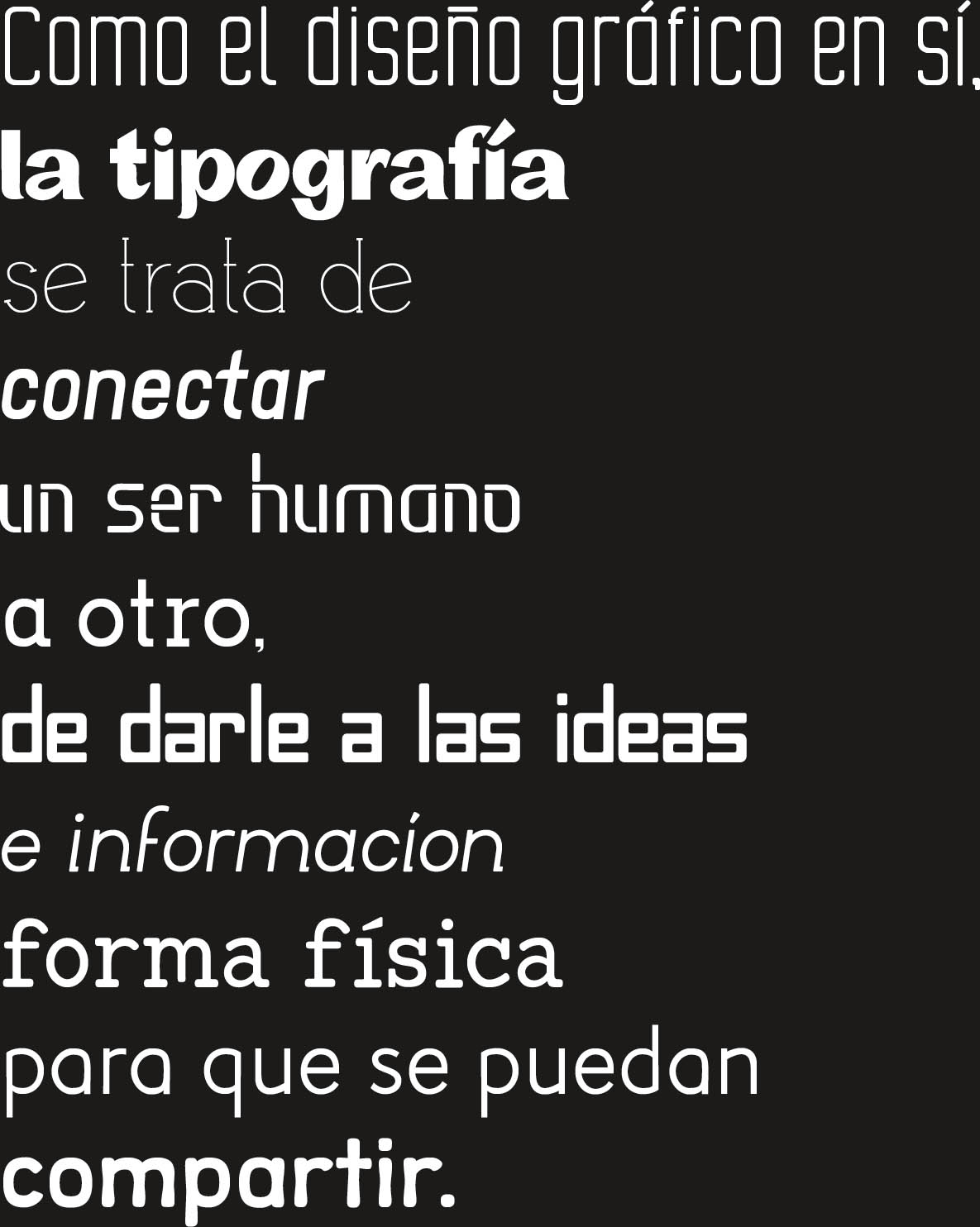
QUOTE, SPREAD DESIGN, AND TRANSLATION. TYPEFACES ART DIRECTOR, SPREAD DESIGNER, AND AUTHOR: Claudia Guerrero Strong As a Chilean-born, U.S.-trained journalist and designer, Syracuse University typography professor Claudia Strong now lives happily at the corner of words and design. This spread melds her love of teaching, words, and design with the languages that helped shape her.
TYPEFACE DESIGN, FROM TOP TO BOTTOM, BY HER STUDENTS: John Doscas (Seven Sans), Jiawen Cao (Mingle), Lucy Naland (Verbatim), Yingying Yue (Dialectic), Katie Getman (Bondy), Libby Stankaitis (Freedom Slab), David Connuck (Simon Says), Anastasia Golub (Dynamic Oblique), Emma Comtois (Courier Giglio), Junyu Guan (Concepción), Abant Berke (eXTraordinary).
History and associations.
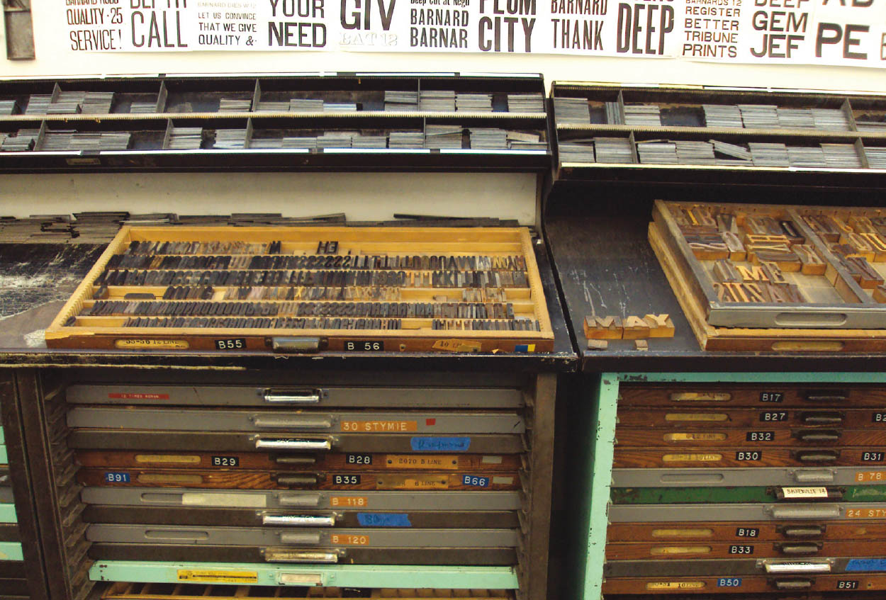
It is so easy these days to just turn on a computer, type a few words, and print out a document that we take this process for granted. There is a lot of work that people have done in advance of this that is often overlooked—including the type design. Letterforms were first carved into stone, then carved from wood blocks, and eventually cast out of metal moveable type. Though the printing process has become easier throughout the years, designers still respect and appreciate the rich history of type. In the early 2000s there was a large movement by designers to recapture the handmade feel of type through hand-lettering, calligraphy, and brush lettering—ways to add some of the imperfection and humanism back into their type—which, because most type was being created on computers, started to look sterile. As you look at the history of design and typography, you start to see repeatable trends that weave in parallel with the technologies of the times. The more digital the work has become, the more we long for that human touch. There is such beauty in a letterpress print, which is the printing process where an impression of type and a design are inked and then pressed into a piece of paper through the printing press. I encourage you to contact a local letterpress shop or museum to get a tour or attend a workshop if you are able. There is nothing like putting the ink directly on a roller and seeing a design come to life on press.
Despite advances in the printing technology of type, it is important to understand and appreciate both the history and the art form of this craft that is often hidden inside a laser-jet printer. Being able to hold type that was carved by hand out of wood makes you really notice and appreciate those distinct shapes and angles that can become easy to miss in digital format. In an homage to this history, we still use terminology, such as upper and lowercase letters, which got these names because of their placement in a printing shop. The lowercase letters were used more frequently, so they were stored in the lower cases to be easier to reach.
LETTERPRESS TYPE CASES AT WASHINGTON UNIVERSITY IN ST. LOUIS DURING THE SGCI CONFERENCE IN 2011. PHOTOGRAPHER: Michelle Cornelison CC BY-SA 4.0, https://commons.wikimedia.org/w/index.php?curid=53038058
Some typefaces have been around for centuries and, as you can imagine, have a deep history. Caslon is a serif typeface that was designed by William Caslon in the 1700s in London. His metal engraving of type was the first of its kind in the British Empire. It held a reputation as being “the British typeface.” The irony of this association is that when the United States chose a typeface for the Declaration of Independence, declaring their independence from Britain, they set it in Caslon.
It is important to learn and research the history and associations of typefaces before using them, especially for branding and identities. Society and culture have strong connections with certain typefaces, and people can unconsciously apply those associations to designs that use those typefaces. This could have a negative effect if people associate your design with something that is not in line with your client’s brand story. That being said, it can also be a very positive thing that adds value and depth to your brand logo and visuals.
If we take a look at some election campaign logos, you can see the importance of researching and making decisions on a typeface based on its history. To be clear, we are looking at these from a design standpoint—sans politics. (If you understood that pun, you should take a moment to acknowledge all you have learned so far.) With the Obama campaign, the typeface Gotham was used for the branding. It was so consistently used that people started referring to it as the Obama font (though we know that is incorrect; it actually should be referred to as the Obama typeface). Gotham was designed by typographers Tobias Frere-Jones and Jonathan Hoefler. The inspiration for the typeface was from outside the design world and came from an engineering perspective, as it was inspired by the lettering used at the Port Authority bus terminal in New York City. The typographers’ intention was to preserve some of the history of the building and the style which held a classic New York City feel. As a result of this inspiration and location, Gotham has been classified as very American and, perhaps even more notable, for every American. When you are running for president and you choose this as the typeface for your campaign, it elevates your message further. Choosing a typeface to represent the everyday American tells a story beyond just the words that you use—the association comes along with it.
Then, as you may know, when President Obama’s second presidential campaign was announced, what typeface do you think he chose? It would make sense to stick with Gotham, but the campaign needed a more sophisticated look, as Obama had significant experience being president this time around. As was announced via a tweet by Frere-Jones when asked if he could make Gotham a serif typeface, his response was, “Yes we can, but only because you asked, and only because you are the president of the United States.” The second campaign branding revealed a beautifully constructed slab-serif version of the Gotham typeface, which added a nice foundational, experienced look to the typeface while retaining the familiarity and comfort. As history shows, this resounded with Americans.
OBAMA AT AMERICAN UNIVERSITY. PHOTOGRAPHER: Will White, Ridgefield, USA

MCCAIN ANNOUNCING HIS CANDIDACY FOR PRESIDENT, APRIL 2007. PHOTOGRAPHER: River Bissonnette
https://commons.wikimedia.org/w/index.php?curid=3447450
Obama’s opponent, John McCain, chose the typeface Optima for his presidential campaign in 2008. The typeface was designed by typographer Hermann Zapf and was inspired by the capitals used on an ancient Roman gravestone he saw during a visit to Florence, Italy. The typeface also has an interesting style—the ends of the letters have a bit of a flare, hinting at a serif, while still maintaining its sans serif categorization. This typeface has a strong military history, which is presumed one of the reasons it was chosen for the McCain campaign. It was the typeface chosen for the Vietnam Veterans Memorial in Washington, D.C. It was also the selected type used at the 9/11 Memorial in New York City. With McCain’s strong military history, you can see how his choice of the Optima typeface was intended to amplify his message beyond just his campaign slogan and branding.
Typography is everywhere and it has a rich history; people make strong conscious and unconscious associations with typefaces all the time. As part of the research you do on every project, you should learn about the typefaces you are drawn to in order to make sure that the messages and stories from their histories align with and amplify the intended message you are communicating with your design.

BILINGUAL LANGUAGE DESIGNER: Connie Seem
The word “love,” expressed in both English and Korean.
HAJAR MOSAIC LOGO. JEWELRY DESIGNER: Wafa Twal A heritage mosaic business in Jordan that incorporates delicate functional art in the form of high-trend jewelry. The Arabic term hajar means stone. www.hajar-art.com
DESIGN CHALLENGE:
Design in a language other than your native language. First, select the language you are designing in, and learn as much as you can about it. Learn how the rhythm works, what direction it reads, what rules there are, and how it differs from other languages you have designed in. Then find a typeface that has all the glyphs you need for your project. Push the boundaries to see how you can make it work for your audience. The last step is to show it to someone who is fluent in the language you chose to get feedback.
