
Chapter 9
Game Development: Graphics
Casual games were once the domain of Flash and the Web. Today, casual gaming is making big waves in the mobile space. While there have been mobile gaming devices for some time, the advent of smartphones that are capable of playing games has in effect put a gaming device in the pockets of millions of people who would never buy a dedicated gaming devices. By definition, this new group of game players is casual; they play games while waiting in line or on the bus. At least at first, these folks are not interested in big name titles with huge budgets; they want to check in on their virtual farms or solve a few puzzles. As a result, most casual games are 2D.
The first thing a game developer must do is select which technology they will use to implement their game. Basically, the developer has to choose between 2D and 3D. If 3D is required for the design of the game, they choose OpenGL ES because that library offers everything they will need to develop their game. If 2D is the choice, they can still use OpenGL ES, but the complexity of OpenGL ES might get in their way. The other choice for 2D is to use the graphics capabilities built into the Androids Java runtime.
In this chapter we will take a look at implementing a 2D game, this will serve the many developers looking to ride the wave of mobile casual game development. We will learn that there are really two ways of drawing things on the screen and will explore both. We will also take a look at some of the fundamentals of dealing with different size screens as well some other odds and ends that turn up while writing a game.
Figure 9–1 shows the starting screen of the game on the left and the game itself on the right. The starting screen allows players to start a new game, view their high scores or view the About screen. The user plays the game by trying to create vertical or horizontal lines of similar, orbs. They can rearrange orbs by selecting two to be swapped. When a matching line is created the orbs are animated off-screen and their score is incremented.

Introducing the Android View Package
The most basic way to render a scene in Android is to use the component library provided with the Android software development kit (SDK). This SDK includes all the basic widgets one would expect in a modern user interface (UI) library, including dynamic layouts, buttons, sliders, and so on. The core class for getting content onto the screen is the View class, which is found on the android.view package. This package and its subpackages contain all classes required to draw whatever you want onto the screen. These packages also contain methods for layout, intercepting user actions, binding the UI to data, and applying style. The class itself is not particularly useful in and of itself, but it does provide a base functionality inherited by all its subclasses. These subclasses include both Views that the user interacts with, like a Button, and Views used for layout, like a LinearLayout. There are two basic methods for getting content onto the scene: the first is to use XML files to describe the layout of a View and the second is to describe the layout of a scene with code. Both techniques use the same application programming interface (API), but there are advantages and disadvantages to both techniques. Most applications will use a combination of these techniques. Let's start by looking at how layouts are described in XML.
Understanding XML Layout
Most developers are familiar with the concept of the Model View Controller (MVC) pattern. The idea with MVC is to separate the Model (the raw data) from the code that is responsible for controlling and validating the data. Further, the controller is separated from how the data is actually rendered to the screen. This separation of interests is helpful because it allows for code reuse and divides the responsibility of the application into common divisions of labor. Let's consider a hypothetical web page as an example of MVC.
Say you have a web page that displays a table containing all upcoming events for an office. The data for this page is probably a number of rows returned from a database. Each row contains the name and time for each event. This data is considered the Model; the people actually putting the web page together don't know exactly what the data will be on each given day, but they know there will be data and it will be of a particular type, so they can move forward with their work, even before the database is fully set up and populated.
The finished web page will be composed of HTML, CSS, and JavaScript. The CSS is solidly in the camp of the View because it describes the color of the page; nothing in the CSS should care about the data that is being returned or even that there is data. The HTML will provide the table itself, and the JavaScript will be responsible for populating the table with rows. This means that the HTML and the table it provides is part of the View while the JavaScript is the controller since it interprets the data in way that is meaningful to the table.
With Android, we have the ability to break up our application in a way similar to the web page we described. This is done in part by describing the layout of an application in a special XML file. The XML files that describe layout are generally stored in the layout directory under the res directory. An application can have any number of XML files describing layout, and each file contains an element describing a single root View(and possibly sub-Views). In general, each element in the XML file describes a View class that will be instantiated at runtime. Figure 9–2 shows a dialog from our example application that is defined by one of these XML files.
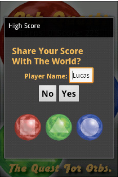
Figure 9–2. The Score dialog is defined by XML
Figure 9–2 shows a dialog with the title “High Score.” This dialog is displayed to users after the end of the game; it gives them the option of entering a username and deciding whether they want their score sent to a web service. The XML used to describe the layout of the text and buttons is shown in Listing 9–1 (taken from the example code accompanying this chapter).
Listing 9–1. score_dialog.xml
<?xml version="1.0" encoding="utf-8"?>

<LinearLayout

  xmlns:android="http://schemas.android.com/apk/res/android"

  android:id="@+id/dialogRoot"

  android:layout_width="fill_parent"

  android:layout_height="fill_parent"

  android:orientation="vertical"

  android:gravity="center"

  android:padding="20px"

  android:background="#333333"

  >

        <TextView

                android:text="Share Your Score With The World?"

                android:textColor="#FBB040"

                android:textStyle="bold"

                android:textSize="24px"

                android:layout_width="wrap_content"

                android:layout_height="wrap_content"/>

        <LinearLayout

                android:layout_width="wrap_content"

                android:layout_height="wrap_content"

                android:orientation="horizontal"

                android:gravity="center">

                <TextView

                        android:text="Player Name: "

                        android:textColor="#FBB040"

                        android:textStyle="bold"

                        android:textSize="18px"

                        android:layout_width="wrap_content"

                        android:layout_height="wrap_content"/>

                <EditText

                        android:text="User Name"

                        android:id="@+id/playerNameEditText"

                        android:layout_width="wrap_content"

                        android:layout_height="wrap_content"/>

        </LinearLayout>

        <LinearLayout

                android:layout_width="wrap_content"

                android:layout_height="wrap_content"

                android:orientation="horizontal"

                android:gravity="center">

                <Button

                        android:id="@+id/noButton"

                        android:text="No"

                        android:textSize="24px"

                        android:textStyle="bold"

                        android:layout_width="fill_parent"

                        android:layout_height="wrap_content"

                />
                <Button

                        android:id="@+id/yesButton"

                        android:text="Yes"

                        android:textSize="24px"

                        android:textStyle="bold"

                        android:layout_width="fill_parent"

                        android:layout_height="wrap_content"

                />

        </LinearLayout>


</LinearLayout>
Listing 9–1 shows a root element called LinearLayout, which is an Android class that extends GroupView. GroupView extends View and is the root class for any View that contains children. So in the case of LinearLayout, we know that this class is intended to contain child Views and lay them out in a line. The attribute orientation (of namespace android) is set to vertical, which directs the LinearLayoutto place each child View lower on the screen then its predecessor. The other possible value for the attribute orientation is horizontal, which would lay out the children from left to right.
The attributes layout_width and layout_height are required attributes and describe the size of this View. The size being set is not absolute and is either driven by the size of its parent or its children. This is done to allow the description of a layout independent of the size of the screen or region where this component is being drawn. The possible values for these attributes are the following:
- fill_parent: This directs the
Viewto consume as much space as is available within the bounds of its parentView. If theViewusing this layout directive is the only child of its parent, it will be the same size as its parent, minus any padding. - wrap_content: This directs the
Viewto be the minimum size required to display its childrenViews. So if aViewhas twoButtonsin it, it will take up just enough screen space to display those two children, plus any padding on the children. - match_parent: This directs the
Viewto use the same value for eitherlayout_widthorlayout_heightused by the parent.
The children of a View might not take up all the space a View takes up, especially if the parent View is using fill_parent for either layout_width or layout_height, so there needs to be a way of describing where the children should go. When this is the case, the gravity attribute can be used to indicate where in the parent View the children should be located. The root LinearLayout in Listing 9–1 has its gravity attribute set to center, which indicates that space taken up by all its children should be in the middle, both vertically and horizontally. The gravity attribute can also be set to lay out the children so they are aligned with the top, right, bottom, or left edge of the parent View, or just centered vertically or horizontally.
TIP: Each View class has a number of attributes that can be set, these are all well documented on the Android website (http://developer.android.com/reference/packages.html), but remember, for quick reference, code completion works in Eclipse when editing layout XML files.
The LinearLayout root in Listing 9–1 also has its padding and background attributes set. The padding attribute indicates how much space should be left between itself and any containing View. The background attribute specifies how the background should be drawn; in this case, a solid gray color. The background can also be set to an image or any other Drawable class. More on the Drawable class later.
In Listing 9–1, the three children Views of the LinearLayout root contain the content of this View. The first View is a TextView, which displays text on the screen. In this case, the TextView is displaying a question to the user: “Share Your Score With The World?” The layout_widthand layout_height are set to wrap_content, which indicate that the TextView should be the minimum size to display its text, given the length of the text and the attributes textSize and textStyle. The other two children Views of the root LinearLayout contain additional Views laid out horizontally. The first child LinearLayout contains another TextView and an EditText view. EditText is a View that allows the user to enter text; in this case, the name they wish to associate with their score. EditText, along with the two buttons in the second LinearLayout, have their id attributes set. The id attribute is a way of naming a View with the XML so it can be accessed programmatically. We will look at how View IDs are used in the following section, when we look at the Java side of things.
Beyond LinearLayout there are a host of other layouts available in Android, each providing the developer with unique layout options. The following is a selection of the most popular layouts with a brief description:
- FrameLayout:
FrameLayoutis the simplest layout; it just draws all its children at the upper-left corner (0,0). This layout is handy when you want to provide a container for a singleView. For example, say you have a spot in your application where you display an image that needs to change. You can use aFrameLayoutto mark the location where the image should be displayed; then remove the old image and add a new one when required. - LinearLayout: As mentioned,
LinearLayoutis used to lay outViews either vertically or horizontally. This is a very common strategy for laying outViews. - TableLayout:
TableLayout, as the name suggests, is aViewthat is used to lay outViews in a table-like way.TableLayoutis different from the other layoutViews in that it expects its children to be of typeTableRow. ATableRowcan contain zero or moreViews, where eachViewis a cell in that row.TableLayoutis like an HTML table in that it is organized by rows (<tr>in HTML), but it is unlike the HTML table because cells cannot span more than one column. - RelativeLayout:
RelativeLayoutprovides a mechanism for laying out children relative to each other. This is a layout mechanism I have never run across on other platforms, but the idea is that you can say things like “place this button to the right of this text”. - AbsoluteLayout: If you want to specify the exact location of a child, you can use
AbsoluteLayout. It should be noted that this class is deprecated because this layout can easily break when used on devices with different screen sizes.
The previous layouts may seem limiting compared with other UI libraries, but Android makes up for this by making the creation of custom layouts pretty simple. We will take a look at an example of a custom layout later in this chapter.
Layout in Code
Know we have our layout declared in XML we will want to display this content on the screen. Displaying content from an XML file is very similar to laying out a screen programmatically. Let's take a look at both these techniques and how they can be used. Listing 9–2 shows the constructor of ScoreDialog, which is the dialog displayed in Figure 9–2.
Listing 9–2. ScoreDialog.java (constructor)
public class ScoreDialog extends Dialog implements

                android.view.View.OnClickListener {


        public final static String PREF_USER_NAME = "PREF_USER_NAME";


        public final static String SERVICE_URL = "http://pap-game-service

.appspot.com/add_high_score?highscore=";


        private EditText playerNameEditText;

        private Button yesButton;

        private Button noButton;


        private GameActivity activity;


        public ScoreDialog(GameActivity activity) {

                super(activity);

                this.activity = activity;


                setContentView(R.layout.score_dialog);

                setTitle("High Score");
                playerNameEditText = (EditText) findViewById(R.id.playerNameEditText);

                yesButton = (Button) findViewById(R.id.yesButton);

                noButton = (Button) findViewById(R.id.noButton);


                SharedPreferences settings = getContext().getSharedPreferences(

                                HighScoreView.PREFS_ORB_QUEST, 0);

                String unsername = settings.getString(PREF_USER_NAME, "User Name");

                playerNameEditText.setText(unsername);


                yesButton.setOnClickListener(this);

                noButton.setOnClickListener(this);


                LinearLayout rootLayout = (LinearLayout) findViewById(R.id.dialogRoot);


                BitmapDrawable bitmapDrawable = (BitmapDrawable) activity

                                .getResources().getDrawable(R.drawable.dialog_graphic);


                ImageView imageView = new ImageView(activity);

                imageView.setImageDrawable(bitmapDrawable);


                rootLayout.addView(imageView);


        }
In Listing 9–2 we see that the constructor requires a GameActivity object. A GameActivity is the class defined in our example project. At this point, the only thing we need to know about GameActivity is that it extends Context and is passed to the required superconstructor. The first thing the constructor does, as related to layout, is to call the setContentView() method and pass in the constant R.layout.score_dialog. Ris a class that is automatically generated by the Android SDK and is used as a way to reference the artifacts declared in the res folder of an Android project. In Listing 9–1 we showed the content of the file score_dialog.xml. Because this file is located in the subfolder layout, the Android SDK creates a constant called score_dialog in the inner class layout. Listing 9–3 shows R.javaand should help explain what is going on here.
Listing 9–3. R.java
/* AUTO-GENERATED FILE.  DO NOT MODIFY.

 *

 * This class was automatically generated by the

 * aapt tool from the resource data it found.  It

 * should not be modified by hand.

 */


package org.ljordan.orb_quest;


public final class R {


    public static final class anim {

        public static final int scale_down=0x7f040000;

    }

    public static final class attr {

    }

    public static final class drawable {

        public static final int background=0x7f020000;

        public static final int blue_orb=0x7f020001;
        public static final int dialog_graphic=0x7f020002;

        public static final int green_orb=0x7f020003;

        public static final int icon=0x7f020004;

        public static final int nine_patch=0x7f020005;

        public static final int red_orb=0x7f020006;

    }

    public static final class id {

        public static final int aboutButton=0x7f060006;

        public static final int dialogRoot=0x7f060007;

        public static final int gameView=0x7f060000;

        public static final int highScoreButton=0x7f060005;

        public static final int noButton=0x7f060009;

        public static final int playGameButton=0x7f060004;

        public static final int playerNameEditText=0x7f060008;

        public static final int root=0x7f060001;

        public static final int scoreTextView=0x7f060003;

        public static final int turnsTextView=0x7f060002;

        public static final int yesButton=0x7f06000a;

    }

    public static final class layout {

        public static final int about=0x7f030000;

        public static final int game=0x7f030001;

        public static final int high_score=0x7f030002;

        public static final int main=0x7f030003;

        public static final int score_dialog=0x7f030004;

    }

    public static final class string {

        public static final int about_text=0x7f050005;

        public static final int about_text_title=0x7f050006;

        public static final int app_name=0x7f050001;

        public static final int hello=0x7f050000;

        public static final int play_game=0x7f050002;

        public static final int view_about=0x7f050004;

        public static final int view_highscores=0x7f050003;

    }

}
In Listing 9–3, the R class has a number of inner classes defined. Each of these classes corresponds with a type of resource defined in the res folder of the project. Continuing our example, we see that the score_dialog constant is defined in the class layout. Further, the constant yesButtonis defined in the class id. So if we want to refer to either of these components, we have a handy constant available to do so. In Listing 9–2, we sent the content of the dialog to the content of the score_dialog.xml file by referring to R.layout.score_dialog. In that file we define a pair of buttons; one of them is the yes button for the dialog. Since we need access to this view in order to register a listener, we can call findViewById and pass in the constant R.id.yesButton and get a pointer to it.
Normally referring to an external resource by an int constant would be a very fragile design pattern. Imagine if one developer changed the file score_dialog.xml so that the yes button was referred to as the confirm button and did not change R.java to reflect this change. Normally, you would have a runtime error, but since R.javais automatically generated you get a compile time error (since R.id.yesButton would no longer be a valid symbol). In this way we have a tightly coupled relationship between the XML and the Java code.
So we know that calling setContentViewand passing in the right constant will populate the dialog with the Views described in score_dialog.xml. And we know that we can find those sub-Views by calling findViewById. But what if we want to add a new View to the scene? At the end of Listing 9–2, we do this by adding the image with the three orbs on it, as seen in Figure 9–2.
In Listing 9–2 we see that the root layout is also pulled out by calling findViewByIdand passing in R.id.dialogRoot. Once we have a reference to this object, we can add Views to it, but first we need to construct one. In this case, we want to add an image, and the easiest way to add an image to the scene is to put an image in the res directly and get a handle to it by calling Context.getResources().getDrawable() and passing in the correct id. The returned object is of type BitmapDrawable. The Drawable class is a generic class that provides an abstraction for things that are drawn. As can be guessed, BitmapDrawable is a subclass of Drawable and is used to draw bitmaps. There are other types of Drawables, and we will get to them, but for now we just want BitmapDrawable, so we can create an ImageView.
Once we have created an ImageViewand passed bitmapDrawable to its setImageDrawable() method, we are ready to add the image to the scene. This is done by calling addView on rootLayout and passing the ImageView. Conceptually, this is identical to declaring an ImageView within score_dialog.xml.
It is up to each developer to decide whether they prefer to lay out their application in XML or in Java code. Personally, I think using XML makes more sense when working on a team, since it helps enforce the MVC pattern.
Custom Component
The Score dialog shows us how to use the existing components and layouts to create a UI. For any game, it is unlikely that the out-of-the-box widgets will be sufficient. By definition, games provide some unique form of interaction. However, we can take advantage of the existing View classes as a foundation for our game. For our game, we are going to create an Activity called GameActivity that will have its layout defined in XML, but one of the Views we add will be of type GameView, which is defined by us. Figure 9–3 shows the GameActivity. In Figure 9–3 we see a big square area with 25 orbs drawn on it. This region is defined by the GameView class. We also see four TextViews for displaying the number of remaining turns as well as the current score. The background is composed of the big orbs and the text “Orb Quest” and “The Quest for Orbs.”
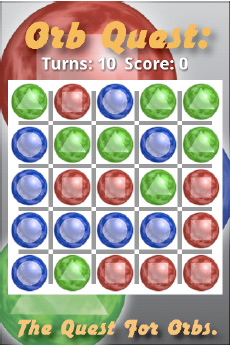
Figure 9–3. The GameActivity of Orb Quest
Let's start by looking Listing 9–4, which shows the content game.xml. We will look at the GameView class after that.
Listing 9–4. game.xml
<?xml version="1.0" encoding="utf-8"?>

<LinearLayout

  xmlns:android="http://schemas.android.com/apk/res/android"

  android:id="@+id/root"

  android:layout_width="fill_parent"

  android:layout_height="fill_parent"

  android:gravity="center"

  android:background="@drawable/background" android:orientation="vertical">


<LinearLayout

        android:orientation="horizontal"

        android:layout_width="wrap_content"

        android:layout_height="wrap_content"

        android:paddingBottom="2px"

        >

        <TextView

              android:layout_width="wrap_content"

              android:text="Turns: "

              android:layout_height="wrap_content"

              android:textSize="24px"

              android:textStyle="bold"

              android:paddingBottom="5px"

              android:textColor="#FFFFFF"

              android:shadowColor="#000000"

              android:shadowRadius="2.0"

              android:shadowDx="1.0"

              android:shadowDy="1.0"

              />
        <TextView android:id="@+id/turnsTextView"

              android:layout_width="wrap_content"

              android:text="10"

              android:layout_height="wrap_content"

              android:textSize="24px"

              android:textStyle="bold"

              android:textColor="#FFFFFF"

              android:shadowColor="#000000"

              android:shadowRadius="2.0"

              android:shadowDx="1.0"

              android:shadowDy="1.0"

              />

        <TextView

              android:layout_width="wrap_content"

              android:text="Score: "

              android:layout_height="wrap_content"

              android:textSize="24px"

              android:textStyle="bold"

              android:textColor="#FFFFFF"

              android:shadowColor="#000000"

              android:shadowRadius="2.0"

              android:shadowDx="1.0"

              android:shadowDy="1.0"

              />

        <TextView android:id="@+id/scoreTextView"

              android:layout_width="wrap_content"

              android:text="10"

              android:layout_height="wrap_content"

              android:textSize="24px"

              android:textStyle="bold"

              android:textColor="#FFFFFF"

              android:shadowColor="#000000"

              android:shadowRadius="2.0"

              android:shadowDx="1.0"

              android:shadowDy="1.0"

              />


</LinearLayout>

<view class="org.ljordan.orb_quest.GameView"

          android:id="@+id/gameView"

          android:layout_width="wrap_content"

          android:layout_height="wrap_content"

/>


</LinearLayout>
In Listing 9–4, we see that the root View is again a LinearLayout. There are four TextViews in a LinearLayout with a horizontal orientation. Two of these TextViews have IDs set (turnsTextView and scoreTextView) and will be updated dynamically in code. The last component is aGameView. To use Views of your own design in an XML layout file, you simply create a View element and specify the class attribute with the fully qualified name of your class. Listing 9–5 shows the GameActivity class.
Listing 9–5. GameActivity.java
public class GameActivity extends Activity {


        private final static int DIALOG_CONFIRM_SHARE = 10;


        private TextView turnsTextView;

        private TextView scoreTextView;

        private GameView gameView;


        @Override

        public void onCreate(Bundle savedInstanceState) {

                super.onCreate(savedInstanceState);

                requestWindowFeature(Window.FEATURE_NO_TITLE);

                getWindow().setFlags(WindowManager.LayoutParams.FLAG_FULLSCREEN,

                                WindowManager.LayoutParams.FLAG_FULLSCREEN);

                setContentView(R.layout.game);


                turnsTextView = (TextView) findViewById(R.id.turnsTextView);

                scoreTextView = (TextView) findViewById(R.id.scoreTextView);


                gameView = (GameView) findViewById(R.id.gameView);


                gameView.reset(this);

        }


        public void updateValues(int score, int turns) {

                scoreTextView.setText("" + score);

                turnsTextView.setText("" + turns + "  ");

        }


        public Long getScore() {

                return Long.parseLong(scoreTextView.getText().toString());

        }


        public void endGame() {

                showDialog(DIALOG_CONFIRM_SHARE);

        }


        @Override

        protected Dialog onCreateDialog(int id) {

                if (id == DIALOG_CONFIRM_SHARE) {

                        return new ScoreDialog(this);

                } else {

                        return null;

                }

        }


        public void dialogClosed() {

                gameView.reset(this);

        }

}
In Listing 9–5 we see that the class GameActivity extends Activity. In the onCreate() method, we call requestWindowFeature and pass the constant Windw.FEATURE_NO_TITLEso we don't have a title. We also call setFlags on the object returned by getWindow and pass the flag FLAG_FULLSCREENwith the mask FLAG_FULLSCREEN. This removes the default Android status bar at the top of the screen, which is the bar that usually indicates the time and battery levels.
Once we have claimed as much screen real estate as possible, we add content by calling setContentView and passing R.layout.game. Finally we pull out the Views we will need access to later by calling findViewByIdand passing in the constants as defined by the R class. Calling gameView.reset at the very end simply prepares the GameViewfor the first round.
In Listing 9–5, we see a couple of convenience methods such as updateValues, getScore(), endGame(), and dialogClosed(). These are called by GameView and ScoreDialog during the lifecycle of the application. There is not much to GameActivity; the meat of the application is in the class GameView, and the first chunk of that class is shown in Listing 9–6.
Listing 9–6. GameView.java (partial)
public class GameView extends ViewGroup implements View.OnClickListener {


        private int orb_ids[] = new int[3];

        private Random random = new Random();


        private OrbView selectedOrbView = null;

        private boolean acceptInput = true;


        private int score = 0;

        private int turns = 10;


        private GameActivity gameActivity;


        public GameView(Context context, AttributeSet attrs) {

                super(context, attrs);

                init();

        }


        public GameView(Context context) {

                super(context);

                init();

        }


        private void init() {

                setBackgroundDrawable(new Background());


                orb_ids[0] = R.drawable.red_orb;

                orb_ids[1] = R.drawable.green_orb;

                orb_ids[2] = R.drawable.blue_orb;

        }


        public void reset(GameActivity gameActivity) {

                this.gameActivity = gameActivity;

                score = 0;

                turns = 10;

                acceptInput = true;


                removeAllViews();
                for (int c = 0; c < 5; c++) {

                        for (int r = 0; r < 5; r++) {

                                OrbView orbView = new OrbView(getContext(), c, r,

                                                random.nextInt(3));

                                addView(orbView);

                        }

                }

                gameActivity.updateValues(score, turns);

        }
In Listing 9–6, we see that GameViewextends ViewGroupand implements View.OnClickListener. GameView has a number of private fields. The field orb_ids is an array that stores the IDs of the three different orb images; they are set in the init() method. The field random is of type Random from the core Java classes. The fields selectedOrbView and acceptInput are used to track game state. The score and turns fields track the current score and number of remaining turns. Finally, a reference to the containing GameActivity is held so we can update the TextViews it maintains reference to.
In Listing 9–6, you see that GameView has two constructors: the first takes a Context and an AttributeSet; the second takes only a Context. The constructor that takes two arguments is the constructor that is called when a View is instantiated from XML and is required if you intend to do so. The second constructor is actually never called in our application, but is included to illustrate that you would require such a constructor if you want to create an instance of GameView programmatically.
The method reset in Listing 9–6 is called whenever a new game should be started (including the first time) and is responsible for setting up the game state. Beyond resetting the score and the number of turns, 25 OrbViews are added as children to the GameView, one for each row and column. Before you look at how the orbs are laid out in the grid pattern, take a look at the class OrbView in Listing 9–7.
Listing 9–7. OrbView.java
protected class OrbView extends ImageView {

        private int orbType;

        private int col;

        private int row;


        protected OrbView(Context context, int col, int row, int orbType) {

                super(context);

                this.col = col;

                this.row = row;

                this.orbType = orbType;


                Drawable image = getResources().getDrawable(orb_ids[orbType]);

                setImageDrawable(image);

                setClickable(true);

                setOnClickListener(GameView.this);

        }


        public int getOrbType() {

                return orbType;

        }
        public void setRandomType() {

                orbType = random.nextInt(3);

                Drawable image = getResources().getDrawable(orb_ids[orbType]);

                setImageDrawable(image);

        }


        public int getCol() {

                return col;

        }


        public int getRow() {

                return row;

        }


        public void setCol(int col) {

                this.col = col;

        }


        public void setRow(int row) {

                this.row = row;

        }

}
Listing 9–7 shows the OrbView class, which is used to represent a single orb on the screen. OrbView extends ImageView, and in its constructor you can see that one of the three IDs for the images is used as the OrbView image. The GameView is also registered to receive click events by passing it to the setOnClickListener() method.
To understand how the OrbViews are laid out in a grid, look at two more methods from the GameView class, as shown in Listing 9–8 and Listing 9–9.
Listing 9–8. GameView.java (onMeasure)
@Override

protected void onMeasure(int widthMeasureSpec, int heightMeasureSpec) {

        int parentWidth = MeasureSpec.getSize(widthMeasureSpec);

        int parentHeight = MeasureSpec.getSize(heightMeasureSpec);

        int size = Math.min(parentHeight - 20, parentWidth - 20);

        this.setMeasuredDimension(size, size);

}
Listing 9–8 shows the onMeasure() method, which is defined in the View class. We are overriding it for two reasons. First, we want to give ourselves a 20-pixel border. Second, and more importantly, we want to make the GameViewsquare. The onMeasure() method, if overridden, requires that the setMeasuredDimension()method be called. Failing to do so will cause a runtime exception. The ints passed in as arguments to the onMeasure method describe the parent View requirements for how the child (GameView) may specify its size. The possible values for the specs are the dimension of the parent masked with either UNSPECIFIED, EXACTLY, or AT_MOST as defined by the class View.MeasuredSpec. The meaning of these masks is as follows:
- UNSPECIFIED: The parent does not care what size the child wants to be; any value will be honored.
- EXACTLY: Regardless of size the child wants to be, it will be set to precisely one size.
- AT_MOST: The child may specify any size as long as it is smaller then some size, probably the size of the parent.
Given specs for the required size, we can get the actual parent size by calling MeasureSpec.getSizeand passing in the widthMeasureSpec and the heightMeasureSpec. In our case, the spec being passed for both dimensions is AT_MOST, so we can't specify an actual size any larger. That's fine; we just take the smaller of the two values (minus 20) and pass that as both the width and height to setMeasuredDevice. This makes our GameView square and fit within our parent View. Subtracting 20 gives us a bit of padding―purely for aesthetics.
onMeasure() is called just before our GameView is laid out. The onLayout()method is called during the GameView parent's layout and gives us a chance to specify the location of any children Views. Listing 9–9 shows the onLayout() method.
Listing 9–9. GameView (onLayout)
@Override

protected void onLayout(boolean changed, int l, int t, int r, int b) {

        int size = getWidth();

        int oneFifth = size / 5;


        int count = getChildCount();

        for (int i = 0; i < count; i++) {

                OrbView orbView = (OrbView) getChildAt(i);

                int left = oneFifth * orbView.getCol();

                int top = oneFifth * orbView.getRow();

                int right = oneFifth * orbView.getCol() + oneFifth;

                int bottom = oneFifth * orbView.getRow() + oneFifth;

                orbView.layout(left, top, right, bottom);

        }

}
By the time onLayout() (from Listing 9–10) is called, we know there are 25 OrbViews that are sub-Views of this GameView. Since we assigned each OrbView a column and row value, we can simply iterate through them and use those values to calculate the space each OrbView should occupy.
In order to calculate the location for each OrbView, we note in the variable size the current size of the game View by calling getWidth(getHeight will return an identical value). Since we have five columns and rows, we record what one-fifth of the total size is and store it in the variable oneFifth. To place each OrbView, we calculate the number of pixels from the left and top of the GameView by multiplying the OrbView col and row by oneFifth, respectively. The OrbView.layout()method is used to set the location of each OrbView. The layout() method is defined by the View class (a superclass of OrbView) and takes four ints. The first two are the left and top distances relative to the origin of the parent; the second two are right and bottom, also relative to the origin of the parent View. So, by adding one-fifth to the left and top values, we can calculate the right and bottom values.
I find the View.layout() method sort of weird. Why doesn't it specify the x,y width and height values, like so many other UI libraries? Further, by naming the second two arguments right and bottom, I was confused when I first used this method, since in HTML, for example, right and bottom specify the distance from the right and bottom of the parent container. In View.layout(), right and bottom specify the distance from the origin (top,left/0,0) of the parent container. I have never seen it done this way.
The GameView class gives us a custom layout specific to the requirements of the game Orb Quest. We did this by first extending ViewGroup and then overriding onMeasure() and onLayout(). The background grid is draw using a custom Drawable and will be explored in the next section.
Understanding the Drawable Class
Android uses the View class and its subclasses to describe the layout of the components on the screen. This is pretty normal for a UI library. Android extends this common pattern by introducing the Drawable class. A class that extends Drawable represents content that can be drawn. This is an anemic definition I know; let me explain. Drawables are different from Views in that they don't specify a size or a layout and don't respond to user interaction. They simply represent content that can be displayed at different sizes. The idea is that Drawable provides an important abstraction that can be exploited to facilitate the rendering of content, agnostic of the size of the host devices screen or any of its display limitations.
We used Drawables earlier in this chapter (in Listing 9–2 we created a BitmapDrawable that presented an image stored in the res directory). Let's take a closer look at the Drawable class and learn what else it can do.
Drawable Class
TheDrawable class extends Object and is abstract. It provides a number of useful methods that are useful for all its subclasses. Listing 9–10 shows a number of method signatures defined by the Drawable class (this code was taken from the Android source code).
Listing 9–10. Methods from Drawable.java
public abstract void draw(Canvas canvas);

public void setBounds(int left, int top, int right, int bottom);

public void setDither(boolean dither);

public void setFilterBitmap(boolean filter);

public abstract void setAlpha(int alpha);

public abstract void setColorFilter(ColorFilter cf);

public boolean setState(final int[] stateSet);

public final boolean setLevel(int level);

public int getIntrinsicWidth();

public int getIntrinsicHeight();

public int getMinimumWidth();

public int getMinimumHeight();
In Listing 9–10 we see the signature for a number of important methods defined by the Drawable class. The draw()method takes a Canvas object and is where the actual drawing code for a particular Drawable resides. The Canvas class is analogous to the Graphics2D class from Swing and provides a number of low-level drawing commands. Each subclass if Drawable will implement the draw() method differently.
Before a Drawable is drawn, it will have its bounds set by the setBounds()method. The View using Drawable will ultimately define the bounds being passed to this method. The bounds set by the View may or may not have a direct relation to the content being drawn. For example, if we create a BitmapDrawable from an image, the Drawable has an intrinsic size: the width and height of the image. However, the BitmapDrawable class must honor whatever bounds are passed to it. In practical terms, BitmapDrawable simply scales the image to fit within the bounds. For other Drawables, this behavior may be different.
As mentioned, some Drawables have an intrinsic size; the getIntrinsicHeight() and getIntrinsicWidth() methods are used to query a Drawable object for this information. We used the example of a BitmapDrawable as a Drawable with an intrinsic size, since these methods are defined on Drawable, all Drawables may specify these intrinsic size values. If the Drawable does not have an intrinsic size, it may return -1 for either of these two methods. An example of a Drawable that does not have any intrinsic size is ColorDrawable, which simply fills its bounds with a given color.
Similarly, a Drawable may specify a minimum size by returning a value in either the getMinimumWidth() or getMinimumHeight() methods. The minimum size of a Drawable is simply a suggestion, and there are no guarantees that Drawable will not be passed bounds that are smaller then the defined minimums. If a Drawable has no need to specify a minimum, it returns 0 for both of these methods.
In Listing 9–10, the Drawable class has a number of methods for adjusting how the content is drawn. These methods include setAlpha(), setDither(), setFilterBitmap(), and setColorFilter(). The setAlpha()method allows the caller to specify a transparency level for any Drawable. The setDither()method instructs the Drawable to dither its colors when it is being drawn on a device with fewer than 8-bits per color. setDither() has no effect otherwise.
The setFilterBitmap() method instructs Drawable to filter any bitmap that is being drawn by Drawable when scaled or rotated. This is a rendering hint that will improve the visual quality of any image being drawn at something besides its native scale. There may be a performance hit when setting setFilterBitmap to true. If Drawable does not use any bitmap data to draw, this method does nothing.
The setColorFilter() methodis used to apply a ColorFilter to a Drawable. The ColorFilter class is a class that describes some color adjustment or enhancement that should be applied when Drawable is drawn. An example of a ColorFilter is the PorterDuffColorFilter class. PorterDuffColorFilter allows you to specify how the alpha channel in an image is applied to the final result. If you have ever used Adobe's Photoshop or the GIMP, you know that each layer in the image can be set to things like ADD or MULTIPLY. This is what PorterDuffColorFilter does.
The remaining methods in Listing 9–10 to be talked about are setState() and setLevel(). The setState() method is used on Drawables that have different states, think buttons. A button may have a pressed state, a highlighted state, or even more states. The states and visual representations of a Drawable are not defined; it is up the implementation of a specific Drawable to handle these values. It is also not necessary for a Drawable to have a state; in that case, calls to the setState() method are ignored. The setLevel() method is used with Drawables that have some visual indication of level. A progress bar, for example, has a level. The setLevel() method could there for be used with a Drawable that represents a progress bar to set how far along it should be drawn.
As can be seen by the description of some of the methods of Drawable methods, not all methods make sense with all types of Drawables. It is sort of a weird design pattern to stick these methods in an abstract superclass. I think this can cause confusion when working with specific subclasses of Drawable, since we don't immediately know whether a given method will have any effect. It requires us to go to the documentation and check each class. This confusion also exists when using a third-party library that offers implementations of Drawable.
Drawable Subclasses
We have taken a look at the Drawable class and explored some of its features. Now let's take a look at some of the subclasses of Drawable available in the Android SDK. There is a host of different types, and we are going to look at some of the most common used Drawables to illustrate how these classes can be used and combined to create a number of platform-independent visual effects.
- BitmapDrawable:
BitmapDrawableis aDrawablethat draws an image to the screen. While a common use forBitmapDrawableis to draw an image provided as a resource to an application,BitmapDrawableis really used to describe how an image should be drawn. For example,BitmapDrawableis used to specify whether the image should be drawn with dithering or with antialiasing, or even if the image should be tiled. - AnimationDrawable: To create a simple static animation in an application, it is common practice to create a sequence of images, where each image is a single frame of the animation. By replacing each image with the next image in the sequence. a sense of animation can be created. The
AnimationDrawableclass provides an API to handle this common use case. To use this class simply create it with a number of images and then call run on it. - ColorDrawable:
ColorDrawableis aDrawablethat simply fills its bounds with specific color. A common use for this class is to set the background on aViewto a specific color. Of course, it can be used anywhere a rectangular region should have a specific color. - GradientDrawable: Much like
ColorDrawable,GradientDrawableis used to fill its bounds with a gradient.GradientDrawableallows a number of different gradients to specify by setting the colors, shape, and gradient style. The gradient style can be any of the usual suspects:LINEAR_GRADIENT,RADIAL_GRADIENT, orSWEEP_GRADIENT. - PaintDrawable: Android obviously allows you to define the colors of things. Sometimes, however, it is desirable to describe how a color should be drawn, which is where the
Paintclass comes in. ThePaintclass provides a way of designating a color and some other values about how those colors should be applied. For example, when drawing a line, thePaintclass is used to specify what type of end caps the line should have. For another example, when drawing text, thePaintclass can be used to specify that a strikethrough line or an underline should be used. ThePaintDrawableclass fills a rectangular region with the specifiedPaint, optionally with rounded corners with a particularPaint. - ShapeDrawable:
ShapeDrawabledraws aShapewith a particularPaint. TheShapeis a superclass to various classes that present different types of shapes, including basic shapes such asOvalShapeandRoundedRectShape, and also complex shapes that can be defined by thePathShapeclass. When drawing a shape thePaintobject defines the thickness of the lines and other shape-related properties. - RotateDrawable and ScaleDrawable:
RotateDrawableandScaleDrawableare wrapperDrawables that apply a transformation to anotherDrawable. - LayerDrawable: A
LayerDrawabledraws an array ofDrawables from back (index 0) to front. When used withRotateDrawable,ScaleDrawable, and otherLayerDrawables, combining more content-orientedDrawables together can render complex scenes.
Let's take a look at an example from the game Orb Quest and see how some of these Drawable classes can be used in an application. Figure 9–4 shows the grid rendered behind the orbs.
Figure 9–4 shows a grid composed of eight lines, four running vertically and four running horizontally. This grid is defined in the Background class, as seen in Listing 9–11.
Listing 9–11. Background.java
public class Background extends LayerDrawable {


        public Background() {

                super(new Drawable[] { new ColorDrawable(Color.WHITE),

                                new GridDrawable() });

        }


        private static class GridDrawable extends ShapeDrawable {

                private GridDrawable() {

                        super(createGridPath());

                        getPaint().setColor(Color.GRAY);

                        getPaint().setStrokeWidth(1.0f);

                        getPaint().setStyle(Paint.Style.FILL);

                }

        }


        private static PathShape createGridPath() {

                float size = 1000;

                float colOrRowSize = size / 5.0f;

                float fivePercent = size * 0.05f;


                float onePercent = size * 0.01f;


                Path lines = new Path();

                for (int i = 0; i < 4; i++) {

                        float x = i * colOrRowSize + colOrRowSize;
                        lines.moveTo(x - onePercent, fivePercent);

                        lines.lineTo(x + onePercent, fivePercent);

                        lines.lineTo(x + onePercent, size - fivePercent);

                        lines.lineTo(x - onePercent, size - fivePercent);

                        lines.close();

                }

                for (int i = 0; i < 4; i++) {

                        float y = i * colOrRowSize + colOrRowSize;


                        lines.moveTo(fivePercent, y - onePercent);

                        lines.lineTo(fivePercent, y + onePercent);

                        lines.lineTo(size - fivePercent, y + onePercent);

                        lines.lineTo(size - fivePercent, y - onePercent);

                        lines.close();

                }


                return new PathShape(lines, size, size);

        }


}
In Listing 9–11, the Background class extends LayerDrawable so we know that Background will be a composite of other Drawables. Looking at the constructor we see that we are creating an array of two Drawables. The first Drawable is the ColorDrawabletype. Because this Drawable is the first in the array, it gives us a nice white background to draw our grid on. The second Drawable in the array is of type GridDrawable, an inner class of our own design. The GridDrawable class extends ShapeDrawable, and we are using the superclasses' constructor to pass in a PathShaped defined by the static createGridPath method. Before we look at the createGridPath() method, let's look at the rest of the GridDrawable constructor. Here we are modifying the ShapeDrawablePaint field by setting the color to gray, setting the stroke width to 1.0, and specifying that we want the shape filled.
The createGridPath() methodcreates a PathShaped used by GridDrawable. A PathShape object describes a shape in terms of paths. This is a pretty common abstraction in graphical libraries and similar to Java Swing class' GeneralPath. The first thing we do in this method is to define some values that we will use when describing the paths that make up the PathShape object. The first thing to note is that we declare the variable size as 1000. The value of size can be almost any value, since we want to describe this grid in a resolution-independent way. In fact, if you changed this value to 100, for example, you would not see any difference in the rendering. The other values colOrRowSize, fivePercent, and onePercent are derived from size.
To define the lines, we create a Path object in which we describe the paths that make up this shape. The paths are defined in two loops, one for the vertical lines and one for the horizontal line. In each loop, we describe the path a pen would take if it were outlining each line (describing a rectangle for each gray line). Once all these little rectangles are described in the object lines, we use it to create our result, the PathShape. Note that we also pass the size value to the constructor of the PathShape object, which tells the PathShape to draw the lines in terms of the size when PathShape is scaled.
So to create our background, we use the class LayerDrawable class to draw two other Drawables, one on top of the other. The first Drawable simply defines a colored region and provides our white background. The second Drawable extends ShapeDrawable and specifies a grid shape and how this grid should be drawn.
There are other Drawables available in Android; most are just extensions of the ideas presented previously. There is, however, a very useful type of Drawable called NinePatchDrawable that deserves special attention.
NinePatchDrawable
When creating buttons and other components for an application, it is common to include a decorative border and background to a component. It is often desirable for this decoration to be fairly elaborate, and the best way to create elaborate graphics is by creating a bitmap image. However, it can be time-consuming and difficult to create a background image for every component. For example, if an application has lots of buttons, each of a different size, you don't want to create a background image for each button. You want to be able to create a single image that somehow describes the border and background for all your buttons. This is where the NinePatchDrawable comes in. Figure 9–5 shows a close-up of three buttons using a NinePatchDrawable for their background.

Figure 9–5. Buttons using a NinePatchDrawable
Figure 9–5 shows the opening screen of the Orb Quest game. There are three buttons, each with a different size. They each share a common theme in terms of border and background. The image that describes the background of these three buttons is a special PNG image that describes how the image should be stretched and scaled in order to be visually consentient at different size. Android distinguishes images that should be used as a NinePatchDrawable from regular images by the extension of the file, which should be .9.png. The image used as the NinePatchDrawable is shown in Figure 9–6.

Figure 9–6. The nine_patch.9.png file zoomed in
Figure 9–6 shows the nine_patch.9.png file zoomed in; it looks like a square button from Figure 9–5. What makes this file different from other PNG files are the black bars along the sides of the image. These black bars are never drawn in the application; they simply describe how the image should be cut up so it can be displayed correctly as a border and background. Figure 9–7 shows a graphical depiction of how these black lines break the image up.
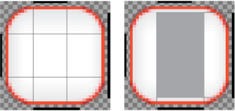
Figure 9–7. Regions of a nine-patch PNG file
Figure 9–7 shows the image from Figure 9–6 twice. On the left, we have extended four imaginary lines coming from the ends of the top and left black lines. These four lines break the image up into nine regions. These nine regions are then used to draw this image at different sizes. The four corner regions are used as is, to draw the corners of the buttons. The four edge areas are scaled to fill in any extra space along the sides of each button. Finally the center region is scaled to fill in the middle of the button.
On the right of Figure 9–7 is a rectangular region that is described drawing imaginary lines from the ends of the right and bottom black lines. This rectangular region describes the area where content (the text of the button) can be drawn without requiring the image to be scaled. In this particular case, the right and bottom lines allow text to get closer to the top of the image than to the sides. The right and bottom black lines are optional; if they are omitted, the region described by the top and left lines will describe the region where scaling is not required.
Specifying a NinePatchDrawable as the background of a View is easiest in XML, as Listing 9–12 shows.
Listing 9–12. main.xml (partial)
<Button

            android:id="@+id/playGameButton"

            android:layout_width="wrap_content"

            android:layout_height="wrap_content"

            android:text="@string/play_game"

            android:background="@drawable/nine_patch"

            android:textSize="24px"

            android:textStyle="bold"

/>
In Listing 9–12, the background of a button is being set to use out the nine_patch.9.png file by assigning the attribute background to “@drawable/nine_patch”. Note that the extension of the filename is not used. This also assumes that the nine_patch.9.png file is stored in the drawable directory found in the resdirectory.
Direct Rendering
We have looked at two related techniques for using Android's built-in components for drawing content on the screen: Views and Drawables. Using these technologies can be a huge time-saver when creating an application since they offer a wide range of features, including layout and resolution-independent drawing. There are plenty of times, however, when greater control is required. In these cases, we want to use the Canvas class to get direct access to pixel-level rendering.
A View customizes how it is drawn by overriding the onDraw() method. The onDraw() method takes a Canvas object as its only parameter. The Canvas class is much like the Java Swing Graphics2D class in that it provides a number of low-level graphics functions for drawing line, shapes, text, and images. For demonstration purposes, the HighScoreView of the Orb Quest application was written to draw itself using a Canvas object. Figure 9–8 shows the HighScoreView.
Figure 9–8 shows the title “Your High Scores” drawn at the top of the screen. The title is drawn along a curved path and has a shadow. Just below the title is a horizontal bar that looks a little like an indent. Finally there are 10 scores, comprised of a username (Lucas) and a score value. Listing 9–13 shows the HighScoreView class and how we use the onDraw() method to achieve these visual effects.

Figure 9–8. HighScoreView rendered within onDraw with Canvas
Listing 9–13. HighScoreView.java
public class HighScoreView extends View {


        public final static String PREFS_ORB_QUEST = "PREF_ORB_QUEST";

        public final static String PREF_HIGH_SCORE = "PREF_HIGH_SCORE";


        private List<HighScore> highscores;


        public HighScoreView(Context context, AttributeSet attrs) {

                super(context, attrs);

                init();

        }


        public HighScoreView(Context context) {

                super(context);

                init();

        }


        private void init() {

                SharedPreferences settings = getContext().getSharedPreferences(

                                PREFS_ORB_QUEST, 0);

                String json = settings.getString(PREF_HIGH_SCORE,

                                HighScore.createDefaultScores());

                try {

                        JSONArray jsonArray = new JSONArray(json);


                        highscores = HighScore.toList(jsonArray);

                } catch (JSONException e) {

                        throw new RuntimeException(e);

                }

        }
        @Override

        public void onDraw(Canvas canvas) {

                int width = getWidth();

                int height = getHeight();


                //Draw Background

                canvas.drawColor(Color.GRAY);


                Rect innerRect = new Rect(5, 5, width - 5, height - 5);

                Paint innerPaint = new Paint();

                LinearGradient linearGradient = new LinearGradient(0, 0, 0, height,

                                Color.LTGRAY, Color.DKGRAY, Shader.TileMode.MIRROR);

                innerPaint.setShader(linearGradient);


                canvas.drawRect(innerRect, innerPaint);


                //Draw Title

                Path titlePath = new Path();

                titlePath.moveTo(10, 70);

                titlePath.cubicTo(width / 3, 90, width / 3 * 2, 50, width - 10, 70);


                Paint titlePaint = new Paint(Paint.ANTI_ALIAS_FLAG);

                titlePaint.setColor(Color.RED);

                titlePaint.setTextSize(38);

                titlePaint.setShadowLayer(5, 0, 5, Color.BLACK);


                canvas.drawTextOnPath("Your High Scores", titlePath, 0, 0, titlePaint);


                //Draw Line

                Paint linePaint = new Paint();

                linePaint.setStrokeWidth(10);

                linePaint.setColor(Color.WHITE);

                linePaint.setStrokeCap(Cap.ROUND);


                float[] direction = new float[] { 0, -5, -5 };

                EmbossMaskFilter maskFilter = new EmbossMaskFilter(direction, .5f, 8, 3);

                linePaint.setMaskFilter(maskFilter);


                canvas.drawLine(15, 100, width - 15, 100, linePaint);


                //Draw Scores

                Paint scorePaint = new Paint(Paint.ANTI_ALIAS_FLAG);

                scorePaint.setShadowLayer(5, 0, 5, Color.BLACK);

                scorePaint.setTextSize(20);


                RadialGradient radialGradient = new RadialGradient(width / 2,

                                height / 2, width, Color.WHITE, Color.GREEN,

 TileMode.MIRROR);

                scorePaint.setShader(radialGradient);


                int index = 0;

                for (HighScore score : highscores) {

                        canvas.drawText(score.getUsername(), 40, 150 + index * 30,

                                        scorePaint);

                        canvas.drawText("" + score.getScore(), width - 115,
                                        150 + index * 30, scorePaint);


                        index++;

                }


        }

}
Listing 9–13 shows the HighScoreView class that is responsible for reading the current high scores from the user preferences and then drawing them on the screen. The high scores are found in the init() method where a SharedPreferences object is retrieved from the context. The SharedPreferences object called settings is used to get a json-encoded string representation of a collection of HighScore objects. The String json is converted to a List containing HighScore objects by using the HighScore.toList() utility method.
Once we have our list of HighScore objects, we can focus on the actual drawing. The first thing done in the onDraw() method is to call drawColor and pass in the color gray. This fills the entire screen with a gray color; in our final rendered scene, it winds up just being a gray border around the rest of the content.
The next step in the onDraw() method is to draw the large rectangle with the gradient. Drawing a rectangle is pretty straightforward; we simply create a Rect object called innerRect and pass it to the drawRect() method of the Canvas object. The gradient effect is created by the second parameter passed to the drawRect() method: the innerPaint variable, which is a Paint object that has had its shader set to a LinearGradient. The first four parameters to the LinearGradient constructor tell LinearGradient that it should draw the gradient starting at the top left and complete at the bottom left. The constants Color.LTGRAYand Color.DKGRAY are the start and end colors, respectively. The last parameter indicates what the LinearGradient should do when drawing pixels outside of the region defined by the start and end points. In our case we don't really care because we have included the entire screen in the region specified by our points. The possible values are as follows:
- CLAMP: Pixels that are before the start of the gradient line should be the color of the first color. Conversely, pixels past the end of the gradient line should be the color of the last color in the gradient.
- MIRROR: Pixels beyond the range of the gradient line should be colored as if a mirror of the current gradient were applied. This creates a seamless gradation with no obvious indication of where the gradient starts and stops.
- REPEAT: This indicates that the pixels beyond the range of the gradient line should be colored as if an identical gradient existed just beyond the range of the line. This can create an abrupt edge in the gradation if the start and end colors are dissimilar.
The title text at the top of the screen is drawn along a curve, which is specified by creating a Path object and calling moveTo, followed by cubicTo. Figure 9–9 shows the drawn path.

Figure 9–9. Line for the title text
Figure 9–9 shows the black line that the text is drawn on using the drawTextOnPath() method of the Canvas class. The Paint object specified for this drawing operation is called titlePaint and is constructed with the rendering flag ANTI_ALIAS_FLAG. This flag is important as it greatly improves the visual quality of text. The titlePaintPaint object is set to be red and size 38. The last thing you need to do to modify the titlePaint object is to specify a shadow by calling setShadowLayer. The first parameter indicates the radius of the blurred shadow, the next parameters indicate the x and y offset for the shadow, and the last parameter sets the color to black.
In Figure 9–8 there is a horizontal line under the title text. This line has two distinct decorations applied to it. First is the fact that it looks like it is recessed into the background, which is accomplished by creating an EmbossMaskFilter and assigning it the Paint object named linePaint. Second, the ends of the line are rounded, which is accomplished by calling setStrokeCap in linePaint and passing in the constant Cap.ROUND.
Once the linePaint is set up the way we want, we simply call drawLine on Canvas and pass in coordinates for the line and the linePaint object.
The last thing we need to do to is to draw the scores. To do this, we create a new Paint object called scorePaint. We set a shadow on scorePaint by calling setShadowLayer in the same way we did the title. For scorePaint, we will apply a subtle radial gradient to help break up the visual impact of the text, creating a RadialGradient object. When creating a RadialGradient object, the first two parameters specify a center point, and the third parameter specifies a radius. The last parameter indicates how pixels should be drawn outside the defined circle. The same options apply here as they did the LinearGradient.
Once the scorePaint object is all set up, we simply iterate through each HighScore object and draw its username and its score by calling the drawText() method.
Summary
In this chapter, we used the example application Orb Quest to explore how Views can be laid out using subclasses of ViewGroup such as LinearLayout. You looked at how the objects that define a set of Views can be defined in XML or constructed in code. You looked at the Drawable class and its many subclasses to understand how to define resolution-independent graphical content. Finally, you looked at direct pixel-level rendering with the Canvasclass.