In this chapter, we will explore the design of the graphical user interface (GUI) for pdCalc. Anytime one designs a GUI, a widget platform needs to be selected. As previously noted, I chose to use Qt for the creation of the GUI. That said, this is not a how-to chapter on using Qt to design an interface. Rather, I assume that the reader has a working knowledge of Qt, and the chapter itself focuses on design aspects of the GUI. In fact, as much as possible, I will defer the reader to the source code to see detailed aspects of the widget implementations. Any discussion of the Qt implementation is either merely incidental or worthy of particular emphasis. If you have no interest in GUI design, this chapter can be skipped entirely with virtually no loss in continuity.
6.1 Requirements
In Chapter 5, we began our analysis of the command line interface (CLI) by deriving an interface abstraction that would be used by both the CLI and the GUI. Obviously, we will reuse this interface here, and we therefore already know the abstract interface to which our overall user interface must conform. We thus begin this chapter by defining the requirements for the GUI specialization.
As with the CLI, we quickly discover that the requirements from Chapter 1 are woefully inadequate for specifying a graphical user interface. The given requirements are only functional. That is, we know what buttons and operations the calculator should support, but we know nothing about the expected appearance.
- 1.
The GUI should have a window that displays both input and output. The output is the top six entries of the current stack.
- 2.
The GUI should have clickable buttons for entering numbers and all supported commands.
- 3.
The GUI should have a status display area for displaying error messages.
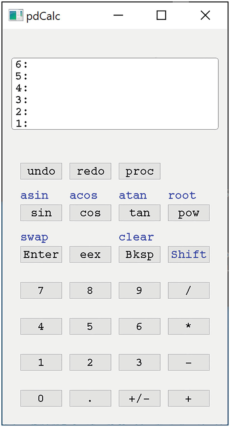
The GUI on Windows with no plugins
The GUI for pdCalc was inspired by my HP48S calculator. For those familiar with any of the Hewlett-Packard calculators in this series, the interface will feel somewhat familiar. For those not familiar with this series of calculators (likely, the majority of readers), the following description explains the basic behavior of the GUI.
The top third of the GUI is a dedicated input/output (I/O) window. The I/O window displays labels for the top six stack levels on the left, with the top of the stack being at the bottom of the window. Values on the stack appear on the right side of the window on the line corresponding to the number’s location on the stack. As the user enters a number, the stack reduces to showing only the top five stack elements, while the number being entered is displayed left justified on the bottom line. A number is terminated and entered onto the stack by pressing the enter button.
Assuming sufficient input, an operation takes place as soon as the button is pressed. If insufficient input is present, an error message is displayed above the I/O window. With respect to commands, a valid number in the input area is treated as the top number on the stack. That is, applying an operation while entering a number is equivalent to pressing enter and then applying the operation.
To economize on space, some buttons have a shifted operation above and to the left of the button itself. These shifted operations can be activated by first pressing the shift button and then pressing the button below the shifted text. Pressing the shift button places the calculator in shift mode until a button with a shifted operation is pressed or until the shift button is pressed again. For clarity, a shifted operation is often the inverse of the operation on the button.
To ease input, many buttons are bound to keyboard shortcuts. That is, in addition to pressing the GUI button, one can alternatively press a keyboard key instead. For example, number buttons can be clicked by pressing the corresponding number key, the Enter button can be clicked by pressing the Enter key, the Shift button can be clicked by pressing the S key, the Bksp button can be clicked by pressing the Backspace key, the exponentiation operation (eex) can be clicked by pressing the E key, and the four basic arithmetic operations (+, -, *, /) can be clicked by pressing the corresponding keyboard keys.
Finally, a few operations are semihidden. When not entering numbers, the backspace button drops the top entry from the stack, while the enter button duplicates the top entry on the stack. Some of these combinations are not intuitive and therefore might not represent very good GUI design. However, they do mimic the input used on the HP48S. If you have never used an HP48 series calculator before, I highly suggest building and familiarizing yourself with the GUI from the GitHub repository before continuing.
If you’re wondering what a proc key does, it executes stored procedures. It is one of the “new” requirements we’ll encounter in Chapter 8.
One’s first critique about the GUI might be that it is not very pretty. I would agree. The purpose of the GUI in this chapter is not to demonstrate advanced Qt features. Rather, the purpose is to illustrate how to design a code base to be modular, robust, reliable, and extensible. Adding code to make the GUI more attractive rather than functional would distract from this message. Of course, the design permits a prettier GUI, so feel free to make your own pretty GUI on top of the provided infrastructure.
We now have sufficient detail to design and implement the calculator’s GUI. However, before we begin, a short discussion on alternatives for building GUIs is warranted.
6.2 Building GUIs
Essentially, two distinct paths exist for building a GUI: construct the GUI in an Integrated Development Environment (IDE) or construct the GUI in code. Here, I loosely use the term code to indicate building the GUI by text, whether it be by using a traditional programming language like C++ or a declarative markup syntax like XML. Of course, between the two extremes is the hybrid approach, which utilizes elements from both IDEs and code.
6.2.1 Building GUIs in IDEs
If all you need is a simple GUI, then, certainly, designing and building your GUI in an IDE is the easier route. Most IDEs have a graphical interface for laying out visual elements onto a canvas, which, for example, might represent a dialog box or a widget. Once a new canvas is set up, the user visually builds the GUI by dragging and dropping existing widgets onto the canvas. Existing widgets consist of the built-in graphical elements of the GUI toolkit (e.g., a push button) as well as custom widgets that have been enabled for drag-and-drop in the IDE framework. Once the layout is complete, actions can be tied together either graphically or with a little bit of code. Ultimately, the IDE creates code corresponding to the graphically laid out GUI, and this IDE-created code is compiled with the rest of your source code.
Building a GUI using an IDE has both advantages and disadvantages. Some of the advantages are as follows. First, because the process is visual, you can easily see the GUI’s appearance as you perform the layout. This is in direct contrast with writing code for the GUI, where you only see the look of the GUI after compiling and executing the code. The difference is very much akin to the difference between using a WYSIWYG text editor like Microsoft Word and a markup language like LaTeX for writing a paper. Second, the IDE works by automatically generating code behind the scenes, so the graphical approach can significantly reduce the amount of coding required to write a GUI. Third, IDEs typically list the properties of a GUI element in a property sheet, making it trivial to stylize a GUI without constantly consulting the API documentation. This is especially useful for rarely used features.
Some of the disadvantages to using an IDE to build a GUI are as follows. First, you are limited to the subset of the API that the IDE chooses to expose. Sometimes, the full API is exposed, and sometimes, it is not. If you need functionality that the IDE’s author chose not to grant you, you’ll be forced into writing your own code. That is, the IDE may limit fine-tuned control of GUI elements. Second, for repetitive GUI elements, you may have to perform the same operation many times (e.g., clicking to make text red in all push buttons), while in code, it’s easy to encapsulate any repeated task in a class or function call. Third, using the IDE to design a GUI limits the GUI to decisions that can be made at compile time. If you need to dynamically change the structure of a GUI, you’ll need to write code for that. Fourth, designing a GUI in an IDE ties your code to a specific vendor product. In a corporate environment, this may not be a significant concern because the development environment may be uniform throughout the company. However, for an open source, distributed project, not every developer who might want to contribute to your code base will want to be restricted to the same IDE you chose.
6.2.2 Building GUIs in Code
Building a GUI in code is exactly what the name implies. Rather than graphically placing widgets on a canvas, you instead write code to interact with the GUI toolkit. Several different options exist for how the code can be written, and often, more than one option is available to you for any given GUI toolkit. First, you can almost always write source code in the language of the toolkit. For example, in Qt, you can build your GUI entirely by writing C++ in a very imperative style (i.e., you direct the GUI’s behavior explicitly). Second, some GUI toolkits permit a declarative style (i.e., you write markup code describing the style of GUI elements, but the toolkit defines the elements’ behaviors). Finally, some toolkits use a script-based interface for constructing a GUI (often JavaScript or a JavaScript derivative syntax) perhaps in conjunction with a declarative markup. In the context of this chapter, building a GUI in code refers exclusively to coding in C++ against Qt’s desktop widget set.
As you might expect, building a GUI in code has nearly the opposite trade-offs as building a GUI with an IDE. The advantages are as follows. First, the full API to the widgets is completely exposed. Therefore, the programmer has as much fine-tuned control as desired. If the widget library designer wanted a user to be able to do something, you can do it in code. Second, repetitive GUI elements are easily managed through the use of abstraction. For example, in designing a calculator, instead of having to customize every button manually, we can create a button class and simply instantiate it. Third, adding widgets dynamically at runtime is easy. For pdCalc, this advantage will be important in fulfilling the requirement to support dynamic plugins. Fourth, designing a GUI in code grants complete IDE independence, provided that the build system is independent of the IDE.
While building a GUI in code has many advantages, disadvantages exist as well. First, the layout is not visual. In order to see the GUI take shape, you must compile and execute the code. If it looks wrong, you have to tweak the code, try again, and repeat this process until you get it right. This can be exceedingly tedious and time consuming. Second, you must author all of the code yourself. Whereas an IDE will autogenerate a significant portion of the GUI code, particularly the parts related to the layout, when you are writing code, you must do all the work manually. Finally, when writing a GUI in code, you will not have access to all of a widget’s properties succinctly on a property sheet. Typically, you’ll need to consult the documentation more frequently. That said, good IDE code completion can help significantly with this task. Someone may cry foul to my last remark claiming, “It’s unfair to indicate that using an IDE can mitigate a disadvantage of not using an IDE.” Remember, unless you’re writing your source code in a pure text editor (unlikely), the code editor is still likely a sophisticated IDE. My comparison is between building a GUI using an IDE’s graphical GUI layout tool and writing the code manually using a modern code editor, likely itself an IDE.
6.2.3 Which GUI Building Method Is Better?
The answer to the overly general question in the section header is, of course, neither. Which technique is better for building a GUI is entirely context dependent. When you encounter this question in your own coding pursuits, consult the preceding trade-offs, and make the choice most sensible for your situation. Often, the best solution is a hybrid strategy where some parts of the GUI will be laid out graphically while other parts of the GUI will be built entirely from code.
A more specific question in our context is, “Which GUI building method is better for pdCalc?” For this application, the trade-offs heavily favor a code-based approach. First, the visual layout for the calculator is fairly trivial (a status window, a display widget, and a grid of buttons) and easily accomplished in code. This fact immediately removes the most significant advantage of the IDE approach, handling complex layout visually. Second, the creation and layout of the buttons are repetitive but easily encapsulated, one of the advantages of a code-based approach. Finally, because the calculator must support runtime plugins, the code approach works better for dynamically adding widget elements (runtime discovered buttons).
In the remainder of this chapter, we’ll explore the design of pdCalc’s GUI in code. In particular, the main emphasis will be on the design of components and their interfaces. Because our focus is not on widget construction, many implementation details will be glossed over. Never fear, however. If you are interested in the details, all of the code is available for your perusal in the GitHub repository.
6.3 Modularization
From the outset of this book, we have discussed decomposition strategies for the calculator. Using the MVC architectural pattern, we split our design into a model, a view, and a controller. In Chapter 4, we saw that one of the main modules, the command dispatcher, was split into subcomponents. Whereas the CLI module was simple enough to be implemented with a single class, the GUI module is sufficiently complex that decomposition is useful. Recall from Chapter 2 that when we refer to the GUI module, we are referring only to a module as a logical construct since Qt, at the time of writing, does not yet support C++20 modules.
In Chapter 5, we determined that any user interface for our system must inherit from the UserInterface abstract class. Essentially, the UserInterface class defines the abstract interface of the view in the MVC pattern. While the GUI module must inherit from UserInterface and hence present the same abstract interface to the controller, we are free to decompose the internals of the GUI however we see fit. We’ll again use our guiding principles of loose coupling and strong cohesion to modularize the GUI.
When I decompose a module, I first think in terms of strong cohesion. That is, I attempt to break the module into small components that each do one thing (and do it well). Let’s try that with the GUI. First, any Qt GUI must have a main window, defined by inheriting QMainWindow. The main window is also the entry point to the MVC view, so our main window must also inherit from UserInterface. The MainWindow is our first class. Next, visually inspecting Figure 6-1, the calculator is obviously divided into a component used for input (a collection of buttons) and a component used for display. We therefore add two more classes: the InputWidget and the Display. We’ve already discussed that an advantage of using the code approach to building a GUI is to abstract the repeated creation of buttons, so we’ll make a CommandButton class as well. Finally, I added a component responsible for managing the look-and-feel of the calculator (e.g., fonts, margins, spacing, etc.) that I aptly named the LookAndFeel class. A component for stored procedure entry also exists, but we will delay the discussion of that component until Chapter 8. Let’s now look at the design of each class, starting with the CommandButton. We’ll discuss any necessary refinements to this initial decomposition if and when they arise.
6.3.1 The CommandButton Abstraction
We begin our discussion by describing how buttons are abstracted. This is a sensible place to begin since buttons underlie the input mechanism for both numbers and commands to the calculator.
Qt provides a push button widget class that displays a clickable button that emits a signal when the button is clicked. This QPushButton class provides the basis for the functionality that we require for number and command input. One prospective design we could employ would be to use QPushButtons as is. This design would require explicitly writing code to connect each QPushButton manually to its own customized slot. However, this approach is repetitive, tedious, and highly error prone. Moreover, some buttons need additional functionality not provided by the QPushButton API (e.g., shifted input). Therefore, we instead seek a button abstraction for our program that builds upon the QPushButton, supplements this Qt class with additional functionality, but also simultaneously restricts the QPushButton’s interface to meet exactly our requirements. We’ll call this class the CommandButton.
In pattern parlance, we are proposing something that acts as both an adapter and a facade. We saw the adapter pattern in Chapter 3. The facade pattern is a close cousin. Whereas the adapter pattern is responsible for converting one interface into another (possibly with some adaptation), the facade pattern is responsible for providing a unified interface to a set of interfaces in a subsystem (often as a simplification). Our CommandButton is tasked with doing both. We are both simplifying the QPushButton interface to a restricted subset that pdCalc needs but simultaneously adapting QPushButton’s functionality to match the requirements of our problem. So, is CommandButton a facade or an adapter? The difference is irrelevant; it shares characteristics of each. Remember, it is important to understand the objectives of different patterns and adapt them according to your needs. Try not to get lost in rote implementations from the Gang of Four [11] for the sake of pattern purity.
The CommandButton Design
Introductory remarks aside, we still must determine what exactly our CommandButton needs to do and how it will interact with the rest of the GUI. In many ways, a CommandButton looks and acts similarly to a QPushButton. For example, a CommandButton must present a visual button that can be clicked, and after the button is clicked, it should emit some kind of signal to let other GUI components know a click action has occurred. Unlike a standard QPushButton, however, our CommandButton must support both a standard and shifted state (e.g., a button that supports both sin and arcsin). This support should be both visual (both states should be shown by our CommandButton widget) and functional (click signals must describe both a standard click and a shifted click). We therefore have two design questions to answer. First, how do we design and implement the widget to appear correctly on the screen? Second, how will the calculator, in general, handle shifted operations?
Let’s first address the CommandButton appearance problem. Sure, we could implement our button from scratch, paint the screen manually, and use mouse events to trap button clicks, but that’s overkill for CommandButton. Instead, we seek a solution that reuses Qt’s QPushButton class. We essentially have two options for reuse: inheritance and encapsulation.
First, let’s consider reusing the QPushButton class in the CommandButton class’s design via inheritance. This approach is reasonable since one could logically adopt the viewpoint that a CommandButton is-a QPushButton. This approach, however, suffers from an immediate deficiency. An is-a relationship implies public inheritance, which means that the entire public interface of QPushButton would become part of the public interface for CommandButton. However, we already determined that for simplicity within pdCalc, we want CommandButton to have a restricted interface (the facade pattern). OK, let’s try private inheritance and modify our viewpoint to an implements-a relationship between CommandButton and QPushButton. Now we encounter a second deficiency. Without public inheritance from QPushButton, CommandButton loses its indirect inheritance of the QWidget class, a prerequisite in Qt for a class to be a user interface object. Therefore, any implementation inheriting QPushButton privately would also require public inheritance from QWidget. However, because QPushButton also inherits from QWidget, the multiple inheritance of both of these classes by CommandButton would lead to ambiguities and is thus disallowed. We must seek an alternative design.
Now, consider encapsulating a QPushButton within a CommandButton (i.e., CommandButton has-a QPushButton). We probably should have started with this option since general practice indicates we should prefer encapsulation to inheritance whenever possible. However, many developers tend to start with inheritance, and I wanted to discuss the drawbacks of that approach without resorting merely to C++ best practices canon. Aside from breaking the strong inheritance relationship, choosing an encapsulation approach overcomes the two drawbacks of using inheritance previously discussed. First, since the QPushButton will be encapsulated within a CommandButton, we are free to expose only those parts of the QPushButton interface (or none at all) that make sense for our application. Second, by using encapsulation, we’ll avoid the multiple inheritance mess of inheriting from both the QWidget and QPushButton classes, simultaneously. Note that I do not object, in principle, to designs that use multiple inheritance. Multiple inheritance is simply ambiguous in this instance.
For our application, I think aggregation makes more sense. That is, our CommandButton uses a QPushButton rather than is composed from a QPushButton. The difference is subtle, and an equally logical argument could be made for declaring the relationship to be composition. That said, both designs work mechanically within Qt, so your compiler really won’t care how you choose to express the relationship.
Now that we have decided to aggregate the QPushButton within the CommandButton, we can proceed with the overall design of the CommandButton class. Our CommandButton must support both a primary and a secondary command. Visually, I chose to display the primary command on the button and the secondary command in blue above and to the left of the button (we’ll discuss how the shifted state operates momentarily). Therefore, the CommandButton merely instantiates a QPushButton and a QLabel and places them both in a QVBoxLayout. The QPushButton displays the text for the primary command, and the QLabel displays the text for the shifted command. The layout is depicted in Figure 6-2. To complete the design, as previously stated, in order to interact graphically with the rest of the GUI, the CommandButton must publicly inherit from the QWidget class. The design results in a reusable CommandButton widget class for a generic push button declaring both a primary and secondary command. Because the push button action is achieved by using a QPushButton, the overall implementation of the CommandButton class is remarkably simple.
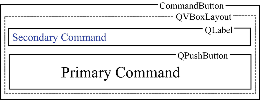
The layout of the CommandButton
We now return to modeling the shifted state within the calculator. We have two practical options. The first option is to have CommandButtons understand when the calculator is in the shifted state and only signal the correct shifted or unshifted command. Alternatively, the second option is to have CommandButtons signal with both the shifted and unshifted commands and let the receiver of the signal sort out the calculator’s current state. Let’s examine both options.
The first option, having CommandButtons know if the calculator is in a shifted or unshifted state, is fairly easy to implement. In one implementation, the shift button notifies every button (via Qt signals and slots) when it is pressed, and the buttons toggle between the shifted and unshifted state. If desired, one could even swap the text in the shift position with the text on the button every time the shifted state is toggled. Alternatively, the shift button can be connected to one slot that sets a global shift state flag that buttons can query when they signal that a click has occurred. In either implementation scenario, when the button is clicked, only the command for the current state is signaled, and the receiver of this command eventually forwards the single command out of the GUI via a commandEntered() event.
In the second option, the CommandButtons are not required to know anything about the calculator’s state. Instead, when a button is clicked, it signals the click with both the shifted and unshifted states. Essentially, a button just informs its listeners when it is clicked and provides both possible commands. The receiver is then responsible for determining which of the possible commands to raise in the commandEntered() event. The receiver presumably must be responsible for tracking the shifted state (or be able to poll another class or variable holding that state).
For the CommandButton, both designs for handling the calculator’s state work fairly well. However, personally, I prefer the design that does not require CommandButtons to know anything about the shifted state. In my opinion, this design promotes better cohesion and looser coupling. The design is more cohesive because a CommandButton should be responsible for displaying a clickable widget and notifying the system when the button is clicked. Requiring CommandButtons to understand calculator states encroaches on the independence of their abstraction. Instead of just being generic clickable buttons with two commands, the buttons become integrally tied to the concept of the calculator’s global state. Additionally, by forcing CommandButtons to understand the calculator’s state, the coupling in the system is increased by forcing CommandButtons to be unnecessarily interconnected to either the shift button or to the class they must poll. The only advantage gained by notifying every CommandButton when the shift button is pressed is the ability to swap the labels for the primary and secondary commands. Of course, label swapping could be implemented independently of the CommandButton’s signal arguments.
The CommandButton Interface
The CommandButton class has two constructors: the four-argument overload and the two-argument overload. The four-argument overload permits specification of both a primary command and a secondary command, while the two-argument overload permits the specification of only a primary command. Each command requires two strings for full specification. The first string equates to the text the label will present in the GUI, either on the button or in the shifted command location. The second string equates to the text command to be raised by the commandEntered() event. One could simplify the interface by requiring these two strings to be identical. However, I chose to add the flexibility of displaying a different text than that required by the command dispatcher. Note that we require overloads instead of default arguments due to the trailing parent pointer.
The only other public part of the interface is the clicked() signal that is emitted with both the primary and shifted commands for the button. The rationale behind a two argument vs. one argument signal was previously discussed. Despite being private, I also listed the onClicked() slot in CommandButton’s interface to highlight the private slot that must be created to catch the internal QPushButton’s clicked() signal. The onClicked() function’s sole purpose is to trap the QPushButton’s clicked() signal and instead emit the CommandButton’s clicked() signal with the two function arguments.
If you look at the actual declaration of the CommandButton class in CommandButton.h, you will see a few additional functions as part of CommandButton’s public interface. These are simply forwarding functions that either change the appearance (e.g., text color) or add visual elements (e.g., a tool tip) to the underlying QPushButton. While these functions are part of CommandButton’s interface, they are functionally optional and are independent of CommandButton’s underlying design.
6.3.2 Getting Input
The GUI is required to take two distinct types of inputs from the user: numbers and commands. Both input types are entered by the user via CommandButtons (or keyboard shortcuts mapped to these buttons) arranged in a grid. This collection of CommandButtons, their layout, and their associated signals to the rest of the GUI compose the InputWidget class.
Command entry is conceptually straightforward. A CommandButton is clicked, and a signal is emitted reflecting the command for that particular button. Ultimately, another part of the GUI will receive this signal and raise a commandEntered() event to be handled by the command dispatcher.
Entering numbers is a bit more complicated than entering commands. In the CLI, we had the luxury of simply allowing the user to type numbers and press enter when the input was complete. In the GUI, however, we have no such built-in mechanism (assuming we want a GUI more sophisticated than a CLI in a Qt window). While the calculator does have a Command for entering numbers, remember that it assumes complete numbers, not individual digits. Therefore, the GUI must have a mechanism for constructing numbers.
Building a number consists of entering digits as well as special symbols such as the decimal point, the plus/minus operator, or the exponentiation operator. Additionally, as the user types, they might make errors, so we’ll want to enable basic editing (e.g., backspace) as well. The assembly of numbers is a two-step process. The InputWidget is only responsible for emitting the button clicks required for composing and editing numbers. Another part of the GUI will receive these signals and assemble complete number input.
The Design of the InputWidget
Conceptually, the design of the InputWidget class is straightforward. The widget must display the buttons needed for generating and editing input, bind these buttons to keys (if desired), and signal when these buttons are clicked. As previously mentioned, the InputWidget contains buttons for both digit entry and command entry. Therefore, it is responsible for the digits 0–9, the plus/minus button, the decimal button, the exponentiation button, the enter button, the backspace button, the shift button, and a button for each command. Recall that as an economization, the CommandButton class permits two distinct commands per visual button.
For consistency throughout the GUI, we’ll use the CommandButton exclusively as the representation for all of the input buttons, even for buttons that neither issue commands nor have secondary operations (e.g., the 0 button). How convenient that our design for the CommandButton is so flexible! However, that decision still leaves us with two outstanding design issues, which are how do we lay out the buttons visually and what do we do when a button is clicked.
Two options exist for placing buttons in the InputWidget. First, the InputWidget itself owns a layout, it places all the buttons in this internal layout, and then the InputWidget itself can be placed somewhere on the main window. The alternative is for the InputWidget to accept an externally owned layout during construction and place its CommandButtons on that layout. In general, having the InputWidget own its own layout is the superior design. It has improved cohesion and decreased coupling over the alternative approach. The only exception where having the InputWidget accept an external layout would be preferred would be if the design called for other classes to share the same layout for the placement of additional widgets. In that special case, using a shared layout owned externally to both classes would be cleaner.
Let’s now turn our attention to what happens when a button is clicked within the InputWidget. Because the InputWidget encapsulates the CommandButtons, the clicked() signal for each CommandButton is not directly accessible to consumers of the InputWidget class. Therefore, the InputWidget must catch all of its CommandButtons’ clicks and reemit them. For calculator commands like sine or tangent, reemitting the click is a trivial forwarding command. In fact, Qt enables a shorthand notation for connecting a CommandButton’s clicked() signal directly to an InputWidget commandEntered() signal, forgoing the need to pass through a private slot in the InputWidget. Digits, number editing buttons (e.g., plus/minus, backspace), and calculator state buttons (e.g., shift) are better handled by catching the particular clicked() signal from the CommandButton in a private slot in the InputWidget and subsequently emitting an InputWidget signal for each of these actions.
As just described, as each input button is pressed, the InputWidget must emit its own signal. At one extreme, the InputWidget could have individual signals for each internal CommandButton. At the other extreme, the InputWidget could emit only one signal regardless of the button pressed and differentiate the action via an argument. As expected, for our design, we’ll seek some middle ground that shares elements from each extreme.
Essentially, the InputWidget accepts three distinct types of input: a modifier (e.g., enter, backspace, plus/minus, shift), a scientific notation character (e.g., 0–9, decimal, exponentiation), or a command (e.g., sine, cosine, etc.). Each modifier requires a unique response; therefore, each modifier binds to its own separate signal. Scientific notation characters, on the other hand, can be handled uniformly simply by displaying the input character on the screen (the role of the Display class). Thus, scientific notation characters are all handled by emitting a single signal that encodes the specific character as an argument. Finally, commands are handled by emitting a single signal that simply forwards the primary and secondary commands, verbatim, as function arguments to the signal.
In constructing the signal handling, it is import to maintain the InputWidget as a class for signaling raw user input to the rest of the GUI. Having the InputWidget interpret button presses leads to problems. For example, suppose we designed the InputWidget to aggregate characters and only emit complete, valid numbers. Since this strategy implies that no signal would be emitted per character entry, characters could neither be displayed nor edited until the number was completed. This situation is obviously unacceptable, as a user would definitely expect to see each character on the screen as they entered it.
Let’s now turn our attention to translating our design into a minimal interface for the InputWidget.
The Interface of the InputWidget
Essentially, the entire class interface is defined by the signals corresponding to user input events. Specifically, we have one signal indicating entry of any scientific notation character, one signal to forward command button clicks, and individual signals indicating clicking of the backspace, enter, plus/minus, or shift buttons, respectively.
If you look in the GitHub repository source code in the InputWidget.cpp file, you will find a few additional public functions and signals. These extra functions are necessary to implement two features introduced in subsequent chapters. First, an addCommandButton() function and a setupFinalButtons() function are needed to accommodate the dynamic addition of plugin buttons, a feature introduced in Chapter 7. Second, a procedurePressed() signal is needed to indicate a user request to use a stored procedure. Stored procedures are introduced in Chapter 8.
6.3.3 The Display
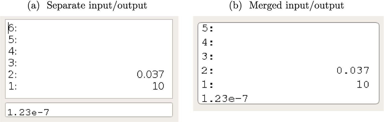
Input and output display options
Choosing one style of I/O vs. the other ultimately reduces to the customer’s preference. Having no particular affinity for either style, I chose a merged display because it looks more like the display of my HP48S calculator. With a display style chosen, let’s now focus on the design implications this choice implies.
With a separate on-screen widget for input and output, as seen in Figure 6-3a, the choice to have separate input and output display classes would be obvious. The input display would have slots to receive the InputWidget’s signals, and the output display would have slots to receive completed numbers (from the input display) and stack updates. The cohesion would be strong, and the separation of components would be appropriate.
Our design, however, calls for a commingled input/output display, as seen in Figure 6-3b. The commingled design significantly alters the sensibility of using independent input and output display classes. While lumping input and output display concerns into one class does decrease the cohesion of the display, trying to maintain two independent classes both pointing to the same on-screen widget would lead to an awkward implementation. For example, choosing which class should own the underlying Qt widget is arbitrary likely resulting in a shared widget design (using a shared_ptr, perhaps?). However, in this scenario, should the input or the output display class initialize the on-screen widget? Would it make sense for the input display to signal the output display if the input display shared a pointer to the single display widget? The answer is simply that a two class design is not tenable for a merged I/O display widget even though we might prefer to separate input and output display concerns.
The aforementioned discussion identifies a few interesting points. First, the visual presentation of the design on screen can legitimately alter the design and implementation of the underlying components. While this may seem obvious once presented with a concrete GUI example, the indirect implication is that GUI class design may need to change significantly if the on-screen widgets are changed only slightly. Second, situations exist where the result is cleaner when the design directly contradicts the elements of good design postulated in Chapter 2. Obviously, the guidelines in Chapter 2 are meant to aid the design process, not to serve as inviolable rules. That said, my general advice is to aim to preserve clarity over adherence to guidelines but only violate best practices judiciously.
Now that we’ve decided to pursue a single I/O display with a single underlying Display class, let’s look at its design.
The Design of the Display Class
I confess. My original design and implementation for the Display class was inept. Instead of using proper analysis techniques and upfront design, I grew the design organically (i.e., alongside the implementation). However, as soon as my design forced the Display class to emit commandEntered() signals for the GUI to function properly, I knew the design had a “bad smell” to it. The class responsible for painting numbers on the screen should probably not be interpreting commands. That said, the implementation worked properly, so I left the code as it was and completed the calculator. However, when I finally started writing about the design, I had so much difficulty trying to formulate a rationale for my design that I finally had to admit to myself that the design was fatally flawed and desperately needed a rewrite.
Obviously, after redesigning the display, I could have simply chosen to describe only the improved product. However, I think it is instructive to study my first misguided attempt, to discuss the telltale signs that the design had some serious problems, and finally to see the design that eventually emerged after a night of refactoring. Possibly, the most interesting lesson here is that bad designs can certainly lead to working code, so never assume that working code is an indicator of a good design. Additionally, bad designs, if localized, can be refactored, and sometimes, refactoring should be undertaken solely to increase clarity. Refactoring, of course, assumes your project schedule contains enough contingency time to pause periodically just to pay down technical debt. We now begin by briefly studying my mistake before returning to a better design.
A Poor Design
From the preceding analysis, we determined that the calculator should have one unified Display class handling both input and output. The fundamental mistake in my design for the display derived from incorrectly interpreting that one Display class implied no additional classes for orthogonal concerns. Hence, I proceeded to lump all functionality not handled by the InputWidget class into a single Display class. Let’s start along that path. However, rather than completing the design and implementation as I had previously done, we’ll stop and redesign the class as soon as we see the first fatal flaw emerges (which is what I should have done originally).
With a single Display class design, the Display is responsible for showing input from the user and output from the calculation engine. Showing the output is trivial. The Display class observes the stackChanged() event (indirectly, since it is not part of the GUI’s external interface) and updates the screen display widget (a QLabel, in this case) with the new stack values. Conceptually, showing the input is trivial as well. The Display directly receives the signals emitted by the InputWidget class (e.g., characterEntered()) and updates the screen display widget with the current input. The simplicity of this interaction belies the fundamental problem with this design, which is that the input is not entered atomically for display. Instead, it is assembled over multiple signals by entering several characters independently and finalizing the input by pressing the enter button. This sequential construction of the input implies that the calculator must maintain an active input state, and input state has no business existing in a display widget.
At this point, you may inquire what, aside from ideological aversion, is wrong with the Display class maintaining an input state. Can’t we just view the state as simply a display input buffer? Let’s follow through with this design to see why it is flawed. Consider, for example, the backspace button, whose operation is overloaded based on the input state. If the current input buffer is nonempty, the backspace button erases one character from this buffer. However, if the current input buffer is empty, pressing the backspace button causes the issuance of the command to drop the top number from the stack. Since, under this design, the Display owns the input state and is the sink for the backspacePressed() signal, the Display must be the source of the drop number from stack command. Once the Display starts issuing commands, we’ve completely given up on cohesion, and it’s time to find the pasta sauce because spaghetti code ensues. From here, instead of just abandoning the design, I doubled down, and my original design actually got worse. However, instead of proceeding further along this misguided path, let’s simply move on to examining a better approach.
An Improved Display Design
Early in the discussion of the poor display design, I pointed out that the fatal mistake came from assuming that a unified display necessitated a single class design. However, as we’ve seen, this assumption was invalid. The emergence of state in the calculator implies the need for at least two classes: one for the visual display and one for the state.
Does this remind you of a pattern we’ve already seen? The GUI needs to maintain an internal state (a model). We’re currently in the midst of designing a display (a view). We have already designed a class, the InputWidget, for accepting input and issuing commands (a controller). Obviously, the GUI itself is nothing more than an embodiment of a familiar pattern, the model-view-controller (MVC). Note that relative to the MVC archetype seen in Figure 2-2, the GUI can replace direct communication between the controller and the model with indirect communication. This minor change, which promotes decreased coupling, is facilitated by Qt’s signals and slots mechanism.
We now focus our attention on the design of the newly introduced model class. Upon completion of the model, we’ll return to the Display class to finish its now simpler design and interface.
6.3.4 The Model
The six slots in the GuiModel class all correspond to signals emitted by the InputWidget class. The GuiModel interprets these requests, changes the internal state as appropriate, and emits one or more of its own signals. Of particular note is the commandEntered() signal. Whereas the GuiModel’s onCommandEntered() slot accepts two arguments, the raw primary and secondary commands corresponding to the CommandButton that was pressed, the GuiModel is responsible for interpreting the shifted state of the GUI and only reemitting a commandEntered() signal with the active command.
The remainder of the GuiModel interface involves the GUI’s state. We begin by discussing the rationale behind the nested State struct. Rather than declaring each piece of the model’s state as a separate member within GuiModel, I find it much cleaner to lump all of the state parameters into one struct. This design facilitates the querying of the model’s state by permitting the entire system state to be returned by const reference with one function call as opposed to requiring piecemeal access to individual state members. I chose to nest the State struct because it is an intrinsic part of GuiModel that serves no stand-alone purpose. Therefore, the State struct naturally belongs in GuiModel’s scope, but its declaration must be publicly declared in order for other components of the GUI to be able to query the state.
An interesting question to ask is, why does the GuiModel’s State buffer the visible numbers from the top of the stack? Given that the Stack class is a singleton, the Display could access the Stack directly. However, the Display only observes changes in the GuiModel (via the modelChanged() slot). Because state changes unrelated to stack changes occur frequently in the GUI (e.g., character entry), the Display would be forced to wastefully query the Stack on every modelChanged() event since the Display is not a direct observer of the stackChanged() event. On the other hand, the GuiModel is an observer of the stackChanged() event (indirectly via function call from the MainWindow). Therefore, the efficient solution is to have the GuiModel update a stack buffer only when the calculator’s stack actually changes and give the Display class access to this buffer, which is guaranteed by construction to be current, for updating the screen.
6.3.5 The Display Redux
The optional arguments to the Display class’s constructor simply dictate visual appearance of the stack on the screen. Specifically, a client of the Display class has flexibility over the number of stack lines to display and the minimum width (in units of fixed width font characters) of the on-screen display.
6.3.6 Tying It Together: The Main Window
The main window is a fairly small class that serves a big purpose. To be precise, it serves three purposes in our application. First, as in most Qt-based GUIs, we need to provide a class that publicly inherits from QMainWindow that acts, naturally, as the main GUI window for the application. In particular, this is the class that is instantiated and shown in the function that launches the GUI. Following my typical creative naming style, I called this class the MainWindow. Second, the MainWindow serves as the interface class for the view module of the calculator. That is, the MainWindow also must publicly inherit from our abstract UserInterface class. Finally, the MainWindow class owns all of the previously discussed GUI components and glues these components together as necessary. For all practical purposes, gluing components together simply entails connecting signals to their corresponding slots. These straightforward implementation details can be found in the MainWindow.cpp source code file. We’ll spend the remainder of this section discussing the MainWindow’s design and interface.
We’ve written a Qt application; it’s obvious that we’ll have a descendant of QMainWindow somewhere. That, in and of itself, is not terribly interesting. What is interesting, however, is the decision to use multiple inheritance to make the same class also serve as the UserInterface to the rest of pdCalc. That said, is that truly an interesting decision, or does it just seem provocative because some developers have a strong aversion to multiple inheritance?
Indeed, I could have separated the QMainWindow and the UserInterface into two separate classes. In a GUI where the main window were decorated with menus, toolbars, and multiple underlying widgets, I, perhaps, would have separated the two. However, in our GUI, the QMainWindow base serves no purpose other than to provide an entry point for our Qt application. The MainWindow literally does nothing else in its QMainWindow role. To therefore create a separate MainWindow class with the sole purpose of containing a concrete specialization of a UserInterface class serves no purpose other than to avoid multiple inheritance. While some may disagree, I think a lack of multiple inheritance, in this instance, would actually complicate the design.
The situation described previously is actually an archetypal example of where multiple inheritance is an excellent choice. In particular, multiple inheritance excels in derived classes whose multiple base classes exhibit orthogonal functionality. In our case, one base class serves as the GUI entry point to Qt, while the other base class serves as the UserInterface specialization for pdCalc’s GUI view. Notice that neither base class shares functionality, state, methods, or ancestors. Multiple inheritance is especially sensible in situations where at least one of the base classes is purely abstract (a class with no state and only pure virtual functions). The scenario of using multiple inheritance of purely abstract bases is so useful that it is permitted in programming languages that do not otherwise allow multiple inheritance (e.g., interfaces in both C# and Java).
6.3.7 Look-and-Feel
Because we only need one LookAndFeel object in the calculator, the class is implemented as a singleton.
A great question to ask is, “Why do we need this class at all?” The answer is that it gives us the opportunity to dynamically modify the appearance of the calculator based on the current environment, and it centralizes in memory access to the look-and-feel of pdCalc. For example, suppose we had wanted to make our GUI DPI aware and choose font sizes accordingly (I didn’t in the source code, but you might want to). With a static configuration file (or the conceptual equivalent, registry settings), we would have to customize the settings for each platform during the installation process. Either we would have to build customization within the installer for each platform, or we would have to write code to execute during the installation to create the appropriate static configuration file dynamically. If we have to write code, why not just put it in the source where it belongs? As an implementation decision, the LookAndFeel class could be designed simply to read a configuration file and buffer the appearance attributes in memory (a look-and-feel proxy object). That’s the real power of the LookAndFeel class. It centralizes the location of appearance attributes so that only one class needs to be changed to effect global appearance changes. Maybe even more importantly, a LookAndFeel class insulates individual GUI components from the implementation details defining how the GUI discovers (and possibly adapts to) the settings on a particular platform.
The full implementation for the LookAndFeel class can be found in the LookAndFeel.cpp file. The current implementation is very simple. The LookAndFeel class provides a mechanism for standardizing the GUI’s look-and-feel, but no implementation exists to allow user customization of the application. Chapter 8 briefly suggests some possible extensions one could make to the LookAndFeel class to make pdCalc user customizable.
6.4 A Working Program
Note the similarities between the main() function for executing the GUI mentioned previously and the main() function for executing the CLI listed at the conclusion of Chapter 5. The likenesses are not accidental and are the result of pdCalc’s modular design.
As with the CLI, to get you started quickly, a project is included in the repository source code that builds an executable, pdCalc-simple-gui, using the preceding main() function as the application’s driver. The executable is a stand-alone GUI that includes all of the features discussed up to this point in the book.
6.5 A Microsoft Windows Build Note
pdCalc is designed to be both a GUI and a CLI. In Linux, no compile time distinction exists between a console application (CLI) and a windowed application (GUI). A unified application can be compiled with the same build flags for both styles. In Microsoft Windows, however, creating an application that behaves as both a CLI and a GUI is not quite as trivial because the operating system requires an application to declare during compilation the usage of either the console or the windows subsystem.
Why does the declaration of the subsystem matter on Windows? If an application is declared to be a windowed application, if it is launched from a command prompt, the application will simply return with no output (i.e., the application will appear as if it never executed). However, when the application’s icon is double-clicked, the application launches without a background console. On the other hand, if an application is declared to be a console application, the GUI will appear when launched from a command prompt, but the GUI will launch with a background console if opened by double-clicking the application’s icon.
Conventionally, Microsoft Windows applications are designed for one subsystem or the other. In the few instances where applications are developed with both a GUI and a CLI, developers have created techniques to avoid the preceding problem. One such technique creates two applications: a .com and a .exe that the operating system can appropriately call depending on the option selected via command line arguments.
In order to keep pdCalc’s code simple and cross platform, I ignored this problem and simply built the GUI using the console subsystem (pdCalc-simple-gui, however, having no CLI, is built in windowed mode). Indeed, this means that if the application is launched by double-clicking pdCalc’s icon, an extra console window will appear in the background. If you intend to use the application exclusively as a GUI, the problem can be remedied by building the program using the windows subsystem. If you make this change, remember that pdCalc’s CLI will essentially be disabled. Building a windowed application can be accomplished by adding the WIN32 option to the add_executable() command of the CMakeLists.txt file responsible for building pdCalc’s executable file (see the CMakeLists.txt file for pdCalc-simple-gui). If you need access to both the CLI and the GUI and the extraneous console drives you crazy, you have two realistic options. First, search the Internet for one of the techniques discussed previously and give it a try. Personally, I’ve never gone that route. Second, build two separate executables (maybe called pdCalc and pdCalc-cli) instead of one executable capable of switching modes based on command line arguments. The application’s flexible architecture trivially supports either decision.