
Chapter 7
Pinning Down Statistics and Probability
IN THIS CHAPTER
![]() Creating visual representations of data
Creating visual representations of data
![]() Exploring ways of analyzing data
Exploring ways of analyzing data
![]() Determining the probability of an event
Determining the probability of an event
![]() Writing numbers in scientific notation
Writing numbers in scientific notation
The probability of you becoming a statistician after you finish this chapter is about one out of infinity; that is, it’s not very likely to happen. Statistics is the study of simple, real-life facts and figures — like the number of students who passed or failed a math quiz or the number of people who access Facebook on their cellphone versus their computer. Statistical data can often be thought of as data that is analyzed, averaged, and displayed in tables and graphs.
The review in this chapter also focuses on probability, which deals with how likely something is to happen. So, we can easily say that you are likely to be asked to solve probability problems on the Praxis Core exam, given that we know that there are at least 11 real-life questions on the exam that deal with statistics and probability.
Representing Data
It’s time to plan a date with a collection of lots of pieces of information called data. On your date, you’ll find that data is honest, true-life, and based on facts of everyday life. A collection of data is known as a data set.
As you get familiar with data, make a point of looking for patterns within the data. Looking for patterns allows you to predict what new data may come later on and then use it to make important real-life decisions.
For the Praxis Core exam, you need to become familiar with many ways to display or represent your data. Using lists, tables, graphs, charts, and plots to represent data is a surefire way to make sure you aren’t tricked by the data. These methods of organizing data can also help you see patterns more readily. In the sections that follow, you become skilled at dissecting and interpreting different types of data representations.
Tables
When you have gobs of data about a particular subject, you can sort, analyze, and display your data in a table. Tables only work if you have at least two sets of data to be organized into columns and rows.
 When working with tables, make sure to pay attention to the title of the table; it helps you understand what data to analyze. Next, notice the column and row titles.
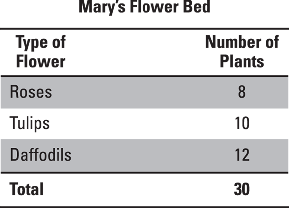
In the following table, the data for the types of flowers and the number of each type of plant in Mary’s flower bed are listed. Make sure to read your question carefully and dissect the data accordingly.
 Which ratio compares the number of rose plants to the number of daffodil plants?
© John Wiley & Sons, Inc.
(A) 3:2
(B) 2:3
(C) 4:3
(D) 5:6
(E) 3:4
The correct answer is Choice (B). The ratio of roses to daffodils is 8:12; when factored, the ratio is 2:3. The Praxis Core exam will expect answers in the simplest form.
Bar graphs and line graphs
A bar graph uses the length of vertical or horizontal bars to represent numbers and compare data. Bar graphs are good to use when your data is in categories. Bar graphs must contain a title, axis labels for the horizontal and vertical axis, scales, and bars that represent numbers.
The following bar graph shows the number of canned goods collected by homerooms at Cardozo Middle School.

© John Wiley & Sons, Inc.
Mr. Smith’s homeroom collected more cans than how many other homerooms?
(A) 3
(B) 4
(C) 5
(D) 6
(E) 7
The correct answer is Choice (A). Use the graph to compare the number of cans collected by each homeroom. According to the length of the vertical bars, Mr. Smith’s homeroom collected more cans than Mr. Lewis, Mr. Davis, and Mrs. Reed’s classes.
Line graphs are graphs that show data that is connected in some way over a period of time. Suppose you’re preparing for a statistics test and each day you take a short online quiz to see how you’re progressing. These are the results:
Day 1 |
30 percent |
Day 2 |
20 percent |
Day 3 |
50 percent |
Day 4 |
60 percent |
Day 5 |
80 percent |
After you’ve created a table from your results, display them in a line graph. You can then decide, based on your progress on the practice quizzes, how likely you are to pass your statistics test. What trends do you see in the following graph?

© John Wiley & Sons, Inc.
The graph indicates that as the days of practicing the online quizzes increase, your score increases; so you will, more than likely, pass your statistics test.
Pie charts
Are you ready for a slice of pie? Pie charts are also known as circle graphs. These graphs focus on a whole set of data that is divided into parts. To create a pie chart, follow these steps:
- Record the data in table format.
Convert each data value (the raw number) into a fraction.
Use the data value for the numerator and the total for the denominator.
Convert the fraction to a decimal.
Divide the numerator by the denominator.
Convert the decimal to a percent.
Move the decimal point two places to the right and add a percent symbol.
- Multiply the percent by 360 to get the number of degrees for that slice of your pie chart.
- Display all the slices together in the pie chart.
The following table shows the conversion of raw data to information that can be used to create a pie chart. The resulting pie chart is shown in the example question.

© John Wiley & Sons, Inc.
When reading a pie chart, the larger the value, the larger the piece of pie!
Use this graph to answer the following questions.

© John Wiley & Sons, Inc.
What are the two favorite fruits of the people surveyed?
(A) Strawberries and apples
(B) Peaches and strawberries
(C) Peaches and apples
(D) Strawberries and bananas
(E) Peaches and bananas
The correct answer is Choice (B). Out of 170 people, 55 chose peaches. When ![]() is converted to a decimal, it becomes 0.32 or 32 percent. Out of the same 170 people, 50 chose strawberries. When
is converted to a decimal, it becomes 0.32 or 32 percent. Out of the same 170 people, 50 chose strawberries. When ![]() is converted to a decimal, it becomes 0.29, or 29 percent. These are the two largest pieces of the pie.
is converted to a decimal, it becomes 0.29, or 29 percent. These are the two largest pieces of the pie.
What percentage of the people liked strawberries and bananas?
(A) 41%
(B) 47%
(C) 53%
(D) 59%
(E) 61%
The correct answer is Choice (A). Out of 170 people, 50 chose strawberries. When ![]() is converted to a decimal, it becomes 0.29 or 29 percent. Out of the same 170 people, 20 chose bananas. When
is converted to a decimal, it becomes 0.29 or 29 percent. Out of the same 170 people, 20 chose bananas. When ![]() is converted to a decimal, it becomes 0.12, or 12 percent. Adding these percentages together,
is converted to a decimal, it becomes 0.12, or 12 percent. Adding these percentages together, ![]() .
.
Stem-and-leaf plots
A stem-and-leaf plot blossoms into a useful graph when analyzed properly. You usually use this type of graph when you have large amounts of data to analyze. You can analyze data sets such as classroom test results or scores of the basketball team using a stem-and-leaf plot.
Based on place value, each value in your data set is divided into a stem and leaf. What each stem and leaf represents is indicated by a Key. Draw a vertical line to separate the stem from the leaf. The leaf is always the last digit in the number. The stem represents all other digits to the left of the leaf. To divide 105 into stem-and-leaf format, you draw a line to separate the stem from the leaf, ![]() , which indicates a stem of 10 and a leaf of 5.
, which indicates a stem of 10 and a leaf of 5.
Say you have the following numbers:
50, 65, 65, 60, 50, 50, 55, 70, 55
The first step is to arrange your data in least to greatest order, as follows:
50, 50, 50, 55, 55, 60, 65, 65, 70
Now arrange these numbers vertically in a table:
|
Math Test Results |
|
Stem |
Leaf |
5 |
0 0 0 5 5 |
6 |
0 5 5 |
7 |
0 |
Key: 5|0 means 50
This arrangement allows you to quickly identify your stems. Your stems in the data set are 5, 6, and 7. You have five data values in the list in the 50s: 50, 50, 50, 55, and 55. The leaves that go along with the 5 stem are 0, 0, 0, 5, and 5. You have three data values in the 60s: 60, 65, and 65. The leaves that go with the 6 stem are 0, 5, and 5. Finally, you have one leaf with a data value of 0 to accompany the stem of 7.
When using a stem-and-leaf plot, you can quickly identify the least and greatest values in the data set (50 and 70), calculate the range (![]() ), and calculate the median or middle number (55).
), and calculate the median or middle number (55).
The following data shows the number of people visiting a particular frozen yogurt shop per hour across a 12-hour day.
Hourly customers: 4, 17, 22, 31, 39, 40, 25, 43, 35, 40, 38, 13.
When this data is arranged in a stem-and-leaf plot, you get the following diagram. Use it to answer the questions that follow.
Hourly Customers |
|
Stem |
Leaf |
0 |
4 |
1 |
3 7 |
2 |
2 5 |
3 |
1 5 8 9 |
4 |
0 0 3 |
Key: 4|0 means 40
What was the largest number of people that entered the shop during an hour?
The correct answer is 43. Based on the diagram, the highest stem is 4 and the highest leaf in that stem is 3.
Box-and-whisker plots
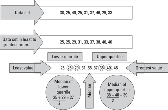
Box-and-whisker plots, also known as box plots, show different parts of a data set using a line of numbers that are in order from least to greatest.
A box-and-whisker plot allows you to divide your data into four parts using quartiles. The median, or middle quartile, divides the data into a lower half and an upper half (for more on finding the median, see the later section “Measuring arithmetic mean, median, or mode”). The median of the lower half is the lower quartile. The median of the upper half is the upper quartile. Your data set will contain the following five parts:
- The least value: The smallest value in the data set.
- The lower quartile: The median of the lower half of the data set.
- The median: The median or middle quartile. This divides the data into a lower half and an upper half. The median is the number in the center. If two numbers are in the center, find the average of the two middle values.
- The upper quartile: The median of the upper half of the data set.
- The greatest value: The largest value in the data set.
The following diagram shows how data is dissected using a box-and-whisker plot. To create a box-and-whisker plot, follow the diagram below.
© John Wiley & Sons, Inc.
The diagram begins with the data set. The data set is then put in least to greatest order. Underline the least value and the greatest value in the data set. Then find the median of the entire data set. Remember, when calculating the median, if there are two values in the center of a data set, find their average. The median divides the data set into the lower quartile and the upper quartile. You must then find the median of the lower quartile and the median of the upper quartile.
After dissecting the data into the five values, graph the five values on a number line. Draw a box from the median of the lower quartile to the median of the upper quartile. Draw a vertical line inside the box at the median. The lines connecting the least and greatest values to the box are called the whiskers. You can think of your data in four quartiles, known as Q1, Q2, Q3, and Q4. Each quartile represents about 25 percent of the data set.

© John Wiley & Sons, Inc.
Use the following graph to answer the following questions.

© John Wiley & Sons, Inc.
This box plot indicates the scores from yesterday’s math test. How many students did not get above 65%?
(A) 25%
(B) 50%
(C) 65%
(D) 75%
(E) 85%
The correct answer is Choice (A). The box-and-whisker plot indicates that the lowest score on the test was 60. The median of the lower quartile is 65, so 25 percent of the students scored lower than 65.
What is the median test score from yesterday’s math test?
(A) 25%
(B) 50%
(C) 65%
(D) 75%
(E) 85%
The correct answer is Choice (D). The median of the box-and-whisker plot is indicated by a line drawn through the center of the box. The value graphed at this point is 75.
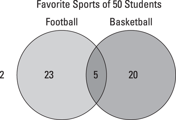
Venn diagrams
“Venn” you need to picture relationships between different groups of things, use a Venn diagram. A Venn diagram is an illustration where individual data sets are represented using basic geometry shapes such as ovals, circles, or other shapes. Simply draw and label two or more overlapping circles to represent the sets you’re comparing. The sets overlap in an area called the intersection. When an item is listed in both sets, it goes in the intersection. If an item doesn’t fit in either set, it falls outside the circles.
Use the following graph to answer the following questions.
© John Wiley & Sons, Inc.
Football is the favorite sport of how many students in the Venn diagram?
(A) 2
(B) 5
(C) 23
(D) 25
(E) 48
The correct answer is Choice (C). In the Venn diagram, 23 students picked football as their favorite sport. This is the only portion of the diagram reserved for football only.
Football and basketball are the favorite sports of how many students?
(A) 2
(B) 5
(C) 23
(D) 25
(E) 48
The correct answer is Choice (B). Five students in the Venn diagram like football and basketball. This is the portion of the diagram that football and basketball have in common.
How many students do not like football or basketball?
(A) 2
(B) 5
(C) 23
(D) 25
(E) 48
The correct answer is Choice (A). There are two students who did not fall inside the Venn diagram; therefore, they like neither football nor basketball.
Scrambling around scatter plots
If you want to determine the strength of your relationship, use a scatter plot. Scatter plots are a graphical representation of two variables determining whether a positive, a negative, or no correlation exists. Data from two sets are plotted as ordered pairs (x, y). You can draw three conclusions from scatter plots:
- If the coordinates are close to forming a straight line that rises up from left to right, then a positive relationship or correlation exists.
- If the coordinates are close to forming a straight line (line of best fit) with one variable increasing as the other decreases, then a negative relationship or correlation exists.
- If the coordinates don’t come close to forming a line and are all over the place, then no relationship or correlation exists! Hence, the name scatter plot.
The three types of correlations are shown below.

© John Wiley & Sons, Inc.
Make sure to give your plot a title and make sure to label your axes when you create a scatter plot.
Loitering around line plots
If you want to see your mode (the value that occurs the most) pop up quickly, use a line plot. A line plot, also known as a dot plot, allows you to identify the range, mode, and outliers in your data set. Follow these simple steps:
- Put your data in order from least to greatest.
- Arrange your data on a number line.
- Mark each value in the data set with an x or a dot.
Using the following line plot, what is the mode of the data set?

© John Wiley & Sons, Inc.
(A) 50
(B) 60
(C) 70
(D) 80
(E) 90
The correct answer is Choice (E). The score of 90 appears in the data set the most.
Analyzing Data
After you’ve created a visual representation of your data, the next phase is to analyze and interpret the data by making comparisons; calculating the mean, median, and mode; determining the range; and finding out what variables affect your data set. After you analyze, interpret, and display the pieces of information, you can use them to make important decisions. This section prepares you to analyze data sets in a variety of ways.
Combing through comparisons
When you’re working data analysis problems on the Praxis Core exam, it’s wise to comb your data set, looking for the smallest and largest values to calculate the range. Then you need to find the mean, median, or mode — or measure of central tendency — of the data set. A measure of central tendency tells you where the middle of a data set lies. You have to be clear on which measure is appropriate for the data you have. Then you can use your data analysis to make important, real-life decisions.
Homing in on the range
When preparing for the Praxis Core exam, you need to know how to calculate the range of a data set. The range is the difference between the largest (maximum) and smallest (minimum) values in your data set. If your range is small, most values in the data set are alike; however, if you have a large range, the values in the data set are different from each other. Whether you have 14 or 14,000 pieces of data in your set, simply take the difference between the largest and smallest values in the data set to find the range.
Brit went bowling with her classmates. She bowled five games with the following scores: 193, 190, 149, 146, and 183. What is the range of her bowling scores?
(A) 3
(B) 44
(C) 46
(D) 47
(E) 149
The correct answer is Choice (D). The range is calculated by subtracting the smallest number in the data set from the largest number in the data set: ![]() .
.
Measuring arithmetic mean, median, or mode
Who do you think is the most popular in the measures of central tendency clique: mean, median, or mode? The measures of central tendency are all types of averages of data sets. When preparing for the Praxis Core exam, you need to be able to decide the value of a data set that best describes the entire data set.
Mastering the mean
For a data set with no high or low numbers, the mean, also known as the average, is the most popular measure of central tendency. To find the mean of a set of values, use the following formula:
Marking the middle with the median
When the data set has a couple of values higher or lower than the others, the median is the most popular measure of central tendency. When finding the median of a data set, you must first ensure that the data is in order from least to greatest. Use the cross-out method to mark out values until you get to the center. If two values are left in the center, take the average of them.
Making the most of the mode
When your data set is filled with the same data values, then the mode wins as the most popular value. In the following data set, the mode is 23 because it appears most often.
15, 20, 23, 23, 23, 40, 45, 60
The following table contains Kelsey’s Face Time usage for 1 week (in minutes).

© John Wiley & Sons, Inc.
Find the mean, median, and mode of the data set. Write your answers in the boxes provided. Which measure best describes the amount of time spent on Face Time?
Mean

Median

Mode

The mean (93.85) and mode (65) are close to only a few data points; the median (75) is close to most data points, so the best measure of central tendency for this data set is the median. You can say that Kelsey spends an average of 75 minutes per day on Face Time. Here’s how to calculate each of the three measures of central tendency:


- Mode = 65, because it appears most frequently in this set of data.
Variably affecting data
When working with data analysis, variables often affect the data. Did you ever have a test score that was exceedingly better or worse than your other scores? In statistics, this piece of data is known as the outlier, which drifts way out at the end of a data set. Outliers can affect how your data is interpreted.
You can tell whether your data set has outliers by putting your numbers in least to greatest (ascending) order. Check each number to see whether it’s much less or much greater than the next number.
The following data set contains the math test scores for a student. Plot the data set on a line plot.

© John Wiley & Sons, Inc.
Once you see the test data displayed on a line plot, you can see that 90 is a loner, or outlier, in the data set. To decide what best measure of central tendency to use, calculate the mean, median, and mode of the data set.
Scrutinizing samples for data analysis
What if you were collecting data about the favorite food of middle-school students? It would be difficult to interview every student in the middle-school group or population, so you’d take a sample, which is a depiction of the entire group.
The sample you choose must represent the whole group or population. You wouldn’t collect data from only the football team or the math classes. An ideal sample would be to randomly select five students from each class period or to randomly select students from the school directory. From the sample, you can infer data about the entire population. If 10 kids out of 100 like pizza for lunch, then 100 kids out of 1,000 probably like pizza for lunch too.
A random sample is a select group that represents the entire population. If you’re studying middle-school students, you can’t just survey your friends at middle school. You need to randomly select students from the middle-school directory — including all ages and all grades taught at the school.
Interpreting linear models
You can use data in a table to make a graph. The graph and the table will both present the same data but in different ways. If the graph of the values in a table forms a line when graphed, then it can be called a linear function. First graph the data points, and then connect the points with a line. If you can connect them with a line, the relationship is linear.
Linear models simply use patterns to explore relationships. Say that the honor society is selling mugs as a fundraiser. The daily sales and income are recorded in a table. The mugs sell for $10 each.
First, identify your input (x) and output (y) variables. The income or money you make depends on how many mugs are sold, so the number of mugs you sell will determine how much money you make. Next, record the mug sales in a table.
Number of Mugs Sold (x) |
Income (10x) |
1 |
10 |
5 |
50 |
10 |
100 |
30 |
300 |
Then plot your table values as a line graph. Now you’re ready to analyze your data. Make sure you study the shape of the graph below; use your finger to trace the x and y values. You can say that the number of mugs sold (x) determines the income (y), or ![]() . The more mugs sold, the more income made. The table shows if you sell one mug, you’ll make $10; if you sell ten mugs, you’ll make $100.
. The more mugs sold, the more income made. The table shows if you sell one mug, you’ll make $10; if you sell ten mugs, you’ll make $100.

© John Wiley & Sons, Inc.
Calculating Probability
The review in this section focuses on probability of an event, also known as P (event), which deals with how likely something is to occur. You can record the probability of an event as a fraction, decimal, or percent.
A chance action, such as tossing a number cube, is also called an experiment. Each observation of the experiment is called a trial, and what happens at the end of the trial is the outcome. One or more outcomes are called events.
When you throw a single die, there are six possible outcomes: 1, 2, 3, 4, 5, or 6. The probability of any one of them occurring is 1/6.
Determining the likelihood of an event
When you throw a single die, there are six sides and six possible outcomes. The following table indicates that the even outcomes are half and the not-even outcomes are half; therefore, the likelihood of rolling an even number is as likely to happen as not — you have a 3/6 (read, three in six) or 50-50 chance.
Even |
Not Even |
2, 4, 6 |
1, 3, 5 |
What is the likelihood that you’ll roll a 6 on the single die? When a single die is rolled, either a 6 will be rolled or it won’t be rolled. There is only one 6 on the single die, so the likelihood that it will be rolled is 1 out of 6.
Using complements
Are you ready for a complement? The complement of an event is the set of all outcomes that are not the event. Analyze the situation that is occurring and find your total possible outcomes.
For example, you have 16 total marbles in a bag, and the marbles are different colors. Write each color as a fraction, decimal, or percent of the total number.
Blue |
Red |
Green |
Black |
Total |
8/16 |
5/16 |
2/16 |
1/16 |
16/16 or 1 |
The bag contains eight blue marbles, five red marbles, two green marbles, and one black marble. The probability of randomly picking a blue marble is 8/16. What is the probability of not drawing a blue marble? The probability of not picking a blue marble would be 8/16 or the sum of the numbers of remaining marbles in the bag divided by the total number of marbles. The (P) of not picking blue is the complement.
Pointing Out Scientific Notation Facts
Scientific notation is a shortcut for writing very large or very small numbers. The decimal point is moved about in such a way as to make the numbers easier to write and read.
The goal is to write the scientific notation number as a product of two factors: The first factor is a number equal to or greater than 1 but less than 10, and the second factor is a power of 10 (also called the base). So, to write 3,000 in scientific notation, you’d write ![]() . All the focus is on the decimal point.
. All the focus is on the decimal point.
Exponents tell you how many times to use the base as a factor. A positive exponent indicates a large number (greater than 1), and a negative exponent indicates a very small number (less than 1, also known as a decimal).
Light travels 1 meter in 0.0000000025 seconds. Write the number in scientific notation.

The correct answer is ![]() . Focus on the decimal point. You have to move the decimal point nine places to the right to reach 2.5. Why would you decide to stop the decimal at 2.5? Because that number is from 1 to 9. Write the number in scientific notation as
. Focus on the decimal point. You have to move the decimal point nine places to the right to reach 2.5. Why would you decide to stop the decimal at 2.5? Because that number is from 1 to 9. Write the number in scientific notation as ![]() . Moving the decimal point to the right indicates a very small number and is written with a negative exponent.
. Moving the decimal point to the right indicates a very small number and is written with a negative exponent.
Light travels 18,000,000,000 meters per minute. Write the number in scientific notation.

The correct answer is ![]() . Focus on the decimal point. Remember, if the decimal point isn’t visible in the number, it’s found at the end. Your task is to count how many places you have to move the decimal point to get to a number from 1 to 9. The number in the preceding example question written in scientific notation is
. Focus on the decimal point. Remember, if the decimal point isn’t visible in the number, it’s found at the end. Your task is to count how many places you have to move the decimal point to get to a number from 1 to 9. The number in the preceding example question written in scientific notation is ![]() .
.
Practice Questions about Probability and Statistics
These practice questions are similar to the questions about statistics and probability that you’ll encounter on the Praxis.
1. There are 9 yellow counters and 15 red counters in a bag. What is the probability of picking a yellow counter from the bag?
(A) 5/8
(B) 1/2
(C) 2/5
(D) 2/3
(E) 3/8
2. Using the following line plot, what is the mean of the data set?

© John Wiley & Sons, Inc.
(A) 65
(B) 72
(C) 75
(D) 80
(E) 82
3. The heights from a group of 20 students include 7 that are below 4 feet tall and 8 that are above 5 feet tall. What is the probability that a student selected will be between 4 and 5 feet tall, inclusively?
(A) ![]()
(B) ![]()
(C) ![]()
(D) ![]()
(E) ![]()
4. Find the range, mean, median, and mode for the following data set:
1, 3, 3, 3, 3, 4, 6, 6, 6, 8, 12
Range 
Mean 
Median 
Mode 
5. Using the stem-and-leaf plot that follows, find the median number of people who entered a frozen yogurt shop during a given hour.
Hourly Customers |
|
Stem |
Leaf |
0 |
4 |
1 |
3 7 |
2 |
2 5 |
3 |
1 5 8 9 |
4 |
0 0 3 |
(A) 22
(B) 29
(C) 33
(D) 40
(E) 43
6. Which of the following represents 57,590,000 in scientific notation?
(A) ![]()
(B) ![]()
(C) ![]()
(D) ![]()
(E) ![]()
7. Which is the best way to survey a random sample of students from your school about their favorite radio station?
(A) Survey 5 students in each first-period class.
(B) Survey 12 students in the band.
(C) Call 25 friends.
(D) Survey each student in your math class.
(E) Survey the football team.
Answers and Explanations
Use this answer key to score the practice statistics and probability questions in this chapter.
- E. 3/8. There are 24 counters in the bag. Nine of the 24 counters, or 9/24, are yellow, which reduces to 3/8.
- B. 72. The mean of the line plot is identified by taking the average of the numbers:

- B.
 . If the total number of students is 20, and they have given us the heights of 15 students, then 5 students must be between 4 and 5 feet tall, including 4 and 5 feet (meaning they could be 4 and a half and so on).

Range, 11; mean, 5; median, 4; and mode, 3. Using the data set 1, 3, 3, 3, 3, 4, 6, 6, 6, 8, 12, the range is
 . You find the range by subtracting the smallest data value from the largest.
The mean =
 . You find the mean, also known as the average, by adding the numbers in the data set and dividing the total by the number of items in the data set.
The median = 4. The median is the center or middle number in the data set. If there are two numbers in the center of the data set, find the average of them.
The mode = 3. It is the number that occurs the most frequently in the data set.
Please note: You won’t usually see this many separate questions in one on the Praxis Core; however, you may have to calculate all of these to answer a single question.
- C. 33. Since there are 12 data points, take the middle two numbers and get the average.

- D.
 . 57,590,000 written in scientific notation is
  . Move your decimal point to the left until you reach a number from 1 to 9. It takes 7 places to reach 5.759; therefore, your answer should be
  .
. - A. Survey 5 students in each first-period class. Surveying five students in each first period class will give a more diverse sample than the other methods presented in the other answer choices.