
Chapter 4
Data Issues
If information is the confluence of data tributaries, analytics is one hell of river!
Imagine for a moment that the vice president (VP) of human resources (HR) schedules a meeting with you, the leader of a talent analytics team, to learn about the effectiveness of an HR initiative called Retain & Grow. The initiative began soon after your technology company acquired a smaller, company for its innovative processes, patents, and deeply skilled engineers. The program is also an extension of a failed program that was designed to stanch the loss of highly talented young employees who come to the company for a couple years of experience and depart for more lucrative jobs with better work/life balance.
Your company is facing a talent crisis, and the VP of HR is coming to you for solutions. She wants to know how you can help her identify high and low performers, identify competency gaps, provide technical skills, increase competencies, increase engagement, and reduce turnover. Her supervisors, the business leaders of the company, believe that improvements in these areas will lead to increased product quality, customer loyalty, improved sales, and increased revenue.
A week prior to the meeting, you spend several hours compiling the information you have about every aspect of the initiative. Your organization has invested heavily in HR technology, so you have access to a large variety of data. The results quickly become overwhelming, so you start to organize the reports to make sense of them and create a meaningful picture for your VP. After spending hours combing through the data and reports, you compile a list of meaningful metrics that you know will be useful (shown below under the heading Efficiency Measures). The measures relate to activities and costs, and you are proud that your HR group accomplishes so much at minimal cost. In combination, these measures define the efficiency of your group.
EFFICIENCY MEASURES
- Number of open positions in the business unit
- Number of positions filled/month
- Average number of days to fill an open requisition
- Average salary of the open position
- Cost to hire
Once you have culled the measures to this list, it doesn’t take long to organize your thoughts to create a story about the inputs and outputs of the program over the last quarter. You create a succinct MS PowerPoint presentation with bullet points and graphs that explain your data.
When you finally meet with the VP, you carefully present the information you have compiled. Here is the story you tell:
“Our company has invested heavily, hired new people, administered competency assessments, and deployed onboarding programs, which include classroom training, e-learning, and coaching. People are being hired in reasonable time frames (similar to benchmarks), and new hires are successfully completing training.
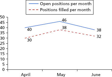
“With regard to open positions and the positions filled per month, our numbers are stable throughout the quarter. Exhibit 4.1 shows both metrics by month. The numbers shown, when translated into percentages, indicated that we are filling 75% to 84% of the positions within the first month.
Exhibit 4.1 Open Positions and Positions Filled per Month
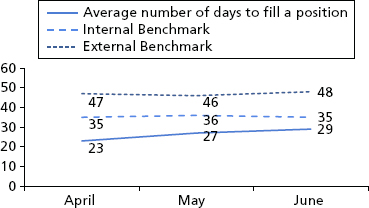
“The second set of metrics shows our average time to fill a position. External benchmarks are shown as well. Exhibit 4.2 shows our time-to-fill metrics. On average, we are filling the positions 25% faster compared to internal benchmarks and 44% faster compared to external benchmarks.
Exhibit 4.2 Time to Fill Compared to Benchmarks
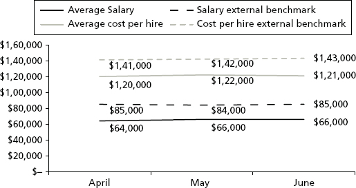
“The third set of measures compares salary costs to external benchmarks and total cost to hire against external benchmarks. Exhibit 4.3 shows these metrics for each month. Our salary costs are 23% lower than the industry benchmark, and the total cost to hire is 15% lower than the benchmark.”
Exhibit 4.3 Salary Costs and Total Cost to Hire Compared to Benchmarks
The VP is very thankful for the results and appreciates the time and care you have taken to compile the information. She says, “You have provided good information about our HR activities, but I feel like there is more that needs to be reported.” As you let the message sink in, “You missed something,” the VP stands up to draw on a whiteboard in the room. Then she asks, “Will you brainstorm with me for a moment?”
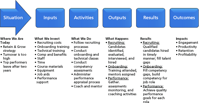
“Of course,” you agree. Then she draws a picture with an arrow and rectangles on the whiteboard like the model in Exhibit 4.4. She calls it a logic model.
Exhibit 4.4 Logic Model
Source: KnowledgeAdvisors, W. K. Kellogg Foundation Logic Model Development Guide, January 2004, www.smartgivers.org/uploads/logicmodelguidepdf.pdf
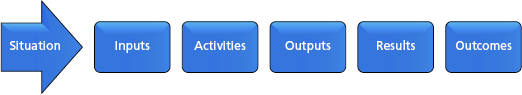
Then she continues, “I’ve used this in the past to help simplify the cause-and-effect relationships within the organization. Let’s look at the onboarding and retention of new hires first, that’s our situation. Based on your data and understanding of what we are doing now, what are our inputs?”
You share a whole list of things, like the time and effort of your recruiters, the technology that supports your processes, the salaries offered to new employees, and the benefits package. The VP lists these below the inputs box. Then you move to activities and outputs. All of the data you have provided fits nicely into these buckets. Then the VP says, “How do we know if we are hiring good people?”
After thinking for a moment and referencing the data, you respond frankly, “We don’t know.” You are somewhat embarrassed and concerned that you should have such a measure in your scorecard. You are not even sure what measures you currently collect about the quality of your new hires. The VP senses your concern and says, “It’s fine. We’ll have to begin collecting a new hire quality metric. My real concern is turnover. Our campus hires are likely to leave after two years—at least 30% voluntarily depart, which is higher than the industry benchmark.” She lists “30% turnover campus hires” below Outcomes. “This is one of the key business measures that we need to monitor and reduce. I notice you do not have it listed among you metrics.”
“I do now,” you say.
“Good. The next step is to consider why. Why are 30% of our new hires leaving?”
Together, you brainstorm some more with the VP, and you come up with a short list of ideas:
- New hires gain valuable skills through training that are marketable beyond our company.
- They find jobs with better work/life balance.
- They feel that they are not valued and do not contribute substantially to the overall mission of the company.
- They are underpaid.
“What other information can you get regarding attitudes? Why are people leaving?” the VP asks.
“We could look at engagement scores for employees the year before they left,” you offer.
“Great idea! And what about exit surveys? Do you have access to that information?”
“Yes, I completely forgot about those.”
“Well, it’s on the table now. Can you get the data?”
“It might be a struggle with IT.”
“Keep me informed. I’ll sponsor you on this. Use my name if necessary, and I’ll clear any roadblocks that come up.” She continues, “What measures do we have with regards to turnover and revenue?”
Deflated, you respond, “I’m not certain. I’ll have to look into that.” Seeing that she has worn you thin, she reassures and encourages you, “This is a journey. Often a long one. Stick with me, and we’ll get there.”
She returns to the logic model and fills out the remaining sections based on the information you provided. “This is what we have.” She points to the inputs, activities, and outputs on the logic model. “And this is what we need.” She points to the results and outcomes on the logic chain. The final model looks something like the image in Exhibit 4.5.
Exhibit 4.5 Completed Logic Model
Source: KnowledgeAdvisors, W. K. Kellogg Foundation Logic Model Development Guide, January 2004, www.smartgivers.org/uploads/logicmodelguidepdf.pdf
Your 30-minute meeting has extended to 90. You are exhausted but also exhilarated. The VP is thankful for the information you brought to the table, essentially the inputs, activities, and outputs, but she also clarified that she needs measures for results and outcomes. The only unfortunate part is that she has scheduled a follow-up meeting for the next week. So much to do. So little time.
One week later you head into your meeting with the VP. You are nervous. You have collected much more information, and this time it is substantially different from the first set of metrics. You have gathered data from several disparate systems. Some results have come to you just as you need them. Others came to you in spreadsheets and needed to be cleaned before analysis. Much of the data you had to process manually using MS Excel. You are nervous because your requests took much longer than expected. The data came to you late, and you’ve been racing to analyze it, let alone understand it. Moreover, the data are unfamiliar to you. You are accustomed to reviewing recruiting metrics. For this report you’ve gathered competency assessment results, performance ratings, feedback about training, and productivity estimates. When you finally compile a report, you consider the overarching theme of the results. They are clearly focused on competencies, performance, and effectiveness.
EFFECTIVENESS MEASURES
These are the effectiveness measures you compiled:
- Performance ratings of new hires at 90 days; identification of high potentials/low performers
- Competency assessment results—aggregated information about competency strengths and gaps
- Speed to competency
- Opinions from learners about what is most effective about onboarding
- Engagement survey results
- Exit survey data and exit interview comments
Results and Interpretation
During the first 30 minutes of your meeting, you share your results with the VP. She is impressed with the amount of data you were able to compile so quickly. She is patient as you share the graph shown in Exhibit 4.6.
Exhibit 4.6 Quarterly Performance Ratings
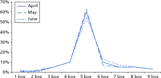
Performance Ratings for New Hires at 90 Days
A 9-box performance rating system is used in your company. The graph shows those results, and they are consistent with your expectations, that the majority will land in the middle of the graph and that results for each month will be similar. Sixty-plus percent of new hires are in the middle tier “capable” 5-box. Only 15% to 21% are rated as high potentials (6-, 8-, or 9-box). Another 12% fall in the low-performer group (1-, 2-, or 4-box). This high, medium, and low structure provides a meaningful breakdown of the results that carries through Exhibits 4.7 through 4.14.
Exhibit 4.7 Competency Results
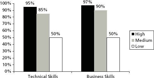
Exhibit 4.8 Speed to Competency
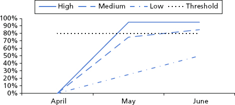
Exhibit 4.9 Test Score—Percentage Passing by Performance Group and Month
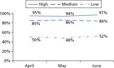
Exhibit 4.10 Employee Engagement by Group at 90 Days and One Year
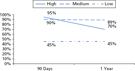
Exhibit 4.11 Exit Survey Results
| Top Reasons for Leaving the Company | ||
|---|---|---|
| High Performers | Mid-Tier | Low Performers |
| More challenging work | New industries in a similar role | Family/friends at the company |
| Higher pay | Better work/life balance | Better work/life balance |
| Promotion/higher position | Higher pay | Less demanding job |
Exhibit 4.12 Turnover by Group at Two Years
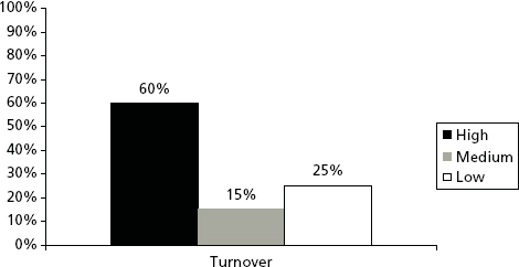
Exhibit 4.13 Optimization Model with Key Performance Metrics
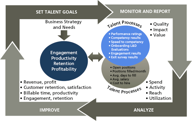
Exhibit 4.14 Productivity among Groups during Year 1
Competency Assessment
The competency assessment results in Exhibit 4.7 show that high performers have 95% of the technical competencies and 97% of the business competencies for the job. The mid-tier group is capable but not as strong. The low performers only have half of the competencies they need. Results are aggregated across all three months of the quarter.
Speed to Competency
High performers in Exhibit 4.8 are fully productive first at four weeks. The middle tier requires 12 weeks to achieve the minimum performance threshold, and the low-performing group is not competent at 90 days.
Onboarding Feedback (Test and Evaluation)
Based on tests in Exhibit 4.9 and evaluation results (not graphed), the high performers score the highest on the test but gain the least from training. They likely had much of the knowledge and skills necessary for the job prior to joining. However, they do indicate that training is relevant, well designed, and well delivered. The middle group does almost as well as the high-performing group on the test and has similar opinions about the quality of training. The low-performing group does not perform well on the final test, and their feedback about the course is that too much material is covered too quickly.
Engagement Survey
Results were gathered at 90 days and at one year and reflect the percentage responses that fall in the top two boxes for the question “I am thriving at this company.” At 90 days, the high potentials feel like they are thriving (See Exhibit 4.10). The middle tier is doing well, but the lower tier is struggling. Engagement for the middle tier and low performers does not change at one year. However, engagement among high potentials has dropped substantially. A deeper dive into the comments reveals that they are bored and not challenged. Additionally, they do not feel they are contributing directly to the success of the company.
Exit Survey
The exit survey results in Exhibit 4.11 show that high potentials leave for more challenging work, higher pay, and more advanced positions. Turnover is highest among this group at 60% by year 2. (See Exhibit 4.12.) The middle tier has the lowest turnover at 15%. They are satisfied with their role and enjoy the work but want better work/life balance and better pay. The underperforming group has the second highest turnover rate at 25%. Their exit survey results indicate they struggle with the work, want a less demanding job, and prefer to work with friends and family.
After presenting the results, the VP thanks you for your hard work and insights. Based on the data, she would have drawn the same conclusions you have. Then she says, “There is still more to do, and let me share a model to help guide you. This comes from a book titled Beyond HR by Boudreau and Ramstad.”1
“Based on this model, we should consider the efficiency data, the information you shared last week, with our effectiveness data, the information you just shared. We should view these data sets as related. For example, if we added two or three more recruiters, we could find and hire new candidates faster, improving our time-to-fill measures.”
You interrupt her for a moment. “Two to three new recruiters—it will be hard to get budget for more headcount.”
“True,” she says. “So we’ll need to show the predicted return on investment for adding them—better candidates that stay longer. We’ve only talked about improving our efficiency measures. We also want to improve our effectiveness measures, like the quality of the candidate and the length of their tenure. There is a tangible return on investment (ROI) for adding more people to get better candidates that stay longer. We have to estimate that impact to get the new head count. Then, when they are here and we can improve both efficiency and effectiveness measures, we will show improvement in overall outcomes—quality of candidate, productivity, increased tenure, profitability—for the company. Prediction now—in the absence of data—is just as important as prediction with the actual data.”
You look at the model, process what the VP has said, and restate, “So if we hire the right people quickly, we should improve engagement, productivity, retention, and maybe even profitability.”
“Exactly!”
“We need more data.”
“What do you mean?”
“I’ve only brought the engagement and retention data. I should be able to get productivity and profitability information. If I can get those, we should be able to test for a link between the quality of the hire and profitability.”
“I like the way you’re thinking. How much time do you need?” she asks.
You ask for a couple weeks so you can get the data, analyze it, and create a meaningful report. The VP is supportive and looks forward to your next meeting.
Two weeks later, you bring all of the data together to share with the VP. The first thing you share is a set of business outcome metrics displayed in the next section. They seem much simpler in concept than the efficiency and effectiveness measures, but they pose their own challenges for collection and analysis. It is a brief list, but it is well aligned with the needs of the Retain & Grow initiative.
BUSINESS OUTCOME MEASURES
These are the business outcome measures you compiled:
- Engagement
- Productivity measures
- Retention
- Profitability
Next, you share the Boudreau and Ramstad model that you have populated with key measures aligned to the three groups of data: efficiency, effectiveness, and outcomes. The VP agrees with your categorization of the measures. She even notices that you have shifted engagement and turnover from effectiveness to outcomes.
Business Outcomes
Now that you have agreed on the model and metrics, you share with her the results you have compiled related to business outcomes.
Engagement
You shared this during your last meeting but have shifted it to the outcomes section rather than the effectiveness section, because engagement is a viable business outcome for the organization. As mentioned during the last meeting, higher performers are highly engaged at 90 days but are far less engaged at one year. (See Exhibit 4.10.)
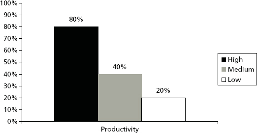
Productivity
During the first year, high performers log more billable hours than the other tiers. Eighty percent of their time is billable. They are twice as productive as the middle tier and four times more productive than the lower tier. In different terms, it takes a low performer four days to do the work a top performer can do in one day. Exhibit 4.14 shows the productivity differences by group.
Retention and Turnover Costs
Turnover was shared during your last meeting. Like engagement, you and the VP agree that it belongs in the outcome measures group, so you shifted it to this section. High performers account for 60% of the turnover during the first two years. (See Exhibit 4.11.) The costs associated with turnover are high. When high performers depart, they cost the company 150% of their salary to replace. It costs only 100% of salary to replace a mid-tier or low performer.
Profitability
Because associates charge the same amount per hour, profitability follows productivity. The top tier is twice as profitable as the middle tier and four times as profitable as the low performers. This makes high performers the most profitable employees in the first year.
The VP is very impressed with the information you have compiled. Then she asks for two more things: She wants to see the data you have compiled in a dashboard, so that she and other leaders can monitor the new hires. She also would like your opinion about what the company should do next. What are the action steps?
You quickly promise that the dashboard is easy to produce and can have a draft to her by next week. With regard to the action steps, you lean back in your chair and start to think. The VP looks at the clock and sees it is near the end of the hour. She suggests, “Let’s talk about it next week.”