
![]()
Data Preparation
Machine learning can feel magical. You provide Azure ML with training data, select an appropriate leaning algorithm, and it can learn patterns in that data. In many cases, the performance of the model that you build, if done correctly, will outperform a human expert. But, like so many problems in the world, there is a significant “garbage in, garbage out” aspect to machine learning. If the data you give it is rubbish, the learning algorithm is unlikely to be able to overcome it. Machine learning can’t perform “data alchemy” and turn data lead into gold; that’s why we practice good data science, and first clean and enhance the data so that the learning algorithm can do its magic. Done correctly, it’s the perfect collaboration between data scientist and machine learning algorithms.
In this chapter, we will describe the following three different methods in which the input data can be processed using Azure ML to prepare for machine learning methods and improve the quality of the resulting model:
- Data Cleaning and Processing: In this step, you ensure that the collected data is clean and consistent. It includes tasks such as integrating multiple datasets, handling missing data, handling inconsistent data, and converting data types.
- Feature Selection: In this step, you select the key subset of original data features in an attempt to reduce the dimensionality of the training problem.
- Feature Engineering: In this step, you create additional relevant features from the existing raw features in the data that increase the predictive power of the resulting model.
Cleaning and processing your training data, followed by selecting and engineering features, can increase the efficiency of the machine learning algorithm in its attempt to extract key information contained in the data. Mathematically speaking, the features used to train the model should be the minimal set of independent variables that explain the patterns in the data and then predict outcomes successfully. This can improve the power of the resulting model to more accurately predict data it has never seen.
Throughout this chapter we will illustrate the procedures involved in each step using Azure Machine Learning Studio. In each example, we will use either sample datasets available in Azure ML or public data from the UCI machine learning data repository, which you can upload to Azure ML so that you can recreate each step to gain first-hand experience.
Machine learning algorithms learn from data. It is critical that you feed them the right data for the problem you wish to solve. Even if you have good data, you need to make sure that it is in a useful scale, the right format, and even that meaningful features are included. In this section, you will learn how to prepare data for machine learning. This is a big topic and we will cover the essentials, starting with getting to know your data.
Getting to Know Your Data
There is no substitute for getting to know your data. Real world data is never clean. Raw data is often noisy, unreliable, and may be missing values. Using such data for modeling will likely produce misleading results. Visualizing histograms of the distribution of values of nominal attributes and plotting the values of numeric attributes are extremely helpful to provide you with insights into the data you are working with. A graphical display of the data also makes it easy to identify outliers, which may very well represent errors in the data file; this allows you to identify inconsistent data, and can let you know if you have missing data to deal with. With a large dataset, you may be tempted to give up; how can you possibly check it all? This is where the ability for Azure Machine Learning to create a visualization of a dataset, along with the ability to sample from an extremely large dataset, shines. Before diving straight into that, let’s first consider what you might want to learn from your first examination of a dataset. Examples include
- The number of records in the dataset
- The number of attributes (or features)
- For each attribute, what are the data types (nominal, ordinal, or continuous)
- For nominal attributes, what are the values
- For continuous attribute, the statistics and distribution
- For any attributes, the number of missing values
- For any attribute, the number of distinct values
- For labeled data, check that the classes approximately balanced
- For inconsistent data records, for a given attribute, check that values are within the expected range
Let’s begin by visualizing data in a dataset. For this example, you will use the Automobile price dataset, so drag it into your experiment and right-click the output pin. This brings up options, including the ability to visualize the dataset, as illustrated in Figure 3-1; select this option.
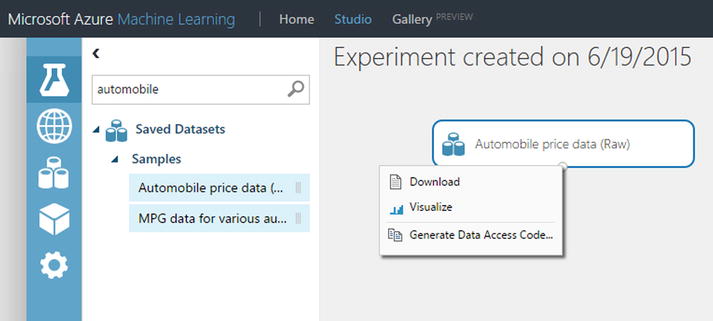
Figure 3-1. Visualizing a dataset in Azure ML Studio
The result are returned in an information-rich infographic (Figure 3-2). In the upper left corner are the number of rows in the dataset, along with the number of columns. Below that are the names of each column (attribute), along with a histogram of the attribute distribution and below this histogram is a list of the values with missing values are represented by blank spaces; there is an option to switch from histograms to box plots for numeric attributes. Immediately you have learned a great deal of information about your dataset.

Figure 3-2. Infographic of data, types, and distributions
Let’s select a column to learn more about that feature. If you select the make column, information about that column is presented on the right side of the screen. You can see that there are 22 unique values for this feature, there are no missing values, and the feature is a string data type. Below this information is a histogram that displays the frequency of values of this feature; there are 32 instances of the value Toyota and only 9 instances of the value Dodge, as illustrated in Figure 3-3.

Figure 3-3. Statistics on a categorical feature in Azure ML
If you select a numeric feature in the dataset, such as horsepower, the information in Figure 3-4 is displayed.

Figure 3-4. Statistics on a numeric feature in Azure ML
In the right hand side of Figure 3-4 are statistics on this numeric attribute, such as the mean, median, both min and max values, standard deviation, along with the number of unique values and number of missing values. And, as with a nominal attribute, you see the frequency of values for the attribute displayed; note that cars with 48 horsepower occur with the highest frequency–55 instances to be exact.
If you wish to learn even more information about your dataset, you can attach the Descriptive Statistics module, and once the experiment run is finished, you can visualize the results, as illustrated in Figure 3-5.

Figure 3-5. Descriptive Statics module in Azure ML
The Descriptive Statistics module creates standard statistical measures that describe each attribute in the dataset, illustrated in Figure 3-6. For each attribute, the module generates a row that begins with the column name and is followed by relevant statistics for the column based on its data type. You can use this report to quickly understand the features of the complete dataset, ranging from the number of rows in which values are missing, and the number of unique categorical values, to the mean and standard deviation of the column, and much more. But this visualization is merely a partial list of the statistics computed by the Descriptive Statistics module. To get the complete list, you merely need to save the dataset generated by this module and, instead of selecting the visualize option, convert to CSV using an Azure ML module. Then you can use Power BI or other reporting tool to fully explore the results.
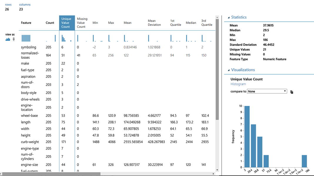
Figure 3-6. Display of descriptive statics created by Azure ML
When you find issues in your data, processing steps are necessary, such as cleaning missing values, removing duplicate rows, data normalization, discretization, dealing with mixed data types in a fields, and others. Data cleaning is a time-consuming task, and you will likely spend most of your time preparing your data, but it is absolutely necessary to build a high-quality model. The major data processing steps that we will cover in the remainder of this section are
- Handling missing and null values
- Removing duplicate records
- Identifying and removing outliers
- Feature normalization
- Dealing with class imbalance
Missing and Null Values
Many datasets encountered in practice contain missing values. Keep in mind that the data you are using to build a predictive model using Azure ML was almost certainly not created specifically for this purpose. When originally collected, many of the fields probably didn’t matter and were left blank or unchecked. Provided it does not affect the original purpose of the data, there was no incentive to correct this situation; you, however, have a strong incentive to remove missing values from the dataset.
Missing values are frequently indicated by out-of-range entries, such as a negative number in a numeric attribute that is normally only positive, or a 0 in a numeric field that can never normally be 0. For nominal attributes, missing values may be simply indicated by blanks. You have to carefully consider the significance of missing values. They may occur for a number of reasons. Respondents in a survey may refuse to answer certain questions about their income, perhaps a device being monitored failed and it was impossible to obtain additional measurements, or the customer being tracked churned and terminated their subscription. What do these things mean about the example under consideration? Is the value for an attribute randomly missing or does the fact a value is missing carry information relevant to the task at hand, which we might wish to encode in the data?
Most machine learning schemes make the implicit assumption that there is no particular significance in the fact that a certain instance has an attribute value missing; the value is simply not known. However, there may be a good reason why the attribute’s value is unknown—perhaps a decision was taken, on the evidence available, not to perform some particular test—and that might convey some information about the instance other than the fact that the value is simply missing. If this is the case, it is more appropriate to record it as “not tested” or encode a special value for this attribute or create another attribute in the dataset to record the value was missing. You need to dig deeper and understand how the data was generated to make an informed judgment about if a missing value has significance or whether it should simply be coded as an ordinary missing value.
Regardless of why a value is missing, this is a data quality issue that can cause problems downstream in your experiment and typically must be handled. You handle the missing or null value by either removing the offending row or by substituting in a value for the missing values. In either case, the Azure Machine Learning Clean Missing Values module is your tool of choice for cleaning missing values from your dataset. To configure the Clean Missing Values module, shown in Figure 3-7, you must first decide how to handle the missing values. This module supports both the removal and multiple replacement scenarios. The options are to
- Replace missing values with a placeholder value that you specify. This is useful when you wish to explicitly note missing values when they may contain useful information for modeling.
- Replace missing values with a calculated value, such as a mean, median, or mode of the column, or replace the missing value with an imputed value using multivariate imputation using chained equations (MICE) method or replace a missing value with Probabilistic PCA.
- Remove rows or columns that contain missing values, or that are completely empty.

Figure 3-7. Cleaning missing data from your dataset
You will continue using the automobile price data, which has missing values in the horsepower attribute, and replace these missing values using the Clean Missing Data module set to replace missing values using the MICE method.
The Clean Missing Data module provides other options for replacing missing values, as illustrated in Figure 3-8, which are worth noting. In the first example, missing values are replaced with a custom substitution value, a fixed user-defined value, which is zero(0) in this example, which could be used to flag these values as missing. In the second example, if you assume the values are missing at random, you can replace them with median value for that column. In the third example, missing values are replaced using Probabilistic PCA, which computes replacement values based on other feature values within that same row and overall dataset statistics. You also generate a new feature (column) that indicates which columns were missing and filled in by the Clean Missing Data module.

Figure 3-8. Options for replacing missing values in a dataset
Duplicate data presents another source of error that, if left unhandled, can impair the performance of the model you build. Most machine learning tools will produce different results if some of the instances in the data files are duplicated because repetition gives them more influence on the result. To identify and handle these records, you will identify and remove the duplicate rows using the Remove Duplicate Rows module in ML Studio. This module takes your dataset as input with uniqueness defined by either a single or combination of columns, which you identify using the Column Selector. The module will remove all duplicate rows from the input data, where two rows are considered duplicates if the values of all selected attributes are equal. It’s noteworthy that NULLs are treated differently than empty strings, so you will need to take that into consideration if your dataset contains both. The output of the task is that your datasets have duplicate records removed.
For example, in the Movie Recommendation model that is provided in Azure ML, along with the IMDB Movie Titles dataset available in Azure ML, you need to remove all duplicates so that you have only one rating per each user per movie. The Remove Duplicate Rows module, illustrated in Figure 3-9, makes quick work of this and returns a dataset with only unique entries.

Figure 3-9. Removing duplicate rows from the IMDB dataset
Identifying and Removing Outliers
It is important to check your dataset for values that are far out of the normal range for the attribute. Outliers in a datasets are measurements that are significantly distant from other observations and can be a result of variability or even data entry error. Typographical or measurement errors in numeric values generally create outliers that can be detected by graphing one variable at a time using the visualize option for the dataset and selecting the box plot option for each column, as illustrated in Figure 3-10. Outliers deviate significantly from the pattern that is apparent in the remaining values.

Figure 3-10. Visualizing data distributions using box plots
Often, outliers are hard to find through manual exploration, particularly without specialist domain knowledge. When not handled, outliers can skew the results of your experiments, leading to suboptimal results. To remove outliers or clip them, you will use the Clip Values module in ML Studio, illustrated in Figure 3-11.
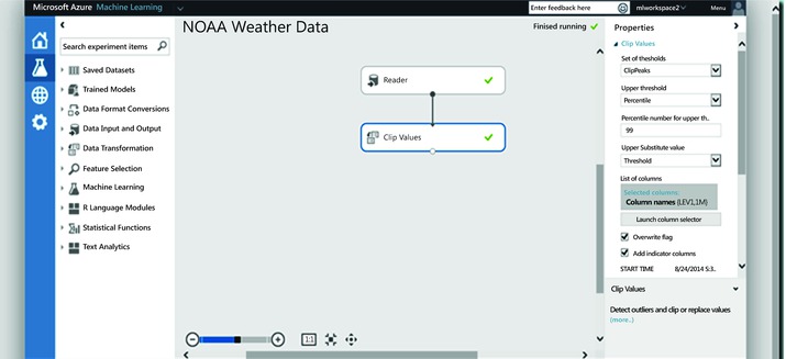
Figure 3-11. Clipping values using the Clip Values module
The Clip Values module accepts a dataset as input and is capable of clipping data point values that exceed a specified threshold using either a specified constant or percentile for the selected columns. The outliers, both peak and sub-peak, can be replaced with the threshold, mean, median, or a missing value. Optionally, a column can be added to indicate whether a value was clipped or not. The Clip Values module expects columns containing numeric data. This module constructs a new column with the peak values clipped to the desired threshold and a column that indicates the values that were clipped. Optionally, clipped values can be written to the original column in place. There are multiple ways to identify what constitutes an outlier and you must specify which method you wish to use:
- ClipPeak looks for and then clips or replaces values that are greater than a specified upper boundary value.
- ClipSubpeaks looks for and then clips or replaces values less than a specified lower boundary value.
- ClipPeaksAndSubpeaks applies both a lower and upper boundary on values, and clips or replaces all values outside that range.
You set the values to use as the upper or lower boundary, or you can specify a percentile range. All values outside the specified percentiles are replaced or clipped using the method you specify. Missing values are not clipped when they are propagated to the output dataset, and missing values are ignored when mean or median is computed for a column. The column indicating clipped values contains False for them. The Clip Values module allows you to target specific columns by selecting which columns the Clip Values modules will work with. This allows you to use different strategies for identifying outliers and different replacement strategies on a per column basis.
Feature Normalization
Once you have replaced missing values in the dataset, removed outliers, and pruned redundant rows, it is often useful to normalize the data so that it is consistent in some way. If your dataset contains attributes that are on very different scales, such as a mix of measurements in millimeters, centimeters, and meters, this can potentially add error or distort your experiment when you combine the values as features during modeling. By transforming the values so that they are on a common scale, yet maintain their general distribution and ratios, you can generally get better results when modeling. To perform feature normalization, you need to go through each feature in your dataset and adjust it the same way across all examples so that the columns in the dataset are on a common scale. To do this, you will use the Normalize Data module in Azure ML Studio.
The Normalize Data module offers five different mathematical techniques to normalize attributes and it can operate on one or more selected columns. To transform a numeric column using a normalization function, select the columns using Column Selector, then select from the following functions:
- Zscore: This option converts all values to a z-score.
- MinMax: This option linearly rescales every feature to the [0,1] interval by shifting the values of each feature so that the minimal value is 0, and then dividing by the new maximal value (the difference between the original maximal and minimal values).
- Logistic: The values in the column are transformed using a log transform.
- LogNormal: This option converts all values to a lognormal scale.
- Tanh: All values are converted to a hyperbolic tangent.
To illustrate, you will use the German Credit Card dataset from the UC Irvine repository, available in ML Studio. This dataset contains 1,000 samples with 20 features and 1 label. Each sample represents a person. The 20 features include both numerical and categorical features. The last column is the label, which denotes credit risk and has only two possible values: high credit risk = 2, and low credit risk = 1. The machine learning algorithm you will use requires that data be normalized. Therefore, you use the Normalize Data module to normalize the ranges of all numeric features, using a tanh transformation, illustrated in Figure 3-12. A tanh transformation converts all numeric features to values within a range of 0-1, while preserving the overall distribution of values.

Figure 3-12. Normalizing dataset with the Tanh transformation
Dealing with Class Imbalance
Class imbalance in machine learning is where the total number of a class of data (class 1) is far less than the total number of another class of data (class 2). This problem is extremely common in practice and can be observed in various disciplines including fraud detection, anomaly detection, medical diagnosis, oil spillage detection, and facial recognition. Most machine learning algorithms work best when the number of instances of each classes are roughly equal. When the number of instances of one class far exceeds the other, it usually produces a biased classifier that has a higher predictive accuracy over the majority class(es), but poorer predictive accuracy over the minority class. SMOTE (Synthetic Minority Over-sampling Technique) is specifically designed for learning from imbalanced datasets.
SMOTE is one of the most adopted approaches to deal with class imbalance due to its simplicity and effectiveness. It is a combination of oversampling and undersampling. The majority class is first under-sampled by randomly removing samples from the majority class population until the minority class becomes some specified percentage of the majority class. Oversampling is then used to build up the minority class, not by simply replicating data instances of the minority class but, instead, it constructs new minority class data instances via an algorithm. SMOTE creates synthetic instances of the minority class. By synthetically generating more instances of the minority class, inductive learners are able to broaden their decision regions for the minority class.
Azure ML includes a SMOTE module that you can apply to an input dataset prior to machine learning. The module returns a dataset that contains the original samples, plus an additional number of synthetic minority samples, depending on a percentage that you specify. As previously described, these new instances are created by taking samples of the feature space for each target class and its nearest neighbors, and generating new examples that combine features of the target case with features of its neighbors. This approach increases the features available to each class and makes the samples more general. To configure the SMOTE module, you simply specify the number of nearest neighbors to use in building feature space for new cases and the percentage of the minority class to increase (100 increases the minority cases by 100%, 200 increases the minority cases by 200%, etc.). You use the Metadata Editor module to select the column that contains the class labels, using select Label from the Fields drop-down list. Based on this metadata, SMOTE identifies the minority class in the label column to get all examples for the minority class. SMOTE never changes the number of majority cases.
For illustrative purposes, you will use the blood donation dataset available in Azure ML Studio. While this dataset is not very imbalanced, it serves the purpose for this example. If you visualize the dataset, you can see that of the 748 examples in the dataset, there are 570 cases (76%) of Class 0 and only 178 cases (24%) of class 1. Class 1 represents the people who donated blood, and thus these rows contain the features you want to model. To increase the number of cases, you will use the SMOTE module, as illustrated in Figure 3-13.

Figure 3-13. Visualizing the class imbalance in the blood donation dataset, which is available in Azure ML
You use the Metadata Editor module to identify the class label and then send the dataset to the SMOTE module and set the percentage increase to 100 and nearest neighbors to 2. Smote will select a data instance from the minority class, find the two nearest neighbors to that instance, and use a blend of values from the instance and its two nearest neighbors to create a new synthetic data instance. Once the experiment is complete, you visualize the dataset, illustrated in Figure 3-14; note that the minority class has increased while the majority class remains unchanged.

Figure 3-14. Visualizing the class distribution in the blood donation dataset after running the SMOTE module
Feature Selection
In practice, adding irrelevant or distracting attributes to a dataset often confuses machine learning systems. Feature selection is the process of determining the features with the highest information value to the model. The two main approaches are the filtering and wrapper methods. Filtering methods analyze features using a test statistic and eliminate redundant or non-informative features. As an example, a filtering method could eliminate features that have little correlation to the class labels. Wrapper methods utilize a classification model as part of feature selection. One example of the wrapper method is the decision tree, which selects the most promising attribute to split on at each point and should, in theory, never select irrelevant or unhelpful attributes.
There are tradeoffs between these techniques. Filtering methods are faster to compute since each feature only needs to be compared against its class label. Wrapper methods, on the other hand, evaluate feature sets by constructing models and measuring performance. This requires a large number of models to be trained and evaluated (a quantity that grows exponentially in the number of features). With filter methods, a feature with weak correlation to its class labels is eliminated. Some of these eliminated features, however, may have performed well when combined with other features.
You should find an approach that works best for you, incorporate it into your data science workflow, and run experiments to determine its effectiveness. You can worry about optimization and tuning your approaches later during incremental improvement.
In this section, we will describe how to perform feature selection in Azure ML Studio. Feature selection can increase model accuracy by eliminating irrelevant and highly correlated features, which in turn will make model training more efficient. While feature selection seeks to reduce the number of features in a dataset, it is not usually referred to by the term “dimensionality reduction”. Feature selection methods extract a subset of original features in the data without changing them. Dimensionality reduction methods create engineered features by transforming the original features. We will examine dimensionality reduction in the following section of this chapter.
In Azure Machine Learning Studio, you will use the Filter-Based Feature Selection module to identify the subset of input columns that have the greatest predictive power. The module, illustrated in Figure 3-15, outputs a dataset containing the specified number of best feature columns, as ranked by predictive power, and also outputs the names of the features and their scores from the selected metric.

Figure 3-15. The Filter-Based Feature Selection module
The Filter-Based Feature Selection module provides multiple feature selection algorithms, which you apply based on the type of predictive task and data types. Evaluating the correlation between each feature and the target attribute, these methods apply a statistical measure to assign a score to each feature. The features are then ranked by the score, which may be used to help set the threshold for keeping or eliminating a specific feature. The following is the list of widely used statistical tests in the Filter-Based Feature Selection module for determining the subset of input columns that have the greatest predictive power:
- Pearson Correlation: Pearson’s correlation statistics, or Pearson’s correlation coefficient, is also known in statistical models as the r value. For any two variables, it returns a value that indicates the strength of the correlation. Pearson’s correlation coefficient is computed by taking the covariance of two variables and dividing by the product of their standard deviations. The coefficient is not affected by changes of scale in the two variables.
- Mutual Information: The Mutual Information Score method measures the contribution of a variable towards reducing uncertainty about the value of another variable —in this case, the label. Many variations of the mutual information score have been devised to suit different distributions. The mutual information score is particularly useful in feature selection because it maximizes the mutual information between the joint distribution and target variables in datasets with many dimensions.
- Kendall Correlation: Kendall’s rank correlation is one of several statistics that measure the relationship between rankings of different ordinal variables or different rankings of the same variable. In other words, it measures the similarity of orderings when ranked by the quantities. Both this coefficient and Spearman’s correlation coefficient are designed for use with non-parametric and non-normally distributed data.
- Spearman Correlation: Spearman’s coefficient is a nonparametric measure of statistical dependence between two variables, and is sometimes denoted by the Greek letter rho. The Spearman’s coefficient expresses the degree to which two variables are monotonically related. It is also called Spearman rank correlation because it can be used with ordinal variables.
- Chi-Squared: The two-way chi-squared test is a statistical method that measures how close expected values are to actual results. The method assumes that variables are random and drawn from an adequate sample of independent variables. The resulting chi-squared statistic indicates how far results are from the expected (random) result.
- Fisher Score: The Fisher score (also called the Fisher method, or Fisher combined probability score) is sometimes termed the information score because it represents the amount of information that one variable provides about some unknown parameter on which it depends. The score is computed by measuring the variance between the expected value of the information and the observed value. When variance is minimized, information is maximized. Since the expectation of the score is zero, the Fisher information is also the variance of the score.
- Count-Based: Count-based feature selection is a simple yet relatively powerful way of finding information about predictors. It is a non-supervised method of feature selection, meaning you don’t need a label column. This method counts the frequencies of all values and then assigns a score to the column based on frequency count. It can be used to find the weight of information in a particular feature and reduce the dimensionality of the data without losing information.
Consider, for example, the use of the Filter-Based Feature Selection module. For illustration, you will use the Pima Indians Diabetes Binary Classification dataset available in ML Studio (shown in Figure 3-16). There are eight numeric features in this dataset, along with the class label, and you will reduce this to the top three features.

Figure 3-16. Pima Indians Diabetes Binary Classification data
Set Feature scoring method to be Pearson Correlation, the Target column to be Col9, and the Number of desired features to 3. Then the module Filter-Based Feature Selection will produce a dataset containing three features together with the target attribute called Class Variable. Figure 3-17 shows the flow of this experiment and the input parameters just described.
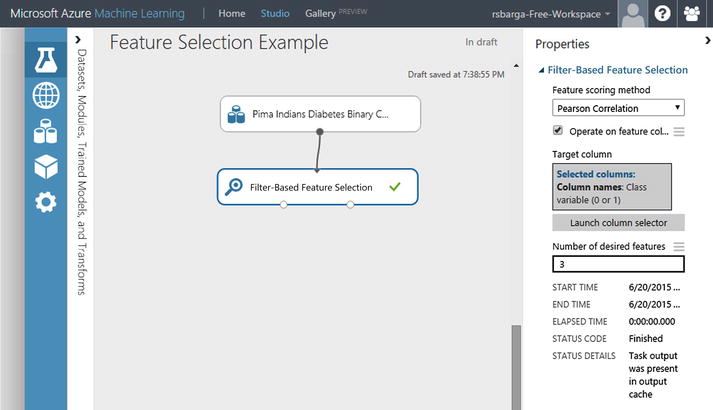
Figure 3-17. Pearson Correlation’s top three features
Figure 3-18 shows the resulting dataset. Each feature is scored based on the Pearson Correlation with the target attribute. Features with top scores are kept, namely 1) plasma glucose, 2) body mass index, and 3) age.

Figure 3-18. Top three features by Pearson Correlation
The corresponding scores of the selected features are shown in Figure 3-19. Plasma glucose has a Pearson correlation of 0.66581, body mass a Pearson correlation of 0.292695, and age is 0.238356.

Figure 3-19. Pearson Correlation feature correlation measures
By applying this Filter Based Feature Selection module, three out of eight features are selected because they have the most correlated features with the target variable Class Variable, based on the scoring method Pearson Correlation.
Feature Engineering
Feature engineering is the process where you can establish the representation of data in the context of the modeling approach you have selected and imbue your domain expertise and understanding of the problem. It is the process of transforming raw data into features that better represent the underlying problem to the machine learning algorithm, resulting in improved model accuracy on unseen data. It is the foundational skill in data science. And, where running effective experiments is one aspect of the science in data science, then feature engineering is the art that draws upon your creativity and experience. If you are seeking inspiration, review the forum on Kaggle.com in which data scientists describe how they won Kaggle data science contests; it’s a valuable source of information.
Feature engineering can be a complex task that may involve running experiments to try different approaches. Features may be simple, such as “bag of words,” a popular technique in text processing, or may be based on your understanding of the domain. Knowledge of the domain in which a problem lies is immensely valuable and irreplaceable. It provides an in-depth understanding of your data and the factors influencing your analytic goal. Many times domain knowledge is a key differentiator to your success. Let’s look at an illustrative example.
Assume you are attempting to build a model that will inform you whether a package should be sent via ground transportation or sent via air travel. Your training set consists of the latitude and longitude for the source and destination, illustrated in Figure 3-20, along with the classification for whether the package should be sent via ground transportation (drivable) or air travel (not drivable).

Figure 3-20. Sample dataset to drive or fly a package
It would be exceptionally difficult for a machine learning algorithm to learn the relationships between these four attributes and the class label. But even if the machine learning algorithm doesn’t have knowledge of latitude and longitude, you do, so why not use this to engineer a feature that carries information the machine learning algorithm can use? If you simply compute the distance between the source and destination, as illustrated in Figure 3-21, and use this as the feature, any linear machine learning algorithm could learn this classification in short order.

Figure 3-21. A new feature, distance between destination
Feature engineering is when you use your knowledge about the data to create fields that make a machine learning algorithm work better. Engineered features that enhance the training provide information that better differentiates the patterns in the data. You should strive to add a feature that provides additional information that is not clearly captured or easily apparent in the original or existing feature set. The modules in the Manipulation drawer of Azure ML, under the Data Transformation category, shown in Figure 3-22, will enable you to create these new features.

Figure 3-22. Data manipulation modules in Azure ML
Here are some considerations in feature engineering to help you get started:
- Decompose Categorical Attributes: Suppose you have a categorical attribute, like Item_Color, that can be Red, Blue, or Unknown. Unknown may be special, but to a model, it looks like just another color choice. It might be beneficial to better expose this information. You could create a new binary feature called Has_Color and assign it a value of 1 when an item has a color and 0 when the color is unknown. Going a step further, you could create a binary feature for each value that Item_Color has. This would be three binary attributes: Is_Red, Is_Blue, and Is_Unknown. These additional features could be used instead of the Item_Color feature (if you wanted to try a simpler linear model) or in addition to it (if you wanted to get more out of something like a decision tree).
- Decompose Date-Time: A date-time contains a lot of information that can be difficult for a model to take advantage of in its native form, such as ISO 8601 (i.e. 2014-09-20T20:45:40Z). If you suspect that there are relationships between times and other attributes, you can decompose a date-time into constituent parts that may allow models to discover and exploit these relationships. For example, you may suspect that there is a relationship between the time of day and other attributes. You could create a new numerical feature called Hour_of_Day for the hour that might help a regression model. You could create a new ordinal feature called Part_Of_Day with four values: 1) morning, 2) midday, 3) afternoon, and 4) night, with hour boundaries you think are relevant. You can use similar approaches to pick out time-of-week relationships, time-of-month relationships, and various structures of seasonality across a year.
- Reframe Numerical Quantities: Your data is very likely to contain quantities that can be reframed to better expose relevant structures. This may be a transform into a new unit or the decomposition of a rate into time and amount components. You may have a quantity like a weight, distance, or timing. A linear transform may be useful to regression and other scale dependent methods.
Great things happen in machine learning when human and machine work together, combining your knowledge of how to create relevant feature from the data with the machine learning algorithm talent for optimizing.
You may encounter a numeric feature in your dataset with a range of continuous numbers, with too many values to model; in visualizing the dataset, the first indication of this is the feature has a large number of unique values. In many cases, the relationship between such a numeric feature and the class label is not linear (the feature value does not increase or decrease monotonically with the class label). In such cases, you should consider binning the continuous values into groups using a technique known as quantization where each bin represents a different range of the numeric feature. Each categorical feature (bin) can then be modeled as having its own linear relationship with the class label. For example, say you know that the continuous numeric feature called mobile minutes used is not linearly correlated with the likelihood for a customer to churn. You can bin the numeric feature mobile minutes used into a categorical feature that might be able to capture the relationship with the class label (churn) more accurately. The optimum number of bins is dependent on characteristics of the variable and its relationship to the target, and this is best determined through experimentation.
The Quantize Data module in Azure ML Studio provides this capability out-of-the-box; it supports a user-defined number of buckets and provides multiple quantile normalization functions, which we describe below. In addition, the module can optionally append the bin assignment to the dataset, replacing the dataset value or returning a dataset that contains only the resulting bins.
During binning (or quantization), each value in a column is mapped to a bin by comparing its value against the values of bin edges. For example, if the value is 1.5 and the bin edges are 1, 2, and 3, the element would be mapped to bin number 2. Value 0.5 would be mapped to bin number 1 (the underflow bin), and value 3.5 would be mapped to bin number 4 (the overflow bin).
Azure Machine Learning provides several different algorithms for determining the bin edges and assigning numbers to bins:
- Entropy MDL: The entropy model for binning calculates an information score that indicates how useful a particular bin range might be in the predictive model.
- Quantiles: The quantile method assigns values to bins based on percentile ranks.
- Equal Width: With this option, you specify the total number of bins. The values from the data column will be placed in the bins such that each bin has the same interval between start and end values. As a result, some bins might have more values if data is clumped around a certain point.
- Custom Edges: You can specify the values that begin each bin. The edge value is always the lower boundary of the bin.
- Equal Width with Custom Start and Stop: This method is like the Equal Width option, but you can specify both lower and upper bin boundaries.
Because there are so many options, each customizable, you need to experiment with the different methods and values to identity the optimal binning strategy for your data.
For this example, you will use the public dataset Forest Fires Data, provided by the UCI Machine Learning repository and available in Azure ML Studio. The dataset is intended to be used to predict the burn area of forest fires in the northeast region of Portugal by using meteorological and other data. One feature in this dataset is DC, a drought code index, which ranges from 7.9 to 860.6 and there are a large number of unique values. You will bin the DC values into five bins.
Pull the dataset into your experiment; pull the Quantize Data module onto the pallete; connect the dataset to the module; click the Quantize Data module; select the quantiles binning mode and specify five bins, identify the DC column as the target for binning; and select the option to add this new binned feature to the dataset, as illustrated in Figure 3-23.

Figure 3-23. Quantize Data module in Azure ML
Once complete, you can visualize the resulting dataset, illustrated in Figure 3-24, and scroll to the newly created column DC_quantized and select that column, at which point you can see that you have created a new categorical variable with five unique values corresponding to the bins.

Figure 3-24. Display of binned data for the DC feature
You can apply a different quantization rule to different columns by chaining together multiple instances of the Quantize Data module, and in each instance, selecting a subset of columns to quantize.
If the column to bin (quantize) is sparse, then the bin index offset (quantile offset) is used when the resulting column is populated. The offset is chosen so that sparse 0 always goes to bin with index 0 (quantile with value 0). As a result, sparse zeros are propagated from the input to output column. All NaNs and missing values are propagated from the input to output column. The only exception is the case when the module returns quantile indexes, in which case all NaNs are promoted to missing values.
The “curse of dimensionality” is one of the more important results in machine learning. Much has been written on this phenomenon, but it can take years of practice to appreciate its true implications. Classification methods are subject to the implications of the curse of dimensionality. The basic intuition is that as the number of data dimensions increases, it becomes more difficult to create a model that generalizes and applies well to data not in the training set. This difficulty is often hard to overcome in real-world settings. As a result, you must work to minimize the number of dimensions. This requires a combination of clever feature engineering and use of dimensionality reduction techniques. There is no magical potion to cure the curse of dimensionality, but there is Principal Components Analysis (PCA).
In many real applications, you will be confronted with various types of high-dimensional data. The goal of dimensionality reduction is to convert this data into a lower dimensional representation, such that uninformative variance in the data is discarded and the lower dimensional data is more amenable to processing by machine learning algorithms. PCA is a statistical procedure that uses a mathematical transformation to convert your training dataset into a set of values of linearly uncorrelated variables called principal components. The number of principal components is less than or equal to the number of original attributes in your training set. The transformation is defined in such a way that the first principal component has the largest possible variance and accounts for as much of the variability in the data as possible, and each succeeding component in turn has the highest variance possible under the constraint that it is orthogonal to (uncorrelated with) the preceding components. The principal components are orthogonal because they are the eigenvectors of the covariance matrix, which is symmetric. PCA is sensitive to the relative scaling of the original variables, so your dataset must be normalized prior to PCA for good results. You can view PCA as a data-mining technique. The high-dimensional data is replaced by its projection onto the most important axes. These axes are the ones corresponding to the largest eigenvalues. Thus, the original data is approximated by data that has many fewer dimensions and that summarizes well the original data.
To illustrate, you will use the sample dataset MNIST Train 60k 28x28, which contains 60,000 examples of handwritten digits that have been size-normalized and centered in a fixed-size image 28x28 pixels; as a result there are 784 attributes (see Figure 3-25).
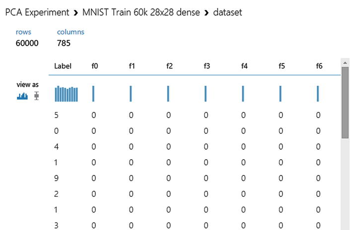
Figure 3-25. Display of MNIST dataset prior to PCA
You will use the Principal Component Analysis module in Azure ML Studio, which is found in the Scale and Reduce drawer under the Data Transformation category (see Figure 3-26).

Figure 3-26. The Principal Componet Analysis module
To configure the Principal Component Analysis module, you simply need to connect the dataset, then select the columns on which the PCA analysis is to operate, and specify the number of dimensions the reduced dataset is to have. In selecting columns over which PCA is to operate, ensure that you do not select the class label and do not select features highly valuable for classification, perhaps identified through Pearson Correlation or identified through your own experiments. You should never use the class label to create a feature, nor should you lose highly valuable feature(s). Select the remaining undifferentiated features as input for PCA to operate on.
For illustration purposes, you will select 15 principal components to represent the datasets. Once complete, you can visualize these principal components, as illustrated in Figure 3-27, from the left output pin and then use this reduced dataset for machine learning.

Figure 3-27. Fifteen principal components of the dataset after PCA
Summary
In this chapter, we described different methods by which input data can be processed using Azure ML to prepare for machine learning methods and improve the quality of the resulting model. We covered cleaning and processing your training data, including how to deal with missing data, class imbalance, and data normalization, followed by selecting and engineering features to increase the efficiency of the machine learning algorithm you have selected. Data preparation is a large subject that can involve a lot of iterations, experiments, and analysis. You will spend considerable time and effort in this phase of building a predictive model. But getting proficient in data preparation will make you a master at building predictive models. For now, consider the steps described in this chapter when preparing data and always be looking for ways to transform data and impart your insights on the data and your understanding of the domain so the learning algorithm can do its magic.