![]()
Building Customer Propensity Models
This chapter provides a practical guide for building machine learning models. It focuses on buyer propensity models, showing how to apply the data science process to this business problem. Through a step-by-step guide, this chapter will explain how to apply key concepts and leverage the capabilities of Microsoft Azure Machine Learning for propensity modeling.
Imagine that you are a marketing manager of a large bike manufacturer. You have to run a mailing campaign to entice more customers to buy your bikes. You have a limited budget and your management wants you to maximize return on investment (ROI). So the goal of your mailing campaign is to find the best prospective customers who will buy your bikes.
With an unlimited budget the task is easy: you can simply buy lists and mail everyone. However, this brute force approach is wasteful and will yield a limited ROI since it will simply amount to junk mail for most recipients. It is very unlikely that you will meet your goals with this untargeted approach since it will lead to very low response rates.
A better approach is to use predictive analytics to target the best potential customers for your bikes, such as customers who are most likely to buy bikes. This class of predictive analytics is called buyer propensity models or customer targeting models. With this approach, you build models that predict the likelihood that a prospective customer will respond to your mailing campaign.
In this chapter, we will show you how to build this class of models in Azure Machine Learning. With the finished model you will score prospective customers and only send mail to those who are most likely to respond to your campaign, those prospective customers with the highest probability of response. We will also show how you can maximize the ROI on your limited marketing budget.
![]() Note You will need to have an account on Azure Machine Learning. Refer to Chapter 2 for instructions to set up your new account if you do not have one yet.
Note You will need to have an account on Azure Machine Learning. Refer to Chapter 2 for instructions to set up your new account if you do not have one yet.
vides a practical guide for building machine leaThis model we will discuss in this chapter is published as the Buyer Propensity Model in the Azure Machine Learning Gallery. You can access the Gallery at http://gallery.azureml.net/. We highly recommend downloading this experiment to your workspace in Azure Machine Learning.
As you saw in Chapter 1, the data science process typically follows these five steps.
- Define the business problem.
- Data acquisition and preparation.
- Model development.
- Model deployment.
- Monitor model performance.
Having defined the business problem, your next step is to reframe it as an analytics problem. In this case, your job is to build a statistical model to predict the probability that a person will respond to a mailing campaign, using their demographic data as predictors. Let’s now explore the rest of the process, namely data acquisition and preparation, model development, and evaluation, in the rest of this chapter.
Data Acquisition and Preparation
To build the buyer propensity models you will need data from several sources:
- Sales transactions data from your organization’s data warehouse. This has useful data about your customers including those who bought bikes in the past.
- Data from previous marketing campaigns that shows which customers were targeted and whether they responded or not.
- Purchased consumer lists from third-party vendors augmented by demographic data from Equifax, Experian, or similar providers. This will have prospective customers to target for the campaign.
This experiment uses the Buyer Propensity Model in the Gallery and includes the required dataset. Be sure to download the model from the Gallery at http://gallery.azureml.net/. This model comes with the required dataset for the experiment.
Data Analysis
With the data loaded in Azure Machine Learning, the next step is to do pre-processing to prepare the data for modeling. It is always very useful to visualize the data as part of this process. You can visualize the Bike Buyer dataset by selecting BikeBuyerWithLocation.csv from the Saved Datasets menu item in the left pane. When you hover over the small circle at the bottom of the dataset module, a menu opens, giving you two options: Download or Visualize. See Figure 7-1 for details. If you choose the Download option, you can save the data to your local machine and open it in Excel to view the data. Alternatively, you can visualize the data in Azure Machine Learning by choosing the Visualize option.

Figure 7-1. Two options for visualizing data in Azure Machine Learning
If you choose the Visualize option, the data will be rendered in a new window, as shown in Figure 7-2. Figure 7-2 shows the BikeBuyerWithLocation.csv dataset that has historical sales data on all customers. You can see that this dataset has 10,000 rows and 18 columns, including demographic variables such as marital status, gender, yearly income, number of children, occupation, age, etc. Other variables include home ownership status, number of cars, and commute distance. The last column, called Bike Buyer, is very important since it shows which customers bought bikes from your stores in the past.
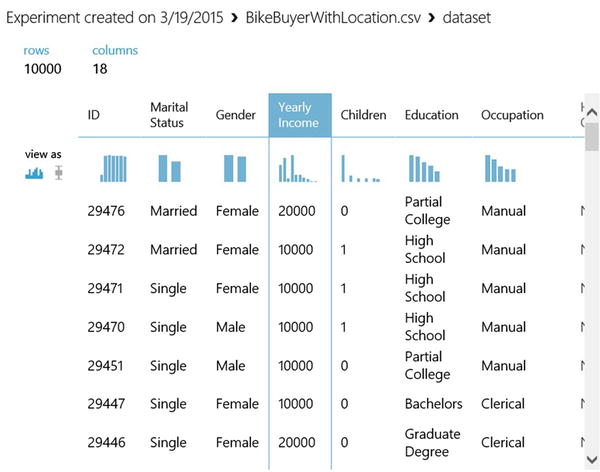
Figure 7-2. Visualizing the Bike Buyer dataset in Azure Machine Learning
Figure 7-2 also shows the data type of each variable and the number of missing values. By scrolling down you will see a sample of the dataset showing actual values.
The first row at the top of the feature list is a set of thumbnails showing the distribution of each variable. You can see the full distribution by clicking the thumbnail. For instance, if you click the thumbnail above the Yearly Income column, Azure Machine Learning opens the full histogram in the window on the top left of the screen; this is shown in Figure 7-3. This histogram shows you the distribution of the selected variable, and you can start to think about the ways in which it can be used in your model. For instance, in Figure 7-3, you can see clearly that yearly income is not drawn from a normal distribution. If anything, it looks more like a lognormal distribution. This is important because some predictive algorithms, such as Linear Regression, assume that the data is normally distributed. To use such algorithms you will have to transform this variable. We will explain later how to transform this yearly income variable to a log scale.

Figure 7-3. A histogram of yearly income
Another useful visualization tool in Azure Machine Learning is the box-and-whisker plot that is widely used in statistics. You can visualize your continuous variables with a box-and-whisker plot instead of a histogram. To do this, select the box-and-whisker icon in the first thumbnail labeled view as.
Figure 7-4 shows yearly income as a box-and-whisker plot instead of a histogram. On this plot, the y-value at the bottom of the box is the 25th percentile and the value at the top of the box is the 75th percentile. The line inside the box is the median yearly income. The box-and-whisker plot shows outliers much more clearly: in Figure 7-4 the outliers are shown as a single dot above the edge of the whisker. How are outliers determined? A rule of thumb is that any point that lies above or below 1.5*IQR is an outlier. IQR is the interquartile range measured as the 75th percentile - 25th percentile. On the box-and-whisker plot, IQR is the distance between the top and bottom of the box. Since you don’t plan to drop the outliers in this case, a good alternative is to transform yearly income with the log function. The result is shown in Figure 7-5. Note that after the log transformation the single dot disappears from the box-and-whisker plot. This means the extreme yearly incomes no longer appear as outliers. This is a great way to include valid extreme values in your model. This treatment can also increase the power of your predictive model.
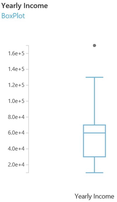
Figure 7-4. A box-and-whisker plot of yearly income

Figure 7-5. A box-and-whisker plot of the log of yearly income
How can you transform yearly income to logs? Use the module named Apply Math Operation found under the Statistical Functions menu in the left pane of Azure Machine Learning. Select Yearly Income as the column set and Log10 from Basic Math Function. This is shown in Figure 7-6.

Figure 7-6. Transforming yearly income to log10 scale
More Data Treatment
In addition to visualization and data transformation, Azure Machine Learning provides many other options for data preprocessing. The menu on the left pane has many modules organized by function. Many of these modules are useful for data preprocessing.
The Data Format Conversions item has five different modules for converting data formats. For instance, the module named Convert to CSV converts data from different types, such as Dataset, DataTableDotNet, etc., to CSV format.
The Data Transformation item in the menu has subcategories for data filtering, data manipulation, learning with counts, data sampling, and scaling. The menu item named Statistical Functions also has many relevant modules for data preprocessing.
Figure 7-7 shows some of these modules in action. The Join module (found under the Manipulation subcategory) enables you to join datasets. For instance, if there was a second relevant data for the propensity model, you could use the Join module to join it with the Bike Buyer dataset.
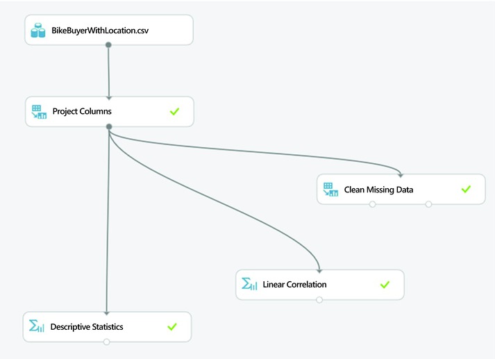
Figure 7-7. More options for data preparation
The module named Descriptive Statistics shows descriptive statistics of your dataset. For example, if you click the small circle at the bottom of this module, Azure Machine Learning shows descriptive statistics such as mean, median, standard deviation, skewness kurtosis, etc. of the Bike Buyer dataset. It also shows the number of missing values in each variable.
You can resolve missing values with the module named Clean Missing Data. Like any other module in Azure Machine Learning, when you select this module, its parameters are shown on the right pane. This module allows you to handle missing values in a number of ways. First, you can remove columns with missing values. By default, the tool keeps all variables with missing values. Second, you can replace missing values with a hard-coded value in the parameter box. By default, the tool will replace any missing values with the number 0. Alternatively, you can replace missing values with the mean, median, or mode of the given variable.
The Linear Correlation module is also useful for computing the correlation of variables in your dataset. If you click the small circle at the bottom of the Linear Correlation module, and then select Visualize, the tool displays a correlation matrix. In this matrix, you can see the pairwise correlation of all variables in the dataset. This module calculates the Pearson correlation coefficient. Other correlation types, such as Spearman, are not supported by this module. In addition, note that this module only calculates the correlation for numeric variables. For all non-numeric variables, such as categorical variables, the module shows NaN.
Feature Selection
Feature selection is a very important part of data pre-processing. Also known as variable selection, this is the process of finding the right variables to use in the predictive model. It is particularly critical when dealing with large datasets involving hundreds of variables. Throwing too many variables at a predictive model increases the risk of over-fitting where the model memorizes the data but cannot generalize when tested with unseen data. With too many variables it is also harder to build explainable models. In addition, too many variables increases the chance of collinearity, which is when two or more variables are inter-correlated. Through feature selection you can find the most influential variables for the prediction. Since the Bike Buyer dataset only has 18 variables, you could skip this step. However, let’s see how to do feature selection in Azure Machine Learning because it is very important for large datasets.
To do feature selection in Azure Machine Learning, drag the module named Filter Based Feature Selection from the list of modules in the left pane. You can find this module by searching for it in the search box or by opening the Feature Selection category. To use this module, you need to connect it to a dataset as the input. Figure 7-8 shows it in use as a feature selection for the Bike Buyer dataset. Before running the experiment, use the Launch column selector in the right pane to define the target variable for prediction. In this case, choose the column Bike Buyer as the target since this is what you have to predict.
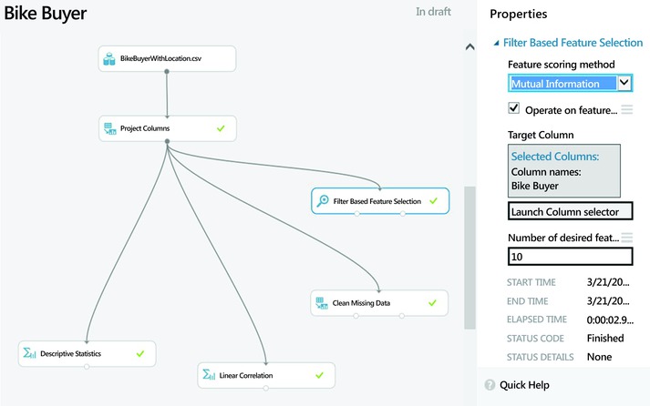
Figure 7-8. Feature selection in Azure Machine Learning
You also need to choose the scoring method that will be used for feature selection. Azure Machine Learning offers the following options for scoring:
- Pearson correlation
- Mutual information
- Kendall correlation
- Spearman correlation
- Chi-Squared
- Fischer score
- Count-based
The correlation methods find the set of variables that are highly correlated with the output, but also have low correlation among them. The correlation is calculated using Pearson, Kendall, or Spearman correlation coefficients, depending on the option you choose.
The Fisher score uses the Fisher criterion from statistics to rank variables. In contrast, the mutual information option is an information theoretic approach that uses mutual information to rank variables. Mutual information measures the dependence between the probability density of each variable and that of the outcome variable.
Finally, the Chi-Squared option selects the best features using a test for independence; in other words, it tests whether each variable is independent of the outcome variable. It then ranks the variables based on the results of the Chi-Squared test.
![]() Note See http://en.wikipedia.org/wiki/Feature_selection#Correlation_feature_selection or http://jmlr.org/papers/volume3/guyon03a/guyon03a.pdf for more information on feature selection strategies.
Note See http://en.wikipedia.org/wiki/Feature_selection#Correlation_feature_selection or http://jmlr.org/papers/volume3/guyon03a/guyon03a.pdf for more information on feature selection strategies.
When you run the experiment, the Filter-Based Feature Selection module produces two outputs. First, the filtered dataset lists the actual data for the most important variables. Second, the module shows a list of the variables by importance with the scores for each selected variable. Figure 7-9 shows the results of the features. In this case, you set the number of features to five and used Chi-Squared for scoring. Figure 7-9 shows six columns since the results set includes the target variable (Bike Buyer) plus the top five variables (ZIP Code, City, Age, Cars, and Commute Distance). The last row of the results shows the score for each selected variable. Since the variables are ranked, the scores decrease from left to right.

Figure 7-9. The results of feature selection for the Bike Buyer dataset with the top variables
Note that the selected variables will vary based on the scoring method. So it is worth experimenting with different scoring methods before choosing the final set of variables. The Chi-Squared and Mutual Information scoring methods produced a similar ranking of variables for the BikeBuyerWithLocation dataset.
Training the Model
Once the data pre-processing is done, you are ready to train the predictive model. The first step is to choose the right type of algorithm for the problem at hand. For a propensity model, you will need a classification algorithm since your target variable is Boolean. The goal of your model is to predict whether a prospective customer will buy your bikes or not. Hence, it is a great example of a binary classification problem. As you saw in Chapters 1 and 6, classification algorithms use supervised learning for training. The training data has known outcomes for each feature set; in other words, each row in the historical data has the Bike Buyer field that shows whether the customer bought a bike or not in the past. The Bike Buyer field is the dependent variable (also known as the response variable) that you have to predict. The input variables are the predictors (also known as independent variables or regressors) such as age, cars, commuting distance, education, region, etc. If you use logistic regression, your model can be represented as

where β0 is a constant which is the intercept of the regression line; β1, β2, β3, etc. are the coefficients of the independent variables; and ε is the error that represents the variability in the data that is not explained by the selected variables. In this equation, Bike Buyer is the probability that a customer will buy a bike, given his or her input data. Its value ranges from 0 to 1. Age, cars, and Communte_distance are the predictor variables.
During training, you present both the input and the output variables to the selected algorithm. At each learning iteration, the algorithm will try to predict the known outcome using the current weights that have been learned so far. Initially, the prediction error is high because the weights have not been learned adequately. In subsequent iterations, the algorithm will adjust its weights to reduce the predictive error to the minimum. Note that each algorithm uses a different strategy to adjust the weights such that predictive error can be reduced. See Chapter 6 for more details on the statistical and machine learning algorithms in Azure Machine Learning.
Azure Machine Learning offers a wide range of classification algorithms from multiclass decision forest and jungle to two-class logistic regression, neural network, and support vector machines. For a customer propensity model, a two-class classification algorithm is appropriate since the response variable (Bike Buyer) has two classes. So you can use any of the two-class algorithms under the Classification subcategory. To see the full list of algorithms, expand the category named Machine Learning in the left pane. Select Initialize Model from this menu. Expand the subcategory named Classification and Azure Machine Learning will list all available classification algorithms. We recommend experimenting with a few of these algorithms until you find the best one for the job. Figure 7-10 shows a simple but complete experiment for the bike buyer propensity model.
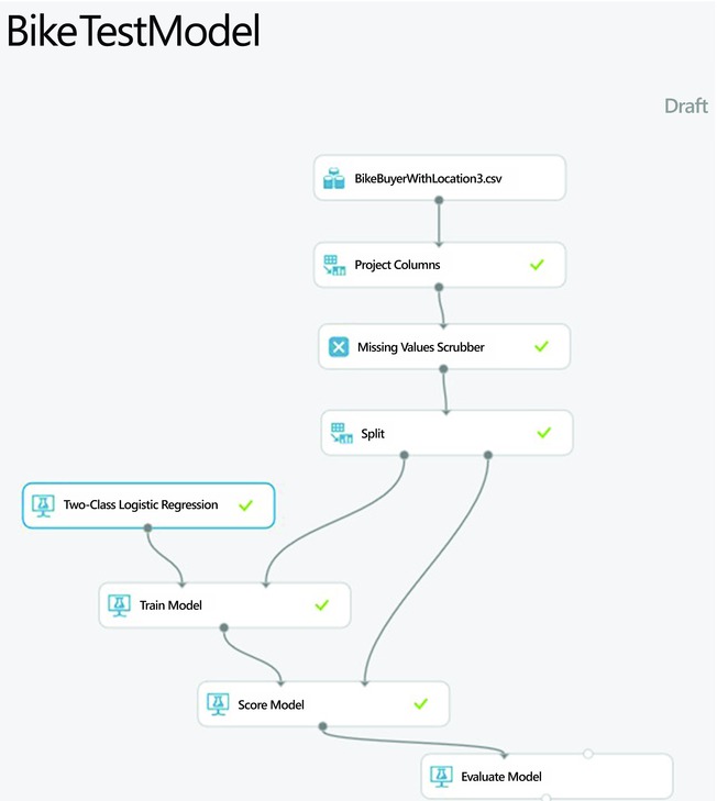
Figure 7-10. A simple experiment for customer propensity modeling
The Project Columns module simply excludes the columns named ID, latitude, longitude, and country since they are not relevant to the model. Use the Clean Missing Data module to handle missing values, as discussed in the previous section. The Split module splits the data into two samples, one for training and the second for testing. In this experiment, we reserved 70% of the data for training and the remaining 30% for testing. This is one strategy commonly used to avoid over-fitting. Without the test sample, the model can easily memorize the data and noise. In that case, it will show very high accuracy for the training data but will perform poorly when tested with unseen data in production. Another good strategy to avoid over-fitting is cross-validation; this will be discussed later in this chapter.
Two modules are used for training the predictive model: the Two-Class Logistic Regression module implements the logistic regression algorithm, while the Train Model actually trains the learning algorithm. The Train Model module trains any suitable algorithm to which it is connected. So it can be used to train any of the classification modules discussed earlier, such as Two-Class Boosted Decision Tree, Two-Class Decision Forest, Two-Class Decision Jungle, Two-Class Neural Network, or Two-Class Support Vector Machine.
Model Testing and Validation
After the model is trained, the next step is to test it with a hold-out sample to avoid over-fitting. In this example, your test set is the 30% sample you created earlier with the Split module. Figure 7-10 shows how to use the module named Score Model to test the trained model.
Finally, the module named Evaluate Model is used to evaluate the performance of the model. Figure 7-10 shows how to use this module to evaluate the model’s performance on the test sample. The next section also provides more details on model evaluation.
As mentioned earlier, a strategy to avoid over-fitting is cross-validation where you use not just two, but multiple samples of the data to train and test the model. Azure Machine Learning uses 10-fold validation where the original dataset is split into 10 samples. Figure 7-11 shows a modified experiment that uses cross-validation as well as the train and test set approach. On the right track of the experiment you replace the two modules, Train Model and Score Model, with the Cross Validate Model module. You can check the results of the cross-validation by clicking the small circle on the bottom right side of the Cross Validate Model module. This shows the performance of each of the 10 models.
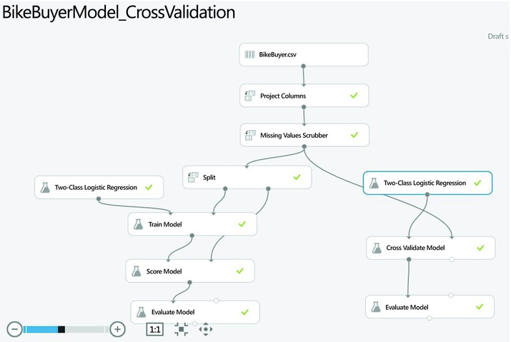
Figure 7-11. A modified experiment with cross-validation
Model Performance
The Evaluate Model module is used to measure the performance of a trained model. This module takes two datasets as inputs. The first is a scored dataset from a tested model. The second is an optional dataset for comparison.
After running the experiment you can check your model’s performance by clicking the small circle at the bottom of the module Evaluate Model. This module provides the following metrics to measure the performance of a classification model such as the propensity model:
- The Receiver Operating Curve (ROC) curve plots the rate of true positives to false positives.
- The Lift curve (also known as the Gains curve) plots the number of true positives vs. the positive rate. This is popular in marketing.
- The Precision versus recall chart.
- The Confusion matrix shows type I and II errors.
Figure 7-12 shows the ROC curve for the propensity model you built earlier. The ROC curve visually shows the performance of a predictive binary classification model. The diagonal line from (0,0) to (1,1) on the chart shows the performance of random guessing; so if you randomly selected who to target, your response would be on this diagonal line. A good predictive model should do much better than random guesses. Hence, on the ROC curve, a good model should fall above the diagonal line. The ideal model that is 100% accurate will have a vertical line from (0,0) to (0,1), followed by a horizontal line from (0,1) to (1,1).
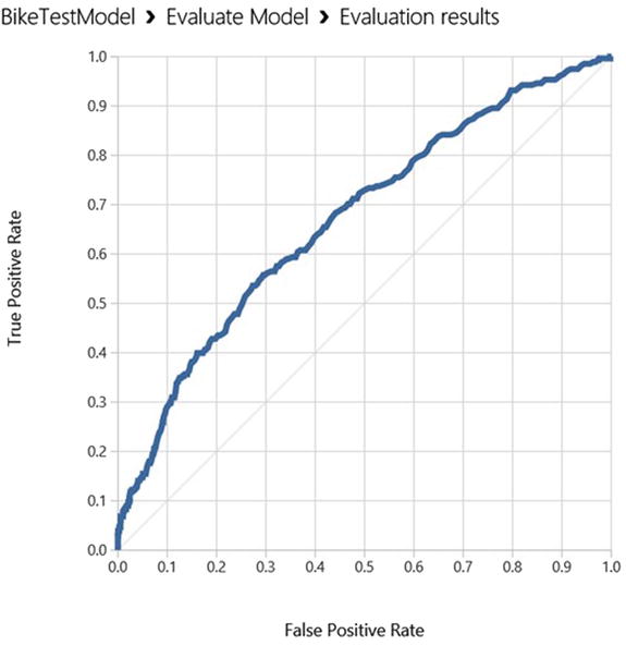
Figure 7-12. The ROC curve for the customer propensity model
One way to measure the performance from the ROC curve is to measure the area under the curve (AUC). The higher the area under the curve, the better the model’s performance. The ideal model will have an AUC of 1.0, while a random guess will have an AUC of 0.5. The logistic regression model you built has an AUC of 0.67, which is much better than a random guess!
Figure 7-13 shows the confusion matrix for the logistic regression model you built earlier. The confusion matrix has four cells, namely
- True positives: These are cases where the customer actually bought a bike and the model correctly predicts this.
- True negatives: In the historical dataset these customers did not buy bikes, and the model correctly predicts that they would not buy.
- False positives: In this case, the model incorrectly predicts that the customer would buy a bike when in fact they did not. This is commonly referred to as a Type I error. The logistic regression you built had no false positives.
- False negatives: Here the model incorrectly predicts that the customer would not buy a bike when in real life the customer did buy one. This is also known as a Type II error. The logistic regression model had up to 270 false negatives.
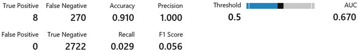
Figure 7-13. Confusion matrix and more performance metrics
It is worth noting that when we test the model, its output is the predicted probabilities for each example. So we need to set a threshold probability to determine the predicted class. By default, Azure Machine Learning uses a threshold of 0.5. Hence if the predicted probability is greater than 0.5, the predicted class is set to 1, and zero otherwise. However, 0.5 in this case is arbitrary. A better approach is to set the probability threshold at the point where the sensitivity equals the specificity. Sensitivity and specificity are discussed in detail at the end of this chapter.
In addition, Figure 7-13 also shows the accuracy, precision, and recall of the model. Here are the formulas for these metrics.
Precision is the rate of true positives in the results.
Recall is the percentage of buyers that the model identifies and is measured as
Finally, accuracy measures how well the model correctly identifies buyers and non-buyers, as in
where tp = true positive, tn = true negative, fp = false positive, and fn = false negative.
You can also compare the performance of two models on a single ROC chart. As an example, let’s modify the experiment in Figure 7-11 to use the Two-Class Boosted Decision tree module as the second trainer instead of the Two-Class Logistic Regression module. Now your experiment has two different classifiers, the Two-Class Logistic Regression on the left branch and the Two-Class Boosted Decision Tree on the right branch. You connect the scored datasets from both models into the same Evaluate Model module. The updated experiment is shown in Figure 7-14 and the results are illustrated in Figure 7-15 and Figure 7-16. On this chart, the curve labeled scored dataset to compare is the ROC curve for the Two-Class Boosted Decision Tree model, while the one labeled scored dataset is the one for the Two-Class Logistic Regression. You can see clearly that the boosted decision tree model outperforms the logistic regression model, as it has a higher lift over the diagonal line for random guesses. The area under the curve (AUC) for the boosted decision tree model is 0.849, which is better than that of the logistic regression model, which was 0.67, as you saw earlier.

Figure 7-14. Updated experiment that compares two algorithms, Logistic Regression and Boosted Decision Trees
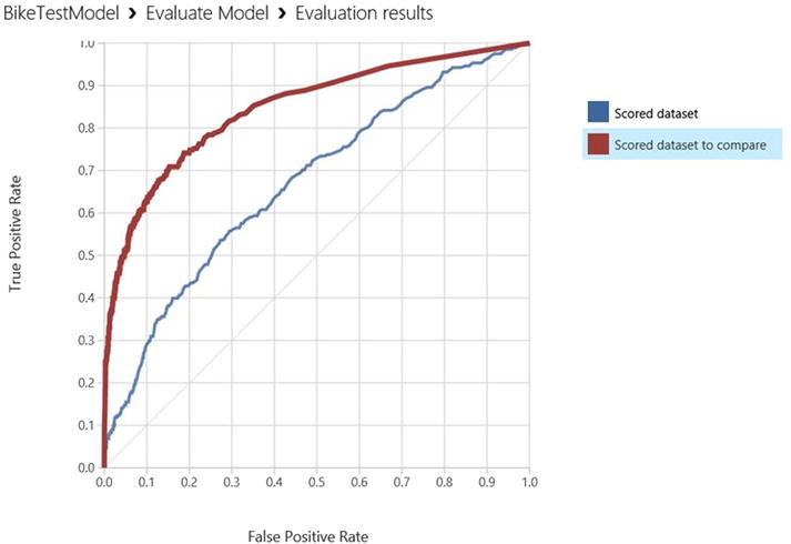
Figure 7-15. ROC curves comparing the performance of two predictive models, the boosted decision tree vs. logistic regression
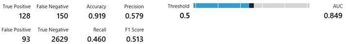
Figure 7-16. Results of the Boosted Decision Tree model
Prioritizing Evaluation Metrics
It is clear that the Boosted Decision Tree model is better than that of Logistic Regression because the Boosted Decision Tree model has higher area under the curve (AUC) and accuracy than the Logistic Regression model. So it makes sense to use the Boosted Decision Tree model for this customer targeting exercise. For each model you have seen that Azure Machine Learning provides several evaluation metrics such as accuracy, precision, recall, and the F1 score. Which of these is the most important? It is tempting to focus on accuracy as the most important variable. After all, the accuracy measures the model’s ability to correctly classify test cases. In general, the higher the accuracy, the lower the error rates. So it seems intuitive to prioritize this metric for assessing the performance of our models.
However, accuracy alone can be misleading. For most buyer propensity models, accuracy is not the right performance to prioritize because of class imbalance. In this example, the BikeBuyerWithLocation dataset has only 1,000 customers who bought bikes, out of a total of 10,000 customers. So a naïve model that predicts 0 for all prospects will have an accuracy of 90%, even though it would incorrectly classify all the customers who actually bought bikes. This is due to the prevalence of one class in the dataset since the majority of customers did not buy bikes.
To avoid this trap, you need to check the sensitivity and specificity of your model before deploying it in production. Sensitivity measures the model’s ability to correctly identify the target of interest. In this case, sensitivity measures how well a model will predict those who bought bikes. Sensitivity can be measured as follows:

In contrast, specificity measures a model’s ability to correctly identify negative cases. In this example, it measures how well a model will predict which customers will not buy bikes. Specificity is given by


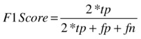
The ideal model would have 100% sensitivity (it would perfectly predict who will buy bikes) and 100% specificity (it would perfectly predict who will not buy bikes). However, this is not possible because each model has a theoretical error limit, also known as the Bayes Error rate, which rules out this possibility. So for most practical purposes we have to make a tradeoff between sensitivity and specificity. This is why the F1 score is important. The F1 score is the harmonic mean of sensitivity and specificity. A good model that balances sensitivity and specificity will have a higher F1 score. The F1 score is given by
From the results of the two models, you see that the Boosted Decision Tree model has an F1 score of 0.513 while that of the Logistic Regression model is only 0.056, despite a perfect precision of 1.0! This is yet another reason why the Boosted Decision Tree model is better than the one based on Logistic Regression.
One final factor to consider is explainability. If your stakeholders simply want the most accurate model and are not too concerned about how it works, then the Boosted Decision Tree model is better. However, if your stakeholders want to explain predictions from the model, then a Boosted Decision Tree may not be as desirable because its results are harder to explain. Since it is an ensemble model, its prediction for each customer comes from several trees. So it is harder to explain what variables contribute to the prediction for a single customer. This makes the Boosted Decision Tree a black box. So if the stakeholder needs to explain the results of each prediction, the Logistic Regression model is better suited since you can obtain the important factors from the variable weights (the coefficients β1, β2, β3, etc.) in the Logistic Regression equation. The weights have to be interpreted with care especially if the scale of some of the variables is much higher than that of the rest. In general, the weights are easier to interpret if the variables are either binary or normalized. In addition, you need to check the p-values to find the variables that are statistically significant. Typically you may reject any variables whose p-values are greater than 5%.
Summary
In this chapter, we provided a practical guide on how to build buyer propensity models with the Microsoft Azure Machine Learning service. You learned how to perform data pre-processing and analysis, which are critical steps towards understanding the data that you are using to build customer propensity models. With that understanding of the data, you used a two-class logistic regression and a two-class boosted decision tree algorithm to perform classification. You also saw how to evaluate the performance of your models and determine the best one for your application. Finally, we reviewed key performance metrics such as accuracy, precision, recall (also known as sensitivity), specificity, and the F1 score. In this section, you saw why it is naïve to rely on accuracy for classification, and why the F1 score is more appropriate for a buyer propensity model.