“Everything happens to everybody sooner or later if there is time enough.”
ASP.NET Web Forms pages are typically made of a markup template—the ASPX file—and a back-end class—the code-behind class. In the ASPX template, you find literal text mixed with special markup tags (featuring the runat attribute) that identify server controls. In the code-behind class, you insert some request-processing logic—mostly presentation logic. So what’s the role of server controls?
Server controls are components with a declarative and programming interface used to generate a specific piece of HTML markup based on the request and associated presentation logic. As you saw in Chapter 5, anything you place in the ASPX template is mapped to a server control. The ASP.NET runtime then combines the output of all controls and serves the client an HTML response to display in a browser. The programming richness of ASP.NET springs from the wide library of server controls that covers the basic tasks of HTML interaction—for example, collecting text through input tags—as well as more advanced functionalities such as calendaring, menus, tree views, and grid-based data display.
There are two main families of server controls: HTML server controls and Web server controls. HTML server controls are implemented through server-side classes whose programming interface faithfully represents the standard set of attributes for the corresponding HTML tag. Web controls, in turn, are a more abstract library of controls in which adherence of the proposed API to HTML syntax is much less strict. As a result, Web and HTML controls share a large common subset of functionalities and, in spite of a few exceptions, we could say that Web controls, functionally speaking, are a superset of HTML controls. Web controls also feature a richer development environment with a larger set of methods, properties, and events, and they participate more actively in the page life cycle.
Let’s start looking at the generalities of ASP.NET server controls.
All ASP.NET server controls, including HTML and Web controls plus any custom controls you create or download, descend from the Control class. Defined in the System.Web.UI namespace, the class is also the foundation for all ASP.NET pages. The Control class is declared as follows:
public class Control : IComponent, IDisposable, IParserAccessor,
   IUrlResolutionService, IDataBindingsAccessor,
   IControlBuilderAccessor, IControlDesignerAccessor,
   IExpressionsAccessor
The IComponent interface defines the way in which the control interacts with the other components running in the common language runtime (CLR), whereas IDisposable implements the common pattern for releasing managed objects deterministically. Table 6-1 explains the role of the other interfaces that the Control class implements.
Table 6-1. Interfaces Implemented by the Control Class
The IDataBindingsAccessor interface defines a read-only collection—the DataBindings property—that contains all the data bindings for the controls available to Rapid Application Development (RAD) designers such as Microsoft Visual Studio. Note that the collection of data bindings exists only at design time and, as such, is useful only if you write a RAD designer for the control.
The properties of the Control class have no user interface–specific features. The class, in fact, represents the minimum set of functionalities expected from a server control. The list of properties for the Control class is shown in Table 6-2.
Table 6-2. Properties Common to All Server Controls
The Control class is the ideal base class for new controls that have no user interface and don’t require ASP.NET-based style information.
Important
As you can see in the preceding table, ASP.NET 4 still supports themes and skins. These are features through which you can style server controls using a fluent, .NET-based API. All in all, an ASP.NET theme is a superset of a cascading style sheet (CSS) and ultimately works by applying CSS styles to HTML elements being output by controls. Introduced with great pomp and ceremony, ASP.NET themes are today commonly deprecated in favor of plain HTML-level CSS styles.
A server control usually generates a piece of HTML markup. The root HTML element in the markup is always given a unique client-side ID. In ASP.NET 4, the client ID of a control can be generated in a number of different ways that I’ll cover in a moment.
In older versions, the client ID is always generated from the value of the UniqueID property—the truly server-side identifier that ASP.NET generates for each control. In versions of ASP.NET prior to version 4, the content of the ClientID property differs from UniqueID simply in that all occurrences of the dollar symbol ($), if any, are replaced with the underscore (_). Note that dollar symbols in the UniqueID string are possible only if the control belongs to a naming container different from the page.
In turn, ASP.NET generates the value for the UniqueID property based on the value of the ID property that the programmer indicates. If no ID has been specified, ASP.NET autogenerates a name such as _ctlX, where X is a progressive 0-based index. If the control’s naming container is the host page, UniqueID simply takes the value of ID. Otherwise, the value of ID is prefixed with the string representing the naming container and the result is assigned to UniqueID.
What if the returned markup contains multiple elements that need a client ID? The author of the control is responsible for ensuring that any required ID is available and unique. The need for multiple IDs arises when multiple individual controls are aggregated in a hierarchy. Since its first version, ASP.NET has implemented a built-in algorithm that prevents name conflicts on hierarchies of controls. As an example, think of a DataGrid control where the first cell of each column contains a text box. In your server template for the grid, you put a TextBox control with a given ID. However, that ID is going to be repeated for each row added to the grid.
An ASP.NET control that can contain child controls and is at risk of having conflicting IDs should be created as a naming container—that is, it should implement the INamingContainer (marker) interface. A naming container has an effect on the default algorithm used for ID generation.
Note
A naming container is primarily a control that acts as a container for other controls. In doing so, the naming container generates a sort of virtual namespace so that ASP.NET roots the actual ID of contained controls in the ID of the naming container.
To fully understand the role and importance of naming containers, consider the following example. Imagine you have a composite control, such as a user control, that includes a child control like a button. Entirely wrapped by the user control, the button is not directly accessible by the page code and can’t be given a distinct and per-instance ID. In the end, the ID of the button is hard-coded in the outermost control that creates it.
What happens when two or more instances of the composite control are placed on a page? Are you going to have two button child controls with the same ID? This is exactly what will happen unless you configure the composite control to be a naming container. A naming container is taken seriously by ASP.NET when it generates IDs automatically to avoid conflicts.
To see the ASP.NET ID autogeneration mechanism in action, consider the following code fragment. It features an ASP.NET Repeater control—a data-bound control whose content consists of repeating the item template for each object in a bound collection. (Data binding is the topic of Chapter 10.)
<ul>
<asp:Repeater runat="server" ID="Repeater1">
    <ItemTemplate>
        <li><span id="Element">
        <%# DataBinder.Eval(Container.DataItem, "CustomerID") %>
        </span></li>
    </ItemTemplate>
</asp:Repeater>
</ul>
You populate the Repeater control using the following sample code:
protected void Page_Load(object sender, EventArgs e)
{
     // Load some data into the Repeater
     var customerIds = new Object[] {
              new { CustomerID = "ALFKI" },
              new { CustomerID = "ANATR" },
              new { CustomerID = "BOTTM" }
     };
     Repeater1.DataSource = customerIds;
     Repeater1.DataBind();
}
The Repeater then produces the HTML markup shown here:
<ul>
   <li><span id="Element">ALFKI</span></li>
   <li><span id="Element">ANATR</span></li>
   <li><span id="Element">BOTTM</span></li>
</ul>
The <span>’s ID is simply emitted as is for each data bound item. As a result, the page DOM will contain multiple elements with the same ID. This conflict violates the HTML standard but doesn’t prevent a successful page display. However, it will make it hard to script <span> elements if you need to.
In this example, though, the Repeater control doesn’t embed any other ASP.NET control. As a further step, let’s try adding some server controls, instead, in the repeatable template:
<ul>
<asp:Repeater runat="server" ID="Repeater2">
    <ItemTemplate>
        <li><asp:Label runat="server" ID="Element">
        <%# DataBinder.Eval(Container.DataItem, "CustomerID") %>
        </asp:Label></li>
    </ItemTemplate>
</asp:Repeater>
</ul>
Bound to the same data source as in the previous example, the Repeater control for any version of ASP.NET older than version 4 produces a slightly different markup:
<ul>
   <li><span id="Repeater2_ctl00_Element">ALFKI</span></li>
   <li><span id="Repeater2_ctl01_Element">ANATR</span></li>
   <li><span id="Repeater2_ctl02_Element">BOTTM</span></li>
</ul>
Note that if the ASPX markup is hosted by the content placeholder of a master page, the composed ID will be longer because it will be prefixed by the ID of the placeholder too:
ctl00_MainContentPlaceholder_Repeater2_ctl00_ElementIn the client page, each <span> tag now has its own unique ID, and client scripting is much easier. Now if you want to, say, render in blue and bold the <span> element that contains ALFKI, you can add the following script. (The script assumes the jQuery library is being used. I’ll cover the jQuery library in Chapter 21.)
<script type="text/javascript">
    $(document).ready(function () {
        var alfki = $("#ctl00_MainContentPlaceholder_Repeater2_ctl00_Element");
        alfki.css("color", "blue").css("font-weight", "bold");
    });
</script>
This wouldn’t be too bad except that you need to figure out yourself what the actual ID of a bound element is going to be. The autogenerated ID ensures that each ID is unique, but the actual name is not always predictable.
Until ASP.NET 4, you had no way to change the naming algorithm. In ASP.NET 4, you can choose from a few options.
The default algorithm entails that the name of each repeated element be scoped into the naming container. This explains the first token of Repeater1. Note also that controls that are not assigned an explicit ID are given a system-provided progressive ctlXX string. In the previous example, each bound element is wrapped in an implicitly created RepeaterItem control with a ctlXX ID. This explains the progressive ctlXX token. Finally, the common name of the element is appended. Note that what makes two IDs unique is just the presence of implicitly named controls such as the RepeaterItem. In ASP.NET, any data-bound, template-based control follows a similar schema.
As mentioned, in ASP.NET 4 the base Control class features the ClientIDMode property. The property is declared to be of type ClientIDMode—an enumerated type. Table 6-3 lists the feasible values for the property.
Table 6-3. Values in the ClientIDMode Enumeration
The value for the ClientIDMode property can be set at various levels: for individual controls, or for all controls in the page via the @Page directive. Finally, you can even set your preference for all pages in the application by storing the setting in the <pages> section of the web.config file:
<pages ClientIDMode="Predictable">
   ...
</pages>
When the Static option is selected, ASP.NET doesn’t apply any name mangling to the original ID. The ID is emitted without concatenating the IDs of parent naming containers. In the case of repeated templates, however, you end up having multiple IDs in the client page. As mentioned, this violates the HTML standard, but it won’t generate any run-time error in most browsers. The Static option is not a good one to use with iterative, data-bound controls such as GridView, ListView, and list controls.
On the other hand, the Static option is useful when you write user controls devoid of data-bound child controls. Because a user control can be located on different pages and in different container controls, the default algorithm for IDs will generate different IDs each time. Clearly, this makes it quite difficult for you to write client script for embedded elements. Although you can work out some tricks and solve the issue, the Static client ID mode makes it more direct and simpler to do so.
A more interesting scenario is when you set the ClientIDMode property to Predictable. In this case, ASP.NET still guarantees that unique IDs are generated but it uses a different algorithm. How is this new algorithm different from the legacy one that was the only option up to ASP.NET 3.5?
The legacy algorithm that generates the client ID of a control is generated by concatenating the ID values of each parent naming container with the ID of the control. Each segment is separated by an underscore character (_). With the Predictable option, the client ID of a control is generated by concatenating the value of the ClientID property of the parent naming container with the ID of the control. Because only the innermost parent naming container is considered, the algorithm won’t ensure uniqueness in the case of data-bound controls that generate multiple rows. If the control also features the ClientIDRowSuffix property, that value is added at the end; otherwise, a progressive number is appended. The ClientIDRowSuffix property is part of the new interface IDataKeysControl.
When Predictable is used, the markup you get for the Repeater shown earlier takes the following form:
<ul>
   <li><span id="Repeater2_Element_0">ALFKI</span></li>
   <li><span id="Repeater2_Element_1">ANATR</span></li>
   <li><span id="Repeater2_Element_2">BOTTM</span></li>
</ul>
If the Repeater control is being used within a master page, the ID of the content placeholder will prefix the ID—something like this:
MainContentPlaceholder_Repeater2_Element_0
The key difference between the two algorithms is all in the trailing token, which is now easy to guess and script and still guarantees uniqueness. The Predictable mode represents the default behavior you get for ASP.NET 4 applications. This is a potentially breaking change. If you have an ASP.NET 3.5 piece of code written to take advantage of the old-fashioned syntax of autogenerated IDs (mostly client script code), well, that code might fail after the application is recompiled to ASP.NET 4.
Important
Many of the posts and articles you can find list AutoID as the default setting for pages. This is not the case with the released version of ASP.NET 4, as you can read here: http://msdn.microsoft.com/en-us/library/950xf363(v=VS.100).aspx. You can also verify that on your own, going step by step through the Repeater example presented earlier.
The Predictable algorithm allows you some degree of further control over the generated ID, at least for controls that implement IDataKeysControl:
public interface IDataKeysControl
{
    String[] ClientIDRowSuffix { get; }
    DataKeyArray ClientIDRowSuffixDataKeys { get; }
}
In ASP.NET 4, only two controls natively implement this interface: GridView and ListView. Similar view controls, such as FormView and DetailsView controls, do not support the ClientIDRowSuffix property because they are not expected to display multiple rows.
Let’s consider a GridView control with a templated column:
<asp:GridView runat="server" ID="GridView1" AutoGenerateColumns="false">
    <Columns>
        <asp:TemplateField>
            <ItemTemplate>
                <asp:Label runat="server" ID="Element" Text='<%# Eval("CustomerID") %>' />
            </ItemTemplate>
        </asp:TemplateField>
    </Columns>
</asp:GridView>
With the default settings, the Predictable algorithm produces the following IDs for the elements via the Label control:
GridView1_Element_0
Try setting the ClientIDRowSuffix to a property name like the one shown here.
<asp:GridView runat="server" ID="GridView1" ClientIDRowSuffix="customerID">
The GridView will emit the following markup:
<table id="MainContent_GridView2">
<tr>
<th scope="col"> </th>
</tr><tr>
<td>
<span id="GridView1_Element_ALFKI">ALFKI</span>
</td>
</tr><tr>
<td>
<span id="GridView1_Element_ANATR">ANATR</span>
</td>
</tr><tr>
<td>
<span id="GridView1_Element_BOTTM">BOTTM</span>
</td>
</tr>
</table>The property is an array of strings; if it’s set declaratively, you use a comma-separated string to list multiple properties whose values you want to retrieve in the ID. Note also that setting a parent to Static and then setting child elements to Predictable will start the naming container at the parent level, which is handy for always giving sections of pages unique IDs.
Note
The ClientIDRowSuffix property is not supported by the Repeater and DataList controls even though the control might output multiple rows. For any list controls, you have only the progressive number to distinguish between repeated templates. This was done essentially to discourage use of these controls, because they are considered deprecated in ASP.NET 4.
Naming containers are not the only type of container object available in ASP.NET. Another one is the binding container exposed through the BindingContainer property.
The binding container indicates which control in the page hierarchy represents the parent of a control as far as data binding is concerned. In other words, the binding container is the control that receives bound data from the host (typically, the page) and that passes it down to child controls.
As you can easily imagine, binding and naming containers often coincide. The only exception is when the control is part of a template. In that case, the NamingContainer property is generally set to the physical parent of the control, namely a control in the template. BindingContainer, instead, will point to the control that defines the template.
ASP.NET 4 introduced two additional special containers: data item and data keys containers. These containers are exposed through the DataItemContainer and DataKeysContainer properties. These containers don’t introduce a new point in the ASP.NET control architecture. They simply identify some capabilities in an existing naming container. The capabilities are summarized by the IDataItemContainer and IDataKeysControl interfaces.
The view state has been one of the most controversial features of ASP.NET since the advent of the platform. Too many developers are still convinced that the view state is a waste of bandwidth and an unacceptable burden for each and every ASP.NET page. Nearly the same set of developers eagerly welcomed ASP.NET MVC because of its complete absence of view state.
The view state is strictly functional for the Web Forms model because it caches some of the content for the controls in the page. Next, the ASP.NET infrastructure takes care of reading that information to restore the last known good state for each control within the page.
Since the beginning, the view state was designed with a hierarchical structure—if it is enabled for the parent, it is enabled also for the children. To keep the size of the view state under control, you might decide to disable the view state only on certain controls. The property EnableViewState seems to be just the perfect tool for the job.
Unfortunately, the capabilities of the EnableViewState property have been exaggerated in the past years. The strictly hierarchical nature of the view state requires that if the view state is enabled on the parent control, it won’t be disabled on any of its child controls—regardless of the value assigned to EnableViewState on child controls. This issue has been fixed with ASP.NET 4, but for the sake of thousands of existing applications the fix comes through a new, dangerously similar property: the ViewStateMode property.
In summary, if the view state is enabled on the page (which is the default setting), you have no means to keep the state of individual controls off the storage. To gain some control over it in ASP.NET 3.5, you need to disable the view state at the page level and then re-enable it where needed. However, you should be aware that any container control that has the view state enabled will inevitably push its setting down to the list of its children.
Imagine you have a page with three hundred controls and need view state disabled only on three of them. Until ASP.NET 4, you had to disable the view state on the page first and then re-enable it for the 297 controls where you want to keep it. That’s too much work, isn’t it?
The ViewStateMode property allows for the enabling and disabling of the view state on any controls in the direct way that always seemed natural. The property accepts values from the following enumeration:
public enum ViewStateMode
{
   Inherit,
   Enabled,
   Disabled
}
Enabled and Disabled mean the view state is enabled or disabled for the specific control—no matter what. Inherit means the control inherits any settings defined on its parent. This is the default setting.
Note
To better understand the intricacy of the view state issue in earlier versions of ASP.NET, consider the following fact. Any ASP.NET control has a protected Boolean property named IsViewStateEnabled. As you can figure out, this property indicates whether view state is working or not for the control. Because of the weird behavior of EnableViewState, it might paradoxically occur that for the same control to have the property IsViewStateEnabled set to true and the property EnableViewState set to false! Specifically, this happens when you try to programmatically disable the view state for a control whose parent (for example, the page) has the view state enabled.
If you set Visible to false, ASP.NET doesn’t generate any markup code for the control. However, having Visible set to false doesn’t really mean that no path in the control’s code can output text. The control is still an active object that exposes methods and handles events. If a method, or an event handler, sends text directly to the output console through Response. Write, this text will be displayed to the user anyway. A control with the Visible attribute set to false is still part of the page and maintains its position in the control tree.
The methods of the Control class are listed and described in Table 6-4.
Table 6-4. Public Methods of a Server Control
Each control can have child controls. All children are stored in the Controls collection, an object of type ControlCollection. This collection class has a few peculiarities. In particular, it post-processes controls that are added to, and removed from, the collection. When a control is added, its view state is restored if needed and view state tracking is turned on. When a control is removed, the Unload event is fired.
The Control class also defines a set of base events that all server controls in the .NET Framework support.
Table 6-5. Events of a Server Control
Event | Description |
|---|---|
DataBinding | Occurs when the DataBind method is called on a control and the control is binding to a data source |
Disposed | Occurs when a control is released from memory—the last stage in the control life cycle |
Init | Occurs when the control is initialized—the first step in the life cycle |
Load | Occurs when the control is loaded into the page; occurs after Init |
PreRender | Occurs when the control is about to render its content |
Unload |
All server controls are rendered to HTML using the RenderControl method and, when this happens, the PreRender event is fired.
Server controls also support some features that are especially related to the returned markup. In the beginning of the ASP.NET era, the focus was primarily on building pages quickly. Nobody really cared much about the emitted markup and its compliance with standards. The relevance of this aspect changed significantly over the years—by the way, ASP.NET is now 10 years old. Semantic markup, control over HTML, XHTML compliance, and browser-sensitive rendering are hot topics today. Let’s see how ASP.NET controls address them.
ASP.NET controls are like HTML factories that accept external parameters and produce chunks of markup. As a developer, you can select and filter any parameters being assigned to control properties. As a developer, though, you can hardly control what the component does to generate the markup. The bad effect is that you end up with an HTML markup that might work differently on different browsers and different browser configurations. When this happens, though, the worst thing is that you have no way to fix it—the HTML is out of your reach. Before ASP.NET 4, adaptive rendering was the common way to address this problem.
Adaptive rendering is the process that enables controls to generate different markup for individual browsers. This result is obtained by delegating the generation of the markup to an external component—the adapter. When each control is about to render, it figures out its current adapter and hands the request over to that adapter. Nicely enough, a control adapter is a configurable component that you can declaratively unplug in any application to roll your own.
The selected adapter depends on the current browser. The adapter for a control is resolved by looking at the browser capabilities as configured in the ASP.NET browser database. If the browser record includes an adapter class for a given control, the class is instantiated and used. Otherwise, the default adapter for the control is used, which is an instance of the ControlAdapter class. The ControlAdapter class is a generic adapter and simply generates the markup for a control by calling the rendering methods on the control itself.
Note
The ASP.NET database used for storing browser information is not a real database. It is, instead, a list of text files with a .browser extension located under the ASP.NET installation folder on the Web server. The exact path is the following:
%WINDOWS%Microsoft.NETFramework[version]CONFIGBrowsers
The data located in this folder is used to return browser capabilities.
A control holds a reference to the mapped adapter instance through the (protected) Adapter property. Each control has an associated adapter unless it is a composite control that defers to its child controls for rendering.
All ASP.NET controls have an entry point into the rendering engine in the Render method. Here’s the method’s signature:
protected virtual void Render(HtmlTextWriter writer)
{
   ...
}
The Render method ends up calling into an internal method whose implementation is nearly identical to the following pseudocode:
void RenderControlInternal(HtmlTextWriter writer, ControlAdapter adapter)
{
    if (adapter != null)
    {
        adapter.BeginRender(writer);
        adapter.Render(writer);
        adapter.EndRender(writer);
    }
    else
    {
        this.Render(writer);
    }
}
As you can see, if defined, a control adapter is used to generate the markup for the control. The adapter can be declaratively specified and is an external component that can be made to measure for your needs. Using an adapter to alter the markup of a given class of controls is an unobtrusive option that doesn’t require any changes to existing pages using the control. It only requires you to add a browser definition file.
Browser definition files have a .browser extension and contain definitions that apply to a specific browser. At run time, ASP.NET determines the browser being used, uses the configuration file to determine the capabilities of the browser, and based on that figures out how to render markup to that browser. Here’s a snippet that illustrates how to register a control adapter for the Menu for whatever browsers the user will employ:
<browsers>
  <browser refID="Default">
    <controlAdapters>
      <adapter controlType="System.Web.UI.WebControls.Menu"
               adapterType="Core35.MenuAdapter" />
      ...
    <controlAdapters>
  </browser>
</browsers>
Saved to a .browser file, the preceding snippet is deployed to the App_Browsers folder of an ASP.NET application.
An adapter class looks like the following class:
public class MenuAdapter :
             System.Web.UI.WebControls.Adapters.MenuAdapter
{
   ...
}
The class commonly overrides methods such as Init, RenderBeginTag, RenderEndTag, and RenderContents.
To write an adapter effectively, though, you must reasonably know a lot of details about the internal workings of the control you’re hooking up. For more information on the architecture of control adapters, you might want to take a look at http://msdn2.microsoft.com/en-us/library/67276kc5.aspx.
This is only half the problem, however.
The markup that too many ASP.NET server controls return makes excessive use of <table> tags (often nested) and inline style properties. Subsequently, ASP.NET controls make limited use of CSS styling. It might be easier and quicker, sure, but it’s probably a shortsighted approach.
Based on community feedback, the ASP.NET team first released a free toolkit to enable a few built-in controls to output CSS-friendly markup where the <table> tag is not used or used less and in accordance with XHTML rules. The CSS Control Adapter Toolkit (CSSCAT) can be downloaded from http://www.asp.net/cssadapters. It comes with full source code and a permissions license that allows for unlimited further customization of the code. CSSCAT is built atop the control adapter architecture of ASP.NET.
CSSCAT defines CSS-friendly adapters for the following controls: Menu, TreeView, DetailsView, FormView, DataList, GridView, PasswordRecovery, ChangePassword, Login, LoginStatus, and CreateUserWizard. By using the source code of CSSCAT as a starting point, you can develop new adapters for other controls. For more information on the CSSCAT logic and internal architecture, pay a visit to http://www.asp.net/cssadapters/whitepaper.aspx.
ASP.NET 4 supports two rendering mechanisms: legacy and CSS-friendly. You control the rendering mechanism for all pages in the application using the controlRenderingCompatibilityVersion attribute added to the <pages> section in the configuration schema. You can set the attribute with one of the following two strings: “3.5” or “4.0”.
<pages controlRenderingCompatibilityVersion="3.5" ...>
    ...
</pages>
If you set it to “3.5”, rendering will occur as in older versions of ASP.NET. If you set it to “4.0”, a number of controls (Menu, GridView, Image) will automatically render out cleaner and much more CSS-friendly HTML. It’s still not perfect, but it’s definitely a much better option, especially if you consider that all you need to do is add a line to the configuration file.
In ASP.NET 4, the Control class (and subsequently the Page class) features a new property, RenderingCompatibility, that informs you about the selected rendering machinery. It’s key to notice that although the RenderingCompatibility property has a setter method, that is reserved for ASP.NET and using it programmatically doesn’t necessarily result in visible effects. In other words, the following code compiles but doesn’t produce any results:
// Default is 4.0
this.RenderingCompatibility = new Version(3, 5);
So for your own purposes, you should consider RenderingCompatibility to be a read-only property and resort to the <pages> section to change the rendering algorithm for all controls in all application pages. The default rendering version is 4.0 if you choose to create an ASP.NET 4 application.
Let’s see the most relevant example of CSS friendliness enforced in ASP.NET 4. Here’s the Menu control as it is being used in the sample ASP.NET project template:
<asp:Menu ID="NavigationMenu" runat="server"
          CssClass="menu"
          EnableViewState="false"
          IncludeStyleBlock="false"
          Orientation="Horizontal">
    <Items>
       <asp:MenuItem NavigateUrl="~/Default.aspx" Text="Home"/>
       <asp:MenuItem NavigateUrl="~/About.aspx" Text="About"/>
    </Items>
</asp:Menu>
This code in version 3.5 will produce the following markup:
<table id="NavigationMenu" class="menu NavigationMenu_2">
    <tr>
        <td onmouseover="Menu_HoverStatic(this)" onmouseout="Menu_Unhover(this)"
            onkeyup="Menu_Key(this)" id="NavigationMenun0">
            <table>
                <tr>
                  <td style="white-space:nowrap;">
                     <a class="NavigationMenu_1" href="Default.aspx">Home</a></td>
                </tr>
            </table>
        </td>
        <td style="width:3px;"></td>
        <td onmouseover="Menu_HoverStatic(this)" onmouseout="Menu_Unhover(this)"
             onkeyup="Menu_Key(this)" id="NavigationMenun1">
             <table>
                 <tr>
                   <td style="white-space:nowrap;">
                      <a class="NavigationMenu_1" href="About.aspx">About</a></td>
                 </tr>
            </table>
        </td>
     </tr>

</table>
As you can see, it is table-based output where most inline style information has been stripped off thanks to the IncludeStyleBlock property being set to false. Here’s the markup you get according to the 4.0 rendering procedure:
<ul class="level1">
   <li><a class="level1" href="Default.aspx">Home</a></li>
   <li><a class="level1" href="About.aspx">About</a></li>
</ul>
The visual output is not the same as shown in Figure 6-1. To achieve a given visual result with the 3.5 rendering approach, you must add style information to the control declaration; in 4.0, you just edit at the CSS level.
In ASP.NET 4, a bunch of other controls feature additional properties to let developers gain more control over the structure of the returned markup. For example, some view controls (for example, FormView and Login) stop rendering inside of a table if you set the property RenderOuterTable to false. Likewise, validation controls and the Image control stop rendering inline style blocks. Finally, list controls such as the CheckBoxList control have additional options for the repeat layout to emit plain ordered or unordered HTML lists.
In ASP.NET 4, as well as in older versions, you can declaratively assign a browser-specific value to a given control property. Here’s a quick example:
<asp:Button ID="Button1" runat="server" Text="I'm a Button"
     ie:Text="IE Button"
     mozilla:Text="Firefox Button" />
The Text property of the button will contain “IE button” if the page is viewed through Internet Explorer and “Firefox button” if the page goes through Firefox. If another browser is used, the value of the unprefixed Text attribute is used. All properties you can insert in a tag declaration can be flagged with a browser ID. Each supported browser has a unique ID. As in the preceding code, ie is for Internet Explorer and mozilla is for Firefox. Unique IDs exist for various versions of Netscape browsers and mobile devices. Browser IDs are interspersed in .browser files, which you can find at this path:
%windows%Microsoft.NETFramework[version]CONFIGBrowsers
In ASP.NET jargon, a theme is a named collection of property settings that can be applied to controls to make them look consistent across pages. You can apply theme settings to an entire Web site, to a page and its controls, or to an individual control. A theme is identified by name and consists of CSS files, images, and control skins. A control skin is a text file that contains predefined values for some control properties. Applied together, these settings contribute to change the look and feel of the control and give the whole site a consistent (and, you hope, appealing) user interface. In addition, because themes are a sort of monolithic attribute, you can easily export that look from one application to the next. With themes enabled, if the developer adds, say, a DataGrid control to a page, the control is rendered with the default appearance defined in the currently selected theme.
Server controls can dynamically accept or deny theming through a Boolean property named EnableTheming, which is set to true by default. As a general rule, themes affect only properties that relate to the control’s appearance. Properties that explicitly specify a behavior or imply an action should not be made themeable. Each control has the power to state which properties are themeable and which are not. This happens at compile time through attributes—in particular, the Themeable attribute. I’ll return to themes in Chapter 8.
HTML server controls look like plain HTML tags, only with an extra runat=server attribute. The additional runat attribute makes a huge difference, however. In ASP.NET, by simply adding the runat attribute, you can bring to life otherwise dead HTML text and transform it into a living instance of a server-side component. After it’s transformed into a server object, the original HTML tag can be configured programmatically using an object-oriented approach.
By design, HTML controls expose a set of methods and properties that carefully reflect the HTML syntax. For example, to set the default text of an input form field, you use a property named Value instead of the more expressive Text. The name of the server control is determined by the value of the ID attribute. The following code snippet shows how to define a server-side input tag named lastName:
<input runat="server" id="lastName" type="text" />
In the example, the tag declaration does not include an explicit value for the Value attribute. You can also set it programmatically as follows:
void Page_Load(object sender, EventArgs e)
{
    lastName.Value = "Esposito";
}
After being processed by the ASP.NET runtime, the preceding declaration generates the following HTML code, which is forwarded to the browser:
<input name="myName" id="myName" type="text" value="Esposito" />
Notice that a server-side ID attribute expands to a pair of HTML attributes: Name and ID. The W3C HTML specification says that the attribute name is used for posting forms to the server; the id attribute is used, instead, for client-side purposes. In no way does this mean that on the server Name and ID can be interchangeably used to name the server instance of the control. The name of the server control instance is given by ID. If you specify both Name and ID on a server-side tag, the value assigned to Name will be silently overridden.
The .NET Framework provides predefined server controls for commonly used HTML elements such as <form>, <input>, and <select>, as well as for tables, images, and hyperlinks. All the predefined HTML server controls inherit from the same base class—the HtmlControl class. In addition, each control then provides its own set of specific properties and its own events.
Controls typically supply properties that allow you to manipulate the HTML attributes programmatically from within server code. HTML controls integrate well with data binding and the ASP.NET state maintenance, and they also provide full support for postback events and client scripting. For example, for a button that gets clicked, you can have some JavaScript code running on the client responding to the onclick event as well as some code that handles the event on the server if the page posts back as the result of that event.
HTML controls are defined in the System.Web.UI.HtmlControls namespace. Most, but not all, HTML tags have a direct control counterpart in the ASP.NET framework. HTML elements that don’t map to a made-to-measure server control are rendered through the HtmlGenericControl class and have attributes set using generic collections rather than direct properties. Generic controls include <iframe>, <hr>, <font>, and <body>. In general, you should bear in mind that every element that can appear in an HTML page can be marked as runat=“server” and programmed and styled on the server.
The HtmlControl class inherits from Control and defines the methods, properties, and events common to all HTML controls. Actually, many properties and all methods and events are simply inherited from the base class. Table 6-6 shows the list of properties specific to HTML controls.
Table 6-6. Specific Properties of an HTML Control
Description | |
|---|---|
Attributes | Gets a collection object representing all the attributes set on the control with the corresponding value |
Disabled | Gets or sets a Boolean value, which indicates whether the HTML control is disabled |
Style | Gets a collection object representing all CSS properties applied to the control |
TagName | Gets the name of the HTML tag behind the control |
A disabled HTML server control is visible and always gets generated as HTML code. If the Disabled property is set to true, the disabled HTML attribute is inserted in the HTML output for the control. As mentioned earlier, if the Visible property is set to false, HTML is not generated for the control.
Individual HTML controls feature more properties than just those listed in Table 6-6. Properties of HTML server controls map to HTML attributes, and the values assigned to the properties are replicated in the HTML output. For controls that don’t have an HTML direct counterpart, the Attributes collection is used to set attributes on the resulting HTML tag. This collection can also be used to set properties not mapped by the control’s interface and, if needed, to define custom HTML attributes. Any content of the Attributes collection is managed as a string.
Given the following HTML code snippet, let’s see how to programmatically set some attributes on the <body> tag:
<script type="text/javascript">
function Init() {
    alert("Hello world");
}
</script>

<script runat=server language="C#">
void Page_Load(object sender, EventArgs e) {
   theBody.Attributes["onload"] = "Init()";
}
</script>

<html>
<body runat="server" id="theBody">
</body>
</html>
You bind a JavaScript script to the onload attribute of the <body> tag. The resulting HTML code that the browser displays is as follows:
<script type="text/javascript">
function Init() {
    alert("Hello");
}
</script>

<html>
<body id="theBody" onload="Init()">
</body>
</html>
The Attributes property is rendered through a special type of class named AttributeCollection. In spite of the name, the content of the class is not directly enumerable using the for…each statement because the IEnumerable interface is not supported. The AttributeCollection class provides ad hoc methods to render attributes of a text writer object and to add and remove elements. Interestingly, if you add an attribute named Style, the class is smart enough to reroute the assigned content to the Style collection.
Most HTML controls can be grouped into two main categories: container and input controls. A few controls, though, cannot be easily catalogued in either of the two groups. They are HtmlImage, HtmlLink, HtmlMeta, and HtmlTitle, and they are the ASP.NET counterpart of the <img>, <link>, <meta>, and <title> tags. Figure 6-2 shows the tree of HTML controls.
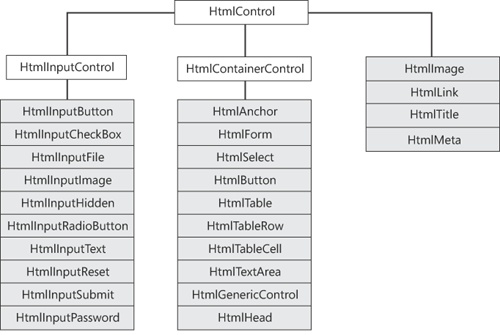
The input controls category includes all possible variations of the <input> tag, from submit buttons to check boxes and from text fields to radio buttons. The container controls category lists anchors, tables, forms, and in general, all HTML tags that might contain child elements.
The base class for container controls is the HtmlContainerControl class, which descends directly from HtmlControl. The HTML elements addressed by this tag are elements that must have a closing tag—that is, forms, selection boxes, and tables, as well as anchors and text areas. Compared to the HtmlControl class, a container control features a couple of additional string properties: InnerHtml and InnerText.
Both properties manipulate the reading and writing of literal content found between the opening and closing tags of the element. Note that you cannot get the inner content of a control if the content includes server controls. InnerHtml and InnerText work only in the presence of all literal content. The tag itself is not considered for the output. Unlike InnerText, though, InnerHtml lets you work with HTML rich text and doesn’t automatically encode and decode text. In other words, InnerText retrieves and sets the content of the tag as plain text, whereas InnerHtml retrieves and sets the same content but in HTML format.
Table 6-7 lists the HTML container controls defined in ASP.NET.
Table 6-7. HTML Container Controls
Class | Description |
|---|---|
HtmlAnchor | Represents an HTML anchor—specifically, the <a> tag. |
Represents the HTML <button> tag. | |
Represents the <form> tag, but can be used only as a container of interactive server controls on a Web page. It cannot really be used to create HTML forms that are programmable on the server. | |
HtmlGenericControl | Represents an HTML tag for which the .NET Framework does not provide a direct class. Sample tags include <font>, <hr>, and <iframe>. You program these controls by using the Attributes collection and set attributes indirectly. |
HtmlHead | Represents the <head> tag, and allows you to control meta tags, the style sheet, and the page title programmatically. |
HtmlSelect | Represents the <select> tag—that is, an HTML selection box. |
HtmlTable | Represents an HTML table—specifically, the <table> tag. |
HtmlTableCell | Represents the <td> HTML tag—that is, a cell in a table. |
HtmlTableRow | Represents the <tr> HTML tag—that is, a row in a table. |
HtmlTextArea | Represents a multiline text box, and maps the <textarea> HTML tag. |
Note that the HtmlButton control is different than HtmlInputButton, which represents the button variation of the <input> tag. The HtmlButton control represents the HTML 4.0–specific <button> tag. I’ll say more about buttons in the next section while discussing the Web controls.
Server-side forms play a key role in the economy of ASP.NET applications because they are the means for implementing postbacks and guaranteeing state maintenance. For this reason, the HtmlForm control is not simply a form element you can program on the server. In particular, the HtmlForm hides the Action property and cannot be used to post content to a page different than the content that generated the HTML for the browser. I’ll cover HTML forms in great detail in Chapter 9.
An instance of the HtmlHead control is automatically created if the page contains a <head> tag marked with the attribute runat=server. Note that this setting is the default when you add a new page to a Visual Studio ASP.NET project, as shown in the following snippet:
<head runat="server">
    <title> </title>
    ...
</head>
The header of the page is returned through the new Header property of the Page class. The property returns null if the <head> tag is missing, or if it is present but lacks the runat attribute.
The HtmlHead control exposes three string properties: Description, Keywords, and Title. Description and Keywords contain meta information about the page. These properties are the actual storage for the content of the Page properties MetaDescription and MetaKeywords that have just been added in ASP.NET 4 to help the rank of your pages in search engine listings.
The Title property is used to retrieve and set the title of the page:
Header.Title = "This is the title";
Note that this property returns the correct page title only if the <title> tag is correctly placed within the <head> tag. Some browsers, in fact, are quite forgiving on this point and allow developers to define the title outside the header. To manipulate the <title> tag independently from the header, use the HtmlTitle control and mark the <title> tag with the runat attribute.
Finally, HtmlHead features a StyleSheet property of type IStyleSheet. The actual class that implements the interface is internal and named StyleSheetInternal. All this class does is let you create CSS style information programmatically. Note that the StyleSheet property is not a programmatic way to link a URL to an external CSS file. It is, instead, an API for you to create an ASP.NET–specific Style object that is then translated into a CSS block within the page. Here’s an example:
protected void Page_Load(object sender, EventArgs e)
{
    var myAreaStyle = new Style {ForeColor = Color.Blue, BackColor = Color.LightGray};

    // Add the style to the header of the current page
    Page.Header.StyleSheet.CreateStyleRule(myAreaStyle, null, "DIV#MyArea");
}
The resulting page header looks like this:
<head>
  <title></title>
  <style type="text/css">
     DIV#MyArea { color:Blue;background-color:LightGrey; }
  </style>
</head>
The RegisterStyle method allows registered page-wide Style objects to be merged programmatically with the style object of individual server controls. You register a new control-focused style as shown here:
var labelStyle = new Style { ... };
...
Page.Header.StyleSheet.RegisterStyle(labelStyle, null);

// Right after registering the style, you apply it to or merge it with multiple controls
Label1.ApplyStyle(labelStyle);
Label2.MergeStyle(labelStyle);
Suppose now your page includes the following controls:
<asp:Label runat="server" ID="Label1" Text="Hello, world" />
<br />
<asp:Label runat="server" ID="Label2" CssClass="bold" Text="Hello, world (merged)" />
Here’s the markup generated for the two Label controls:
<span id="MainContent_Label1" class="aspnet_s0">Hello, world</span>
<br />
<span id="MainContent_Label2" class="bold aspnet_s0">Hello, world</span>
The class attribute of the first control is set to an autogenerated CSS class; the class attribute of the second control is the result of merging the current style with the new one.
To link an external style sheet file, you use the following code:
var link = new HtmlLink {Href = "~/StyleSheet.css"};
link.Attributes.Add("rel", "stylesheet");
link.Attributes.Add("type", "text/css");
Page.Header.Controls.Add(link);
The HtmlLink control represents an individual <link> element. The <link> tag can appear only in the <head> section of a document, although it can appear any number of times.
The HtmlMeta control is a helper object to allow programmatic control over the HTML <meta> element. Located within the <head> section, a <meta> tag contains some meta information about the rendered page. A <meta> element is characterized by a name and an associated value. You use Name property to specify the metadata property name, and the Content property to specify the associated value:
// Meta information providing some clue to search engines
var meta1 = new HtmlMeta
            {
                Name = "keywords",
                Content = "Key terms that describe your page"
            };
Page.Header.Controls.Add(meta1);
You can use the Scheme property to define some content for the scheme attribute of the HTML <meta> tag to provide additional information to user agents on how to interpret the meta information.
Finally, you use the HttpEquiv property instead of Name when you need to assign a value to the http-equiv attribute of the resulting HTML <meta> element.
Important
If your <head> section contains code blocks, you are not allowed to enter changes to its structure, such as adding new controls for <meta> and <link> tags. If you do so, you’ll get a run-time exception. A common reason to have code blocks in a server-side <head> tag is to resolve script URLs. Here’s a common example:
<head runat="server">
      <script src="<%= ResolveUrl("~/Scripts/jquery-1.4.2.min.js") %>"
              type="text/javascript"></script>
</head>
This code just prevents you from programmatically adding new controls to the Header object. The workaround simply consists of moving the script tag away from the <head> block. A good place to move it could be the bottom of the page, which also would deliver better rendering performance for the page. The browser usually stops rendering when it encounters a <script> tag and resumes after the script is downloaded. By placing all the <script> tags at the bottom of the body, your page starts doing some graphic work sooner (at least if it is linked to large script files).
The HtmlAnchor class is the programmatic way of accessing and configuring the <a> tag. With respect to the other container controls, the HtmlAnchor class provides a few extra properties, such as HRef, Name, Target, and Title. The HRef property sets the target of the hyperlink and can be used to navigate to the specified location. The Name property names a section in the ASP.NET page that can be reached from anywhere on the same page through #-prefixed HRefs. The following code demonstrates a bookmarked anchor named MoreInfo:
<a name="MoreInfo" />
This anchor can be reached using the following hyperlink:
<a href="#MoreInfo">Get More Info</a>
The Target property identifies the target window or the frame where the linked URL will be loaded. Common values for Target are _self, _top, _blank, and _parent, as well as any other name that refers to a page-specific frame. Although the feature is mostly browser dependent, you should always consider these special names as lowercase. Finally, the Title property contains the text that virtually all browsers display as a ToolTip when the mouse hovers over the anchor’s area.
In addition to being used for navigating to a different page, the anchor control—as well as the HtmlButton control—can be used to post back the page. Key to this behavior is the ServerClick event, which lets you define the name of the method that will handle, on the server, the event generated when the user clicks the control. The following code demonstrates an anchor in which the click event is handled on both the client and server:
<a runat=server onclick="Run()" onserverclick="DoSomething">
Click
</a>
The onclick attribute defines the client-side event handler written using JavaScript; the onserverclick attribute refers to the server-side code that will run after the page posts back. Of course, if both event handlers are specified, the client-side handler executes first before the postback occurs.
The HtmlSelect control represents a list of options from which you choose one or more. You control the appearance and behavior of the control by setting the Size and Multiple properties. The Size property specifies the number of rows to be displayed by the control, whereas the Multiple property indicates whether more than one item can be selected in the control. Internal items are grouped in the Items collection, and each element is represented by a ListItem object. Interestingly, the ListItem class is not defined in the HtmlControls namespace but lives instead in the WebControls namespace. To specify the text for each selectable item, you can either set the Text property of the ListItem or simply define a series of <option> tags within the opening and closing tags of the <select> element.
By default, the HtmlSelect control shows up as a drop-down list. However, if multiple selections are allowed or the height is set to more than one row, the control is displayed as a list box. The index of the selected item in a single-selection control is returned through the SelectedIndex property. If the multiple selection is enabled, you just loop through the Items collection and check the Selected property on individual list items.
The HtmlSelect control supports data binding through additional properties. The DataSource property lets you set the data source, which can be any .NET object that implements the IEnumerable interface. If the data source contains multiple bindable tables (for example, a DataSet object), by using the DataMember property you can choose a particular one. Finally, the DataTextField and DataValueField properties are used to bind the list item’s Text and Value properties to columns in the data source. (I’ll cover data binding in Chapter 10.)
The HtmlTextArea control corresponds to the <textarea> HTML element and allows you to programmatically create and configure a multiline text box. The HtmlTextArea class provides the Rows and Cols properties to control the number of rows and columns of the text box. The Value property can be used to assign some text to display in the control area.
The HtmlTextArea class also provides a ServerChange event that fires during a postback and allows you to validate on the server the data contained in the control. Note that the HtmlTextArea control does not fire the event itself and does not directly cause the page to post back. Rather, when the page posts back in response to a click on a link or submit button, the HtmlTextArea control intervenes in the server-side chain of events and gives the programmer a chance to run some code if the internal content of the control is changed between two successive postbacks.
All ASP.NET controls that, like HtmlTextArea, implement the IPostBackDataHandler interface can invoke user-defined code when the control’s internal state changes. As discussed in Chapter 5, controls can fire custom events by overriding the RaisePostDataChangedEvent method on the aforementioned interface. The following pseudocode shows what happens in the method’s implementation of HtmlTextArea:
void System.Web.UI.IPostBackDataHandler.RaisePostDataChangedEvent()
{
    this.OnServerChange(EventArgs.Empty);
}
Finally, note that the control raises the event only if the state has changed between two successive posts. To determine whether that has happened, the control needs to track the content it had the time before. This value can be stored only in the view state. Of course, the ServerChange even won’t fire if you disable the view state for the host page or the control.
In HTML, the <input> element has several variations and can be used to provide a submit button as well as a check box or text box. In ASP.NET, each possible instance of the <input> element is mapped to a specific class. All input classes derive from the HtmlInputControl class. HtmlInputControl is the abstract class that defines the common programming interface for all input controls. The class inherits from HtmlControl and simply adds three custom properties—Name, Type, and Value—to the inherited interface.
The Name property returns the name assigned to the control. In ASP.NET, this property is peculiar because, although it’s marked as read/write, it actually works as a read-only property. The get accessor returns the control’s UniqueID property, while the set accessor is just void. As a result, whatever value you assign to the property, either programmatically or declaratively, is just ignored and no exception or compile error is ever thrown.
The Type property mirrors the type attribute of the HTML input elements. The property is read-only. Finally, the Value property is read/write and represents the content of the input field.
Table 6-8 lists the HTML input controls defined in ASP.NET.
Table 6-8. HTML Input Controls
Class | Description |
|---|---|
HtmlInputButton | Represents the various flavors of a command button supported by HTML. Feasible values for the Type attribute are button, submit, and reset. |
HtmlInputCheckBox | Represents an HTML check box—that is, the <input> tag with a type equal to checkbox. |
HtmlInputFile | Represents the file uploader—that is, the <input> tag with a type equal to file. |
HtmlInputHidden | Represents a hidden buffer of text data—that is, the <input> tag with a type equal to hidden. |
HtmlInputImage | Represents a graphic button—that is, the <input> tag with a type equal to image. Note that this tag is supported by all browsers. |
HtmlInputPassword | Represents a protected text field—that is, the <input> tag with a type of password. |
HtmlInputRadioButton | Represents a radio button—that is, the <input> tag with a type equal to radio. |
HtmlInputReset | Represents a reset command button. |
HtmlInputSubmit | Represents a submit command button. |
HtmlInputText | Represents a text field—that is, the <input> tag with a type of either password or text. |
The hidden and text input controls are nearly identical, and the contents of both are posted back. Essentially, they differ only in that hidden fields are not displayed and, subsequently, they don’t provide some UI-related properties such as MaxLength and Size.
The HtmlInputButton class is the most flexible button class in the .NET Framework. It differs from the HtmlButton class in that it renders through the <input> tag rather than the Internet Explorer–specific <button> tag. This fact ensures for the control much wider support from browsers.
The HTML input button controls support the ServerClick event, which allows you to set the code to run on the server after the button is clicked. Note that if you set the button type to Button and the ServerClick event handler is specified, the control automatically adds the postback script code to the onclick HTML attribute. In this way, any click causes the page to post back and the code to execute. Let’s consider the following ASP.NET code:
<input runat="server" type="button" id="btn" value="Click"
    onserverclick="buttonClicked" />
The corresponding HTML code is as follows:
<input language="javascript" onclick="__doPostBack('btn','')"
    name="btn"
    type="button"
    value="Click" />
The client-side __doPostBack script function is the standard piece of code generated by ASP.NET to implement the postback. If the button type is set to Submit—that is, a value that would always cause a postback—no client-side script code is generated and the onclick attribute is not set.
In ASP.NET 2.0 and newer versions, more specific controls have been added to render submit and reset buttons. The controls are HtmlInputSubmit and HtmlInputReset.
Note
The HtmlInputImage control supports a nearly identical pattern for handling server-side events and validation. The HtmlInputImage control features a few more properties specific to the image it shows. In particular, you can set the alternate text for the image, the border, and the alignment with respect to the rest of the page. The ServerClick event handler has a slightly different form and looks like the following:
void ImageClickEventHandler(object sender, ImageClickEventArgs e);
When an image button is clicked, the coordinates of the click are determined by using the X and Y properties of the ImageClickEventArgs data structure.
The HtmlInputButton class, as well as the HtmlButton class, support a Boolean property named CausesValidation. The property indicates whether the content of the input fields should be validated when the button is clicked. By default, the property is set to true, meaning the validation always takes place. We’ll examine data validation in Chapter 9. For now, it suffices to say, you can programmatically enable or disable the validation step by using the CausesValidation property.
Typically, you might want to disable validation if the button that has been clicked doesn’t perform a concrete operation but simply clears the user interface or cancels an ongoing operation. By design, in fact, server-side page validation takes place just before the ServerClick event handler is executed. Setting the CausesValidation property to false is the only means you have to prevent an unnecessary validation.
Earlier in this chapter, while discussing the features of the HtmlTextAreacontrol, we ran into the ServerChange event and described it as the mechanism to detect and validate changes in the control’s state between two successive postbacks. The ServerChange event is not an exclusive feature of the HtmlTextArea control; it’s also supported by other input controls, such as HtmlInputCheckBox, HtmlInputRadioButton, HtmlInputHidden, and HtmlInputText. Let’s look at an example in which you use the ServerChange event to detect which elements have been checked since the last time the control was processed on the server.
You build a page with a list of check boxes and a button to let the user post back to the server when finished. Notice, in fact, that neither the HtmlInputCheckBox control, nor any other input control except buttons, post back to the server when clicked. For this reason, you must provide another control on the Web page that supports posting to the server—for example, an HtmlButton or HtmlInputButton control. The following code implements the page shown in Figure 6-3:
<%@ Page Language="C#" %>
<html>
<script runat="server">
public void DetectChange(object sender, EventArgs e) {
    var cb = (HtmlInputCheckBox) sender;
    Label1.Text += "Control <b>" + cb.UniqueID + "</b> changed<br />";
}
</script>

<body>
<form runat="server">
    ...
    <input runat="server" type="checkbox" id="one"
        OnServerChange="DetectChange" />One<br />
    <input runat="server" type="checkbox" id="two"
        OnServerChange="DetectChange" />Two<br />
    <input runat="server" type="checkbox" id="three"
        OnServerChange="DetectChange" />Three<br />
    <input runat="server" type="submit" value="Submit" />
    <hr />
    <asp:Label runat="server" ID="Label1" />
</form>
</body>
</html>
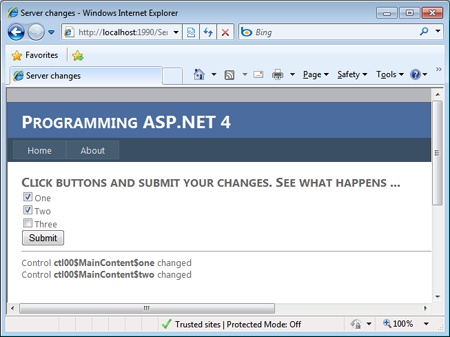
Figure 6-3. The ServerChange event fires only if the status of the control has changed since the last time the control was processed on the server.
The ServerChange event is fired only if the state of the control results changed after two postbacks. To get the first screen shot, you select the element and then submit. Next, if you submit again without selecting or deselecting anything, you get the second screen shot.
As mentioned in Chapter 5, when you implement the IPostBackDataHandler interface, each server control gets a chance to update its current state with data posted by the client.
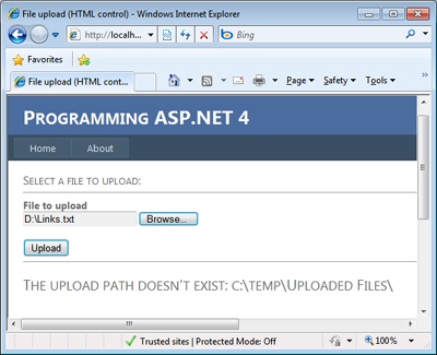
The HtmlInputFile control is the HTML tool for uploading files from a browser to the Web server. To take advantage of the HtmlInputFile control, you should first ensure that the server form’s Enctype property is set to multipart/form-data. However, starting with ASP.NET 2.0, the proper EncType is automatically set, care of the HtmlInputFile control, before the control’s markup is rendered. The enctype attribute in the code shown next is therefore unnecessary:
<form runat="server" enctype="multipart/form-data">
    <input runat="server" type="file" id="upLoader" >
    <input runat="server" type="submit" value="Upload..." />
</form>
The way in which the HtmlInputFile control is rendered to HTML is browser-specific, but it normally consists of a text box and a Browse button. The user selects a file from the local machine and then clicks the button to submit the page to the server. When this occurs, the browser uploads the selected file to the server, as shown in Figure 6-4.
Note
Prior to ASP.NET, a server-side process—the posting acceptor—was required to run in the background to handle multipart/form-data submissions. In ASP.NET, the role of the posting acceptor is no longer necessary because it is carried out by the ASP.NET runtime itself.
On the server, the file is parked into an object of type HttpPostedFile and stays there until explicitly processed—for example, saved to disk or to a database. The HttpPostedFile object provides properties and methods to get information on an individual file and to read and save the file. The following code shows how to save a posted file to a particular folder to disk:
<%@ Page language="C#" %>
<%@ Import Namespace="System.IO" %>

<script runat="server">
    void UploadButton_Click(object sender, EventArgs e)
    {
        // *** ASSUME THE PATH EXISTS ***
        string savePath = @"c:	empuploaded files";
        if (!Directory.Exists(savePath)) {
            const String msg = "<h1>The upload path doesn't exist: {0}</h1>";
            UploadStatusLabel.InnerHtml = String.Format(msg, savePath);
            return;
        }

        // Verify that a file has been posted
        if (FileUpload1.PostedFile != null)
        {
            // Save the uploaded file to the specified path
            var fileName = Path.GetFileName(FileUpload1.Value);
            savePath += fileName;
            FileUpload1.PostedFile.SaveAs(savePath);

            // Notify the user of the name the file was saved under.
            UploadStatusLabel.InnerText = "File saved as: " + savePath;
        }
        else
        {
            // Notify the user that a file was not uploaded.
            UploadStatusLabel.InnerText = "No file specified.";
        }
    }
</script>

<html>
<head runat="server">
    <title>File Upload</title>
</head>
<body>
    <form runat="server">
      <h3>Select a file to upload:</h3>
        <hr />
        <b>File to upload</b><br />
        <input type="file" id="FileUpload1" runat="server" />
        <br><br>
        <input runat="server" id="UploadButton" type="submit"
             value="Upload" onserverclick="UploadButton_Click" />
        <hr />
        <span runat="server" id="UploadStatusLabel" />
     </form>
</body>
</html>
You can also use the InputStream property of the HttpPostedFile object to read the posted data before persisting or processing. The HttpInputFile control also allows you to restrict the file types that can be uploaded to the server. You do this by setting the Accept property with a comma-separated list of MIME types.
Caution
When you use the SaveAs method, you should pay attention to specify the full path to the output file. If a relative path is provided, ASP.NET attempts to place the file in the system directory. This practice can result in an “access denied” error. Furthermore, make sure to provide write permission for the account used by ASP.NET for the directory where you want to store the file.
ASP.NET exercises some control of the amount of data being uploaded. The maxRequestLength attribute in the <httpRuntime> section of the configuration file sets the maximum allowable file size. An error is generated in the browser when the file exceeds the specified size—4 MB by default. Uploading large files might also generate another run-time error as a result of an excessive consumption of system memory. Finally, in a hosting scenario if you still experience problems regardless of the settings in your configuration, check out the maximum upload size on your Web server.
The HtmlImage class is the ASP.NET counterpart of the <img> tag. You can use it to configure on the server the display of an image. Possible parameters you can set are the size of the image, the border, and the alternate text. An instance of HtmlImage is created only when the runat attribute is added to the <img> tag. If you simply need to display an image within a page, and the image is not dynamically determined or configured, there is no need to resort to the HtmlImage control, which would add unnecessary overhead to the page.
The following code snippet shows how to configure a server-side <img> tag called to display an image whose name is determined based on run-time conditions:
theImg.Width = 100;
theImg.Height = 100;
theImg.Src = GetImageUrl(Request); // assume GetImageUrl is a method of yours
The HtmlImage control should be used to programmatically manipulate the image to change the source file, the width and height, or the alignment of the image relative to other page elements. The majority of properties of the HtmlImage control are implemented as strings, including Src—the URL of the image—and Align. Feasible values of Align are only a small set of words such as left, right, top, and so forth. These words would have been more appropriately grouped in a custom enumerated type, thus providing for a strongly typed programming model. If you think so, too, you just got the gist of the difference between HTML and Web server controls! HTML controls just mirror HTML tags; Web controls attempt to provide a more consistent and effective programming interface by exploiting the characteristics of the .NET Framework.
Web controls are defined in the System.Web.UI.WebControls namespace and represent an alternative approach to HTML server controls. Like HTML controls, Web controls are server-side components that spring to life thanks to the runat=“server” attribute. Unlike HTML controls, Web controls provide a programming interface that refactors the classic set of HTML attributes and events. For this reason, Web controls sometimes appear to be more consistent and abstract in the API design and richer in functionality, but they still generate valid markup. When hosted in .aspx pages, Web controls are characterized by the asp namespace prefix.
To a large degree, Web controls and HTML controls overlap and generate almost the same markup, although they do it through different programming interfaces. For example, the Web controls namespace defines the TextBox control and makes it available through the <asp:textbox> tag; similarly, the HTML controls namespace provides the HtmlInputText control and declares it using the <input> tag. Using either is mostly a matter of preference; only in a few cases will you run into slight functionality differences.
The WebControl class is the base class from which all Web controls inherit. WebControl inherits from Control. The class defines several properties and methods that are shared, but not necessarily implemented, by derived controls. Most properties and methods are related to the look and feel of the controls (font, style, colors, CSS) and are subject to browser and HTML versions. For example, although all Web controls provide the ability to define a border, not all underlying HTML tags actually support a border.
Table 6-9 lists the properties available on the WebControl class.
Table 6-9. Specific Properties of Web Controls
The ControlStyle and ControlStyleCreated properties are used primarily by control developers, while the Style property is what application developers typically use to set CSS attributes on the outer tag of the control. The Style property is implemented using an instance of the class CssStyleCollection. The CssStyleCollection class is a simple collection of strings like those you assign to the HTML style attribute.
The ControlStyle property evaluates to an object of type Style—a class that encapsulates the appearance properties of the control. The Style class groups together some of the properties that were shown in Table 6-9, and it works as the repository of the graphical and cosmetic attributes that characterize all Web controls. The grouped properties are BackColor, BorderColor, BorderStyle, BorderWidth, CssClass, Font, ForeColor, Height, and Width. All properties of the Style class are strongly typed. The properties just mentioned are not persisted to the view state individually, but they benefit from the serialization machinery supported by the Style object.
It should be clear by now that the Style class is quite different from the Style property, whose type is CssStyleCollection. Note that style values set through the Style property are not automatically reflected by the (strongly typed) values in the Style object. For example, you can set the CSS border-style through the Style property, but that value won’t be reflected by the value of the BorderStyle property.
// Set the border color through a CSS attribute
MyControl.Style["border"] = "solid 1px black";

// Set the border color through an ASP.NET style property
MyControl.BorderColor = Color.Red;
So what happens if you run the preceding code snippet? Which setting would win? When a control is going to render, the contents of both the ControlStyle and Style properties are rendered to HTML style attributes. The ControlStyle property is processed first, so in the case of overlapping settings the value stuffed in Style, which is processed later, ultimately wins.
The style properties of a Web control can be programmatically manipulated to some extent. For example, in the Style class, you can count on a CopyFrom method to duplicate the object and on the MergeWith method to combine two style objects.
currentStyle.MergeStyle(newStyle);
The MergeWith method joins the properties of both objects. In doing so, it does not replace any property that is already set in the base object but limits itself to defining uninitialized properties. Finally, the Reset method clears all current attributes in the various properties of the style object.
Note
I already mentioned this point a few times, but the best practice today is having ASP.NET controls emit style-ignorant markup. The emitted markup then will be decorated at will and made as colorful and attractive as it needs to be by using external CSS classes. In light of this, all of the control style features of ASP.NET lose much of their original appeal.
The WebControl class supports a few additional methods that are not part of the base Control class. These methods are listed in Table 6-10.
Table 6-10. Specific Methods of Web Controls
Description | |
|---|---|
ApplyStyle | Copies any nonempty elements of the specified style object to the control. Existing style properties are overwritten. |
CopyBaseAttributes | Imports from the specified Web control the properties AccessKey, Enabled, ToolTip, TabIndex, and Attributes. Basically, it copies all the properties not encapsulated in the Style object. |
MergeStyle | Like ApplyStyle, copies any nonempty elements of the specified style to the control. Existing style properties are not overwritten, though. |
RenderBeginTag | Renders the HTML opening tag of the control into the specified writer. The method is called right before the control’s RenderControl method. |
RenderEndTag | Renders the HTML closing tag of the control into the specified writer. The method is called right after the control’s RenderControl method. |
All these methods are rarely of interest to application developers. They are mostly designed to support control developers.
The set of Web controls can be divided into various categories according to the provided functionality—input and button controls, validators, data-bound controls, security-related controls, grid and view controls, plus a few miscellaneous controls that provide ad hoc functions and are as common on the Web as they are hard to catalogue (for example, calendar, ad rotator, and so forth).
In this chapter, we’re focused on covering the most common and essential Web controls, such as the controls for capturing the user’s input and posting data to the server. Table 6-11 details the core server controls of ASP.NET. (Other more advanced controls will be covered later when discussing input forms and data binding.)
Table 6-11. Core Web Controls
Control | Description |
|---|---|
Button | Implements a push button through the <input> tag. |
CheckBox | Implements a check box through the <input> tag. |
FileUpload | Allows users to select a file to upload to the server. |
HiddenField | Implements a hidden field. |
HyperLink | Implements an anchor <a> tag, and lets you specify either the location to jump to or the script code to execute. |
Image | Implements a picture box through the <img> tag. |
ImageButton | Displays an image and responds to mouse clicks on the image like a real button. |
ImageMap | Displays an image and optionally defines clickable hot spots on it. |
Label | Represents a static, nonclickable piece of text. It’s implemented through the <span> tag. |
LinkButton | Implements an anchor <a> tag that uses only the ASP.NET postback mechanism to post back. It is a special type of hyperlink where the programmer can’t directly set the target URL. |
Localize | Reserves a location on a Web page for you to display localized text. |
MultiView | Represents a control that acts as a container for a group of child View controls. |
Panel | Implements an HTML container using the <div> block element. In ASP.NET 2.0, the container supports scrolling. Note that in down-level browsers the control renders out as a <table>. |
RadioButton | Implements a single radio button through the <input> tag. |
Table | Implements the outer table container. It’s equivalent to the HTML <table> element. |
TableCell | A table cell; it’s equivalent to the HTML <td> element. |
TableRow | A table row; it’s equivalent to the HTML <tr> element. |
TextBox | Implements a text box using the <input> or <textarea> tag as appropriate and according to the requested text mode. It can work in single-line, multiline, or password mode. |
View | Acts as a container for a group of controls. A View control must always be contained within a MultiView control. |
Most controls in Table 6-11 look like HTML controls. Compared to HTML controls, their programming model is certainly richer and more abstract, but in the end it still generates valid markup. If a given feature can’t be obtained with raw HTML, there’s no way a custom Web control can provide it. No matter how complex the programming model is, all Web controls must produce valid HTML for both up-level and down-level browsers.
In ASP.NET, controls that provide button functions are characterized by the IButtonControl interface. Core controls that implement the interface are Button, ImageButton, and LinkButton. In general, by implementing IButtonControl any custom control can act like a button on a form. Table 6-12 details the IButtonControl interface.
Table 6-12. The IButtonControl Interface
In addition to the properties defined by the IButtonControl interface, the Button class features two properties for handling the steps following the user’s clicking. The properties are OnClientClick and UseSubmitBehavior. The former lets you define the name of the JavaScript function to run when the client-side onclick event is fired. The following two statements are perfectly legal and equivalent:
Button1.OnClientClick = "ShowMessage()";
Button1.Attributes["onclick"] = "ShowMessage()";
The OnClientClick property is also available on LinkButton and ImageButton controls.
By default, the Button class is rendered through an <input type=submit> tag. In this way, it takes advantage of the browser’s submit mechanism to post back. The UseSubmitBehavior property allows you to change the default behavior. Set the UseSubmitBehavior property to false and the control will render out through an <input type=button> tag. Also in this case, though, the Button control remains a postback button. When UseSubmitBehavior is false, the control’s onclick client event handler is bound to a piece of JavaScript code (the __doPostBack function) that provides the ASP.NET postback mechanism just like for LinkButton or ImageButton controls.
Important
Buttons are not the only controls that can trigger a postback. Text boxes and check boxes (plus a few more data-bound list controls, which you’ll see in Chapter 10) also can start a postback if their AutoPostBack property is set to true. (Note that the default setting is false.) When this happens, the control wires up to a client-side event—onchange for text boxes, and onclick for check boxes—and initiates a postback operation via script. In light of this, virtually any control can be modified to post back.
The HyperLink control creates a link to another Web page and is typically displayed through the text stored in the Text property. Alternatively, the hyperlink can be displayed as an image; in this case, the URL of the image is stored in the ImageUrl property. Note that if both the Text and ImageUrl properties are set, the ImageUrl property takes precedence. In this case, the content of the Text property is displayed as a ToolTip when the mouse hovers over the control’s area.
The NavigateUrl property indicates the URL the hyperlink is pointing to. The Target property is the name of the window or frame that will contain the output of the target URL.
The Image control displays an image on the Web page. The path to the image is set through the ImageUrl property. Image URLs can be either relative or absolute, with most programmers showing a clear preference for relative URLs because they make a Web site inherently easier to move. You can also specify alternate text to display when the image is not available or when the browser doesn’t render the image for some reason. The property to use in this case is AlternateText. The image alignment with respect to other elements on the page is set by using the ImageAlign property. Feasible values are taken from the homonymous enum type (for example: ImageAlign.Left, ImageAlign.Middle, and so forth).
The Image control is not a clickable component and is simply limited to displaying an image. If you need to capture mouse clicks on the image, use the ImageButton control instead. The ImageButton class descends from Image and extends it with a couple of events—Click and Command—that are raised when the control is clicked. The OnClick event handler provides you with an ImageClickEventArgs data structure that contains information about the coordinates for the location at which the image is clicked.
The OnCommand event handler makes the ImageButton control behave like a command button. A command button has an associated name that you can control through the CommandName property. If you have multiple ImageButton controls on the same page, the command name allows you to specify which one is actually clicked. The CommandArgument property can be used to pass additional information about the command and the control.
Finally, the ImageMap control deserves a few words. In its simplest and most commonly used form, the control displays an image on a page. However, when a hot-spot region defined within the control is clicked, the control either generates a postback to the server or navigates to a specified URL. The hot spot is a clickable region within the displayed image. The hot spot is implemented with a class that inherits from the HotSpot class. There are three predefined types of hot spots: polygons, circles, and rectangles.
Check boxes and radio buttons are implemented through the <input> tag and with the type attribute set to checkbox or radio. Unlike the HTML control versions, the Web control versions of check boxes and radio buttons let you specify the associated text as a property. The HTML elements and corresponding HTML controls lack an attribute whose content becomes the text near the check box or radio button. In HTML, to make the text near the check box or radio button clickable, you have to resort to the <label> tag with the for attribute:
<input type="checkbox" id="ctl" />
<label for="ctl">Check me</label>
Neither the HtmlInputCheckBox nor the HtmlInputRadioButton control adds a label, which leaves you responsible for doing that. The counterparts to these Web controls, on the other hand, are not bound to the HTML syntax and do precisely that—they automatically add a Text property, which results in an appropriate <label> tag. For example, consider the following ASP.NET code:
<asp:checkbox runat="server" id="ctl" text="Check me" />
It results in the following HTML code:
<input type="checkbox" id="ctl" />
<label for="ctl">Check me</label>
The fastest way to insert text in a Web page is through literals—that is, static text inserted directly in the ASPX source. This text will still be compiled to a control but, at least, the number of dynamically created literal controls is the minimum possible because any sequence of consecutive characters are grouped into a single literal. If you need to identify and manipulate particular strings of text programmatically, you can resort to a Literal control or, better yet, to the richer Label control. Modifiable text requires a TextBox.
Over the years, ASP.NET text controls went through a number of minor changes but preserved core functionalities. In particular, I want to mention that the TextBox class implements two interfaces as a way to logically group its capabilities. Frankly, this aspect is not that relevant for the ASP.NET developer seeking coding tips and tricks. It makes a good statement, however, about the design of the control and, all in all, represents a good example of programming to learn from and reuse in our own classes. (This is related to one of the core design principle I’ll cover in Chapter 13, —the Interface Segregation Principle.)
The two interfaces implemented by TextBox classes are ITextControl and IEditableTextControl. The former includes the sole Text property and is implemented by Literal, Label, TextBox, and list controls. The latter interface defines the TextChanged event and is specific to TextBox and list controls.
Speaking of text controls, it is also worth mentioning an accessibility feature of the Label control—the AssociatedControlID property. The property takes the ID of a control in the page—typically, an input control such as a TextBox—that you want to associate with the label. AssociatedControlID changes the way the Label control renders out. It is a <span> tag if no associated control is specified; it is a <label> tag otherwise. Let’s consider the following example:
<asp:Label ID="Label1" runat="server" Text="Sample text" />
<asp:TextBox ID="TextBox1" runat="server" />
As is, it generates the following markup:
<span id="Label1">Sample text</span>
<input name="TextBox1" type="text" id="TextBox1" />
If you set the label’s AssociatedControlID property to TextBox1, the markup changes as shown here:
<label for="TextBox1" id="Label1">Sample text</label>
<input name="TextBox1" type="text" id="TextBox1" />
The run-time behavior changes a bit because now any click on the label text will be extended to the associated control. For example, clicking on the label will move the input focus to a text box, or it will select or deselect a check box.
Hidden Fields and File Upload
If you’re looking for a more comfortable programming interface to create hidden fields and upload files, two Web controls might help. The HiddenField and FileUpload controls add no new functionality to the ASP.NET programmer’s bag, but they have been added to the toolbox for completeness. A hidden field can be created in two other ways that work with ASP.NET 1.x too. For example, you can use the RegisterHiddenField method on the Page class:
// Works in ASP.NET 1.x but is obsolete starting with 2.0
RegisterHiddenField("HiddenField1", "Great book!");
Note that the RegisterHiddenField method has been flagged as obsolete as of ASP.NET 4. The recommended code analogous to the previous snippet is shown next:
// Recommended code
ClientScriptManager.RegisterHiddenField("HiddenField1", "Great book!");
In addition, to create a hidden field you can resort to the HTML markup, adding a runat attribute if you need to set the value programmatically:
<input runat="server" id="HiddenField1" type="hidden" value="..." />
Analogous considerations can be made for the FileUpload control, which provides the same capabilities as the HtmlInputFile control that we discussed earlier. In this case, though, the programming interface is slightly different and perhaps more intuitive. The HasFile property and SaveAs method hide any reference to the object that represents the posted file. Likewise, the FileName property provides a more immediate name for the name of the posted file. The code to upload a file can be rewritten as follows:
if (FileUpload1.HasFile)
{
     // Get the name of the file to upload.
     var fileName = FileUpload1.FileName;
     var targetPath = GetSavePath(fileName);    // a function of yours...
     FileUpload1.SaveAs(targetPath);
}
Whether you use FileUpload or HtmlInputFile is mostly a matter of preference.
The WebControls namespace also includes a few controls that provide useful functionality that is common in Web applications. In particular, we’ll examine the AdRotator control, which works like an advertisement banner, and the Calendar control, which is a flexible and highly interactive control used to specify a date.
Abstractly speaking, the AdRotator control displays an automatically sized image button and updates both the image and the URL each time the page refreshes. The image to display and other information is read from an XML file written according to a specific schema. More concretely, you use the AdRotator control to create an advertisement banner on a Web Forms page. The control actually inserts an image and hyperlink in the page and makes them point to the advertisement page selected. The image is sized by the browser to the dimensions of the AdRotator control, regardless of its actual size. The following code shows a typical XML advertisement file:
<Advertisements>
<Ad>
    <ImageUrl>6235.gif</ImageUrl>
    <NavigateUrl>www.microsoft.com/MSPress/books/6235.asp</NavigateUrl>
    <AlternateText>Introducing ASP.NET AJAX</AlternateText>
    <Impressions>50</Impressions>
</Ad>
<Ad>
    <ImageUrl>5727.gif</ImageUrl>
    <NavigateUrl>www.microsoft.com/MSPress/books/5727.asp</NavigateUrl>
    <AlternateText>Programming ASP.NET Applications</AlternateText>
    <Impressions>50</Impressions>
</Ad>
</Advertisements>
The <Advertisement> root node contains multiple <Ad> elements, one for each image to show. The advertisement file must reside in the same application as the AdRotator control. The syntax of the AdRotator control is as follows:
<%@ Page Language="C#" %>
<html>
<head><title>Ad Rotators</title></head>
<body>
    <form runat="server">
        <h1>Dino Esposito's Books</h1>
        <asp:AdRotator runat="server" id="bookRotator"
            AdvertisementFile="MyBooks.xml" />
    </form>
</body>
</html>
In the XML advertisement file, you use the <ImageUrl> node to indicate the image to load and the <NavigateUrl> node to specify where to go in case of a click. The <AlternateText> node indicates the alternate text to use if the image is unavailable, whereas <Impressions> indicates how often an image should be displayed in relation to other images in the advertisement file. Finally, each image can also be associated with a keyword through the <Keyword> node. Of all the elements, only <ImageUrl> is required.
Once per roundtrip, the AdRotator control fires the server-side AdCreated event. The event occurs before the page is rendered. The event handler receives an argument of type AdCreatedEventArgs, which contains information about the image, a navigation URL, alternate text, and any custom properties associated with the advertisement. The AdCreated event can be used to programmatically select the image to show. The XML schema of the advertisement is not fixed and can be extended with custom elements. All nonstandard elements associated with the selected advertisement will be passed to the AdCreated event handler stuffed in the AdProperties dictionary member of the AdCreatedEventArgs class.
Note
The AdRotator control can also get its advertisement feed through an XML or relational data source. Image and navigation URLs, as well as the alternate text, can be read from fields belonging to the data source. The control cannot be bound to more than one data source at a time. If more than one property—AdvertisementFile, DataSourceID, or DataSource—is set, an exception will be thrown.
The Calendar control (shown in Figure 6-5) displays a one-month calendar and allows you to choose dates and navigate backward and forward through the months of the year. The control is highly customizable both for appearance and functionality. For example, by setting the SelectionMode property, you can decide what the user can select—that is, whether a single date, week, or month can be selected.
<asp:calendar runat="server" id="hireDate"
    SelectedDate="2010-08-21" VisibleDate="2010-08-21" />
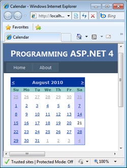
The VisibleDate property sets a date that must be visible in the calendar, while SelectedDate sets with a different style the date that is rendered as selected. The control also fires three ad hoc events: DayRender, SelectionChanged, and VisibleMonthChanged. The DayRender event signals that the control has just created a new day cell. You can hook the event if you think you need to customize the cell output. The SelectionChanged event fires when the selected date changes, while VisibleMonthChanged is raised whenever the user moves to another month using the control’s selector buttons.
The Calendar control originates a roundtrip for each selection you make. Although it is cool and powerful on its own, for better performance you might also want to provide a plain text box for manually typing dates.
The Xml control, defined by the <asp:Xml> tag, is used to inject the content of an XML document directly into an ASP.NET page. The control can display the source XML as-is or as the results of an XSL transformation (XSLT). The Xml control is a sort of declarative counterpart for the XslTransform class, and it can make use of the .NET Framework XSLT transform class internally.
You use the Xml control when you need to embed XML documents in a Web page. For example, the control is extremely handy when you need to create XML data islands for the client to consume. The control lets you specify a document to work with and, optionally, a transformation to apply. The XML document can be specified in a variety of formats—an XML document object model, string, or file name. The XSLT transformation can be defined through either an already configured instance of the .NET Framework XslTransform class or a file name.
<asp:xml runat="server"
    documentsource="document.xml"
    transformsource="transform.xsl" />
If you’re going to apply some transformation to the XML data, you can also embed it inline between the opening and closing tags of the control. The control also makes it easier to accomplish a common task: apply browser-dependent transformations to portions of the page expressed in an XML meta language. In this case, you exploit the programming interface of the control as follows:
<asp:xml runat="server" id="theXml" documentsource="document.xml" />
In the Page_Load event, you just check the browser capabilities and decide which transformation should be applied:
void Page_Load(object sender, EventArgs e)
{
    if (IsInternetExplorer(Request.Browser))
        theXml.TransformSource = "ie5.xsl";
    else
        theXml.TransformSource = "downlevel.xsl";
}
The PlaceHolder control is one of the few controls in the WebControls namespace that isn’t derived from the WebControl class. It inherits from Control and is used only as a container for other controls in the page. The PlaceHolder control does not produce visible output of its own and is limited to containing child controls dynamically added through the Controls collection. The following code shows how to embed a placeholder control in a Web page:
<asp:placeholder runat="server" id="theToolbar" />
After you have a placeholder, you can add controls to it. As mentioned, the placeholder does not add extra functionality, but it provides for grouping and easy and direct identification of a group of related controls. The following code demonstrates how to create a new button and add it to an existing placeholder:
Button btn = new Button();
btn.Text = "Click me";
theToolbar.Controls.Add(btn);
The PlaceHolder control reserves a location in the control tree and can be extremely helpful in identifying specific areas of the page to customize and extend by adding controls programmatically.
Important
Note that each control dynamically added to the Controls collection of a parent control is not restored on postback. If the control generates some input elements on the client, the client data is regularly posted but there will be no server-side control to handle that. To avoid this, you must “remember” that you created a certain control dynamically and re-create it while the page loads on postbacks. To remember that a certain control was added to a parent, you can create a custom entry in the view state or use a hidden field.
ASP.NET provides two related controls to create a group of interchangeable panels of child controls. The MultiView control defines a group of views, each represented with an instance of the View class. Only one view is active at a time and rendered to the client. The View control can’t be used as a standalone component and can be placed only inside a MultiView control. Here’s an example:
<asp:MultiView runat="server" id="Tables">
    <asp:View runat="server" id="Employees">
        ...
    </asp:View>
    <asp:View runat="server" id="Products">
        ...
    </asp:View>
    <asp:View runat="server" id="Customers">
        ...
    </asp:View>
</asp:MultiView>
You change the active view through postback events when the user clicks buttons or links embedded in the current view. To indicate the new view, you can either set the ActiveViewIndex property or pass the view object to the SetActiveView method.
Figure 6-6 shows a sample page in action. You select the page from the drop-down list and refresh the view:
void Page_Load(object sender, EventArgs e)
{
    // Views is an auto-postback drop-down list
    Tables.ActiveViewIndex = AvailableViews.SelectedIndex;
}
The combination of View and MultiView controls lends itself very well to implementing wizards. In fact, the new ASP.NET Wizard control uses a MultiView control internally. We’ll cover the Wizard control in Chapter 8.
In ASP.NET pages, server controls are vital components and transform the programming model of ASP.NET from a mere factory of HTML strings to a more modern and effective component-based model. ASP.NET features a long list of control classes. Looking at the namespaces involved, you should conclude that only two families of controls exist: HTML and Web controls. Controls in the former group simply mirror the set of elements in the HTML syntax. Each constituent control has as many properties as there are attributes in the corresponding HTML tag. Names and behavior have been kept as faithful to the originals as possible. The ultimate goal of the designers of HTML controls is to make the transition from ASP to ASP.NET as seamless as possible—just add runat=“server” and refresh the page.
The overall design of Web controls is more abstract and much less tied to HTML. In general, Web controls do not promote a strict one-to-one correspondence between controls and HTML tags. However, the capabilities of Web and HTML controls overlap. All ASP.NET server controls render in HTML, but Web controls render to a more complex HTML representation than HTML controls.
In the next chapter, we’ll touch on programming issues that relate to authoring an ASP.NET page—error handling, localization, and personalization.