
Ignorance, the root and the stem of every evil.
Server controls are one of the pillars of the entire ASP.NET Web Forms framework. Server controls are compiled classes that encapsulate user-interface and other functionality into reusable packages. ASP.NET provides a full bag of stock controls to serve most developers’ needs. However, writing custom controls is possible and sometimes necessary. Custom controls are no different than standard ASP.NET server controls except that they are bound to a different tag prefix and must be registered and deployed explicitly. Aside from that, custom controls can have their own object model, fire events, and support all the design-time features of Microsoft Visual Studio, such as the Properties window, the visual designer, property builders, and the Toolbox. Because of their compiled nature, custom controls can be installed in a single copy in the global assembly cache (GAC), making them available to all applications, or they can simply be deployed to the Bin directory for use by a single application.
A custom control is a class and inherits from a base control class. The logic already available in the base class determines how much, and what, code you have to write. There are basically two ways of creating custom controls. If you find that an existing control meets your requirements only partially and lacks some key features, the simplest thing you can do is extend the control by deriving a new class from it. You can override specific properties, methods, and events as well as add new features. If none of the existing Web server controls meet your requirements, consider creating a custom control from scratch by deriving from one of the base control classes—Control and WebControl. These classes provide only the basic functionality of ASP.NET server controls, and they require that you take care of some of the control’s operational aspects yourself, such as rendering, styling, view state, and state management.
Note
Custom controls are not to be confused with user controls (ASCX files). Web user controls are dynamic-compile components and cannot be added to the Toolbox. In addition, user controls should be deployed as source code unless the application that incorporates them is precompiled. In this case, you can extract the dynamic assembly that contains the user control and share it between applications. However, this technique is not supported by Microsoft and, well, requires a lot of familiarity with the ASP.NET internals.
When you realize you need a custom control to accomplish a certain task, first pause and make sure the feature you devised can really be obtained with HTML, literals, and JavaScript code. If you know how to do that in pure HTML, you can start planning an ASP.NET control and then architect and engineer the feature for the best reusability and efficiency.
A custom server control is a Microsoft .NET Framework class that inherits—either directly or indirectly—from Control. Control is the root class for all server controls in ASP.NET applications. It should be noted, though, that very few controls that you commonly use in ASP.NET applications really inherit directly from Control. For the most part, ASP.NET controls inherit from intermediate classes that encapsulate a given predefined behavior.
Each ASP.NET server control that is not marked as sealed can be further inherited and specialized. Table 12-1 lists all the classes in ASP.NET that represent some sort of base functionality. Each class in the list represents the root of a family of controls.
Table 12-1. Base Control Classes Available in ASP.NET
Among the commonly used controls that inherit directly from Control, you find Repeater, MultiView, Placeholder, and LiteralControl. All other controls in ASP.NET inherit from one of these classes.
The base Control class incorporates a number of features and makes them available to all child controls. A quick list includes view-state management, control identification, naming container capabilities, design-time support, themes, control state, and adaptive rendering. If you choose to inherit from any of the classes in Table 12-1, be prepared to write quite a bit of code because the control you get in the beginning is not particularly rich with concrete functionalities.
You typically inherit from any of those classes if you’re going to write a control that provides unique capabilities that are hard to find in other ASP.NET controls. Inheriting from any of the classes in Table 12-1 is more like building a custom control from scratch, where the effective starting point is determined by the selected base class.
If you opt for inheritance from a concrete control class—that is, a control that provides an observable behavior and user interface—you should strive to add new features or override existing capabilities without altering too much the structure and the personality of the control itself.
Let’s start with a sample custom control that extends the standard behavior of the HyperLink built-in control. By default, the ASP.NET HyperLink control outputs an anchor <a> tag that points to a URL. By design, any click on an anchor tag is served directly by the browser, which navigates to the specified page. No postback occurs to the page that originally displayed the anchor. Put another way, if you want to track that the user clicked on a given anchor, you need to extend the behavior of the hyperlink control.
Let’s further develop the idea of a control that drives users to a different page but gives the page author a way to track the event. The canonical example used to illustrate the importance of this feature is the page hit counter. Monitoring the visitor activity is an important task that each administrator of a Web site should consider to improve the quality and content of the site. A click-through is the name commonly used to indicate the user’s clicking to see particular content, and it’s an important parameter for evaluating how the visitors of a site receive advertising. How would you implement a counter service that counts click-throughs in a page?
You can associate each button control in a page (Button, HyperLink, ImageButton, LinkButton, and AdRotator) with an extra layer of code that first tracks the click and then proceeds with the expected behavior. Getting this behavior with controls that entail a postback is not difficult. Take the LinkButton class, for example. You can derive a new control and override the OnClick protected member as follows:
protected virtual void OnClick(EventArgs e)
{
    // Track the event
    ...

    // Proceed with the default behavior
    base.OnClick(e);
}
What about the HyperLink control, though? The click on the hyperlink is handled directly by the browser and doesn’t pass through any ASP.NET code of yours.
The idea is that you force the HyperLink control to adopt a navigation URL that is different from the one set by the programmer. In other words, you divert the HyperLink to a custom page on your site where you first accomplish any custom tasks you need (such as tracking) and then redirect to the originally requested page. The code for such a modified version of the HyperLink control doesn’t look particularly scary:
using System;
using System.Web.UI.WebControls;

namespace Samples
{
    public class Hyperlink : System.Web.UI.WebControls.HyperLink
    {
        public string RedirectPage
        {
            get
            {
                var o = ViewState["RedirectPage"];
                if (o == null)
                    return "redir.aspx";
                else
                    return (String) o;
            }
            set { ViewState["RedirectPage"] = value; }
        }

        public new String NavigateUrl
        {
            get { return base.NavigateUrl; }
            set
            {
                var url = "{0}?page={1}";
                url = String.Format(url, RedirectPage, value);
                base.NavigateUrl = url;
            }
        }
    }
}
As you can see, the new control has a brand new property—RedirectPage—and overrides an existing property—NavigateUrl. RedirectPage indicates the URL of the intermediate page, where the user is temporarily redirected so that any custom tasks such as click-through tracking can be accomplished. Here’s an example of the code file of such a page:
public partial class Redir : System.Web.UI.Page
{
    protected void Page_Load(object sender, EventArgs e)
    {
        // Capture the originally requested page
        var url = String.Empty;
        var o = Request["Page"];
        if (o != null)
        {
            url = Server.UrlEncode((String) o);
            if (String.IsNullOrEmpty(url)
               return;
        }

        // Do something here, such as updating a counter
        ...

        // Redirect the user to the originally requested page
        Response.Redirect(url);
    }
}
You are assuming that the custom HyperLink control calls the redirector page, passing a Page parameter on the query string set to the original URL. Of course, this trick is arbitrary and you can find any better workarounds if you want.
The navigation URL for a hyperlink is set through the NavigateUrl property. You need to ensure that whenever a new value is assigned to the NavigateUrl property (say, http://www.asp.net), it gets overridden by something like the following:
redir.aspx?page=http://www.asp.net
In this way, the user first reaches redir.aspx, where his action is tracked, and then he is directed to his final destination.
To override the setter (or the getter) of a control property, you need the property to be marked as virtual at some point in the control’s inheritance chain. The HyperLink control has a virtual property—Text—and a couple of public, but not virtual, properties such as Target and NavigateUrl. If the property is not marked as virtual (namely, it is overridable), you can’t override it; however, you can replace its implementation altogether. You do this through the new modifier in C# and the Shadows modifier in Microsoft Visual Basic .NET:
public new string NavigateUrl
{
    get { return base.NavigateUrl; }
    set
    {
        var url = "{0}?page={1}";
        url = String.Format(url, RedirectPage, value);
        base.NavigateUrl = url;
    }
}
The new modifier applied to a property instructs the compiler that the current implementation for the member replaces any other implementation available on base classes. If you redefine the NavigateUrl property without using the new keyword, you simply receive a warning from the compiler. The warning informs you that you are hiding an existing member, and it just recommends the use of the new modifier if hiding the member was intentional.
There are two main situations in which ASP.NET developers feel the need to create custom controls. At times, developers need a control that simply doesn’t exist in the ASP.NET builtin toolbox. And occasionally, developers need a control that is similar to one of the native controls but not close enough to justify using one. In this case, developers typically derive a new control from an existing one and add or override members as appropriate. Let’s discuss techniques and tricks to design and code completely new ASP.NET controls that address functionalities that ASP.NET doesn’t provide out of the box.
Several programming aspects support the development of a custom control in ASP.NET. First, there are base classes such as Control and WebControl. Each class provides a common set of base properties that address and fit into a particular use case. In addition to base classes, interfaces help you to better characterize the behavior and programming model of the control. A few interfaces are worth mentioning. They are INamingContainer, IPostBackDataHandler, and IPostBackEventHandler.
In Table 12-1, you see listed all base classes for controls and data-bound controls. For now, let’s focus on Control and WebControl.
The Control class defines the properties, methods, and events common to all ASP.NET server controls. These include the methods and events that determine and govern the life cycle of the control, plus a few properties such as ID, UniqueID, Parent, and ViewState and the collection of child controls named Controls.
The WebControl class derives from Control and adds extra properties and methods, mostly regarding control styles that affect rendering. These properties include ForeColor, BackColor, Font, Height, and Width. WebControl, in particular, is the base class for the family of Web server controls in ASP.NET.
When developing a new ASP.NET control, there’s just one guideline to follow. If your control renders a user interface, you should derive it from WebControl. If you’re authoring a component that doesn’t provide specific user-interface features, you’re better off using Control as your base class. Although these rules are effective in most cases, there might be exceptional situations in which you would reasonably do otherwise. For example, you can derive from Control if you want to provide a subset of the user-interface features.
When building composite controls—that is, controls designed by aggregating multiple controls together—you might want to use CompositeControl as the base class. You should never use UserControl, on the other hand, as a base class for a custom control.
Depending on the functionality of your control, you might have to implement additional interfaces. Typically, a server control implements some of the following interfaces:
INamingContainer This interface, also referred to as a marker interface, doesn’t contain methods—it simply notifies the ASP.NET runtime that the control that exposes it should be treated as a naming container. Child controls contained within a naming container control have their UniqueID property prefixed with the ID of the container. The naming container, therefore, acts as a namespace and guarantees the uniqueness of the control’s client IDs within the specified naming scope. (Note that if the ClientIDMode property is set to Static, this warranty just ceases.) The use of the INamingContainer interface is essential if you’re writing composite controls or controls that include templates.
IPostBackDataHandler The interface is needed whenever your control has to examine postback data. If the user can execute actions that affect the state of the control, you need to look into the postback data. For example, a TextBox control stores its configuration in the view state but also needs to read what the user typed in through the browser. This scenario is just where the IPostBackDataHandler interface fits in. The method LoadPostData lets controls examine posted values. The interface is also helpful if you need to raise events on the server based on changes to the data (method RaisePostDataChanged). Again, the TextBox is the perfect sample control; if the data changed between postbacks, the TextChanged event is also raised.
IPostBackEventHandler The interface serves to capture a client-side postback event (for example, a click). Upon postback, after raising data change events, the ASP.NET runtime looks for a server control whose UniqueID property matches the name of a posted value (for example, the name of the clicked button). If a match is found and the control implements IPostBackEventHandler, ASP.NET invokes the RaisePostBackEvent method on the control. RaisePostBackEvent is the only method defined on the IPostBackEventHandler interface. What a particular control does within the RaisePostBackEvent method can vary quite a bit. The Button control—a simple control that implements this interface—fires its Click event when ASP.NET invokes the RaisePostBackEvent method.
For an ASP.NET server control, the sole purpose in life is outputting markup text. The control’s object model and the system infrastructure it leverages serve to determine the contents to output, but the whole life cycle of controls (and host pages) inevitably ends with the rendering step. There are various ways for a server control to render out.
Typically, an ASP.NET control renders out through the Render method. To take total control of the control’s rendering, you therefore override the Render method and write markup code to the specified HTML text writer object:
protected override void Render(HtmlTextWriter writer)
The HTML text writer object is a sort of buffer where you can accumulate all the text to be output—nearly the same as a string builder. You can compose markup using the methods of the HtmlTextWriter object or by building plain strings. Writing to the text writer is indeed the fastest way for controls to generate their markup, but unfortunately it doesn’t result in easily readable code. If you take this route for a reasonably complex control, your final code will look like an intricate mess of nested if-then-else statements. Your code will be hard to read and maintain.
There’s another aspect to consider about direct markup output. Consider the following code snippet:
protected override void Render(HtmlTextWriter writer)
{
    writer.Write("<input type=text id="TextBox1" />");
}
The final page contains an input field of type text with an ID of TextBox1. The server environment, though, doesn’t know anything about this element and might not be able to process server events for this element correctly. In other words, you should render the markup directly only for controls that output raw HTML that don’t match ASP.NET controls and don’t need to raise or handle server events such as postbacks or post-data-changed events. If you’re going to write a server control that renders an HTML marquee or a table of data, writing to the control’s text writer buffer is fine. If you’re building a control that results from the composition of other controls, you’re better off taking another approach—building the control tree programmatically.
When your control embeds constituent child controls, you have a composite control. In this case, it is recommended that you build the final tree of controls programmatically by overriding the CreateChildControls method defined on the Control class. You do this by adding all constituent controls to the Controls collection of the control being developed. Here’s an example:
protected override void CreateChildControls()
{
    // Clears child controls
    Controls.Clear();

    // Build the control tree
    CreateControlHierarchy();

    // Clear the view state of child controls
    ClearChildViewState();
}
ClearChildViewState is a method on the Control class that deletes the view-state information for all the server child controls. CreateControlHierarchy, on the other hand, is an arbitrary name and represents a user-defined method that builds the control’s tree. You should feel free to replace that function with your own function or plain code. As a matter of fact, though, most ASP.NET built-in composite controls define a protected, overridable method with just that name. Here’s a possible implementation for CreateControlHierarchy that creates a text box with a leading label. Note that not only is the name of CreateControlHierarchy arbitrary, but its prototype also is.
protected void CreateControlHierarchy()
{
    // Add the label
    var lbl = new Label();
    lbl.Text = "Some text";
    Controls.Add(lbl);

    // Add a blank literal control for spacing
    Controls.Add(new LiteralControl("  "));

    // Add the text box
    var txt = new TextBox();
    txt.Text = String.Empty;
    Controls.Add(txt);

    // Specifies that child controls have been created
    ChildControlsCreated = true;
}
The ultimate goal of CreateControlHierarchy is populating the Controls collection of the current control with all child controls in the proper position in the final hierarchy. The ChildControlsCreated Boolean property is defined on the Control class and indicates whether all child controls have been created or not.
For a composite control, you don’t need to override the Render method, but it is recommended that you implement the marker interface INamingContainer to facilitate ASP.NET’s ability to recognize postback events caused by any child control.
Finally, a method that is worth mentioning regarding composite controls is EnsureChildControls. This method checks whether all child controls have been created and, if not, it re-creates them. How can the control know about that? It simply reads the value of the ChildControlsCreated Boolean property and calls CreateChildControls if all child controls haven’t been created. The following code snippet illustrates the behavior of EnsureChildControls:
protected virtual void EnsureChildControls()
{
    if (!ChildControlsCreated)
    {
        try {
            CreateChildControls();
        }
        finally {
            ChildControlsCreated = true;
        }
    }
}To get a grip on building new ASP.NET controls, let’s create a control with a limited state but a significant rendering engine. The control, named SimpleGaugeBar, is a simple, non-data-bound gauge bar that you can use to implement a rating system that represents the progress made for certain tasks. Generally, it can be used to give a friendly user interface to measurable quantities.
A gauge control needs to have at least two properties—one to indicate the value being rendered, and one that provides the scale. In addition, you can also give users a chance to control the ruler and the descriptive text for the gauge. Table 12-2 lists the properties of a gauge control.
Table 12-2. Properties of the SimpleGaugeBar Control
Description | |
|---|---|
FormatString | Formats the string that the control will render alongside the bar. The string can contain up to two placeholders. The first placeholder is set with the value; the second placeholder is set with the scale. The default string has the following form: {0} / {1}. |
GridLines | Indicates whether vertical delimiters should be displayed to mark notches. |
Maximum | Indicates the maximum value the gauge can represent. It’s set to 100 by default. |
Segments | Indicates the number of notches to draw on the gauge ruler. It’s set to 4 by default. |
Value | Indicates the value to represent. It’s set to 0 by default, and it cannot be higher than the scale. |
The setter method of the Value property adjusts any value provided that exceeds the current Maximum. The value stored in Maximum is the highest value you can assign to Value. The format string should be formed using two parameters in a fixed order: Value and Maximum. In the format string, you can use any HTML formatting and even reference the parameters in the reverse order. The following code snippet shows possible ways of setting the format string:
GaugeBar1.FormatString = "{0} ({1})";
GaugeBar2.FormatString = "Maximum is {1}. Value is <b>{0}</b>";
The SimpleGaugeBar control has no methods and doesn’t fire any events.
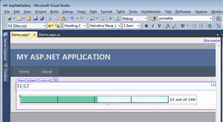
Internally, the control renders the gauge using an HTML table. The Value and Maximum pair are translated as percentages, and the ruler is drawn using table cells. Figure 12-1 shows the control within the Microsoft Visual Studio designer.
The notches on the ruler are obtained simply by adding as many cells to the underlying table as there are units in the Segments property. The following listing shows the implementation of the control properties:
public class SimpleGaugeBar : CompositeControl
{
    private int _dividerCell;

    public SimpleGaugeBar()
    {
    }

    // Gets and sets the value to represent in the gauge bar
    public float Value
    {
        get
        {
            var o = ViewState["Value"];
            if (o == null)
                return 0;
            return (float) o;
        }
        set
        {
            ViewState["Value"] = value;
            if (value > Maximum)
                ViewState["Value"] = Maximum;
        }
    }

    // Gets and sets the maximum value representable in the gauge bar
    public float Maximum
    {
        get
        {
            var o = ViewState["Maximum"];
            if (o == null)
                return 100;
            return (float) o;
        }
        set { ViewState["Maximum"] = value; }
    }

    // Number of segments to divide the bar into
    public int Segments
    {
        get
        {
            var o = ViewState["Segments"];
            if (o == null)
                return 4;
            return (int) o;
        }
        set
        {
            ViewState["Segments"] = value;
            if( value < 1)
                ViewState["Segments"] = 1;
        }
    }

    // Gets and sets the pattern to format the value in the gauge bar
    public string FormatString
    {
        get
        {
            var o = ViewState["FormatString"];
            if (o == null)
                return "<b>{0}</b> / <b>{1}</b>";
            return (string) o;
        }
        set { ViewState["FormatString"] = value; }
    }

    // Gets and sets whether the gauge bar has grid lines
    public bool GridLines
    {
        get
        {
            var o = ViewState["GridLines"];
            if (o == null)
                return true;
            return (bool) o;
        }
        set { ViewState["GridLines"] = value; }
    }
    ...
}
The control maintains some state by using the view-state collection. All the properties, in fact, are persisted using ViewState. Because all the persisted properties are marked as public, you can disable the view state altogether and still keep the control fully functional by explicitly setting properties upon page loading.
The ruler divides the area of the control into segments, which are filled proportionally based on the current value of the gauge. Each segment of the ruler corresponds to a cell in the underlying table. All cells but one are entirely filled or entirely empty. Filled cells are rendered using the current foreground color; empty cells are rendered using the current background color. One cell, named the divider cell, contains a child table with exactly one row and two cells. The first cell is rendered with the foreground color; the second cell is colored as the control’s background. The two cells have a width, measured in percent, whose total amounts to 100. The latter cell denotes how much is still left to do to reach the maximum. The following HTML code snippet shows the final HTML markup to render a value of 52 out of 100 using a ruler with four notches or segments:
<table><tr>
    <td bgcolor=orange width=25%></td>
    <td bgcolor=orange width=25%></td>
    <td>
      <table><tr>
        <td bgcolor=orange width=2%></td>
        <td bgcolor=white width=98%></td>
      </tr></table>
    </td>
    <td bgcolor=white width=25%></td>
</tr></table>
Figure 12-2 shows gauges with different ruler settings.
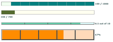
As you might have guessed already from the preceding figures, other properties get into the game in addition to those discussed in Table 12-2. Admittedly, the grayscale rendering used in this book doesn’t do justice to the actual capabilities of the SimpleGaugeBar control in terms of color support. However, the control exploits a few color-related properties defined on the base class. These properties are BackColor, ForeColor, Width, and Height.
Width and Height are used to delimit the control’s site—that is, the area within the container the control is assigned for rendering. The control is assigned a default size that can be changed either programmatically or through the Visual Studio Properties window.
The value of the ForeColor property is used to render the text of the label that accompanies the gauge. The value of the BackColor property determines the color to be used for the progress bar. Note that the implementation we just discussed assumes that only known colors can be used.
The user interface of a Web control is pure HTML, sometimes topped off with a bit of client script. As mentioned, there are basically two ways in which this HTML can be generated. You can compose the HTML code in the supplied writer, or you can build an in-memory representation of the output using existing HTML and Web server controls and then have them recursively render their contents to the writer. Let’s discuss these two options in more detail.
From a pure performance standpoint, writing out the control’s markup to an HTML text writer object is the preferred approach. No server control is ever instantiated, and the final and correct markup is sent to the browser. There are a few downsides to this approach you should consider, however. One is that you end up making several calls to the writer. And, aside from some negligible repercussions in terms of the performance (repercussions that are negligible when compared to control instantiation), the size of the code grows considerably, making your source code on the whole much less readable and harder to maintain. Let’s consider a quick but significant example.
To write the content of a string in a table cell, you need the following code if you decide to opt for the rich interface of the writer:
output.WriteFullBeginTag("table");
output.WriteFullBeginTag("tr");
output.WriteFullBeginTag("td");
output.Write(text);
output.WriteEndTag("td");
output.WriteEndTag("tr");
output.WriteEndTag("table");
However, as long as you don’t have a full bag of attributes to render, or a really complex structure to build, the following code is equally effective and even slightly faster:
output.Write("<table><tr><td>");
output.Write(text);
output.Write("</td></tr></table>");
In general, neither of these two approaches is always the best possible approach. A good compromise between the two is recommended to optimize performance while producing compact code. Taking the first approach to its natural limit, you end up with many more lines of code than are necessary. Taking the second approach further, you resort to building the control using strings, which is indeed not the best thing you can do, mainly from a maintenance point of view.
In ASP.NET, every piece of HTML code can be managed on the server as an instance of a class. This pattern results in extreme flexibility and ease of development. However, it doesn’t come without problems either. The rub lies in the fact that you instantiate lots of controls, which always affects performance. Let’s take a look at this in more detail.
Sometimes the custom control needs to build up a complex infrastructure with nested tables and elements. In this case, it makes sense to build an in-memory representation of the overall tree and then render everything to HTML using the RenderContents method of the root control. Typically, for controls with a relatively complex hierarchy of child controls and rich styles, you override the Render method as follows:
protected override void Render(HtmlTextWriter output)
{
    // This is a custom method that you normally use
    // to ensure that all elements are styled properly.
    // We'll show an implementation of this method later.
    PrepareControlForRendering();

    // Render the contents of the control
    base.RenderContents(output);
}
The SimpleGaugeBar control renders a nontrivial table structure that is much more manageable through a control tree:
protected override void CreateChildControls()
{
    Controls.Clear();
    CreateControlHierarchy();
    ClearChildViewState();
}

protected virtual void CreateControlHierarchy()
{
    // Build the outermost container table
    var outer = new Table();
    var outerRow = new TableRow();
    outer.Rows.Add(outerRow);

    // Ruler cell
    var rulerCell = new TableCell();
    outerRow.Cells.Add(rulerCell);
    BuildGaugeBar(rulerCell);

    // Text cell
    var textCell = new TableCell();
    if (!_textStyle.DisplayTextAtBottom)
    {
        outerRow.Cells.Add(textCell);
        BuildLabel(textCell);
    }

    // Save the control tree-add the table as a child of the gauge
    Controls.Add(outer);

    // Build the label
    if (!_textStyle.RenderInsideTable && _textStyle.DisplayTextAtBottom)
         BuildLabel(null);
}

void BuildGaugeBar(TableCell container)
{
    // Create the table with one or two rows: ruler (and label)
    var t = new Table();
    var ruler = new TableRow();
    t.Rows.Add(ruler);

    // Build the ruler row
    BuildRuler(ruler);

    // Build the label
    if (_textStyle.RenderInsideTable)
        BuildLabelIntoTable(t);

    // Save the control tree
    container.Controls.Add(t);
}
The output of the SimpleGaugeBar control consists of an outermost table that has one row and two cells. The first cell contains the gauge bar; the second cell optionally contains the text, when the companion text has to be displayed on the side of the gauge. (See Figure 12-2.) If the text goes below the gauge, it can either be part of the table (a second row) or just an additional Label control. You control rendering styles of the text through a custom style property—the TextStyle property—that I’ll say more about in a moment. Let’s first focus on the ruler.
The ruler is a sequence of table cells. Each cell corresponds to a notch you want to see on the final gauge. The number of notches is determined by the Segments property. The Value property is scaled as a percentage of the Maximum value, and the resulting value is used to determine the color of the various cells. If the value to represent is larger than the value represented by the current notch, a cell is added with the average width determined by dividing 100 by the number of notches. The same happens if the value is smaller and the divider cell has been rendered already. (In this case, finished is true.)
void BuildRuler(TableRow ruler)
{
    // Calculate the value to represent
    var val = GetValueToRepresent();
    float valueToRepresent = 100f * val / Maximum;
    var numOfSegments = GetNumOfSegments();

    int segmentWidth = 100 / numOfSegments;
    bool finished = false;
    for (int i = 1; i <= numOfSegments; i++)
    {
        if (valueToRepresent < i * segmentWidth)
        {
            if (finished)
            {
                // Still-To-Do
                var stillToDo = new TableCell();
                ruler.Cells.Add(stillToDo);
                stillToDo.Width = Unit.Percentage(segmentWidth);
            }
            else
            {
                // Cell to divide
                _dividerCell = i - 1;  // need a 0-based index
                var cell = new TableCell();
                ruler.Cells.Add(cell);
                cell.Width = Unit.Percentage(segmentWidth);
                cell.Height = Unit.Percentage(100);

                // Add a child table to the cell
                var child = new Table();
                child.Width = Unit.Percentage(100);
                child.Height = Unit.Percentage(100);
                cell.Controls.Add(child);
                child.CellPadding = 0;
                child.CellSpacing = 0;
                var childRow = new TableRow();
                child.Rows.Add(childRow);

                float fx = (100 *
                           (valueToRepresent - segmentWidth *
                           (i - 1)) / segmentWidth);
                if (valueToRepresent > (i - 1) * segmentWidth)
                {
                    TableCell left = new TableCell();
                    childRow.Cells.Add(left);
                    left.Width = Unit.Percentage(fx);
                }
                var right = new TableCell();
                childRow.Cells.Add(right);
                right.Width = Unit.Percentage(100 - fx);
                finished = true;
            }
        }
        else
        {
            // Done
            var done = new TableCell();
            ruler.Cells.Add(done);
            done.Width = Unit.Percentage(segmentWidth);
        }
    }
}
The divider cell is the cell that is split in two to represent the remaining value, as shown in Figure 12-3.
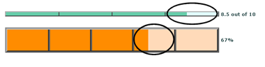
The divider cell is the first cell where the value of the corresponding notch is larger than the value to represent. The divider cell is rendered through an embedded table with one row and two cells. The index of the divider cell is cached for further use.
The companion text of the gauge can be displayed to the right of the gauge or below it. When rendered below it, the text can either be incorporated in the table or added as an extra control. BuildLabel can either add the text as an additional control or place it in the rightmost cell. BuildLabelIntoTable writes the text in an additional table row below the gauge. In this case, the text inherits most of the gauge graphical settings.
void BuildLabel(TableCell container)
{
    // Calculate the value to represent
    float buf = GetValueToRepresent();

    // Get the string to display on the label
    string msg = GetTextToRepresent();

    var lbl = new Label();
    if (container is TableCell)
        container.Controls.Add(lbl);
    else
        Controls.Add(lbl);
    lbl.Text = String.Format(msg, buf, Maximum);
}

// Build the control tree for the label
void BuildLabelIntoTable(Table t)
{
    // Calculate the value to represent
    float valueToRepresent = GetValueToRepresent();
    int numOfSegments = GetNumOfSegments();

    // Get the string to display on the label
    var companionText = GetTextToRepresent();
    if (_textStyle.DisplayTextAtBottom)
    {
        // Add a bottom row
        var label = new TableRow();
        t.Rows.Add(label);

        var lblCell = new TableCell();
        label.Cells.Add(lblCell);

        lblCell.ColumnSpan = numOfSegments;
        lblCell.Text = String.Format(companionText, valueToRepresent, Maximum);
    }
}
Note
In the code shown thus far for the SimpleGaugeBar control, there a pair of unexplained methods: GetValueToRepresent and GetTextToRepresent. In this simple control, the methods return, respectively, the value of the Value and FormatString properties. However, you can extend the control with data-binding capabilities. In doing so, most of the changes will consist of extending the GetValueToRepresent and GetTextToRepresent methods.
There’s no functional difference between the two approaches—it’s purely a matter of appearance and preference. But how can you control the rendering and the styles of the companion text? You do that through a new style property.
After it’s compiled, the SimpleGaugeBar control can be installed in the Visual Studio toolbox and dragged and dropped onto any Web Forms page you’re developing. Here’s some sample code being added to a page:
<x:SimpleGaugeBar id="GaugeBar1" runat="server"
      Width="500px" Height="15px"
    FormatString="<b>{0}</b> out of <b>{1}</b>"
    Segments="10"
    Value="65">
</x:SimpleGaugeBar>
The properties of the control that feature simple types can be set using the Properties window; for properties of a complex type, such as classes, you need to write a type converter and configure the property for the design-time environment of Visual Studio. The following code shows how to set properties on the gauge control programmatically:
private void Button1_Click(Object sender, EventArgs e)
{
    GaugeBar1.Maximum = 200;
    GaugeBar1.Value = 55;
}
You should try to set the Maximum property first because, in this way, the control automatically validates the value. Maximum and Value are stored in the view state and are automatically restored when the page posts back. If the host page disables the view state, you should modify the code that relates to the control so that the needed properties are set on each request.
So far, we’ve created the SimpleGaugeBar control as a composite control to display a notched indicator of a given quantity. By setting the Value and Maximum properties on the control, you can graphically represent a value on the proper scale. The SimpleGaugeBar control is not data bound, meaning that no elements in its programming interface can be automatically and declaratively bound to external data. Derived from CompositeControl, the SimpleGaugeBar control doesn’t incorporate any of the features listed previously regarding data-bound controls.
The goal of this section is to extend the SimpleGaugeBar control to make it support data binding through enumerable objects and data source controls.
A data-bound version of SimpleGaugeBar is a form of simple binding. A couple of existing properties—Value and FormatString—can be automatically filled with external data according to the classic data-binding pattern of ASP.NET. A data source object specified through either DataSource or DataSourceID and bindable properties are mapped to public fields on the data source object through mapper properties. In simple binding, the bound data source object is an individual object that contains just one logical piece of information—no items, no lists.
The key features of a data-bound control can be summarized as follows:
Let’s dig out more.
When you bind data to, say, a DropDownList control, you first set the data source and then specify which fields on the data source should be used to display the text and the value of the resulting list. The DropDownList control features a pair of DataTextField and DataValueField string properties.
The former is set to the name of the public field on the data source that will render the text of displayed list items. The latter is set to the name of the field on the bound data source object that will render the unique value associated with each displayed list item.
On a new data-bound control, you need to define similar properties to specify any required mapping between data source fields and bindable control properties. All these properties are usually string properties stored in the view state; the name is arbitrary, but it generally follows the pattern DataXxxField, where Xxx indicates the role of the bindable control property.
By design, the bound data source object must be an object that implements any of the following interfaces: IEnumerable (collections), IListSource (ADO.NET objects), or IDataSource (data source controls). Let’s suppose you bind a control to one row of a DataTable. Do you really need to persist the whole data row? If yes, what if the data row contains a couple of large binary large object (BLOB) fields?
The recommended approach entails that you extract a subset of information from the originally bound data source object and copy that to a control-specific data item object. This object is an instance of a custom class that typically has as many public properties as there are bindable properties on the control. For example, the DropDownList control has two bindable properties: Text and Value. Subsequently, the data item object—named ListItem—has two properties: Text and Value. (Naming is arbitrary, though.)
In a new data-bound control, you define a data item class that will be filled with any necessary information contained in the bound data source. This data item object must be persisted through the view state to guarantee that the control refreshes properly across postbacks. For performance reasons, the data item class must be able to serialize itself to the view state without resorting to the binary formatter. Put another way, it means that the data item class must implement IStateManager, just like style classes do.
The final key feature for a custom data-bound control is overriding the PerformDataBinding method. The method receives the contents of the bound data source object in the form of an enumerable object. As a control developer, you must read any required data from the source and cache it in the data item object.
Finally, you modify the rendering engine of the control to display bound data.
Note
Unless you need a data-bound control that behaves in a particular way (for example, a list control or a composite data-bound control), deriving your control from DataBoundControl is the most reasonable thing to do most of the time. If you need to start from a lower level, though, you can inherit from BaseDataBoundControl and override PerformSelect and ValidateDataSource. Needless to say, you might want to take this route only if you need to change the way a data source is validated, retrieved, or both.
Let’s apply all the steps outlined so far to a new version of the SimpleGaugeBar control, aptly named GaugeBar. The new control will still be a composite control, but it will inherit from DataBoundControl to gain standard data-binding capabilities.
public class GaugeBar : DataBoundControl
{
    ...
}
To be precise, ASP.NET also features a class that incorporates both composition and data binding. The name of the class is CompositeDataBoundControl.
The new GaugeBar control uses the same code as SimpleGaugeBar and extends it to define a couple of bindable properties—say, Value and FormatString. This choice of bindable properties is arbitrary, however.
You define a pair of DataXxxField properties—one for Value and one for FormatString. These string properties contain the name of the data source fields mapped to the Value and FormatString. In particular, DataValueField indicates that the field mapped to Value and DataTextField specifies the field linked to FormatString. Once again, note that the names used here are arbitrary.
public virtual string DataValueField
{
   get
   {
      var o = ViewState["DataValueField"] as String;
      return o ?? String.Empty;
   }
   set { ViewState["DataValueField"] = value; }
}

public virtual string DataTextField
{
   get
   {
      var o = ViewState["DataTextField"] as String;
      return o ?? String.Empty;
   }
   set { ViewState["DataTextField"] = value; }
}
As you can see, both properties use the ViewState as the storage medium and are set to the empty string by default. Other popular data-bound properties available on the GaugeBar class are DataSource, DataSourceID, and DataMember, all of which are inherited from parent classes.
After the GaugeBar control is bound to some external data, you need to track and cache any bound data. For this purpose, you need a data item object. As mentioned, a data item object is a custom class with as many public properties as there are bindable properties in the control’s interface. The data item class for the GaugeBar control is named GaugeBarDataItem (again, an arbitrary name) and is defined as follows:
public class GaugeBarDataItem : IStateManager
{
    private string _text;
    private float _value;
    private bool _marked;

    public GaugeBarDataItem()
    {
    }

    public GaugeBarDataItem(float value, string text)
    {
        _text = text;
        _value = value;
    }

    public string Text
    {
        get { return _text; }
        set { _text = value; }
    }

    public float Value
    {
        get { return _value; }
        set { _value = value; }
    }

    public bool IsTrackingViewState
    {
        get { return _marked; }
    }

    public void LoadViewState(object state)
    {
        if (state != null)
        {
            Pair p = (Pair)state;
            _value = (float)p.First;
            _text = (string)p.Second;
        }
    }

    public object SaveViewState()
    {
        return new Pair(_value, _text);
    }

    public void TrackViewState()
    {
        _marked = true;
    }
}
The class has two public properties—Text and Value—persisted through local members. More interestingly, the class also implements the IStateManager interface, which provides a standard interface to save any valuable contents to the view state across postbacks.
The SaveViewState method returns a Pair object (a sort of simplified array of two elements) filled with the current values of the Text and Value properties. The Pair object returned by SaveViewState becomes the input argument of LoadViewState, which unpacks the Pair object and initializes the Text and Value properties.
The GaugeBar control needs to expose a read-only property of type GaugeBarDataItem. You can use any name for this variable—I’m using DataItem here. More important than the name of the property is its implementation. Take a look at the following code:
private GaugeBarDataItem _dataItem;
...

private GaugeBarDataItem DataItem
{
   get
   {
      if (_dataItem == null)
      {
         _dataItem = new GaugeBarDataItem();
         if (base.IsTrackingViewState)
             _dataItem.TrackViewState();
      }
      return _dataItem;
   }
}
Unlike other control properties that are persisted directly in the ViewState collection object, the DataItem property uses a private member (_dataItem) to persist its value. A private member, though, is not persistent and doesn’t survive postbacks. For this reason, in the get accessor of the property you need to check _dataItem for nullness and create a new instance if it is null.
The code contained in the get accessor of a property runs whenever that property is invoked. As you’ll see in a moment, the preceding code ensures that no access to DataItem results in a null object exception and that the state of the object is restored correctly after each postback.
Most of the control properties we’ve considered thus far use the ViewState container to persist the values. Why should we not store DataItem or style properties in the same way? Is there anything wrong with the following code?
// NB: for this code to work, GaugeBarDataItem must be
// a serializable type
public virtual GaugeBarDataItem DataItem
{
   get
   {
      var o = ViewState["DataItem"] as GaugeBarDataItem;
      return o ?? new GaugeBarDataItem();
   }
   set { ViewState["DataItem"] = value; }
}
Actually, nothing is “wrong” with the code per-se—but consider for a moment view-state size and performance. Saving a class type directly in the ViewState container results in the object being serialized using the binary formatter. The BinaryFormatter class—the standard way to serialize managed objects in .NET applications—is not particularly fast and is designed to save the entire state of the object, including both public and private members, both simple and complex. The use of the BinaryFormatter increases the response time for each request and generates a larger view-state output. By customizing the view-state serialization, you obtain much faster code and save exactly the information you need to save.
As a rule of thumb, you should use the ViewState container to store property values if the type of the property is primitive—a string, numbers, Boolean values, colors, dates, bytes, and arrays of any of these types. Reference types (for example, custom classes) should be serialized by implementing IStateManager and exposing the property via a get accessor like the one shown previously. As far as control development is concerned, this is commonly required for styles and data item properties.
A control that has properties that take advantage of custom view-state serialization must override the SaveViewState and LoadViewState protected methods. These methods are defined on the Control class, and they indicate how to save and restore the state of the control to and from the view state. The default implementation of both methods takes care of the contents of only the ViewState container object.
protected override object SaveViewState()
{
    // Get the standard state object-ViewState container
    var baseState = base.SaveViewState();

    // Get the state object for the DataItem property
    var itemState = DataItem.SaveViewState();

    // Get the state object for the TextStyle object
    var styleState = TextStyle.SaveViewState();

    // Pack everything into a unique object
    return new Triplet(baseState, itemState, styleState);
}
The SaveViewState method of the GaugeBar control needs to save three objects: the standard view state, the DataItem property, and the TextStyle property. You get the standard view-state output by calling SaveViewState on the base class, and you get other state objects by calling SaveViewState on the IStateManager implementation of DataItem and TextStyle. The SaveViewState method on the control needs to return a single object, so you just group all data to return in a single object—typically, an array or a combination of Pair and Triplet objects.
The object returned by SaveViewState is received by LoadViewState, which extracts and assigns data back to the original objects.
protected override void LoadViewState(object savedState)
{
    if (savedState != null)
    {
        var t = (Triplet) savedState;
        base.LoadViewState(t.First);
        DataItem.LoadViewState(t.Second);
        TextStyle.LoadViewState(t.Third);
    }
    else
    {
        base.LoadViewState(null);
    }
}
The IStateManager implementation of LoadViewState on the serialized objects determines how each object (for example, styles and data items) restores its own data.
Note that when DataItem.LoadViewState is called, the get accessor of DataItem is invoked and initializes the internal _dataItem member on the first call.
In ASP.NET, a bound control obtains bound data through the PerformDataBinding method. Overriding this method is mandatory for any data-bound control because the standard implementation of the method does nothing. It is important to recall that the IEnumerable argument passed to PerformDataBinding represents the collection of bound data regardless of the format of the originally bound data source—whether it is an ADO.NET object, collection, or data source control.
Here’s the implementation of PerformDataBinding for the GaugeBar control:
protected override void PerformDataBinding(IEnumerable data)
{
    // In this control, in spite of the IEnumerable type being used
    // the argument "data" is a single object, not a real list to enumerate.
    // You need to get an enumerator and call MoveNext once to get the effective
    // content to bind.
    if (data == null)
       return;
    var e = data.GetEnumerator();
    e.MoveNext();

    // Set default values for bindable properties
    float displayValue = 0;
    var displayText = String.Empty;

    // Read the value for the Value property
    if (!String.IsNullOrEmpty(DataValueField))
        displayValue = (float) DataBinder.GetPropertyValue(
                e.Current, DataValueField);

    // Read the value for the FormatString property
    if (!String.IsNullOrEmpty(DataTextField))
        displayText = (String) DataBinder.GetPropertyValue(
                e.Current, DataTextField);

    // Fill the DataItem property
    DataItem.Value = displayValue;
    DataItem.Text = displayText;
}
In this particular case, the IEnumerable object passed to PerformDataBinding contains just one element. The IEnumerable interface, though, doesn’t distinguish between a single element or a list of elements. In other words, to get the data object you need to get the enumerator and move to the first item:
// data is of type IEnumerable
IEnumerator e = data.GetEnumerator();
e.MoveNext();

// Use e.Current to get the physical data object
The e.Current expression returns the data object bound to the control—that is, the container from which you extract the fields mapped to bindable properties. If you know the control is bound to, say, a DataRow object, you can retrieve the value for the Value property through the following code:
displayValue = ((DataRow) e.Current)[DataValueField];
Using the DataBinder class adds greater flexibility to your code and makes your code independent from the type of the bound data source. The GetPropertyValue method on the DataBinder class uses reflection to query the object to see whether it contains a public property with the specified name:
displayText = (string) DataBinder.GetPropertyValue(
       e.Current, DataTextField);
GetPropertyValue returns an object and requires a cast to the proper type.
The remaining step is updating the rendering engine so that it accesses the DataItem object whenever it requires bound data. The BuildLabel method shown next displays the descriptive text around the gauge:
void BuildLabel(TableCell container)
{
    // Calculate the value to represent
    var valueToRepresent = GetValueToRepresent();

    // Get the string to display on the label
    var msg = GetTextToRepresent();

    var lbl = new Label();
    if (container is TableCell)
        container.Controls.Add(lbl);
    else
        Controls.Add(lbl);

    lbl.Text = String.Format(msg, valueToRepresent, Maximum);
}
The BuildLabel method adds a Label control to the control hierarchy under construction. The text displayed through the label is composed using the value and the format string of the gauge. Both Value and FormatString can be either data-bound or statically assigned. For this reason, you should use a get function that checks the current binding, if any, and returns the bound value or the assigned value. Note the bound value is returned in favor of an assigned value, if both are present.
float GetValueToRepresent()
{
    float f = 0;
    if (DataItem.Value >=0)
        f = DataItem.Value;
    else
        f = Value;

    return f;
}

string GetTextToRepresent()
{
    var msg = "";
    if (!String.IsNullOrEmpty(DataItem.Text))
        msg = DataItem.Text;
    else
        msg = FormatString;
    return msg;
}
No other changes are required to enhance the SimpleGaugeBar control and make it data-bound.
The following code shows the Load handler of a sample page that uses the GaugeBar control and binds it to a dynamically generated DataTable object:
public class MyDataContainer
{
    public float Numbers { get; set; }
    public String Label { get; set; }
}

protected void Page_Load(object sender, EventArgs e)
{
    // Uses a random number as the value of the GaugeBar.
    // The value is stored in a custom object.
    Random rnd = new Random();
    var container = new MyDataContainer();
    container.Numbers = rnd.Next(0,100);
    container.Label = "{0} out of {1}";

    // Binds the DataTable to the GaugeBar
    GaugeBar1.DataValueField = "Numbers";
    GaugeBar1.DataTextField = "Label";
    GaugeBar1.DataSource = container;
    GaugeBar1.DataBind();
}
The DataTable has two columns—Numbers and Label—of type float and string, respectively. The table contains one data row. If the table contained multiple rows, only the first would be taken into account according to the code in PerformDataBinding.
Note that you can also use the DataItem property to bind data to the GaugeBar control:
GaugeBar1.DataItem.Value = 12;
GaugeBar1.DataItem.Text = "{0} %";
Note that no call to DataBind is required to trigger the process and update the control’s user interface.
The CompositeDataBoundControl class is the starting point for building rich, complex, and data-bound composite controls. A composite data-bound control must do the following:
The good news is that you can completely ignore the third point if you derive your control class from the CompositeDataBoundControl class. The class, in fact, implements internally any necessary logic.
The main aspect you care about when building a composite data-bound control is designing the internal hierarchy of your control. The method to override for this purpose is an overloaded version of CreateChildControls. In addition, you typically add styles and templates.
In a real-world composite control, the internal control tree is usually quite complex. The outermost container is often a multirow HTML table (or perhaps a collection of <div> tags, each with specific semantics associated with it). However, what’s in the various cells and rows can vary quite a bit and result in a pretty sophisticated combination of child controls and literals.
You should know by now that composite controls build their own interface by composing controls in the override of the CreateChildControls method. Defined on the Control class, the method has the following prototype:
protected override void CreateChildControls()
In the CompositeDataBoundControl class, the method is overridden and overloaded. In particular, the overridden version accomplishes a few interesting tasks. Here’s its pseudo-code:
protected override void CreateChildControls()
{
    Controls.Clear();
    var o = ViewState["_!ItemCount"];
    if ((o == null) && RequiresDataBinding)
         EnsureDataBound();
    else
    {
         int numOfItems = (int) o;
         object[] items = new object[numOfItems];
         CreateChildControls(items, false);
         base.ClearChildViewState();
    }
}
The method first empties the Controls collection so that no pending child controls are left around. Next, it retrieves a value from a particular (and internally managed) view-state entry named _!ItemCount. The view-state entry caches the number of items that form the composite control. The code that actually builds the control tree is responsible for storing this value in the view state.
Knowing the number of items that form the control hierarchy is important to optimize the data-binding process. In ASP.NET, complex controls that show a possibly long list of data items are implemented as composite data-bound controls. In what way is this different from list and simple-bound controls?
List controls and simple-bound controls, such as the GaugeBar we considered earlier, cache the data item or items in the view state. In addition, they can either receive data from the data-binding process or programmatically through the Items collection and the DataItem property, respectively. Composite data-bound controls (such as ListView and GridView) work on the assumption that they receive data exclusively from data binding and, for this reason, don’t persist bound data in any form. Consider now the following scenario.
Imagine a page that contains a rich control such as the GridView and some button controls. One of the button controls, when clicked, executes no code that involves the GridView but still refreshes the page. Without some special tricks in the control’s code, you can be sure that the composite data-bound control would be empty upon postback. Why is this so? If the postback event handler doesn’t bind data back to the composite control, the control has no way to figure it out and refresh properly. In ASP.NET, by design, composite data-bound controls take their data only from data binding and don’t cache any bound data. So a special workaround is required to handle postback events.
For composite data-bound controls, the CreateChildControls method works in either of two modes: binding or nonbinding. When CreateChildControls is working in binding mode, the control tree is created as usual. When it’s working in nonbinding mode, the control calls an overloaded version of CreateChildControls. The method is defined as abstract on the CompositeDataBoundControl and must be overridden in any derived class.
The overloaded version of CreateChildControls that is defined on the CompositeDataBoundControl class is shown here:
protected abstract int CreateChildControls(
    IEnumerable dataSource, bool dataBinding);
The first parameter is the collection of bound data. The second parameter indicates whether the control is being bound to fresh data (that is, it is working in binding mode) or is being refreshed after a postback. The return value indicates the number of items added to the control tree. This value will then be stored in the view state during the call to PerformDataBinding. The following code snippet shows an excerpt from the source code of PerformDataBinding on the CompositeDataBoundControl class:
protected internal override void PerformDataBinding(IEnumerable data)
{
   base.PerformDataBinding(data);
   Controls.Clear();
   base.ClearChildViewState();
   TrackViewState();
   int numOfItems = CreateChildControls(data, true);
   base.ChildControlsCreated = true;
   ViewState["_!ItemCount"] = numOfItems;
}
Note that PerformDataBinding calls into the new overload of CreateChildControls and passes it true as the second argument, indicating that a binding operation is taking place. This makes sense because executing PerformDataBinding, by definition, means you are performing a binding operation.
What kind of code should you place in the overloaded CreateChildControls? Basically, you call your own control builder method (typically, CreateControlHierarchy) and return its return value. I’ll return to this point later when discussing the sample BarChart control.
The overloaded CreateChildControls method is invoked in binding mode from within PerformDataBinding, and it’s invoked in nonbinding mode from within the other CreateChildControls method:
// o is the value read from ViewState
int numOfItems = (int) o;
object[] items = new object[numOfItems];
CreateChildControls(items, false);
In this case, the bound data passed to the method is an empty array of objects of a well-known size. The goal of this array is to force the control builder method (typically, CreateControlHierarchy) to loop the right number of times and build an outermost container with the right configuration—for example, a table with the right number of rows and columns.
As you’ll see in detail for the sample BarChart control, a composite data-bound control neatly separates hierarchy from data. If the Boolean parameter of CreateChildControls is false, no data is added to the hierarchy. How can the control show up as it did the last time? The ASP.NET postback mechanism guarantees that child controls are restored with all their values. In other words, if a composite data-bound control displays bound data through, say, a Label control, after a postback the composite control doesn’t restore its bound data directly. However, it asks any child control, including the Label, to restore itself from the view state. In doing so, the Label restores the bound data from its Text property.
The bottom line is that the amount of extra data that flows in the view state for a composite control is limited to the number of constituent items, and the control refreshes correctly after a postback. (Of course, child controls put in the view state the usual amount of data.)
It should be clear from the previous discussion that the ASP.NET team had excellent arguments to dictate that composite data-bound controls get their data exclusively from the data-binding process. This fact eliminates the need of having a kind of Items property on composite data-bound controls that works like the Items property of list controls. This said, feel free to add support for data item objects and collections to your composite controls if you need to.
Most composite controls feature a collection of items, but not a collection of data items. Each item represents a control item—that is, a logical building block of the control’s user interface. For a GridView, it is a GridViewRow object that represents a table row. For a sample BarChart control that displays a bar chart, the control item will be a class derived from TableRow that contains all the information needed to handle a single bar. The number of items that composite controls store in the view state is exactly the number of “control” items.
Let’s see how these concepts apply to a sample composite data-bound control such as BarChart.
The BarChart control inherits from CompositeDataBoundControl and defines the properties listed in Table 12-3.
Table 12-3. BarChart Properties
Property | Description |
|---|---|
DataTextField | Name of the data field to use as the label of each bar. |
DataTextFormatString | Format string for the display text. |
DataValueField | Name of the data field to use as the value of each bar. |
DataValueFormatString | Format string for the value to display on top of each bar. |
Items | Collection of BarChart items. Each element represents a bar in the chart. Elements in the Items collection are of type BarChartItem. |
Maximum | Gets and sets the maximum value that can be represented in the chart. |
SubTitle | Gets and sets the subtitle of the final chart. |
Title |
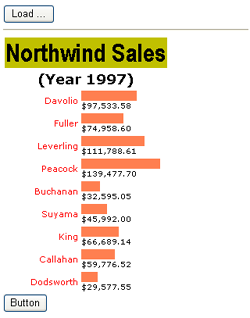
The final markup for the control is a horizontal bar chart such as the one illustrated in Figure 12-4.
Each bar is fully represented by an element in the Items collection. In addition, the BarChart control features a few style properties, as Table 12-4 details.
Table 12-4. BarChart Style Properties
Property | Description |
|---|---|
BarStyle | The style of the whole row that contains the bar |
LabelStyle | The style of the label |
SubTitleStyle | The style of the subtitle in the control’s header |
TitleStyle | The style of the title in the control’s header |
ValueStyle | The style of the element displaying the value rendered |
The attributes of all style properties are applied in the Render method, as in other data-bound controls.
The user interface of the BarChart control is created in the overloaded version of CreateChildControls.
protected override int CreateChildControls(
    IEnumerable dataSource, bool dataBinding)
{
    return CreateControlHierarchy(dataSource, dataBinding);
}
Both input arguments are passed down to an internal CreateControlHierarchy method, which is ultimately responsible for the creation of the bar chart:
int CreateControlHierarchy(IEnumerable dataSource, bool dataBinding)
{
    // Get the data to display (either from data source or viewstate)
    if (dataSource == null)
    {
        RenderEmptyControl();
        return 0;
    }

    // Start building the hierarchy of controls
    Table t = new Table();
    Controls.Add(t);

    // Add the header row with the caption
    CreateTitle(t);

    // Add the subtitle row
    CreateSubTitle(t);

    // Add bars
    int totalItems = CreateAllItems(t, dataSource, dataBinding);
    return totalItems;
}
The control hierarchy is a table with two rows for the title and subtitle and other rows for the bars of the chart. CreateAllItems adds bar chart items and counts their number. This number is then returned and ends up in the view state.
int CreateAllItems(Table t, IEnumerable data, bool useDataSource)
{
    // Count how many items we add
    int itemCount = 0;

    // Clears the Items collection (creates it, if null)
    Items.Clear();

    // Scroll data items, and create table items
    foreach (object o in data)
    {
        // Create the match item object
        BarChartItemType itemType = BarChartItemType.Item;
        BarChartItem item = CreateBarChartItem(t,
             itemType, o, useDataSource);

        // Add the newly created object to the Items collection
        _items.Add(item);

        // Increase the counter
        itemCount++;
    }

    // Return how many items we have into the viewstate (for postbacks)
    return itemCount;
}
For each bound item, the method creates a BarChartItem object and adds it to the Items collection. We’ll discuss the BarChartItem class in a moment.
Note that you use Items.Clear to clear the collection and _items.Add to add a new bar chart item to the collection. The Items property is implemented as follows:
private BarChartItemCollection _items;
...
public virtual BarChartItemCollection Items
{
    get
    {
        if (_items == null)
            _items = new BarChartItemCollection();
        return _items;
    }
}
The property Items uses the _items variable as its storage medium. The first call to Items.Clear ensures that the collection is properly initialized. The second call to the same collection can go through the local variable to save a call to the get accessor of the Items property.
The BarChartItem class represents a bar in the chart and is defined as follows:
public class BarChartItem : TableRow
{
    private object _dataItem;
    private BarChartItemType _itemType;

    public BarChartItem(BarChartItemType itemType)
    {
        _itemType = itemType;
    }

    public object DataItem
    {
        get {return _dataItem;}
        set {_dataItem = value;}
    }

    public BarChartItemType ItemType
    {
        get {return _itemType;}
    }
}
The class inherits from TableRow (actually, a bar in the chart is a table row) and defines a couple of properties: DataItem and ItemType. The DataItem property references the data item in the bound data source associated with the corresponding item. For example, if the BarChart is bound to a DataTable, DataItem is bound to the DataRow that corresponds to a given bar. ItemType, on the other hand, indicates the type of table row—such as a title, subtitle, or item. The item types are defined through an enumerated type:
public enum BarChartItemType
{
   Title,
   SubTitle,
   Item
}
The Items property groups a bunch of BarChartItem objects in a collection. The collection type is BarChartItemCollection:
public class BarChartItemCollection : Collection<BarChartItem>
{
}
Because bar chart item objects don’t go to the view state, there’s no need to implement IStateManager and add extra view-state management methods as we did previously for the hyperlink control.
With a composite data-bound control, you don’t need to override the PerformDataBinding method. However, you should pay some attention to keeping neatly separated the code that builds the structure of the control and the code that adds data.
The CreateBarChartItem method creates a new table row and enriches it with a DataItem property. What’s the content of the row? Looking at Figure 12-3, you can see that each table row has a cell for the label and a cell for the progress bar.
BarChartItem CreateBarChartItem(Table t, BarChartItemType itemType,
       object dataItem, bool useDataSource)
{
    // Create a new row for the outermost table
    var item = new BarChartItem(itemType);

    // Create cells for label and value
    var labelCell = CreateLabelCell(item);
    var valueCell = CreateValueCell(item);

    // Add the row to the table
    t.Rows.Add(item);

    // Handle the data object binding
    if (useDataSource)
    {
        // Get the data source object
        item.DataItem = dataItem;

        // Data bind the team labels
        BindLabelCell(labelCell, dataItem);
        BindValueCell(valueCell, dataItem);
    }

    // Return the fully configured row item
    return item;
}
CreateLabelCell and CreateValueCell add cells to the table row. Here is their implementation:
private TableCell CreateLabelCell(BarChartItem item)
{
    // Create and add the cell
    var cell = new TableCell();
    item.Cells.Add(cell);
    return cell;
}

private TableCell CreateValueCell(BarChartItem item)
{
    // Create and add the cell
    var cell = new TableCell();
    item.Cells.Add(cell);

    // Add the internal labels
    var lblGraph = new Label();
    var lblText = new Label();

    cell.Controls.Add(lblGraph);
    cell.Controls.Add(new LiteralControl("<br>"));
    cell.Controls.Add(lblText);
    return cell;
}
The colored bar is represented with a label whose width is a percentage of the maximum value possible on the chart.
As you can see in the code of CreateBarChartItem, an if statement separates the creation of required child controls from the data binding. If the method is working in binding mode, the DataItem property is set on each bar chart item and the following two methods are called to add data to the child controls of the BarChart control:
private void BindLabelCell(TableCell cell, object dataItem)
{
    if (!String.IsNullOrEmpty(DataTextField))
    {
       string txt = DataBinder.GetPropertyValue(
             dataItem, DataTextField, DataTextFormatString);
       cell.Text = txt;
    }
}

private void BindValueCell(TableCell cell, object dataItem)
{
    // Bind the label for the graph
    var lblGraph = (Label) cell.Controls[0];
    object o = null;
    if (!String.IsNullOrEmpty(DataValueField))
        o = DataBinder.GetPropertyValue(dataItem, DataValueField);
    else
        return;
    var val = Convert.ToSingle(o);
    float valueToRepresent = 100 * val / Maximum;
    lblGraph.Width = Unit.Percentage(valueToRepresent);

    // Bind the label for the text
    var lblText = (Label) cell.Controls[2];
    lblText.Text = DataBinder.GetPropertyValue(
           dataItem, DataValueField, DataValueFormatString);
}
The data-binding process works in a way that is no different from what you saw earlier for other types of data-bound controls. The trickiest part here is the calculation of the width of the label that, when properly styled, generates the horizontal bar.
The BarChart control also features a couple of events: BarChartCreated and BarChartDataBound. It is not coincidental that these two events mimic analogous events on the DataGrid control. Although far simpler, the BarChart is a control designed along the same guidelines that inspired the creation of the DataGrid control:
public event EventHandler<BarChartItemEventArgs> BarChartItemCreated;
public event EventHandler<BarChartItemEventArgs> BarChartItemDataBound;
protected virtual void OnBarChartCreated(BarChartItemEventArgs e)
{
    if (BarChartItemCreated != null)
        BarChartItemCreated(this, e);
}

protected virtual void OnBarChartItemDataBound(BarChartItemEventArgs e)
{
    if (BarChartItemDataBound != null)
        BarChartItemDataBound(this, e);
}
The BarChartItemCreated event is fired whenever a new table row is added to represent a bar. The BarChartItemDataBound event fires when a newly added table row is bound to its data. The former event fires regardless of the working mode of the control. The latter fires only when the control is created in binding mode.
The data carried out with the event is grouped in the BarChartItemEventArgs class:
public class BarChartItemEventArgs : EventArgs
{
    private BarChartItem _item;
    public BarChartItemEventArgs(BarChartItem item)
    {
        _item = item;
    }

    // Properties
    public BarChartItem Item
    {
        get { return _item; }
    }
}
Both events are fired from within the CreateBarChartItem method:
BarChartItem CreateBarChartItem(Table t, BarChartItemType itemType,
       object dataItem, bool useDataSource)
{
    // Create a new row for the outermost table
    var item = new BarChartItem(itemType);

    // Create cells for the label and value
    var labelCell = CreateLabelCell(item);
    var valueCell = CreateValueCell(item);

    var argsCreated = new BarChartItemEventArgs(item);
    OnBarChartItemCreated(argsCreated);
    ...
    if (useDataSource)
    {
       ...
       BarChartItemEventArgs argsData = new BarChartItemEventArgs(item);
       OnBarChartItemDataBound(argsData);
    }
}Let’s see how to consume these events from within a host page. The following markup enables a BarChart control in an ASP.NET page:
<x:BarChart runat="server" id="BarChart1"
      Maximum="100" SubTitle="Subtitle" Title="Title"
      OnBarChartDataBound="BarChart1_BarChartDataBound" >
    ...
</x:BarChart>
Nothing in the preceding markup indicates the data source. In the Page_Load event, the control is bound to its data—a collection of custom objects with a couple of properties. One property indicates the amount of sales for an employee in the specified year; the other indicates the name of the employee:
protected void Button1_Click(object sender, EventArgs e)
{
    var data = GetDataByYear(1997);
    BarChart1.Maximum = 150000;
    BarChart1.Title = "Northwind Sales";
    BarChart1.SubTitle = "(Year 1997)";
    BarChart1.DataSource = data;
    BarChart1.DataTextField = "Employee";
    BarChart1.DataValueField = "Sales";
    BarChart1.DataBind();
}
The bar chart shown in Figure 12-3 is obtained by running the preceding code. The sample page handles the BarChartDataBound event through the following code:
void BarChart1_BarChartDataBound(object sender, BarChartItemEventArgs e)
{
    // Get the amount of sales for the current bar
    var sales = (Decimal) DataBinder.GetPropertyValue(
                     e.Item.DataItem, "sales");

    // Add a ToolTip
    var tip = sales.ToString();
    e.Item.Attributes["title"] = tip;

    // Highlight bar where sales > 50000
    if (sales > 50000)
       e.Item.Cells[1].BackColor = Color.LightGreen;
}
The amount of sales for the current employee is retrieved and added to the row as a ToolTip. In addition, if the sales are larger than 50,000, the cell is highlighted by using a different background color. (See Figure 12-5.)
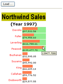
The BarChart control accepts two strings to display as the title and subtitle of the chart. Likewise, you can define a similar property for the footer. Title, subtitle, and footer are distinct items in the BarChart control hierarchy. What are you allowed to display in these items? As long as the properties are implemented as plain strings, there’s not much more than static text that can show up through the items.
A bit more flexibility can be added with format strings. A format string is a string that contains a predefined number of placeholders that the control machinery fills with internal data. For example, the FormatString property of the GaugeBar defaults to {0} / {1}—namely, a format string with two placeholders. The string is resolved as follows:
// First placeholder gets the Value to represent
// Second placeholder gets the Maximum value that can be represented
String.Format(FormatString, Value, Maximum);
You can enrich the format string with HTML tags to obtain more appealing results but, in the long run, this approach results in unmanageable code. A much better route to deep customizations of the user interface of controls is to use templates.
In ASP.NET, you can import templates in two ways: through properties of type ITemplate or by dynamically loading user controls. A Web user control is a custom component that can be used wherever a server control is valid. You can import such a user-defined control into the layout of the main control and make the interface more flexible and generic. You put a PlaceHolder control in the location in which you want custom contents to be injected, and then at run time you create an instance of the user control and add it to the Controls collection of the placeholder:
placeHolder.Controls.Add(Page.LoadControl("usercontrol.ascx"));The right time to call this code is early in the control life cycle—that is, in an Init event handler. Using the LoadControl method, the code of the template is insulated in a separate file. This can be a good thing or a bad thing, depending on the context. If the template you want to implement is complex, keeping it off the main page is positive. Otherwise, it would certainly add a layer of unnecessary complexity. Having the template directly available in the source code of the page makes authoring the page much more intuitive and fast because you don’t have to follow code into a separate file.
There’s also a sort of compromise between the two approaches. You can define an ITemplate property in the control and leave the page author free to decide how to set it—with statically defined markup or using the contents of an .ascx file.
A template property represents a collection of text and controls that is hosted within a container. The container is also responsible for exposing properties that page authors can use to create data-bound expressions. The following code snippet shows how to define a template property named TitleTemplate:
[PersistenceMode(PersistenceMode.InnerProperty)]
[TemplateContainer(typeof(TitleTemplateContainer))]
public ITemplate TitleTemplate
{
    get { return _titleTemplate; }
    set { _titleTemplate = value; }
}
The storage of the template is guaranteed by the private member _titleTemplate, defined as follows:
private ITemplate _titleTemplate = null;
A template property is characterized by a couple of attributes: PersistenceMode and TemplateContainer.
The PersistenceMode attribute indicates how a control property is persisted declaratively in a host page. Table 12-5 lists possible modes of persistence.
Table 12-5. Persistence Modes for Control Properties
Description | |
|---|---|
Attribute | The property persists as an encoded HTML attribute in the final markup. |
EncodedInnerDefaultProperty | The property persists as the only inner text of the control. The property value is HTML encoded. Only a string can be given this designation. |
InnerDefaultProperty | The property persists in the control as inner text and is the element’s default property. Only one property can be designated the default property. |
InnerProperty | The property persists in the control as a nested tag. This is commonly used for complex objects with templates and styles. |
The most common setting is InnerProperty, which instructs Microsoft Visual Studio to save the contents of the template as a nested tag named after the property:
<x:BarChart runat="server" ID="BarChart1" ... >
    <TitleTemplate>
        ...
    </TitleTemplate>
</x:BarChart>
If you choose InnerDefaultProperty, you can have only one nested tag; by opting for InnerProperty, you can have as many nested tags as needed. This is good for rich controls with multiple templates and styles.
The TemplateContainer attribute declares the type of the naming container that will contain the template once it is created. As mentioned, a template is hosted by a container which, in turn, is appended to the control’s Controls collection. The TemplateContainer attribute references a type that you, as a control developer, are responsible for declaring.
A template container type is a simple Web control decorated with the INamingContainer interface. This control can be given any public members you like. However, it will typically expose the host control as a whole and a bunch of quick-access properties. Here’s a sample container type for the TitleTemplate property:
public class TitleTemplateContainer : WebControl, INamingContainer
{
    private BarChart _parent;
    public TitleTemplateContainer(BarChart parent)
    {
        _parent = parent;
    }
    public string Title
    {
        get { return _parent.Title; }
    }
    public string SubTitle
    {
        get { return _parent.SubTitle; }
    }
    public BarChart BarChart
    {
        get { return _parent; }
    }
}
Once again, be sure to note that there are no constraints or special guidelines to influence the set of members of the class. The class needs to have a reference to the parent control—the BarChart in this case. Normally, you create this class for a particular control (or set of controls) and don’t reuse it beyond that. It is up to you to expose the parent control through a direct property (BarChart in the preceding code) or filter the control’s programming interface with a subset of properties (for example, Title and SubTitle). You can also do both things.
The programming interface of the template container class is important because it defines the information that page authors have access to when creating a template for the property. The template container is made accessible through the Container property.
You can use any combination of controls and literals to populate a template. To access external information, though, you need to use data-bound expressions. Here’s an example:
<TitleTemplate>
    <img src="Title.gif" />
    <%# Container.Title %>
</TitleTemplate>
The code snippet demonstrates a BarChart title that displays an image in addition to the text set through the Title property. Here’s another example:
<TitleTemplate>
   <%# Container.Title %>
   <small>(<%# DateTime.Now.ToString() %>)</small>
</TitleTemplate>
Figure 12-6 shows a templated title item where the originally set Title property is displayed side by side with the current time. The current time is rendered with a smaller font and within parentheses.
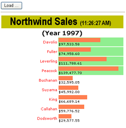
Note that any style attributes set through the TitleStyle property are maintained in the template.
The Container keyword references an instance of the template container type. You use the Container keyword to access any control properties exposed through the template container class. Nonstatic information requires a <%# … %> data-bound expression, just like in the templates of ASP.NET built-in controls.
So far you’ve seen how to define a template property in a server control. But what other changes to the code are required to host a template? In summary, to define a template property you need to do the following:
These steps define only the public interface of the template; more is needed to embed the template in the control’s hierarchy. In particular, you need to tweak the code that creates the portion of the control tree where you want the template to display. For example, the TitleTemplate property refers to the title item; so the internal method to modify is CreateTitle. Here’s the updated version:
private void CreateTitle(Table t)
{
    // Create the table row
    var item = new BarChartItem(BarChartItemType.Title);
    t.Rows.Add(item);

    // Add the title cell
    var cell = new TableCell();
    cell.ColumnSpan = BarChart.ColumnsCount;
    item.Cells.Add(cell);

    // Decide between plain string and template
    if (TitleTemplate != null)
    {
        _titleTemplateContainer = new TitleTemplateContainer(this);
        TitleTemplate.InstantiateIn(_titleTemplateContainer);
        cell.Controls.Add(_titleTemplateContainer);
    }
    else
        cell.Text = Title;

    // Must call DataBind to enable #-expression on templates
    item.DataBind();
}
You check whether a template for the title item is defined; if it is not, you just set the Text property of the title cell with the contents of the Title property. Otherwise, you get an instance of the template container type and use it as the input argument of the InstantiateIn method—the only method on the ITemplate interface. When done, you add the template container to the control hierarchy—in this case, to the Controls collection of the title cell.
A fundamental further step is required to enable the template to successfully process data-bound expressions. You must place a call to DataBind on the title item. Data-bound expressions, in fact, are evaluated only after a call to DataBind is made that involves the parent control that hosts the expression. Without the DataBind call, templates will work correctly but won’t display any <%# … %> expression.
ASP.NET provides a wealth of server controls from which you can likely choose exactly the control you are looking for. If this is not the case, and the control simply doesn’t exist, you can create your own control from the ground up or by extending an existing control, and obtain incredibly powerful results. Writing a control is a matter of defining an appropriate object model and providing an effective rendering algorithm. Aside from these two points, other equally important aspects of control development are containment, naming, and integration with the engine that supplies state management.
In this chapter, we’ve built a few ASP.NET controls with different capabilities, from simple components capable of rendering an HTML tree to controls with rich support for data binding and templates.