
Chapter 5
The Grammar of Graphics: The ggplot2 Package
Chapter preview
This chapter describes how to produce plots using the ggplot2 package. There is a brief introduction to the concepts underlying the Grammar of Graphics paradigm as well as a description of the functions used to produce plots within this paradigm. The distinguishing feature of the ggplot2 package is its ability to produce a very wide range of different plots from a relatively small set of fundamental components. Because ggplot2 uses grid to draw plots, this chapter describes another way to produce a complete plot using the grid system.
The ggplot2 package provides an interpretation and extension of the ideas in Leland Wilkinson’s book The Grammar of Graphics. The ggplot2 package represents a complete and coherent graphics system, completely separate from both traditional and lattice graphics.
The ggplot2 package is built on grid, so it provides another way to generate complete plots within the grid world, but as with lattice, the package has so many features that it is unnecessary to encounter grid concepts for most applications.
The graphics functions that make up the graphics system are provided in an extension package called ggplot2. This package is not part of a standard R installation, so it must first be installed, then it can be loaded into R as follows.
> library(ggplot2)
This chapter presents a very brief introduction to ggplot2. HadleyWickham’s book, ggplot2: Elegant Graphics for Data Analysis, provides much more detail about the package.
5.1 Quick plots
For very simple plots, the qplot() function in ggplot2 serves a similar purpose to the plot() function in traditional graphics. All that is required is to specify the relevant data values and the qplot() function produces a complete plot.
For example, the following code produces a scatterplot of pressure versus temperature using the pressure data set (see Figure 5.1).
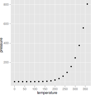
A scatterplot produced by the qplot() function from the ggplot2 package. This plot is comparable to the traditional graphics plot in Figure 1.1.
> qplot(temperature, pressure, data=pressure)
This plot should be compared with Figures 1.1 and 4.1. The main differences between this scatterplot and what is produced by the traditional plot() function, or lattice’s xyplot(), are just the default settings used for things like the background grid, the plotting symbols, and the axis labeling.
There are also similarities in how the appearance of the plot can be modified. For example, the following code adds a title to the plot using the argument main.
> qplot(temperature, pressure, data=pressure,
main="Vapor Pressure of Mercury")
However, ggplot2 diverges quite rapidly from the other graphics systems if further customizations are desired. For example, in order to plot both points and lines on the plot, the following code is required (see Figure 5.2). Notice that, like lattice, the ggplot2 result has automatically resized the plot region to provide room for the title.
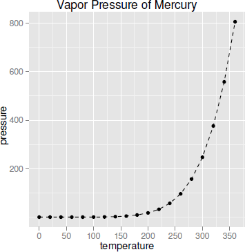
A scatterplot produced by the qplot() function from the ggplot2 package, with a title and lines added. This plot is a modified version of 5.1.
> qplot(temperature, pressure, data=pressure,
main="Vapor Pressure of Mercury",
geom=c("point", "line"), lty=I("dashed"))
The lty argument in this code is familiar, but the value "dashed" is wrapped inside a call to the I() function. The geom argument is also unique to ggplot2.
In order to understand how this code works, rather than spending a lot of time on the qplot() function, it is useful to move on instead to the conceptual structure, the grammar of graphics, that underlies the ggplot2 package.
5.2 The ggplot2 graphics model
The ggplot2 package implements the Grammar of Graphics paradigm. This means that, rather than having lots of different functions, each of which produces a different sort of plot, there is a small set of functions, each of which produces a different sort of plot component, and those components can be combined in many different ways to produce a huge variety of plots.
The steps in creating a plot with ggplot2 often come down to the following essentials:
- Define the data that you want to plot and create an empty plot object with ggplot().
- Specify what graphics shapes, or geoms, that you are going to use to view the data (e.g., data symbols or lines) and add those to the plot with, for example, geom_point() or geom_line().
- Specify which features, or aesthetics, of the shapes will be used to represent the data values (e.g., the x- and y-locations of data symbols) with the aes() function.
In summary, a plot is created by mapping data values via aesthetics to the features of geometric shapes (see Figure 5.3).
![]()
A diagram showing how data is mapped to features of a geom (geometric shape) via aesthetics in ggplot2.
For example, to produce the simple plot in Figure 5.1, the data set is the pressure data frame, and the variables temperature and pressure are used as the x and y locations of data symbols. This is expressed by the following code.
> ggplot(pressure) +
geom_point(aes(x=temperature, y=pressure))
A ggplot2 plot is built up like this by creating plot components, or layers, and combining them using the + operator.
The following sections describe these ideas of geoms and aesthetics in more detail and go on to look at several other important components that allow for more complex plots that contain multiple groups, legends, facetting (similar to lattice’s multipanel conditioning), and more.
5.2.1 Why another graphics system?
Many of the plots that can be produced with ggplot2 are very similar to the output of the traditional graphics system or the lattice graphics system, but there are several reasons for using ggplot2 over the others:
- The default appearance of plots has been carefully chosen with visual perception in mind, like the defaults for lattice plots. The ggplot2 style may be more appealing to some people than the lattice style.
- The arrangement of plot components and the inclusion of legends is automated. This is also like lattice, but the ggplot2 facility is more comprehensive and sophisticated.
- Although the conceptual framework in ggplot2 can take a little getting used to, once mastered, it provides a very powerful language for concisely expressing a wide variety of plots.
- The ggplot2 package uses grid for rendering, which provides a lot of flexibility available for annotating, editing, and embedding ggplot2 output (see Sections 6.9 and 7.8).
5.2.2 An example data set
The examples throughout this section will make use of the mtcars2 data set. This data set is based on the mtcars data set from the datasets package and contains information on 32 different car models, including the size of the car engine (disp), its fuel efficiency (mpg), type of transmission (trans), number of forward gears (gear), and number of cylinders (cyl). The first few lines of the data set are shown below.
> head(mtcars2)
mpg cyl disp gear trans
Mazda RX4 21.0 6 160 4 manual
Mazda RX4 Wag 21.0 6 160 4 manual
Datsun 710 22.8 4 108 4 manual
Hornet 4 Drive 21.4 6 258 3 automatic
Hornet Sportabout 18.7 8 360 3 automatic
Valiant 18.1 6 225 3 automatic
5.3 Data
The starting point for a plot is a set of data to visualize. The following call to the ggplot() function creates a new plot for the mtcars data set. The data for a plot must always be a data frame.
> p <- ggplot(mtcars2)
There is no information yet about how to display these data, so nothing is drawn. However, the result, a "ggplot" object, is assigned to the symbol p so that we can add more components to the plot in later examples.
5.4 Geoms and aesthetics
The next step in creating a plot is to specify what sort of shape will be used in the plot, for example, data symbols for a scatterplot or bars for a barplot. This step also involves deciding which variables in the data set will be used to control features of the shapes, for example, which variables will be used for the (x, y) positions of the data symbols in a scatterplot.
The following code adds this information to the plot that was created in the last section. This code produces a new "ggplot" object by adding information that says to draw data symbols, using the geom_point() function, and that the disp variable should be used for the x location and the and mpg variable should be used for the y location of the data symbols; these variables are mapped to the x and y aesthetics of the point geom, using the aes() function. The result is a scatterplot of fuel efficiency versus engine size (see Figure 5.4).
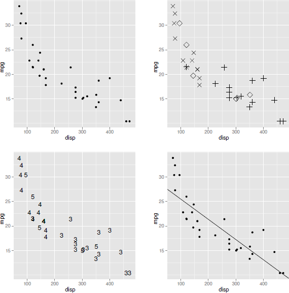
Variations on a scatterplot that shows the relationship between miles per gallon (mpg) and engine displacement (disp): at top-left, a points geom is used to plot data symbols; at top-right, the shape aesthetic of the points geom is used to plot different data symbols for cars with different numbers of forward gears; at bottom-left, a text geom is used to plot labels rather than data symbols; and at bottom-right, both a points geom and an abline geom are used on the same plot to draw both data symbols and a straight line (of best fit).
> p + geom_point(aes(x=disp, y=mpg))
Depending on what geom is being used to display the data, various other aesthetics are available. Another aesthetic that can be used with point geoms is the shape aesthetic. In the following code, the gear variable is associated with the data symbol shape so that cars with different numbers of forward gears are drawn with different data symbols (see Figure 5.4). Table 5.1 lists some of the common aesthetics for some common geoms.
Some of the common geoms and their common aesthetics that are available in the ggplot2 graphics system. All geoms have color, size, and group aesthetics. The size aesthetic means size of shape for points, height for text, and width for lines and it is in units of millimeters.
Geom |
Description |
Aesthetics |
|---|---|---|
geom_point() |
Data symbols |
x, y, shape, fill |
geom_line() |
Line (ordered on x) |
x, y, linetype |
geom_path() |
Line (original order) |
x, y, linetype |
geom_text() |
Text labels |
x, y, label, angle, hjust, vjust |
geom_rect() |
Rectangles |
xmin, xmax, ymin, ymax, fill, linetype |
geom_polygon() |
Polygons |
x, y, fill, linetype |
geom_segment() |
Line segments |
x, y, xend, yend, linetype |
geom_bar() |
Bars |
x, fill, linetype, weight |
geom_histogram() |
Histogram |
x, fill, linetype, weight |
geom_boxplot() |
Boxplots |
x, y, fill, weight |
geom_density() |
Density |
x, y, fill, linetype |
geom_contour() |
Contour lines |
x, y, fill, linetype |
geom_smooth() |
Smoothed line |
x, y, fill, linetype |
ALL |
color, size, group |
> p + geom_point(aes(x=disp, y=mpg, shape=gear),
size=4)
This example also demonstrates the difference between setting an aesthetic and mapping an aesthetic. The gear variable is mapped to the shape aesthetic, using the aes() function, which means that the shapes of the data symbols are taken from the value of the variable and different data symbols will get different shapes. By contrast, the size aesthetic is set to the constant value of 4 (it is not part of the call to aes()), so all data symbols get this size. This is the reason for the use of the I() function on page 148; that is how to set an aesthetic when using qplot().
The ggplot2 package provides a range of geometric shapes that can be used to produce different sorts of plots. Other geoms include the standard graphical primitives, such as lines, text, and polygons, plus several more complex graphical shapes such as bars, contours, and boxplots (see later examples). Table 5.1 lists some of the common geoms that are available. As an example of a different sort of geom, the following code uses text labels rather than data symbols to plot the relationship between engine displacement and miles per gallon (see Figure 5.4). The locations of the the text are the same as the locations of the data symbols from before, but the text drawn at each location is based on the value of the gear variable. This example also demonstrates another aesthetic, label, which is relevant for text geoms.
> p + geom_text(aes(x=disp, y=mpg, label=gear))
A plot can be made up of multiple geoms by simply adding further geoms to the plot description. The following code draws a plot consisting of both data symbols and a straight line that is based on a linear model fit to the data (see Figure 5.4). The line is defined by its intercept and slope aesthetics.
> lmcoef <- coef(lm(mpg ~ disp, mtcars2))
> p + geom_point(aes(x=disp, y=mpg)) +
geom_abline(intercept=lmcoef[1], slope=lmcoef[2])
Specifying geoms and aesthetics provides the basis for creating a wide variety of plots with ggplot2. The remaining sections of this chapter introduce a number of other plot components within the ggplot2 system, which are required to control the details of plots and which extend the range of plots even further.
5.5 Scales
Another important type of component that has not yet been mentioned is the scale component. In ggplot2 this encompasses the ideas of both axes and legends on plots.
Scales have not been mentioned to this point because ggplot2 will often automatically generate appropriate scales for plots. For example, the x-axes and y-axes on the previous plots in this section are actually scale components that have been automatically generated by ggplot2.
One reason for explicitly adding a scale component to a plot is to override the detail of the scale that ggplot2 creates. For example, the following code explicitly sets the axis labels using the scale_x_continuous() and scale_y_continuous() functions (see Figure 5.5).

Scatterplots that have explicit scale components to control the labeling of axes or the mapping from variable values to colors: at top-left, the x-axis and y-axis labels are specified explicitly; at top-right, the y-axis range has been expanded; and the bottom plot has an explicit mapping between transmission type and shades of gray.
> p + geom_point(aes(x=disp, y=mpg)) +
scale_y_continuous(name="miles per gallon") +
scale_x_continuous(name="displacement (cu.in.)")
It is also possible to control features such as the limits of the axis, where the tick marks should go, and what the tick labels should look like. Table 5.2 shows some of the common scale functions and their arguments. In the following code, the limits of the y-axis are widened to include zero (see Figure 5.5).
Some of the common scales that are available in the ggplot2 graphics system. All scales have name, breaks, labels, limits parameters. For every x-axis scale there is a corresponding y-axis scale.
Scale |
Description |
Parameters |
|---|---|---|
scale_x_continuous() |
Continuous axis |
expand, trans |
scale_x_discrete() |
Categorical axis |
|
scale_x_date() |
Date axis |
major, minor, format |
scale_shape() |
Symbol shape legend |
|
scale_linetype() |
Line pattern legend |
|
scale_color_manual() |
Symbol/line color legend |
values |
scale_fill_manual() |
Symbol/bar fill legend |
values |
scale_size() |
Symbol size legend |
trans, to |
ALL |
name, breaks, labels, limits |
> p + geom_point(aes(x=disp, y=mpg)) +
scale_y_continuous(limits=c(0, 40))
The ggplot2 package also automatically creates legends when it is appropriate to do so. For example, in the following code, the color aesthetic is mapped to the trans variable in the mtcars data frame, so that the data symbols are colored according to what sort of transmission a car has. This automatically produces a legend to display the mapping between type of transmission and color.
> p + geom_point(aes(x=disp, y=mpg,
color=trans), size=4)
The plot resulting from the above code is not shown because this example demonstrates another important role that scales play in the ggplot2 system.
When the aes() function is used to set up a mapping, the values of a variable are used to generate values of an aesthetic. Sometimes this is very straight-forard. For example, when the variable disp is mapped to the aesthetic x for a points geom, the numeric values of disp are used directly as x locations for the points.
However, in other cases, the mapping is less obvious. For example, when the variable trans, with values "manual" and "automatic", is mapped to the aesthetic color for a points geom, what color does the value "manual" correspond to?
As usual, ggplot2 provides a reasonable answer to this question by default, but a second reason for explicitly adding a scale component to a plot is to explicitly control this mapping of variable values to aesthetic values (see Figure 5.6). For example, the following code uses the scale_color_manual() function to specify the two colors (shades of gray) that will correspond to the two values of the trans variable (see Figure 5.5).
![]()
A diagram showing how the mapping of data to the features of geometric shapes is controlled by a scale. The scale specifies how data values are mapped to aesthetic values.
> p + geom_point(aes(x=disp, y=mpg,
color=trans), size=4) +
scale_color_manual(values=c(automatic=gray(2/3),
manual=gray(1/3)))
5.6 Statistical transformations
In the examples so far, data values have been mapped directly to aesthetic settings. For example, the numeric disp values have been used as x-locations for data symbols and the levels of the trans factor have been associated with different symbol colors.
Some geoms do not use the raw data values like this. Instead, the data values undergo some form of statistical transformation, or stat, and the transformed values are mapped to aesthetics (see Figure 5.7).
![]()
A diagram showing how the scaled data may be undergo a statistical transformation before being mapped to the values of an aesthetic.
A good example of this sort of thing is the bar geom. This geom bins the raw values and uses the counts in each bin as the data to plot. For example, in the following code, the trans variable is mapped to the x aesthetic in the geom_bar() call. This establishes that the x-locations of the bars should be the levels of trans, but heights of the bars (the y aesthetic) is automatically generated from the counts of each level of trans to produce a bar plot (see Figure 5.8).
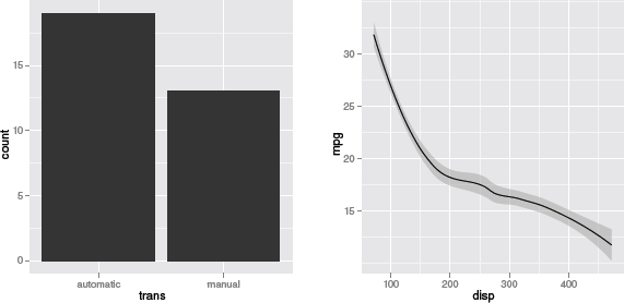
Examples of geoms with stat components: a bar geom, which uses a binning stat, and a smooth geom, which uses a smoother stat.
> p + geom_bar(aes(x=trans))
The stat that is used in this case is a binning stat. Another option is an identity stat, which does not transform the data at all. The following code shows how to explicitly set the stat for a geom by creating the same bar plot from data that have already been binned.
> transCounts <- as.data.frame(table(mtcars2$trans))
> transCounts
Var1 Freq
1 automatic 19
2 manual 13
Now, both the x and the y aesthetics are set explicitly for the bar geom and the stat is set to "identity" to tell the geom not to bin again.
> ggplot(transCounts) +
geom_bar(aes(x=Var1, y=Freq), stat="identity")
The following code presents another common transformation, which involves smoothing the original values. In this code, a smooth geom is added to the original empty plot. Rather than drawing a line through the original (x, y) values, this geom draws a smoothed line (plus a confidence band; see Figure 5.8).
> p + geom_smooth(aes(x=disp, y=mpg))
A similar result (without the confidence band) can be obtained using a line geom and explicitly specifying a "smooth" stat, as shown below.
> p + geom_line(aes(x=disp, y=mpg), stat="smooth")
Yet another alternative is to add an explicit stat component, as in the following code. This works because stat components automatically have a geom associated with them, just as geoms automatically have a stat associated with them. The default geom for a smoother stat is a line.
> p + stat_smooth(aes(x=disp, y=mpg))
Similarly, the bar plot in Figure 5.8 could be created with an explicit binning stat component, as shown below. The default geom for a binning stat is a bar.
> p + stat_bin(aes(x=trans))
One advantage of this approach is that parameters of the stat, such as binwidths for binning data, can be specified clearly as part of the stat. For example, the following code controls the method for the smooth stat to get a straight line (the result is similar to the line in Figure 5.4).
> p + stat_smooth(aes(x=disp, y=mpg), method="lm")
Table 5.3 shows some common ggplot2 stats and their parameters.
Some of the common stats that are available in the ggplot2 graphics system.
Stat |
Description |
Parameters |
|---|---|---|
stat_identity() |
No transformation |
- |
stat_bin() |
Binning |
binwidth, origin |
stat_smooth() |
Smoother |
method, se, n |
stat_boxplot() |
Boxplot statistics |
width |
stat_contour() |
Contours |
breaks |
5.7 The group aesthetic
Previous examples have demonstrated that ggplot2 automatically handles plotting multiple groups of data on a plot. For example, in the following code, by introducing the trans variable as an aesthetic that controls shape, two groups of data symbols are generated on the plot and a legend is produced (the scale_shape_manual() function is used to control the mapping from trans to data symbol shape; see Figure 5.9).
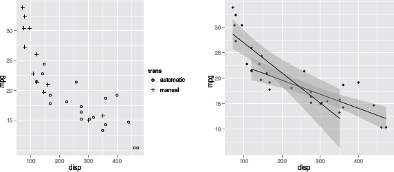
The group aesthetic in ggplot2. At left, mapping the shape aesthetic for point geoms automatically generates a legend. At right, mapping the group aesthetic for a smoother stat generates separate smoothed lines for different groups.
> p + geom_point(aes(x=disp, y=mpg, shape=trans)) +
scale_shape_manual(values=c(1, 3))
It is also useful to be able to explicitly force a grouping for a plot and this can be achieved via the group aesthetic. For example, the following code adds a smoother stat to a scatterplot where the data symbols are all the same, but there are separate smoothed lines for separate types of transmissions; the group aesthetic is set for the smoother stat. The method parameter is also set for the smoother stat so that the result is a straight line of best fit (see Figure 5.9).
> ggplot(mtcars2, aes(x=disp, y=mpg)) +
geom_point() +
stat_smooth(aes(group=trans),
method="lm")
Notice that in the code above, aesthetic mappings have been specified in the call to ggplot(). This is more efficient when several components in a plot share the same aesthetic settings.
5.8 Position adjustments
Another detail that ggplot2 often handles automatically is the problem of how to arrange geoms that overlap with each other. For example, the following code produces a bar plot of the number of cars with different transmissions, but also with the number of cylinders, cyl, mapped to the fill color for the bars (see Figure 5.10). The color aesthetic for the bars is set to "black" to provide borders for the bars and the fill color scale is explicitly set to three shades of gray.
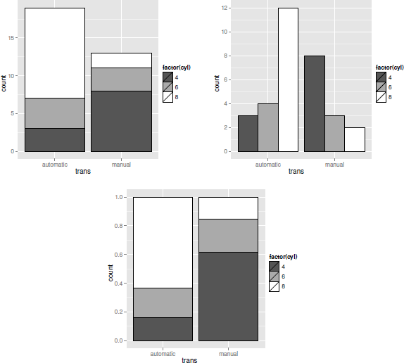
Examples of position adjustments in ggplot2: at top-left, the bars are "stacked"; at top-right, the bar position is "dodge" so the bars are side-by-side; and at the bottom, the position is "fill", so the bars are scaled to fill the available (vertical) space.
> p + geom_bar(aes(x=trans, fill=factor(cyl)),
color="black") +
scale_fill_manual(values=gray(1:3/3))
There are three bars in this plot for automatic transmission cars (i.e., three bars share the same x-location). Rather than draw these bars over the top of each other, ggplot2 has automatically stacked them up. This is an example of position adjustment.
An alternative is to use a dodge position adjustment, which places the bars side-by-side. This is shown in the following code and the result is shown in Figure 5.10.
> p + geom_bar(aes(x=trans, fill=factor(cyl)),
color="black",
position="dodge") +
scale_fill_manual(values=gray(1:3/3))
Another option is a fill position adjustment. This expands the bars to fill the available space to produce a spine plot (see Figure 5.10).
> p + geom_bar(aes(x=trans, fill=factor(cyl)),
color="black",
position="fill") +
scale_fill_manual(values=gray(1:3/3))
5.9 Coordinate transformations
Section 5.5 described how scale components can be used to control the mapping between data values and the values of an aesthetic (e.g., map the trans value "automatic" to the color value gray(2/3)).
Another way to view this feature is as a transformation of the data values into the aesthetic domain. Another example of a transformation of data values is to use log axes on a plot. The following code does this for the plot of engine displacement versus miles per gallon via the trans argument of the scale_x_continuous() function. The result is shown in Figure 5.11.
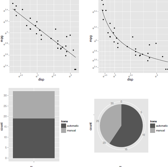
Examples of coordinate system transformations in ggplot2: at top-left is a cartesian plot of logged data with linear axes; at top-right is a cartesian plot of logged data with exponential axes; at bottom-left is a cartesian stacked barplot; and at bottom-right is a polar stacked barplot (a pie chart).
> p + geom_point(aes(x=disp, y=mpg)) +
scale_x_continuous(trans="log") +
scale_y_continuous(trans="log") +
geom_line(aes(x=disp, y=mpg), stat="smooth",
method="lm")
This is another reason for using an explicit scale component in a plot. Notice that the data are transformed by the scale before any stat components are applied (see Figure 5.7), so the line is fitted to the log transformed data.
Another type of transformation is also possible in ggplot2. There is a coordinate system component, or coord, which by default is simple linear cartesian coordinates, but this can be explicitly set to something else.
For example, the following code adds a coordinate system component to the previous plot, using the coord_trans() function. This transformation says that both dimensions should be exponential.
> p + geom_point(aes(x=disp, y=mpg)) +
scale_x_continuous(trans="log") +
scale_y_continuous(trans="log") +
geom_line(aes(x=disp, y=mpg), stat="smooth",
method="lm") +
coord_trans(x="exp", y="exp")
This sort of transformation occurs after the plot geoms have been created and controls how the graphical shapes are drawn on the page or screen (see Figure 5.12). In this case, the effect is to reverse the transformation of the data, so that the data points are back in their familiar arrangement and the line of best fit, which was fitted to the logged data, has become a curve (see Figure 5.11).
![]()
A diagram showing how geometric shapes may be transformed by a coordinate system before they are drawn on the page or screen.

A facetted ggplot2 scatterplot. A separate panel is produced for each level of a facetting variable, gear.
Another example of a coordinate system in ggplot2 is polar coordinates, where the x- and y-values are treated as angle and radius values. The following code creates a normal, cartesian coordinate system, stacked barplot showing the number of cars with automatic versus manual transmissions (see Figure 5.11).
> p + geom_bar(aes(x="", fill=trans)) +
scale_fill_manual(values=gray(1:2/3))
This next code sets the coordinate system to be polar, so that the y-values (the heights of the bars) are treated as angles and x-values (the width of the bar) is a (constant) radius. The result is a pie chart (see Figure 5.11).
> p + geom_bar(aes(x="", fill=trans)) +
scale_fill_manual(values=gray(1:2/3)) +
coord_polar(theta="y")
5.10 Facets
Facetting means breaking the data into several subsets and producing a separate plot for each subset on a single page. This is similar to lattice’s idea of multipanel conditioning and is also known as producing small multiples.
The facet_wrap() function can be used to add facetting to a plot. The main argument to this function is a formula that describes the variable to use for subsetting the data. For example, in the following code a separate scatterplot is produced for each value of gear. The nrow argument is used here to ensure a single row of plots is produced.
> p + geom_point(aes(x=disp, y=mpg)) +
facet_wrap(~ gear, nrow=1)
There is also a facet_grid() function for producing plots arranged on a grid. The main difference is that the formula argument is of the form y ~ x and a separate row of plots is produced for each level of y and a separate column of plots is produced for each level of x.
5.11 Themes
The ggplot2 package takes a different approach to controlling the appearance of graphical objects, by separating output into data and non-data elements. Geoms represent the data-related elements of a plot and aesthetics are used to control the appearance of a geom, as was described in Section 5.4. This section looks at how to control the non-data elements of a plot, such as the labels and lines used to create the axes and legends.
The collection of graphical parameters that control non-data elements is called a theme in ggplot2. A theme can be added as another component to a plot in the now-familiar way. For example, the following code creates a basic scatterplot, but changes the basic color settings for the plot using the function theme_bw(). Instead of the standard gray background with white grid lines, this plot has a white background with gray gridlines (see Figure 5.14).
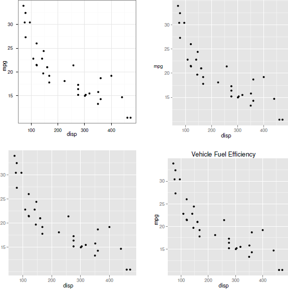
Some examples of themes in ggplot2: at top-left, the overall default style has been set to theme_bw; at top-right, the y-axis label has been rotated to horizontal; at bottom-left, the y-axis label has been removed altogether; at bottom-right, the plot has been given an overall title.
> p + geom_point(aes(x=disp, y=mpg)) +
theme_bw()
It is also possible to set just specific theme elements of the overall theme for a plot. This requires the opts() function and one of the element functions to specify the new setting. For example, the following code uses the theme_text() function to make the y-axis label horizontal (see Figure 5.14).
This example sets the text angle of rotation; it is also possible to set other parameters such as text font, color, and justification.
> p + geom_point(aes(x=disp, y=mpg)) +
opts(axis.title.y=theme_text(angle=0))
There are other functions for setting graphical parameters for lines, segments, and rectangles, plus a theme_blank(), which removes the relevant plot element completely (see Figure 5.14).
> p + geom_point(aes(x=disp, y=mpg)) +
opts(axis.title.y=theme_blank())
Table 5.4 shows some of the plot elements that can be controlled in this way.
Some of the common plot elements in the ggplot2 graphics system. The type implies which element function should be used to provide graphical parameter settings (e.g., text implies theme_text()).
Element |
Type |
Description |
|---|---|---|
axis.text.x |
text |
X-axis tick labels |
legend.text |
text |
Legend labels |
panel.background |
rect |
Background of panel |
panel.grid.major |
line |
Major grid lines |
panel.grid.minor |
line |
Minor grid lines |
plot.title |
text |
Plot title |
strip.background |
rect |
Background of facet labels |
strip.text.x |
text |
Text for horizontal strips |
The opts() function can also be used to control other features of the plot. For example, the following code specifies an overall title for a scatterplot (see Figure 5.14).
> p + geom_point(aes(x=disp, y=mpg)) +
opts(title="Vehicle Fuel Efficiency")
5.12 Annotating
With the emphasis on mapping values from a data frame to aesthetics of geoms, it may not be immediately obvious how to create custom annotations on a plot with ggplot2.
One approach is just to make use of the ability to set aesthetics rather than mapping them. For example, the following code shows how to add a single horizontal line to a scatterplot by setting the yintercept aesthetic of an hline geom to a specific value. The result is shown in Figure 5.15.
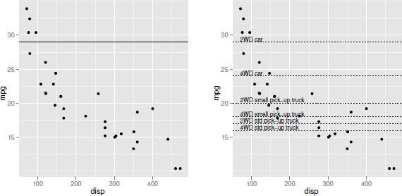
Some examples of annotation in ggplot2: at left, a single horizontal line has been added by setting a geom aesthetic (rather than mapping the aesthetic) and, at right, several horizontal lines and text labels have been added by using a completely new data set for the relevant geoms.
> p + geom_point(aes(x=disp, y=mpg)) +
geom_hline(yintercept=29)
Another option is to make use of the fact that the functions that create geoms are actually creating a complete layer, just with many components of the layer either inheriting or automatically generating default values. In particular, a geom inherits its data source from the original "ggplot" object that forms the basis for the plot. However, it is possible to specify a new data source for a geom instead.
In order to demonstrate this idea, the following code generates a data frame containing various fuel efficiency (lower) limits for different classes of vehicle. These come from Criterion 4 of the Green Communities Grant Program, which is run by the Massachusetts Department of Energy Resources.
> gcLimits <-
data.frame(category=c("2WD car",
"4WD car",
"2WD small pick-up truck",
"4WD small pick-up truck",
"2WD std pick-up truck",
"4WD std pick-up truck"),
limit=c(29, 24, 20, 18, 17, 16))
The following code creates a scatterplot from the mtcars2 data set and adds some extra lines and text based on this new gcLimits data set. The data argument to the geom functions is used to explicitly specify the data source for these geoms, so the aesthetic mappings for these geoms make use of variables from the gcLimits data frame. The final result is shown in Figure 5.15.
> p + geom_point(aes(x=disp, y=mpg)) +
geom_hline(data=gcLimits,
aes(yintercept=limit),
linetype="dotted") +
geom_text(data=gcLimits,
aes(y=limit + .1, label=category),
x=70, hjust=0, vjust=0, size=3)
5.13 Extending ggplot2
Because ggplot2 is based on a set of plot components that are combined to form plots, developing a new type of plot is usually simply a matter of combining the existing components in a new way.
HadleyWickham’s ggplot2 book provides further discussion, including advice on how to write a high-level function for producing a plot from ggplot2 functions.
Chapter summary
The ggplot2 package implements and extends the Grammar of Graphics paradigm for statistical plots. The qplot() function works like plot() in very simple cases. Otherwise, a plot is created from basic components: a data frame, plus a set of geometric shapes (geoms), with a set of mappings from data values to properties of the shapes (aesthetics). Legends and axes are generated automatically, but the detailed appearance of all aspects of a plot can still be controlled. Multipanel plots are also possible.