
Chapter 2
Simple Usage of Traditional Graphics
Chapter preview
This chapter introduces the main high-level plotting functions in the traditional graphics system. These are the functions used to produce complete plots such as scatterplots, histograms, and boxplots. This chapter describes the names of the standard plotting functions, the standard ways to call these functions, and some of the standard arguments that can be used to vary the appearance of the plots. Some of this information is also applicable to high-level plotting functions in extension packages.
The aim of this chapter is to provide an idea of the range of plots that are available in the traditional graphics system, to point the user toward the most important ones, and to introduce the standard approach to using them.
The graphics functions that make up the traditional graphics system are provided in an extension package called graphics, which is automatically loaded in a standard installation of R. In a non-standard installation, it may be necessary to make the following call in order to access traditional graphics functions (if the graphics package is already loaded, this will not do any harm).
> library(graphics)
This chapter mentions many of the high-level graphics functions in the graphics package, but does not describe all possible uses of these functions. For detailed information on the behavior of individual functions the user will need to consult the individual help pages using the help() function. For example, the following code shows the help page for the barplot() function.
> help(barplot)
Another useful way of learning about a graphics function is to use the example() function. This runs the code in the “Examples” section of the help page for a function. The following code runs the examples for barplot().
> example(barplot)
2.1 The traditional graphics model
As described at the start of Chapter 1, a plot is created in traditional graphics by first calling a high-level function that creates a complete plot, then calling low-level functions to add more output if necessary.
If there is only one plot per page, then a high-level function starts a new plot on a new page. There may be multiple plots on a page, in which case a high-level function starts the next plot on the same page, only starting a new page when the number of plots per page is exceeded (see Section 3.3). All low-level functions add output to the current plot. It is not generally possible to go back to a previous plot in the traditional graphics system (see Section 3.3.3 for an exception).
2.2 The plot() function
The most important high-level function in traditional graphics is the plot() function. In many situations, this provides the simplest way to produce a complete plot in R.
The first argument to plot() provides the data to plot and there is a reasonable amount of flexibility in the way that the data can be specified. For example, each of the following calls to plot() can be used to produce the scatterplot in Figure 1.1 (with small variations in the axis labels). In the first case, all of the data to plot are specified in a single data frame. In the second case, separate x and y variables are specified as two separate arguments. In the third case, the data to plot are specified as a formula of the form y ~ x, plus a data frame that contains the variables mentioned in the formula.
> plot(pressure)
> plot(pressure$temperature, pressure$pressure)
> plot(pressure ~ temperature, data=pressure)
Traditional graphics does not make a major distinction between, for example, scatterplots that only plot data symbols at each (x, y) location and scatterplots that draw straight lines connecting the (x, y) locations (line plots). These are just variations on the basic scatterplot, controlled by a type argument. This is demonstrated by the following code, which produces four different plots by varying the value of the type argument (see Figure 2.1).
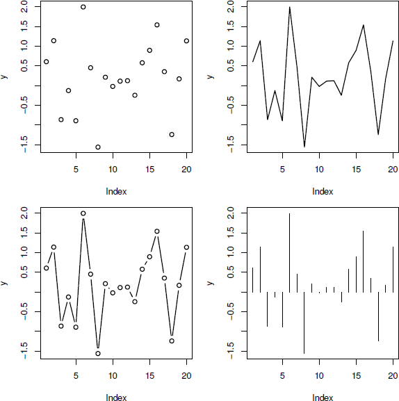
Four variations on a scatterplot. In each case, the plot is produced by a call to the plot() function with the same data; all that changes is the value of the type argument. At top-left, type="p" to give points (data symbols), at top-right, type="l" to give lines, at bottom-left, type="b" to give both, and at bottom-right, type="h" to give histogram-like vertical lines.
> y <- rnorm(20)
> plot(y, type="p")
> plot(y, type="l")
> plot(y, type="b")
> plot(y, type="h")
Traditional graphics also does not make a distinction between a plot of a single set of data and a plot containing multiple series of data. Additional data series can be added to a plot using low-level functions such as points() and lines() (see Section 3.4.1; also see the function matplot() in Section 2.5).
The plot() function is generic. One consequence of this has just been described; the plot() function can cope with the same data being specified in several different formats (and it will produce the same result). However, the fact that plot() is generic also means that if plot() is given different types of data, it will produce different types of plots. For example, the plot() function will produce boxplots, rather than a scatterplot, if the x variable is a factor, rather than a numeric vector. Another example is shown in the code below. Here an "lm" object is created from a call to the lm() function. When this object is passed to the plot() function, the special plot method for "lm" objects produces several regression diagnostic plots (see Figure 2.2).*
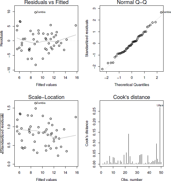
Plotting an "lm" object. There is a special plot() method for "lm" objects that produces a number of diagnostic plots from the results of a linear model analysis.
> lmfit <- lm(sr ~ pop15 + pop75 + dpi + ddpi,
data = LifeCycleSavings)
> plot(lmfit)
In order to learn more about the "lm" method for the plot() function, type help(plot.lm).
In many cases, graphics extension packages provide new plots by defining a new method for the plot() function. For example, the cluster package provides a plot() method for plotting the result of an agglomerative hierarchical clustering procedure (an agnes object). This method produces a special bannerplot and a dendrogram from the data (see the following code and Figure 2.3).* The first block of expressions is just setting up the data and creating an agnes object; the last expression plots the agnes object.
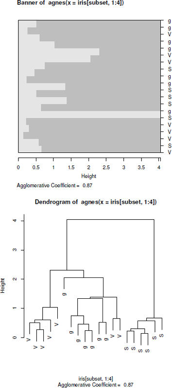
Plotting an agnes object. There is a special plot() method for agnes objects that produces plots relevant to the results of an agglomerative hierarchical clustering analysis.
> subset <- sample(1:150, 20)
> cS <- as.character(Sp <- iris$Species[subset])
> cS[Sp == "setosa"] <- "S"
> cS[Sp == "versicolor"] <- "V"
> cS[Sp == "virginica"] <- "g"
> ai <- agnes(iris[subset, 1:4])
> plot(ai, labels = cS)
Simple calling plot(x), where x is an R object containing the data to visualize, is often the simplest way to get an initial view of the data.
The following sections briefly describe the main types of plots that can be produced using either plot() or one of the other high-level functions in the graphics package. Toward the end of the chapter is a discussion of important arguments to these functions that allow some control over the detailed appearance of the plots (see Section 2.6).
Part IV of this book describes many other high-level functions from extension packages that produce many other types of plots.
2.3 Plots of a single variable
Table 2.1 and Figure 2.4 show the traditional graphics functions that produce a plot based on a single variable.
High-level traditional graphics plotting functions for producing plots of a single variable.
Function |
Data |
Description |
|---|---|---|
plot() |
Numeric |
Scatterplot |
plot() |
Factor |
Barplot |
plot() |
1-D table |
Barplot |
barplot() |
Numeric (bar heights) |
Barplot |
pie() |
Numeric |
Pie chart |
dotchart() |
Numeric |
Dotplot |
boxplot() |
Numeric |
Boxplot |
hist() |
Numeric |
Histogram |
stripchart() |
Numeric |
1-D scatterplot |
stem() |
Numeric |
Stem-and-leaf plot |

High-level traditional graphics plotting functions for producing plots of a single variable. Where the function can be used to produce more than one type of plot, the relevant data type is shown (in gray).
The plot() function will accept a single numeric vector, or a factor, or a one-dimensional table (a table of counts from a single factor). A numeric vector will produce a scatterplot of the numeric values as a function of their indices, while both a factor and a table produce a barplot of the counts for each level of the factor. The plot() function will also accept a formula of the form ~ x and if the variable x is numeric, the result is a one-dimensional scatterplot (stripchart). If x is a factor, the result is a barplot.
A barplot can also be produced explicitly with the barplot() function. The difference is that this function requires a numeric vector, rather than a factor, as input — the numeric values are treated as the heights of the bars to be plotted.
One issue with producing a barplot is providing a meaningful label below each bar. The plot() function uses the levels of the factor being plotted for bar labels and barplot() will use the names attribute of the numeric vector if it is available.
As alternatives to a barplot, the pie() function plots the values in a numeric vector as a pie chart, and dotchart() produces a dotplot.
Several functions provide a variety of ways to view the distribution of values in a single numeric vector. The boxplot() function produces a boxplot (or box-and-whisker plot), the hist() function produces a histogram, stripchart() produces a one-dimensional scatterplot (stripchart), and stem() produces a stem-and-leaf plot (but as text, on the console, rather than graphical output).
2.4 Plots of two variables
Table 2.2 and Figure 2.5 show the traditional graphics functions that produce plots of two variables.
High-level traditional graphics plotting functions for producing plots of two variables.
Function |
Data |
Description |
|---|---|---|
plot() |
Numeric, numeric |
Scatterplot |
plot() |
Numeric, factor |
Stripcharts |
plot() |
Factor, numeric |
Boxplots |
plot() |
Factor, factor |
Spineplot |
plot() |
2-D table |
Mosaic plot |
sunflowerplot() |
Numeric, numeric |
Sunflower scatterplot |
smoothScatter() |
Numeric, numeric |
Smooth scatterplot |
boxplot() |
List of numeric |
Boxplots |
barplot() |
Matrix |
Stacked/side-by-side barplot |
dotchart() |
Matrix |
Dotplot |
stripchart() |
List of numeric |
Stripcharts |
spineplot() |
Numeric, factor |
Spinogram |
cdplot() |
Numeric, factor |
Conditional density plot |
fourfoldplot() |
2x2 table |
Fourfold display |
assocplot() |
2-D table |
Association plot |
mosaicplot() |
2-D table |
Mosaic plot |
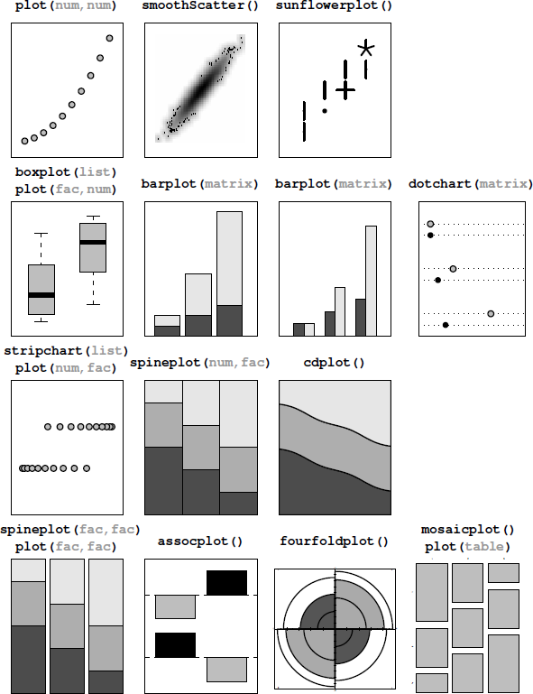
High-level traditional graphics plotting functions for producing plots of two variables. Where the function can be used to produce more than one type of plot, the relevant data type is shown (in gray).
The plot() function will accept two variables in a variety of formats: a pair of numeric vectors; one numeric vector and one factor; two factors; a list of two vectors or factors (named x and y); a two-dimensional table; a matrix or data frame with two columns (the first column is treated as x); or a formula of the form y ~ x.
If both variables are numeric, the result is a scatterplot. If x is a factor and y is numeric, the result is a boxplot for each level of x. If x is numeric and y is a factor, the result is a (grouped) stripchart, and if both variables are factors, the result is a spineplot. If plot() is given a table of counts, the result is a mosaic plot.
Two functions provide alternatives to the scatterplot, both motivated by the problem of overplotting, which occurs when values repeat or when there are very many points to plot. The sunflowerplot() function draws a special symbol at each location to indicate how many points are overplotted and the smoothScatter() function draws a representation of the density of points in the scatterplot (rather than drawing individual points). Another way to produce multiple stripcharts is to provide stripchart() with a list of numeric vectors.
When x is a factor and y is numeric, another way to produce multiple boxplots is with the boxplot() function, with the data provided either as a list of numeric vectors or as a formula of the form y ~ x, where x is a factor.
If the data consist of a numeric matrix, where each column or row represents a different group, the barplot() function will produce a stacked or side-by-side barplot from the numeric values and dotchart() will produce a dotplot.
When x is numeric and y is a factor, the spineplot() function will produce a spinogram, and cdplot() will produce a conditional density plot. Both functions will also accept the data as a formula of the form y ~ x.
For plotting two factors, there are also several options. Given the raw factors, the spineplot() function will produce a spineplot, just like plot() produces from two factors. An alternative is to work with a table of counts of the two factors. Given a table, the mosaicplot() function produces a mosaic plot, just like plot() does. The mosaicplot() function will also accept a formula of the form y ~ x where both y and x are factors.
In the special case where both factors have only two levels, assocplot() produces a Cohen-Friendly association plot and fourfoldplot() produces a fourfold display. See Chapter 13 for more plots that are designed specifically for displaying categorical variables.
In addition to the numeric vector and factor data types, another important basic data type is dates (or date-times). If plot() is given either x or y as a "Date" or "POSIXt" object then the corresponding axis will be labeled with date descriptions (e.g., using month names).
2.5 Plots of many variables
Table 2.3 and Figure 2.6 show the traditional graphics functions that produce plots of many variables.
High-level traditional graphics plotting functions for producing plots of many variables.
Function |
Data |
Description |
|---|---|---|
plot() |
Data frame |
Scatterplot matrix |
pairs() |
Matrix |
Scatterplot matrix |
matplot() |
Matrix |
Scatterplot |
stars() |
Matrix |
Star plots |
image() |
Numeric,numeric,numeric |
Image plot |
contour() |
Numeric,numeric,numeric |
Contour plot |
filled.contour() |
Numeric,numeric,numeric |
Filled contour |
persp() |
Numeric,numeric,numeric |
3-D surface |
symbols() |
Numeric,numeric,numeric |
Symbol scatterplot |
coplot() |
Formula |
Conditioning plot |
mosaicplot() |
N-D table |
Mosaic plot |
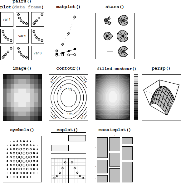
High-level traditional graphics plotting functions for producing plots of many variables. Where the function can be used to produce more than one type of plot, the relevant data type is shown (in gray).
Given a data frame, with all columns numeric, the plot() function will produce a scatterplot matrix, plotting all pairs of variables against each other.
The pairs() function does likewise, but it will accept the data in matrix form as well.
An alternative, when the data are in matrix form, is the matplot() function, which will plot a single scatterplot with a separate series of data symbols or lines for each column of data. The data can be separate x and y matrices, or a single matrix, in which case the values are treated as y-values and plotted against 1:nrow.
Another alternative is the stars() function, which draws a star for each row of data, with the values in the columns columns dictating the lengths of the arms of each star. This type of plot is an example of the small multiples technique, where many small plots are produced on a single page (see Section 3.3 for details on how to place multiple plots of any sort on a single page; see Section 12.4 for other examples of plots based on polar coordinates; and see Section 17.2.2 for a more sophisticated system for viewing multivariate data).
Several functions cater for the special case of three numeric variables. When x and y are measured on a regular grid, and there is a single response variable, z, the image() function plots z as a grid of colored regions, the contour() function draws contour lines (lines of constant z), filled.contour() produces colored regions between contour lines, and persp() produces a three-dimensional surface to represent z (see Chapter 16 for more sophisticated 3D graphics functions).
The symbols() function produces a scatterplot of x and y with a small symbol used to represent z, for example, a circle with radius proportional to z. A range of symbols is provided, some of which allow multiple variables to be represented within the symbol, for example, a rectangle symbol can encode separate variables as the width and height of the rectangle.
When the data consist of two numeric variables and one or two grouping factors, the coplot() function can be used to produce a conditioning plot, which draws a separate plot for each level of the grouping factors. The data must be given to this function as a formula of the form y ~ x | g or y ~ x | g*h, where g and h are factors. This idea is implemented on a much grander scale in the lattice package (see Chapter 4) and in the ggplot2 package (see Chapter 5).
For data consisting of multiple factors, the mosaicplot() function will produce a multidimensional mosaic plot, given a multidimensional table of counts (see Chapter 13 for other options for plotting multiple factors).
2.6 Arguments to graphics functions
It is often the case, especially when producing graphics for publication, that the output produced by a single call to a high-level graphics function is not exactly right in all its details. There are many ways in which the output of graphics functions may be modified and Chapter 3 addresses this topic in full detail. This section will only consider the possibility of specifying arguments to high-level graphics functions in order to modify their output.
Many of these arguments are specific to a particular function. For example, the boxplot() function has width and boxwex arguments (among others) for controlling the width of the boxes in the plot, and the barplot() function has a horiz argument for controlling whether bars are drawn horizontally rather than vertically. The following code shows examples of the use of the boxwex argument for boxplot() and the horiz argument for barplot() (see Figure 2.7).
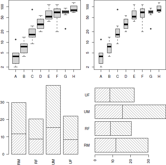
Modifying default barplot() and boxplot() output. The top two plots are produced by calls to the boxplot() function with the same data, but with different values of the boxwex argument. The bottom two plots are both produced by calls to the barplot() function with the same data, but with different values of the horiz argument.
In the first example, there are two calls to boxplot(), which are identical except that the second specifies that the individual boxplots should be half as wide as they would be by default (boxwex=0.5).
> boxplot(decrease ~ treatment, data = OrchardSprays,
log = "y", col="light gray")
> boxplot(decrease ~ treatment, data = OrchardSprays,
log = "y", col="light gray",
boxwex=0.5)
In the second example, there are two calls to barplot(), which are identical except that the second specifies that the bars should be drawn horizontally rather than vertically (horiz=TRUE).
> barplot(VADeaths[1:2,], angle = c(45, 135),
density = 20, col = "gray",
names=c("RM", "RF", "UM", "UF"))
> barplot(VADeaths[1:2,], angle = c(45, 135),
density = 20, col = "gray",
names=c("RM", "RF", "UM", "UF"),
horiz=TRUE)
In general, the user should consult the documentation for a specific function to determine which arguments are available and what effect they have.
2.6.1 Standard arguments to graphics functions
Despite the existence of many arguments that are specific only to a single graphics function, there are several arguments that are “standard” in the sense that many high-level traditional graphics functions will accept them.
Most high-level functions will accept graphical parameters that control such things as color (col), line type (lty), and text font (font and family). Section 3.2 provides a full list of these arguments and describes their effects.
Unfortunately, because the interpretation of these standard arguments may vary in some cases, some care is necessary. For example, if the col argument is specified for a standard scatterplot, this only affects the color of the data symbols in the plot (it does not affect the color of the axes or the axis labels), but for the barplot() function, col specifies the color for the fill or pattern used within the bars.
In addition to the standard graphical parameters, there are standard arguments to control the appearance of axes and labels on plots. It is usually possible to modify the range of the axis scales on a plot by specifying xlim or ylim arguments in the call to the high-level function, and often there is a set of arguments for specifying the labels on a plot: main for a title, sub for a subtitle, xlab for an x-axis label and ylab for a y-axis label.
Although there is no guarantee that these standard arguments will be accepted by high-level functions in graphics extension packages, in many cases they will be accepted, and they will have the expected effect.
The following code shows examples of setting some of these standard arguments for the plot() function (see Figure 2.8). All of the calls to plot() draw a scatterplot of the same data with lines connecting the data values: the first call uses a wider line (lwd=3), the second call draws the line a gray color (col="gray"), the third call draws a dashed line (lty="dashed"), and the fourth call uses a much wider range of values on the y-scale (ylim=c(-4, 4)).
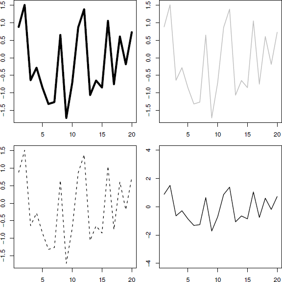
Standard arguments for high-level functions. All four plots are produced by calls to the plot() function with the same data, but with different standard plot function arguments specified: the top-left plot makes use of the lwd argument to control line thickness; the top-right plot uses the col argument to control line color; the bottom-left plot makes use of the lty argument to control line type; and the bottom-right plot uses the ylim argument to control the scale on the y-axis.
> y <- rnorm(20)
> plot(y, type="l", lwd=3)
> plot(y, type="l", col="gray")
> plot(y, type="l", lty="dashed")
> plot(y, type="l", ylim=c(-4, 4))
In cases where the default output from a high-level function cannot be modified to produce the desired result by just specifying arguments to the high-level function, possible options are to add further output to the plot using low-level graphics functions (see Section 3.4), or to generate the entire plot from scratch (see Section 3.5).
Some high-level functions provide an argument to inhibit some of the default output in order to assist in the customization of a plot. For example, the default plot() function has an axes argument to allow the user to inhibit the drawing of axes and an ann argument to inhibit the drawing of axis labels; the user can then produce customized output to represent the axes and labels (see Section 3.4.4).
2.7 Specialized plots
The traditional graphics system, and the extension packages that are built on it, contain a number of functions to produce plots that are suited to a particular type of data or analysis technique, or that are specific to a particular area of research.
Several of these are just variations on a basic scatterplot, with data symbols and/or lines plotted on cartesian coordinates. For example, the qqplot() and qqnorm() functions produce quantile-quantile plots (plotting observed values against values generated from theoretical distributions), the plot() method for "ecdf" objects (empirical cumulative distribution functions) draws a step plot, and the plot() methods for "ts" (time series) objects or density estimates (from the density() function) automatically draw lines between values to show the appropriate trends.
One interesting case is the display of a parametric curve where, rather than specifying explicit data points, a relationship between x and y is provided. This can be achieved in two ways: via the plot() method for function objects and via the curve() function. The following code shows both approaches to draw a sine wave (see Figure 2.9).
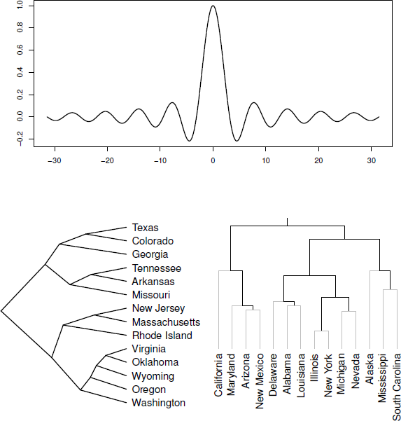
Some specialized plots. At the top is a plot of an R function and along the bottom are two variations on a dendrogram.
> plot(function(x) {
sin(x)/x
},
from=-10*pi, to=10*pi,
xlab="", ylab="", n=500)
> curve(sin(x)/x, -10*pi, 10*pi)
There are also some functions that produce quite different sorts of plots. The plot() method for dendrogram objects is provided for drawing hierarchical or tree-like structures, such as the results from clustering or a recursive partitioning regression tree. The bottom two plots in Figure 2.9 show examples of output from the plot() method for dendrogram objects.* Part IV of this book contains several chapters that describe how to produce specialized plots of various kinds. For example, Chapter 15 describes other functions that draw this sort of node-and-edge graph.
2.8 Interactive graphics
The strength of the traditional graphics system lies in the production of static graphics and there are only limited facilities for interacting with graphical output.
The locator() function allows the user to click within a plot and returns the coordinates where the mouse click occurred. It will also optionally draw data symbols at the clicked locations or draw lines between the clicked locations.
The identify() function can be used to add labels to data symbols on a plot. The data point closest to the mouse click gets labeled.
There is also a more general-purpose getGraphicsEvent() function that allows capture of mouse and keyboard events (mouse button down, mouse up, mouse move, key stroke). This provides a more flexible basis for developing interactive plots (though at the time of writing only for the Windows and X Window graphics device).
Chapter 17 includes a more detailed discussion of creating and using dynamic and interactive graphics with R.
Chapter summary
The traditional graphics system has functions to produce the standard statistical plots such as histograms, scatterplots, barplots, and pie charts. There are also functions for producing higher-dimensional plots such as 3D surfaces and contour plots and more specialized or modern plots such as dotplots, dendrograms, and mosaic plots. In most cases, the functions provide a number of arguments to allow the user to control the details of the plot, such as the widths of the boxes in a boxplot. There is also a standard set of arguments for controlling the appearance of a plot, such as colors, fonts, and line types and axis ranges and labeling, although these are not all available for all types of plots.
*The data used in this example are measures relating to the savings ratio (aggregate personal saving divided by disposable income) averaged over the period 1960-1970 for 50 countries, available as the data set LifeCycleSavings in the datasets package.
*The data used in this example are the famous iris data data set giving measurements of physical dimensions of three species of iris, available as the iris data set in the datasets package.
*The data used in these examples are measures of crime rates in various US states in 1973, available as the data set USArrests in the datasets package.