Chapter 16. Preflighting and Printing
Despite the claims of some industry pundits, print is not dead! We may rely on more different kinds of media for our information and entertainment than we did a decade or two ago, but almost every creative professional ultimately needs to print page layouts created in InDesign, or drawings produced in Illustrator, or images built in Photoshop. Many of us also need to publish this material, which requires preparing our files for commercial printing. And if we care about the accuracy of our printouts—especially if commercial printing is involved—it is important that we check our files ahead of time to make sure they met our expectations.
The process of analyzing and checking files as an early step in a print workflow is called preflighting. This industry-standard term, originally coined by consultant and writer Chuck Weger, derives its name from the checklist that pilots use when preparing to fly. The process of translating a file created on a computer screen to one that prints as we expect can be a rocky road. Many things can go wrong along the way. Thus, most print workflows mandate preflighting, by the file creator as well as by others who may receive the file later in the process. The Adobe Creative Suite 2 applications feature numerous tools to ensure that the file is created correctly. (InDesign, Illustrator, and Acrobat include these tools, but not Photoshop, because printing pixels directly from an application usually does not require them.) In this chapter we cover how you can use the CS2 application tools to preflight a file, including the following tasks:
• Previewing your entire layout at high resolution and with overprinting to display any interactions between transparency, process and spot colors, overprinting elements, and color conversions (for example, from RGB to CMYK).
• Previewing separations of a layout in InDesign and Acrobat to see exactly how a file will separate into color plates.
• Previewing and creating settings for transparency flattening (the process of converting different kinds of transparency to a single opaque layer necessary for printing).
• Checking fonts, graphics, and colors used in a file automatically in InDesign, or manually in Illustrator.
We also discuss the myriad kinds of printing that the CS2 applications support: You may print to a low-resolution inkjet printer or produce continuous-tone output from a film recorder or dye-sublimation printer. You might also use a printer that uses screens to simulate shades of gray or colors. You could even print high-resolution, color-separated output to imagesetters and platesetters, but this is most often done by a print service provider.
This chapter covers the issues you need to understand to produce different kinds of output. We provide tips for working with print service providers, and information about how they, too, can learn more about printing from the CS2 applications. Finally, we cover how Acrobat 7.0 Professional can be used preflight, correct, and print PDF files.
Preflighting Your Files
For the layout designer, the document creator, or the production manager responsible for sending files to a printer, it’s important to look for problems before sending the files to print—in other words, to preflight the files. This quality check warns of problems that may prevent a document or book from imaging as desired—most commonly, missing files or fonts. It provides helpful information such as the inks used, the first page on which a font appears, and print settings. (Note that in a very simple print workflow—for example, photographers printing directly from Photoshop to their own inkjet printer—such a checklist may not be necessary.)
Preflighting must also be done by print service providers when they receive files from a customer. They must check that the files meet the requirements for their particular print work-flow, and correct the files if necessary.
Catching mistakes as early in the production process as possible saves you time and money. Caught too late, they may not be correctable at all, and will end up in a printed piece.
Previewing at High Resolution
To work most effectively with graphics and pages in the Adobe Creative Suite applications, you must display them at high resolution. When graphics are placed near type created in InDesign or Illustrator, it’s hard to see their relative positioning with low-resolution proxy previews. It’s even more difficult to see color accurately in placed graphics without a high-resolution, color-managed display. CS2 applications use the Adobe Graphics Manager to display graphics based on their high-resolution information. This is a major step forward and provides you with a better onscreen representation of what your printed piece will look like. (This wasn’t always so; see the sidebar “When What You Saw Wasn’t What You Got.”)
All of the Creative Suite 2 applications share this technology, but only InDesign has controls for what kind of display is available for each document window or each individual graphic (Figure 16-1). There are three choices:
• Fast Display grays out all images and turns off transparency effects. This is the fastest preview option.
• Typical Display shows images with low-resolution proxy previews. This is the default setting.
• High Quality Display shows the images at the same resolution as they appear in Photoshop or Illustrator. This is the slowest display and is not recommended if you’re working on a slow machine.
Figure 16-1. InDesign CS2 has three display options: Fast Display (left); Typical Display (middle), and High Quality Display (right).
You can select these settings for each open document window by choosing the View > Display Performance submenu. Or you can individually select a graphic, and choose from the Display Performance submenu of the Object (or context) menu.
Behind the Scenes: When What You Saw Wasn’t What You Got
Figure 16-2. This is what a jaggy font looked like before Adobe Type Manager was available to smooth fonts at all sizes. Nowadays, a PostScript font will still appear jaggy if the vector portion of the font isn’t installed.

Overprinting Color and Previewing Overprinting
Overprinting controls how overlapping objects with different colors interact with each other when printed. By default, overprinting is turned off: Printing one colored object on top of another knocks out, or removes, color on underlying objects to preserve the color on top.
The basic knockout process is shown in Figure 16-3. Pure cyan type is placed on top of a pure yellow object in InDesign. The preview in the Separations Preview palette (see “Previewing Separations” for details) shows a hole—in the shape of the type—knocked out of the yellow plate. As a result, the colors don’t mix.
Figure 16-3. With overprinting turned off, the cyan plate knocks out the type on the yellow plate (top-left and top-right). The result is that the two colors don’t mix, and print purely (bottom-left).
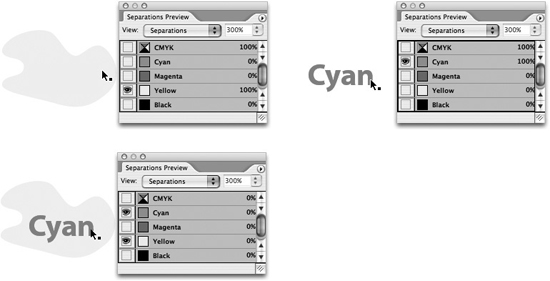
(See color version on page C-6 of the Color Insert.)
Overprinting can be used for several purposes:
• To mix colors. Purposely overprinting colors can stretch your printing budget when printing with two or three colors.
• To print varnish plates. Varnish must overprint other colors.
• To create trapping. Trapping is the using small overlaps at the edges of colored objects to compensate for registration problems on a printing press. Some print service providers still use overprinting to create manual trapping, although usually other trapping methods are more productive and effective.
Setting Overprinting
In InDesign and Illustrator, apply overprinting by selecting an object, opening the Attributes palette (choose Window > Attributes), and selecting Overprint Fill, Overprint Stroke, or both (Figure 16-4). In addition, InDesign by default overprints anything colored solid black; you can turn this off in the Appearance Of Black preferences.
Figure 16-4. InDesign Attributes palette set to overprint the cyan-colored type.
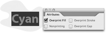
(See color version on page C-6 of the Color Insert.)
When the fill of the type is overprinted, the underlying object is not knocked out, and the colors mix (Figure 16-5).
Figure 16-5. Setting the cyan type to overprint leaves the yellow plate untouched (top-left). The colors now mix (bottom-left).

(See color version on page C-7 of the Color Insert.)
Previewing Overprinting
Overprint Preview is a feature in InDesign, Illustrator, and Acrobat 7.0 Professional. It simulates how objects that use the overprint attribute will appear in color-separated output (or when transparency and spot colors interact—see the sidebar “Transparency and the White Box Effect”). You could use it to detect, for example, that the creator of a file incorrectly set an object to overprint—which would cause the wrong printed result.
To turn on Overprint Preview in InDesign and Illustrator, choose View > Overprint Preview. In Acrobat 7.0 Professional, choose Advanced > Overprint Preview.
Tip: Preview Overprinting in Adobe Reader 7.0
Clients who use the free Adobe Reader 7.0 can now view overprinting in a proof so they can preview how it will print more accurately. To view the Overprint Preview, they must turn it on in Reader: Choose Page Display preferences, and check Overprint Preview.
Previewing Separations
As Figures 16-3 and 16-5 show, you can preview and evaluate spot- and process-color separations onscreen in the InDesign Separations Preview palette. This preview helps you identify and prevent costly mistakes before they appear on a proof or on press. For example, you could use it to detect that an object would color-separate on the wrong printing plate. To open the palette, choose Window > Output > Separations Preview (or press Shift-F6). Then select Separations from the palette’s View menu. (Acrobat 7.0 Professional has a similar feature that we describe later in “Preflighting, Correcting, and Printing PDF Files.”)
By default, all plates are showing. This is exactly the same display as when you choose Overprint Preview, as described in the previous section. Choosing the Overprint Preview keyboard shortcut (Shift-Option-Command-Y on the Mac, Shift-Alt-Ctrl-Y in Windows) toggles the Separations option when the palette is visible.
For Steve, this seems almost too good to be true. When he worked as a production manager for a prepress company, he spent countless hours laser-printing proofs of separations to see what would print on each plate of a job. Now he can do it with just a few keystrokes.
This is the most accurate way of previewing your InDesign pages because it uses the Adobe Graphics Manager display engine, and uses transparency when necessary to represent features such as overprinting, RGB-to-CMYK conversion, and spot-color interactions with transparency. The Adobe Graphics Manager even calculates its preview based on the ink characteristics of process and spot colors.
Viewing by the Numbers
You can view the color values underneath your cursor as you move it around the InDesign document window, using the onscreen densitometer included in the Separations Preview palette. This process is kind of like using the Info palette to show color values when viewing a Photoshop image.
You can turn the visibility of plates on and off by clicking the visibility (eye) icons. This is similar to changing the visibility of color channels in the Photoshop Channels palette. You can also toggle the visibility of plates with keyboard shortcuts (Table 16-1).
Table 16-1. Keyboard Shortcuts for Separations Preview

Controlling the Preview
You can control the Separations Preview in these ways:
• Change the preview to display only the colors used in a document, rather than the default display of all inks defined in a document. To delete colors that are not used, choose Select All Unused from the Swatches palette menu, and then click the Delete Swatch button. (Note that CMYK plates are always listed, even in a job with only two spot colors. However, the CMYK plates will not output if there are no colors to be printed.)
• Change the preview of a single plate to display in the separation color rather than in black. Deselect Show Single Plates In Black on the Separations Preview palette menu.
• Preview the effect of converting spot colors to process or aliasing spot inks. Both of these options are available by choosing Ink Manager from the Separations Preview palette menu. (For more on the Ink Manager, see “InDesign Ink Manager.”)
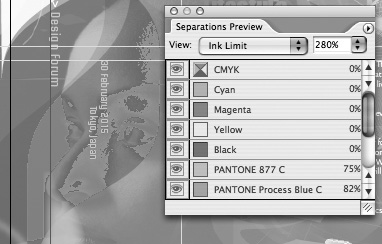
Previewing Ink Limits
Previewing ink densities of objects on your InDesign page enables a print service provider to see (and subsequently correct) areas that can be problematic when printed with a particular ink and paper combination. (Too much ink on the paper can prevent press sheets from drying properly.) To preview ink densities, in the Separations Preview palette, and choose Ink Limit from the View menu (Figure 16-6). Select an ink percentage from the right-hand menu. Areas that exceed the designated ink limit appear in shades of red; areas within the ink limit are gray. You can also move your cursor over a specific location to read its ink limit.
Figure 16-6. Select Ink Limit and an ink percentage in the Separations Preview palette to display, in shades of red, any areas exceeding the limit.
(See color version on page C-7 of the Color Insert.)
Controlling Transparency Flattening
Transparency is the visual interaction between overlapping, nonopaque colors in text and graphics. Examples of transparency include drop shadows, feathering effects, and opacity settings produced with a CS2 Transparency palette. Transparency can be created in InDesign, Illustrator, and Photoshop; and it can be displayed in Acrobat 7.0 Professional. (See Chapter 11, “Transparency,” for how to create and use transparency.)
Transparency effects must be flattened for printing. All the complex effects between text and graphics must be flattened to a single opaque layer when printing to most raster image processors (RIPs), when exporting EPS files, or when exporting to PDF files in Acrobat 4 or earlier formats. In Illustrator, flattening can also occur when saving backwards to Illustrator 8 and earlier formats. (Some newer Adobe PostScript 3 RIPs can directly process PDF files and handle transparency without a problem. But you won’t find many of them at your print service provider yet.)
To help prevent any nasty surprises when objects get flattened, InDesign, Illustrator, and Acrobat all provide ways of previewing transparency to give you more control over the process. (We discuss previewing transparency for InDesign and Illustrator in this section, and for Acrobat in “Previewing and Correcting PDF Files” later in this chapter.) Examples of problems that can occur when transparency is incorrectly applied and flattened include the following:
• Type or fine lines can thicken if they are lower in the stacking order when placed close to transparent effects.
• Objects with drop shadows may appear with a white box behind them.
• Color can shift unexpectedly.
How the Transparency Flattener Works
The Adobe Creative Suite 2 applications share a core technology called the Transparency Flattener (which we’ll refer to as “the Flattener”) that controls the flattening process. The Flattener is designed to maintain the appearance of objects as accurately as possible when you print or export files.
When flattening occurs, transparent objects that interact with other objects or each with other may be broken into smaller opaque pieces, sometimes called atomic regions. Figure 16-7 shows four simple objects created in InDesign. Two of the shapes and the type have had their opacity reduced with the Transparency palette. To show the effect of flattening, which normally only appears when printed, we exported the file as an Acrobat 4.0 (PDF 1.3) file. (All PDF 1.3 files are automatically flattened.) Then we opened the PDF file in Illustrator to see the flattened objects. To make the effect more apparent, we offset some of the objects to show that they were broken into pieces. Note in this example that InDesign doesn’t break up the type, but does convert some of it to a clipping path.
Figure 16-7. Simple objects with transparency before flattening (left) and after (right). Some of the flattened objects were offset to make the results more obvious.

(See color version on page C-8 of the Color Insert.)
The Flattener employs a couple of other strategies to maintain the integrity of object appearances: If spot colors and transparency interact, the Flattener may use overprinting commands in the resulting file to create transparent effects with opaque objects. (We discuss the implications of this choice in the sidebar “Transparency and the White Box Effect.”) If the Flattener encounters transparency that is too complex to be handled any other way, it must rasterize part of the artwork, turning vector objects into a bitmapped image.
Flattener Presets
The typical way to control how transparency will print is by selecting a transparency flattener preset in InDesign or Illustrator, or a transparency flattener setting in Acrobat 7.0 Professional. (We’ll discuss transparency flattening in Acrobat in “Preflighting, Correcting, and Printing PDF Files.”)
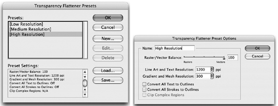
You can select or create flattener presets in InDesign and Illustrator by choosing Edit > Transparency Flattener Presets. Flattening takes time, and usually adds to the time it takes to print a document—how much time depends on the complexity of the page. There’s no reason to use the highest quality flattening settings when printing a proof to a desktop printer, but you probably won’t mind taking the time to get the best quality on an imagesetter or platesetter. To make the process easier, InDesign and Illustrator ship with three built-in transparency flattener presets: High Resolution, Medium Resolution, and Low Resolution (Figure 16-8, left). Most of the time, one of these settings will work for whatever you’re doing. As we describe later in this section, you can also create custom presets.
Figure 16-8. Transparency Flattener Presets dialog boxes in InDesign and Illustrator show three presets (left); selecting one and clicking New opens the Preset Options (right).
You select flattener presets in the Print dialog box, the Export Adobe PDF or Save Adobe PDF dialog box, or the Export EPS dialog box. Generally, match the preset to the resolution of your printer (low for proofing on low-resolution printers and high for imagesetters and platesetters). (InDesign also lets you override the flattener preset for an individual spread, using a command found in the Pages palette menu. It’s rare that you’d need to do that.)
If you’re a print service provider and you need to fine-tune your transparency output, you can customize flattener presets by choosing a built-in preset to start, and then clicking the New button. A second dialog box appears (Figure 16-8, right), with a number of controls. The Raster/Vector balance slider alters how the flattening occurs: Drag toward Vectors to have the Flattener maintain as many objects as vector as the artwork’s complexity will allow. This is usually what you want for high-resolution printing.
If rasterization is necessary, you can also choose settings to control the resolution in this same dialog box. The Line Art And Text Resolution setting controls the resolution of hard-edged objects like type, and the Gradient Resolution setting controls the resolution of soft-edged objects like drop shadows, gradients, or Illustrator mesh objects. Controls for some special situations are discussed in the following section, “Best Practices for Preserving Transparency.”
For the nitty-gritty details of how to use the flattener preset controls, refer to the Adobe InDesign CS2 Printing Guide for Prepress Service Providers in the Technical Info folder of the CS2 Std Content CD of your installation CDs.
Transparency and the White Box Effect
• Turn on overprint preview in the CS2 applications, as described in “Previewing Overprinting.”
• When printing to a RIP that supports overprinting, turn on that feature.
• If the flattened file will be printed to a printer that doesn’t support overprinting, choose the Simulate Overprint option. In InDesign and Acrobat 7.0 Professional, this option is located in the Print dialog box’s Output panel; in Illustrator, the option is located in the Print dialog box’s Advanced panel. It’s best to restrict using this feature to composite proofs, because flattening converts spot colors in the affected area to process.
Figure 16-9. With overprinting turned off, spot colors interacting with transparency print with a white box (left). With overprinting (or Simulate Overprint) turned on, the effect previews and prints correctly.

(See color version on page C-10 of the Color Insert.)
Previewing Transparency Flattening in InDesign
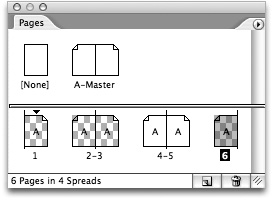
InDesign provides the best controls for previewing how transparency will be flattened. InDesign displays a checkerboard pattern in the Pages palette (Figure 16-10) for any spread that has at least one transparent element: The checkerboard pattern is the same indicator for the transparency grid in a Photoshop layer.
Figure 16-10. Checkerboard background on an InDesign page indicates transparency.
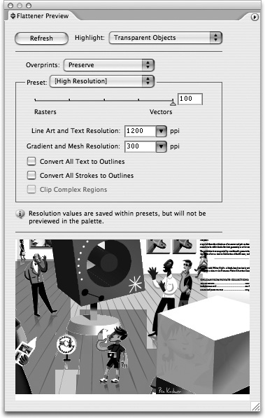
Another way to preview transparency in InDesign is using the Flattener Preview palette (choose Window > Output > Flattener Preview) (Figure 16-11). To highlight the effects of any transparency flattener preset in the document window, specify the kind of results you want to see. Using the Flattener Preview, objects affected by the specified transparent settings appear in shades of red in the document window; all other objects appear as gray. You can continue to edit the document while previewing flattening.
Figure 16-11. InDesign Flattener Preview palette highlights the effects of any transparency flattener preset in the document window.

(See color version on page C-9 of the Color Insert.)
To use the palette, use the Highlight menu to choose what to preview: Transparent Objects, All Affected Objects, or any of the other choices. Then select a transparency flattener preset from the Preset menu. After you change the settings, click the Refresh button to update the transparency display.
Previewing Transparency in Illustrator
Illustrator uses many of the same choices as InDesign, but it previews transparency within the Flattener Preview palette, providing a much smaller preview (Figure 16-12). To open the palette, choose Window > Flattener Preview. Be sure to choose Show Options from the palette menu to see all your choices. The choices for Presets and Highlight are similar to InDesign.
Figure 16-12. Illustrator’s Flattener Preview highlights the effects of transparency within the palette.
(See color version on page C-9 of the Color Insert.)
Tip: Navigate Through the Illustrator Flattener Preview
To best use the Illustrator Flattener Preview palette, open the palette as large as possible by dragging the resize handle at the bottom right. To magnify (zoom) the preview, click in the preview area. To zoom out, Option/Alt-click the preview area. To pan the display, hold down the spacebar and drag.
Best Practices for Handling Transparency
To ensure that the transparency you create in a file appears as you expect when printed, it helps to follow certain best practices. Here are a few tips:
• Whenever possible in InDesign and Illustrator, place type on a higher layer in the Layers palette, or in front of nearby transparent effects. Placed lower in the stacking order, type may interact with transparency and end up outlined or rasterized when the transparency is flattened, while some of it may remain as PostScript fonts. The affected type may appear thicker. To preserve the type, put it on its own layer and move it higher in the stacking order (Figure 16-13).
Figure 16-13. Type lower than the transparent drop shadow interacts with the flattened transparency and is rasterized, indicated by the red in the Flattener Preview (left). On its own, higher layer, type is unaffected by transparency, indicated by the gray (right).

(See color version on page C-11 of the Color Insert.)
• In InDesign, make sure that the transparency blend space (Edit > Transparency Blend Space) is set to Document CMYK for printing to CMYK printers for separations. Otherwise, color shifts can occur during flattening.
• Because they support live transparency, place native Illustrator (AI) files and native Photoshop (PSD) files instead of older formats like EPS that don’t support transparency.
• Be sure to use high-resolution images, which the Flattener requires. If you’re using DCS (Desktop Color Separation) and OPI (Open Prepress Interface) workflows, replace your low-resolution images with high-resolution versions.
Preflighting and Packaging in InDesign
Surveys of print service providers have shown that most output problems are caused by missing fonts and graphics.
With its very capable automated Preflight feature, InDesign makes it easy to fix these and other problems, such as duplicate colors or missing plug-ins, before the file is packaged. Packaging a file creates a folder that contains the InDesign document (or documents in a book file), any necessary fonts, linked graphics, text files, and a customized report.
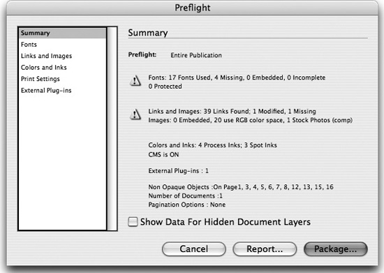
You can preflight an InDesign file at any time by choosing File > Preflight, or pressing Shift-Option-Command-F (Mac) or Shift-Alt-Ctrl-F (Windows). After InDesign analyzes the document and prepares its report, the Preflight dialog box appears, set to the Summary panel (Figure 16-14). Problems are highlighted in the summary with a triangle warning icon.
Figure 16-14. Summary panel of the InDesign Preflight dialog box.
Displaying and Replacing Fonts
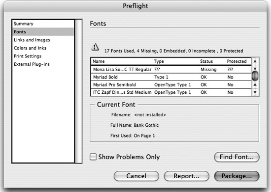
Use the Fonts panel to list the fonts in your document and in any linked EPS and PDF files (Figure 16-15). For any missing fonts, the panel will list the first page in the document where the font is used. Clicking the Find Font button opens the Find Font dialog box. Here you can find out more information about a font, or replace one. For more about this dialog box, see “When Good Fonts Go Bad” in Chapter 6, “Type Magic.”
Figure 16-15. Fonts panel of the InDesign Preflight dialog box.
Displaying and Replacing Links and Images
The Links And Images panel lists the document’s embedded and linked files (Figure 16-16). Linked images are listed by their name on disk, and embedded images are just listed as “(Embedded)”. For each image, InDesign lists the file format and color space (unfortunately, the program can’t detect RGB color information in vector RGB EPS or PDF files). It also lists the Actual ppi and Effective ppi (scaled resolution) for each image.
Figure 16-16. Links And Images panel of the InDesign Preflight dialog box.
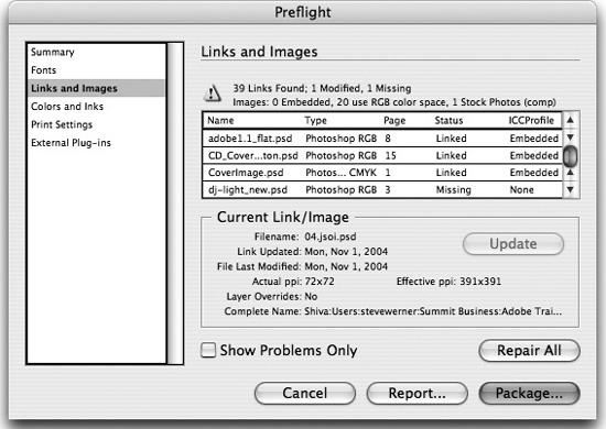
Use the Update/Relink button to select an individual linked graphic that is missing or modified, and to update or relocate it without leaving the dialog box (the feature toggles its name depending on the status of the image selected). The Repair All button lets you fix all missing and modified links. (For more information on linked and embedded images, see “Linking Files in Illustrator and InDesign” in Chapter 9, “Smart Objects and Intelligent Layouts.”)
Choosing Additional Preflight Options
There are three other panels in the InDesign Preflight dialog box:
• The Colors And Inks panel shows you the inks used in your document, including inks in EPS or PDF files.
• The Print Settings panel summarizes the current settings in the Print dialog box.
• The External Plug-ins panel identifies any plug-ins which are required to reproduce the document.
Packaging a File in InDesign
Packaging creates a folder to collate a publication, its associated graphics and fonts, and a report about the document for the print service provider or to whomever you are handing off your document.
(You don’t need to perform a final preflight check before packaging. InDesign performs an up-to-date preflight check. If problem areas are detected, a dialog box appears.)
To package a file in InDesign, click the Package button at the bottom of the Preflight dialog box (or press Shift-Option-Command-P (Mac) or Shift-Alt-Ctrl-P (Windows)). This launches the packaging feature.
Before InDesign finishes packaging a file, it displays the Printing Instructions dialog box, in which you can enter contact information and printing instructions. Click Continue to choose how to package your document using the Create Package Folder dialog box (Mac, Figure 16-17) or the Package Publication dialog box (Windows).
Figure 16-17. The InDesign Create Package Folder dialog box (called Package Publication in Windows).
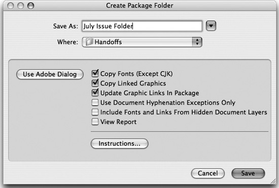
The document and the Printing Instructions report are always copied into the folder. However, you can choose which other items to include. Almost always, you’ll want to use the default choices: copying the fonts, copying linked graphics, and updating the graphic links in the package. Choosing to update graphic links ensures that when your recipient opens the file, all the graphics will be linked and up-to-date. When you click Save (Mac) or Package (Windows), an alert from the Adobe Legal Department appears warning of the dangers of sending fonts to people who don’t own them. (As much as we respect the message, we wish we could disable this.) Click OK to complete the packaging process.
Manually Preflighting in Illustrator
Sadly, Illustrator lacks the automated preflighting feature of InDesign. It also has no packaging feature. So when you prepare a file for handoff, note that you’ll have to manually include the fonts and graphics in the package for your print service provider.
However, you can manually preflight your Illustrator file and check for many of the same items as does InDesign. We’ll tell you where to look.
Displaying Document and Object Information
To list general file information and object characteristics, use the Illustrator Document Info palette. To open it, choose Window > Document Info. By default, the palette displays only information about the currently selected object. To show information about all objects in a file, deselect Selection Only in the palette menu (Figure 16-18).
Figure 16-18. Illustrator’s Document Info palette, with the Objects panel displayed.

The default display, Document, is the least interesting. But choosing Objects from the palette menu displays a very comprehensive overview of all the kinds of objects in the Illustrator file. You can then select the other display options from the palette menu for more detailed information.
Displaying Image and Font Information
To get information about images and fonts in a document, use the respective Links palette and Find Font dialog box:
• Check the status of linked and embedded images on Illustrator’s Links palette. See “Linking Files in Illustrator and InDesign” in Chapter 9, “Smart Objects and Intelligent Layouts.”
• Identify and replace missing fonts using the Find Font dialog box (choose Type > Find Font). The Find Font dialog box (Figure 16-19) indicates missing fonts in angle brackets, as well as listing all fonts used in the document. Icons indicate the type of font: “O” for an OpenType font, a blue “TT” for a TrueType font, and a red “a” for a PostScript Type 1 font. You can replace a missing font with a font already in the document, or from installed system fonts.
Figure 16-19. Illustrator’s Find Font dialog box.

Printing in the CS2 Applications
After you have used the preflighting features in the Adobe Creative Suite 2 applications, the second part of the road to getting good print output is to choose the correct print settings. Sometimes, you’ll do this yourself when you print a file to the printer in your workplace. Other times, you’ll pass on your file to a print service provider. We’ll talk about both of these options in this section.
(The topic of color management, including how to use the Color Management Print feature, is covered in Chapter 10, “Colors and Color Management.”)
Printing Basics
You have several choices for how to output your computer-created file to paper. Before learning about these choices, you need to understand some essential concepts: the difference between halftone and continuous tone output; between a PostScript and non-PostScript printer; and between composite and separated output.
Halftones and Continuous Tone
Some printing devices work in a binary way: When they image, they produce either black or white, on or off. This is true when you’re printing to a laser printer, inkjet printer, high-resolution imagesetter or platesetter, or to a printing press. For example, on a printing press, there’s no such thing as continuously varying amounts of ink: There’s either ink, or no ink on paper.
These binary devices usually combine the grid of printer dots with which they image into larger “spots” called halftone dots. Laser printers work with larger printer pixels, and imagesetters and platesetters work with smaller printer pixels; thus, laser printers have coarser halftone dots (Figure 16-20, left) than do high-resolution printing devices (Figure 16-20, middle and right). We discuss printer and halftone resolution in “Pixel Essentials” in Chapter 4, “Pixels and Raster File Formats.” Halftone devices use patterns of halftone spots (called screens) that fool the eye into seeing them as continuous tones when they’re really not. (Inkjet printers don’t use halftone dots, but use small, diffuse spots that can appear continuous.)
Figure 16-20. Laser printers (left) have larger, coarser printer pixels; imagesetters and platesetters (middle and right) have smaller, finer printer pixels. Each creates halftone spots that simulate shades of gray or color.

Continuous-tone printers, on the other hand, really can vary the color or gray value of each printer (or monitor) pixel. Examples of continuous-tone devices include your computer’s monitor and film recorders, which work with beams of electrons or light; and dye-sublimation printers, which can vary the amount of ink to build a color when printing.
PostScript and Non-PostScript Printers
PostScript printers include a PostScript RIP (raster image processor) that can interpret commands in the PostScript language. (We explain more about PostScript in “Working with PostScript and PDF Files” in Chapter 14, “Creating and Using PDF Files.”) PostScript printers are designed to output high-resolution placed images reliably, and to render fonts accurately at the printer’s resolution—and thus are optimized for typical InDesign and Illustrator output. Color PostScript printers (including imagesetters and platesetters) use CMYK as their native color space.
Non-PostScript printers are optimized more for printing raster images than type or vector graphics. The inkjet printers that now flood the printer market use RGB as their native color space. Still, the CS2 applications—especially InDesign, which can even rasterize placed EPS files—generally do a good job outputting to inkjet printers,. When a non-PostScript printer is selected, some InDesign and Illustrator Print commands are grayed out—for example, printing separations. In some cases, you may get better results from a non-PostScript printer by exporting a PDF file and printing from Acrobat 7.0 Professional.
Composite and Separated Output
The third issue when printing from the CS2 applications is whether the output is composite or color-separated. Continuous-tone printers, inkjet printers, and color laser printers produce composite output, where all the colors are applied together to produce a single image on paper. Other workflows that produce composite output include creating PDF files (which we discuss in Chapter 14, “Creating and Using PDF Files,”) and outputting to some high-end workflow systems that take composite color data and use their own methods to output color separations.
Color-separated output refers to using an application like InDesign, Illustrator, or Acrobat to produce color separations—one for each color plate. These separations are output as separate files for a platesetter (which produces plates for a printing press) or an imagesetter (which uses film as an intermediate step before producing plates). To produce color-separated output, either place pre-separated CMYK images in your InDesign and Illustrator layouts, or place RGB images and use the CS2 color-management features to convert them to CMYK.
Printing from InDesign
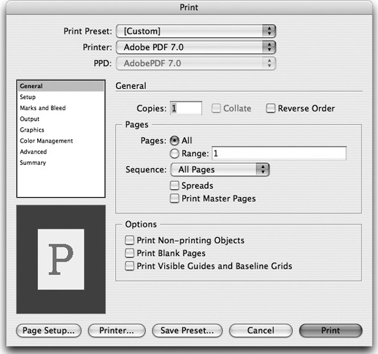
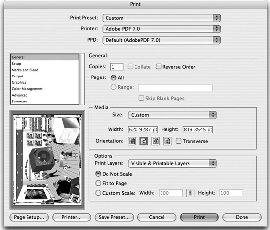
Whether you’re outputting halftone or continuous-tone documents, or composite or color-separated plates, InDesign is the premiere application for printing to either PostScript or non-PostScript devices because of its wide range of options. To set printing options in InDesign, choose File > Print or press Command/Ctrl-P. The Print dialog box opens, displaying the General panel (Figure 16-21). The numerous controls are arranged on eight panels.
Figure 16-21. General panel of the InDesign Print dialog box on the Macintosh. Printer- and driver-specific options differ somewhat in Windows.
Tip: Move Through the Print Panels
The quick way to move through the many print panels in InDesign is with the keyboard: Down Arrow moves to the next panel, and Up Arrow moves to the previous panel.
Many printing controls (especially on the Output, Graphics, Color Management, and Advanced panels) are available only when a PostScript printer is selected.
Setting Common Printing Controls
Some of the printer controls can be viewed from all the printer panels. These include setting the printer and PostScript Printer Description (PPD) file, creating a PostScript file, setting printer-specific controls, and previewing output. Here are the common controls:
• Set up a printer by selecting a printer from the Printer menu. In Mac OS X, the Printer menu lists printers that you have defined using the Printer Setup Utility. In Windows, it displays printers you have set up with the Add Printer Wizard.
Selecting a printer also displays the PPD (PostScript Printer Description) file corresponding to the printer driver, grayed out in the PPD menu. The PPD is a text file that lists the specific characteristics—for example, paper sizes—available for the selected PostScript printer. The PPD is set in the operating system printing controls, not in InDesign. For a non-PostScript printer the PPD field displays nothing.
• Create a PostScript file for print workflows that require one by choosing PostScript File from the Printer menu. You then have the choice to include or exclude printer-specific PostScript code along with the PostScript code created in InDesign. Choose the name of a PPD file to add printer-specific code, or choose Device Independent.
• Access printer-specific controls available for some printers (such as hardware collating features or tray selection) by clicking the Page Setup and Printer buttons (Mac), or the Setup button (Windows) at the bottom of the Print dialog box.
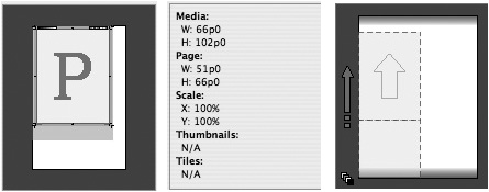
To preview the printer settings, use the interactive preview proxy in the lower left corner of the Print dialog box. For example, the preview will update if you change the page size or orientation, or add printer’s marks (Figure 16-22). Click the preview proxy to toggle it between three views: Initially, the standard view shows the relationship between the print settings and the current media (paper) size. Click the proxy, and it shows this information as text. Click again, and it displays cut sheet view, showing the relationship between the selected media size and the film or plate material used by the printing device. For an imagesetter or platesetter, this reflects the position of the media size on the film or plate material, including Offset, Gap, and Transverse settings. A small icon also indicates the color mode of the output.
Figure 16-22. Clicking the Preview Proxy in the Print dialog box toggles between standard view (left), text view (middle), and cut sheet view (right). Icon at lower left of cut sheet view shows output color mode.
Setting General InDesign Print Options
The General panel contains the most commonly used commands for printing. Following are the most common options you can set up:
• Set the number of copies, page range, and printing spreads.
• Print master pages. This printout can be helpful when designing a document.
• Print Nonprinting Objects. This option overrides choosing the Non-Printing attribute on the Attributes palette.
• Print Visible Guides and Baseline Grids. These print in the color specified in the document, a great feature for page designers.
Setting Paper Size
Use the Setup panel (Figure 16-23) in the Print dialog box to set paper size.
Figure 16-23. Setup panel of the InDesign Print dialog box.
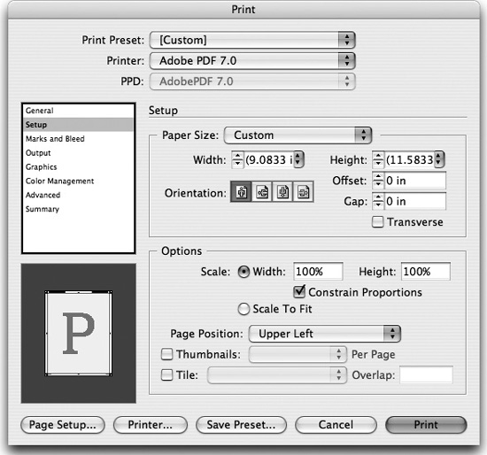
You have three choices for paper size, depending on your Printer menu selection:
• If you select a printer, the Paper Size menu reads Defined by Driver, which means that InDesign uses the current printer driver’s default size. You can override this by choosing a different paper size, based on those specified in that printer’s PPD file. Some printers also allow the Custom option, described later in this section.
• If you choose Device Independent PostScript, no paper size is available because this PostScript file will be handled by post-processing software later in the workflow (like software for imposition, for example).
• If you choose PostScript targeted for a particular printer, you can also choose paper sizes in that printer’s PPD file, or Custom if that is available.
High-resolution platesetters and imagesetters can output pages of any size that can fit onto their roll-fed media. Thus, their PPDs allow creating custom paper sizes. Choose Custom from the Paper Size menu, and enter any Width or Height value you wish that fits on the paper. However, there’s a much easier and smarter way! Use the InDesign default “Auto” for both Width and Height; InDesign then automatically calculates the minimum paper size needed to output the current page with all marks and bleeds. (You can also choose Custom when you choose Adobe PDF 7.0 as your printer.)
Scaling Pages and Printing Thumbnails
The Setup panel in the Print dialog box allows scaling and positioning pages, printing thumbnails, and tiling documents. Set page scaling from 1% to 1000%. Usually you would scale printing proportionally; however, unchecking Constrain Proportions can be useful for a specialized printing process like flexography. (Flexography is used to print on irregular surfaces such as pressure-sensitive label paper, plastic films, and packaging.) You can also choose Scale To Fit, and options for page positioning. You can print several scaled-down pages called thumbnails on a single sheet of paper by turning on the Thumbnails option. You can also tile the document—print an oversize page in sections on a smaller media size.
Adding Printer’s Marks and Bleed
Use the Marks And Bleed panel (Figure 16-24) of the Print dialog box to specify which printer’s marks should appear around the printed page, as well as how big the bleed area should be. InDesign lets you individually choose which printer’s marks are included, as well as their weight and offset values. Customize your bleed settings in this panel, or define them in File > Document Setup to use those values in this panel. You can also choose to print a slug area, usually used for approval forms or instructions to a printer
Figure 16-24. Marks and Bleed panel of the InDesign Print dialog box.

Setting Output Options
Determine how color in the document is sent to the printer using the Output panel in the Print dialog box. This panel contains some of the more complex InDesign printing controls, most of which are available only when a PostScript printer is chosen (Figure 16-25).
Figure 16-25. Output panel of the InDesign Print dialog box showing Composite CMYK selected (left) and Separations selected (right).
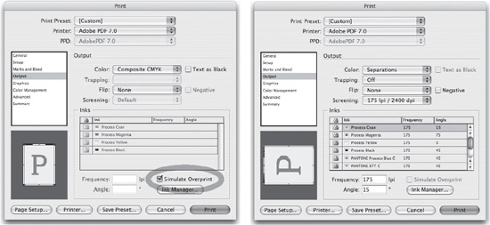
Consider the kind of output you are expecting from your printer. Are you producing a composite color proof, a grayscale print, or do you want each color in the document to be printed on a separate printing plate?
Choose the following options from the Color menu:
• Composite Leave Unchanged sends a full-color version of specified pages to the printer, preserving all color values in the original document. This is useful when you want the printer to do the color conversion. Selecting this option disables Simulate Overprint.
• Composite Gray sends grayscale information to the printer. Any colors in the InDesign file are converted to grays, but colors inside EPS or PDF graphics remain unchanged. This is useful for printing to a black-and-white composite printer, such as a desktop laser printer.
• Composite RGB sends full-color RGB to the printer. This is best for RGB printers like inkjet printers and film recorders.
• Composite CMYK sends full-color CMYK to the printer. This is best for CMYK PostScript printers and composite color workflows. This color output mode converts spot colors to process colors in a composite environment, but preserves spot colors if the PostScript output from this mode is processed in a separations environment. RGB-to-CMYK conversion is determined by the color-management settings, if enabled.
• Separations sends the data as CMYK separations with each color (including spot colors) on a separate plate. This is best for pre-separated workflows, including those to most imagesetters and platesetters.
• In-RIP Separations sends the data as composite CMYK and spot-color data, optimized for separation within the printer’s RIP. The choice is only available if you have chosen the PPD of an imagesetter or platesetter with this capability.
When you choose Separations or In-RIP Separations (Figure 16-25, right), you have several other choices available:
• For Trapping, choose Application Built-in or In-RIP. (For information about the trapping controls in InDesign, we recommend Real World Adobe InDesign CS2 from Peachpit Press.)
• Flip allows you to print the page so it images right-reading or wrong-reading and on the correct emulsion side when producing film output. Negative turns black to white and vice versa, to produce film negatives.
• The Screening options provide combinations of screen frequency (in lines per inch) and output resolution (in dots per inch) for printing. For Separations, the settings are those available in the current printer’s PPD file. You can also select custom halftone values in the Inks section of the dialog box. (When printing Composite Gray output, you can also select Custom screening.)
Choose from these additional options in the Output panel:
• Select Text As Black to turn text to black if it isn’t colored None, Paper, or a 0-percent tint. Select this option for faxing a proof to someone, for example.
• Select Simulate Overprint when a Composite option (other than Leave Unchanged) is selected, to allow proofing transparency accurately when it interacts with spot colors (Figure 16-25, left). For more information, see the “Transparency and the White Box Effect” sidebar.
InDesign Ink Manager
The Ink Manager lets you control which color plates are produced when you print color separations. You may have applied many colors in your InDesign document (and imported more colors in placed graphics). If the colors are (perhaps accidentally) spot colors, many more plates may output than you expected.
To display the Ink Manager dialog box, in the Output panel of the Print dialog box, click the Ink Manager button (Figure 16-26). (You can also access the Ink Manager from the InDesign Swatches and Separation Preview palette menus.) The Ink Manager lets you choose whether an individual spot color prints on its own plate or is converted to a process color. To convert all spot colors, check All Spots To Process. To convert an individual ink, click the column to the left of the ink name.
Figure 16-26. The Ink Manager lets you change the inks output from a file without changing the file itself.

Even more powerfully, you can use the Ink Manager to alias one spot color to another. An all-too-familiar scenario for an output provider is that the client has applied two or more different names for the same spot color. If not corrected, these will output on separate plates.
Figure 16-26 shows two versions of PANTONE 129 in the ink list—one ending with “C,” the other with “U.” (These stand for the Pantone Coated and Uncoated libraries, respectively.) To alias one to the other, the PANTONE 129 C was selected and PANTONE 129 U was chosen from the Ink Alias menu. This changes the output of the inks without having to manually edit the file to fix the problem!
Controlling Graphics Output
Use the Graphics panel of the Print dialog box to control how graphics are output.
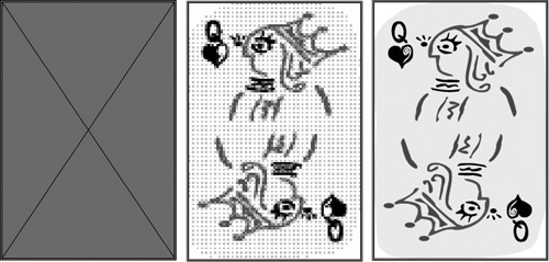
The Send Data menu in the Images section determines how the data in linked graphics is sent to the printer:
• All sends all the high-resolution data (always choose this option for high-resolution output and any transparency).
• Optimized Subsampling and Proxy downsample the data to print faster.
• None replaces all placed graphics with a large X.
Downloading Fonts
You can choose how fonts are sent to the printer using the Graphics panel of the Print dialog box:
• Complete downloads all the document’s fonts at the beginning of the print job.
• Subset downloads only the glyphs used.
• None downloads only references to fonts and is used only when you know all fonts are on the printer.
The Download PPD Fonts checkbox forces all the document’s fonts to download, even if the PPD says they reside in the printer.
Controlling Transparent Output
Use the Advanced panel (Figure 16-27) of the Print dialog box to choose the Transparency Flattener preset described in the preceding section, “Flattener Presets.” Here also you can choose to ignore any custom Spread Overrides for transparency flattening set in the InDesign Pages palette.
Figure 16-27. Advanced Panel of the InDesign Print dialog box.

Summarizing Settings
The Summary Panel of the Print dialog box displays a report of the settings you’ve made in all the panels of the Print dialog box. The option to save this summary may be useful for troubleshooting, or as a record of the settings used if you need to output the file again.
Creating Print Presets
As we have described in other parts of this book, all of the CS2 applications can save common settings—called presets—that can be called up quickly. Print presets make it easy to reduce errors in a high-production, time-constrained environment. InDesign lets you create print presets that save almost all of the choices you make in the InDesign Print dialog box.
We find it easiest to create print presets in the Print dialog box. Open the Print dialog box for a typical print. Make all the choices necessary in each of the panels, and then click the Save Preset button at the bottom of the dialog box. The preset name will now appear in the Print Preset menu at the top of the dialog box. That’s all there is to it.
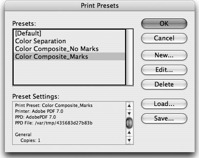
If you have a lot of different devices that you print to, you may prefer to choose File > Print Presets > Define. This displays the Print Presets dialog box (Figure 16-28), which lists the Default preset (the settings which appear by default in the Print dialog box) as well as any other print presets you’ve created. Click the New button to create a new preset. Select a preset, and click the Edit button to edit a preset; click the Delete button to delete a preset. You can also use the Load and Save buttons to exchange print presets between workstations.
Figure 16-28. InDesign Print Presets dialog box.
Printing from Illustrator
In the last two versions of Illustrator, the Print dialog box has been significantly improved: It has borrowed much of the look and many features from the superior printing interface in InDesign. To open the Illustrator Print dialog box, choose File > Print or press Command/Ctrl-P (Figure 16-29).
Figure 16-29. General panel of Illustrator Print dialog box.
Comparing the Illustrator and InDesign Print Interface
Illustrator print features no longer are a poor second cousin to InDesign. In earlier versions of Illustrator, many print controls were missing, and many people tended to place Illustrator files in page-layout applications like InDesign simply to print them. With the improvements to the Print dialog box, this shouldn’t be necessary any more.
The layout of the Illustrator Print dialog box is quite similar to that of InDesign. You can choose a name on the left to display a panel of choices. The most important settings are always visible as you make choices from the Print panels. Like InDesign, the Print Preset, Printer, and PPD menus are on top, and a preview of the current settings is on the bottom left.
You can choose a printer or print to a PostScript file in exactly the same way as we described for InDesign in “Setting General InDesign Print Options.”
However, Illustrator doesn’t replicate all the print features available in InDesign; for example, Illustrator has no Ink Manager option.
Since so many features are the same, we’ll focus mostly on the differences in the following sections.
Setting General Illustrator Print Options
Unlike InDesign (which uses the Setup panel), in Illustrator you choose Media Size and Orientation options on the General panel. You also have options to choose to print visible layers, visible and printable layers (when both the Show and Print options are selected in Layer Options on the Layers palette), or all layers. You can use scaling choices to fit oversized artwork onto a single sheet of media.
Setting Print Bounding Box and Tiling Options
Use the Setup panel to define the Illustrator printing bounding box. Also use this panel to set tiling options, including tile overlap.
Setting Flatness Values for Curves
Use the Graphics panel (Figure 16-30) of the Print dialog box to set the Flatness option and control how closely an output device will approximate curves. A lower setting (toward Quality) creates more, smaller straight line segments, more closely approximating the curve. A higher setting (toward Speed) results in longer and fewer line segments, producing a less accurate curve but a faster print time. The Automatic option chooses an appropriate flatness value based on the printer PPD.
Figure 16-30. Graphics panel of the Illustrator Print dialog box.

Controlling Overprinting
To control overprinting in Illustrator, use the Advanced panel of the Print dialog box. You can choose between Preserve (which retains overprinting, and is the default for separations), Simulate (which works similarly to the Simulate Overprint feature described in the sidebar “Transparency and the White Box Effect”), or Discard (which discards any Overprint Fill or Overprint Stroke attributes).
Choosing a Transparency Flattener Preset
Use the Advanced panel of the Illustrator Print dialog box to choose a Transparency Flattener preset.
Summarizing Settings
Illustrator Summary panel features are very similar to those in InDesign, with the addition of some useful printing warnings, such as when transparency needs to be flattened or the Document Raster Effects setting is at screen resolution (which we discuss in the “Applying Filters and Effects” section of Chapter 4, “Pixels and Raster File Formats”).
Print Presets
Print presets can be created in Illustrator, in an almost identical way to InDesign, by clicking Save Preset in the Print dialog box. You can also control print presets by choosing Edit > Print Presets to open the Print Presets dialog box.
Printing from Photoshop
In days past, it was rare to print directly out of Photoshop. Images were inevitably placed into a page-layout application for printing. But with the proliferation of inkjet printers throughout the graphics industry, this has certainly changed. Printing choices in Photoshop are much simpler than those of InDesign and Illustrator.
Using the Print With Preview Command
The Print With Preview dialog box is always our choice when we need to print directly from Photoshop (Figure 16-31). It provides some nice options for printing an image that go beyond the capabilities of the operating system’s Print dialog box.
Figure 16-31. Print With Preview dialog box in Photoshop.

The controls at the top of the dialog box are always available, and they let you position and scale your image on the available paper size. (Click the Page Setup button to choose a paper size from the operating system dialog box.) In the Scaled Print Size section, you can enter a scaling percentage or set Height and Width values. You can also choose the Scale To Fit Media option. For the most control when scaling an image, make choices here rather than in the operating system’s Page Setup dialog box.
You can even print a selected area. In your image, use the Rectangular Marquee tool to select an area. When you enter the Print With Preview dialog box, the Print Selected Area option is available.
Choosing Output Options
To access Output options available in Photoshop, click the More Options button in the Print With Preview dialog box to display the bottom portion of the dialog box. There are two toggleable panels here: We’ll discuss a few of the Output options (the other panel is Color Management, which we discuss in Chapter 10, “Colors and Color Management”):
• Screen. Click this button to open the Halftone Screens dialog box and specify the halftone screen frequency and angle, as well as dot shape. Almost always it’s safest to select the Use Printer’s Default Screen option.
• Background. This sets a background color that appears behind an image when printed.
• Border. You can set a border weight to surround an image. It’s always printed in black.
• Description. You can add a description to be printed with the image.
• Calibration Bars, Registration Marks, Crop Marks, Labels, Negative, and Emulsion Down. These add printer’s marks and printing controls for image setting and plate setting. The Emulsion Down choice changes the emulsion direction for film output. The Negative choice turns black to white and vice versa, to produce film negatives.
Working with a Print Service Provider
You work with a print service provider when you need output from printing devices that you don’t have in your own workgroup or organization. Usually this is to produce high-resolution output in preparation for commercial printing.
Sometimes the relationship between creative professionals and their print service providers is not the best. This can result from differing experiences and expectations: A creative professional may have worked with a print service provider who used obsolete RIPs and software, or whose knowledge was out of date. A print service provider may have received files that were poorly prepared, with missing fonts and graphics, or transparency features that seemed impossible to print.
The intention of the first part of this chapter was to provide enough knowledge in how to pre-flight your files to make them ready to print. Here we’ll talk about the other side of the equation: Making sure that the print service provider is ready to handle your files in a reasonable manner so that you’ll get the output you expect.
Warning Signs When Working with a Print Service Provider
Not all print service providers follow an up-to-date workflow. Out of choice or financial constraints, some providers hold back on upgrading their RIPs or purchasing software, thus jeopardizing the quality of their service and their success at outputting files. Files created in InDesign—a truly modern page-layout application—are particularly impacted when processed in an outmoded workflow.
Here are some warning signs that print service providers may not be up to snuff:
• They request that you export your layout as single-page EPS or PDF files. This is an almost sure sign they are going to place your files into an application like QuarkXPress. The results of doing this can be very unpredictable, especially when you’re using transparency!
• They request that you save your InDesign CS2 file backwards to InDesign CS (or even earlier). This is not a good choice for printing. If it is necessary, you should do it yourself, and proof the pages carefully because subtle changes can occur.
• They request that you outline all your fonts in the application or PDF file that you provide. Outlining fonts is not necessary because both InDesign and Illustrator always embed fonts when creating a PDF file. Outlining renders the text no longer editable, and can thicken the shapes of letterforms.
• They request that you submit your file (typically an advertisement) as a raster TIFF or JPEG file. Rasterizing will severely degrade text and vector art.
Finding a Print Service Provider
Sometimes you don’t have a choice over who will do your printing. In that case, look for the warning signs we just mentioned, and ask lots of questions of those who will print your file. Sometimes a print service provider simply needs to be educated: The provider may have had bad experiences printing directly-exported PDF files from InDesign, for example, because earlier versions of InDesign encoded fonts in a way that caused errors on their RIPs. This problem is now solved, as we discuss in the sidebar “Good News About Embedded Fonts and Older Raster Image Processors,” in Chapter 14, “Creating and Using PDF Files.” You might refer them to Adobe service provider programs, described later in the section.
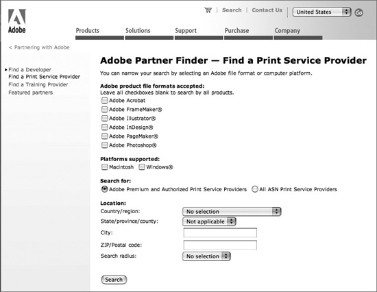
Other times, it may cause less aggravation if you look for a print service provider who is more prepared to handle your CS2 files. Adobe offers a service called the Adobe Partner Finder for creative professionals who are looking for printers that support Adobe software (Figure 16-32). You can search for print service providers in your area who are ready to handle CS2 files. Printers can register to be listed in the online searchable database for free. To use the Partner Finder, go to www.adobe.com/sp-partnerfinder.
Figure 16-32. Adobe Partner Finder service for finding a print service provider who handles CS2 files.
Adobe Service Provider Program
To make it easier for your print service provider to get up to speed on the knowledge they need to output your CS2 files, and to make sure they have the latest software, Adobe has established the Adobe Solutions Network (ASN) Print Service Provider Program. It now offers three levels of service provider support:
• The Basic service provider program is free. It offers a print service provider technical bulletins, white papers, toolkits, access to free online training seminars, and a monthly technical newsletter. It also allows the provider to list in the Adobe Partner Finder.
• The Adobe Authorized Service Provider (AASP) program offers all of the basic features listed above, plus both Mac and Windows single-user copies of the Adobe Creative Suite 2 Premium Edition (including updates and upgrades), and unlimited toll-free technical support calls for a year for those applications. At the time of this writing, this program cost only $595 per year! (This program is for print service providers who offer services to clients outside their company, and requires application, including submitting sample output or other proof or credentials of the business.)
• The Premium Level Service Provider program is for companies with more complex workflows, and includes all the benefits of the AASP program and adds other benefits, including eligibility for on-site training and co-hosted seminars for a print service provider’s customers for $995 per year.
Print service providers can learn more about these programs by going to http://partners.adobe.com and clicking on the Print Service Providers link.
Advice for Print Service Providers
And for all you print service providers reading along out there, some friendly advice from the trenches:
• Keep up-to-date in knowledge and equipment, whenever possible, using the resources we just described.
• Be willing to adapt your workflow—for example, accepting PDF/X-compliant PDF files—to accommodate files coming from Adobe Creative Suite applications.
• Clearly inform your customers what your requirements are for receiving documents and PDF files intended for print.
• Once you have educated yourself, be proactive in educating your customers in how to prepare files correctly for your workflow.
• Using the methods we describe in this chapter and in Chapter 14, “Creating and Using PDF Files,” provide PDF presets and PDF preflight profiles for your customers to enable them to create and preflight files that are optimized for your workflow.
Preflighting, Correcting, and Printing PDF Files
As we discuss in Chapter 14, “Creating and Using PDF Files,” many print service providers now accept and even prefer PDF files for print workflows. For a print service provider, outputting from PDF files can offer workflow advantages over application files. When receiving application files, here are some examples of common events that can interrupt the workflow:
• The application version that the print service provider uses doesn’t match the customer’s, which can cause confusion or output errors.
• The customer’s job waits while the customer sends missing assets, like fonts or graphics, not included when the job was submitted (or if the customer initially sent the wrong assets).
• The print service provider’s inexperienced staff sometimes doesn’t understand the complexities of the application’s print settings, causing the job to be re-run.
When properly created, a PDF file includes all the job assets—including fonts and graphics—in a single package. For a print service provider who has invested in creating an up-to-date workflow, printing from supplied PDF files creates a simpler process, bypassing many of the problems of receiving application files.
In this section, we describe some of the features of Acrobat 7.0 Professional that make this simpler process possible. We discuss how to preflight PDF files, how to correct many of the problems they may contain, and how to use some of Acrobat’s advanced printing features.
Preflighting PDF Files
Acrobat 7.0 Professional includes a professional-level preflighting tool to check whether PDF files meet specific criteria that are required for the intended output and that work with your workflow. Typically, a print service provider uses this tool to check files coming from a customer, but anyone who uses the Creative Suite can use this tool. A creative professional could use it to check for transparency or RGB images in a PDF file, for example.
To open the Preflight tool, choose Tools > Print Production > Preflight, or click the Preflight icon on the Print Production toolbar that we discuss in the next section. The Preflight dialog box appears (Figure 16-33, left). Selecting a profile displays its purpose at the bottom of the dialog box. Many of the profiles have been created to reflect “best practices” for certain segments of the print industry.
Figure 16-33. Use the Preflight dialog box in Acrobat 7.0 Professional to select a profile to preflight a PDF file (left). The results indicate conditions which cause the preflight to fail (right).
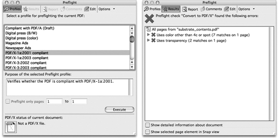
To preflight a PDF file, select a profile in the Preflight dialog box, and click the Execute button. After a few moments, the Results panel appears (Figure 16-32, right). Conditions which cause the preflight to fail are marked with a red X. In the illustration, when a PDF/X-1a profile was run, the preflight failed because it contained colors other than CMYK and spot colors, and contained two instances of transparency. None of these is allowed by the PDF/X-1a standard. You can create a droplet (a mini-application) to preflight files (see “Droplets in Acrobat 7.0 Professional” in Chapter 15, “Automating Your Work”).
To view or edit a profile, click the Edit button in the Preflight dialog box. The Preflight: Edit Profile dialog box appears. Since the profiles are locked by default, the best way to customize a profile is to click the Duplicate Profile button. You can then edit any of the conditions checked in the profile, and save the profile under a new name.
Previewing and Correcting PDF Files
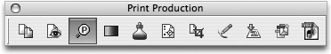
In addition to preflighting, Acrobat 7.0 Professional includes a group of production-oriented tools for previewing and correcting PDF files so they will work in your print workflow. You can select tools individually by choosing Tools > Print Production, but the easiest way to use them is to open the Print Production toolbar (Figure 16-34). To do this, choose Tools > Print Production > Show Print Production Toolbar, or Control/right-click the Acrobat main toolbar to choose it from the context menu. We describe the primary PDF previewing and correction tools in this section. The PDF Optimizer tool is also found on this toolbar. We discuss this tool in the “Repurposing PDF Files” section of Chapter 14, “Creating and Using PDF Files.”
Figure 16-34. Opening the Print Production toolbar in Acrobat makes its PDF correction tools quickly accessible.
Previewing Output
The Output Preview tool provides the same functions as the InDesign Separation Preview feature, but combines them with a soft preview, color warnings, access to an Ink Manager feature, and a color space preview. To use it, click the tool on the Print Production toolbar, or choose Tools > Print Production > Output Preview. In the Output Preview palette that appears, the Preview menu toggles between showing Separations Preview and Color Warnings.
Selecting Separations in the Preview menu (Figure 16-35, left), displays a Separations Preview feature similar to that in InDesign. Choose from these features:
• Use the cursor as a densitometer to view the color values underneath your cursor as you move it around the document window. It’s analogous to using the Info palette to show color values when viewing a Photoshop image.
• Change color plate visibility by clicking plates on and off.
• Check the Total Ink Coverage option to show ink values similar to the InDesign Ink Limit display: Areas of the PDF document with ink values over the limit specified are shown in a highlight color.
• Soft proof a PDF document by selecting a Simulation Profile at the top of the palette. The Simulate Ink Black option previews the ink’s dynamic range defined by the profile. The Simulate Paper White option previews the white of the paper described by the profile.
• Access the Ink Manager (described in the next section).
• Unique to Acrobat, you can choose a color space, such as RGB, from the Show menu. Only objects using that color space are displayed. You can use this to view any RGB images in your PDF file, for example. Choosing All from the Show menu displays all objects on the displayed pages.
Figure 16-35. The Output Preview dialog box in Acrobat 7.0 Professional, showing Separations Preview (left) and Color Warnings (right).
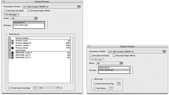
When you choose Color Warnings in the Preview menu (Figure 16-34, right), you see other choices in the Output Preview palette: Then you can check Show Overprinting to preview objects with the overprint attribute set, indicated in a highlight color. If you check Rich Black, areas will be highlighted where black is mixed with color inks. This is particularly useful for highlighting rich black text, which can cause problems on press.
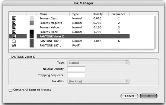
Acrobat Ink Manager
Acrobat has an Ink Manager feature very similar to that in InDesign. To use it, click the Ink Manager tool in the Print Production toolbar, or click the Ink Manager button in Output Preview to display the Ink Manager dialog box (Figure 16-36). You can also access the Ink Manager from the Advanced Print Setup dialog box (described in the following section, “Advanced PDF Printing Features”). Use the dialog box to select which inks to output from the PDF file, convert all or individual spot colors to process, or alias spot-color inks. Using the Ink Manager doesn’t change the PDF file, but causes it to be output using the inks selected in the Ink Manager dialog box.
Figure 16-36. The Ink Manager dialog box in Acrobat 7.0 Professional.
Converting Colors
If your PDF file will be output as high-resolution color separations, you may want to convert objects to CMYK or another color space. You might need to do this, for example, if you need to color-separate a PDF file created in a Microsoft Office application that supports only RGB color output, not CMYK. You can do this with the Convert Colors tool in Acrobat 7.0 Professional: Click the Convert Colors tool on the Print Production toolbar, or choose Tools > Print Production > Convert Colors. The Convert Colors dialog box (Figure 16-37) displays all the color spaces present in the PDF document. It shows the results of any colors already converted or mapped with the Ink Manager. Depending on the color space you select, you can use the Action menu to preserve, convert, or map color values. When converting colors, you choose a destination ICC profile for the conversion. You can convert colors on one page or all pages. Color conversion can be complex: Choose Help > Complete Acrobat 7.0 Help for details.
Figure 16-37. The Convert Colors dialog box in Acrobat 7.0 Professional. The effect of converting and mapping spot colors in the Ink Manager are displayed.

Tip: Convert PDF files to Grayscale
In addition to converting color spaces to CMYK (the most common use of the Convert Colors feature), you can also convert PDF files to grayscale. To do this, select Gray Gamma 1.8 or Gray Gamma 2.2 as your destination profile in the Profile menu. (The gamma value affects how light or dark an image appears. Mac OS systems normally use a gamma of 1.8, which makes images appear lighter than on Windows systems, with a gamma of 2.2.)
Fixing Hairlines
Hairlines that are too thin to reproduce present another potential printing problem. The Fix Hairlines tool on the Print Production toolbar searches for most thin hairlines in a PDF document and replaces them with a heavier line weight of your choice. You can do this for a particular page or the entire document.
Adding Printer’s Marks and Enlarging Pages
Another important part of a PDF workflow is specifying the page boundary boxes of PDF files. This is a part of the PDF specification that allows printing workflow systems and printing devices to detect the boundaries of printed jobs: Crop, Trim, Bleed, and Art boxes define these boundaries. (A printing workflow system is an integrated management system, which typically organizes page processing, proofing, trapping, and computer-to-film and computer-to-plate output.)
If a PDF document has been created in InDesign or another page-layout application with trims and bleeds, then Acrobat 7.0 Professional can recognize that information. However, sometimes PDF files are created from applications that don’t support proper printers’ marks and boundary boxes. Acrobat 7.0 Professional provides two tools that help you correct problems. For details, refer to Help > Complete Acrobat 7.0 Help.
• The Add Printer Marks tool lets you add printer’s marks (trim marks, bleed marks, and so on) to one or more pages of a PDF file. Choose the Add Printer Marks tool on the Print Production toolbar to open the Add Printer Marks dialog box.
• The Crop Pages tool opens the Crop Pages dialog box. This lets you define the margins for Crop, Trim, Bleed, and Art boxes in a PDF file. You can also use the Crop Pages dialog box to change the page size of a PDF file, either for one page or all pages. Note that the Crop Pages tool does not permanently delete a selection, and what was cropped can be restored.
Previewing and Flattening Transparency
Files created with Acrobat 5.0, 6.0, or 7.0 compatibility can contain transparency.
The files must be flattened before printing, exporting as PostScript or EPS files, or using the PDF Optimizer tool to save to Acrobat 4.0 compatibility.
Acrobat provides a Flattener Preview feature similar to those in InDesign and Illustrator (described in “Controlling Transparency Flattening” earlier in the chapter). To choose the feature in Acrobat 7.0 Professional, select the Transparency Flattening tool on the Print Production toolbar. A Flattener Preview palette similar to that in Illustrator appears (Figure 16-38). The transparency settings and their preview are similar to those in InDesign and Illustrator. You can use the palette to view the effects of selecting different flattening settings. However, unlike InDesign and Illustrator, you can also use this palette to immediately flatten the PDF file and remove transparency.
Figure 16-38. Flattener Preview palette in Acrobat 7.0 Professional.

Another difference from the Flattener Preview features in InDesign and Illustrator is that Acrobat doesn’t provide a way of setting transparency flattener presets. Instead, you must choose Flattener Settings manually. For high-resolution output, the recommended settings are as follows:
• Raster/Vector Balance slider at 100 (moved all the way to the right).
• Line Art and Text Resolution: 1200 ppi
• Gradient and Mesh Resolution: 300 ppi.
• Turn off other options unless needed. For the nitty-gritty details of how to use these controls, refer to the Adobe InDesign CS2 Printing Guide for Prepress Service Providers, found in the Technical Info folder of the CS2 Std Content CD of your installation CDs.
Acrobat 7.0 Professional lets you flatten transparency in three places:
• In the Flattener Preview palette, make the Flattener settings as we describe above. Select a page range, and click the Apply button at the bottom of the dialog box. Flattening will take place immediately, removing all transparency from the PDF file. This operation cannot be undone; Acrobat will save the file under a different name.
• In the PDF Optimizer dialog box, choose the Transparency panel. Choose from the same settings as in the Flattener Preview palette, and click OK. Flattening will take place immediately.
• In the Advanced Print Setup dialog box, as described in the same-named section, you can flatten transparency at the time of printing the PDF file.
Participating in a JDF Workflow
A new print workflow is gathering steam. For several years now, a consortium of graphic arts vendors and creative professionals have been developing the concept of a digital job ticket to replace the mishmash of paper-based systems used for processing print jobs. The device-independent, vendor-neutral format developed by the CIP4 consortium is called Job Definition Format (JDF). (See the following sidebar, “The CIP4 Consortium and JDF.”) Using a digital job ticket can enable both creative professionals who create files and print service providers who receive them to reduce errors and improve communication.
The first manifestation of this new standard and workflow in Acrobat 7.0 Professional is the JDF Job Definition dialog box (Figure 16-39). Choose the JDF Job Definitions tool on the Print Production toolbar to open the dialog box. You use this dialog box to create a JDF file. In a typical JDF workflow, a print service provider would supply a JDF template, based on conversations with a customer about the specifications for a job. It would include PDF presets to be used with the job, preflight profiles, and as much information about the job as is known. The customer would add other information, for example, contact information about the employees who will be working on the job.
Figure 16-39. JDF Job Definition dialog box.

When it’s time to submit the job to the print service provider, the customer clicks the Submit button. The JDF Acrobat plug-in then checks the PDF files submitted with the JDF file for consistency with the job definition in the JDF file (for example, the number of pages and page size). If an inconsistency occurs (for example, a different number of pages in the PDF than is described in the JDF template), the customer is alerted. Then the plug-in preflights the files using the embedded preflight profile. As a last step, it turns the file into a MIME package so that it can be transmitted over the Internet (or passed by other means) to the print service provider for output.
Advanced PDF Printing Features
In the first versions of Acrobat, printing was something of an afterthought, useful only for printing to your office printer. High-resolution printing of color separations had to be handled by expensive third-party Acrobat plug-ins. Beginning with Acrobat 6.0 Professional, printing has been considerably beefed up, and Acrobat 7.0 Professional continues that trend.
Acrobat 7.0 Professional Print Dialog Box
The initial Acrobat Print dialog box seems pretty Spartan but has some useful controls (Figure 16-40). As you’d expect, you can select the page range to print in this dialog box. What’s not obvious is that you can print noncontiguous pages. To do this, before opening the Print dialog box, click the tab of the Pages panel to open it. Then Shift-click or Command/Ctrl-click the desired page thumbnails on the panel to select them. When you open the Print dialog box, the Selected pages option will be chosen.
Figure 16-40. Print dialog box in Acrobat 7.0 Professional, showing Page Scaling options. By default, Acrobat reduces a PDF page to printer margins.

The most important option to look at is Page Scaling, shown in the illustration above. Acrobat’s default setting is Reduce To Printer Margins. This has been designed for office workers to ensure their documents fit on the printed page. This default has tripped up many a graphic artist who is left wondering how a page layout got reduced when printed. For high-resolution output, None would be a much better choice. Other useful options are Tile Large Pages and Tile All Pages. When you choose these options, additional choices become available for Tile Scale, Overlap, Cut Marks, and Labels. You can also select Multiple Pages Per Sheet, which lets you save paper and print page thumbnails. When the Multiple Pages Per Sheet option is chosen, you can also choose Pages Per Sheet, Page Order, Print Page Border, and Auto-Rotate Pages. The Comments And Forms menu lets you choose whether to print markups, stamps, and form fields; the preview window reflects your menu choices.
You can print a selected area within a PDF page. To do so, choose the Snapshot tool on the Acrobat toolbar, and drag a selection marquee of the area you want to print. Acrobat copies the selected area to the Clipboard and displays a message. Click OK. When you open the Print dialog box, the Selected graphic option will be chosen.
Advanced Print Setup Dialog Box
To get to the settings most useful for high-resolution printing, click the Advanced button at the bottom of the Print dialog box. This opens the Advanced Print Setup dialog box (Figure 16-41), which is organized much like the InDesign and Illustrator Print dialog boxes and contains four panels.
• The Output panel gives options for composite and separated output. When Composite is selected, the option to Simulate Overprinting is available. When Separations or In-RIP Separations is chosen, you can select plates to print. Screening choices reflect the options in the PPD file of the current printer. You can access the Ink Manager with a button.
• The Marks and Bleeds panel lets you add marks and bleeds at printing time (similar to the Add Printer Marks tool on the Print Production toolbar).
• The Transparency panel provides the same choices as the Flattener Preview palette to apply flattening settings at print time.
• The PostScript Options panel is a catch-all location to select which fonts and resources are included when printing.
Figure 16-41. Advanced Print Setup dialog box in Acrobat 7.0 Professional.

Complete Control
Many obstacles can keep you from getting your layout to print the way you intended. To be most successful, you need to plan how the project will print from the beginning of the process. Consult with your print service provider when you’re laying out the pages to try to foresee any potential problems. When the layout is complete, preflight it using all the available tools.
Whether you’re printing your file to a printer in your office, or preparing files to be sent to a commercial printer, the Adobe Creative Suite 2 applications give you the tools you need for complete control over the entire process.