Chapter 5
Take Your Data Visualizations to the Next Level
Many SPSS users miss out on the advanced data visualization capabilities in SPSS because they do their charting in Excel, or don’t go beyond the basic capability of Chart Builder. However, data visualization is not just about sending a handful of data points to a charting menu. If it were, there would be little risk in doing your descriptive statistics in SPSS and your charting in Excel. The following are some reasons why it can be a less-than-efficient approach:
- Most users vastly underestimate what is possible with SPSS graphics.
- Moving data from SPSS to Excel is typically done manually with a copy-and-paste operation, which is risky and inefficient. For example, often a user wants a quick chart based on some of the contents of a pivot table. Little known is that you can activate the table, select rows or column, and choose Create Graph from the context menu to get a quick chart. This feature supports the most popular chart types, and the resulting chart can be edited in the Chart Editor.
- Graphical representation is best thought of as a single continuous process starting with data access, followed by data preparation and transformation, and ending with a visualization, preserving data integrity, and ensuring that the visualization is 100% consistent with the data.
At a minimum you should avoid the copy-and-paste maneuver by utilizing the Output Management System, which is discussed in detail in Chapter 17. In this chapter we survey the landscape of SPSS graphics. We will explore options, but the broader goal is to understand SPSS graphics using menus to pave the way for the discussion of Graphics Production Language (GPL) in Chapter 6. Candidly, SPSS graphics has grown confusing in recent versions because multiple, seemingly competing systems are vying for your attention (even though underneath they all use the same charting engine).
There are three graphing options in SPSS Statistics: Chart Builder, Graphboard Template Chooser, and the Legacy Dialogs. Each is discussed in this chapter. First, we explore the history behind the design of current graphics options in SPSS. We investigate an influential book, The Grammar of Graphics by Leland Wilkinson (Springer, 2005), because the author of that book played a role in the design of SPSS graphics. Also, the popular ggplot2 package in the R statistical programming language is named after that book. Many who are impressed with R graphics, and who might be a bit befuddled by SPSS graphics, probably don’t realize that both are the intellectual heirs of the same author. We then discuss the graphing options in the menus, then the concepts behind them, and finally we walk through some examples.
Graphics Options in SPSS Statistics
The Graphs menu, shown in Figure 5.1, offers three fairly comprehensive submenus:
- Legacy Dialogs
- Chart Builder
- Graphboard Template Chooser
The three other menu items are extension commands (that generate GPL).
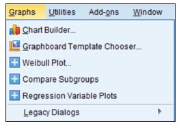
Figure 5.1 Graphs menu
Legacy Dialogs are the original graphing options in SPSS. The options here are the least interesting. For example, when you explore the Legacy Dialogs looking for Bar Charts, you are greeted with some pretty standard options, as shown in Figure 5.2

Figure 5.2 Legacy Bar Charts menu
In the next section we discuss this kind of design principle, but essentially it starts with a chart type followed by populating a fairly rigid structure with variables. Finally, there is usually pretty extensive editing involved. A quick look at the pasted syntax shows that there don’t seem to be a lot of options, which would leave much of the work to the editing window:
GRAPH
  /BAR(SIMPLE)=COUNT BY degree.
This is one of the biggest problems with the legacy graphs. They have very simplified syntax, which seems like a good thing until you realize that everything is standardized. If you want to customize a graph, it has to be done after the fact (that is, the graph has to be manually edited). For those who use Excel, this may be the only approach to creating charts that you’ve tried. The heavy lifting is in the editing, and if you have been disappointed with SPSS, it is probably because you are frustrated with not being able to transform the resulting chart into what you want during the editing process. While the frustration is understandable, you can consider a completely different approach. That alternative approach, revolutionary in its thinking, is explored for the entire balance of the chapter.
The first menu option in Figure 5.1 is the SPSS Chart Builder. In this menu, more extensive options are available before you create the chart—that is before you get to the editing window—than are available in the Legacy Dialogs. Having these options available before you create the chart is important because the chart can be more easily automated, customized, and replicated. Most actions in the editing window, shown in Figure 5.3, are manual.

Figure 5.3 Chart Builder main menu
There is a clue that we have more options—the Basic Elements tab (see Figure 5.4), and the element properties. The revolutionary approach is to build up visualizations as a collection of elements, thoughtfully mixing and matching these elements, paving the way to many combinations that might be impossible if you were choosing only from the traditional choices in the gallery.
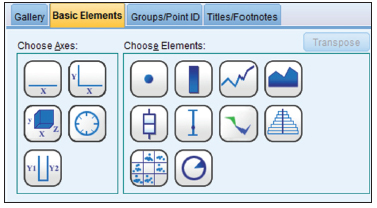
Figure 5.4 Basic Elements submenu
If we paste the SPSS syntax from this menu, the result provides further evidence that we are in new territory. The details don’t matter now except to observe that, while clearly more complex, it is also richer in options: options that can be changed and options that can be saved for later, obviating spending all of our time in the editing window. This language, GPL, is the subject of Chapter 6. Learning GPL opens the doors to hundreds of options that you would not have via the menus. The Chart Builder menus only allow you to do about 5 to 8 % of what is possible with the GPL language.
* Chart Builder.
GGRAPH
  /GRAPHDATASET NAME="graphdataset" VARIABLES=degree
COUNT()[name="COUNT"] MISSING=LISTWISE
    REPORTMISSING=NO
  /GRAPHSPEC SOURCE=INLINE.
BEGIN GPL
  SOURCE: s=userSource(id("graphdataset"))
  DATA: degree=col(source(s), name("degree"), unit.category())
  DATA: COUNT=col(source(s), name("COUNT"))
  GUIDE: axis(dim(1), label("RS HIGHEST DEGREE"))
  GUIDE: axis(dim(2), label("Count"))
  SCALE: cat(dim(1), include("0", "1", "2", "3", "4"))
  SCALE: linear(dim(2), include(0))
  ELEMENT: interval(position(degree*COUNT),
shape.interior(shape.square))
END GPL.
The final Graphs menu choice is what we focus on in this chapter. The Graphboard Template Chooser (see Figure 5.5) allows users to select variables and then the appropriate charts are suggested based on the type of data. We can use a gallery approach, or an elements approach.

Figure 5.5 Graphboard Template Chooser main menu
In contrast to the Chart Builder, our syntax looks different. Note that both the Chart Builder and the Graphboard Template Chooser generate code using the GGRAPH command.
GGRAPH
  /GRAPHDATASET NAME="graphdataset"
    VARIABLES=degree[LEVEL=nominal]
    MISSING=LISTWISE REPORTMISSING=NO
  /GRAPHSPEC SOURCE=VIZTEMPLATE(NAME="Bar of Counts"[LOCATION=LOCAL]
    MAPPING( "categories"="degree"[DATASET="graphdataset"]
"Summary"="count"))
    VIZSTYLESHEET="Traditional"[LOCATION=LOCAL]
    LABEL='BAR OF COUNTS: degree'
    DEFAULTTEMPLATE=NO.
There is no denying that having three options gets confusing. Here is the bottom line for deciding which is right for you:
- If you don’t have a long history with the Legacy Dialogs, then don’t start now.
- If you like the convenience of menu-based help, and you want to create graphs based on suggestions after you have specified your variables, then the Graphboard Template Chooser is the way to go. You are in the right chapter for this option.
- If you want to create graphs from predefined galleries of chart types or build graphs from chart elements, or you are a programmer at heart, then Chart Builder and GPL as presented in Chapter 6 may be the best option. It is my favorite option, and the code is not difficult to learn. The options are almost limitless. But even if this feels like the best option, press on, and finish this chapter because the case studies will help you understand the next chapter.
Understanding the Revolutionary Approach in The Grammar of Graphics
In this section we discuss The Grammar of Graphics by Leland Wilkinson. Knowledge of these ideas is interesting on its own, and will aid in understanding why the Graphboard Template Chooser looks and works the way it does. As we show in the next chapter, GPL’s structure comes directly from The Grammar of Graphics, and the Graphboard Template Chooser is basically a menu system to eliminate the need to learn GPL. However, after reading both chapters, you may decide that GPL is not that difficult after all, and you may decide to work directly with GPL.
Should you read The Grammar of Graphics? For most the answer is probably not, and to some it would seem a tortuous read and a strange book indeed, and for a few it would be a fascinating read. It is quite abstract, with lots of math notation, and is written for computer scientists and theoreticians. The practical nuts and bolts that are useful for the SPSS practitioner will be reviewed here.
For our purposes, what you need to know is that this approach is an alternative to having a chart typology. You can use a standard chart type as a starting off point, but this approach is different—it is all about elements and aesthetics.
- An element is a graphical feature like a line, a point, or an area.
- An aesthetic is what makes an element visible and distinct in the graphic. Examples include position, size, shape, color, transparency, and so on.
Each element and aesthetic can make a different aspect of your data visual. For instance, consider the bubble chart made famous by Hans Rosling https://www.gapminder.org/world/. Although he is using his own software in his well-received TED videos, it is easy to use his graphics as an example. A point element shows the location of the countries on two axes. This alone would be a standard scatter plot. By adding aesthetics he enriches the information content many fold. He uses color for region of the world, size for population, and even animation for calendar year. All of this is possible in the Graphboard Template Chooser, and we will do a case study like this.
Because the graphic elements and aesthetics are like words, and the grammar allows us to create “sentences,” we can make countless visualizations. Rather than restricting ourselves to a dozen (or even several dozen) chart types, we have boundless options, including combinations of elements that the developers of the grammar possibly never envisioned themselves. If you can draft an example on a whiteboard, and the data is capable of showing the relationships, then there is a very good chance that you can create it in SPSS.
Sometimes we think we are helping our audience if we make charts very simple, and put only statistics on each slide. This actually forces us to use our memory to establish relationships. Rosling is showing a great deal of information all at once, but that is precisely what makes the relationships easy to see.
Bar Chart Case Study
For our first example, we will create a bar chart showing the relationship between how old people are when they have their first child and region of the country the live in. Then we will add a couple of variations like using color as an aesthetic to differentiate between men and women.
- Open the dataset GSS2012 Bar Chart.sav.
- To create a graph, go to the Graphs menu and choose Graphboard Template Chooser.
- The default is the Basic tab. Notice that it seems like nothing is available, as seen in Figure 5.6.

Figure 5.6 Graphboard Template Chooser Basic tab
- Click on the variable reg16.
- Hold the Control key down and also click on the variable agekdbrn. Notice that different visualizations become available as you specify which variables you want to display.
- Specify Bar as the Visualization type, as shown in Figure 5.7.

Figure 5.7 Graphboard Template Chooser fields specified
- Choose Mean as the Summary. At this point we are ready to create a bar chart depicting the relationship between region of the country and age when first child is born.
- Before we do this, click the Detailed tab.
- The Detailed tab is another way to specify the same information as in the Basics tab, but with a little more control. (For example, if we had selected several categorical variables, the Detailed tab would allow you to better specify where you would like each variable to go.) Place the variable sex in the Color box, as shown in Figure 5.8
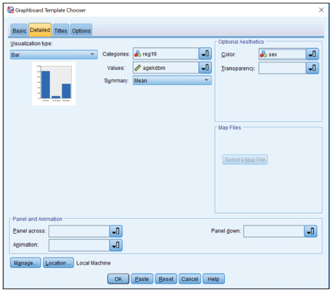
Figure 5.8 Detailed Tab
-
Click OK.
We have now created our graph, as shown in Figure 5.9.
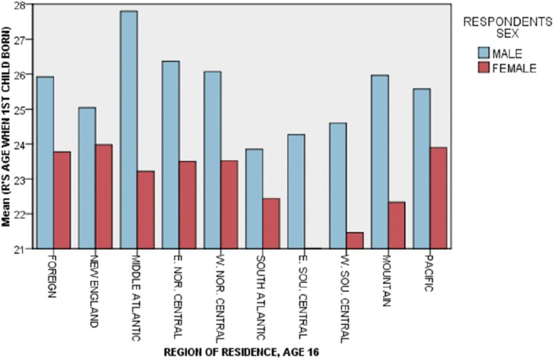
Figure 5.9 Bar chart
- Once the graph has been created, double click on it to edit the graph, as shown in Figure 5.10

Figure 5.10 Graphboard Editor
- Click on the View menu, go down to Palettes and select Properties and then select Categories. You can begin to see how the process is all about elements and aesthetics.
- Let’s sort the regions by statistic. To do this you will have to click Region of Residence, Age 16 at the bottom, which will then populate the window on the left with the available categories. You can move the categories around manually, but we will choose Statistics in the drop-down menu, (see Figure 5.11).

Figure 5.11 Regions sorted
- Now let’s make this a range bar instead of a bar chart where the height is a mean. We will display the mean, but in a different way. Click the bars to activate them, and in the lower left choose Region: Range in the Summary box for our bars (see Figure 5.12).

Figure 5.12 : Region: Range as summary
At a glance we can see that the survey respondents in East South Central USA were the youngest on average when they had their first child. The bars are “range bars” showing minimums and maximums. Not surprisingly, in every region, the maximum age of the men was older.
At this point we could make many other changes. We could exclude categories, add captions, change font styles and sizes, etc.
Bubble Chart Case Study
In this case study, we are going to do a bubble chart, not unlike the ones made famous by Hans Rosling’s TED videos. The advantages of this case study are:
- Bubble charts are popular.
- We will be doing this same chart as our first GPL example in the next chapter.
- Open the State Ranks.sav file.
- To a create a graph, go to the Graphs menu and choose Graphboard Template Chooser.
- Because we will be using several variables, it will be easier to work with the Detailed tab. Click on the Detailed tab.
- Select the Bubble Plot as out Visualization Type.
- Place the variable Bachelors_Perc in the X-axis, Unemp in the Y-axis, Pop in the sizes variable, Zip1_Mod in the Color box, and State as the Data Label (see Figure 5.13). Zip1 is the first digit of the zip code, which can be a good basis for a region variable. Zip1_Mod is collapsed into fewer categories. State2 is a possible variant—it is the two-letter postal abbreviation.
- Click OK.
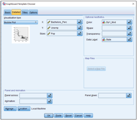
Figure 5.13 Bubble Chart Detailed tab
As shown on Figure 5.14, the result on default settings shows the shape of our graphic. It already shows the pattern, but it could use some editing to be more readable.

Figure 5.14 Bubble Chart
Some possible edits for you to try are:
- Improve the labeling of the axes.
- Modify the point labeling.
- Remove the legends.
- Add gridlines.
For now we will just modify the point labeling.
- Double click on the graph to edit.
- Click on any state name.
- Use the toolbar to remove the white background behind the labels. Choose the option with the red line through the white background at the left of the top row of colors, which represents no background allowing you to see the gray background behind. I’ve also chosen no box or frame around the label, and chosen solid points with no border (see Figure 5.15).
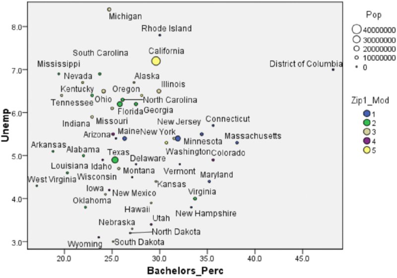
Figure 5.15 Edited Bubble Chart
In exploring the relationship between the percentage of adults (over 25 years old) who have earned a Bachelor’s degree and the unemployment rate at the state level, we discover that the relationship is rather weak. What becomes interesting in this graphic are the outliers. West Virginia has lowest degree attainment, but does not have the lowest unemployment. Michigan is average on degree attainment, but is very high on unemployment. The District of Columbia is striking in that it occupies a completely different position on the graphic than any of the states. If we had done a traditional scatter plot without labeling, and without color, none of this would have been visible. Even though there is not a strong correlation here, we still learn a lot of these five variables: region, population, degree attainment, unemployment, and state.
The Graphboard Template Chooser was made available to the SPSS community as a way of avoiding having to learn GPL, although you’ve probably learned more about GPL than you realize. Take a little time to familiarize yourself with it. You may opt to circle back and apply the approach you’ve learned in this chapter, or you may decide to take what you’ve learned to the next level and build your graphics with a programming language approach.