Chapter 7
Mapping in IBM SPSS Statistics
As researchers, it is very important that we are able to communicate our findings. Typically we hold meetings or write reports that allow others to understand what we have found. Graphs allow researchers to summarize data quickly and easily. Graphs also allow you to visualize data to better understand relationships among variables.
SPSS Statistics has several procedures that allow users to create graphs (for example, the Chart Builder, the Legacy Graphs, and the Graphboard Template Chooser). The standard graphs and charts in SPSS Statistics are complete entities, so that users need to know what they want to show in a graph before they create it. For example, I might want to create a scatterplot or a bar chart, so when using the Chart Builder or a Legacy Graph, I would choose a scatterplot or a bar chart type, and all the available elements of the graph would be chosen for me (of course the elements can be manipulated or removed using the Chart Editor).
The Graphboard Template Chooser, on the other hand, defines structure and elements of a graphic, not the entire graphic. For example, I may want to show the relationship between two categorical variables and one continuous variable, and I might want to display the mean for this combination of variables. With the Graphboard Template Chooser, users explore how best to visualize their data, or the Graphboard Template Chooser can recommend potential visualizations depending on the type(s) of data selected.
Creating Maps with the Graphboard Template Chooser
In these first examples, we will use the Worldwidesales.sav file. This file (see Figure 7.1) contains sales revenue broken down by product purchased and location.
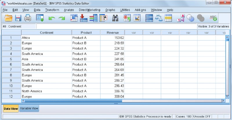
Figure 7.1 Worldwide sales data
Perhaps the simplest graph you can create using the Graphboard Template Chooser to show the distribution of customer locations is a bar chart. The bar chart shown in Figure 7.2 displays the number of customers in each continent, with each continent represented by a bar. The bars are arranged in alphabetical order. We can see that we have the fewest customers in Africa because it has the shortest bar, and North America is the continent where we have the most customers because it has the tallest bar.

Figure 7.2 Bar chart of customer location
However, when data has a geographical component, a better solution might be to use a map. Maps allow you to see patterns in the data that might not be evident in traditional charts, such as clusters or regions with a higher concentration of values. The map in Figure 7.3 shows the distribution customer locations. It shows the number of customers in each continent and each continent is represented by its geographical location. Furthermore, color saturation is used to represent values that correspond to the variables depicted on the map (here, darker values represent higher values). Maps give context that is meaningful.

Figure 7.3 Map of customer locations
Maps can be used in a wide variety of settings to help answer many important questions. For example, organizations may want to know the location of certain client characteristics to determine where to send salespeople, where to hire additional employees, where to create new stores, which marketing campaigns to use, and so on.
Investigators can use maps to determine the locations of crimes, the spread of disease, fluctuations in temperature, population growth, distance traveled, where to send school buses, how to create new districts, and so on.
Creating a Choropleth of Counts Map
The Choropleth of Counts map is used when you have only one categorical variable to display, and the categorical variable is the data key. This is the simplest map you can create because it only requires one categorical variable.
This section walks you through the process of creating a Choropleth of Counts map:
-
To access the Graphboard Template Chooser, click Graphs ➪ Graphboard Template Chooser.
Maps can be created from a single variable, or multiple variables. Maps can use categorical variables, continuous variables, and combinations of categorical and continuous variables.
-
Click the Continent variable.
The Basic tab gives suggestions for templates. On the Basic tab, you first have to select the data that you are interested in analyzing and then select a graph that is appropriate for that data. You start from the data, rather than a specific graph type. Notice that there is only one possible map you can create (as shown in Figure 7.4).
- Click the Choropleth of Counts icon.
-
Click the Detailed tab.
The Detailed tab is an alternative to the Basic tab where you can specify all required variables, summary statistics, and aesthetics. You select the graph type, specify the type of data, and then you can specify details that are not available on the Basic tab. The Detailed tab is optional for most visualizations; however, it is required when you are creating a map. You need to make sure that the right template and data key are selected. For example, if you have data for Africa, you need to make sure that the map template is also for Africa.
-
Click the Select a Map File button.
The Select a Map dialog allows users to select the appropriate map and the template is specified next to the map box.
-
Click the Map drop-down list and select Continents.
You then need to specify the map key. The map key contains the values that are represented on the map template. Then you need to specify the data key. The data key holds the values that you actually have in your dataset. A data key is a variable that contains the labels that correspond to the areas on a map. It is a way to tie the data to the map, so that the data can be displayed on the map correctly. It is important to make sure that the map and data key values match.
-
Click the Data key drop-down list and select Continent.
You can click the Compare button after the appropriate map and data keys have been determined.
-
Click the Compare button.
Now you can see which keys match between the map and data keys. Ideally you would like all the values to match. As shown in Figure 7.5, you want to make sure that all of the values for the data key match the values on the map. If your data does not have some of the values on the map key, that is okay. In our example Oceania appears on the map key but not in the data.
-
Click OK.
Figure 7.6 shows the Detailed tab with the correct map file.
- Click OK.
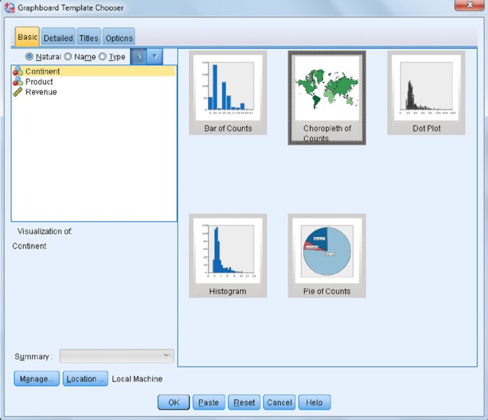
Figure 7.4 One variable selected

Figure 7.5 Select Maps dialog
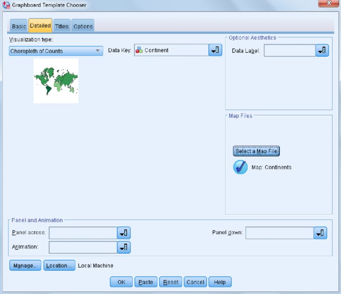
Figure 7.6 Completed Detailed tab
This type of map (Figure 7.7) is used when you want to see the frequency of different regions in your map or how often values for your data key occur. For example, it can be used when you want to look at number of sales or crimes in different regions. Color saturation is used to represent values that correspond to the variables depicted on the map (here, darker values represent higher values). We can see that we have the fewest customers in Africa because it has the lightest color, and North America is the continent where we have the most customers because it has the darkest color.
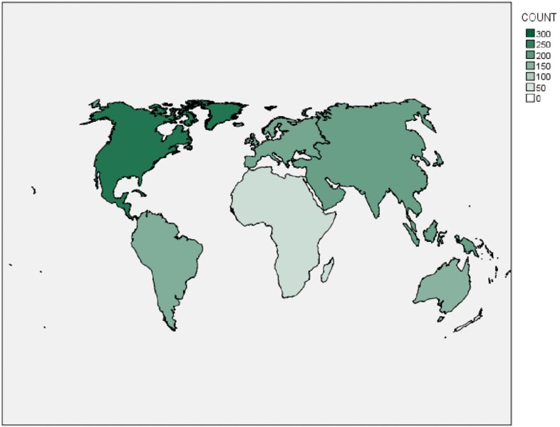
Figure 7.7 Choropleth of Counts
Creating Other Map Types
In this section you continue using the Graphboard Template Chooser to create additional map types.
Choropleth of Values
The Choropleth of Values map shows relationships between two categorical variables. Here the mode or most common value is what is depicted on the map as a different color.
Start by following these steps to create a Choropleth of Values map:
- Click Graphs ➪ Graphboard Template Chooser.
- Click the Continent variable.
-
Hold down the Ctrl key and click the Product variable.
You have selected two categorical variables. Notice that six possible maps are available (as shown in Figure 7.8).
-
Click the Choropleth of Values icon.
Make sure when using the Detailed tab that you are using the Continents map and that the Continent variable is the data key.
- Click OK.

Figure 7.8 Two categorical variables selected
Figure 7.9 illustrates the relationship between the Continent and Product variables. The map shows that the continents of North America, Europe, and Australia prefer Product B, whereas Product A is the biggest seller in South America and Africa, and Asia has a preference for Product C.
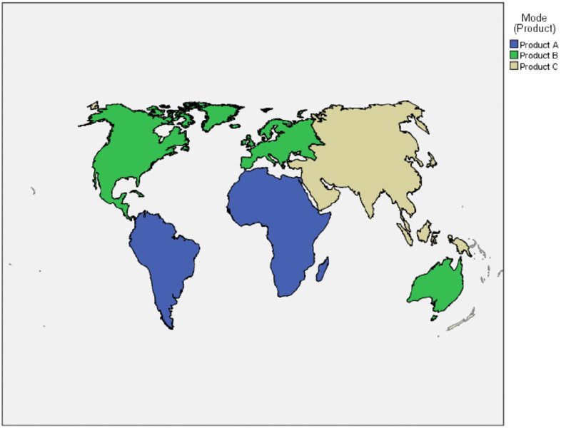
Figure 7.9 Choropleth of Values
Pie of Counts
The pie of counts on a map (or bar of counts on a map) shows relationships between two categorical variables. It displays the proportion of rows divided by cases for each category of a variable for each map feature (area) as pie (or bar) charts positioned in the center of each map feature.
Let’s next create a Pie of Counts map for two categorical variables:
- Click Graphs ➪ Graphboard Template Chooser.
- Click the Continent variable.
- Hold down the Ctrl key and click the Product variable.
- Click the Pie of Counts on a Map icon.
- Make sure that you are using the Continents map and that the Continent variable is the data key.
- Click OK.
Figure 7.10 shows the relationship between the Continent and Product variables. The map shows the Product category breakdown within each Continent, so whereas the Choropleth of Values map showed only the modal response for each Continent, here we see the Product category breakdown within each Continent. Note that you can edit these charts.
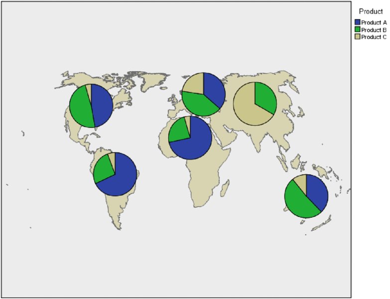
Figure 7.10 Pie of counts on a map
Choropleth of Sums
The Choropleth of Sums (means or medians) map shows relationships between a categorical and a continuous variable.
Now let’s create a Choropleth of Sums map for one categorical variable and one continuous variable:
- Click Graphs ➪ Graphboard Template Chooser.
- Click the Continent variable.
-
Hold down the Ctrl key and click the Revenue variable.
You have selected one categorical and one continuous variable. Notice that you can create three possible maps (as shown in Figure 7.11).
-
Click the Choropleth of Sums icon.
Make sure that you are using the Continents map and that the Continent variable is the data key.
- Click OK to display the map shown in Figure 7.12.
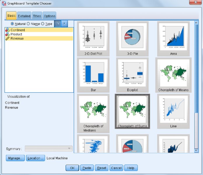
Figure 7.11 One categorical and one continuous variable selected

Figure 7.12 Choropleth of Sums
Color saturation shows the sum of values within each continent (here, darker values represent higher values). We can see that we have the lowest revenue in Africa because it has the lightest color, and North America is the continent where we have the most revenue because it has the darkest color. A map like this can be used in various situations, including investigating the average income per neighborhood or amount spent by country on health care. Note that in this dataset the mean is just the average revenue per country, while the user would probably want average revenue per capita.
Bars on a Map
The bars (pie or line chart) on a map requires two categorical variables and one continuous variable. It displays a summary statistic for each category of a variable for each map feature as bar (pie or line) charts positioned in the center of each map feature.
Now let’s create one final map with this dataset for two categorical variables and one continuous variable:
- Click Graphs ➪ Graphboard Template Chooser.
- Click the Continent variable.
- Hold down the Ctrl key and click the Revenue variable.
- Hold down the Ctrl key and click the Product variable.
-
Select Sum in the Summary drop-down list.
You have selected two categorical variables and one continuous variable. Notice that you can create three possible maps (as shown in Figure 7.13).
-
Click the Bars on a Map icon.
Make sure that you are using the Continents map and that the Continent variable is the data key.
- Click OK. You should see the map shown in Figure 7.14.
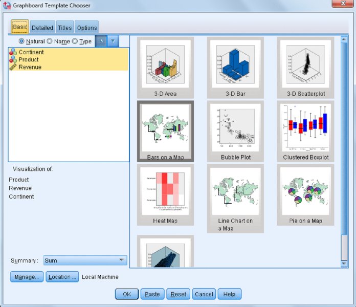
Figure 7.13 Two categorical and one continuous variable selected
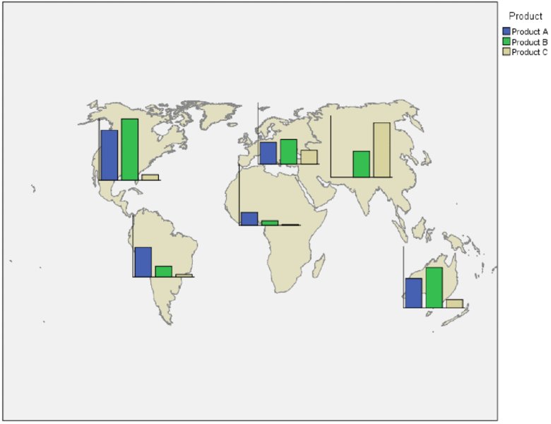
Figure 7.14 Bars on a Map
This type of map can be used to show the number of sales of different products in different areas where you do business or how different types of crimes relate to home values in different neighborhoods. In our example, the map shows total revenue by the Product category breakdown within each Continent. So we see that South America and Africa had the greatest revenue from Product A, Asia had the greatest revenue from Product C, and North America, Europe, and Australia had the greatest revenue from Product B.
Creating Maps Using Geographical Coordinates
In these next examples, we will use the file Coordinates.sav. This file contains latitude and longitude coordinates of customer location. Longitude and latitude coordinates can be created using freeware on the Internet from many different pieces of geographical information including addresses, zip codes, cities, and so on.
Coordinates on a Reference Map
Coordinates on a Reference map uses two continuous variables—one representing longitude, and one representing latitude—and then draws a map that displays points using longitude and latitude coordinates.
First let’s create a map using latitude and longitude coordinates:
- Click Graphs ➪ Graphboard Template Chooser.
- Click the Longitude variable.
-
Hold down the Ctrl key and click the Latitude variable.
You have selected two continuous variables. Notice that you can create one possible map (as shown in Figure 7.15).
-
Click the Coordinates on a Reference Map icon.
Make sure that you are using the Continents map and that the latitude and longitude variables point to the correct location.
- Click OK. You should see the map shown in Figure 7.16.
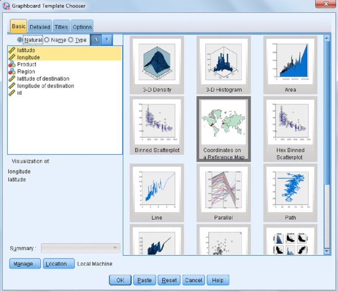
Figure 7.15 Two continuous variables selected
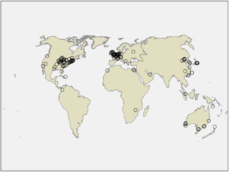
Figure 7.16 Coordinates on a Reference map
This type of map can be used to show where different crimes are committed, or the spread of disease, or where customers are located, or to modify school bus routes where children live. In this example we can see that most of our customers are located in the Eastern United States and Western Europe.
Coordinates on a Choropleth of Counts
The Coordinates on a Choropleth of Counts map uses two continuous variables that represent longitude and latitude coordinates and one categorical variable that represents the color depicted on the map.
Now let’s create a Coordinates on a Choropleth of Counts map:
- Click Graphs ➪ Graphboard Template Chooser.
- Click the Longitude variable.
- Hold down the Ctrl key and click the Latitude variable.
-
Hold down the Ctrl key and click the Region variable.
You have selected two continuous variables and one categorical variable. Notice that you can create two possible maps (as shown in Figure 7.17).
-
Click the Coordinates on a Choropleth of Counts icon.
Make sure when using the Detailed tab that you are using the Continents map file and that the latitude and longitude variables point to the correct location.
- Click OK to display the map shown in Figure 7.18.
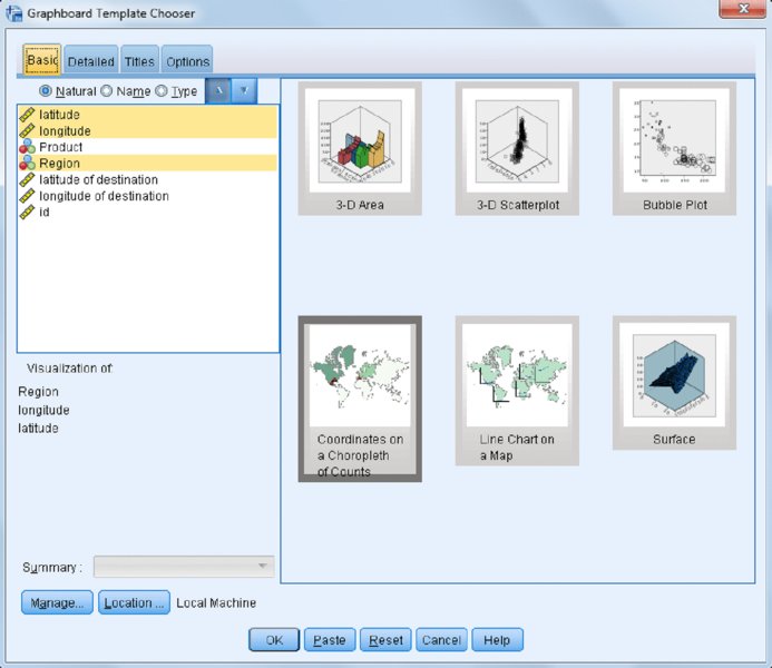
Figure 7.17 Two continuous variables and one categorical variable selected
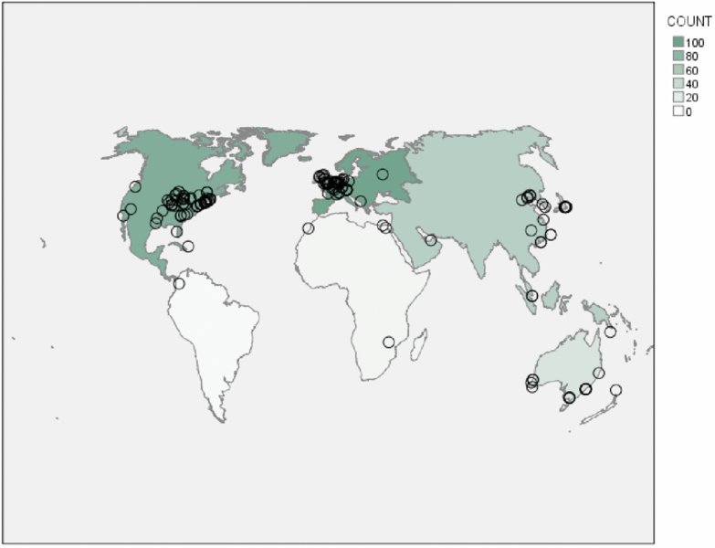
Figure 7.18 Coordinates on a Choropleth of Counts map
The longitude and latitude coordinates are used to identify points on a map, and color saturation (here, darker values represent higher values) is used to represent the number of cases that correspond to the variables depicted on a map. We can see that we have the least number of customers in Africa and South America because they have the lightest color, and North America and Europe are the continents where we have the most customers because they have the darkest color.
Arrows on a Reference Map
The Arrows on a Reference map uses four continuous variables for starting and ending coordinates. These variables represent the starting longitude and latitude coordinates and the ending longitude and latitude coordinates. These types of maps are ideal for displaying the spread of disease, or movement, or distance traveled.
Now let’s create one final map:
- Click Graphs ➪ Graphboard Template Chooser.
- Click the Longitude variable.
- Hold down the Ctrl key and click the Latitude variable.
- Hold down the Ctrl key and click the Longitude of destination variable.
-
Hold down the Ctrl key and click the Latitude of destination variable.
You have selected four continuous variables. Notice that there is one possible map you can create (as shown in Figure 7.19). Note that depending on your preference settings, variable names or labels appear on the variable list.
-
Click the Arrows on a Reference Map icon.
In the Detailed tab make sure that you are using the Continents map file and that the latitude and longitude variables are in the correct location.
- Click OK to display the map shown in Figure 7.20.
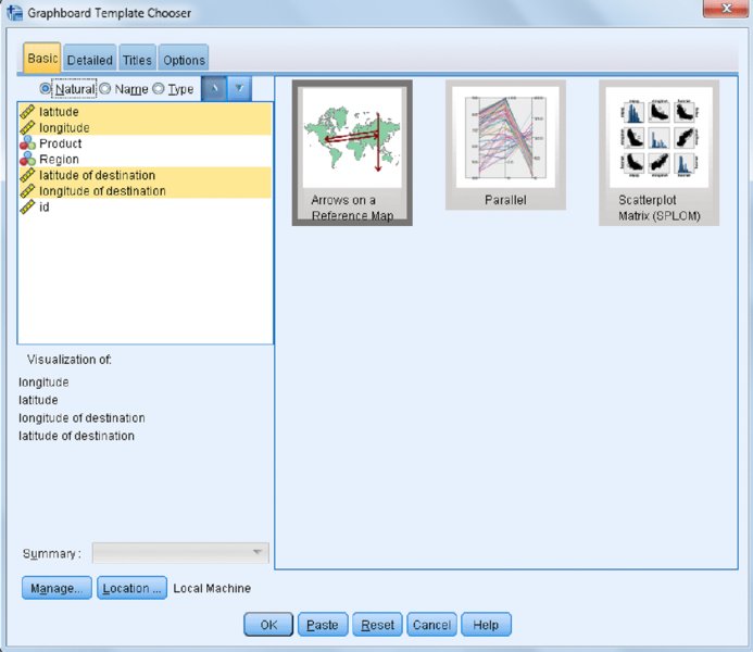
Figure 7.19 Four continuous variables selected

Figure 7.20 Arrows on a Reference map
The Options tab of the Graphboard Template Chooser controls how missing data is handled. As a default, listwise deletion is used. Notice that in our dataset we only have ending coordinates for people that originated in North America, so we can easily see where each person in North America traveled.
In SPSS Statistics V23, three new mapping procedures are introduced: Geospatial Association Rules, Spatial Mapspec, and Spatial Temporal Prediction. These are covered in Chapter 8, and they are the natural evolution from the simple mapping approach illustrated here.