
Hour 13. Adding Navigation
What You’ll Learn in This Hour:
 Implementing sliding drawer navigation
In this hour, you use an ActionBar, Toolbar, and sliding drawer menu. All provide solutions for navigation and persistent presence of navigation controls in the app. You can use these features to always give your users a sense of where they are in your app and how they can navigate to other areas. Getting around a complex app requires consistent and thoughtful navigation. These tools are provided so that you can do that.
Using the ActionBar
Until version 3.0, all Android phones and devices included a hardware-based menu button. That ensured that the option to click Menu was persistent in apps. To add functionality to that hardware Menu button, you would use the options menu functionality.
Since Android 3.0, the options menu functionality has been incorporated into the ActionBar(android.app.ActionBar).
The options menu provides a robust and simple mechanism for providing navigation and functionality that many applications require.
Displaying the Options Menu
You may have noticed that when you create a new Activity a corresponding resource file is created under the menu resource folder. For example, if you create an activity called MainActivity, a resource file named menu_main.xml is generated. In addition, the code to use that menu resource file is added to the MainActivity.java code.
The menu resource file menu_main.xml contains the following:
<menu xmlns:android="http://schemas.android.com/apk/res/android"
xmlns:tools="http://schemas.android.com/tools" tools:context=".MainActivity">
<item
android:id="@+id/action_settings"
android:title="@string/action_settings"
android:orderInCategory="100"
android:showAsAction="never" />
</menu>
This single item includes the following attributes:
id: The id of this menu item.
orderInCategory: The order that this item appears.
showAsAction: Show this item as an action on the ActionBar.
title: The title for the menu item.
In the source for MainActivity.java, the following code is generated:
@Override
public boolean onCreateOptionsMenu(Menu menu) {
// Inflate the menu; this adds items to the action bar if it is present.
getMenuInflater().inflate(R.menu.menu_options_menu, menu);
return true;
}
@Override
public boolean onOptionsItemSelected(MenuItem item) {
// Handle action bar item clicks here. The action bar will
// automatically handle clicks on the Home/Up button, so long
// as you specify a parent activity in AndroidManifest.xml.
int id = item.getItemId();
//noinspection SimplifiableIfStatement
if (id == R.id.action_settings) {
return true;
}
return super.onOptionsItemSelected(item);
}
The onCreateOptionsMenu() method will inflate the menu items defined in the menu resource file menu_main.xml.
When you run the app, you will see an ActionBar, as shown in Figure 13.1. The icon with three vertical dots is known as the overflow menu.
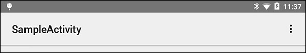
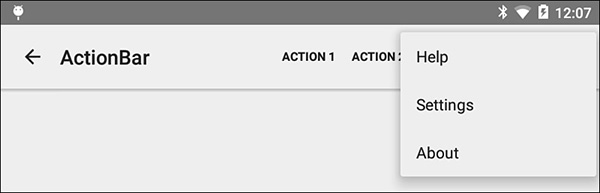
When menu items do not fit in the ActionBar, they are shown in the overflow menu. You can also specify items that should always be shown or never be shown in the ActionBar. That is the case with “Settings.” It was defined to have showAsAction set to never:
android:showAsAction="never"
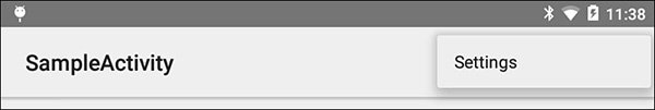
When selected, the overflow menu expands to show the ActionBar with the Settings item displayed (see Figure 13.2). The user can now select that option.
Understanding the showAsAction Attribute
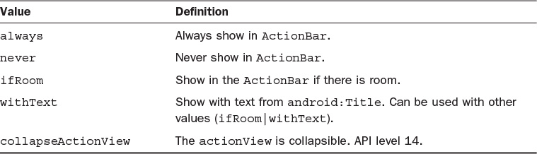
You can specify how items are displayed in an ActionBar by using the showAsAction attribute. Table 13.1 shows the possible values.
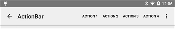
It is easy to expand the sample menu that is generated with a new Activity. This menu resource file includes three items for the overflow menu and four items set to be shown if there is room. The two states of this ActionBar are shown in Figures 13.3 and 13.4.
<menu xmlns:android="http://schemas.android.com/apk/res/android"
xmlns:tools="http://schemas.android.com/tools"
tools:context="com.talkingandroid.hour13application.ActionBarActivity">
<item
android:id="@+id/action_help"
android:title="@string/action_help"
android:orderInCategory="100"
android:showAsAction="never" />
<item
android:id="@+id/action_settings"
android:title="@string/action_settings"
android:orderInCategory="110"
android:showAsAction="never" />
<item
android:id="@+id/action_about"
android:title="@string/action_about"
android:orderInCategory="120"
android:showAsAction="never" />
<item
android:id="@+id/action_item_1"
android:orderInCategory="10"
android:showAsAction="ifRoom"
android:title="Action 1"/>
<item
android:id="@+id/action_item_2"
android:orderInCategory="20"
android:showAsAction="ifRoom"
android:title="Action 2"/>
<item
android:id="@+id/action_item_3"
android:orderInCategory="30"
android:showAsAction="ifRoom"
android:title="Action 3"/>
<item
android:id="@+id/action_item_4"
android:orderInCategory="40"
android:showAsAction="ifRoom"
android:title="Action 4"/>
</menu>
Adding Icons to Menu Items
An icon can be added to an item in the menu resource file with a single line:
android:icon="@+drawable/action_item"
In this case, a drawable named action_item must exist in the drawable resource folder.
Responding to the Options Menu
So far, you have displayed items on ActionBar. Responding to a click on an item is straight-forward. You created the menu with the onCreateMenuOptions() method. To respond when a menu item is clicked, you use the onOptionsItemsSelected() method, as shown in Listing 13.1.
LISTING 13.1 Using onOptionsItemSelected()
1: package com.talkingandroid.hour13application;
2: import android.app.Activity;
3: import android.os.Bundle;
4: import android.view.Menu;
5: import android.view.MenuItem;
6:
7: public class ActionBarActivity extends Activity {
8:
9: @Override
10: protected void onCreate(Bundle savedInstanceState) {
11: super.onCreate(savedInstanceState);
12: setContentView(R.layout.activity_action_bar);
13: }
14:
15: @Override
16: public boolean onCreateOptionsMenu(Menu menu) {
17: // Inflate the menu; this adds items to the action bar if it is present.
18: getMenuInflater().inflate(R.menu.menu_action_bar, menu);
19: return true;
20: }
21:
22: @Override
23: public boolean onOptionsItemSelected(MenuItem item) {
24: int id = item.getItemId();
25: switch (id){
26: case R.id.action_about:
27: return true;
28: case R.id.action_help:
29: return true;
30: case R.id.action_settings:
31: return true;
32: case R.id.action_item_1:
33: return true;
34: case R.id.action_item_2:
35: return true;
36: case R.id.action_item_3:
37: return true;
38: case R.id.action_item_4:
39: return true;
40: }
41: return super.onOptionsItemSelected(item);
42: }
43: }
The onCreate() method for this Activity is on lines 9–13 of Listing 13.1. The setContentView() method is called on line 12.
Lines 15–20 show the onCreateOptionsMenu(), and that is where the menu is inflated.
The onOptionsItemSelected() method is on lines 22–42 of Listing 13.1. The parameter menuItem is passed to this method. The menuItem contains the information defined for the selected menuItem. You can access the id and the title, for example.
On line 24, the ID of the selected item is determined using the method getItemId(). On lines 25–40, a switch statement is used to determine what action to take based on the selected item. In Listing 13.1, you just return true for each case. That true means that the menuItem response has been handled.
In your code, you determine what to do based on each item click. You might switch to a new fragment, navigate to an activity, and open a dialog window.
Adding Up Navigation
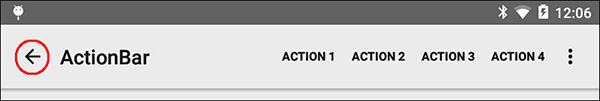
There is a design pattern in Android known as up navigation. The idea is that there is a parent activity that launches child activities. The child activities navigate back to the parent activity. Figure 13.5 shows a red circle around the icon used in a child activity to indicate the user can navigate back up to the parent activity.
Implementing up navigation for a child activity is very easy. In the Android manifest for the child activity, you include a reference to the parent activity.
This snippet defines an Activity called ActionBarBasicActivity that includes a title and a reference to the parent activity using android:parentActivityName:
<activity
android:name=".ActionBarBasicActivity"
android:label="@string/title_activity_action_bar"
android:parentActivityName=".MainActivity" >
</activity>
Introducing the Toolbar
The ActionBar can be used for many applications for overall navigation and persistent presence. The Toolbar is a widget that was introduced in Lollipop that can be a replacement for the ActionBar or can be an additional toolbar that you add anywhere in your app.
A Toolbar is easy to customize. Because the Toolbar extends the ViewGroup class, you can add child views to the Toolbar.
Note: Maintaining Compatibility with Toolbars
There is both an android.widget.Toolbar class and an android.support.v7.widget.Toolbar. The android.widget.Toolbar was introduced in Lollipop (API level 21). The android.support.v7.widget.Toolbar can be used to support older versions of Android.
A Basic Toolbar
A basic Toolbar can replace an ActionBar. A Toolbar can include a title, subtitle, menu items, and up navigation. Because a Toolbar is a widget, you can add it to the layout file for your Activity.
This shows a layout file that includes a Toolbar:
<RelativeLayout xmlns:android="http://schemas.android.com/apk/res/android"
xmlns:tools="http://schemas.android.com/tools"
android:layout_width="match_parent"
android:layout_height="match_parent"
tools:context="com.talkingandroid.hour13application.ToolbarActivity">
<Toolbar android:layout_width="match_parent"
android:layout_height="wrap_content"
android:minHeight="?android:attr/actionBarSize"
android:background="#FFC107"
android:id="@+id/toolbar"
/>
This defines a simple Toolbar with the background color set.
You need to add code to your Activity class to make the Toolbar useful. Listing 13.2 shows the Activity code for this layout and Toolbar.
1: package com.talkingandroid.hour13application;
2: import android.app.Activity;
3: import android.os.Bundle;
4: import android.view.Menu;
5: import android.view.MenuItem;
6: import android.widget.Toolbar;
7:
8: public class ToolbarActivity extends Activity {
9: @Override
10: protected void onCreate(Bundle savedInstanceState) {
11: super.onCreate(savedInstanceState);
12: setContentView(R.layout.activity_toolbar);
13: Toolbar toolbar = (Toolbar) findViewById(R.id.toolbar);
14: toolbar.setTitle("TITLE");
15: toolbar.setSubtitle("Sub-title");
16: toolbar.setLogo(R.mipmap.ic_launcher);
17: setActionBar(toolbar);
18: getActionBar().setDisplayHomeAsUpEnabled(true);
19: }
20:
21: @Override
22: public boolean onCreateOptionsMenu(Menu menu) {
23: getMenuInflater().inflate(R.menu.menu_action_bar, menu);
24: return true;
25: }
26:
27: @Override
28: public boolean onOptionsItemSelected(MenuItem item) {
29: int id = item.getItemId();
30: if (id == R.id.action_settings) {
31: return true;
32: }
33: return super.onOptionsItemSelected(item);
34: }
35: }
On line 13 of Listing 13.2, the Toolbar is defined using the findViewById() method. The Toolbar is just another widget like a Button or TextView, so you access it like any other widget.
Lines 14 and 15 add a title and subtitle to the Toolbar. Line 16 adds a logo.
Line 17 is important. It tells the Activity to consider this Toolbar to be the ActionBar:
setActionBar(toolbar);
Line 18 is a programmatic way to implement up navigation:
getActionBar().setDisplayHomeAsUpEnabled(true);
Caution: Defining the Right Style for Your Activity
You cannot use a Toolbar as your ActionBar if your Activity is not properly defined in the AndroidManifest.xml file. There is an assumption that an ActionBar will be present. On line 18 of Listing 13.2, you replace the ActionBar with the Toolbar. To do that, you must define the Activity to have a style with no ActionBar.
This Activity definition in the AndroidManifest.xml refers to the style AppThemeNoActionBar:
<activity
android:name=".ToolbarActivity"
android:label="@string/title_activity_tool_bar"
android:parentActivityName=".MainActivity"
android:theme="@style/AppThemeNoActionBar" >
</activity>
The AppThemeNoActionBar style is defined in the styles.xml resource file as follows:
<style name="AppThemeNoActionBar" parent="android:Theme.Material.Light">
<item name="android:windowNoTitle">true</item>
<item name="android:windowActionBar">false</item>
</style>
Note that the windowActionBar attribute is set to false.
Putting together the layout file, the code, and the style will result in displaying a toolbar in your activity, as shown in Figure 13.6.
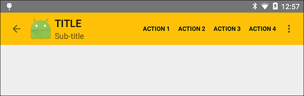
In Figure 13.6, the overflow menu is present, and the items that were defined as part of the menu resource file are shown. Remember, you replaced the action bar with this toolbar, so the menu items are attached to the Toolbar. Check lines 21–25 of Listing 13.2 to see that the menu resource is inflated in the onCreateOptionsMenu() method.
Adding a Child View to a Toolbar
Because the Toolbar is a ViewGroup, you can add child views. That allows for a great amount of customization and functionality in the Toolbar.
In this case, you add a spinner to the Toolbar. The work will be similar to the basic toolbar. You start with a Toolbar in the layout. In this case, you add a Spinner as a child view to the Toolbar. This is the XML layout file for the Activity:
<RelativeLayout xmlns:android="http://schemas.android.com/apk/res/android"
xmlns:tools="http://schemas.android.com/tools"
android:layout_width="match_parent"
android:layout_height="match_parent"
tools:context="com.talkingandroid.hour13application.ToolbarCustomViewActivity">
<Toolbar android:layout_width="match_parent"
android:layout_height="wrap_content"
android:minHeight="?android:attr/actionBarSize"
android:background="#FFC107"
android:id="@+id/toolbar">
<Spinner
android:layout_width="wrap_content"
android:layout_height="wrap_content"
android:id="@+id/spinner" />
</Toolbar>
</RelativeLayout >
The Spinner has ID set to spinner and is defined within the Toolbar.
The ToolbarCustomViewActivity code in Listing 13.3 is similar to the code for the basic toolbar. A Spinner is defined, and an ArrayAdapter is used to populate the contents of the spinner.
LISTING 13.3 Adding a Child View to a Toolbar
1: package com.talkingandroid.hour13application;
2: import android.app.Activity;
3: import android.os.Bundle;
4: import android.widget.ArrayAdapter;
5: import android.widget.Spinner;
6: import android.widget.Toolbar;
7:
8: public class ToolbarCustomViewActivity extends Activity {
9: Toolbar toolbar;
10: Spinner spinner;
11: String[] values = {"View 1", "View 2", "View 3", "View 4" };
12: ArrayAdapter<String> spinnerAdapter;
13:
14: @Override
15: protected void onCreate(Bundle savedInstanceState) {
16: super.onCreate(savedInstanceState);
17: setContentView(R.layout.activity_action_bar_custom_view);
18: toolbar = (Toolbar) findViewById(R.id.toolbar);
19: toolbar.setTitle("TITLE");
20: toolbar.setLogo(R.mipmap.ic_launcher);
21: setActionBar(toolbar);
22: getActionBar().setDisplayHomeAsUpEnabled(true);
23: spinner = (Spinner) findViewById(R.id.spinner);
24: ArrayAdapter<String> spinnerAdapter = new ArrayAdapter<String>
25: (this,android.R.layout.simple_spinner_dropdown_item,values);
26: spinner.setAdapter(spinnerAdapter);
27: }
28: }
Lines 18–22 of Listing 13.3 define the toolbar and handle the toolbar set up such as setting the title, setting the icon, and setting the toolbar as the action bar.
Lines 23–26 define the spinner and the associated adapter. In this case, the data to be displayed is defined in the code on line 11. The Spinner will show the strings View 1, View 2, View 3, and View 4.
Figure 13.7 shows the resulting Toolbar, and Figure 13.8 shows the Toolbar with the Spinner open.
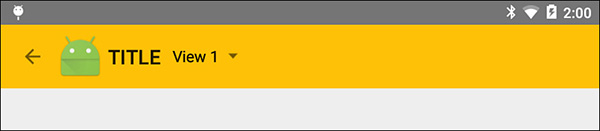
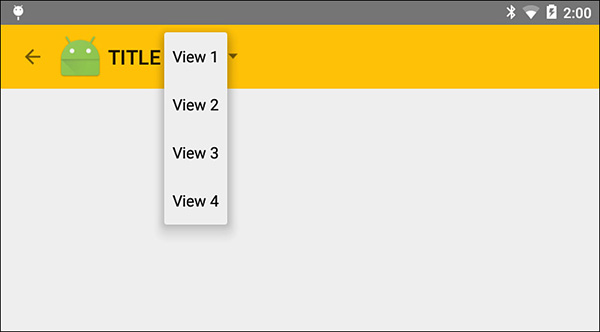
If your app included different views of similar content, one way to navigate to the content is to use a Spinner in the ActionBar. You would need to add code to react to the Spinner item selected and update the View or switch out a Fragment.
Sliding Drawer Navigation
You have probably seen apps that use the design pattern that Android calls sliding drawer navigation. There is an icon in the action bar that some call the “hamburger icon.” When you select it, a menu list of options appears to slide out from the left side of your app. (It might also come from the right.) When you select an item from the list, the drawer slides back and the content you selected is displayed.
The sliding drawer is persistent and there is usually no up navigation or the idea that the user is going back to a previous screen. The action occurs in the sliding drawer.
In Figure 13.9, you can take a closer look at the three states of the icon for the sliding drawer. In the initial state, it is the hamburger icon. An arrow shows when the sliding drawer options are fully visible. Between the time the hamburger icon is selected and the arrow shows, the icon animates and the drawer slides out.
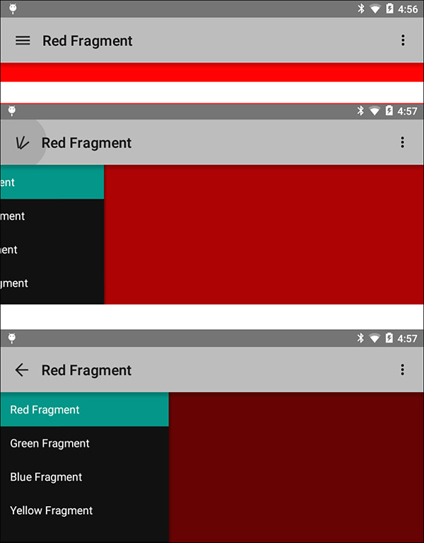
Figure 13.9 shows the demo app that will be used in this hour. A single activity contains a sliding drawer with four options. There is a corresponding fragment to display for each option. The fragments in this example are simple. They just have different background colors and a different text message, but in your own apps, the sliding drawer can be used for showing fragments that look completely different and that contain very different functionality.
The Importance of Layouts
The layout for the main activity is important when implementing a sliding drawer. You need an action bar, a location for the contents of the sliding drawer, and a location for the contents to be displayed.
When the sliding drawer is not showing, you want the application contents to show on the entire screen. When the sliding drawer is showing, it displays over the current contents.
The view hierarchy used to accomplish this is shown in Figure 13.10, which is a screenshot of the component view in Android Studio.
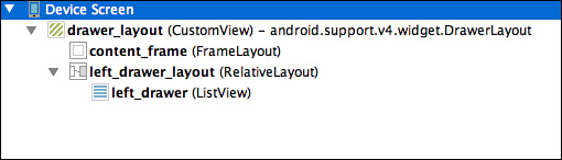
An android.support.v4.widget.DrawerLayout is the top-level component. The content_frame is a FrameLayout that is the size of the whole screen. When a new fragment is displayed, it will occupy this content frame.
The left_drawer_layout is a RelativeLayout. This is the view that is displayed as the sliding drawer. The left_drawer_layout is 240dp wide. The left_drawer_layout contains a ListView called left_drawer that displays the list of choices to select.
The FrameLayout and the RelativeLayout are on the same level in the hierarchy. The RelativeLayout appears over the FrameLayout.
The ListView is a child view of the RelativeLayout. A sliding drawer does not just need to contain a ListView. It can be as simple or complex as necessary for your application.
This is the full XML layout file contents:
<android.support.v4.widget.DrawerLayout
xmlns:android="http://schemas.android.com/apk/res/android"
android:id="@+id/drawer_layout"
android:layout_width="match_parent"
android:layout_height="match_parent">
<FrameLayout
android:id="@+id/content_frame"
android:layout_width="match_parent"
android:layout_height="match_parent" />
<RelativeLayout
android:id="@+id/left_drawer_layout"
android:layout_width="240dp"
android:layout_height="match_parent"
android:layout_gravity="start">
<ListView
android:id="@+id/left_drawer"
android:layout_width="240dp"
android:layout_height="match_parent"
android:choiceMode="singleChoice"
android:divider="@android:color/transparent"
android:dividerHeight="0dp"
android:background="#111"/>
</RelativeLayout >
</android.support.v4.widget.DrawerLayout>
In the app, the choices for the sliding drawer will be displayed in the ListView. When an item in the ListView is selected, a fragment will be displayed in the FrameLayout.
The work to implement the app is to
Wire the infrastructure for the sliding drawer.
Populate the contents of the ListView.
Show the Fragment that corresponds to the selected item in the ListView.
Setting Up the Sliding Drawer
In this section, you use the components defined in the layout file to implement the sliding drawer. You rely on properly setting up an ActionBarDrawerToggle to use the sliding drawer.
Caution: Using the ActionBarActivity
Your sliding drawer activity must extend an ActionBarActivity(android.support.v7.app.ActionBarActivity). The ActionBarActivity is part of the app compatibility libraries in Android. Your activity will be defined using something like this: public class NavigationDrawerActivity extends ActionBarActivity.
Listing 13.4 shows the activity definition and a portion of the onCreate() method that is used to create the sliding drawer. The code continues in Listing 13.5.
LISTING 13.4 Implementing the Sliding Drawer
1: public class NavigationDrawerActivity extends ActionBarActivity {
2: private DrawerLayout mDrawerLayout;
3: private ListView mDrawerListView;
4: private RelativeLayout mDrawerRelativeLayout ;
5: private ActionBarDrawerToggle mDrawerToggle;
6: String[] mDrawerOptionLabels;
7:
8: @Override
9: protected void onCreate(Bundle savedInstanceState) {
10: super.onCreate(savedInstanceState);
11: setContentView(R.layout.activity_navigation_drawer);
12: mDrawerLayout = (DrawerLayout) findViewById(R.id.drawer_layout);
13: mDrawerListView = (ListView) findViewById(R.id.left_drawer);
14: mDrawerRelativeLayout = (RelativeLayout )
15: findViewById(R.id.left_drawer_layout);
16: mDrawerLayout.setDrawerShadow(R.drawable.drawer_shadow,
17: GravityCompat.START);
18: getSupportActionBar().setDisplayHomeAsUpEnabled(true);
19: getSupportActionBar().setHomeButtonEnabled(true);
20: mDrawerToggle = new ActionBarDrawerToggle(
21: this, /* host Activity */
22: mDrawerLayout, /* DrawerLayout object */
23: R.string.drawer_open, /* "open drawer" for accessibility */
24: R.string.drawer_close /* "close drawer" for accessibility */
25: );
26:
27: mDrawerLayout.setDrawerListener(mDrawerToggle);
28: mDrawerToggle.syncState();
Lines 13–15 of Listing 13.4 define the components previously mentioned. There is a DrawerLayout, a RelativeLayout, and a ListView.
Lines 16–17 set the drawable that is used as a shadow over the contents when the sliding drawer is displayed using the setDrawerShadow() method.
Lines 18–19 set the action bar to use up navigation. In this case, you are not really using the up navigation to go to a parent activity. Instead, this is setting up the icon for the sliding drawer.
Lines 20–25 define the ActionBarDrawerToggle. This is the key to setting up the sliding drawer. The first parameter is the current activity. The second parameter is the DrawerLayout object. In Listing 13.4, the DrawerLayout object to use was defined on line 2 and populated using the findViewById() on line 12.
Line 27 sets the DrawerListener to the ActionBarToggle that was just created.
The ActionBarToggle in this case takes four parameters. If you are going to use a sliding drawer with a Toolbar instead of an ActionBar, there are five parameters that the Toolbar is passed:
mDrawerToggle = new ActionBarDrawerToggle(
this, /* host Activity */
mDrawerLayout, /* DrawerLayout object */
mToolbar, /* Toolbar object */
R.string.drawer_open, /* "open drawer" for accessibility */
R.string.drawer_close /* "close drawer" for accessibility */
);
Populating ListView and Handling Selection
The sliding drawer contains a RelativeLayout, and that RelativeLayout contains a ListView. You can handle this ListView like any other. Listing 13.5 shows the code to populate the ListView and to handle a selection made on the sliding drawer.
LISTING 13.5 Handling the ListView in the Sliding Drawer
1: Resources resources = getResources();
2: mDrawerOptionLabels = resources.getStringArray(R.array.sliding_drawer_array);
3: ArrayAdapter<String> drawerAdapter = new ArrayAdapter<String>(this,
4: R.layout.drawer_list_item, mDrawerOptionLabels);
5: mDrawerListView.setAdapter(drawerAdapter);
6: mDrawerListView.setOnItemClickListener(new AdapterView.OnItemClickListener() {
7:
8: @Override
9: public void onItemClick(AdapterView<?> parent, View,
10: int position, long id) {
11: FragmentManager fragmentManager = getFragmentManager();
12: Fragment = new RedFragment();
13: switch (position){
14: case 0: //RED
15: fragment = new RedFragment();
16: break;
17: case 1: //GREEN
18: fragment = new GreenFragment();
19: break;
20: case 2: //BLUE
21: fragment = new BlueFragment();
22: break;
23: case 3: // YELLOW
24: fragment = new YellowFragment();
25: break;
26: }
27: fragmentManager.beginTransaction().
28: replace(R.id.content_frame, fragment).commit();
29: setTitle(mDrawerOptionLabels[position]);
30: mDrawerListView.setItemChecked(position, true);
31: mDrawerLayout.closeDrawer(mDrawerRelativeLayout );
32: }
33: });
Lines 1 and 2 in Listing 13.5 read an array of strings from resources. The array contains the list of labels that correspond to the fragments to display.
Lines 3–5 set up an adapter for the ListView as you have done previously.
Lines 6–33 show the onClickListener for the ListView, and this is where the determination is made about which fragment to show. This code is responsible for showing the fragment and for closing the sliding drawer.
The position of the selected item in the list is passed as a parameter to the onItemClick() method of the onClickListener. See lines 9 and 10. You know that the position in the list corresponds to the fragment to display. The order is red, green, blue, yellow. So, if the first item is selected, the red fragment should be displayed.
Lines 11 and 12 define a FragmentManager and initialize a Fragment to use in this section.
A switch statement handles determining which Fragment is in use based on the item position. See lines 13–26.
When the switch statement is complete, a Fragment has been specified to be displayed. You can now display it and close the sliding drawer.
Lines 27 and 28 display the Fragment.
Line 31 closes the sliding drawer. Note that the parameter to the closeDrawer() method is the view that is displayed in the drawer layout. In this case, that is mDrawerRelativeLayout:
mDrawerLayout.closeDrawer(mDrawerRelativeLayout );
Line 29 sets the title in the ActionBar to have the same label as the item selected from the sliding drawer:
setTitle(mDrawerOptionLabels[position]);
Line 30 sets the selected item to checked in the sliding drawer:
mDrawerListView.setItemChecked(position, true);
The position of the selected item drives much of what occurs. You can make your sliding drawers dynamic and more complicated. In this case, the position directly corresponds to the data for the selected item.
Odds and Ends for the Sliding Drawer
The hamburger icon used in the sliding drawer design and the arrow used to close the sliding drawer must be handled as part of the options menu. In the onOptionsItemSelected() method, this is the code to have the ActionBarDrawerToggle handle when these are selected in the ActionBar. See lines 94–97 of Listing 13.6.
if (mDrawerToggle.onOptionsItemSelected(item)) {
return true;
}
When you implement a sliding drawer, you should handle configuration changes.
Listing 13.6 shows the complete code for the sliding drawer activity. Configuration changes are handled in the PostCreate() and onConfigurationChanged() methods. See lines 75–85 of Listing 13.6.
To handle the case of displaying an initial fragment when the app starts and nothing has been selected from the sliding drawer menu, check for the state where savedInstance is null. That occurs on lines 65–72. In that case, the red fragment is displayed directly.
LISTING 13.6 Full Code for Sliding Drawer Activity
1: public class NavigationDrawerActivity extends ActionBarActivity {
2: private DrawerLayout mDrawerLayout;
3: private ListView mDrawerListView;
4: private RelativeLayout mDrawerRelativeLayout ;
5: private ActionBarDrawerToggle mDrawerToggle;
6: String[] mDrawerOptionLabels;
7:
8: @Override
9: protected void onCreate(Bundle savedInstanceState) {
10: super.onCreate(savedInstanceState);
11: setContentView(R.layout.activity_navigation_drawer);
12: mDrawerLayout = (DrawerLayout) findViewById(R.id.drawer_layout);
13: mDrawerListView = (ListView) findViewById(R.id.left_drawer);
14: mDrawerRelativeLayout = (RelativeLayout )
15: findViewById(R.id.left_drawer_layout);
16: mDrawerLayout.setDrawerShadow(R.drawable.drawer_shadow,
17: GravityCompat.START);
18: getSupportActionBar().setDisplayHomeAsUpEnabled(true);
19: getSupportActionBar().setHomeButtonEnabled(true);
20: mDrawerToggle = new ActionBarDrawerToggle(
21: this, /* host Activity */
22: mDrawerLayout, /* DrawerLayout object */
23: R.string.drawer_open, /* "open drawer" for accessibility */
24: R.string.drawer_close /* "close drawer" for accessibility */
25: );
26:
27: mDrawerLayout.setDrawerListener(mDrawerToggle);
28: mDrawerToggle.syncState();
29: Resources resources = getResources();
30: mDrawerOptionLabels =
31: resources.getStringArray(R.array.sliding_drawer_array);
32: ArrayAdapter<String> drawerAdapter = new ArrayAdapter<String>(this,
33: R.layout.drawer_list_item, mDrawerOptionLabels);
34:
35: mDrawerListView.setAdapter(drawerAdapter);
36: mDrawerListView.setOnItemClickListener(new
37: AdapterView.OnItemClickListener() {
38: @Override
39: public void onItemClick(AdapterView<?> parent, View,
40: int position, long id) {
41: FragmentManager fragmentManager = getFragmentManager();
42: Fragment = new RedFragment();
43: switch (position){
44: case 0: //RED
45: fragment = new RedFragment();
46: break;
47: case 1: //GREEN
48: fragment = new GreenFragment();
49: break;
50: case 2: //BLUE
51: fragment = new BlueFragment();
52: break;
53: case 3: // YELLOW
54: fragment = new YellowFragment();
55: break;
56: }
57: fragmentManager.beginTransaction().
58: replace(R.id.content_frame, fragment).commit();
59: setTitle(mDrawerOptionLabels[position]);
60: mDrawerListView.setItemChecked(position, true);
61: mDrawerLayout.closeDrawer(mDrawerRelativeLayout );
62: }
63: });
64:
65: if (savedInstanceState == null) {
66: FragmentManager fragmentManager = getFragmentManager();
67: Fragment = new RedFragment();
68: fragment = new RedFragment();
69: fragmentManager.beginTransaction().
70: replace(R.id.content_frame, fragment).commit();
71: setTitle(mDrawerOptionLabels[0]);
72: }
73: }
74:
75: @Override
76: protected void onPostCreate(Bundle savedInstanceState) {
77: super.onPostCreate(savedInstanceState);
78: mDrawerToggle.syncState();
79: }
80:
81: @Override
82: public void onConfigurationChanged(Configuration newConfig) {
83: super.onConfigurationChanged(newConfig);
84: mDrawerToggle.onConfigurationChanged(newConfig);
85: }
86:
87: @Override
88: public boolean onCreateOptionsMenu(Menu menu) {
89: getMenuInflater().inflate(R.menu.menu_navigation_drawer, menu);
90: return true;
91: }
92:
93: @Override
94: public boolean onOptionsItemSelected(MenuItem item) {
95: if (mDrawerToggle.onOptionsItemSelected(item)) {
96: return true;
97: }
98:
99: int id = item.getItemId();
100: if (id == R.id.action_settings) {
101: return true;
102: }
103: return super.onOptionsItemSelected(item);
104: }
105:}
Summary
In this hour, you learned about the ActionBar and the Toolbar. You learned that by configuring a menu resource file, you have great control over what appears in an action bar. You saw that a toolbar is a widget-based version of an action bar that can be customized and that can hold child views. The relationship between styles and how an activity is defined in the Android manifest is important when working with toolbars. You also learned about the up navigation pattern and how to implement a sliding drawer menu.
Q&A
Q. When should I use a sliding drawer instead of a Toolbar?
A. A short answer is that you should use a sliding drawer if you have a lot of different navigable content in your app. There are some guidelines in the online Android documentation that say to use a sliding drawer for navigation if you have more than three top-level views or if you have deep navigation branches and want to provide a way to more easily navigate to content at lower levels.
Q. In the sliding drawer example, one activity was used, and Fragments were displayed as different content. Is that a good model for using the ActionBar and Toolbar?
A. Yes, you can use Fragments to display content in a consistent manner regardless of the navigation. You can also use activities and dialogs depending on your app. It may make sense to have a help option in the overflow menu that displays a dialog or an item in the action bar that navigates to a different activity. It will largely depend on your design, but fragments can be very useful.
Workshop
Quiz
1. What is a difference between an ActionBar and a Toolbar?
2. How would you indicate that a menu item should always be displayed in the overflow menu?
3. What would you do to implement the up navigation pattern if you had an Activity called ChildActivity that will navigate to MainActivity when the up navigation icon is selected?
Answers
1. A Toolbar is a widget that can be added to an XML layout file. An ActionBar is not a widget.
2. In the menu resource file, you set the item to never show as an action by using android:showAsAction="never”.
3. To use up navigation with ChildActivity and MainActivity, you modify the AndroidManifest.xml file entry for ChildActivity to indicate that MainActivity was its parent:
android:parentActivityName=".MainActivity"