
Pages, apps (also called add-ins), and web parts are used to organize and present information and to introduce business functionality into SharePoint sites. Pages are used to create organized views of information. The information provided in SharePoint pages can be text, images, and videos organized to support information access and management needs. Pages can also be used to hold apps, which can display data such as views of list and library content or introduce other business solution capabilities.
In this chapter, we discuss the different types of pages available within SharePoint and how to create and manage these pages. We also discuss apps and web parts and how they can be used to present content stored within the sites and introduce additional business application capabilities into your SharePoint sites.
Pages
SharePoint pages are the tools used within sites to organize and present information. When a SharePoint site is created, it typically contains a single SharePoint page that acts as the site’s home page. Three types of pages can be created in SharePoint 2016, each with its own capabilities designed to satisfy different needs. These types of pages include the following:
Web Part pages
Wiki pages
Publishing pages
Web Part Pages
The most basic type of page that can be created in SharePoint 2016 is the web part page. A web part page contains web part zones, in which apps and web parts can be added and configured. Web part zones are organized within pages based on the pages’ defined layouts. Web part zones are designed to store apps and web parts that are functional components adding application functionality to pages within SharePoint. We discuss apps and web parts in more detail later in this chapter.
Web part pages are best used when you, as the site administrator , need to add a page that contains specific functionality yet would not need to be managed by general site users and would not need significant standard textual content in the page. This type of page allows addition of only apps and web parts to the defined zones.
Creating Web Part Pages
In SharePoint 2016 web part pages are created by default within the Site Pages library. This library is also used to create wiki pages, which we discuss later in this chapter. You can also add the ability to create web part pages in other libraries if you want to.
The Site Pages library is added to a site through the activation of the Wiki Page Home Page feature. Activating this feature will also update the site’s home page so that it is based on a wiki page instead of the default web part page. To activate the Wiki Home Page feature, do the following:
Navigate to the site where you want to enable the Wiki Page Home Page feature.
On the site’s home page, select the Site Settings option from the settings menu.
On the Site Settings page, select the Manage Site Features option from the Site Actions section.
On the Site Features page, click the Activate option for the Wiki Page Home Page feature.
The Wiki Page Home Page feature is activated, creating the Site Pages library and reconfiguring the site’s home page so that it is based on a new page, named Home.aspx, created in the Site Pages library.
There are times when you will not want to enable the Wiki Page Home Page feature within a site because you do not want to make the ability to create wiki pages available within the site or want the home page of the site to be updated to a wiki page. When this is the case, you can make the web part page content type available in a different library within the site, allowing web part pages to be created within that library. To make web part pages available in a library, do the following:
Navigate to the site where you need to make web part pages available.
If it does not yet exist, create the document library where you want to store created web part pages.
Navigate to the library where you want to be able to save web part pages.
On the library’s home page, select the Library Settings option from the Library ribbon tab.
On the Settings page, select the Advanced Settings option from the General Settings page.
On the Advanced Settings page in the Content Types section, select Yes for “Allow Management of Content Types” option and click the OK button.
On the Settings page for the library in the Content Type section, select the “Add from Existing Site Content Types” option.
On the Add Content Types page, select the Web Part Page option from the Available Site Content Types section, click the Add button to add the item to the Content Types to Add section and then click the OK button.
With the ability to add web part pages now available in the library, you can create web part pages in that library.
Whether you decide to create web part pages in the Site Pages library or provide the ability to add web part pages to a different library in the site, you create web part pages by doing the following:
Navigate to the library where you want to create the web part page.
On the library view page, select the Web Part Page option from the New Document drop-down menu, located on the Files ribbon tab.
On the New Web Part page, do the following:
In the Name section, select the name for the new page.
In the Layout section, select the layout for the page. The layout identifies the zone configuration for the new page being created. The standard web part page layouts are listed in Table 4-1.
Table 4-1. Default Web Part Page Layouts
Template
Description
Layout
Header, Footer, 3 Columns
Contains a header zone that spans the width of the page, followed by a row of three zones and then below that zone row a footer zone that also spans the width of the page.
Full Page, Vertical
Includes a single web part zone that spans the page.

Header, Left Column, Body
Includes a header spanning the width of the page, followed by a row containing a thin left column and wider right column.

Header, Right Column, Body
Includes a header spanning the width of the page, followed by a row containing a wide left column and a thin right column.

Header, Footer, 2 Columns, 4 Rows
Contains a header zone spanning the width of the page, followed by a row containing three zones and then below that zone row a footer zone spanning the width of the page.

Header, Footer, 4 Columns, Top Row
Includes a header zone spanning the width of the page, followed by a row containing a central set of zones having two full-height right and left columns, with a central area having a full-size zone with two zones located below it. At the bottom is a footer zone spanning the width of the page.

Left Column, Header, Footer, Top Row, 3 Columns
Includes a full-height left zone and a set of zones to the right that includes two zones spanning the remaining page width, with a set of three zones below this area and a bottom zone below that zone row.

Right Column, Header Footer, Top Row, 3 Columns
Includes a full-height right zone and a set of zones to the left that includes two zones spanning the remaining page width, with a set of three zones below this area and a bottom zone below that zone row.

Click the Create button to create the new page.
The new page is created. You will be navigated to it, and you can then configure the page by adding any needed web parts to it.
Viewing Web Part Pages
Users having access to a site may not initially be aware of pages other than the site’s home page. Page visibility is dependent on the configuration of the navigation within the site and the inclusion of page references in the navigation areas. There are several methods that can be used to make pages accessible within SharePoint sites. Some of the most common approaches are the following:
Add a link to a page on the navigation bar of the site.
Add a link to the Quick Launch menu of the site.
Create a view on the home page to the web part pages available in the library containing the web part pages.
Editing Web Part Pages
Web part page editing consists of adding, editing, configuring, and deleting web parts from the pages. To edit web part pages, do the following:
Navigate to the page you want to edit.
On the web part page, select the Edit Page option from the Page ribbon tab.
With the web part page in Edit mode , select the Add a Web Part link in the zone where you want to add the web part, as shown in Figure 4-1.

Figure 4-1. Web part page in Edit mode
In the web part selection area (see Figure 4-2), select the web part to add to the zone, and click the Add button.
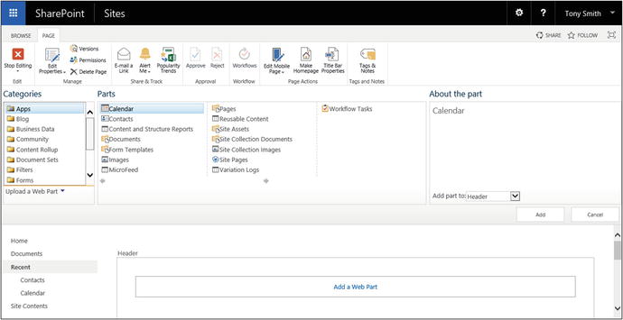
Figure 4-2. Web part page selection area
The web part is added to the zone and can be configured. Configuring and managing web parts are discussed later in this chapter. With the items on the page, you can move them into the appropriate location by dragging the items within the zone to the desired location.
Wiki Pages
A wiki page is another type of page that can be created within SharePoint sites. Wiki pages are managed within a site’s Site Pages library. While web part pages have zones where apps or web parts can be placed, wiki pages have zones that can contain apps, web parts, rich text content, references to images and videos, HTML elements (like tables and bulleted lists), and code (such as JavaScript) to further manipulate information within the page. These elements can be integrated within the page in any combination.
Create a wiki page when you want to provide full creative control of the page to content contributors within the site. Like web part pages, wiki pages have different page layouts available, and a page’s layout can be updated after the page has been created.
Creating Wiki Pages
Wiki pages are created within a site’s Site Pages library. This library is made available within a site by activating the Wiki Page Home Page feature (activating this feature is discussed in the “Creating Web Part Pages” section). To create a wiki page, do the following:
Navigate to the site where you want to create the wiki page.
On the site’s home page, select the Add a Page option from the Settings menu.
In the Add a Page window, enter the name of the new page to create, and click the Create button.
The page is created. You are navigated to the page, and it is placed in Edit mode to allow changes to be made.
Editing Wiki Pages
An existing wiki page can be edited by navigating to the desired wiki page and then doing one of the following:
Selecting the Edit Page option from the Settings menu.
Selecting the Edit option from the Page ribbon tab.
When a wiki page is edited, several characteristics can be managed, and elements can be added and configured. These elements include the following.
Managing the Page Layout
The layout of a wiki page can be edited after the page has been created. This is done to alter the wiki zone configuration to meet the needs of the page. To change the zone configuration for a page being edited, select the desired page layout from the Text Layout menu on the Format Text ribbon tab. The default wiki page layout includes those listed in Table 4-2.
Table 4-2. Default Wiki Part Page Layouts
Template | Description | Layout |
|---|---|---|
One Column | Contains a single column spanning the entire page. |
 |
One Column with Sidebar | Contains a two-column layout, with a large left column and a smaller right column. |
 |
Two Columns | Includes two columns in a side-by-side configuration. |
 |
Two Columns with Header | Includes a single column spanning the width of the page, with two columns in a side-by-side configuration below it. |
 |
Two Columns with Header and Footer | Includes a single column spanning the width of the page, with two columns in a side-by-side configuration below it and a full-width column at the bottom. |
 |
Three Columns | Contains three side-by-side columns making up the page. |
 |
Three Columns with Header | Includes a single column spanning the width of the page, with three columns in a side-by-side configuration below it. |
 |
Three Columns with Header and Footer | Includes a single column spanning the width of the page, with three columns in a side-by-side configuration below it and a full width column at the bottom. |
 |
Editing Text
Wiki pages let you enter text to be presented on the page. Rich text content is added to the page much as you would add content to a Word document. When text is added to the page, it is formatted with the format controls on the Format Text ribbon tab, as shown in Figure 4-3.

Figure 4-3. Format Text ribbon tab
Adding Tables
HTML tables are used to format page content into table structures and can be added to wiki pages. Tables are added to pages by editing a page, placing the cursor where the table should be inserted, and selecting the row and column configuration from the Table drop-down menu on the Insert tab of the ribbon, as shown in Figure 4-4.

Figure 4-4. Insert ribbon tab
Once the table is added to the page, the Design ribbon tab will be available allowing you to select the desired table layout and choose to show or hide grid lines for the table. The Table Layout ribbon tab can also be used to specify table and cell width, height, and layout properties. Tables are used to style and organize text and objects within a page to create the desired information layout.
Adding Pictures
You can add images to wiki pages in order to show them within the page. Pictures can be added using any of three different approaches.
Approach 1: If the image to be displayed on the page is not yet in SharePoint and you want to upload the image and display it on the page, select the From Computer option from the Picture drop-down on the Insert ribbon tab (see Figure 4-4). You can then pick the file and the library where the file will be uploaded. The file is placed in the identified location and referenced on the page.
Approach 2: If the image to be referenced is already located in SharePoint, you can select the From SharePoint option from the Picture drop-down on the Insert ribbon tab. When the Select an Asset window appears, you pick an item to reference from a location within the site collection. The selected item is referenced on the page.
Note
When referencing images from within SharePoint, you should make sure that users visiting the page have at least Read permissions to the library where the image is located. The image reference will appear a broken image reference if the users do not have at least Read permissions.
Approach 3: If the image to be displayed on the page is in a location outside the site collection, such as on another SharePoint site or some other web location, you can select the From Address option from the Picture drop-down menu on the Insert ribbon tab. You can then identify the URL of the image to reference.
Adding a Video or Audio File
Video and audio files can be added directly to a wiki page, allowing them to play in place on the page. As with pictures, video and audio files can be added whether they are on your local computer or already in SharePoint or some other web-addressable location. Video and audio files are added to a page through one of the following approaches:
Approach 1: If the video or audio file is located outside the SharePoint environment—on your local computer, for example—and needs to be uploaded to the environment, select the From Computer option from the Video and Audio drop-down on the Insert ribbon tab. Then select the file to upload and the library to upload it to. The file is uploaded to the designated location and referenced within the page.
Approach 2: If the video or audio is in a web-accessible location and needs to be referenced from its current location through an embedded object reference, identify the file by selecting the Embedded option from the Video and Audio drop-down menu on the Insert ribbon tab. The Embed window will appear and you can enter the script or code necessary to reference the video.
Approach 3: If the video or audio file is already stored in the SharePoint environment, reference it by selecting the From SharePoint option from the Video and Audio drop-down menu of the Insert ribbon tab. Then select the file to reference.
Approach 4: If the video or audio file exists in a web-accessible location and can be referenced through a standard URL, reference the file by using the From Address option of the Video and Audio drop-down menu of the Insert ribbon tab. Then enter the URL for the audio or video file.
Adding Links
Link references can be added to wiki pages to create references to other web resources, such as to items that exist in other locations within your SharePoint environment or to web resources external to it. Two approaches can be used to add links to the page.
Approach 1: If the item you want to create a reference to exists in your SharePoint site collection, select the From SharePoint option from the Link drop-down of the Insert ribbon tab. Then select the item to reference, and the link is added to the page.
Approach 2: If the item to reference does not exist within your SharePoint environment, reference it by selecting the From Address option from the Link drop-down of the Insert ribbon tab. Then enter the URL of the item and the text to display for the item.
Adding App Parts or Web Parts
App parts and web parts add business functionality to SharePoint pages. You can add an app part or web part to a page by selecting either the App Part or Web Part option from the Insert ribbon tab. Then select the app part or web part to add to the page and click the Add button. Once on the page, the app or web part can be configured. Configuring app parts and web parts is discussed later in this chapter.
Adding Embedded Code
Just as standard web objects can be embedded in SharePoint pages, if you want to add script logic to a page, you can embed your code directly in the page. To embed code, select the Embed Code option from the Insert ribbon tab, and then enter the code to be placed on the page.
Publishing Pages
The last type of page available in SharePoint is the publishing page. Publishing pages are only available in sites where the SharePoint Server Publishing site feature is active. Publishing pages contain web part zones, like web part pages, and rich text entry zones, like wiki pages. Use publishing pages when you want to control the overall layout of the page while providing page editors the ability to manage content within the structure. This type of page is commonly used to create standard templated pages, such as press releases or case studies, where you want a consistent layout for each of the items created.
Enabling Publishing Pages
In order to use publishing pages within a site, the SharePoint Server Publishing feature needs to be enabled. By default these features are available in publishing sites but need to be enabled in other site types. To enable the use of publishing pages in a site along with the other publishing capabilities of SharePoint, you first must ensure the SharePoint Server Publishing Infrastructure site collection feature is active, and then verify the SharePoint Server Publishing site feature within the site where you want to use publishing pages.
To enable the SharePoint Server Publishing Infrastructure site collection feature, do the following:
Navigate to the root site in the site collection.
On the root site home page, select the Site Settings option from the Settings menu.
On the Site Settings page, select the Site Collection Features option from the Site Collection Administration section.
On the Site Collection Features page, select the Activate option for the SharePoint Server Publishing Infrastructure site collection feature.
The site collection feature is activated. With this done, you then need to activate the SharePoint Server Publishing feature within the site where you want to use publishing pages. To activate this feature, do the following:
Navigate to the site where you want to use publishing pages.
From the site’s home page, select the Site Settings option from the Settings menu.
On the Site Settings page, select the Manage Site Features option from the Site Actions section.
On the Site Features page, select the Activate option for the SharePoint Server Publishing feature.
The now active publishing features will allow you to create SharePoint publishing pages within the site.
Creating Publishing Pages
Publishing pages are managed within a site’s Pages library. This library is created when the SharePoint Server Publishing site feature is enabled within the site. To create a new publishing page, do the following:
Navigate to the site where you want to create the page.
On the site’s home page, select the New option from the Page ribbon tab.
In the Add a Page window, enter the name for the page, and click the Create button.
The page is created, and you are navigated to the new page in Edit mode.
Editing Publishing Pages
Users with Contribute rights or higher within the site can create and manage publishing pages. To edit a publishing page do the following:
Navigate to the publishing page you want to edit.
On the page, select the Edit Page option from the Settings menu or select the Edit option from the Page ribbon tab.
Make your updates to the page, and once done, click the Save option from the Format Text or Page ribbon tabs.
Publish the page by selecting the Publish option from the Publish ribbon tab.
Once the page is published, site users can see the changes made to the publishing page. Prior to this point only people having the ability to edit the page would be able to see the changes.
You can make several types of changes to publishing pages when editing them. Changes that can be made to these pages include determining page layout, creating and managing content, and configuring apps and web parts. Publishing pages include two types of zones, along with other elements focused on configuring web-based content. The zone types in a publishing page include the following:
Wiki zones allow management of rich text content, pictures, videos, apps, web parts, and other content (see the “Wiki Page” section).
Web Part zones host web parts and app parts that.
Page Image allows identification of an image to be displayed on a page in the identified location.
Rollup Image allows identification of an image to be used in other site pages that reference the page using the content query web part or other page rollup tools.
Summary Links is an area within the page containing one or more Summary Links web parts that allow for the creation and management of links.
The layout and inclusion of these zones depend on the page layout selected.
Changing a Page Layout
The page layout defines the number and configuration of zones within a page. When a publishing page is initially created, its layout is based on the Body Only article page layout, which includes a content area and rollup image, as shown in Figure 4-5.
Figure 4-5. Body Only article page layout
To change the page layout for a publishing page while viewing the page in Edit mode, select the desired page layout from the Page Layout drop-down menu on the Page ribbon tab. The available layouts include the following:
Article Pages
Body Only: This type of page includes a single content area covering the full page. It also contains a Rollup Image section, where you can reference an image used when the page is listed in other areas of the site (see Figure 4-5).
Image on Left: This page layout is similar to the Body Only layout in that it contains the full-page content area and the Rollup Image section. As Figure 4-6 shows, this page also includes a page image that is listed in the upper-left area of the page. Article Date and Byline fields are also listed.

Figure 4-6. Image on Left page layout
Image on Right: This page layout and the Image on Left layout contain the same elements, the only difference being that the page image is located to the right of the content area instead of the left.
Summary Links: This layout and the Image on Right layout contain the same structure, but in place of the page image is a Summary Links web part allowing management of a set of related links (see Figure 4-7).

Figure 4-7. Summary Links page layout
Catalog Item Reuse
Blank Catalog Item: This page layout is used to show Catalog content. It can reference the catalog item and has a series of web part zones and includes the Table of Contents web part by default (see Figure 4-8).

Figure 4-8. Blank Catalog Item page layout
Catalog Item Image on Left: This layout allows selection of the catalog item to reference within the page.
Enterprise Wiki Page
Basic Page: This layout is the only wiki page layout in the Publishing Page layouts. It includes a single wiki zone, like those described in the “Wiki Pages” section. The page also includes a rating option and has the ability to categorize the page.
Error Page
Error: This type of page includes only a byline, a page content area, and a rollup image.
Project Page
Basic Project Page: This layout includes a single wiki zone, with an area to the right that allows configuration of metadata about the project to be associated with the page (see Figure 4-9).

Figure 4-9. Basic Project Page layout
Redirect Page
Redirect: This type of page has a field that identifies the URL to navigate to when the page is accessed. This page can be any URL and does not need to be located within SharePoint (see Figure 4-10).

Figure 4-10. Redirect Page layout
Welcome Page
Blank Web Part Page: This page layout includes a full-page wiki zone area for adding content, followed by a series of web part zones for inclusion of web parts within the page (see Figure 4-11).
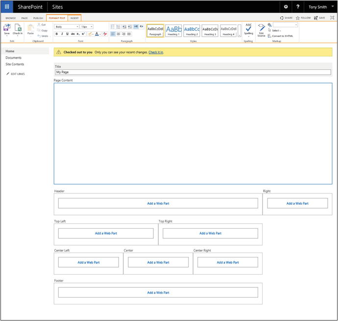
Figure 4-11. Blank Web Part Page layout
Splash: This layout can include an image and a set of links, followed by a set of web part zones.
Summary Links: This layout is similar to that of the Blank Web Part Page. It contains the page image area and the page content area. Below the content area, however, this layout also contains a pair of Summary Links web parts that can be used to configure links on the page. Below this pair of web parts is a set of additional web part zones for adding web parts and app parts to the page.
Checking In and Publishing Pages
The publishing pages library, created when the SharePoint Server Publishing site feature is activated, has versioning enabled by default. Versioning requires that you check in pages after edits are made and publish the pages before changes become available to general site users. To check in a page that has been edited, do the following:
On the page, select the Check In option from the Page ribbon tab.
In the Check In window, optionally enter a comment, and then click the Continue button.
The page is checked in as a minor version. For example, if the previous version of the page was 1.0, the new version will be 1.1. Minor versions of a page are available only to users with the ability to edit the page. In order to make the changes available to all site users, the page must be published. To publish a SharePoint page select the Publish option from the Publish ribbon tab.
Apps
In order to understand the difference between web parts and apps, you need to understand the different ways these two types of components work . Web part solutions are deployed into an environment as either a farm solution or a sandbox solution. Farm solutions have full trust within the SharePoint farm and are available for activation in all the site collections. Sandbox solutions, deployed into a specific site collection, are available for use only within that site collection.
Where web parts are deployed in the SharePoint farm to leverage resources, apps are stand-alone applications. This isolates their execution and allows them to run from their own web locations. SharePoint apps are made available from an online SharePoint App Store that is managed by Microsoft and from internal corporate app catalogs that can be managed from within your own environment. The next sections discuss how to manage and use apps within your SharePoint sites.
Note
It is the responsibility of the SharePoint technical administrator to create app catalogs, configure connections to app catalogs, and set users’ security rights to download apps to use in the environment.
Adding Apps to Your Site
For apps to be available within a SharePoint site, a site manager must first add the app to SharePoint for use. A site manager’s ability to add apps to SharePoint depends on the app management settings defined by the SharePoint technical administrator, who can select from the following options to determine site managers’ ability to manage apps.
Do not allow users to add apps: This option allows site managers to work only with apps that have already been added to the SharePoint environment for use. The only apps you can add to pages are the app parts for lists and libraries contained in the site.
Allow users to request apps: This option allows site owners to access the app store to identify apps they are interested in adding. They can create a request for a desired app that then must be approved by a SharePoint technical administrator, who will download the app. This allows centralized management of apps and controls app purchases while letting site administrators identify and select apps they feel will meet their business needs.
Allow users to add apps: This option allows site owners to access the app store and add apps to their SharePoint sites without the involvement of the SharePoint technical administrator. This gives site administrators complete control over app management in their sites.
Adding Apps Directly
As already discussed, your ability to add apps to SharePoint depends on settings configured by your SharePoint technical administrator. When the environment is configured to allow site owners to add apps, you can add apps from your corporate app repository or from the online SharePoint app store. To add an app from the online app store or from your corporate app repository, do the following:
Navigate to the site where you want to add the app.
From the Settings menu of the site, select the Add an App option.
On the Your Apps page (see Figure 4-12), select the SharePoint Store option from the Quick Launch area.

Figure 4-12. Your Apps page
On the SharePoint Store page (see Figure 4-13), select the app to install.

Figure 4-13. SharePoint Store page
Caution
Some apps in the app store are free, but others must be purchased. Note the app’s cost before downloading it. Also, some apps are free previews of products that must later be purchased for continued use.
On an app’s detail page, review details about the app, including the description and user ratings, and then choose the Add It option to add the app.
On the Market Place page, log on to the online store using your Microsoft account (this is the same as your Windows Live ID).
On the Confirm That You Wish to Add the App page, click the Continue option.
On the App Added confirmation screen, click the Return to Site option.
The app is added for use in your site from within the Your Apps page. As discussed earlier, you can then add the app to the appropriate SharePoint pages.
Requesting Apps to Add
When your SharePoint technical administrator has configured the environment so that site owners can request apps but not install apps directly, you will need to get the administrator’s approval for apps you want to install. To request an app, do the following:
Navigate to the site where you want to add the app.
From the Settings menu of the site, select the Add an App option.
On the Your Apps page (see Figure 4-12), select the SharePoint Store option from the Quick Launch area.
On the SharePoint Store page (see Figure 4-13), select the app to install. In this example, the World Clock and Weather app has been selected.
On the app’s detail page, review the app’s details, and select the Request It option.
In the App Request window, identify the following:
Enter the user license details:specify the number of users the request is for or note that the request is for the entire organization.
Enter a justification for the request. That is, identify why the app is needed.
Click the Request button to complete the request.
Viewing Your App Requests
After you have placed a request for an app, you can track its status through the Site Content area as follows:
Navigate to the site collection where you made the request.
From the Settings menu, select the Add an App option.
On the Your Apps page, select the Your Requests option from the Quick Launch area.
On the Your Requests page, view the details for the identified request.
Once the SharePoint technical administrator approves the request and adds the app, it is available for use in your SharePoint site.
Removing Apps
Apps that have been added to the SharePoint environment can later be removed if needed. To remove an app, do the following:
Navigate to the site collection where you want to remove the app.
On the home page of the site, select the Site Contents option.
On the Site Contents page click the … option next to the app to remove it.
Note
The default apps installed in the SharePoint environment will not have the … option and cannot be removed.
On the apps hover panel, select the … option, and choose the Remove option.
On the deletion confirmation screen, select the OK button to remove the application.
The app is removed, and you are returned to the Site Content page.
Adding App Parts to Pages
Once apps have been added to the environment, they can be added to site pages. To add an app to a page, do the following:
Navigate to the page where the app is to be added.
On the page, select the Edit option to edit the page.
Within the Edit mode of the page, select the location to place the app, and from the ribbon select the App Part option from the Insert tab.
On the Parts list, select the app to add to the page, and then click the Add button.
The app part is added to the page, and you can configure it as necessary. App parts have different configurations depending on the configuration needs of the app, and they are managed and configured just as web parts are managed and configured. Managing web parts and app parts are discussed in the next section.
Web Parts
Like app parts, web parts add information views and business functionality to SharePoint sites. Web parts can be used to show content in lists and libraries, implement process, interface with outside databases or systems, and provide any other application solution functionality.
Adding Web Parts to Pages
Web parts can be added to any of the pages discussed previously. They are added to either web part zones or wiki zones within SharePoint site pages. To add a web part to a web part zone in a page, do the following:
Navigate to the web part or publishing page to be edited.
Place the page into Edit mode (how to do this was explained earlier in this chapter).
Click the Add a Web Part link in the web part zone where you want to add the web part.
Select the web part to add from the Parts list (see Figure 4-14) and click the Add button.

Figure 4-14. SharePoint page parts list
The web part is added to the page in the top of the web part zone where the Add a Web Part link was clicked. You can then drag and drop this web part into the appropriate position in the zone.
To add a web part to a wiki zone, do the following:
Navigate to the wiki or publishing page to be edited.
Place the page into Edit mode.
Place the cursor in the wiki zone where you want to add the web part.
From the Insert ribbon tab, select the Web Part option.
Select the web part to add from the Parts list (see Figure 4-14) and click the Add button.
The web part is added to the page in the location where the cursor was placed.
Editing Web Parts
Web parts have properties that govern their configurations. These properties include display settings, connectivity details, and business capability definitions. To edit a web part’s properties , do the following:
Navigate to the page containing the web part to be configured.
Place the page into Edit mode.
From the web part drop-down menu, select the Edit Web Part option (see Figure 4-15).
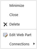
Figure 4-15. Edit Web Part options menu
In the Web Part Properties window, update the web part’s properties and click the Apply button to save them.
The properties of a web part are specific to the purpose and configuration needs of the web part itself. There are also some common properties available across most web parts to manage, as Figure 4-16 shows.

Figure 4-16. Web Part properties screen
Common properties include the following:
Appearance: These settings are used to identify properties that manage the appearance of the web part.
Title specifies the text displayed in the web part’s title bar.
Height specifies the height of the web part. The default option is to adjust the height based on the content’s needs. However, you can also specify a fixed height for the web part.
Width specifies the width of the web part. The default option is to adjust the width based on the width of the zone and the contained content. However, you can also specify a fixed width for the web part.
Chrome State determines whether the web part is minimized by default.
Chrome Type specifies whether to display the title bar and border for the web part.
Layout: These settings identify the general web part display properties.
Hidden specifies whether the web part is hidden on the page. If it is, it is still part of the page but is not visible to site users.
Direction allows control of the direction in which the content within the web part is displayed.
Zone specifies the zone the web part is located within when it is part of a web part page.
Zone Index determines the order of the web part in the zone relative to other web parts in the same zone when it is used in a web part zone.
Advanced: These settings allow you to determine which web part capabilities are available to site users.
Allow Minimize specifies whether the web part can be minimized on the page.
Allow Close specifies whether page users can close the web part when used in a web part zone.
Allow Hide specifies whether the web part can be hidden within a page when used in a web part zone.
Allow Zone Change specifies whether the web part can be moved to another zone within the page when used in a web part zone.
Allow Connections specifies whether the web part is allowed to be connected to other web parts.
Allow Editing in Personal View specifies whether the web part can be edited when the page is in a personal view.
Title URL identifies the web address to navigate to when the title of the web part is clicked.
Description identifies the hover text to be displayed when the mouse hovers over the title of the web part.
Help URL identifies the URL to navigate to when the Help option is selected from the web part context menu.
Help Mode specifies how the help pages are displayed to the users.
Catalog Icon Image URL allows display of an image for the web part when it is added to the pages.
Title Icon Image URL allows display of an image in the title bar of the web part.
Import Error Message specifies the message to display to users if there is a problem when attempting to display the web part.
Target Audiencesspecifies whether the web part is to be targeted to a specific user or group.
Removing Web Parts
Web parts listed on a page can be removed if they are no longer needed. Remove a web part by doing the following:
Navigate to the page to be edited.
Place the page into Edit mode.
From the web part drop-down menu (see Figure 4-15), select the Delete option.
In the deletion confirmation window, click the OK button.
The web part is removed from the page.
Connecting Web Parts
Many of the web parts available in SharePoint can be connected to other web parts. This allows details in one web part to be used to filter content in another. An example of when this is useful is when you want to filter a library or list view based on the user viewing the page showing only items that the user created or modified. Web part connections are made between provider web parts and consumer web parts. Provider web parts include the details to filter by and the consumer web part lists the content to be filtered. Creating a connection between these web parts allows the details from the provider to be made available to the consumer for use.
SharePoint filter web parts are specifically designed to act as provider web parts that can be connected to other web parts, such as list or library views, in order to filter them. For example, you could add a date filter to a page to filter the details in a calendar list to show just those items falling on the identified date. To create a connection between a provider and consumer web part, do the following:
Navigate to the page containing the web parts to be connected.
Place the page into Edit mode.
On the provider web part, select the Connections option, then Send Filter Values To, and then the consumer web part.
On the Web Part Dialog/Choose Connection page, click the Configure button.
On the Web Part Dialog/Configure Connection page, select the column that the provider web part is to supply and the column that the consumer web part is to apply the connection against. Then click the Finish button.
The connection is established between the web parts, and the consumer web part is filtered based on the provider web part details.
Exporting and Importing Web Parts
Once a web part has been added to a page and properly configured, you may want to export it so that it can be imported into other pages. Doing so allows an exact copy of the web part to be created within other pages.
Exporting a web part creates an XML file containing configuration details for the web part. To export a web part, do the following:
Navigate to the page containing the web part to be exported.
Place the page in Edit mode.
From the web part menu, select the Export option.
On the open or save prompt, select the Save or Save As option to save the web part file.
An exported web part file can be imported into a SharePoint page, where it can be added to the information already displayed. The web part will be imported with the exact configuration it had when exported. To import a web part into a page, do the following:
Navigate to the page where you want to add the web part.
Place the page in Edit mode.
Select to add a new web part to the page.
In the Parts list under the Categories section, select the Upload a Web Part option.
In the Upload Web Part box, browse to the file you want to upload and click the Upload button.
Select to add a web part to the page.
On the web part selection screen from the Imported Web Parts category, select the uploaded web part and click the Add button.
The web part is added to the page. Use this approach when you need to upload the web part into a specific page. It is also possible to upload a web part so that it appears in one of the available web part configurations in the parts list. Over time, the web part can be added to multiple pages within your environment by uploading it into the Web Part Gallery. To import a web part to the Web Part Gallery, do the following:
Navigate to the root site in the site collection.
Select the Site Settings option from the Settings menu.
On the Site Settings page, click the Web Parts link under the Galleries section.
On the Web Part Gallery page, select the Upload Document command from the New group on the Files ribbon tab.
In the Add a Web Part window, click the Browse button.
In the Choose File window, browse to the exported web part file, and select it. Then click the Open button.
In the Upload Web Part window, click the OK button.
In the Edit Item window, edit the name, title, and description loaded from the file, and then select a group and optional recommendation settings to determine how the web part is organized and presented to users.
Click the Save button.
The web part is added to the Web Part Gallery and is made available when adding web parts to pages within the site collection.
Standard SharePoint Web Parts
There are a variety of default web parts available within SharePoint. These default web parts provide a variety of capabilities to SharePoint sites and allow you to take advantage of many of the SharePoint services, including search, Excel services, PerformancePoint services, and others. These web parts are organized into the following categories and include the following web parts.
Apps
The Apps category lists the app parts available within the environment. App parts available by default include references to each of the lists and libraries available in the current site (apps were discussed earlier in the chapter).
List View App Part
An instance of the List View app part is available in each of the site’s lists and libraries. This app part is used to display list information on the page with one of the list’s views. You can also create a custom view to display the information from the list or library. Users can be given the ability to view and manage content within the list through this app part. An example of this app part is shown in Figure 4-17.

Figure 4-17. List View app part
The options available to configure List View app parts include the items in Table 4-3.
Table 4-3. List View App Part Properties
Property | Description |
|---|---|
Selected View | Allows selection of the list view to display within the app part. This includes a list of all views available within the list as well as the Summary View. The Summary View is the default view for the type of list the app part is being used to display. In this section you can also select the Edit the Current View option to customize the selected view. |
Toolbar Type | Allows selection of the toolbar configuration for the app part. Options available for the toolbar selection include Full Toolbar, Summary Toolbar, No Toolbar, and Show Toolbar. |
Blog
The Blog category lists web parts used to display details about blogs. All web parts in this category are available in all versions of SharePoint and are designed to be used within blog sites. The default set of web parts available in this category includes the following items.
Blog Archives
The Blog Archives web part provides a set of references to old blog posts located in the current blog site.
Blog Notifications
The Blog Notifications web part can be added to a blog site. It provides registration links for the site’s RSS feed or alerts for site activities. Like the Blog Archives part, this part includes no special configuration capabilities beyond standard SharePoint web part configurations.
Blog Tools
The Blog Tools web part provides a set of links for managing a blog site. This web part also has no custom configurations.
Business Data
The Business Data category web parts are available only in SharePoint Server Enterprise. The Business Data category includes web parts for managing different forms of data to be integrated into site pages. The web parts within this category include the following items.
Business Data Actions
The Business Data Actions web part provides a list of business data connectivity actions that can be performed. When added to a page, this web part must be configured to connect to the appropriate external content type. Table 4-4 lists the configuration options for the Business Data Actions web part.
Table 4-4. Business Data Actions Web Part Properties
Property | Description |
|---|---|
Type | Used to identify the external content type for which business data actions are to be displayed. |
Item | Used to identify the item or items for which business data actions are to be displayed. |
Actions | Allows selection of actions to display and specifies whether new actions are to be displayed by default. |
Style | Identifies the styling for the list of actions, with styles including Bulleted List, List, and Tool Bar. |
Business Data Connectivity Filter
The Business Data Connectivity Filter web part is used to permit filtering of content returned through data connections.
Business Data Item
The Business Data Item web part is used to present a single item from a defined data source. and is used in conjunction with the Business Data Item Builder to identify the item to be presented. Table 4-5 includes the configuration options for the Business Data Item web part.
Table 4-5. Business Data Item Web Part Properties
Property | Description |
|---|---|
Type | Used to identify the external content type for which business data actions are to be displayed. |
View | Allows selection of the external content type view to use for selecting the business data item. |
Item | Used to identify the item or items for which business data actions are to be displayed. |
Display Animation While Loading | Identifies if an animation is to be displayed when the content is loaded in the web part. |
Fields | Allows specification of fields to display for the selected item. |
Actions | Allows selection of actions to display and specifies whether new actions are to be displayed by default. |
XSL Editor | Used to customize the view of the business data item being displayed. |
Business Data Item Builder
The Business Data Item Builder web part is used to identify a data item from a data connection based on parameters passed into the page through the query string. This identified item can then be presented through the Business Data Item web part.
Business Data List
The Business Data List web part is used to present a list of items from an identified data connection. This web part is used in conjunction with such data retrieval web parts as the Business Data Connectivity Filter or the Business Data Related List to identify the items to be presented.
Table 4-6 lists the options available to configure the Business Data List web part.
Table 4-6. Business Data List Web Part Properties
Property | Description |
|---|---|
Type | Used to identify the external content type for which business data actions are to be displayed. |
View | Allows selection of the external content type view to use for selecting the business data item. |
Display Toolbar | Specifies whether the toolbar is to be displayed for the presented list. |
Display Animation While Loading | Specifies whether an animation is to be displayed when the content is loaded in the web part. |
XSL Editor | Used to customize the view of the business data item being displayed. |
Business Data Related List
The Business Data Related List web part is used to present items related to a Business Data List item. Table 4-7 lists the options available to configure the Business Data Related List web part.
Table 4-7. Business Data Related List Web Part Properties
Property | Description |
|---|---|
Type | Used to identify the external content type for which business data actions are to be displayed. |
Relationship | Used to identify the item the web part will be related to. |
Display Toolbar | Specifies whether the toolbar is to be displayed for the presented list. |
Display Animation While Loading | Specifies whether an animation is to be displayed when the content is loaded in the web part. |
XSL Editor | Used to customize the view of the business data item being displayed. |
Excel Web Access
The Excel Web Access web part is used to show content in an Excel workbook within the web page (see Figure 4-18).

Figure 4-18. Excel Web Access web part
The Excel Web Access web part has several properties that need to be configured. These configurations include the items listed in Table 4-8.
Table 4-8. Excel Web Access Web Part Properties
Property | Description |
|---|---|
Workbook | Identifies the Excel document to be referenced. |
Named Item | Identifies the named item in the Excel document to be displayed. This can be any named object, such as a PivotTable or Chart, or a named range. |
Title Bar | Specifies whether the web part title and the web part title URL are to be automatically generated. |
Type of Toolbar | Specifies whether the toolbar is to be Full, Summary, Navigation Only, or None. |
Toolbar Menu Commands | Specifies which menu commands are to be available and allows selection of the following: • Open in Excel, Download, Download a Snapshot • Refresh Selected Connection, Refresh All Connections • Calculate Workbook • Named Item Drop-Down List |
Navigation | Specifies whether navigation hyperlinks are to be included. |
Interactivity | Allows selection of the type of interactivity with the Excel data the web part is to support. The options available for selection include the following: • All Workbook Interactivity • Typing and Formula Entry • Parameter Modifications • Display Parameters Task Pane • Display Task Pane Apps • Sorting • Filtering • All PivotTable & PivotChart Interactivity • Periodically Refresh if Enabled in Workbook • PivotTable & PivotChart Modification |
Indicator Details
This web part is used to show a single status indicator based on information retrieved through a data connection, information located in a SharePoint list, information in an Excel workbook, or information in an Analysis Services KPI. Table 4-9 includes the parameters unique to the web part that need to be configured.
Table 4-9. Indicator Details Web Part Properties
Property | Description |
|---|---|
Status List | Identifies the list against which the Indicator Detail web part is to be configured. |
Status Indicator | Identifies the item in the list to base the indicator on. |
Change Icon | Identifies the icon to use for the status indicator, with the options being Default, Checkmarks, Flat, and Traffic Lights. |
Status List
The Status List web part shows status indicators, or KPIs, to represent important measures. The web part is configured through the management of the options listed in Table 4-10.
Table 4-10. Status List Web Part Properties
Property | Description |
|---|---|
Indicator List | Identifies the list against which the Status List web part is to be configured. |
Change Icon | Identifies the icon to use for the status indicator, with the options being Default, Checkmarks, Flat, and Traffic Lights. Also, identifies which icon and toolbar properties to include, selecting from the following: |
• Show Only Status Icon • Show Only Problems • Hide the Toolbar • Display edit toolbar in View mode | |
Display Multiple Indicators Columns | Used to determine whether multiple columns are to be displayed in the web part. |
Status Indicator | Specifies the item in the list to be the indicator for the web part. |
Column or Dimension | Specifies the column to use for the indicator. |
Hierarchy | Identifies the hierarchy for the web part. |
Members to Display | Identifies the items from the hierarchy items to be included. |
Visio Web Access
The Visio Web Access web part is used to show the contents of a Visio diagram file in a SharePoint page.
The Visio Web Access web part has several properties that need to be configured, including the items listed in Table 4-11.
Table 4-11. Visio Web Access Web Part Properties
Property | Description |
|---|---|
Web Drawing URL | Identifies the Visio document to reference. |
Force Raster Rendering (Applies to VDW Files Only) | Determines whether raster rendering is to be forced to occur for the web part display. |
Automatic Refresh Interval (in Minutes) | Identifies how frequently the diagram display is to be refreshed. |
Fit All Shapes in View | Determines whether the diagram is to be sized to fit in the display of the web part in the page. |
Index of the Initial Page to Show | Identifies which page in the Visio diagram to display when the web part is initially accessed. |
Expose the Following Shape Data Items to Web Part Connections | Specifies whether any of the objects in the Visio diagram configured with data connection display are to be manageable through web part connections (connecting web parts is discussed earlier in this chapter). |
Toolbars and User Interface | Identifies user interactivity with the Visio menus to be made available in the web part, including the following options: • Show Refresh • Show Open in Visio • Show Page Navigation • Show Status Bar • Show the Shape Information Pane • Show default background |
Web Drawing Interactivity | Specifies whether the diagram interactivity is to be restricted within the web part by disabling diagram interaction options, including the following: • Disable Zoom • Disable Pan • Disable Hyperlink • Disable Selection |
Community
The Community category of web parts includes items used to support community sites within the environment. All of the web parts listed in this category are available in both SharePoint Server Standard and Enterprise.
About the Community
The About the Community web part displays the general community details for a site with the community features enabled. This includes information such as the community description and the date the community was established. The web part does not include any custom configuration options to be managed.
Join
The Join web part allows individuals who access the community site to join the community. This makes them members of the community.
My Membership
The My Membership web part lists membership details, including reputation details, for the person currently visiting the site. Community reputation is discussed in more detail in Chapter 12.
Tools
The Tools web part lists a set of community management feature links for the community site.
What’s Happening
The What’s Happening web part lists a summary of the activities occurring within the current community site, including how many members have joined, the number of discussions within the site, and the total number of replies made against those discussions, as shown in Figure 4-19.

Figure 4-19. What’s Happening web part
Content Rollup
The Content Rollup category of web parts includes a set of web parts designed to organize and present information managed within SharePoint. Content in lists and libraries throughout the environment can be organized into logical groupings for site users. This category contains a mix of web parts available in both SharePoint Server Standard and Enterprise, as well as some only available in SharePoint Server Enterprise.
Categories
The Categories web part is used to display the category details listed in the site directory of the current site collection. This web part is available in SharePoint Server Standard and Enterprise and can be configured to present the site directory details in different ways. The web part is configured through its web part properties. Table 4-12 displays the properties available to be configured.
Table 4-12. Categories Web Part Properties
Property | Description |
|---|---|
Header Text | Identifies text to present in the top of the web part to act as the header for the information being displayed. |
Header Style | Identifies the style for the header information, with the choices being Default, Large Text, Small Text, Banded, Centered, Separator, and Whitespace. |
Level 1 Style | Identifies the style for top level items in the category listing, with options including Vertical, Vertical with boxed title, Vertical with large title, Vertical with small title, Horizontal, Horizontal with boxed title, Horizontal with large title, and Horizontal with small title. |
Level 2 Style | Identifies the style for the second tier level of items within the site category to be listed, with the style options being the same as those listed for the Level 1 style. |
Level 3 Style | Identifies the style for the third tier level of items, with the style options being the same as those for the Level 1 and 2 styles. |
Source List | Identifies the list within the site collection that contains the site directory information. |
Source View | Identifies the view from the source list to use as the source for the information to display in the web part, with the web part respecting the sorting and filtering defined in the view. |
Content Query
The Content Query web part is used to identify content from across the site collection that you want to consolidate into a single information view. This web part, available in both SharePoint Server and Enterprise, allows environment-wide content selection based on content type and metadata details. Figure 4-20 shows an example of the Content Query web part layout consolidating announcements from across sites in a single site collection.

Figure 4-20. Content Query web part
To define the details for the content to be displayed, several properties need to be configured for the Content Query when it is added to a page. These properties are described in Table 4-13.
Table 4-13. Content Query Web Part Properties
Property | Description |
|---|---|
Source | Identifies the source location for items to be included in the view. Items can come from across the entire site collection, from a specific site location within the site collection, or from a specific list. |
List Type | Identifies the type of list from which to take items. |
Content Type | Used to identify the source content type on which the content query is to be based and to allow selection of the content type group and content type. You can also specify whether the view is to include content types based on the selected type. |
Audience Targeting | Specifies whether information is to be filtered based on audiences and, if it is, whether items not targeted to an audience are to be included. |
Additional Filters | Identifies whether the information to be presented is to be further filtered and, if it is, what the filter criteria are to be. |
Grouping and Sorting | Specifies whether displayed information is to be grouped and, if it is, by what details, how it is to be sorted and by what column, how many columns the information is to be listed in, and whether any item display limits are to be enforced. |
Fields to Display | Identifies the displayed field that is to represent a link to the associated item, the column containing the image to use as the thumbnail image in the view, and the title and description details. |
Feed | Identifies whether the content query is to be listed as an RSS feed and, if it is, what details to use as the title and description fields in the feed. |
Content Search
Like the Content Query web part, the Content Search web part is used to identify resources to be shown within the current page. The content displayed can be any information crawled by the SharePoint search services and will be organized and displayed based on configuration details, as defined in Table 4-14. This web part is available in SharePoint Server Standard and Enterprise.
Table 4-14. Content Search Web Part Properties
Property | Description |
|---|---|
Search Criteria | Identifies the search query used to locate items to be displayed and the number of items to include in the display. |
Display Templates | Identifies the display control that formats the items to be presented and allows selection of List, List with Paging, or Slideshow. You can also specify the item format for the elements displayed from the following options: • Diagnostic • Large Picture • Picture on left, 3 lines on right • Picture on top, 3 lines on bottom • Recommended Items:Picture on left, 3 lines on right • Two lines • Video Finally, this property also identifies what is to be displayed when no results are returned. |
Property Mappings | Identifies whether the mapping of the managed properties is to be changed from the defaults, with the properties that can be changed, including the following: • Picture URL • Link URL • Line 1 • Line 2 • Line 3 |
Settings | Specifies where the query results are to be provided and what result table is used to display them. You can also specify the starting item for the results and whether an alternative error message is to be displayed if the query generates an error. |
Project Summary
The Project Summary web part lists a summarized view of the task details for the site (see Figure 4-21) and is available in SharePoint Server Enterprise. This web part can be configured to point to any task list within the site through the management of the configuration items listed in Table 4-15.

Figure 4-21. Project Summary web part
Table 4-15. Project Summary Web Part Properties
Property | Description |
|---|---|
Primary Task List | Identifies the task list against which to configure the web part. |
Headlines | Identifies the fields to include in the display. |
Relevant Documents
The Relevant Documents web part, available in both versions of SharePoint, lists documents contained within the site that were created or edited by the person currently visiting the page.
RSS Viewer
The RSS Viewer web part, available in SharePoint Server Standard and Enterprise, is used to show RSS feed content. The web part is configured through the web part properties listed in Table 4-16.
Table 4-16. RSS Viewer Web Part Properties
Property | Description |
|---|---|
RSS Feed URL | Lists the URL to the RSS feed to be displayed within the page. |
Feed Refresh Time (in Minutes) | Specifies the interval in which the web part will be refreshed on the page. |
Feed Limit | Identifies the item limit for items returned. |
Show Feed Title and Description | Specifies whether title and description fields for the feed are to be presented. |
Data View Properties | An XSL Editor allowing management of the layout of the RSS data returned. |
Site Aggregator
The Site Aggregator web part is used to show documents and tasks assigned to the current user located within specified sites. It is available in SharePoint Server Standard and Enterprise and has no configuration beyond the standard web part configuration options. Web part content is managed by adding tabs within the web part body, by clicking the Add New Tab button and then specifying the site URL to add and a title to appear on the tab to represent the site.
Sites in Category
The Sites in Category web part, available in SharePoint Server Standard and Enterprise, lists sites in the site directory of the current site collection that are assigned to an identified category. The configuration parameters available for the web part include just standard data view properties, which include the XSL Editor and parameter editor options.
Summary Links
The Summary Links web part, available in SharePoint Server Standard and Enterprise, provides the ability to create a set of formatted web links to allow navigation to the web-based resources either within SharePoint or in some other web site. Links can be configured in multiple formats, with bulleted lists and images used to represent the links. They can also be configured to allow the selected item to be opened in the current browser window or in a new window. The configuration of the summary links web part is handled directly within the web part interface by individuals who are able to edit the page (see Figure 4-22).

Figure 4-22. Summary Links web part management options
Table of Contents
The Table of Contents web part shows the navigation hierarchy for the current site, including listed sites, lists, and libraries. This web part is available in both SharePoint Server Standard and Enterprise and is configured through the properties defined in Table 4-17.
Table 4-17. Table of Contents Web Part Properties
Property | Description |
|---|---|
Start From | Identifies the site within the collection from which to start the table of contents view. |
Levels to Show | Specifies the number of item levels to show in the table of contents. |
Show Pages | Defines whether pages are to be listed in the table of contents. |
Include hidden Pages | Defines whether hidden pages are to be listed in the table of contents. |
Include hidden Sites | Identifies whether hidden sites are to be listed in the table of contents. |
Header Text | Specifies the text to show as the table of contents header. |
Header Style | Identifies the style for the listed header, with the options including Default, Large Text, Small Text, Banded, Centered, Separator, and Whitespace. |
Level 1 Style | Identifies the style for the top level items listed in the table of contents, with style options including Vertical, Vertical with boxed title, Vertical with large title, Vertical with small title, Horizontal, Horizontal with boxed title, Horizontal with large title, and Horizontal with small title |
Level 2 Style | Identifies the style for the second level items listed in the table of contents, with the style options being the same as those in the Level 1 Style. |
Level 3 Style | Identifies the style for the third level items listed in the table of contents, with the style options being the same as those in the Level 1 and 2 Styles |
Organization | Identifies the sorting approach for the items listed and allows sorting to follow the navigational sort order or allows sorting to be based on selected fields . |
Term Property
The Term Property web part shows an identified property from a selected term in the term store. This web part, available in SharePoint Server Standard and Enterprise, must be configured in the page through the web part’s properties, which are detailed in Table 4-18.
Table 4-18. Term Property Web Part Properties
Property | Description |
|---|---|
Term | Used to identify whether the page context term is to be used or a different term is to be selected. |
Render Property | Identifies the property to be displayed, the choices being Name, Description, Path, ID, or a custom property. |
Timeline
The Timeline web part , available in all versions of SharePoint, shows a timeline view of task details within a defined task list (see Figure 4-23).

Figure 4-23. Timeline web part
The task list to associate with the timeline is identified through the web part properties, which are defined in Table 4-19.
Table 4-19. Timeline Web Part Properties
Property | Description |
|---|---|
Web URL | Identifies the URL to the web site containing the list. |
Type | Specifies the type of object to be identified, with the only option being List. |
Source | Allows selection of the task list to base the timeline on. |
View Name | Identifies the view within the list to base the timeline on. |
WSRP Viewer
The WSRP (Web Service for Remote Portlets) Viewer web part is available only in SharePoint Server Enterprise and can be used to consume WSRP data. The WSRP source to connect with is identified through the properties of the web part listed in Table 4-20.
Table 4-20. WSRP Web Part Properties
Property | Description |
|---|---|
Produccer | Selects the WSRP data producer control. |
User Identification | Identifies whether the control uses anonymous access or whether the current user’s credentials are to be used when connecting to the portlet. |
XML Viewer
The XML Viewer web part is available in both versions of SharePoint and allows the presentation of XML data using XSL to format the information. The web part properties listed in Table 4-21 are used to configure the XML source and the XSL layout for the web part.
Table 4-21. XML Viewer Web Part Properties
Property | Description |
|---|---|
XML Editor | Allows entry of the XML or selection of the XML file to be referenced. |
XSL Editor | Allows entry of the XSL used to define the layout of the information or selection of the XSL file to be referenced. |
Document Sets
The Document Sets category of web parts includes solutions used to display document set details. All of the web parts in this category are available in both SharePoint Server Standard and Enterprise and allow interaction with document sets and document set content.
Document Set Content
The Document Set Content web part shows the items included in a specified document set. This web part is typically used when navigating within a library in a document set.
Document Set Properties
The Document Set Properties web part shows the properties associated with the current document set. This web part, like the Document Set Content web part, is typically used when navigating within a document set.
Filters
Filter web parts connect to other web parts in order to filter the details displayed in these web parts. All of the web parts in this category are available only in SharePoint Server Enterprise. We discussed connecting web parts earlier in this chapter.
Apply Filters Button
When the go web part is listed on a page, other filters will not be applied to their connected content until this button is pressed. If this button is not on a page, filters are automatically applied to connected content when a value is entered or selected. Use this button when you have multiple filters to apply and want to allow them to be applied at the same time. This web part is configured through the web part properties defined in Table 4-22.
Table 4-22. Apply Filters Button Web Part Properties
Property | Description |
|---|---|
Show Apply Filters Button | Specifies whether the button is to be displayed and, if it is, what the button text should be. You can also define the button’s alignment on the page:left, center, or right. |
Allow Users to Save Filter Choices | Identifies whether the user can save the choices made against the available filter options. |
Choice Filter
The Choice Filter web part places a list of choices on the page to be used to filter connected content. The configuration options available for this web part are listed in Table 4-23.
Table 4-23. Choice Filter Web Part Properties
Property | Description |
|---|---|
Filter Name | Lists a name for the filter. |
Choices | Lists selection options for the Choice Filter, along with an optional description. |
Control Width | Allows identification of the width of the choice control. |
Require User to Choose a Value | Specifies whether the selection of a choice is required. |
Default Value | Identifies the default value, if any, for the choice filter. |
Show “(Empty)” Value | Defines whether an empty option is to be included in the choice control’s list of options. |
Allow Multiple Selections | Specifies whether multiple choices can be selected. |
Current User Filter
The Current User Filter web part places a hidden filter on the page that can be used to filter connected content based on the current user. The details to be used to filter connected content are configured through the properties listed in Table 4-24.
Table 4-24. Current User Filter Web Part Properties
Property | Description |
|---|---|
Filter Name | Lists a name for the filter. |
Select Value to Provide | Specifies whether the current username is passed or a specific profile value for the current user is to be used. |
Send Empty if There Are No Values | Specifies whether an empty value is to be passed if there is no value for the defined user details. |
When Handling Multiple Values | Defines how to handle the passing of information if there are multiple values for the filter value. You can choose to send only the first value or all the values or to combine them into a single value separated by a defined character. |
Text to Insert Before Values | Allows identification of any text to be inserted into the front of the values to be passed by the filter. |
Text to Insert After Values | Allows identification of any text to be inserted at the end of the values to be passed by the filter. |
Date Filter
The Date Filter web part allows selection of a date value against which to filter connected content. This web part is configured by managing the web part properties defined in Table 4-25.
Table 4-25. Date Filter Web Part Properties
Property | Description |
|---|---|
Filter Name | Lists a name for the filter. |
Default Value | Identifies the default value for the filter when presented. The value can be none, a specific date, or a date based on an offset value from the current date. For example, you could identify the default value as two days after today. |
Require User to Choose a Value | Specifies whether a value for the filter must be selected. |
Page Field Filter
The Page Field Filter web part allows selection of a property of the current page to use to filter the content on the page. This web part is configured by managing the web part properties defined in Table 4-26.
Table 4-26. Page Field Filter Web Part Properties
Property | Description |
|---|---|
Filter Name | Lists a name for the filter. |
Select a Column from the List in which the Current Page Is Stored | Identifies the page property by which to filter the contained content. |
Send Empty if There Are No Values | Determines whether an empty value is to be sent to the consuming web parts if there is no value for the selected property. |
When Handling Multiple Values | Identifies how to handle page fields supporting multiple values, with the options being to send only the first value or send all values or to combine the values into a single value, with items separated by a defined character. |
Query String (URL) Filter
The Query String (URL) filter uses details in the query string for the page to filter connected content within the page. This web part is configured by managing the web part properties defined in Table 4-27.
Table 4-27. Query String (URL) Filter Web Part Properties
Property | Description |
|---|---|
Filter Name | Lists a name for the filter. |
Query String Parameter Name | Identifies the parameter from the query string variable to be used to identify the filter value. |
Default Value | Specifies whether there is to be a default value for the filter and, if there is, what that value is to be. |
Send Empty if There Are No Values | Determines whether an empty value is to be sent to the consuming web parts if the selected property has no value. |
When Handling Multiple Values | Identifies how to handle query string elements containing multiple values, with the options being to send only the first value or send all values or to combine the values into a single value, with items separated by a defined character. |
SharePoint List Filter
The SharePoint List Filter web part uses the information contained in a list to filter connected content. The properties in Table 4-28 identify the configuration options for the web part.
Table 4-28. SharePoint List Filter Web Part Properties
Property | Description |
|---|---|
Filter Name | Lists a name for the filter. |
List | Allows selection of the list to filter the content by. |
View | Identifies the view against the list to use for the filter |
Value Field | Identifies the field from the list to use as the filter value |
Description Field | Identifies the field to use as the description for selecting the value. |
Control Width in Pixels | Sets the width of the list filter control. |
Require User to Choose a Value | Identify if the user must select a list value |
Default Value | Lists the value to default the control to. |
Show (Empty) Value | Identifies if (empty) should be listed when there is no value. |
Allow Multiple Selections | Identifies if multiple values can be selected. |
SQL Server Analysis Services Filter
The SQL Server Analysis Services Filter web part allows use of information in an SQL Server Analysis Services cube to filter connected content. The properties in Table 4-29 identify configuration options for the web part.
Table 4-29. SQL Server Analysis Services Filter Web Part Properties
Property | Description |
|---|---|
Filter Name | Lists a name for the filter. |
Pick a Data Connection From | Identifies the source of the data connection. Allows selection from a status list, data connection file, or a connection in a SharePoint data connection library. |
Dimension | Identifies the element to use as the dimension for the filter. |
Hierarchy | Identifies the hierarchy element for the filter. |
Encode Selected Values as a Set | Determines whether the selected values are to be treated as a set of values. |
Control Width in Pixels | Allows identification of the width of the control. |
Require User to Choose a Value | Specifies whether the selection of a choice is to be required. |
Default Value | Identifies the default value, if any, for the filter. |
Text Filter
The Text Filter web part adds a text field to the page where text can be entered to filter connected content. The properties in Table 4-30 identify configuration options for the web part.
Table 4-30. Text Filter Web Part Properties
Property | Description |
|---|---|
Filter Name | Lists a name for the filter. |
Maximum Number of Characters | Identifies how many characters to allow in the text field. |
Default Value | Identifies the default value, if any, for the filter. |
Require User to Choose a Value | Specifies whether the entry of a value is required. |
Control Width | Allows identification of the width of the choice control. |
Forms
The Forms category contains web parts that allow the introduction of forms to a SharePoint page.
HTML Form Web Part
The HTML Form web part is used to add an HTML-based form to the page. This web part is available in both SharePoint versions. The HTML Form is configured through the web part properties using the Source Editor option.
InfoPath Form Web Part
The InfoPath Form web part is used to show a browser-enabled InfoPath form on the page. This web part, available only in SharePoint Server Enterprise, is configured through the web part properties detailed in Table 4-31.
Table 4-31. InfoPath Form Web Part Properties
Property | Description |
|---|---|
List or Library | Identifies where the InfoPath form is located. |
Content Type | Identifies the content type of the form. |
Display a Read-Only Form (Lists Only) | Identifies whether the form is to be displayed in read-only mode. |
Show InfoPath Ribbon or Toolbar | Determines whether the InfoPath form management options are to be made available. |
Send Data to Connected Web Parts when page loads | Identifies whether the form data is to be sent to any connected web parts when the page loads. |
Views | Identifies the default view used to display the InfoPath form. |
Submit Behavior | Specifies what action occurs when the Submit button is clicked. |
Media and Content
The Media and Content category includes web parts used to create content to be added to pages or to reference existing SharePoint-based content for inclusion on the page. All of the media and content web parts are available in both SharePoint Server Standard and Enterprise versions.
Content Editor Web Part
When added to a page, the Content Editor web part allows direct entry of enhanced rich text content. Given that Wiki zones allow for enhanced rich text to be applied directly to the pages the Content Editor web part tends to be unnecessary on Wiki and Publishing pages, but the part is useful on web part pages when text content is needed. Once added, you can edit the content introduced into the web part within the part itself, just as you would on a wiki page. However, you can also configure the web part to display content based on the information in a text file. This is done by configuring the web part’s Content Link property.
Get Started with Your Site Web Part
The Get Started with Your Site web part shows a set of links that guide you through managing a site (see Figure 4-24). This web part is part of the default home page for team sites.

Figure 4-24. Get Started with Your Site web part
Image Viewer Web Part
The Image Viewer web part lets you select an image to display on the page. Configure the image to be presented in the web part through the part properties (see Table 4-32).
Table 4-32. Image Viewer Web Part Properties
Property | Description |
|---|---|
Image Link | References the image file to be displayed. |
Alternative Text | Specifies the text displayed when hovering over the image file. |
Image Vertical Alignment | Specifies the image’s alignment with options of Top, Middle, and Bottom. |
Image Horizontal Alignment | Specifies the image’s alignment within the web part area with options of Left, Center, or Right. |
Web Part Background Color | Identifies the color to use behind the presented image in the web part. |
Media Web Part
The Media web part lets you specify a video or audio file to be embedded in the page. Table 4-33 identifies properties used to configure the web part to display the desired media content.
Table 4-33. Media Web Part Properties
Property | Description |
|---|---|
Preview Image URL | References an image that can be used as the preview picture for the audio or video file. |
Media URL | Identifies the audio or video file to be displayed in the web part. |
Page Viewer Web Part
The Page Viewer web part lets you identify a web page to be displayed within the current page in an iframe. The referenced page can be content within SharePoint or some other site. The page to be displayed is configured using the properties detailed in Table 4-34.
Table 4-34. Page Viewer Web Part Properties
Property | Description |
|---|---|
Type of Item to Display | Used to select a web page, folder, or file. |
Link | Identifies the item to be displayed. |
Picture Library Slideshow Web Part
The Picture Library Slideshow web part rotates through a set of images in an identified picture library within the page. The web part is configured by identifying the library containing the images to be displayed and the display properties. These details are configured through the web part properties defined in Table 4-35.
Table 4-35. Picture Library Slideshow Web Part Properties
Property | Description |
|---|---|
Duration to Show Picture (Seconds) | Identifies the length of time to present an image before transitioning to the next image. |
Picture Library | Identifies the picture library where the images are located. |
Library View | Specifies the library view used to identify the images to be included in the display. |
Picture Display Mode | Specifies whether the items are to be displayed in a random order or in a sequence based on the selected view. |
Display With | Identifies details about the image along with the image and the layout of this information, with options including No Title or Description, Title only below image, Title and Description below image, and Title and Description beside image. |
Show Toolbar | Specifies whether to display the item’s toolbar with the images. |
Script Editor Web Part
The Script Editor web part allows direct injection of HTML code or JavaScript into the page. Once this web part is added to the page, the code is entered into the web part by selecting the Edit Snippet option listed within the web part display. This will open the Embed window, where the script can be entered.
Silverlight Web Part
The Silverlight web part is used to display an identified Silverlight application. When the part is added to a page, you are prompted to identify the URL for the application. The URL can later be updated in the web part properties.
PerformancePoint
The PerformancePoint category includes web parts used to display and interact with PerformancePoint resources. All of the web parts in this category are available only within SharePoint Server Enterprise.
PerformancePoint Filter
The PerformancePoint Filter web part lets you select a PerformancePoint filter value to connect to other PerformancePoint web parts. This web part is configured through the web part properties, where you can select the list to use as the filter.
PerformancePoint Report
The PerformancePoint Report web part lets you identify a PerformancePoint report to display within the page. As with the PerformancePoint Filter web part, the PerformancePoint Report web part is configured through the web part properties by selecting the location of the report.
PerformancePoint Scorecard
The PerformancePoint Scorecard web part lets you identify a PerformancePoint scorecard to display within the page. This web part is configured through the web part properties by selecting the location of the scorecard.
PerformancePoint Stack Selector
The PerformancePoint Stack Selector web part is used to stack and make selectable all PerformancePoint web parts contained in the zone.
Search
The Search category includes a selection of web parts that allow integration with the SharePoint Search services.
Find by Document ID
The Find by Document ID web part can be used when the SharePoint Document ID Service site collection feature is enabled in SharePoint Server Standard or Enterprise. This web part lets you use the search service to locate a document by its automatically generated document ID created through the Document ID Service.
Refinement
The Refinement web part, which introduces refiners on the page to work in conjunction with search results, allows items in the search results to be further filtered based on the metadata of the documents in the search results. It is available in both versions of SharePoint and is configured through the properties listed in Table 4-36.
Table 4-36. Refinement Web Part Properties
Property | Description |
|---|---|
Refinement Target | Identifies the target to be refined using the web part. |
Refiners | Specifies whether to manage the refinement options through a term set or directly through the web part. |
Control | Identifies the layout of the refiner controls. |
Alternate Error Message | Identifies the optional alternative error message text to present if there is an error in the web part. |
Search Box
The Search Box web part adds a search box to the page to allow searching against the SharePoint search service. This web part, available in all versions of SharePoint, is configured through the web part properties listed in Table 4-37.
Table 4-37. Search Box Web Part Properties
Property | Description |
|---|---|
Which Search Results Page Should Queries Be Sent To? | Identifies whether the search box is to submit the query to other parts on the page or to direct it to a specific search URL. |
Show Suggestions | Identifies whether search suggestions are to be listed within the search box as users type queries. |
Show People Name Suggestions | Identifies whether suggestions are to include username suggestions as users type queries. |
Number of Query Suggestions | Allows selection of the number of suggestions to list at a time. |
Minimum Number of Characters | Identifies the number of characters to be typed before suggestions are displayed. |
Suggestions Delay (in Milliseconds) | Specifies the delay in typing before suggestions are presented. |
Show Personal Favorite Results | Identifies whether personal favorite results are to be displayed and, if they are, how many. |
Show Preferences Link | Identifies whether the preferences option is to be made available on the search box. |
Show Advanced Link | Specifies whether the advanced option, allowing search users to navigate to an advanced search page, is listed with the search box. Also specifies the URL the advance search page is to use. |
Search Box Control Display Template | Identifies the search box display template defining the layout of the search box, with the default option being the Default Search Box or Site Search Box, and allows customization of the template if needed. |
Make the Search Box Have Focus when the Page Is Loaded | Specifies whether the cursor will be placed in the search box when the page initially loads and thus allow immediate typing, without the need to click into the field first. |
Search Navigation
The Search Navigation web part lets users navigate between search verticals. It is available in both versions of SharePoint. With the web part added, you can identify the web part containing the query and the maximum number of links before the web part is considered to overflow.
Search Results
The Search Results web part, which displays the results of an executed search, is available in both versions of SharePoint and is configured through the web part properties listed in Table 4-38.
Table 4-38. Search Results Web Part Properties
Property | Description |
|---|---|
Search Criteria | Identifies the search query provider and the query text. |
Display Template | Identifies the display template for the search results displayed. |
Results Settings | Identifies the number of results per page and whether any of the following result management tools are to be displayed: • Show ranked results • Show promoted results • Show “Did you mean?” • Show personal favorites • Show View Duplicates link • Show search navigation menu |
Results Control Settings | Specifies whether the advanced link is to be displayed and, if it is, lists the link to the advanced search page. The settings also identify whether the following items are to be presented: • Show result count • Show language drop-down • Show sort drop-down • Show paging • Show preferences link • Show AlertMe link |
Taxonomy Refinement Panel
The Taxonomy Refinement Panel web part allows refinement of the search results presented based on information in a defined term set. This web part is only available within SharePoint Enterprise and is configured through the web part properties listed in Table 4-39.
Table 4-39. Taxonomy Refinement Panel Web Part Properties
Property | Description |
|---|---|
Query | Identifies the refinement target and the associated refiner. |
Presentation | Determines the sort order for the results, along with the templates for the controls and filters. |
Search-Driven Content
The Search-Driven Content category of web parts includes resources that take advantage of the search service to present various types of information crawled by the search service. All of the web parts in this category are available in SharePoint Server Enterprise.
Category-Item Reuse
The Category-Item Reuse web part allows presentation of content in an identified catalog. To configure the web part, update the properties listed in Table 4-40.
Table 4-40. Category-Item Reuse Web Part Properties
Property | Description |
|---|---|
Search Criteria | Identifies the search query and the number of items to be presented. |
Property Mappings | Identifies whether to alter the managed properties for the field to display and what field is to be used if they are. |
Settings | Allows selection of where query results are to come from and of the result table to use to present the results. |
Items Matching a Tag
The Items Matching a Tag web part shows query results associated with a defined term value. Table 4-41 lists the properties within the web part properties area that can be used to configure the web part.
Table 4-41. Items Matching a Tag Web Part Properties
Property | Description |
|---|---|
Search Criteria | Identifies the search query and the number of items to be presented. |
Display Template | Identifies the control and item template for the presentation of information and, when no results are returned, whether anything is to be presented. |
Property Mapping | Identifies whether the mappings of managed properties are to be changed and, if they are, what fields are to be mapped to the Picture URL, Link URL, and Line 1, Line 2, and Line 3 elements. |
Settings | Allows selection of where query results are to come from and of the result table to use to present the results. |
Pages
The Pages web part is used to list a set of items based on the Pages content type. Table 4-42 lists the properties within the web part properties area that can be used to configure the web part.
Table 4-42. Pages Web Part Properties
Property | Description |
|---|---|
Search Criteria | Identifies the search query and the number of items to be presented. |
Display Template | Identifies the control and item template for the presentation of information and, when no results are returned, whether anything is to be presented. |
Property Mapping | Identifies whether the mappings of managed properties are to be changed and, if they are, what fields are to be mapped to the Picture URL, Link URL, and Line 1, Line 2, and Line 3 elements. |
Settings | Allows selection of where query results are to come from, of the result table to use to present the results, and of the result number to start displaying results from. |
Pictures
The Pictures web part is used to list a set of items based on the Picture or Image content type. Table 4-43 lists the properties within the web part properties area that can be used to configure the web part.
Table 4-43. Pictures Web Part Properties
Property | Description |
|---|---|
Search Criteria | Identifies the search query and the number of items to be presented. |
Display Template | Identifies the control and item template for the presentation of information and, when no results are returned, whether anything is to be presented. |
Property Mapping | Identifies whether the mappings of managed properties are to be changed and, if they are, what fields are to be mapped to the Picture URL, Link URL, and Line 1 and Line 2 elements. |
Settings | Allows selection of where query results are to come from, of the result table to use to present the results, and of the result number to start displaying results from. |
Popular Items
The Popular Items web part will show a set of the items that have been recently viewed by the most users. Table 4-44 lists the properties that can be used to configure the web part.
Table 4-44. Popular Items Web Part Properties
Property | Description |
|---|---|
Search Criteria | Identifies the search query and the number of items to be presented. |
Display Template | Identifies the control and item template for the presentation of information and, when no results are returned, whether anything is to be presented. |
Property Mapping | Identifies whether the mappings of managed properties are to be changed and, if they are, what fields are to be mapped to the Picture URL, Link URL, and Line 1, Line 2, and Line 3 elements. |
Settings | Allows selection of where query results are to come from, of the result table to use to present the results, and of the result number to start displaying results from. |
Recently Changed Items
The Recently Changed Items web part shows the set of the most recently modified items. Table 4-45 lists the properties used to configure the part.
Table 4-45. Recently Changed Items Web Part Properties
Property | Description |
|---|---|
Search Criteria | Identifies the search query and the number of items to be presented. |
Display Template | Identifies the control and item template for the presentation of information and, when no results are returned, whether anything is to be presented. |
Property Mapping | Identifies whether the mappings of managed properties are to be changed and, if they are, what fields are is to be mapped to the Picture URL, Link URL, and Line 1, Line 2, and Line 3 elements. |
Settings | Allows selection of where query results are to come from, of the result table to use to present the results, and of the result number to start displaying results from. |
Recommended Items
The Recommended Items web part shows content recommended to the current user based on usage patterns. Table 4-46 lists the properties used to configure the part.
Table 4-46. Recommended Items Web Part Properties
Property | Description |
|---|---|
Search Criteria | Identifies the search query and the number of items to be presented. |
Display Template | Identifies the control and item template for the presentation of information and, when no results are returned, whether anything is to be presented. |
Property Mapping | Identifies whether the mappings of managed properties are to be changed and, if so, what fields are to be mapped to the Picture URL, Link URL, and Line 1, Line 2, and Line 3 elements. |
Settings | Allows selection of where query results are to come from, of the result table to use to present the results, and of the result number to start displaying results from. |
Videos
The Videos web part is used to show a set of items based on the video content type meeting search criteria. Table 4-47 lists the properties within the web part that can be used to configure the part.
Table 4-47. Videos Web Part Properties
Property | Description |
|---|---|
Search Criteria | Identifies the search query and the number of items to be presented. |
Display Template | Identifies the control and item template for the presentation of information and, when no results are returned, whether anything is to be presented. |
Property Mapping | Identifies whether the mappings of managed properties are to be changed and, if they are, what fields are to be mapped to the Picture URL, Link URL, Line 1, File Extension, View Count, and Video File URL elements. |
Settings | Allows selection of where query results are to come from, of the result table to use to present the results, and of the result number to start displaying results from. |
Web Pages
The Web Pages web part is used to list a set of web pages based on the Page content type meeting search criteria. Table 4-48 lists the properties within the web part that can be used to configure the part.
Table 4-48. Web Pages Web Part Properties
Property | Description |
|---|---|
Search Criteria | Identifies the search query and the number of items to be presented. |
Display Template | Identifies the control and item template for the presentation of information and, when no results are returned, whether anything is to be presented. |
Property Mapping | Identifies whether the mappings of managed properties are to be changed and, if they are, what fields are to be mapped to the Picture URL, Link URL, and Line 1, Line 2, and Line 3 elements. |
Settings | Allows selection of where query results are to come from, of the result table to use to present the results, and of the result number to start displaying results from. |
Wiki Pages
The Wiki Pages web part is used to list a set of items that meet search criteria based on the Wiki Page content type. Table 4-49 lists the properties within the web part that can be used to configure the part.
Table 4-49. Web Pages Web Part Properties
Property | Description |
|---|---|
Search Criteria | Identifies the search query and the number of items to be presented. |
Display Template | Identifies the control and item template for the presentation of information and, when no results are returned, whether anything is to be presented. |
Property Mapping | Identifies whether the mappings of managed properties are to be changed and, if they are, what fields are to be mapped to the Picture URL, Link URL, and Line 1, Line 2, and Line 3 elements. |
Settings | Allows selection of where query results are to come from, of the result table to use to present the results, and of the result number to start displaying results from. |
Social Collaboration
The Social Collaboration category includes the SharePoint web parts that provide social interaction capabilities to SharePoint. All social collaboration web parts are available in both SharePoint Standard and Enterprise.
Contact Details
The Contact Details web part is used to present details about a contact for the page or site. The site contact is identified through the Contact property of the web part.
Note Board
The Note Board enables users to leave microblog-like messages within the page, as shown in Figure 4-25. It can be used when the Site Feed features are active within a site. The web part is available in SharePoint Server Standard and Enterprise.
Figure 4-25. Note Board web part
Organization Browser
The Organization Browser web part displays the reporting chain for the organization based on the manager details listed in the SharePoint user profile. As Figure 4-26 shows, users can interact with it. The web part is available in SharePoint Server Standard and Enterprise.

Figure 4-26. Organization Browser web part
Site Feed
The Site Feed web part places a microblog feed within the site page. The site feed can be used to allow for communications to be had related to the site resources. This web part is listed on the default Team Site home page.
Site Users
The Site Users web part displays the list of users assigned Member rights within the site. This web part can show people and groups assigned permissions or the users assignments to the site’s Members group or a specified group. The web part is configured through the web part properties described in Table 4-50.
Table 4-50. Site Users Web Part Properties
Property | Description |
|---|---|
Number of Items to Display | Identifies the number of items to be displayed in the web part. |
Display Type | Identifies whether the web part is to list users permitted to access the site, users in the site’s Member group, or people in a specified group. |
Tag Cloud
The Tag Cloud web part lists tags associated with content in the site. The web part is configured through the web part properties described in Table 4-51.
Table 4-51. Tag Cloud Web Part Properties
Property | Description |
|---|---|
Show Tags | Identifies whether to show tags for the current user or all users or just those under the current URL for all users. |
Maximum Items | Identifies the maximum number of items to be displayed and whether the number count is to be listed. |
User Tasks
The User Tasks web part lists the tasks assigned to the current user within the SharePoint environment.
Summary
In this chapter, we reviewed the different types of pages that can be created within SharePoint and demonstrated how to add, manage and remove these pages. We then looked at apps and web parts discussing what they are and how to add them to pages and configure them. We then reviewed the different web parts that are available by default within SharePoint Server Standard and Enterprise, describing what they are and how they are configured.
In the next chapter we will start discussing lists and libraries. We will look at how to create and manage these components, which are used to store content within SharePoint. We will review their structures and detail how to use key features such as columns and views.