
Chapter 11: Designing Platform User Interface Components
The Android platform provides a large variety of user interface widgets, typography options, icons, and animations. Writing your own components is very seldom necessary. The platform components are flexible and easily customizable by changing parameters.
This chapter introduces the bulk of the default components for building Android user interfaces. User interface layouts are covered in Chapter 13.
Using User interface widgets
User interface widgets form the core of the Android user interface. They are the buttons, text fields, and images that your users interact with. User interface widgets are not to be confused with app widgets, which were covered in Chapter 8.
The following sections give you a brief overview of the user interface widgets that are available out of the box.
 Scan the QR code with your Android phone to open the companion app and try out a functional example.
Text widgets
Text widgets are the simplest components on your app’s user interface. You can use the TextView component to show text and the EditText component to display an editable field. Figure 11-1 shows examples of the default Android text components.

Figure 11-1: Example text components.
Text View
A TextView component displays texts on-screen. By default, a TextView component does not register taps or gain focus, but you can override both settings by adding corresponding attributes to your layout definitions.
Changing the text appearance is possible. You can learn more about customizing the text appearance in the typography section of this chapter.
Text Field (Edit Text)
EditText is the basic text field input component. Users can use it to type in text or numbers. EditText components by default show only a single line, but you can make it appear as a multi-line text field by adding the lines attribute. It is important to define the correct input type for every EditText component in order to make it easier for users to type the data. Input types are covered in Chapter 10.
Buttons
Buttons are the basic action components of any user interface. Users know how to interact with buttons. Android buttons have all the states and visuals to represent them out of the box. The default button visually represents both focused and pressed states.
For any button you can define drawables to any direction of the button label. (A drawable is a graphical element defined in XML or as a bitmap—more about drawables in Chapter 14.) You can, for example, simply add icons to your buttons by setting the drawableLeft attribute like so:
android:drawableLeft=”@drawable/drawable_example”
See Figure 11-2 for examples of this and other buttons.
Image Buttons
The image button is an extension of the default button. It allows you to use an image as a button. You can even combine images to create custom buttons.
Toggle Components
Toggle components like checkboxes and radio buttons are familiar components from other platforms. Android adds a few new components to that list. See Figure 11-3 for examples.
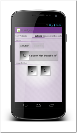
Figure 11-2: Examples of Android and image buttons.
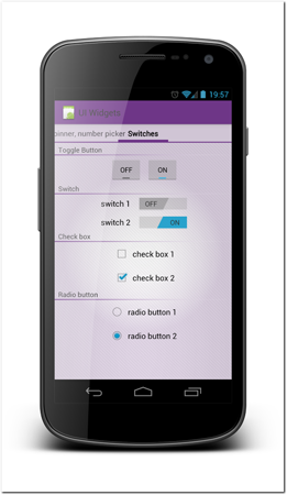
Figure 11-3: Examples of Android’s toggle components.
Toggle Button
The toggle button is exactly as the name implies; it’s a button that can be on or off.
Switch
A switch is functionally very similar to the toggle button but differs visually. It is designed to fit visually with lists of preferences and settings, but can be used elsewhere. The switch component was added to Android in version 4.0 so it cannot be used on devices running older versions of the operating system. If you plan to support older versions, which you should in most cases, you need to define different layout files for older versions. A toggle button or a checkbox is a good substitute for a switch.
Checkbox
The checkbox is this same familiar component that users have seen on other platforms. It functions on Android as you would expect. The label of the checkbox is defined in the same component definition by adding the text attribute. The label is automatically part of the area that changes the checkbox’s selected state.
Radio Button and Radio Group
Radio buttons function very similarly to checkboxes. You can group radio buttons by surrounding them with a RadioGroup element in your layout definition. Only one radio button in a group can be selected at a time.
Selection components
If you have a list of options that the users must select from, it is better to present the users with the options than make them type the options into a text field. Android has few different components you can use depending on your needs. See Figure 11-4 for some examples.
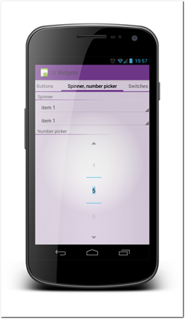
Figure 11-4: Examples of Android selection components.
Dropdown Spinner
A dropdown component is called a spinner on the Android platform. It has two operating modes. There is a dropdown mode where the options appear below the menu (or above if there’s no room below), and there is pop-up mode where the options appear in a pop-up window for the users to select from.
Number Picker
A number picker can be used to select a number from a predefined range. This component was added in Android version 3.0 and is not available in the older versions.
A number picker component supports multiple gestures. Users can drag the number up and down and even fling to rapidly move between a large selection of choices (fling can be disabled using an attribute). Another way to use this component is to tap the small up and down arrows to move the selection one by one.
Note that the number picker is implemented as a scrolling container. It cannot be placed inside another scrollable container.
Date and time widgets
Android offers you a set of components that allow you to easily handle dates and times.
Calendar View
The calendar view shows the traditional calendar grid representation. Users can scroll through months by swiping up or down. Figure 11-5 displays the default calendar view. Calendar view is available only on Android 3.0 or newer.
Date Picker
The date picker presents users with a calendar view and controls to pick a date. The date selector and calendar view controls are both interactive and the component is automatically kept in sync. The date selector is based on number pickers. Figure 11-6 shows an example of how the date picker looks out of the box.
Time Picker
The time picker is a combination of number pickers that are formatted in a time format. Figure 11-6 shows the time picker.
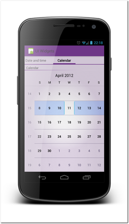
Figure 11-5: Android calendar view.
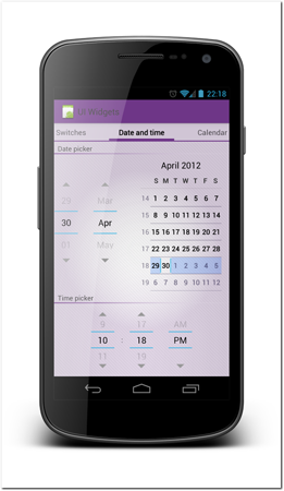
Figure 11-6: Android date picker and time picker.
Progress bars
Progress bars are used to indicate ongoing processes. The Android framework provides components with multiple styles to do this.
Progress bars have also been adapted to functionally that’s very similar—although from the user’s point of view they might seem like very different tasks. Figure 11-7 shows examples of different progress bars and progress bar adaptations.
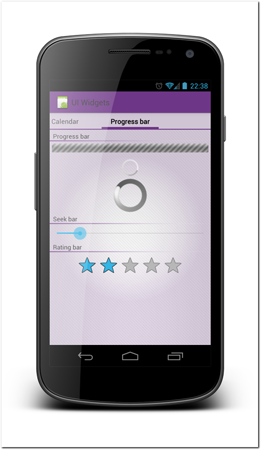
Figure 11-7: Progress bar, seek bar, and rating bar.
Progress Bar
There are two main styles for displaying running background processes using the default Android progress bar. You can use the horizontal bar, which is often used to display running tasks that are finite and have an estimated task duration. The second style is the round spinning animation. It usually indicates that, while the background task is running, it is not possible to know when it is going to be finished.
To change the progress bar appearance, you can use styles provided by the platform. For example, setting the progress bar element attribute as follows shows the progress bar as a horizontal bar instead of using the spinning animation:
style=”@android:style/Widget.ProgressBar.Horizontal”
If you chose the horizontal progress bar presentation you can an endless animation or use it as a finite progress indicator. Setting the attribute android:indeterminate=”true” will cause the progress bar to animate endlessly. Setting it to false means you must bind the progress bar to the ongoing process in your code.
Seek Bar
The seek bar is an adaptation of the progress bar that lets the users select the value by dragging the thumb icon. The seek bar is used in the standard media controller to display the video position.
Rating Bar
A rating bar has a very specific purpose. The users can select how many stars are activated by dragging or tapping the stars.
Media widgets
Android allows you to build media-rich apps easily. There are many components that help you on the way and provide you with rich functionality out of the box.
Image View
Image view is a component for displaying images on-screen. There are few tricks for getting your images right when using the ImageView component.
If you are using graphics you include in your app remember to provide images for each supported screen density. Android’s automatic scaling algorithm sometimes does good work scaling images but most graphics look much better when you scale them manually. Screen density is covered in Chapter 12.
When you use an ImageView to display images that you load dynamically it is not always possible to provide different assets for different densities. It is also sometimes difficult to know the image size beforehand. To maintain control of your layout, you can make your ImageView a fixed size and tell the operating system how scaling should be handled.
To define how the image should be handled you can set the scaleType attribute of the ImageView. Table 11-1 shows the different scaleType options.
Table 11-1 ImageView ScaleType Options as Defined in the Android Documentation
|
ScaleType Value |
Scaling Method |
|
|
|
|
|
Scale the image uniformly (maintain the image’s aspect ratio) so that both dimensions (width and height) of the image will be equal to or larger than the corresponding dimension of the view (minus padding). |
|
|
Scale the image uniformly (maintain the image’s aspect ratio) so that both dimensions (width and height) of the image will be equal to or less than the corresponding dimension of the view (minus padding). |
|
|
Compute a scale that will maintain the original aspect ratio, but will also ensure that original fits entirely inside target. At least one axis (X or Y) will fit exactly. The result is centered inside target. |
|
|
Compute a scale that will maintain the original aspect ratio, but will also ensure that original fits entirely inside target. At least one axis (X or Y) will fit exactly. |
|
|
Compute a scale that will maintain the original aspect ratio, but will also ensure that original fits entirely inside target. At least one axis (X or Y) will fit exactly. |
|
|
Scale in X and Y independently, so that original matches target exactly. This may change the aspect ratio of the original. |
(Source: http://developer.android.com/reference/android/widgit/ImageView.ScaleType.html)
Note that the image view can also have a background image. This allows you to create, for example, shadow effects on your images.
Zoom Controls
The zoom controls are two buttons (zoom in and zoom out). They can be used to add the standard controls for zooming in any app. It is always good to remember that not all devices support multi-touch gestures and pinch-to-zoom is not always available. Figure 11-8 shows an example of how zoom controls look in an app.
You need to manually connect the zoom controls into the zooming logic in your code.
Video View
VideoView makes it very easy to play video content in your app. You can use VideoView to play local videos and stream remote content. To learn how to use and set up the video view see the Android documentation at http://developer.android.com/reference/android/widget/VideoView.html.
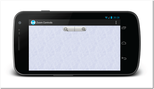
Figure 11-8: This app uses zoom controls to let users zoom in and out without using pinch-to-zoom.
Media Controller
In combination with the VideoView you can use media controller to add standard video controls to the user interface. The media controller provides Play/Pause, Fast Forward, and Rewind buttons as well as a seekbar for jumping to any part of the video. It also shows the elapsed time and total time of the video being played (see Figure 11-9).
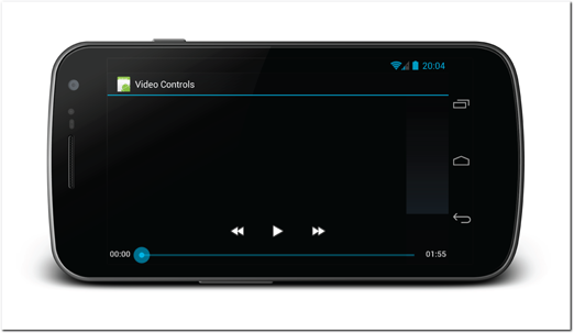
Figure 11-9: An example of a video view with the standard media controller.
Source: Android
Sliding drawer
The sliding drawer component allows you to create a drawer that the user can make visible by dragging from a handle. This component can be very useful for secondary screen actions.
There is no default drawer handle graphics, so you must define it manually. You can use any view as the handle, for example ImageView, which makes the sliding drawer visually very flexible.
The sliding drawer component should be placed as an overlay to the layout you use. The best way to achieve it is to use it inside a FrameLayout on the same level as its sibling view. That way you will achieve the correct drawer effect, and it will slide on top of the other components at the view. In Figures 11-10 (sliding drawer closed) and 11-11 (sliding drawer opened), you can see an example of this component in practice.
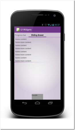
Figure 11-10: Sliding drawer closed.
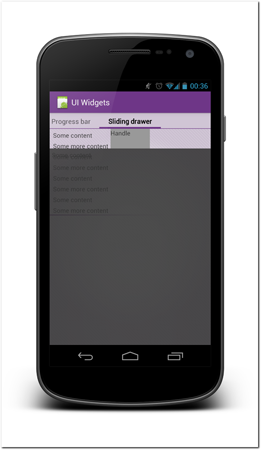
Figure 11-11: Sliding drawer open.
Lists
Lists are one of the most useful components of the Android platforms. They are very flexible and provide tons of functionality out of the box. As a tradeoff they are fairly complicated to program correctly. List is what is called an adapter view. It means that you must provide a special class that handles assigning list items to the list.
List Performance
Lists can be critical components when it comes to performance. Users can scroll through a large number of list items in a short time. You need to be considerate of the complexity of each list item if your lists are long. Although Android can handle reasonably complex lists, you can run into the risk of your application’s user interface not being fluent on some older generation devices.
Tip: Building the list adapters is outside of this book’s scope. There are good resources for getting a deeper understanding of how to build memory-effective lists—check out Professional Android Application Development by Reto Meier for one. Probably the best online reference is a set of tutorials written by Mark Allison on his website at http://blog.stylingandroid.com/archives/605.
List Items
You have free hands in defining the layouts and user interface widgets you use to build the list items. A list item is simply a layout. You can use any non-scrolling components in it. You should keep in mind the way that users use lists. If you plan to add any clickable components inside your list items you need to make sure that the components don’t conflict with the row selection.
It is very common for list items to have a checkbox on the left side and often a secondary selection component on the right side while still allowing users easily select the items. When adding clickable items to a list item only add them to the far left or far right. You also should extend the item hit area, making it larger than it is by default. This is due to the fact that the list item is clickable. There are no safety margins between the additional clickable components on your list item and the list item itself. Figure 11-12 shows a diagram explaining how list items should be laid out.
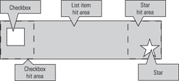
Figure 11-12: List items should have a maximum of two clickable components. These components should be placed only at the ends of the list item and the hit areas should be extended to prevent users from making accidental list row selections.
Gallery List
A gallery is a list that is scrolled horizontally while the selected item stays in the middle position. A gallery component is implemented the same way as a list. It is also an adapter view and you can define the items in it freely. The name “gallery” is, therefore, a bit misleading. You can use the gallery to create many styles of horizontally scrolling lists.
The gallery component has some default behaviors that are not present in the vertical list component. The selected item stays horizontally centered and there is a snapping effect when users drag the selection and let go.
Customizing user interface widgets
The Android default components offer a lot of possibilities to customize their look and feel. You can easily modify the colors directly or by using the selector mechanism. You can also extend these components by subclassing them in code; this is a way to add completely new functionality.
Colors
Android has multiple ways to define colors. You can set colors in your layout files as well as in code. In the layout file you can set any color value by defining a hexadecimal color code. The color code can also contain alpha (transparency) value, but it doesn’t have to.
The following syntaxes are allowed in the layout definitions. A = alpha, R = red, G = green, and B = blue.
• #AARRGGBB
• #RRGGBB
• ARGB
• #RGB
To define colors that are easier to maintain and reuse, you can define colors as resources. Add a file, for example colors.xml, in your res/values/ project folder. In that file you can add color resources like in the following example code.
<?xml version=”1.0” encoding=”utf-8”?>
<resources>
<color name=”background_color”>#FFFFF0</color>
</resources>
By doing this you can refer to these colors whenever you need to define a color in your layout or code. Using color files has two great benefits:
• You can easily change your colors uniformly by changing the code in one place only.
• You can also easily change the whole theme of your app if you’re creating multiple versions by simply replacing the color file in a build script or overriding it in a project where you use the original project as a library project.
Selectors
A selector is a great concept that can help you with any components that have different states, such as a button’s down and focused states.
A selector is a XML file added in the res/drawable project folder. It defines a set of items that have state parameters and tells the operating system which of the items should be used and when. You can put anything inside the item element that you can use to draw from XML. I’ll talk about drawing from XML more in Chapter 14.
The following example is probably the simplest selector possible. If you put this example code into your project’s res/drawable/example_selector.xml file, you can use it as a background for almost any component by setting the background attribute to point to it like this android:background=”@drawable/example_selector”.
If the component you’re using with it has a pressed state (such as a button), the operating system will take care of changing the button color whenever the user presses and releases the button.
<selector xmlns:android=”http://schemas.android.com/apk/res/android”>
<item android:state_pressed=”true”>
<color android:color=”#FFFF0000” />
</item>
<item>
<color android:color=”#55FF0000” />
</item>
</selector>
If you want to add custom visuals to any component that has different visual states, you should always use selectors. The state parameters can be combined to create complex conditional statements. You can for example specify a background when a button is focused and pressed.
The available state parameters are as follows:
• state_pressed —True if this item should be used when the object is pressed
• state_focused—True if this item should be used when the object is focused
• state_selected—True if this item should be used when the object is selected
• state_checkable—True if this item should be used when the object is checkable
• state_checked—True if this item should be used when the object is checked
• state_enabled—True if this item should be used when the object is enabled
• state_window_focused—True if this item should be used when the application window has focus
See the Android documentation for the full specification at http://developer.android.com/guide/topics/resources/color-list-resource.html.
Tip: These states can be complex, so it’s wise to create them so that multiple states are applicable at once. The operating system uses a very simple resolution method. It always picks the first state that matches the current state. For this reason, you can always add a last item without any state attributes as the default.
Selectors are particularly powerful tools in combination with 9-patch images. I’ll introduce the 9-patch images in Chapter 14.
Adjusting the Typography
Using text wisely is important to draw attention to the right places and to help you users get the information they need. Android has very powerful and flexible tools for altering the look of your text.
 Scan the QR code with your Android phone to open the companion app and try out a functional example.
Fonts
Android default font is something that at least for now any device manufacturers have not replaced in their devices. Android devices with version 4.0 or newer have the newer font, called Roboto, as their default font, and older devices still use the older Droid font.
Roboto
The Roboto font was redesigned to make fonts look good on the new high-resolution screens that are becoming more common. The Roboto font is the default font in Android 4.0 and newer operating system versions. If you don’t change the font, your app will use this font.
You can download the font as well as a specimen book from http://developer.android.com/design/style/typography.html.
Droid
Droid was the default font for devices all the way up to Android 3.2.
Adding Your Own Fonts
You don’t have to stick with the default fonts. You can also include fonts with your app and use them. To install any fonts in your app, simply copy the font file to your app’s assets/fonts folder. You can then create a new typeface and set it to any text component. See the following example code for how to do that.
Creating Your Own Class
If everything else fails you can always override any functionality of any component by creating your own class. You should pick the component that is closest to what you need, and create a subclass that overrides only the necessary methods. This way you keep most of the tested and designed code of the framework and add your own functionality. Only in very extreme cases should you create subclasses to the View class.
Typeface tf = Typeface.createFromAsset(getAssets(),”fonts/Gamaliel.otf”);
TextView customFontTextView = (TextView) findViewById(R.id.CustomFontExampleText);
customFontTextView.setTypeface(tf);
Most custom fonts work in Android apps without any problems. Figure 11-13 shows some examples of a few fonts.
Typeface
You can change your font’s typeface for any text component simply by setting the android:typeface attribute of the component. You can select sans, serif, and monospace. Figure 11-14 shows some examples of the different typefaces with the Roboto font.
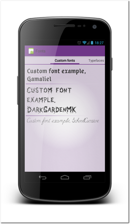
Figure 11-13: Example fonts rendered in text components.
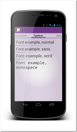
Figure 11-14: Example typefaces with Roboto font.
Text style
Text style can be used to highlight text components. You can set text styles to bold, italic, normal, or bold and italic. Figure 11-15 shows some different text styles. Text styles can be changed by setting the textStyle attribute to the text component. For example, android:textStyle=”bold”.

Figure 11-15: Examples of the available text styles.
Text size
Text size can be changed by setting the textSize attribute. To make sure that your app scales correctly and fits with the rest of the platform, make sure that you use scalability features and default sizes correctly when possible.
Text Size and Scalability
Normally text sizes are defined in pixel size. As with everything else size-related on Android you must take screen densities into account. That is why text size should always be defined in scale-independent pixels (sp). One scale-independent pixel corresponds to one pixel on a 160dpi screen. Using scale-independent pixels ensures that when your user interface is scaled to other screen densities, your text size stays in correct proportions.
Default Text Sizes
You can use any size you want in your app. There are few preset values that are used elsewhere in the operating system. It’s best to use those values if you don’t have a good reason not to. It will make your app look and feel more a part of the platform. Table 11-2 lists the recommended default text sizes from the Android design guidelines.
Table 11-2 Recommended Text Sizes
|
Size Label |
Font Size in Scale-Independent Pixels (sp) |
|
Micro |
12sp |
|
Small |
14sp |
|
Medium |
16sp |
|
Large |
18sp |
Accessibility
When designing the text portions of your app you should also keep in mind the accessibility factor. Some people prefer or need to have larger text to see the text properly. In Android settings users can choose to have larger text. If you have defined your app’s text sizes in scale-independent pixels, that setting will automatically scale all your app’s fonts to a larger size. You can see how this shows in practice in Figures 11-16 and 11-17. Both figures show the same activity and the same layout. In Figure 11-16 the accessibility setting is off and in Figure 11-17 the accessibility large font setting is enabled.
Text color and shadow
Naturally, you can also change the text colors. As with other color definitions, text color can also be set to translucent by changing the color alpha channel.
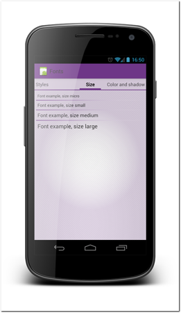
Figure 11-16: Default font sizes with normal settings.

Figure 11-17: Default font sizes with large fonts setting enabled.
The operating system also defines a few default colors that are used throughout the default apps. These colors can be a good starting point for your design unless you can spend time to define your own colors. The default colors are defined for primary text color and secondary text color for both dark and light theme. To set the default colors of your text, refer to the Android attributes by setting your text color to for example @android:color/primary_text_light.
Tip: You can also set a shadow to your text. Avoid overusing this feature, though. Adding shadows can make your user interface look corny. Android user interfaces are generally flat in style, and shadows don’t fit the picture.
See Figure 11-18 for examples of different text color settings, including examples of the default colors and shadow.
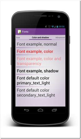
Figure 11-18: Example color settings, including a shadow setting.
Formatting from HTML
Sometimes you want to emphasize only a few words inside one text component or add other more complex formatting that can be applied only to parts of the content instead of all the text in one text field. In cases like this you can use HTML styling to get the effect you want. It is possible to load HTML markup inside a text component; the operating system will format it correctly. It is worth noting that you cannot use everything that is defined in the HTML specification but the supported subset is often enough. Note that you can also make links in your text component clickable and make them open in a browser.
To load HTML content into a text component, you need to invoke HTML helper in code. See the following code example for how to do that.
TextView textView = (TextView) findViewById(R.id.text_from_html);
textView.setText(Html.fromHtml
(“Example <b>HTML</b> text with a <a href=”#”>link</a>”));
Creating app-wide text styles
Setting text styles separately to each text component doesn’t make sense in the long run. Fortunately, Android offers you a way to define styles that you can then assign to any component. The benefit of doing this is that your text styles are unified across the whole application. You can also easily change them later and can benefit from the Android’s runtime asset selection mechanism by placing your style files into language/screen size/screen density specific folder.
To define your own style, you need to add a XML file to your app project’s res/values/ folder. In that file you can define style elements that you can then refer to with the name you define. In the style element’s child elements you can define any of the text component’s attributes. These will be applied to each element you add this style.
<style name=”ExampleStyleText” parent=”@android:style/TextAppearance.Medium”>
<item name=”android:textSize”>20sp</item>
<item name=”android:textStyle”>bold</item>
<item name=”android:textColor”>#CC0000FF</item>
</style>
To add this style to a text component you simply refer to it in the style attribute like this:
style=”@style/ExampleStyleText”
Tip: Note that when defining styles you should define a parent from the styles provided by the platform. That way you ensure that all the attributes you don’t define are correct and consistent with rest of the content.
Using Icons
Icons are abstract images that represent functions, display status, and guide users. Icons can be used on many user interface components and they can often replace text and save screen real estate.
Getting icons right requires careful planning and design. An icon must be representative and easily understood. Icons whose meaning is not immediately clear to users are going to make the app user interface difficult to use. Users should be able to just glance at the icon and understand the meaning of it. On touch screen devices, users cannot hover the cursor over an icon to invoke a tooltip that defines it like they can on desktop environments.
Each platform also has established icons for many actions. Android is no exception. Study carefully how other apps use icons, and avoid bringing icons over from other platforms. Always follow the platform icon guidelines.
Tip: Special attention must be paid to icons that perform actions that cannot be undone, such as permanent deletion or send actions. Make sure that your users won’t confuse these icons with other functionality.
Dealing with screen densities
Icons are extremely vulnerable to automatic scaling algorithms. Many icons are very small, and even slight automated scaling is likely to distort them and make them look bad. The Android framework allows you to draw icons separately for each available screen density to prevent automated scaling. You should always provide icons for each supported screen density and not rely on automated scaling.
More about screen densities and how to actually provide assets for different densities in Chapter 12.
Icon types
Different icons have different roles and should be treated differently. It is important that icons that belong to same group have the same look and feel. They must look like they belong together. This is why Google has provided exact guidelines for each of these icon groups.
A free online tool, Android Asset Studio, can be used to generate many of the icons from text and clipart. Although not all of the generated icons are good enough for production, this tool is a great way to get placeholder graphics to your app. The tool can be found at http://android-ui-utils.googlecode.com/hg/asset-studio/dist/index.html.
Launcher Icons
The launcher icon is the only icon that is visible to users outside your app. It is also used in multiple places (in launcher and in multi-tasking menu). Following launcher icon guidelines is doubly important. You don’t want your app to stand out in a bad way.
It is also good to remember that for many users your launcher icon is one of the very first contact places to your app. A high-quality launcher icon helps users get a better first impression of your app.
The design of the launcher icon is difficult also in the sense that you have no control of the background in which the icon is going to be displayed. Users might be using anything as their home screen background. You must make sure that your icon will look good on any background. Using one-color icons is generally a bad idea for this reason. What if the user happens to have exactly that color home screen?
Here are few tips for designing good launcher icons:
• Not all launcher icons are square. Use transparency correctly to create a unique shape.
• The icon should reflect your brand.
• Avoid having text on your icon. Text doesn’t scale well, and your app’s name is always visible next to your icon anyway.
• Use 3D effects and gradients carefully. Android style is often flat.
• Too many small details will make the icon look blurry.
• The icon must work on all backgrounds.
• Use launcher lighting: top-lit.
• Don’t make your icon too heavy or too light. Try to match the average weight of other icons.
• Provide an icon for all screen densities that your app supports.
Study the icons used by other apps. In Figure 11-19 you can see a selection of Android app launcher icons for Android default apps and apps by Google.
Figure 11-19: A selection of Android app launcher icons for Android default apps and apps by Google.
Source: Google Inc.
Menu Icons
Android menu is a deprecated concept and should be avoided. The menu has been replaced by Action Bar overflow menu (I talk about Action Bar in Chapter 18).
If you still decide to use the menu, following the guidelines is very important. It is very likely that your icons will be displayed next to icons that are provided by the platform. Having icons with different styles would be a disaster.
For more about menu icon design and strict guidelines, see the Android documentation at http://developer.android.com/guide/practices/ui_guidelines/icon_design_menu.html.
Action Bar Icons
Action Bar is a user interface pattern that has been around in Android for a while, but was added as part of the core platform in Android 3.0 Honeycomb. I talk more about Action Bar in Chapter 18.
Icons on the Action Bar represent the most important function on any given screen. Although it is possible to include text with the action, it is very rarely used as it takes too much room. The Action Bar icons must be clear to the users so they have the confidence to use them as intended.
Action Bar icons are grayscale, flat, and appear face on. The icons must not have a background and use transparent background instead. To ensure consistency between apps, Google has specified the exact palette for Action Bar icons. Depending on the theme you are using as the basis of your app theming (Holo dark or Holo light), you should make sure that your Action Bar icons follow the guidelines.
For Holo dark theme the Action Bar icons should use fill color #ffffff, 80% opacity. For the Holo light theme, use fill color #333333, 60% opacity.
Status Bar Icons
Status bar icons are used to represent events that the user is being notified about. Although the status bar notification itself can contain text, users often only see the icon. The icon must be descriptive and users must be able to recognize its meaning.
It is also important that users understand which app is triggering the notification, as notifications from all apps are shown exactly the same way in the status bar. If your app has only one event that it uses status bar notifications for, the best icon to use is often an abstract version of your app icon.
In short, status bar notification icons are grayscale icons. The size of the icons is relatively small, so the simpler the better. Using text in the icons usually doesn’t work.
Status bar notification icon guidelines are very different on different Android versions. Older than 2.2 Android versions require icons to have a background, whereas 2.3 and newer don’t. Android 3.0 versions added secondary icons to the notifications. Supporting all Android versions is going to take a lot of work. You need to provide multiple versions of your notification icons that match each version of the guidelines and multiple screen density versions of each.
See the full status bar icon guidelines online, including color palettes and size requirements, at http://developer.android.com/guide/practices/ui_guidelines/icon_design_status_bar.html.
Tab Icons
On a tabbed interface, the text on the tabs is sometimes replaced by icons. Tab icons are also grayscale images with transparent backgrounds. Tab icons are a bit larger than Action Bar icons or status bar icons.
Tab icons aren’t generally as critical as Action Bar icons. If the user taps a wrong icon (tab), it’s easy to simply press another one. Changing tabs never causes irreversible damage. Users can therefore easily determine what an icon means by simply tapping it without risk.
Tab icon guidelines were changed after Android 1.6. Market share of 1.6 and older Android versions is now so small that they can safely be ignored. You can find the full guidelines at http://developer.android.com/guide/practices/ui_guidelines/icon_design_tab.html.
Dialog Icons
Dialog boxes should generally be avoided, as discussed in Chapter 9. There are some situations where they are the only way to get the user’s attention. An Android dialog box can have an icon, but it doesn’t have to have one. As a general guideline, an icon is a good idea when a dialog box is required.
Make sure that the icon reflects the situation’s severity correctly. If you use a pop-up dialog box to tell user that something is really wrong, using an exclamation mark icon is appropriate.
List View Icons
List icons are used in lists to identify individual list items. In custom list items these icons aren’t strictly defined. There are, however, guidelines for standard list icons like the ones in the Android settings app. The guidelines are often broken down by device manufacturers, rendering them somewhat useless.
Platform icons
The Android platform has tons of ready icons and graphics. All of these assets are distributed under the Apache 2.0 Open Source license. This means that they are all available for you to be used in your apps regardless of whether you are working on a commercial or non-commercial project.
Direct Reference Use vs. Making Copies to Your App
Some of the icons are available using Android’s internal reference structure, but many of them are not public, which means that you cannot use them directly.
Google has recommended that developers not use the icons in the framework using the direct reference. A better way to use them is to copy them into your app. The reason they’ve made this recommendation is that many Android device manufacturers replace many of the icons with their own. The icons are also different between different platform versions.
Copying the assets to your project has drawbacks. You need to support users on multiple different devices, and if you pick one icon for sharing and sending, those icons will be used on all devices regardless of the Android version or manufacturer skin.
The decision you should make is whether to use all of your icons in one context directly from the platform or copy all of them into your app. The worst possible solution is to mix these two options. In that case your app will always look wrong—part of the icons are derived from the runtime environment, and part of them from your app. So pick one option and follow it throughout your app.
Accessing the Platform Graphics
Once you have the Android SDK installed, you can easily access all included graphical components. You can browse icons of different Android versions and different screen densities. To find icons of, for example, Android 4.0.3 (API level 15) and extra high-density screens, go to the folder <your Android SDK installation>/platforms/android-15/data/res/drawable-xhdpi.
Icon packs
To help developers and designers Google has provided a downloadable icon pack containing multiple icons that can be used for many purposes. These can be especially useful for implementing Action Bar actions, but you might find use for them elsewhere, too. The icons in the icon pack come in multiple screen density versions as well as Photoshop files. You can download the Google’s icon pack from http://developer.android.com/design/downloads/.
There are also many more places where you can find icons for your app. Some of them are free, and some of them are not. A quick Internet search before starting to implement your own icons can save you a lot of your time.
Using Animations and transitions
Animations can make your app look and feel polished. Correctly used animations can also be used to help your users understand how your application works.
Overusing animations can cause negative effects. The human eye is automatically drawn toward any motion. Animations can, therefore, be very distracting. The screen should always be fully static when the users are reading something, for example.
Animations should always serve a purpose. If, for example, your app’s layout changes, using animation to highlight the layout change might make sense. This might make it easier for the users to follow where individual components move.
Transitions between screens should always enforce the user’s sense of location within the app. If a button takes your users deeper into the app, the transition should indicate that. When the user presses Back, the same animation should play backward, thus reinforcing user’s understanding of the app navigation.
Activity transitions
Whenever a new activity starts, the operating system plays a subtle animation by default. Although the animation can vary between devices of different manufacturers and Android versions, it is always carefully selected to make the navigation feel natural. Whenever users press the Back button, the same animation is played backward.
You can override activity transitions. In most cases it is not necessary and often it’s even a bad idea. Users are familiar with the default transition animation. The default transitions enforce users’ understanding when they dive deeper into the app. They usually know that they can use the Back button to navigate back.
No Transitions
Sometimes playing animations between activities doesn’t make sense. Maybe you want two activities to feel like one to the users. In this case, you can prevent the transition animation altogether by setting the intent flag Intent.FLAG_ACTIVITY_NO_ANIMATION to the triggered intent.
Overriding Activity Transitions
If you have a good reason to override the transition animation, you can do so when you trigger the intent to start the next activity. Immediately after you call startActivity you must call the overridePendingTransition() method from the activity class. See the following example code:
startActivity(new Intent(ExampleActivity.this, AnotherActivity.class));
overridePendingTransition(R.anim.custom_animation_in, R.anim.custom_animation_out);
The overridePendingTransition method takes two parameters. The first parameter is the ID of the animation that is played for the incoming activity and the second parameter is the ID of the outgoing activity animation. You can set either of these parameters to 0 so as not to play animation. Both parameters refer to animation defined in XML. See the next section for information about how to do that.
The Android platform provides a couple of defined animations. You call them using the android.R.anim class. For example, you can use android.R.anim.slide_in_left to have an animation slide in from the left side of the screen. Other options are slide_out_right, fade_out, and fade_in.
Tween Animations
The Android view animations can be used to animate a view and its content, for example, by moving, rotating, or zooming. Each animation can consist of a single animation or can be a set of animations that are played together. The animations are usually defined in the XML files but can also be built-in code.
The following example code illustrates a very simple tween animation. This animation scales the view of the X and Y values. Tween animation files must be placed in the res/anim/ project folder.
<?xml version=”1.0” encoding=”utf-8”?>
<set xmlns:android=”http://schemas.android.com/apk/res/android”
android:fillAfter=”true”
android:shareInterpolator=”false” >
<scale
android:duration=”700”
android:fromXScale=”1.0”
android:fromYScale=”1.0”
android:interpolator=”@android:anim/accelerate_decelerate_interpolator”
android:pivotX=”50%”
android:pivotY=”50%”
android:toXScale=”2.4”
android:toYScale=”0.6” />
</set>
Tween animations allow you to animate view scale, alpha position, rotation, or location (translate). For the full XML definition, see the Android documentation at http://www.developer.android.com/guide/topics/resources/animation-resource.html#Tween.com/.
 Scan the QR code with your Android phone to open the companion app and try out a functional example.
Problems with Tween Animations
Tween animations are applied to the view elements only superficially. This means that the position of a view element does not actually change in the app’s user interface. Although you can force the animation not to reset once it is complete (using android:fillAfter=”true”), doing so will cause problems if any of the animated components are interactive. For example, a button whose location is animated will not respond to user interactions properly. The touch events are still recognized in the old location.
Tween animations have their place, but they are mostly being replaced by the newer API, property animations. I talk about property animations later in this chapter.
Frame animations
Frame animation is the simplest kind of animation. A frame animation is simply a sequence of images displayed one after another in a set order. Frame animations are drawable resources and can be used anywhere drawable resources are allowed. You can set a frame animation as a background image, for example.
The following example code shows a simple frame animation definition that defines a three-image sequence that is played in a loop until it is stopped. This file must be placed in the res/drawable/ project folder.
<?xml version=”1.0” encoding=”utf-8”?>
<animation-list xmlns:android=”http://schemas.android.com/apk/res/android”
android:oneshot=”false”>
<item android:drawable=”@drawable/animation_a” android:duration=”200” />
<item android:drawable=”@drawable/animation_b” android:duration=”200” />
<item android:drawable=”@drawable/animation_c” android:duration=”200” />
</animation-list>
It is not enough to just place the frame animation as, for example, a background of a component. It must be started from code. It’s a very simple command. See the following code for an example.
ImageView animatedImage = (ImageView) findViewById(R.id.animated_image);
animatedImage.setBackgroundResource(R.drawable.example_frame_animation);
AnimationDrawable exampleAnimation = (AnimationDrawable) animatedImage.getBackground();
exampleAnimation.start();
 Scan the QR code with your Android phone to open the companion app and try out a functional example.
Property animations
A property animation is a new animation framework introduced in Android 3.0 Honeycomb. The property animation framework is superior to the old tween animations, as it can be used to animate any view properties as well as any other object properties. The framework also has very flexible definitions of each animation set.
Property animations differ from tween animations fundamentally as property animations apply the animation properties to the user interface components. This means that the same problems with hit areas do not exist with property animations. If you, for example, move a part of the user interface that has the buttons in it, the buttons correctly reach to your touch events the way users expect. This is true even when the buttons are pressed during the animation or after it’s complete. The animated properties are not reset at the end.
 Scan the QR code with your Android phone to open the companion app and try out a functional example.
Property Animations to Older Devices
Still at the time of this writing, older android versions like Android 2.3 Gingerbread are so prominent that supporting them is wise. Fortunately there is a community-maintained project lead by Jake Wharton that has back-ported most of the new framework’s functionality to older devices. The library is Open Source and free to be used in any project. You can find and download it from the project’s website at http://nineoldandroids.com/.
Creating Property Animations
Property animations can be simple value animations that calculate values from start to beginning, object animations that change an object property value, or animation sets that combine these features.
Object animations are created by defining objects that tell the system which property should be animated. These objects are called object animators and are implemented by the ObjectAnimator class. You can set animators easily with a simple call like this:
ObjectAnimator.ofFloat(exampleView, “rotationY”, 0, 180)
This call creates an animator object that can be run alone or be grouped together with other animator objects to create more complex animations.
To start an animation, simply make this call:
<your animator object or animator set>.setDuration(3000).start();
Keyframes
Not all animations should run at a constant speed. You can define keyframes in your animations to make them irregular. Note that easing effects are not implemented with keyframes but using interpolators. I’ll explain use of interpolators later in this chapter.
With keyframes you can, for example, make a component move across the screen, stay in place for a while, and then continue moving again in a single animation.
For more about using keyframes, see the Android developer documentation at http://www.developer.android.com/guide/topics/graphics/prop-animation.html#keyframes.com/.
Layout Animations
 Scan the QR code with your Android phone to open the companion app and try out a functional example.
You can use property animations to automatically trigger when components are added or removed from view or when component layout changes. The layout animations are defined the same way as any other property animation.
The platform also offers default layout animations that don’t require any code. You can enable the default layout animations by setting android:animateLayoutChanges=”true” on any layout in your app. Any layout that has animateLayoutChanges set to true will automatically call the default layout animations whenever the content of the view is changed.
Animation Interpolators
Both tweening animations and property animations can use interpolators to tweak animation timing to make the animations feel and look better. A straightforward animation where values are adjusted at a constant rate from the animation start to the end does not look right. No objects in the real world behave like that, and that is why our brains automatically make us dislike animations like that. An interpolator can, for example, make the animation first accelerate and then decelerate at the end. That mimics the way objects move in the real world.
The Android platform provides multiple interpolators for you. The platform interpolators are going to be enough for most cases, but it is also possible to create your own. Figures 11-20 through 11-28 show all the interpolators that are part of the Android platform.
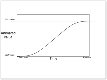
Figure 11-20: AccelerateDecelerateInterpolator. Animation speed is slower at the end and at the start of the animation.
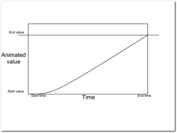
Figure 11-21: AccelerateInterpolator. Animation speed is slower at the start of the animation.
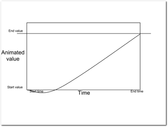
Figure 11-22: AnticipateInterpolator. Animation is reversed at the start of the animation.
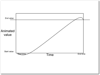
Figure 11-23: AnticipateOvershootInterpolator. Animation overshoots the final value at the end of the animation and the playing is reversed at the beginning.
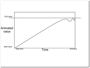
Figure 11-24: BounceInterpolator. Animation is reversed a couple of times at the end of the animation to create a bounce-like effect.
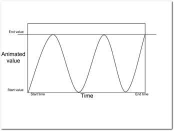
Figure 11-25: CycleInterpolator. Animation is repeated multiple times.
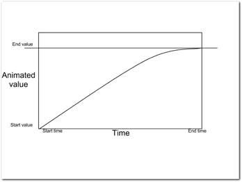
Figure 11-26: DecelerateInterpolator. Animation speed is slower at the end of the animation.
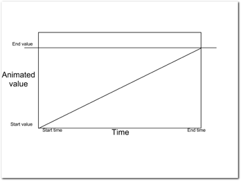
Figure 11-27: LinearInterpolator. Animation speed is constant.
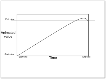
Figure 11-28: OvershootInterpolator. Animation overshoots the final value at the end of the animation.
Summary
The Android platform offers a rich toolset for building user interfaces. User interface components are flexible and customizable. Most apps can be built using ready components, and you typically need to tweak only some of the parameters.
The platform typography options let you tweak the look of any of your text components almost limitlessly. You need to remember to implement the text components using scalable measures like scale-independent pixels, and be prepared for users who use the large text accessibility option.
Animations can add polish and smoothness to your app if used correctly. By avoiding overuse and keeping in mind the purpose of each animation, you can utilize different animation frameworks to create almost any effect you want.