
Chapter 20: Data Design Patterns
Handling and showing data requires that you consider many factors, from both a performance and a usability point of view. In many apps, accessing the data is the user’s goal. Users want to see or modify a certain piece of information. If your app shows or manipulates data poorly, your users won’t be happy.
This chapter covers data-related user interface design patterns. It is worth noting that these are not data structure or data architecture design patterns; it doesn’t cover correct usage of databases or caches. There are other books that are better for that. This chapter covers data design issues from the user interface perspective.
The data design patterns discussed in this chapter include the following:
• Dynamic lists
• The image placeholder pattern
• The non-forced login pattern
• The drag-to-reorder handle
Using Dynamic lists
The dynamic list is one of the most common components in Android apps. They also are fairly complex from both a user interface point of view and from a code point of view. Android has great support for lists; it can automatically optimize memory usage and even recycle view objects for you. You must consider how much data you need to show in one list and how users can access more data when they need to.
Problems that lists solve
The list has a limited number of items in it. When you’re handling real-world data like social network update statuses or online store item catalogs, however, the amount of data will be much larger than can be shown in a single list. You need to design your lists so it’s easy and intuitive for users to view more items.
Solution
A dynamic list can automatically load more items without users having to explicitly request more. Whenever a user scrolls the list to a point where there are no more items available, a dynamic list will loading the new items automatically. To let users know that more options will appear automatically, you should include an indicator at the end of your list. The Twitter app does this perfectly (see Figure 20-1). The app is often so fast that the users don’t even see the loading indicator; the list just feels endless.
Consequences
Loading more items only when they’re needed makes your app more responsive; you can show the list much faster, as you don’t have to wait for a long download first. The automatic download trigger, which is activated when users reach the end of the list, makes it effortless for users. They don’t have to think about it or even notice it.
Although it’s often enough to start loading new items when the last item becomes visible, you can also tweak the loading triggers if it is likely that your users are going to load more items in your app. You can, for example, start the load process in the background when another item other than the last one becomes visible. Depending on your app, users might not ever see the loading indicator, and they’ll simply feel that the list has everything loaded already.
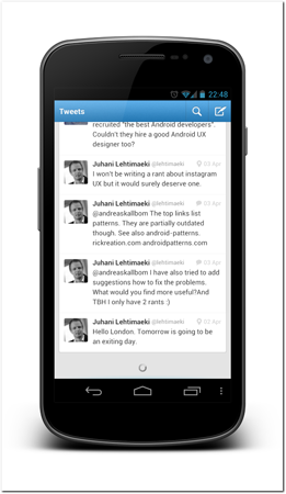
Figure 20-1: The Twitter app automatically starts downloading new items when users reach the end of the loaded items.
Source: Twitter
Large screen adaptation
The dynamic list design pattern works on large screens as well as on smaller screens. You don’t have to make any changes to it.
Variations
If your list-loading process is very slow or uses a lot of data (or for some other reason should not be triggered automatically), you can use a manual trigger instead. You can add an extra list item to the end of your list with appropriate controls so users can start loading additional items.
Note that this manual option should be used only if there’s a very good reason not to use the automatic option.
Technical implementation
There are few specialized third-party library components that are built to implement the dynamic list design pattern. It’s a good idea to quickly search github before you start to implement your own functionality, especially if you need something more complex. For example, cwac-endless is one of the projects that implement this design pattern. You can find it at github (see https://github.com/commonsguy/cwac-endless).
It is, however, possible to implement this design pattern using Android components. You simply need to add an OnScrollListener listener instance to your lists. The Android system will then notify the listener automatically when the list ends and you can invoke methods to load more items.
Here’s a short example code for the OnScrollListener onScroll method implementation. It calculates whether new items should be loaded. Note that the event can be fired multiple times as the last list item becomes partially visible. You must prepare and handle it and trigger the loading process only once.
public void onScroll(AbsListView view, int firstVisible, int visibleCount, int totalCount) {
if(firstVisible + visibleCount >= totalCount) {
// load more items here
}
}
Using the Image placeholder pattern
Making your interface feel fast and responsive is very important and can sometimes be difficult when you use large images or have images that are loaded over the Internet. In these cases, it’s better to use a local placeholder image initially, while your slow images load, in order to make the user interface operational as quickly as possible. Note that a splash screen or a blocking loading indicator is not a good solution to this problem. In fact, splash screens are covered in the anti-patterns chapter (see Chapter 21).
Problems that the image placeholder pattern solves
If your interface has images that are large or loaded over the network or Internet, they can cause your app to become less responsive and slow. Making users wait for images to load before you allow them to interact with your interface is not acceptable.
Solution
Whenever you need to show images that take some time to load, you should show a local placeholder image first. Render the user interface and activate the user controls and then load the images in the background. The local placeholder image should be good enough in case the connection fails. The user interface must be usable even when no images are loaded. The placeholder image should also be lightweight, so that it’s rendered quickly. The Gigbeat app uses placeholders in its user interface, so it’s ready to be used immediately (see Figure 20-2).
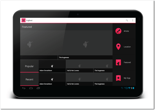
Figure 20-2: The Gigbeat app uses placeholder images so the user interface can be used immediately.
Source: Gigbeat
Consequences
Using lightweight local images makes the interface immediately usable. Your users will be much happier if they can start using the app without waiting. Using placeholder images also make the app usable when users are offline.
Large screen adaptation
There is no difference on a large screen compared to smaller screens with this design pattern.
Technical implementation
The best way to go about implementing this design pattern is to use a third-party Open Source library. There are multiple libraries you can use and if one of these libraries doesn’t support your use case, you can easily find others that will. You can also modify the existing libraries to add features you need.
One of the lightweight libraries that can help to get you started is called UrlImageViewHelper (see https://github.com/koush/UrlImageViewHelper). This library loads images based on URLs and can cache them. It automatically replaces your placeholder images when the real image is done loading. You don’t have to use custom image views. You simply pass the target image view, the remote image URL, and a placeholder image to the helper class and it takes care the rest automatically. It even checks the cache before triggering a download in the background. The following short code sample is all you need to write when using this library:
UrlImageViewHelper.setUrlDrawable(mImageView, drawableURL, R.drawable.placeholder);
Using the Non-forced login Pattern
Forcing your users to log in to your app before they can see any parts of the interface is extremely bad practice. Instead, your app should allow the users to explore the app before it forces them to log in or create an account.
Problems that this pattern solves
It’s not uncommon for an app to have server-side functionality that requires users to log in to a system before using it. The apps might be extensions to already existing systems (for established users), for example. But if new users search Google Play and your app is featured or trending in the Google Play, these new users might try to install the app from this approach. Your app will then launch directly to a login screen. Most of the potential new customers are likely to be turned off and leave.
Solution
Do not force users to log in. Let unidentified users try your app’s features and experiment with it before forcing them to create an account or sign in. You might think that your app is useless without an account but the reality is that most apps are not. Your app might not be at its full potential without an account, but potential users can form an opinion and determine whether they should take the time to create an account.
Think of ways you can provide local caching or access to public information, or maybe even provide an example account for potential users so they can see what your app is all about—all without having to create an account.
The Catch notes app does this very well. When the app launches for the first time, it prompts users to log in to the app but also provides users with an option to continue to use the app without an account (see Figure 20-3).
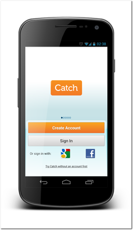
Figure 20-3: The Catch notes app shows this screen when it starts. It invites users to log in but also provides a link for non-logged-in use.
Source: Catch.com
Once the users have started using the app without an account, they can keep on using the app. However, all of the sync features are not available. The user’s notes are saved in local storage and synced later if they decide to log in to an account. The app also discretely reminds users of the features that can be enabled with an account on the app’s landing screen (see Figure 20-4).
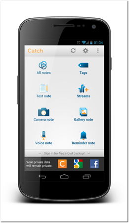
Figure 20-4: Once the user starts to use the app in non-logged-in mode, the app shows information on the app’s landing screen encouraging the user to log in.
Source: Catch.com
Consequences
If you let your users experiment with your app without creating an account, you are likely going to gain new customers. Users who find your app through a mobile app market are more likely to stick with it if they see more than just a login screen.
Large screen adaptation
When you use this design pattern on large screens you have an even better opportunity to promote the benefits of creating an account. You can show features that are disabled on the screen. However, never make disabled features look like they are enabled. If users press a button on your user interface, it should be active. It’s not good practice to use a pop-up window to inform the users that the button they just tapped isn’t active and they need to create an account. It is better to make the unavailable features look disabled and explain that creating an account will enable them.
Considerations and criticism
In some cases, creating a functional app without forced logging means a lot more work. As with everything, you need to perform a cost-benefit analysis as to whether it’s best to create non-forced logins. At the very least, you should allow new users to see parts of the user interface without any functions. Do not block users from the login screen.
Tip: A simple variation is to create a demo account and provide an easy way for users to log in to it. You might want to make the account read-only to avoid privacy and license agreement issues.
Technical implementation
Technical implementation of this design pattern depends on your app’s functions. It’s best when your app is set up to work in offline mode and then sync data when users are online. You might be able to utilize the same mechanism for unregistered users as well.
Using the Drag-to-reorder handle pattern
The drag-to-reorder handle design pattern allows users to reorder list items. This pattern is most commonly used in lists, but it can be applied to similar constructs.
Problems that this pattern solves
In lists where order matters, users should be allowed to manually reorder them. Many gestures are already reserved on lists, such as the long-press to trigger quick actions and dragging to scroll the list. Forcing users to select and then move the items using some kind of separate controls is too cumbersome and can lead to bad user experiences.
Solution
Adding a handle to lists that can be reordered is a nice, clean way to allow users to manipulate your interface. Users can grab the handle to move the items around easily, with a simple and intuitive gesture.
The Tasks app implements this design pattern very well. The Tasks app’s developers added a drag-to-reorder handle to the list item’s right side (see Figure 20-5). The handle is easy to understand due to its graphical representation. Once the user touches the handle part of a list item, the item immediately indicates to the users that they have selected the correct item (see Figure 20-6). When the users drag their fingers, the list rearranges itself on the fly. This makes it clear to users what would happen in each state if they were to drop the item. It is very important to indicate the new order during the gesture.
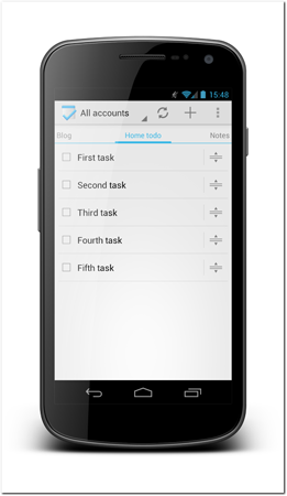
Figure 20-5: The Tasks app has a handle on each list item. The visuals clearly indicate where users can grab an item.
Source: Tasks App
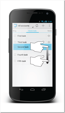
Figure 20-6: When users touch the drag handle on a list item, the list item is immediately highlighted and starts to follow the user’s gesture.
Source: Task App
Consequences
When you implement this feature, your users can effortlessly order the list items without having to think about conflicting gestures and complicated interactions. Keep in mind that the dragging handle does consume some of the screen real estate available for your list items.
Large screen adaptation
The same approach works on larger screens as well. You just need to be mindful of the list item sizes. Do not make the lists too wide and the dragging handle too far from the list content. Otherwise, it will be difficult to keep the list item visually consistent.
Variations
You can change the style of the dragging handle in different ways. In the Tasks app, the handle is an icon representing the function, whereas in other apps a different metaphor is used. You can, for example, make it look like a handle or a rougher surface that encourages users to grab it.
Technical implementation
There are several Open Source libraries that you can use to implement this functionality. You can use these libraries as a basis for your own implementation. My recommendation is to use a library called DragSortListview. You can get it from github at https://github.com/bauerca/drag-sort-listview.
Summary
The data user interface design patterns introduced in this chapter can help you handle data-related problems in your apps. You should always be conscious of the ways your users are going to interact with your data. Your goal should be to think of ways to make data manipulation easier, transparent, and even automatic.