
Chapter 21: User Interface Design Anti-Patterns
User interface anti-patterns are bad—but common—solutions to commonly occurring problems. All of the anti-patterns described in this chapter are relatively common, and you’ll see them in apps that are currently distributed in Google Play. I don’t show real-life examples of the bad designs because I have no intention of shaming any developers, well-known and not. I’m sure you have seen instances of these anti-patterns and probably even have apps that use them on your phone. It is also worth noting that an app that uses some of these anti-patterns should not automatically be seen as badly designed. Such app designs might be flawed in one place, but are still excellent in other respects.
As with user interface design patterns, user interface design anti-patterns do not apply in every situation. If your app has certain exceptions and constraints, these anti-patterns might after all be an acceptable solution, or maybe your only recourse. Suffice it to say that it’s always better to avoid these anti-patterns if at all possible, but keep in mind that there are exceptions to every rule.
The user interface anti-patterns discussed in this chapter include the following:
• The splash screen
• The tutorial screen
• The confirmation window
• On-screen Back button
• Menu button
• Hiding the status bar
• Swipe overlay quick actions
• Using non-Android designs
Avoid Using the Splash screen
The splash screen is a loading screen that appears while the app’s interface is loading. It typically shows the logo and company name and is a full-screen image that sometimes includes a loading indicator.
This is not a new device. Splash screens have been used on desktop computers for a long time. If you’re an Android developer, you have most likely seen a splash screen used when the Eclipse or IntelliJ IDEA is launching.
Problem being addressed
The process of loading an app’s user interface can take a fair amount of time, especially when the app contains a lot of heavy graphical assets and components loaded over a network connection. Indicating to the users in some way that the app is loading is better than having the screen appear black and unresponsive.
Why A splash screen is a bad solution
With desktop operating systems and applications, the splash screen is a pretty standard and acceptable design approach. This is due to the large size of desktop applications (they take a long time to load) as well as the nature of how applications are used on desktop computers. Computer desktop games, IDEs, and programs are typically used for hours in one go. The same is not true on a mobile phone. Apps are used in short bursts, sometimes for a few seconds. Therefore, it is important to load your app as soon as possible. Including a splash screen will make it slower. First, loading the splash screen itself takes extra time. Most apps implement a minimum time for a splash screen to be seen. Remember that your app should include features only if they help your users reach their goals. There is no mobile phone goal that is helped by using a splash screen.
Better solution
Instead of using a splash screen, try to make your app’s landing screen lightweight and void of heavy graphical elements that must be loaded before the interface is functional. Utilize design patterns like the image placeholder pattern introduced in Chapter 20. Your goal should always be to allow users to start using your app as soon as they open it. Even a few seconds of delay when opening your app can lead to a poor user experience, especially if your app is the kind they might use for 10 seconds at a time.
Exceptions
Games are a good example of apps that can get away with using splash screens without losing users. Try to avoid it, even with games if possible, but it can be more difficult to do so than in normal apps due to the heavily customized and graphics-heavy user interfaces in many games.
Avoid Using the Tutorial screen
Tutorial screens appear when users first open an app. They explain the app’s available functionality and screens. They usually contain instructions on how to open menus, find functions, and perform gestures.
Problem being addressed
Learning to use an app and learning the user interface can be difficult at first, especially when the app uses non-standard user interface components or gestures. The tutorial screens try to explicitly tell the users where the features are and how to access them.
Why is this a bad solution?
Although it might sound like a good idea, the tutorial screen is actually counter-productive. When users start your application for the first time, they do not have any understanding of your app’s user interface, functionality, or context.
Users are also more interested in using your app instead of reading text or looking at tutorials. They just want to see the UI and start using it. It is also very difficult to know which of your users are new and which ones are just reinstalling the app after changing to a new device or using a secondary device. Those users are going to be extra annoyed by tutorial screens that are forced on them.
Better solution
Of course, the best solution is to make your app so easy to use and intuitive that no tutorials are needed. That’s not always possible. You should, however, make sure that your app’s main user interface and core functions do not need any tutorials. Make sure users can just jump in and start using the main screen.
You still might have to explain how the more advanced features are used. It’s better to incorporate your tutorial screen into your app instead of showing it upon launch. Once your users have become familiar with the app’s user interface, it is much easier for them to learn new features.
All user help should be available on request once the users are familiar with the user interface. User help should also be presented in the right context. The Evernote app has done a great job work implementing its tutorials. Users can at any point open a list of available tutorials (see Figure 21-1). When a tutorial is selected, it is shown in right context for users to understand easily what it means (see Figure 21-2).
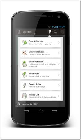
Figure 21-1: Evernote displays its tutorials in a list whenever the users want to see them.
Source: Evernote Corporation
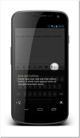
Figure 21-2: When a user selects one of Evernote’s tutorials, an overlay on the live user interface shows the help functionality.
Source: Evernote Corporation
Avoid Using the Confirmation Window
The confirmation window is typically a pop-up dialog box that confirms users actions. You’ve probably seen thousands of these before. Many of them are used to ask the users questions and confirm their actions.
Problem being addressed
These windows help prevent users from accidentally performing operations that are irreversible. Users might accidentally delete a file or discard edits they’ve made in a text document.
Why is this a bad solution?
Users do not always read what a dialog box says. In many cases, they simply tap yes for any question presented to them. This is learned behavior from years of using apps that abuse pop-ups and confirmation dialog boxes.
A pop-up confirmation window is the easiest way to try to move the responsibility of accidental operations from the developers to the users. However, forcing a user to tap an OK button doesn’t relieve the design and developer team from responsibility if users mistakenly lose their data or perform actions they don’t want to.
Better solution
Every action should be reversible. Try to provide an Undo for all operations instead of confirmation windows. The Gmail app does this brilliantly. When a user deletes an email, the app deletes it but provides an easy way to undo this deletion (see Figure 21-3).
Exceptions
There do exist operations that are truly irreversible. Still it is worth trying to find alternatives before reverting to a confirmation window. Sending email is a good example of an irreversible operation as once the email is in the receiver’s email box you cannot change it. Even in this example you should try to make sure that the users will not send the email accidental by organizing your user interface in a way that it is very clear how the email is sent and avoiding user interface component placements that can cause confusion or accidental taps.
Avoid Using the On-screen back button
The on-screen Back button is a part of the app’s user interface that brings the user back to the previous screen. It is common to see these buttons on apps that have been directly ported from the iOS. On the iOS, apps must have a Back button.
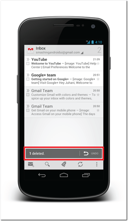
Figure 21-3: The Gmail app provides users with an easy undo if they delete an email by accident.
Source: Google
Problem Being addressed
Users need to be able to navigate back to the previous screen when they navigate in the app’s screen hierarchy.
Why is this a bad solution?
All Android devices have a Back button. Some of them are software Back buttons, and some of them are hardware buttons. Adding an extra Back button to the app user interface is counter-productive. The back stack can already be confusing to users, especially when combined with the Up button concept. If you add an on-screen Back button, your app’s users will probably confuse it with an Up button. If the button then works as a Back button instead of an Up button, it is likely to cause confusion.
Better solution
You can rely on Android’s Back button and the Up button to handle all the required backward and upward navigation in your app. Do not add on-screen Back buttons to your app. Also, make sure that your Up button doesn’t look like a Back button. Try to use the Action Bar’s up affordance without modifying it. It can already be fairly confusing to users and making it look like a left arrow is likely to add to that confusion.
Avoid Using the Menu button
Before the release of Android 4.0 Ice Cream Sandwich, all Android phones were required to have a hardware menu button. The menu button opens a context menu on screens that have a menu set.
Problem Being addressed
Not all actions can be addressed in the user interface. Users need to have access to advanced contextual actions on top of the visible action on the screen.
Why is this a bad solution?
From a user interface design point of view, the early Android phones had two large design flaws. First, you had to hold down the Home key to access multitasking. The second flaw was the use of the hardware menu button. The problem with a hardware menu button is that users cannot tell if the menu is available. Not all screens and apps use the context menu, so users have to guess. The only way to find out if it’s active is to press it. It goes against all usability guidelines to force users to do that.
Better solution
In the Android 4.0 release, support for software buttons was added and the requirement for a menu button was removed. In the new guidelines, the menu concept is gone altogether, and it is replaced with the Action Bar design pattern combined with the overflow action menu. You should use this new guideline instead of the old menu concept.
Avoid Hiding the status bar
Android allows your app to hide the status bar (the top bar with notifications, clock, and so on). It is quite common to see reading apps, for example, hiding the status bar.
Problem Being addressed
Hiding the status bar leaves more on-screen space for the actual content. This can be especially true when the content is large blocks of text, such as with an ebook reader.
Why is this a bad solution?
Android notifications are visible to users only in the status bar. These notifications are not accessible if the status bar is hidden. If user is using an ebook reader app that hides the status bar when they’re reading a book, for example, they can still hear the notification sound. The user has no way of telling whether the notification is important or not if the status bar is not visible. The only way for her to know is to go back to the home screen and check the notification. If the status bar was visible, she could simply dismiss the notification if it wasn’t important.
It is also important to realize that hiding the notification bar also prevents users from seeing the time. That can be annoying and counter-productive.
Better solution
Try to avoid hiding notification bars. Users use their phones to pass time while waiting for a train or bus. During that time, each notification might be significant and hiding the status bar in your app will make it much more difficult for users to react to notifications. Remember that yours isn’t the only app running on the user’s device.
Exceptions
Apps playing full-screen video in landscape mode have often a good reason to hide the status bar. Having the status bar visible with full screen video would ruin the video experience. Google’s YouTube app has dealt with this issue by showing the video in full-screen landscape mode without the status bar, but including the status bar when the video is viewed in portrait mode.
Avoid Using Swipe overlay for quick actions
Some apps use a swipe gesture to activate quick actions in list items. See more about quick actions design pattern in Chapter 18. Users swipe the list item to expose a quick actions panel that replaces the list item.
Problem Being addressed
Apps often have screen where they display multiple items like emails, notes, or to-do items. Users need to be able to perform actions only on items they want to be affected. Operations like delete, edit, and move require users to select the items explicitly.
On mouse-operated user interfaces, users are used to right-clicking items they want to manipulate individually. On touch screens, this approach is not possible. An alternative must be found. Note that this is the same problem that the quick actions design pattern handles effectively (see Chapter 18).
Why is this a bad solution?
There are three reasons why this approach should not be used in Android apps. First, this gesture is very difficult to discover. It is not a standard way of activating a quick action on the Android platform, so users are unlikely to know about it. Second, the swipe gesture already serves a different purpose on the Android user interface—it is used to switch between workspaces (see more about the workspaces design pattern in Chapter 19) or removing items using the swipe-to-dismiss user interface design pattern.
The third and possibly biggest problem to this approach is that the quick actions panel replaces the actual list item. This means that users immediately lose context to their actions. When you replace the row in your list that the actions apply to, you have removed the most important part of the user interface that should be visible.
Better solution
You should use the solution outlined in the quick actions design pattern in Chapter 18. It is much better to allow your users to see the available actions without hiding the actual content these actions are going to perform. That way, users remain aware of the context and can perform the actions with greater confidence.
Avoid Using Non-Android Designs
The importance of designing for the Android platform specifically and not applying a design that was originally made for another smartphone platform is sometimes difficult to communicate to your project’s stakeholders. Bad decisions might lead to a situation where a design that is not suitable for an Android device ends up being used anyway.
Problem Being addressed
Good design requires skill and time. Using a design that was already created for a different platform might sound like a good way to save time and money. Some people think that all smartphone platforms are the same, and, therefore, all touch screen designs are interchangeable. This is not true.
I’ve also heard arguments about maintaining brand consistency among smartphone platforms and, therefore, keeping a one-to-one design approach across all platforms.
Why is this a bad solution?
Unfortunately, all the large smartphone platforms are different. Android has its own design guidelines that you should follow. Users have certain expectations of how apps work and they will expect your app to work within these basic paradigms or otherwise will find it frustrating and difficult.
The argument about brand consistency over platform consistency is also flawed. Users rarely own more than one smartphone, particularly ones running on different operating systems, at the same time. Users will, however, have multiple applications on their phones. Your app will be one of many. If your app differs from the general experience, it is much more likely to be abandoned and rated poorly.
Better solution
It is worth investing in correct design from the beginning, even if your client or company already has a successful app on another platform. Android has the largest mobile operating system and, therefore, can offer your project a lot more visibility and more new customers. You only get one chance to launch a first impression.
Exceptions
The web is a platform that spreads across operating system limits. Each of the large mobile operating systems has a browser capable of rendering modern web applications. If your client doesn’t want to invest into application design for a platform-specific app, you might be better off targeting mobile web browsers instead. Users have different expectations of an app’s functionality when it runs inside a web browser. Your app can look similar on the iOS and on Android, for example, as long as users access it through a web browser.
Summary
Anti-patterns are design approaches that you should avoid in your apps, even though you will see many examples of them on current Android apps. There are better ways to handle these problems, but sometimes it requires more work and design investment. You must perform a cost-benefit analysis on a case-by-case basis. In some cases, the cost of implementing the better design might actually be less. Always keep in mind the user’s goals—what do your users want to achieve when using your app? Don’t create user interfaces that just look cool or are great on other platforms. Create a good Android user experience and your users will be happy. In addition, your app will receive better ratings and more downloads.