
13
Count Data
Up to this point, the response variables have all been continuous measurements such as weights, heights, lengths, temperatures and growth rates. A great deal of the data collected by scientists, medical statisticians and economists, however, is in the form of counts (whole numbers or integers). The number of individuals who died, the number of firms going bankrupt, the number of days of frost, the number of red blood cells on a microscope slide, or the number of craters in a sector of lunar landscape are all potentially interesting variables for study. With count data, the number 0 often appears as a value of the response variable (consider, for example, what a 0 would mean in the context of the examples just listed). In this chapter we deal with data on frequencies, where we count how many times something happened, but we have no way of knowing how often it did not happen (e.g. lightening strikes, bankruptcies, deaths, births). This is in contrast with count data on proportions, where we know the number doing a particular thing, but also the number not doing that thing (e.g. the proportion dying, sex ratios at birth, proportions of different groups responding to a questionnaire).
Straightforward linear regression methods (assuming constant variance and normal errors) are not appropriate for count data for four main reasons:
- the linear model might lead to the prediction of negative counts
- the variance of the response variable is likely to increase with the mean
- the errors will not be normally distributed
- zeros are difficult to handle in transformations
In R, count data are handled very elegantly in a generalized linear model by specifying family=poisson which uses Poisson errors and the log link (see Chapter 12). The log link ensures that all the fitted values are positive, while the Poisson errors take account of the fact that the data are integer and have variances that are equal to their means.
A Regression with Poisson Errors
This example has a count (the number of reported cancer cases per year per clinic) as the response variable, and a single continuous explanatory variable (the distance from a nuclear plant to the clinic in kilometres). The question is whether or not proximity to the reactor affects the number of cancer cases.
clusters <- read.csv("c:\temp\clusters.csv")attach(clusters)names(clusters)
[1] "Cancers" "Distance"
plot(Distance,Cancers,pch=21,bg="lightblue")
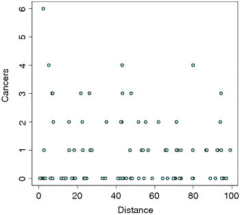
As is typical of count data, the values of the response don't cluster around a regression line, but they are dispersed in discrete rows within a roughly triangular area. As you can seem there are lots of zeros all the way from distances of 0 to 100 km. The only really large count (6) was very close to the source. There seems to be a downward trend in cancer cases with distance. But is the trend significant? We do a regression of cases against distance, using a GLM with Poisson errors:
model1 <- glm(Cancers~Distance,poisson)summary(model1)
Coefficients:Estimate Std. Error z value Pr(>|z|)(Intercept) 0.186865 0.188728 0.990 0.3221Distance -0.006138 0.003667 -1.674 0.0941 .
(Dispersion parameter for poisson family taken to be 1)
Null deviance: 149.48 on 93 degrees of freedomResidual deviance: 146.64 on 92 degrees of freedomAIC: 262.41
Number of Fisher Scoring iterations: 5
The trend does not look to be significant, but we need first to look at the residual deviance. It is assumed that this is the same as the residual degrees of freedom. The fact that residual deviance is larger than residual degrees of freedom indicates that we have overdispersion (extra, unexplained variation in the response). We compensate for the overdispersion by refitting the model using quasipoisson rather than Poisson errors:
model2 <- glm(Cancers~Distance,quasipoisson)summary(model2)
Coefficients:Estimate Std. Error t value Pr(>|t|)(Intercept) 0.186865 0.235364 0.794 0.429Distance -0.006138 0.004573 -1.342 0.183
(Dispersion parameter for quasipoisson family taken to be 1.555271)
Null deviance: 149.48 on 93 degrees of freedomResidual deviance: 146.64 on 92 degrees of freedomAIC: NA
Number of Fisher Scoring iterations: 5
Compensating for the overdispersion has increased the p value to 0.183, so there is no compelling evidence to support the existence of a trend in cancer incidence with distance from the nuclear plant. To draw the fitted model through the data, you need to understand that the GLM with Poisson errors uses the log link, so the parameter estimates and the predictions from the model (the ‘linear predictor’ above) are in logs, and need to be antilogged before the (non-significant) fitted line is drawn.
We want the x values to go from 0 to 100, so we can put:
xv <- 0:100
To draw attention to the relationship between the linear predictor and the values of y we want to draw on our scatterplot, we shall work out the y values long-hand. The intercept is 0.186865 and the slope is −0.006138 (see above), so the linear predictor gives yv as:
yv <- 0.186865-0.006138*xv
The important point to bear in mind is that yv is on a logarithmic scale. We want to plot y (the raw numbers of cases, not their logarithms) so we need to take antilogs (to back-transform, in other words):
y <- exp(yv)lines(xv,y,col="red")
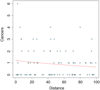
The red fitted line is curved, but very shallow. The trend is not significant (p > 0.18). Once you have understood the relationship between the linear predictor, the link function and the predicted count data, y, you can speed up the curve drawing with the predict function, because you can specify type="response", which carries out the back-transformation automatically:
y <- predict(model2,list(Distance=xv), type="response")lines(xv,y,col="red")
Analysis of Deviance with Count Data
The response variable is a count of infected blood cells per mm2 on microscope slides prepared from randomly selected individuals. The explanatory variables are smoker (a logical variable with values ‘yes’ or ‘no’), age (three levels: under 20, 21 to 59, 60 and over), sex (male or female) and a body mass score (three levels: normal, overweight, obese).
count <- read.csv("c:\temp\cells.csv")attach(count)names(count)
[1] "cells" "smoker" "age" "sex" "weight"
It is always a good idea with count data to get a feel for the overall frequency distribution of counts using table:
table(cells)
0 1 2 3 4 5 6 7314 75 50 32 18 13 7 2
Most subjects (314 of them) showed no damaged cells, and the maximum of 7 was observed in just two patients. We begin data inspection by tabulating the main effect means:
tapply(cells,smoker,mean)
FALSE TRUE0.5478723 1.9111111
tapply(cells,weight,mean)
normal obese over0.5833333 1.2814371 0.9357143
tapply(cells,sex,mean)
female male0.6584507 1.2202643
tapply(cells,age,mean)
mid old young0.8676471 0.7835821 1.2710280
It looks as if smokers have a substantially higher mean count than non-smokers, that overweight and obese subjects had higher counts than those of normal weight, males had a higher count that females, and young subjects had a higher mean count than middle-aged or older people. We need to test whether any of these differences are significant and to assess whether there are any interactions between the explanatory variables:
model1 <- glm(cells~smoker*sex*age*weight,poisson)summary(model1)
You should scroll down to the bottom of the (voluminous) output to find the residual deviance and residual degrees of freedom, because we need to test for overdispersion:
Null deviance: 1052.95 on 510 degrees of freedomResidual deviance: 736.33 on 477 degrees of freedomAIC: 1318
Number of Fisher Scoring iterations: 6
The residual deviance (736.33) is much greater than the residual degrees of freedom (477), indicating substantial overdispersion, so before interpreting any of the effects, we should refit the model using quasipoisson errors:
model2 <- glm(cells~smoker*sex*age*weight,quasipoisson)summary(model2)
Coefficients: (2 not defined because of singularities)Estimate Std. Error t value Pr(>|t|)(Intercept) -0.8329 0.4307 -1.934 0.0537 .smokerTRUE -0.1787 0.8057 -0.222 0.8246sexmale 0.1823 0.5831 0.313 0.7547ageold -0.1830 0.5233 -0.350 0.7267ageyoung 0.1398 0.6712 0.208 0.8351weightobese 1.2384 0.8965 1.381 0.1678weightover -0.5534 1.4284 -0.387 0.6986smokerTRUE:sexmale 0.8293 0.9630 0.861 0.3896smokerTRUE:ageold -1.7227 2.4243 -0.711 0.4777smokerTRUE:ageyoung 1.1232 1.0584 1.061 0.2892sexmale:ageold -0.2650 0.9445 -0.281 0.7791sexmale:ageyoung -0.2776 0.9879 -0.281 0.7788smokerTRUE:weightobese 3.5689 1.9053 1.873 0.0617 .smokerTRUE:weightover 2.2581 1.8524 1.219 0.2234sexmale:weightobese -1.1583 1.0493 -1.104 0.2702sexmale:weightover 0.7985 1.5256 0.523 0.6009ageold:weightobese -0.9280 0.9687 -0.958 0.3386ageyoung:weightobese -1.2384 1.7098 -0.724 0.4693ageold:weightover 1.0013 1.4776 0.678 0.4983ageyoung:weightover 0.5534 1.7980 0.308 0.7584smokerTRUE:sexmale:ageold 1.8342 2.1827 0.840 0.4011smokerTRUE:sexmale:ageyoung -0.8249 1.3558 -0.608 0.5432smokerTRUE:sexmale:weightobese -2.2379 1.7788 -1.258 0.2090smokerTRUE:sexmale:weightover -2.5033 2.1120 -1.185 0.2365smokerTRUE:ageold:weightobese 0.8298 3.3269 0.249 0.8031smokerTRUE:ageyoung:weightobese -2.2108 1.0865 -2.035 0.0424 *smokerTRUE:ageold:weightover 1.1275 1.6897 0.667 0.5049smokerTRUE:ageyoung:weightover -1.6156 2.2168 -0.729 0.4665sexmale:ageold:weightobese 2.2210 1.3318 1.668 0.0960 .sexmale:ageyoung:weightobese 2.5346 1.9488 1.301 0.1940sexmale:ageold:weightover -1.0641 1.9650 -0.542 0.5884sexmale:ageyoung:weightover -1.1087 2.1234 -0.522 0.6018smokerTRUE:sexmale:ageold:weightobese -1.6169 3.0561 -0.529 0.5970smokerTRUE:sexmale:ageyoung:weightobese NA NA NA NAsmokerTRUE:sexmale:ageold:weightover NA NA NA NAsmokerTRUE:sexmale:ageyoung:weightover 2.4160 2.6846 0.900 0.3686
(Dispersion parameter for quasipoisson family taken to be 1.854815)
Null deviance: 1052.95 on 510 degrees of freedomResidual deviance: 736.33 on 477 degrees of freedomAIC: NA
Number of Fisher Scoring iterations: 6
The first thing to notice is that there are NA (missing value) symbols in the table of the linear predictor (the message reads Coefficients: (2 not defined because of singularities). This is the first example we have met of aliasing (p. xxx): these symbols indicate that there are no data in the dataframe from which to estimate two of the terms in the four-way interaction between smoking, sex, age and weight.
It does look as if there might be three-way interaction between smoking, age and obesity (p = 0.0424). With a complicated model like this, it is a good idea to speed up the early stages of model simplification by using the step function, but this is not available with quasipoisson errors, so we need to work through the analysis long-land. Start by removing the aliased four-way interaction, then try removing what looks (from the p values) to be the least significant three-way interaction, the sex–age–weight interaction:
model3 <- update(model2, ~. -smoker:sex:age:weight)model4 <- update(model3, ~. -sex:age:weight)anova(model4,model3,test="F")
Analysis of Deviance Table
Resid. Df Resid. Dev Df Deviance F Pr(>F)1 483 745.312 479 737.87 4 7.4416 1.0067 0.4035
That model simplification was not significant (p = 0.4035) so we leave it out and try deleting the next least significant interaction
model5 <- update(model4, ~. -smoker:sex:age)anova(model5,model4,test="F")
Again, that was not significant, so we leave it out.
model6 <- update(model5, ~. -smoker:age:weight)anova(model6,model5,test="F")
Despite one-star significance for one of the interaction terms, this was not significant either, so we leave it out.
model7 <- update(model6, ~. -smoker:sex:weight)anova(model7,model6,test="F")
That is the last of the three-way interactions, so we can start removing the two-way interactions, starting, as usual, with the least significant:
model8 <- update(model7, ~. -smoker:age)anova(model8,model7,test="F")
Not significant. Next:
model9 <- update(model8, ~. -sex:weight)anova(model9,model8,test="F")
Not significant. Next:
model10 <- update(model9, ~. -age:weight)anova(model10,model9,test="F")
Not significant. Next:
model11 <- update(model10, ~. -smoker:sex)anova(model11,model10,test="F")
Not significant. Next:
model12 <- update(model11, ~. -sex:age)anova(model12,model11,test="F")
Analysis of Deviance Table
Resid. Df Resid. Dev Df Deviance F Pr(>F)1 502 791.592 500 778.69 2 12.899 3.4805 0.03154 *
That is significant so the sex–age interaction needs to stay int the model. What about the smoker–weight interaction? We need to compare it with model11 (not model12):
model13 <- update(model11, ~. -smoker:weight)anova(model13,model11,test="F")
Analysis of Deviance Table
Resid. Df Resid. Dev Df Deviance F Pr(>F)1 502 790.082 500 778.69 2 11.395 3.0747 0.04708 *
That is significant too, so we retain it. It appears that model11 is the minimal adequate model. There are two-way interactions between smoking and weight and between sex and age, so all four of the explanatory variables need to remain in the model as main effects (you must not delete main effects from a model, even if they look to be non-significant (like sex and age in this case) when they appear in significant interaction terms. The biggest main effect (to judge by the p values) is smoking. The significance of the intercept is not interesting in this case (it just says the mean number of cells for non-smoking, middle-aged females of normal weight is greater than zero – but it is a count, so it would be).
Coefficients:
Estimate Std. Error t value Pr(>|t|)(Intercept) -1.09888 0.33330 -3.297 0.00105 **smokerTRUE 0.79483 0.26062 3.050 0.00241 **sexmale 0.32917 0.34468 0.955 0.34004ageold 0.12274 0.34991 0.351 0.72590ageyoung 0.54004 0.36558 1.477 0.14025weightobese 0.49447 0.23376 2.115 0.03490 *weightover 0.28517 0.25790 1.106 0.26937sexmale:ageold 0.06898 0.40297 0.171 0.86414sexmale:ageyoung -0.75914 0.41819 -1.815 0.07007 .smokerTRUE:weightobese 0.75913 0.31421 2.416 0.01605 *smokerTRUE:weightover 0.32172 0.35561 0.905 0.36606
(Dispersion parameter for quasipoisson family taken to be 1.853039)
Null deviance: 1052.95 on 510 degrees of freedomResidual deviance: 778.69 on 500 degrees of freedom
This model shows a significant interaction between smoking and weight in determining the number of damaged cells (p = 0.05)
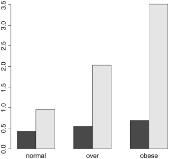
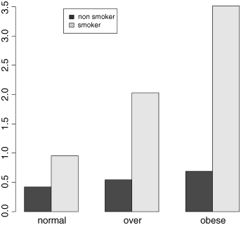
tapply(cells,list(smoker,weight),mean)
normal obese overFALSE 0.4184397 0.689394 0.5436893TRUE 0.9523810 3.514286 2.0270270
and an interaction between sex and age (p = 0.03):
tapply(cells,list(sex,age),mean)
mid old youngfemale 0.4878049 0.5441176 1.435897male 1.0315789 1.5468750 1.176471
The summary table shows that the gender effect is much smaller for young people (where the count was slightly higher in females) than for middle-aged or older people (where the count was much higher in males).
With complicated interactions like this, it is often useful to produce graphs of the effects. The relationship between smoking and weight is shown like this:
barplot(tapply(cells,list(smoker,weight),mean),beside=T)
This is OK, but the bars are not in the best order; the obese category should be on the right of the figure. To correct this we need to change the order of the factor levels for weight away from the default (alphabetical order) to a user-specified order, with normal of the left and obese on the right. We do this using the function called factor:
weight <- factor(weight,c("normal","over","obese"))barplot(tapply(cells,list(smoker,weight),mean),beside=T)
That's more like it. Finally, we need to add a legend showing which bars are the smokers:
barplot(tapply(cells,list(smoker,weight),mean),beside=T)legend(locator(1),c("non smoker","smoker"),fill=gray(c(0.2,0.8)))
Just click when the cursor is over the spot on the graph where you want the top left-hand corner of the legend to appear:
The Danger of Contingency Tables
We have already dealt with simple contingency tables and their analysis using Fisher's exact test or Pearson's chi-squared test (see Chapter 6). But there is an important further issue to be dealt with. In observational studies we quantify only a limited number of explanatory variables. It is inevitable that we shall fail to measure a number of factors that have an important influence on the behaviour of the system in question. That's life, and given that we make every effort to note the important factors, there's little we can do about it. The problem comes when we ignore factors that have an important influence on the response variable. This difficulty can be particularly acute if we aggregate data over important explanatory variables. An example should make this clear.
Suppose we are carrying out a study of induced defences in trees. A preliminary trial has suggested that early feeding on a leaf by aphids may cause chemical changes in the leaf which reduce the probability of that leaf being attacked later in the season by hole-making caterpillars. To this end we mark a large cohort of leaves, then score whether they were infested by aphids early in the season and whether they were holed by insects later in the year. The work was carried out on two different trees and the results were as follows:
| Tree | Aphids | Holed | Intact | Total leaves | Proportion holed |
| Tree1 | Without | 35 | 1750 | 1785 | 0.0196 |
| With | 23 | 1146 | 1169 | 0.0197 | |
| Tree2 | Without | 146 | 1642 | 1788 | 0.0817 |
| With | 30 | 333 | 363 | 0.0826 |
There are four variables: the response variable, count, with eight values (highlighted above), a two-level factor for late season feeding by caterpillars (holed or intact), a two-level factor for early season aphid feeding (with or without aphids) and a two-level factor for tree (the observations come from two separate trees, imaginatively named Tree1 and Tree2).
induced <- read.csv("c:\temp\induced.csv")attach(induced)names(induced)
[1] "Tree" "Aphid" "Caterpillar" "Count"
We begin by fitting what is known as a saturated model. This is a curious thing, which has as many parameters as there are values of the response variable. The fit of the model is perfect, so there are no residual degrees of freedom and no residual deviance. The reason why we fit a saturated model is that it is always the best place to start modelling complex contingency tables. If we fit the saturated model, then there is no risk that we inadvertently leave out important interactions between the so-called ‘nuisance variables’. These are the parameters that need to be in the model to ensure that the marginal totals are properly constrained.
model <- glm(Count~Tree*Aphid*Caterpillar,family=poisson)
The asterisk notation ensures that the saturated model is fitted, because all of the main effects and two-way interactions are fitted, along with the three-way, tree–aphid–caterpillar interaction. The model fit involves the estimation of 2 × 2 × 2 = 8 parameters, and exactly matches the eight values of the response variable, Count. There is no point looking at the saturated model in any detail, because the reams of information it contains are all superfluous. The first real step in the modelling is to use update to remove the three-way interaction from the saturated model, and then to use anova to test whether the three-way interaction is significant or not:
model2 <- update(model, ~ . - Tree:Aphid:Caterpillar)
The punctuation here is very important (it is comma, tilde, dot, minus) and note the use of colons rather than asterisks to denote interaction terms rather than main effects plus interaction terms. Now we can see whether the three-way interaction was significant by specifying test="Chi" like this:
anova(model,model2,test="Chi")
Analysis of Deviance Table
Model 1: Count ~ Tree * Aphid * CaterpillarModel 2: Count ~ Tree + Aphid + Caterpillar + Tree:Aphid + Tree:Caterpillar + Aphid:Caterpillar
Resid. Df Resid. Dev Df Deviance Pr(>Chi)1 0 0.000000002 1 0.00079137 -1 -0.00079137 0.9776
This shows clearly that the interaction between caterpillar attack and leaf holing does not differ from tree to tree (p = 0.9776). Note that if this interaction had been significant, then we would have stopped the modelling at this stage. But it wasn't, so we leave it out and continue. What about the main question? Is there an interaction between caterpillar attack and leaf holing? To test this we delete the aphid–caterpillar interaction from the model, and assess the results using anova:
model3 <- update(model2, ~ . - Aphid:Caterpillar)anova(model3,model2,test="Chi")
Analysis of Deviance Table
Model 1: Count ~ Tree + Aphid + Caterpillar + Tree:Aphid + Tree:CaterpillarModel 2: Count ~ Tree + Aphid + Caterpillar + Tree:Aphid + Tree:Caterpillar + Aphid:Caterpillar
Resid. Df Resid. Dev Df Deviance Pr(>Chi)1 2 0.00408532 1 0.0007914 1 0.003294 0.9542
There is absolutely no hint of an interaction (p = 0.954). The interpretation is clear: this work provides no evidence for induced defences caused by early season caterpillar feeding.
But look what happens when we do the modelling the wrong way. Suppose we went straight for the aphid–caterpillar interaction of interest. We might proceed like this:
wrong <- glm(Count~Aphid*Caterpillar,family=poisson)wrong1 <- update(wrong,~. - Aphid:Caterpillar)anova(wrong,wrong1,test="Chi")
Analysis of Deviance Table
Model 1: Count ~ Aphid * CaterpillarModel 2: Count ~ Aphid + Caterpillar
Resid. Df Resid. Dev Df Deviance Pr(>Chi)1 4 550.192 5 556.85 -1 -6.6594 0.009864 **
The aphid–caterpillar interaction is highly significant (p < 0.01) providing strong evidence for induced defences. Wrong! By failing to include the tree variable in the model we have omitted an important explanatory variable. As it turns out, and we should really have determined by more thorough preliminary analysis, the trees differ enormously in their average levels of leaf holing:
tapply(Count,list(Tree,Caterpillar),sum)
holed notTree1 58 2896Tree2 176 1975
The proportion of leaves with holes on Tree1 was 58/(58 + 2896) = 0.0196, but on Tree2 was 176/(176 + 1975) = 0.0818. Tree2 has more than four times the proportion of its leaves holed by caterpillars. If we had been paying more attention when we did the modelling the wrong way, we should have noticed that the model containing only aphid and caterpillar had massive overdispersion, and this should have alerted us that all was not well.
The moral is simple and clear. Always fit a saturated model first, containing all the variables of interest and all the interactions involving the nuisance variables (tree in this case). Only delete from the model those interactions that involve the variables of interest (aphid and caterpillar in this case). Main effects are meaningless in contingency tables, as are the model summaries. Always test for overdispersion. It will never be a problem if you follow the advice of simplifying down from a saturated model, because you only ever leave out non-significant terms, and you never delete terms involving any of the nuisance variables.
Analysis of Covariance with Count Data
In this example the response is a count of the number of plant species on plots that have different biomass (a continuous explanatory variable) and different soil pH (a categorical variable with three levels: high, mid and low):
species <- read.csv("c:\temp\species.csv")attach(species)names(species)
[1] "pH" "Biomass" "Species"We start by plotting the data, using different colours for each of the three pH classes:
plot(Biomass,Species,pch=21,bg=(1+as.numeric(pH)))Now we fit a straightforward analysis of covariance and use abline to draw lines of the appropriate colour through the scatterplot:
model <- lm(Species~Biomass*pH)summary(model)
Call:lm(formula = Species ~ Biomass * pH)
Residuals:Min 1Q Median 3Q Max-9.290 -2.554 -0.124 2.208 15.677
Coefficients:
Estimate Std. Error t value Pr(>|t|)(Intercept) 40.60407 1.36701 29.703 < 2e-16 ***Biomass -2.80045 0.23856 -11.739 < 2e-16 ***pHlow -22.75667 1.83564 -12.397 < 2e-16 ***pHmid -11.57307 1.86926 -6.191 2.1e-08 ***Biomass:pHlow -0.02733 0.51248 -0.053 0.958Biomass:pHmid 0.23535 0.38579 0.610 0.543
Residual standard error: 3.818 on 84 degrees of freedomMultiple R-squared: 0.8531, Adjusted R-squared: 0.8444F-statistic: 97.58 on 5 and 84 DF, p-value: < 2.2e-16
There is no evidence in the linear model for any difference between the slopes at different levels of pH. Make sure you understand how I got the intercepts and slopes for abline out of the model summary:
abline(40.60407,-2.80045,col="red")abline(40.60407-22.75667,-2.80045-0.02733,col="green")abline(40.60407-11.57307,-2.80045+0.23535,col="blue")
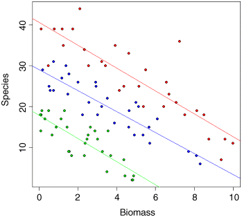
It is clear that species declines with biomass, and that soil pH has a big effect on species, but does the slope of the relationship between species and biomass depend on pH? The biggest problem with this linear model is that it predicts negative values for species richness above biomass values of 6 for the low pH plots. Count data are strictly bounded below, and our model should really take account of this.
Let us refit the model using a GLM with Poisson errors instead of a linear model:
model <- glm(Species~Biomass*pH,poisson)summary(model)
Coefficients:
Estimate Std. Error z value Pr(>|z|)(Intercept) 3.76812 0.06153 61.240 < 2e-16 ***Biomass -0.10713 0.01249 -8.577 < 2e-16 ***pHlow -0.81557 0.10284 -7.931 2.18e-15 ***pHmid -0.33146 0.09217 -3.596 0.000323 ***Biomass:pHlow -0.15503 0.04003 -3.873 0.000108 ***Biomass:pHmid -0.03189 0.02308 -1.382 0.166954
(Dispersion parameter for poisson family taken to be 1)
Null deviance: 452.346 on 89 degrees of freedomResidual deviance: 83.201 on 84 degrees of freedomAIC: 514.39
Number of Fisher Scoring iterations: 4The residual deviance is not larger than the residual degrees of freedom, so we don't need to correct for overdispersion. Do we need to retain the interaction term? We test this by deletion:
model2 <- glm(Species~Biomass+pH,poisson)anova(model,model2,test="Chi")
Analysis of Deviance Table
Model 1: Species ~ Biomass * pHModel 2: Species ~ Biomass + pH
Resid. Df Resid. Dev Df Deviance Pr(>Chi)1 84 83.2012 86 99.242 -2 -16.04 0.0003288 ***
Yes, we do. There is a highly significant difference between the slopes at different levels of pH. So our first model is minimal adequate.
Finally, we draw the fitted curves through the scatterplot, using predict. The trick is that we need to draw three separate curves; one for each level of soil pH.
plot(Biomass,Species,pch=21,bg=(1+as.numeric(pH)))xv <- seq(0,10,0.1)length(xv)
[1] 101
acidity <- rep("low",101)
yv <- predict(model,list(Biomass=xv,pH=acidity),type="response")lines(xv,yv,col="green")
acidity <- rep("mid",101)
yv <- predict(model,list(Biomass=xv,pH=acidity),type="response")lines(xv,yv,col="blue")
acidity <- rep("high",101)
yv <- predict(model,list(Biomass=xv,pH=acidity),type="response")lines(xv,yv,col="red")
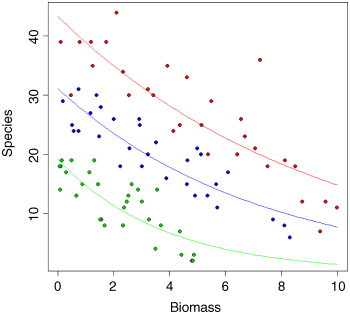
Note the use of type="response" in the predict function. This ensures that the response variable is calculated as species rather than log(species), and means we do not need to back-transform using antilogs before drawing the lines. You could make the R code more elegant by writing a function to plot any number of lines, depending on the number of levels of the factor (three levels of pH in this case).
Frequency Distributions
Given data on the numbers of bankruptcies in 80 districts, we want to know whether there is any evidence that some districts show greater than expected numbers of cases.
What would we expect? Of course we should expect some variation. But how much, exactly? Well, that depends on our model of the process. Perhaps the simplest model is that absolutely nothing is going on, and that every single bankruptcy case is absolutely independent of every other. That leads to the prediction that the numbers of cases per district will follow a Poisson process: a distribution in which the variance is equal to the mean (Box 13.1).
Let us see what the data show:
case.book <- read.csv("c:\temp\cases.csv")attach(case.book)names(case.book)
[1] "cases"First we need to count the numbers of districts with no cases, one case, two cases, and so on. The R function that does this is called table:
frequencies <- table(cases)frequencies
cases0 1 2 3 4 5 6 7 8 9 1034 14 10 7 4 5 2 1 1 1 1
There were no cases at all in 34 districts, but one district had 10 cases. A good way to proceed is to compare our distribution (called frequencies) with the distribution that would be observed if the data really did come from a Poisson distribution as postulated by our model. We can use the R function dpois to compute the probability density of each of the 11 frequencies from 0 to 10 (we multiply the probability produced by dpois by the total sample of 80 to obtain the predicted frequencies). We need to calculate the mean number of cases per district – this is the Poisson distribution's only parameter:
mean(cases)
[1] 1.775 The plan is to draw two distributions side by side, so we set up the plotting region:
windows(7,4)par(mfrow=c(1,2))
Now we plot the observed frequencies in the left-hand panel:
barplot(frequencies,ylab="Frequency",xlab="Cases",col="red",main="observed")
and the predicted, Poisson frequencies in the right-hand panel:
barplot(dpois(0:10,1.775)*80,names=as.character(0:10),ylab="Frequency",xlab="Cases",col="blue",main="expected")
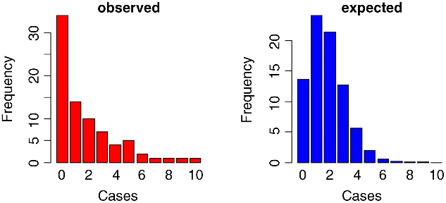
The distributions are very different: the mode of the observed data is zero, but the mode of the Poisson with the same mean is 1; the observed data contained examples of 8, 9 and 10 cases, but these would be highly unlikely under a Poisson process. We would say that the observed data are highly aggregated; they have a variance–mean ratio of nearly 3 (the Poisson, of course, has a variance–mean ratio of 1):
var(cases)/mean(cases)
[1] 2.99483So, if the data are not Poisson distributed, how are they distributed? A good candidate distribution where the variance–mean ratio is this big (c. 3.0) is the negative binomial distribution (Box 13.2).
As described in Box 13.2, this a two-parameter distribution. We have already worked out the mean number of cases, which is 1.775. We need an estimate of the clumping parameter, k, to establish the degree of aggregation in the data (a small value of k (such as k < 1) would show high aggregation, while a large value (such as k > 5) would indicate randomness). We can get an approximate estimate of magnitude using the formula in Box 13.2:
We have:
mean(cases)^2/(var(cases)-mean(cases))
[1] 0.8898003so we shall work with k = 0.89.
How do we compute the expected frequencies? The density function for the negative binomial distribution is dnbinom and it has three arguments: the frequency for which we want the probability (in our case 0 to 10), the clumping parameter (size = 0.8898), and the mean number of cases (mu = 1.775); we multiply by the total number of cases (80) to obtain the expected frequencies
expected <- dnbinom(0:10,size=0.8898,mu=1.775)*80The plan is to draw a single figure in which the observed and expected frequencies are drawn side by side. The trick is to produce a new vector (called both) which is twice as long as the observed and expected frequency vectors (2 × 11 = 22). Then we put the observed frequencies in the odd numbered elements (using modulo 2 to calculate the values of the subscripts), and the expected frequencies in the even numbered elements:
both <- numeric(22)both[1:22 %% 2 != 0] <- frequenciesboth[1:22 %% 2 == 0] <- expected
On the x axis, we intend to label only every other bar:
labels <- character(22)labels[1:22 %% 2 == 0] <- as.character(0:10)
Now we can produce the barplot, using light grey for the observed frequencies and dark grey for the negative binomial frequencies:
barplot(both,col=rep(c("lightgray","darkgray"),11),names=labels,ylab="Frequency",xlab="Cases")We need to add a legend to show what the two colours of the bars mean. You can locate the legend by trial and error, or by left-clicking mouse when the cursor is in the correct position, using the locator(1) function (see p. 169):
legend(locator(1),c("Observed","Expected"), fill=c("lightgray","darkgray"))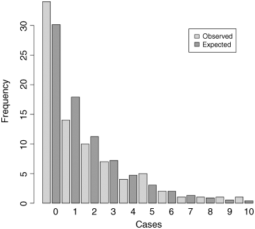
The fit to the negative binomial distribution is much better than it was with the Poisson distribution, especially in the right-hand tail. But the observed data have too many zeros and too few ones to be represented perfectly by a negative binomial distribution. If you want to quantify the lack of fit between the observed and expected frequency distributions, you can calculate Pearson's chi square ![]() based on the number of comparisons that have expected frequency greater than 4.
based on the number of comparisons that have expected frequency greater than 4.
expected
[1] 30.1449097 17.8665264 11.2450066 7.2150606 4.6734866 3.0443588[7] 1.9905765 1.3050321 0.8572962 0.5640455 0.3715655
If we accumulate the rightmost six frequencies, then all the values of expected will be bigger than 4. The degrees of freedom are then given by the number of comparisons (6) minus the number of parameters estimated from the data (2 in our case; the mean and k) minus 1 for contingency (because the total frequency must add up to 80), so there are 3 degrees of freedom. We use ‘levels gets’ to reduce the lengths of the observed and expected vectors, creating an upper interval called ‘5+’ for ‘5 or more’:
cs <- factor(0:10)levels(cs)[6:11] <- "5+"levels(cs)
[1] "0" "1" "2" "3" "4" "5+"Now make the two shorter vectors of and ef (for observed and expected frequencies):
ef <- as.vector(tapply(expected,cs,sum))of <- as.vector(tapply(frequencies,cs,sum))
Finally, we can compute the chi-squared value measuring the difference between the observed and expected frequency distributions, and use 1-pchisq to work out the p value:
sum((of-ef)^2/ef)
[1] 2.581842
1 - pchisq(2.581842,3)
[1] 0.4606818 We conclude that a negative binomial description of these data is reasonable (the observed and expected distributions are not significantly different; p = 0.46).
Further Reading
- Agresti, A. (1990) Categorical Data Analysis, John Wiley & Sons, New York.
- Santer, T.J. and Duffy, D.E. (1990) The Statistical Analysis of Discrete Data, Springer-Verlag, New York.