
A simple fact of life is that most phenomena have a random component. Human beings have a natural height that is different than the natural height of a dog or a tree. However, human beings are not all of the same height. The usually small range is governed by random error. For example, the range of adult human height is roughly 52–75 inches. This does not mean that 100% of all mankind are in this range. The small portions that are outside this range are considered outliers. Summarizing the height of human beings is very common in statistics. However, in science, it is helpful to provide the associated level of confidence in a statement. For example, it is important to state that a particular percentage, say 90%, of human beings have a height between 58 and 72 inches. One might think that it is important, or may be even necessary, to provide a range that covers all cases. However, such a range may prove to be too wide to be of actual use. For example, one might be able to say with 100% certainty that the annual income in the United States is between $0 and $100,000,000,000. Although, the lower end is a certainty, the upper end need not be as definite. Granted that the chance of anyone making $100,000,000,000 in a year is very low, nevertheless, there is no compelling reason against it. Therefore, one has to provide the probability of someone making such a huge income. Since this chance is low, it would be more meaningful to state an income range for a meaningful majority, such as income range of 95% of people. It is more useful to know that 99% of all people in the United States earned less than $380,354 per individual return in 2008,1 which is the same as saying that the top 1% made at least that much per individual return in the same year. According to the same source, the top 10% made more than $113,799 per individual return. The actual percentage is not important and depends on the task at hand. For example, the government might want to help the middle class, which has been losing ground in economic terms, by granting them a tax break to lower their tax burden to a burden equivalent to that of the upper and lower classes. One way of determining the middle class income of a population is to find 50% of the people whose incomes are in the middle. Alternatively, this means to identify the cutoff income level for the lower 25% of incomes, and the cutoff income level for the upper 25% of incomes. The two cutoff incomes mark the income range that contains 50% of the incomes. Computations necessary to determine these and other useful values are the subject of descriptive statistics.
Descriptive statistics provides quick and representative information about a population or a sample. A typical man is 5'10", the average temperature on July 4 is 89°, Olympic runners finish the 100 meter dash in under 10 seconds, the most common shoe size for women is seven, and so forth. These statistics are describing something of interest about the population and condense all the facts in a single parameter. Descriptive statistics is the science of summarizing and condensing information in few parameters.
There are many ways of condensing information to create descriptive statistics. Different types of data require different tools. Data can be qualitative or quantitative. These naming conventions actually refer to the way variables are measured and not the inherent characteristic of a phenomenon. In my opinion, these naming conventions are inaccurate. Variables are used for statistical analysis and are measured based on their characteristics. Sometimes, qualitative variables are called categorical variables. There are numerous measurement scales. Therefore, we focus on qualitative and quantitative variables.
In many cases, analyzing qualitative and quantitative variables requires different tools, but in some cases the tools are similar, if not identical, for both. However, the interpretations of qualitative and quantitative variables are usually different. Note that a population is not defined as either qualitative or quantitative. Rather, it is the variable of interest in the population that is either qualitative or quantitative. For example, the population can be defined as a person. If the age of the person is of interest, then the variable is quantitative; but if the gender of the person is of interest, then the variable is qualitative. If the population is a firm and the variable is pollution (the firm pollutes or does not pollute), then it is a qualitative variable. However, if the amount of pollution is of interest, then it is a quantitative variable.
Definition 1.1
Qualitative variables are non-numeric. They represent a label for a category of similar items. For example, the color of socks of students in a class is a qualitative data.
Definition 1.2
Quantitative variables are numerical and countable values. The distance each student has to travel to get to school is a quantitative data.
Measurement Scales
Variables must be measured in a meaningful way. The following is a brief description of different types of measurement scales. Over time, different vocabularies and naming conventions have evolved in naming different measurement scales. It is not possible to decipher an appropriate measurement scale by observing the measurement. Instead, the method of measurement and the quantities that are measured must be examined to determine the extent of the meaning one can assign to the numeric values, and hence, identify the measurement scale. Most of the methods in this text require an interval or measurement scales with stronger relational requirements.
Definition 1.3
Nominal or categorical data are the “count” of the number of times an event occurs. As an example for categorical data, countries might be grouped according to their policy toward trade and might be classified as open or closed economies. Care must be taken to assure that each case belongs to only one group. An ID number is an example of nominal data. As the relative size does not matter for nominal data, the customary arithmetic computations and statistical methods do not apply to these numbers.
Definition 1.4
When there are only two nominal types, the data is dichotomous. Dichotomous variables are also known as dummy variables in econometrics. When there is no particular order the dichotomous variable is called the discrete dichotomous variable. Gender is an example of a discrete dichotomous variable. When one can place an order on the type of data, as in the case of young and old, then the variable is a continuous dichotomous variable.
Definition 1.5
An ordinal scale indicates that data is ordered in some way. Although orders or ranks are represented by numerical values, such values are void of content and cannot be used for typical computations such as averages. The distances between ranks are meaningless. The income of the person who is ranked 20th in a group of ordered income is not twice the income of someone who is ranked 40th. In the ordinal scale only the comparisons “greater,” “equal,” or “less” are meaningful. This is a very important scale in economics, as in the case of utility and indifference curves. It is not necessary to measure the amount of utility one receives from different goods and services; it is sufficient to rank the utilities. The customary arithmetic computations and statistical methods do not apply to ordinal numbers.
Definition 1.6
A Likert scale is a special kind of ordinal scale where the subjects provide the ranking of each variable. Customarily, the numbers of the choices for ranking are odd numbers to allow the center value to represent the “neutral” case.
Definition 1.7
In an interval scale, the relative distances between any two sequential values are the same. In the interval scale, size of the difference between measurements is also important. Each numerical scale is actually measured from “accepted zero.” This makes use of the type of scale irrelevant as in the case of Celsius and Fahrenheit scales for temperatures. Both scales have an arbitrary zero. Some arithmetic computations such as addition and subtraction are meaningful.
Definition 1.8
The ratio scale provides meaningful use of the ratio of measurements in addition to interval size and order of scales. For example, the ratio of sales, gross domestic product (GDP), and output are expressed as ratio scale.
There are numerous other measurement scales, but these have little practical use in economics. A classical work on measurement is by S. S. Stevens.2
Types of Available Tools
Descriptive statistics provides summaries of information about a population or sample, both of which will be defined shortly. The amount of information available is vast and comprehending their intrinsic value is difficult. Descriptive statistics provides some means of condensing massive amounts of information in as few parameters as possible.
Definition 1.9
A parameter is a characteristic of a population that is of interest. Parameters are constant and usually unknown.
Examples of parameters include population mean, population variance, and regression coefficients. One of the main purposes of statistics is to obtain information from a sample that can be used to make inferences about population parameters. The estimated value obtained from a sample is called a statistic.
Table 1.1 summarizes the descriptive methods for quantitative and qualitative variables. Note that these are only the descriptive statistics and by no means all the methods at our disposal.
Table 1.1. Descriptive Statistics
|
Qualitative Variables |
Tabular Methods |
Frequency |
||
|
Relative Frequency |
||||
|
Graphical Methods |
Bar Graphs |
|||
|
Pie Charts |
||||
|
Quantitative Variables |
Tabular Methods |
Frequency Distribution |
||
|
Relative Frequency |
||||
|
Cumulative Distribution |
||||
|
Percentiles |
||||
|
Quartiles |
||||
|
Hinges |
||||
|
Graphical Methods |
Histograms |
|||
|
Ogive |
||||
|
Stem-and-Leaf |
||||
|
Dot Plot |
||||
|
Scatter Plot |
||||
|
Box Plot |
||||
|
Numerical Methods |
Measures of Location |
Mean |
Ungrouped Data |
|
|
Grouped Data |
||||
|
Trimmed Mean |
||||
|
Median |
||||
|
Mode |
||||
|
Measures of Dispersion |
Range |
|||
|
Interquartile Range |
||||
|
Variance |
Ungrouped Data |
|||
|
Grouped Data |
||||
|
Standard Deviation |
||||
|
Coefficient of Variation |
||||
|
Measures of Association |
Covariance |
|||
|
Correlation Coefficient |
||||
Definition 1.10
When data are summarized or organized to provide a better and more compact picture of reality, then data are grouped. The grouping can be in the form of relative frequency or summarized in cross tabulation tables or into classes.
Descriptive Statistics for Qualitative Variables
The available descriptive statistics for qualitative variables can be divided into graphical and tabular methods. Each one consists of several customarily used tools. In order to be able to graph the data, it must be tabulated in some fashion; therefore, we will discuss the tabular methods first.
Tabular Methods for Qualitative Variables
The most common tabular methods for qualitative variables are frequency and relative frequency.
Frequency Distribution for Qualitative Variables
A frequency distribution shows the frequency of occurrence for non-overlapping classes.
Example 1.1
In a small town a small company is responsible for refilling soda dispensers of 30 businesses. The type of business, the average number of cans of soda (in 100 cans), the gender of the business owner, and the race of business owner are presented in Table 1.2. Find the frequencies of the business types where soda dispensers are located.
Table 1.2. Some Information About Soda Dispensers
|
Store type |
Average |
Gender |
Race |
|
Gas Station |
3.8 |
Male |
Black |
|
Gas Station |
3.5 |
Female |
Black |
|
Gas Station |
2.6 |
Male |
White |
|
Mechanic Shop |
2.1 |
Male |
Black |
|
Mechanic Shop |
1.9 |
Male |
White |
|
Mechanic Shop |
3.4 |
Female |
White |
|
Mechanic Shop |
2.7 |
Male |
White |
|
Mechanic Shop |
1.8 |
Female |
Black |
|
Mechanic Shop |
3.7 |
Male |
White |
|
Mechanic Shop |
4 |
Female |
White |
|
Mechanic Shop |
1.9 |
Female |
White |
|
Mechanic Shop |
2.6 |
Female |
White |
|
Drug Store |
2.7 |
Female |
White |
|
Drug Store |
2.4 |
Male |
Black |
|
Drug Store |
3.6 |
Female |
Black |
|
Drug Store |
3.2 |
Female |
White |
|
Drug Store |
2.7 |
Male |
White |
|
Hardware Store |
3.5 |
Male |
Black |
|
Hardware Store |
1.8 |
Female |
White |
|
Hardware Store |
3.4 |
Male |
White |
|
Hardware Store |
2.8 |
Male |
Black |
|
Hardware Store |
2.1 |
Female |
White |
|
Hardware Store |
3.1 |
Female |
White |
|
Hardware Store |
2.6 |
Male |
White |
|
Sporting Goods |
1.7 |
Male |
White |
|
Sporting Goods |
4 |
Female |
White |
|
Sporting Goods |
3.2 |
Male |
White |
|
Sporting Goods |
2.4 |
Female |
Black |
|
School |
3.7 |
Female |
White |
|
Tire Shop |
2.8 |
Female |
White |
Solution
A frequency distribution for the business type will clarify the information.
|
Gas Stations |
|
|
|
Mechanic Shop |
|
//// |
|
Drug Store |
//// |
|
|
Hardware Store |
|
// |
|
Sporting Goods |
//// |
|
|
School |
/ |
|
|
Tire Shop |
/ |
This certainly is an improvement, but Table 1.3 makes it even clearer and more condensed.
Table 1.3. Business Types, Frequencies, and Relative Frequencies of Locations
|
Location |
Frequency |
|
Gas Stations |
3 |
|
Mechanic Shop |
9 |
|
Drug Store |
5 |
|
Hardware Store |
7 |
|
Sporting Goods |
4 |
|
School |
1 |
|
Tire Shop |
1 |
|
Total |
30 |
It is easier to determine the locations, how many times each is restocked, as well as finding the most frequent, and the least frequent locations.
A table with 30 cells has been reduced to a two-column table with seven rows. If there were 20,000 locations and the types of business remained similar, the resulting table would not be any larger. While no one can really understand anything from a table with 20,000 entries, the resulting table would be very clear. This signifies the power of statistics to condense information in as few parameters as possible. The result can be graphed for more visual presentation. One possible graph is called a bar graph. Other graphs, such as pie charts, are also available.
The example could have been about the types of industries in a state, the kinds of automobiles produced at a plant, the kinds of services provided by a firm, or the kinds of goods sold in a store. The method of determining the frequencies would be the same in all such cases.
Relative Frequency for Qualitative Data
The magnitude of the frequency changes for different populations and samples. For better comparison, the relative frequency is used. The relative frequency shows the percentage of each class to the total population or sample. It is obtained by dividing the frequency for each class by the total in the population or the sample (see Table 1.4).
Table 1.4. Business Types, Frequencies, and Relative Frequencies of Locations
|
Location |
Frequency |
Relative frequency |
|
Gas Stations |
3 |
0.1 |
|
Mechanic Shop |
9 |
0.3 |
|
Drug Store |
5 |
0.166 |
|
Hardware Store |
7 |
0.233 |
|
Sporting Goods |
4 |
0.133 |
|
School |
1 |
0.033 |
|
Tire Shop |
1 |
0.033 |
|
Total |
30 |
0.9998 |
The sum of the relative frequency is always 1.0. Here, however, the sum is not exactly 1 due to roundoff error.
Graphical Methods for Qualitative Variables
The two most commonly used graphical methods for qualitative variables are bar graphs and pie charts. Many other graph types have been introduced with the advent of spreadsheet and more are available in specialty software.
Bar Graph
A bar graph is a graphical representation of the frequency distribution, or relative frequency distribution, when dealing with qualitative data. The names of the qualitative variables are placed on the x-axis and the frequency is depicted on the y-axis. A histogram and a bar graph are identical except for the fact that the bar graph is used for qualitative variables, while the histogram is used for quantitative variables.
Example 1.2
The following table represents the frequency of the business type among 30 locations of soda dispensers. Provide a bar graph of the business types where soda dispensers are located.
|
Business type |
Frequency |
|
Gas Stations |
3 |
|
Mechanic Shops |
9 |
|
Drug Stores |
5 |
|
Hardware Stores |
7 |
|
Sporting Goods |
4 |
|
School |
1 |
|
Tire Shop |
1 |
|
Total |
30 |
Solution
All examples involving graphs are solved using Microsoft Office Excel. For the graphs, the appropriate Excel commands are given in each section. All the other Excel commands are included in the Appendix.
Bar graph in Excel is rotated 90° to the right. The sequence of commands to plot a bar graph in Excel is provided for your reference.
Open a new spreadsheet in Excel. In cell A1, type “Business Type” and then going downward list the business types as shown in the table above. In cell B1, type “Frequency” and then going downward list the frequency in cells A1 through B8. Go to “Insert,” which is the second tab at the top left on the spreadsheet. Click on “Column” (which looks like a bar graph) and then click on the first chart (top left). Excel will populate a chart similar to the one below.
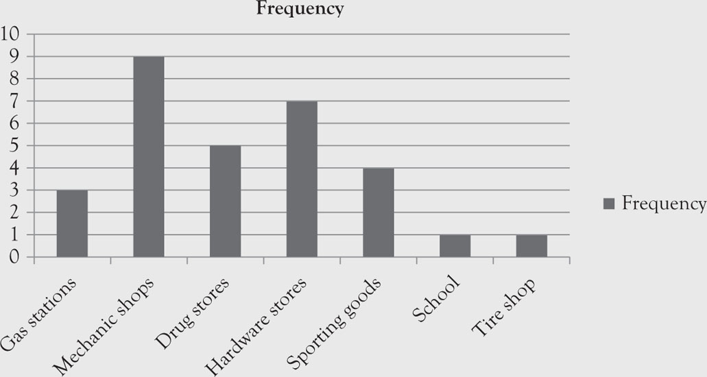
Figure 1.1. Bar graph of business types, frequencies, and relative frequencies of locations.
The above graph can represent the relative frequencies, too. Only the unit of measurement on the y-axis will differ. In Excel this graph is called a “column” graph.
Creating a bar graph of the relative frequencies would not provide additional meaningful results. The graph will be identical to the above graph, except the scales on the vertical axis would be the relative frequencies (percentages) and not the actual frequencies. However, the relative frequencies are already known so further benefit is not gained. Often it is more meaningful to plot the relative frequencies instead of the actual frequencies because you can easily compare relative frequencies and they are similar to probabilities.
Pie Chart
A pie chart is a graphical presentation of frequency distribution and relative frequency. In this regard, the pie chart is similar to the bar graph because one cannot differentiate between the graphs of actual and relative frequencies, except for the scale. In some cases when a quantitative variable has only few outcomes you can use the pie chart to provide visual effects.
A circle is divided into wedges representing each of the categories in the table. If frequencies are charted, their magnitude is placed under their name. When the pie chart is based on the relative frequencies instead of the frequencies, the scale will be different but not the size of the slices on the pie.
Example 1.3
Provide a pie graph for the business types of locations in Table 1.3.
Solution
Open a new spreadsheet in Excel. In cell A1, type “Business Type,” list the business types as shown in the Table 1.3. In cell B1, type “Frequency” followed by the frequency for each business type as shown in the Table 1.3. Capture data in cells A1 through B8. Go to “Insert,” which is the second tab at the top left hand corner of the spreadsheet. Click on “Pie.” Several options become available. You can select whichever Pie shape you wish. Excel will populate a chart similar to the one below.
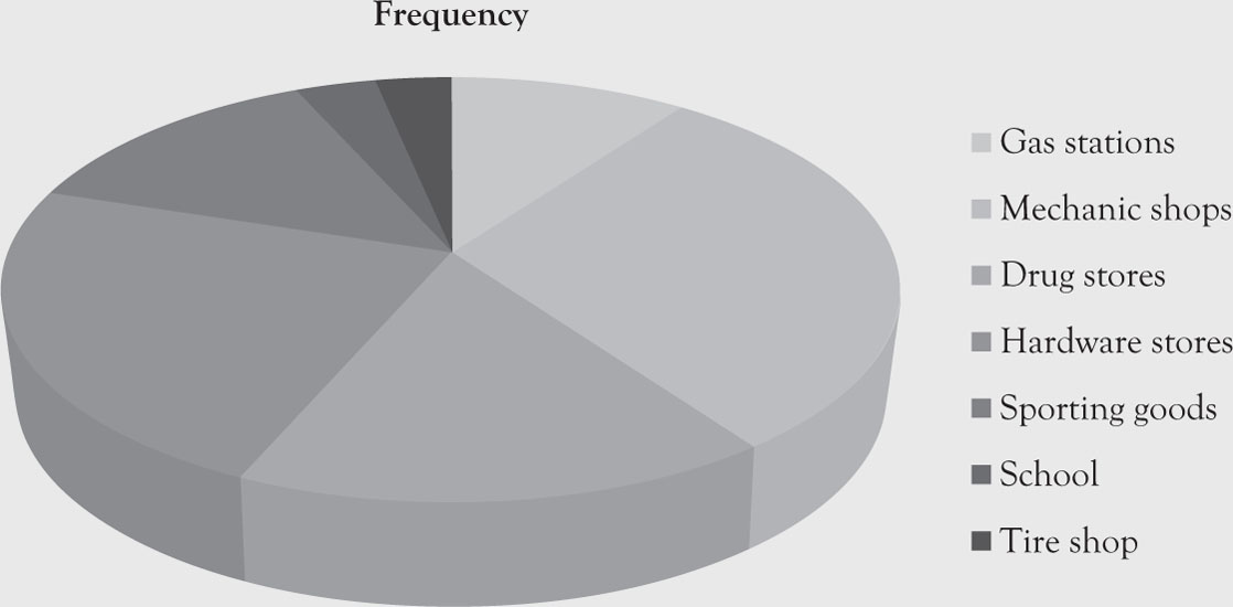
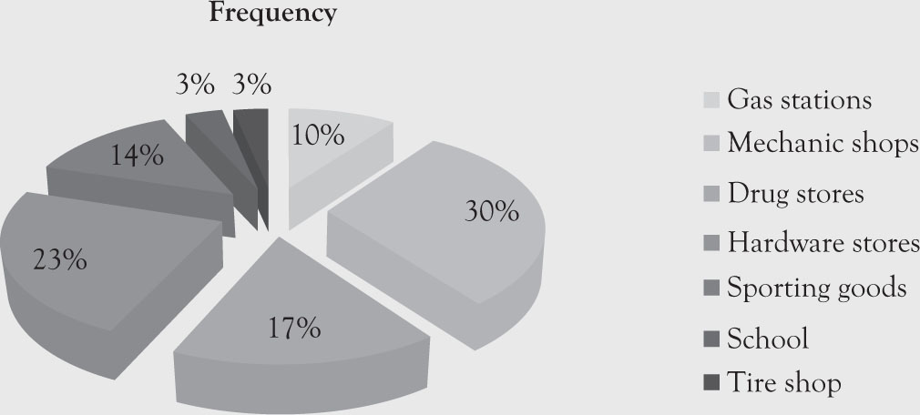
Figure 1.2. Pie charts of business types for soda dispensers.
Notice that due to space limitation the legend is placed on the side. Furthermore, the labels represent “Business Type” and have nothing to do with the pie colors the computer provides.
Descriptive Statistics for Quantitative Variables
As depicted in Table 1.1, there are more methods available to describe quantitative data. Some are very similar to the methods used in quantitative methods, but their interpretations are usually broader.
Tabular Methods for Quantitative Variables
There are three commonly used tabular descriptive statistics for quantitative variables. They are frequency distribution, relative frequency distribution, and cumulative distribution.
Frequency Distribution for Quantitative Variables
A frequency distribution shows the frequency of occurrence for non-overlapping classes. Unlike the qualitative frequency distribution, there are no set and predefined classes or groups. The researcher will determine the size of each class and the number of classes. Such data are called grouped data.
Example 1.4
An anthropologist is studying a small community of gold miners in a remote area. The community consists of nine families. The family income is reported below in thousands of dollars.
66, 58, 71, 73, 64, 70, 66, 55, 75
Solution
The researcher would like to summarize these data using descriptive statistics. We deliberately chose a small set to demonstrate the point better without boring calculations. In real life, data will be much larger, and it would make more sense to condense the data using some technique, say descriptive statistics. As only one value is repeated, it does not make sense to build a frequency distribution; no real summary will emerge. If we divide the data into classes, however, we can build the frequency distribution. The range of data is from 55 to 75. If the researcher wishes to have 5 classes, the size of each class would be:
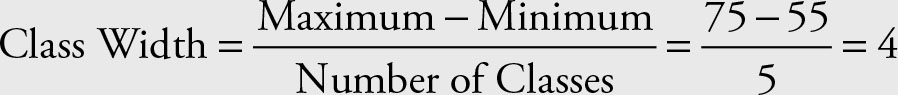
The number of classes is arbitrary and any reasonable number of classes and class widths will work. Avoid extremities and unbalanced classes. To avoid decimal places in classes, we added an extra class for values greater than or equal to 75. Other solutions would be as valid. The quantitative data can include decimal numbers; however, in this case, extra caution is needed to avoid overlapping in the classes.
The histogram command in Excel provides the frequency as well as the cumulative frequency. If the option “Chart Percentage” is selected from the histogram dialog box, the histogram and the Ogive will be graphed too.
A list of nine values has been reduced to a two-column table with six rows as shown in Table 1.5. Again here, the size of population is deliberately small to allow students to see the details easily and to be able to duplicate the results. The procedure would be the same for the family incomes of the United States with a population around 300,000,000 people. This signifies the power of statistics to condense information in as few parameters as possible. The result can be graphed for more visual presentation. One such graph is called a dot plot. Other graphs such as a histogram are also available.
Table 1.5. Classes and Their Frequencies
|
Classes |
Frequency |
|
55–59 |
2 |
|
60–64 |
1 |
|
65–69 |
2 |
|
70–74 |
3 |
|
≥ 75 |
1 |
Relative Frequency Distribution for Quantitative Variables
The relative frequency for quantitative variables is computed in the same way as those of qualitative variables. The frequency for each class is divided by the total number of members in the population or sample to obtain the relative frequency.
Example 1.5
Table 1.6 provides the relative and cumulative frequencies for the family incomes indicated in the Example 1.4.
Table 1.6. Relative and Cumulative Frequencies of Family Incomes
|
Classes |
Frequency |
Relative frequency |
Cumulative frequency |
|
55–59 |
2 |
0.222222222 |
0.222222222 |
|
60–64 |
1 |
0.111111111 |
0.333333333 |
|
65–69 |
2 |
0.222222222 |
0.555555556 |
|
70–74 |
3 |
0.333333333 |
0.888888889 |
|
≥ 75 |
1 |
0.111111111 |
1 |
Cumulative Frequency Distribution for Quantitative Variables
In the case of quantitative variables, the classes or values of interest are sequential and have meaningful order, usually from smallest to the largest. This allows us to obtain cumulative frequencies. Cumulative frequencies consist of sums of frequencies up to the value or class of interest. The last value is always 1 since it represents 100% of observations (see Table 1.6).
Percentiles
A percentile is the demarcation value below which the stated percentage of the population or sample lie. For example, 17% of a population or a sample lies below the 17th percentile.
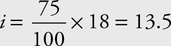
To obtain a percentile, sort the data and identify which value represents the stated percentile. The 17th percentile of a data containing 84 members is the 15th member of the sorted group (0.17 × 84 = 14.28). As countable data cannot take a fractional value, the 15th member of the sorted data is the observation where 17% of the data are smaller than it.
To obtain the percentile, after sorting the data calculate an index i:
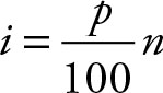 (1.1)
(1.1)
where p is the desired percentile and n is either the population or the sample size. When the result is an integer, add 1 to it to get the position of the percentile. If the result is a decimal value, use the next higher integer to get the position of the percentile.
Example 1.6
A retail store has collected sales data, in thousands of dollars for 18 weeks. Find the 18th and the 50th percentiles for weekly sales.
66, 58, 71, 73, 64, 70, 66, 55, 75, 65, 57, 71, 72, 63, 71, 65, 55, 71
Solution
Sort the combined data.
55, 55, 57, 58, 63, 64, 65, 65, 66, 66, 70, 71, 71, 71, 71, 72, 73, 75
The 18th percentile is obtained by:
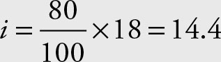
Since the result is a real number, it has decimal value. Thus, use the next higher integer, which is 15 in this example. The number in the 15th position is the 18th percentile. That value is 71.
The 50th percentile is:
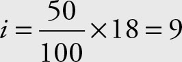
Since the index is an integer, use the next higher integer, namely the 10th observation, which is 66.
Quartiles
Quartiles divide the population into four equal portions, each equal to 25% of the population. Like the median and percentiles, the data must be sorted first. The first quartile, Q1, is the data point such that 25% of the data are below it. The second quartile, Q2, is the data point such that 50% of the data are below it. The third quartile, Q3, is the data point such that 75% of the data are below it.
The first quartile is the same as the 25th percentile. The second quartile is the same as the 50th percentile, as well as the median. The third quartile is the same as the 75th percentile. The quartiles are calculated the same way as the 25th, 50th, and 75th percentiles using the following indices.
Use 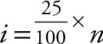 for the first quartile.
Use 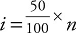 for the second quartile.
Use 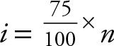 for the third quartile.
If the result of the index is an integer, use the next higher integer to find the location of the quartile. If the result of the index is a real value, a value with a decimal number, the next higher integer will determine the position of the quartile.
Example 1.7
For the weekly sales data of the retail store in Example 1.5, find the first, second, and the third percentiles. The data are repeated for your convenience.
66, 58, 71, 73, 64, 70, 66, 55, 75, 65, 57, 71, 72, 63, 71, 65, 55, 71
Solution
The 3 quartiles are calculated using the following indexes.
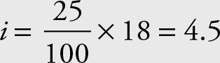 the first quartile is in the 5th position.
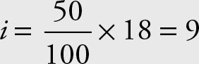 the second quartile is in the 10th position.
 the third quartile is in the 14th position.
Sort the combined data.
55, 55, 57, 58, 63, 64, 65, 65, 66, 66, 70, 71, 71, 71, 71, 72, 73, 75
Q1 Q2 Q3
The first quartile is the 25th percentile, the second quartile is the 50th percentile, and the third quartile is the 75th percentile.
Hinges
The hinges also divide the data into four equal portions. The hinges, however, use the definition of the median. For example, sort the data (as indicated below) and then find the median. Find the median of the lower half and call it the first hinge. Find the median of the second half and call it the upper hinge.
Example 1.8
For the weekly sales data of the retail store in Example 1.5, find the first, second, and third percentiles.
Solution
Sort the combined data.
55, 55, 57, 58, 63, 64, 65, 65, 66, 66, 70, 71, 71, 71, 71, 72, 73, 75
lower hinge Median upper hinge
Graphical Methods for Quantitative Variables
The numbers of available graphical methods for quantitative variables far exceed the number of graphical methods available for qualitative variables. Here, we will address histograms, Ogive, stem-and-leaf, dot-plot, scatter plot, and box plot. Box plot uses some of the concepts that are introduced in Chapter 2.
Histogram
A histogram is a graphical representation of the frequency distribution or relative frequency distribution when dealing with quantitative data. The boundaries of the classes are used for the demarcation of the vertical bars. A histogram and a bar graph are identical except for the quantitative values used in the histogram on the x-axis.
Example 1.9
The following data represents the income of gold miners in a small community. The corresponding histogram follows (see Figure 1.3).
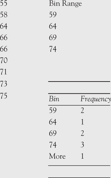
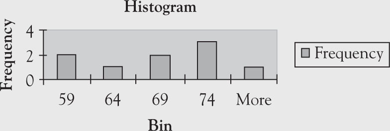
Figure 1.3. Histogram and related setup in Excel.
|
Classes |
Frequency |
|
55–59 |
2 |
|
60–64 |
1 |
|
65–69 |
2 |
|
70–74 |
3 |
|
≥75 |
1 |
Open a new spreadsheet in Excel. In cell A1, type in “Bin” and enter the Bin Range from the list below. In cell B1, type “Frequency” followed by the frequencies. The data should be captured in cells A1 through B6. Go to “Insert,” which is the second tab at the top left hand corner of the spreadsheet. Click on “Column” (which looks like a bar graph) and then click on the first chart (top left). Excel will populate a chart similar to the one below.
The output from Excel is presented below. The frequency is shown too.
The above graph can represent the relative frequencies, too. Only the unit of measurement on the y-axis will differ.
The above graph was created in Excel. Ironically, in Excel this graph is called a “column” graph. Bar graph in Excel is the same thing except for the rotation of 90° to the right.
Ogive
The graph for the cumulative frequencies is called Ogive. In carpentry, there is a molding bit for shaping the edge of the wood called Roman Ogive. The graphs of the cumulative frequencies usually resemble the finished edge of the Roman Ogive molding.
Example 1.10
For the below nine communities of gold miners, find the graph frequencies and cumulative frequencies.
66, 58, 71, 73, 64, 70, 66, 55, 75
Solution
The frequency, relative frequency, and cumulative frequency for these data are given in Table 1.7.
Table 1.7. Frequency, Relative Frequency, and Cumulative Frequency
|
Classes |
Frequency |
Relative frequency |
Cumulative frequency |
|
55–59 |
2 |
0.222 |
0.222 |
|
60–64 |
1 |
0.111 |
0.333 |
|
65–69 |
2 |
0.222 |
0.555 |
|
70–75 |
4 |
0.444 |
0.999 |
In Excel the Ogive is obtained from the histogram dialog box by selecting the cumulative percentage option.
The Ogive gives the cumulative area under the relative frequency histogram. The derivative of the function that represents the Ogive will give the relative frequency histogram function (see Figure 1.4).
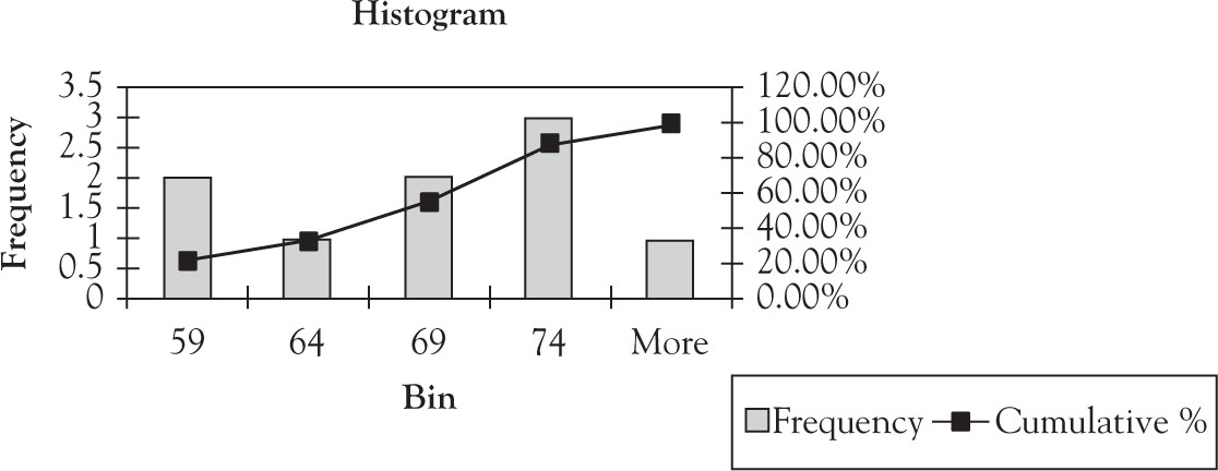
Figure 1.4. Ogive superimposed on histogram.
Stem-and-Leaf
Stem-and-leaf is another descriptive way of summarizing information and, hence, qualifies as descriptive statistics. Tukey3 introduced the concepts of the stem-and-leaf. Some authors, such as Anderson et al.,4 place stem-and-leaf under the exploratory data.
In the stem-and-leaf, usually the last digit of a value is recorded as the leaf and the preceding digits on a number as the stem. A vertical line for easy visualization separates the leaves and stems. To create a stem-and-leaf display, place the first digit(s) of each data to the left of a vertical line. Place the last digit of each data to the right of the line.
Example 1.11
Provide a stem-and-leaf graph for the gold miners’ data.
66, 58, 71, 73, 64, 70, 66, 55, 75
Solution
The frequency, relative frequency, and cumulative frequency for this data are given in Table 1.7.
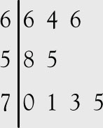
Figure 1.5(a). Stem-and-leaf graph.
Note that the result resembles a rotated histogram. If the data for each leaf is also sorted, a better summary is obtained, as in Figure 1.5(b).
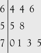
Figure 1.5(b). Sorted stem-and-leaf graph.
If the numbers are too large, the first two or more digits could be placed on the left side. The idea is to select the digits in a manner that makes the summary useful.
Dot Plot
The dot plot is useful when only one set of data is under consideration. The actual data are placed on the x-axis. For each occurrence of the value a dot is placed above it. All the dots are at the same height, which has no significant meaning other than reflecting the occurrence of the observation. In the case of multiple occurrences additional dots are placed above the previous ones. The dots are placed at equal distances for visual as well as representation purpose.
Example 1.12
Provide a dot plot for the gold miners’ data.
66, 58, 71, 73, 64, 70, 66, 55, 75
Solution
See Figure 1.6.
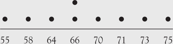
Figure 1.6. Dot plot.
A dot plot resembles an exaggerated histogram.
Scatter Plot
An observant reader would notice that all the previous examples have been based on only one variable with numerous classifications and categories. In economics and many other branches of science, it is also beneficial to present graphics of two or more variables. Below, we will use a scatter plot to show the relationship between two variables (see Figure 1.7). More variables can be combined into one graph. Usually, numerous variables are placed on the x-axis and only one variable is placed on the y-axis to show the relationship between the variable in the former group and the variable on the y-axis. In such cases, the variables on the x-axis are usually the ones that affect the variable on the y-axis. Sometimes they are called factors and response variables, respectively.
Example 1.13
Graph a scatter plot of annual income and consumption data for the United States for the years 1990 through 2010 which is depicted in Table 1.8.
Table 1.8. Annual Income (I) and Consumption (C) in the United States (1990–2010)
|
Year |
I |
C |
|
1990 |
17,004 |
15,331 |
|
1991 |
17,532 |
15,699 |
|
1992 |
18,436 |
16,491 |
|
1993 |
18,909 |
17,226 |
|
1994 |
19,678 |
18,033 |
|
1995 |
20,470 |
18,708 |
|
1996 |
21,355 |
19,553 |
|
1997 |
22,255 |
20,408 |
|
1998 |
23,534 |
21,432 |
|
1999 |
24,356 |
22,707 |
|
2000 |
25,944 |
24,185 |
|
2001 |
26,805 |
25,054 |
|
2002 |
27,799 |
25,819 |
|
2003 |
28,805 |
26,833 |
|
2004 |
30,287 |
28,179 |
|
2005 |
31,318 |
29,719 |
|
2006 |
33,157 |
31,102 |
|
2007 |
34,512 |
32,356 |
|
2008 |
36,166 |
32,922 |
|
2009 |
35,088 |
32,087 |
|
2010 |
36,051 |
33,039 |
Sources: Bureau of Economic Analysis: National Income and Product Account Tables (Table 2.3.5-Personal Consumption Expenditures by Major Type of Product). GDP and Personal Income (SA1-3 Personal Income Summary).
Solution
To obtain a scatter plot, type the information from Table 1.8 in an Excel spreadsheet. In cell A1 type “I” for Income followed by the income data from the second column in Table 1.8. In cell B1, type “C” for Consumption followed by consumption data from the third column in Table 1.8. Highlight cells A1 through B22. Go to “Insert,” which is the second tab on the top left hand corner of the spreadsheet. Click on “Scatter,” which will reveal several options. Select the option at the top left. Excel will populate a chart similar to the one shown in Figure 1.7.
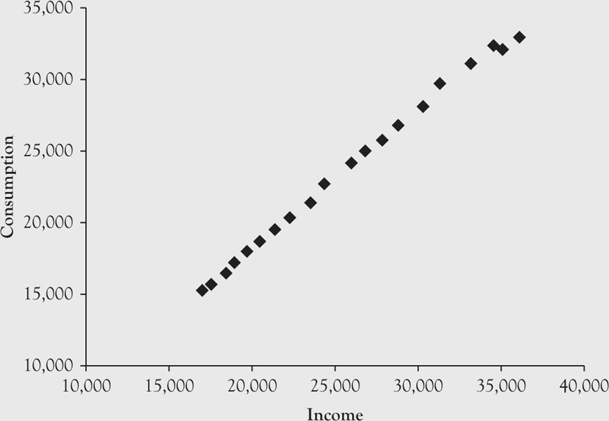
Figure 1.7. Scatter plot of income and consumption for the United States, 1990–2010.
These graphs present, by no means, the extent of possible ways to present data for either qualitative or quantitative variables. Many other imaginative ways can be used, some of which are available in popular software such as Microsoft Excel or dedicated software such as Stata.
Box Plot
A box plot is a visual representation of several basic descriptive statistics in a concise manner. The descriptive statistics that are used in a box plot are explained in Chapter 2. The graph consists of one box per variable. The borders of the box represent the 25th percentile (lower hinge) and the 75th percentile (upper hinge), with a line in the box representing the 50th percentile or the median. Lines, called whiskers, extend from the edges of the box to the adjacent values, capped by an adjacent line.5 The values further away from the box extending past the adjacent lines in either direction are called outside values.
Example 1.14
Use the data from Table 1.2 to obtain the box plot of income by the type of business and by gender.
Solution
The graph of box plot (Figure 1.8) is created in Stata.
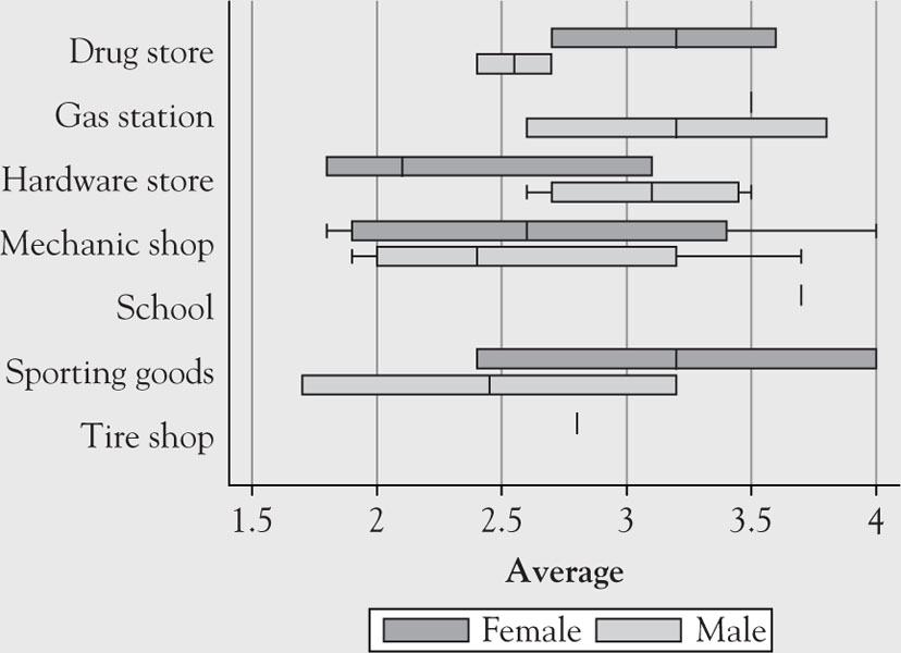
Figure 1.8. Box plot of income by location and by gender.