Chapter 11
Simple Linear Regression
Linear regression is a statistical method for determining the relationship between one or more independent variables and a single dependent variable. In this chapter we look at what is called simple linear regression. Simple linear regression is the relationship between a single independent variable and a single dependent variable.
11.1 Meaning and Calculation of Linear Regression
Linear regression is a method of organizing data that uses the least squares method to determine which line best fits the data.
To examine what is meant by the relationship between an independent variable and a dependent variable, consider the four graphs shown in Figure 11.1. The figure shows examples of four different possible relationships between two variables. The black points in each graph represent individual observations (50 in all but difficult to count). The horizontal axis (from 0 to 20) represents the value of any individual observation on the independent variable. This variable is commonly designated x. The vertical axis (from 0 to 20) represents the value of each individual observation on the dependent variable. The dependent variable is commonly designated y. So if one looks at the point farthest to the right in chart (a), that individual observation has a value of approximately 15 on the variable x (the horizontal axis) and 15 on the variable y (the vertical axis). If we look at the point farthest to the right in chart (b), that observation has a value of approximately 15 on the variable x, but about 5 on the variable y.
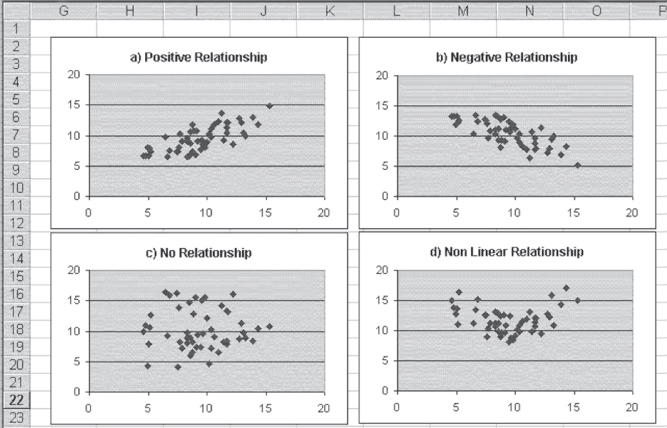
Figure 11.1 Examples of relationships
Analyzing Relationships between Dependent and Independent Variables
Each of the charts in Figure 11.1 demonstrates a possible relationship, briefly described in the chart title, between the variable x and the variable y. Chart (a) shows a positive relationship between x and y. This means that observations with larger values of x tend also to have larger values of y. Chart (b) shows a negative relationship between x and y. In this case, observations with larger values of x tend to have smaller values of y. In general, knowing something about x in either chart (a) or chart (b) will allow you to predict something about y even if you have no other knowledge of y.
Chart (c) shows another type of relationship between x and y—in this case, no relationship at all. In chart (c), observations with small values of x tend to have both large and small values of y, and observations with large values of x also appear to have both large and small values of y. In general, knowing something about the value of x is no better than knowing nothing about x in predicting values of y for data that conform to chart (c). Chart (d) shows yet a different type of relationship between x and y, one that is called a nonlinear relationship. In chart (d), knowledge of x will provide a better prediction of y than no knowledge of x, but because the relationship is not linear, simple linear regression, as discussed in this chapter, will not be adequate to describe the relationship. Simple linear regression will provide us with no useful information about chart (d).
Chapter 13 discusses ways to adapt regression analysis to deal with chart (d), but, for now, only linear relationships will be discussed. Producing charts with Microsoft Excel is important and fairly easy (see Chapter 2). Charts give us the ability to determine whether linear regression can adequately describe a relationship.
Linear Regression: Fitting a Line to Data
Linear regression can describe the data in chart (a) and chart (b) in Figure 11.1, but what does that mean? What it means is that the regression process will assign a best-fitting straight line to the data. What does best-fitting mean? We will soon provide a formal definition of best-fitting, but for now, think of it as a line through the data that goes through the means of both x and y and comes as close as possible to all the points in the data set. Consider specifically chart (a) in Figure 11.1. This chart is reproduced as Figure 11.2. In addition to the data points shown in Figure 11.1, Figure 11.2 shows the best-fitting straight line. This is the line that comes closest to all points in the data set while at the same time going through the true mean of both x and y.
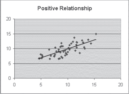
Figure 11.2 Positive relationship with the best-fitting straight line
A straight line in a two-dimensional space (the space defined by the values of x on the horizontal axis and y on the vertical axis) can be described with an equation, as shown in Equation 11.1. Any point on the line is the joint graphing of a selected value of x and the value of y defined by Equation 11.1. If we know that b1 is 0.5 and b0 is 2, then if x is 5, y will be 4.5. If x is 10, y will be 7. If x is 0, y will be 2.
The Equation of a Line: Slope Intercept Form
In Equation 11.1, the two coefficients b1 and b0 have particular meanings. The coefficient b1 is frequently referred to as the slope of the line. In concrete terms, b1 is the distance the line rises in a vertical direction as x increases by one unit. So if x increases from 2 to 3, y increases by one half unit. The coefficient b0 is frequently referred to as the intercept of the line. It represents specifically the point at which the line crosses the y-axis, or the value of y when x is equal to 0.
If we are representing the points in Figure 11.2 with the best-fitting straight line, we must recognize that most of the points do not fall on the straight line. Actually, almost none of them do. To account for this, the equation shown in Equation 11.1 is likely to be modified in one of two ways, both shown in Equation 11.2. The representation in Equation 2a indicates that the straight-line equation is only an estimate of the true value of y. The ![]() designation (pronounced y hat by statisticians) indicates that the value produced by the straight-line equation is an estimate of the true value of y. The representation in Equation 2b is the actual value of y rather than an estimate. The e at the end of the equation indicates that some value e (termed the error) must be added to the formula in order to produce the true value of y.
designation (pronounced y hat by statisticians) indicates that the value produced by the straight-line equation is an estimate of the true value of y. The representation in Equation 2b is the actual value of y rather than an estimate. The e at the end of the equation indicates that some value e (termed the error) must be added to the formula in order to produce the true value of y.
What Does Regression Mean in Practical Terms?
To get a better understanding of what a straight-line prediction of y by x means in practical terms, let us consider 20 hospital admissions, the length of stay of each admission, and the charges for the stay. Figure 11.3 shows data on 20 hospital admissions that were randomly selected from a file of 2,000 admissions. First, regression is a statistical test of the independence of the two variables—the length of stay and the total charges. The implicit null hypothesis is that the two variables are independent. If we reject that null hypothesis, we are left with the conclusion that the two variables are dependent on each other. But the nature of this dependence is very explicit. If we look back at Equations 2a or 2b, either indicates explicitly that the value of y is dependent on the value of x but not the other way around. In terms of the data shown for the 20 hospital stays in Figure 11.3, it is quite likely that total charges are dependent on the length of stay. However, it would make little logical sense to suggest that the length of hospital stay was dependent on what was charged for the stay.
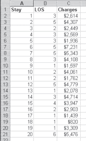
Figure 11.3 Twenty hospital stays
Furthermore, what does it mean to reject the null hypothesis of independence? Because regression deals with linear relationships, rejecting the null hypothesis of independence would mean finding a linear relationship between, for example, the length of stay and the charges for which the slope of the line could be determined to be different from zero. To see if it is likely that we will be able to find such a straight line, consider the graph of the length of stay and the charges as shown in Figure 11.4. In Figure 11.4 it is possible to see that the data from the 20 hospitals suggest that as the length of stay increases, total charges also increase. The short lengths of stay have the lowest costs, and the longer lengths of stay have the highest costs. The single 10-day stay has the highest cost of all.
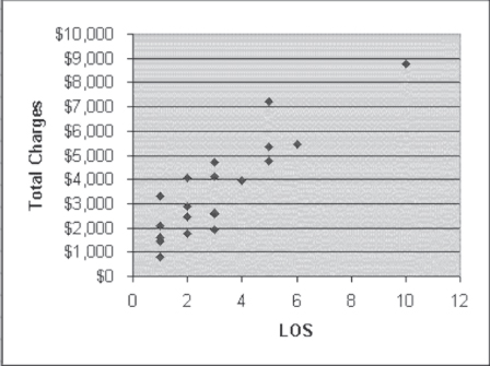
Figure 11.4 Length of stay and charges
The Linear Relationship: How Is it Determined?
The data also appear to show a linear relationship. It is relatively easy to imagine a straight line that begins at about $2,000 when LOS is 1 day and then goes up to about $9,000 when LOS is 10 days. Imagining such a straight line, we could say that its slope—that is, the change in the dollar value of total charges as LOS changes by one day—is the difference between $2,000 and $9,000, divided by the difference between 1 day of stay and 10 days of stay. If we accept this logic, the slope of the straight line through the data in Figure 11.4 could be tentatively calculated as given in Equation 11.3. From a practical standpoint, then, we could conclude that for these hospitals (and the hospitals from which the sample of 20 was taken), as the length of stay increases by one day, the total charges increase by $777.78.
Furthermore, by finding the dollar value of the straight line at any point along its path, we can predict what the actual dollar value of any number of days of stay will be. Typically, the dollar value that is used as the reference point for setting the position of the line for all points is the dollar value of 0 on the x-axis. Although a hospital stay of zero days may not actually exist, the straight line through the data will cross the y, or vertical, axis at some point. That point, known as the intercept, could be calculated as $2,000 (the cost of a one-day stay) minus $777.78 (the slope of the line) or, as given in Equation 11.4, $1,222.22.
Based on the simple expedient of imagining where the straight line runs through the data in Figure 11.4, we come up with the predictor equation for charges, as shown in Equation 11.5.
Equation 11.5 matches the format of a straight line, as it is given in Equation 11.1. What does this mean in practical terms? It means that if a hospital wishes to project the cost of any length of stay in the hospital, it can do so by multiplying the length of stay by $777.78 and adding a constant amount of $1,222.22. Although this will not indicate precisely what the charges for any individual stay will be, it can be a good guideline on the average.
But before we can accept this result as a good guideline for anticipating the total charges, we must be able to reject the null hypothesis of independence between the charges and the length of stay. We have so far done nothing that would allow us to reject that null hypothesis, although we would feel, just by looking at the data in Figure 11.4, that we should reject that hypothesis in favor of the explicit hypothesis given in Equation 11.5. Equation 11.5 states that charges are dependent on the length of stay. Furthermore, though we have found a line that may seem to fit the data, we may not necessarily have found the best-fitting straight line. Both of these issues are taken up in the next section.
Calculating Regression Coefficients
In the previous section we considered how we might estimate regression coefficients based on a simple examination of the plot of the data in a two-dimensional space. In this section we actually calculate the coefficients, using formulas that produce the exact coefficients b1 and b0. These coefficients are then used to create the best-fitting straight line through the data. At this point, it is probably useful to define the best-fitting straight line formally. The best-fitting straight line is the line that minimizes the sum of squared differences between each individual data point and the line predicted by the coefficients. The formal definition of a best-fitting straight line can be seen in Equation 11.6.
Given the formal definition of a best-fitting straight line, as shown in Equation 11.6, the two formulas for the coefficients b1 and b0 are as given in Equations 11.7 and 11.8. The formulas in Equations 11.7 and 11.8 are derived using calculus.
The regression coefficient is the ratio of the covariation between both variables to the variation of the independent variable.
Some discussion of the derivation is developed in Chapter 12, but there is no assumption that you need to understand calculus in order to proceed.

Given the formulas in Equations 11.7 and 11.8, it is possible to proceed to find the coefficients for the best-fitting straight line mathematically rather than rely on the eyeball method. The calculations for finding the coefficients are developed in Figure 11.5.
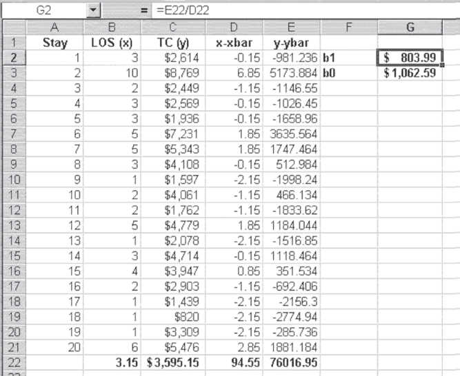
Figure 11.5 Calculation of coefficients
Using Excel to Calculate the Regression Coefficients
In Figure 11.5, the means of the length of stay and the total charges are shown in cells B22 and C22, respectively. Each value of x minus the mean of x is shown in column D, and each value of y minus the mean of y is shown in column E. Cell D22, which is the denominator in the formula in Equation 11.7, takes advantage of the Excel =SUMSQ() function, which finds the sum of the squares of a stream of numbers. In this case, the function was invoked as =SUMSQ(D2:D21). Cell E22, which is the numerator in the formula in Equation 11.7, takes advantage of the Excel =SUMPRODUCT() function, which finds the sum of the product of two streams of numbers. In this case, the function was invoked as =SUMPRODUCT(D2:D21,E2:E21). The value of b1, shown in cell G2, was calculated, as the formula bar shows, by dividing the value in cell E22 by that in cell D22. The value of b0, shown in cell G3, was calculated by subtracting cells B22*G2 from cell C22.
The result of this calculation is the set of coefficients b1 and b0 for a best-fitting straight line through the data, as defined by Equation 11.6. Although the coefficients are not exactly the same as those estimated by the eyeball method in the first subsection of Section 11.1, they are certainly of the same order of magnitude. Table 11.1 displays the formulas for the calculation of the linear regression coefficients in Figure 11.5.
Table 11.1 Formulas for Figure 11.5
| Cell or Column | Formula | Action/Note |
| B22 | =AVERAGE(B2:B21) |
|
| C22 | =AVERAGE(C2:C21) |
|
=B2−B$22 |
Copied from cells D2:D21 | |
| E2 | =C2−C$22 |
Copied from cells E2:E21 |
| D22 | =SUMSQ(D2:D21) |
|
| E22 | =SUMPRODUCT(D2:D21,E2:E21) |
|
| G2 | =E22/D22 |
|
| G3 | =C22−G2*B22 |
11.2 Testing the Hypothesis of Independence
We have determined the coefficients for the straight-line equation that best fits the data in Figures 11.4 and 11.5. The question now is, can we use this information to determine whether we will accept or reject the implicit null hypothesis of independence between the charges and the length of stay? In looking at the data, it appears clear that we should reject the null hypothesis, because the points so clearly show that as the length of stay increases, the charges increase. But we can calculate both a measure of the degree of this relationship and a statistical test for the null hypothesis.
Calculation of Total Variance
Both the calculation of the degree of the relationship and the statistical test (an F test) for the null hypothesis depend on calculating variances. In this case, the variances are all with respect to the dependent variable, y. The total variance in y is as shown in Equation 11.9, which is the mean of y subtracted from each value of y and the result squared and then summed across all values of y (thus SST, which stands for sum of squares—total).
Dividing the Total Variance: Regression Variance and Error Variance
The total variance in y can be considered as being divided into two portions. One portion is that which can be accounted for with the knowledge of the regression coefficients. This portion is termed sum of squares due to regression, or SSR, and shown in Equation 11.10. The second portion is that which cannot be accounted for with the knowledge of the regression coefficients. This portion is termed sum of squares due to error, or SSE, shown in Equation 11.11. In both Equations 11.10 and 11.11, the representation is as given in Equation 11.2. Also, SST = SSR + SSE.
Calculating the Degree of Relationship: R2 or Coefficient of Determination
The calculation of the degree of the relationship between the length of stay and the charges is the calculation of a ratio of the amount of variation that can be accounted for by the regression line and the total variation. This ratio is sometimes called the coefficient of determination but is almost universally referred to as R2. The formula for R2 is given in Equation 11.12.
The calculation of the degree of the relationship between the length of stay and the charges is the calculation of a ratio of the amount of variation that can be accounted for by the regression line and the total variation.
The calculation of R2 is given in Figure 11.6, in which several of the calculations deserve explanation. The values in cells H2:H21 are calculated using the formula in Equation 2a. These are the predicted values of y(![]() ), based on the regression coefficients in cells G2 and G3. It should be noted that the average of the predicted values is exactly the same as the average of the actual values of y. This will always be true and is a way to check the accuracy of calculations. The values in cells I2:I21 represent the difference between the predicted values of y and the mean of y(
), based on the regression coefficients in cells G2 and G3. It should be noted that the average of the predicted values is exactly the same as the average of the actual values of y. This will always be true and is a way to check the accuracy of calculations. The values in cells I2:I21 represent the difference between the predicted values of y and the mean of y(![]() ). The mean of this column, shown in cell I22, should always be 0. The values in cells J2:J21 represent the difference between each value of y and the predicted values of y (
). The mean of this column, shown in cell I22, should always be 0. The values in cells J2:J21 represent the difference between each value of y and the predicted values of y (![]() ). Again, the mean of these data, shown in cell J22, will always be 0.
). Again, the mean of these data, shown in cell J22, will always be 0.
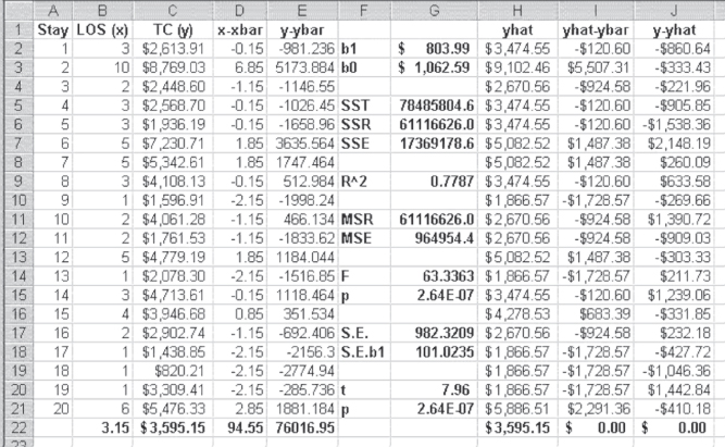
Figure 11.6 Calculation of R2 and F
The total sum of squares (SST), shown in cell G5, were calculated using the =SUMSQ() function on cells E2:E21. The sum of squares that can be accounted for by the regression equation (SSR)—typically called the sums of squares due to regression—were calculated using the =SUMSQ() function on cells I2:I21. R2, shown in cell G9, was calculated by Equation 11.12. The value of R2 can range from 0.00 to 1.00 and literally means the proportion of variation in the dependent variable y that can be predicted, knowing the values of the independent variable x and the coefficients for the best-fitting straight line through the data. In this case, 78 percent of the variation in charges can be accounted for by knowledge of the length of stay. Table 11.2 displays the formulas for the calculation of R2 and F for Figure 11.6.
Table 11.2 Formulas for Figure 11.6
| Cell or Column | Formula | Action/Note |
| H2 | =G$2*B2+G$3 |
Copied from cells H2:H21 |
| H22 | =AVERAGE(H2:H21) |
|
| I2 | =H2−C$22 |
Copied from cells I2:I21 |
| J2 | =C2−H2 |
Copied from cells J2:J21 |
| I22 | =SUM(I2:I21) |
|
| J22 | =SUM(J2:J21) |
|
| G5 | =SUMSQ(E2:E21) |
|
| G6 | =SUMSQ(I2:I21) |
|
| G7 | =SUMSQ(J2:J21) |
|
| G9 | =G6/G5 |
|
| G11 | =G6/1 |
G6 is divided by 1 because the degrees of freedom is 1. |
| G12 | =G7/18 |
G6 is divided by 18 because the degrees of freedom is 20 minus 2. |
| G14 | =G11/G12 |
|
| G15 | =FDIST(G14,1,18) |
Degrees of freedom are 1 and 18 for the =FDIST() function. |
| G17 | =SQRT(G7/18) |
Eighteen is the degrees of freedom or n − 2, n = 20. |
| G18 | =G17/SQRT(D22) |
|
| G20 | =G2/G18 |
|
| G21 | =TDIST(G20,18,2) |
=TDIST() contains three arguments: the first is the calculated t value, the second the degrees of freedom, and the third a 1 or a 2, indicating a one-tailed or two-tailed test. Here we choose 2 as we are conducting a two-tailed test. |
Understanding Explained versus Unexplained Variance
The sum of squares due to error (SSE)—that proportion of the variation in y that cannot be accounted for by knowledge of x, shown in G7—are calculated using the =SUMSQ() function on cells J2:J21. The unexplained portion of the variation, SSE, accounts for the 22 percent of the variation in charges that cannot be accounted for by knowing the length of stay. The portion of the variation that can be accounted for by regression is known also as the explained variance, and the portion that cannot be accounted for is known as the unexplained variance.
It might be useful to consider again what explained variance and unexplained variance mean in terms of the chart first shown in Figure 11.4. That chart is reproduced in Figure 11.7, with several additions. The solid line sloping from the lower left to the upper right is the best-fitting straight line through the points, as defined by the regression coefficients calculated in Figure 11.6. The dashed horizontal line represents the mean of the points shown in cell C22 in Figure 11.6. There are three labeled brackets. The bracket labeled ![]() represents the total variation for the length of stay of five days, shown in cell B7 in Figure 11.6. That bracket represents the value of charges for that stay—$7,230.71—minus the mean charges for all stays—$3,595.15, or $3,635.56. The bracket labeled
represents the total variation for the length of stay of five days, shown in cell B7 in Figure 11.6. That bracket represents the value of charges for that stay—$7,230.71—minus the mean charges for all stays—$3,595.15, or $3,635.56. The bracket labeled ![]() represents the difference between the predicted value for that stay—$5,082.52—and the mean of all stays—$3,595.15, or $1,487.38. This is the portion of the variation in the charges for this stay that can be predicted using the regression equation. The bracket labeled
represents the difference between the predicted value for that stay—$5,082.52—and the mean of all stays—$3,595.15, or $1,487.38. This is the portion of the variation in the charges for this stay that can be predicted using the regression equation. The bracket labeled ![]() represents the difference between the actual charges for this particular stay—$7,230.71—and the predicted value of $5,082.52, or $2,148.19. This is the portion of the variation in the charges for this stay that cannot be predicted with the regression equation. When all these differences for each point are squared and summed, the values of SST, SSR, and SSE are generated.
represents the difference between the actual charges for this particular stay—$7,230.71—and the predicted value of $5,082.52, or $2,148.19. This is the portion of the variation in the charges for this stay that cannot be predicted with the regression equation. When all these differences for each point are squared and summed, the values of SST, SSR, and SSE are generated.
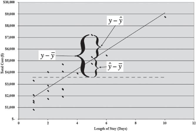
Figure 11.7 Total variance, regression variance, and error variance
Testing the Null Hypothesis: Is the Model Predicting Well?
The R2 value tells us the degree of relationship between the length of stay and charges. In this case, the length of stay accounts for 78 percent of the variance in the charges. This would generally be considered a very high degree of relationship. But still not yet discussed explicitly is the resolution of the question of whether we can reject the null hypothesis of independence between the two variables. The resolution of that question is given formally by the F test shown in cell G14 in Figure 11.6. This F test is calculated by the formula given in Equation 11.13, the formula in which is usually described as the division of the mean square due to regression by the mean square error. The mean square values are found by dividing SSR and SSE by their respective degrees of freedom.
where
Interpreting the F Test
The F value shown in cell G14 of Figure 11.6 is 63.33, a relatively large value of F. The probability of this F is given in cell G14 as 2.64E-07. This indicates that the F value calculated would have been found approximately three times out of 10 million different samples of 20 observations if charges were independent of the length of stay. Because this is an extremely small probability, we reject the null hypothesis of independence and conclude that the two variables are, in fact, not independent. In other words, charges and length of stay are related.
There are several additional values in Figure 11.6. These include the overall standard error of estimate (S.E.) in cell G17, the standard error of b1 (S.E. b1) in cell G18, a t test in cell G20, and the probability of the t in cell G21. Each of these deserves some discussion.
Calculating Standard Error and t Tests
The standard error shown in cell G17 is the average error of the actual observations around the regression line shown in Figure 11.7. It is calculated using the formula given in Equation 11.14.
The standard error of b1 (S.E. b1 in cell G18) is the average variation of the coefficient, b1. The coefficient b1 in any regression analysis is a sample-based estimate of the true population coefficient b1. As a sample mean value ![]() , an estimate of the true population mean m has a range within which there is a probability of the true mean being found; so, too, the coefficient, b1, has a similar range. That range is determined by the S.E. b1. But the S.E. b1 also serves another function. Just as a t test can be conducted by dividing appropriate mean values by their standard errors, a t test can be conducted to determine whether the coefficient b1 is different from 0. If the t test does not produce a t value large enough to reject the implied null hypothesis that b1 is 0, the conclusion would have to be that the null hypothesis of independence of the variables x and y would be rejected. The standard error of b1 is calculated using the formula in Equation 11.15.
, an estimate of the true population mean m has a range within which there is a probability of the true mean being found; so, too, the coefficient, b1, has a similar range. That range is determined by the S.E. b1. But the S.E. b1 also serves another function. Just as a t test can be conducted by dividing appropriate mean values by their standard errors, a t test can be conducted to determine whether the coefficient b1 is different from 0. If the t test does not produce a t value large enough to reject the implied null hypothesis that b1 is 0, the conclusion would have to be that the null hypothesis of independence of the variables x and y would be rejected. The standard error of b1 is calculated using the formula in Equation 11.15.
t Test versus F Test: Why Calculate Both?
The t test to determine if b1 is different from 0 is shown in Equation 11.16, and the value of the t test for the length of stay and the charges is shown in cell G20 in Figure 11.6. The probability of the t test is shown in cell G21. You will note that it is exactly the same as the probability of the F test in cell G15. This is no accident. In simple linear regression with a single predictor variable, the probability of the F test will always be the same as the probability of the t test. This is because the F test of the general hypothesis of independence is exactly the same as the t test of the null hypothesis that the coefficient b1 is zero. In multiple regression, which we will take up in Chapter 12, the F test and the individual t tests for regression coefficients will not have the same probabilities. Therefore, we must calculate both the F statistic and the associated t statistics.
What to Do about the Intercept, b0?
It is useful to note that there is no comparable test in this analysis to determine whether the coefficient b0 is different from zero. In this analysis no standard error for b0 has been determined, but the primary reason no test for b0 is conducted is that whether b0 is different from 0 has no bearing on the rejection or nonrejection of the null hypothesis of independence. The coefficient b0 is simply an anchor for the left side of the regression line. Whether it is 0 or different from 0 is usually not central to the analysis. In the analysis discussed here, no value for b0 has even been found. We will see when we move to multiple regression, however, that a value for the standard error of b0 will be produced by the analysis.
11.3 The Excel Regression Add-In
Now that we have worked through the steps of regression analysis, we can look at the capabilities of the Excel regression add-in. When Data Analysis is invoked, the dialog box shown again in Figure 11.8 will appear. When Regression is selected, as it is in the figure, the Regression dialog box, shown in Figure 11.9, appears. In Figure 11.9, several things should be noted. First, the field labeled Input Y Range contains the cell reference to the y variable, total charges, which is in cells C1:C21. The field labeled Input X Range contains the cell references for length of stay, which is in cells B1:B21. The box named Labels is checked, indicating that the first row in each column is a label. If cells B1 and C1 were not included in the input range fields and the Labels box were checked, Excel would treat the values 3 for the length of stay and $2,613.91 as labels and would not include that observation in the analysis.
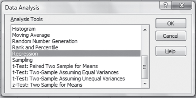
Figure 11.8 Excel Data Analysis add-in dialog box

Figure 11.9 Regression dialog box
The box labeled “Constant is Zero” should never be checked. There is an analysis known as weighted least squares that involves the assumption that the constant is 0, but, in general, that box should be left unchecked. The confidence level is given as 95 percent by default. It is possible to change this to another level by checking the Confidence Level box. The final item in the Regression dialog box that must be indicated is where the output is to go. It can go on the same sheet, on a new worksheet, or in a new workbook. If we check the Output Range radio button and then enter E1 in the corresponding field, the output will be placed on the same sheet in cell E1. Several other options in this dialog box produce additional results, but in general we will not use those in this book.
Linear Regression in Excel Using the Data Analysis Package: Step-by-Step Instructions
Follow these step-by-step instructions to invoke the Data Analysis package in Excel and complete the required inputs for linear regression analysis.
- Go to the Data ribbon, in the Analysis group, and click the Data Analysis option.
- A dialog box (Figure 11.8) will appear. Here, choose the Regression option. Another dialog box (Figure 11.9) will appear.
- In the Input Y Range field, enter $C$1:$C$21 or highlight cells C1 through C21.
- In the Input X Range field, enter $B$1:$B$21 or highlight cells B1 through B21.
- Click the Output Range radio button, and enter $E$1.
- Click OK, and the Regression output will be created.
Analyzing the Excel Regression Output
Clicking OK in the Regression dialog box (Figure 11.9) will produce the results shown in Figure 11.10. The table shown here is exactly as it appears in the regression output for any set of data. The labels cannot be completely seen because the column is not wide enough—for example, Adjusted R in cell E6 is actually Adjusted R square. Similarly, andard Err in cell G16 is really Standard Error, but the cell is too narrow for the entire title to show. It is possible to see the entire titles by putting the cursor between, for example, columns E and F at the top of the sheet and double-clicking. But after a little use, the absence of complete labels will not be a problem.
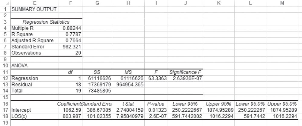
Figure 11.10 Results of using the regression add-in
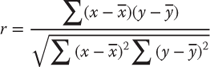
But let us look at the various different numbers that are produced by the regression analysis add-in. The first number in the table is labeled Multiple R. This value, which is often called the correlation coefficient, represents the correlation between the two variables, x and y. The correlation coefficient can be calculated by the formula shown in Equation 11.17. It can also be found by taking the square root of R2 in cell G9 in Figure 11.6. One caveat to taking the square root of R2 to find r, however, is that r may be negative or positive. If the value of b1 is negative, the actual value of r in two-variable linear regression will be negative. However, the Multiple R shown in the Excel regression result will always be positive.
- Multiple R Multiple R represents the strength of the linear relationship between the actual and the estimated values for the dependent variables. The scale ranges from −1.0 to 1.0, where 1.0 indicates a good direct relationship and −1 indicates a good inverse relationship.
- R Square R2 is a symbol for a coefficient of multiple determination between a dependent variable and the independent variables. It tells how much of the variability in the dependent variable is explained by the independent variables. R2 is a goodness-of-fit measure, and the scale ranges from 0.0 to 1.0.
- Adjusted R Square In the adjusted R square, R2 is adjusted to give a truer estimate of how much the independent variables in a regression analysis explain the dependent variable. Taking into account the number of independent variables makes the adjustment.
- Standard Error of Estimates
The standard error of estimates is a regression line. The error is how much the research is off when the regression line is used to predict particular scores. The standard error is the standard deviation of those errors from the regression line. The standard error of estimate is thus a measure of the variability of the errors. It measures the average error over the entire scatter plot.
The lower the standard error of estimate, the higher the degree of linear relationship between the two variables in the regression. The larger the standard error, the less confidence can be put in the estimate.
- t Statistic
The rule of thumb says the absolute value of t should be greater than 2. To be more accurate, the t table has been used.
The critical values can be found in the back of most statistical textbooks. The critical value is the value that determines the critical regions in a sampling distribution. The critical values separate the obtained values that will and will not result in rejecting the null hypothesis.
- F Statistic
The F statistic is a broad picture statistic that intends to test the efficacy of the entire regression model presented.
A hypothesis is tested that looks at H0: B1 = B2 = 0. If this hypothesis is rejected, this implies that the explanatory variables in the regression equation being proposed are doing a good job of explaining the variation in the dependent variable Y.
The R2 value shown in cell F5 is exactly the same value as that calculated for R2 by using the formula shown in Equation 11.12 and as given in cell G9 in Figure 11.6.
The adjusted R square (cell E6) represents the reduction of the actual R2 to reflect the number of independent variables in the prediction equation (as shown in Equation 11.2). The terms “independent variables,” “regressors,” and “predictor variables” are all considered synonymous. In the case of two-variable regression, there is always only one independent variable. In turn, the adjusted R2 is very close to the R2 value. However, the more independent variables, regressors, or predictor variables that are included in the regression equation, the larger will be the R2. This is because every additional independent variable reduces the size of SSE. To counter this, the adjusted R2 reduces the value of R2 to reflect this decrease in SSE. The formula for the adjusted R2 is shown in Equation 11.18. More is said about the adjusted R2 in Chapter 12.
The standard error, what we labeled S.E. in Figure 11.6 (cell G17), is shown in cell F7 of the Excel regression output (Figure 11.10). The number of observations—20—is confirmed in cell F8 in Figure 11.10. The ANOVA section of the Excel regression output also matches our previous calculations. SS Regression in Figure 11.10, cell G12 at 61,116,626, matches the value of SSR in cell G6 in Figure 11.6. A brief examination of the two figures will show that all the SS values and MS values in Figure 11.10 match their corresponding values in Figure 11.6. The F test value of 63.336 is the same in both figures, as is the probability of F, 2.64E-07.
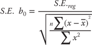
Similar results are found with regard to the coefficients themselves. The coefficients b1 and b0, shown as LOS(x) and Intercept, respectively, in Figure 11.10, are the same in both figures, as is the standard error of b1. The standard error of b0 was not calculated in Figure 11.6. In general, whether b0, the intercept term, can be shown to be different from 0 is irrelevant to the decision to reject the null hypothesis of independence between the two variables in the analysis. The intercept represents no more than an anchor to establish the position of the regression line. But because the standard error of b0 is given in the Excel regression output, it is useful to know how it can be calculated. The formula for the standard error of b0 is given in Equation 11.19. Although Σx2 is not calculated in Figure 11.6, it is easy to confirm with =SUMSQ(C2:C21) that it is 293, and the term in the denominator in Equation 11.19 is ![]() , which gives a value for S.E. b0 of 386.67.
, which gives a value for S.E. b0 of 386.67.
The t statistic for the coefficient b1 as shown in Figure 11.10 was calculated in cell G20 in Figure 11.6. These both match, as do their probabilities. The t statistic for b0 was not calculated in Figure 11.6, but if it had been, it would have equaled that found in the Excel regression output. The last four columns in rows 16 to 18 in Figure 11.10 give upper and lower 95 percent limits for the coefficients b1 and b0. If the user requests a level of confidence other than 95 percent, the upper and lower limits will then be given as the last two sets of cells. These values, though not found in Figure 11.6, can be found in exactly the same way that upper and lower 95 percent limits are found for a mean value. The lower value of 591.744, for example, which is shown in cell J18 (and L18) in Figure 11.10, is calculated exactly as shown in Equation 11.20. The other limits can be found in the same way.
11.4 The Importance of Examining the Scatterplot
The scatterplots shown in Figure 11.1 provide one example of data not appropriate for two-variable regression: chart (d). This relationship is curvilinear and, consequently, is not best described by using a straight line. This section looks at some other cases in which regression analysis must be used very carefully. The presentation in this section is inspired by a similar presentation in Statistics for Managers Using Microsoft Excel (Levine, Stephan, and Szabat [2007]; Levine, Stephan, and Szabat, [2013]) and Spreadsheet Modeling for Business Decisions (Kros [2014]).
A scatterplot is a way to graphically display a collection of points, each having the value of one variable determining the position on the horizontal axis and the value of the other variable determining the position on the vertical axis.
Four different data sets are shown in Figure 11.11. For each of these data sets, the best-fitting straight line is defined by the equation y = 0.50x + 1.55. (The best-fitting straight line for data set 4 is actually y = 0.51x + 1.55.) If you calculate the regression coefficients b1 and b0 for each of these data sets, they will be essentially equal for each data set. But only one of these data sets could be considered appropriate for simple linear regression with one predictor variable, x.
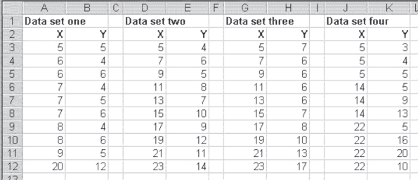
Figure 11.11 Four data sets
Visual Inspection of the Scatterplots: Attempting to Identify Relationships
The xy scatterplots of these four data sets, along with the best-fitting straight lines, are shown in Figure 11.12. When looking at this figure, it should be possible to see why only one of these data sets—data set 2—is appropriate for simple linear regression analysis. Although the equation for the best-fitting straight line for data set 1 is exactly the same as that for data set 2, that line depends entirely on the value at x = 520 and y = 12. If that value were not included, the coefficient of b1 would have been 0 and there would be no relation between x and y at all. In essence, the entire relationship found between x and y in this case depends on a single data point. The single data point in this case is often called an outlier. When outliers are present, it is important to decide whether they are unduly affecting the regression results.
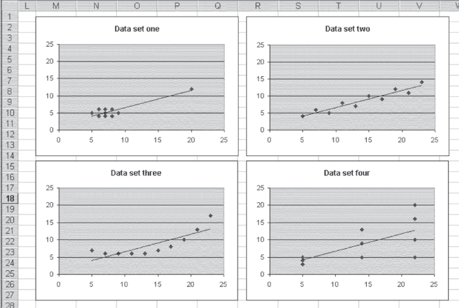
Figure 11.12 Scatterplots of four data sets where y = .5x + 1.55
Data set 3 is inappropriate for simple linear regression because the data actually show a curved relationship between x and y. Regression can be used to describe the data in data set 3, but it must be curvilinear regression, which is taken up in Chapter 13. In essence, a straight-line relationship between x and y is not the correct model for describing the way the x variable affects the y variable in data set 3.
Examining the Variance of the Data: The Constant Variance Assumption
Data set 4 may be a little more difficult to see as being inappropriate for simple linear regression. The points do tend to lie along the straight line defined by the regression equation. However, they do not seem to depict a nonlinear relationship as in data set 3, and the line is not defined by a single outlier as in data set 1. The problem with the use of simple linear regression to analyze data set 4 is that the variance in the data is not the same at each point where a value of x is recorded. When x is 5, the three values taken on by y have an average variance (the difference between each value of y at x = 5 and the mean of the values of y at x = 5 divided by the number of values of y at x = 5) of 0.33. The three values taken on by y when x = 14 have an average variance of 5.33. The four values taken on by y when x = 22 have an average variance of 10.89.
One of the basic assumptions of simple linear regression is that the variance of y across all values of x is constant. In the case of the data in data set 4, this is clearly not the case. As the value of x increases, the variance in y increases. Most authors of statistics texts agree that the results of regression analysis are not greatly affected by violating this assumption of equal variance. More important, the more appropriate analysis of the data in data set 4 would be an analysis called weighted least squares. Weighted least squares are discussed in Chapter 14, but in a different context. For those interested in a general treatment of weighted least squares, any good introductory text in econometrics will provide a discussion of its calculation and use.
11.5 The Relationship between Regression and the t Test
This section considers the relationship between regression and the t test. Remember that t tests were discussed in Chapter 9. The one that is particularly examined here is the t test for two different groups. Consider the example given in Chapter 9 of the two groups of women, one of which received information from a physician about breast cancer and the other of which received only written information. In turn, the question that was asked was, “Between the two groups, did this result in different knowledge about breast cancer?” The results of the t test, with both equal and unequal variance assumptions, were shown in Figures 9.10 and 9.11. The mean knowledge assessment scores for the two groups were 10.040 for the women who received information from a physician and 7.525 for the women who received only a pamphlet. For the equal variance assumption, the pooled variance was 0.762 and the value of the t statistic ((10.040 − 7.525)/0.762) was 3.3.
Using Excel's Regression Function to Perform a t Test
Figure 11.13 shows the data for the comparison between the two groups redone using regression analysis. The dependent variable in the regression is the score received by each woman, whether in the experimental or control group, on the knowledge test. The independent variable is a variable that is coded 1 if the woman is in the experimental group and 0 if she is not. Such a variable is called a dummy variable, probably because it does not actually represent a numerical variable but, rather, serves as a categorical variable that can be treated as a numerical variable.
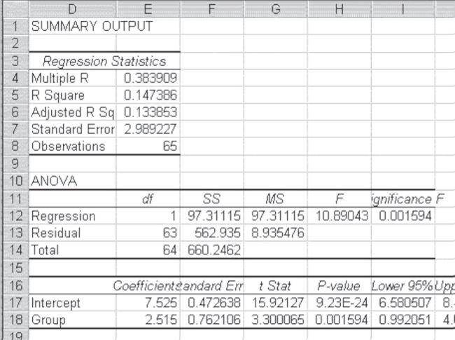
Figure 11.13 Regression as a t test
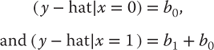
In examining Figure 11.13, it is possible to see that the Intercept term in cell E17 (7.525) is the mean of the control group. The coefficient indicated as Group is the coefficient on the dummy variable that takes on only the values 1 and 0. As such, the value of 2.515 is not a slope but is, rather, the value that is added to the intercept to get the mean of the experimental group. It is easy to see that 7.525 + 2.515 = 10.040. Furthermore, it is possible to see that the t test on the coefficient for group, which is precisely the difference between the control group and the experimental group divided by the pooled variance (0.762), is exactly the same as the t test for two groups assuming equal variance. This will always be the case. Whenever a dummy variable is employed in regression, the coefficient will be the difference between the mean of the group coded 0 and the mean of the group coded 1. The t test for the coefficient will be exactly the same as the t test for the difference in means.
It is important to note that when a variable is employed in a regression context, a dummy actually defines two different regression equations. In this simple case of a single dummy variable, the original regression equation, shown in Equation 11.21, actually becomes two equations as shown in Equation 11.22. It should be clear that these values are just the mean of the group designated 0 and the group designated 1 by the dummy variable, respectively.