
3.1. Asset Stock Accumulation
Asset stock accumulation is a very important idea in system dynamics, every bit as fundamental as feedback and in fact complementary to it. You can't have one without the other. Asset stocks accumulate change. They are a kind of memory, storing the results of past actions. When, in a feedback process, past decisions and actions come back to influence present decisions and actions they do so through asset stocks. Past investment accumulates in capital stock – the number of planes owned by an airline, the number of stores in a supermarket chain, the number of ships in a fishing fleet. Past hiring accumulates as employees – nurses in a hospital, operators in a call centre, players in a football squad, faculty in a university. Past production accumulates in inventory and past sales accumulate in an installed base.
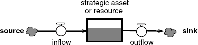
Figure 3.1. Asset stock accumulation in a stock and flow network
All business and social systems contain a host of different asset stocks or resources that, when harnessed in an organisation, deliver its products and services. Crucially, the performance over time of an enterprise depends on the balance of these assets and resources (Warren, 2002). An airline with lots of planes and few passengers is out of balance and unprofitable. Empty seats bring no revenue. A factory bulging with inventory while machines lie idle is out of balance and underperforming. Inventory is expensive.
To appreciate how such imbalances occur we first need to understand the nature of asset stock accumulation – how assets build and decay through time. A process of accumulation is not the same as a causal link. Accumulations change according to their inflows and outflows in just the same way that water accumulates in a bathtub. If the inflow is greater than the outflow then the level gradually rises. If the outflow is greater than the inflow then the level gradually falls. If the inflow and outflow are identical then the level remains constant. This bathtub feature of assets in organisations is depicted using the symbols in Figure 3.1. Here an asset stock or resource is shown as a rectangle, partially filled. On the left there is an inflow comprising a valve or tap superimposed on an arrow. The arrow enters the stock and originates from a source, shown as a cloud or pool. A similar combination of symbols on the right represents an outflow. In this case, the flow originates in the stock and ends up in a sink (another cloud or pool). The complete picture is called a stock and flow network.
Consider, for example, a simple network for university faculty as shown in Figure 3.2. Let's forget about the distinction between professors, senior lecturers and junior lecturers and call them all instructors. Instructors teach, write and do research. The stock in this case is the total number of instructors. The inflow is the rate of recruitment of new faculty - measured say in instructors per month, and the outflow is turnover - also measured in instructors per month. The source and sink represent the university labour market, the national or international pool of academics from which faculty are hired and to which they return when they leave. The total number of instructors in a university ultimately depends on all sorts of factors such as location, reputation, funding, demand for higher education and so on. But the way these factors exert their influence is through flow rates. Asset stocks cannot be adjusted instantaneously no matter how great the organisational pressures. Change takes place only gradually through flow rates. This vital inertial characteristic of stock and flow networks distinguishes them from simple causal links.
Figure 3.2. A simple stock and flow network for university faculty

3.1.1. Accumulating a 'Stock' of Faculty at Greenfield University
 The best way to appreciate the functioning of stocks and flows is through simulation. Luckily it is only a small step from a diagram like Figure 3.2 to a simulator. In the CD folder for Chapter 3, find the model called 'Stock Accumulation – Faculty' and open it. A stock and flow network just like Figure 3.2 will appear on the screen. To make this little network run each variable must be plausibly quantified. Imagine a new university called Greenfield. There is a small campus with some pleasant buildings and grounds, but as yet no faculty. The model is parameterised to fit this situation. Move the cursor over the stock of instructors. The number zero appears meaning there are no instructors at the start of the simulation. They will come from the academic labour market. Next move the cursor over the valve symbol for recruitment. The number five appears. This is the number of new instructors the Vice Chancellor and Governors plan to hire each month. Finally move the cursor over the symbol for turnover. The number is zero. Faculty are expected to like the university and to stay once they join. So now there is all the numerical data to make a simulation: the starting size of the faculty (zero), intended recruitment (five per month) and expected turnover (zero per month).
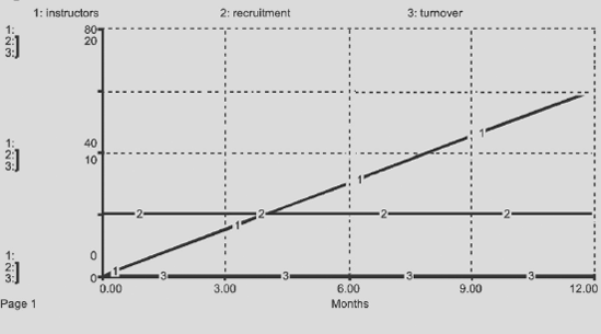
Press the 'Run' button. What you see is stock accumulation as the 'bathtub' of instructors gradually fills-up. This steady increase is exactly what you expect if, each month, new instructors are hired and nobody leaves. Now double click on the graph icon. A chart appears, a colour version of Figure 3.3, that plots the numerical values through time of instructors (line 1), recruitment (line 2) and turnover (line 3). The horizontal time axis spans 12 months. The number of instructors begins at zero and builds steadily to 60 after 12 simulated months. Meanwhile recruitment remains steady at five instructors per month and turnover is zero throughout. Numerically the simulation is correct and internally consistent. Recruitment at a rate of five instructors per month for 12 months will, if no one leaves, result in a faculty of 60 people. That's all very obvious, and in a sense, stock accumulation is no mystery. It is simply the result of taking the numerical difference, period by period, between the inflow and the outflow and adding it to the stock size. An equation shows the simple arithmetic involved:
Figure 3.3. Faculty size at Greenfield University – a 12-month simulation
Here, the number of instructors at time t (this month) is equal to the number of instructors at time t-dt (last month) plus the difference between recruitment and turnover for an interval of time dt. The interval is a slice of time convenient for the calculation, the so-called delta-time dt. So if dt is equal to one month then the calculation is a monthly tally of faculty. The initial value of instructors is set at zero.
All stock accumulations have the same mathematical form, no matter whether they represent tangible assets (machines, people, planes) or intangible assets (reputation, morale, perceived quality). The relationship between a stock and its flows is cumulative and naturally involves time. It is not the same as a simple causal link.[] The stock of instructors accumulates the net amount of recruitment and turnover through time. Mathematically speaking, the stock integrates its inflow and outflow. The process is simple to express, but the consequences are often surprising.
[] For more ideas on stock accumulation see Sterman (2000), Chapter 6, 'Stocks and Flows' and Warren (2002), Chapter 2, 'Strategic Resources – the Fuel of Firm Performance' and Chapter 7, 'The Hard Face of Soft Factors – the Power of Intangible Resources'.
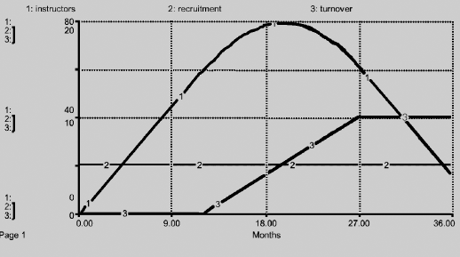
To illustrate, let's investigate a 36-month scenario for Greenfield University. Recruitment holds steady at five instructors per month throughout, but after 12 months some faculty are disillusioned and begin to leave. To see just how many leave, double click on the 'turnover icon'. A chart and table appear. The chart on the left shows the pattern of turnover across 36 months and the table on the right shows the corresponding numerical values at intervals of three months. For a period of 12 months, turnover is zero and faculty are content. Then people start to leave, at an increasing rate. By month 15 turnover is two instructors per month, by month 18 it is four instructors per month, and by month 21 it is six instructors per month. The upward trend continues to month 27 by which time faculty are leaving at a rate of ten per month. Thereafter turnover settles and remains steady at ten instructors per month until month 36. (As an aside it is worth noting this chart is just an assumption about future turnover regardless of the underlying cause. In reality instructors may leave Greenfield University due to low pay, excess workload, lazy students, etc. Such endogenous factors would be included in a complete feedback model.)
To investigate this new situation, it is first necessary to extend the simulation to 36 months. Close the turnover chart by clicking the 'OK' button. Then find 'Run Specs' in the pull-down menu called 'Run' at the top of the screen. A window appears containing all kinds of technical information about the simulation. In the top left, there are two boxes to specify the length of simulation. Currently the simulator is set to run from 0 to 12 months. Change the final month from 12 to 36 and click 'OK'. You are ready to simulate. However, before proceeding, first sketch on a blank sheet of paper the faculty trajectory you expect to see. A rough sketch is fine – it is simply a benchmark against which to compare model simulations. Now click the 'Run' button. You will see the 'bathtub' of faculty fill right to the top and then begin to empty, ending about one-quarter full. If you watch the animation very carefully you will also see movement in the dial for turnover. The dial is like a speedometer, it signifies the speed or rate of outflow. Now move the cursor over the 'turnover icon'. A miniature time chart appears showing the assumed pattern of turnover. Move the cursor over 'recruitment' and another miniature time chart appears showing the assumed steady inflow of new faculty from hiring. Finally, move the cursor over the 'stock of instructors'. The time chart shows the calculated trajectory of faculty resulting from the accumulation of recruitment (the inflow) net of turnover (the outflow).
All three trajectories can be seen in more detail by clicking the 'graph icon'. The chart in Figure 3.4 appears. Study the time path of instructors (line 1). How does the shape compare with your sketch? For 12 months, the number of instructors grows in a straight line, a simple summation of steady recruitment (line 2). Then turnover begins to rise (line 3). The faculty therefore grows less quickly. By month 20 turnover reaches five instructors per month, exactly equal to recruitment, and line 3 crosses line 2. The process of accumulation is perfectly balanced. New faculty are arriving at the same rate that existing faculty are leaving. The number of instructors therefore reaches a peak. Beyond month 20 turnover exceeds recruitment and continues to rise until month 27 when it reaches a rate of ten instructors per month, twice the recruitment rate. The faculty shrinks even though turnover itself stabilises.
Figure 3.4. Faculty size at Greenfield University – a 36-month simulation
Notice that although the number of instructors gently rises and falls, neither the inflow nor the outflow follow a similar pattern. The lack of obvious visual correlation between a stock and its flows is characteristic of stock accumulation and a clear sign that the process is conceptually different from a simple causal link. You can experience more such mysteries of accumulation by redrawing the turnover graph and re-simulating. Double click on the turnover icon and then hold down the mouse button as you drag the pointer across the surface of the graph. A new line appears and accordingly the numbers change in the table on the right. With some fine-tuning you can create a whole array of smooth and plausible turnover trajectories to help develop your understanding of the dynamics of accumulation. One interesting example is a pattern similar to the original but scaled down, so the maximum turnover is no more than five instructors per month.
3.1.2. Asset Stocks in a Real Organisation – BBC World Service
Figure 3.5 shows the asset stocks from a model of BBC World Service, created in a series of meetings with an experienced management team. World Service is a renowned international radio broadcaster specialising in news and current affairs. At the time of the study in the mid-1990s, the organisation was broadcasting over 1 200 hours of programming per week in 44 languages from 50 transmitters that reached 80 per cent of the globe. It had 143 million listeners, an audience double its nearest rival. Although World Service is a part of the BBC, it is separately funded by the British Foreign and Commonwealth Office (FCO), with a budget in the mid-1990s of £180 million per year.
Figure 3.5. Asset stocks at BBC World Service
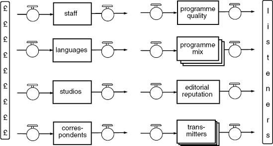
Source: Morecroft, J.D.W., 1999, Visualising and Rehearing Strategy, Business Strategy Review, 10(3) 17–32. Blackwell Publishing.
The model was developed and used to explore 10-year strategy scenarios and to support the organisation's bid to government for future funding (Delauzun and Mollona, 1999). For this purpose, World Service was conceived as a dynamical system in which public funds from Government on the left are deployed in various ways to build assets that collectively attract listeners on the right. There is a rich mix of tangible and intangible assets. The tangibles include staff and studios located at Bush House, the headquarters of World Service on the Strand in London. There are also foreign correspondents stationed in the numerous countries that receive World Service broadcasts, and an international network of transmitters (short-wave, medium-wave and FM) that beam programmes to listeners across the globe. The intangibles include the portfolio of languages as well as soft yet vital factors such as programme quality, programme mix and editorial reputation. A successful broadcaster like World Service builds and maintains a 'balanced' portfolio of tangible and intangible assets that attract enough of the right kind of listeners at reasonable cost. Behind the scenes there is a complex coordinating network of feedback loops that mimic the broadcaster's operating policies and strive to maintain an effective asset balance. Parts of the structure are presented later in this chapter, but, for now, the purpose is simply to show a practical example of stocks and flows in a real business.