Make an Interactive PDF Form (Pro Feature)
“You can talk all you want […] But you gotta know the territory!” chants a salesman in the first scene of The Music Man. But how do you get to know the territory?
You ask questions, that’s how.
One way to ask questions is with a form. PDFpenPro has tools for making interactive PDF forms. With these tools, you can ask questions to get the information you need. And, with the email and web submission capabilities that you can build into a form, you don’t have to go out to the territory to get that information—it comes to you.
So, you can talk, you can talk, you can bicker, you can talk, but with an interactive form, you can get to know the territory.
Build a Form
A form can be as simple as a single checkbox, or as complicated as an IRS Schedule C. But, as you saw in Fill Out PDF Forms, all forms consist of only a few simple elements—such as text fields and checkboxes. You can use these elements repeatedly and in combination.
I’ve made a form that demonstrates each form element available in PDFpenPro (Figure 81). In the following pages, I use my example form, “Wizard_Tim.com User Survey,” to explain each form element. I started with a new blank one-page PDF (see Create a PDF), but you can add form elements to any PDF.

To access form elements, click the Form tools icon on the right end of the Editing Bar’s tool-selection  button. Each individual form element has a group of properties you can set in the Inspector to name the element and describe how it operates. As we proceed, I’ll explain the properties associated with each form element. Before we begin this guided tour, though, you may want to refer back to The Form Creation Tools (Pro Feature) to refresh your memory.
Make a Text Field
The Name field in Wizard Tim’s form represents that staple of the interactive form, the text field. Use a text field when you want free-form information from your respondents that you can’t anticipate.
To make a text field, drag it out on the page with the Text Field  tool.
tool.
Once you have the field in place, you set its properties in the Form Element Properties tab of the Inspector (Figure 82).

To see a field’s properties, click it with the Edit  tool (if you use the Select Text
  tool, PDFpenPro assumes you want to enter information into the field).
Here is some advice for customizing the properties of a text field:
Name: Every text field should have a distinct name. PDFpenPro gives each new field a unique name, but you should change it to reflect the type of information in it. As you can see by the size of the Name field in the Inspector, names are expected to be short.
Default Value: This property can be empty. If you put text in it, that text appears in the form element as its default value, although the respondent can change it; if you leave the Default Value blank, the element is empty until the respondent fills it in.
Tool Tip: Text entered into this property appears as a tool tip when the user’s pointer hovers over the form element; in addition, screen-reading assistive tools, such as VoiceOver, speak tool tips. Use this property to add a short description of the text element’s purpose.
Character Limit: You can enable this and then specify the maximum number of characters the respondent can put in the field. For example, you might limit a field for a telephone area code in the United States to three characters. When this property is disabled, respondents can type only as many characters as will fit in the field visibly unless Scroll Text or Size to Fit is enabled (see below).
Required: Select this checkbox if the field must be filled in before the form is submitted. Most programs that allow respondents to fill out PDF forms display an error dialog if a required field is empty when the respondent submits it.
Multi-line: When this property is enabled, text typed in the field can wrap when the text reaches the edge of the field.
Size to Fit or Scroll Text: If you select one of these boxes and the other is already selected, the other is automatically deselected:
Select Size to Fit if you want text the user enters scaled in size so that it fills the field. The text that the respondent types becomes smaller once the field’s boundaries are reached.
Select Scroll Text to allow text to scroll past the field’s borders.
Offer a Single Choice
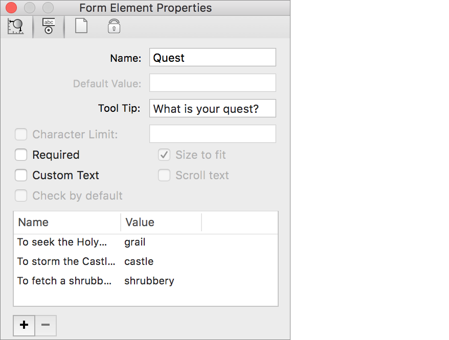
A choice element allows the respondent to choose one item from a set of items. In PDFpenPro a choice element resembles a drop-down menu, such as the Quest item shown in the survey (Figure 81, a few pages back), although other PDF programs may display a choice element quite differently. A choice element can optionally allow the respondent to type in an item that isn’t among those provided.
To place a choice element on the page, drag with the Choice  tool.
tool.
Use a choice element when you have several mutually exclusive choices to offer and a limited amount of room in which to present them. Figure 83 shows the properties associated with the choice element.
You can modify these choice element properties:
Name: Each choice element requires a unique name. As with the text-field element, enter a short descriptive name so you can identify the data when it is returned.
Tool Tip: This text appears when the user’s pointer hovers over the element, and is read aloud by screen-reading assistive software such as VoiceOver.
Required: Enable this property if the respondent must make a choice before submitting the form.
Custom Text: Select this to allow the respondent to type in a choice that doesn’t appear among those that you have provided. A choice element that allows custom text shows a text cursor when the respondent clicks the body of the element; the respondent must click the arrow controls at the right of the element to display the choices you have offered.
Name-Value box: Recall that a choice element offers the user a list of choices. Name-Value pairs supply those choices. Click the add
 button to add an empty Name-Value pair, and then click the selected pair in the list box to add a name and a value. The name is what the user sees and can choose in the choice element; the value is the data returned when the form is submitted. For example, in the choice element whose properties are shown in Figure 83, earlier, if the respondent chooses
 To Storm the Castle Anthrax, the form will return the value ofCastle.If you don’t supply a value, the name is returned. In such cases, you may want to use short names.
To remove a Name-Value pair, select it and then click the remove
 button.
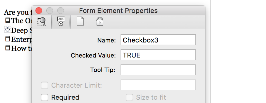
Make Checkboxes
The data from checkboxes is returned only when a respondent checks a box on the form; you never receive data from unchecked boxes.
You use checkboxes to provide a respondent with what amounts to a true-false question. For example, in Wizard Tim’s survey (Figure 81, back a few pages), the Knights checkboxes allow the user to answer the implied question “Is this knight accompanying you?” for each listed knight (Brave Sir Robin must have turned his tail and bravely fled when the form was filled out).
Click with the Check Box  tool to create both a default-size checkbox and a label (a text imprint) for it. Or, you can instead drag with the Check Box tool to create a checkbox that has a custom size. To edit the label text, use the Select Text tool.
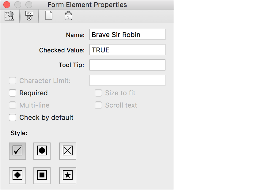
The properties of a checkbox element from the Wizard’s survey are shown in Figure 84.
You can customize the following checkbox properties:
Name: Each checkbox should have a unique name; if two or more checkboxes have the same name, they behave like radio buttons (see the section about radio buttons, just after this list), which violates normal user-interface conventions and can confuse the respondent. The best practice is to use the same name as the one in the checkbox label, or a shortened version of it.
Checked Value: By default, the value returned from a checked checkbox is
TRUE, but you can use a different value if you have a special need.Tool Tip: This field can contain a brief description of the checkbox’s purpose that appears when the user’s pointer hovers over the element, and is read aloud by screen-reading assistive software such as VoiceOver.
Required: Enable this property if the respondent must check the checkbox before submitting the form. Unless you are using the checkbox like a radio button, you should leave this property disabled.
Check by Default: Enable this property to have the checkbox checked when the form is first opened or when it is reset.
Style: Your choice here determines what mark appears when the checkbox is selected. It is a good practice to use the same style for all the checkboxes in a group.
Offer Radio Button Choices
In Wizard Tim’s survey (Figure 81, shown near the start of this chapter), the Favorite Colors are presented as radio buttons. Radio buttons offer a small set of mutually exclusive choices. When the user clicks a radio button in a group, the other buttons in the group are deselected. It’s good user-interface practice to restrict the number of radio buttons in a group to five items or fewer.
Click with the Radio Button  tool to create both a default-size radio button and a text imprint label. You can drag with the tool to create a radio button that has a custom size.
When you add a radio-button group, you should add an additional text imprint with the Text  tool to label the entire group, as Wizard Tim does in his survey. You can use that label, or a shortened form of it, as the Name property for each of the radio buttons in the group. For example, the name of the three Favorite Color buttons in Wizard Tim’s survey is
 Color (Figure 85).

You need to set at least the first two of these radio-button properties:
Name: Each radio button in a button group should share the same name so that clicking one deselects the others that share that name.
Checked Value: The best practice is to use a short version of the text that labels the individual button. If the form is submitted with this radio button selected, the name assigned to the button group will return the value in this field. Although all buttons in a group must have the same Name property, they should each have a different Checked Value property.
Tool Tip: Use this to add a brief description of the radio button that appears when the user’s pointer hovers over the element; it can also be read aloud by screen-reading assistive software such as VoiceOver.
Required: Enable this property if the respondent must select one of the buttons in the radio-button group before submitting the form. If you enable this property for one button in the group, you should enable it for all buttons in the group, since they are treated as a unit.
Check by Default: Enable this property to have the button appear selected when the form is first opened or reset. You should set this property for only one button in the group, because, by convention, no more than one radio button in a group can be selected at a time.
Style: Click a style to set the radio button element’s appearance. In most cases, the default appearance is best, but if you choose another style, make sure that all the radio buttons in the group use the same style.
Make a List
You use a list element to display a list of items from which the respondent can choose. Wizard Tim uses a list element to list the supplies that the respondent possesses in the survey form shown near the beginning of this chapter (Figure 81).
A list can allow the respondent to select only one item, or it can allow the respondent to select multiple items by Shift-clicking a range of adjacent items, or by ⌘-clicking non-contiguous items (Windows users can Control-click to choose non-contiguous items). Wizard Tim’s list allows multiple items to be selected.
Use the List  tool to drag a rectangle out on the page. If the number of items is longer than can be displayed within the list’s area, the respondent can scroll through the list. Figure 86 shows the list element’s properties from the Wizard Tim’s survey.
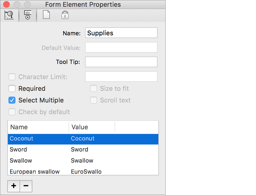
You can set the following properties for a list element:
Name: Each list element requires a unique name.
Tool Tip: Give a brief description of the list’s purpose that users can see when hovering their pointers over the element, or can be read aloud by screen-reading assistive software such as VoiceOver.
Required: Enable this property if the respondent must select at least one item before submitting the form.
Select Multiple: Enable this to allow the respondent to choose more than one item in the list.
Name-Value box: I explain this box in more detail a few pages earlier where I describe the choice element (see Offer a Single Choice). As with a choice element, you use Name-Value pairs to supply the list element with content. The add
 button and the remove button work the same way as they do in a choice element’s properties. And, like choice elements, if you don’t supply a value in a Name-Value pair, the name is returned as the value.
Make an Interactive Signature
An interactive signature allows respondents to sign an interactive form by hand. When respondents click the field, a dialog appears in which they can scribble their signatures using a trackpad, stylus, or similar pointing device (they can even use a mouse or a trackball if they are sufficiently dexterous)—or they can drag a signature graphic (see Add a Scanned Signature) directly into the interactive signature dialog, as in Figure 87. This form element also provides users with the capability of applying a digital signing certificate; see Apply a Signing Certificate.
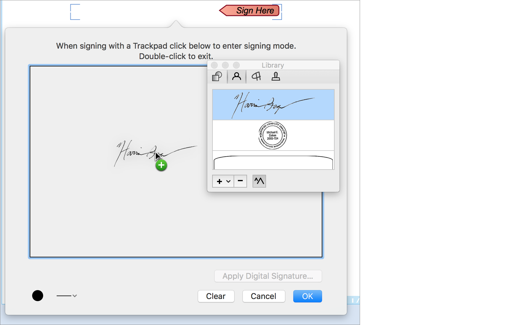
To create an interactive signature field, drag out a rectangular area on the form with the Signature Field  tool. The field has markers at each corner to indicate the field’s dimensions, and it includes a graphic “Sign Here” stamp. When the respondent signs the field, the stamp goes away and the signature appears within the field’s boundaries. The submitted form includes the signature graphic.
The Inspector provides no properties that you can set for interactive signature fields. However, you can set the color of the signature and the thickness of the signature stroke with the signature color and stroke  controls at the bottom-left of the signature field dialog.
Make a Submit Button
Respondents use a submit button to send the information on the form, and, optionally, the form itself back to the form’s originator; e.g., you. The Wizard Tim’s survey shown near the beginning of this chapter (Figure 81) has such a button at the bottom, but you can put it anywhere you like.
With the Submit Button  tool, click the page to create a default-size submit button or drag to create a button with a custom size. PDFpenPro displays a dialog with submission options (Figure 88). Use the options to specify the destination for the form’s data.

The form can be set up to submit data by email to a specific address or via the web to a specific URL:
In the case of email, you can choose whether the PDF is included; the XFDF form is always attached (XFDF is a forms data XML format, the full name of which is XML Forms Data Format). The message is sent with the respondent’s default email program.
When a form submits data to a URL, it is sent as XFDF data.
If you later want to edit the submission options, double-click the submit button with the Edit tool, or access the submission options in the button’s form element properties in the Inspector (Figure 89).
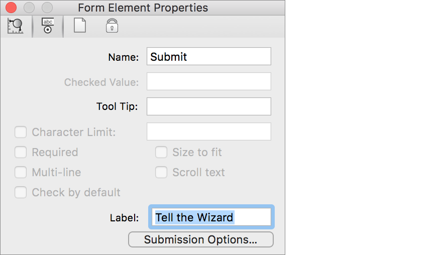
Aside from the submission options, the other properties you can set are minimal:
Name: Like any other form element, the submit button needs a name. It should be a unique name within the document.
Tool Tip: Supply text that explains what the button does; the text appears when the user hovers the pointer over the button, and is read aloud by screen-reading assistive software such as VoiceOver.
Label: Enter the text you want seen on the button.
Let PDFpenPro Build Your Form
Very often, all you need on a form are text fields and checkboxes; this is especially true of forms that are designed to be printed and filled out by hand but that could also be filled out on screen. PDFpenPro’s Create Form Fields command is perfect for such forms.
For example, consider the word processing document shown in Figure 90, a job application that contains only lines and checkboxes. It can be saved as a PDF (see Print to PDF) and brought into PDFpenPro, where the static form elements can be brought to life.

To turn the static form elements on the current page into interactive elements, choose Edit > Create Form Fields for Page.
Figure 91 shows the result of running the Create Form Fields for Page command on the PDF created from the document in Figure 90.
PDFpenPro examines the PDF for line and box elements and uses those to generate interactive form elements that overlay the static ones found in the PDF. PDFpenPro proceeds from left to right and top to bottom so that in most cases the tab order for the created elements matches what most users will expect, but if it doesn’t produce the tab order you want, you can change it (see Set the Tab Order).
In addition, PDFpenPro turns on highlighting of form fields when it creates a form automatically so that the newly created elements are immediately obvious. You can turn form highlighting on and off by choosing View > Highlight Form Fields; this command works with forms that you create by hand and with automatically generated forms.
Polish the Layout
It’s not hard to slap a bunch of form elements on a page, but you’ll get more responses and better ones if you design the form so that it is easy to read and use. At the very least, you should align the elements neatly and label them so that the respondent can see which elements go together, and so that they can figure out what information is actually being requested. The controls on the Inspector’s Alignment tab can help you align form elements (see The Inspector).
Use a Grid
To further help you precisely line up form elements, labels, and any other explanatory text, you can turn on a grid overlay and specify that new items, and dragged items, should snap to that grid (Figure 92).

To turn on the grid and have items snap to it, do the following:
Choose Arrange > Show Grid.
Choose Arrange > Snap to Grid.
Use Guides
By default, PDFpen and PDFpenPro automatically present you with visible guidelines to help you align objects (Figure 93).

How the guides appear depends on the type of object:
Text objects: As you drag a text object, it displays guidelines that align the baseline of the object’s text with the baseline of other text on the page.
Other objects: When you drag a non-text object, guidelines appear that help you align the center or edges of the object with the centers or edges of other objects on the page.
You can choose Arrange > Snap to Guides to have a dragged object snap to a guideline as it appears.
Should you find the guides distracting, you can turn their automatic appearance off: go to PDFpen > Preferences > Editing and uncheck Show Guides.
Set the Tab Order
You should also consider that people with keyboards often prefer to navigate without having to resort to a pointing device. PDFpenPro creates a tabbing order for form elements automatically. The person filling out the form can press the Tab key to “tab” from one form element to the next without reaching for a pointing device.
The tab order by default follows the way you read English: left to right, top to bottom.
You can see the tab order, change it, and, if necessary, reset it so it follows the left-to-right, top-to-bottom convention again, with the following commands on the Arrange menu:
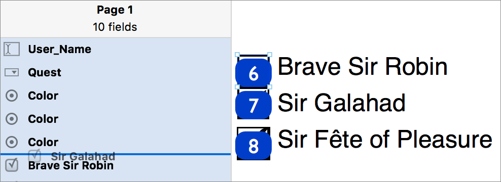
Show Tab Order: Small number boxes are superimposed on each element (Figure 94) so you can see the order in which you can tab through them.
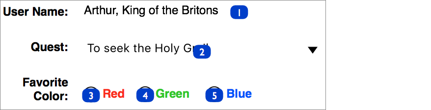
Figure 94: Display the tab order to see where tabbing takes you. Move Forward: Increase the selected element’s position in the tabbing order by one.
Move Backward: Decrease the selected element’s position in the tabbing order by one.
Move to Front: Make the selected element the final one in the tabbing order.
Move to Back: Make the selected element the first one in the tabbing order.
Reset Tab Order: Set the tab order to follow English reading convention.
An even easier way to arrange your form elements is to use the sidebar. This method works best if you have given your form elements easily identifiable names.
To arrange form elements with the sidebar, choose View > Form Fields or choose Form Fields from the Sidebar  pop-up menu. The sidebar displays the form elements in your PDF in their current tab order (Figure 95), and you can then drag them into the order you desire.