
7.6. Cross-Browser Testing
Although we have discussed cross-browser testing in Chapter 5, there are more issues than simply automation. The reality of web development is that you need to deal with cross-browser issues as each browser renders with your site in a slightly different way. Luckily there are some tools to help you and make the experience less painful.
The aim of cross-browser testing is to ensure that when users visit your site using a variety of browsers they all receive the same experience and can use your site as you expect. We have experienced a number of sites where you visit using one browser only to find large sections of the site completely broken and usable because they haven't been developed and tested with different browsers in mind.
One of the best tools available to help cross-browser testing is called BrowserShots (http://browsershots.org/). Simply enter a URL for a site as shown in Figure 7-1 and it will access the site using a variety of browsers which you can use to manually verify that the site renders correctly on almost every browser on every platform. The free version takes a while to complete all the tests and it only works against public accessible sites; however, it's a great way to validate the site.
The web page with the results is shown in Figure 7-2.
While validating across lots of different browsers is useful, the main problem with cross-browser is between the different versions of Internet Explorer (IE) such as 6, 7, and 8. At the time of writing, IE6 still has around 15 percent of the browser share, yet it doesn't support key standards and getting sites to work in IE6 involves a number of hacks which can limit the design and usefulness when the site is visited using standard complicated browsers such as IE8 or Firefox. Having such a key browser render sites differently is causing major problems and testers need to extensively test their sites to ensure they work on all the different versions.
Although BrowserShots would provide you with some support, a more targeted tool to solve this problem is called IETester (http://www.my-debugbar.com/wiki/IETester/HomePage). As shown in Figure 7-3, the application allows you to open different tabs which represent different versions of IE allowing you to use the site as you would if you had the actual browser installed on your desktop.
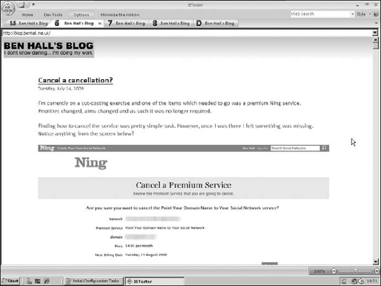
As you can see from Figure 7-3, the site renders correctly using IE8; however, as you can see from the IE6 tab in Figure 7-4, the site layout renders completely different with the logo having a different colored background.
Figure 7-1. BrowserShots homepage with a list of different browsers
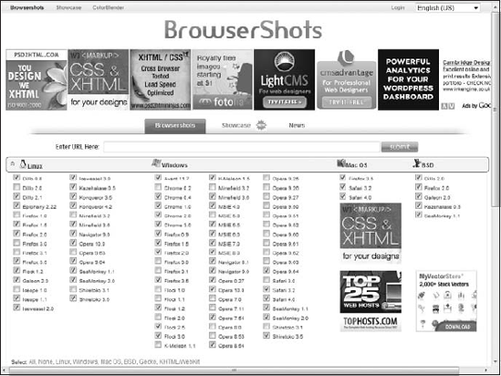
Figure 7-2. Results for Google.com from BrowserShots

Figure 7-3. Blog.BenHall.me.uk rendered using IE8 via IETester
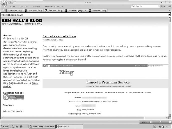
Figure 7-4. Blog.BenHall.me.uk rendered using IE6 via IETester
This is a great way to easily verify layout changes and have a very fast debug cycle to verify if the application works. This is also a great tool for developers.
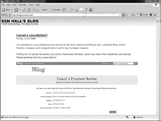
Another tool is called Xenocode (http://www.xenocode.com/Browsers/). This combines the approach of BrowserShots in the cross-browser nature and IETester in providing a full browser to test the entire site. Xenocode uses application virtualization allowing you to have the full browser as a desktop application without ever having to install it. Figure 7-5 shows how IE6 looks when using it via Xenocode.
Figure 7-5. Blog.BenHall.me.uk rendered using IE6 via Xenocode
This is a great tool when you want to quickly test multiple browsers.
Other browsers which are much more difficult to test are mobile browsers. During the past few years, the use of mobile browsers has increased and as such more sites need to take this into consideration.
Sadly there are no services or applications available as with desktop browsers. Instead, you need to manually download and configure the different mobile phone emulators to test the different browsers. Because of this we recommend you take a different approach and crowd source browsers. Crowd sourcing is when you get a group of people to help you. In this case, ask people to use their mobile to see if it works. Ask friends, employees, and family members to try the site. Get as many different phones as you can to look at it. Sadly, this is the only sure way to do mobile testing due to the large number of different browsers, screen sizes, and screen resolutions.
The other type of browser that needs to be tested is the print version. Users often still like to print content from your website, especially confirmations or receipts for future reference. As such, you need to verify that the content printed looks correct and is laid out in an understandable way. To help with the layout, you can use CSS to have a different style when printing compared to using the browser. This allows you to hide content and rearrange the layout to ensure people will be happy with the printed result.
When testing cross-browsers alongside CSS issues, another major problem is with JavaScript.