
4
Testing directives
- Using the types of directives available in Angular
- Testing attribute and structural directives
- Using
TestMetaDatato configureTestBed
In this chapter, you’ll learn how to test directives. Directives, like components, are a way to encapsulate parts of your application as reusable chunks of code. With regard to functionality, both directives and components allow you to add behavior to the HTML in your application.
For example, let’s say your application has a table, and you want to change the background color of a row when the pointer hovers over it. You could create a directive named HighlightRowDirective that adds that row highlighting behavior and reuse it throughout your project.
Before you get started writing the tests for directives, you’ll want to know a little more about them.
4.1 What are directives?
Angular provides three types of directives:
- Components
- Structural directives
- Attribute directives
Directives and components are similar. Let’s get started by exploring the differences and similarities between the two.
4.1.1 Components vs. directives
Components are a type of directive. The only difference between the two is that components contain a view (defined by a template). Another way to think about the difference is that components are visible in the browser, and directives are not. For example, a component could be a header or a footer, whereas a directive modifies the element it’s attached to. A directive might append classes to an element or hide and show something based on a condition. Examples of directives built into Angular include ngFor and ngIf.
To expand your understanding, let’s look at two of the decorators that are included with the Contacts app you’ve been working on. Decorators are a way to add behavior to a class or method, kind of like annotations in Java.
First, let’s look at the @Component decorator for the ContactDetail component, which you can find at /website/src/app/contacts/contact-detail/contact-detail.component.ts:
@Component({
  selector: 'app-contact-detail',
  templateUrl: './contact-detail.component.html',
  styleUrls: ['./contact-detail.component.css']
})
You can customize the view using options such as templateUrl, styleUrls, and viewProviders.
Now, let’s look at the @Directive decorator for FavoriteIcon, which you can find in /website/src/app/contacts/shared/favorite-icon/favorite-icon.directive.ts and will be testing later in this chapter:
@Directive({
  selector: '[appFavoriteIcon]'
})
You may notice that the selector has a different name, [appFavoriteIcon], than the name of the directive, which is FavoriteIcon. We prefixed the selector name with ‘app’ to namespace the directive. This is an easy way to differentiate between directives that we created versus ones that belong to Angular.
Notice that the FavoriteIcon @Directive decorator has a selector, like the @Component decorator, but no options for templateUrl, styleUrls, or viewProviders. Because directives have no views associated with them, they also have no templates to use, create, or style.
Now that we’ve looked at components and the difference between components and directives, let’s review the difference between attribute and structural directives.
4.1.2 Different directives
Use attribute directives when you’re trying to change the appearance of a DOM element. A good example of an attribute directive is the one we mentioned earlier where you were changing the background color of a row in a table to highlight it as a user rolled over the row.
Use structural directives to add or remove elements from the DOM—to change the structure of the page. Angular includes a few structural directives out of the box, like ngIf and ngShow.
In this chapter, you’ll create tests for both an attribute directive and a structural directive. The attribute directive adds a gold star to a contact when it’s marked as a favorite. The structural directive adds and removes contact tables depending on whether contacts are available.
You’ll write tests for the attribute directive first; then you’ll move on to the structural directive.
4.2 Testing attribute directives
To test an attribute directive, you get an instance of the directive, take some kind of action, and then check that the expected changes show up in the DOM. Before you get to the process of writing the tests, let’s take a closer look at the attribute directive that you’ll be testing.
4.2.1 Introducing the favorite icon directive
You’ll be testing a directive that we created, named FavoriteIconDirective. Its source code is in /website/src/app/contacts/shared/favorite-icon/icon.directive.ts. You can add FavoriteIconDirective to an element to display a star when a contact is favorited. Let’s see how to use it.
Usage
Usage for FavoriteIconDirective looks like the following:
<element [appFavoriteIcon]="expression"></element>
The following is an example of FavoriteIconDirective being used from line 20 of the contact-list.component.html template at /website/src/app/contacts/contacts-list/ in the Contacts app source code:
<i [appFavoriteIcon]="contact.favorite"></i>
In this example, you can see that you set [appFavoriteIcon] to the contact.favorite expression, which can be either true or false. If the expression evaluates to true, meaning that the contact is a favorite, a gold star will be displayed, as in figure 4.1.
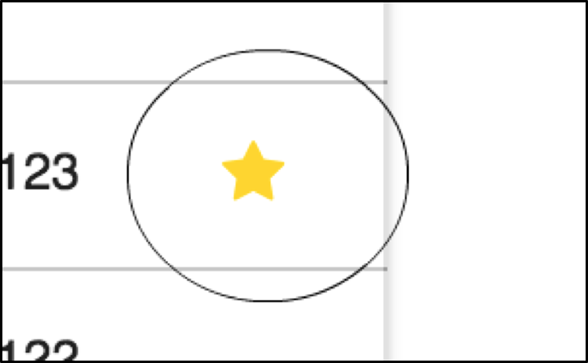
Figure 4.1 [appFavoriteIcon] set to true, displaying a gold star
Figure 4.2 shows what happens when [appFavoriteIcon] is false. The star becomes white, which makes it invisible against the white background.
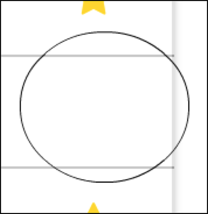
Figure 4.2 [appFavoriteIcon] set to false, with a white star displayed but invisible
If you roll over a row where [appFavoriteIcon] is set to false, you’ll be able to see the white star because the background color changes to gray, as in figure 4.3.

Figure 4.3 [appFavoriteIcon] set to false, with white star displayed and visible while row is hovered over
Adding color as a second parameter
FavoriteIconDirective defaults to the color gold, but you can pass in a second parameter that changes the color of the star.
Setting the [color] parameter of [appFavoriteIcon] looks like this:
<element [appFavoriteIcon]="expression" [color]="'color name'"></element>
In figure 4.4, you display a blue star when the [appFavoriteIcon] expression evaluates to true and you set the [color] parameter to blue using the following code:
<i [appFavoriteIcon]="contact.favorite" [color]="'blue'"></i>

Figure 4.4 [appFavoriteIcon] set to true, with solid blue star displayed when the [color] parameter is set
The rest of the cases are the same as the default star. Now that we’ve covered the functionality of FavoriteIconDirective, let’s go over the test cases, so you can start writing tests!
4.2.2 Creating tests for FavoriteIconDirective
Let’s separate the test cases into three different parts:
- When
FavoriteIconDirectiveis set totrue(table 4.1) - When
FavoriteIconDirectiveis set tofalse(table 4.2) - When a
[color]parameter is passed in as a second parameter and you need to make sure it works as expected (table 4.3)
The first two sets of cases will be the most common use of the directive, and you’ll have a third set of tests for when the color of the star is changed to blue. Tables 4.1, 4.2, and 4.3 summarize cases for the three parts.
FavoriteIconDirective is set to true| Test Case | Event | Displays |
| The element should include a gold star after the page loads. | After page loads | Gold star |
| The element should still display a gold star if the user rolls over the star. | Roll over | Gold star |
| The element should still display the black outline of a star after the user clicks on the star. | On click | Black outline star |
| The element should still display a gold star if the user rolls off the star. | Roll off | Gold star |
FavoriteIconDirective is set to false| Test Case | Event | Displays |
| The element should include a white star after the page loads. | After page loads | White star |
| The element should display the black outline of a star if the user rolls over the star. | Roll over | Black outline star |
| The element should display a gold star after the user clicks on the star. | On click | Gold star |
| The element should display a white star after the user rolls off the star. | Roll off | White star |
[color] parameter is set to a color| Test Case | Event | Displays |
| The element should display a star of the color that’s specified in the second parameter after the page loads. | After page loads | Specified color star |
| If a color is unrecognized, the color of the star should be set to black by default. | After page loads | Black star |
4.2.3 Setting up the FavoriteIconDirective test suite
Now that we’ve planned out the test cases, you can create your test suite. Create a file named favorite-icon.directive.spec.ts in the /website/src/app/contacts/shared/favorite-icon directory. First, you import the dependencies that you’ll be using to execute your tests. Add the following statements at the top of your file to import the Angular dependencies:
import { Component } from '@angular/core';
import { ComponentFixture, TestBed, TestModuleMetadata } from
  '@angular/core/testing';
Now that you’ve imported the Angular dependencies, you can import the dependencies that we created for the Contacts app by adding the following code:
import { constants } from './favorite-icon.constants';
import { FavoriteIconDirective } from './favorite-icon.directive';
import { getStarElement, doClassesMatch } from '../../testing';
To test a directive, you need to create a host component that uses it. Your host component has a different <i> element for each test case. Add the following code after the import statements:
@Component({
  template: `
      <i [appFavoriteIcon]="true"></i>
      <i [appFavoriteIcon]="false"></i>
      <i [appFavoriteIcon]="true" [color]="'blue'"></i>
      <i [appFavoriteIcon]="true" [color]="'cat'"></i>
    `
})
class TestComponent { }
You may notice that tick marks wrap the HTML, appearing at the start and end of the template section. The tick marks are used for multiline strings. Now create a describe block that will house all your tests for FavoriteIconDirective. After the TestComponent class you just created, add the following lines of code:
describe('Directive: FavoriteIconDirective', () => {
});
Inside the describe block, you need to create some variables that you’ll use in all the favorite icon tests by adding the following code:
let fixture: ComponentFixture<any>;
const expectedSolidStarList = constants.classes.SOLID_STAR_STYLE_LIST;
const expectedOutlineStarList = constants.classes.OUTLINE_STAR_STYLE_LIST;
You’ll set the fixture variable in the beforeEach block, which will create a fresh fixture for each test. Add the beforeEach code in the following listing after the variables you just declared.
Listing 4.1 Creating a fresh fixture with beforeEach
beforeEach(() => {
  const testModuleMetadata: TestModuleMetadata = {    ①
    declarations: [FavoriteIconDirective, TestComponent]
  };
  fixture = TestBed.configureTestingModule(testModuleMetadata)    ②
           .createComponent(TestComponent);    ③
  fixture.detectChanges();    ④
});
Let’s take a minute to recap what’s included in the beforeEach statement. If you read chapter 3, some of this may look familiar.
In the first line of the beforeEach method, you declare a variable called testModuleMetadata. This variable implements the TestModuleMetadata interface, which you use to provide test metadata to configure the TestBed. In the previous chapter, you used test metadata itself to configure TestBed. The difference this time is that you’ve created a separate variable to contain that data. In doing so, you’ve passed an object that conforms to the TestModuleMetadata interface to the configureTestingModule method that configures TestBed.
After you configure TestBed, you use the createComponent method from TestBed to return an instance of a ComponentFixture. Finally, you call fixture.detectChanges() to invoke change detection and render updated data whenever an event occurs, such as click or mouseenter.
Now you should add an afterEach block after the beforeEach block to make sure the fixture object is destroyed by setting it to null, as follows:
afterEach(() => { fixture = null; });
You’ve finished setting up the tests, and now you can move on to writing them. Almost all your tests will follow a similar pattern. You’ll create a new instance of a component, run some kind of event, and then check that the element changed as expected.
4.2.4 Creating the FavoriteIconDirective tests
First off, create a describe block directly after the afterEach code you just added. This will allow you to group together all the tests that cover when [appFavoriteIcon] is set to true. It should look like this:
describe('when favorite icon is set to true', () => {
});
Create a variable named starElement to reference the star element and set it to null. You initialize the variable to null because you’ll set it later in the beforeEach block that will execute before each test. Add this line after the describe block:
let starElement = null;
Now you’ll create another beforeEach method that’s scoped only to this suite. Add the following code after the variable you just declared:
beforeEach(() => {
  const defaultTrueElementIndex = 0;
  starElement = getStarElement(fixture, defaultTrueElementIndex);
});
Notice that in the line after beforeEach you declare a constant named defaultTrueElementIndex and set it to 0. You may recall that earlier, when you created TestComponent, the template contained four different sets of HTML tags for the different test cases. The different elements are stored in an array. You’re testing the first element in fixture for this set of tests, so you use the 0 index to retrieve it from the array. Recall that using TestComponent creates the class fixture.
To get starElement from fixture, you use a helper method called getStarElement. All the getStarElement method does is extract a child element from fixture. If you’re curious about the implementation, you can read the source code at /website/src/app/contacts/testing/get-star-element.ts.
Finally, you can create the afterEach method that will set starElement to null:
afterEach(() => { starElement = null; });
Next you’ll check to see if the favorite icon appears after the page loads.
Element includes a solid gold star after the page loads
To start, create an it block and place it after the beforeEach block you just added:
it('should display a solid gold star after the page loads', () => {
});
Your first test case will check that the element’s color is gold, as expected. Inside the it block, add the following code:
expect(starElement.style.color).toBe('gold');
For your second test, you’ll check that the colors list matches the colors in your elements list. To do this, you can use another helper method called doClassesMatch. As with the getStarElement method, you can find this method at /website/src/app/contacts/testing/. All this method does is take an element and a list of styles and make sure they match by looping through the styles in the lists. The result of the comparison is true if the element has all the expected styles.
The style classes for a solid star are stored as a list called expectedSolidStarList. If you looked at the contents of this list, you’d find three classes: ['fa', 'fa-star', 'fa-lg']. These are all the classes that you can expect for a solid star. You would expect your starElement to include these classes to be correctly styled.
To ensure that starElement has the correct styles, add the following code to your test:
expect(doClassesMatch(starElement.classList,
  expectedSolidStarList)).toBeTruthy();
Your completed test should look like this:
it('should display a solid gold star after the page loads', () => {
  expect(starElement.style.color).toBe('gold');
  expect(doClassesMatch(starElement.classList,
    expectedSolidStarList)).toBeTruthy();
});
Now, in your terminal, run the ng test command. You should see something similar to figure 4.5.
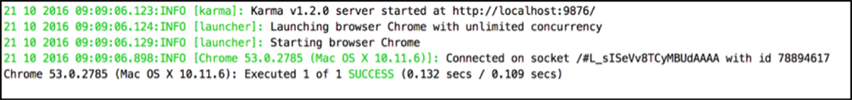
Figure 4.5 First test of displaying a gold star after page loading successfully executed
Element still displays a solid gold star if the user rolls over the star
Your second test is a bit more complicated than the first test because you need to simulate a rollover effect. You can use the Event class to create a mouseenter event to simulate the user moving the pointer over the star. You manually dispatch the event by using the dispatchEvent method that’s part of every DOM element. Add the following code after your first test:
it('should display a solid gold star if the user rolls over the star',
  () => {
  const event = new Event('mouseenter');
  starElement.dispatchEvent(event);
});
Your two test cases are the same as the first test case because you still expect the gold star to display when the user hovers over it. Add the following code after the event code that you just added:
expect(starElement.style.color).toBe('gold');
expect(doClassesMatch(starElement.classList,
  expectedSolidStarList)).toBeTruthy();
Run ng test. You now should have two completed tests.
Element still displays the outline of a black star if the user clicks on the star
This test is similar to the previous one. The only difference is that because this is a click event, you use a different argument when you create an instance of the Event class. You also change the expected color to be black and the class list to expectedOutlineStarList, because you expect the star to be only an outline instead of a solid star.
Because you only need to make small changes, the following code presents the full test with the changes in bold. You can add this test after the previous one:
it('should display a black outline of a star after the user clicks on the
  star', () => {
  const event = new Event('click');
  starElement.dispatchEvent(event);

  expect(starElement.style.color).toBe('black');
  expect(doClassesMatch(starElement.classList,
    expectedOutlineStarList)).toBeTruthy();
});
Execute the tests again in your terminal by running ng test, and you now should have three successful tests. We’ve covered all the tests for your attribute directive. The completed test is at /chapter04/favorite-icon.directive.spec.ts for your reference. Next up, we’ll look at how to test structural directives.
4.3 Testing structural directives
Testing structural directives is similar to testing attribute directives. You’re checking that the DOM is rendered as you expect when you use the directive. Before you start writing tests, let’s look at the directive you’ll be testing, ShowContactsDirective.
4.3.1 Introducing ShowContactsDirective
The structural directive you’ll be testing is ShowContactsDirective. You can use ShowContactsDirective to add elements to or remove them from the DOM. It mimics the implementation of ngIf; we’re using it only to demonstrate how to test structural directives.
Usage
Here’s an example of using ShowContactsDirective:
<div *appShowContacts="contacts.length"></div>
In this example, you can see that you set *appShowContacts to the contacts.length expression, which in JavaScript resolves to true if the length is greater than 1 and false if the length is 0. We’ve taken this example directly from the application, and you can find the code at /website/src/app/contacts/contact-list.component.html on the first line if you would like to see it for yourself.
To see how the directive works, start the application using ng s and then open your browser to http://localhost:4200/. You should see something like figure 4.6.
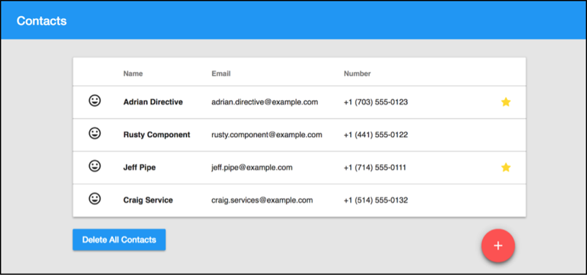
Figure 4.6 The Contacts app with contacts
Now click the Delete All Contacts button. The result should look like figure 4.7.

Figure 4.7 The Contacts app with no contacts
Notice that the table completely disappeared, and now there’s a message stating, “You do not have any contacts yet.” That’s because ShowContactsDirective is hiding and showing elements based on whether there are any contacts. The Delete All Contacts button text has also changed to Add Contacts. Two different buttons are shown or hidden using ShowContactsDirective. Go ahead and click Add Contacts, and you’ll see the same screen that you saw in figure 4.6.
If you’d like to see the ShowContactsDirective source code, navigate to /website/src/app/contacts/shared/show-contacts/ and view the show-contacts.directive.ts file. Now that you understand the basic functionality of ShowContactsDirective, let’s go over all the test cases you’ll be writing tests for.
4.3.2 Creating your tests for ShowContactsDirective
When you test ShowContactsDirective, you only care about two test cases: one when the input evaluates to true and one when the input evaluates to false (table 4.4).
| Test Case | Input | Displays |
The element should be shown when the input evaluates to true. | true | Element |
The element should be hidden when the input evaluates to false. | false | Nothing |
Now that you’ve seen the two test cases, you can create the test suite.
4.3.3 Setting up the ShowContactsDirective test suite
To start, navigate to /website/src/app/contacts/shared/show-contacts and create a file called show-contacts.directive.spec.ts. The first thing you include is the dependencies that the tests need. Add the following statements at the top of your file to import the Angular dependencies:
import { Component } from '@angular/core';
import { ComponentFixture, TestBed } from '@angular/core/testing';
These are the same classes that you imported for your FavoriteIconDirective tests. Because we already covered these classes, we won’t cover them again. Now you need to import two custom dependencies we created for the Contacts app.
import { ShowContactsDirective } from './show-contacts.directive';
import { getElement } from '../../testing';
ShowContactsDirective is the code that you’ll be testing. The getElement function is similar to the getStarElement function that you used earlier—it’s a small helper function that takes in a fixture and returns the element that you want to test. If you’d like to see how it’s implemented, check out /website/src/app/contacts/testing/get-element.ts.
Now that you have your imports, you need to create a TestComponent, as you did for your attribute test. Add the following code under the import statements:
@Component({
  template: `
      <div *appShowContacts="true">
        <p>This is shown</p>
      </div>
      <div *appShowContacts="false">
        <p>This is hidden</p>
      </div>
    `
})
class TestComponent { }
You’ll notice that the first <div> contains *appShowContacts="true". appShowContacts is the name used in the template for ShowContactsDirective. You can think of appShowContacts as an alias for ShowContactsDirective.
You’ll check this element first, and it should contain the child <p> element, because appShowContacts is set to true. The second <div> contains *appShowContacts="false". For this test, you want to check to see that this <div> doesn’t contain the child <p> element, because appShowContacts is set to false.
Now create a describe function to house all of your tests. Also, go ahead and add the fixture and beforeEach method. In the line below the import statements, add the following code:
describe('Directive: ShowContactsDirective', () => {
  let fixture: ComponentFixture<any>;

  beforeEach(() => {
    fixture = TestBed.configureTestingModule({
      declarations: [ShowContactsDirective, TestComponent]
    }).createComponent(TestComponent);
    fixture.detectChanges();
  });

  afterEach(() => { fixture = null; });
});
You may notice that this is almost exactly the same as the attribute directive tests. The only difference is that you replaced FavoriteIconDirective with ShowContactsDirective because you’re testing a different directive.
4.3.4 Creating the ShowContactsDirective tests
The two tests will follow the same format as before. You get the element you want to test from the fixture and then check the DOM to see if it renders as it should. For your first test, you check if an element is rendered if the input is set to true. Add the following code before the afterEach:
it('should be displayed when the input evaluates to true.', () => {
  const element = getElement(fixture);
  expect(element.innerText).toContain('This is shown');
});
This test case will pass because the child element with the text “This is shown” uses appShowContacts=true in your TestComponent. For your second test, you check that the content from the second div with the appShowContacts set to false doesn’t show in the rendered HTML. Add the following code after the previous code:
it('should be hidden when the input evaluates to false.', () => {
  const element = getElement(fixture);
  expect(element.innerText).not.toContain('This is hidden');
});
Go ahead and fire up your terminal if you don’t have it open and run ng test. Both tests should pass. You can check out the completed tests at /chapter04/show-contacts.directive.spec.ts for your reference. That’s it for testing directives! In the next chapter, we’ll look at testing another important concept in Angular, pipes.
Summary
- Angular allows three types of directives: components, attribute directives, and structural directives. They’re all similar in that they encapsulate reusable functionality. The difference between components and attribute and structural directives is that components have a view.
- You can use attribute directives to change the appearance of an element, whereas you use structural directives to add elements to and remove them from the DOM.
- Testing attribute and structural directives is similar in that you set the initial state of an element, perform the desired action, and then test to confirm that the expected change occurs.
- The
configureTestingModulemethod takes in an object that has to use theTestModuleMetadatainterface.You can either create a variable that sets the type toTestModuleMetadataand then pass the variable into theconfigureTestingModulemethod, or create an object with the relevant configuration data and then pass that into theconfigureTestingModulemethod.