
|
|
Chapter 16
|

If it doesn't matter who wins or loses, then why do they keep score?
Vince Lombardi
After studying this chapter you will be able to:
• Align the presentation with requirements
• Select the presentation type most appropriate to your needs
• Understand scorecard and dashboard terms
• Determine requirements for your scorecards and dashboards
• Design your scorecards and dashboards
• Understand data visualization graphics – the building blocks of reports, scorecards, and dashboards
• Apply techniques to mobile devices – smart phones and tablets.
In Chapter 15, you became familiar with the components of analytic applications. The data resulting from analytic applications can be used as input to data presentations on scorecards, dashboards, reports, and charts.
KPIs (Key Performance Indicators) are the primary data that will drive presentations. Therefore, before starting to specify scorecards and dashboards, it is necessary to define a library of KPIs. Each KPI library entry will include the information specified in Table 16-01. Designing dashboards and scorecards is a matter of pulling together the KPIs required for each job role.
Table 16-01: KPI Library Information
|
Characteristic |
Description |
|---|---|
|
KPI Name |
A KPI name is a string that identifies and describes a KPI. Each KPI has a unique name, such as Customer Retention Percent. |
|
Datatype |
This specifies if the KPI is stored as a string, a number, or a date, and its size. The datatype, also known as the data format, has a value such as decimal(12,4). Most KPIs are numbers. |
|
Definition |
A KPI definition is a narrative that conveys or describes the meaning of a KPI. For example, “Customer Retention Percent is a percentage of customers that continue to buy each year.” |
|
Responsibility Level |
Categorize the KPI as one or more of the following: • Operational – detailed information needed by supervisors to monitor operations • Tactical – department information needed by managers to improve processes • Strategic – enterprise information needed by executives to carry out strategy |
|
Responsible Business Roles |
Identify the job roles that are measured by the KPI. This includes identification of drill down levels responsible for levels of the KPI. |
|
Targets and Priority |
Specify target levels of the metric for each business role, as well as the priority level for each role. Rules that specify notifications and alerts that should be generated when the KPI deviates from target should also be specified. |
|
Align to Enterprise Scorecard Categories |
Relate the KPI to strategic categories, such as those proposed in the Balanced Scorecard (BSC): • Customer Satisfaction • Financial Performance • Organizational Learning • Production and Innovation |
|
Frequency of Review |
Specify how often the KPI should be reviewed and analyzed. Operational data should be reviewed multiple times during the day, tactical data daily or weekly, and strategic data monthly or quarterly. |
|
Data Calculation and Sources |
Specify the data that makes up the KPI, calculations and where the data should be obtained. Include sources of drill down details. |
|
Presentation Type |
Select the appropriate presentation type for the KPI such as: • Bar Graphs • Broken Line Graphs • Pie Charts • Histograms • Gauges • Reports • Trees See the Presentation Types section of this chapter for guidance on choosing presentation type. |
An effective process can lead to better scorecards and dashboards. Figure 16-01 depicts a step-by-step process for designing and building dashboards and scorecards.
Figure 16-01: Dashboard and Scorecard Building Steps

Follow these steps to design and build a scorecard or dashboard for a given business role:
• Step 1.0 – Determine Business Role. Examine job duties of the user and classify the role. This classification should match a job role in the KPI Library. Strategic job classifications require a scorecard, while tactical and operational roles require a dashboard.
• Step 2.0 – Obtain KPIs. Select KPIs from the KPI Library that match the business role targeted by the scorecard or dashboard. Select KPIs based on priority and business input.
• Step 3.0 – Categorize KPIs. Group KPIs by category. For example, a Balanced Scorecard has categories for customer satisfaction, financial performance, organizational learning, and innovation.
• Step 4.0 – Connect to Data and Navigation. Build the scorecard or dashboard. Data will be presented using the presentation type determined from the KPI library. Include secure navigation to the display to enable the scorecard owners to access the display and drill down to details. Connect each KPI to the appropriate data source described in the KPI Library.
• Step 5.0 – Execute and Monitor. Begin using the scorecard and/or dashboard. Monitor to ensure that business needs are being met.
• Repeat as needed to refine outputs and KPIs.
Scorecards
In this section, you will see how to design and produce BI scorecards. A scorecard is a report or display that shows the performance of one or more individuals or organizations for a specific time period. It typically contains multiple scores based on multiple measurements with weighted rankings between those measurements. Scorecards are aimed toward executives who have strategic concerns.
The idea is to measure progress toward goals and to support performance management, which is a set of management and analytic processes. Performance management is used to control and improve organizational performance, which is the accomplishment of goals through execution of tasks that are measured and compared to goals. Other names for this are Business Performance Management (BPM), Corporate Performance Management (CPM), and Enterprise Performance Management (EPM).
Scorecards can be delivered as static outputs on PDFs or other fixed media, or they can be delivered through a dynamic medium like the web. There are great benefits to scorecards:
• Scorecards communicate and promote alignment with enterprise goals
• Executives quickly see key pieces of information
• Interactive scorecards enable drill down for analysis of root causes and accountabilities.
Scorecards include scores that are calculated from one or more KPIs. There are target values for each score; the difference between the target and actual score is a variance. Symbols are often included rather than numeric scores. For example, one set of symbols indicates if the score is on target, in danger of going off target, or is off target. Another set of symbols shows trends and indicates whether performance is better than, equal to, or worse than the prior period. Figure 16-02 includes an example of a scorecard that ranks a number of performers.
Figure 16-02: Scorecard Ranking Example

The Balanced Score Card (BSC) is a management approach that evaluates the overall performance of an organization. Information provided by the scorecard enables management to make effective decisions which lead to actions that improve scorecard results. It combines multiple factors (financial performance, customer satisfaction, organizational learning, and production and innovation) to produce scores that can be included in scorecards. BSC was originated by Robert Kaplan and David Norton in 1992 (Kaplan 1996). Objectives, measures, targets, and strategies are determined for each of these BSC aspects. Figure 16-03 shows an example of a Balanced Score Card.
Figure 16-03: Balanced Scorecard Example

The individual scores in the scorecard are calculated using metrics along with weighting factors that yield a comparative score. Table 16-02 depicts an example set of calculations for computing BSC scores from metrics.
Table 16-02: Scorecard Calculations
|
Calculated Item |
Calculation |
|
ProfitScore |
(ActualProfitAmount / TargetProfitAmount)*100 |
|
CustomerSATScore |
(Net Promoter Score * NetPromoterWeight) + (Returns * ReturnsWeight) + (Repeat Business * Repeat Business Weight) |
|
ProductionScore |
(InventoryTurns * Inventory Turns Weight) + (MfgLeadTime * Mfg Lead Time Weight) |
|
LearningScore |
(Training Event Count * Training Event Weight)
|
|
TotalScore |
(ProfitScore * ProfitWeight) +
|
|
Rank |
Order TotalScore in descending order
|
Obtaining Scorecard Data
Scorecard data is often obtained from data warehouse systems, taking advantage of the data integration and aggregation available there. Data is often strategic in nature and summarized to monthly, quarterly, and annual levels, which supports trending and period to period comparisons.
Figure 16-04: Big Picture – The Data Warehouse System

Scorecards may link to more detailed data to enable analysis of root causes. Those data displays may include data in more dynamic databases, such as an ODS, ERP, or CRM system.
Scorecard Tips and Traps
There are a number of practices to emulate and to avoid. Table 16-03 shows both Tips and Traps to guide you in the right direction.
Table 16-03: Scorecard Tips and Traps
|
Tips (Do This) |
Traps (Do Not Do This) |
|
• Keep it balanced – include multiple factors – financial, customer, and internal process, as well as learning and growth • Align with strategy and objectives • Develop summary financial metrics such as Earned Value Added (EVA) and Return on Net Assets (RONA) • Include customer satisfaction measures like returns and lost business • Include team and individual performance • Include competitor or benchmark data as a comparison |
• Rolling out without quality input data • Choosing unrealistic or non-aligned objectives • Failing to provide timely and accurate data • Using the same metric in multiple ways • Forcing unhealthy competition within the organization • Ignoring unintended obligations |
|
Scorecard Key Points • A Scorecard is a report or display that shows the performance of individuals or organizations for a specified time period in the form of scores. • A Scorecard that evaluates performance using multiple balanced factors (financial performance, customer satisfaction, organizational learning, and production and innovation) is known as a Balanced Scorecard (BSC). • A Score is calculated from multiple KPIs using weighting factors. This calculation often includes a comparison to targets and the calculation of variances. • Scorecards can be created and stored using multiple technologies, including paper and pencil, spreadsheets, specialized scorecard tools, and data warehouses. • Some enterprises rank people and organizations based on their scorecard results as a motivational tool. Getting a high rank can result in being rewarded, while a consistently low rank can result in corrective action. • Adding a drill down capability to scorecards is a way to analyze and possibly discover the root causes of high and low performance. |
Dashboards
Not everything that counts can be counted;
not everything that can be counted counts.
Albert Einstein
A dashboard is a display of indicators that show the current status of key metrics in a graphic format that resembles aircraft control panels with charts and gauges. Figure 16-05 shows an example. Dashboards:
• Support an individual or single job function
• Focus on immediate action
• Provide a large amount of information on a single page
• Often use graphics
• Tend to be near real-time
• Tend to support operational and tactical BI.
Figure 16-05: Dashboards Track Business Processes

Obtaining Dashboard Data
Dashboard data may be obtained from a variety of sources including data mart, ODS, PDS, MDM Hub, and source system, as depicted in Figure 16-06. Data is often tactical or operational in nature and enables detailed views. This supports the details required to monitor and manage operations.
Figure 16-06: Dashboards May Need Near Real-time Information
|
|

Dashboard Tips and Traps
Table 16-04 shows both Tips and Traps to guide you to best practices when building dashboards.
Table 16-04: Dashboard Tips and Traps
|
Tips (Do This) |
Traps (Do Not Do This) |
||
|
• Keep visuals simple • Consolidate to the most critical KPIs • Design KPIs and prove out using a spreadsheet • Manage change of KPIs • Catalog KPIs • Validate and automate data sources • Build dashboards through an iterative approach • Support drill down to detail • Identify trends |
• Providing the wrong level of detail • Failing to link to root cause detail • Providing too many KPIs • Using the wrong data source(s) • Choosing the wrong BI tool • Attempting a “do all” dashboard on the first try • Failure to test enough • Entering data manually |
||
|
• Start with requirements – what questions need to be answered? • Every report is not a dashboard (define dashboard). • Every output need not be a dashboard. • Explain dashboards by showing diagrams with rectangles and questions answered. • Keep it simple – avoid adding extraneous data. • Keep it visually simple – avoid shading, fancy borders, and extra labels. • Position the most important information in the upper right to draw attention to it. • Support drill down – enable click on the display to obtain more detail. • Excel is often used to display dashboard data. |
|||
Data Visualization Graphics Types
Statistical results are often presented graphically to enable people to visualize those results. Not only are results graphically displayed in reports, dashboards, and scorecards, they are also used to communicate in media like television, internet, newspapers, and books. Useful graphic types include:
• Bar Graphs
• Broken Line Graphs
• Pie Charts
• Histograms
• Gauges
• Trees.
Bar graphs are very effective for presenting data because they are easy to create and understand. The bar chart is two dimensional. One axis is labeled with data category names while the other axis is labeled with measurement amounts. Bar charts can be arranged horizontally or vertically. Additional data can be communicated using multiple and divided bars, as illustrated in Figure 16-07.
Figure 16-07: Bar Graphs

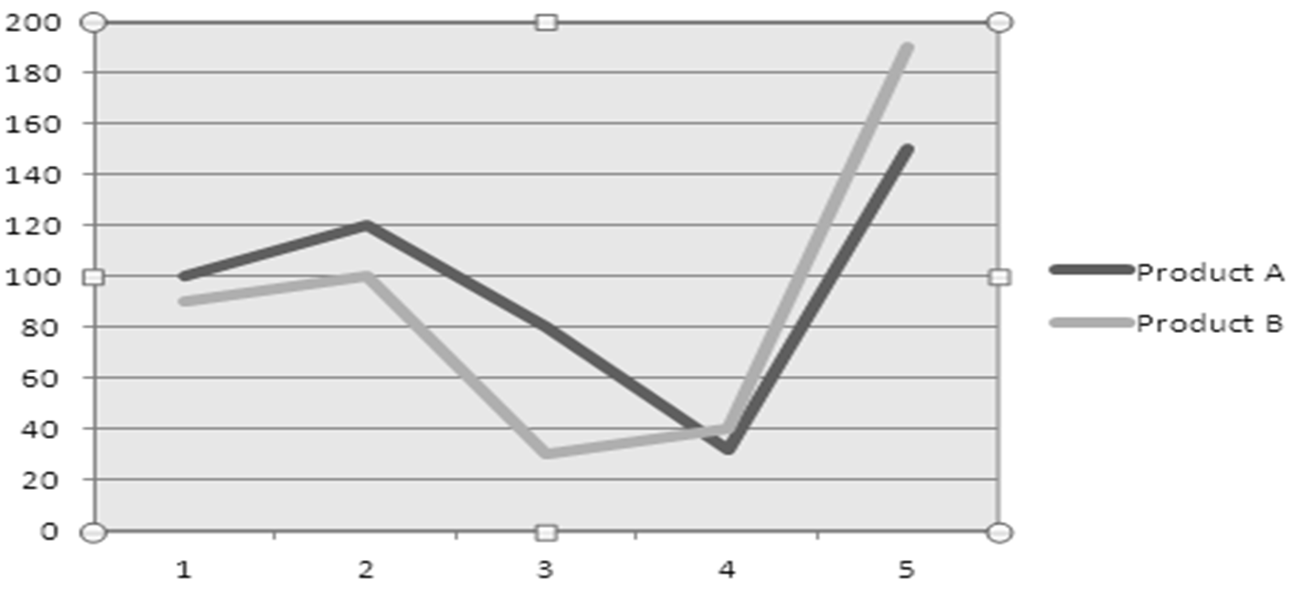
Broken line graphs show trends by connecting data points with lines. These graphs are arranged in two dimensions, like the bar graph, and are useful for illustrating trends. Multiple sets of measures can be depicted using different colors or line patterns like shading as seen in Figure 16-08.
Figure 16-08: Broken Line Graph – Sales by Product Example
Pie charts show how a whole is divided into categories within a circle. The percentage of each category is represented by its size. Categories are sequenced by size and labeled. Each percentage point is represented by 3.6 degrees in the circle. Figure 16-9 shows sales divided between regions using a pie chart.
Figure 16-9: Pie Chart

Histograms are commonly used to represent frequency distributions. They are bar graphs without space between the bars. Labels can indicate both absolute and relative frequency, as illustrated by Figure 16-10.
Figure 16-10: Histogram

Gauges are used to show progress toward goals or performance within tolerance levels. Progress bars and speedometers are examples of gauges. Figure 16-11 shows an example of this.
Figure 16-11: Gauge of Daily Production Level

Trees are used to depict hierarchies and to enable drill down navigation. Trees may be placed on the left side of a display to enable navigation to desired information. Trees are presented so branches can be expanded and hidden. Figure 16-12 shows an example sales organization hierarchy represented through a tree structure.
Figure 16-12: Sales Organization Tree Example

Mobile Device Considerations
The use of mobile devices to communicate business intelligence information is a revolutionary change. Increasingly business intelligence users expect to receive and use information on mobile devices. This in turn has an impact on the design of user friendly information displays.
Obviously screens are smaller than those of desktop and laptop computers. Mobile users intuitively touch and point at information desired as they explore data. These considerations should help you to design better scorecards, dashboards and other displays for mobile devices:
• Display the most important information in the upper right of the screen
• Break displays into multiple pages rather than trying to fit more items on a page than can be accommodated by mobile devices
• Avoid storing data on the mobile device to help mitigate security concerns
• Establish predefined drill paths and filters to easily navigate data
• Identify the mobile computing audience and determine requirements – different audiences may require different capabilities
• Obtain feedback from mobile users about display usability
• Consider HTML5 for designing mobile device displays because it can support many more devices than native apps.
|
Graphic Presentation Key Points • Graphic displays help people turn data into information. • Bar graphs are useful for displaying changes over time or for multiple categories for multiple groups. The groups can be rendered as separate bars or as stacked bars. • Broken line graphs illustrate trends by connecting data points with lines. Different colors and line patterns can be used to depict multiple groups. • Pie charts depict how a whole, rendered as a circle, is composed of categories, rendered as pie slices. • Histograms illustrate frequency distributions as a bar graph with no spaces between bars. • Gauges illustrate progress toward goals or measurement of KPIs using familiar symbols such as speedometers, progress bars, and traffic signals. • Trees depict hierarchies and support drill down, often using the familiar directory folder paradigm. • Keep it consistent – select a limited set of chart styles with consistent labels, colors, and symbols to make graphics. • Design for mobile device users. Data must be structured to fit into a smaller footprint and to be easily navigated. |
Learn More
Expand your knowledge of data presentation, including dashboards, scorecards, and portals.
|
Visit a website! |
Chandoo.org provides numerous tutorials that show how to create dashboards and scorecards using Microsoft Excel: http://www.chandoo.org Balanced Scorecard Institute provides education and best practices toward building balanced scorecards: http://www.balancedscorecard.org
|
|
Read about it! |
Try these books: Tufte, Edward. The Visual Display of Quantitative Information. Graphics Press, 2001. LaPointe, Patrick. Marketing by the Dashboard Light. National Board of Advertisers, 2005.
|