
5
Selecting the Optimal Price with Price Demand Elasticity
Price elasticity of demand measures how much a product’s consumption changes in response to price changes. A good is elastic if a price adjustment results in a significant shift in either supply or demand. If a price adjustment for the goods does not significantly affect demand or supply, it is inelastic. The elasticity of a product is impacted by the accessibility of an alternative. Demand won’t change as the price increases if the product is necessary and there are no suitable alternatives, making it inelastic.
In this chapter, we will learn about the following:
- What is price elasticity and how it can be used to maximize revenue?
- Exploring the data to determine pricing patterns and consumer behavior around them
- Determining the demand curve for different products
- Optimizing the price to maximize revenue for all items
In this case, we will use food truck sales data to analyze the impact of different pricing strategies.
Technical requirements
In order to be able to follow the steps in this chapter, you will need to meet the next requirements:
- A Jupyter Notebook instance running Python 3.7 or above. You can also use the Google Colab notebook to run the steps if you have a Google Drive account.
- Understanding of basic math and statistical concepts.
Understanding price demand elasticity
The concept of price elasticity is used when trying to explain the responsiveness of the number of goods sold to proportional increases in price. This is valuable information for managers that need to anticipate how the finance of the company will be affected by price rises and cuts.
Mathematically, it is as follows:

Here, each term represents the following:
 : Price elasticity
- Q: Quantity of the demanded good
 : Variation in the quantity of the demanded good
- P: Price of the demanded good
 : Variation in the price of the demanded good
Price elasticity is a measure of how sensitive the quantity required is to price, with nearly all goods seeing a fall in demand when prices rise but some seeing a greater decline. Price elasticity determines, while holding all other factors constant, the percentage change in quantity demanded by a 1% rise in price. When the elasticity is -2, the amount demanded decreases by 2% for every 1% increase in price. Outside of certain circumstances, price elasticity is negative. When a good is described as having an elasticity of 2, it almost invariably indicates that the formal definition of that elasticity is -2.
The term more elastic means that the elasticity of a good is greater, regardless of the sign. Two uncommon exceptions to the rule of demand, the Veblen and Giffen goods are two groups of goods with positive elasticity. A good’s demand is considered to be inelastic when its absolute value of elasticity is less than 1, meaning that price changes have a relatively minor impact on the amount demanded. If a good’s demand is more elastic than 1, it is considered to be elastic. A good with an elastic demand of -2 has a drop-in quantity that is twice as great as its price rise, whereas a good with an inelastic demand of -0.5 has a decrease in the quantity that is only half as great as the price increase.
When the price is chosen so that the elasticity is exactly 1, revenue is maximized. The incidence (or “burden”) of a tax on a good can be predicted using the elasticity of the good. To ascertain price elasticity, a variety of research techniques are employed, such as test markets, historical sales data analysis, and conjoint analysis.
Exploring the data
The experiment’s initial data source is the sales of a food truck outside of office buildings. It’s vital to review excessive prices because of the pressure on costs. The proprietor of a food truck must be aware of how a price increase affects the store’s demand for hamburgers. In other words, to determine how much the price can be raised, it is critical to understand the price elasticity of demand for the burgers in the store. In actuality, price elasticity measures how much a product’s price influences demand.
We will use the following Python modules in the next example:
- Pandas: A Python package for data analysis and data manipulation.
- NumPy: This is a library that adds support for large, multi-dimensional arrays and matrices, along with a large collection of high-level mathematical functions to operate on these arrays.
- statsmodels: A Python package that provides a complement to SciPy for statistical computations, including descriptive statistics and estimation and inference for statistical models. It provides classes and functions for the estimation of many different statistical models. It’s a Python package that is used for statistical methods and descriptive statistics, as well as other models’ statistical models.
- Seaborn and Matplotlib: Python packages for effective data visualization.
- The following block of code will load all the required packages as well as load the data and show the first five rows of it:
import seaborn as sns; sns.set(style="ticks",
data = pd.read_csv('foodcar_data.csv',data.head()
This results in the next DataFrame, showing the data that contains the transactional data of items sold by a food truck, along with some other external variables:

Figure 5.1: Food truck sales data to be analyzed
The data consists of the following variables:
- SELLER: Identifier of who sold the item
- CAT: Variable indicating whether the product was sold by itself (0) or as part of a combo (2)
- ITEM_ID: Identifier of the item sold
- ITEM_NAME: Full name of the item
- DATE: When the item was sold
- YEAR: Year extracted from the date
- HOLIDAY: Boolean variable that indicates whether that day was a holiday
- WEEKEND: Boolean variable indicating whether it was a weekend
- SCHOOLBREAK: Boolean variable indicating whether it was a school break
- AVG_TEMPERATURE: Temperature that day in degrees Fahrenheit
- In the next command, we will run a descriptive statistical analysis, previously removing the ITEM_ID column, because although this is understood as a numeric variable, it represents a categorical dimension.
data.drop(['ITEM_ID'],axis=1).describe()
This results in the following output:

Figure 5.2: Statistical description summary of the data
- One of the things we are interested to know is the different types of products that we will find in the data. In this case, we will just pick the SELLER, ITEM_ID, and ITEM_NAME data and remove the duplicates:
print(d)
This results in the following output:
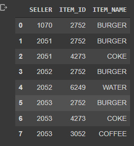
Figure 5.3: Products that are being sold
- By transforming this data into dummies, we can see that the seller column actually shows different combinations of products, some of them being sold alone and some of them being sold as combos, such as 4104, which is a burger and a bottle of water:
pd.concat([d.SELLER, pd.get_dummies(d.ITEM_NAME)], axis=1).groupby(d.SELLER).sum().reset_index(drop=True)
This results in the following output:

Figure 5.4: Combination of products sold
- One of the ways that we can use to start exploring the data is by running a pair plot. This Seaborn plot allows us to see the distribution of the values, as well as the relationship between the variables. It’s really useful if we want to be able to see any possible relationship between them at first glance:
sns.pairplot(data[['PRICE','QUANTITY']],height=5,aspect=1.2)
This results in the following output:
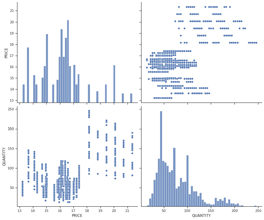
Figure 5.5: Pair plot of price and quantity
At a simple glance, we can see that there are many superimposed trends in the relationship between price and quantity. We can also see two very distinct groups, one placed in the lower-left quadrant and the other in the upper-right quadrant.
- We can explore the relationship between price and the CAT variable to dive into these differences using the Seaborn histogram plot and using the CAT variable as the hue. The next block of code does exactly this, first by creating a matplotlib figure, which is then populated with the defined histogram. This is useful for certain kinds of Seaborn plots that require this setup to define the figure size properly:
fig = sns.histplot(x='PRICE',data=data,hue='CAT',
palette=['red','blue'])
This results in the following output:

Figure 5.6: Price histogram differentiated by CAT
We can see in the preceding plot that the products that have a CAT value of 2 are more highly priced than the other ones.
- These are the product sold in combos, so this is a reasonable outcome. We can keep exploring these price differences by running a new pair plot – this time, looking for the relationship between PRICE, QUANTITY, and ITEM_NAME:
sns.pairplot(data[['PRICE','QUANTITY','ITEM_NAME']], hue = 'ITEM_NAME', plot_kws={'alpha':0.1},height=5,aspect=1.2)
This results in the following output:

Figure 5.7: Price, quantity, and item name pair plot
We can see now the differences between the prices of each item in a bit more detail. In this case, the burgers have the highest price, and water is the cheapest (again, reasonable). What is interesting to see is that for the same items, we have different prices, and differences in the number of units being sold.
We can conclude then that is necessary to analyze the price difference by having a clear distinction per item, as we will most likely have different elasticities and optimal prices for each one of them.
- The next block of code will create a Matplotlib figure of 10 x 6 inches and fill it up with a Seaborn histogram plot that will show us the distribution of item names per category:
fig = sns.histplot(x='ITEM_NAME',data=data,hue='CAT', palette=['red','blue'])
This results in the following output:
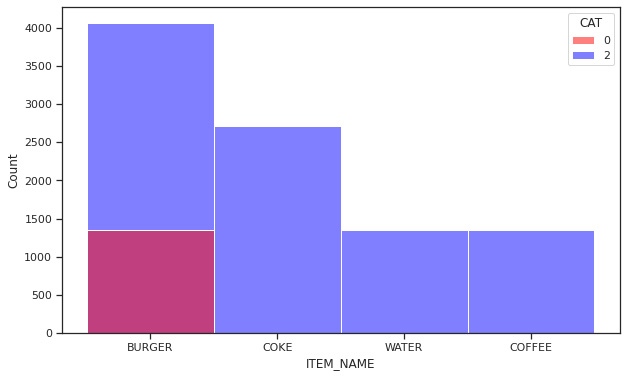
Figure 5.8: Histogram of item names per category
From this histogram, we can see that the burger is the only item that belongs to category 0, so that is sold alone. This means that Coke, water, and coffee are all sold in a bundle along with a burger. This is useful information, as it shows us the way the food truck owner sells their products, thus allowing us to think of better ways to price or combine products to be offered to customers.
- The next block of code will filter the data to only contain items that fall into CAT = 2 and will create a Seaborn relation plot to explain the relationship between price and quantity:

Figure 5.9: Price versus quality relationship for CAT = 2 items
In the relationship plot shown here, we can see the relationship between price and quality in items that belong to the second category, meaning that all of them were sold as part of a combo. Besides the outliers, which were priced much higher than the rest of the data points, most of the items are within a certain range. Although we are looking at several items at the same time, we can see a certain relationship by realizing that items that were priced lower were sold in greater quantities. Our job will now be to dive into the specifics of these relationships at the item level in order to be able to determine the price that will maximize the revenue.
- In the next block of code, we will try to capture the changes in price and the quantities being sold over time. We will create a new set of data in which we will look at the prices and quantities in a normalized way by subtracting the mean and dividing it by the range:
d['QUANTITY'] = (d['QUANTITY'] - d['QUANTITY'].mean())/((d['QUANTITY'].max() - d['QUANTITY'].min()))
- Once we have normalized the price and quantities on a scale that ranges from -1 to 1, we will set d['DATE'] as the index, and finally, apply a rolling average to soften the curves, and use the plot method of the pandas DataFrame object:

Figure 5.10: Price versus quality relationship over time
It is interesting to see that price reductions have always led to increases in the quantities being sold. In this case, we can see that the biggest price drop was in the first half of 2020, which led to an increase in the quantities being sold. The question that we need to ask is whether the amount of revenue that was lost by this price reduction has been compensated for by an increase in the number of products sold.
- In the next block of code, we will try to dive into the correlation between the different variables and price. To do this, we will use both the corr() method of the pandas Dataframe, and the NumPy library to create a mask to “cover” the repeated values above the diagonal, as well as the matplotlib library to create a 12 x 12-inch figure to populate with a Seaborn heat map:

Figure 5.11: Correlation between variables
The data shown here gives us an idea of how the variables are correlated. We can see that there is a negative correlation between price versus temperature (people do not fancy a coffee and a burger combo when it is too hot perhaps), positive with a school break (maybe kids also buy products on these days), and a negative relationship with the weekend, which might indicate that the location of the food truck has less traffic during the weekends.
Please take these conclusions with a grain of salt, as we would need to go through a case-by-case analysis by item to corroborate these assumptions, and always remember the maxima that correlation does not imply causation.
Now that we have explored the data to understand the price differences for what would otherwise have seemed like the same items, as well as to understand how this distribution looks, we can try to estimate the demand curve. Knowing the demand curve allows us to establish the relationship between price and quantity sold, and it’s what we will do in the next section.
Finding the demand curve
A demand curve in economics is a graph that depicts the relationship between the price of a specific good and the amount of that good needed at that price. Individual demand curves are used for price-volume interactions between individual consumers, while market-wide demand curves are utilized for all consumers (a market demand curve).
It is generally accepted that the demand curve declines because of the law of demand. For the majority of things, demand declines as price rises. This law does not apply in several peculiar circumstances. These include speculative bubbles, Veblen goods, and Giffen goods, and when prices rise, purchasers are drawn to the products.
Demand curves are used in combination with supply curves to establish an equilibrium price. At this ideal point, both sellers and buyers have achieved a mutual understanding of how valuable a good or service really is, which allows us to produce just enough to satisfy the demand without shortages or excess.
Exploring the demand curve in code
In order to find the demand curve for each one of the items, first, we will isolate the data for each item into a separate data frame:
- In the next block of code, we create a DataFrame for burger_2752 to dive into the specifics of the price versus demand relationship of this specific item, as we suspect that each item has its own specific demand curve:
burger_2752 = data[data['ITEM_ID']==2752].drop(['
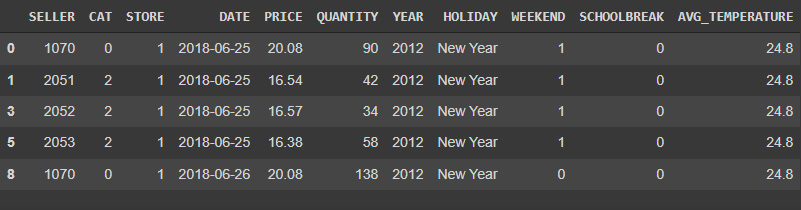
Figure 5.12: Burger data
- Once we have isolated the data, we can start to determine the relationship between price versus data. To do this, we will use the statsmodels package, specifically the Ordinary Least Squares (OLS) module. We will analyze the relationship by passing the expected relationship as "QUANTITY ~ PRICE" as a parameter to the OLS function. This way, the OLS function will interpret Quantity as a dependent variable and Price as the independent variable. We could also pass other variables as dependent but for now, we will just focus on Price:
model = ols("QUANTITY ~ PRICE", burger_2752).fit() - Once the model is properly fitted to the data, we can print the slope of the relationship as the given item, price_elasticity, as well as the other parameters on the OLS model:
price_elasticity))
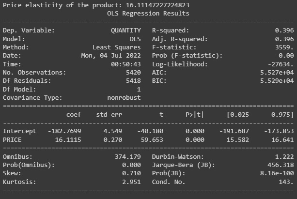
Figure 5.13: Burger OLS model summary
One of the ways in which we can analyze the model performance is by looking at the regression plots of the intercept and error. These are scatter plots that provide us with a sense of the relationship between dependent and independent variables in linear regression.
- The next block of code will create a Matplotlib figure of 12 x 8 inches, and use statsmodels to create the partial regression plot for the model:
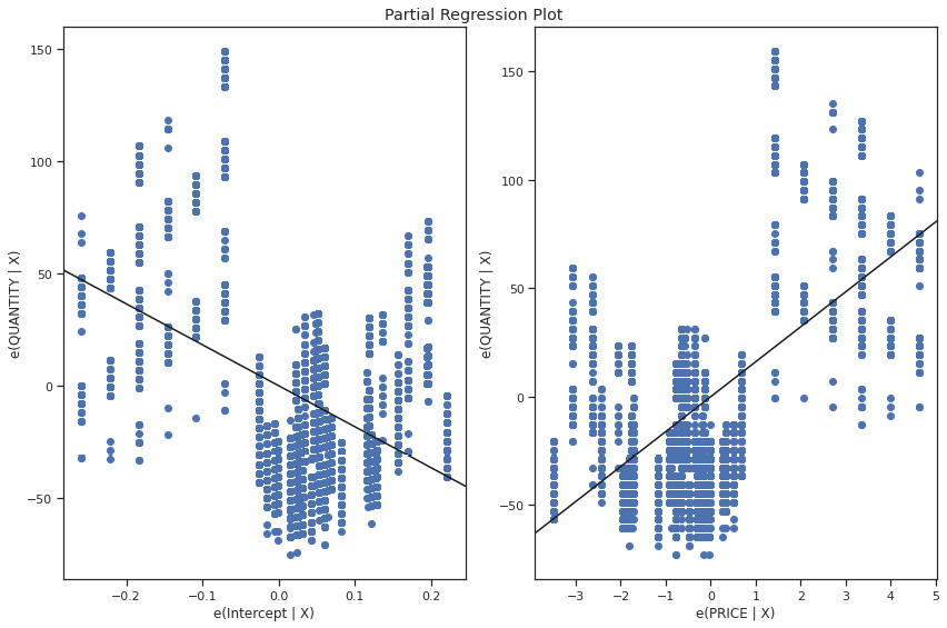
Figure 5.14: Burger OLS model partial regression plot
- The next step in our analysis will be to create a function to pack the creation of the models, determine the price elasticity, and return the price elasticity and the model itself. This function takes the data for each item as a parameter:
return price_elasticity, model
- Now that we have defined the function, we will create two dictionaries to store the results: one for the elasticities, and the other for the models themselves. After this, we will loop over all the unique items in the data, apply the function to the subset of data, and finally, store the results for each one of the items:
models = {}price_elasticity, item_model =
create_model_and_find_elasticity(data[data[
'ITEM_ID']==item_id])
- After running through all the unique items, we can print the results of the elasticities for each item.

Figure 5.15: Product items elasticities
Now that we have determined the price elasticities for each item, we can simulate the different possible prices and find the point which maximizes revenue.
Optimizing revenue using the demand curve
Once we have established the relationship between the price and the quantity, we can simulate the revenue for each one of the possible prices. To do this, we will find the minimum and maximum price for each item, establish a threshold, create a range of possible prices, and use the stored model to predict the quantity sold. The next step is to determine the total revenue by multiplying the price by quantity. It is important to note that in this kind of analysis, it is always better to look at the revenue rather than the profit because most of the time, we don’t have the data for the cost of each item. We will explore how to do so using the following steps:
- The next block of code will take the data for burger_2752, determine the upper and lower price boundaries, create a range using a NumPy range, and finally, use the trained model to predict the quantity sold and therefore the revenue:
test.head()
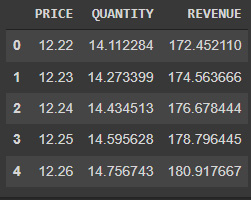
Figure 5.16: First rows of the predicted revenue for each price
- To be able to visualize the relationship between the variables, regardless of the unit of measure, we will normalize the data variables by subtracting the mean and diving by the range. Finally, we will use the plot method to visualize the data:
test['QUANTITY'] = (test['QUANTITY']-test['QUANTITY'].mean())/(test['QUANTITY'].max()-test['QUANTITY'].min())
test['REVENUE'] = (test['REVENUE']-test['REVENUE'].mean())/(test['REVENUE'].max()-test['REVENUE'].min())
test.plot(figsize=(12,8),title='Price Elasticity - Item 2752)
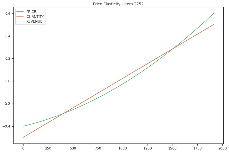
Figure 5.17: burger_2752 demand curve
We can see from the demand curve that this item is inelastic, meaning that even if the price goes up, more of this kind of product will continue to sell. To get a better picture, we will repeat the same exercise for a different item.
- We will use the coffee data and repeat the same exercise to visualize the demand curve:
test['QUANTITY'] = (test['QUANTITY']-test['QUANTITY'].mean())/(test['QUANTITY'].max()-test['QUANTITY'].min())
test['REVENUE'] = (test['REVENUE']-test['REVENUE'].mean())/(test['REVENUE'].max()-test['REVENUE'].min())
test.plot(figsize=(12,8),title='Price Elasticity - Item 3052')
By running the preceding code, we can see that the demand curve is concave, with a negative elasticity, which means that if the price goes up, fewer units will be sold. Although this will create a decrease in revenue due to fewer units being sold, it also means that it will increase due to the higher price.
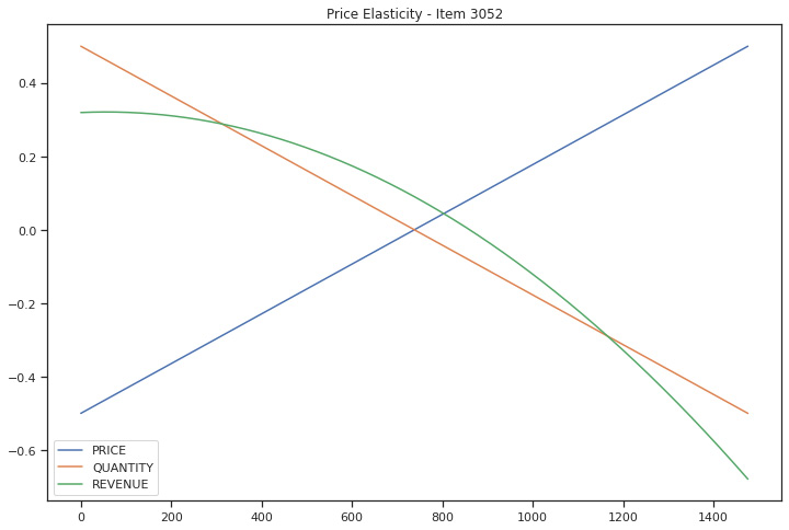
Figure 5.18: coffee_3052 demand curve
- Now, we can take this procedure and transform it into a function that can be applied to each item’s data to obtain the demand curve, and also determine the optimal price.
The way in which we can determine the optimal price is quite simple. We just need to find the maximum value in the REVENUE column and find the optimal set of values. We can do this simply by using the NumPy package and the where clause, which will return the values at which the revenue is highest:
def find_optimal_price(data, model,item_id):
  start_price = data.PRICE.min() - 1
  end_price = data.PRICE.max() + 10
  test = pd.DataFrame(columns = ["PRICE", "QUANTITY"])
  test['PRICE'] = np.arange(start_price, end_price,0.01)
  test['QUANTITY'] = model.predict(test['PRICE'])
  test['REVENUE'] = test["PRICE"] * test["QUANTITY"]
  test['P'] = (test['PRICE']-test['PRICE'].mean())/(test['PRICE'].max()-test['PRICE'].min())
  test['Q'] = (test['QUANTITY']-test['QUANTITY'].mean())/(test['QUANTITY'].max()-test['QUANTITY'].min())
  test['R'] = (test['REVENUE']-test['REVENUE'].mean())/(test['REVENUE'].max()-test['REVENUE'].min())
  test[['P','Q','R']].plot(figsize=(12,8),title='Price Elasticity - Item'+str(item_id))
  ind = np.where(test['REVENUE'] == test['REVENUE'].max())[0][0]
  values_at_max_profit = test.drop(['P','Q','R'],axis=1).iloc[[ind]]
  values_at_max_profit = {'PRICE':values_at_max_profit['PRICE'].values[0],'QUANTITY':values_at_max_profit['QUANTITY'].values[0],'REVENUE':values_at_max_profit['REVENUE'].values[0]}
  return values_at_max_profit
- Now that we have the function to determine the maximum profit, we can calculate the optimal price for all items and store them in a dictionary:
optimal_price[item_id] =
find_optimal_price(data[data['ITEM_ID']==item_id],
models[item_id],item_id)
After running this for all of the items in the data, we can determine the parameters that will maximize the revenue for the food truck.

Figure 5.19: item_6249 demand curve
We can see for the other two items left to be analyzed that their elasticity is also negative, implicating that the higher the price, the lower the number of units sold is.
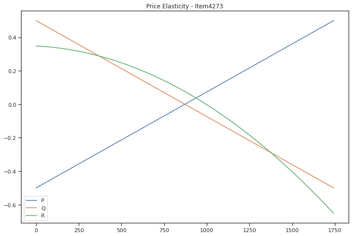
Figure 5.20: item_4273 demand curve
- Now that we have the optimal prices, we can print the parameters that lead to a maximization of the revenue. The next block of code iterates over the optimal_price dictionary:
print(item_id,optimal_price[item_id])

Figure 5.21: Optimal parameters for each item
In this way, we can determine the optimal price, regardless of the item’s characteristics, and how much the customers are willing to pay for each item.
Summary
In this chapter, we dived into the relationship between the price of an item and the number of items being sold. We studied that different items have different demand curves, which means that in most cases, a higher price leads to the least items being sold, but this is not always the case. The relationship between price and quantity being sold can be modeled using price elasticity, which gives us an idea of how much the number of products being sold will be reduced by a given increase in the price.
We looked into the food truck sales data in order to determine the best price for each one of their items and we discovered that these items have different elasticities and that for each item, we can determine the price, which will maximize the revenue.
In the next chapter, we will focus on improving the way we bundle and recommend products by looking at how to perform a Market Basket analysis to recommend meaningful products that are frequently bought together.