
8
Grouping Users with Customer Segmentation
To better understand consumer needs, we need to understand that our customers have distinct consumer patterns. Each mass of consumers of a given product or service can be divided into segments, described in terms of age, marital status, purchasing power, and so on. In this chapter, we will be performing an exploratory analysis of consumer data from a grocery store and then applying clustering techniques to separate them into segments with homogenous consumer patterns. This knowledge will enable us to better understand their needs, create unique offers, and target them more effectively. In this chapter, we will learn about the following topics:
- Understanding customer segmentation
- Exploring data about a customer’s database
- Applying feature engineering to standardize variables
- Creating users’ segments with K-means clustering
- Describing the common characteristics of these clusters
Let us see the requirements to understand the steps and follow the chapter.
Technical requirements
To be able to follow the steps in this chapter, you will need to meet the following requirements:
- A Jupyter notebook instance running Python 3.7 and above. You can also use the Google Colab notebook to run the steps if you have a Google Drive account.
- An understanding of basic math and statistical concepts.
- A Kaggle account—you must agree to the terms and conditions of the competition from where we will get the data, which you can find here: https://www.kaggle.com/datasets/imakash3011/customer-personality-analysis.
Understanding customer segmentation
Customer segmentation is the practice of classifying customers into groups based on shared traits so that businesses may effectively and appropriately market to each group. In business-to-business (B2B) marketing, a firm may divide its clientele into several groups based on a variety of criteria, such as location, industry, the number of employees, and previous purchases of the company’s goods.
Businesses frequently divide their clientele into segments based on demographics such as age, gender, marital status, location (urban, suburban, or rural), and life stage (single, married, divorced, empty nester, retired). Customer segmentation calls for a business to collect data about its customers, evaluate it, and look for trends that may be utilized to establish segments.
Job title, location, and products purchased—for example—are some of the details that can be learned from purchasing data to help businesses to learn about their customers. Some of this information might be discovered by looking at the customer’s system entry. An online marketer using an opt-in email list may divide marketing communications into various categories based on the opt-in offer that drew the client, for instance. However, other data—for example, consumer demographics such as age and marital status—will have to be gathered through different methods.
Other typical information-gathering methods in consumer goods include:
- Face-to-face interviews with customers
- Online surveys
- Online marketing and web traffic information
- Focus groups
All organizations, regardless of size, industry, and whether they sell online or in person, can use customer segmentation. It starts with obtaining and evaluating data and concludes with taking suitable and efficient action on the information acquired.
We will execute an unsupervised clustering of data on the customer records from a grocery store’s database in this chapter. To maximize the value of each customer to the firm, we will segment our customer base to alter products in response to specific needs and consumer behavior. The ability to address the needs of various clientele also benefits the firm.
Exploring the data
The first stage to understanding customer segments is to understand the data that we will be using. The first stage is, then, an exploration of the data to check the variables we must work with, handle non-structured data, and adjust data types. We will be structuring the data for the clustering analysis and gaining knowledge about the data distribution.
For the analysis we will use in the next example, the following Python modules are used:
- Pandas: Python package for data analysis and data manipulation.
- NumPy: This is a library that adds support for large, multi-dimensional arrays and matrices, along with an ample collection of high-level mathematical functions to operate on these arrays.
- Statsmodels: Python package that provides a complement to scipy for statistical computations, including descriptive statistics and estimation and inference for statistical models. It provides classes and functions for the estimation of many different statistical models.
- Yellowbrick: A Python package of visual analysis and diagnostic tools designed to facilitate machine learning (ML) with scikit-learn.
- Seaborn, mpl_toolkits, and Matplotlib: Python packages for effective data visualization.
We’ll now get started with the analysis, using the following steps:
- The following block of code will load all the required packages mentioned earlier, including the functions that we will be using, such as LabelEncoder, StandardScaler, and Kmeans:
from sklearn.cluster import AgglomerativeClustering
- For readability purposes, we will limit the maximum rows to be shown to 20, set the limit of maximum columns to 50, and show the floats with 2 digits of precision:
pd.options.display.precision = 2
- Next, we will load the data, which is stored in the local data folder. The file is in CSV format with a tab delimiter. We will read the data into a Pandas DataFrame and print the data shape as well as show the first rows:
data.head()
This results in the following output:
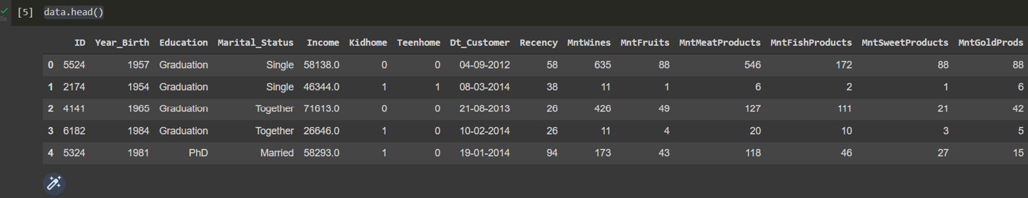
Figure 8.1: User data
- In order to get a full picture of the steps that we will be taking to clean the dataset, let us have a look at the statistical summary of the data with the describe method:
data.describe()
This results in the following output:
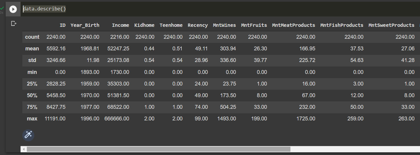
Figure 8.2: Descriptive statistical summary
- To get more information on features, we can use the info method to display the number of null values and data types:
data.info()
This results in the following output:
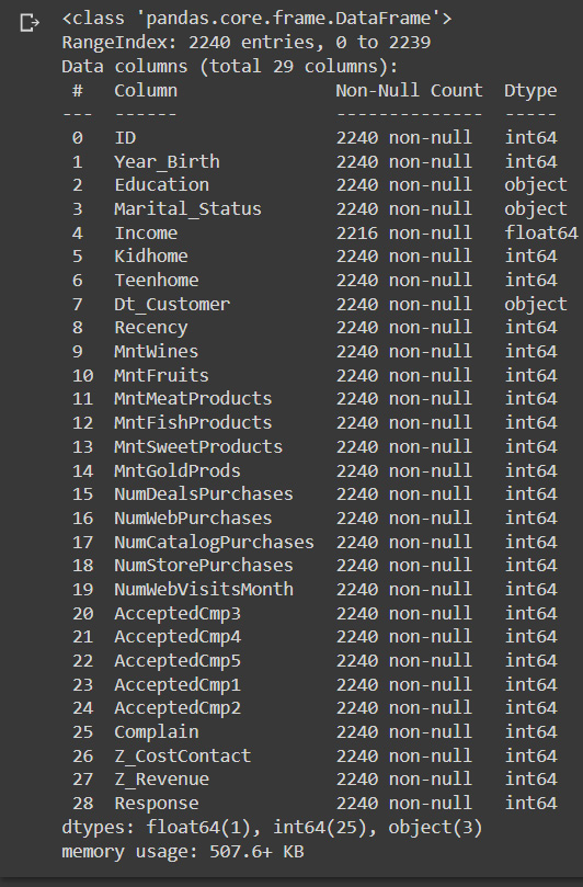
Figure 8.3: Column data types and null values
From the preceding output shown with the describe and info methods of Pandas DataFrames, we can see the following:
- There are 26 missing values in the Income column
- The date variable named Dt_Customer, indicating the date a customer joined the database, is not parsed as DateTime
- There are categorical features in our DataFrame of the dtype object that we will need to encode into numerical features later to be able to apply the clustering method
- To address the missing values, we will drop the rows that have missing income values, as it is an important variable to describe to customers:
print("Data Shape", data.shape) - We will parse the date column using the pd.to_datetime Pandas method. Take into account that the method will infer the format of the date, but we can otherwise specify it if it is necessary:
data["Dt_Customer"] = pd.to_datetime(data["Dt_Customer"])
- After parsing the dates, we can look at the values of the newest and oldest recorded customer:
>>>> ('2012-01-08 00:00:00', '2014-12-06 00:00:00') - In the next step, we will create a feature out of Dt_Customer that indicates the number of days a customer is registered in the firm’s database, relative to the first user that was registered in the database, although we could use today’s date. We do this because we are analyzing historical records and not up-to-date data. The Customer_For feature is, then, the date of when the customer was registered minus the minimum value in the date column and can be interpreted as the number of days since customers started to shop in the store relative to the last recorded date:
data["Customer_For"] = data["Customer_For"].dt.days
- Now, we will explore the unique values in the categorical features to get a clear idea of the data:
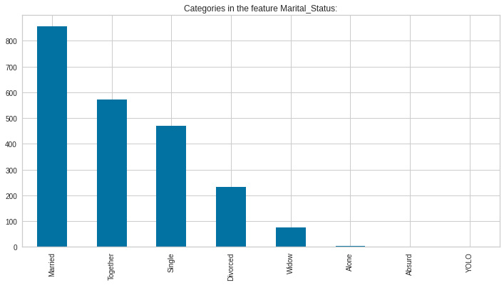
Figure 8.4: Marital status
Here, we can see that there are several types of marital status, which may have been caused by free text entry during the data capturing. We will have to standardize these values.
- Next, we will look at the values in the Education feature using the value_counts method to create a bar chart using the Pandas plot method:

Figure 8.5: Education values
Again, we can see the effects of free text entry as there are several values that have the same underlying meaning; thus, we will need to standardize them as well.
In the next section, we will apply feature engineering to structure the data for better understanding and treatment of the data.
Feature engineering
To be able to properly analyze the data as well as to model the clusters, we will need to clean and structure the data—a step that is commonly referred to as feature engineering—as we need to restructure some of the variables according to our plan of analysis.
In this section, we will be performing the next steps to clean and structure some of the dataset features, with the goal of simplifying the existing variables and creating features that are easier to understand and describe the data properly:
- Create an Age variable for a customer by using the Year_Birth feature, indicating the birth year of the respective person.
- Create a Living_With feature to simplify the marital status, to describe the living situation of couples.
- Create a Children feature to indicate the total number of children in a household—that is, kids and teenagers.
- Aggregate spending by product type to better capture consumer behaviors.
- Indicate parenthood status with a feature named Is_Parent.
So, let’s apply the steps mentioned here to structure the data:
- First, let us start with the age of the customer as of today, using the pd.to_datetime method to get the current year and the year of birth of the customers:
data["Age"] = pd.to_datetime('today').year -data["Year_Birth"]
- Now, we will model the spending on distinct items by using the sum method on selected columns and summing along the column axis:
prod_cols = ["MntWines","MntFruits","MntMeatProducts",
data["Spent"] = data[prod_cols].sum(axis=1)
- As the next step, we will map the marital status values into a different encoding to simplify terms with close meaning. For this, we define a mapping dictionary and use it to replace the values in the marital_status column to create a new feature:
"Widow":"Alone",
data["Living_With"] = data["Marital_Status"].replace(marital_status_dict)
- Next, we create a Children feature by summing up the total number of children living in the household plus teens living at home:
data["Children"]=data["Kidhome"]+data["Teenhome"]
- Now, we model the total members in the household using the relationship and children data:
data["Family_Size"] = data["Living_With"].replace({"Alone": 1, "Partner":2})+ data["Children"] - Finally, we capture the parenthood status in a new variable:
data["Is_Parent"] = (data.Children> 0).astype(int)
- Now, we will segment education levels into three groups for simplification:
edu_dict = {"Basic":"Undergraduate","2n Cycle":"Undergraduate", "Graduation":"Graduate", "Master":"Postgraduate", "PhD":"Postgraduate"}data["Ed_level"]=data["Education"].replace(edu_dict)
- Now, to simplify, we rename columns into more understandable terms using a mapping dictionary:
"MntFruits":"Fruits",
data = data.rename(columns=col_rename_dict)
- Now, we will drop some of the redundant features to focus on the clearest features, including the ones we just created. Finally, we will look at the statistical descriptive analysis using the describe method:
to_drop = ["Marital_Status", "Dt_Customer",
data.describe()
- The stats show us that there are some discrepancies in the Income and Age features, which we will visualize to better understand these inconsistencies. We will start with a histogram of Age:

Figure 8.6: Age data
We can see that there are some outliers, more than 120 years old, so we will be removing those.

Figure 8.7: Income data
Again, we can see that most incomes are below 20,000, so we will be limiting the spending level.
- Next, we drop the outliers by setting a cap on Age to avoid data that doesn’t reflect reality, and the income to include 99% of the cases:
prev_len = len(data)
print('Removed outliers:',new_len)
The preceding code prints the next output:
>>> Removed outliers: 11
- Now, we can look back at the Age and Spend data distribution to better understand our customers. We start by creating a histogram plot of the Age feature:

Figure 8.8: Age with no outliers
The age is centered on the 50s, with a skew to the right, meaning that the average age of our customers is above 45 years.
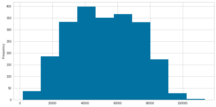
Figure 8.9: Income with no outliers
Looking at the spend distribution, it has a normal distribution, centered on 4,000 and slightly skewed to the left.
- Up next, we will create a Seaborn pair plot to show the relationships between the different variables, with color labeling according to the parental status:

Figure 8.10: Relationship plot
These graphics allow us to quickly observe relationships between the different variables, as well as their distribution. One of the clearest is the relationship between spend and income, in which we can see that the higher the income, the higher the expenditure, as well as observing that single parents spend more than people who are not. We can also see that the consumers with higher recency are parents, while single consumers have lower recency values. Next, let us look at the correlation among the features (excluding the categorical attributes at this point).
- We will create a correlation matrix using the corr method, and show only the lower triangle of data using a numpy mask. Finally, we will use a Seaborn method to display the values:
df_corr = data.corr()
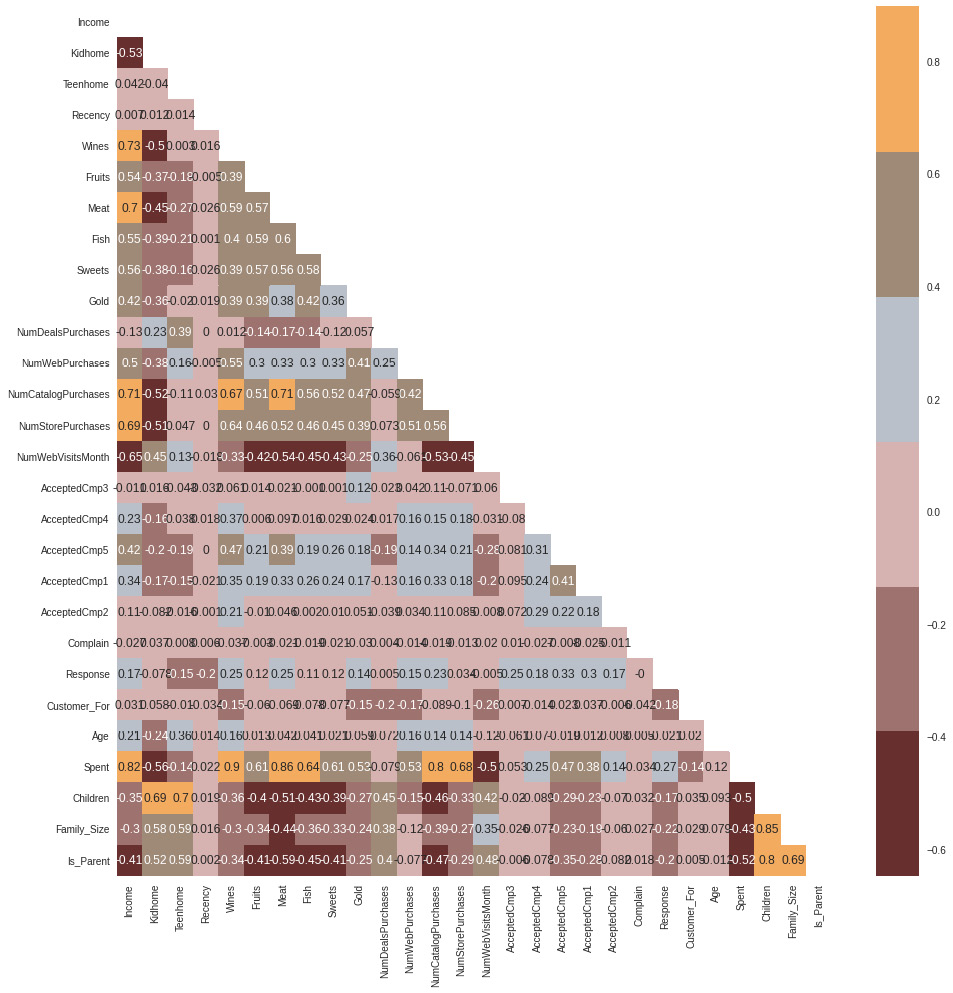
Figure 8.11: Variable correlation
The correlations allow us to explore the variable relationships in more detail. We can see negative correlations between children and expenditure in the mean, while there are positive relationships between children and recency. These correlations allow us to better understand consumption patterns.
In the next section, we will use the concept of clustering to segment the clients into groups that share common characteristics.
Creating client segments
Marketers can better target different audience subgroups with their marketing efforts by segmenting their audiences. Both product development and communications might be a part of those efforts. Segmentation benefits a business by allowing the following:
- Creating targeted marketing communication on the right communication channel for each client or user segment
- Applying the right pricing options to the right clients
- Concentrating on the most lucrative clients
- Providing better client service
- Promoting and cross-promoting other goods and services
In this section, we will be preprocessing the data to be able to apply clustering methods for customer segmentation. The steps that we will apply to preprocess the data are set out here:
- Encoding the categorical variables using a label encoder, which will transform them into numerical columns
- Scaling features using the standard scaler to normalize the values
- Applying principal component analysis (PCA) for dimensionality reduction
So, let’s follow the steps here:
- First, we need to list the categorical variables. Here, we will use the column names and check the column dtype to get only the object columns:
print("Categorical variables in the dataset:", object_cols) - Next, we will encode the dtypes object using the sklearn LabelEncoder function:
for i in object_cols:
data[i]=data[[i]].apply(LE.fit_transform)
- We subset the data and apply scaling to the numerical variables by dropping the features on deals accepted and promotions:
scaled_ds = data.copy()
cols_del = ['AcceptedCmp3', 'AcceptedCmp4', 'AcceptedCmp5', 'AcceptedCmp1','AcceptedCmp2', 'Complain', 'Response']
scaled_ds = scaled_ds.drop(cols_del, axis=1)
- Finally, we can apply the scaling:
scaler.fit(scaled_ds)
scaled_ds = pd.DataFrame(scaler.transform(
scaled_ds),columns= scaled_ds.columns )
There are numerous attributes in this dataset that describe the data. The more features there are, the more difficult it is to correctly analyze them in a business environment. Many of these characteristics are redundant since they are connected. Therefore, before running the features through a classifier, we will conduct dimensionality reduction on the chosen features.
Dimensionality reduction is the process of reducing the number of random variables considered. To reduce the dimensionality of huge datasets, a technique known as PCA is frequently utilized. PCA works by condensing an ample collection of variables into a smaller set that still retains much of the data in the larger set.
Accuracy naturally suffers as a dataset’s variables are reduced, but the answer to dimensionality reduction is to trade a little accuracy for simplicity since ML algorithms can analyze data much more quickly and easily with smaller datasets because there are fewer unnecessary factors to process. In conclusion, the basic principle of PCA is to keep as much information as possible while reducing the number of variables in the data collected.
The steps that we will be applying in this section are the following:
- Dimensionality reduction with PCA
- Plotting the reduced DataFrame in a 3D plot
- Dimensionality reduction with PCA, again
This will allow us to have a way to visualize the segments projected into three dimensions. In an ideal setup, we will use the weights of each component to understand what each component represents and make sense of the information we are visualizing in a better way. For reasons of simplicity, we will focus on the visualization of the components. Here are the steps:
- First, we will initiate PCA to reduce dimensions or features to three in order to reduce complexity:
pca = PCA(n_components=3)
PCA_ds = pd.DataFrame(PCA_ds, columns=([
"component_one","component_two", "component_three"]))
- The amount of variation in a dataset that can be attributed to each of the main components (eigenvectors) produced by a PCA is measured statistically as “explained variance”. This simply refers to how much of a dataset’s variability may be attributed to each unique primary component.
>>>>[0.35092717 0.12336458 0.06470715]
For this project, we will reduce the dimensions to three, which manages to explain the 54% total variance in the observed variables:
print('Total explained variance',sum(pca.explained_variance_ratio_))
>>>> Total explained variance 0.5389989029179605- Now we can project the data into a 3D plot to see the points’ distribution:
x,y,z=PCA_ds["component_one"],PCA_ds[
plt.show()
The preceding code will show us the dimensions projected in three dimensions:

Figure 8.12: PCA variables in 3D
Since the attributes are now only three dimensions, agglomerative clustering will be used to perform the clustering. A hierarchical clustering technique is agglomerative clustering. Up until the appropriate number of clusters is reached, examples are merged.
The process of clustering involves grouping the population or data points into a number of groups so that the data points within each group are more like one another than the data points within other groups. Simply put, the goal is to sort into clusters any groups of people who share similar characteristics. Finding unique groups, or “clusters”, within a data collection is the aim of clustering. The tool uses an ML algorithm to construct groups, where members of a group would typically share similar traits.
Two methods of pattern recognition used in ML are classification and clustering. Although there are some parallels between the two processes, clustering discovers similarities between things and groups them according to those features that set them apart from other groups of objects, whereas classification employs predetermined classes to which objects are assigned. “Clusters” is the name for these collections.
The steps involved in clustering are set out here:
- Elbow method to determine the number of clusters to be formed
- Clustering via agglomerative clustering
- Examining the clusters formed via a scatter plot
In K-means clustering, the ideal number of clusters is established using the elbow approach. The number of clusters, or K, formed by various values of the cost function are plotted using the elbow approac:.
- The elbow approach is a heuristic used in cluster analysis to estimate the number of clusters present in a dataset. Plotting the explained variation as a function of the number of clusters, the procedure entails choosing the elbow of the curve as the appropriate number of clusters, as illustrated in the following code snippet:
fig = plt.figure(figsize=(12,8))
elbow = KElbowVisualizer(KMeans(), k=(2,12), metric='distortion') # distortion: mean sum of squared distances to centers
elbow.fit(PCA_ds)
elbow.show()
This code will plot an elbow plot, which will be a good estimation of the required number of clusters:
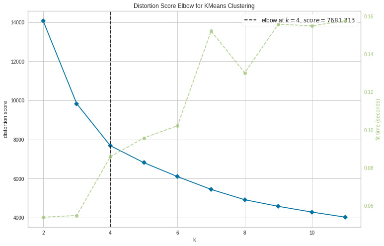
Figure 8.13: Elbow method
- According to the preceding cell, four clusters will be the best choice for this set of data. To obtain the final clusters, we will then fit the agglomerative clustering model, like so:
yhat_AC = AC.fit_predict(PCA_ds)
PCA_ds["Clusters"] = yhat_AC
- Finally, we will add a Clusters feature to the original DataFrame for visualization:
data["Clusters"]= yhat_AC
- Now, we can visualize the clusters in three dimensions using the color codes of each cluster:
values = PCA_ds["Clusters"]
ax = plt.subplot(projection='3d')
plt.legend(handles=scatter.legend_elements()[0], labels=classes)
The preceding code will show a three-dimensional visualization of the PCA components colored according to the clusters:

Figure 8.14: PCA variables with cluster labeling
From this, we can see that each cluster occupies a specific space in the visualization. We will now dive into a description of each cluster to better understand these segments.
Understanding clusters as customer segments
To rigorously evaluate the output obtained, we need to evaluate the depicted clusters. This is because clustering is an unsupervised method and the patterns extracted should always reflect reality, otherwise; we might just as well be analyzing noise.
Common traits among consumer groups can help a business choose which items or services to advertise to which segments and how to market to each one.
To do that, we will use exploratory data analysis (EDA) to look at the data in the context of clusters and make judgments. Here are the steps:
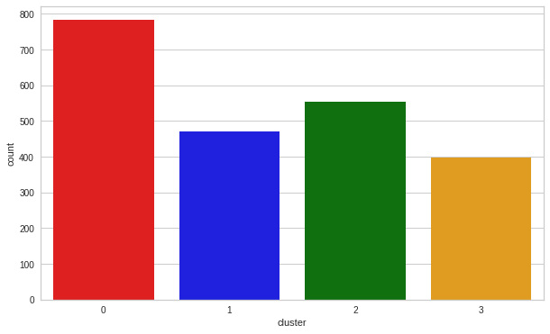
Figure 8.15: Cluster count
The clusters are fairly distributed with a predominance of cluster 0. It can be clearly seen that cluster 1 is our biggest set of customers, closely followed by cluster 0.
- We can explore what each cluster is spending on for the targeted marketing strategies using the following code:
f, ax = plt.subplots(figsize=(12, 8))
pl = sns.scatterplot(data = data,x=data["Spent"], y=data["Income"],hue=data["Clusters"], palette= colors)
plt.legend()
plt.show()
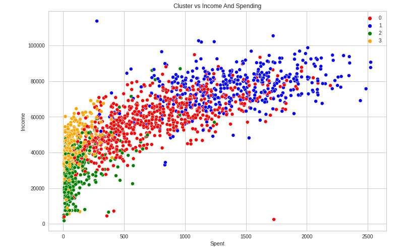
Figure 8.16: Income versus spending
In the income versus spending plot, we can see the next cluster patterns:
- Cluster 0 is of high spending and average income
- Cluster 1 is of high spending and high income
- Cluster 2 is of low spending and low income
- Cluster 3 is of high spending and low income
- Next, we will see the detailed distribution of clusters of the expenditure per product in the data. Namely, we will explore expenditure patterns. The code is illustrated here:
sample = data.sample(750)

Figure 8.17: Spend distribution per cluster
From Figure 8.17, it can be seen how the spend is evenly distributed in cluster 0, cluster 1 is centered on high expenditure, and clusters 2 and 3 center on low expenditure.
- Next, we will use Seaborn to create Boxen plots of the clusters to find the spend distribution per cluster:
f, ax = plt.subplots(figsize=(12, 6))
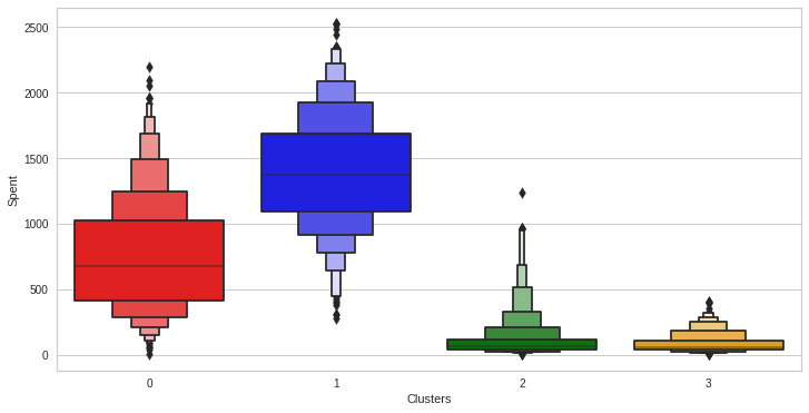
Figure 8.18: Spend distribution per cluster (Boxen plot)
We can visualize the patterns in a different way using a Boxen plot.
- Next, we will create a feature to get a sum of accepted promotions so that we can model their relationships with the different clusters:
data["TotalProm"] = data["AcceptedCmp1"]+ data["AcceptedCmp2"]+ data["AcceptedCmp3"]+ data["AcceptedCmp4"]+ data["AcceptedCmp5"]
- Now, we will plot the count of total campaigns accepted in relation to the clusters:
f, ax = plt.subplots(figsize=(10, 6))
pl = sns.countplot(x=data["TotalProm "],hue=data["Clusters"], palette= ['red','blue','green','orange'])
pl.set_ylabel("Count")
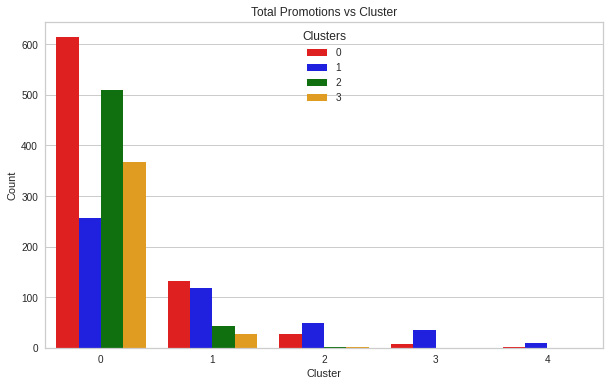
Figure 8.19: Promotions applied per cluster
We can see that although there is no characteristic pattern in the promotions per cluster, we can see that cluster 0 and cluster 2 are the ones with the highest number of applied promotions.
- Now, we can visualize the number of deals purchased per type of cluster:
f, ax = plt.subplots(figsize=(12, 6))
pl = sns.boxenplot(y=data["NumDealsPurchases"],x=data["Clusters"], palette= ['red','blue','green','orange'])
pl.set_title("Purchased Deals")

Figure 8.20: Purchased deals per cluster
Promotional campaigns failed to be widespread, but the transactions were successful. The results from clusters 0 and 2 are the best. Cluster 1, one of our top clients, is not interested in the promotions, though. Nothing draws cluster 1 in a strong way.
Now that the clusters have been created and their purchasing patterns have been examined, let us look at everyone in these clusters. To determine who is our star customer and who requires further attention from the retail store’s marketing team, we will profile the clusters that have been developed.
Considering the cluster characterization, we will graph some of the elements that are indicative of the customer’s personal traits. We will draw conclusions based on the results.
- We will use a Seaborn joint plot to visualize both the relationships and distributions of different variables:

Figure 8.21: Spend versus education distribution per cluster
Cluster 0 is centered on medium education but with a peak in high education. Cluster 2 is the lowest in terms of education.
- Next, we will look at family size:

Figure 8.22: Spend versus family size distribution per cluster
Cluster 1 represents small family sizes, and cluster 0 represents couples and families. Clusters 2 and 3 are evenly distributed.
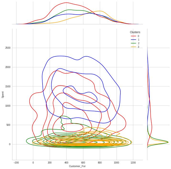
Figure 8.23: Spend versus customer distribution per cluster
Cluster 3 is the group with older clients. While it is interesting to see that although cluster 0 is the one with the highest spending, it is skewed to the left in terms of days since the user has been a customer.
sns.jointplot(x=data['Age'], y=data["Spent"], hue =data["Clusters"], kind="kde", palette=['red','blue','green','orange'],height=10)

Figure 8.24: Spend versus age distribution per cluster
Cluster 0 is the one with older customers, and the one with the youngest clients is cluster 2.
Summary
In this chapter, we have performed unsupervised clustering. After dimensionality reduction, agglomerative clustering was used. To better profile customers in clusters based on their family structures, income, and spending habits, we divided users into four clusters. This can be applied while creating more effective marketing plans.
In the next chapter, we will dive into the prediction of sales using time-series data to be able to determine revenue expectations given a set of historical sales, as well as understand their relationship with other variables.