
2
Using Machine Learning in Business Operations
Machine learning is an area of research focused on comprehending and developing “learning” processes, or processes that use data to enhance performance on a given set of tasks. It is considered to be a component of artificial intelligence. Among them, machine learning is a technology that enables companies to efficiently extract knowledge from unstructured data. With little to no programming, machine learning—and more precisely, machine learning algorithms—can be used to iteratively learn from a given dataset and comprehend patterns, behaviors, and so on.
In this chapter, we will learn how to do the following:
- Validate the difference of observed effects with statistical analysis
- Analyze the correlation and causation as well as model relationships between variables
- Prepare the data for clustering and machine learning models
- Develop machine learning models for regression and classification
Technical requirements
In order to be able to follow the steps in this chapter, you will need to meet the next requirements:
- Have a Jupyter notebook instance running Python 3.7 and above. You can use the Google Colab notebook to run the steps as well if you have a Google Drive account.
- Have an understanding of basic math and statistical concepts.
- Download the example datasets provided in the book’s GitHub page, and the original source is https://python.cogsci.nl/numerical/statistics/.
Validating the effect of changes with the t-test
When measuring the effects of certain actions applied to a given population of users, we need to validate that these actions have actually affected the target groups in a significant manner. To be able to do this, we can use the t-test.
A t-test is a statistical test that is used to compare the means of two groups to ascertain whether a method or treatment has an impact on the population of interest or whether two groups differ from one another; it is frequently employed in hypothesis testing.
When the datasets in the two groups don’t relate to identical values, separate t-test samples are chosen independently of one another. They might consist of two groups of randomly selected, unrelated patients to study the effects of a medication, for example. While the other group receives the prescribed treatment, one of the groups serves as the control group and is given a placebo. This results in two separate sample sets that are unpaired and unconnected from one another. Simply put, the t-test is employed to compare the means of two groups. It is frequently employed in hypothesis testing to establish whether a procedure or treatment truly affects the population of interest or whether two groups differ from one another.
The t-test is used in the context of businesses to compare two different means and determine whether they represent the exact same population, and it’s especially useful in validating the effects of promotions applied in the uplift of sales. Additionally, it enables firms to comprehend the likelihood that their outcomes are the product of chance.
We will learn how to make an independent-samples t-test using the SciPy package and the Matzke et al. dataset (2015). Participants in this dataset underwent a memory challenge in which they had to recollect a list of words. One group of participants focused on a central fixation dot on a display during the retention interval. Another group of volunteers continuously moved their eyes horizontally, which some people think helps with memory.
To determine whether memory performance (CriticalRecall) was better for the horizontal eye movement group than the fixation group, we can utilize the ttest_ind function from the SciPy library:
from scipy.stats import ttest_ind
import pandas as pd
dm = pd.read_csv('matzke_et_al.csv')
dm_horizontal = dm[dm.Condition=='Horizontal']
dm_fixation = dm[dm.Condition=='Fixation']
t, p = ttest_ind(dm_horizontal.CriticalRecall, dm_fixation.CriticalRecall)
print('t = {:.3f}, p = {:.3f}'.format(t, p))
Figure 2.1: T-test result
The test’s p-value, which may be found on the output, is all you need to evaluate the t-test findings. Simply compare the output’s p-value to the selected alpha level to conduct a hypothesis test at the desired alpha (significance) level:
import seaborn as sns
import matplotlib.pyplot as plt # visualization
sns.barplot(x='Condition', y='CriticalRecall', data=dm)
plt.xlabel('Condition')
plt.ylabel('Memory performance')
plt.show()
You can reject the null hypothesis if the p-value is less than your threshold for significance (for example, 0.05). The two means’ difference is statistically significant. The data from your sample is convincing enough to support the conclusion that the two population means are not equal:

Figure 2.2: Population distribution
A high t-score, also known as a t-value, denotes that the groups are distinct, whereas a low t-score denotes similarity. Degrees of freedom, or the values in a study that can fluctuate, are crucial for determining the significance and veracity of the null hypothesis.
In our example, the results indicate a noteworthy difference (p =.0066). The fixation group, however, outperformed the other groups, where the effect is in the opposite direction from what was anticipated.
Another way to test the difference between two populations is using the paired-samples t-test, which compares a single group’s means for two variables. To determine whether the average deviates from 0, the process computes the differences between the values of the two variables for each occurrence. The means of two independent or unrelated groups are compared using an unpaired t-test. An unpaired t-test makes the assumption that the variance in the groups is equal. The variance is not expected to be equal in a paired t-test. The process also automates the calculation of the t-test effect size. The paired t-test is used when data are in the form of matched pairs, while the two-sample t-test is used when data from two samples are statistically independent.
Let’s use the Moore, McCabe, and Craig datasets. Here, aggressive conduct in dementia patients was assessed during the full moon and another lunar phase. This was a within-subject design because measurements were taken from every participant at both times.
You can use the ttest_rel SciPy function to test whether aggression differed between the full moon and the other lunar phase:
from scipy.stats import ttest_rel
dm = pd.read_csv('moon-aggression.csv')
t, p = ttest_rel(dm.Moon, dm.Other)
print('t = {:.3f}, p = {:.3f}'.format(t, p))
As you can see in the figure below, there was an interesting effect that was substantial, as the p values are never 0 as the output implies. This effect was such that people were indeed most violent during full moons:

Figure 2.3: T-test result of the aggression dataset
Another way in which we can compare the difference between two groups is the statistical method known as analysis of variance (ANOVA), which is used to examine how different means differ from one another. Ronald Fisher created this statistical test in 1918, and it has been in use ever since. Simply put, an ANOVA analysis determines whether the means of three or more independent groups differ statistically. So does ANOVA replace the t-test, then? Not really. ANOVA is used to compare the means among three or more groups, while the t-test is used to compare the means between two groups.
When employed in a business setting, ANOVA can be used to manage budgets by, for instance, comparing your budget against costs to manage revenue and inventories. ANOVA can also be used to manage budgets by, for instance, comparing your budget against costs to manage revenue and inventories. For example, in order to better understand how sales will perform in the future, ANOVA can also be used to forecast trends by examining data patterns. When assessing the multi-item scales used frequently in market research, ANOVA is especially helpful. Using ANOVA might assist you as a market researcher in comprehending how various groups react. You can start the test by accepting the null hypothesis, or that the means of all the groups that were observed are equal.
For our next example, let’s revisit the heart rate information provided by Moore, McCabe, and Craig. Gender and group are two subject-specific factors in this dataset, along with one dependent variable (heart rate). You need the following code to see if gender, group, or their interactions have an impact on heart rate.
We will use a combination of ordinary least squares (OLS) and an ANOVA test (anova_lm), which isn’t very elegant, but the important part is the formula:
from statsmodels.stats.anova import anova_lm
dm = pd.read_csv('heartrate.csv')
dm = dm.rename({'Heart Rate':'HeartRate'},axis=1)  # statsmodels doesn't like spaces
df = anova_lm(ols('HeartRate ~ Gender * Group', data=dm).fit())
print(df)
The results show us that heart rate is related to all factors: gender (F = 185.980, p < .001), group (F = 695.647, p < .001), and the gender-by-group interaction (F = 7.409, p = .006).
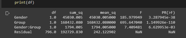
Figure 2.4: ANOVA test results
Now that we have validated that there is in fact difference between multiple groups, we can start to model these relationships.
Modeling relationships with multiple linear regression
The statistical method known as multiple linear regression employs two or more independent variables to forecast the results of a dependent variable. Using this method, analysts may calculate the model’s variance and the relative contributions of each independent variable to the overall variance. Regressions involving numerous explanatory variables, both linear and nonlinear, fall under the category of multiple regression.
The purpose of multiple regression analysis is so that researchers can evaluate the strength of the relationship between an outcome (the dependent variable) and a number of predictor variables, as well as the significance of each predictor to the relationship using multiple regression analysis frequently with the effect of other predictors statistically eliminated.
Multiple regression includes multiple independent variables, whereas linear regression only takes into account one independent variable to affect the relationship’s slope.
Businesses can use linear regressions to analyze trends and generate estimates or forecasts. For instance, if a firm’s sales have been rising gradually each month for the previous several years, the corporation may anticipate sales in the months to come by doing a linear analysis of the sales data with monthly sales.
Let’s use the dataset from Moore, McCabe, and Craig, which contains grade point averages and SAT scores for mathematics and verbal knowledge for high-school students. We can use the following code to test whether satm and satv are (uniquely) related to gpa.
We will use the OLS SciPy function to evaluate this relationship, which is passed as a combination of the variables in question, and then fitted to the data:
from statsmodels.formula.api import ols
dm = pd.read_csv('gpa.csv')
model = ols('gpa ~ satm + satv', data=dm).fit()
print(model.summary())

Figure 2.5: OLS results
The result shows us that only SAT scores for mathematics, but not for verbal knowledge, are uniquely related to the grade point average.
In the next section, we will look at the concepts of correlation, which is when variables behave in a similar manner, and causation, which is when a variable affects another one.
Establishing correlation and causation
The statistical measure known as correlation expresses how closely two variables are related linearly, which can be understood graphically as how close two curves overlap. It’s a typical technique for describing straightforward connections without explicitly stating cause and consequence.
The correlation matrix displays the correlation values, which quantify how closely each pair of variables is related linearly. The correlation coefficients have a range of -1 to +1. The correlation value is positive if the two variables tend to rise and fall together.
The four types of correlations that are typically measured in statistics are the Spearman correlation, Pearson correlation, Kendall rank correlation, and the point-biserial correlation.
In order for organizations to make data-driven decisions based on forecasting the result of events, correlation and regression analysis are used to foresee future outcomes. The two main advantages of correlation analysis are that it enables quick hypothesis testing and assists businesses in deciding which variables they wish to look into further. To determine the strength of the linear relationship between two variables, the primary type of correlation analysis applies Pearson’s r formula.
Using the corr method in a pandas data frame, we can calculate the pairwise correlation of columns while removing NA/null values. The technique can be passed as a parameter with the pearson or kendall values for the standard correlation coefficient, spearman for the Spearman rank correlation, or kendall for the Kendall Tau correlation coefficient.
The corr method in a pandas data frame returns a matrix of floats from 1 along the diagonals and symmetric regardless of the callable’s behavior:
import numpy as np
import pandas as pd
df = pd.DataFrame([(.2, .3,.8), (.0, .6,.9), (.6, .0,.4), (.2, .1,.9),(.1, .3,.7), (.1, .5,.6), (.7, .1,.5), (.3, .0,.8),],columns=['dogs', 'cats','birds'])
corr_mat = df.corr()
We can plot the results correlation matrix using a seaborn heatmap:

Figure 2.6: Correlation matrix
Finding groups of highly correlated features and only maintaining one of them is the main goal of employing pairwise correlation for feature selection, which aims to maximize the predictive value of your model by using the fewest number of features possible.
Pairwise correlation is calculated between rows or columns of a DataFrame and rows or columns of a Series or DataFrame. The correlations are calculated after DataFrames have been aligned along both axes. Next, we can see an example that might make it more clear:
df1=pd.DataFrame( np.random.randn(3,2), columns=['a','b'] )
df2=pd.DataFrame( np.random.randn(3,2), columns=['a','b'] )
Use corr to compare numerical columns within the same data frame. Non-numerical columns will automatically be skipped:
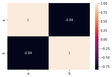
Figure 2.7: Correlation matrix
We can also compare the columns of df1 and df2 with corrwith. Note that only columns with the same names are compared:
df1.corrwith(df2)
To make things easier, we can rename the columns of df2 to match the columns of df1 if we would like for pandas to disregard the column names and only compare the first row of df1 to the first row of df2:
df1.corrwith(df2.set_axis( df1.columns, axis='columns', inplace=False))
It’s important to note that df1 and df2 need to have the same number of columns in that case.
Last but not least, you could also just horizontally combine the two datasets and utilize corr. The benefit is that this essentially functions independently of the quantity and naming conventions of the columns, but the drawback is that you can receive more output than you require or want:

Figure 2.8: Correlation heatmap
Now that we have established the fact that two variables can be correlated using correlation analysis, we can seek to validate whether the variables are actually impacting one another using causation analysis.
The ability of one variable to impact another is known as causality. The first variable might create the second or might change the incidence of the second variable.
Causality is the process by which one event, process, state, or object influences the development of another event, process, condition, or object, where the cause and effect are both partially reliant on each other. So what distinguishes correlation from causation? Correlation does not automatically imply causation, even if causality and correlation might coexist. In situations where action A results in outcome B, causation is expressly applicable. Correlation, on the other hand, is just a relationship.
We can use the next dataset to study the causation between variables:
import numpy as np
import pandas as pd
import random
ds = pd.DataFrame(columns = ['x','y'])
ds['x'] = [int(n>500) for n in random.sample(range(0, 1000),
      100)]
ds['y'] = [int(n>500) for n in random.sample(range(0, 1000),
      100)]
ds.head()
To study the causation, we can seek to estimate the difference in means between two groups. The absolute difference between the mean values in two different groups is measured by the mean difference, often known as the difference in means. It offers you a sense of how much the averages of the experimental group and control groups differ from one another in clinical studies.
In the next example, we will estimate the uplift as a quantified difference in means along with the determined standard error. We will use 90 as the confidence interval in the range of the normal, which yields a z-score of 1.96:
base,var  = ds[ds.x == 0], ds[ds.x == 1]
delta = var.y.mean() - base.y.mean()
delta_dev = 1.96 * np.sqrt(var.y.var() / var.shape[0]
      +base.y.var() / base.shape[0])
print("estimated_effect":,delta, "standard_error": delta_dev)
Figure 2.9: Estimated differences between populations
We can also use the contingency chi-square for the comparison of two groups with a dichotomous dependent variable. For example, we might contrast males and females using a yes/no response scale. The contingency chi-square is built on the same ideas as the straightforward chi-square analysis, which compares the anticipated and actual outcomes.
This statistical technique is used to compare actual outcomes with predictions. The goal of this test is to establish whether a discrepancy between observed and expected data is the result of chance or a correlation between the variables you are researching. The results create a contingency matrix from which we can infer that your variables are independent of one another and have no association with one another if C is close to zero (or equal to zero). There is a relationship if C is not zero; C can only take on positive values:
from scipy.stats import chi2_contingency
contingency_table = (
         ds
         .assign(placeholder=1)
         .pivot_table(index="x", columns="y",
              values="placeholder", aggfunc="sum")
         .values)
_, p, _, _ = chi2_contingency(contingency_table,
     lambda_="log-likelihood")
Here, we will just seek to interpret the p-values:
print("P-value:",p)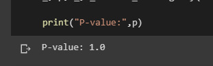
Figure 2.10: Resulting p-value
Now we will use a set of datasets that were synthetically generated:
data_1 = pd.read_csv('observed_data_1.csv' )
data_1.plot.scatter(x="z", y="y", c="x", cmap="rainbow", colorbar=False)
Figure 2.11: Plot of data distribution
The probability density function of a continuous random variable can be estimated using the kernel density estimation (KDE) seaborn method. The area under the depicted curve serves as a representation of the probability distribution of the data values:
import seaborn as sns
sns.kdeplot(data_1.loc[lambda df: df.x == 0].y, label="untreated")
sns.kdeplot(data_1.loc[lambda df: df.x == 1].y, label="treated")
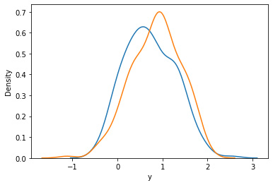
Figure 2.12: Density graph
To study causation, the researcher must build a model to describe the connections between ideas connected to a particular phenomenon in causal modeling.
Multiple causality—the idea that any given outcome may have more than one cause—is incorporated into causal models. For instance, social status, age, sex, ethnicity, and other factors may influence someone’s voting behavior. In addition, some of the independent or explanatory factors might be connected.
External validity can be addressed using causal models (whether results from one study apply to unstudied populations). In some cases, causal models can combine data to provide answers to questions that no single dataset alone is able to address.
We can use the est_via_ols function of the causalinference package to estimate average treatment effects using least squares.
Here, y is the potential outcome when treated, D is the treatment status, and X is a vector of covariates or individual characteristics.
The parameter to control is adj, an int which can be either 0, 1, or 2. This parameter indicates how covariate adjustments are to be performed. Setting adj to 0 will not include any covariates. Set adj to 1 to include treatment indicator D and covariates X separately, or set adj to 2 to additionally include interaction terms between D and X. The default is 2.
!pip install causalinference
from causalinference import CausalModel
cm = CausalModel(
    Y=data_1.y.values,
    D=data_1.x.values,
    X=data_1.z.values)
cm.est_via_ols(adj=1)
print(cm.estimates)
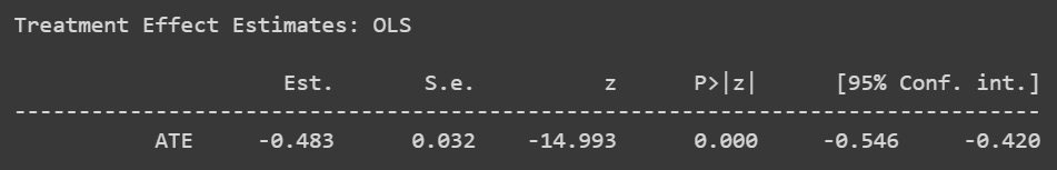
Figure 2.13: Causal model results
The estimates show us that there is a negative relationship between the variables. The negative estimate might be an indication that the application of D reduces the probability of Y by 48%. It’s really important to look at the entire set of estimate distributions to draw any conclusions.
The analysis of a hypothetical or counterfactual reality is causal analysis, because we must make claims about the counterfactual result that we did not witness in order to assess the treatment effect:
data_2 = pd.read_csv('observed_data_2.csv')
data_2.plot.scatter(x="z", y="y", c="x", cmap="rainbow", colorbar=False)
The data previously loaded will show us different values in the causal model:

Figure 2.14: Data distribution
We will build the new causal model using the new loaded values:
We can print the treatment effect estimates to validate whether our causal model is valid:
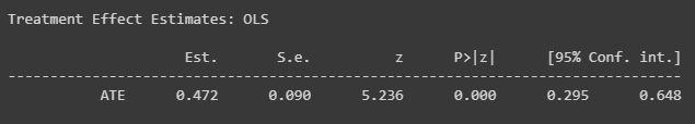
Figure 2.15: Causal model results with new data
The estimates inform us that the relationship has become positive.
Causal models are a great way to validate the modeling and direction of relationships between the variables in data.
In the next section, we will dive into how we can use scaling to prepare our data for machine learning, depending on the distribution that it has.
Scaling features to a range
When working with machine learning models, it is important to preprocess data so certain problems such as an explosion of gradients or lack of proper distribution representation can be solved.
To transform raw feature vectors into a representation that is better suited for the downstream estimators, the sklearn.preprocessing package offers a number of common utility functions and transformer classes.
Many machine learning estimators used in scikit-learn frequently require dataset standardization; if the individual features do not more or less resemble standard normally distributed data, they may behave poorly: Gaussian with a mean of 0 and a variation of 1.
In general, standardizing the dataset is advantageous for learning algorithms. Robust scalers or transformers are preferable if there are any outliers in the collection. On a dataset with marginal outliers, the actions of several scalers, transformers, and normalizers are highlighted in the analysis of the impact of various scalers on data containing outliers.
In reality, we frequently ignore the distribution’s shape and simply adapt the data to scale by dividing non-constant features by their standard deviation and centering it by subtracting each feature’s mean value.
For instance, several components of a learning algorithm’s objective function (such as the RBF kernel of SVMs or the l1 and l2 regularizers of linear models) may make the assumption that all features are centered around zero or have variance in the same order. A feature may dominate the objective function and prevent the estimator from successfully inferring from other features as expected if its variance is orders of magnitude greater than that of other features.
The StandardScaler utility class, which the preprocessing module offers, makes it quick and simple to carry out the following operation on an array-like dataset:
from sklearn import preprocessing
x_train = pd.DataFrame([[ 1., -1.,  2.],
                    [ 2.,  0.,  0.],
                    [ 0.,  1., -1.]],columns=['x','y','z'])
scaler = preprocessing.StandardScaler().fit(x_train)
The following code will fit the scaler to the data, assuming that our distribution is standard:
scaler.mean_
We can visualize now the mean of the data:
Figure 2.16: Mean of the data
We can visualize the scale as well:
scaler.scale_
The data is shown as an array of values:
Figure 2.17: Scale of the columns
Finally, we can scale the data using the transform method:
A different method of standardization is to scale each feature’s maximum absolute value to one unit, or to a value between a predetermined minimum and maximum value, usually zero and one. MaxAbsScaler or MinMaxScaler can be used to do this.
The robustness to very small standard deviations of features and the preservation of zero entries in sparse data are two reasons to employ this scaling.
To scale a toy data matrix to the [0, 1] range, consider the following example:
min_max_scaler = preprocessing.MinMaxScaler()
x_train_minmax = min_max_scaler.fit_transform(x_train)
In case our distribution differs from the standard Gaussian, we can use non-linear transformations. There are two different kinds of transformations: power and quantile transform. The rank of the values along each feature is preserved by both quantile and power transforms because they are based on monotonic transformations of the features.
Based on the formula, which is the cumulative distribution function of the feature and the quantile function of the desired output distribution, quantile transformations place all features into the same desired distribution. These two facts are used in this formula: it is uniformly distributed if it is a random variable with a continuous cumulative distribution function, and it has distribution if it is a random variable with a uniform distribution on. A quantile transform smoothes out atypical distributions using a rank transformation and is less susceptible to outliers than scaling techniques. Correlations and distances within and between features are, however, distorted by it.
Sklearn provides a series of parametric transformations called power transforms that aim to translate data from any distribution to one that resembles a Gaussian distribution as closely as possible.
We can map our data to a uniform distribution using QuantileTransformer, which provides a non-parametric transformation to map the data to a uniform distribution with values between 0 and 1:
from sklearn.datasets import load_iris
data = load_iris()
x, y = data['data'],data['target']
quantile_transformer = preprocessing.QuantileTransformer(
n_quantiles=5)
x_train_qt = quantile_transformer.fit_transform(x)
x_train_qt[:5]
We can see the resulting array:
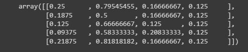
Figure 2.18: Transformed data
It is also possible to map data to a normal distribution using QuantileTransformer by setting output_distribution='normal'. The following example uses the earlier example with the iris dataset:
quantile_transformer = preprocessing.QuantileTransformer(
n_quantiles=5,output_distribution='normal')
x_trans_qt = quantile_transformer.fit_transform(x)
quantile_transformer.quantiles_
Figure 2.19: Transformed data through the quantiles method
The preceding code will scale the data using a quantile transformation, defining five quantiles and looking to have a normal distribution in the output.
To determine the proper distribution to be utilized, we need to analyze in depth the distribution of our variables, as the wrong transformation can make us lose details that might be important to take into account.
In the next section, we will dive into unsupervised learning by looking at clustering algorithms using scikit-learn.
Clustering data and reducing the dimensionality
The process of clustering involves grouping the population or data points into a number of groups so that the data points within each group are more similar to one another than the data points within other groups. Simply said, the goal is to sort any groups of people who share similar characteristics into clusters. It is frequently used in business analytics. How to arrange the enormous volumes of available data into useful structures is one of the issues that organizations are currently confronting.
Image segmentation, grouping web pages, market segmentation, and information retrieval are four examples of how clustering can help firms better manage their data. Data clustering is beneficial for retail firms since it influences sales efforts, customer retention, and customer shopping behavior.
The goal of the vector quantization technique known as “K-means clustering,” which has its roots in signal processing, is to divide a set of n observations into k clusters, each of which has as its prototype in the observation with the closest mean. K-means clustering is an unsupervised technique that uses the input data as is and doesn’t require a labeled response. A popular method for clustering is K-means clustering. Typically, practitioners start by studying the dataset’s architecture. Data points are grouped by K-means into distinct, non-overlapping groups.
In the next code, we can use KMeans to fit the data in order to label each data point to a given cluster:
from sklearn.cluster import KMeans
kmeans = KMeans(n_clusters=len(set(y)), random_state=0).fit(x)
kmeans.labels_

Figure 2.20: Cluster data
We can predict to which cluster each new instance of data belongs:
kmeans.predict(x[0].reshape(1,-1))
Figure 2.21: Predicted data
We can also visualize the cluster centers:
kmeans.cluster_centers_
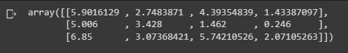
Figure 2.22: Cluster centers
KMeans allows us to find the characteristics in common data when the number of variables is too high and it’s useful for segmentation. But sometimes, there is the need to reduce the number of dimensions to a set of grouped variables with common traits.
In order to project the data into a lower dimensional environment, we can use principal component analysis (PCA), a linear dimensionality reduction technique. Before using the SVD, the input data is scaled but not centered for each feature. Depending on the structure of the input data and the number of components to be extracted, it employs either a randomized truncated SVD or the complete SVD implementation as implemented by LAPACK. You should be aware that this class does not accept sparse input. For a sparse data alternative, use the TruncatedSVD class.
Up next, we fit data into two components in order to reduce the dimensionality:
We should strive to account for the maximum amount of variance possible, which in simple terms can be understood as the degree to which our model can explain the whole dataset:

Figure 2.23: PCA singular values
After we have worked our data to preprocess it, reducing the number of dimensions and clustering, we can now build machine learning models to make predictions of future behavior.
In the next section, we will build machine learning models that we can use to predict new data labels for regression and classification tasks.
Building machine learning models
One of the most simple machine learning models we can construct to make a forecast of future behaviors is linear regression, which reduces the residual sum of squares between the targets observed in the dataset and the targets anticipated by the linear approximation, fitting a linear model using coefficients.
This is simply ordinary least squares or non-negative least squares wrapped in a predictor object from the implementation perspective.
We can implement this really simply by using the LinearRegression class in Sklearn:
from sklearn.linear_model import LinearRegression
from sklearn.datasets import load_diabetes
data_reg = load_diabetes()
x,y = data_reg['data'],data_reg['target']
reg = LinearRegression().fit(x, y)
reg.score(x, y)
Figure 2.24: Model regression score
The preceding code will fit a linear regression model to our data and print the score of our data.
We can also print the coefficients, which give us a great estimation of the contribution of each variable to explain the variable we are trying to predict:
reg.coef_
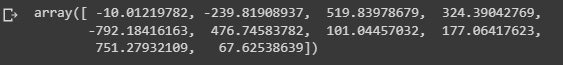
Figure 2.25: Regression coefficients
We can also print the intercept variables:
reg.intercept_
Figure 2.26: Regression intercepts
Finally, we can use the model to make predictions:
print('Predicted:',reg.predict(x[10].reshape(
1,-1)),'Actual:',y[10])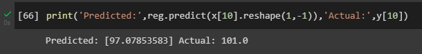
Figure 2.27: Predicted regression values
Here we are predicting a continuous variable, but we can also predict categorical variables using a classifier instead of a regression.
Sklearn gives us the option of using the logistic regression (logit and MaxEnt) classifier, in which in the multiclass case, the training algorithm uses the one-vs-rest (OvR) scheme if the 'multi_class' option is set to ‘ovr' and uses the cross-entropy loss if the 'multi_class' option is set to 'multinomial'. This class uses the 'liblinear' library, 'newton-cg','sag','saga', and the 'lbfgs' solvers to implement regularized logistic regression. Keep in mind that regularization is used by default. Both dense and sparse input can be handled by it. For best speed, only use matrices with 64-bit floats; all other input formats will be transformed.
The sole regularization supported by the "newton-cg," "sag," and "lbfgs" solvers is the L2 regularization with the primal formulation. The "liblinear" solver supports both the L1 and L2 regularizations, however, only the L2 penalty has a dual formulation. The only solver that supports the elastic net regularization is the "saga" solver.
When fitting the model, the underlying C program chooses features using a random number generator. Thus, slightly varied outputs for the same input data are common. Try using a smaller tol parameter if it occurs:
from sklearn.pipeline import make_pipeline
from sklearn.preprocessing import StandardScaler
from sklearn.linear_model import LogisticRegression
from sklearn.datasets import load_digits
data_class = load_digits()
x,y = data_class['data'],data_class['target']
clf = make_pipeline(StandardScaler(),
      LogisticRegression(penalty='l2',C=.1))
clf.fit(x, y)
clf.predict(x[:2, :])
Figure 2.28: Logistic regression results
We can also score the model to assess the precision of our predictions:
clf.score(x, y)
Figure 2.29: User data
In order to validate the model, we can use cross-validation, which allows us to evaluate the estimator’s performance. This is a methodological error in learning the parameters of a prediction function and evaluating it on the same set of data. A model that simply repeats the labels of the samples it has just seen would score well but be unable to make any predictions about data that has not yet been seen. Overfitting is the term for this circumstance. It is customary to reserve a portion of the available data as a test set (x test, y test) when conducting a (supervised) machine learning experiment in order to avoid this problem.
It should be noted that the term “experiment” does not just refer to academic purposes because machine learning experiments sometimes begin in commercial contexts as well. Grid search methods can be used to find the optimal parameters.
In scikit-learn, a random split into training and test sets can be quickly computed with the train_test_split helper function. Let’s load the iris dataset to fit a linear support vector machine on it:
Figure 2.30: Data shape
We can now quickly sample a training set while holding out 40% of the data for testing (evaluating) our classifier:
from sklearn.model_selection import train_test_split
from sklearn import svm
x_train, x_test, y_train, y_test = train_test_split(x, y,
test_size=0.4, random_state=0)
We can validate the shape of the generated train dataset by looking at the numpy array shape:
x_train.shape, y_train.shape
Figure 2.31: Train data shape
We can repeat the same with the test dataset:
x_test.shape, y_test.shape
Figure 2.32: Test data shape
Finally, we can train our machine learning model on the training data and score it using the test dataset, which holds data points not seen by the model during training:
Figure 2.33: Logistic regression scores
There is still a chance of overfitting on the test set when comparing various settings of hyperparameters for estimators, such as the C setting that must be manually selected for an SVM. This is because the parameters can be adjusted until the estimator performs at its best. In this method, the model may “leak” information about the test set, and evaluation measures may no longer reflect generalization performance. This issue can be resolved by holding out a further portion of the dataset as a “validation set”: training is conducted on the training set, followed by evaluation on the validation set, and when it appears that the experiment has succeeded, a final evaluation can be conducted on the test set.
However, by dividing the available data into three sets, we dramatically cut down on the number of samples that can be used to train the model, and the outcomes can vary depending on the randomization of the pair of (train and validation) sets.
Cross-validation is an approach that can be used to address this issue (CV for short). When doing CV, the validation set is no longer required, but a test set should still be kept aside for final assessment. The fundamental strategy, known as a k-fold CV, divides the training set into k smaller sets (other approaches are described below, but generally follow the same principles). Every single one of the k “folds” is done as follows:
The folds are used as training data for a model, and the resulting model is validated using the remaining portion of the data (as in, it is used as a test set to compute a performance measure such as accuracy).
The average of the numbers calculated in the loop is then the performance indicator supplied by k-fold cross-validation. Although this method can be computationally expensive, it does not waste a lot of data (unlike fixing an arbitrary validation set), which is a significant benefit in applications such as inverse inference where there are few samples.
We can compute the cross-validated metrics by calling the cross_val score helper function on the estimator and the dataset is the simplest approach to apply cross-validation. The example that follows shows how to split the data, develop a model, and calculate the score five times in a row (using various splits each time) to measure the accuracy of a linear kernel support vector machine on the iris dataset:
The mean score and the standard deviation are hence given by the following:
print('Mean:',scores.mean(),'Standard Deviation:',
scores.std())
The estimator’s scoring technique is by default used to calculate the score at each CV iteration:
Figure 2.34: CV mean scores
This can be altered by applying the scoring parameter:
Since the samples in the iris dataset are distributed evenly throughout the target classes, the accuracy and F1 score are nearly equal:
Figure 2.35: CV scores
The CV score defaults to using the KFold or StratifiedKFold strategies when the cv parameter is an integer, with the latter being utilized if the estimator comes from ClassifierMixin.
It is also possible to use other CV strategies by passing a CV iterator using the ShuffleSplit Sklearn class instead:
from sklearn.model_selection import ShuffleSplit
n_samples = x.shape[0]
cv = ShuffleSplit(n_splits=5, test_size=0.3, random_state=0)
cross_val_score(clf, x, y, cv=cv)
The preceding code will show us the CV scores on multiple folds of test samples, which can be used to prevent the overfitting problem:
Figure 2.36: Results using shuffle split
The preceding results show us the results of the CV score.
Summary
In this chapter, we have learned how descriptive statistics and machine learning models can be used to quantify the difference between populations, which can later be used to validate business hypotheses as well as to assess the lift of certain marketing activities. We have also learned how to study the relationship of variables with the use of correlation and causation analysis, and how to model these relationships with linear models. Finally, we have built machine learning models to predict and classify variables.
In the next chapter, we will learn how to use results from web searches and how to apply this in the context of market research.