
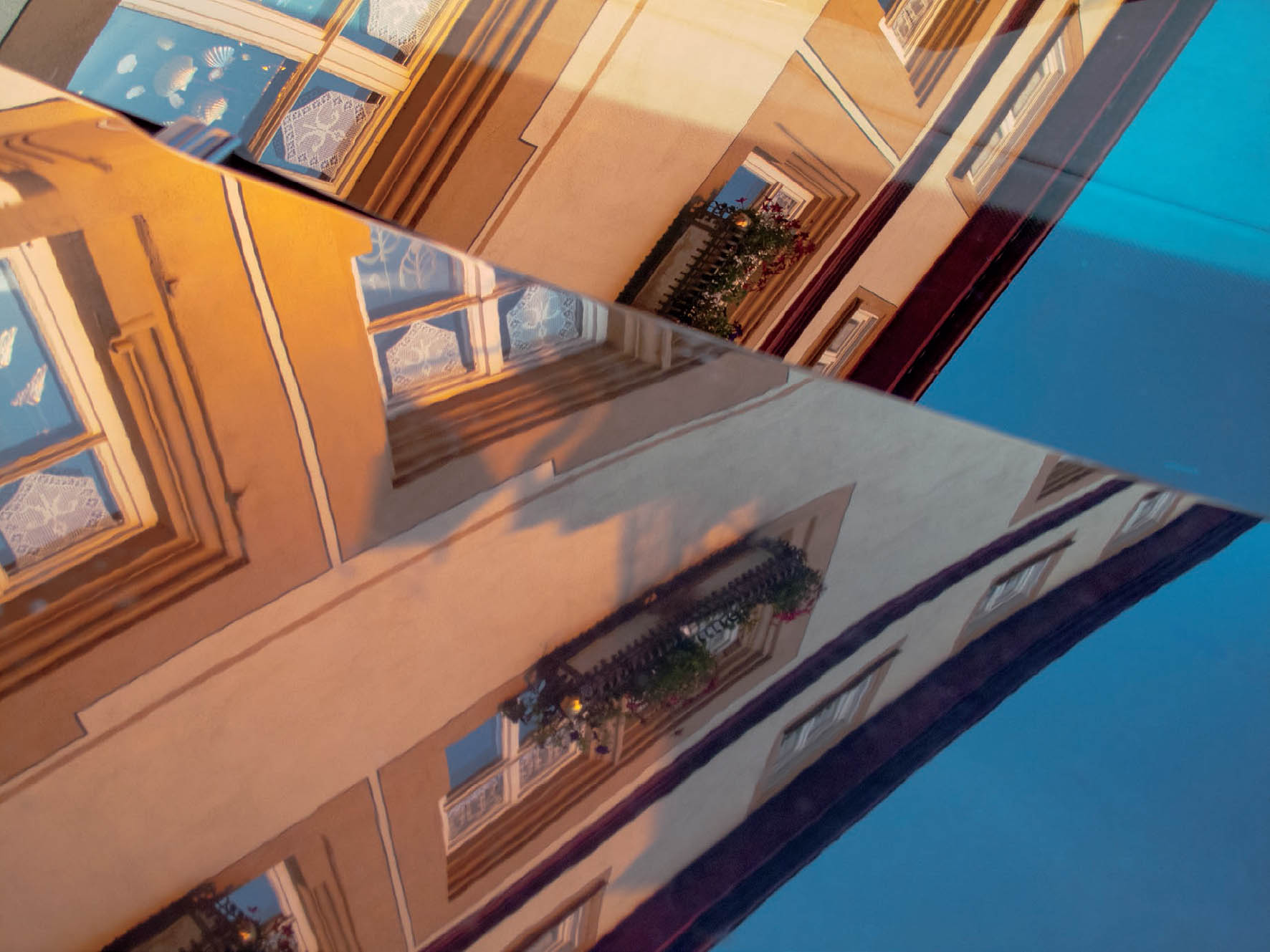
Figure 12-1: Rothenberg Building Abstract
In ACR I used Curves (including the overall and three individual channels), slightly altered both the Temperature and Tint defaults, and altered both Vibrance and Saturation, all to bring a bit more color saturation and interest to a geometrically compelling and intentionally confusing image. No further color or contrast alterations were added in Photoshop.
CHAPTER 12
Image Adjustments—Using the Digital Tools
![]()
IN MY INTERACTIONS WITH STUDENTS WORKING DIGITALLY, I have found that a lot of users are unfamiliar with many of the basic technical tools of Adobe Camera RAW (ACR), which are similar to those of the development module in Lightroom and Photoshop. I have also found that among the professionals and the most advanced amateurs using digital methods, every one has different approaches to the many options available as they go from the RAW file to the final image. So, with no attempt to begin ranking the various approaches (the statistical possibilities would be nearly infinite) and without trying to cover every available tool and menu option, it seems worthwhile to review the tools that I use, which I find many others also use, for successful post-processing of digital imagery.
The digital technical tools discussed in this chapter are far more than just “basic tools.” These should be all you need to yield wonderfully expressive final images. If you’re new or relatively new to ACR and Photoshop, the following discussion can be extremely useful. Even if you’re a long-time user, you may find new information. If you’re already familiar with earlier versions of ACR and Photoshop, you’ll see that there have been a few changes, but nothing so radical as to be confusing. I had been using Photoshop CS4 (along with its version of ACR, similar to the Develop module of Lightroom 2), and have smoothly transitioned to the Creative Cloud version of both. Finally, please recognize that since this is a book geared toward expressive photographic art, not an encyclopedia of “how to” methods, I do not pretend to include everything about digital tools here, but to give you, the reader, a solid grounding in the use of digital tools to serve your expressive purposes.
I began using digital means for my photography quite late in my own career, and relatively late in the digital “revolution.” Throughout the 1990s and early 2000s, I watched as digital processes expanded from their infancy, continually yielding utterly unacceptable results, at least to my eye. I then began observing changes that rapidly—or perhaps gradually, depending on your time frame of reference—began turning digital imagery into an art form with quite nice results. It was only at that point that I began to embrace digital means. At the same time, in the 1990s, traditional black-and-white photography itself went through something of a revolution. Variable contrast papers of the highest quality came on the market, allowing me to print every image I had previously printed on graded paper (i.e., fixed contrast-level papers) with equal or superior results. Beyond that, it opened the way to successfully print negatives that were previously extremely difficult or impossible to print on graded papers. That revolution improved the quality and expanded the opportunities for traditional darkroom silver-gelatin prints so effectively that today’s traditional black-and-white imagery still stands as the gold standard of quality. Beyond that, I love the traditional process of hands-on printing in my darkroom, which is my sanctuary. In many ways, it serves as my spiritual center. For these reasons, I have seen no reason to switch to digital means for my black-and-white work.
![]() Your prime question and concern at all times should be “Am I, the photographer, using a tool to help convey my thoughts most effectively, or am I using it simply because it’s there to be used?”
Your prime question and concern at all times should be “Am I, the photographer, using a tool to help convey my thoughts most effectively, or am I using it simply because it’s there to be used?”
Color is different. Since I am a working photographer, where I try to view my work as art (with the hope others will also view it as art), I would be shortchanging myself if I didn’t employ the methodology that yields the finest images. I see no value in working with any process that ultimately yields inferior results, even if I love the process involved in doing it. Hence, I have fully switched to digital means for all my color photography, and I recommend it for all color photographers. But I still do all of my black-and-white work traditionally—with the notable exception of making digital files of black-and-white images for book reproduction.
With that quick explanation of my thoughts and approach, let’s move toward a better understanding of the digital post-processing tools I have found most valuable. There are numerous approaches and applications for refining imagery, but the discussion that follows will be based exclusively on use of Adobe Camera Raw (ACR) and Photoshop, both of which are widely used and generally understood by most digital users. My RAW files are first opened in ACR, which is virtually identical to the Develop module in Light-room. So, Lightroom users can take the following ACR tools and methods and apply them with little variation.
My approach is to do as much as I can using the tools of ACR to mold the RAW file to my vision of the final image, and then I work in Photoshop on the finishing touches that are either beyond the capabilities of ACR, or ones that I simply find easier to use in Photoshop. I have found that some people do as little in ACR as necessary, leaving the bulk of the work for Photoshop. I strongly recommend against that approach because I feel that it’s best to start any project off with a strong foundation, rather than leaving a lot of “fix-its” for later. The more problems you can solve early on, the better chance you have of getting things right at the end. Conversely, the more you leave for later, the fewer chances you have for correcting them all (figure 12-1).
Finally, let me note that in the ensuing discussion I consistently relate the technical use of any image adjustment tool to other tools and to the overriding importance of the artistic value of employing those tools sensibly and effectively. Your prime question and concern at all times should be “Am I, the photographer, using a tool to help convey my thoughts most effectively, or am I using it simply because it’s there to be used?” I find that all too often photographers lose sight of their overall expressive goals in their efforts to maximize every pixel within the image area. Use the digital technical tools discussed next to advance your compositional and interpretive goals, not to subvert them.
The ACR Tool Chest
Since ACR is the first step of my two-step workflow, let’s review ACR tools first. While the writing may indicate a specific order in which I use the basic tools, I don’t follow any specific order. Instead, it depends on what strikes me as needing immediate attention, and which tools are needed in whatever order after that. Often, I’ll circle back to make further adjustments, sometimes even negating the initial adjustment. So, any of the following tools may be employed in any order; I always work in a visual manner (because photography is a visual medium), using the appropriate tools in an appropriate order as needed alterations appear to me. Each image requires its own approach.
It is also extremely valuable to know that while you’re working on any image in ACR, you can toggle back and forth to and from your starting point (i.e., the untouched RAW file) by hitting the P key on your keyboard (P for “preview”). Once you hit the Done button, or the Open Image button (each of which saves all the ACR adjustments you’ve made), the toggle no longer works.
Temperature and Tint Tools
Initially, I tend to deal with the major overall sliders in ACR already fully discussed in chapter 11. Those six basic controls give me a good overall feel for how the image should look. After those, I tend to go to the Temperature and Tint controls at the top of the Basic panel to be sure that the colors look and feel right to my eye. I feel strongly that the more abstract an image, the more I can diverge from realistic colors; the more recognizable and realistic the image, the more I must stay within constraints imposed by reality. On that basis, a landscape needs green trees and grasses and blue skies (except at sunrise and sunset), and portraits need recognizable skin tones. But if your subject matter is a pile of metal objects dumped into a junkyard bin or a macro photograph of unrecognizable objects, it allows you to turn greens into pinks, oranges into blues, or any other colors you want to use for your final abstract image. Anything is acceptable in an image like that. Work the Temperature and Tint controls carefully to get the right color balance for your goals.
Tone Curve Tool
The Tone Curve tool (second from the left in the gray rectangle below the histogram) tends to be my next choice, and often my first choice because it is such a powerful tool. Click on Tone Curve and it opens a histogram of the image and a 45° default line from black (lower left) to white (upper right). The histogram will tell you if any amount of the image is clipped (the gray area will go up to the right edge of the graph) or unexposed (the gray area will go up to the left edge of the graph). Over time it has become my most relied-upon tool. Whether I go it first, second, third, or at some other point, I always go to the Curve tool. Even if the image looks perfect on my computer monitor, I want to check the overall histogram, and the three channels individually to see that they look reasonable. It’s an invaluable check to see that everything is as good as it appears to be. Sometimes I use this tool to alter the basic tonal values throughout the image.
I find it frustrating that I cannot assess the tonal value of any specific point with a readout of numbers from 0 (total black) to 255 (blank white) within the image, which is possible when using Lightroom, and also using Curves in Photoshop, to be discussed later). So the ACR Tone Curve tool is slightly limited—but only slightly—and is nevertheless extremely useful. Because Photoshop allows me to make a full number assessment of any point within the image—overall or channel by channel—I always put the image into Curves in Photoshop, either as a final check, or to make further adjustments. In ACR Tone Curves is such an important and powerful a tool that I use it on every image. (I must admit to wondering if such limitations in ACR is a subtle way of Adobe trying to force users to purchase Lightroom, but of course, that would be hard to imagine.)
The default mode for Tone Curves in the CC version of ACR is Point (found just above the histogram), which can be toggled to Parametric. In Point mode you can grab the curve at any location—including the end points—to move that location of the curve up or down, left or right. This way you can shape the curve exactly as you see fit, and you can observe the effects on the image in real time as you alter the curve. In the CC version of Photoshop, you can also go to any of the three separate color channels—red, green or blue—to alter them individually to suit your wishes. Often, major contrast increases are accompanied by major color shifts, so use of the separate RGB curves can be instrumental in bringing back the color saturation that was altered along with contrast. Also, be aware that if major contrast increases entail major color shifts, it can be concluded that minor contrast increases include minor color shifts that may not be easily noticed, but it’s worth taking the time to see if subtle changes have occurred that you should correct. Because of the immense control offered by Tone Curves, not only overall but also in the three color channels, it can serve as a far more precise tool than simply pushing the overall Contrast slider from the Basic panel.
If a RAW image is simply way too flat, I invariably go straight to the Tone Curves tool to dramatically increase contrast as needed. In the sand dune image under overcast skies (see figure 6-15a) the histogram was merely a sharp spike, which I placed about ¾ or 4/5 of the way up the scale (i.e., placing the histogram to the right of center for increased digital information and overall smoothness of tone). Then I turned to the Tone Curves tool to create a nearly vertical S-curve cutting through the histogram. The resulting radical contrast increase also caused a dramatic increase in color saturation, forcing me to reduce both Vibrance and Saturation quite significantly to achieve a sensible, realistic look for the image (see figure 6-15b). I will get back to the Vibrance and Saturation tools of the Basic panel later.
For more typical images (i.e., ones not requiring such dramatic changes), once the basic overall adjustments are done (together with the color balance adjustments of Temperature and Tint), the refinements afforded by the Tone Curves tool and the Contrast slider from the Basic panel can get things really looking good. Use them in combination or separately as you see fit. Also note that this overlap of tool usage is common throughout the use of ACR (or the Light-room Develop module) and Photoshop. These applications allow many routes to the same end, so the choice of controls is very much in your hands (and of course, this is the reason each user has his/her own approach). The options are enormous. Use them as you see fit, but use them sensibly.
Let me caution that although moving the white end point down with the Tone Curves tool may eliminate clipped endpoints, it may simply substitute meaningless light gray for blank white. Be aware of this, and be careful because losing a bright white may be counterproductive. A featureless light gray rarely confers an advantage over a blank white, and may result in saddling the image with an overall dull, lifeless feel. The same thing is true at the dark end of the tonal range: raising the black point may eliminate the deepest black, only to replace it with a flat dark gray, often dulling the image. Also, beware of moving the white endpoint to the left too far, as it could lead to clipping. Similarly, moving the black endpoint to the right too far could yield undesirable, featureless blacks with no detail. Yes, the endpoints can be moved advantageously, but they can also be moved destructively. Be fully cognizant of the effects your adjustments have on your image.
In Parametric mode you can move the Highlights, Lights, Darks, and Shadows sliders to the left and right while watching the effects on the image in real time, but you cannot move the end points. As a result of this lack of complete control, I recommend using the Tone Curve in the default Point mode exclusively.
In older versions of ACR, Parametric was the default Tone Curve mode, and it’s nice to see that Adobe has recognized the superiority of Point over Parametric as the default mode.
Consider the fact that there is a lot of overlap between the adjustments you can make using the Exposure and Contrast tools on the Basic panel and the possibilities offered by altering the curves on the Tone Curve tool. I tend to use the Exposure control for basic overall adjustment of the RAW exposure (i.e., the exposure in the camera, which should be pushed as far to the right as possible—short of clipping—for smoothest results in the final image). Whenever possible, start with a camera exposure pushed as far to the right as possible, which looks overexposed and “washed out” on your camera monitor, but is packed with useful information, then start your post-processing adjustments. So, you can often start with an Exposure adjustment—almost always downward—which gets the image to look a lot better, and no longer washed out. Alternatively, you may want to move either of the sliders that affect only the brighter tones—Highlights or Whites—while leaving the mid-tones and darker tones intact. You will see, on an image-by-image basis, which approach works best for any specific image, keeping in mind that the same approach will not be the best approach for all images. Of course, if you have properly pushed the histogram to the right, it’s likely that reducing overall exposure will be the best choice to pull everything back to more palatable tones—but with more information preserved—rather than bunching up highlight tones while leaving mid-tones and shadows too light. On the other hand, if the histogram is already pushing both ends of the scale, reducing Highlights or Whites would surely be the better choice, rather than risk pushing the left end of the histogram into featureless blacks via use of the Exposure slider.
Straighten and Crop Tools
For a moment let’s move to the tools shown in the upper-left panel of the ACR window. Sometimes I must rotate the image 90° to the left or right—sometimes even 180°—especially if my RAW file happens to be a macro shot looking straight down, or at some extreme angle (and the resulting image displays an orientation that I simply don’t like). As a result, one of the two rotation tools (one for rotating the image clockwise and the other for rotating counterclockwise) may be the first tool I turn to when the default orientation simply irritates me, and I can’t even work on the image until I get it oriented properly to my eye. The two rotation tools at the right end of that panel will rotate the image in 90° increments in the direction you desire. For finer adjustments, go the Straighten tool (the fifth one to the right of the Hand tool). Place your cursor at the left edge of your image, click on it and while holding the mouse down, drag it across to the right edge of the image at the level you deem best to be your horizontal line, then release the mouse. The dotted line will be your new horizontal line, and the largest possible cropping of the image area with the new horizontal line will be outlined. You can then crop further to alter the shape of the image, and you can even grab the corners with the curved tool to rotate it a bit farther clockwise or counterclockwise for more perfect alignment. After you get the proper alignment and cropping you want, click on the Hand tool, and the cropped, rotated image will now fill your screen. You can further use the Crop tool (the fourth tool to the right of the Hand tool) to then crop smaller, narrower, or square. If there is no need to change the horizontal line on the RAW image, just go directly to the Crop tool to crop the image as you please. You can even crop a horizontal image to a vertical or vice versa. (I never hesitate to crop if I see a stronger image within the RAW image . . . and I have always done the same with my black-and-white negatives when making prints. The downside to cropping: if you crop too much, you may end up with too small an image area, necessitating extreme enlargements that can then introduce excessive pixilation or grain, and which can prove unacceptable. So there’s a limit to cropping, and you have to define that limit on a case-by-case basis.)
![]() Whenever possible, start with a camera exposure pushed as far to the right as possible, which looks overexposed and “washed out” on your camera monitor, but is packed with useful information; then start your post-processing adjustments.
Whenever possible, start with a camera exposure pushed as far to the right as possible, which looks overexposed and “washed out” on your camera monitor, but is packed with useful information; then start your post-processing adjustments.
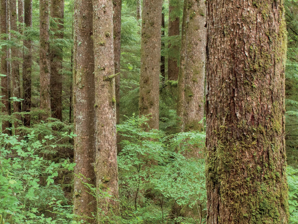
Figure 12-2: My Backyard Conifer Forest
The lush conifer forest is on my 20-acre property in the North Cascade Mountains of Washington. The original RAW file was not perfectly aligned vertically, being off by merely 1°, or perhaps a bit more. I used the straighten tool vertically, simply going right down the edge of one of the trees to be sure the final image has the trees at a true vertical. (Of course, not all conifers stand exactly 90° to the ground, but on balance, if most seem to be leaning to one side, everything seems wrong.)
The Straighten tool can alternatively be used to create a perfect vertical. Instead of drawing the line from left to right to create a true horizontal, you can start at the top and draw a line to the bottom (or vice versa) to properly align true verticals, such as for architectural purposes, or in a conifer forest (figure 12-2).
Clarity Tool
From the Basic Panel, the Clarity slider tends to be another prime tool of choice. By pushing the slider to the right or left, it increases or decreases local midtone contrasts. I generally tend to move it from the neutral position to the right, thereby increasing midtone contrast, which also tends to give the image a higher degree of apparent sharpness (essentially due to the increased contrast). The most striking effect of pushing the Clarity slider to the right is an apparent increase in brilliance and “snap” throughout the image, and for this reason I tend to slide it to the right much of the time, but not too far. I rarely push the Clarity slider above 30, for it can introduce unwanted effects of thin black lines at the edges of abrupt tonal changes, such as the edge of a building against a bright sky. At times, the slider should be pushed to the left, to subtly blur out tonal differences and to help create a more ethereal feel. At other times, it may be useful apply the Clarity slider to only select parts of the image and push it to the left to subtly blur those parts while leaving everything else sharper and more vivid.
With every editing tool, it’s best to work with each image independently of other images and to choose the most appropriate adjustments and the degree to which you want to push the effect for your purposes. When working with quiet, soft-toned images, moving the Clarity slider to the left can help soften the overall feel even more.
Graduated Filter Tools
An often-used tool located in the upper-left panel is the Graduated filter tool. I have often found this tool to be invaluable when I want to darken an image toward an edge or corner. Clicking on the Graduated filter tool, opens a dialog box with a set of new controls at the far right of your screen under the histogram. Suppose it’s the lower-left corner you wish to darken. Place the cursor at the corner, press the mouse down, and drag upward to the right. A small green circle opens where you first clicked on the mouse, and a black-and-white dotted line follows your cursor with a red circle as you drag the cursor up and in from the corner. Then a second dotted red-and-white line at 90° to the direction of the black-and-white dotted line will appear from the point of your cursor. Once you release the mouse, you have defined the area where the effect will be applied. Then go to the dialog box and move the Exposure slider to the left. You’ll see the corner will become dark and will fade inward and upward toward the ending line, where nothing darkens . . . and nothing is affected beyond that line. You can push the exposure slider as far as necessary to darken that corner in a tapered manner. You can do the same with any of the other controls (sliders) on that panel, for example, Contrast. You can even change the color balance using the Temperature and Tint controls, or you can fine tune that selection with the Highlights, Shadows, Whites and Blacks sliders. Conversely, you can lighten toward that corner in a tapered manner, just as easily by moving the Exposure slider to the right.
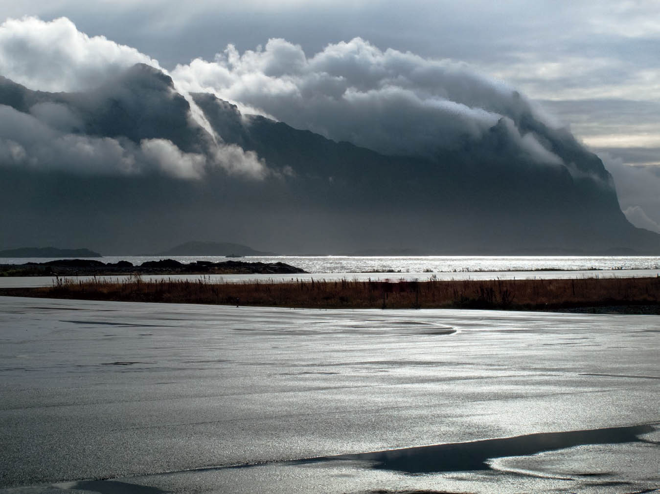
Figure 12-3: Litle Molle, Clearing Storm
Litle Molle is one of Norway’s Lofoten Islands. This view from the island of Skrova shows clouds rapidly flowing over the island’s hidden summits, as a storm departs. Almost a black-and-white image, nothing was done to alter color saturation, but the foreground reflective water was greatly toned down using the linear gradient tool, as the sunlit reflections were almost blinding. Interestingly that foreground, appearing to be a shallow ocean inlet, is actually the wet asphalt apron of the airport, with the photograph made through the terminal window while I waited to board my flight.
If you were to do exactly the same thing starting in the middle of any edge (left, right, top, or bottom) of the image (rather than coming in from a corner), and hold the mouse down as you move the cursor toward the center of the image, you can taper down the tonality toward that entire edge in the same manner (figures 12-3 and 12-4). Again, you can also lighten it toward that edge. Beyond that you can use any of the other controls to alter the image as you see fit within that selected area. And, of course, starting from any edge, you can move diagonally into the image when desired; you don’t always have move perpendicularly into the image from any edge. If you hold down the Shift key while defining the area to be darkened from an edge, the area will end parallel to the edge.
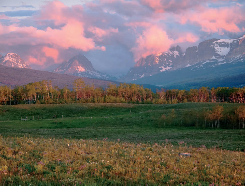
Figure 12-4: Rockies and Rangeland Sunrise
Photographed from the rolling rangelands east of Glacier National Park, the tones required post-processing rebalancing. A graduated filter was used to darken the sky, clouds, and distant mountains, and another was used to lighten the foreground up the sunlit trees across the center of the image.
I should caution that overuse of some of the controls could create strange, undesirable effects. I recommend extreme caution with using controls like Clarity or Sharpness in just a portion of any image without including the full image. Always consider the cumulative effect on the full image when you invoke any of the controls on a portion of the image, whether it’s from a corner or an edge or any other portion of the image.
Now consider the vast possibilities this tool offers. Suppose you taper down the tonality of the image toward the lower-left corner. (In traditional darkroom terms, you’re burning—or darkening—the image down to the corner.) Then suppose you also taper down the image along the bottom edge. At that point you may have overly darkened that lower left corner, because you’ve darkened it twice. But then you can come back with a third Graduated filter gradient adjustment upward and inward from that lower-left corner to lighten the new selection, thereby negating the excessive darkening you’ve created by the overlap of the two previous tapered burns. Obviously, that third adjustment can come up from that same corner, or near that corner, and it can go into the image as little or as far as you wish, and the degree of lightening can be adjusted to suit you. So now, with three Graduated filter gradients applied to your image—two darkening and one lightening—you’ve darkened the image toward the corner and toward the entire bottom, but you haven’t overly darkened that corner.
You can come into the image from any point at any edge or corner, move into the image in any direction, and stop the tapered adjustment at any point. If your next starting point is on, or very close to, any of your previous starting points, and the previous choice is inadvertently activated again, just click the mouse anywhere outside the activated area to delete that starting point, and start again with your next Graduated filter choice.
In the CC version of ACR, there is also a Radial filter tool that allows you to taper out to all edges and corners simultaneously. It works in a somewhat different way from that of the Graduated filter tool. With the Radial filter tool you can start from the center of the image, click the mouse down and move it toward a corner. When you release the mouse you will see an oval dotted line centered at your starting point with the oval going through your end point. You can then grab either of the two major axis points or the minor axis points of that oval (e.g., the left, right, top or bottom points of the oval) and move it, thereby changing the shape and size of the full oval. You can place your mouse on the starting (central) point of the oval, and move it in any direction, thereby moving the entire oval with it. With the Radial filter tool, the dotted line indicates where the tapering begins inward toward the center. Everything outside the oval will be altered to the full extent you designate; it will taper down to no change from that dotted oval inward 50% of the way to the center of the oval (your starting point). Thus, if you start your oval in the exact center and then have the oval’s dotted line touching the four center edges, if you then darken the Exposure slider the image will darken to that full extent outside of the oval, and will taper back to nothing inside the oval from the oval halfway back to the center of the oval. Again, you can use any of the other controls to alter the image inside and outside the oval in the same manner.
As you create the oval, you can reshape it as you please as long as you’re holding the mouse down. You can shape it to a long, narrow horizontal oval or a long, narrow vertical oval, or to a perfect circle. Once the mouse is released, the shape is set. You can still reshape it as you please by grabbing any of the four “handles” (i.e., left, right, top, or bottom of the oval) by the edge of the cursor. (Note: If the oval goes beyond the picture area, reduce the size of the image until the oval fully shows, and reshape it.)
You can even re-orient the oval’s axis clockwise or counterclockwise via a curved icon with arrowheads at each end, and then rotate the entire oval to the angle that best suits your needs. Simply place your cursor near one of the four “grab points” moving it slowly around until the curved double-arrow appears, and then pull the point up, down, left, or right to re-orient the oval. Thus, you’re not confined to an oval that’s oriented left/right or top/bottom. You can orient it to any angle you want. This is a wonderful, simple-to-use, control that gives you additional options for image adjustment.
This, too, is a valuable tool, and can be moved around to darken or lighten, or alter in any other way, just one corner, two corners, three corners or an oval along one or two edges, or even three edges, depending on how you shape and locate the oval.
Keep in mind that you don’t have to always work from the center outward. You can, for example, start the Radial filter at any point within the image and have the curve end anywhere. For example, on occasion you may see a need to darken, or lighten, or alter the color balance in a curve along the left and bottom edges simultaneously. In this instance you can center the curve at the upper right—or even beyond the image area—and bring the circle or oval as far toward the lower left as you wish. When employed with careful planning, this tool can be immensely valuable.
You can reverse the effect by pressing the Inside button below the sliders. So, if you want to darken the inside of the oval you’ve created rather than the outside, pressing the Inside button does it. This is handy anywhere, but I have found it particularly useful along the edges of an image, where I have wanted to burn (darken) or dodge (lighten) an edge, but not as much toward the corners. With the Inside button activated, the greatest effect will occur at the center of the oval, and will diminish to zero at the oval’s boundary.
You can even reshape the oval asymmetrically if you hold down the Alt key as you grab any one of the oval’s four handles, moving only that side of the oval. This allows for more flexibility in reshaping the original oval. (I should note that I have encountered inconsistencies with this method, in which some images refused to work in this manner. Although frustrating, it represents no serious problem. You can overcome this failure by reshaping the oval symmetrically, and then grabbing the center point to move it one way or the other. Thus, instead of accomplishing the asymmetric reshaping in one move, you have to resort to two moves to accomplish the desired reshaping.)
On occasion I have encountered unexpected color distortions toward a corner or edge of an image. Either the Graduated filter tool or the Radial filter tool can be effectively employed with the appropriate color balance controls to neutralize such discolorations.
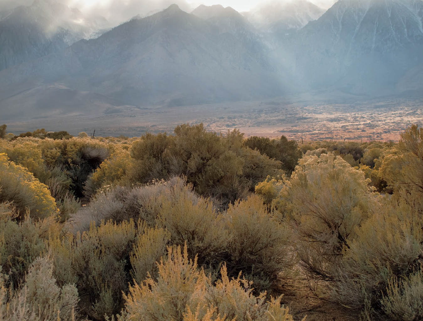
Figure 12-5: Sunbeams, Owens Valley and Sierra
A difficult image to deal with due to the tonal range from the brightness at the top to the shaded brush in the lower half. By employing the HSL tool and then turning to the Targeted Adjustment tool, I was able to click on the upper edge of one of the bushes and increase both its luminosity (to a moderate extent) and saturation (very slightly), which added light and life to the foreground, turning it from a dull base to an actively interesting foreground, and creating greater depth between the foreground and the summits, 10 miles away.
Adjustment Brush Tool
I think the Adjustment Brush tool should be renamed the “Burning and Dodging” tool, because it serves that purpose (as an approximate equivalent to the traditional darkroom). Choose the “brush” size you need, and a considerable additional amount of “feather” where your burning or dodging smoothly blends into its surroundings. The solid black inner circle shows the extent of the full adjustment, the black-and-white barred outer circle shows the extent of the feathering to the surroundings.
Below the numerous adjustment sliders, and at the very bottom of the screen, you’ll see boxes labeled Overlay and Mask, with a third unlabeled box to the right of Mask. These are important to understand. Click on the Overlay button, and the starting point of every complete brushstroke you’ve made shows up on the image. When you choose any brushstroke, or as you’re starting any brushstroke, if you click Mask, it will show you the full extent, including the feathering, of the adjustment area. The third box (the unlabeled one to the right of the word “Mask”) can be adjusted to the color of the mask. The mask color can be changed if, for example you’ve been using a red color to show the adjusted area, and now you’re working to change the tonality of a red fire engine and you can’t see the chosen area because the red mask can’t be distinguished on the red fire engine. Click on that unnamed rectangle and change the indicator color to green or yellow or blue, or whatever color you choose to clearly show the extent of the adjusted area. This can be quite helpful. I tend to click the Mask box “on” when I’m initially painting on the area to be adjusted in order to be sure I’m covering the full area I want to adjust, then I click it off to see the actual adjustments as I’m making them.
If you decide you’re unhappy with the adjustments you’ve just made, you can click on the Clear All box at the lower right to erase all adjustments and start over. That’s extreme. You’ve made some really poor choices if you have to negate them all! But joking aside, there are times when you start off on the wrong path without realizing it, and continue on that path for some time before recognizing you’re headed in a wrong direction, so the Clear All button puts you back to “go,” allowing you to start again. Of course, alternatively you can click on the Overlay button, choose the individual adjustments you want to eliminate, and then start each one of those again.
Immediately below the adjustment sliders you’ll find another box labeled “Auto Mask.” When clicked on, it will confine the feathering to a hard edge. So, if you want to lighten to the edge of building, but not overlap the adjacent sky, you can click on Auto Mask while you paint on the area to be altered with the Adjustment Brush tool without worrying that you’ll feather out into the sky . . . as long as the center of your brush stays within the confines of the building.
Use of Auto Mask may introduce unwanted problems, specifically a sharp line introduced at the edge of a tonal break. After defining the mask and making your adjustment (such as darkening the masked area), it’s wise to greatly enlarge the image to see if such undesirable effects have been introduced at the edge of the mask. If so, try cutting back on the amount of alteration (e.g., reduce the amount you’ve darkened the masked area) until the effect is negated. Sometimes you may have to abandon the Auto Mask feature entirely, and simply work on the greatly enlarged image with a small paintbrush as carefully as possible.
If, on the other hand, you’re painting a mask on a different object with a hard edge, say one rock within a pile of rocks, but a portion of an adjacent rock is identical or quite similar in tonality, you might overlap that hard edge. In that case, go to the very top, above the sliders, and click on Erase, adjust the brush size, and use the brush as an eraser to remove the overlay of the mask that intrudes onto the unwanted rock.
So, with that overview of how to go about controlling the tool, how do you use it?
You can use the Adjustment Brush tool to neutralize unwanted color distortions, as suggested at the close of the previous section. While the Graduated filter tool or the Radial filter tool can be used easily at an edge or corner, the Adjustment Brush tool can be used anywhere in the image.
You can isolate any portion of an image by painting it with the Adjustment Brush tool and then go to the sliders to lighten or darken the tonality; increase or decrease the contrast; adjust the highlights shadows, whites or blacks; alter color balance; or apply any of the other adjustables, as you see fit. If, for example, you darkened an area of foliage via this method, you can then enlarge the image, make the brush smaller, and bring back a solitary branch within that foliage to a brighter tonality. So you have extraordinary control.
As with all the digital controls, the real problem is controlling yourself from the lure of overusing and abusing the controls. Lightening that solitary branch, for example, may cause it to stand too much and may pull the viewer’s eye away from more important things you really want the viewer to concentrate on. Always keep the total goal in mind when you’re working on image adjustments. Don’t get so wrapped up in the minutiae that you lose sight of the total picture (literally and figuratively). This, of course, is an oft-repeated warning in this book, but my workshop experience tells me that can’t be repeated too often.
![]() As with all the digital controls, the real problem is controlling yourself from the lure of overusing and abusing the controls.
As with all the digital controls, the real problem is controlling yourself from the lure of overusing and abusing the controls.
I also want to single out one adjustment slider that can prove problematic: the Clarity slider. As noted above, pushing the Clarity slider too far to the right may introduce unwanted thin lines into the image at abrupt tonal changes, similar to oversharpening the image. So, if you slide Clarity to the right on the overall image, and then you slide it to the right when using the Adjustment Brush tool, the combination may push the image over the brink. So, always keep in mind the cumulative effects of using sliders. I tend to avoid the Clarity slider when using any specific adjustment—the Graduated filter or the Radial filter being other prime examples—but I generally employ it for the overall image, only. There are exceptions. (Always remember James Thurber’s observation that “There’s no exception to the rule that every rule has an exception.”) Suppose, for example, you have some nearby objects you want to bring attention to, with some distant objects partially obscured by clouds and fog. In this case, you may want to isolate the near objects and increase their clarity while leaving the rest untouched, or even push the Clarity slider to the left for those distant areas. Too often, those distant objects are increased in contrast and sharpness, which tends to counteract the appearance of distance and atmosphere between the foreground and those objects.
Hue, Saturation, Luminance, Grayscale, and the Targeted Adjustment Tools
These are very powerful and extraordinarily dangerous tools. The power comes from the ability to target specific colors within the image and altering any or all of the three stated properties (hue, saturation, or luminance). The danger comes from the lure to go overboard by pushing each and every one of these adjustments too far. Throughout my 40 years of teaching workshops—starting well before digital photography was even a thought—I have fought the tendency of photographers “going too far.” Too often traditional black-and-white printers were printing their images with contrast that vastly exceeded the desired mood of the image. They were regularly equating high contrast with high drama, with the goal of garnering instant attraction to the image. The problem was the excess contrast generally equated to excess contrast, and nothing more. Furthermore, many of the images were intended to convey a quieter, softer, more relaxed mood, yet the high contrast clashed with the intended mood. Color photographers were too often putting too much contrast and/or color saturation into their images. Again, either one was excessive, often violating the desired mood. The problem with digital imagery is that the same mistakes can be made even more easily: all you have to do is push a slider to the right . . . and keep pushing it farther to the right.
HSL/Grayscale is the fourth tool from the left in the upper-right Basic panel. Click on it and it launches a set of eight sliders of the colors of the rainbow—i.e., the full color spectrum of white light. You can use any one, two or three of the color adjustments (hue, saturation or luminance) to alter specific colors within the image. These sliders are referred to as “filters,” and you can see how great an effect any one has on the image by sliding it from side to side. Some will have a profound effect, while others will be minimal or even non-existent. I recommend trying each of the sliders to see what affect it has, and then use it with carefully considered restraint to help achieve the image you want.
As an alternative, once you activate the HSL tool, and choose any of the three adjustments (let’s choose Saturation), you can then go to the Targeted Adjustment tool (fifth from the left in the top left toolbar). This tool allows you to place your cursor on any spot in the image, press the mouse down, and while holding it down move the mouse up or down. Your chosen color will increase or decrease in saturation with the mouse movement, and it will bring other colors within the image along with it in proportion to their degree of saturation. (Moving the mouse to the right or left will produce the same effect.) This combination of tools allows you to precisely choose the color you want to change . . . but always be aware of other parts of the image changing along with it (figure 12-5). (You can, of course, do the same maneuvers using the Hue or Luminosity adjustments.)
Beware of unexpected changes. For example, if you choose Luminosity as the adjustment you wish to make, place your cursor on a very dark area, and then move your mouse upward, everything in the image may get lighter and completely washed out. So, using these two tools in combination require some time getting used to them, but once understood, they can be quite helpful.
Also, consider using the Targeted Adjustment tool without pairing it with the HSL tool, but just with the Basic panel. Choosing a spot on your image, pressing the mouse down and raising or lowering the cursor can brighten or darken all similar areas within the image. It can be quite useful. (This also points to the potential options available by trying any tool in conjunction with others or alone. If you simply experiment with the possibilities, you may discover more hidden options available to you than anyone could reasonably put into an encyclopedia.)
Conversion to Black-and-White
The HSL/Grayscale tool is also the tool to use if you want to convert your RAW color image to black-and-white in ACR. Upon opening this tool, you’ll find a button in the center at the top labeled “Convert to Grayscale.” Click that button, and the image is immediately rendered in black-and-white. However, under the surface it is still a full RGB image (the button is a toggle between color and black-and-white; click it again to prove that). In chapter 11, it was already strongly recommended not to quickly convert your RAW file to grayscale immediately. That approach will yield inferior results. We will explore a different way that opens up wider options to you and can lead to better results.
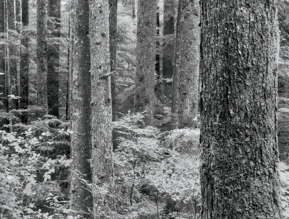
Figure 12-6: Home Conifer Forest—Black-and-White
Converting figure 12-2 to black-and-white entailed just a few alterations using the filter sliders, moving the orange slider to the left, the green slider to the right, and then employing the linear gradient tool to reduce the bright glare of the leaves in the lower-left corner of the image. It’s best to always do the black-and-white conversion via the HSL tool, and the “Convert to Grayscale” button, where the underlying image retains all color data.
You can, of course, start by manipulating the sliders below that button (figure 12-6), which I did in converting figure 12-2 to black-and-white. To achieve the tonal characteristics I desired, I first pushed the green slider to the right, thus brightening all the foliage within the image, and then I pushed the orange slider to the left to darken the tree trunks. The deciduous foliage on the lower left was then too bright, pulling my eye toward that corner, so I applied a gradient filter at a 45° angle from the lower-left corner upward and to the right to taper the brightness down in that corner of the image.
Sometimes, an alternate approach for a black-and-white conversion is in order. Once you’re in grayscale viewing mode, you can start by going to any of the ACR tools: Exposure, Contrast, Highlights, Shadows, Blacks, Whites and Clarity, just as you would work with a color image. You can even work with the Temperature and Tint sliders to see what affect they have on the total image, now being viewed as a black-and-white. For black-and-white, the Vibrance and Saturation are both fixed at the far left side, because in the black-and-white image view those controls have no meaning. You can enable the Crop or Straighten tools, the Graduated filter or the Radial filter, the Adjustment brush, etc., from the upper-left toolbar or from the Basic panel to the right, where you can apply the Tone Curve tool or work with any of the sliders below the upper set of tools.
If you start by using those tools first, edging the newly converted black-and-white image toward the final finished file you want, you can later employ the color filters as needed.
Keep in mind that at any point in this process, you can click the “Convert to Grayscale” button to again view the image in full color, which may be particularly helpful at this stage to get a renewed view of the actual colors in the image—now altered from the original RAW image by the adjustments you’ve already made. (Note: You can then press the P key on your keyboard—again, P for “preview”—to view the untouched original RAW image, as well.) A look back at the full color view may help you choose which filters to use for further adjustments. Alternatively, you can ignore the color view, continue viewing the image as a black-and-white, and simply play with the sliders to see what effects they produce. Some users like to toggle back and forth to see what they like best; some find toggling back to color to be a major distraction. You’ll quickly discover which approach works best for you.
You can alter filters to any degree you wish while watching their effect on the black-and-white image. It is my observation as a lifelong traditional black-and-white film and filter user that the degree of image alteration using the digital filters vastly exceeds that of any filter used in traditional photography, which tells me that gross overuse of digital filtration is a real lure and threat. Overuse of filters can be ridiculous, so my greatest caution is to use them to slightly and sensibly modify the image; not to transform it into a cartoon. A small push of a slider to the left or right can have a huge effect, so caution is in order. However, if your intent is to blow off reality, then no holds are barred, and you can apply the filters to any degree you wish. As I have repeatedly stated, if you keep your basic goals in mind at all times, you’ll end up with the statement you want to make.
To my eye and mind, the filter siders do not emulate filtration in traditional black-and-white imagery. For example, I have found that moving the aqua filter slider may have virtually no effect, but moving the blue or green could have a profound effect (or vice versa). But these “filters” represent colors that are relatively close to one another on the visual spectrum, making it baffling to me why one would have a profound effect and a neighboring color filter would exhibit none. Over time you’ll simply have to ignore the alleged “color” of the filter, move the sliders to see exactly what effect it has on the image, and simply use the ones that help you achieve your goals. The important thing here is to keep those filters active by maintaining the underlying image in full RGB. The moment the underlying color image is removed, you lose those controls. Keep the controls alive, and work the image as carefully in black-and-white viewing mode as you would with any color image.
Many of the best practitioners converting from a color RAW file to black-and-white agree that while wonderful things can be done in ACR and Photoshop, the finest results are achieved through third-party software. At the time of writing, one that gets particularly high marks is Silver Effex Pro 2 (a Google product, now downloadable for free). In addition, there are many books and video tutorials available to help walk you through some of these rather complicated processes. Are they worth the time and trouble? The answer should be apparent: if you want to produce the finest imagery, you have to put in the effort. This is true of any field of endeavor, so it’s true of both traditional and digital approaches to photography, as well.
Vibrance and Saturation Tools
Two tools I sometimes use in ACR are the Vibrance and Saturation tools. I say “sometimes use” because I rarely employ them, and when I do, it’s often to reduce the color saturation rather than raise it, because the original RAW colors have a lot of brilliance at the start, or because other post-processing alterations—most often a large contrast increase—pushed color saturation levels to unacceptable levels, as in figure 6-15b. Furthermore, before coming to the Vibrance and Saturation controls, I may have already altered colors to my satisfaction the with the color balance controls (Temperature and Tint) and further modified them with Clarity or the Curve tool—and certainly if I’ve used any of the three primary color curves—or other controls already discussed.
Throughout my life I have heard the phrase “The ways of God are unknown.” I think that phrase applies equally well to the Vibrance and Saturation tools. If I move either one to the extreme left, I end up with a grayscale image—no color, effectively a black-and-white image, although I have encountered some images with a semblance of color remaining with only the Vibrance control pushed all the way to the left. Moving either one all the way to the right creates unbearably garish colors. This tells you that, in general, these sliders must be used minimally, and with care.
Over time I have found that Vibrance seems to affect blues and closely related colors to a greatest extent, whereas Saturation seems to work most strongly in reds, oranges, and related colors. Beyond that, the two seem to work in ways that I cannot predict in advance, so I have learned to play with the sliders to see how the image responds, and then use them individually or in tandem to achieve the desired results. In all cases, color saturation is increased when pushed to the right (but not in exactly the same way), and decreased when pushed to the left (again, somewhat differently from one another). So, just as with the recommendation given in chapter 11 for using the four basic controls (Highlights, Whites, Shadows and Blacks) in the Basic panel, I recommend working the sliders independently to see what they do on each individual image. I further recommend using the two in tandem, pushing either one as little as possible to achieve your color saturation goals. Pushed too far to the right, each one will turn the image into a garish, glowing, neon atrocity. Don’t go there! Pushed too far to the left, each will change the color to be drab and uninteresting. Don’t go there, either!
It has been my experience that the greater problem is too much saturation, not too little. The best photographs are attractive because of their insight, their enlightening compositions, and their surprising revelations, not their garish colors. Color—in particular, its degree of saturation—is a critical component in a color image, and it should be used to create emotion, not to overwhelm the viewer. Always keep that in mind during post-processing.
Healing Brush and Clone Tools
The final two tools I use in ACR are the Healing Brush and Clone Stamp tools. Let me bypass a discussion of these very useful tools for now, and I will pick them up just below in my discussion of the Clone Stamp tool in Photoshop.
ACR Summary
These are the tools I employ in the first stage of my postprocessing of any RAW image. There are others but I don’t work with them. I’m sure other practitioners will explain why I’m missing the boat, but as I stated at the start, everyone has his or her own workflow. This is mine.
I do not employ the tools in any specific order. Upon opening an image, I first jump to the tool that appears most necessary. Sometimes it’s the Graduated filter, sometimes it’s the Temperature and Tint controls, sometimes it’s the Tone Curve, sometimes it’s the Crop tool, and sometimes it’s something else. I look for needed adjustments from the RAW file in whatever order my whim strikes me with each individual image. This is art; this is not a construction job in which you have to do things in a specific order to get the job done properly. Besides all that, I want to be loose and have fun with the image. I often go back and forth between tools, because sometimes a change in one requires a further change in another that I’d already adjusted. It’s an iterative process, and I approach it that way with each image. I recommend you approach this equally loosely. Don’t create a list of tool that must be used in any specific order. That’s a surefire means of pushing you off track more often than it will keep you on track.
Once I’ve completed this post-processing in ACR, I can click on “Done” to save it as modified for further work at a later date (either in ACR or in Photoshop), or I can open it in Photoshop by clicking on “Open Image.” So let’s proceed into Photoshop, with the understanding that much of the postprocessing of the RAW file has already been accomplished.
The Photoshop Tool Chest
Upon opening an image in Photoshop, I first go to the Window menu to be sure the following palettes are visible on the monitor at the right: Adjustments, History, Info, and Layers. (The icons shown in the Adjustments box are exactly the same as you’ll find in the drop-down Layer menu at the top, when you go down to New Adjustment Layer and click on it. At that point, you’ll see the same potential adjustments.) So you can open up any new adjustment layer (e.g., Curves; Hue, Saturation, Lightness; Levels, etc.) or by going to New Adjustment Layer from the drop-down Layers menu.
It’s best to do all adjustments in Layers—in fact, it should be your only approach to adjustments in Photoshop—because any layer can be altered or thrown out if you simply don’t like the adjustments made. To throw one out, grab the layer icon and drag it to the trash can in the lower right of the Layers palette. Then start again with a new layer.
The Clone Stamp Tool
I love the Clone Stamp tool! This is the tool I wish existed in traditional photography, where the only way to eliminate a black dot in a light sky is to etch it off with an X-ACTO knife (or some similar instrument). The Clone Stamp tool allows you to eliminate an unwanted spot or any other type of blemish without any damage to the emulsion.
Go to Layer > New Layer and name your layer “Clone Layer 1,” or whatever you wish to name it. Then click on the Clone Stamp tool. Be sure when attempting to use the Clone Stamp tool that on the top gray bar above the image the Mode is Normal, Opacity is 100% and Flow is 100%, and that down on the toolbar along the left edge the Set Foreground Color is black. It’s generally best to open the Brush Preset picker found on the left side of the top gray bar and set the brush hardness to something significantly less than 100% to best feather the cloning action with its surroundings.
The way the Clone Stamp tool works is interesting. Assume you have a black spot in a light sky. You want to remove that black spot. Let’s call the location of that black spot “location 2.” First, find a patch of sky with precisely the same tonality as the sky surrounding the black spot, but one without any spot within it. Let’s call that unblemished portion of sky “location 1.” Select a size for the stamp you’re about to employ using the bracket keys: ] to increase its size or [ to decrease it. While holding down the Option key place the cursor over the unblemished section of sky (location 1) and click on it. That creates the choice that will replace the defective area containing the spot. Then move the cursor directly over the spot (location 2) and click again. The contents of location 1 (the unblemished sky) immediately replaces the contents of location 2 (with the spot). Voilà! The spot is gone.
But that action does more. It establishes a vector (to use the correct mathematical term): a fixed distance and direction from location 2 back to location 1. After that, if you then click on any other portion of the image, let’s say a second blemish in a different portion of the sky, which immediately is the new location 2, the Clone Stamp tool is activated again, applies the same vector to choose location 1, and places new location 1’s contents into location 2. You can continue to effectively click on various portions of the image, and the same vector will be applied each time. You can change the size of the selection from one click to the next, but the same vector will be applied to take contents from location 1 to location 2. To change that vector, hold the Option key down once again as you click the mouse to get a new “location 1,” release the Option key, and move the mouse to a new “location 2” and click. That replaces the contents of the newly chosen location 2 with the contents of “new location 1,” and establishes a new vector, which will be adhered to until you change it again.
Now, let’s do something seemingly more complicated. Suppose you’ve photographed a forest, with intersecting branches up into the sky. But there is one small section of bright open sky that is eye-catching and irritating. Choose a size of the Clone Stamp tool that covers the size of open sky, and with the Option key down, place the cursor over a segment of foliage and branches elsewhere in the image, and click on it. That’s a new “location 1.” Release the Option key and move the cursor over the blank sky (i.e., location 2) and click again. The foliage from location 1 now replaces the blank sky in location 2. If you’ve carefully chosen the area of foliage (i.e., an appropriately chosen location 1) it may replace the blank sky so seamlessly that it may be impossible to see anything amiss. It blends perfectly. In the same way, you can remove a blemish from someone’s face in a portrait.
Furthermore, if you hold the mouse down when you’re at location 2 and move it around, it will continue to replace the contents from location 1 via the same vector. You may be able to use this procedure (when very careful selections are made) to remove a scar on a person’s face, or any other linear blemish on any object. When this is done correctly, it’s almost like magic.
The Clone Stamp tool is fabulous; it’s my favorite of all digital tools.
The Healing Brush Tool in ACR
ACR has a tool called the Healing Brush, which also contains a Clone Stamp tool as an option. But these two tools work in ways that are different from the Photoshop Clone Stamp tool. In ACR, go to the Spot Removal Tool (the middle tool in the upper-left array of tools) and click on it. A dialog box opens in the upper right, with the type of tool either the Healing Brush or the Clone Stamp. You can adjust the size, degree of feathering, and opacity below the type of tool you’ve chosen. With either the Healing Brush or the Clone Stamp tool you place your cursor on the object you want to remove and press the mouse down. ACR creates a circle around the point where you clicked the mouse—which you can enlarge or contract using the bracket keys: ] or [. It then automatically grabs a section of the image to replace the unwanted distraction. While holding the mouse down, if you move the cursor, it will create any shape you chose to clone or heal (not just a circle.) The original circle containing the distraction is shown as a dotted red line; the choice ACR picks to replace it is a dotted green circle, with a dotted green line connecting the two. (Of course, if you move the mouse while pressing down the original shape of the red area to be altered will be replicated by a similar shape chosen elsewhere.) The choice ACR makes seems strangely arbitrary . . . so the start of this process is distinctly weird. (If there is a non-random method behind its choice, I have been unable to determine what its algorithm is.) But, there is a way to get around this weirdness. You can place your cursor within the green circle (or odd shape), and move the circle to a new location of your choice to replace the unwanted distraction. (Note: Placing your cursor at the edge of the green circle yields a different icon—a two-sided arrow—that allows you to enlarge or reduce the size of both the red and green circles simultaneously. You can move or enlarge the original circle in the same way.)
Once you tune in to that flexibility, the Healing Brush/Clone Stamp tool becomes much more useful, as I learned. In fact, you can place the original circle anywhere in the image (then watch as ACR makes its arbitrary choice of a replacement), and then ignoring both, move the original circle to where you want to place it, and then move the ACR replacement choice to wherever you want to place it. You’re done! Before recognizing that flexibility, I used the Clone Stamp or Healing Brush in ACR only when a distraction was so bothersome to me that I needed to get it out of my field of vision. But once I realized how to take control of these two tools, I have largely transferred its use from a Photoshop tool to an ACR tool. However, I must admit that the way it’s done in Photoshop, without the distracting circles on the image for both the starting and ending points, is far “cleaner” and therefore easier to follow. My preference would be for Adobe to simply transfer the Clone Stamp tool from Photoshop to ACR.
Curves
The Curves adjustment used to be my most relied-upon image adjustment in Photoshop, but now I do most of it in ACR, and I strongly recommend that practice to all digital users. After all, why wait until the end to make needed adjustments at the beginning that are totally nondestructive (i.e., nothing of the original RAW file is ever lost in ACR)? Some practitioners say that they can do everything needed using Curves, which, if not the truth, is close to the truth. Still, doing it in ACR gives you the same control, but earlier in the process.
Before I learned that the Tone Curve tool in ACR had the Point option (which was an optional mode in older versions of ACR, but is now the default mode in the CC version of ACR, as it should be), I relied on Curves in Photoshop for more than 90 percent of my post-processing adjustments. No longer. With ACR obviously giving equal control of the overall tonal curve from the RAW file, including the ability to move the ends points of the initial 45° default line, plus further control in each of the three color channels, you can do it in ACR rather than wait until you get into Photoshop. At the risk of unnecessary repetition, I recommend trying to do as much initial processing as possible in ACR, so that you can leave more sophisticated refinements at the end to Photoshop. Often, the work done in ACR is enough. No further work is required in Photoshop (except for saving it as a TIFF or PSD finished file). But if more is needed, Curves still accounts for the vast bulk of my processing.
Indeed, more is always needed even when I apparently accomplish all necessary adjustments via the Tone Curve tool in ACR, I still go to Curves in Photoshop because it allows me to measure the tonal value of any point in the image with the eyedropper, which ACR fails to provide (though Lightroom allows such measurement). So, while things may look perfect to my eye, in Photoshop Curves I can actually measure any point to make the final tonal or color adjustments. For this reason, I invariably open the Curves tool in Photoshop for every image. It provides excellent insurance, and I strongly recommend all users doing the same. (More thoughts on the difference between eyeballing it and measuring it at the end of this chapter.)
While working in Curves you can click on the hand icon in the upper left of the adjustment box, activating the eye-dropper, and then place the eyedropper at any point in the image, which will give you an immediate reading of the density at that point. Its point on the curve is also shown. You can click your mouse on the image at that point, thus locking a point onto the curve, and then move the cursor up or down to alter the density of that point—along with other parts of the image—as the curve changes with the up or down move of the cursor. You can do the same with the red, green, and blue components individually. This gives you great control of the image. (This cannot be done in ACR, but it can be done in Lightroom.)
Curves can be applied globally or it can be localized to color regions that need special attention. Let’s first deal with the global application of Curves, then discuss methods of applying Curves in a more targeted manner.
In the Adjustments window, click on the Curves icon. That creates a layer, which you can name as you please. The histogram of the full image will appear with the typical straight line default “curve” from the lower left (black) to the upper right (white). Altering that 45° straight line lightens or darkens the image: pushing it to the left or upward lightens tones; pushing it to the right or downward darkens tones. Where you grab the curve and pull it left or right will determine which portions of the image are most affected. In Photoshop, the ends of the default curve can be moved just as any other portion of the default line, as you can using the Point option in ACR. Furthermore, you can grab the default curve at any point from black to white and move it up or down, or left or right, as little or far as you want. With this, fine alterations are possible. Also, once you click on any portion of the default curve, you can move it by grabbing it with the mouse or using the keyboard arrows to move that section of the curve, one space at a time, in any of the directions.
At the top of the Curves dialog box, you can change the overall tonal curve to work specifically on any of the primary color channels: red, green, or blue (just as you can in ACR Curves). This affords even more refined alterations. If, for example, you detect a slight red/magenta tinge in a light sky, you can go the red curve, and bring the upper part of the curve down just a bit . . . and perhaps employ a further adjustment of the green and blue channels, as well. If it’s a deeper blue sky, you can alter the middle or darker portion of the curve to deal with just that tonality, and bring it back to the default in other portions of the default curve.
If you click on the hand with the pointing finger in the Curves dialog box, you’ll get the eyedropper, which, when you move it across any part of your image, will show exactly what tonality on the overall curve it corresponds to, and gives you a number from 0 (total black) to 255 (pure white). If you click the mouse over any portion of the image you get a “grab point” on the curve, which you can keep fixed, or you can move the curve as you see fit with the mouse or by using the directional arrows on the keyboard. You can use this eyedropper tool with the full gray tonal scale, or with the red, green, or blue channels individually.
It has been my experience that careful alterations of the overall curve, with perhaps some additional tweaks of the three primary channels, generally satisfies my vision of the final image 90 to 95 percent of the time. With the initial changes I’ve made in ACR, I can generally use Curves in Photoshop to accomplish the rest.
Refining Curves to Selected Areas
But then there are the remaining 5 to 10 percent of images that need further processing. Most of those images can be satisfactorily processed with more specific targeting of Curves. There are two ways this can be accomplished: the quick and dirty way or the more complicated, refined method. Let’s go for the quick and dirty first, which really isn’t dirty at all, but it is quick and very effective.
Create another Curves layer (either from the menu bar at the top, where you select Layer > New Adjustment Layer > Curves (or simply go back to the Adjustments window to click on the Curves icon, thus opening a new Curves layer).
Before proceeding with any adjustments, go back up to the menu bar and select Select > Color Range. An eyedropper appears, and when you click it on any portion of the image—let’s say that magenta-tinged section of sky, it will select just those portions of the image with that color and tone. You can then widen or narrow the variation of tone and color from your initial point by changing the amount of Fuzziness in the dialog box. In the dialog box, you’ll see what portions of the image will be altered—they are shown in white—and everything else in black. This will guide you to determine the degree of Fuzziness you want. Then, when you begin to alter the newly created Curves layer, it will affect only those portions of the image shown in white in the dialog box. Now, with only the magenta-tinged portion of the sky selected, you can add some green there to neutralize the magenta. Therefore, using the Select > Color Range option, you’ve confined the alteration to the area needed.
By contrast, it may have been that when you tried to remove the sky’s magenta cast using an overall Curves adjustment, the increased green component altered other portions of the image in undesirable ways, perhaps turning another portion of the image too green. Thus, trying to make this desired change in the sky using the overall Curves adjustments proved unacceptable.
It’s a quick, simple, and very effective procedure, which I have used often. This is also an option unavailable in ACR.
Further Refining of Curves
Sometimes, even that refinement isn’t quite enough. Let’s suppose you have three areas within an image with a pronounced reddish color and you want to either increase or decrease the intensity, or alter the color somewhat in just one of those areas while leaving the remaining two unaltered. If you click on any one of them using the color range idea, all three are selected. So, let’s see how to selectively work with just one of the three areas.
Here are the steps required to do it:
- From the Select menu, go to Color Range (Select > Color Range). In the dialog box click on Localized Color Clusters, and then choose a Fuzziness setting so there will not be an abrupt edge to the selection.
- Then go to the image and click on the color/tone that you wish to alter. You can further hold the Shift key down while clicking on adjacent areas to enlarge your selection.
- Once the complete selection is chosen, do a copy and paste (Command-C, Command-V), which saves that selection into a new layer. At this point you have made your full selection. Going along with the three reddish sections of the image in this hypothetical example, all three are now selected (even if you chose just one of them at the start, because they are so similar in color and tone).
- Click off the eyeball on the background layer and all other layers, and activate (i.e., click on the eyeball adjacent to) the newly created selection layer. You will see a light gray dotted pattern, with the areas selected in darker gray.
- From the left-side tool palette, choose the eraser, and set the flow and opacity at 100%. You can then adjust the Hardness or Fuzziness of the eraser to suit your needs. Proceed to erase the selections you do not want altered.
At this point, you have eliminated both red areas you wish to remain unaltered, and have only the one area remaining that you want altered.
- Go to the Image menu, and scroll down to Adjustments . . . then you can choose any of the options best suited to alter the tone/color you have planned to alter. I tend to choose Curves most of the time, and on rare occasions I may chose Saturation. Needless to say, any of the other options are also available.
Done!
This method of carefully targeting a segment of the image for adjustment can be immensely useful . . . but can be badly abused when it is allowed to go too far. So many users wax eloquent about the fabulous controls you have over an image, while often losing sight of the overall message they want an image to convey. I urge all users to fully understand the range of tools available to accomplish your goals, but never to lose sight of the goal itself. As I have stated repeatedly, too often photographers get so caught up with the many adjustments they can make to any image that any intended meaning behind the image gets subverted to these innumerable adjustment options. Ansel Adams’s wise counsel that “There’s nothing as useless as a sharp photograph of a fuzzy concept” should always be at the forefront of your thinking. It’s not just edge sharpness that Ansel Adams was referring to, but the basic underlying message that has to come through clearly. If you have something to say, say it . . . and use the tools wisely to say it effectively. If you really have nothing to say, no amount of tool usage will prove to be of value.
Technical vs. Artistic Concerns
Let’s use a specific example to further discuss this issue of refining Curves adjustments (or any other image adjustment) from both a technical and expressive point of view. The images of the Peru Outdoor Goods Stand (Figures 12-7a and 12-7b) exhibit the difference between a finished image with and without the selective process just detailed. Note the rather dull green sweater worn by the woman on the left in figure 12-7a. If I had tried to intensify the sweater without any specific selection, everything in the scene containing a green component in it would be pushed to greater intensity. That would have been unacceptable. If I had resorted to the “quick and dirty” selection detailed above, I could have clicked on a portion of the sweater (and even added to it by doing one or more Shift-clicks on other parts of the sweater to include all lighter and darker parts of it), but when I tried that, the distant mountains were also selected because they were close enough in color and tonality. Hence, any change I made to the sweater would also have changed those distant green slopes. To me, that was also unacceptable. Finally I resorted to the refined selection method detailed above, and was able to erase away the similar colors of the distant slopes, thus confining the alteration to the sweater alone. At that point, I chose a Curves layer, went to the green channel, and pulled the curve to the left, thus brightening and saturating the green of the sweater (figure 12-7b).
My goal in this image is to draw primary attention to the stand and the two women who are selling the goods, and secondarily to the remarkable location, with the deep valley and huge mountains in the background. With those goals in mind, let’s compare the image with the untouched sweater to that of the enhanced version. Most of the materials for sale on the tables are brightly colored, which draws attention to them immediately. The two women are also immediately noticed because we always notice people in a photograph. Beyond that, it’s hard not to notice the setting, with the canyon and mountains. The untouched sweater does not draw attention to itself, but the enhanced sweater does, taking attention away from the colorful goods on the stands, and even from the women, especially the woman wearing the sweater. To my mind the enhancement is either undesirable or undesirably intense. Perhaps a slight enhancement of the sweater’s color could improve the image, but the degree of enhancement shown goes way too far.
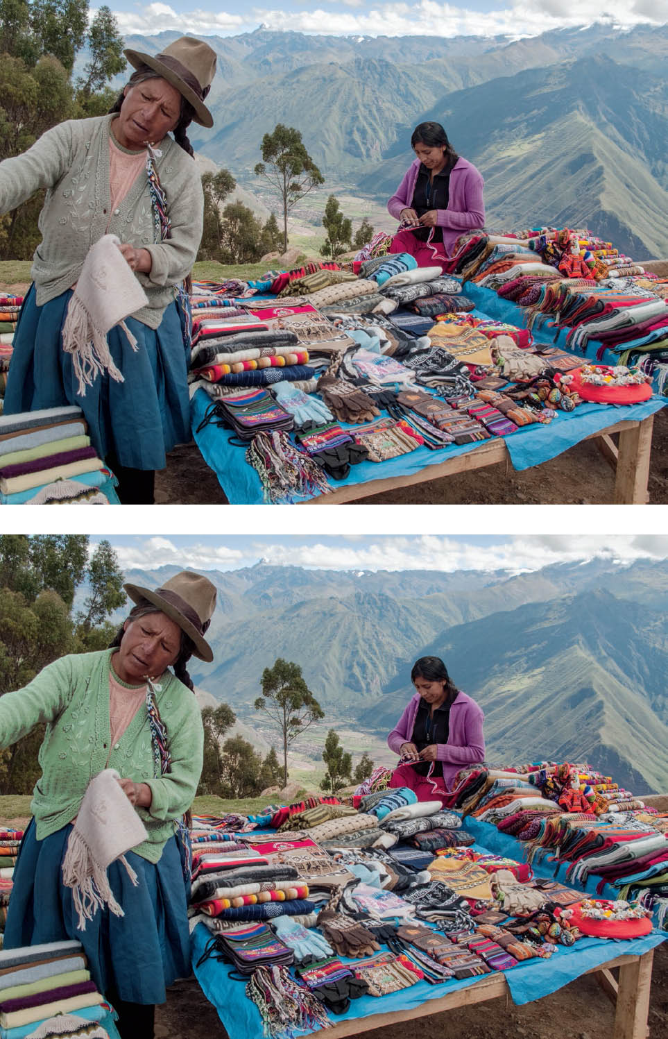
Figures 12-7a and 12-7b: Outdoor Goods Stand, Peru
Many tools in ACR and Photoshop were employed to obtain figure 12-7a. An additional selection of just the vendor’s sweater on the left resulted in the alteration seen in figure 12-7b. Which version comes closer to your concept of how the image should be presented?
Thinking about the options from a purely technical point of view, it is useful to know that this refined method of selection is extremely valuable. From an aesthetic and artistic point of view, the degree to which the enhancement is applied—if it is to be applied at all—becomes an aesthetic decision as well as an expressive decision. Now that you know the method that was used to select the sweater, would you apply it at all, would you apply it to a very mild extent, or would you apply it to the extent shown in figure 12-7b? My choice is to make no enhancement of the sweater, whatsoever, allowing the rest of the image to draw the viewer’s attention in line with my goals. These are the expressive decisions you have to make. It’s one thing to learn the tools, and how they can be applied; it’s quite another to make the correct artistic decisions and to apply them appropriately as a means of serving your expressive purposes as an artist. (Chapter 13 contains further thoughts on this.)
Magic Wand
The steps just detailed for isolating a tone/color for specific modification can also be accomplished by employing the Magic Wand tool. (As a necessary aside, before proceeding with discussion of this tool, I must say that the choice of the name Magic Wand is about as idiotic a name as any that could have been chosen. It gives you no clue about the potential use of the tool. It could be called the “Tone Selector” tool or any other sensible name to indicate what it does, rather than have a name and an icon drawn from Peter Pan, with no intuitive indication attached to it. Adobe could do a better job.)
The Magic Wand will choose a tone/color area, or several closely related tone/color areas (depending on the degree of fuzziness you choose), and you can further choose to isolate just one choice by selecting the Contiguous choice in the dialog box. Of course, you can choose the Non-Contiguous choice if you wish to incorporate more than one isolated selection.
Similar to the steps detailed above, choose the Magic Wand tool, then copy and paste (i.e., Command-C, Command -V) to create a new layer. De-activate all other layers (i.e., click off the eyeball next to that layer), and use the Eraser tool to eliminate all selected areas you do not wish to alter, and proceed just as in the steps above for refining Curves.
As an alternative, you can click on the Quick Mask icon (lower left on the toolbar), which will put a red overlay (very much like a transparent red cellophane) over all parts of the image that will not be affected by any alterations you make, leaving the parts to be altered as you would view them without the cellophane. Then you can use the eraser to remove parts of the mask, or click X to toggle the eraser to transform it into an “add tool”, which you can add to the mask. Then proceed with the changes you want to make in the unmasked portions, employing such tools as Curves, Saturation, or any other alteration desired.
Gradient Burn
You’re now in Photoshop (not ACR or Lightroom) and you notice your image needs to be darkened (or even lightened) toward a corner or an edge . . . or maybe toward all edges and corners. Perhaps you hadn’t noticed this while in ACR, where the moves are much easier and direct. So, let’s go over one method of accomplishing this in Photoshop (there may be others, and perhaps others that are more direct and less convoluted).
Here are the steps to follow:
- Click on the Quickmask icon (next to the bottom icon on the left-side toolbar . . . or simply hit Q).
- Move up the left-side toolbar to the Gradient Tool icon (just below the Eraser icon), and click on it. (Make sure you’re on the Gradient Tool, not the Paint Bucket or other tool hidden underneath.)
- Go to the top bar and click on the type of tool you want. (Note: The only ones I’ve ever used are the first two on the left, the Linear Gradient or Radial Gradient, while the others seem to me to be specialized beyond my desire to ever use them.)
- Now is when it starts getting complicated. Suppose you want to darken—and perhaps increase contrast—toward the lower-left corner of the image. Place your cursor in the image as far up and to the right of that lower corner as you want to darken, click the mouse down and run it to the corner, and then release it. You will see a red, translucent “mask” covering the rest of the image—like overlaying the image with a piece of red cellophane—which tapers down to nothing from where you first placed your cursor to the lower-left corner. That area covered in red, which is the mask, will not be affected by the darkening you are about to do; only the unmasked portion will be affected.
- Click off the Quickmask Icon (i.e., click on it again . . . or simply hit Q again). The red mask disappears and you will see the marching ants at the corner you had chosen. The diagonal line of marching ants depicts the line at which the darkening (or lightening, or whatever alteration you are about to make) will be at 50% of its full effect. (It will be at 100% at the corner, and 0% where you first placed your cursor and clicked down the mouse.)
- Make a copy and save (i.e., Command-C/Command V), which creates a new layer for you.
- Go to Image Menu > Adjustments > Curves (or Exposure or whatever choice is appropriate) and make the desired change. (Note: If your adjustment choice is Exposure, a dialog box opens with several sliders, which you can push to the right or left to alter the unmasked portion of the image. In that dialog box Gamma is equivalent to Contrast.)
That’s it. You’ve done the tapered burn (or whatever alteration was needed in that corner).
The potential confusion at step 4 is that if you forget to set your cursor in the image and take it to the corner, but instead you start at the corner and then move up and in to the image, the portion you need to work on is now the masked portion, and whatever you do will take place on the rest of the image. Should you make that mistake, you can choose Select Menu > Inverse and this will, indeed, invert your misguided selection to what you wanted.
The further confusion is that if you had done this in ACR, you would click on ACR’s Linear Gradient tool, start at the corner, and move the cursor in and up to the endpoint of where you wanted to darken things. In Photoshop that movement is reversed. You have to keep in mind that while in Photoshop, you’re making a mask, not going directly to the gradient tool. It’s my view that the programmers at Adobe who came up with this unique set of opposites for ACR and Photoshop deserve a real commendation for inventiveness (to say nothing of intentional confusion).
I advise you to test how the Radial Gradient, rather than the Linear Gradient, works so that you understand it, as well.
Image Rotation
This is not truly a tool, but it is an important enough adjustment to briefly review. Even though there is the option of creating a horizontal line (or a vertical line) for your image in ACR, discussed earlier, you may have different ideas of how to present the image once you’re in Photoshop. One such change could be a new vision of exactly how the image should be oriented. Here’s how to reorient it.
Go to the Image menu and drop down to Image Rotation. You can immediately rotate your image 90° clockwise or counterclockwise or 180° clockwise or counterclockwise. That’s obvious and easy. But if you click on Arbitrary, a dialog box opens up, allowing you to rotate the image any degree you type in clockwise or counterclockwise. This is a very useful, quick way to perfect the orientation of any image, especially if the “horizon” truly needs to be horizontal, such as a view over a lake or the ocean (after all, you probably don’t want the water to run out one side or the other if the horizon is tilted).
Crop Tool
You may have already cropped the RAW image in ACR—and this is a smart thing to do since you can undo the crop at any time—but you may need more cropping in Photoshop. First, you may just decide that a bit more cropping is required now that you’ve worked your way through a number of image refinements. The crop tool along the left side allows you to do that at this point. After you make the basic crop, you can refine it by grabbing the handles at the corners or midway along any of the the four borders, pushing it in or out as you see fit. But, keep in mind that once you crop in Photoshop, you’ve lost the cropped portion of the image forever.
However, Photoshop allows a variation of cropping that can be extremely useful: the Perspective Crop. Once you engage the Crop tool, you can place your cursor at the upper left of the image, click on your mouse, and hold it down as you drag toward the lower right. A dotted crop line in a rectangle from the start to the location of the cursor will follow you as you drag, until you stop and release the mouse . . . and just above the image you’ll see a blue square with the word “Perspective” next to it. If it’s checked, you can then grab any of the corner handles, and move it to the left or right, up or down, in order to crop a side at an angle, rather than as a 90° typical crop. Then click on the check box way farther over to the right, and the crop is completed.
You may want to do this on more than one side, but I strongly recommend doing just one angled crop at a time, because I’ve found that doing both a left and right side angled crop simultaneously often ends up with a badly distorted image. I avoid more than one angled crop at a time, so I recommend you do the same.
The Perspective Crop is extremely valuable if you have an architectural subject and the buildings near the edge are obviously converging or diverging—leaning either inward or outward. This can be easily corrected with a large format camera, which has adjustments that give you perspective control. Some digital cameras have perspective control lenses, but most do not. So, if the RAW file shows divergence or convergence, which is a product of the camera being aimed downward or upward (and ACR has no means of correcting that problem, though Lightroom does in the Lens Corrections panel of the Develop module), the Perspective Crop in Photoshop provides the option of realigning the image and straightening everything up in a formal manner. This can also be used effectively in a forest of straight-trunk conifer trees, or any other subject matter that requires a more formal approach.
I should note in passing that there is a perspective control crop available in ACR. It is improbably hidden in the Lens Correction tool at the top of the Basic panel, where you can click on Manual. From there, choose the icon for the perspective crop you want, and then it’s a tortuous iterative process of realigning the image, and then making the vertical lines vertical. I prefer the direct simplicity of the Perspective Crop available in Photoshop.
You still have a way out of a poorly thought-out crop: simply click off the image, and click Don’t Save, at which point you go back to the previous save. You may have to start again, but you haven’t lost it all. Also, you can always start again from the ACR-manipulated image. So you always have a second chance.
Paint Brush
The Paint Brush is a tool I used to employ extensively in my early days of digital usage, but one that I resort to less and less today because of the many superior controls afforded by the tools discussed above. Yet, once in a while, I still find a use for the Paint Brush.
To use the Paint Brush, first, create a new layer, and title it as you please (i.e., “Paint Layer 1” or any specific reference you wish to make). Choose the Paint Brush tool, and then decide if you want to lighten or darken any portion of the image painting over it, using the [ key to make the brush’s diameter smaller or the ] key to make it larger.
It can be used somewhat like burning (darkening) or dodging (lightening) in traditional photography, and to a minor degree, somewhat like bleaching (lightening while increasing contrast) in the traditional darkroom. It’s worthwhile seeing what happens with an image if you select the Paint Brush and then choose to darken any portion using the “Darken” or “Linear Burn” or “Color Burn” or any of the other options (or the equivalent options to lighten any portion of the image) to see the minor but important differences each afford. Always be sure that the black/white (Set Foreground Color, at the lower end of the left-side tool-bar) matches the way you want to alter the image (putting black in front to darken the area to be painted or white in front to lighten the area). Furthermore, you don’t have to stick to either black or white for the foreground color, but you can choose any color from the full color palette for a desired color shift when either lightening or darkening the area you wish to paint. I’d recommend setting the Opacity to 100% and the Flow to a very low amount of perhaps 3% to 5%, allowing multiple strokes of the brush while holding the mouse down. Place the cursor (i.e., the paintbrush) where you want to start, click the mouse down, which activates the paintbrush, and start moving the circle (the brush) around while holding the mouse down. As you continue painting, the effect adds up. It’s wise to periodically deactivate and reactivate the layer (i.e., toggle the eyeball on and off) to see how far you’ve altered the image. If you’ve gone too far, or if the color shift is not what you wanted, you can go to the layer and alter the opacity to modify the alteration you just made. If nothing seems to help, you can trash the layer and start again.
Here’s how to choose the color you want for either burning or dodging. Once you’re in the paint layer, click on the Foreground color, which gives you an eyedropper. Click on any spot in your image, which opens a dialog box called the Color Picker (Foreground Color). It pinpoints the exact color you had chosen (in the large color square on the left and the exact tonal density by the small circle within that square). In the rainbow strip to its right, the arrows will indicate the color band for that choice. But you can then slide the arrows to any part of the rainbow strip to reset the color you want for burning or dodging, then move the small circle within the large color square to any portion of lightness or darkness, high or low saturation, that you want for the burn or dodge adjustment. Once you’ve made the color/tone selection, as you “paint” with that chosen selection, you’ll see the effect in real time on the image.
Saving Images
Once you’ve completed all your processing in ACR, and opened the image in Photoshop—whether or not there is a need for further adjustments in Photoshop—you can then save the image as a PSD file (the standard file format for a Photoshop-completed file) or a TIFF file (an industry standard image file format). Only then do you have a completed file that can be used for printing an exhibition image or one suitable for high-quality reproduction printing purposes.
If you’re working in Lightroom, you can print directly from the image you’ve created without importing the image to Photoshop, saving it as a TIFF or PSD, and then printing. This can save disc space for you.
Returning to ACR from Photoshop
Suppose you’ve completed your processing in Photoshop and you’ve saved the finished file as a TIFF or PSD. But then you decide that additional improvements are required. If you’re like me, you’ll want to make those adjustments in ACR rather than in Photoshop, because ACR is generally easier and more intuitive. Here are two ways to return to ACR from a finished TIFF or PDS file:
Method 1
- Open the finished file in Photoshop.
- Check the layers. Either flatten the image (if it includes layers) or go to the background layer and click on it.
- From the Filter dropdown (in top menu bar) select the Camera Raw filter and your image will open as a TIFF file in ACR, where you can resume editing it.
Method 2
- Open the finished file in Photoshop
- Flatten the image (or save it as another name and then flatten it).
- Go to Bridge (which comes with Photoshop).
- Navigate to the file in Bridge and select it (click just once).
- With the image file selected, go to the upper-left Bridge toolbar and click on the little shutter icon (just left of the image rotation icons). This will re-open your file as a TIFF in ACR where you can resume refining it.
This is a change from Photoshop CS6, where you were able to open your image file in Bridge, go to the File menu, and click on Open in Camera Raw. Obviously that was simpler, but all applications seem to strive for greater complexity with each newer version. Be aware of the need to have a good deal of RAM available on your computer for this to work. For me, with the help of Adobe, I raised the available RAM from 60% to 81% for the procedure above to work.
Closing Thoughts
These are the tools I use, and this is my basic workflow. I rarely use other tools. So rarely that I chose not to clutter up the chapter with additional descriptions, though I’m sure that some of them could be quite useful, and I’m sure there are plenty of other digital practitioners who use them often and effectively.
The applications keep evolving, which has resulted in my increased use of ACR tools in place of Photoshop tools. My approach amounts to the following: The more I can do in “step 1” (ACR), the less I need to adjust in “step 2” (Photoshop). I can do nearly all of my image editing in “step 1” with one exception: in order to save the file as a finished TIFF (or PSD, if you prefer) I have to bring it into Photoshop, even if there are no further image adjustments needed in Photoshop.
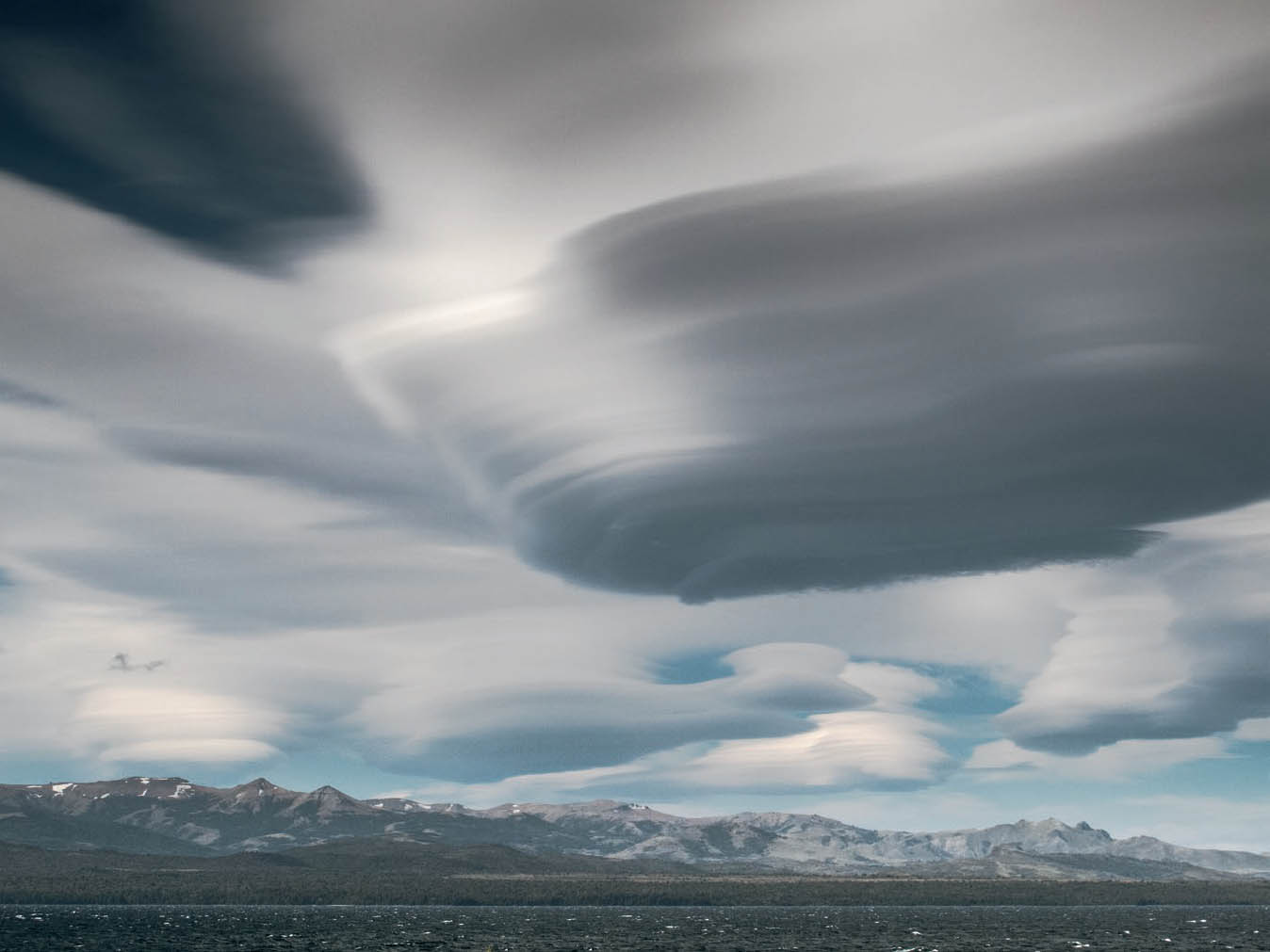
Figure 12-8: Lenticular Clouds over Lake Nahuel Huapi, Argentina
From my vantage point near the Bariloche Airport in Bariloche, Patagonia. In post-processing, I had to extensively remove several foreground bushes that jutted up into the lake and portions of the distant lower mountain slopes. It is my hope that everything in the image is believable, except for the unbelievable, but real, lenticular clouds that had formed over the lake.
There is a great difference, however, between knowing what can be done with each and every tool and using them effectively to enhance personal expression. I’ve seen as many examples of practitioners misusing tools as I have of practitioners using them effectively. The prime misuses are twofold: first is excess color saturation (which I’ve already flagged numerous times), and second is the tendency to go into every part of the image and increase its brilliance or contrast to the point that the entire image loses its meaning. When every part of the image is calling for your attention, nothing stands out. There is no hierarchy of importance. Restraint is necessary to produce an image that creates the hierarchy of pushing the viewer to “see” the image in the way you want it to be seen. Some images need to be subtle throughout; virtually all images require some subtle passages. When every square millimeter is brought up to the highest level of brilliance, the overall message and impact are lost. So, try to refrain from too much “micromanagement” of your images.
![]() If, during the exposure, the lighting is not well chosen, if the composition is poor, if the underlying feeling that needs to be there is lacking, you’ve simply created a technically appealing picture that really says nothing.
If, during the exposure, the lighting is not well chosen, if the composition is poor, if the underlying feeling that needs to be there is lacking, you’ve simply created a technically appealing picture that really says nothing.
The final misuse of digital tools is not really a misuse at all, but simply the feeling that if you’ve processed the initial image to the best extent possible, you’ve created a true masterpiece. But, if during the exposure, the lighting is not well chosen, if the composition is poor, if the underlying feeling that needs to be there is lacking, you’ve simply created a technically appealing picture that really says nothing. This has been the case for over 100 years with traditional photography, and now has transitioned into the digital realm. Technically wonderful images can be produced that have little artistic merit. My advice to every reader (myself included) is to do your best with the subject you feel most strongly about, and then let the public decide the merits of the work.
In the section about use of the Curves tool in Photoshop, I brought up the issue of eyeballing an image versus measuring it. Let me expand upon that teaser here.
No painter ever “measures” the depth of blue of yellow or any other color in her painting. If it looks good, it is good. It’s what she wants. This is a visual thing; it’s not a scientifically measurable entity. Let’s try to keep it that way (figure 12-8).
There is a serious caveat when you’re doing digital photography. The image you see on your monitor is not exactly the same as the image you get in a good print or even the best book reproduction. Part of the difference is that the when you view your computer monitor you’re viewing the image with transmitted light (i.e., light coming from behind the screen, shall we say), whereas when you view a print, you’re seeing it via reflected light (i.e., light from an outside source such as daylight or room lighting, going through the ink, and reflecting back through that ink again after bouncing off the paper surface beneath). Thus, the image you “perfect” on your monitor and the final printed image are not identical. In order to get it right in the final print, you not only have to do a lot of computer monitor calibration at the start to get correct colors and tonalities on your monitor, but you have to do a lot of “profiling” to get what you want from the monitor to the final print. The image on your monitor and the printed image two different entities.
To achieve satisfactory prints, extensive measurements are necessary. So there has to be a balance here. Measurement is required to understand the differences between the image seen on your monitor and the final printed image. Unless you’re wealthy enough to make print after print before you’re satisfied with the right finished print, or make one proof print after another before settling on the final reproduction print, measurement tempered with experience is the only way to get it right. Ultimately, the “perfect” image on your computer monitor may have to be altered to something “imperfect” in order to achieve the perfect print.
Both Lightroom and Photoshop allow you to “soft-proof” an image before printing (ACR offers no such option at this point). Lightroom has a soft proof tool. In Photoshop there are proofing options in the View menu. This can and should be used before going from the final image you’ve perfected on your screen to a printed image. Then the final steps are accomplished via profiling both your computer and the printer to get them to mesh as you expect them to do.
The specifics are beyond the scope of this book because the hardware, software, and technology keeps shifting. Ultimately it’s an issue between the image on your computer monitor, and the output from the specific printer you are using. This book cannot deal with all such combinations, and it would be outdated before it went to the printer if it engaged in that level of detail for any specific combination of computer and printer. It’s best to get videos and short-term books dealing with these issues in order to get it right and to stay current with the quickly shifting technology.
Instead, let’s keep our focus on photography and on personal expression. When it comes to eyeballing or measuring your images, try to keep a proper balance between the two in mind. Always keep your overall goal in mind. If you find yourself doing more and more measurement—especially if it’s just to get every nuance of the image on your monitor tweaked to your liking—you’re probably hurting yourself. You’re into the realm of micromanagement. Step back. Take a deep breath, start again and keep assessing whether the overall image gets your point across. Keep in mind that even in Beethoven’s greatest symphonies, there are quiet passages that make the crescendos so much more exciting.