
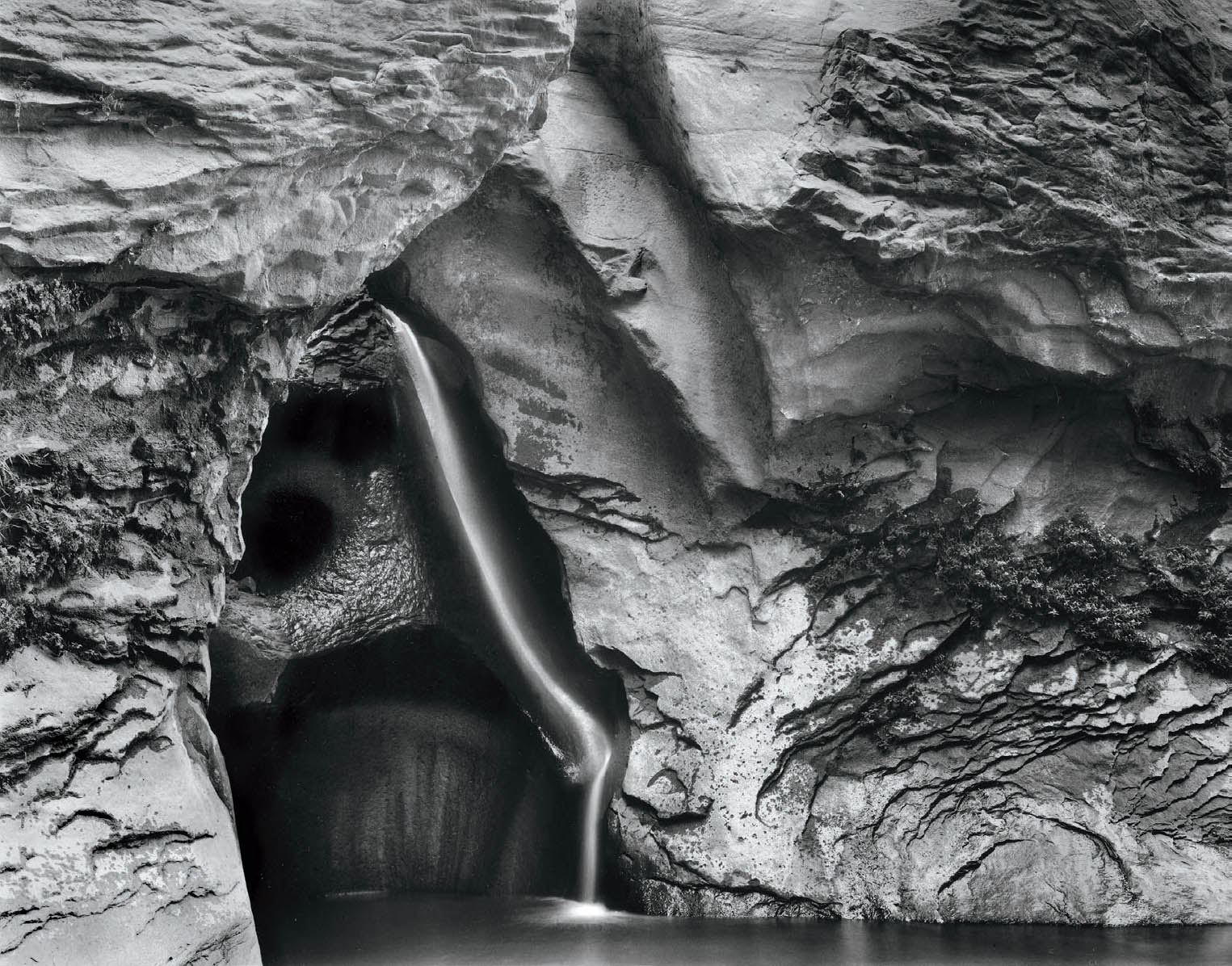
Figure 15-1: Gothic Fall, 40-Mile Canyon
40-Mile Canyon is one of the many side canyons of the Escalante River in Southern Utah, itself a tributary of the Colorado River. Midway down the dry, wide canyon, the trail suddenly drops via several switchbacks into a narrow cleft with running water. A waterfall, seemingly coming out of nowhere, feeds the lower canyon. I named it Gothic Fall because of the pointed arches enclosing the waterfall, reminding me of the Gothic arches of English cathedrals.
For any image to attract the viewer it must be well composed, well exposed, well printed, and well presented. Previous chapters dealt with the first three issues; this chapter deals with the fourth.
CHAPTER 15
Presentation
![]()
A FINE PHOTOGRAPH DESERVES AN APPROPRIATE PRESENTATION. The presentation should enhance the photograph without overwhelming or detracting from it. The frame or method of displaying the photograph should not draw attention to itself. The best presentation is understated, simple, and conservative. Showy presentations detract from the image and are needed only if the photograph is inherently weak. I feel that a fine photograph looks best when dry mounted. A dry mounted print has the structural support of the mount board, it lies perfectly flat, and it appears to have been given greater care than an unmounted print. (Dry mounting is a procedure of gluing the photograph to the base mount board with a heatsensitive glue that looks like wax paper in a heated press. The photograph is then perfectly flat and permanently adhered to the mount board.)
Corner-mounted, overmatted prints have always enjoyed a degree of popularity, but I am somewhat ambivalent to them. Such prints can be made to lay reasonably flat with only a small bow or ripple, and if the mount board is damaged, the print can be easily removed and remounted on a new board. This has obvious advantages, yet I still prefer the look of a smooth, dry mounted print.
Research by the Center for Creative Photography at the University of Arizona shows that all dry mount tissue ever produced in the United States, and all dry mount tissue ever produced anywhere (with the exception of one produced for about 18 months in the 1920s in Czechoslovakia), has a neutral pH, meaning that none of these can harm the life of the print. Furthermore, the research determined that dry mount tissue forms an impervious barrier between the mount board and the print, which means that dry mounting actually improves the life of any print mounted on a board that is not of archival quality. The hinge-mounted or corner-mounted print would be in direct contact with the inferior board, placing it in jeopardy of degeneration.
On the other hand, suppose a print is dry mounted and stored under somewhat humid conditions, allowing mold to grow on the board. Then you’re stuck! The board is irreparably damaged, and the print is permanently dry mounted to it. Some dry mount tissue claims to be removable when reinserted into the press at a high temperature. I’m skeptical about such claims on two grounds. First, I’ve never met anyone who has successfully dismounted and remounted a print; second, I wonder if the print emulsion would be damaged if the temperature were too high (though I’ve never found studies indicating that this is a problem).
Many digital papers lie quite flat and can be corner mounted and overmatted successfully, especially with computer-driven mat cutters (very expensive, but programmable to within one millimeter). Digital matte papers tend to lie flatter than gloss or semigloss papers, making them the prime candidates for this type of overmatting. I suggest that you research the various options before deciding which way to go with your own work, recognizing that you don’t have to employ the same approach for every photograph. I still dry mount all of my work, for I feel that it finishes the photograph in the best way possible. I discuss my methods fully in the next few pages, but you may settle on a different approach.
To avoid contamination problems, it makes sense to use the finest quality museum mount boards made to archivally permanent standards, and to store them under conditions that won’t allow mold to grow. Most mount boards of this quality are made of cotton fiber (so-called “rag board”) and are manufactured by processes that do not utilize acids. Several manufacturers produce mount board of archival permanence from wood pulp, which is available in white and a multitude of colors. Often the stark white border of archival rag board is incompatible with the color tint of a warm-toned black-and-white photograph, or may be too harsh for a color photograph. Wood pulp products may help alleviate these problems.
For color photographs, matching the color of the mount board to a specific color in the print is virtually impossible, as well as undesirable. It’s preferable to choose a color that is compatible, though not necessarily identical, to colors in the photograph. In general, the mount board’s color should be somewhat muted so as to support, but not dominate, the image. There are exceptions to this rule (as there always are!), but they must be employed with a keen sense of overall design and visual impact. I prefer off-white, such as antique white, as the color for the mount or overmat of my color images. The softer white does not call attention to itself, and it’s more compatible with the softer white of the color print papers (which are invariably softer than those brilliant whites of black-and-white papers).
For black-and-white photographs, white mount boards are universally accepted for fine art prints by galleries, museums, and collectors—virtually to the exclusion of any other color. This is a carryover from historical precedence in which the only archival mount board was the cotton fiber in pure white. Today, however, colored boards—particularly neutral gray—can be especially attractive because the brightest white of the print will not compete with the white of the mount board. The biggest stumbling block I have encountered with colored boards is lack of acceptance by galleries, museums, and collectors who are reluctant to break with tradition. I think this is shortsighted and unfortunate, because some images simply look better on colored or gray mounts. In any case, I continue to mount on traditional white board because I would rather have viewers look at my images rather than question my choice of board. Perhaps greater flexibility will gain acceptance in time.
I feel that the presentation looks best if the texture of the mount board is compatible with the print surface. Because I prefer an air-dried gloss surface, I also prefer a smooth surface mount board—but not one with an obvious sheen, for reflectivity makes the board too glaringly bright and detracts from the image.
The size of the mount board compared to the print is also a subjective decision. A border that is too narrow is nothing more than a bothersome stripe around the print, and one that is too wide diminishes the importance of the print. I mount 16" × 20" prints on 22" × 28" board, though I prefer 24" × 28". Many galleries demand specific standard sizes for framing and display, and I am somewhat constrained by those demands. For the same reason, I mount 11" × 14" prints on 16" × 20" board, though I much prefer the proportions of 17" × 20". I mount 8" × 10" prints on 14" × 17" board (which I like very much), and all prints significantly smaller than 8" × 10" are mounted on 11" × 14" board. You may want to experiment with other sizes to suit your taste. Edward Weston used to mount his 8" × 10" contact prints on 13⅓" × 16" board—the size dictated by the fact that six such mounts could be cut with no waste from one 32" × 40" board!
Generally, the format of the print—whether horizontal or vertical—goes best with a board of similar format. Once in a while there may be a reason to mount a vertical print on a horizontal board or vice versa, but these instances are rare. In addition to compatible formats, all successful mounts I have ever seen are pleasingly centered left to right, with the print raised slightly above center. Anytime I’ve seen an off-center mount (usually with the print off in one corner), it has an affected, “cute” look. The emphasis should be on the photograph, and everything should be done to enhance it without calling attention to the mount or any other aspect of the presentation. When the presentation calls attention to itself, it detracts from the statement of the photograph.
Dry Mounting Prints
Dry mounting is a method of adhering the photographic print to a mount board for permanent display. It is done using a material known as dry mount tissue, a heat-sensitive glue that looks like waxed paper. When a sandwich of the print, the dry mount tissue below it, and the mount board below that are placed in a dry mount press (a large, flat press with heating elements), the dry mount tissue partially melts and glues the print to the board permanently.
![]() The size of the mount board compared to the print is also a subjective decision. A border that is too narrow is nothing more than a bothersome stripe around the print, and one that is too wide diminishes the importance of the print.
The size of the mount board compared to the print is also a subjective decision. A border that is too narrow is nothing more than a bothersome stripe around the print, and one that is too wide diminishes the importance of the print.
The first step in mounting a print is to make the mount tissue adhere to the back. To do this properly, always preheat the print prior to tacking the dry mount tissue. This is true of all fiber-based papers for black-and-white and for digital printing papers, as well. Fiber-based traditional papers are not dimensionally stable; they expand when wet and contract when dried. As a result, such prints shrink slightly when heated because the heat drives out the moisture in the emulsion and paper base. If the print is not preheated before trimming, it will shrink during mounting; however, the dry mount tissue will not shrink, and a distracting, shiny line of mount tissue will be visible all around the print. It’s important to note that all fiber-based prints are wavy and stiff if not heated prior to mounting, so preheating makes them more pliable and easier to work with. It appears that digital papers are dimensionally stable, and can be dry mounted without preheating, but I recommend testing that with any digital paper you use.
Prior to tacking the dry mount tissue to the preheated print for trimming, carefully wipe the back of the print to remove any grit that may cause a bump in the mounted print. I do this with my hand rather than a brush because a brush often passes over a small impurity without budging it, while my hand will feel the bump, and I can then dislodge it. Then use a single stroke of the tacking iron in the center of the print, about two to three inches in length, to tack the tissue to the print. The traditional method of tacking—a large X on the back of the print—may cause ripples in the tissue at the junction of the X and result in an imperfect mount.
Once the dry mount tissue is tacked to the print, the two should be trimmed together. Trimming itself is extremely important, for this is your last chance to do any cropping of the image. Before trimming—and then again after trimming—check for minor edge distractions or intrusions that can be eliminated with another cut 1/32 or 1/64 of an inch in length. (Ansel Adams once remarked with his teeth clenched in mock anger, “I’d like to get my hands on the guy who invented 1/64 of an inch!”) This is also the time to perform any more significant surgery, such as cropping. After all, it may be a stronger image at 15" × 20" than 16" × 20", or at 11" × 13" rather than 11" × 14". Don’t become wedded to the exact format of the purchased paper. You may even go to extremely long and narrow formats or square formats to achieve your strongest image. Don’t hesitate to crop. Although I feel it’s important to attempt to use the maximum area of your negative, I always advise cropping if it improves the image.
When the print is trimmed, it’s ready for positioning on the mount board. Before placing the print on the board, wipe the surface free of any grit to eliminate any maddening bumps. Again, this should be done by hand, not with a brush.
Making Positioning Guides for Print Placement
To help position my print properly on the mount board, I have cut a number of positioning guides from scrap board. I have them for horizontal and vertical 16" × 20" prints, horizontal and vertical 11" × 14" prints, and so on. Sometimes I print an image slightly smaller than full frame for subtle variation of effect, as with a 14½" × 18" print that is mounted on 22" × 28" board. When I do this, I use my guide for a “narrow” 16" × 20" print.
Making the guide is a bit laborious, but using it saves enormous amounts of time. Here is my procedure for making one: the width is chosen as the distance from the top of the mount board to the top of the print, while the length is the width of the mount board. My guide for a horizontal 16" × 20" print mounted on 22" × 28" board is 28" long and 31/16" wide, while the guide for a vertical 11" × 14" print mounted on 16" × 20" board is 16" long and 2¾" wide).
When cutting the guide, I must be certain that its width is uniform across its entire length, in order to ensure that the print is positioned parallel to the top edge of the mount. I place the guide atop the mount board and push both of them against a straight edge to ensure that the guide is parallel with the board. Then I position the first print against the new guide and measure carefully to make sure the sides of the print are parallel to the edges of the board. If they are, then I know the guide is properly made, and I have no reason to measure subsequent prints for parallelism. I then slide the top edge of the print along the guide until the sides of the print are equidistant from the edges of the mount board.
The print is now positioned for tacking. While holding the print in place (with the top edge firmly against the guide), I lift each lower corner of the print and tack it to the mount board with a short stroke of the tacking iron toward the corner. The first print to use the new guide for positioning is now ready for mounting, but to complete the guide, I make marks on it at the edges of the positioned print. Those two points are equidistant from the edge of the guide. I label those two points as the “0 point” (zero point) and mark off 1/16" intervals on both sides of those points. Each subsequent print is then placed against the guide, positioned equally from the 0 point, and immediately tacked. Positioning is a matter of seconds (diagram 12.1).
Prior to inserting the print into the mount press, inspect the surface for any grit, dust, dirt, or hair that may have fallen on the surface during the positioning process and remove it. To mount the print, place the board and its tacked print into the press and follow the instructions that come with the tissue. I use four-ply mount board as a cover sheet between the print and the upper heat platen of the press. If the pressure of your dry mount press is uniform and sufficient, and if your temperature is uniform over the surface, you should get a perfect mount within 90 seconds to two minutes.
Spotting, Etching, and Correction of Defects
The mounted print must be devoid of any surface defects, including scratches, abrasions, creases, bumps (generally caused by grit particles embedded between the print and the mount board), or small craters on the surface (caused by grit particles pressed into the emulsion when the print was placed in the mount press). Such defects are extremely distracting on the otherwise smooth, flat surface. Galleries and collectors will balk at accepting prints with such defects, but more important, they should be unacceptable to you, the photographer.
If you work digitally, all spots on the print can and should be removed prior to printing. The most commonly used tools are the ACR Healing or Clone brush and the Photoshop Clone Stamp tool, which allows you to place a nearby section of the print on top of any defect—e.g., a defect caused by dust on the camera sensor—thus removing it cleanly and completely. This is a photographic godsend that has no equal in traditional photography. But be careful: Unless the replaced area is truly identical in color and/or tone to the area with the defect, it can be disturbingly apparent. The final print should be devoid of any distracting defects.
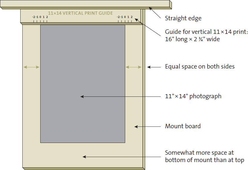
Diagram 12.1: Positioning guide for mounting photographs
Sometimes the problems of bumps and craters can be corrected. For bumps, I have found that the gently rounded cap of a Bic ballpoint pen can be used to gently tap or press the grit particle down and into the mount board. I stress the word gently because if you push too hard, you’ll create a wide crater that will never come out. Also, this procedure will rarely work if the embedded particle is between the print and the dry mount tissue, though it may work well if the particle is between the dry mount tissue and the mount board.
For craters, first place a drop of water (with a touch of Photo-Flo in it to break surface tension) on and around the crater, and let it fully absorb into the emulsion. Spread the droplet to a size of ¼" in diameter or more. This will swell the emulsion. Then, as the emulsion begins to dry and contract, repeatedly dab a tiny droplet of water only on the crater. This will keep it swollen as the emulsion around it contracts. Finally, let the original crater dry and contract. Unless the crater is too large or too deep, this may pull the emulsion flat and eliminate the crater. Several applications of the entire procedure may be needed if the crater is large, but it will eliminate all but the largest craters and greatly reduce the size of the largest ones as well.
There is no cure for creases in the print except to inspect the print carefully before mounting. If it’s creased, tear it up, throw it away, and mount another one. Remember, you are your only quality control supervisor, and if you are satisfied showing defective prints, it’s your choice!
Spotting is the method of removing white specks or spots on the print caused either by scratches on the negative or by dust and dirt during enlargement. I used, and still use, Spotone as a basic spotting dye, diluted slightly with water to control its depth of tone. Spotone may be available at some photography stores, though it’s now out of business; Marshall also has spotting dyes that I’m sure are just as good.
By carefully mixing several colors, you can obtain a color very close to that of your print. Use an eyedropper to measure the amounts of each color, and make notes of the good combinations for future reference. The mix of colors depends on the paper you use and the way you tone your print, so no formula can be given. To mix the proper color, choose an unmounted print with a white border and attempt to extend a middle gray tonal area at the edge of the print into the border area. I generally start with a #3 gray, then add other colors as necessary to achieve the exact color of my print. I always mix and apply spotting dye under tungsten light rather than fluorescent because fluorescent has a discontinuous spectrum that yields incorrect color much of the time. If I can’t get an exact color mix, I edge the color over to the desired color with a drop or two from another color spotting kit.
When I achieve the proper color, I apply the spotting dye with a No. 0 brush, a relatively narrow brush that comes to a very fine point. There are narrower brushes, but they don’t hold enough liquid to apply for very long. Wider brushes are unsuitable for intricate work. Depending on the size of the spot, I either brush on the spotting dye gently or stipple it lightly by dabbing it onto the print with the tip of the brush. I gradually build up density to the adjacent densities surrounding the spot.
The instructions warn you not to use Spotone in conjunction with Photo-Flo. I recommend the opposite. I always put a drop or two of water with a small amount of Photo-Flo into the mixture to break surface tension and allow the liquid to absorb into the emulsion more thoroughly. If the liquid doesn’t absorb into the emulsion, it dries on the surface and leaves a spot of excess sheen, which can be removed by light swabbing with a moistened cotton swab. This may remove some of the spotting dye, and an additional application may be needed.
Until recently, I did spotting or etching after the print was mounted so that I could work on a print that was stabilized and immovable. A print that is not mounted has a tendency to flex and pop as moisture changes, and even just breathing on the emulsion is sufficient to flex it. Inevitably, just when I hunch over the print to apply some spotting color, I exhale and the print jumps up ⅛"! This can easily create a black mark on the print.
Another tip I’d like to offer is that for small white lines or small spots (usually caused by dust or hairs on either the negative or the enlarging paper), a standard #2 or #3 pencil can be very useful for spotting. Sharpen the pencil, and then rub its graphite edge on a piece of scrap paper until the point is a truly very sharp. Then use the pencil for spotting—not with the sharp tip, but with the edge of the graphite tip gently touching the print surface. If you press too hard or use the sharp point, you can indent the print surface. Then gently rub the pencil marks with either a cotton swab or the tip of your finger (make sure it’s a clean swab or finger!) to smooth out the tonality. This method works amazingly well, and I use it often, especially in very light gray areas that require spotting.
Etching is used when a black dot or line mars the image. This is most often caused by a pinhole or a particle of dust or grit that was on the negative at the time of exposure, resulting in a clear area that prints as black. I use an X-ACTO knife to gently—very gently—scrape at the surface of the print and wear away the emulsion (and the silver embedded in it) until the black line is reduced in density to mesh with the surroundings. I apply no pressure to the X-ACTO knife, letting its own weight be the only pressure, but simply guide the blade in a series of short, gentle scrapes. Avoid trying to dig out the black mark and gouging the print in the process.
If the black mark is excessively large, I may attempt to retouch the negative with Kodak’s Opaque—a claylike substance that can be diluted with water and painted directly onto the clear area of the negative emulsion, rendering it opaque. When the negative is printed, the opaque area will print as a white spot that can be retouched with spotting dye without damaging the emulsion. What makes Opaque so attractive is that if you fail to put it on satisfactorily, you can wipe it off completely with a water-moistened cotton swab, allow the negative to dry, and try it again. You can do it incorrectly 150 times and lose nothing but time, and if you do it well the 151st time, you’re done!
Print Finishing
Once the print—black-and-white or color—is spotted, etched, or hand colored, it only needs your signature. Put it on: it’s your print! You should show it and be proud of it. But use restraint. Sign it lightly, not heavily so that it becomes a distraction. I use a No. 6 pencil, which is very hard. I recommend against using a No. 2 or No. 3 pencil, both of which leave a heavy signature that becomes a distracting graphic element.
I prefer signing a print on the mount board, just below the print on the right edge. Generally I place the date of the image below the print on the left edge. There are variations to this basic approach. Some photographers place the name and date together. Some just sign the print, ignoring the date as irrelevant. Few photographers sign the image on the print itself. If the print is not dry mounted, but hinge mounted at the corners and overmatted, it is best to sign the back of the print.
You may want to overmat and frame the print for viewing. Framed prints should be overmatted so that the emulsion of the print is separated from the glass. This is necessary, for alternating periods of humidity and dryness can cause the emulsion to stick to the glass and destroy the print. Glass offers protection from dust and grit damage; though reflections can be a nuisance, well-placed lighting can overcome this problem to a great extent.
Please do not use non-glare glass. It places a slight fog across the entire image and slightly blurs sharpness, an effect that becomes pronounced if the print is separated from the glass. Plexiglas is a fine material to use instead of glass. It is lighter in weight and virtually impervious to breakage should the frame fall.
Framing, like mounting, is best if kept simple. It strikes me that this is a consequence of photography’s inherently direct approach. Exceptions exist, of course, such as Marie Cosindas’s color prints that are tastefully presented in ornate frames. But for the most part, such presentations of photography are out of character. For black-and-white photographs, metal sectional frames in brushed or polished aluminum work well, and for color photographs, finishes such as bronze are quite attractive. Plastic or plexiglass frames with thin, black borders are equally attractive. The array of possibilities abound. Just keep it simple and clean—let the photographs do the talking.
Presentation of photographs is a highly subjective matter. Don’t feel compelled to follow my dictates as gospel. Nobody has a corner on the aesthetic market. There are innumerable variations of successful, tasteful presentations. Use the method that suits you best. My only caution is to avoid “arty” presentations that may garner attention, but are devoid of sophistication and are basically silly.