
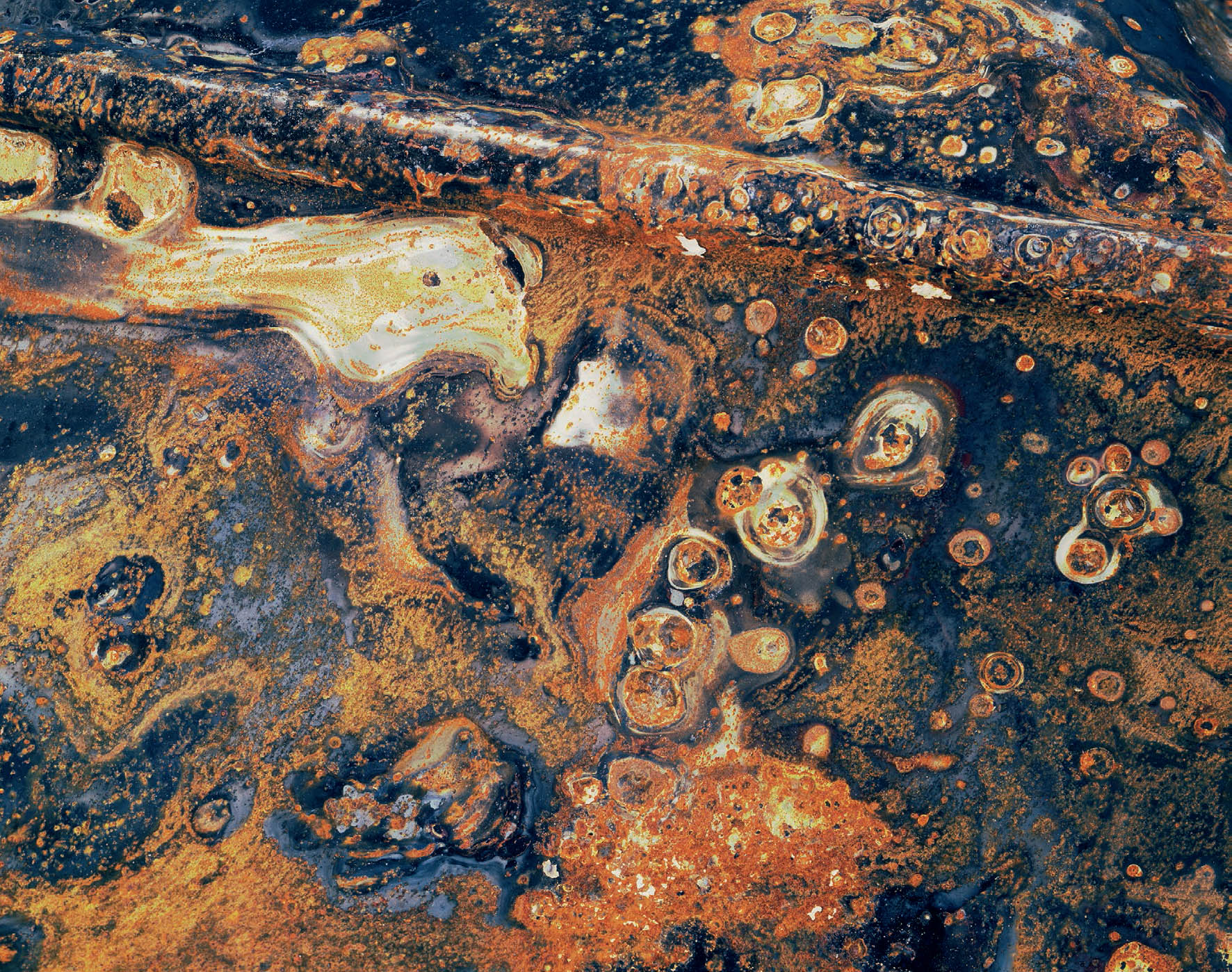
Figure 6-1: Burnt, Corroded Metal
The devastating Agoura-Malibu and Mandeville Canyon fires occurred on the same day in 1978, burning 30,000 acres in 24 hours. In the Mandeville Canyon fire, an old, corroded metal shed, now burnt, had amazing colors. Despite looking like a Hubble Telescope cosmic photograph, it’s just junk on the ground.
CHAPTER 6
Color
![]()
THE FIRST FIVE CHAPTERS DISCUSS a variety of practical and philosophical topics, all applicable to both black-and-white and color. In chapter 3, I specifically delayed a discussion of color as an element of composition due to its exceptional importance. This chapter deals with the profound compositional considerations that color brings to photography, and also with some specific considerations of color as applied to both digital and traditional approaches.
This chapter also marks a significant break from the first edition of this book. In the first edition much discussion revolved around indoor and outdoor color transparency film and their respective qualities, a few words about color negative film, plus a review of digital approaches to color. Today, much of that discussion is largely irrelevant. Color indoor transparency film has virtually disappeared, though a few remain and some photographers are actively and successfully using them. Outdoor color transparency film is also on the wane.
The limited availability of indoor transparency film was a personal blow to me because I was exposing color on indoor film (even for outdoor scenes, with an appropriate filter to convert the indoor film to outdoor color balance) because the indoor film accommodated a wider brightness range, giving me more detail in the shadows or highlights or both. Color negative film still exists, but with fewer options than in the past and far fewer options for size availability (i.e., from 35mm format to large format). And finally, color printing materials have also declined, as evidenced by the end of llfochrome printing paper, which used to allow for direct printing from a transparency to a display print.
As a result of these changes and constrictions in traditional color film and print imagery, color traditional methods strike me now as having limited value for personal expression. Despite my own decades of shooting color transparencies, I have now fully switched to digital means for my color work. I have scanned and converted all my important transparencies to digital files, and now shoot digitally for all of my imagery.
In later chapters I will fully explain why I have made no such switch for my black-and-white work, nor do I foresee any in the future.
In this chapter, and others to follow, I will first discuss color as a concept, as a means of personal interpretation, and as a tool, and then I’ll discuss how digital means offers the best options today for working in color. But I’ll also discuss these considerations with color film since there are still options and they still produce fine results. That said, let’s get back to the discussion of color photography as an art form, and as a form of personal expression.
I feel that color photographs and black-and-white photographs are essentially two different art forms, effectively as different from each other as photography is from painting. (Without going into any further detail, let me qualify the statement in the previous sentence by noting that while I recognize that painting requires skills in drawing and hand-eye coordination that are unmatched—maybe unneeded—in photography [among other obvious differences], the final result of a color photograph compared to a black-and-white photograph is about as different as a color photograph to a painting.)
I approach color and black-and-white differently, I see them differently, and my goals are different in each. To me, the emotional connotations as well as some of the compositional elements involved with color have no analogy in black-and-white. Rarely can I photograph the same scene successfully in both media—so rarely, in fact, that I almost always choose between color and black-and-white before making an exposure. In my early years in photography I often shot a scene both ways, but since I was never equally satisfied with the results, I have discarded the dual approach. I consider this a form of discipline that requires me to be fully in tune with my feelings about the scene and my thoughts about expressing those feelings (figure 6-1).
The benefit of this approach is that I can concentrate fully on the choice I make, rather than giving partial thought to both color exposures and partial thought to black-and-white exposures. I do allow for exceptions, however: if I encounter unusual conditions that I feel allow both color and black-and-white exposures of real significance, then I may consider exposing the scene both ways.
One reason to photograph a scene in both color and black-and-white would be a purposefully altered coloration that brings a new reality to the scene, or an unusual effect in black-and-white that makes it a vastly different image from its color counterpart. Sometimes, of course, the image simply has merit for both approaches, but I’ve never yet seen an image have the same feeling both ways. And sometimes I simply can’t determine which way I like it better, so I do both (figures 6-2a and 6-2b). But I limit those exceptions quite severely.
I base my choice of black-and-white or color primarily on the importance—or the lack of importance—of color in the photograph. I feel that for a color photograph to be successful, color itself must be a central element. There must be something compelling about the colors, about the relationships among the colors, about the intensities of the colors, and about their placement within the scene that makes them essential to the photograph. On the other hand, if color is merely present in the scene—as it always is—without lending needed support, and if it can be eliminated without losing the compositional essence of the image, then my choice is black-and-white. This does not mean that the color has to be intense or brilliant for it to be important—it can, in fact, be subdued or nearly monochrome—but it must be important! (Figures 6-3 and 6-4.) Sometimes the compositional elements of black-and-white are so compelling that the presence of color actually detracts from them, in which case I also choose black-and-white.
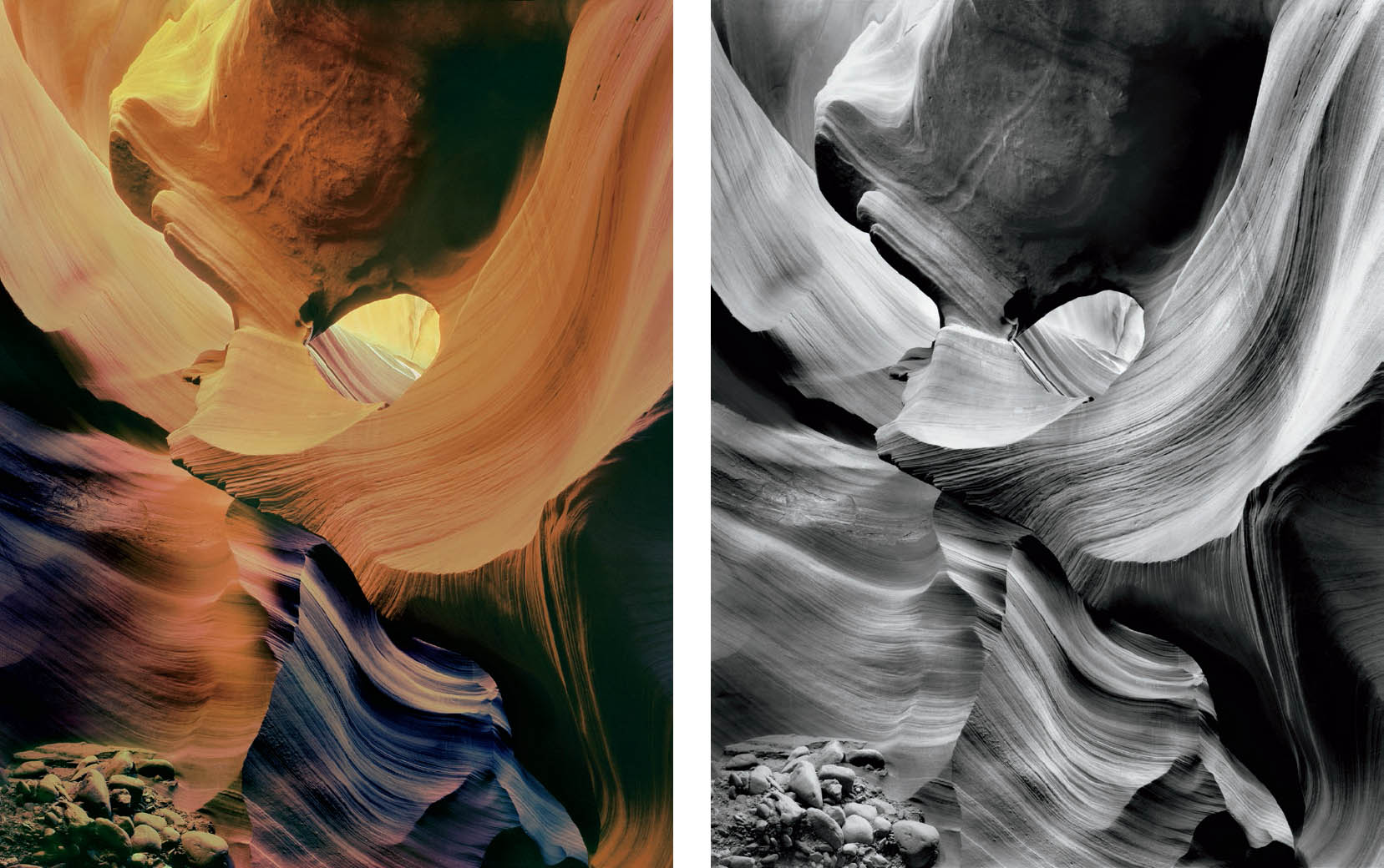
Figures 6-2a and 6-2b: The Keyhole, Lower Antelope Canyon
This is one of the few photographs I have successfully made in both color and black-and-white. After exposing the black-and-white negative I noticed overtones of color that were barely visible to the eye—in particular the blue-purple tinges that are reflections of skylight off the canyon walls. Realizing that color film could materially enhance those colors, I exposed a single transparency as an experiment. It worked. The two images, though compositionally identical, carry different messages and feelings.
I have to make a candid admission. If my mindset is to look more intently for either color or black-and-white, I tend to overlook strong possibilities of the other without even being aware of it while in the field. In other words, if I’m thinking in terms of black-and-white, I may pass up a good color composition simply because I’m “thinking black-and-white.” Conversely, if I’m somewhat fixated on color, I may pass up a good black-and-white opportunity. To put it another way, I find what I’m looking for and completely miss what I’m not seeking. While this may not be surprising, it helps illuminate just how narrowly the human mind can focus. This, of course, is the subject matter for a Ph. D. dissertation, not a discussion here, but it may be worth thinking about when you’re in the field doing your own work. However, it surely is worth emphasizing that while I may be seeking either a black-and-white or a color image at any moment, I never look for a specific image; instead I look for what is interesting to me, not knowing what I will see next. I avoid seeking a specific image for two reasons: First, it may not exist, and second, while stalking it, I may pass up numerous possibilities that I have blinded myself to in the search for the nonexistent image.
![]() Color doesn’t have to be intense or brilliant for it to be important—it can, in fact, be subdued or nearly monochrome—but it must be important!
Color doesn’t have to be intense or brilliant for it to be important—it can, in fact, be subdued or nearly monochrome—but it must be important!
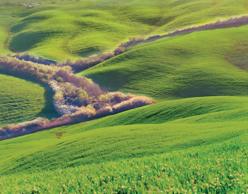
Figure 6-3: Sheep Flock, Tuscany
The green color is almost monotone, but necessary because of its emerald-like intensity (step aside, Ireland!). The riparian foliage creates an interesting shape, providing the compositional interest. The flock of sheep in the upper left provides an unexpected surprise.
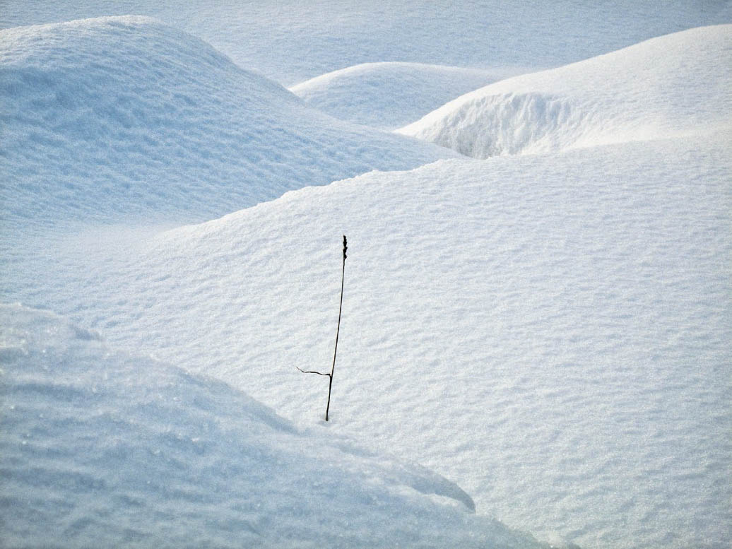
Figure 6-4: Skrova Grass in Snow
This image contains no strong coloration, yet the colors are important. The soft blues in the snow shadows impart a feeling of cold to the image. The basic simplicity of the image also jumps out, with just a single blade of grass, with its attendant strand of grass peeling off to the left, adding a layer of interest to the image.
In years past, I looked upon color primarily as a medium of beauty, and black-and-white as a medium of drama. There was always a degree of overlap in my mind, for I have seen plenty of dramatic color photographs and beautiful black-and-white photographs. I won’t attempt to define either beauty or drama—it’s always been basically a gut feeling for me—and your own definitions will suit you better than mine. My perceptions of drama in black-and-white or beauty in color were simply generalizations that I found to be true in a majority of cases.
I no longer maintain that dichotomy of thinking about the two media. I have come to more fully understand the control that can be exercised over color, especially with today’s extraordinary digital controls. That, combined with the enormous emotional changes wrought by even subtle variations of color, has changed my attitude.
Yet it should also be recognized that the degree of control acceptable in color is probably not as great as in black-and-white because color is one step closer to reality and cannot be altered as easily. When dealing with realistic images such as human skin, the sky, foliage, etc., there can be wide variation in black-and-white, but these types of subject matter must be rendered within narrow limits in color or they simply appear “off.” In some cases, “off-colors” create a tension or imbalance that can have a profound emotional impact, but these effects must be used with great care so as not to be perceived simply as bad color.
Pure color abstraction, on the other hand, allows any variation from realistic colors. When you’re in the realm of pure abstraction, who cares if the greens are rendered as pink or the blues as orange (figure 6-5a)? Here we are dealing with color as an element of composition alone, and the only considerations are the relationships, intensities, and balances of colors. (See chapter 16 for more thoughts on abstraction and art.)
![]() I have to make a candid admission. If my mindset is to look more intently for either color or black-and-white, I tend to overlook strong possibilities of the other without even being aware of it while in the field. In other words, if I’m thinking in terms of black-and-white, I may pass up a good color composition simply because I’m “thinking black-and-white.” Conversely, if I’m somewhat fixated on color, I may pass up a good black-and-white opportunity. To put it another way, I find what I’m looking for and completely miss what I’m not seeking.
I have to make a candid admission. If my mindset is to look more intently for either color or black-and-white, I tend to overlook strong possibilities of the other without even being aware of it while in the field. In other words, if I’m thinking in terms of black-and-white, I may pass up a good color composition simply because I’m “thinking black-and-white.” Conversely, if I’m somewhat fixated on color, I may pass up a good black-and-white opportunity. To put it another way, I find what I’m looking for and completely miss what I’m not seeking.
The Color Wheel and Color Sphere
The next several sections will deal with the theory of color, what it is, how it affects us, and how it can be most effectively used. This may be considered an attempt to talk about color as a concept, as a means of affecting the way we see the world, and the way we try to convey our feelings about it through the photographs we produce. Everything in the next few sections applies equally to digital or traditional. It is about color as a major compositional element.
Let’s begin the study of color composition with some basic definitions. Colors can be grouped into families by the color wheel: a circle on which the three primary pigment colors are separated by 120 degrees. (There are other primary colors based on light rather than pigment, but a discussion of them is unnecessary for our purposes here. Most people understand pigments better than light, and that will serve our purposes quite effectively.)
Between each primary color is the color created by mixing the adjacent primaries. A “color family” is any set of colors on the circle within a pie-shaped wedge cut from it. Colors opposite those in the wedge are simply called “color opposites.”
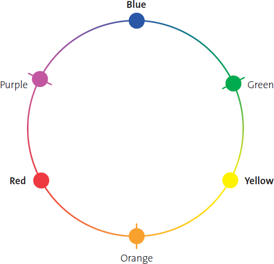
Diagram 6.1: The Color Wheel
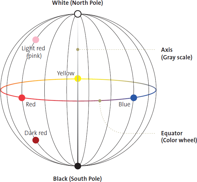
Diagram 6.2: The Color Sphere
Understanding the color wheel helps you decide how to alter color balance for the effect you want in a color photograph. It will also be a great help when post-processing a black-and-white digital file (chapter 12) or when deciding which filter to use when exposing a black-and-white negative (chapter 7). The color wheel—together with the color sphere—will help you understand how the use of related or opposite colors can create mood and emotion in your images.
So, let’s expand the concept of the color wheel to that of the color sphere. The color sphere is a sphere like the earth with the color wheel as its equator. The north pole is pure white and the south pole is pure black, while the axis between the poles is the gray scale from black to white. As you move along the surface of the sphere from any color on the equator northward to the pole (along a longitude line, as the case may be), the color becomes progressively lighter until it merges with pure white at the pole. Moving southward, it grows progressively darker until it merges with black at the south pole. As you travel from any point on the surface, where colors are most saturated (pure hue), directly inward toward the axis (at the same latitude) the color becomes progressively less saturated, “grayer,” and colorless until it becomes its own gray tonal equivalent at the axis. (This means that when we talk about the “tone” of any specific color, we are talking about its gray-scale equivalent on the sphere’s axis.) It should be apparent that the color sphere contains all colors and tones on its surface or within its interior.
On the sphere, as on the wheel, a family of related colors corresponds to a wedge-shaped piece cut out from the surface to the axis, as you would section an apple or an orange. Opposite colors or opposite families of colors are simply wedges cut from the opposite side of the central axis.
Color Composition
With an understanding of the color wheel and sphere, let’s look at the issues to consider when creating color photographs. All of the compositional considerations discussed in chapter 3—line, form, pattern, balance, movement, the relationships among these items, etc.—apply to color as well as black-and-white. Color adds a dimension to the elements of composition that has no black-and-white equivalent, that of color, itself.
Lines of color are just as attracting to the eye in a color photograph as tonal lines are in black-and-white photography. In color, however, a series of unrelated objects—perhaps even unrelated in form—may create an apparent line if they are all of the same, or closely related, color. If such a color image were translated into black-and-white, the apparent line may disappear completely (especially if it is composed of forms that are tonally different from one another, or if they merge with the surrounding tonalities), yet the line can be prominent in color.
The intensities of related colors and their placement within the frame must be considered with care and sensitivity in order to make the photograph say what you want it to say. The degree of saturation of the colors along with their depth of hue (e.g., whether they are dark and highly saturated, high key and pastel, or relatively midway between the two extremes) makes an immense difference to the overall character of the photograph.
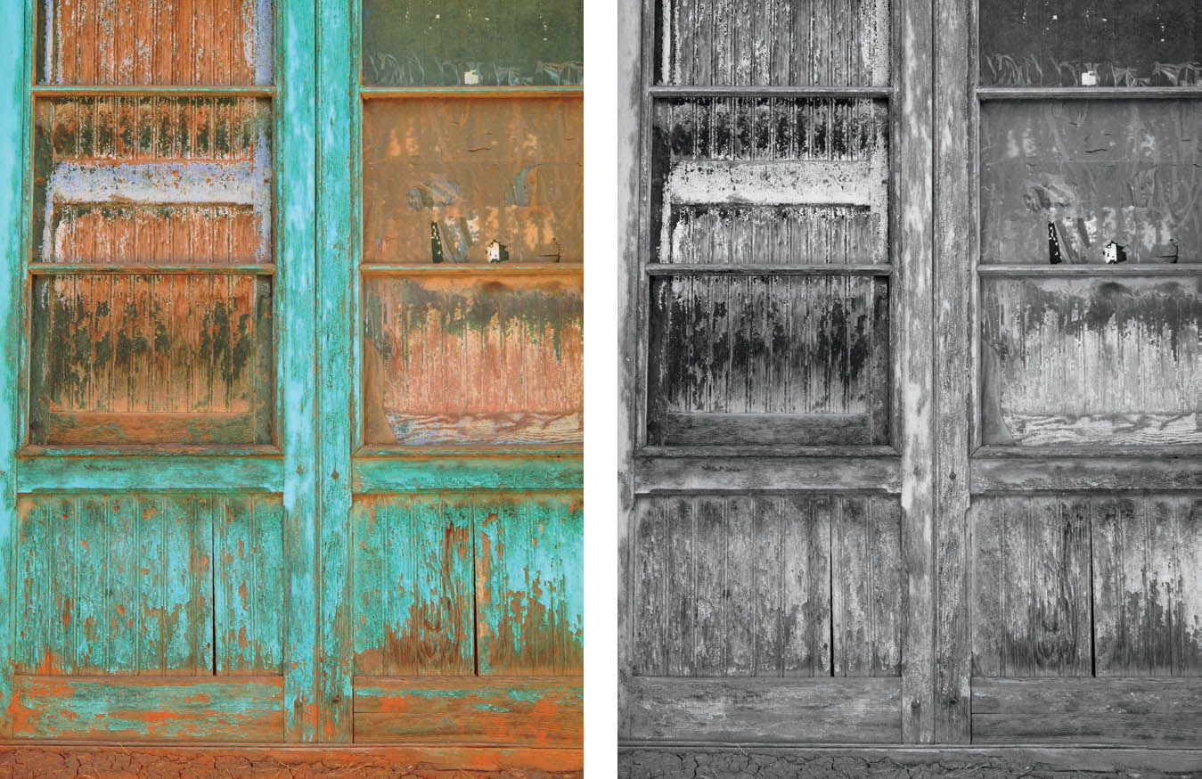
Figures 6-5a and 6-5b: Mono, Peru, Door with Windows
The turquoise and reddish colors of the door are nearly opposite colors on the color wheel, with the turquoise the more heavily saturated of the two. In the color image, they stand apart from one another brilliantly, but in black-and-white—without filtration to separate them effectively—they nearly merge. The color image has its own life due to the colors and the strong geometric shapes; the black-and-white has no interest because there is no separation of tonalities, and the geometric shapes are lost.
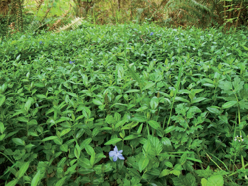
Figure 6-6: Vinca Field
In a field of green ground cover called vinca, the blue flower in the foreground immediately grabs the viewer’s attention, despite the fact that these are not “opposite colors.” The simple fact that the flower is a different color from everything around it makes it stand out prominently. After a while, the viewer will notice several other blue vinca flowers farther back.
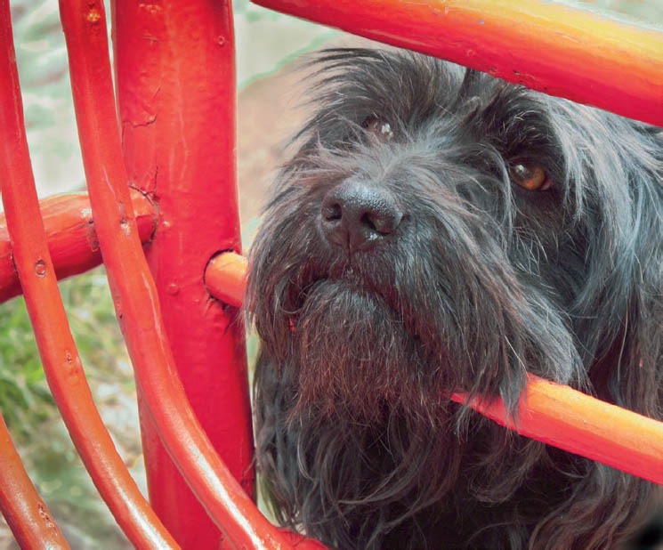
Figure 6-7: Dog and Chair, Pisac
In the Peruvian town of Pisac, upstream from the famous ruins of Machu Picchu, members of our workshop group stopped for a midday snack. A cute, fuzzy local dog saw this as an opportunity for some free snacks. His dark gray hairs and pleading eyes were irresistible, especially as he pushed his face through the bars of the brilliantly painted red chairs of the outdoor café.
![]() The eye will jump toward an opposite color within a composition just as quickly as it will jump in a black-and-white photograph to a white within dominant dark tones, or a black within dominant light tones.
The eye will jump toward an opposite color within a composition just as quickly as it will jump in a black-and-white photograph to a white within dominant dark tones, or a black within dominant light tones.
Furthermore, the eye will jump toward an opposite color within a composition just as quickly as it will jump in a black-and-white photograph to a white within dominant dark tones, or a black within dominant light tones. For example, if you photographed green foliage in a forest, but there was a cardinal perched on one of the branches, the viewer’s eye would immediately dart to that spot of intense red amidst the sea of green. The bird and the foliage may be exactly the same tone in a black-and-white image, but color separates them dramatically (figures 6-5a and 6-5b). The dramatic power of an opposite color, and its location within a composition, must be one of your prime considerations when you begin composing a color photograph. If you want a quiet, subtle mood, a sharp color contrast may be too powerful, too overwhelming. But if you’re looking for drama, it may be exactly what you want (figures 6-6 and 6-7).
Let’s consider another hypothetical example. Suppose there is an area of red in the lower right of the image (not necessarily the cardinal, but any red object). Are there other reds, perhaps reds of less intense saturation, or alternatively red-oranges, magentas, or other similar colors within the image that relate to the red object in the lower right? If not, can such a color relationship be arranged, perhaps by changing the camera position? Is it desirable to have that solitary red object stand alone, unrelated to any other color in the frame? What element of composition ties the lower-right area to the rest of the scene? In other words, does it relate compositionally to the rest of the image?
Unless a related form of a different color (or several such related forms) exists, or a strong line leads from that lower right area to elsewhere in the image, that corner of the photograph will be heavily imbalanced. It will not relate visually to the rest of the image, but rather will stand apart and draw your eye strongly to it. Of course this may be your intent, but you should be aware of this effect. A strong, unrelated color can create either a powerful attractant or a harmful distraction.
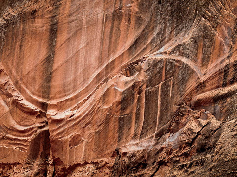
Figure 6-8: Choprock Canyon Wall Sweep with Diamond
The camera position from farther up Choprock Canyon, looking obliquely at the magnificent wall, rather than looking almost straight at the wall, allowed me to include the full bas-relief sweep carved into the wall, as well as the wonderful diamond-shaped form that so beautifully ended this natural work of art.
Too many color compositions include unfortunate distractions because they were attractive to the eye at the scene, such as a solitary thing in the lower-right corner of your image. The simple expedient of turning the camera so the object is farther away from the corner or edge can relieve the imbalance and improve the image, but only if the elements around it add visual interest and work well in relationship to it. Sometimes a small spot of a related color elsewhere in the image sets up a powerful visual relationship that is enough to balance it successfully.
Camera position can change a random array of colors into an organized composition with interesting lines, patterns, color placements, and color relationships. Sometimes using a wider or narrower focal length lens can bring in or eliminate unrelated objects from the image. It’s worthwhile to quickly check such options before snapping off an exposure. Resist the urge to quickly shoot a scene that has pleasing colors. Instead, first explore where your camera can be placed or determine what the optimum focal length lens is that will help move the eye around related colors in a directed fashion, or reveal a subtle pattern or visual rhythm not seen from any other viewpoint.
In 2016, on my annual backpack workshop, as I hiked up Choprock Canyon, one of the many side canyons of Utah’s Escalante River, I saw a stunningly curved and swept wall pattern, easily 100 yards long. I photographed it in both color and black-and-white, for both seemed to have real potential. Then, as I continued up canyon just a short distance, I looked back, noting that the more distant view allowed me to better incorporate a diamond-shaped form at the right end of the magnificent wall sweep into the composition. Only from the more distant camera position did the two forms come together so perfectly, allowing the curved bas-relief to end in the elegant diamond shaped structure, together with its many echoes (figure 6-8). You may not be able to rearrange the objects and their colors, but a change in camera position can alter their relative positions with respect to one another and may be sufficient to bring about greater compositional interest.
Repetitions and subtle echoes of color throughout an image set up visual rhythms. They help tie the image together as a unified whole. They must be sought and considered from the start. Too often color is included in a photograph simply because it’s there, without adequate consideration given to its placement within the scene. Whether the composition is indoors or outdoors, arranged or found; colors, line, and light can (and should!) be used to hold and direct the viewer’s eye (figure 6-9).
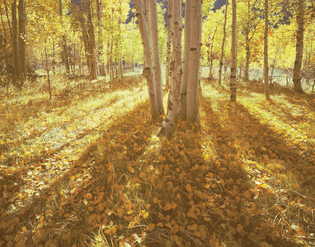
Figure 6-9: Autumn Aspens, Late Afternoon, Sierra Nevada Mountains
Yellow-golds dominate this image, yet subtle variations into browns (toward the bottom) and greens (toward the top) create a visual flow. It’s the light streaming around the trees and the strong shadows that create the movement. Kodak Ektachrome 64T indoor film held the high contrast of the scene so that the near side of the trees retain a wonderful glow, despite being shaded.
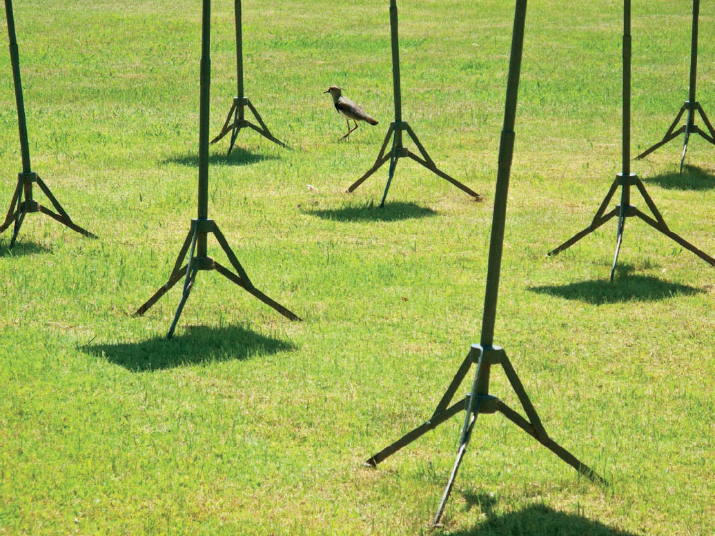
Figure 6-10: Bird and Stands
Negative space is often the dark areas—often the unimportant areas—between or behind the more important lighter areas. In this disorienting image, it is the opposite: the black stands, the bird, and the bird’s spindly legs, which relate magically to the stands, constitute the positive space. The sunlit grass is the negative space.
The eye will follow a series of color-related objects in the same way that it follows a series of related forms in black-and-white. Just as related forms of the same tonality can produce interesting visual rhythms in a black-and-white composition, related forms of different colors can produce exciting visual rhythms in color photographs. In fact, in color this can happen with the same color but with different tonalities (such as light and dark greens amidst oranges), or with different but related hues or saturation levels of the same color against lighter or darker tones of color opposites. Such visual rhythms should be sought out or exploited whenever you find them, for they are so visually revealing and appealing. These are the things that can open up new vistas to the viewer, who may have subliminally seen such relationships in passing without ever stopping to really notice or think about them. Now, you’re pointing them out! The viewer instantly sees what he or she has never consciously seen or thought about previously. You’re expanding the viewer’s horizons. That’s an achievement, and it shows that you have the eye to notice such things and bring them to the fore.
Positive/negative space, discussed in chapter 3 as the interplay between light and dark areas of the image, has an interesting extension in color. Not only will light and dark areas create positive/negative interactions, but alterations of color may do it equally well. One family of colors interacting with a contrasting family of colors may set up a fascinating positive/negative interaction. In figure 6-5a the deteriorating turquoise paint on the equally deteriorated red wood could be viewed as the positive space, with the red wood serving as the negative. If the two families are opposites (e.g., blue and orange or red and green), the interplay can be vibrant and scintillating; if the two families are closer together, it can be quiet and subtle (figure 6-10).
Colors can be used effectively to balance an image. A relatively small color-saturated object—royal blue, fire engine red, etc.—toward the edge of an image can balance larger objects on the other side that are not as deeply saturated. This is the teeter-totter analogy of a small child at one end balancing a huge man on the other side of the fulcrum, but close to the fulcrum. Conversely, of course, a color placed toward the extreme edge or corner can unbalance an image, and that can be used effectively if that’s your intent. Yet those colors may not stand out as equivalent gray tones in a black-and-white image, and therefore may be compositionally meaningless in black-and-white.
The most important thing to recognize is that composition must be controlled in a color photograph. Painters have complete control over color—the overall palette, the color intensities, placements on the canvas, harmonies and contrasts between them, and all other aspects of color composition—and photographers should exercise the same degree of control. The photographic controls discussed above and the elements of composition discussed in chapter 3 contribute to that end.
Color Families, Color Contrast, and Their Emotional Effects
As you look at the color sphere, consider color families and how they can augment mood. Reds, yellows, and closely related colors are known as “warm” colors; blues, greens, and related colors are known as “cool” colors. The reasons for this terminology are rather clear. Millions of years of evolution have taught us that fire, sunlight, and a host of other things that are warm in temperature are associated with reds, yellows, oranges, and the like (figure 6-11). We have also come to associate water, ice, thick vegetation, and other cool things with blues, greens, and related colors.
People respond emotionally and physically to warm and cool colors. Artistic depictions of landscapes or still lifes dominated by cool colors actually impart a feeling of lowered temperature; those dominated by warm colors have the opposite effect. Portraits dominated by warm tones may subtly convey a feeling of personal warmth, charm, or friendliness; a similar portrait dominated by cool colors may depict aloofness or other related characteristics.
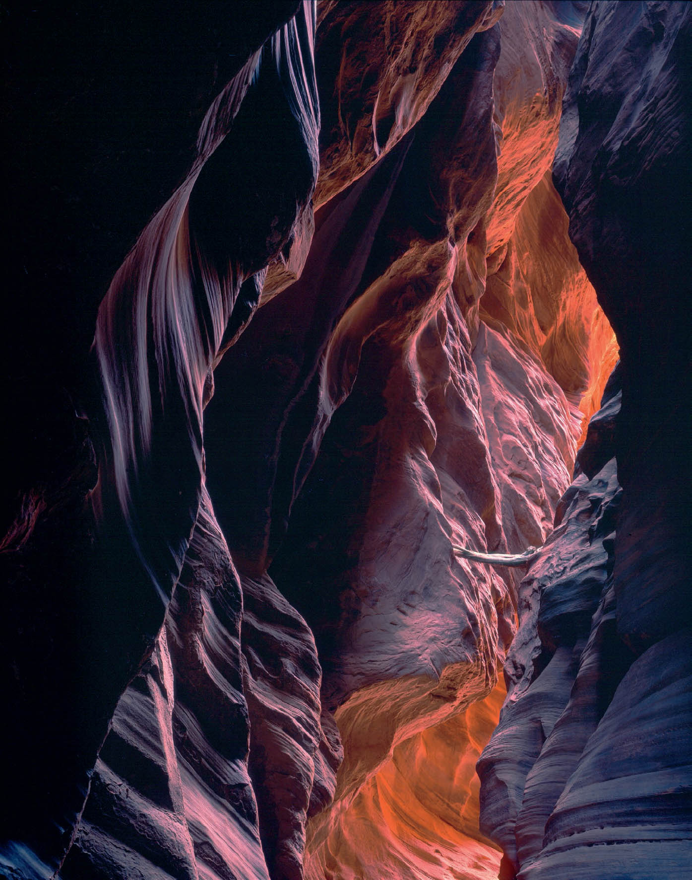
Figure 6-11: View from the Center of the Earth, Buckskin Gulch
If the earth were to split open, this might be what you would see at its center. That’s what I thought on a backpacking trip through Buckskin Gulch when I encountered this scene. The glowing reds give the impression of intense heat. It was stupendous, almost frightening, but magnetically attractive at the same time.
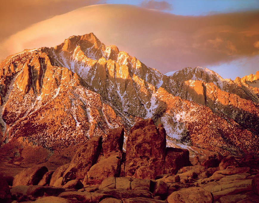
Figure 6-12: Mt. Lone Pine and Sierra Wave Cloud
Taken at sunrise as a dramatic cloud swept over the rugged Sierra summit, this photograph displays the warm coloration characteristic of early morning and late evening light. The same scene photographed during the midday hours would have had a cold, blue-gray color throughout. Color is dramatically different during the first few minutes and final few minutes of the day.
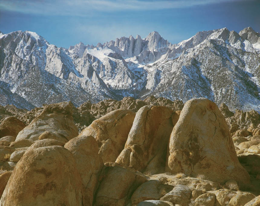
Figure 6-13: Sierra Nevada Mountains and Alabama Hills
Taken from a location close to that of figure 6-8, but at midday, this image displays a color balance that has changed to cooler, bluer hues. It’s surely a truer rendition of the actual colors of the scene, but the colors of sunrise and sunset can’t be overlooked.
Furthermore, people often become agitated or nervous when surrounded by bright reds, pinks, and oranges. We grow relaxed and restful among darker warm colors and so-called earth colors, and even thoughtful among cool colors. This explains why fast-food restaurants decorate in bright pinks and oranges under bright lights to move people through quickly, whereas plush restaurants use deep reds and browns under soft, subdued lighting to keep people seated in a cozy atmosphere. Libraries and other public buildings use beiges and soft blues and greens to help promote quiet and thought. Research shows that such color and lighting schemes work.
With these thoughts in mind, you can begin to consider appropriate color as an emotional boost for your photographs. You can heighten mood in the desired emotional direction through clever use of color and its available controls. First, the objects that you photograph have colors—warm or cool, intense or subdued, monochrome or varied—that should be compatible with the mood you wish to convey. In addition, the light under which you are shooting has inherent color.
Landscapes under midday light can have a cold, austere appearance, while similar scenes at sunrise or sunset can glow with warmth (figures 6-12 and 6-13). The color of sunlight changes rapidly during the first and last half hour or hour of the day, while almost no color shift takes place during the rest of the day—only the sun’s direction changes.
Let’s consider two examples of color and tonal manipulation, one with nearly imperceptible subtlety and one with astounding boldness. It may be difficult to notice minor color temperature shifts as the day goes on, such as in forests, but changes do occur. An image I made at the head of a forest trail on my home property (figure 6-14a) may not appear to be overly blue in character, but it is. Here, simple post-processing to adjust the color tint and temperature slightly warms up the image (figure 6-14b), bringing out more yellow and green, while subtly subduing the blue, and bringing the image in line with the scene as I remembered it. You may prefer the colder (bluer) rendition or the warmer (yellower) rendition, and since both are fully believable, the choice is yours.
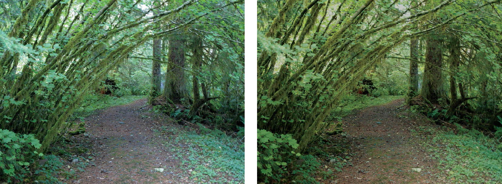
Figures 6-14a and 6-14b: Forest Trail, North Cascade Mountains
Figure 6-14a, digitally captured, was made in the early evening under cloudy skies, giving it an overall blue cast. Using basic global Photoshop adjustments—hue, saturation, and contrast curves—figure 6-14b shows how I brought in the colors that my eyes saw at the scene (note the path). I made no attempt to aggrandize the colors or saturate them needlessly, but rather to show the scene realistically.
Now consider a radically different example. Sand dunes in the middle of a typical sunny day or under overcast skies possess soft lines, low contrast, and rather bland colors (except for a few renowned ones with quite wonderful colors, such as those in Namibia). As such, they have little emotional impact imparted via their color. But the same dunes at sunrise or sunset can be alive with reds, yellows and oranges, and their shadows give them greater tonal contrast as well.
If you are seeking higher emotional impact, shoot near sunrise or sunset. If you want to heighten the mood—or even create a mood—during midday or cloudy light, when conditions can be extremely bland, you can extensively increase the contrast in digital post-processing, but this will work only if the underlying forms are interesting (figures 6-15a and 6-15b). (It should be noted that similar, or even greater, contrast increases are available for black-and-white images via traditional film/gelatin-silver print methods.)
Along with the emotional effects of color families and their degree of saturation, another feature of color that must be considered in order to fully evaluate its emotional effect is contrast. To do this properly, let’s first distinguish between color contrast and tonal contrast. The two may or may not be related, depending on the situation. For example, leaf green and fire engine red possess high color contrast (they are on opposite sides of the color sphere) but low tonal contrast because both translate to medium gray on the black to white tonal scale (see figures 6-5a and 6-5b again). On the other hand, light blue and deep red have high color contrast as well as high tonal contrast, since the deep red translates to dark gray while the light blue translates to light gray. Light blue and dark blue have no real color contrast but only tonal contrast, and for this reason they stand apart. It may be easiest to think of color contrasts as two colors being on opposite sides of the sphere, and tonal contrast as being far apart on the sphere’s axis (where maximum tonal contrast is north pole—white—and south pole—black).
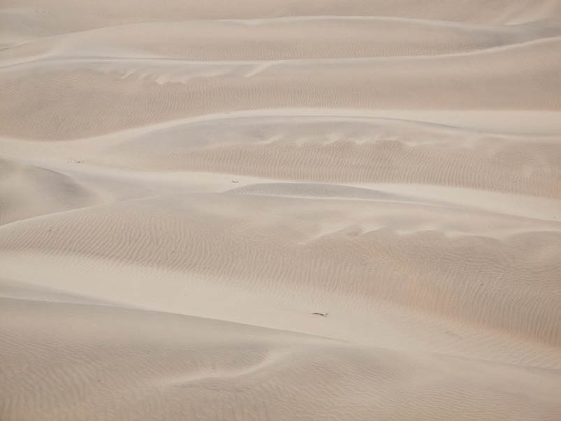
Figure 6-15a: Dune Layers, Morning Overcast (RAW File)
The first image shows the untouched digital RAW file made under overcast skies, showing how uninteresting the image may have seemed to the untrained eye. But recognizing the possibilities available through both traditional black-and-white and digital processes, I made several exposures that morning.
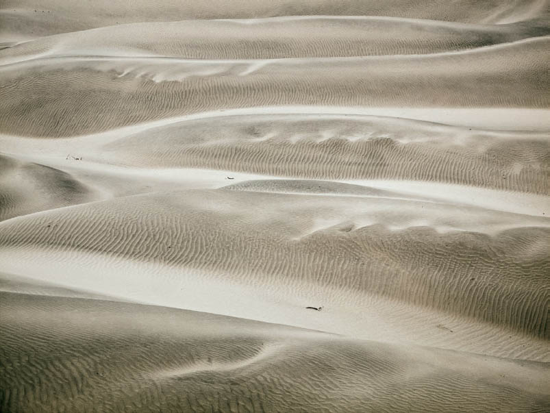
Figure 6-15b: Metallic Dunes (Post-Processed File)
In the second image, the use of curves in digital color post-processing plus dramatic reduction in both vibrance and saturation yields an exciting image without oversaturated colors, to create a successful image from an apparent dud. This is the photographic equivalent of turning a sow’s ear into a silk purse. When contrast is greatly increased using digital processes, there tends to be greatly enhanced color saturation accompanying it, often necessitating reductions in saturation to keep the image believable.
High color contrast occurs when color opposites are placed against one another; low contrast occurs when related colors are juxtaposed. Pastels within a family possess the lowest color contrast of all for they are both light in tone and not deeply saturated in color, and hence will have a soothing emotional effect (figure 6-16), while deep-toned opposites have high contrast, and a jarring or exciting emotional effect. Yellow placed against orange, brown (which is basically dark orange), or light green is seen as low contrast, but against blue it exhibits higher contrast. Taxicab yellow placed against royal blue or deep purple will pop your eyes out with contrast. Sometimes a single dominating color can impart such strong emotion that it’s almost viewed as high color contrast, as the dominating oranges and yellows can be seen and felt in Sunset, Abazio St. Antimo (figure 6-17). The emotional impact is immediate.
In summation, each level of contrast and each degree of color saturation possesses a different degree of emotional impact. High contrast has snap and pizzazz; low contrast has subtlety. Just as the eye jumps to light and contrast in a black-and-white photograph, it jumps to high color contrast in a color photograph. Just as tonal contrast can control the mood of a black-and-white print, color contrast together with color saturation can control the mood of a color photograph.
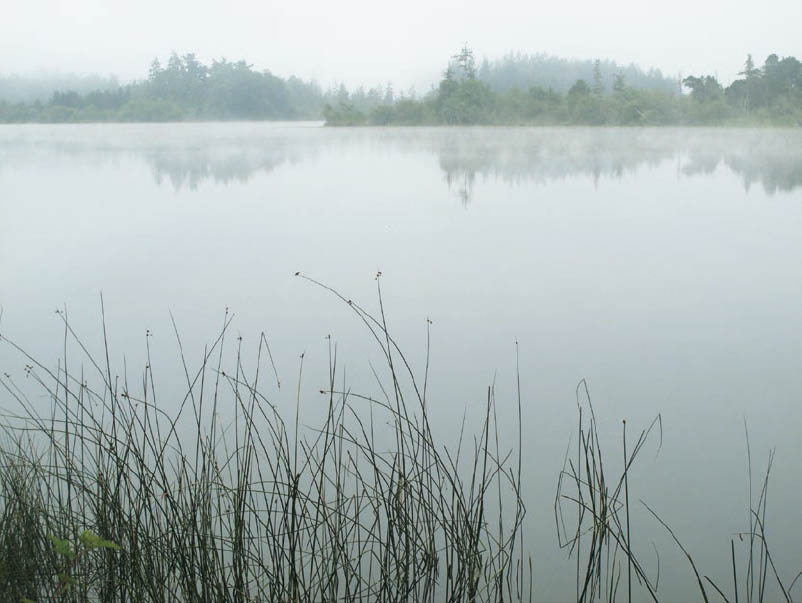
Figure 6-16: Whidbey Island Lake, Morning Fog
A light fog engulfs this scene on the largest island in the Puget Sound. The subdued light and soft coloration—almost nonexistent, yet visible—of unsaturated blues and greens, along with the lacy foreground grasses and glass-smooth water, impart a feeling of undeniable calm.
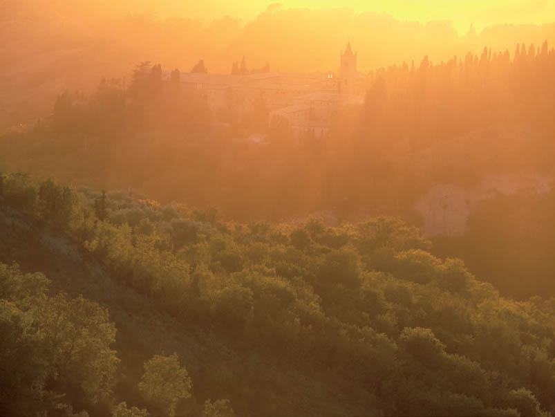
Figure 6-17: Sunset, Abazio St. Antimo
The pervasive moisture—often fog—in the Tuscany region turned sunset into a wash of golden light as the sun set over the monastery of Abazio St. Antimo and the surrounding hills. It was a magical moment. Yet the color is soft, and somewhat monochrome, nothing to avoid in a color image.
Subjectivity and Mood of Color
Color renditions of every film type and digital sensor are different. Printing papers vary as well. Which combination is best is a matter of purely subjective judgment. My favorites may prove to be those you dislike most. By working with these variables over long periods of time, you become familiar with their characteristics—their strengths and weaknesses—and learn to exploit their advantages while minimizing their shortcomings.
It has been my observation over the years that all too often photographers tend to push color saturation beyond acceptable limits. This is a critically important issue that I intend to stress throughout this book. (As a related aside, let me note that most of today’s TV screens reinforce that tendency toward oversaturation with colors—such as human skin tones—that are unrealistically brilliant, thus making everyone a “person of color.” Remarkably, TV controls to increase or decrease color saturation have been removed, so the viewer cannot reduce the saturation level of skin tones to those that people you meet everyday actually have.)
The oversaturation problem manifests itself most grievously in recognizable, realistic imagery including portraits, landscapes, architecture, etc. As stated near the start of this chapter, it is my contention that realistic images require realistic colors, and as the imagery becomes progressively more abstract, the necessity for color realism drops accordingly.
Sometimes, the issue of color saturation and realism can even go the other way . . . toward extreme subtlety. As an example, I have always disliked Polaroid color print film. In my opinion, the colors are erratic and muted. Yet Marie Cosindas produced a large body of outstanding color Polaroid portraits and still lifes. By working with the inherent characteristics of the film, she produced images that can be likened to paintings of the Baroque and Romantic periods. She often dressed her subjects in lavish costumes, used flowers or ornate objects for embellishment, and tended toward darker tones and muted colors, while leaning toward the warm tones of browns, oranges, soft reds, and yellows; but her images always tended toward low saturation to create a lush and intense mood. Often one brilliant color stands out against the prevailing deeper tones. In the hands of many photographers the results could prove outlandish or absurd, but in hers they are magical. Much of the credit must be given to her painstaking patience in learning the characteristics of the material.
Cosindas’s Polaroid prints eloquently point out an aspect of color work that often escapes color photographers: it is not necessary to have the entire color spectrum in each photograph. In fact, it can often be destructive. Color harmonies—colors of a single family—can help create unity in a color composition, and color contrast can help create high drama.
Intensity of hue is also of major importance in creating a color photograph. Just as in black-and-white, lighter colors tend to impart a brighter mood while darker colors tend to impart a richer, more serious, or even somber mood. A slight exposure decrease can intensify colors and mood simultaneously; a slight exposure increase can do the opposite. Needless to say, large exposure changes can ruin an image by washing it out at the upper end of the scale or muddying it at the lower end. Subtle changes, however, can have a remarkable effect on overall mood. It’s always wise to heed Ansel Adams’s observation that “There is often a small difference between a print that’s acceptable and a print that’s exceptional.”
Control of color balance, intensity of hue, and contrast levels are major means of creating expressive color photographs. Few photographs require garish or overly saturated colors, though the fad today is to saturate all colors. It seems that garish, neon colors sell in today’s market, leaving serious photographers with the unfortunate conundrum of choosing between true personal expression or sales. (I’ve seen too many books about how to sell your photographs via the use of high color saturation, and most of them turn me off quickly.)
Sometimes monochrome or near-monochrome renditions can be extremely effective. At other times, a subdued color palette with one contrasting color can have tremendous strength. Use of subtle coloration, when appropriate, or saturated coloration, when appropriate, conveys a command of the medium and a personal insight that the discerning viewer will appreciate.
Working with Color Digitally
Now, with those color considerations in mind, let’s see how they can be implemented effectively, first via digital processes, then via film. I recommend reading about both, even if you work purely with digital or traditional methods, for the discussion will open your thinking up to ideas that are common to both.
![]() An aspect of color work that often escapes color photographers: it is not necessary to have the entire color spectrum in each photograph.
An aspect of color work that often escapes color photographers: it is not necessary to have the entire color spectrum in each photograph.
For best results, every digital exposure should be made in 16-bit RAW files, not as 8-bit JPEGs. JPEGs, of course, have great value for sending things out quickly, but the whole premise of this book is based on quality, not speed. So I will be discussing RAW files exclusively, not JPEGs.
I should point out, however, that the monitor on the back of the camera displays that of a JPEG, which is not the same as the RAW file you are exposing. The image shown on the monitor will lose recorded detail in both the highlights and the deep shadows, detail that may be recorded in the RAW file, and can be worked on in post-processing. So it is necessary for you to learn how far beyond the range shown on your monitor you can expect to get in your RAW files. Keen observation coupled with experience will tell you the additional range the RAW file will encompass.
Let’s start at the beginning, when you’re making your initial exposures. Digitally you can set the white balance on your camera (e.g., sunny, cloudy, tungsten, fluorescent, etc.) to closely approximate ambient lighting conditions as seen by the eye. In an indoor studio, you’re in full control over the lighting, so your white balance starting point should be obvious. Outside of the studio, things may be quite different, especially if you’re in mixed lighting (perhaps a mix of tungsten and fluorescent, or indoor room lighting with open windows allowing daylight into the room). If you’re outdoors you have to work with the temperature of light provided by nature: whether it’s sunny, cloudy, foggy, or any other condition, and whether it’s dawn or dusk, sunrise or sunset, or midday. You can quickly switch between various white balance starting points to see which approximates the actual conditions or your artistic vision best. In doing this, understand that there are situations in which none of the white balance choices will be perfect for your situation. Not all sunny days have exactly the same ambient color temperature; not all cloudy days are identical. Tungsten and fluorescent lights possess many variations in color temperature. So, when choosing the closest white balance setting, don’t expect to be exactly on target. Such “near misses” may be corrected with post-processing adjustments.
For example, I have found in my many forays into the slit canyons of Utah and Arizona, none of the white balance options yields the colors my eye sees. The two that come closest are “cloudy” and (surprisingly) “fluorescent.” Yet the former yields colors that are overall too yellow/gold, and the latter colors that are too blue (but not as blue as “sunlight” white balance). However, if I make two separate exposures with the two different white balance starting points, I can achieve virtually the same finished TIFF file through post-processing adjustments. They’re not exactly the same, but they’re very close, with each one closely replicating my memory of the colors as I saw them.
You can go from your RAW files directly to the computer using the powerful tools of Lightroom, Photoshop, or another such image-editing application. It’s easy to alter whatever hues and balances you’ve captured to correspond more closely to the colors as you remember them, or as you wish to adjust them to impart the mood you want to convey. But I advise using such adjustments with subtlety, with major exceptions always available, such as the sand dune example earlier (figures 6-15a and 6-15b). Digital tools today are extremely varied and powerful. They offer exceptional control. They should be used with wisdom and subtlety, not with reckless abandon and lack of artistic integrity. Too often the latter is the case. It doesn’t have to be that way.
This is a caution—perhaps even a warning—already stated but requiring repetition throughout this book. I regularly see color photographs that go well beyond realistic colors and far into the realm of neon brilliance. While I support sensible efforts to heighten the emotional impact of an image, digital tools make it extremely easy to alter or increase color balance and saturation, and far too many practitioners apparently succumb to the lure of such intense coloration.
Technique should be invisible. This means that the viewer should be unaware of the techniques you employed because everything appears natural and correct. The viewer should have the feeling that “you were in the right place at the right time”—in other words, you were simply “lucky” to have been there—leaving that viewer completely unaware of all the maneuvering you may have gone through to achieve the image being viewed. When used intelligently and effectively, none of those maneuvers should be evident. When technique becomes apparent, the image, itself, is lost. This is true not only of color rendition—including both the colors you produce and the degree of color saturation you decide upon—but every other aspect of your image, including contrast, tonalities, burning and dodging (see chapters 11 and 12), and all the other variables of the printing and editing process. Your images should appear natural and unmanipulated . . . unless you’re dealing with fantasy, for which obvious manipulations may be perfectly acceptable.
Over the past several years I have scanned all of my important color transparencies, and in doing so, I have been able to digitally re-create the original color balances for those transparencies that have faded or color-shifted dramatically over the years. In essence, I have brought back to life many transparencies that had largely faded to uselessness. Now I have them all as digital files for future use. Included in this book are examples (with some being noted as original film exposures).
Digital methods have two great advantages not available with traditional color materials. First, scenes of extremely high contrast can be photographed twice, with one exposure for the shadow area and another for the highlights. Then, using image-editing software, the two exposures can be combined into a single image file, thus increasing the usable range over that of a color film transparency. In fact, three exposures can be layered as well: one for shadows, one for midtones, and one for highlights. Actually, any number of exposures can be combined. (More about this in chapter 11.) The final print may rival the eye’s ability to encompass the full range of contrast in the scene. This offers tremendous advantages for color photography.
Caution and common sense must be employed in using such layering procedures because the full tonal range of any image can be no greater than black to white. You cannot capture the full range of a scene using several exposures and then expect detail together with high contrast within each portion of the range. So it must be recognized that encompassing the full range via several exposures means that portions of the final image must be rather low in contrast, simply because the combination of the several exposures cannot exceed the limits of black to white. If you try to cram too much contrast and pizzazz into each portion of the image, strange visual effects begin to emerge that destroy the final image.
The second great advantage of digital color procedures is the ability to vary the contrast level throughout the entire image, or selectively in different parts of the image. For these reasons I now see digital processes as the best approach available to create color imagery, and it’s the reason I have gone completely digital in my color work. I simply see no reason to work with existing traditional processes that cannot equal the flexibility or the variety of options available through digital color processes.
On the other end of the contrast range, scenes with unacceptably low contrast can easily be increased using applications such as Lightroom or Photoshop. Thus, contrast levels are easily controllable once you understand how to employ the appropriate tools (see details in chapter 12). However, there is an inherent logic to the degree of contrast that can be accepted, which varies scene by scene, just as there is with the degree of color saturation that remains logical and realistic. (Again, see figures 6-15a and 6-15b as an example of wildly increased contrast that remains visually attractive and apparently realistic). If you go too far, it simply looks contrived, cartoonish, and absurd. I recommend staying within logical limits.
![]() There is an inherent logic to the degree of contrast that can be accepted, which varies scene by scene, just as there is with the degree of color saturation that remains logical and realistic. If you go too far, it simply looks contrived, cartoonish, and absurd.
There is an inherent logic to the degree of contrast that can be accepted, which varies scene by scene, just as there is with the degree of color saturation that remains logical and realistic. If you go too far, it simply looks contrived, cartoonish, and absurd.
Color saturation presents an interesting set of problems. As stated above, all too often color saturation is undesirably exaggerated. Part of the reason for oversaturation of color lies in the original capture itself, where there is a clear increase in saturation beyond what the eye perceives. (Of course, this can happen with film too, as in figure 6-2a where film greatly enhanced the visible color during an extended length exposure of five minutes. Yet that was an unusual situation created by the long exposure, and not normally encountered.) The initial digital characteristic of enhanced color saturation goes far enough; there is rarely a need to push it further. If you accept the colors from the initial capture as your base point, i.e., your starting point—forgetting that they are already somewhat enhanced above those of the actual scene—and then you work toward further enhancement of the RAW file, you are prone to go overboard. And the ease with which you can increase saturation—simply slide the saturation or vibrance slider to the right—is apparently extraordinarily addictive, proving irresistible to most digital practitioners.
This is a problem I call the “Dr. Strangelove Effect.” Photographers need to control their baser instincts instead of spiraling down to the greatest color saturation in image after image. Sometimes a pastel is what you really want. Sometimes subtle colors convey the right mood. As photographer/instructor Jay Dusard once noted during a workshop review of color images, “Not all photographs have to look like a professional football jersey.”
It turns out that the slider can also be pushed to the left, as easily as to the right. Color saturation or vibrance can be decreased as well as increased. I find that in my post-processing, I tend to push the saturation level down more often than I turn it up. From my point of view, the image should be the thing that carries the impact, while the colors in the image should serve to enhance that mood; colors should rarely be the driver of that mood.
Keep in mind that color is inherently closer to reality than black-and-white. Unless you’re totally color blind—and very few people are totally color blind—you see the everyday world in color. So you’re somewhat constrained in pushing color balance or saturation . . . unless your imagery goes into the abstract realm. It’s hard to push colors of recognizable and realistic scenes very far from “realism” before they simply appear to be wrong, yet photographers forget this repeatedly. My recommendation is to try to remember the original scene, which will prove to give you a better basis of how far you can alter, saturate, or desaturate those colors to keep them compatible with the mood you wish to convey.
Used sensibly and subtly, the digital approach to color can offer tremendous rewards and exhibit remarkable visual power. The problem is not with the digital means, which afford all the control anyone could ask for. It’s in controlling you! Sometimes you may want the viewer to sit down and think rather than jump up and shout. In fact, subtle, subdued colors have their place. (Look at the subtlety in Japanese or Chinese paintings to see the strength of well-chosen pastels.)
What about nighttime color photography? In urban areas contrast created by the inverse square law (see chapter 5), where street lights and other point sources produce extremely spotty, contrasty situations, is a difficult problem to overcome. One clever way to overcome this is to shoot well after sunset (or before sunrise) but with enough dusk or dawn light to serve as the basic light source, and help even out the spotty lighting. In essence, it’s the dawn and dusk light that you’re dealing with, while the man-made light sources add a bit of accent to the scene.
In urban areas, after dusk or before dawn, point sources of light (such as street lights) produce the primary lighting, and several exposures followed by post-processing layering of the exposures can yield detail virtually everywhere, avoiding the “blowout effect” at and around those point sources traditionally seen in nighttime imagery. Thus, one exposure can be made to encompass the light sources and their immediate vicinity, with another exposure (or several other exposures) made for those darker areas far from the light sources, and then the two (or more) exposures can be combined.
If you’re away from human-created point sources of light (perhaps out in the countryside, at the seashore, up in the mountains, or at some other purely natural setting), moonlight photography can be quite successful. Out in nature, digital photography offers options that we’ve all seen, including full nighttime landscapes together with a sky filled with stars as myriad pinpoints of light where you can clearly see individual stars and the band of the Milky Way in such photographs. (I must admit to my own dislike of such images, for they carry a distinctly unreal and perhaps even “forged” feeling to me—the digitally exposed nighttime sky always strikes me as too bright and overwhelming—but it does clearly show the degree of flexibility that digital, alone, can offer. I also realize that the unreal brightness can be toned down.)
Working with Color Traditionally
As stated near the start of this chapter, color indoor transparency film has disappeared, as has Ilfochrome printing paper, which allowed direct printing of transparencies. The loss of these two products was a large reason for my switch to digital methods, since I had been using both for my color work. That, combined with the greater flexibility of color digital processes, tipped the balance for me. Yet, traditional color processes have merit, and are worth discussing.
Today there remain two starting points for traditional color photography: outdoor transparency film and negative film. The following discussion deals with both of those starting points.
If you’re using film outdoors, you can enhance early morning or late afternoon warm tones with a film that inherently enhances warm tones, or subdue it with films that enhance cooler tones. Choosing the appropriate film can help put your vision into your photographs. By the same token, you can intensify the cooler midday colors with films that tend toward cooler tones, or warm them up a bit with warmer-toned films.
You’ll find that the film’s response to the color of ambient light can dramatically alter the overall color and mood. Your choice of film can prove to be an asset or a detriment to your goals. Every color film has a characteristic color balance. Some are stronger in the warm colors but weaker in the cool colors (i.e., the warm colors are pure and rich; the cool colors are somewhat grayed and dull). Others are stronger in the cool colors. (Fuji Velvia breaks that mold by being overly high in tonal contrast and overly saturated with intense color, and, as you can easily guess, is a film I heartily dislike.)
Every film has its own unique palette—i.e., a combination of color balance, saturation, and inherent contrast. I strongly urge you to experiment with several color film types before settling on one as your sole medium. Since color is highly subjective, it’s best not to rely on the recommendations of others; instead, determine for yourself what is most appropriate for your needs.
When you’re using color negative film materials, the negative is never the final product but rather the halfway point between the exposure and the print. Color balance can be altered and improved during printing. Film transparencies can be the final product, and they can also be made into prints, today largely via an internegative onto negative print material. (An internegative is a direct emulsion-to-emulsion image onto negative film through the original color transparency, so that the created negative can then be printed as a traditional negative would, without any loss of sharpness from the original transparency.) Both negatives and transparencies can be digitally scanned for further digital processing, which I believe today is the best way to proceed due to the superior controls available digitally compared to those available via traditional color processes. With film, color correction can be done at the printing stage in the same way as with negatives, in which case initial color balance is of lesser concern. However, to state the obvious: the closer you come to the balance you want using the original material, the better chance you have of obtaining your desired balance in the final image you create.
Color negative film is lower in tonal contrast than transparency film, with very few exceptions, and can be expected to yield lower contrast prints than ones derived from transparencies. So color negative films tend to yield softer, more subtle final prints than do transparencies. Differences in color contrast levels can create greater emotional swings than you might expect without seeing comparisons. I strongly recommend that those using color film—either transparency or negative film—for the exposure, convert the image to digital and proceed from there with the postprocessing and printing. (As I will make clear in subsequent chapters, I do not recommend the traditional-to-digital approach with black-and-white.)
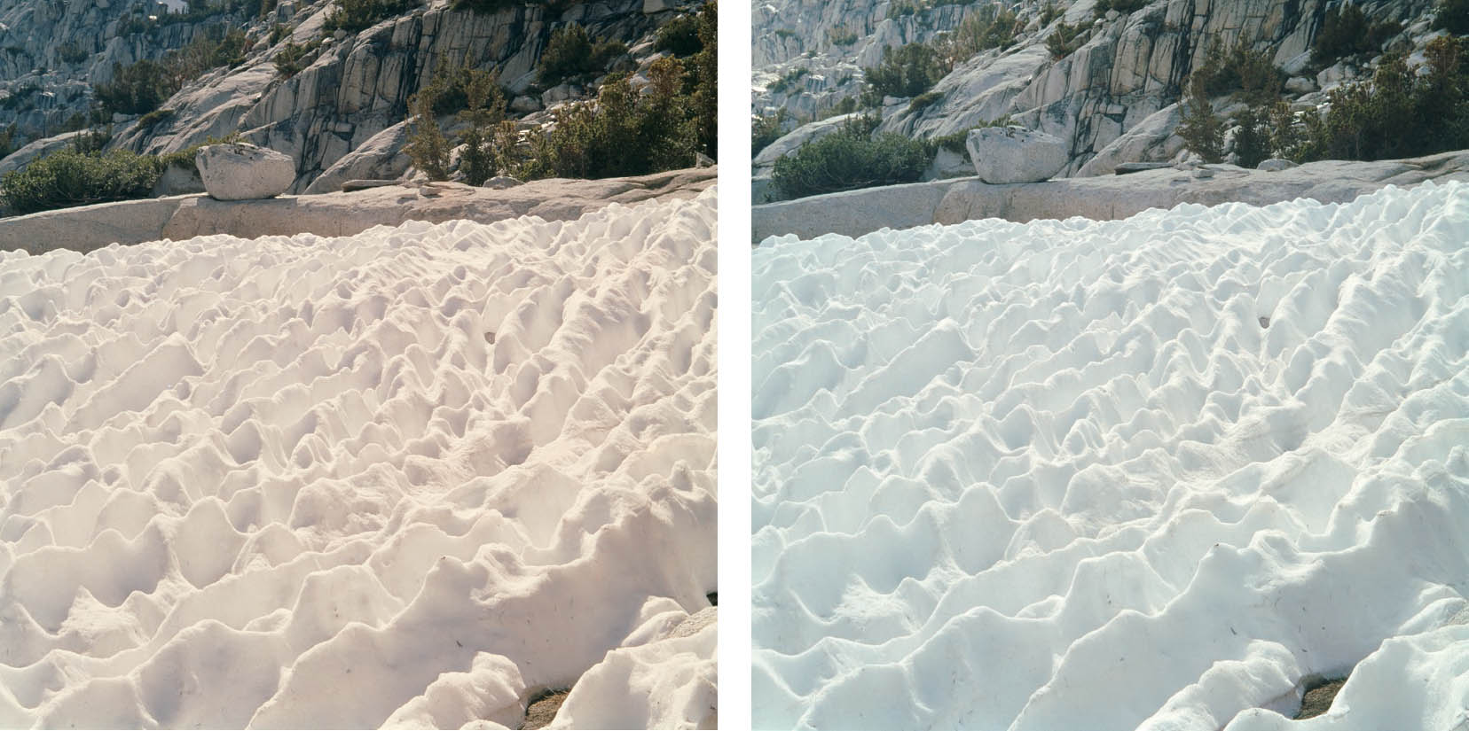
Figures 6-18a and 6-18b: Snow Cups, Sierra Nevada Mountains
These two photographs were made minutes apart at the same location; figure 6-18a under sunlit conditions and figure 6-18b as a cloud passed over the scene. These images show subtle but important differences in the film’s color balance. Figure 6-18b (in shade) exhibits a colder blue tone in both the melting snow and granite rocks on the high slopes. That color balance strikes me as more appropriate to convey the feeling of cold, as opposed to the yellower, warmer rendition in sunlight. Digitally, it’s almost the equivalent of choosing the white balance between sunny and cloudy, with sunny being the colder, bluer rendition and cloudy being the warmer, yellower rendition. In this way the initial choice of white balance can help communicate the feeling you want, not only in a scene like this, but in a wide variety of others.
Neither the degree of color saturation nor the inherent contrast of color film can be significantly altered in development (in the way contrast can be altered in black-and-white) unless you develop your own negatives or transparencies and learn some highly sophisticated, perhaps tedious, means of contrast control. (Please keep in mind that tedium is one thing and fine art is another. How many people think that Michelangelo, Shakespeare, or Beethoven avoided doing their utmost because it was too tedious?) Most photographers use commercial labs for processing, and contrast control methods are not available at most labs. Thus, the only way to alter color saturation or contrast is by changing from one film to another. Color balance, on the other hand, can be altered by choice of film or filters. Therefore in choosing a film—or several films—for your purposes, it would be wise to place greater emphasis on saturation and contrast than on color balance; while you can’t control the first two, you can control the latter.

Figures 6-19a and 6-19b: Red Mountain Heather, Sierra Nevada Mountains
Figure 6-19a was made under sunlit conditions, figure 6-19b under cloudy conditions. These two photographs show the same sun vs. shade color shifts that we see on the snow cups (figures 6-18a and b). Which version is more appropriate? To me, it’s a toss-up. I see no clear winner despite the obvious differences.
With film, you should learn about lighting characteristics in advance, or you could end up with an irreversible problem because you guessed an incorrect color balance . . . hence, garbage in; garbage out. If you are supplying the lighting indoors, you should already be familiar with what you’re dealing with, so the problem disappears.
However, just as with digital approaches, mixed lighting conditions create challenges. For the most part, you cannot properly balance mixed lighting, so you must make a choice of which way is best to be “off.” For example, when I was doing commercial architectural photography, I found it best to filter for fluorescent, and let tungsten lighting within the same room warm up those parts of the room with a golden glow, whereas if I filtered for tungsten, the green cast from the fluorescent lighting imparted a sickly look to the scene.
If you want to heighten a mood a bit, you can consider increasing the contrast. Digitally, of course, you can increase or decrease contrast, saturation, hue, and color balance quite easily on the computer, giving you remarkable options beyond those of color film. With film, if you like warm colors but want a softer rendition, use a lower contrast film and/or one that is stronger in cool colors. Also, some very exacting and sophisticated masking procedures can be employed in printing to increase or decrease contrast, but these are not easy to master (see the discussion about masking in black-and-white in chapter 10). If you want a quieter mood, shoot during the midday hours, remembering that changes in color balance or contrast among films can edge the image one way or another emotionally. (See chapter 7 on color correction filters for film.)
It’s important to be aware of the fact that all daylight color films are balanced for sunlight and they display a heavy blue tone on overcast days or in shadow areas. You’ll find much the same effect shooting digitally with a color balance set for sunlight. This blue shift may be perfect for a few subjects, but harmful for most. With film, this blue cast can be neutralized by filters (see chapter 7); digitally, this can be accomplished by initially setting the white balance or during post-processing. Only if you are aware of the color shift can you work with it to your advantage (figures 6-18a and 18b, and 6-19a and 6-19b). Beware of the effect of fluorescent light; everything takes on a strong green cast, which can be corrected only with heavy filtration.
For outdoor night photography light levels will generally be too low for your meter to respond, but you can experiment with exposure times under full moon, half moon, or quarter moon lighting. Once you lock in the necessary times for such lighting—always requiring extended exposures—you can open up a whole new area of photography that you had previously never considered (figure 6-20).
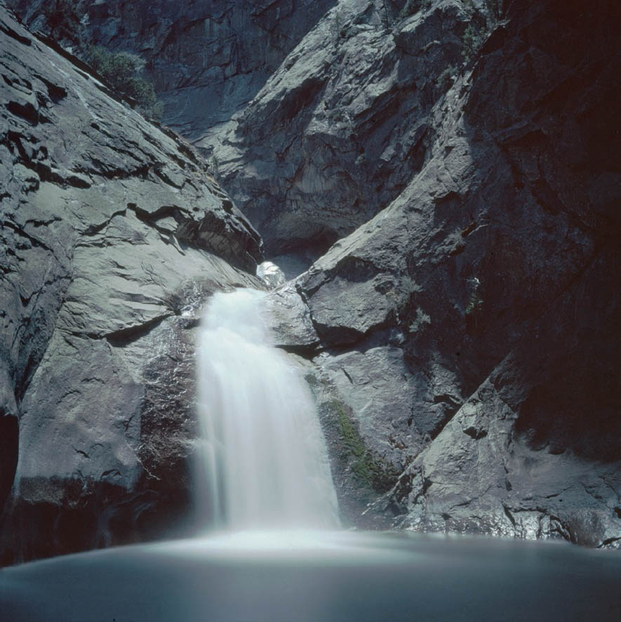
Figure 6-20: Roaring River Fall, Moonlight
Roaring River Fall in Kings Canyon National Park drops to a deep pool near the South Fork of the Kings River. In late autumn, under a full moon, and with the flow low enough to see the cataract, it turned into a magical cathedral. In order to get detail on both the waterfall and the massive granite walls enclosing it, the color transparency exposure lasted more than 15 minutes.
In Summary
Color photography requires at least as much thought as black-and-white photography; perhaps more. Color is an element of composition, and a dominating one, at that. It is also a potent determinant of mood. When making a color photograph, color balance, color placement, color harmony or contrast, color intensity, and appropriateness of color must all be carefully considered along with lighting, balance, lines, forms, textures, and all of the other elements of composition. When printing color, compatibility of the original exposure with all the post-processing and the final print material must be considered in order to obtain the proper look of the final image. If photography is to be used as an expressive extension of your own thoughts, each of these elements must be chosen with care.
![]() I have long felt that it may be easier to make an acceptable color photograph than a black-and-white photograph, but it may be even more difficult to make an outstanding one.
I have long felt that it may be easier to make an acceptable color photograph than a black-and-white photograph, but it may be even more difficult to make an outstanding one.
I have long felt that it may be easier to make an acceptable color photograph than a black-and-white photograph, but it may be even more difficult to make an outstanding one. Because color is instantly recognizable and is therefore more accessible to the average person, it’s easy to make pleasant images. But because color is so accessible, it’s hard to break away from a documentary image to one that is personally expressive: too often the scene dominates over the mood, the feeling, or the interpretation. Creating an image in color that is truly expressive—one that breaks away from the scene—requires a great deal of thought and dedication, as well as rapport with and deep understanding of the subject. None of this comes easily, but when it is achieved, the results can be breathtaking.
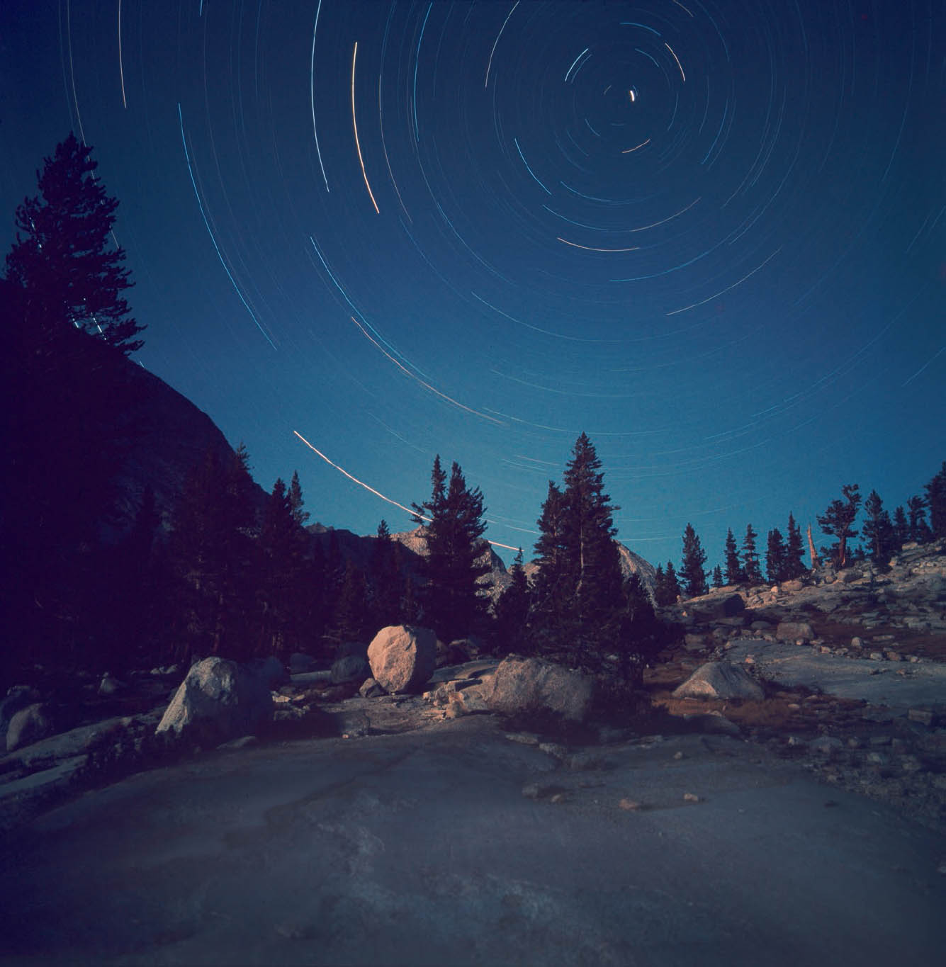
Figure 6-21: Star Tracks, Sierra Nevada Mountains
On a backpacking trip in 1976 to Sequoia National Park, I made an exposure of over three hours starting well after dark, but with a quarter moon setting during the first half hour. At this 11,000-foot elevation, the moon provided sufficient light for the immediate foreground. With the camera aimed toward Polaris (the North Star), the remainder of the exposure simply captured star trails without any subsequent exposure on the land. I could have left the shutter open longer to get even longer star trails, but I was afraid of oversleeping and ruining the exposure with too much dawn light.