
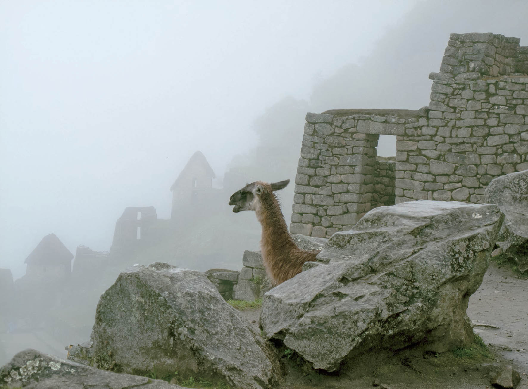
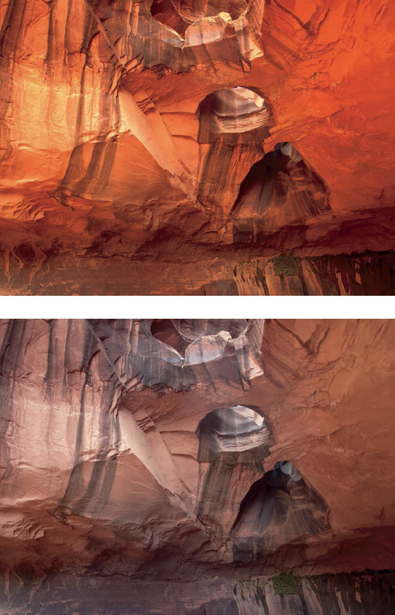
Figure 11-1: Llama Viewing Machu Picchu in Fog
Llamas are the lawn mowers at Machu Picchu, in Peru. They roam freely. Early one morning I saw one apparently taking in the panoramic view of the ancient ruins and perhaps the mountains beyond . . . assuming they became visible during a break in the fog. There was both a surprise and a dash of humor in noticing this solitary llama leisurely enjoying the view.
The contrast in the fog was low. The histogram is easily encompassed on the scale, and was pushed to the right of center to achieve maximum smoothness of tonality.
CHAPTER 11
The Digital Zone System
![]()
THE INFORMATION ON FILM AND DARKROOM PROCEDURES in the preceding chapters is directed at giving you, the photographer, control and predictability over the final image. Although digital logic differs from that of classical (i.e., traditional) photography, the goal is the same in the digital realm: predictable, controlled results.
The discussion that follows begins with a summary of how the photosites and related filters (collectively, the sensor) inside the camera work; turns to digital exposure, and how to optimize it; and then discusses techniques to use multiple exposures when the brightness range of the scene exceeds that of the sensor. This will explain how to work with virtually any brightness range to produce the best possible print quality. The digital sensor’s range falls far short of that of negative film (both color and black-and-white), but multiple exposures merged together can equal, or perhaps even exceed, that range under ideal conditions when the light remains fixed and nothing in the scene is moving. So, just as the making of a silver print cannot be separated from the properties of light-sensitive materials and their related developers, digital photography cannot be separated from the processing of the information produced by the camera’s sensor and the refinement of the image in the software.
The following discussion will also be based on cameras that record the full color image. However, there will be discussion of converting a full color image to black-and-white for the final image in this chapter and in chapter 12.
At the heart of optimum digital exposure is the largely unprocessed data referred to as the “RAW” file. The RAW file consists of sensor data together with ISO, exposure, and other information (referred to as metadata), that is saved to the camera’s memory card and from which a photograph can be rendered. By its nature, a RAW file is not an image and cannot be viewed directly. Rather, it is information from which an editable image can be formed by a computer using software referred to as a RAW converter. (The RAW file is analogous to exposed film—the latent image—prior to chemical development. It’s there, but it has no life yet and you can’t see it until it’s developed.) The output from the RAW converter is saved in a commonly recognized image format such as Tagged Image File Format (TIFF), JPEG (Joint Photographic Experts Group), or Photoshop Document (PSD) (analogous at this point to the developed negative, ready for printing), and the image file can later be printed or opened and refined in an image-editing program such as Adobe Lightroom (Lightroom), Adobe Camera Raw (ACR, which comes with Adobe Photoshop), or Adobe Photoshop (Photoshop).
In brief, the sequence from the memory card to the print is as follows:
- Import the RAW data from the memory card into a RAW conversion program.
- Use the RAW conversion software (which may be a standalone program or may be integrated into your image-editing program) to set values for global adjustments to the image (including color balance, overall contrast, the correction of aberrations, and initial sharpening); apply the adjustments and process the RAW data into an array of picture elements known as pixels with each pixel being composed of three color channels, one each for red, green and blue information; and then save the resulting file in a common image format such as TIFF or PSD.
- In your image-editing program (which may or may not be the same as your RAW conversion software), refine the image, perhaps a TIFF or PSD file, by adjusting such things as contrast, brightness, color balance, and sharpening; burning and dodging selected areas; resampling (changing the number of pixels per inch) and resizing the image for printing; and doing any number of other modifications available in your image-editing program. All this is done to prepare your image for printing.
Because there are a number of excellent books on the use of specific RAW conversion and image-editing programs, the goal here is to place the digital process in context, explain some fundamentals, and give you the tools to optimize your exposures for the best possible prints.
Basics of Digital Exposure
Let’s start with the sensor output, showing how it relates to classical film processes. In the film world, the result of an exposure is the latent image recorded on film. In the digital world, the result of an exposure is electrical output from the many photosites on the camera’s sensor. Although the specifics vary among manufacturers and among camera models, all digital sensors are composed of a number of photosites arranged in a geometric pattern known as an “array.” Each photosite provides an electrical signal in proportion to the amount of light striking it. For the overwhelming majority of sensors, photosites are capable of measuring brightness but not color. To record the information required to produce a full color image, a single color filter is placed over each photosite, arranged in what is referred to as a color filter array (CFA), often consisting of a repeating sequence of one red, two green, and one blue filter known as a Bayer pattern. (Other arrays and color filter patterns are in the works, so we can expect CFA patterns to evolve.) An illustration of an array and its CFA are shown in diagram 11.1.

Diagram 11.1: Diagram of a sensor and color filter array
At the conclusion of an exposure, the electrical signals from all of the photosites are transmitted to the camera’s internal processor, where the signals are converted to binary digital data and are either given minimal processing and written to the memory card as a RAW file or are fully processed in the camera and written to the memory card as a fully processed JPEG file or a TIFF file.
Let’s look into optimizing the image quality from the point of initial exposure in the field. Most cameras allow the photographer to select RAW, DNG (Adobe Digital Negative), or JPEG image quality. The choice is simple: For the highest quality, set your camera to save all of your exposures in RAW format using the highest bit setting available.
As noted, with the camera set to write to the memory card in RAW, the camera does little, if any, processing of the digital information and simply records the sensor information and related metadata to the memory card. In contrast, if you set your camera to write JPEG or TIFF files, the camera processes the sensor output into three grayscale images, each of which is referred to as a channel (one for each of the three primary color filters), applies a contrast curve, adjusts the color balance, makes other modifications based on the camera settings, performs edge sharpening, and saves the fully processed image to the memory card. In the case of JPEGs, the image is limited to 8 bits per color channel and is compressed in such a way that some of the image information is irretrievably lost. Any post-exposure change to a JPEG or TIFF file will result in a loss of data. With a RAW file, before doing any editing of the image, the original exposure information should be saved and kept available as a starting point should you wish to try a different rendering in the future. (This is similar to keeping your original, untouched negative.)
The term bit depth, also referred to as color depth, identifies the amount of color information that is associated with each pixel. Bit depth describes the number of brightness levels, or shades, that are available to describe the color of each pixel. Greater bit depth means more shades resulting in higher color fidelity, smoother and more subtle tonal gradations, and files that will withstand substantial editing without visible degradation. Let me caution, however, not to confuse bit depth with the number of pixels; pixel count is analogous to film resolution, whereas bit depth is the measure of the number of discrete tonalities each pixel can represent.
Although the JPEG and TIFF logic of the camera producing a completely processed photograph is convenient, JPEG and TIFF images contain less information than do RAW images, and the information will be progressively lost as successive edits are made. However, there are two things worth considering about JPEGS. First, the screen display on the back of your camera is a JPEG image. So, in fact, the camera always creates a JPEG image in buffer memory. However, that file is not permanently saved (unless you specifically request it saved with or without a RAW file). Second, if you’re a sports photographer using JPEG, you can make your image, download it to your laptop via a wireless link, and have it to the newspaper in seconds. (Soon—if not already—you may be able to go directly from camera to newsroom, making things even faster.) It’s hard to beat that speed. Furthermore, if you want snapshots of your kids to send to relatives, or vacation shots to send to friends or to post on the Internet, JPEGs will do the job nicely, and will do it instantly. Again, that’s hard to beat. Many cameras can be set to save both the RAW file and a JPEG from the same exposure at the expense of some incamera processing time and the use of additional memory. For this book, we’re really talking about personal expression, not quick-and-dirty (or really, to be fair, quick and clean) uses of the photographic process, so from here on, we’ll confine the discussion to the higher quality RAW files.
Presently, most digital single lens reflex (DSLR) cameras record RAW information as either 12- or 14-bit data. With 12-bit data, each pixel can represent more than 4,000 levels of brightness (212) in each of the 3 color channels. Fourteen-bit data can represent more than 16,000 levels of brightness (214). By comparison, 8-bit data, such as JPEG, can represent only 256 levels per channel (28). To take full advantage of your camera, set your camera to record RAW files with maximum bit depth and to either not compress or use lossless compression.
To preserve all of your photographic information from the original camera exposure to print, be sure to set both your RAW converter and your image processing software to work and save in a large gamut color space with a bit depth of 16 bits per channel. For example, if you are using Adobe Camera Raw (ACR) included with Photoshop, from the Image menu select Mode and choose 16 Bits/Channel and from the Edit menu select Color Settings and choose Adobe RGB or ProPhoto RGB from the color space drop-down menu. If you are using Lightroom, which incorporates the same conversion technology as ACR, under the Lightroom menu select Preferences, choose the External Editing tab, set the color space to Adobe RGB or ProPhoto RGB, and set it to 16 Bits/ Component.
Differences in the levels of information (i.e., 8 bits, or 16 bits) are significant, particularly in shadow areas. This is so because more information produces smoother tonal gradations and because changes to the image resulting from RAW conversion or post-conversion editing, including changes in white balance (to be discussed below), contrast, and brightness levels always result in the loss of data. If enough data is lost in processing, the resulting photograph will be noisy (i.e., it will exhibit undesirable grain, texture, or random color data that has no meaning), and will possibly present the abrupt changes in what should be smooth transitions (such as the sky toward the horizon) known as posterization, or banding.
Today’s hardware and software almost universally support 16-bit processing. However, if your camera or software is limited to 8 bits, you can nevertheless produce fine quality photographs, but it becomes all the more important to obtain as much shadow information as possible by giving the maximum exposure you can without blocking (i.e., overexposing) the highlights, commonly referred to as “clipping.” (More on this later. Stay tuned.)
The Sensor’s Useful Brightness Range
Each sensor has its inherent brightness response range (referred to as the dynamic range). The range varies from one camera model to the next and may vary with ISO setting. Just as with film, the digital sensor requires a minimum level of light to register shadow values (equivalent to the exposure threshold for film). All brightness levels in the photographic subject that fall below the sensor’s response threshold will be depicted as black. (This is similar to the film negative having areas exposed below threshold, having no density, and therefore supplying no information for the print. For transparency film, it’s simply getting unexposed black areas.) In addition, at low brightness levels (equivalent to exposures slightly above the film threshold), random electrical signals generated by the sensor and related circuitry will constitute a significant portion of the information and can be expected to appear as noise (i.e., random, meaningless dots filling in empty spaces that lack true information from the basic exposure). At the highlight end of the sensor’s range, above a maximum brightness level, the sensor will “clip” the highlights, that is, it will not differentiate additional brightness (equivalent to a pronounced shoulder on film) and all brightness beyond the dynamic range will appear as blank white. Clipping is analogous to overexposing transparency film to the point where the highlights are rendered as clear film base.
In the early days of digital cameras, the dynamic range was similar to that of most outdoor color transparency film, a range of approximately 5 f-stops. Current digital cameras have a dynamic range of as many as 10 or more f-stops, and even up to 14 stops, using RAW exposure, the camera’s base ISO, and no image adjustment, thus equaling, or even exceeding, the former indoor transparency films, but still falling short of the useful range of color or black-and-white negative film. However, major expansions of brightness range have been developed, and more can be expected in the future. The expansion of the sensor’s brightness range has been a huge improvement in recent digital technology, and should prove to be key improvements into the future. The useful dynamic range may vary with the ISO setting and can be expanded to some extent in both the shadows and highlights using the shadow and highlight adjustments in the RAW converter. Determining the dynamic range of your camera is discussed in the next section.
The brightness information from each photosite is converted by the camera’s circuitry from analog output to digital data, which quantifies brightness in a geometric progression. That is, the output from a photosite that receives an exposure of up to one f-stop above the threshold will contain one bit of binary data representing one of two possible responses—black or the first brightness level of red, green, or blue (depending on the color filter over the photosite) that is lighter than pure black. The output for the same photosite that receives up to 2 f-stops above the threshold will contain 2 bits of data representing any one of the next 4 lighter shades of its color. The output for the same photosite that receives up to 3 f-stops of exposure above the threshold will contain 3 bits of data representing any of the next 8 lighter shades of its color. The progression continues so that a photosite that receives an exposure within the last f-stop of the dynamic range will record any one of several thousands of shades of its color from very light to white.
The photographic importance of the geometric nature of digital output is that exposures made at the first stop or two above the threshold will contain larger tonal jumps than will an exposure of the same subject made with more exposure. With each f-stop increase in exposure, the number of tonalities doubles and soon there comes a point where neither the printer nor the human eye can distinguish between the increased number of smaller tonal steps. Additionally, as brightness increases, electronic noise becomes increasingly less visible. Thus, up to the point of clipping (i.e., overexposing beyond the sensor’s range), more exposure results in smoother tonal transitions and better color fidelity. More exposure also provides a reserve of data with which to make major tonal modification in your RAW converter or image editing software, and produces cleaner shadows. These are all desirable results obtained at the minimal expense of maximizing your exposure.
Translating Theory to Excellent Digital Exposures
Technical explanations aside, the practical point of understanding this geometric progression is this: Give as much exposure as you can without clipping the highlights. The exposed RAW file will result in more data and better print quality. This is critical to the understanding of optimum digital exposures, for it explains that the higher on the scale you can make your exposure—short of clipping—the more information you have, and therefore, the smoother the fully processed image will be. Don’t worry if your image looks overexposed and “washed out” on the camera display; you can easily preserve shadow detail and dial back the effect of the increased exposure using the settings in the RAW converter (to be discussed shortly, and in more detail in chapter 12).
While this isn’t exactly analogous to my recommendation (maybe my demand) to expose the shadows in Zone 4 in traditional photography, it’s close. In traditional (i.e., classical or film) photography, I’ve stressed the importance of exposing the shadows in Zone 4 to achieve better separations, even if you want them printed in Zone 3. Here, you want to push the exposure higher to get smoother, better, more detailed information. More information—particularly more shadow information, where it decreases with a lower exposure—means tonally richer images, with better gradations from one dark tone to the next. The limit to exposure is the dynamic range of the sensor. As long as you do not increase exposure to the point where the highlights are clipped, the result will be shadows with more tonalities, smoother tonal transitions, and less noise. The histogram discussed in the next section is your onboard tool for getting the exposure just right. In low contrast situations—such as in outdoor foggy conditions—you can expect the histogram to appear like a sharp bell curve or even a narrow spike, and it’s best to expose such images with the curve or spike farther to the right rather than in the center or, worst of all, pushed to the left side of the scale (figure 11-1).
The importance of smooth tonal gradations cannot be overemphasized. Years ago I was shown a comparison of a classical (darkroom) print with a digital print derived from a scan of the original negative. From a distance they looked reasonably similar. But close inspection revealed disturbing artifacts in the digital print. The photograph contained dark bushes along a winding road in fog. In the straight classical print those bushes had minor tonal gradations that made sense. The digital print, however, had random blacks and grays intermixed that made no sense. It would be difficult to describe the difference, but perhaps this will suffice: If you’ve ever painted a wall in a room with a roller, you know how it gets spotty as the roller gets dry (that’s when you dip the roller back in the paint trough for more paint). Now try to imagine vertical strokes with a relatively dry black paint roller and horizontal strokes with a relatively dry gray roller directly atop it. That’s how the bushes looked in the digital print. But that was years ago. Today, working in higher bit depth and with proper exposures, you can avoid that type of noise.
The Histogram—The Heart of the Digital Zone System
The histogram is a graphic representation of the distribution of brightness levels within an exposure. The histogram can be displayed on the camera, in the RAW converter, and in the image-editing program. The lowest brightness level appears on the left edge and the brightest level appears on the right edge of the display. A typical histogram for a properly exposed image appears in diagram 11.2.
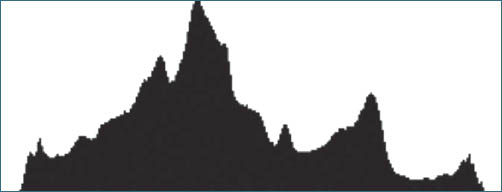
Diagram 11.2: Histogram of a good exposure
For any exposure, if the endpoints of the histogram do not extend to the left and right boundaries, the brightness range of the scene is fully contained within the camera’s dynamic range. If the left edge of the histogram touches the left boundary, some of the lowest brightness levels in the scene may fall below the sensor’s threshold and will be recorded as empty black. If the right edge of the histogram touches the right boundary, some of the brightest portions of the scene may exceed the sensor’s dynamic range and will be recorded as empty white. If you reduce the exposure (i.e., use a higher shutter speed, smaller aperture, and / or lower ISO), the histogram will shift to the left; if you increase the exposure, the histogram will shift to the right. (Keep in mind that the RAW file slightly exceeds the limits of the on-camera histogram, which reflects the more limited range of the JPEG image seen on the monitor. But don’t count on it exceeding those limits by a lot. Some testing and some experience will tell you how far beyond the on-camera histogram you can go. I simply urge caution when pushing the right or left edge of the histogram.)
If the brightness range of the scene is less than the camera’s dynamic range (i.e., when the histogram does not extend to the full width of the display), it’s best to increase your exposure and thereby force the histogram closer to the right edge (rather than the left edge) to take advantage of the increased amounts of information that come with more exposure (short of clipping it at the right edge, of course). This is the critical issue pointed out in the previous section. You simply want the histogram to be pushed as far to the right as possible—short of clipping—to maximize information for your exposure, which translates to maximizing smoothness in your finished image. In other words, pushing the histogram to the right ensures the finest possible imagery. Excellent imagery starts with the best possible exposure—digitally or traditionally—so the attention you put into it at the start is directly related to the quality at the finish.
To see the histogram in action, set your camera to manual exposure. Using an aperture and shutter speed that will underexpose the scene by at least 5 stops, make an initial exposure; increase that first exposure by 1 stop and make another. Repeat the process 10 times and then scroll through the exposures and corresponding histograms. If your first exposure was sufficiently underexposed, the image display will appear black and there will be a thin trace along the left edge of the histogram. With each increase in exposure above the sensor threshold, the right edge of the histogram will move to the right. As you scroll through the exposures, you will come to the point where the deepest shadows are sufficiently overexposed to be beyond the dynamic range of the sensor, the display will appear blank white, and there will be a thin trace on the right edge of the histogram.
Diagram 11.2 shows the histogram for a properly exposed image with the highlight values approaching, but not quite touching, the right edge. This particular histogram also shows that there will be good shadow detail, as the exposure is sufficient to record information in the shadows. If the scene contains specular highlights (such as sunlight glinting off of a curved chrome piece on a car), the histogram from a proper exposure will show some pixels at the right edge. Here is when the flashing overexposure/underexposure display (discussed below) is helpful in interpreting the histogram. Don’t worry about those areas, since you’ll want such specular reflections to be blank white. But if other highlight areas that demand detail show up as being overexposed, reduce the exposure and make another exposure.
Diagram 11.3 shows a theoretic histogram of a good exposure, and diagram 11.4 shows the histogram of the same scene with one stop less exposure. While not optimum, the exposure depicted here will likely produce an acceptable result, although the lower values can be expected to show less separation and possibly some noise.
Diagram 11.5 shows the histogram of the same scene with 2 stops less exposure. The increased gap at the right edge and the bunching at the left edge indicate that the exposure is now seriously underexposed. The concentration at and near the left edge tells us that the image will have blank and noisy shadows. Although a RAW converter may be able to pull out acceptable midtone and highlight values, there will be significant areas of empty black shadows and the overall image quality will be less than optimal. If your initial exposure shows a histogram with the right edge falling as far to the left as the one in diagram 11.5, give at least one stop more exposure and check again. You may need another half-stop . . . and maybe even more. Keep giving more exposure until you get the histogram as close to the right edge as possible.
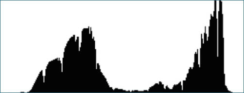
Diagram 11.3: Histogram of another good exposure
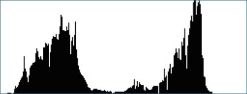
Diagram 11.4: Histogram for an underexposed image
These hypothetical histograms of hypothetical images are designed to give you insight into proper reading of the histogram. I urge every digital photographer to carefully review the histogram on every scene, until you fully understand the relationships between its high and low points and the distribution of light levels (brightnesses) in the scene as you view your camera monitor. Once you can fully understand those relationships, the histogram becomes a quick second-nature check on your exposure, much as the zone system for traditional film exposure becomes a quick procedure that simply becomes a part of your basic workflow. It’s analogous to learning to drive a car: when you’re learning, it requires all your concentration, but once you’ve done it, it becomes second nature when you drive, allowing your thoughts ramble to a variety of other things (though, hopefully, you remain an alert, careful driver).
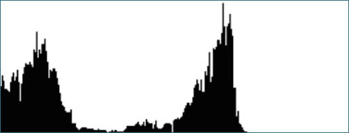
Diagram 11.5: Histogram for image that was underexposed by 2 f-stops
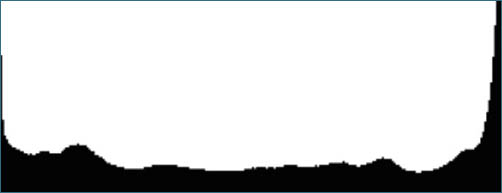
Diagram 11.6: Histogram where the brightness of the scene exceeds the dynamic range of the camera
But, what happens when the brightness range exceeds the dynamic range of the sensor? Diagram 11.6 shows a histogram for such a scene. The histogram shows significant concentrations at and near both edges, which tells you that you cannot contain the entire brightness range of the scene in a single exposure. Here, it would seem that you have a limited set of unpleasant choices: #1) Expose for good shadow detail by giving sufficient exposure to move the histogram away from the left edge and thereby cause additional higher values to be clipped; #2) Expose for good highlight detail by reducing exposure enough to move the histogram away from the right edge and thereby cause additional lower values to be rendered pure black; or #3) Expose for the midtones and live with empty shadows and blocked highlights.
Fortunately, these aren’t the only choices. In the section below under the heading “High Dynamic Range Images—The Extended Zone System for Digital Photography,” we’ll see how to overcome those limitations and extend the range of the sensor by making multiple exposures—though likely no more than two—at various settings and then, in the computer, integrating two or more exposures into a single image. Not surprisingly, the decision of how to proceed depends on your desired interpretation of the scene. While the histogram cannot make the artistic decision, it provides you with the information with which to set the exposure to favor the shadows, the highlights, or the midtones.
Now that you understand the histogram, it’s time to get a feel for how the histogram on your camera’s display responds to changes in exposure, and in particular, increases in exposure as you approach overexposure. This time, let’s obtain a sequence of exposures with the camera on a tripod or placed on a tabletop. Choose as your subject an evenly lit, uniform surface such as an evenly illuminated interior wall. Place the camera a foot or so from the wall, turn off autofocus, use maximum focal length if you are using a zoom lens, and focus at infinity. The idea is to have as uniformly lit a target as possible. Make a series of exposures from grossly underexposed (histogram bunched at the left edge of the display) to grossly overexposed (histogram bunched at the right edge of the display) using one-half or one-third stop increments.
Scroll through those exposures with the histogram display visible and you will quickly get a feel for your camera’s dynamic range, and the amount by which the right edge of the histogram moves with each increase in exposure. The dynamic range can be estimated by counting the number of exposures (how many one-third or one-half stop exposures) it takes to have the majority of pixels move from the left edge to the right edge. Note the sensitivity of the histogram to increases in exposure as the right edge of the histogram approaches clipping. Your understanding of the relationship between changes in exposure and the response of the histogram will serve you well in quickly setting exposures in the field. So far, we have been working with the luminosity histogram, which displays the perceived brightness of the scene with color information being weighted to take into account human color perception. The luminosity histogram is usually sufficient if the final output is to be black-and-white, generally referred to as “grayscale.” For more precise control, which is especially useful for high-fidelity color output, you can view histograms for each of the red, green, and blue channels.
Most cameras allow the user to display the histogram for the three channels in one of a couple of formats: #1) In a three-channel composite similar to the one shown in diagram 11.7 or #2) in three distinct color channels similar to the one shown in diagram 11.8.
Both display formats convey the same information: a channel-by-channel depiction of the distribution of brightness in the basic exposure. If your camera gives you a choice, pick the display that you find easier to read. At the risk of overselling, if you expect your final image to be rendered in color, it is best to view the three-color histograms rather than the luminosity histogram, because the overexposure—clipping—of any one of the color channels may result in a distortion of highlight colors. Even if the final image is to be rendered in black-and-white, it is helpful to be able to review all three channels of information for ease in making selections in your editing software and for maximum flexibility in converting the RAW color file into a grayscale image. Remember, every digital RAW exposure contains the information from which a full color rendering can be produced, even if you intend the final product to be a black-and-white print.
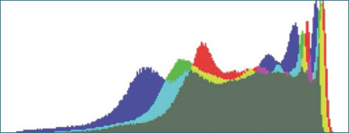
Diagram 11.7: Three-channel composite histogram
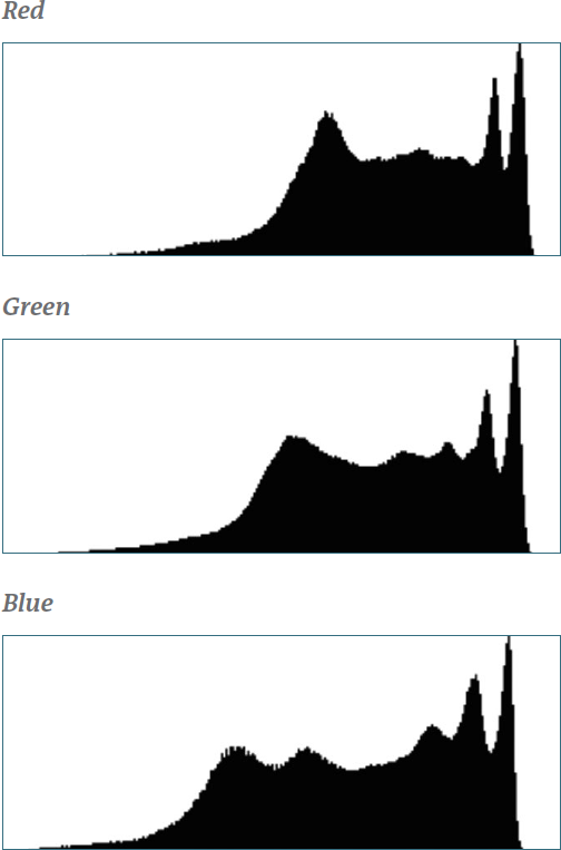
Diagram 11.8: Individual channel histograms
Some cameras have a dedicated histogram button; other cameras permit the user to assign the histogram display to a button. If your camera has, or permits, the assignment of the histogram display to a designated button, you will save time and improve your images by making the assignment and using the histogram button to quickly review your exposures. Most of the exceptionally good mirrorless digital cameras display the histogram together with the image as you are composing, and this can prove especially beneficial to guide you to the best exposure possible. As an additional aid, many cameras can be set to cause the display to indicate areas of underexposure and clipping by highlighting or flashing such areas in a contrasting color. The flashing display is particularly helpful when used with the histogram. If, for example, the histogram shows significant bunching at the right edge but the flashing display shows that the overexposed area is nothing but blank overcast sky, there is no advantage in reducing exposure. It’s best to ignore the apparent overexposure and see if the shadows need additional exposure. If, on the other hand, the flashing area contains important detail, a reduction in the exposure setting or taking two or more exposures (discussed below) may be the best way to proceed.
So, let’s prescribe a sensible sequence that will usually assure optimum exposure (this assumes the scene to have a brightness range within the sensor’s dynamic range):
Start with a test exposure at the exposure suggested by the camera.
- Review the histogram.
- If the histogram is now biased toward the right, you have your exposure and can expose your image. If necessary, adjust the exposure based on the histogram (i.e., give additional exposure if there is room at the right edge of the histogram, give less if the histogram indicates highlight blocking).
- Take a new exposure.
- Recheck the histogram to see if your image is underexposed on the left or clipped on the right, and also (if your camera has this feature) view the image display to check which sub-threshold areas or overexposed areas are flashing.
- Readjust if necessary.
If your exposures consistently require you to apply highlight recovery in your RAW converter, you are probably overexposing; set your camera to reduce your exposures by one-third of a stop and try a few more exposures, using the same procedure outlined above. Repeat the process until you get consistently well-exposed RAW files. Depending on your camera’s controls, it will probably be most convenient to remain in automatic exposure mode and use the overexposure/underexposure setting to bias the exposure for your current lighting and subject environment. Alternately, you can increase or decrease the exposure in manual mode. As long as the ambient lighting and scene conditions remain substantially constant, the same exposure bias should apply. Just be sure to view the histogram from time-to-time to be sure the lighting has not changed significantly. The histogram serves very much like a light meter in this respect, so use it that way.
If you intend to print in grayscale (i.e., black-and-white) you should nevertheless use RAW for your exposures and, if possible, optimize the exposure as you would for color output. Full color high bit depth information will give you the flexibility to alter the grayscale rendering in a manner analogous to using different contrast filters when exposing film (see chapter 12 for details of black-and-white conversion from the RAW color files). In fact, with practice you can even go further, effectively using the equivalent of different filters for different parts of the scene. Imagine the following: you want to use a red filter on the sky (perhaps to increase contrast between blue sky and clouds), and use a green or yellow filter to lighten the foliage in the foreground, but of course you can’t do both in traditional photography, so you chose the best compromise option. However, while postprocessing the RAW file, you can do something that’s equivalent to those wishes of yours by processing each portion of the final image, emphasizing the channel you want for each location. This can be grossly overdone (please refrain from going overboard), but if done with subtlety and sensitivity, it affords a wonderful set of controls.
The histogram is calculated in real time by the camera’s processor from a low-resolution JPEG image, even if the camera is set to record only RAW files. Because the RAW data is recorded in high bit depth and receives only limited processing, the RAW exposure is likely to contain more information in the highlights and shadows than is indicated in the histogram. All of the information contained in the RAW file can be extracted by the RAW converter discussed below and in chapter 12.
Be aware that the histogram and, with some cameras the RAW file, may be affected by camera settings for contrast and sharpening, so you may find it desirable when working in RAW to dial down the setting for contrast and, if possible, turn off (or at least minimize) sharpening. If your camera has memory banks for retrieving camera settings, you will save time by setting one memory bank for your dialed down RAW exposures, and another bank for your typical JPEG settings.
![]() The histogram is very useful in graphically indicating exposure, but its shape is of no artistic significance. The histogram may well indicate a perfect exposure of a perfectly horrible image.
The histogram is very useful in graphically indicating exposure, but its shape is of no artistic significance. The histogram may well indicate a perfect exposure of a perfectly horrible image.
Keep in mind that while the histogram is very useful in graphically indicating exposure, its shape is of no artistic significance. The histogram may well indicate a perfect exposure of a perfectly horrible image. It simply tells you if the exposure is on target. Look to the end points for proper exposure; concentrate on compositional elements for artistic quality. Also realize that when you bias your exposures toward the right edge of the histogram, the camera display may appear washed-out. It’s best to ignore that appearance. You may want to make a second, darker exposure to show you a better rendition of the final image you’re after, but you’ll get better results from the washed-out exposure for final processing, unless you’ve clipped the right edge. But even that washed-out display can be useful for examining distractions at corners and edges, and evaluating overall compositional cohesiveness. You will later correct the washed-out rendering in the RAW converter with simple post-processing adjustments.
The RAW Converter—Processing the RAW Exposure
The processing of the RAW data into an editable image format such as TIFF or PSD requires a number of operations, including demosaicing (de–mosaic–ing), which is the interpolation of the brightness information from each of the photosites into pixels containing red, green, and blue color data; the modification of the linear brightness response of the sensor to correspond to the response of the human eye; the proper rendering of color by setting of the white balance and the making of color corrections through the application of a camera profile; the correction of aberrations; the removal of noise; the increasing of edge contrast, known as sharpening, to compensate for losses resulting from the projection of the image through the camera lens onto the geometric array of photosites; and lastly the saving of the processed image in a recognizable format such as TIFF or PSD. All of these operations, and more, occur in a computer program that we refer to as the RAW converter. A brief explanation of each of the processes is discussed below.
RAW converter programs go by any number of names, many of which do not include the word RAW. Among camera manufacturers, Nikon publishes NX2; Canon publishes Digital Photo Professional; Sony publishes Image Data Converter; and Olympus publishes Olympus Master 2. In addition, there are standalone conversion programs, including Adobe Camera Raw (ACR); Capture One Pro, published by Phase One A/S; DxO Optics Pro, published by DxO Labs; and RAW Therapee, published by RT Team as shareware, to name but a few. Because the structure of the RAW file differs from one camera manufacturer to the next—indeed, sometimes from one camera model to the next—and because some manufacturers encrypt their RAW files, make sure the RAW converter you choose is compatible with your camera.
Predictably, each RAW converter program has its characteristics and each program has its preferred sequence of actions referred to as a workflow. Also, as digital technology evolves, software engineers include an ever-increasing number of features in their converter software. Most software publishers offer a trial version, so you can try a few before buying. As with photographic films, enlarging papers, and developers, every RAW converter has its ardent supporters as well as its detractors. Again, as with traditional photography, you’ll be best served by mastering the features of a limited body of software. For the discussion that follows, I’ll use the ACR converter common to both Lightroom and Photoshop. The user interfaces and controls of other converters will be different but the fundamental principles will apply.
In summary, all RAW exposures require subsequent processing outside the camera in a RAW converter. Each RAW converter has its unique user interface, controls, features, and workflow, and each will render the RAW file differently, in much the same way that different film developers will produce negatives with different characteristic curves.
While the controls for each RAW converter vary, most allow you to zoom to the pixel level, preview the results of prospective changes as you readjust the settings, and permit you to make iterative adjustments. That is, you can go back and change earlier settings based on the results of subsequent settings, and you can make any number of revisions before clicking on the Open Image button. For the preservation of the RAW file, be sure the processed file will be saved separately from the original—you want the original RAW file to remain unaffected and the converted file to be saved in TIFF or PSD format.
We will look at a brief summary of each of the following operations that are available in a RAW converter:
- Demosaicing
- White Balance and Camera Profiles
- Adjusting the Black Point, White Point, and Contrast
- Correcting Aberrations
- Sharpening the Image
- Converting the Image to Black-and-White
- Output Formats and Bit Depth
- Batch Processing
Demosaicing
Demosaicing the color array is the process of filling in the incomplete color information resulting from the brightness data gathered through the CFA (color filter array). That is, the demosaicing process supplies, for each pixel, the two channels of color information not recorded through the specific photosite’s color filter. The RAW converter does so by interpolating from information recorded at neighboring photosites. Because demosaicing requires the estimation of missing color information, and each converter uses a different algorithm, the color rendering of a RAW file will vary from one converter to the next. In other words, the computer fills in the red and green components for each site with a blue filter (and the corresponding channels for the other photosites) based on data from nearby photosites. The demosaicing process results in three grayscale images, one for each of the red, green, and blue color channels, which are integrated by the software into a full color photograph.
White Balance and Camera Profiles
The RAW file is not color balanced. Instead, the camera’s white balance setting is saved as a part of the metadata that accompanies the RAW exposure and becomes the default white balance setting in the RAW converter. Importantly, as with the other setting in Adobe Camera Raw, no color correction will be made until the end of the conversion process, so you are free to change white balance settings, select intermediate color temperatures, preview the results, and change again, all without incurring any losses. This gives you immense control at any time, allowing you to change things as your seeing and thinking evolve.
The ACR’s White Balance drop down menu offers a number of preset color temperatures including Daylight, Cloudy, Shade, and Tungsten, and you can select any value you wish by moving the Color Temperature and Tint sliders or by directly entering numeric values for each of these settings.
Do not confuse these ACR White Balance settings with those on the camera. When you made the exposure, your camera was set to one of the white balance settings available on the camera, such as Daylight, Cloudy, Shade, Fluorescent, or Tungsten or any other to make the image look sensible at the time of exposure (figures 11-2a, 11-2b and 11-2c). That setting is not the same on every Canon or Nikon or Sony or any other brand camera, and now you’ve put that RAW file from your camera into ACR, which has its own settings. You can maintain the original setting by selecting Shot As Is or you can choose any one of ACR’s selections, and/or set things to your own customized values via ACR’s Color Temperature or Tint sliders or fill in your own numbers for those choices. Your choices are virtually unlimited.
Figures 11-2a, 11-2b, and 11-2c: Neon Canyon Wall with Tunnels
My experience in the canyons of Arizona and Utah, from the narrow slit canyons to the wider canyons, is that no white balance setting can replicate the colors of the canyon walls I see before my eyes. The two that come closest are Cloudy (11-2a), which is always too red, and surprisingly, Fluorescent (11-2b), which is always too blue. No other White Balance comes close. However, careful alterations in ACR of the Temperature and Tint controls, Exposure and Contrast, Curves, and the Vibrance and Saturation sliders, with perhaps further alterations in Photoshop via Curves, HSL (Hue, Saturation and Lightness), can create an image from either white balance setting that replicates what I remembered my eye seeing (11-2c). Using those tools I can create a final image from either that is virtually identical to one another. This shows the remarkable control available through these applications.
The variations shown here are at the astounding tunnels that water has carved into Utah’s Neon Canyon, which must be an awesome show at flood stage with water pouring through the tunnels, though it’s unlikely anyone could see the show and survive to tell about it.
Try the presets, move the sliders, and use the settings that render the image as you wish. As with the other settings in ACR, trying different white balance settings alters the RAW data only (but not the original RAW file) and is applied to the processed TIFF or PSD file only when you open or save the image. When you save the converted image, the file will be saved as a new file. The RAW file retains all of the information from the initial RAW exposure should you want to go back to your original and try other converter settings. So nothing is permanently lost from your original RAW file.
For images that require precise color fidelity (suppose you’re photographing a 17th century painting for preservation purposes), you can first photograph a neutral gray or white target in the prevailing light. If you are using a DSLR or one of the more advanced point-and-shoot cameras, the camera will include the measured color temperature in the metadata, and the field determined color temperature will become the default white balance setting in the RAW converter.

In general, I look at my camera monitor to see if the color balance seems right or wrong. Obviously, if I were to go from an outdoor location to one indoors, I will quickly see that the outdoor color balance looks awful under the tungsten or fluorescent (or whatever) ambient lighting is supplied, and I can quickly change the white balance to something more sensible. Of course the same will apply if I transition from indoors to outdoors. Beyond that, I don’t worry much about white balance for two reasons: 1.) If I’m close enough to what I perceive with my own eyes, I recognize that I can use the exacting digital controls to edge the balance to my desires in post-processing. 2.) This is all interpretive anyway, so I will ultimately present the colors as I want them presented, whether they exactly match reality or not. This is the essence of personal interpretation. (Just consider how far any black-and-white photograph departs from reality, and yet we still talk about it being “realistic” or not.) I simply do not want to start the process so far from what I’d like that I’m placing unnecessary obstacles in my path toward obtaining my desired image.
Color temperature and balance are but two elements of the larger subject of color management—the science and art of causing each color in the scene to be rendered identically throughout the digital process. It is the goal of a color management system to cause the colors in front of the camera to be accurately rendered on your computer display, on the Internet, and on the final print. In reality, the goal cannot be achieved fully because each physical device has a limited universe of colors that it can render, display, or print. Furthermore, reflective images (prints) have different properties than do light-transmitted images (such as computer displays and transparencies). The universe of color that any device can record or reproduce is known as its “gamut” and, in the real world, the gamut of the camera is larger than the gamut of the computer display, and the gamut of the display is different from and often larger than the gamut of an inkjet printer. Diagram 11.9 shows a graphic depiction of the gamuts of the visible spectrum, the Adobe RGB color space, the smaller sRGB color space, and the gamut for a typical inkjet printer, though printer improvements—and therefore gamut increases—are occurring.
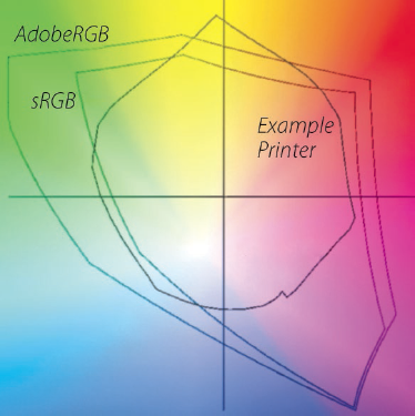
Diagram 11.9:
Graph of gamuts for human vision, Adobe RGB, sRGB, and a typical inkjet printer.
(Graphic created by Stephen Laskevitch.)
The task of maintaining color consistency across physical devices is the function of the color management system. Needless to say, the subject of color management is highly technical, and beyond the scope of this chapter. However, there is one part of color management that you should be aware of as you convert your RAW files and that is the subject of camera profiles. Camera profiles are data tables used by the RAW conversion and image-editing software to cause the computer display to render color as it appeared at the time of the exposure in the field.
Camera manufacturers and software vendors include profiles in their proprietary RAW converters, thereby ensuring consistent color rendition across its family of cameras. ACR offers a default profile for almost all cameras and, for the ultimate in color control, allows the photographer to apply a custom profile for any specific camera and lens combination. If you are working with ACR, you can access any custom profile you may have under the Camera Calibration tab. As you work with camera profiles and white balance, keep in mind that color rendering is subjective and is therefore fair game for the exercise of artistic judgment. There are no absolutes; there are no rules. Always keep your options and goals in mind, for they’re the heart of expressive photography (and, in fact, of all art).
Adjusting the Black Point, White Point, and Contrast
The response of the camera’s sensor is linear, meaning that a change in brightness produces a proportional change in electrical response. Because the linear response of the sensor, without modification, produces a low-contrast, dull photograph, the RAW converter must modify the contrast to render an acceptable image. In addition, the RAW converter must set the black-and-white points, that is, the brightness levels which will be rendered pure black and pure white. In ACR, the settings that control what levels are to be rendered pure black, pure white, and contrast are found under the Basic tab. It is generally useful to modify the settings in the order in which the sliders appear in the user interface. Here is where you can take the washed-out image that you see on your camera display and change it to get the full tonal range you want in the final print.
To most quickly familiarize yourself with the tools of ACR/Lightroom and Photoshop, I strongly recommend working with an image on your computer monitor as you march through the tools available in both applications in this chapter and the next. Without an image in front of you on your screen, what you read takes on theoretic value only, whereas actually working with an image as you read about the tools accords substantive meaning for each of them. (It’s like learning to drive a car: you’ve got to get behind the wheel to make it real. Reading about driving in a book or learning about it in the classroom will not make you a good driver.)
So, let’s get going. Perhaps the most important aspect of the new version is that upon opening the image the Creative Cloud (CC) version of ACR initially displays more detail in both the highlights and shadows than the older versions. So, before you have to resort to the sliders to bring desirable detail into your image, the CC version of ACR gives you more to work with. This is a marvelous improvement. Some of my RAW files that needed Recovery or Fill Light control in the older ACR versions need none in the CC version; those that required significant adjustments in the past tend to need only minor adjustments in the newer CC version.
On the ACR Basic panel start by adjusting the Exposure. This allows you to brighten or darken an image . . . but keep in mind that if you “properly” exposed the image by pushing the histogram to the right, you’ll generally be darkening the image by moving the slider to the left. Pushing the slider to the right is not as good, since you’re introducing some false data. So, push the Exposure slider to the right only when necessary.
Beyond that, things have changed with the CC version of ACR. In the past, you could recover apparently clipped, but important, highlight values using the Recovery slider, thereby setting the white point, then by using Fill Light to lighten shadows, and Blacks to set the black point. Then proceed to the Clarity, Vibrance, and Saturation sliders for fine-tuning. Although editing the washed-out RAW exposure can be postponed until you edit in Photoshop, it is generally best to get as close to the final image as early in the process as possible, and make your refinements later on.
Also, in the older editions of ACR, the Exposure and Recovery sliders set the white point; the Blacks slider set the black point. The white point is where you begin to see the brightest portions of the image rendered in red on your monitor; the black point is where you begin to see the darkest portions of the image rendered in blue. Together, the three sliders provided the pure black and pure white endpoint references from which the other tonalities are measured; however, the settings do not compel you to include pure black or pure white in your photograph.
In the CC version of ACR the controls have changed significantly. The Recovery and Fill Light sliders are gone. Instead there are sliders labeled Highlights, Whites, Shadows, and Blacks, which more accurately control different tonal values of the overall image. For example, the old Recovery slider brought in good detail in apparently lost (i.e., overexposed or clipped) highlight areas, which tended to be information contained in the RAW file but invisible when viewing the JPEG image on the camera’s monitor or the RAW file when first brought up on the computer monitor. Sliding the Recovery slider from the starting point at 0 to 10 or 20 often brought in significant detail. However, pushing it beyond that level often introduced major undesirable artifacts throughout all other tonal portions of the image. The latest CC version eliminates those undesirable effects through more effective algorithms of the Whites and Highlights sliders. These new sliders are better confined to the lighter tonal range of the image.
I recommend putting up an image, and moving the sliders to the right and left while viewing the changes in both the image and the histogram to see how each slider affects the image. There is overlap, so the best approach is to work the sliders on a number of images to get a feel for how they work, and how they overlap. Careful use of the two bright tonal range sliders will bring in as much or more detail into highlight areas without the strange defects that plagued the former Recovery slider when pushed too far.
At the other end of the scale, the Shadows and Blacks sliders can be employed to alter those portions of the tonal range without the adverse defects of the older controls. But always beware of the noise that can accompany recovered detail in the darkest portions of an image.
Note that at the upper right and upper left of the histogram are small triangles. Click on those to toggle between viewing the image with red showing up all areas of blank white (right triangle) and blue showing in all areas of dead black (left triangle), or toggled the other way, viewing the image without the warning colors. When viewing the image with the warning colors turned on, the moment the first bit of red shows in a white area, that’s the “white point”; when the first blue appears in the black area, that sets the “black point.”
However, you may find that the apparent recovery of highlight detail can be deceptive at times. Blown-out highlights in the RAW file appearing as red on the computer monitor may quickly disappear as you move a slider to the left, indicating that detail has been recovered. But sometimes the blown-out white areas may be replaced by indistinguishable light gray, with no tonal variation, although it is no longer pure white. On the dark end of the scale, detail may show up, but beware of the amount of noise that shows up with it. You’ll have to balance the detail versus undesirable noise to suit your taste.
I must admit to a serious personal dislike of the order in which these sliders are now positioned on the Basic panel. It seems to me that they should be placed in logical order from the brightest to the darkest (or vice versa), but instead they are shown on the Basic panel in the order of Highlights, Shadows, Whites and Blacks. I suspect Adobe has a rationalization for this order, but it eludes and irritates me.
If you want to produce a high-key image, the best way to start is by pushing the histogram to the right during image exposure in the field (and the “field” can be anywhere, indoors or outdoors, controlled, as in a studio, or uncontrolled, as in pure nature). If the tonal range of the histogram is relatively small, all tones will be rendered as quite light. If the tonal range is greater, you should see how increasing the Exposure, Whites, and Highlights settings, and perhaps pushing the Shadows and Blacks sliders to the right, can render the darkest portions as midtones or light tones. Don’t confuse the setting of the black point with having a black in the image. ACR will set a black point, or you may well set a black point, but a high-key image may still have nothing darker than a midtone gray. In other words, the black point is a reference from which other tonalities are measured, but you do not have to have any black in your image. So, setting a black point doesn’t force you into having a black if you don’t want one. Nor, of course, does setting a white point force you to have a white when none is desired. (See figures 3-4 and 3-5, respectively, as examples of images lacking a black or a white.)
If your initial exposure appears too dark, you can increase the exposure (i.e., push the Exposure slider to the right), and the histogram will reflect the lighter rendering by moving to the right. As the histogram is driven to the right, pixels near the right edge reach the edge, indicating that the brightest pixels will be rendered pure white. Conversely, decreasing the Exposure setting will darken the image and shift the histogram to the left.
While the Exposure slider shifts the entire histogram to the right, the Whites and Highlights sliders control the extreme highlights by allowing you to dial back the highest values. To fine-tune the rendering of the extreme highlight values, move the Exposure slider to the right to increase overall exposure and then move the Whites and Highlights sliders to the left to restore highlight details. Depending on the amount of exposure the highlights received, you may be able to recover detail in some or all of the highlights that appear in the camera’s histogram display to be blocked. By working the Exposure and Whites and Highlights sliders, you can adjust the appearance of the image. However, if the initial exposure is too badly overexposed (i.e., clipped), all clipped pixels will be rendered pure white.
As an extremely valuable aid in setting the white point, hold the Option/Alt key while moving the Exposure or the Whites and Highlights sliders. The screen will appear black except for those areas that will be rendered pure white. As you move the Exposure, Whites, and Highlights sliders to the right, more of the image will be rendered pure white and will appear red on the screen. As you move them to the left, more of the highlights will disappear into the black screen indicating they will not be rendered pure white. Release the Option / Alt key to view the image. Adjusting the three sliders individually to fit each image will give you the best choice for that image. Again, be mindful that just because you have the control to render portions of the image as blank white, you are not required to do so and in most instances you will want only small areas of the image to be rendered pure white. Your artistic judgment should guide you in deciding which areas, if any, should be rendered pure white.
Thus far, we have addressed the lighter portions of the image; we now turn to the darker areas by setting the black point. This time move the Exposure, Blacks, and Shadows sliders to the left or right to render the darker portions of the image as pure black (where the observed darkest areas are shown on the monitor as blue). To observe the areas that will be rendered pure black as you move the sliders, hold the Option/Alt key while moving any of them or several of them. The screen will appear white except for those areas that will be rendered as pure black. Again, there is no requirement that you render large portions, or any portion, of your image pure black; use your judgment.
Last, the display of your work, whether it is backlit as on a computer display or reflective as with an inkjet print, will influence the appropriate setting of the black-and-white points in an image. Backlit displays will reveal details in deep shadows that would be lost in an inkjet print. Similarly, highlight tonalities will appear different depending on whether they are backlit or reflective. Indeed, prints may need to be adjusted for different viewing conditions. Observation of your work under various lighting conditions will soon give you the judgment to relate the appearance on the computer display, and the numerical data from your software’s color sampler, to your intended form of output. It will prove to be of great help to use the eyedropper tool in Photoshop as a densitometer to correlate the image on the screen to your output, and this will be particularly useful for printed output.
In practice, try all of the controls, observe the image as you change settings, and remember that you can keep changing the settings until you get the result you desire. In other words, play around with it. Toggle the triangles in the upper-left and right-hand corners of the histogram on and off to display any areas of underexposure and overexposure. See what you can and can’t do. Experiment. Only when you tell the program to Open Image (or Save Image or Done) will the settings be applied and the results be saved as a converted image.
In addition to using these five sliders in ACR together with other adjustments you make in ACR (see chapter 12 for a review of the most useful adjustment tools), after you finish adjusting the RAW file in ACR and open the image in Photoshop, you can further fine-tune the settings using a Curves layer. To illustrate using Curves, first create a new Curves layer: From the Layer menu select New Adjustment Layer and choose Curves. Photoshop will prompt you for a name for the new layer. Insert a descriptive name such as Global Contrast, and click OK. The Curves palette will open and present both the histogram and a default 45° straight-line curve. At the lower left of the histogram is a black triangle that sets the black point of the image. Moving the black triangle to the right forces darker pixels to pure black. Hold the Option/Alt key down and slide the black triangle to view the portions of the image that will be rendered pure black. Similarly, at the lower right of the histogram is a white triangle that sets the white point of the image. Moving the white triangle to the left forces brighter pixels to pure white. Hold the Option/Alt key down and slide the white triangle to view the portions of the image that will be rendered pure white. While you have the Curves layer open, you can adjust the overall appearance of the image by altering the curve. This, of course, is the primary use of the Curves layer, and the one I employ mostly for the work I do in Photoshop. To me it is the most valuable of all the Photoshop tools.

Figure 11-3a: HDR—View from My Home: Highlight exposure
Any single exposure of this scene exceeded the dynamic range of the camera sensors. This “Highlight” exposure retains detail in the exterior snow-covered slopes of Mt. Pilchuck, and also the interior sunlit angled ceiling of our living room. Fading into black on both sides are the stone fireplace (on the left) and louvered closet doors to the right, and a large potted plant and vase to the right of the stairway.
Correcting Aberrations
The projection of the scene through your camera lens onto the photosite-CFA induces a number of undesirable effects including color fringing, vignetting, the introduction of noise, and loss of sharpness. RAW converters have a number of tools for the correcting of aberrations. A high quality, calibrated monitor zoomed in to 100% magnification will provide a uniformly lit viewing environment and will aid you in correcting your RAW conversions.
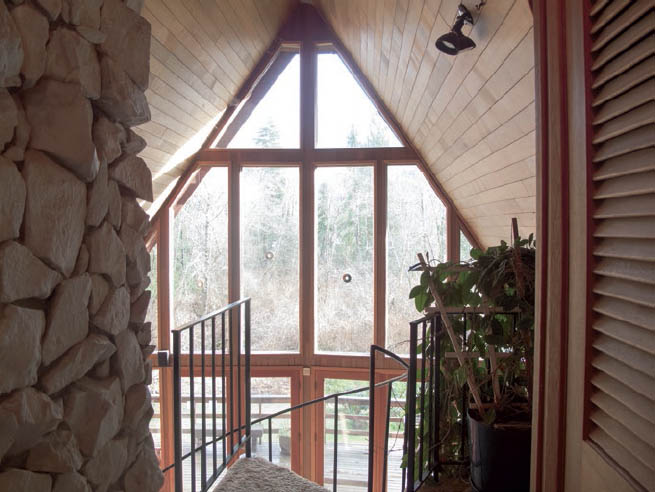
Figure 11-3b: HDR—View from My Home: Shadow exposure
The exterior is utterly washed out in this exposure, with major sections clipped, including the interior sunlit ceiling, but all of the areas that were black in the highlight image are now revealed with detail, including the stone fireplace and louvered closet doors, even without the ACR/Lightroom lens corrections. Hopefully, seeing the uncorrected curved line with barrel distortion will prove bothersome enough to you, the photographer, that you’ll always correct this lens problem (unless you want to have it for specific expressive purposes.
Many zoom lenses exhibit barrel distortion (e.g., if you had photographed a perfect grid of horizontal and vertical lines straight-on, the center is slightly bubbled out toward you, with the edges pushed out in the center of the image’s edges, and coming back together at the corners) at one end of the zoom range and pincushion distortion (e.g., where the center is puckered in, with edge lines pushed inward at the center of each edge, and pushed outward toward the corners) at the other end of the zoom range. If your RAW converter (ACR/Lightroom or another converter) supports your camera model, you can quickly correct for either lens distortion. For most images, you’ll never see the distortions, but if you’re working with architectural subjects or anything that requires perfect fidelity, even minor distortions can be distracting, bothersome, or fatal. See figures 11-3a, b, and c, exhibiting barrel distortions, purposely left uncorrected. In particular, you can see how the vertical edge of the louvered door on the right “bubbles” out toward the edge in the center, curving back inward at both the top and bottom of the image. This common lens aberration is easily straightened with a 100% distortion correction.
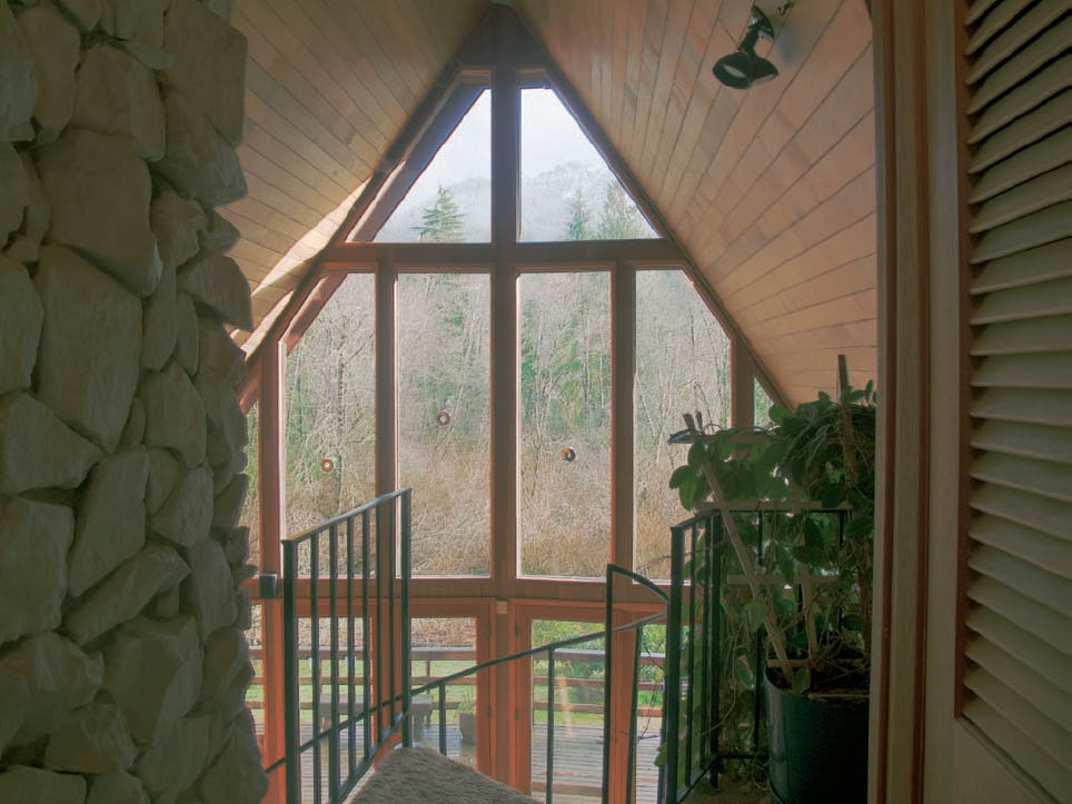
Figure 11-3c: HDR—View from My Home: Composite
Following the steps detailed in the text, 11–3a and b have been combined to create this full range image, in which detail shows throughout. Final adjustments were made in Photoshop using Curves and HSL to refine the composite to replicate how my eye saw the scene as it moved around it, seeing detail throughout. Yet the image exhibits good tonal separations throughout, and a believable look to enjoy the view from my armchair.
See if your camera and lens are included in the ACR list. If not, check periodically to see if they were belatedly added (you may have purchased a new camera/lens combination not yet included in the ACR list, but due for inclusion soon, which can be used with an online update). The images discussed above were made with an excellent but older point-and-shoot camera, not a digital SLR.
The uniformity of the viewing environment (i.e., the ambient lighting where you view your computer monitor) is critical, for if your ambient lighting changes throughout the day and night, you can’t tell with any degree of precision what you’re working with. You’re playing a game with movable boundaries. So, if your monitor sits adjacent to an open window, things look quite different on a sunny day, a cloudy day, at night, or under any other set of changing conditions. If you’re serious about obtaining the best possible images, you must create an environment where the lighting remains constant whenever you are working. This is the equivalent of proper inspection of traditional prints in a standard darkroom under two different light brightnesses discussed in chapter 10, and the importance of consistent ambient lighting for judging your digital imagery cannot be overstressed.
In ACR, the Lens Corrections tab includes sliders to correct for color fringing and for lens vignetting. The Sharpening tab contains the settings for noise reduction. The Camera Calibration tab is the place to import and apply any custom camera profile you may have and to fine-tune the color rendering in each of the color channels. Move the sliders and study the results. When you have arrived at a group of settings that gives consistently good results with your camera-lens combination, you can save the settings for each tab in ACR and apply the settings automatically to any number of exposures taken with the same camera and lens.
Typical of ACR, the settings are not applied until the image is processed, so you can go back and forth between settings and tabs if necessary, and your custom settings can be saved and recalled for reuse.
![]() If you’re serious about obtaining the best possible images, you must create an environment where the lighting remains constant whenever you are working.
If you’re serious about obtaining the best possible images, you must create an environment where the lighting remains constant whenever you are working.
Sharpening the RAW Exposure
One area of image correction that deserves particular attention is that of sharpening. Each step in the process from the initial exposure to print causes a degradation in the sharpness of the image. The fix is what is referred to as sharpening and works by increasing the local contrast along the boundaries between lighter and darker portions of the image. In theory, the software finds edges (the boundaries between lighter and darker areas) and then darkens the darker side and lightens the lighter side of the edge. In practice, what Photoshop registers as an edge may simply be an area of local contrast where you do not want to exaggerate tonal differences. To be effective, sharpening must be strong enough to carry the illusion of sharpness but not so strong as to create undesirable halos or visible outlines, introduce granularity in areas of more or less smooth tonalities, or worse yet, pucker skin tones. Not surprisingly, the difference between effective sharpening and oversharpening is often small, leading to the truism: sharpen but don’t oversharpen.
Common practice is to perform sharpening in two stages. First, do a modest sharpening in the RAW converter to produce a realistic presentation with which to do your editing, and then do a second, output sharpening just before printing. Every photographer has his or her approach to sharpening and you will acquire your own.
To get started with sharpening in ACR, you will find the sharpening controls under the Detail tab. Zoom in to view the image at 100%. To see the effect of your changes, first exaggerate the Amount setting, and then refine the Radius and Detail sliders. As a rule, images with predominately fine detail (e.g., pine needles on the ground, old wood on an abandoned building, stonework inside a cathedral, etc.) often look best with a small radius setting such as 0.7–0.8, and images with areas of smooth texture (e.g., skin tones, lightly rippled water, smooth surfaces like concrete) often look best with a radius setting of 1.2 to 1.4.
Next adjust the Masking slider to confine the sharpening to the true edges. Increasing the masking slider restricts the sharpening to tonal differences that are more likely to be edges. If you want to view the mask as you make changes to the Masking setting, hold down the Option / Alt key and move the Masking slider. The black areas are masked and will not be sharpened; the white areas are treated as edges and will be sharpened. Finally, dial down the Amount until the overall effect is barely visible when viewed at 100%. Use the preview check box to toggle between the sharpened and unsharpened versions. Refine as needed but resist any temptation to oversharpen. Depending on your camera, your computer display, and a number of other variables, you may find you need to increase or decrease the Amount. As you gain experience with different subject matter, you will acquire the judgment to sharpen any number of RAW files of similar subject matter. You can save and recall the sharpening settings you routinely use.
The second stage of sharpening, output sharpening, should not be done until the image has been fully edited, saved as a separate file, resampled to final print size, and any layers you may have created in Photoshop have been flattened. The settings for the output sharpening depend on a number of factors including print size, image content (whether the image is made up of fine detail or broad areas of smooth tonalities), viewing distance, and the output medium (whether printed on glossy or matte paper).
Converting the Image to Black-and-White
Digitally, there are a number of approaches for converting the full color RAW file to grayscale. For example, in ACR, go to the HSL/Grayscale tab and check the Convert to Grayscale check box. On the image window, use the Target Adjustment Tool (use the v key as a shortcut) and drag the cursor over portions of the image. ACR will increase or decrease the percentage contribution of the color you dragged over. Alternatively, you can move the color sliders and observe the changes in the resulting grayscale image. Keep in mind that the resulting image will be saved as a grayscale image that you can convert to a three-channel RGB image in Photoshop if you wish.
If you’re working with the Develop module of Lightroom, you can use the On-Image adjustment tool to adjust the conversion of specific areas of the image. In the HSL-Color-Grayscale box, click on the double arrow symbol to the left of the palette, place the cursor over any part of the image, press the mouse key, and move the cursor up or down. Moving up will lighten the value of the color beneath the cursor; moving down will darken the value. Make changes over other parts of the image and watch the grayscale image change.
As an alternative to converting from color to black-and-white in ACR or Lightroom, you can save the file as an RGB color file and do the conversion with a Black and White adjustment layer in Photoshop. (Before moving on, I should note that all experienced digital practitioners avoid converting the color image to Grayscale as a conversion because so much control is lost, and all color information is destroyed.) In Photoshop, in the Layers menu select New Adjustment Layer and choose Black and White. An Adjustment palette will open. Click on the On-Image adjustment tool (indicated by a pointing hand and a double arrow) in the upper left of the palette, go to the image, click on an area, and move the cursor left and right. Moving to the right will lighten the grayscale rendering of the color information under the cursor: moving to the left will darken it. Move to different areas and repeat until you get the rendering you want. Alternatively, or in addition to using the On-Image tool, you can work the color sliders in the Adjustment palette and observe the results. One of the features of the Black and White layer is that the layer is nondestructive; you can always revise the Black and White layer settings after you have made other adjustments. You can also make more than one Black and White adjustment layer, compare the results, and use layer masks to reveal different portions of different Black and White conversion layers. I discuss more about masking below.
Output Formats and Bit Depth
Output from the RAW converter should be saved using a file format that preserves all of your hard-earned data. The two most commonly used formats are TIFF and PSD. Although there are technical differences between the two, both will preserve all of your photographic information as long as you set the output to be saved in 16 bits / channel with the color space set to ProPhoto RGB. Be aware of the fact that the default option of importing a RAW file from ACR to Photoshop (with whatever changes you made in ACR) is to open it as an 8-bit file. You will have to change that default to 16-bit to maintain high quality. There is a further option for 32-bit output, but you’ll have to balance that with the enormous size of the file that would create. (It seems odd—almost incomprehensible to me—that Adobe sets the default to 8-bit rather than 16-bit for a RAW import.) In ACR, the output settings for 8-bit, 16-bit, or 32-bit files are located at the bottom center of the image window.
Batch Processing
To save time, RAW converters permit the batch processing of selected exposures and will run in the background while you edit a different image. This means that you can apply the settings for a particular subject and lighting condition to any number of exposures. To batch process in ACR, select the RAW exposures you want to batch process using Command-Click (Mac)/Ctrl-Click (PC) in Photoshop Bridge. Press Command-R (Mac)/Ctrl-R (PC) to open ACR, click on one of the images listed on the left-hand side of the window, and fine-tune the selected image using curves, color balance, or any of the other adjustments. When you are satisfied with the settings, press the Select All button in the upper-left corner of the window, then press the Synchronize button immediately below. The Synchronize panel will prompt you for a list of the adjustments you wish to apply to the other exposures; the default is to apply all of the settings other than Crop, Spot Removal, and Local Adjustments. Because you selected a series of exposures of similar subjects under similar lighting conditions, you can go with the defaults unless you have a specific reason not to apply a particular setting to an exposure. Press Save Images located at the bottom left. ACR will present the Save Options panel; complete the panel and click Save. ACR will apply your settings, convert the images, name, and save the converted files to the designated file folder.
High Dynamic Range Images—The Extended Zone System for Digital Photography
Suppose the brightness range of a scene exceeds the dynamic range of the sensor. The histogram will touch each edge as shown in diagram 11.10. This is where high dynamic range (HDR) imaging comes into play. HDR is where you can make several exposures to encompass the full range of a high-contrast subject, and then combine them to access the full range from the darkest to the brightest portions of that subject. For example, you can make two exposures: one that encompasses all of the darkest tonalities in the scene, and goes well into the midtones (while all highlights are blown out, i.e., clipped), and another that encompasses all of the brightest highlights and down into the midtones, while everything darker plunges into meaningless black (where there is no useful information, i.e., no recorded data). Or you can make three exposures: one for the brightest highlights, a second for the midtones, and a third one for the dark shadows. In all cases there must be overlap of the brightness ranges to encompass the full tonal range of the scene.
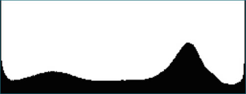
Diagram 11.10: Another histogram where the brightness of the scene exceeds the dynamic range of the camera
However, major improvements in the dynamic range of camera sensors, and further refinements in Lightroom, Photoshop, and similar applications that can pull in more useful information from your RAW file, have made the need to resort to HDR progressively less important. In particular, today’s digital camera sensors encompass a greater tonal range than those available just five years ago, and these constitute the most important recent digital advances. With many of today’s cameras and with the post-processing applications now available, you can now encompass the full dynamic range of nearly all subjects.
But not all. So there’s still a place for HDR in today’s digital world . . . and there may always be one. (It’s much like the need for “compensating development” with traditional black-and-white film processing, which I detailed in chapter 9, including the two-solution development that I invented in 1996, which further extended the film capabilities in high-contrast situations, even after using the single-solution development procedure so successfully for 16 years.)
In the first edition of this book, several different approaches to employing HDR were presented. I don’t believe all are necessary to detail due to the technological advances I’ve just mentioned above. So I’ll confine this brief discussion to the one I feel is most relevant and easiest to use.
Let’s start by nailing down a method of determining the number of exposures needed—now, rarely more than two—to encompass the full dynamic range of the scene when it exceeds the limits of the histogram. Use a tripod, either a remote/cable release or the camera’s self-timer, and mirror lock-up, if available, to eliminate vibration and to record all of the exposures in registration. Focus any way you like (on a stationary subject) and then set the camera to manual focus to assure the camera does not change focus with successive exposures. Set your camera to manual exposure mode (you don’t want to change depth of field), select an aperture based on your desired depth of field, and make a test exposure. Review the histogram of the test exposure and adjust the shutter speed (but don’t change the aperture or refocus as changes will affect the depth of field or image magnification) so that the highlight (right) side of the histogram falls approximately one-quarter of the way from the right edge of the display. Now make your first exposure of the series.
Increase the exposure by a full stop and expose again. (Note: Generally, full-stop bracketed increments are fine, though you may prefer greater or lesser steps.) Review the histogram—it will have moved to the right. Again, increase the exposure by a stop and expose again. Review the histogram again—it will have moved farther to the right. Repeat while incrementally increasing the exposure and reviewing the histogram until the shadow (left) side of the histogram enters into the display and falls approximately one-quarter of the way from the left edge of the histogram. That’s it! You’ve now recorded the entire brightness range of the scene.
Later, during post-processing, you’ll combine the exposures to make a final image that encompasses the entire brightness range of the scene. You might not need all of the exposures, as there will be significant overlap. In the majority of cases just two will probably suffice. Maybe three. There are a number of ways to combine several “bracketed” exposures into a single image, and combining additional or different exposures will produce a different result, so if you are not satisfied with a particular combination, try different combinations.
Below, I describe two different approaches to merging multiple exposures: one technique for two exposures and another for three or more. For these approaches you should work directly from your RAW files. The techniques discussed below require that all of the images be of the same pixel dimensions, so work with uncropped images.
With today’s digital cameras and sensors, and their expanded brightness ranges, virtually any scene can be recorded with just two successive exposures taken two, three, or four stops apart. If the histograms of two bracketed exposures fully contain detail throughout the entire brightness range (fully contained on the left; no clipping on the right), then two exposures are all you need. That should suffice for nearly all situations you’re likely to encounter.
Now that the two files are ready, we will look at how to combine them.
Using Two Exposures and a Luminosity Selection in Photoshop
With this procedure, the computer makes a selection in proportion to luminosity and uses the selection to paint on a layer mask. When you give the command to make a luminosity selection, Photoshop will select pixels in proportion to luminosity: white being 100% selected, perceived middle gray being 50% selected, and black not selected.
Prepare the two images in ACR (or whichever RAW converter you normally use): refine the good highlight exposure to properly render the lighter values, and save it with a name that includes the term “Highlights” (figure 11-3a). Refine the darker values of the other exposure and save it with a file name that includes the term “Shadows” (figure 11-3b).
The thing that may prove confusing at first is that the Shadow Image is the bright one; the Highlight Image is the dark one. Once you give it just a bit of thought, the confusion clears up. The Shadow Image is the one picking up detail down toward the darkest portions of the scene; therefore, in grabbing detail down to the darkest portions of the scene, the rest of it will be quite overexposed (i.e., likely clipped) . . . hence it’s quite bright, overall. The Highlight Image picks up detail in the brightest highlights, and then goes quite dark in the rest of the image; hence it’s quite dark overall. Confusing at first? Yes. Logical upon further thought? Yes.
Open the two images in Photoshop and arrange them so that both are visible, and be sure the Layers palette is visible (if not, go to the Window menu and click on Layers). Next, make a copy of the Background in each of the images; do so by activating one of the two images and in the Layer menu select Duplicate Layer, and then repeat the process for the other image. Now, rename the new Background Copy layers with the names “Highlights” and “Shadows,” respectively.
It’s time to move the Highlights layer to the Shadows image. To do so, select the Move Tool (top tool on the left side, or press “v”), activate the Highlights image, and using the Move Tool Shift-drag the Highlights image over the Shadow image and release. The Highlights image will appear as the top layer in the Shadow image. If, for some reason, the Shadow appears above the Highlights layer, drag the Shadow layer down in the Layers palette. Now that we have the two images as layers in the same photograph, save the composite as a new file with a file name that includes the word “Composite” in the title and close the Shadow file. If the exposures were handheld, auto-align the layers, select all of the layers by doing a Shift-click on every layer, and then from the Edit menu select Auto-Align Layers. Photoshop will move the layers into alignment.
Now that you have both images in a single Photoshop file, the objective is to create a composite image containing shadow information from the Shadow layer and highlight information from the Highlight layer. In the steps set out in the next paragraph, you will make a luminosity selection of the Shadow layer (that is, select the brightest, and therefore overexposed, portions of the Shadow layer) and use the selection to create a mask on the Highlight layer. The luminosity mask will mask the darker (underexposed) portions of the Highlight layer, thereby allowing the good shadow detail from the Shadow layer to contribute to the composite. If this sounds confusing, try the steps below on a few images and the logic will become apparent.
Here are the steps. In the Layers palette make the Highlights layer not visible by toggling off the eye symbol. Next, make the Shadows layer active and visible, and do a luminosity selection by pressing Command-Option-2 (Mac) / Ctrl-Alt-2 (PC). Photoshop will select pixels of the Shadows layer in proportion to their luminosity. That is, Photoshop will select the overexposed and brighter portions of the Shadow layer. The marching ants on the display will outline the areas of the Shadows layer having a luminosity of 50% or more. The last step is to follow the exact same procedure to make the layer mask for the Highlight layer, which reveals the luminosity selection, that is, reveals the brighter portions of the Highlight layer and masks its darker portions. At this point, you’ll have two layers, each with marching ants strutting around them. To make the layer mask, activate the Highlight layer and make it visible; in the Layer menu select Layer Mask and choose Reveal Selection. Photoshop will build a layer mask that reveals the lighter portions of the Highlight layer and conceals the remainder of the layer. Be sure to then toggle the Shadow layer back on—along with the highlight layer—to see the composite.
The result is a composite of two layers with the visibility allocated in proportion to the luminosity. You can fine-tune the relationship between the layers by reducing the opacity of the Highlights layer in the Layers palette. Save the composite image and then make additional post-processing adjustments in Photoshop as needed. See chapter 12 for discussion of the basic tools used in ACR and Photoshop, but after getting your composite image as detailed above, Curves would be my recommended choice for final adjustments, along with any other adjustment, such as HSL (figure 11-3c). After all, before creating the composite, you’ve worked to refine each of the two component exposures in your RAW converter, so most of the preliminary work has already been accomplished. Now it’s simply a case of refining the composite. If you have not corrected for lens aberrations in ACR, it’s too late. There is no such tool available in Photoshop. So if lens distortion is critical, you must make the correction in ACR before layering them into a single file in Photoshop.
The luminosity mask in Photoshop is but one example of using a mask to restrict the effect of an adjustment to a particular portion of an image. This procedure should cover virtually all high-contrast situations you’re likely to encounter. In fact, the example in figure 11-3c, which encompasses an extremely wide range of brightnesses, was produced with an older digital camera that doesn’t have the sensor range of the newer cameras.
There are always limitations. One key limitation is when you’re dealing with a subject that is in motion or any part of a scene that may be in motion, where two exposures may create unacceptable dissonance simply because the two don’t mesh. When the brightness overlap is in an area of motion, be aware of the possibility that two exposures may not work, though it’s certainly worth trying. It’s worthwhile being a bit experimental; sometimes it works, sometimes it doesn’t . . . and it can be wonderful when it does. Try it and have fun doing it.
Before moving on to the next HDR procedure, let’s add a few words about the point-and-shoot camera used for this example. It’s an older camera with limited dynamic range in its sensor. Most of today’s digital sensors have greater dynamic range. Yet even with its limited dynamic range the extreme range of brightness was successfully accommodated with just one highlight and one shadow exposure. The scene includes sunlight hitting the slanted A-frame ceiling, a distant mountain disappearing into high clouds, and an inside plant with deep green leaves in a black vase, for which there was no desire, intent, or attempt to obtain detail. The vase was intended to remain black on the shaded side facing the camera, for my eye saw no detail in it. This is a scene of extreme contrast. Could more exposures have provided more detail? Perhaps. That’s where you have to make the decision of when enough is enough.
Concerning the barrel distortion of the lens, I could have corrected both the highlight and shadow exposures during the ACR post-processing, and then merged them in Photoshop as explained, which would have given me a final image with no such distortion. For illustration purposes, I chose to leave the aberration uncorrected, in hopes that you find the final image disturbing enough to force you to make such lens corrections when they are obviously needed . . . if not for every exposure.
Let’s get back to HDR needs. In the most extreme lighting situations, there could be a need for more than two exposures, which will be explained in the next section.
Using the Merge to High Dynamic Range Function in Photoshop for Multiple Exposures
To accomplish the first step, merge the three or more exposures you’ve made; in the File menu, select Automate and choose Merge to HDR Pro, which will open the Merge to HDR Pro dialog box. In the dialog box, use Browse, and select the RAW exposures you wish to combine. (Note: If the several RAW exposures were handheld, check the Attempt to Automatically Align Source Images box, and then click OK.) When you’ve selected the several RAW exposures, click OK. Photoshop will load the files, perform some processing, and open its processed composite to another Merge to HDR Pro dialog box. Here, you can move the various sliders to the left and right, understanding that nothing changes until you release the mouse after moving any slider. (In other words, it doesn’t show the changes in real time as you’re moving the slider, but only after you stop and release the mouse.)
Be aware of the fact that there are no rules here; the correct settings are those that give you the image you want. Don’t expect those settings to be the same for each image. Each one must be determined based on its own merits, which should be no surprise to you. Finally, here is a technical point to keep in mind: If your image was handheld, select the Remove Ghosts check box to compensate for any possible camera motion, and set the Mode to 16 bits to get a 16 bits / Channel file.
Third-Party Software
ACR and Photoshop together are certainly not the only avenue to produce satisfactory images in situations where one exposure cannot encompass the full brightness range of the scene. There are many others, with apps being created regularly. An effective way to automate the integration of two or more exposures is to combine them in a third-party HDR program such as Photomatix Pro, HDR PhotoStudio, HDR Efex, or Aurora HDR, just to name a few. Trial versions are available, as are tutorials.
For a comprehensive discussion of Photoshop, consider acquiring one or more up-to-date publications that focus on this topic. Also, scour the Internet, where you will find video tutorials, blogs, and discussion groups that may be of help.
Let me close this section on HDR by suggesting an idea that can be of value to black-and-white digital printers. It’s the idea of making a 9-zone step tablet. I don’t use anything like this for my traditional darkroom printing because I’ve refined my inspection and evaluation of prints in the darkroom (see chapter 10), but you may find this to be of value at the computer to help correlate the image as it appears on the computer display with the tonalities of the black-and-white print.
To make the step tablet in Photoshop, open a new file (from the File menu select New), size appropriately (say 4×8), use the Rectangular Marquee Tool (m) to draw the boundaries of the tablet, select the Gradient Tool (g or Shift+g), set the colors to default (d), and draw a gradient from black to white. Then posterize the image: from the Image menu select Adjustments and choose Posterize with levels set at 9. You can augment the step tablet by typing the ink percentage on each step using the sampling tool to determine the ink density for each step.
Print the step tablet on the same paper you use for your prints and have it available for reference as you refine your images. You can also paste the tablet onto the edge of an image you are editing for ready reference as you work. Use the sampling tool to compare values in the image to a known density in the step tablet. Note that I have intentionally avoided making recommendations for the placement of values. Objects in grayscale imagery are amenable to an almost unlimited variety of tonal renderings. Regardless of whether the process is traditional or digital, you should feel free to place values as you deem appropriate. The step tablet simply gives the digital photographer tonal references to help visualize the final image.
Converting Digital Color Exposures to Black-and-White
This section is based on the original digital exposure being color, and then converting it to a black-and-white final image. It does not cover specialized cameras that only make black-and-white exposures. For information about using such cameras, and their post-processing, I urge readers to check with the camera manufacturers, specialized books devoted to that topic, or online chats and videos about it.
Let’s start with the key thing to avoid: never take the original color exposure and convert it to “Grayscale” immediately. Every practitioner of quality black-and-white digital imagery swears that by doing so it virtually ensures a dull black-and-white final image of subpar quality. Instead, maintain it as a full RGB color image while viewing it as a black-and-white. This will allow you to still use all color modifications, including filters that are designed to work like traditional black-and-white film filters to alter tonalities within the image—for the overall image, or even section by section within the image—to ultimately achieve the final image you’re seeking. Only after all adjustments are made using any of the tools of ACR first and then Photoshop should you then convert the image to grayscale.
Having said that, I have already admitted that I immediately convert my RAW image to grayscale when I re-photograph my finished black-and-white darkroom images to digital for all reproductions used as illustrations in this book or other publications. But in my case, the original “scene” is nothing but a black-and-white photograph—not a true scene possessing natural colors as found in nature or in architectural or studio settings. So this is a specialized situation in which immediate conversion makes sense.
The remainder of this topic will be deferred to chapter 12, in the section titled “Hue, Saturation, Luminance, Grayscale, and the Targeted Adjustment Tools,” where it will mesh far better with the review of digital tools.
Panoramas and Other Image Combinations
I do not do any of these things, so I have no advice to offer. Nor do I do black-and-white conversions from color digital exposures—instead doing all of my black-and-white work traditionally with film and darkroom procedures—but I feel such digital approaches are too important to be left out of this book. So, all of the information above is what I’ve learned from the best practitioners of the process, and wish to pass on to the readers.
Panoramas can be exquisitely done, and stacking multiple exposures to gain complete depth of field sharpness throughout an image can be extremely wonderful, but you’ll have to look elsewhere for the necessary “how to” details. As the book’s subtitle says, this is a personal approach to artistic expression, so I am sticking to those I do myself, and a few more that I feel deserve additional discussion.
I feel a need to say something further about panoramas made via stitching multiple images together. Such imagery can be spectacular, and I’ve encountered some that are truly wonderful. However, I’ve seen far too many that have been done simply because they can be done: imagery in which a single exposure within the group actually is a better image than the full, stitched panorama. For example, I’ve seen images of the entire eastern wall of the Sierra Nevada—a spectacular crescendo of nature—that looks like a long strip of glowing red low hills because of the photographer’s desire to get the entire mountain front into a single image. I have felt that any one of the component images, vividly showing the enormous granite walls and pinnacles rising more than 10,000 feet from its base, would have had vastly more power. Sometimes what isn’t shown says more than showing everything. Picasso once said, “Art is the elimination of the unnecessary.” It’s a comment worth remembering. By contrast, in the late 1990s, one of my workshop students showed me a panorama made in the badlands of South Dakota—I can’t remember if it was a stitched image or simply a long, narrow crop, but I suspect the latter, since it was early in the evolution of digital imagery, and likely prior to the advent of stitching. It was an astoundingly spectacular image. The student, however was despondent because the image looked like that of reticulated film, meaning that it had rough and bumpy texture, utterly lacking in the tonal smoothness seen in a good print from a traditional black-and-white 4×5 film negative. Instead it looked like a 35mm negative blown up to 5 feet wide. I loved the image, and I loved the way it had its own unique rough-hewn quality. But I noted that the image became significantly lighter toward one side, a defect the student had overlooked. Two months after the workshop ended, I received a large package with his print enclosed, with the light side burned down to be more compatible with the tonalities in the rest of the panorama . . . and it remains in my collection of treasured photographs by other photographers. It was a case of letting early digital be digital, and not trying to emulate the traditional silver-gelatin prints of Ansel Adams, Edward or Brett Weston, or even my own. It has its own character, and the image itself is fabulous.
Figure 11-4: Boy on Tricycle, Moho, Peru
In the town square, just north of Lake Titicaca, I saw the Mondrianesque geometry and colors of the buildings, with the boy on the vendor’s tricycle adding the extra touch to make the photograph sing. I quickly made the digital exposure as I stepped off our workshop transportation bus before the boy went on his way.