
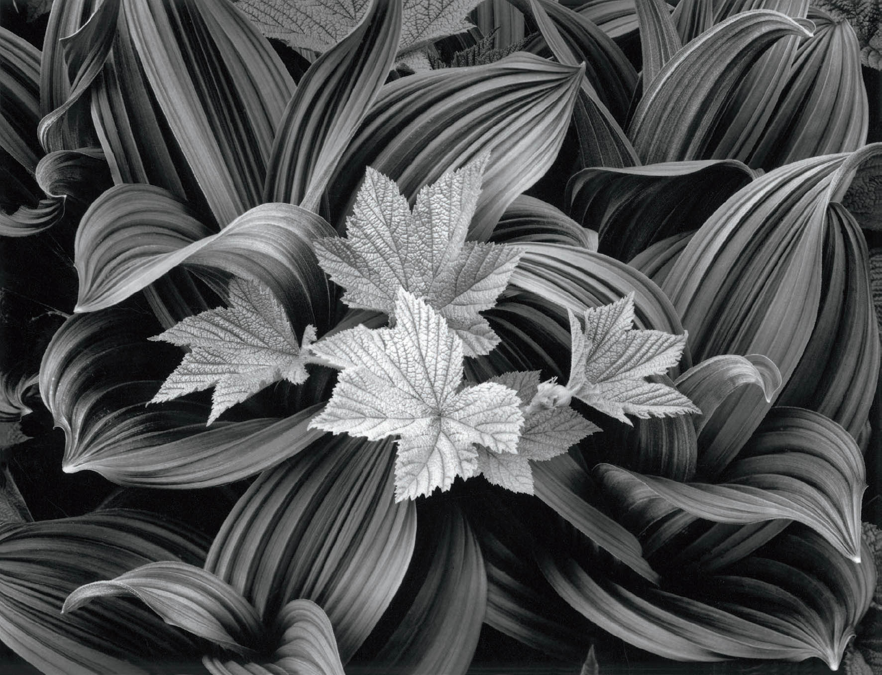
Figure 14-1: Salmonberry and Corn Lily
The relationships between the jagged salmonberry leaves and the sensuous corn lily surrounding them was spectacular. In Glacier National Park on a cloudy day, I aimed my 4×5 camera almost straight down, which eliminated shadows from higher leaves breaking up the forms of the lower leaves.
Does the image break “rules of composition” You bet it does. It breaks the foolish “rule of thirds,” which tells you a good composition should have the center of interest a third of the way into (from left or right) and a third of the way up (or down) from an edge. It’s a popular camera club rule with no valid justification.
CHAPTER 14
Exploding Photographic Myths
![]()
DESPITE ALL THE PHOTOGRAPHY INSTRUCTION OUT THERE—and too often because of it—a number of patently incorrect ideas persist. These photographic myths must be laid to rest. They push photographers in the wrong direction. Let’s reveal the invalidity of these commonly held beliefs.
Some myths have already been dealt with in this book. By approaching them in a somewhat different manner, and perhaps by imparting a different emphasis to them, this chapter may serve as worthwhile reinforcement. Several of the myth-breakers I will discuss are primarily geared toward traditional black-and-white photography, yet many of the concepts are extremely valuable to both traditional and digital photographers.
Myth #1: For digital photography, a well-contained histogram indicates a photograph with little or no need for post-processing. For traditional photography, the zone system gives you a negative that yields a straight print of exactly what you saw in the field, with no burning or dodging required.
This simply isn’t true, but it’s the most widespread misconception about digital exposures or the traditional zone system. It’s wrong because of the following fact: the light rarely hits everything in any scene in exactly the way you want your photograph to look.
As you look at a scene, your eyes scan it randomly, jumping from important area to important area, seeing only small bits of the scene sharply at any moment. As your eyes jump from dark areas to bright areas, the irises open to let in more light when you look the dark areas or close down to prevent the full dose when you look at brighter areas. The brain, working in concert with the eyes, further opens up things in dark areas and closes down things in bright areas. In other words, you view every scene at multiple apertures. Without these automatic mechanisms, it could be very painful indeed to look at a bright spot after looking at a dark spot. Think of what it’s like to come out of a darkened restaurant or afternoon movie into the bright sun!
The camera sees the entire scene at one aperture, the aperture you’ve chosen for the image. It cannot change the aperture to accommodate different parts of a scene. Thus, the camera does not allow the film or sensor to see what you see when you look at a scene. A camera is a mechanical/electronic device lacking the automatic features that allow your eyes to open up or close down. No matter how many remarkable features your camera may have, it still can’t do this!
Since the camera can’t see the way you see, you must learn to see the way the camera sees. You must learn when the brightness range is excessive, when it’s just right, and when it’s too low. You also have to determine how you want your picture to look.
Digitally, the best exposures push the histogram far to the right (without clipping), so the best exposure tends to look overexposed and washed out on your camera monitor. But that’s the exposure you want to work with in post-processing.
With film, you have to expose the negative to get ample density and tonal detail in all areas where you want detail in your final print. With film, the zone system (especially the extended zone system—see chapter 9 and Myth #3 below) is extremely good at yielding the proper exposure to get everything on the negative with usable densities. If you’re shooting digital and the range of light exceeds the sensor’s capability, follow the histogram and make several exposures at various settings, which can later be merged into a single image with an extended dynamic range. Let’s assume you’ve exposed the negative correctly to obtain ample negative density and/or tonal detail throughout. If the brightness range is excessive (i.e., if it’s greater than you want it to be for the print you wish to make), cut back on your negative development to reduce the inherent contrast from that of the scene to that which you want to have on your negative. This is known as “minus development.” If the brightness range is approximately what you want it to be in your final print, give the negative “normal development,” which preserves the brightness (or contrast) range of the scene. If the brightness range is less than you want it to be, give the negative “plus development” to expand the contrast range of the scene. The amount of minus or plus development varies depending on how excessively contrasty or excessively flat the scene is compared to your vision of the final print. These are artistic decisions, not decisions based on replicating the scene.
I have consistently stated that it’s necessary to develop the negative for the contrast range you want to have compared to the inherent contrast range of the scene. If a scene is high in contrast and you want even more contrast for your interpretive purposes, give the negative plus development. If a scene is relatively low in contrast and you want to soften it further, give the negative minus development. You’re allowed to do it. It’s legal! It’s even artistically acceptable. (Digitally, of course, you alter contrast in post-processing.)
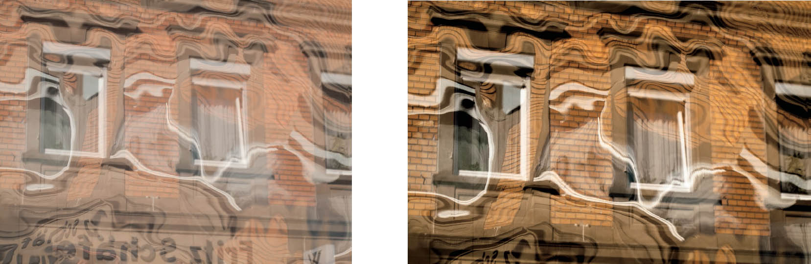
Figures 14-2a, b and c: Creiglingen Reflections
Figure 14–2a shows the RAW file directly from the camera, somewhat overexposed and washed out in appearance, but not clipped, as seen in its histogram in figure 14–2b, which shows a nearly perfect histogram, looking much like a bell curve (except for two tops rather than one smooth one). Obviously the exceptionally good histogram fails to indicate a fine photograph with extensive post-processing work, which was all accomplished in ACR.
After cropping out the lower portion, the major change was making a sharp S-curve in the Tone Curve tool, which dramatically increased contrast while darkening the image significantly, and also increased color saturation. Vibrance was then reduced to –7 and saturation was reduced to –6.
What are we looking at? Two reflections: one in a storefront plate-glass window, plus another from wavy, reflective Mylar behind the window. It’s a straight image from a single exposure, but confusing and highly abstract. Experimental? Yes. Successful? Judge for yourself.
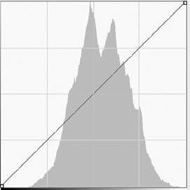
Figure 14-2b
On the other hand, if you always give normal development to a negative when the range of the scene is about 5 zones, if you always give plus development when the range is lower than 5 zones, or if you always give minus development if the range is greater than 5 zones, you’re doing “formula photography” and you’ll always end up with predictable, boring images. You’ll rarely express yourself in a meaningful way. Your prints may be technically perfect with good blacks and good whites and all sorts of tones in between (see Myth #7), but they’ll generally fall flat emotionally. You’ll produce technical gems that say nothing.
Even if you’ve done everything right with your negative exposure and development, it is obvious that the zone system can’t be expected to yield a straight print without manipulation. In my lifetime, I’ve produced between 300 and 400 photographs that I would be proud to exhibit. Of those, only two are straight prints with no burning, dodging, or bleaching. Those two prints make me nervous. The next time I print either one of them, I’ll dodge the upper-right corner, then burn it back, just so I feel like I’m doing something useful in the darkroom! The same is true digitally: I can’t easily remember a single important digital image that required absolutely no post-processing. It seems they all need some refining. (Perhaps if I did a systematic review, I’d find one or two, but the percentage would be so low as to be insignificant.)
![]() Most of the darkroom manipulation I perform, and most digital postprocessing, is not to alter the print away from the scene I encountered, but to bring it back to the way I saw it.
Most of the darkroom manipulation I perform, and most digital postprocessing, is not to alter the print away from the scene I encountered, but to bring it back to the way I saw it.
I approach every image with the thought that manipulation will be required. Most of the darkroom manipulation I perform, and most digital post-processing, is not to alter the print away from the scene I encountered, but to bring it back to the way I saw it, which is absolutely true in the case of the example shown here (figures 14-2a, b, and c).
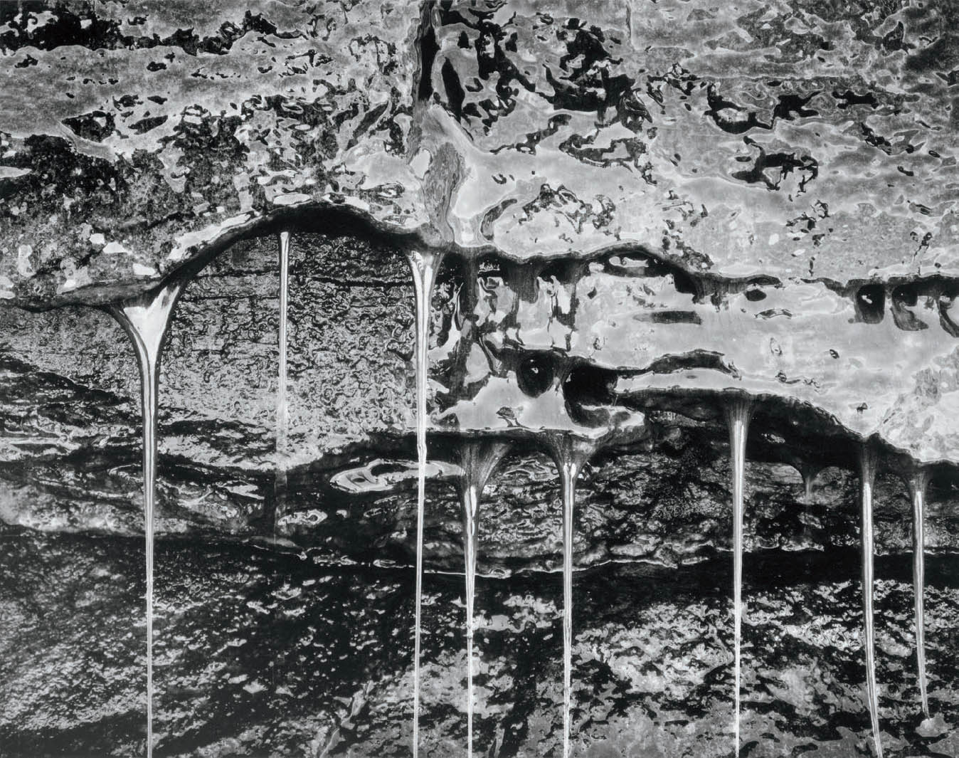
Figure 14-3: Silver Strands
The image has a metallic look to it. With that, it appears that a viscous fluid, perhaps oil, covers everything, and appears to be running down in several streams. In fact it is an emerald green, moss-covered wall alongside a trail in the Canadian Rockies. Long strands of mosses hang down freely from the wall, with water running down those strands.
Did it look like this? Perhaps, but everything was so green in reality that it immediately struck me that photographing it in black-and-white—already one step away from reality and into abstraction—would turn it into something distinctly different, potentially a wonderful abstraction of nature.
When I first peruse a scene, my eye/brain combination does much of the burning and dodging for me by adjusting the light intake via my eye’s iris (or aperture). This occurs automatically and extremely smoothly. I expect to be doing in the darkroom or on the computer what my eyes already do for me at the scene (and perhaps a little bit more). Neither the zone system nor a histogram can do that for me, but it can give me a starting point with solid information throughout and ample density separations so that I can perform the needed manipulations and then I can create an emotionally charged image.
However, there are times when my manipulations are not intended to re-create the way my eyes saw the scene, but rather to alter it—and sometimes to alter it greatly. This requires a vision in the field beyond the scene I encounter. It requires me not only to recognize a good scene, but also to recognize a scene that has the potential for personal interpretation and creativity. There is no requirement in fine art to be true to the scene, but only to be true to your artistic instincts and desires (figure 14-3). The zone system can be used to make radical departures from reality. The same is true of digital processes. If I want to make a deep, dark forest scene glow in a dreamlike manner with high key tones (i.e., light gray and white tones throughout the image), I can use the zone system or histogram as a creative tool and expose the scene higher up on the zone scale, or farther to the right, digitally, than would be realistic. In a situation like this, either system can be used specifically for an effect that is decidedly unrealistic, but one that may be extremely evocative and expressive. The zone system is a tool for creative expression just as much as it is for making straight prints. Obviously, digital processes can be employed for the same goals. Creativity should be sought in whichever process you employ.
I use the zone system for every one of my exposures, but I never expect a straight print to result from its use. That’s where the darkroom comes in. The darkroom is a tool used to mold light passing through the negative, much as a sculptor molds clay, to form the image you want. Digitally, as well, my RAW file is simply a starting point for my desired adjustments. If you expect to make a straight print, why have a darkroom or computer? Just send it to a lab and let them do it. They’re just as good as you at making straight prints, but they’ll never be as good as you at molding the light to make the statement you want to make. If your desired statement is exactly what you saw, but the camera simply can’t see it the way you saw it, you may have to manipulate it back to the way you saw it!
Myth #2: There are 10 zones in the zone system.
Photographic papers yield 10 zones, or doublings, of exposure from black to white. Negatives record far more than 10 zones, exceeding digital sensors in this respect (which is why digital photography may require multiple exposures to encompass the remarkable range of a single film exposure). Almost all panchromatic films cover 16–18 zones of brightness starting from threshold, i.e., the amount of light required to hit the negative material for it to be recorded.
Since enlarging papers yield only 10 zones of detail, most photographers think that exposing the negative beyond Zone 9 or 10 is useless. This is the heart of the myth. Since the negative accepts density increases for about 8 more zones above this false ceiling, higher zones can be brought into play whenever necessary. In fact, many people already use these zones without knowing it.
For example, suppose you have a photograph of a landscape with a big, billowing cumulous cloud. When you make a straight print, the cloud may appear as a featureless white blob. That’s because the density of the cloud on your negative is above Zone 9 or 10. So what do you do? You burn the sky and cloud, and soon the cloud begins to show good detail. You’re actually using the portion of the negative exposed above Zone 9 or 10. You’ve probably done this many times without giving any thought to it and without even being scared.
Furthermore, suppose the landscape has large areas that go completely black in your print but have detail on the negative. You can dodge those areas during the darkroom exposure, allowing you to see the detail in those dark portions of the image. Thus, by dodging the dark portions of the print (i.e., the thinner portions of the negative) and burning the bright portions of the print (i.e., the denser portions of the negative), you obtain visible detail from a negative that has a substantial number of zones.
Take another example: Suppose you walk into an old, abandoned mining shack with great wood textures and shapes inside. There’s a window that opens to a sunlit landscape. You expose the negative to get ample density for the interior, but the exterior is extremely dense. So you burn the hell out of the window, which gives you detail on the landscape beyond. Of course, you may get a black halo on the window frame if the burning overlaps it, or a white halo at the edge of the window if the burning doesn’t go right up to it. You can avoid this by reducing contrast in negative development. The point in this example is that by burning the window area, you add detail by using a portion of the negative with a density above Zone 9 or 10! And it didn’t even faze you!
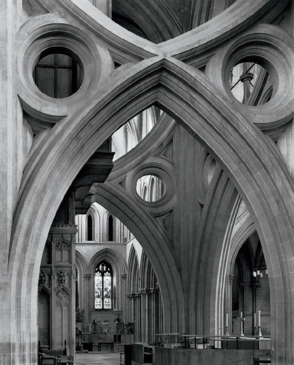
Figure 14-4: Central Arches, Wells Cathedral
When I encountered the Central Arches in Wells Cathedral in 1980, I was so overwhelmed that my project of photographing English cathedrals began instantly. Known variously as the “inverted arches” or “scissors arches,” this structure was created between 1335 and 1338 as a retrofit to prevent the cathedral’s central tower from collapsing. It has stood since then.
The distant window is an extreme highlight. The upper-left corner, lit from an unseen window, is a secondary highlight. Distant arches in the lower right are in the deepest shadows. The contrast range exceeded 10 zones, and a 15-minute exposure increased the contrast.
I exposed the highlights in the mid-teens, and then drastically reduced contrast with compensating development to bring the negative into a printable range. The left-side column and lower arch and the upper-left corner (including the stone circle) required significant burning, and the distant window required still more burning to a lower contrast, bringing everything into full visibility. It required some work, but it’s all there on the negative.
So, negatives contain very useful information above Zone 9 or 10. You may need some burning to access it, but you can get it! If you can print negatives with densities above Zone 9 or 10, why shy away from purposely exposing negatives to those higher densities? I’ve been doing it for more than four decades.
In my photographs of the English cathedrals, I wanted to convey a feeling of their presence. I wanted you to see everything that I saw when I stood there. The range of brightness in many of those images exceeded 8 zones, sometimes up to 10 zones. Yet I wanted detail everywhere. I knew that if I exposed the negative at Zone 2½ or lower, I would be on the toe of the exposure/density curve—stuck with low-density separations and a very flat print (tonally flat, and dimensionally flat, as well). So I generally exposed the low values at Zone 4 or Zone 5, knowing that I would reduce the contrast during negative development by giving the negative minus development. The exposed Zone 4 would develop to a lower density, perhaps Zone 3¾ or so. The exposed Zone 5 would also develop to a lower density, perhaps Zone 4½, dropping a bit more than the exposed Zone 4 during the shortened development time. But the high zones would drop dramatically in the minus development, dropping many zones below its exposed value.
So, if I exposed the darkest areas where I wanted detail in Zone 4, the brightest areas would be exposed in Zone 12, maybe even Zone 13 or Zone 14. But that’s OK. After all, the negative goes all the way up to about Zone 17. Minus development following exposure in the low teens can bring the developed density down to Zone 10 or so, making it easily accessible through burning in the final print.
I don’t want to expose important detail on the toe of the curve, which is generally below Zone 2½, or above the shoulder of the curve, which is above Zone 15 or 15½ (chapter 9, diagram 9.3). Those portions of the curve flatten out and yield very poor tonal separations in the final print. But between the toe and the shoulder, i.e., on the straight-line portion of the curve, the negative still gives me 13 zones of excellent separations (figure 14-4).
Since 1980, I’ve exposed hundreds of negatives in the slit canyons of Arizona and Utah. I regularly expose the highlights in the lower teens (i.e., Zone 13, 14, or 15), enabling me to get the maximum amount of detail onto my negatives below those bright highlights. Of course I reduce the development severely, reducing the highest densities of the developed negative. This allows the negative to be printable—usually with extra highlight burning, but printable nonetheless. It’s very difficult to print detail from negative densities that are up in the teens, but it’s perfectly fine to expose negatives that high on the scale, then reduce those placements to printable densities during development. I simply use compensating development on negatives exposed that high on the scale, usually with the two-solution compensating development detailed in chapter 9. Had I followed the misguided advice of some to expose highlights no higher than Zone 8, I could not have made many of my images in the cathedrals or the canyons (figures 1-6, 1-7, 2-7, 3-6, etc.), which are among my most cherished and popular.
The middle of the straight-line portion of the exposure/ density curve is Zone 8 or 9. Most photographers avoid these zones, yet the middle of the curve is where the separations are best! I regularly expose negatives above Zone 9 or Zone 10, but I generally give “minus development” to such negatives to avoid excessive negative densities and printing times under the enlarger.
Many instructors are unaware of the remarkable range of negatives and are afraid of exposing them into the double-digit zones. Most students are afraid of such exposures because they’ve been taught by people who are unaware of the negative’s true range. If you’re avoiding higher zones (i.e. above Zone 9), you’re throwing away opportunities to photograph in places that may yield exceptional images. Don’t be so narrow-minded. Break through the barrier of higher zones in your exposures. The negative has that range. Use it! When using high zones, reduce development to control them for later printing (figure 14-5).
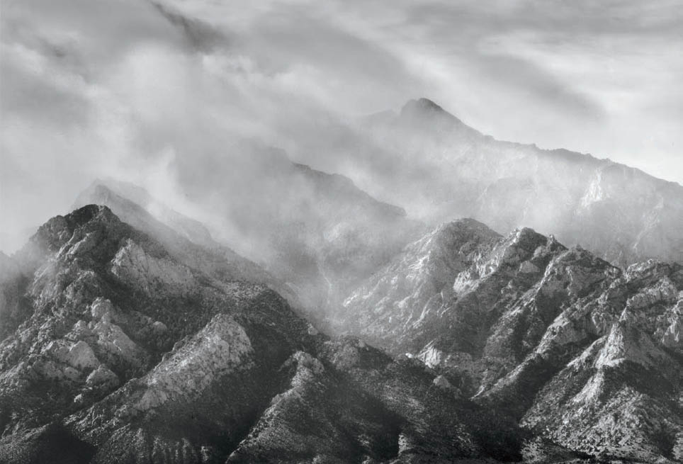
Figure 14-5: Mt. Williamson, Clearing Storm
There was a huge tonal range from the lower, forested, shadowed slopes to the sunlit clouds streaming over the higher ridges, and the distant sunlit clouds. I placed the lower shadows just above Zone 4 to ensure good shadow separations, placing the sunlit clouds at and above Zone 10. The negative was developed to reduced contrast. Subsequent burning of the upper portions of the image brings everything into view, as I intended.
Why does the negative have such a long range when the paper doesn’t? Interestingly, it turns out that the paper emulsion has virtually the same range! The difference is simply how you view the two items. You view a negative by transmitted light. You place a negative on a light box, and light comes through the emulsion so you can see it. When you look at a print, however, the light source is in front of it (and generally, behind you). It goes through the emulsion once on its way to the paper backing, then reflects off the backing and goes through the emulsion a second time before coming to your eye.
Instead of looking at a print with reflected light, try holding it up to a powerful light from behind the print (e.g., a 500-watt floodlight). You’ll see detail in the deepest blacks that will astound you. Now you’re seeing the paper emulsion via transmitted light, the same way you view a negative. In fact, next time you’re printing in the darkroom, inspect your print under white light after you get it into the fixing tray. Look at the deep rich blacks in the print, then hold the wet print up to a bright light (with the light shining through the back of the print from behind). You’ll be amazed at the range of detail within areas you thought were solid black. The paper emulsion equals the range of the negative emulsion (or, at least, comes impressively close to it), but because you see a print with reflected light rather than transmitted light, its range is severely reduced. Therefore, you must develop your negative to a low-contrast range to encompass the paper’s limitations.
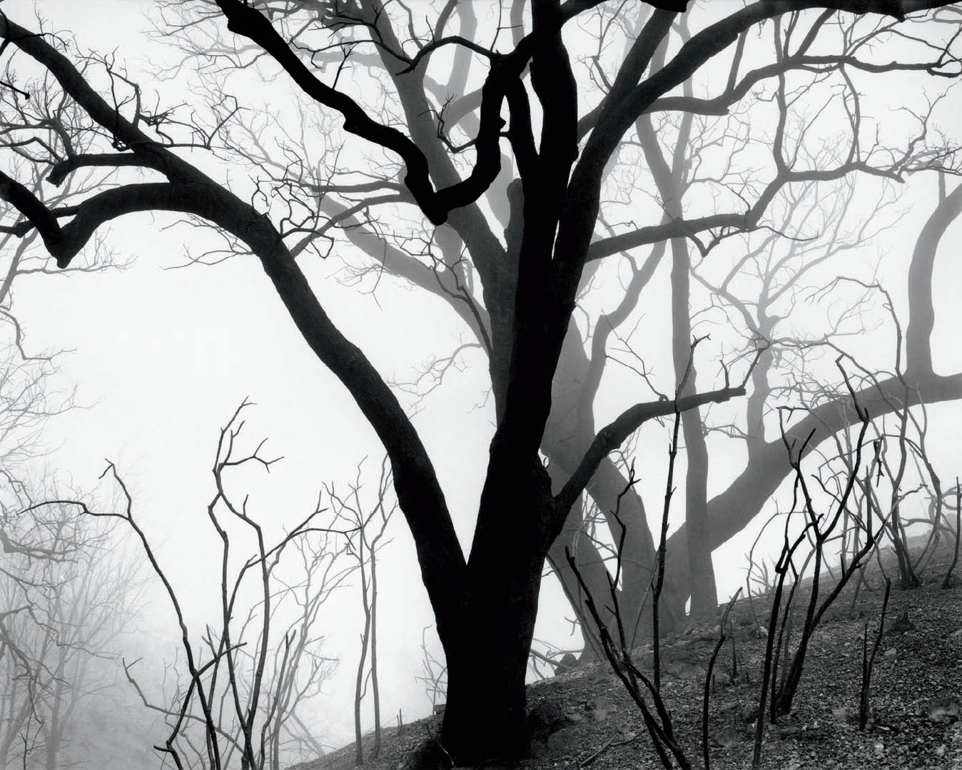
Figure 14-6: Burnt Oak Silhouettes
Photographed in dense fog just weeks after the massive 1978 Agoura-Malibu fire, contrast was raised in negative development. Textural detail on the nearest burnt tree and bushes was eliminated: the fog itself, eliminated detail on the more distant trees, creating a fascinating design—almost like tonal cutouts—unencumbered by textural detail.
This is a challenge, but it’s not a problem. When the image is printed well, it looks extremely brilliant with deep blacks, glowing whites, and rich gray tones in between. You can get just what you want in a silver print from a properly exposed and developed negative. And you can do it in an extremely wide range of situations if you initially take advantage of the extraordinary range of contrast that a negative is able to handle. Don’t hesitate to expose negatives into the double-digit zones.
Most photographers proceed with the certainty that if they expose negatives above Zone 7, they’re getting into rough waters, and if they go above Zone 8, well, lord help them! Above Zone 9, forget it—everything is lost! This is patently absurd. Much of the effort I put into explaining the zone system involves getting students to unlearn the myths that are locked into their thinking. As baseball legend Satchel Paige said, “It ain’t the things you don’t know that hurt you; it’s the things you know that just ain’t so!”
There have been (and still are) well-known teachers who tell students never to expose above Zone 8. Further, they tell people only to develop “normally.” They say that minus development leads to flat prints. They’re wrong. Theirs is a perfectly good approach in open, relatively even lighting situations. But it fails miserably when you get into unusual situations, such as those with extremely high or low contrast. It’s an approach that limits your options. Virtually all of my photographs in the cathedrals or the canyons were exposed with highlights well into the double-digit zones, and nearly all were given minus development . . . often compensating development! The prints aren’t flat. They have a rich tonal palette. I’ve also made prints in low-contrast situations, such as in fog, that also have a rich tonal palette (figure 14-6).
My approach is to expand options, not limit them. Using the full range of the negative expands options. Placing unnecessary limits on the range of the negative restricts the locations and/or lighting situations in which you can photograph.
As a final important aside, some people have the strange notion that if there are 10 zones, there must be 10 gray values. Not true. Going from one zone to the next higher zone involves a doubling of exposure (i.e., a full stop of additional exposure). But you can open up a half stop, a third of a stop, a quarter of a stop, etc., to increase exposure only slightly. Each of these choices represents a slightly different gray value. In fact, there are an infinite number of gray values, some so minutely different from the next that the eye cannot differentiate them. That’s why black-and-white prints can be so rich. The tonal scale is a smooth continuum, not a set of quantum jumps.
Myth #3: Shadows should be placed at Zone 3 in the zone system.
This is an idea about using the zone system that comes from the creator of the zone system himself. Ansel Adams urged photographers to place shadows in Zone 3, but I doubt that he used Zone 3 placement himself. His prints exhibit too much brilliance and illusion of spatial depth to have been given such low placement of shadows in his own negatives.
Let’s look closely at the exposure/density curve (diagram 9.5) to see why Zone 3 placement is too low and why Zone 4 placement turns out to be much better. The toe of the curve is the initial, lower portion of the curve that is rather flat. This part of the curve yields very low-density separations on the negative and consequently very low tonal variations on the print. So you don’t want anything important on that part of the curve. (Note the emphasis on “important.”)
The major part of the curve, the so-called “straight-line” portion, is not flat. It rises at a steeper angle, indicating that for equal increases in exposure of the negative you get greater density separations in the developed negative than you get in the toe of the curve. Let’s keep that in mind and consider what it means for a print.
Texture in any photograph is made up of small tonal variations in immediately adjacent tones. When you talk about Zone 3 texture or Zone 4 texture, you’re not just talking about a Zone 3 tonality or a Zone 4 tonality; you’re talking about small variations in tonality around that zone that comprise texture.
If you expose a shadow area at Zone 3, some of the densities on your negative are lower than Zone 3 and some are higher, yielding texture. They average to Zone 3. But if some of that texture is at Zone 2½ or less, it’s on the toe of the curve where density separations are lower. Therefore tonal separations in the print are lowered, and the print begins to look flat. The word “flat” perfectly describes the unsatisfactory print you get. The print has the following two main flaws:
- It is tonally flat, lacking in the good tonal separations that give it snap.
- It is dimensionally or spatially flat because nearly identical tonalities yield prints that lack the appearance of spatial depth.
To avoid the unsatisfactory look and feel of flatness, expose the negative higher on the scale at Zone 4. With higher placement, those portions of the negative higher and lower than Zone 4 are still on the straight-line portion of the curve, yielding far better tonal separations in the print.
You may object that the shadow is then too light in tone. Of course it is, but you solve that problem by printing it darker—down to your desired Zone 3—when you enlarge it. When you do that, you’ll get a print with far richer tonal separations, one that exhibits far greater spatial depth. In other words, you expose and develop the negative so that the shadow densities are in the Zone 4 range, but you print it down to the Zone 3 range under the enlarger. It’s that simple.
David Vestal, an excellent photographer and recognized sage about technical issues wrote, “For detailed black stuff, I expose only one stop less than indicated.” Thus, he found that he got better results when he placed shadow details in Zone 4 rather than Zone 3. Vestal also mentioned that Ansel Adams recommended Zone 3, but he himself found that “the resulting negatives are too thin.” Vestal is worth reading; he had a lot of worthwhile things to say.
You may inquire, why are we always taught to place the shadows in Zone 3? Because most teachers and most magazine or book writers are sensitometrists, not photographers. They spend too much time testing materials and graphing them and too little time making photographs. When they look at Zone 3, they look at an exact Zone 3 tonality, not at a textured range that averages out to Zone 3. There is an immense difference between studying an exact Zone 3 tonality (lacking texture), and a Zone 3 made up of texture. The photographer’s world is made of textures; the sensitometrist’s world is made of tonalities. The difference is like day and night. The digital equivalent is the technician who knows every tool in the digital toolbox, but is not a photographer, and has little insight in how to use the tools for meaningful personal expression.
Sensitometrists pull out their trusty densitometers and get the perfect Zone 3 by exposing a gray card at that zone. All appears to be well and good. But when they expose a real scene with real tonal variations and real texture, their exposed Zone 3 yields closer tonal separations because the textures are made up of tones both above and below Zone 3. Some of the tones below Zone 3 dip into the toe of the curve. With a Zone 4 exposure, nothing dips into the toe of the curve, so the separations are greater. When you take a negative with Zone 4 texture and print it darker (back down to Zone 3 tonalities), you retain greater tonal separations in your print. Look again at figure 7-2b and specifically at the hill and rock area in the center, directly below the snow-covered mountain. That area was placed just above Zone 4 during negative exposure to retain maximum separations in those shadow areas, but printed significantly darker than Zone 4 to give the photograph the snap I sought. Had I placed those areas at Zone 3, I could not have maintained either the richness of tone or the feeling of depth that the image conveys.
Sensitometrists who work with step wedges and exact tones are like people who study a single musical note. Melodies, however, are made up of many notes creating a musical texture. You can’t get the feel of a melody by examining a single note. Similarly, you can’t get the feel of texture in a photograph by examining a single visual tonality. Sensitometrists are like piano tuners who make sure that each individual key sounds exactly right. You need them to keep the piano tuned, but you need a composer to write music and a pianist to play it or teach it. Photographers are both composers and pianists. It’s wise not to learn how to play the piano from a piano tuner. It’s equally wise not to learn about zone placements from a sensitometrist. I see too many sensitometric curves in photography magazines. The digital equivalent, as I’ve stated in chapter 12, is to avoid learning from technicians who teach and write books about digital photography, but rather to learn from the photographers themselves.
Photographs are not step wedges; they can be real art. They are meant to be personally expressive. They are meant to be seen by others and to move others emotionally. They are meant to communicate a thought, a mood, an experience, a moment in time, a fantasy, or any of dozens of other ideas from the artist to the viewer. They should be imbued with light and life. Exact curves and exact enlarging times won’t get you there. You’ve got to deviate from the densitometer readings and use different approaches from one print to the next if you want to say something.
I don’t own a densitometer—never have, never will. It gives me no useful information. All I need to do is expose and develop a few negatives to tell me everything I need to know about how a film responds to light and how a developer works with that film. I know that however little or much I develop a negative—minus development, normal development, or plus development—the lowest zones look just about the same because they develop quickly and hardly get any denser after the first couple of minutes of development. The low zones tell me the speed of the film and also whether I exposed it properly. Then I look at the high zones to see how much density they have, which tells me whether I developed the negative properly. If I’m off by a little, I adjust my development procedure. Any such readjustment won’t materially affect the low zones because they develop so quickly and so fully. Looking and adjusting is far better than testing.
In order to ensure that I’m solidly above Zone 3 when exposing my negatives (i.e., above the toe of the curve), I generally set my film ASA considerably lower than the recommended value. For example, I shoot Kodak Tri-X rated at ASA 320, but for my purposes I rate it at 160 (a full stop lower than Kodak’s recommendation). When I shoot Ilford HP5+ rated at ASA 400, I shoot it at ASA 300, a half stop lower than Ilford recommends. I do roughly the same for other films I use as well.
Even after lowering the ASA of the film, I still place my shadows in Zone 4. This makes my shadow placement closer to Ilford’s or Kodak’s (or your) Zone 4½ or Zone 5. It gives me a denser negative, but it still gives me 10 zones of good negative separations above that level before I run into the shoulder of the density curve. So I’m not losing any options. Of course, if I run into a scene with high contrast, I’ll give the negative plenty of minus development to make the highlight densities printable.
In several articles written by David Vestal, he also pointed out that he often places highlights in Zone 9 (“I expose four stops more than the meter says for the bright tone”). That’s perfectly fine, but it’s also fine to place highlights even higher—way higher if necessary! I’ve done it for years with excellent, printable results.
My negatives have good, solid densities. They may require longer exposures or a more open aperture for enlargement, but when I place my shadows sufficiently high and develop appropriately for the highlights, I get all the separations and snap I want in the shadows. My prints are neither tonally nor spatially flat. The extra time under the enlarger does not materially shorten my life. It’s not a problem.
Students should not be taught to keep their negatives thin. Negatives should be stout in order to yield good tonal separations from the blacks to the whites. It may be easier to focus a thinner negative, and thin negatives show lower grain—but what’s more important, a negative with lower grain that is a bit easier to focus, or a print that’s alive?
It turns out that Ansel Adams did photography an immense service by creating the zone system and an immense disservice by saddling people with the dictum, “Place your shadows in Zone 3.” It’s wrong. I doubt that he followed his own dictum. I place my shadows in Zone 4 or a bit higher. So did David Vestal, and I recommend that you do the same. You’ll get better results. (And the sensitometrist’s exposure/ density curve explains exactly why . . . when you shoot in the real, textured world!)
Myth #4: Negative densities should be within a fixed density range, and negatives that don’t fit into that range are useless. Histograms should be spread through the range, but short of clipping.
The previous two myths deal exclusively with film issues. But here again, both traditional and digital are included. It may seem like I’m fixated on the zone system or even the histogram, but I don’t really think about it much in my own work because it’s part of me. Just as you drive without thinking about driving, you can afford the luxury of not thinking a lot about the either the zone system or the histogram once you learn it well. To use it properly, you’ve got to understand it so thoroughly that using it becomes instinctive.
Let’s concentrate on film first (though I urge digital users to read the following examples and understand them fully, for they shed light on digital processes, as well), then see it’s application to digital. I’ve already pointed out that I use the full range of the negative. I don’t expect all of my negatives to have the same density range, and they don’t! Some people would say, “They’re all over the board!” That’s absolutely correct. Let’s clarify this with a few examples.
Examples #1 and #2
Suppose I enter an old-growth forest on a typically cloudy day in the Pacific Northwest rainforest. I can do an average reading on the forest and give it normal development, getting a range of tonalities from Zone 4 to Zone 8. (Remember, we’re going higher on the scale for better shadow separations than the usual Zone 3–7 spread.) Let’s forget about exposing this negative from Zone 3 to Zone 7, even if those are the tones desired in the final print (Myth #3). So, this negative now has a standard density range of Zone 4 to Zone 8, which I plan to print with zones ranging from Zone 3 to Zone 7. We’ll call this example #1.
Suppose I have a different idea for this scene: I want it to look light and ethereal. The contrast range is the same, so suppose I expose this negative with a spread from Zone 8 to Zone 12. Then I give that negative extreme minus development, or even compensating development, to radically reduce the high densities. The exposed Zone 12 drops down to about Zone 8½ or 9, while the darkest part of the scene drops from Zone 8 to about Zone 5½ or 6. (I’m just using educated guesses here. But then, I’m never exact! I fully expect to manipulate the print by dodging, burning, bleaching, etc., in the darkroom anyway, so exactness doesn’t matter.)
Now I have a contrast spread of a little less than three zones, from about Zone 6–9 instead of Zone 8–12. If I print those values just a half zone lower, I’ll end up with a high key, dreamy scene where the tones range from something lighter than a gray card all the way up to near-whites. Can you envision this hypothetical print? The negative that produces it is vastly different from the Zone 4–8 spread of the previous example. We’ll call this example #2.
Example #1 is pure realism. Example #2 is pure fantasy. Both are legitimate. Both express a feeling about the place, but example #2 almost creates a new world out of the one I encountered. Its negative densities are all quite high, starting from an initial exposure that is substantially higher.
Example #3
I’m photographing in one of the English cathedrals. A distant stained glass window is eight zones brighter than a dark alcove off to the side. The rest of the cathedral is much darker than the window but brighter than the alcove. The distant window, along with others, is the source of the interior light. My goal is to render everything visible, with detail from the stained glass window to the dark alcove. If I place the alcove at Zone 4½, the window falls at Zone 12½. The rest of the interior architecture lies between Zone 5½ and 7½. Because the cathedral is rather dark, and I’ve closed my aperture for maximum depth of field, I need a long exposure. Then reciprocity failure forces even higher contrast (see chapter 9).
The highlight is so sensitized to light during the exposure that I give the negative compensating development, as in figure 14-4. This brings the window down in density from the exposed Zone 14 to perhaps Zone 10 in the developed negative. The alcove, too, drops in value to Zone 3½ or so, while the rest of the interior ends up around Zone 4 to Zone 6. This negative is moderately thin to average, except for the very dense window area.
Example #4
I find a flat rock with fascinating patterns that speaks volumes to me. Contrast is very low—perhaps just one zone of difference between the darkest and brightest portion of the rock—so I want to increase the inherent contrast as much as possible (figure 14-7). If I underexpose and overdevelop, I can’t increase contrast much because the low zones don’t expand during extended development. So I expose normally and then overdevelop, an approach that I find far more effective than underexposing before overdeveloping.
If I place the average tones of the image around Zone 5 and give the negative maximum development to increase contrast, the average zone will end up around Zone 7 or 7½ with highlights near or above Zone 9. There may be a spread of 2 to 3 zones from the densest to the thinnest portions of the negative. This means that the negative may have values of roughly Zone 6 to Zone 9. This negative is considerably denser on average than one that received compensating development.
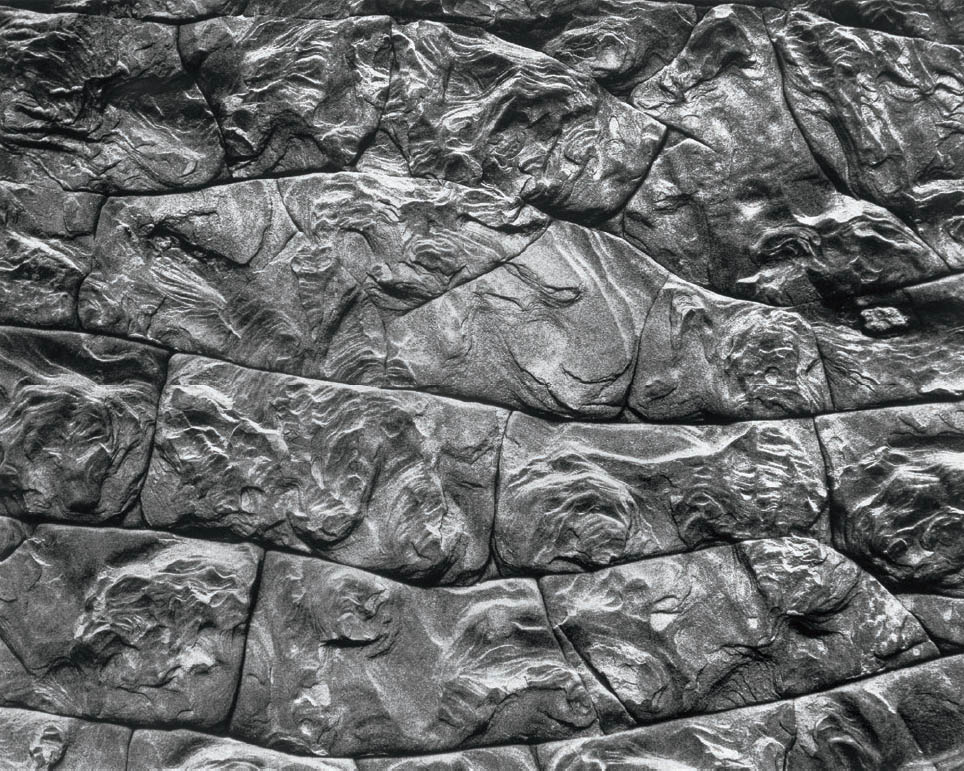
Figure 14-7: South Desert Mosaic
Nearly direct sunlight was hitting this exquisite piece of natural mosaic in Capitol Reef National Park, giving it very little contrast. Greatly expanding the contrast in the darkroom at both the negative and printing stages turned a dull image into one with real life and rhythm. Both the traditional and digital processes offer options far beyond the limited scene in front of you. Imagination along with understanding the technical possibilities can expand your creative reach tremendously.
These two negatives have very different average densities and ranges. I can print example #3 by exposing the negative under the enlarger for the interior architecture and then burning the window, which otherwise would be blank white. For example #4, I’d print the average tonalities farther down on the tonal scale but use the highest contrast enlarging filter to further increase the contrast on the rock—contrast that I already expanded as much as possible via extended negative development. Ultimately, the two prints will each have light and life throughout.
All four of these examples are good negatives, and all vary greatly from one another in density. Each one is designed to express my point of view about the world I’ve seen or the world I’m creating. Creating something different from reality is not only perfectly valid, but also wonderfully desirable. I couldn’t make the photographs I want to make if all of my negatives had to be within a standard range.
Negative densities should be whatever they have to be. They should allow you to say what you want to say. Obviously, if you want to do a realistic version of a wintry snow scene in bright sunlight, you’ll end up with a denser negative than if you want a realistic version of an open pit coal mine on a cloudy day. Those two perfectly realistic photographs will have to come from negatives that are quite different in average density. So, even within the realm of pure realism, there is no reason to expect all negatives to land within a fixed range of densities.
I have made negatives in the slit canyons of Arizona with exposures up to three and a half hours. Despite the long exposures, some portions of those negatives have no density whatsoever, indicating that areas of those canyons were so dark that no amount of exposure would have reached threshold. Yet the highlights are so bright that they have high densities even with compensating development. Some of these negatives end up way, way outside the realm of standard negative densities. Yet they produce some of my favorite, and most popular, prints.
You’ve got to get away from the thinking that everything has to fit inside a box. My negatives vary all over the board. Some are dense. Some are thin. Some are unnecessarily dense because I made a serious mistake somewhere along the line. But I don’t throw away those negatives. Some of them give me prints that I love. They’re usable negatives, even if they’re not perfect. I make no attempt to keep them within the boundaries prescribed by others. And I often expose my highlights above Zone 10 . . . intentionally!
As I pointed out in Myth #3 above, underexposure yields flat prints and ruins the possibility of making a good print. Overexposure, on the other hand, gives you a denser negative that requires a longer enlarging exposure, but the print will be just fine. In any reasonably standard situation (not cathedrals or canyons), you’d have to overexpose by 5, 6, or 7 stops to push the negative up to Zone 15 and beyond (where the negative flattens out on the shoulder of the exposure/ density curve). But, if you underexpose by just ½ or 1 stop, you’re below Zone 3 where the negative flattens out on the toe. As long as you’re between those spots, you’re OK.
The greatest sin in black-and-white photography is underexposure. If you overexpose, you get a denser negative, requiring a longer exposure under the enlarger when printing. The negative will also have a bit more grain. Other than that, you rarely lose a thing. The moral of the story: when in doubt, overexpose!
Loosen up! You don’t have to be exact. In fact, being exact is a formula for disaster—or, at the very least, it’s a formula for very predictable and very boring results. There’s nothing about photography that’s exact! Make sure you have enough exposure so you’re on the straight-line portion of the exposure/density curve. If you’re a little too high, don’t worry about it. You’ll still have a perfectly workable negative. It may require a little longer enlarging exposure, but who cares? You’ll have to manipulate the print anyway with some burning and dodging, just to make it look like the scene as you saw it—or as you envisioned it differently—when you stood behind the camera (please reread Myth #1). What can possibly be exact about a process like this?
Photography is an art. It is based on the sciences of light, optics, chemistry, computerization, etc., but if you get too hung up on the science, you lose the art. Understand the scientific basis, but don’t worry about getting an exact Zone 5 to the fourth decimal place! After all, how many painters measure the hue of blue or red on some decimal scale? None of them! They look to see if it’s the color they want. Then they work with it. Photographers should approach photography in a similar manner.
Not every negative has to fit a predetermined density range. Not every print has to have a black, a white, and all the tones in between. Some prints don’t even want a black or anything near a black. (See Myth #7, below.) You can have a high-key (i.e., light-toned) print without any blacks or dark grays. You can have a deep, moody, low-key print with no whites or light grays. You can have a print with anything you want, as long as it effectively conveys the mood or feeling you want to convey. You can’t convey your thoughts if you’re restricted to printing by the rules. And you can’t convey your thoughts effectively if you try to start with negatives that all have the same density range. It doesn’t work. It can’t work. You’ve got to have the flexibility and creativity to say something important, and you can’t be creative if you’re limited by arbitrary, restrictive rules. Throw them out, have fun, and open up to real creativity!
How does all of this apply to digital approaches? To be brief: in exactly the same way. In example #1 of the rainforest, you expose the histogram off toward the right edge, and in post-processing you push it back down toward the densities you want to realistically depict that forest. In example #2, with the ethereal, dreamlike forest tones, you’ll probably want to keep the tonalities much like they are in the RAW exposure, though you’d probably want to fiddle around with the Tone Curve to better adjust the image to your liking. Ultimately, however, you’ll want to retain those bright tonalities, or you may want to keep nearly everything high key, except for some deeper shadows, which can be kept quite dark for an interesting graphic effect. That can be accomplished by either dropping the left edge of to Tone Curve way down to make the shadow, alone, very dark, or you can use the Paint Brush to very carefully to paint those shadows darker.
Example #3, in the English Cathedral, you may have to go to an HDR approach with two or more exposures by exposing the windows, along with some brighter areas in one exposure, and exposing the remainder of the cathedral interior in another. Of course, it’s best if you use a tripod to get exact alignment of the two exposures, though Photoshop is excellent at aligning two exposures that are not exact. From that point, you can reach the tones you want to have for your final file.
Example #4 would require the same type of dramatic contrast increase that I detailed for figures 6-15a and b, where a narrow spike of a histogram (i.e., one showing very little tonal variation in the scene) can be dramatically expanded via the Tone Curve tool. It’s likely you will then want to push both the Vibrance and Saturations sliders at the bottom of basic ACR’s Basic panel quite far to the left to negate the dramatic color saturation increase that accompanies the contrast increase. Furthermore, you may need to alter the Temperature and Tint siders at the top of the Basic panel to fully re-adjust the colors to your liking. The histograms for the several examples are very different—and example #3 requires two separate histograms for the two exposures. Who cares? Not all histograms have to look alike, or even similar. There can be wide variations. It’s not something worth worrying about.
My educational background is not in the arts, but in the sciences. I have a bachelor’s and a master’s degree in mathematics from UCLA. I understand graphs. I can read an exposure/density curve, which tells me not to expose shadows in Zone 3. I can understand that a histogram (which is a graph) clearly tells me to move it to the right to gain more information, and therefore smoother results. But I also think that following densitometry curves to determine exposures is absurd, as is remaining within strict limits in negative density range. You’ll miss opportunities at every turn. It’s the same with the histogram short of clipping, at which point you simply lose all information in the clipped areas. You’ll restrict yourself to a limited range of possibilities. It’s bad enough when someone else imposes restrictions on any aspect of your life, so why impose restrictions on yourself? Break out of the box. Use the full range of the negative, and use the histogram to your advantage. Don’t be cowed by histograms that fail to fall within the “ideal” limitations. Allow yourself the flexibility of negatives that vary in density, of histograms that vary widely. Don’t feel guilty about such variation. Be proud of it. You’re simply giving yourself artistic freedom. You got a problem with that?
Myth #5: All contact proof prints of negatives should be made at the same exposure.
Digitally, the RAW file is, effectively, your contact proof, your starting point. So, simply take it from there. With film, as we just learned, negatives should not have a standard range of densities. Once you accept this truth, and once you start creating negatives that vary in density from one to another to best suit your expressive purposes, you will almost immediately discover that all contact proof prints should not be made at the same exposure. They can’t be. If they were all made at the same exposure, you’d get very dark, unreadable contact proofs from thinner negatives and very light, unreadable contact proofs from denser negatives. In either case, you wouldn’t obtain the information you need to decide how to print that negative. You might ignore a negative that is perfectly printable—perhaps a negative that is capable of yielding one of your finest prints. At worst, you might even throw away a potentially excellent photograph.
I vary my exposure for contact proofs to accommodate the wide range of densities I have on my negatives. However, I do keep one thing standard: the contrast level of my contact proofs. I make all of them at a fixed, low-contrast level. This gives them a somewhat dull, perhaps even a slightly “muddy” look, but they give me an immense amount of information about the image.
That explodes the myth, but let’s go farther. Let’s look into the contrast level needed for useful contact proofs, then discuss how best to expose them. If I made my contact proofs at a medium contrast level, I might lose detail in either the highlights or the shadows on high contrast negatives, giving me little direction on how to print them. I’m looking for information, not excitement, in my contact proofs. The final print is where I want emotion; the contact proof is where I want information.
I lower the contrast level by dialing in 60 units of yellow filtration on my dichroic head enlarger. Let me explain this. On a dichroic head (i.e., a three-color enlarging light source), you have white light as your source when no filtration is dialed in. The contrast level is about the same as normal contrast grade, or about Grade 2 on the graded papers. As you increase the magenta filtration, contrast progressively increases above the Grade 2 level. As you increase the yellow filtration (starting from white light), contrast progressively decreases below the Grade 2 level. So, with the yellow filter dialed to 60 units of filtration, I expose the proof and develop it solely in Kodak’s Dektol developer. This yields a low-contrast contact proof, giving me a huge amount of information of what I can get out of that negative.
It turns out that a contact proof of a negative exhibits about the same contrast as the enlarged image at the same level of filtration. (This is true of diffusion light sources but not condenser light sources. Most enlargers made today feature diffusion light sources and built-in variable contrast filters. I will assume that most readers are using a diffusion light source on your enlarger.) Over time you can correlate the low contrast contact proof with the amount of contrast filtration you think you’ll need for the final, enlarged print. If you like the contact proof’s contrast level, dial in the appropriate filter setting that yields the same contrast for the enlarged print as you see on your contact print. If the contact proof looks low in contrast, dial in a higher contrast level (i.e., either reduce the yellow filtration level or increase the magenta contrast level). If the contact proof looks very low in contrast and muddy, dial in quite a bit of magenta filtration, say 50 to 75 units. If it really looks muddy, go all the way up to the maximum magenta your enlarger achieves.
On the other hand, if the contrast level of the proof looks too high, I begin printing by dialing in more than 60 units of yellow filtration. The more contrast that the proof appears to have, the greater the amount of yellow filtration I dial in to lower it.
Low-contrast contact proofs give me a great deal of information about how to approach printing my negatives. I recommend you adopt this procedure. If I varied the contrast level from negative to negative when making proof prints, I’d never know which ones were made at high contrast and which were made at low contrast, and I’d have no stable starting point. A fixed contrast level gives me a solid foundation for analyzing my negatives.
My Method of Making Contact Proofs
Let’s now turn to my method of exposing the negatives to make usable contact proofs. I place two sheets of 8×10 enlarging paper atop a thick foam pad under my enlarger and four 4×5 negatives on each sheet of paper. I cover the entire setup with a ¼" sheet of glass, heavy enough to press the negatives into direct contact with the enlarging paper.
The eight negatives normally vary in density. Often there are considerable density differences among them. So I expose them all to the amount of exposure needed to get a good proof of the thinnest negative. Of course, there may be other negatives in the group that have the same relatively low density. After making that exposure, I place 4×5 sheets of cardboard atop the glass over each of those negatives, preventing any further exposure. (I use the cardboard sheets that come with the 4×5 film for this purpose.) Then I give additional exposure to the next densest negative in the group and cover that negative with cardboard. I continue giving additional exposure to successively denser negatives until I expose the densest one fully. Then I develop both sheets of paper to yield eight proof prints.
Of course, I don’t always guess the perfect exposure for all eight negatives, but time and experience make my guesses reasonably good. If any of the eight are much too light or much too dark to yield useful information, I simply expose them again in the next group of eight negatives. If I still get it wrong, I do it a third time, or as many times as needed until I get a useful contact proof print. Once I get a usable proof, I’m finished with that negative, as far as proofing is concerned. After drying the sheets, I cut them into individual proofs, throwing away the bad exposures.
If I’m proofing roll film, I place a full roll (cut into strips) on each 8×10 sheet of paper and do the same procedure as outlined above: exposing for the thinnest negative(s), covering them, and then exposing successively denser negatives on the roll until all are fully exposed. Hopefully I get useful information on all of them. If too many fail to give me usable information, I’ll do the entire roll again. I do not cut roll film proofs into individual negatives because the individual proofs would be too cumbersome or get lost.
I always study a contact proof extensively before enlarging it. Why? Because it tells me how I should approach printing the negative to obtain the image I want. Remember, I was behind the camera when the scene was exposed, so I know how I felt about it at the time. I made a series of decisions in the field to put me on the right path toward my statement. Now that I’ve developed the negative, I study the contact proof to see how I can carry that vision into my final print. If I don’t study that contact print thoroughly, I’d be starting my printing from scratch, as if I were starting with someone else’s negative. Yet I always allow myself the option of seeing the image anew and going in a vastly different direction. I try not to be dogmatic or rigid. A new vision may be more worthwhile than carrying through the thoughts I had while in the field.
Darkroom work is a continuation of the work that started in the field. Printing a negative is not a separate act of photographic creativity; it’s the next step on a continuum. For example, I have often developed a negative to higher contrast in an already contrasty scene. I realized while I was behind the camera that I could use the darkroom to burn down the brightest areas, but that the higher contrast negative would give me better local contrasts within the scene. Thus, I was thinking about how I would print the negative even before I exposed it (figure 7-1). Seeing the process all the way through is known as “previsualization.” It’s part of knowing what you want, learning the zone system, understanding the full capabilities of the negative, and recognizing the options in the darkroom to help get you there.
![]() Darkroom work is a continuation of the work that started in the field. Printing a negative is not a separate act of photographic creativity; it’s the next step on a continuum.
Darkroom work is a continuation of the work that started in the field. Printing a negative is not a separate act of photographic creativity; it’s the next step on a continuum.
A writer has a good outline of a book before starting the story. A composer has a concept of an entire piece of music before composing. A painter has an idea of a painting before committing to the canvas. (There are exceptions, of course, but this is usually the case.) Similarly, photographers should have a clear outline and path for a final photograph while standing behind the camera. But you’ll get there only part of the time if you restrict yourself to negatives of a standard density, proofed at a standard time. Why restrict yourself; why not expand your options?
Now that we’ve made good contact proofs, let’s increase our efficiency in making a final print. This is integrally tied up with Myth #6.
Myth #6: The best landscape photographs are made within an hour and a half of sunrise or sunset.
Confining yourself exclusively to early and late hour photography does not guarantee the making of a great photograph. Some people may extend the stated time frame for good outdoor photographs to two hours, and a few real liberals may even go further. I take the radical route and say that you can photograph landscapes throughout the day, from the first light of morning to the very last photon of evening, with the possibility of great results at any time. The only concession I make to timing is that you need some light; you simply can’t make photographs in total darkness! Other than the need for some amount of light, there’s no reason to put your camera away at any time of the day.
This doesn’t necessarily mean that you can make a great photograph in every location at any time of day, certainly no more so than confining yourself to early and late hour photography could guarantee the making of a great photograph. The making of a great landscape photograph requires a number of convergent conditions, among them: your goals; special lighting and/or atmospheric conditions; special relationships of lines, forms, or tonalities; the equipment and materials you have available; your insight, intuition, and creativity; and any number of other fortuitous conditions.
Some of Edward Weston’s most celebrated landscapes were made at noon, like the eroded patterns at Zabriskie Point in Death Valley. Some of his famous images of nudes on sand dunes were made at midday with axis light. Weston used midday light with confidence, and there is no reason you can’t do so as well. I’ve photographed on the sand dunes in Death Valley at Stove Pipe Wells, and have made photographs at all times of the day that I love, including those midday hours or axis lighting (i.e., the sun directly behind me) that so many photographers avoid, such as figure 3-16, made in the mid-afternoon with axis lighting; figure 5-2, made in the mid-morning with axis lighting; figure 5-5, made at noon with cross lighting; and figure 14-8, made in the mid-afternoon under cross-lighting. Examples abound in this book and throughout the history of photography.
Throughout my career, I’ve successfully photographed at all times of the day (and even at night). It’s true that the early and late minutes after sunrise or before sunset are quite special, especially for the warm colors at those times. But review the many color images in this book made throughout the day, including ones near noon. Particularly in wide-open landscapes, the low angle of the sun in early and late minutes rakes across the landscape, yielding remarkable intersections of light and shadow that exist only during those fleeting moments. Contours of the land stand out that may be invisible at midday when the sun hits at angles approaching 90 degrees. But consider this: not all landscapes are wide-open landscapes. Furthermore, not all wonderful relationships of lines or forms take place only under a low angle of light. Your insight, intuition, and creativity do not mysteriously disappear at midday, nor does your equipment, nor your materials.
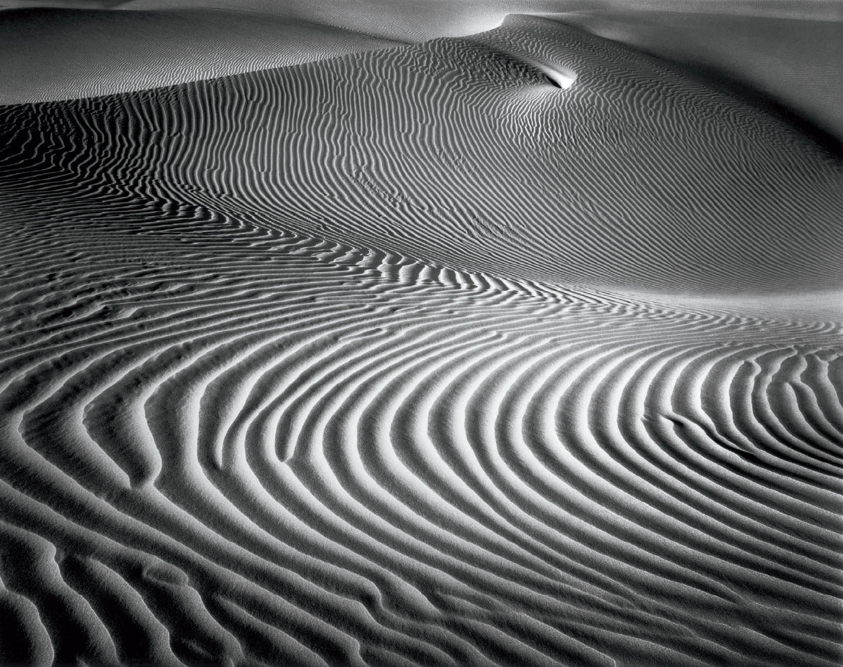
Figure 14-8: Elegant Dune
Photographed at about 2:30 p.m., this image serves as a perfect counterexample to the myth that good landscapes can only be made near sunrise and sunset. The slope of the land rose gently to the left, or west, and the negative was in November, when the sun is relatively low in the sky. Everything came together perfectly for a strong, open midday landscape.
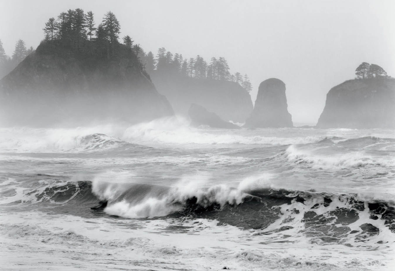
Figure 14-9: Surf, Olympic Peninsula, Washington
This seascape was made at about 1:00 p.m. while crashing surf pounded the shore between huge tree-covered sea stacks.
Restricting your photography to the hours near sunrise or sunset limits your exploration to the times that low light exists. That cramps your options. Low light is fine, but it’s not the only good light. Suppose you wake up on a foggy, rainy, or cloudy day, and that light remains constant. One of my most noteworthy photographs (figure 3-7, Fallen Sequoias) was made under wonderfully foggy conditions at about 11:30 a.m. The fog had several benefits: it softened the light in the forest, it evened out the light (i.e., it removed bright splotches and dark shadows), and it simplified the background by eliminating it! Trees were visible for only a short distance before disappearing into the fog. I couldn’t have made that photograph at noon on a sunny day, nor could I have made it near sunrise or sunset; alternating bright sunlight and deep shade on the trees would have transformed the image into a confusing mess of light and dark spots. Fog at noon was perfect.
But the deep forest was an enclosed situation. The question arises: can you make midday photographs in an open landscape? Of course you can—remember, Weston did! It may not be easy, but it can be done. In December 2000, I went to the Olympic Peninsula on a wild, windy, rainy day. Wave upon wave pounded in, with spindrift flying off each one as it rolled toward the beach. It would have made no difference if the time were sunrise, midday, or sunset. Conditions were exceptional. There was no reason to put down my camera simply because it was 1:00 p.m. (figure 14-9).
I could cite dozens of examples of slit canyon photographs I made in the midday hours. It’s simply too dark to see them earlier and later. These photographs constitute my largest single body of images. While I recognize that they are not exactly landscapes in the usual sense of the word, they still are photographs of landforms.
Examples of successful midday landscape photographs abound. The bottom line here is simple: Don’t shut down when the sun gets high in the sky. You’re shortchanging yourself if you do so. There’s even more potential than I’ve discussed up to now. What about small details? Few photographers would suggest putting your camera away at midday if you’re interested in the small details within the landscape: flowers, mosses, rocks, bark, ice, ripples on a pond . . . you name it! These offer wonderful possibilities—don’t ignore them. Details can work for you at any time of the day.
Keep in mind that when you’re looking at a landscape, you’re not just looking at the land. You’re looking at light. You’re looking at lines and forms. You’re looking at relationships among lines and forms. You’re putting your creativity to work to find the compelling visual relationships that transform a wonderful scene—or even an ordinary scene—into a wonderful photograph, one that communicates your worldview to others. Those situations occur throughout the day. Limiting yourself to the early and late hours limits your options.
Myth #7: All black-and-white photographs need a good black, a good white, and tones in between.
This statement is the equivalent of saying that all good color photographs (or paintings, for that matter) need a primary blue, a primary red, a primary yellow, and all colors in between. Nobody would take that remark seriously, so why should anyone take this myth about black-and-white photography seriously? Beats me.
Of course, there’s nothing wrong with a photograph that fulfills the stated mandate, as long as such tones are appropriate for the desired mood. Similarly, there is no objection to a color photograph that includes the full color spectrum, if that, too, remains consistent with your goals. My objection is to the dictate that all images require a full range of tonalities. They don’t!
The purpose of a photograph is to make a visual statement, not to adhere to some arbitrary rule about tonal range and gradations. A photograph is supposed to be a communication between the photographer and the viewers. It’s supposed to draw viewers in and hold them there until they get the message and feel the emotional impact. If every one of your photographs adheres to the stated mandate, then you’re doing formula photography. There’s a “sameness” to your images, and that uniformity soon bores your viewers.
![]() When you’re looking at a landscape, you’re not just looking at the land. You’re looking at light. You’re looking at lines and forms. You’re looking at relationships among lines and forms.
When you’re looking at a landscape, you’re not just looking at the land. You’re looking at light. You’re looking at lines and forms. You’re looking at relationships among lines and forms.
The emotional content of subject matter coupled with tonality and line structure is the heart of expressive photography. Sometimes you want to express a mood that’s depressing, sometimes uplifting, sometimes dreamlike and airy. A pure black or a pure white tonality could be inappropriate for the mood of your image. Don’t worry about that mandate regarding tonalities. Just print the image in the way that enhances the mood you want to project (figure 14-10).
The way to do this successfully is to understand human visual language. There is a universal visual language that pervades all cultures on our planet. It’s inherent in our being. An image dominated by dark tones doesn’t have the same feeling as one dominated by light tones. There is a mood associated with a set of tonalities. A photograph dominated by midtones doesn’t have the dramatic impact of one replete with brilliant whites and deep blacks. This visual language extends beyond tonalities to lines and forms. Soft, flowing lines and gently rounded forms project a very different mood from straight lines, tightly curved lines, jagged lines, or sharp-edged forms.
When you combine flowing lines and rounded forms in a photograph with midtones or light tones, you get a very quiet, relaxing mood, rarely one of high excitement. If, on the other hand, you combine sharp-edged, broken forms and jagged or tightly curved lines with high contrast, you get an active, exciting image that may even border on the frenetic or angry. It won’t convey a quiet, relaxed feeling. It can’t, with those lines, forms, and high contrasts. These are strong aspects of our visual language. Employ them sensibly and appropriately to make an image that projects the mood you wish to convey.
Since 1975, in workshops I have taught, I have repeatedly seen photographs that blatantly ignore our visual language. A pastoral landscape is often rendered with striking contrasts capped by glowing whites and deep, penetrating blacks. Yet the image cries out for softer tones to convey the inherent sense of peace and serenity. I believe that the reason for the disparity between printed tonalities and appropriate tonalities is that most beginners—and many more advanced photographers—seek high drama in virtually every image. They are either reluctant or scared to convey a quiet mood with mellowed gray tonalities. I also find that those doing digital imagery often fall victim to this syndrome, especially with the advent of HDR, putting the most brilliant aspects of every exposure into the final image. But there is no hierarchy of tonalities when everything is equally brilliant. Viewing an image like that is the equivalent of listening to a symphony in which every phrase is a crescendo; it becomes tedious very quickly. There is no sense of reality or logical light or a quieter mood.
What about color photography? The same concepts apply for line and form structures and for the brightness/darkness of any photograph, either color or black-and-white. But what about color itself? Again, the same concepts apply. Light, pastel colors convey a different mood than deep, rich colors. Saturated primary colors placed next to each other have the same high activity as high-contrast tones placed next to each other in a black-and-white image. So, soft, curved lines and light pastel colors impart a far quieter and more relaxed mood than sharp, jagged lines and saturated primary colors. Yet in today’s world, color photographs often take on a cartoonish air with the highest possible contrast and the most deeply saturated colors. There is no restraint and no reality.
I have seen high dynamic range (HDR) devotees photograph the equivalent of an asphalt road and turn it into a rainbow, claiming, “The colors were actually there!” Yeah, right! Too often the wrong set of colors and/or lines detracts from the appropriate mood of the image. It makes me think that the current fad in color photography (particularly in digital imagery) is based on the idea that every color photograph must indeed have a primary red, a primary yellow, and a primary blue, with all the other colors in between! We seem to have lost all sense of subtlety in the race for high impact and shock value.
I recommend that you look at books of paintings (and if possible, at the actual paintings in museums) to see their use of colors and relationships. You will see how painters use intensely rich colors to convey different moods. For example, Van Gogh often used primary colors and wildly curved or broken lines to create bold, frenetic effects; yet he also used a far more subdued palette to convey an entirely different mood. Andrew and Jamie Wyeth also used subtle colors, tones, and structures to convey wonderful moods.
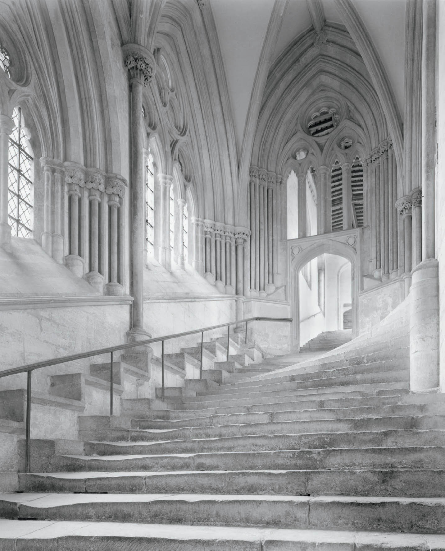
Figure 14-10: Stairway, Wells Cathedral
The English cathedrals struck me overwhelmingly as examples of what humanity can produce at its best. This image is an attempt at an ethereal “stairway to heaven” with no blacks or dark grays.
So, going back to black-and-white, why would anyone implore you to have a white, a black, and tones in-between for every image? It would be like forcing the same emotion in each image. Such an admonition flies in the face of common sense. It damages the central reasons for creating any work of art: making a statement and eliciting an emotional response.
This understanding separates the top photographers from the also-rans. Photography should not become a mere technical exercise. It’s the feeling that counts, not the technical expertise. I don’t make photographs to solve technical problems. If I did, I would be a “tester,” not a photographer. Sometimes I have to solve technical problems to make successful photographs, and I fully recognize the importance of solving those problems. If you don’t solve technical problems, your message may become so compromised that it’s lost.
All great art conveys emotion. This is true of music, literature, sculpture, painting, and dance as well as photography. The greatest, most time-honored works in any field have tremendous emotional impact; that’s why they’re considered great!
So keep this in mind: The message is the important thing. The mood is the important thing. The technique is merely support for communication between the photographer and the viewer. If your photographs are technical tour-de-forces that say nothing, then you’ve produced little of value. Ansel Adams, forcefully supporting this idea, said, “There’s nothing as useless as a sharp photograph of a fuzzy concept.” A good lens can produce a sharp image but nothing more. It’s the photographer with something to say—not the sharp lens—that produces important photographs. Ignore this myth; make good photographs.
Myth #8: Buying, learning, and using the latest app will make me a great photographer.
Image-editing tools such as Lightroom, ACR, and Photoshop give so much control that the issue is controlling your instincts and desires to abuse these tools. There is no new app that is going to make a significant difference to your digital photography. Yes, it’s possible that some new app may make a marginal or discernible difference somewhere—specifically a better-looking print—but it’s not going to produce great photography by its presence on the market.
The only thing that will make you a significantly better photographer is to understand and employ the basics: light, composition, and a keen passion for what you want to tell the world via your photography. A new app will not vault you into greatness, although it may indeed give an already good image the added spark. (Remember Ansel Adams’ comment that “there is often a small difference between a print that’s acceptable and one that’s exceptional.”) But keep in mind that if you start without a firm understanding of good light, good compositional relationships, and a strong sense of what is truly important to you, it will just be “garbage in; garbage out,” and a new app will not turn garbage into art.
Myth #9: The center of interest should be one-third of the way up and one-third of the way into the photograph.
I have heard several conflicting stories about where the “rule of thirds” originated. I don’t know which is correct. My favorite of the stories is that it stems from a flawed study in the 1850s by a statistics professor who decided to learn what makes great paintings great. He worked with several art critics and art historians who chose 250 of the finest paintings. (Consider this: A statistician with no real art background was working with people involved in the arts who had no understanding of statistics. So, this whole “study” started with a communication disconnect.)
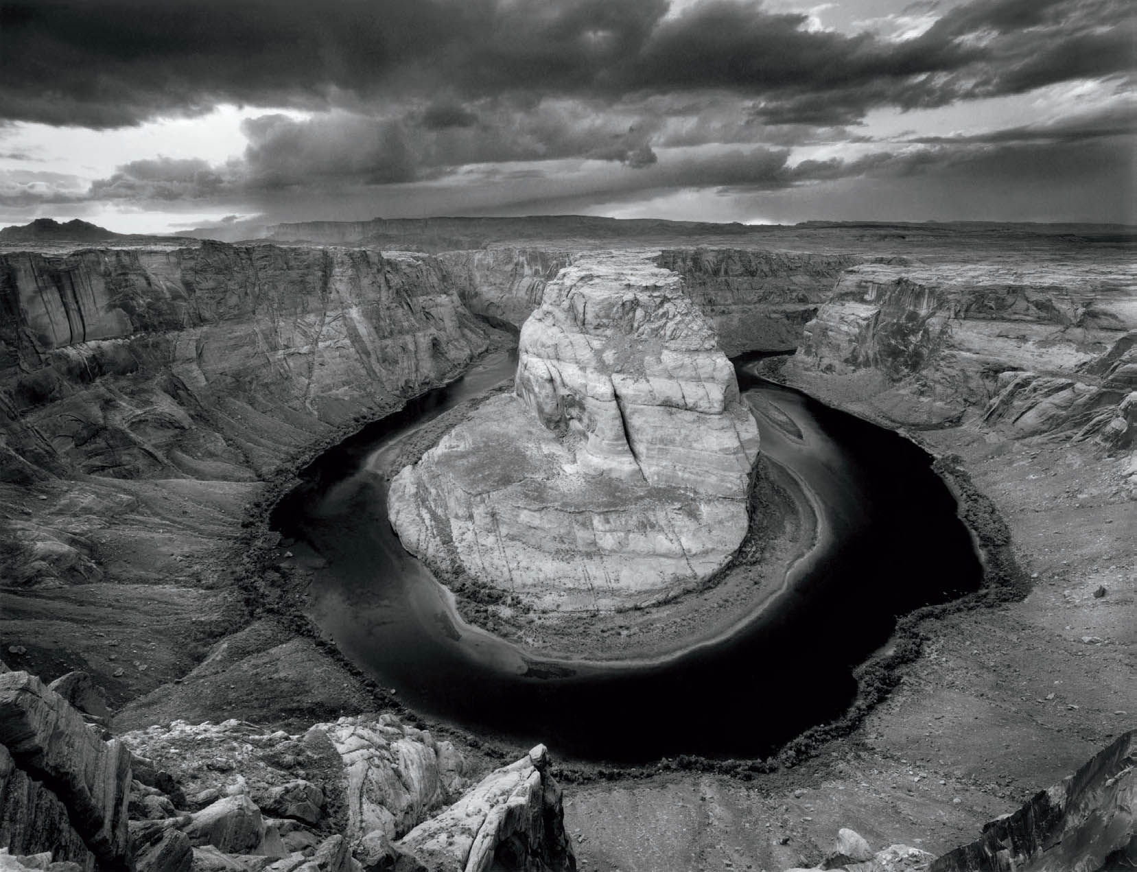
Figure 14-11: Horseshoe Bend of the Colorado River
The unimaginable symmetry of nature on a grand scale drew me to make this photograph. To accentuate that symmetry, I photographed directly toward the cliffs across the 180-degree turn, placing the center of interest directly in the center of the image. I can’t imagine a better placement for it.
One question he wanted to resolve was where the center of interest should lie. Realizing that the center of interest could be placed in any one of four quadrants, and that it would end up at the exact center on average, the statistician rotated the center of interest from wherever it was found around the center of the painting to the lower-right quadrant. Then he applied his statistical analysis, apparently thinking he had produced a valid analysis. He hadn’t.
Consider the imaginary line that goes from the extreme corner to the center. Obviously there would be as many points above the line as below the line, in roughly equal distances from the line. So the statistical average was certain to be on that line. No center of interest is found in the exact corner of a painting, so there is no contribution from the corner, but there could be contributions from the exact center. In other words, the center of interest would be along the line and would be weighted toward the center.
Not surprisingly, the statistician found that the average center of interest was two-thirds of the way along the line. His analysis forced that conclusion. In other words, it was a predetermined result! Without his quadrant rotation, the analysis would have yielded the exact center as the best place to locate a center of interest.
Of course, two-thirds of the way up that line is—ta-da!—exactly one-third of the way up and one-third of the way into the painting from the corner. The result goes beyond useless because it was a meaningless question to begin with. Amazingly, that flawed analysis of a meaningless question is the basis of this baseless compositional rule.
Sometimes you may want to place an object directly in the center of a photograph for stability, strength, balance, symmetry, or any number of other reasons as I did with Salmonberry and Corn Lily (figure 14-1), and with Horseshoe Bend of the Colorado River (figure 14-11). Sometimes you may want a center of interest (if there is one) near the edge or corner, perhaps to create an intentional imbalance or to balance a greater mass nearer the center on the other side (the old teeter-totter balancing act).
The rule of thirds is a cornerstone for much useless teaching about composition—sinking to its lowest ebb in camera club and professional photographic competitions, where it’s considered the epitome of fine composition. It’s an idea that best belongs in the trashcan.
Myth #10: The horizon line should never divide a photograph in half.
Why not? There is simply no logical or visual reason for such a silly compositional rule. It may be that dividing the image space in half horizontally (or vertically) creates the strongest possible composition for a specific image (figure 14-12). Every image must be approached on its own merits. It makes no sense to rule out a valid compositional approach before you begin composing. Rules, assuming there are any, have to be bent and often broken to help make a point.
Yet there are photographers who purposely move the horizon line above or below center for no apparent reason other than to adhere to this so called “rule.” That’s just pure foolishness. Don’t ever be swayed by this senseless rule. Figure 10-9 breaks this silly rule twice: first dividing the top and bottom in half with a horizontal line, then dividing the bottom in half with a vertical line.
This silly myth and the previous one are two absurd rules of composition that are regularly bandied about as meaningful. There are other rules based on things like the “Golden Mean,” made by people who have no idea about the purely mathematical basis of that ratio as the answer to a question posed by Euclid 2,300 years ago. The Golden Mean has no artistic ramifications whatsoever. In fact, none of these purely mathematical considerations have compositional validity.
The golden mean is the point (b) somewhere on the line a–c, that divides the line such that the ratio of the full line (ac) to the longer segment (ab) is the same ratio as the longer segment (ab) is to the shorter segment (bc). So, for example if you had an 8" line (ac), and placed a point on that line at the 5" point (b), then the ratio of ab to ac is ⅝ or .625. The ratio of bc (the shorter 3" segment) to ac (the longer 5" segment) is ⅗ or .600. Close, but no cigar. It turns out that the actual “golden mean” point cannot be expressed as a fraction, or even as a simple decimal. This confounded Greek mathematicians, who thought such a simple question should be solved with a simple answer. But note this: There is absolutely no aesthetic aspect to the basic question. Some people think it has meaningful aesthetic qualities. I see no validity to that.
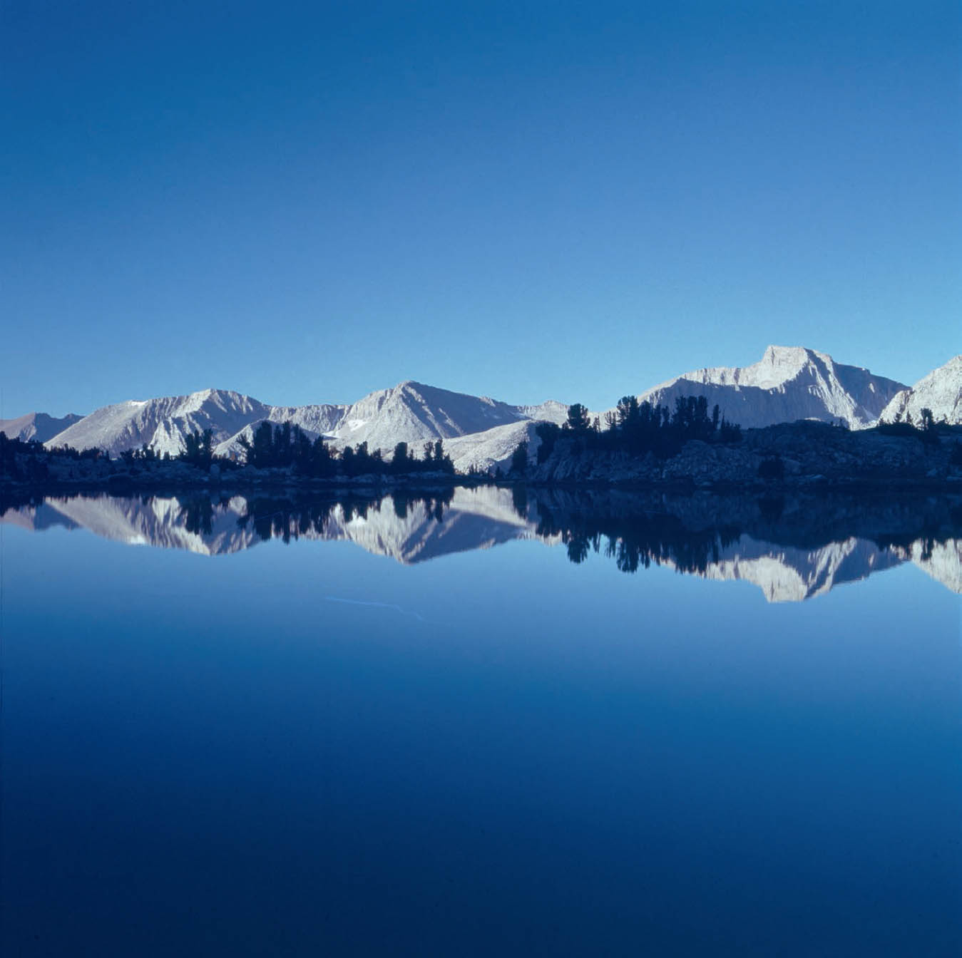
Figure 14-12: Morning, Great Western Divide, Sierra Nevada Mountains
Dividing the image in half—with the deep blues of the sky on top and the perfect lake reflection below—the mountains and trees are like an embroidered belt on a fine dress. This composition imparts tremendous strength to the quiet, yet bold image. As Edward Weston stated, “Good composition is the strongest way of seeing.”
Every image must be dealt with on its own merits. Each one requires its own set of rules, which rarely apply to the next image. Some people think it’s useful to know the rules so they know when to break them. I disagree. Since rules are inherently useless, knowing them simply constrains you to follow them or consciously break them. Why put something in your mind to worry about if it’s inherently useless from the start? It’s like putting an obstacle in your path for no reason whatsoever.
My approach can best be summed up as, “There are no rules!”