
2
Establishing a Raw Workflow
By now you will have realized that making the decision to switch to raw capture has implications that reverberate throughout the rest of the photographic production process. The biggest change, of course, is that you will need to alter the way that you treat the editing and enhancement of your photos, as they are now captured in a specialized format.
A specialized format that requires specialized processing, specialized tools for that processing, and a specialized workflow to structure the processing steps.
Establishing a workflow that works for you
As with many things digital, there are a range of different ways to process, edit and enhance your raw files. Here I present a variety of workflow approaches, all designed for specific photographic environments. It will be your task to pick the approach that best fits with how you work. Like an old glove, the workflow that you choose should fit comfortably.
Most workflows fit within two different methods of working. To get us started, let’s look at each of these approaches as well as the software components that form the base of these workflows.
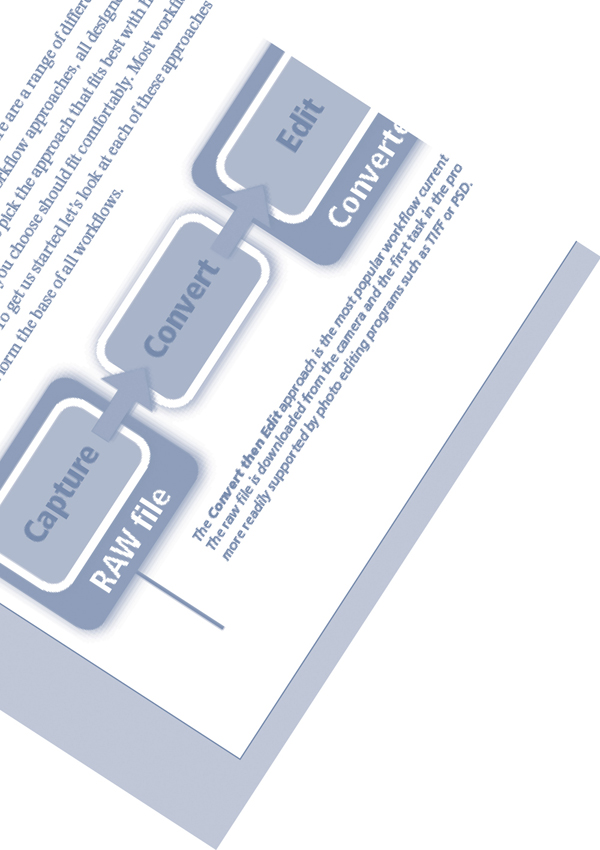
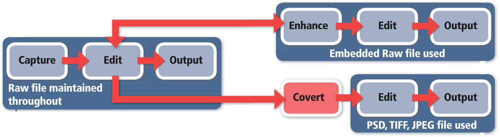
The Convert then Edit approach is the most popular workflow currently used by raw shooting photographers. The raw file is downloaded from the camera and the first task in the process is to convert the file to a type that is more readily supported by photo editing programs such as TIFF or PSD.
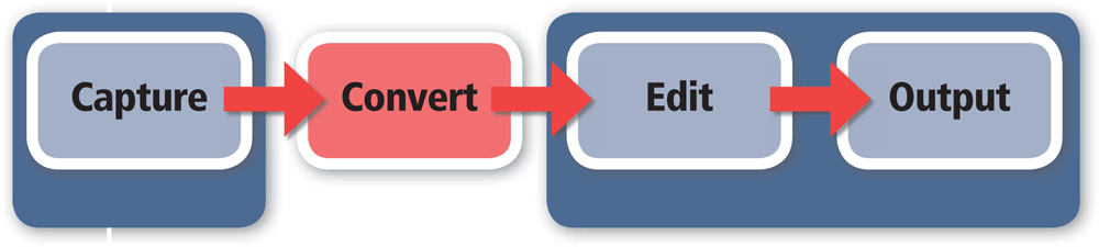
The ‘Convert then Edit’ approach
Until recently, the only way to deal with raw files was to convert them from their unprocessed format to a file type that could be manipulated by photo editing software. The conversion process was handled by specialist software such as Adobe Camera Raw, or the raw utilities supplied with the camera. There are a variety of global enhancements (contrast, brightness, color, white balance, etc.) that can be applied to the photo during the conversion process handled by such utilities, but for many photographers the real work only commences after this process is finished. For this reason, this workflow is often referred to as a Convert then Edit approach.
Very nice thank you!
The workflow structure sits well with new raw users as it allows them to carry on with their standard editing approach after the conversion is complete. It also mimics the traditional photographic process where a single negative (raw file) could be processed in many ways, providing a variety of different outcomes. The process takes full advantage of the quality gains available from careful processing of the raw file and it is still the primary way that many photographers unleash the visual power of their raw files.
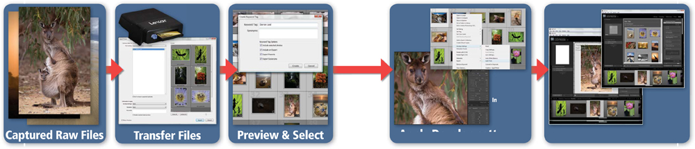
Example photographer ‘A’ – the portrait photographer
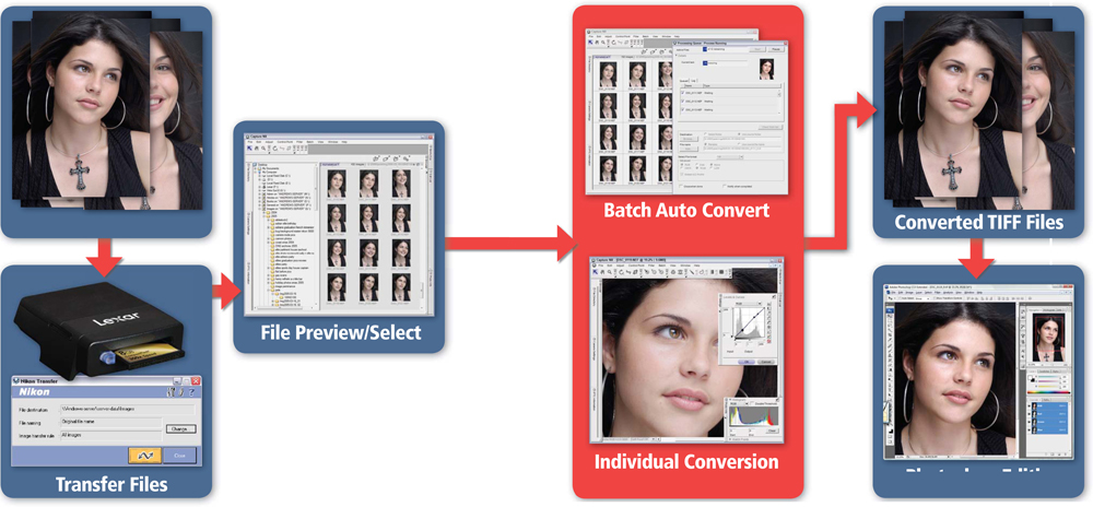
How does this workflow look and feel in practice? Well let’s take example photographer ‘A’. He is a portrait photographer who regularly shoots 20 or 30 photos per session. Previously he would have captured these photos in high quality JPEG or TIFF format but now he selects the raw format. After shooting, the files are downloaded to the computer via a card reader.
The transfer process is handled by the utility supplied by his camera manufacturer. This small program automatically starts when a card is inserted into the reader. After inserting details about where the images are to be stored, and how the files are to be named, the utility transfers the files to the computer and opens the photos in a dedicated file browser (again supplied by his camera manufacturer). Here the files are examined and the best images selected. The batch conversion option in the camera-based raw software is used to convert (using general or auto settings) and export most of the selected photos in a TIFF format.
Specific images that would benefit from individual attention are selected and opened into the raw conversion software. Here color, tone, sharpness and noise settings are customized for each photo before these images too are exported in the TIFF format. The converted files are then opened into Photoshop where they are enhanced and edited in preparation for presentation to the client.
In this example, the raw files are converted with the camera-based software and then further edited in Photoshop. To ensure the best image quality it is important for photographer ‘A’ to make good conversion decisions early on in the process, as once converted, key parameters of the files are set.
Photographer ‘A’ workflow
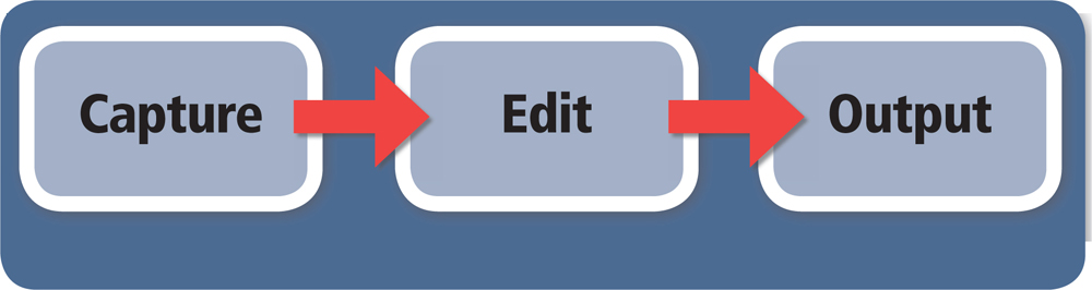
The portrait photographer in this example uses a traditional Convert then Edit workflow for processing and editing his raw files. Once converted, the photos are edited and enhanced in just the same way as pictures captured in JPEG or TIFF formats.
The downside of the ‘Convert then Edit’ approach
The disadvantage of this approach is that once the conversion has taken place the ability to adjust the conversion settings is lost. Yes, it is possible to reconvert the original file with different settings to facilitate a different outcome, but essentially the core of the workflow is that at a specific stage in the process the raw file will no longer be the base reference for the image. In essence the processing that used to occur in the camera is delayed and handled, albeit more consciously and carefully, on the desktop, but the result is the same – the raw file is converted to another file type, and factors such as white balance become fixed and irreversible in the conversion.
Full raw workflow options
Until the release of Aperture, Lightroom and, to a lesser extent, the Smart Object technology in Bridge and Photoshop, Convert then Edit was the only option open to dedicated raw shooters. But that was then, and this is definitely now! Raw shooting and processing is no longer in its infancy, and along with the area’s growing maturity has come new ways of working and new products to facilitate new workflows.
In contrast to the previous approach, programs that provide a full workflow approach maintain the raw file throughout the whole digital imaging process. This completely non-destructive workflow is the way of the future for raw shooters and it is growing in support, with both Apple and Adobe releasing dedicated raw workflow products for the professional photography market. Not to be left out, new editing and enhancement techniques and ‘workarounds’ for Photoshop and Bridge users that adopt this workflow approach are being promoted all the time.
With these new approaches it is possible to maintain the raw state of the picture file throughout the whole digital imaging process. With this workflow the multitude of raw conversion, or development, settings normally applied to a photo can be edited, reversed or even cleared at any time in the process. The primary image data is never destructively altered, only the way that this data is interpolated and previewed on screen is changed. This is the future of raw processing and I predict that more and more image editing products will adopt a full workflow attitude as raw shooting becomes the norm, rather than the exception, for quality hungry shooters.
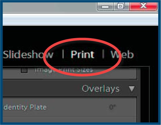
Example ‘B’ – the wildlife photographer
How does a professional photographer apply a full raw workflow? Well, let’s use the example of a wildlife photographer who also shoots more than his fair share of the landscapes. After returning back to the office with a bag full of packed memory cards, or a full portable hard drive, the first task is to transfer the files to his production machine. As Photoshop Lightroom is his software of choice, this means employing one of the Import options listed in the File menu. In the download dialog he can name, add metadata and even apply saved develop settings to the raw files as they are transferred to his machine. Next, the features inside the Library module are used for sorting, tagging and selecting suitable images to enhance. Individual photos are edited and enhanced via the tools in the Develop module. Core changes that are common to all photos, or groups of similar images, are saved as a Preset and then applied to the selected photos. Finally, the images are presented with either the Slideshow or Web modules and/or output to media with the options in the Print module.
Photographer ‘B’ workflow
In this example a wildlife landscape photographer makes use of the full raw workflow afforded by Photoshop Lightroom to handle his files from download, through enhancement to output.
Hybrid approaches
In reality most photographers will still resort to a mixture of both these systems for their daily work. They will use more of a hybrid approach that performs as many image management, editing, enhancing and presentation functions with the photo remaining in the raw format for as long as possible. Many images will not need to be taken beyond this raw-only workflow for them to reach their full potential, but there will be some photos, or imaging projects, that will require editing functions or techniques that are not present in the workflow. It is at this point that the raw file is exported to another program and/or format.
A Hybrid workflow makes use of a full raw workflow product for most enhancement tasks and then employs either a convert or embedded raw file approach for editing outside of the main workflow program.
As an example, think of the photographer who handles all his raw work in Photoshop Lightroom and wants to make a montage of several of his best images in a single document that can be used as a poster. For this to occur the raw files will need to be exported to Photoshop, where the separate images will be combined. During the export process, the raw files will be duplicated and converted to PSD (Photoshop), TIFF or JPEG files, thus losing the ability to edit the raw parameters of these copies later.
In the greater scheme of things, this is no big deal as we always have the original raw files, our original digital negative, from which to commence any further iterations of the photo. In this way, the hybrid approach truly does resemble a traditional film capture and print process, as the original storage device (the raw file) is the basis of a variety of processing outcomes. In the old days this meant different prints, some with more or less exposure, others with areas dodged and burned in, and still more with changes in color or contrast all originated from a single negative. For raw shooters the results are similar, with the raw file sitting at the start of a variety of output options – print, web galleries and slideshows.
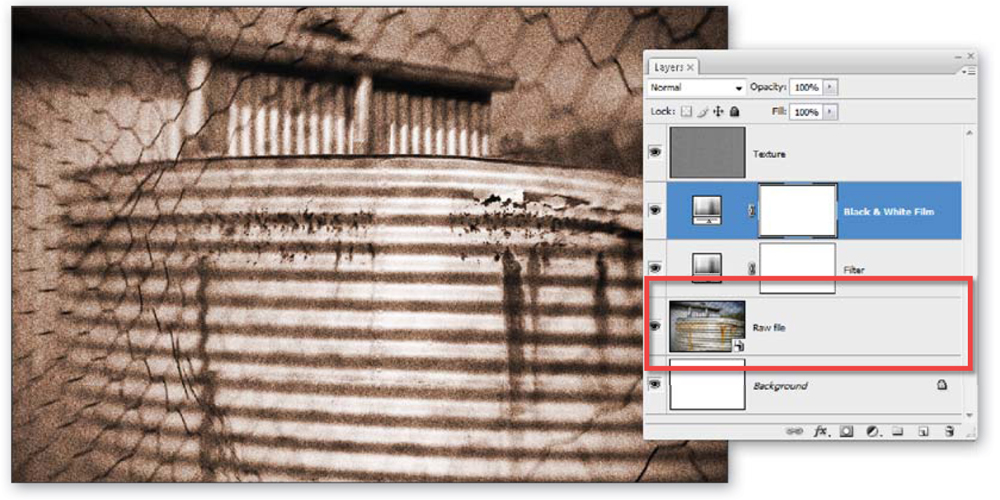
Currently the area of hybrid processing is in a state of flux. With the ever increasing power of the Smart Object technology in Photoshop, and the ability for raw files to be processed in Adobe Camera Raw in Bridge, it is now possible to perform quite complex editing in Photoshop without the need to convert the raw file first. This is one of the most exciting areas of raw editing as the most innovative techniques are both non-destructive and are also based around a non-converted raw file sitting in a Smart Object.
Example ‘C’ – the editorial photographer
The example photographer for the hybrid approach to raw file handling is an editorial photographer. Put simply this means that he can be called upon to produce a range of image types according to what is required by the magazine editor.
The Smart Object technology inside Photoshop CS2 and CS3 enables you to embed a raw file inside a Photoshop document and continue to edit the file non-destructively.
In one issue he might be commissioned for a series of photos in a documentary style. By definition, these images require little editing beyond that which is possible with the tools available from a Full Raw Workflow product such as Photoshop Lightroom. Consequently he uses the program to make all global color, tone and sharpness enhancements. Using the Remove Spots tool, he can eliminate marks in the photos caused by sensor dust and the Remove Red Eye tool can be employed for problem flash photos.
In another edition of the publication, he is asked to produce a series of highly manipulated images that are more illustrations than they are photos. For this series he makes basic adjustments to his raw images in Adobe Camera Raw or utilizes the changes he has already made before opening the files as Objects in Photoshop. This step embeds the raw file in a Smart Object layer inside a Photoshop document. Adjustment layers together with masks are used for changes to specific areas and the new Smart Filtering technology in CS3 is employed for all filtering tasks. In this way he is able to maintain the integrity of the raw file throughout while still editing the image beyond the capabilities of Lightroom.
Building workflows upon a firm foundation
Now that you have a good idea of the various workflow options available to you, I thought it best to spend a few pages looking at some general foundations that should underpin all workflows. In particular, we will concentrate on the importance of good color management and making sure that your hardware is also up to the task. Though not specifically related to raw workflow, these areas are critical for the efficiency and accuracy of your raw processing.
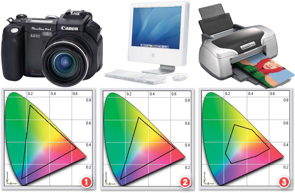
The devices used to capture, process and output color pictures all respond to color in a different way. Each piece of hardware is only capable of working with a subset of all possible hues. This range of colors is called the device’s color gamut.
1. Camera gamut.
2. Screen gamut.
3. Printer gamut.
Graph images generated in ICCToolbox, courtesy of www.icctools.com.
Ensuring color consistency between devices
One of the biggest problems faced by the digital photographer is matching the color and tone in the scene with what they see on screen and then with what is output as a print. Despite the sophistication of raw processing techniques, such basic color consistency is still a core issue that will affect image quality if not handled correctly. This problem comes about because, when working digitally, we use several different devices to capture, manipulate and output color photographs – the camera, or scanner, the monitor or screen, and the printer.
Each of these pieces of hardware sees and represents or depicts color in a different way. The camera converts a continuous scene to discrete digital tones/colors, the monitor displays a full color image on screen using phosphors or filtered LCDs and the printer creates a hard copy of the picture using inks on paper.
The difference between the gamuts of different devices can lead to photographers not being able to match what they see on screen with printer output.
1. All visible colors.
2. Screen colors.
3. Printable colors.
Graph generated in ICCToolbox, courtesy of www.icctools.com.

One of the earliest and most complex problems facing manufacturers was finding a way to produce consistent colors across all these devices. As many readers will attest to, often what we see through the camera is not the same as what appears on screen, which in turn is distinctly different to the picture that prints. These problems occur because each device can only work with a small subset of all the possible colors. This set is called the color gamut of the machine. As the gamut changes from device to device so too does the range of colors in the picture. For example, the range of tones and colors the camera recorded may not be visible on screen and the detail that can be plainly seen on the monitor may be outside the capabilities of the printer.
When color management is not used the same digital photograph can display differently on different screens (1). When a tagged picture is displayed on several profiled monitors in a color-managed environment the image will appear similar despite the different characteristics of each computer and screen setup (2).
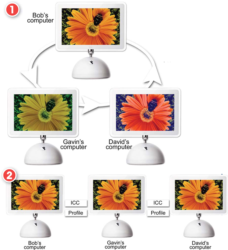
Add to this scenario the fact that if I send the same image to three of my friends it will probably appear differently on each of their screens. On one it may be a little contrasty, on another too blue and on the last screen it could appear overexposed. Each of the monitors is interacting with the digital file in a slightly different way.
So with all these complexities are raw shooters condemned to poor color consistency? The answer is a resounding NO! Through the use of a color-managed system we can maintain predictable color throughout the editing/enhancing process and from machine to machine.
Essentially color management is concerned with describing the characteristics of each device in the editing chain. This description, often called an ICC profile, is then used to translate image detail and color from one device to another. Pictures are tagged, when they are first created, with a profile and when downloaded to a computer, which has a profiled screen attached, the image is translated to suit the characteristics of the monitor. With the corrections complete the tagged file is then sent to the printer, where the picture is translated, again to suit the printer’s profile.
A similar scenario occurs when viewing files on different machines. As the picture is passed around, the profile for each monitor translates and accounts for individual hardware and color changes. The result is a picture that appears very similar on all devices.
Pro’s tip: To ensure that you get the benefits of color management at home, be sure to turn on color management features for your camera, scanner, monitor, software and printer. Always tag your files as you capture them and then use this profile to help keep color consistency as you edit, output and share your work.
Color management, image quality and workflows
So how does color management impact on our raw processing workflows? Well, as we have already seen, much of the quality of the final outcomes of the editing and enhancement process is determined by decisions as early as the capture format used for the photograph. Color management is no different in this respect. It is a fact that the digital photographer who considers color management at the point of shooting, and then again when editing, will output better quality (and more predictable) printed and presentation images than one who doesn’t. So at each stage of the digital process – capture, manipulation (editing/enhancing) and output – your pictures should be color managed.
Capture
Color-managed capture – For non-raw shooters it is critical to make sure that any color management, or ICC profile, settings in the camera are always turned on. This will ensure that the pictures captured will be tagged with a profile. The circumstance for photographers capturing in raw is slightly different. The decision about the color space used for the captured photo is delayed until the raw file is processed and exported. Both Lightroom and Camera Raw have a variety of output color spaces (ProPhoto RGB, AdobeRGB, sRGB) which can be selected at conversion or export time.
Manipulation
Color-managed manipulation – When editing and enhancing files in Lightroom or Adobe Camera Raw, both products place the images in a default, working, color space. For Adobe Camera Raw, this is ProPhoto RGB, and for Lightroom, it is a variation of ProPhoto RGB, code named ‘MelissaRGB’. These programs always use a color-managed workflow. Photoshop too uses a fully color-managed workflow but with the option to alter the default working profiles of RGB, CMYK and Grayscale images via the Color Settings preferences. In Photoshop Elements, we should make sure that one of the color management options is selected in the Color Settings dialog of the program. These measures will ensure that tagged pictures coming into the workspace are correctly interpreted, and displayed ready for editing and enhancement. It also guarantees that when it comes time to print, or output to screen, the software can correctly translate your raw masterpieces into a format that your printer, or monitor, can understand.
Output
Color-managed output – The final step in the process is output to screen or printer and it is critical, if all your hard work to this point is going to pay off, that you load and use the printer’s profile, or select a suitable screen profile (such as sRGB) for output that will be viewed on the web. This step means that the tagged file exiting the program will be accurately translated into the colors and tones that the printer or screen is capable of creating.
Think of the whole system as a chain. The strength of your color management, and therefore the predictability of the process, is based on both the integrity of the individual links and their relationship to each other. ICC profiles are the basis of all these relationships. They ensure that each device knows exactly how to represent the color and tones in an image, as well as how to best translate the colors from one device to another.
Setting up a color-managed workflow
Now that I have convinced you that a color-managed system has distinct quality advantages over a ‘hit and miss’ non-managed approach, you will, no doubt, be eagerly wanting to make sure that all the components in your workflow are color managed. So here are the steps that you will need to follow to put in place a full ICC profile color-managed system for capture, manipulation and output.
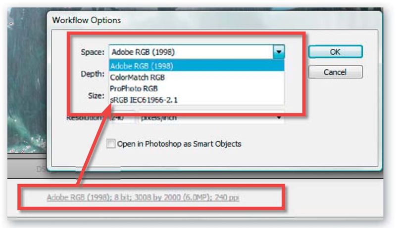
Unlike other capture formats, the color space or ICC profile associated with a raw photo is determined not at time of capture but when the file is processed and saved to another format. For instance, Adobe Camera Raw users can choose the output profile from several options in the Workflow Options dialog.
Camera profiles for raw shooters
All cameras that are capable of raw file capture should be sufficiently color aware straight out of the box. As the selection of a color space for the image is delayed until processing when shooting raw, there is no need to select a color space or ICC profile option in the camera’s setup dialog.
Some models will still allow you to select an output space when the camera is locked into raw capture. In these cases the selected profile, generally either sRGB or AdobeRGB, becomes the color space default in the Output section of Adobe Camera Raw but is not locked in and can be changed at any time. In fact it is possible to output the same raw file in four different color spaces by selecting a Space entry in the Workflow Options and saving off the resulting file.
Companies like X-RITE do provide sophisticated capture targets and analysis software designed for creating custom camera profiles for specific lighting circumstances. For JPEG or TIFF shooters, this provides a very accurate way to ensure good capture color, but given that both Lightroom and Adobe Camera Raw do not have the option to use these profiles, creating a custom profile helps little in a full raw workflow. This is not to say that including a GretagMacbeth (X-RITE) color checker in a reference shot for a series of images captured under the same lighting conditions is not a good idea. In fact, doing so will mean that it is possible to ensure good white balance adjustment in your conversion software. If you are using Adobe Camera Raw, it will also mean that you can customize the default profile used for your camera with the controls in the Camera Calibration tab of the software. Chapter 9 contains full details of the process used.
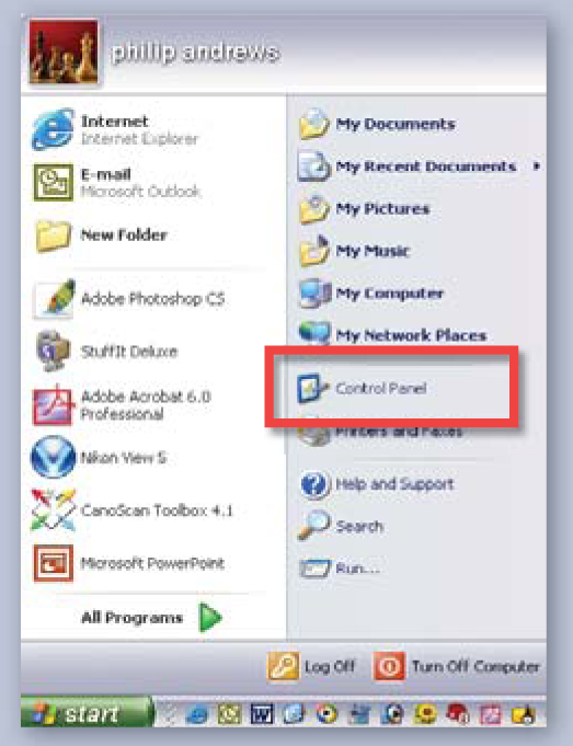
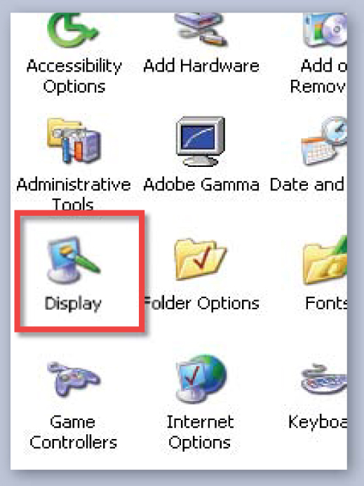
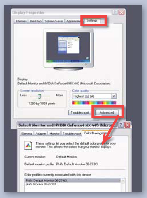
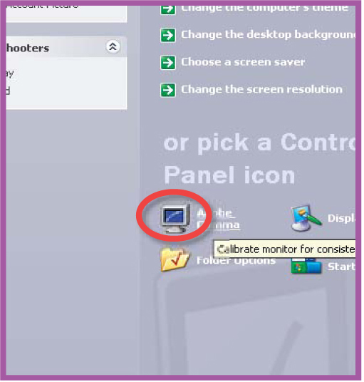
Windows XP users can check the profile that is being used for the monitor via the Settings > Color Management section of the Display control panel.
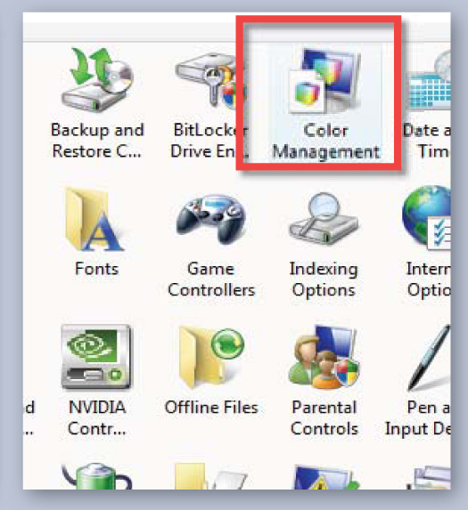
Vista users will find similar controls in the Devices section of the Color Management option in the Control Panel.
Mac OSX users will locate the default monitor profile in the Color section of the Display control panel.

Monitor and screen profiles
Now let’s turn our attention to our screen or monitor. Most manufacturers these days supply a general ICC profile for their monitors that installs with the driver software when you first set up your screen. The default profile is generally the sRGB color space. If you want to check what profile is set for your monitor then Windows XP users will need to view the options in the Advanced settings of the Display control panel. If you are running Vista then the same details can be found in the Devices section of the new Color Management entry in the Control Panel. If you are working on a Mac computer using OSX then you will find a similar group of settings in the Color section of the Display control panel which is located in the System Preferences.
At this stage, simply ensure that there is a profile allocated for your screen. If one isn’t to be found then use the step-by-step guides on the next page to add a monitor profile to your system.
In the following techniques, I will show you how to create specific profiles for your screen using either a hardware tool such as ColorVision’s Spyder, or if you are using an older version of Photoshop, or Photoshop Elements, I also include instructions for the Adobe Gamma monitor calibration utility. This utility no longer ships with the latest versions of either product and Adobe now recommends using one of the hardware options that are available. Mac OSX users, however, can still take advantage of the Calibrate utility, a software-based utility included with the Mac operating system. It is located in the System Preferences under the Displays option and the Color tab.
Windows XP
1. Windows XP users should select the Control Panel option from the Start menu.
2. Click on the Display icon from those listed.
3. Select the Settings tab and then the Advanced settings. Click Add to install a new profile.
Windows Vista

1. In Windows Vista select the Control Panel option from the Start Orb menu.

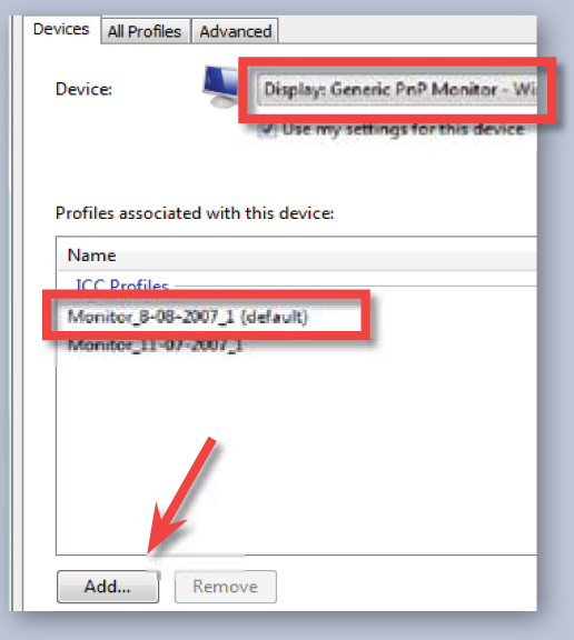
2. Click on the Color Management icon in the Control Panel.
3. Choose your monitor from the Device menu and then click the Add button to locate the ICC profile from the driver disk.
Mac OSX
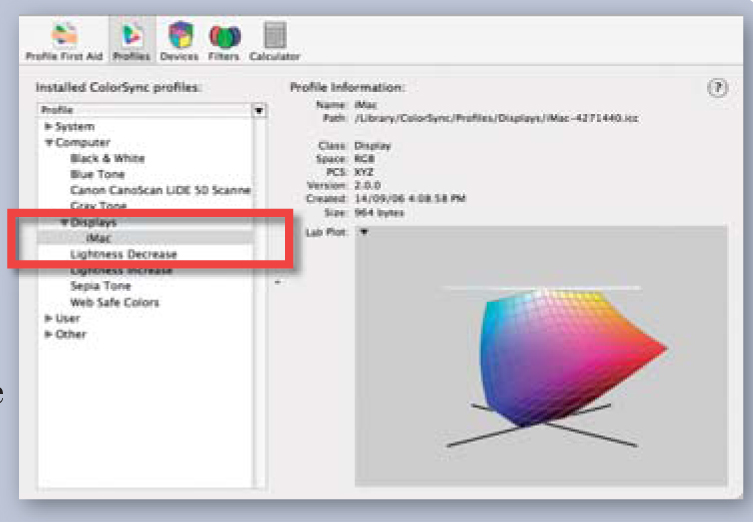
1. To add a new monitor profile to a Macintosh computer copy the profile to either one of these directories/Library/Colorsync/Profiles (System wide) or ˜/Library/Colorsync/Profiles (User folder).
2. To check what profile is currently being used navigate to the ColorSync panel (OSX) and then selecting the Devices or Profiles tabs from the list at the top. Now click on the Displays entry and you will see the profile currently being used by the system.
Hardware-based monitor calibration
For more accuracy than wizard-based screen calibration software alone, professional photographers often use a combined hardware/software solution like the well-known Spyder2 from ColorVision (www.colorvision.com) or the i1 from Xrite (www.xrite.com). Like the Adobe Gamma utility of old, the system will calibrate your screen so you can be sure that the images you are viewing on your monitor have accurate color, but unlike the Adobe utility, this solution does not rely on your eyes for calibration accuracy.
Instead, the ColorVision option uses a seven-filter calorimeter attached to the screen during the calibration process. This piece of hardware samples a range of known color and tone values that the software displays on screen. The sampled results are then compared to the known color values, the difference calculated and this information is then used to generate an accurate ICC profile for the screen. Unlike the Adobe Gamma approach, this method does require the purchase of extra software and hardware, but it does provide an objective way for the digital photographer to calibrate his or her screen.
Before you start…
1. Set the screen to 24-bit color and a resolution of at least 640 x 480 pixels or greater and ensure that the screen has warmed up for at least 30 minutes.
2. Make sure that you know how to change the color, contrast and brightness settings of your monitor. This may be via dials or onscreen menus.
3. Ensure that no light source is shining on the screen during the calibration process.
4. Once the calibration process has started, don’t move the on-screen calibration window.
The ColorVision Spyder2 system works with both CRT (standard) and LCD (flat) screens. A similar system is also available from X-RITE.
Spyder2 target settings for general digital photography
• Color temp. – 6500
• Gamma – 2.2 (Win)
• Gamma – 2.2 (Mac)
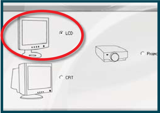
Step 1 Start by selecting the display type that needs calibrating. Here I have chosen an LCD screen.
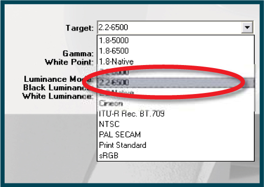
Step 2 Now select the target color temperature and gamma from those listed in the drop-down menu.
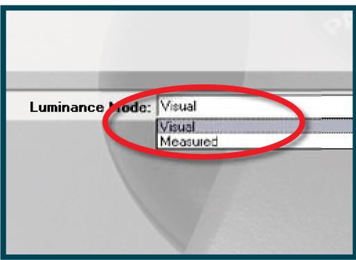
Step 3 Choose the Luminance mode between Visual (single screen) and Measured (multiple screens).
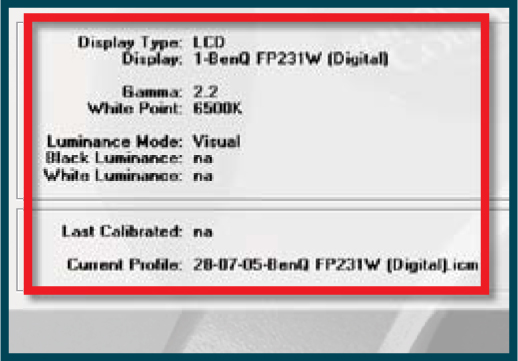
Step 4 Review the target display settings to check that they are correct.
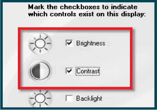
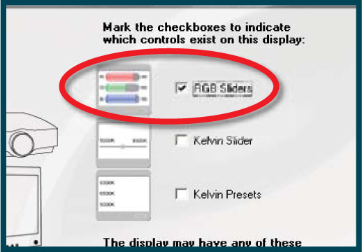
Step 5 Indicate which controls are present on the monitor.
Step 6 Return all settings to their factory default. Check with the monitor manual for instructions.
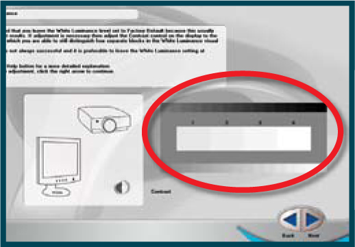
Step 7 Check that four separate white blocks can be seen in the scale. Adjust with the contrast control.
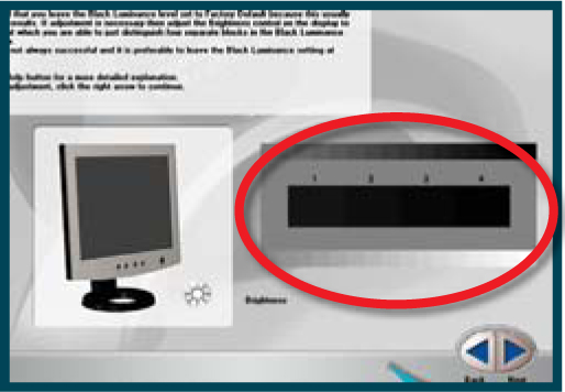
Step 8 Check that four separate black blocks can be seen in the scale. Adjust with the brightness control.
Step 9 Choose the way that the monitor adjusts color from the three options listed.
Step 10 Attach the Spyder and check to see that it is set up correctly for your screen type.
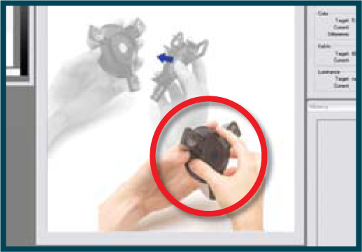
Step 11 Attach the Spyder to the monitor ensuring no other light sources are reflecting on screen.
Step 12 The sensor will initialize and then several colors will be displayed and tested.
Step 13 Adjust the individual Red, Green and Blue controls to balance the screen color.
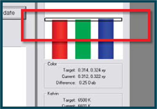
Step 14 Press the Continue button and let the Spyder read the color and tone swatches displayed.

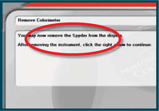
Step 15 When the program is finished, save the new profile.
Software-based monitor calibration
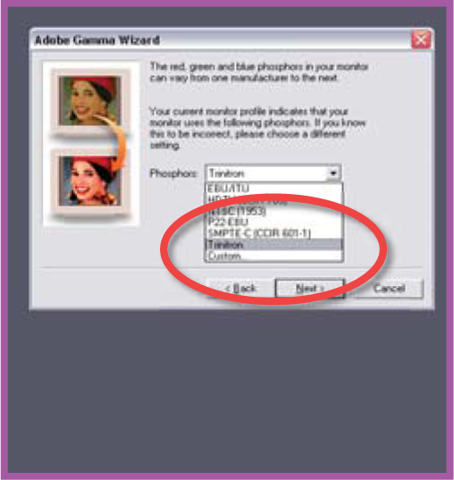
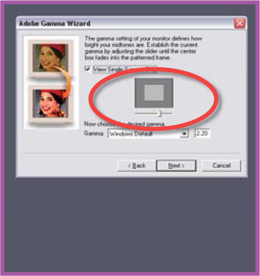
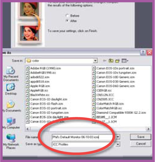
The profile that is included with your screen drivers is based on the average characteristics of all the screens produced by the manufacturer. Individual screens will display slightly different characteristics even if they are from the same manufacturer and are the same model number. Add to this the fact that screens’ display characteristics change as they age and you will start to understand why Adobe packaged a monitor calibration utility with older versions of Photoshop and Photoshop Elements. Designed to account for these age and screen-to-screen differences, the Adobe Gamma utility provides a way for users to calibrate their monitor and in the process write their own personal ICC screen profile. The program provides a step-by-step wizard that sets the black and white points of the screen, adjusts the overall color and controls the contrast of the midtones. When completed these settings are saved as an ICC profile that Adobe Gamma loads each time the computer is switched on. In Windows, Adobe Gamma is located in control panels or the Program Files/Common Files/Adobe/Calibration folder on your hard drive. For Macintosh users with OS9 and Elements 1.0 and 2.0, select the option from the Control Panels section of the Apple menu. OSX users should use Apple’s own Display Calibrator Assistant as Adobe Gamma is not used in the new system software.
NOTE: Adobe Gamma is not included in the latest versions of Photoshop or Photoshop Elements. Instead, Adobe recommends a hardware calibration solution such as the ones provided by X-RITE or ColorVision.
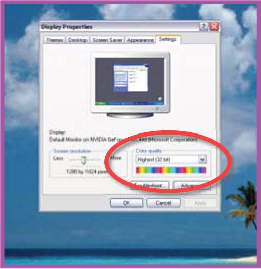
Step 1 Check that your computer is displaying thousands (16-bit) or millions (24-bit) of colors.
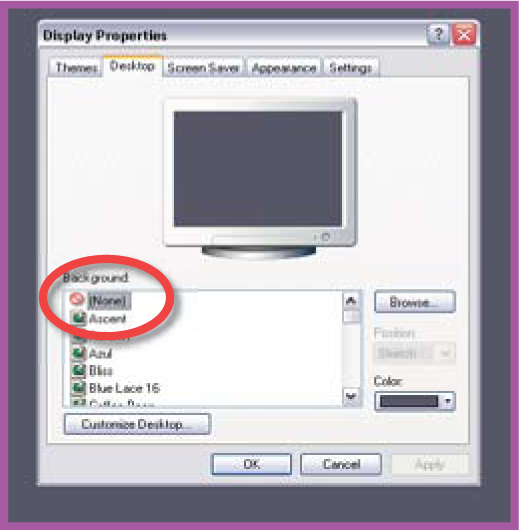
Step 2 Remove colorful or patterned backgrounds from your screen.
Step 3 Ensure that light from the lamps in the room, or from a nearby window, is not falling on the screen surface.
Step 4 Use the monitor’s built-in controls to select the color temperature/white point (e.g. 6500 K). Locate and open the Control Panel menu. Double-click the Adobe Gamma icon to start.
Step 5 Select the Step-by-Step Wizard (Win) or the Assistant (Mac) option and click Next.

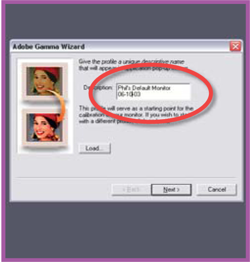
Step 6 Input a description for the ICC profile. Include the date in the title. Click Next.
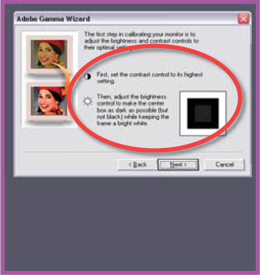
Step 7 Set the screen’s contrast to the highest setting and then adjust brightness. Click Next.
Step 8 Select the Phosphors that suit your screen. Check with manufacturer for details. Click Next.
Step 9 With Windows default set, adjust the Gamma slider until the square inside matches the outside in tone. Uncheck single Gamma and do the same for each R, G and B slider. Then recheck single Gamma and check it again. Click Next.
Step 10 Click the Measure button and calibrate the screen’s white point using the ‘3 squares’ feature. Click Next.

Step 11 Choose the Same as Hardware option as per Step 4 above. Click Next and then Finish.

Step 12 Save the completed profile with a file name the same as the profile description.
Software color management – Photoshop Elements
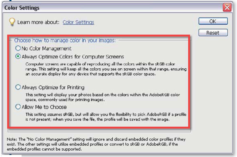
From version 4.0 of Photoshop Elements Adobe revamped the color management system to make it easier to understand and more logical to use. There are now four options to choose from in the Edit > Color Settings dialog. To ensure that Elements is operating with a color-managed workflow think about how you would normally view your work and then choose between Screen Optimized and Print Optimized options. If you need image-by-image control over what profile is used then select the Allow Me to Choose setting.
In Photoshop Elements 4.0/5.0 the color management system includes four different options in the Color Settings dialog.
Elements:
No Color Management – This option leaves your image untagged, deletes attached profiles when opening images and doesn’t add a profile when saving.
Always Optimize Colors for Computer Screens – Attaches sRGB to photos without a profile and uses sRGB as the working space but maintains any attached profiles when opening images.
Always Optimize for Printing – Attaches AdobeRGB to photos without a profile and uses AdobeRGB as the working space but maintains any attached profiles when opening images.
Allow Me to Choose – Maintains all attached profiles but allows the user to choose between sRGB and AdobeRGB when opening untagged files (Editor workspace only).
Software color management – Photoshop
The options that govern color management in Photoshop are grouped in a single dialog titled Color Settings. Here you select the working profiles that will be used for each picture type (RGB, CMYK and Grayscale) and determine when, and how, any color space conversions will occur.
The Color Settings dialog includes the following sections and options:
Working Spaces – Unlike print, monitor, camera or scanner profiles, a working profile or space is not linked to specific input or output characteristics. Instead a working space acts as an intermediate profile that provides a base for editing and enhancing picture colors and tones, and also establishes a known reference point for these tones and colors when converting to other output-specific spaces.
The ICC profile that you choose to use as your working space should reflect the requirements of the area that you work in the most. For instance, many photographers whose work is destined for the printed page choose to use the AdobeRGB profile as their working space, feeling that this space best suits their work environment. Those wanting the largest of the work spaces select ProPhoto RGB. In contrast, web designers often prefer to use sRGB as their working space as it reflects the characteristics of screen-based display more easily than other choices. The options in the Edit > Color Settings dialog allow you to set the working spaces that will be used in Photoshop for RGB, CMYK, Gray and Spot (color) pictures.
Color Management Policies – Also in this dialog are controls (Color Management Policies) that govern how Photoshop handles opening pictures that are not tagged or tagged with a profile that is different to the one nominated for the working space. Here you can choose to preserve the profile already embedded with the photo or convert the colors to a new profile. If a file needs converting then the conversion is based upon two main factors, the Conversion Engine and the Rendering Intent.
All Photoshop color management options are contained in a single Color Settings dialog (Edit > Color Settings). The dialog is split into three main sections.
1. Working Spaces.
2. Color Management Policies.
3. Conversion Options.
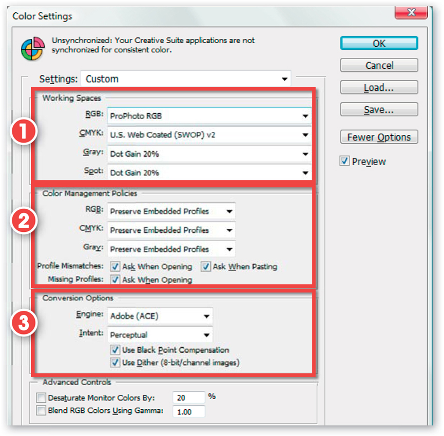
Conversion Engine – Here you can select the Adobe (ACE), Microsoft ICM, or Apple CMM in the Mac version method for conversion. Most photographers favor the Adobe route.
Rendering Intents – At various points in the digital photography process it is necessary to change or alter the spread of colors in a picture so that they fit the characteristics of an output device, such as a screen or printer, more fully. Perceptual is one of the four different approaches that Photoshop can use in this conversion process. The other choices are Saturation, Relative Colorimetric and Absolute Colorimetric.
Each approach produces different results and is based on a specific conversion or ‘rendering intent’. The Perceptual setting puts conversion emphasis on ensuring that the adjusted picture, when viewed on the new output device, appears to the human eye to be very similar to the original photo. So this is a good choice for photo conversions.
The Saturation option tries to maintain the strength of colors during the conversion process (even if color accuracy is the cost). The Relative Colorimetric setting squashes or stretches the range of colors in the original so that they fit the range of possible colors that the new device can display. The Absolute Colorimetric option translates colors exactly from the original photo to the range of colors for the new device. Those colors that can’t be displayed are clipped.
Specific Rendering Intents are also selected as part of the printing process via the color management controls in the Show More Options section of the Photoshop Print Preview dialog or the Lightroom Print Job settings.
Creative Suite users can quickly synchronize the color settings across the full range of CS2/CS3 programs using the Color Settings inside Bridge.
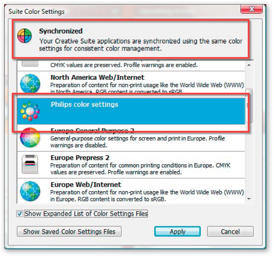
Bridge-based color synchronization
For Creative Suite owners the Bridge application not only provides a single place to access and manage your media assets, it also contains the ability to synchronize the color settings used in all Adobe CS2/CS3 applications.
To synchronize your color settings in CS2 start with Bridge open and the Bridge Center option selected from the Favorites list (1). Next press the Synchronize color management button (2) at the bottom of the window and choose the color setting from those listed in the dialog that is displayed.
CS3 users can synchronize their settings by selecting Edit > Creative Suite Color Settings from inside Bridge. Next, choose the Settings type that best suits your workflow from the list displayed and click the Apply button. Automatically these settings are applied across all CS3 Suite components. To see custom color settings saved previously in Photoshop (via Edit > Color Settings) click the Show Saved Color Settings Files button at the bottom of the dialog.
The Synchronized Color options in Bridge are only available to Creative Suite 2/3 owners. The version of Bridge shipped with Photoshop alone does not contain these options.
Software color management – Adobe Camera Raw and Photoshop Lightroom
As both Lightroom and ACR are at the front end of the process, these programs take the raw file which doesn’t yet have a profile attached and preview the file using an internal color space. At the point of output (to screen or print) or editing in another program, the file is converted from its raw base and a profile is attached.
ACR manipulates images within a ProPhoto RGB working space. Lightroom, on the other hand, carries out the adjustments using ProPhoto RGB, but with a twist in that it uses a gamma of 1.0 instead of 1.8. This custom version of ProPhoto RGB is referred to as Melissa RGB. The gamma of 1.0 matches more closely the gamma of the captured raw file, resulting in less processing of the file as you make changes.
Neither program has color settings options that are accessible to users, nor is their a requirement for the software to be ‘set up’ in order to be color management aware. These are the new breed of imaging programs where color management is second nature, built-in and therefore less visible to the end user……thank goodness.
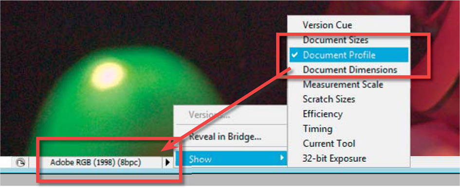
Checking the profiles of images
To check to see if your pictures are tagged, open the file in the Photoshop or the Photoshop Elements’ Editor and click the sideways arrow at the left of the status bar (at the bottom of the picture window) to reveal a fly-out menu. Choose the Document Profile option from the list. Now to the left of the arrow you will see the profile name attached to your file. If the picture is not tagged then it will be labelled ‘Untagged RGB’. Alternatively, you can also display the profile as part of the Info palette (Window > Info) by selecting the setting from the More Options button.
Check the profile associated with an image quickly and easily by selecting the Show > Document Profile option from the bottom border of the document window. The profile will then be displayed in the border.
Each of the main working spaces encapsulate a different range of colors. This range is usually referred to as the gamut of the profile. Here we can see how the gamut of both AdobeRGB and sRGB profiles (shown in color) are smaller than that of the ProPhotoRGB profile (show in light gray).
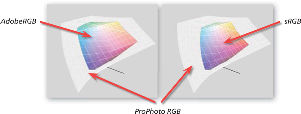
sRGB versus AdobeRGB versus ProPhoto RGB
When talking about working spaces, a lot of discussion centers around two widely used industry standards – sRGB and AdobeRGB. AdobeRGB encompasses a range of colors (color gamut) that more closely matches the characteristics of both desktop and commercial printers, whereas sRGB is a profile that is very closely aligned with the gamut of the average computer screen.
More recently, and with the growing acceptance of raw workflows as daily modus operandi, more and more photographers are working with a third space, ProPhoto RGB. One reason for this change is the fact that this is the basic working space for both Adobe Camera Raw and Lightroom (with a slight change in gamma). The other reason is because ProPhoto RGB is an extremely wide gamut working space and encompasses more colors than either sRGB or AdobeRGB. In practice, this means that you have more space to make color corrections and adjustments in ProPhoto RGB without the fear of clipping details.
Printer calibration
The photo quality of desktop printers is truly amazing. The fine detail and smooth graduation of vibrant colors produced is way beyond my dreams of even just a few short years ago. As the technology has developed, so too has the public’s expectations. It is not enough to have colorful prints; now the digital photographer wants these hues to be closely matched with what is seen on screen. This is one of the reasons why a lot of printer manufacturers are now supplying generic, or ‘canned’, printer profiles. Using such profiles at the time of printing greatly increases the predictability of your output.
To check that you have a printer profile installed on your system, open the Color Management section of the printer driver and search the list of installed profiles for one that matches your machine. If one is not listed then check the manufacturer’s website for the latest drivers or profile updates. The general nature of these profiles means that for most pictures, on most surfaces, you will get a good result, but for the best prints you will need a different setup for each paper stock that you use. Some manufacturers provide matched profiles for all the media they supply, which makes the job of choosing a suitable profile much easier.
Elements:
Step 1 To check to see if you have a printer profile installed, open a picture in Photoshop Elements and then select Print from the File menu.
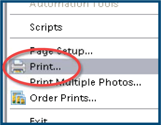
Step 2 Tick the Show More Options feature in the Print Preview dialog to display the printer Color Management settings.
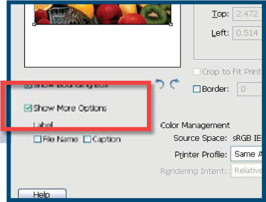
Step 3 Click the down arrow in the Profile section of the dialog and locate your printer profile.

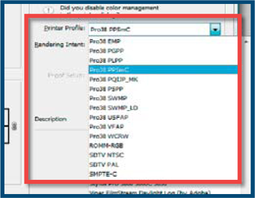
Photoshop:
Step 1 To check to see if you have a printer profile installed, open a picture in Photoshop and then select Print from the File menu.
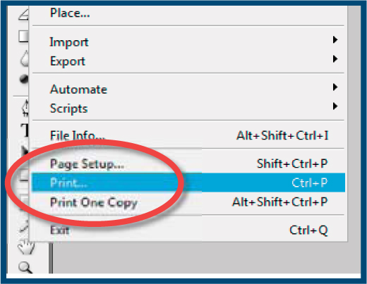
Step 2 Choose the Photoshop Manages Colors from the Color Handling section in the right of the dialog.

Step 3 Click the down arrow in the Printer Profile section of the dialog and locate your printer profile.
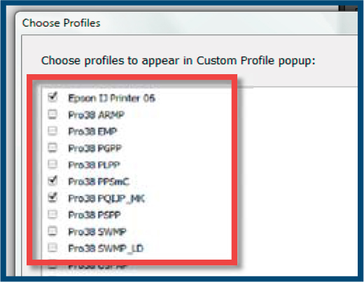
Lightroom:
Step 1 To check to see if you have a printer profile installed, select a photo from the Lightroom library and then choose the Print module.
Step 2 Open the Print Job section in the panel on the right of the workspace. Select Other from the Profile menu.
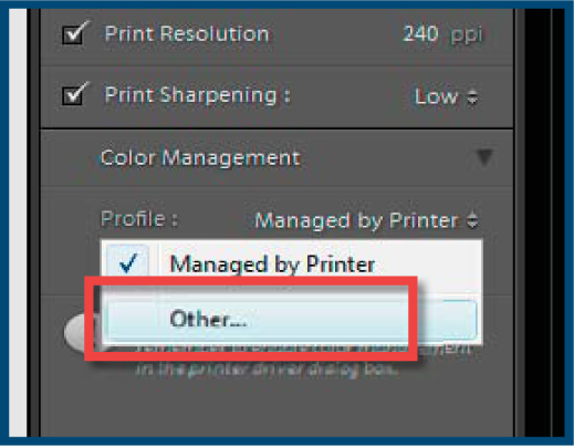
Step 3 Choose the printer profiles from the dialog that is displayed. These will now reside as options in the profile menu.
Power processing
As image makers we spend much of our time concentrating on how to produce the best pictures possible. And rightly so, after all creating fantastic photos is the reason that most of us got into this game in the first place. Right? But with so much of our time spent playing with editing and enhancement techniques, it leaves precious little head space to consider what actually goes on inside the boxes that drive our favorite imaging software. Couple this with the fact that it is pretty difficult to find and understand how all the different technology (hardware parts and operating system) components impact upon the running of everyday tasks, and you have a situation where the average raw shooter settles for machines that are more suited to net surfing, or word processing, than pixel pushing.
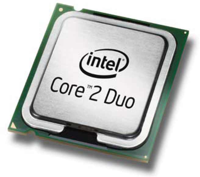
AMD, Intel and Apple: AMD and Intel both manufacture single, dual and quad core CPUs which can be installed in single or twin processor configurations.
What’s inside the box?
To get us started let’s take a simple look at some of the bits and pieces that lurk inside the box that we generally call ‘the computer’. For those readers who are already familiar with these systems’ parts (or for anyone who is under 15 and seems to know and understand these things inherently) feel free to skip this section. Each component of the box that sits on your computer desk plays an important part in the raw editing and enhancement process.
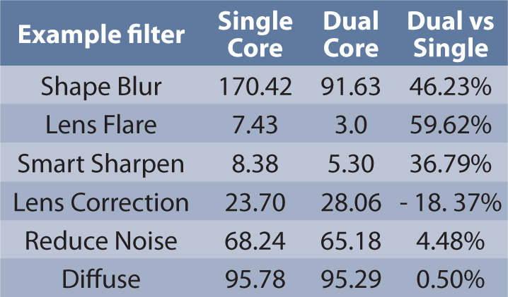
Single vs Dual core processing results: Results from tests conducted by AMD with a 3.3 Mb JPEG image. All test times are in seconds. Smaller is better.
Processor (CPU) – It seems that every 6 months or so the major chip manufacturers produce a new version of their front-line processors. These chips are the engine of your computer and as such determine how quickly your machine will complete most tasks.
For many years processors have been categorized in terms of their cycle or clock speed and generally speaking, the higher the number, the faster and more powerful the chip. At present the fastest processors are rated at 3800 MHz (3.8 GHz), and compared to the 12 MHz ‘Turbo’ chip that drove my computer in 1989, these new processors just fly. But despite the long-held tradition of using clock speed to equate image editing performance, processor speed no longer tells the whole story. Some of the best chips for intensive image editing tasks (filtering in particular) are not those with the highest clock speeds but rather those with the new dual, or quad, core architecture. These chips work like twin or quad processors, churning through pixel changes more efficiently than a single core chip at a higher clock speed.
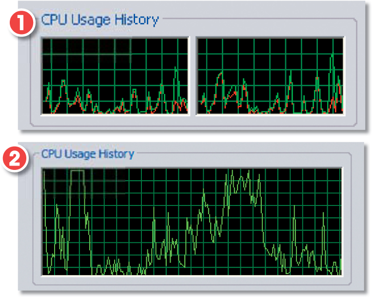
Dual core/processors: Dual core/processor systems split the photo editing workload and process changes more quickly and efficiently. Workload distribution graphs for dual core (1) and single core (2) machines.
For the best power overall choose twin processors and if possible twin dual core processors. For a balance of power and economy select a dual core chip and for an entry-level option choose the fastest single core chip you can afford.
Intel, Asus, MSI, Giga-Byte and Abit: For the latest information on matching CPUs and chipsets check out the websites of the major board manufacturers. Most have web wizards that match CPUs and motherboards.
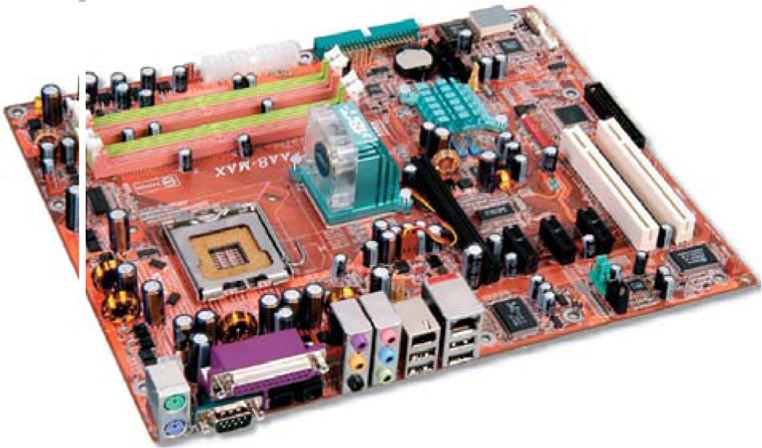
Motherboard – The motherboard is the component that links all the other computer parts together. Issues such as bus speed and chipsets are often considered, by the ‘technology phobic’ amongst us, as too complex to even think about, but like it or not, the motherboard provides a substantial amount of the functionality and efficiency that digital photographers demand on a daily basis. This core component moves the information between CPU, RAM, graphics card (and therefore display) and hard drive via bus pathways. The ability of these pathways to move large chunks of data around determines to a large extent how efficiently the whole system works. A board with slow pathways is not capable of delivering information quickly enough to keep the CPU busy, resulting in the processor not being fully utilized and slower overall system performance. In essence the motherboard is the foundation upon which the other components are built. Careful selection here will ensure that the rest of the system parts run to the best of their ability.
The chipsets resident on the motherboard control the way in which the various components in the system work together. Often manufacturers release new board chipsets to coincide and work with new processor designs. When selecting a motherboard check that the chipset is matched with the processor and that it supports CPU features such as dual core and/or Hyper-Threading. Also pay particular attention to speed of the system bus (connection between component parts) and the total amount of memory that can be installed and addressed. Aim for at least 2 Gb, an option to install 4, 8 or even 16 Gb being preferable.
| Motherboard wish list | Good | Better |
| Memory capacity | 2 Gb | 4 – 8 Gb |
| Graphics interface | AGP 8× | PCI Express ×16 |
| Disk controller | SATA | SATA RAID 0 |
| Chipset | General | Matched with CPU |
Next, look to the type of interface that is used for plugging in graphics cards and attaching hard drives. For graphics the AGP 8X connection is okay but the newer PCI Express X16 is preferable as it provides 3.5 times the performance of the older system. In terms of hard drive connections try to find a board with both a standard SATA (Serial ATA) link as well as a RAID 0 controller (for better scratch disk performance in Photoshop).
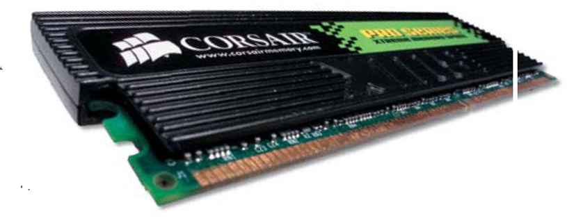
Memory (RAM) – RAM memory is the short-term memory where the imaging program, image data and various Undo Steps and History States are kept during the editing, enhancement and raw conversion process. It is different to the memory of your hard drive or DVD disk, as the information stored in RAM is lost when your computer is switched off. For efficient raw editing the amount of RAM your computer has is just as important as processing power. In general terms you should buy as much memory as you can afford. The amount usually supplied with off-the-shelf systems is sufficient for most word processing and spreadsheet tasks but is usually not enough for good quality digital imaging.
How much memory do I need? Well an image maker with 1 Gb of RAM (2 × 512 Mb) would find that Photoshop would be noticeably more responsive and efficient to work with than a machine with half the memory. Professionals, or dedicated enthusiasts, working with 20–30 Mb files should install at least 1 Gb of RAM as a base figure. Increasing this amount to 2 Gb will provide real gains in terms of workflow speed and more efficient multitasking (working on several documents at once) as well. Running Photoshop on a 64-bit operating system such as Apple’s OSX or Windows XP 64 or Vista 64 provides the added benefit of enabling the program to access more memory than has previously been possible. Professional users employing these setups can take advantage of RAM levels beyond 2Gb which provide real gains in complex environment where very large documents are altered regularly.
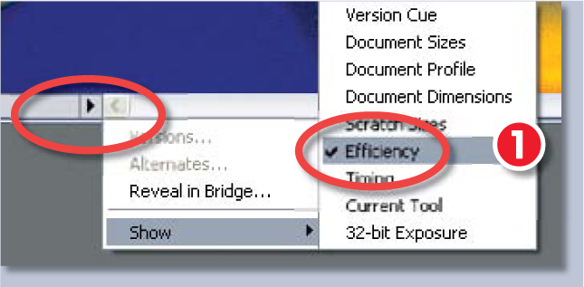
Q How do I know if I am running out of memory whilst making basic enhancement changes in Photoshop?
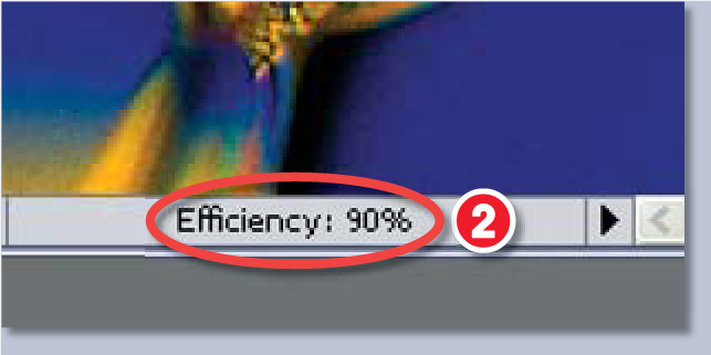
A Select the Efficiency setting (1) available from the pop-up menu at the bottom of the document window (or the Info palette) and then perform a series of standard editing actions in Photoshop. If only RAM memory is being used during editing steps then the Efficiency result displayed will be 100% (2).
The value actually represents the percentage of time spent performing the operation instead of reading or writing data to the scratch disk. If the value falls below 100%, Photoshop is using the scratch disk in the place of RAM and is therefore operating more slowly than if more memory was available. Regular sub-100% figures mean that you either need to allocate more RAM to Photoshop, close programs running at the same time as Photoshop or install more memory.
Storage (hard disk) – The sad fact is that digital imaging files take up a lot of storage space. Even in these days where standard hard disks are measured in terms of hundreds of gigabytes the dedicated digital darkroom worker will have little trouble filling up the space. But the disk requirements for raw shooters are a little more complex than just ensuring that they have enough photo storage space. As Photoshop in particular is such a memory hungry beast the program cleverly uses part of the hard disk as ‘fake memory’ when the software runs out of conventional RAM.
This fake memory space is called a scratch disk and one key to efficient photo processing is ensuring that this hard drive space is situated on a separate fast drive from those used for programs and photo storage. This saves the problem of Photoshop and the OS competing for the same disk space (they both have virtual RAM technologies). The speed of this second drive, the size of the drive’s memory cache and its connection type (ATA, SATA or SCSI) all contribute to the efficiency of the scratch disk. If you have a choice select an SATA or SCSI drive with a minimum of 8 Mb cache that spins 7200 rpm.
The next option for more speed is to control two such drives via a RAID controller and dedicate this RAID as your scratch disk. Using a level 0 RAID will split the read/write activities across both units, effectively increasing the overall speed of the scratch disk and Photoshop in turn.
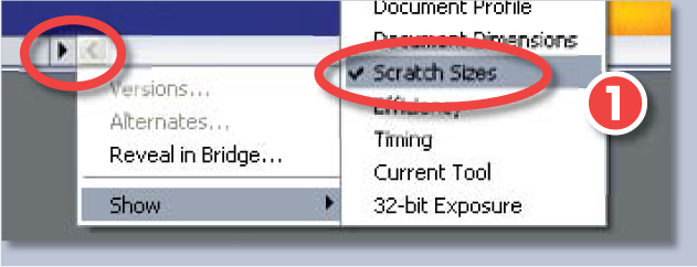
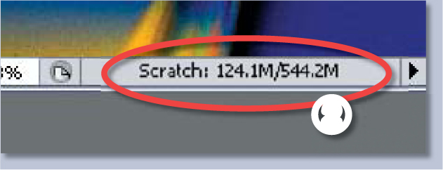
Q How do I know what is the total amount of memory (both RAM and scratch disk space) available to Photoshop during editing operations?
A Photoshop displays RAM and scratch disk usage and allocation in the Scratch Sizes section of the status bar (1). The number on the left represents the amount of memory currently being used by the program to display all open images. The number on the right represents the total amount of RAM available for processing these images (2).
Screen or monitor – The screen is the visual link to your digital file. It follows then that money spent on a good quality screen will help with the whole cycle of production. Screen size is important, as you need to have enough working space to lay out toolbars, dialog boxes and images. Screens are categorized in terms of a diagonal measurement from corner to corner. 17- or 19-inch models are now the standard with 20-inch and larger (widescreen format) being the choice of imaging professionals. Although a few years ago the screen of choice for all professionals was definitely the CRT or Cathode Ray Tube (think old television sets), things have changed. More and more dedicated image makers are now turning to LCD or Liquid Crystal monitors as their displays.
ATI, NVIDIA and Matrox: ATI and NVIDIA are the kings of video card technology so check out their websites for the latest in offerings for the 2D graphics user. Also worth a look is Matrox, who pride themselves in creating cards for graphics professionals.
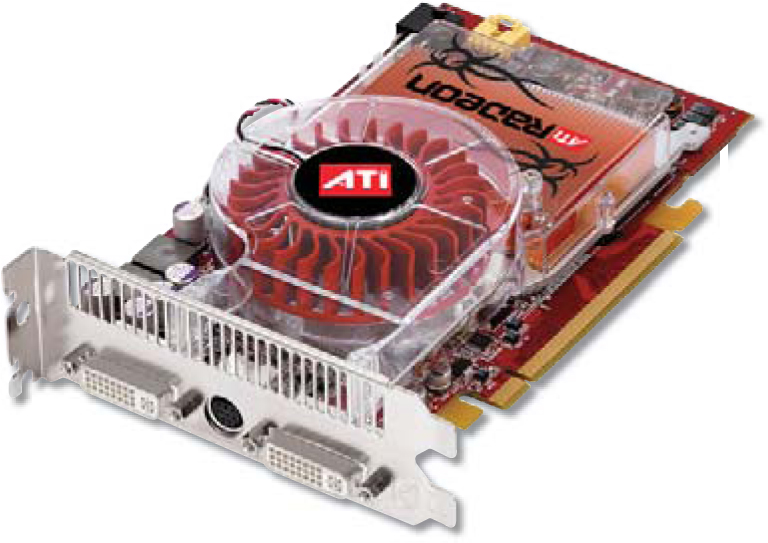
Video card – The video card is the most important part of the pathway between computer and screen. This component determines not only the number of colors and the resolution that your screen will display, but also the speed at which images will be drawn. For best results pick a card with a fast processor and as much memory as you can afford. Don’t assume that good 3-D performance will also be reflected in the area of 2-D graphics. Many of the most touted and most expensive cards on the market are optimized for game play, rather than photo editing efficiency.
Video Card Display Connectors:

1. VGA – CRT screens.
2. DVI – Digital LCD screens
3. S Video -TV or video.
So rather than look for the fastest and latest units, concentrate primarily on the memory amount and the interface the card uses and then consider processing speed. One board with 256 Mb of card memory is a great place to start, but users with big, high-resolution screens should try to upgrade to 512 Mb for better performance.
The latest graphics interface standard is PCI Express, which provides better performance than the older AGP standard. The card type you can use is determined by the connectors on the motherboard. So make sure that your board supports the connection type first, before shelling out the cash for a new video card. And finally, as the video card links the computer to a display or monitor, ensure that the card you choose has the same connection as the screen.
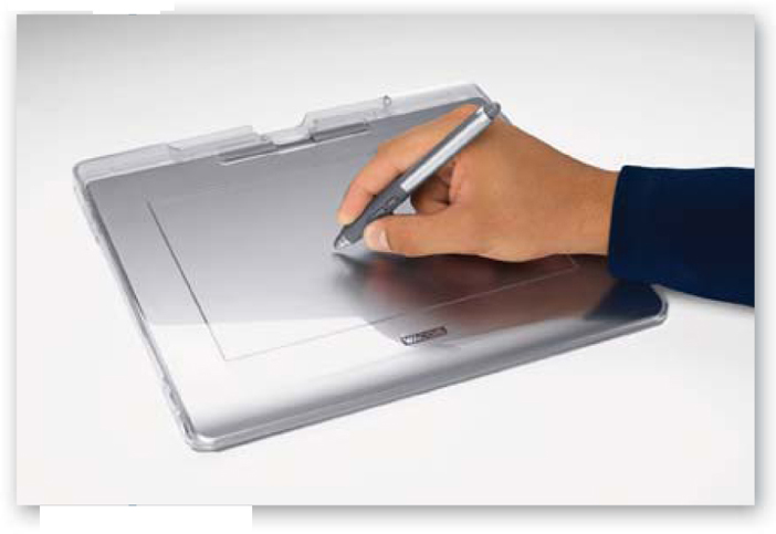
Mouse or graphics tablet – Much of the time spent working on digital images will be via the mouse or graphics tablet stylus. These devices are electronic extensions of your hand, allowing you to manipulate your images in virtual space. The question of whether to use a mouse or stylus is a personal one. The stylus does provide pressure-sensitive options in programs such as Photoshop not available with a mouse-only system. Wacom, the company foremost in the production of graphics tablets for digital imaging use, produces a cordless mouse and stylus combination that allows the user to select either pointer device at will.