
46. THEORY MATTERS
![]()
I KNOW. YOU shuddered when you saw that word “theory.” It’s not a word that gets a lot of folks excited, especially when it’s tied to doing something creative. Then again, much of what we do in the visual creative fields is informed by theory. For photographers, color is one such element, even if you strictly shoot in black and white. In fact, color theory is behind many of the choices we make strategically and stylistically.
Let’s take a look at some foundational color theory that you’ve more than likely applied before (with or without knowing it)—theory that is sure to strengthen your portraiture work.
There are two primary color schemes to which our eyes are drawn: analogous and complementary. Analogous colors are those that are fairly similar to each other (Figure 46.1). Color is a continuous spectrum, and if you imagine looking at a relatively small section of that continuum, e.g., at all the various reds, you would be looking at different colors that are perceived as red. For example, fire engine red and maroon are analogous colors. Analogous coloration is easy to look at, stylistically simple, and can be creatively employed. For portraiture, it allows color to simultaneously stay out of the subject’s way and stand out as something worth noticing.
Complementary color is often a misused term. Whereas many folks mistake it for analogous color, it’s actually colors that are the exact opposite of each other in value (Figure 46.2). On the color wheel, colors that sit across from each other are exact complements. Red and green, for example, are complementary colors, as are blue and orange, and yellow and violet. This type of coloration, like analogous color, is attractive to the eye, but not necessarily because it is comfortable to look at. Rather, complementary colors are dramatically contrasting, and create a great deal of vibrancy when used close to each other. Yet, this contrast can be distracting. When one particular color isn’t fighting as hard for real estate as the other, complementary colors work well together.
Being open to color lets you to take advantage of it, whether that be in planning the clothes your subject is going to wear during the shoot, to noticing a great background to complement your subject’s shirt. Having an understanding of how colors work together can ensure that you are aware of color in your environment. It’s important to understand what most complementary colors are comprised of: dominant and recessive colors. It’s also important to remain flexible. Complementary colors usually need to be planned out in terms of your shoot because these types of scenes aren’t necessarily common occurrences.
Dominant colors jump out at the eye (Figure 46.3). Recessive colors, like the name implies, recede and do all they can to stay quiet. So, colors like red and orange are usually considered dominant, especially when compared to (and when used with) colors like blue and green. Complementary colors, although specifically identified based on their exact relationships to each other, are those that feature this type of contrast.
Dominant and recessive colors, when used together, give photographs great dimensional qualities. Personally, I’m more apt to consider two or more colors’ dominant and recessive characteristics than whether or not they are analogous or complementary. Dominant colors “pop” away from recessive colors, which tend to take a backseat to the more flashy colors. When we start to consider this photographically, especially for portraits, one of the great ways to create visual distance and depth between your subject and the background is through color. For example, a red shirt will pop off a background of a less aggressive color (Figure 46.4). The key to employing this is to ensure that one of the colors does not take up as much room in the frame as the other. It is common to see much more of the frame’s real estate devoted to the recessive color, which lets the smaller, more dominant color shine.
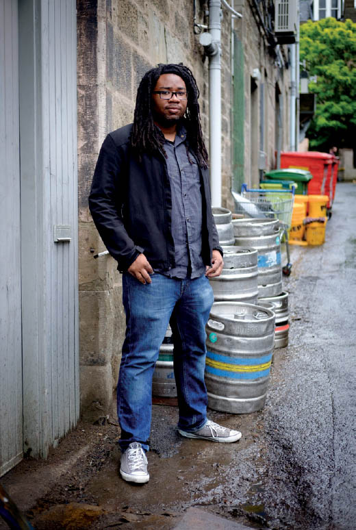
46.1 The subject’s clothing is fairly analogous in coloration, and it doesn’t depart too much from the other color values in the alley way, lending an almost monochromatic look to the environmental portrait.
ISO 400; 1/600 sec.; f/2; 35mm
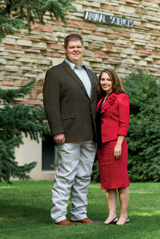
46.2 The woman’s red dress is a direct complement to the green environment, which makes the couple stand out.
ISO 100; 1/125 sec.; f/4; 108mm
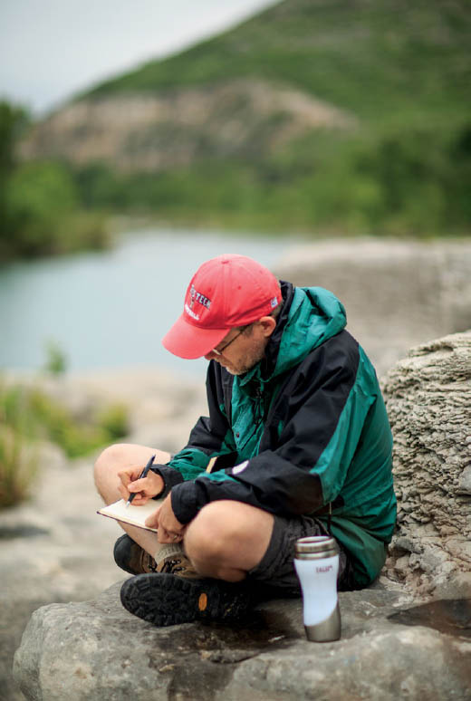
46.3 Poet John Poch’s red cap “pops” toward the eye against the more recessive and muted tones around him.
ISO 100; 1/1000 sec.; f/1.2; 85mm
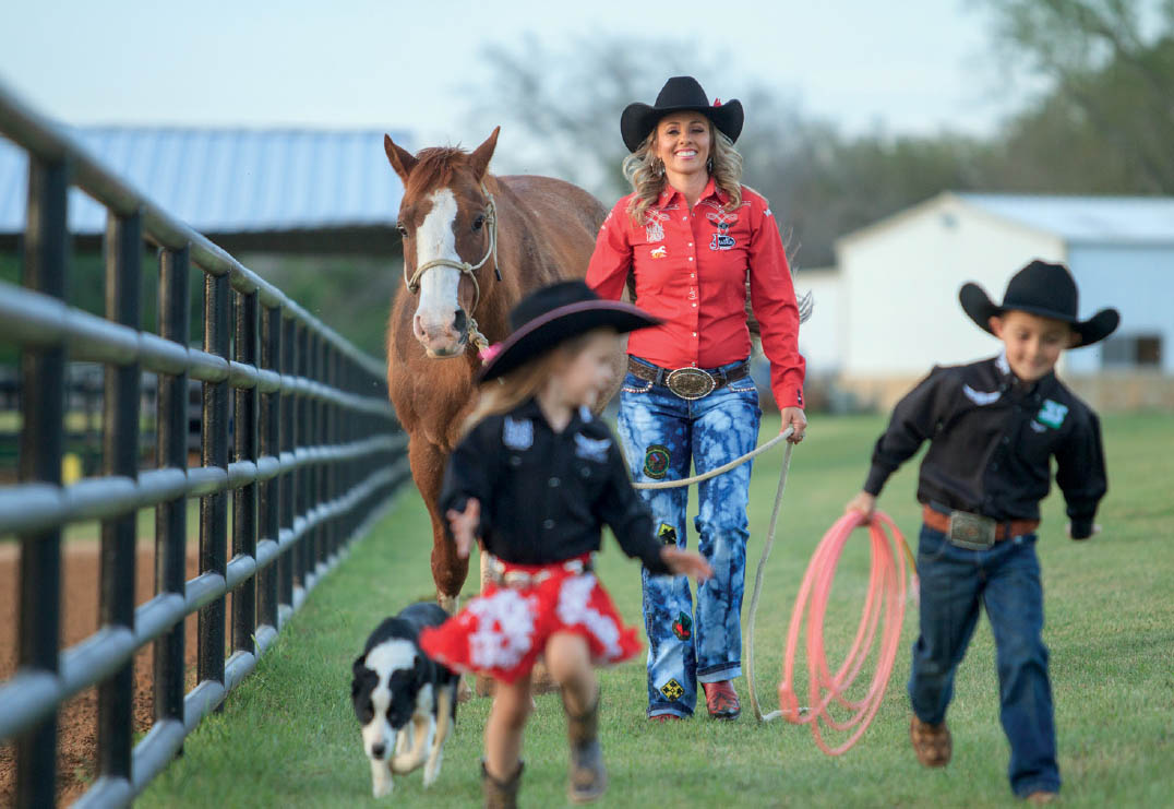
46.4 Not only does Shada’s shirt advance off of a muted background, it also draws the eye through the image’s composition, which in large part is commanded by her children playing in the foreground.
ISO 800; 1/800 sec.; f/2.8; 200mm