
47. LET COLOR DIRECT THE EYE
![]()
TWO WAYS TO use color in your compositions are to incorporate leading lines, and to consider the placement of color within the visual frame. Lines of color can be useful in directing the eye to your subject(s) (Figure 47.1). Consider the structures you are using to move the eye toward the subject, but also consider their color. For example, leaning your subject against rust-red fence rails might be the mildly aggressive ticket to incorporating leading lines into the image. Blockier structures, such as hedgerows or crop rows are a more mellow type of leading lines, in both color and structure.
Color can also be extremely useful in framing your subject. In the previous section, I highlighted how significant dominant and recessive colors are to creating dimension. In addition, if one of those colors is used as the entire background, it can completely encapsulate, or frame, your subject (Figure 47.2). This works best when the background color is the more recessive color, such as a blue sky behind a subject wearing a red baseball cap. Walls of color are popular backdrops for portraits, as well. Imagine your subject leaning against a wall of a solid color. In this type of situation, the eye has an easier time getting to where the color breaks—which is where your subject is positioned on the wall.
Color, like it does when used with leading lines, complements traditional framing structures (Figure 47.3). The framing structure itself can be a useful color as the background for your subject. The point is to be aware of color and its potential to motivate the eye in a certain direction. Don’t use a framing structure without first considering how its color will affect the portrait.
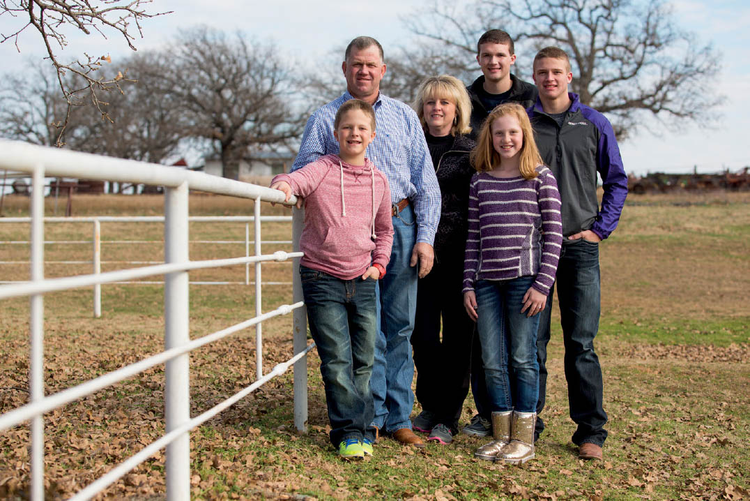
47.1 I used the white fence line to create a clean, attractively bright way of pushing the eye compositionally toward the subjects. A darker color under this type of softer light would not have been quite as effective.
ISO 200; 1/2000 sec.; f/4; 75mm

47.2 The blue sky behind the subject does a nice job in isolating his face, allowing the viewer visual comfort in reading the subject. The orange vest is a nice touch against the sky as well.
ISO 100; 1/2500 sec.; f/2.8; 52mm
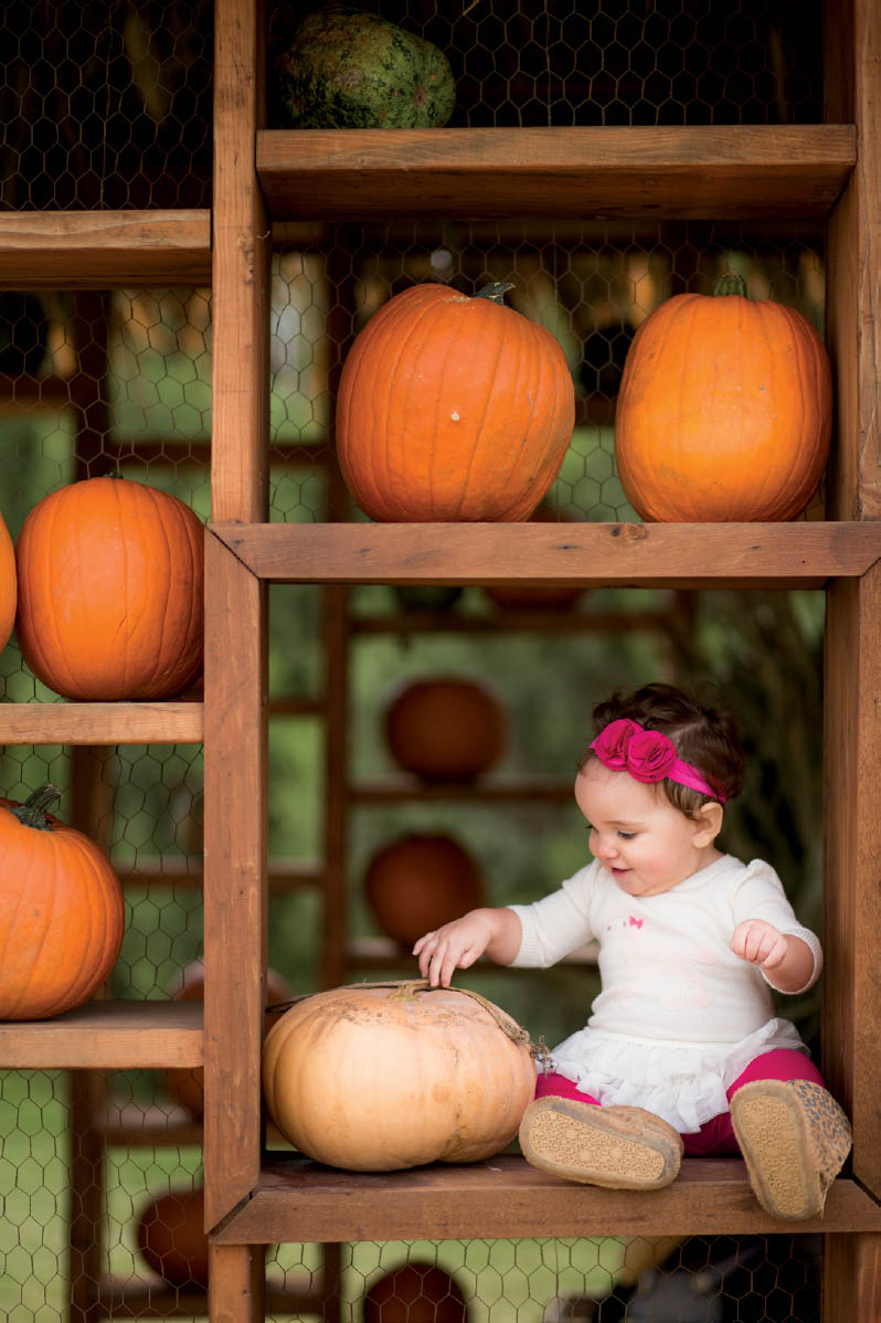
47.3 Not only is my youngest daughter framed by the wooden structure, a well-suited palette of autumn colors also surround the subject.
ISO 200; 1/250 sec.; f/2; 85mm
Look for color in those compositional elements you know are great visual attractants. The human eye is drawn to structures like circles and dots, triangles, parallelograms, and patterns. When color is strategically or narratively valuable among such structure, use it to your advantage (Figure 47.4). Abstractly, a red bow is simply a dot of color to which the eye is attracted. Similarly, an out-of-focus pattern of recessive color behind your subject takes advantage of the compositional strength of lines as well as the ability of that color to launch your subject even toward your viewers’ eyes.
As great as color can be for your portrait composition, it is worth mentioning that color can also be one of the most powerful distractors in the frame (Figure 47.5). Brightly colored backgrounds can steal your viewer’s attention away from the subject, especially if the color does not necessarily relate to the other elements in the image. Likewise, the eye can be drawn to a distinctly different color than what is mostly present in the frame or on your subject. This especially relates to your subject’s clothing, which we will discuss in the next section. While you are paying attention to how color can help you in composing your portraits, also consider how colors can hurt you, as well.
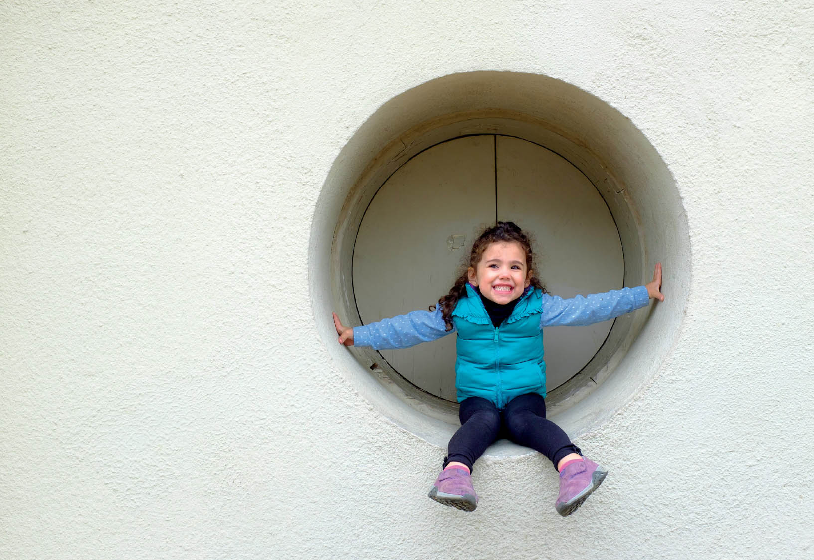
47.4 I knew the round inset on this taupe wall would be a nice frame in which to place my colorfully dressed daughter. The circle is one of the most attractive shapes, so it catches the viewer’s eye (as does the pop of color).
ISO 200; 1/220 sec.; f/4; 23mm
47.5 Although the light and color on the subjects looks nice, the overly bright and yellowish coloration of the background is a great distractor in this portrait.
ISO 100; 1/160 sec.; f/4; 110mm