33. COLOR AS THE SUBJECT
![]()
COLOR HAS REAL psychological effects. It can calm and relax you, or it can make you feel angsty and on edge. I first learned about the power of color when I was ten years old, and I learned it the hard way. We had just moved into a new house and, for the first time in my life, I had my own room. Naturally, I decided that my room would be painted pink. After obsessing over the paint swatches for a couple days, I ignored my parents’ very reasonable understanding of how paint works (it never looks as intense on the swatch as it will in real life) and chose a dark pink, almost the color of salmon.
As soon as we finished painting, I realized my grievous error. Time spent in my room now felt like time spent inside a human lung. The pink was reasonable in daylight, but once the glow of incandescent light bulbs took over, it was oppressive. We’d even painted the ceiling pink because, in my limitless ten-year-old wisdom, the more pink the better. Maybe it was the years I spent in an excessively pink cave, or maybe it was the dawn of adolescence, but that bedroom was the beginning of an emo time for me. Never underestimate the influence of human-lung pink, or any color for that matter.
As you travel, you’ll come to discover that many locations, regions, and cultures have their own unique color palettes. Sometimes stepping into a new place can feel like walking into a Wes Anderson movie—each color feels purposefully selected for its emotional effect and juxtaposition to the other colors present. Some locations are world famous for their color palettes, like the blue city of Chefchaouen, Morocco; the white walls and blue roofs of Santorini, Greece; or the bright pastels of Curaçao. Other locations have color palettes influenced by religious or cultural beliefs, indigenous plants, and natural local dyes. Whatever the reason for your destination’s color palette, successful use of color in your images can bring new dimension, emotion, and interest to your travel photography.
Juxtaposition of Color
Contrast and harmony are two important factors when surveying a colorful scene for a photograph (Figure 33.1).
33.1 Primary colors, Tortola, British Virgin Island
ISO 200; 1/1250 sec.; f/1.8; 50mm
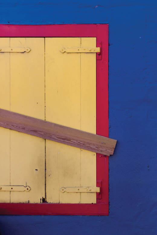
Contrasting colors (colors that are starkly different or even oppositional to each other) will draw the eye and keep its attention. Complementary colors (found opposite each other on the color wheel) will provide the most contrast: green and red, blue and orange, purple and yellow. When presented together, certain complementary colors can make the viewer feel uneasy, alarmed, or even nauseous. In fact, they teach you in theater lighting to avoid using red and green gels together when lighting a scene because it may make audiences physically ill. Not all contrasting colors are bothersome. In fact, in most situations bright, contrasting colors can induce feelings of energy and excitement (Figure 33.2).
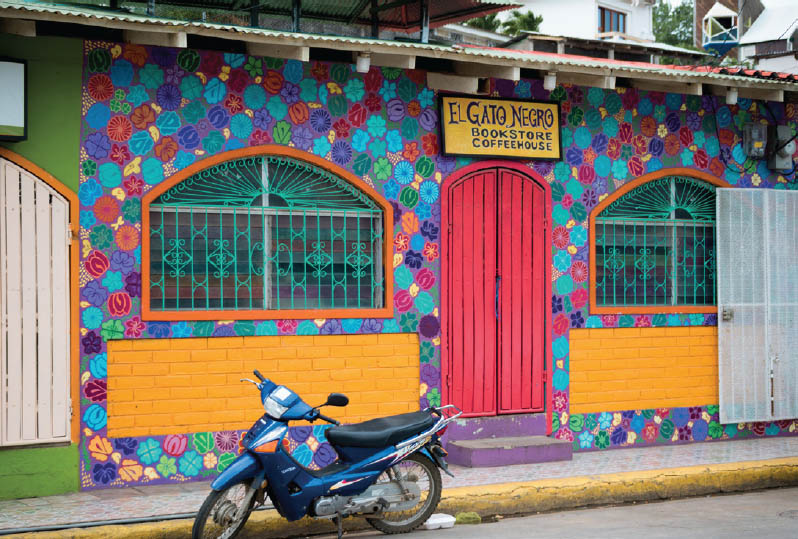
Harmony exists in colors that are similar or relatively adjacent to each other on the color wheel. Think blues, greens, and purples; or yellows, oranges, and reds. Most of the deliberate color palettes you see when you travel are more harmonious in nature. I fell in love with the riverside view of Girona for its gorgeous harmonious color palette (Figure 33.3). Much of the time, floral or landscape design is based around analogous or harmonious color, so as you tour some of the incredible gardens of the world (Figure 33.4), pay attention to the colors and their relationships.
33.2 San Juan del Sur, Nicaragua
ISO 100; 1/250 sec.; f/4.5; 42mm
33.3 Onyar River, Girona, Spain
ISO 100; 1/1600 sec.; f/4.0; 22mm
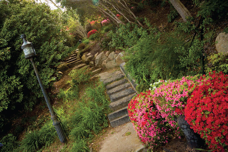
33.4 Spohr Gardens, Woods Hole, Massachusetts
ISO 100; 1/50 sec.; f/5; 17mm
There are millions of potential color combinations, and much of the time they have been deliberately thought out. As you travel, pay careful attention to colors and how they make you feel or draw your attention. If you notice a particular color popping up again and again in a location, ask a local if there is significance to that color in their culture. If the color is of cultural significance, be sure to feature it prominently in your photos.
Naturally Occurring Color
Not all of the beautiful color palettes you discover while traveling have been deliberately designed. In fact, naturally occurring color can be even more impressive! Fall leaves are so universally loved because of the wide range of harmonious reds, yellows, oranges, and browns. The blues and greens found in the Caribbean are so bold that they stop me in my tracks every time I see them. Some natural colors are so intense that it can be a challenge to reproduce them accurately in your images.
When you’re photographing places with unique and nuanced colors, it’s often a good idea to set a custom white balance to accurately capture the color, rather than relying on auto-white balance (Figures 33.5 and 33.6). Take a photo of a plain white index card for reference to set your white balance, or get fancy with a special accessory like the baLens cap (Figure 33.7). Whatever technique you use, be sure to pay attention to the colors you find and don’t be afraid to let them take over your images!
Muted Color
One of the biggest mistakes I see in photography is a tendency toward oversaturation of color. Bright, bold, contrasty colors are gorgeous, but so are monochromatic colors and muted tones. When I travel, I celebrate the opportunity to capture the softer look of color (Figure 33.8). A scene filled with various shades of the same color can force you to pay attention to the details (Figure 33.9).
When you shoot, but more specifically when you edit, don’t push the vibrance or saturation sliders too much. Embrace the gentler colors and the mood they can create in an image (Figure 33.10). The ultimate goal of all travel photography is to tell the authentic stories of the places you visit, so make sure the colors in your images represent what you truly saw along the way.
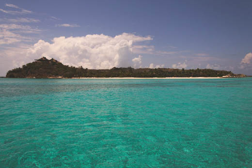
33.5 Auto White Balance loses the nuance of color for this shot of Necker Island, British Virgin Islands.
ISO 100; 1/1600 sec.; f/4.5; 17mm
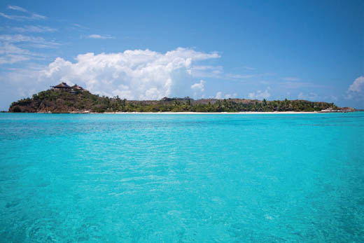
33.6 Here’s the same shot adjusted for accurate color.
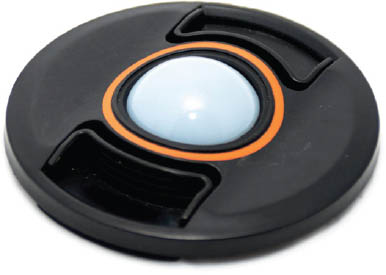
33.7 The baLens cap helps you set an accurate white balance.
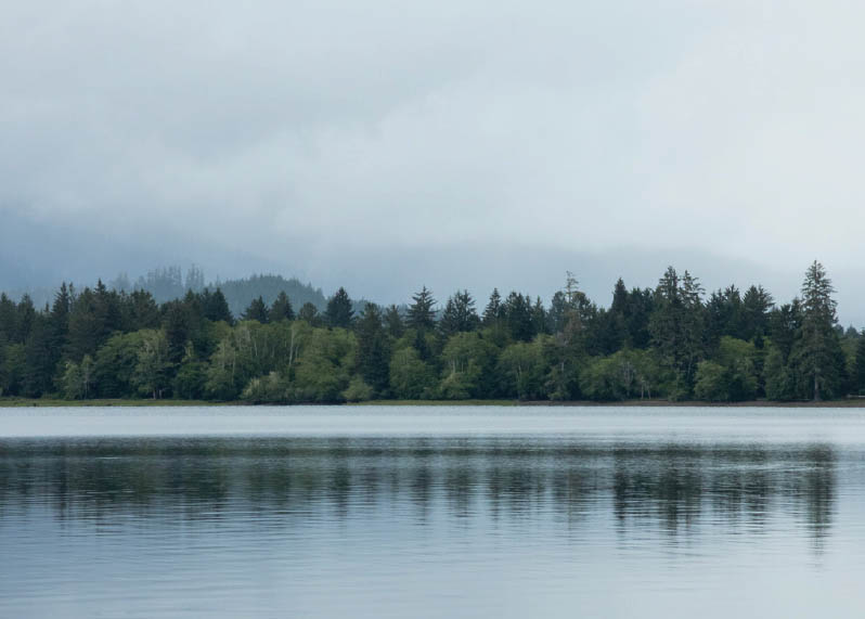
33.8 Lake Quinault, Washington
ISO 400; 1/125 sec.; f/22; 85mm
33.9 Private Estate, Catalonia, Spain
ISO 100; 1/640 sec.; f/5.6; 53mm
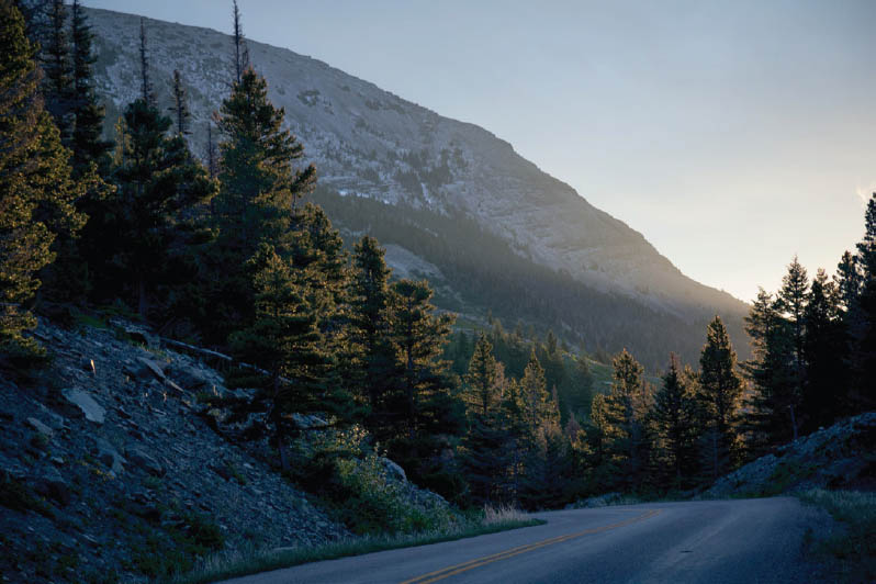
33.10 Going To The Sun Road, Glacier National Park, Montana
ISO 400; 1/60sec.; f/5.6; 85mm