CHAPTER 11
Measure Success
Utilize meaningful metrics to track and increase the value you deliver to customers.
What you’ll learn in this chapter
1 Five categories of customer-centric metrics for measuring a product’s performance and to show where to focus for improvements.
2 How to design useful customer- and business-centric metrics and the common pitfalls to avoid.
3 Frameworks and example metrics you can use for your product.
Five Customer-Centric, Product-Performance Metrics
Most useful product-performance metrics fit into one of five categories that, in combination, provide a complete picture of your product’s health and financial viability:
1. Product flows—Can customers achieve their goal with your product? And how do they achieve their goals?
2. Actionable value-based indicators—What are the leading indicators of customer behavior that show they get value from using your product?
3. Customer satisfaction—Is your product meeting, failing, or surpassing customer expectations? What specific areas need more attention?
4. Customer relationship funnel—How well do you optimize each stage of the journey to guide customers toward a more meaningful relationship with your company and your product?
5. Customer lifetime value (LTV)—How valuable is your product to your customers over the long term, to support a financially viable, sustainable business?
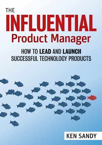
As illustrated in Figure 11.1 as you go down the list, each, in turn, represents a stronger indicator of long-term product success—with optimized product flows being the weakest and a healthy LTV being the strongest. However, each also requires increasing amounts of time to gather sufficient data and observe trends, sophistication in tracking and analysis, and complexity in developing effective strategies to address issues.
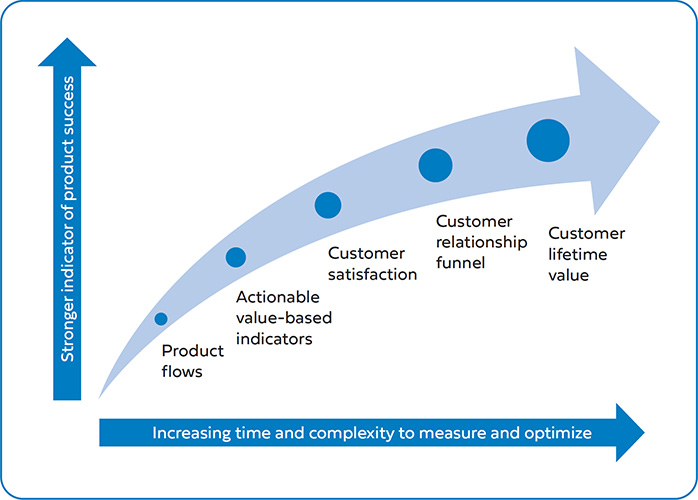
Collectively, the five categories provide a holistic picture of your product’s performance: you can track the usability of your service, you can appreciate its value as perceived by customers and as revealed by underlying customer lifecycle behavior, and you can understand the economics of supporting and scaling your product. Table 11.1 provides a summary of each category, their purposes, and the kinds of actions you might take based on the insights surfaced—which I will cover in more detail in this chapter.
You must define and monitor specific metrics across each category—tailoring their methodologies to suit your unique service offerings, the life stage of your product, and the data-analysis capabilities of your organization.
While you should define a range of metrics to track, highlight a few (or perhaps only one) that are critical based on the maturity of your product and your next greatest challenge. Doing so will give you and your team focus, helping prioritize those efforts that will have the most impact on performance. Having too many metrics can create confusion and, when some are in contention with each other, prioritization becomes harder.
In this chapter, I discuss the key attributes of all good metrics and then introduce each of the five categories of product-performance metrics and associated frameworks. Each company adapts its definitions, methodologies, and approaches for gathering, analyzing, and reporting data. This chapter aims to provide a starting point to orient you to the metrics that matter, understand how to define metrics for your product, and know how to avoid common pitfalls.
At http://www.influentialpm.com, I include examples of frequently used metrics definitions, sample charts and reports, and analyses and exercises to apply, to go more in-depth on what is covered here. You’ll also find a list of commonly used analysis tools; this list is periodically refreshed given the fast-changing nature of this ever-evolving industry.
Attributes of Useful Product-Performance Metrics
Useful metrics focus a team on achieving a shared, actionable goal, and they are easily and frequently measured, so the outcomes and lessons are clear. Not all—not even most—commonly tracked metrics are helpful in this way. Useful metrics have common traits that make them inherently “good”:
1. Useful Metrics Are Actionable
Actionable metrics sufficiently pinpoint where you may have a problem so you can identify potential solutions—or, at a minimum, they enable you to form a firm hypothesis, so you can do further research or run an experiment. Actionable metrics can also tell you where you don’t need to do something and should focus on something else instead, which is incredibly valuable when prioritizing work for your under-resourced team. When selecting a metric, ask yourself what you would do if these numbers went up or down, or stayed the same. If you can’t identify specific actions, choose a different metric.
Inherently, comparative metrics, such as ratios (with a numerator and denominator) and rates (fractions and percentages), tend to be actionable in that you can generally isolate the effects of product improvements over time and spot variations and trends. Unlike absolute numbers, they are less subject to non-product influences. If uncontrolled externalities easily influence a metric, you won’t learn anything.
Similarly, an actionable metric must be frequently measurable. If you are to iterate quickly, the metric must give you fast feedback. The loop between taking action and seeing a result should be as short as possible—ideally measured in days or weeks. Quarterly or yearly is too slow.
That said, be aware of potential downstream, lagging effects. For example, for a change in the product designed to increase customer conversion, you will quickly see if users purchase at a higher rate, but it will be some time before you can see if those customers engage with and later repurchase your product at levels similar to those of your previous customers.
2. Useful Metrics Are Meaningful to Product Goals
Many metrics (such as those measuring short-term financial objectives) have little to do with actual product performance. Product metrics, when relevant, get right to customer-centric goals. They help you identify where the product could be improved. They measure the value you are delivering to your customers, which, in turn, generates positive business results.
Product managers should be aligned with (and induced to pursue) what’s good for the customer. Simply pursuing short-term business goals might lower long-term value, and the team might do “what it takes” to hit them (which may not be strategic or right for the customer).
Every company likes to see increased revenue. But if increasing revenue is the only goal, then the team might allocate all resources to maximize short-term sales—at the expense of long-term sustainability. Or the team might prioritize one-off development efforts to secure client deals, incurring an opportunity cost in not building functionality for their broader target market.
Meaningful product metrics measure sustainable, scalable business value for beneficial, long-term customer outcomes. They should not be deal-driven or prematurely promote scale or growth before the product is ready.
3. Useful Metrics Avoid Averages and Correlation Bias
Averages mask the underlying user behavior and trends. For instance, if you have 100 people using your product, and 90 percent of them use it for 10 seconds and 10 percent use it for 2 hours, is that better than 100 percent of users using it for 10 minutes each? An average total of time spent (12 minutes versus 10 minutes) would suggest it is but arguably the product is failing to adequately serve the vast majority of its customers.
Always complement averages with medians and distributions. The median tells you how a typical user behaves, whereas averages can be unduly influenced by outliers. Distributions will surface interesting and unusual “blips” where an issue might be hiding. Segment all your data by different audience types, channels, and platforms—then search for those secondary drivers that may lead to valuable insights and breakthrough ideas.
The Dangers of Overusing Averages
When tracking advertising performance for a media company, we initially used a metric called “average engagement time,” which focused on understanding how long users spent interacting with the brand once they clicked on an advertisement. We reported a healthy time-spent metric of about 30 seconds (better than a TV ad!).
A different picture was revealed, however, when you looked at the overall distribution curve. There was a very sharp spike, where many users spent as little as five seconds, and a long tail, where fewer users would spend 30 seconds or more. Imagine a standard distribution curve but with the peak pushed sharply to the left.
We knew that, while we still had high-performing solutions, we had too many disengaged users. We needed to find ways to capture their attention longer. So we set about improving the quality of the initial experience.
We also knew that average time spent was artificially inflating our impression of what the average user was doing. By switching to a median (the point at which 50 percent of users were to the left of the line on the curve and 50 percent were to the right), the reported time spent fell (to about 20 seconds). The results were still better than those of most online advertisers and gave a more accurate picture of how much time the typical user was interacting with the brand through our solution.
Similarly, do not confuse causality with correlation. Correlation is an apparent relationship between two variables that change together. That doesn’t mean one causes the other. To determine if causality exists, you can only use techniques like split-testing, so that discrete groups of customers experience different versions—one a control and the other the feature you want validated. Since you eliminate all other influences, the feature must produce the outcomes.
4. Useful Metrics Are Clear, Shared, and Robustly Measured
Choose simple metrics with clear, precise definitions for shared understanding. Have a transparent methodology for consistently calculating them. Create a data dictionary and, for each metric, include the following:
• A clear, descriptive naming convention (with no ambiguity).
• The rationale for why the metric is important to the business.
• The precise period over which it is always measured.
• A documented technical methodology for tracking and calculating it.
• Ways to handle edge cases and outliers (what gets excluded or capped in the analysis).
Correlation vs. Causation
A team member was evaluating the effectiveness of a new feature on the site. He dutifully gathered data, dividing users into two groups: those that had used the feature and those that had not. He then ran an analysis to see if either group spent more time with the product, came back more often, or stayed on longer as paid customers.
The results were positive—those who had used the feature outperformed the others.
Unfortunately, he had incorrectly assumed that the new feature was the cause of improved engagement. All he had proven was that users who were already more engaged with the product were more likely to try out new features than less-engaged users.
The results were inadvertently biased: there was a correlation (highly engaged users tend to use new features), but there was no causation (the new feature was driving increased engagement). The correct way to have established actual cause and effect was to run a randomized A|B test (where some users got to see the new feature, while others did not).
• Sorting, filtering, and sub-segmentation options (by customer type or channel, for example).
• The expected ranges: “out of range” means there is likely either an anomaly or a calculation error.
• A history of actions or events (product launches, optimization tests, externalities, metric methodology changes, lost or corrupted data) that may have impacted the metric over time.
Help stakeholders internalize the definition, familiarize themselves with reports, and agree that your chosen primary metrics are those that matter most. You will help avoid situations where a stakeholder reacts to a negative impact on a secondary metric when the key metrics are improving.
Data hygiene is of paramount importance. Your data warehousing and tracking systems must be thoroughly tested, reliable, efficient, and automated. If data can be lost or incorrectly reported, then your metrics won’t be accurate. Your credibility is damaged when data is proven inaccurate. Ideally, any member of your company should be able to take the same source data, reproduce your analysis, and draw the same conclusions.
A Shared Understanding of Metric Definitions across Stakeholders Is Essential
We launched major improvements to the website’s search-engine optimization and thought the results a momentous success. While most traffic continued to come through the homepage, search engines now also indexed thousands of “deep-links”: pages with content that hadn’t previously been picked up by search-engine crawlers. By making them search-engine-friendly, we suddenly increased visitors to our website by about 30 percent.
However, these deep links were also less effective at converting visitors to paying customers. So the site’s average conversion rate fell (the homepage continued to do well, but now we had more than doubled the traffic to lower-converting pages). The net effect was very positive—we were driving more overall sales—but stakeholders were confused by the results.
We had carefully defined neither our conversion-rate metric nor the need to segment performance for homepage traffic from that for deep-link entry pages. A lower average conversion rate even had some managers thinking that total sales were down and that we should consider a roll-back to reduce traffic to the poorer-performing pages.
After many meetings to educate everyone on the actual outcomes—showing the data behind segmented conversion rates that led to increased sales—we finally achieved agreement. But not without some deep disappointment and frustration for the team that had put in such hard work to achieve our goals. Had we first clarified the opportunity and our project goals, and gotten agreement on the metric by which we would measure success, we might have avoided the post-launch crisis.
1. Improving Product Flows
Each user session with your product is a discrete journey. They have come to your product to achieve a goal—but do they? Or did they drop out without completing what they intended? Did they take too long or follow an inefficient path? Did they become confused at some point?
Start with the customer entry points into your product and then trace the user journey, step by step. Review every decision a user must take, every page or component, every action and result. Look for friction points getting in the way of your users completing their tasks.
Thanks to the advent of many easily integrated out-of-the-box tools, product-flow analysis is one of the simplest ways for a product manager to get the insights necessary to guide usability and flow improvements. However, you must invest time in defining trackable events, adding them to product requirements and understanding and carefully interpreting what the data are telling you.
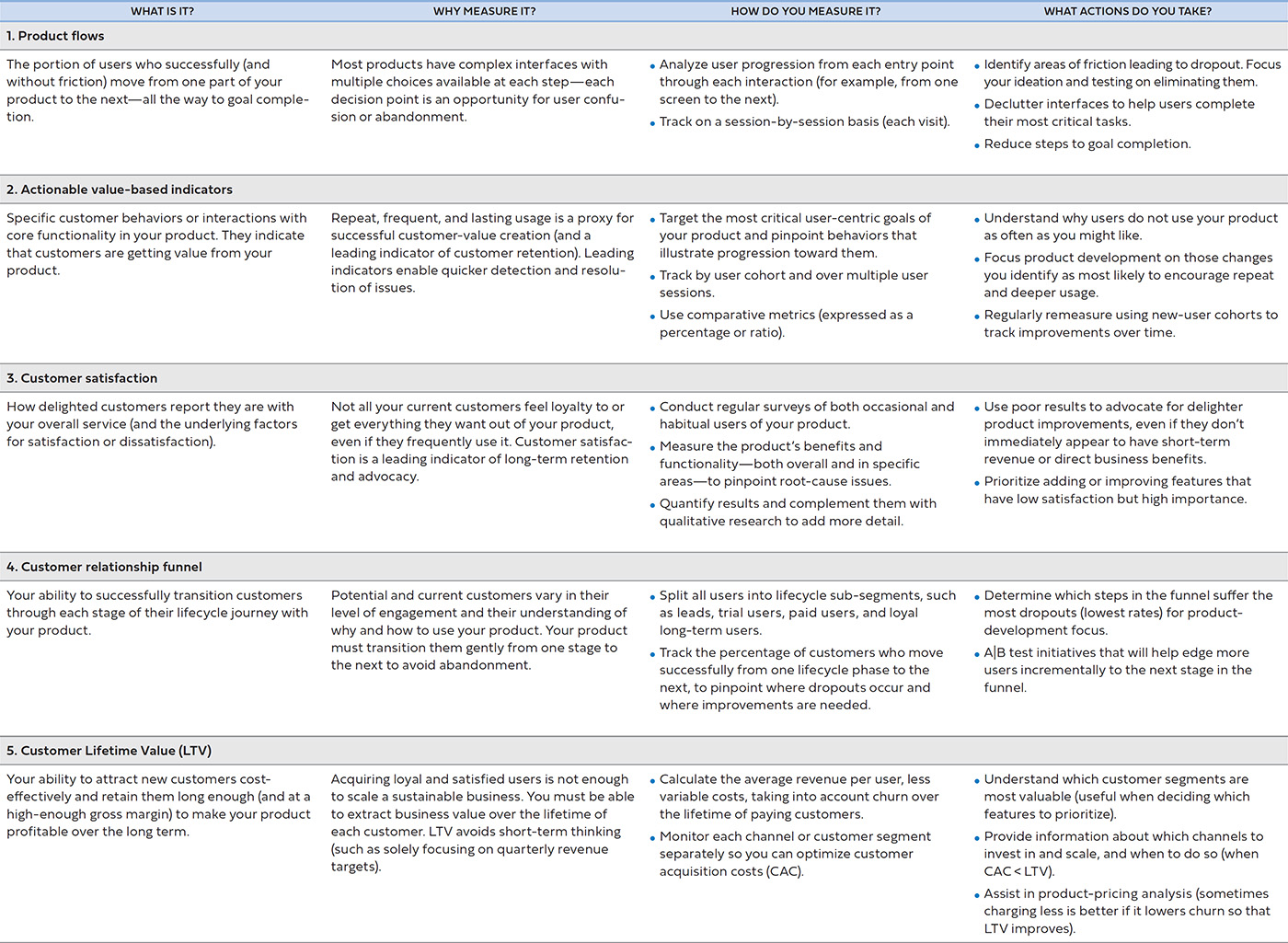
Imagine the hypothetical website Centsible introduced in Chapter 7. As you will recall, users are invited to take a quiz to learn more about personal finance and to set up a credit card for tracking their spending (and receiving offers and advice). This flow is illustrated in Figure 11.2. Users visiting Centsible are offered two choices. The first is for a user who is not ready to signup yet, to learn more about personal finances and what Centsible can offer (“take a quiz”). The second choice allows a user ready to start receiving personalized advice, to register, and “link a credit card.” Each path has a number of steps that can be analyzed for maximum goal completion and optimal user satisfaction.
Say the product manager has noticed that only 30 percent of potential applicants make it to their goal and wishes to increase that to 50 percent or more. The product manager decides to understand under lying issues within the flow—developing hypotheses around possible causes and looking for telltale signs in the data. Once found, the product manager can do further customer research or A|B testing to improve each step—and ultimately increase goal completion.

Consider the Entire Customer Journey
Many products rely on users interacting with touch-points outside of a website or application. Advertising, app store listings, social media channels, email, push notifications, and customer service interactions are all part of your customer’s experience with you. So, too, are any physical touch points, such as reliable shipment and delivery of physical goods.
These external elements can create a disjointed experience or be the greatest obstacles to improving your service. Always map out the entire customer journey and look for improvements, especially ones that don’t require much engineering time.
Specifically, the product manager may investigate the following:
• Bounce rate—The bounce rate is a single-page session. Often it indicates the user did not find what they came looking for and left after scanning only one page or screen. A high bounce rate for Centsible might suggest the product manager needs to work on improving the first-time experience and messaging. Perhaps they should experiment with landing pages and personalization technologies to make different traffic sources more relevant and to “speak” to the unique needs of that user. Bounce rate can be misleading, however, and particularly if your service delivers value in a single pageview.
• Path branching—Product flows are rarely linear. Choices on a page logically represent different directions a user can take, which branch out to achieve different goals and link back to previous pages. Too many choices increases cognitive load and potentially confuses the user (getting them lost). In Centsible’s case, it might be better to focus the user on completing one primary objective (“take a quiz”) and encourage finishing the other (“link a credit card”) later.
• View analysis—You can use tools (such as heat maps) and user studies to analyze clicks, mobile gestures, and scrolling behavior. More advanced tools can even evaluate what users are scanning, reading, or hovering over. You might think core features and content are in plain sight, with crystal-clear messaging, but then find that users are searching all over the page for what they want or clicking on other items by mistake. A close look at the heat map for the quiz feature in Centsible may suggest users are paying more attention to one area of the page much more than others.
• Error handling—Track and determine frequently occurring error conditions that are irritating users. These errors are likely the result of incomplete or unclear messaging or page design. Never assume it’s the user’s fault. Instead, make it your responsibility to guide them, helping them to avoid errors and to recover as quickly as possible when a user-driven error occurs. The Centsible product manager might look at how to avoid incorrectly entered credit card information blocking a user from going further, perhaps through more real-time verification and more explicit error messaging.
• Engagement time—Some services prefer to optimize for longer time-on-page or session time, while others shorter. For Centsible, a user interacting with the quiz and learning more about personal finances for a longer time on the site is likely desirable. However, conversely the product manager probably wants to reduce the time the user spends linking a credit card.
Reducing Drop-Off
Working on a user community product, we were measuring dropout during registration and profile setup. While many users completed initial registration, we had a 30 percent drop-off during the steps required to complete an account profile. This was hampering our ability to grow active users.
We brainstormed some alternative approaches. Some were simple (such as enhanced messaging). Others were quite radical (such as eliminating the entire profile setup and letting users join the community immediately).
The simpler options did not make enough progress—we were still asking too much of our first-time users. The more radical ideas were dismissed outright because they created other problems—notably, the risk that bad actors might create invalid and duplicate accounts and behave in unacceptable ways, putting the integrity of the community at risk.
We tested several different combinations, asking less of users, to find what would reduce dropout, while providing enough real-world validation to protect the community. The answer: asking for the user to upload a single profile photo and enter an email address was sufficient. All other attributes we could ask for later, once the user had experienced enough value from the product.
In addition, we added a photo-validation tool that helped our customer service team quickly find profile photos that were not of real people or were duplicate accounts, and to block these.
More Strategies for Flow Optimization
• Speed matters. So make sure your product loads quickly by reducing the overall page and image size. Test response times across target environments (not all users have the high-bandwidth broadband that you enjoy).
• Your user experience team can help organize navigation and overall information architecture so that users quickly find what they need. Remember that your internal jargon and terminology may not make sense to your users.
• Identify the top user goal for each step. Increase its prominence and optimize messaging. Eliminate the less-travelled paths (or link to them in minor menus or side panels).
• Steps that have high levels of user commitment, such as making a purchase in a checkout flow, usually have very high dropouts. Require as little user-entered data as possible, reduce clutter, and minimize competing calls to action to focus the user.
• Consider both in-page progressive revealing of secondary information upon a user’s hover or click (which can be done using JavaScript) and infinite scrolling techniques. These will keep the user from having to load a new page or click Next or More or overwhelm the user with too much initially (while still making additional information easily accessible).
• Ensure your time tracking correctly measures actual user interaction with the service. Background windows or applications can overinflate calculations, adding to session time when the user isn’t actively engaged.
• Review logs for frequently occurring errors and experiment with instructions, form validation, and instant feedback to help users avoid them.
• Evaluate whether users successfully recover from an error in one try. If not, then your error messages might be vague or written for an internal audience. Don’t leave writing error messages to the development team unless you want them to say something like “Error #U4395: Input Invalid.”
• Step optimization—The product manager might also look to increase or decrease the number of discrete steps necessary to complete a task. Each step is an opportunity for the user to drop out—to abandon your product before goal completion, whether through confusion, impatience, or disappointment that they are not getting the value they came seeking. Focus on eliminating or improving the steps with high dropout. For the remaining steps, provide feedback along the way, so the user feels closer to their goal.
![]() Use KJ brainstorming techniques, RICE prioritization, and split-testing—overviewed in Chapter 4—to determine and execute against your product-flow optimization strategy.
Use KJ brainstorming techniques, RICE prioritization, and split-testing—overviewed in Chapter 4—to determine and execute against your product-flow optimization strategy.
Consider the “cognitive” load for each step. Having fewer steps is not always better as it means you must increase the complexity for any one step. For example, upon reviewing of the link-a-credit-card flow, the product manager may discover that asking for all the user’s information on one page was overwhelming and that breaking this into two or more pages reduced abandonment. Sometimes you improve goal completion by adding steps to reinforce your value proposition and guiding the user slowly toward the end goal.
Armed with a better understanding of where the greatest pain points in the existing flows are, a product manager can focus on the highest leverage steps. (Don’t try to optimize too much of your product experience at once, as this can become wasteful and it will be harder to discern which of the changes drove benefits.)
Brainstorming with your team, you can test promising ideas to improve your product flows over time. Don’t overlook the simple layout and messaging changes that can make a massive difference and are easiest to test and deploy.
2. Vanity Metrics versus Actionable Value-Based Indicators
Vanity metrics often make their way into company collateral or management updates. They show a nice hockey stick from left to right, illustrating how big and impressive your product has (or will) become. They may look good, but vanity metrics can mask severe fundamental business and product issues—they are distractions from understanding what value users get from your product offering:
• They are included only for bragging rights; they give an illusion of success, such as impressive growth, but perhaps without sustainable customer or business-value generation.
• They over-optimize for short-term decision-making (such as temporary boosts in revenue or delivering product features just to win a deal).
• They are incomplete, painting only a partial picture (the real problems lurk under the surface, masked by apparently positive results).
• They tend to be highly correlated with other metrics, failing to isolate product decisions from other factors (such as sales and marketing activities or external market trends).
• They do not lead naturally to more in-depth analysis and actionable changes.
For example, which metrics are better indications of product success?
• Mobile app downloads that sit on the mobile desktop unused? Or fewer app downloads, but ones that are actively used daily?
• An e-commerce service’s total customer base, each submitting an order exactly once? Or a smaller community of loyal re-purchasers?
• Your social media followers who passively view and “like” your content? Or a sub-group of passionate community users who frequently engage with and share your posts?
• A media site that attracts millions of monthly active visitors who stay there for an average of 10 minutes a month? Or 100,000 passionate readers regularly engaging for an extended time-on-site of 30 minutes a day?
In each of the above examples, it is more important to optimize for the second metric than for the vanity metric that precedes it.
Actionable metrics are those that pinpoint and measure specific behaviors that customers exhibit within your product, which demonstrate they find sustained, substantial value from using your service. Actionable value-based metrics conform to the “Attributes of Useful Product-Performance Metrics” covered at the beginning of this chapter. Specifically, they have some or all of the following characteristics:
• They are comparative over time and against different cohorts. You can measure them frequently and consistently. In particular, you’ll usually find them stated as rates—not as absolute numbers.
• They are leading indicators of retention—in that they predict (correlate with or perhaps cause) users continuing to use your service.
• They align the goals and best interests of the user with the activities of the product development team.
• As their name implies, they’re actionable (with further analysis) and bring focus—in that they guide the product team to identify initiatives that result in improving that specific metric.
• They isolate the effect of product improvements from externalities or other activities. An increase in a rate after a product improvement signifies that the product change caused the benefit, and not something else.
That is not to say that your company shouldn’t track registered users, revenue, client growth, and so on—and also occasionally make decisions to optimize for short-term improvements. But such metrics are not appropriate for product manager accountability. They may create unintended incentives to focus on activities that don’t generate long-term value for either your customers or company. By also tracking actionable metrics, you can balance competing goals and empower your product team with the primary charter of driving value for the user.
Actionable metrics can exist at a very high level, measuring the overall performance of the product. High-level metrics are usually owned by a senior product leader in charge of the whole product. More specific metrics might drill into the performance of particular features, perhaps measuring the percentage of users who discover the feature and complete some task—these are best owned by the product manager in charge of that area of functionality.
In general, actionable metrics will be some variant of one or more of the following:
1. Activation rate—The ratio of users who both can and do start an activity, whether that be users (at a high level) meaningfully adopting the overall product, or (at a granular level) discovering and trying a specific feature. For example, if 1,000 visitors come to the Centsible website and 300 of them start taking a quiz, the quiz activation rate is 30 percent.
2. Conversion rate—The ratio of users who started and completed an activity or transaction. Conversion can refer to users opting to pay for your service, or simply a user’s success in achieving a goal with your product. For example, Centsible may define a conversion event to be when an unregistered user signs up and links a credit card (since they can now potentially earn revenues from that user).
3. Retention rate—The ratio of users still actively using a service at the end of a given period, who were using the product at the start of the period. Retention can be a measure of repeat purchases, paid renewals, or simply continued usage of a product over time. In Centsible’s case, they may discover that each month about 5 percent of active users over one month do not come back to engage with their product the next month. Their monthly retention rate is 95 percent.
4. Frequency of use (also known as “stickiness ratio”)—The portion of users, out of all active users over a long period (say, monthly active users [MAU]), who return to engage with the service over a shorter period (say, daily active users [DAU]). The stickiness ratio is DAU divided by MAU. Increasing frequency means users become more active, generally a positive thing for most services.
5. Engagement time—The total time the average active user engages with the service over a defined period (over multiple visits and not just one session). Engagement is critical for content, social, and gaming applications and less so for transactional services (such as e-commerce and enterprise). For example, if the average Centsible user returns three times in a month and spends 10 minutes reviewing their personal finances, total engagement time is 30 minutes per month per user.
6. Match rate—A measure of how accurate the recommended content is to the end user. This metric is specifically useful for services with heavy personalization, a marketplace, or targeted advertising features. One of the goals for Centsible’s “take a quiz” feature is to tailor content recommendations to the user’s answers. By measuring how many of those content recommendations are then consumed by the quiz taker, Centsible can improve the quality of its quiz and its ability to match useful content to the user’s needs.
7. Referral rate—A measure of virality that addresses the following question: Assuming your product is delivering value to customers, to what extent do they promote and advocate your product to others? Imagine Centsible asks users to share their completed quiz scores with friends and family. The percentage of users who do so is the referral rate.
In the online resources at http://www.influentialpm.com, you can find a detailed overview of these seven common actionable metrics and examples, which can be adapted to your needs.
Actionable metrics can be a particularly important addition for regular monitoring and reporting of an enterprise company’s products. In business-to-business companies, the focus tends to be on a deep understanding of sales metrics (such as lead-to-conversion rates, client deal sizes, transaction volumes, and win-loss ratios). But, after a successful sale, it may be a year or more before the customer is up for renewal—how do you know whether the client is getting value out of the service in the intervening time without subsequently measuring end-user behavior?
Sales metrics are appropriate for a sales team but should never be the sole metrics for the supporting product team. If you are also tracking successful customer onboarding and integration, and employee account activation and engagement, you can understand the health of each client account. These are leading indicators—low adoption likely correlates with (but won’t be the sole source of) cancelations. By monitoring these metrics too, you have plenty of time to address any issues in the product before the renewal period.
The Dangers of Vanity Metrics
We were presenting the monthly dashboard, and among the metrics were some vanity metrics such as 20 million total registered users and 4 million monthly active users.
During the end-of-month review, the CEO asked whether the fact that only about one-fifth of registered users was active was a problem or not. Was this to be expected after six years of operation? Admittedly, we should have expected many inactive accounts by then. But how many?
Attention turned to the monthly active-user metric: 4 million. This represented about a 6 percent drop over January. This led to a discussion about possible causes for the lower performance in February and what to do about it until a product manager at the meeting pointed out that February has three fewer days than January.
Following the meeting, I convinced the CEO to introduce a few additional actionable value-based metrics to focus attention instead on how successfully the product delivered on users’ needs. As a result, the following metrics became part of the dashboard:
• “Stickiness ratio” (Did users frequently use the service?)—Calculated as the number of daily active users divided by the number of monthly active users
• “Goal-completion” (Did users achieve the task they came for?)—Measured by the number of user sessions that ended with a transaction divided by the total number of user sessions started
The product team had responsibility for improving performance on these metrics and reporting progress.
(Incidentally, for our specific service, we chose not to track “total time engaged per month”—cumulatively, how much time users spend on the product—even though it qualifies as a value-based indicator. Since our goal was to get the user to transact as quickly as possible, it would have been in conflict with our user’s needs.)
3. Quantifying Customer Satisfaction
Behavioral metrics are good proxies for (or leading indicators of) customer value creation. But measuring satisfaction—by asking your customer for feedback—is a more direct way to track loyalty and the likeliness of retention. Customer satisfaction can help you evaluate your product at two levels:
1. Overall, how well is your product performing relative to competitor benchmarks or customer expectations?
2. Specifically, in what benefits (features and functionality) are you failing, meeting, or exceeding customer expectations?
Accurate measurement can involve substantial work—preparing high-quality questionnaires, identifying and qualifying customers to survey, and following up to increase participation. You then need to analyze, interpret, and link results back to in-service customer behavior (to correlate satisfaction with the customer’s real-world experience with the product). Doing this well requires leveraging experienced data analytics professionals, many hours of preparation, and infinite patience. As a result, it is often done too infrequently. However, measuring customer satisfaction need not be so complicated.
It’s possible that your company has customer research personnel who frequently survey users. If so, approach them to see what they already monitor. If necessary, ask if you can add some questions specifically about your product and get access to their raw data (as opposed to secondary reports). If you aren’t currently surveying customer satisfaction, I’ll introduce a couple of simple approaches to get you started.
1. Overall Customer Satisfaction
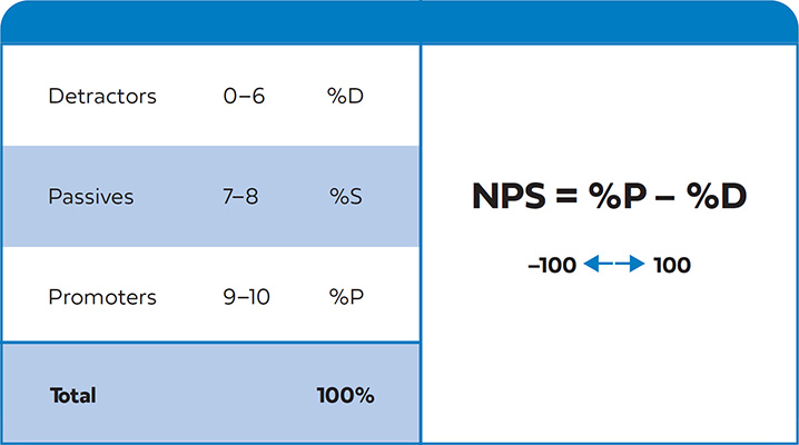
A popular methodology to measure overall customer satisfaction is the Net Promoter Score (NPS). NPS reduces customer satisfaction down to a single, highly visible metric (and sets a very high bar). To determine your NPS score, ask users the question,
“On a scale of zero to ten, how likely are you to refer/recommend [your product] to a friend or colleague?”
As shown in Figure 11.3, once you have results, group together detractors (people who rate your product from 0 to 6) and promoters (who rate it 9 to 10), then subtract the percentage of the detractors from the promoters. Ignore passives (those who give a 7 to 8 rating).
Always follow up the NPS question with one or a couple of qualitative questions to understand why the respondent answered the way they did—otherwise NPS is not actionable.
Merely making customers happy or satisfied is not sufficient to reach an NPS in the 50-plus range. You must delight most of your customers, such that they become advocates.
NPS has received some valid criticism. Some common issues:
• Without a large enough sample set, it lacks statistical significance and, as such, can vary wildly from one measurement period to the next.
• It is subject to bias in the customer selection process and overemphasizes recent customer experiences.
• It is not comparable across industries—some industries consistently rate very low in NPS across the board. NPS is useful for comparing your product to competitors but not to outside-industry players.
• Many products are not inherently referral-based, such as intimate, sensitive, everyday, or “boring” products. For example, you are unlikely to go out of your way to recommend taxation-preparation software, self-help tools, or personal hygiene items to your colleagues and friends. A low NPS does not mean the customer isn’t satisfied—they might just not be comfortable being a vocal advocate.
• Without secondary root-cause analysis, NPS isn’t very actionable.
Nonetheless, if backed up by more sophisticated customer surveys, research programs, product tracking, and reports from customer service, NPS can provide a quick and easy (if imperfect) way to elevate customer satisfaction to a top-of-mind quantifiable business metric.
NPS Is Sensitive to User Perception and Other Biases
I was working on an online skills-development product. We’d built a vibrant subscriber base of self-trained consultants and professionals, enjoying weekly content releases. Anecdotally, we heard stories of changing peoples’ lives—professionals previously stuck working in poor jobs able to break into new careers, older employees using the product to keep their skills current to compete alongside crops of young graduates trained in the latest techniques, and mothers able to reenter the workforce after a long hiatus.
But NPS was very low. We sought to understand the disconnect and discovered users’ reasoning. Far from being dissatisfied with the product offering, their unwillingness to refer the product to others was a deeply personal fear: “I’m embarrassed. I don’t want any of my friends or colleagues to know I don’t know how to do that skill already!”
A similar case occurred for an on-demand workforce marketplace. The NPS was negative until they realized that no one user would refer another user since the referred user might be competition in the on-demand labor pool. Simply adding to the NPS question “if it didn’t impact your business opportunities,” NPS rose by 60 points.
And at a niche video-content company, NPS survey completion rates were very low. In the research, users responded that their “friends and colleagues wouldn’t be interested in this content.” After changing the question to “recommend this product to someone like you,” survey completion rates soared.
Finally, be careful of selection bias. One company consistently rated NPS in the 60s, but a closer look revealed they were only surveying users who had been active for at least 20 minutes. Half their users had moved on by then (an example of survivor bias). After launching a revised survey strategy that reached all users, NPS fell by 10 points—which is still an excellent score.
2. Ranking Customer Satisfaction of Specific Benefits and Functionality
A simple approach to evaluating satisfaction with specific benefits, functionality, or features is to ask customers a two-part question with the option of four multiple-choice answers (or rankings on a scale from 1 to 4) for each component of your service, as outlined in Figure 11.4. Four options are better than five, because this eliminates fence-sitting (neutral) responses (such as “Neither satisfied nor dissatisfied”), forcing customers to express an opinion one way or the other.
Components you can survey for can include specific features and flows, or benefits and user outcomes. Test basic needs or table-stakes and your key differentiation features. For example, for the Centsible application, you might may ask users to rate their satisfaction on:
• Ease of use
• Application speed and stability
• Account set-up
• Link credit card
• Review spending activity
• Usefulness of quizzes
• Breadth of personal finance content
• Effectiveness of personal finance content
• Quality of personal finance management recommendations
Remove biased language (for example, word as “application speed” rather than “fast application”) and ensure each description is meaningful to your audience at a glance. Provide an optional free-form comment box for users to write thoughts or justifications for their choices. You may find clues to problems or misunderstandings in your questions.
Asking for ratings for both satisfaction and importance provides invaluable data. You can use the responses to force-rank features and functionality into the following four quadrants to inform product-optimization priorities:
• Cut—If you have a dissatisfying element in your service that is of limited use to customers, consider cutting it altogether to simplify the user experience and reduce maintenance complexity. If cutting is not possible, consider making the element less prominent and put minimal effort into further development.
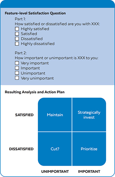
• Maintain—Don’t invest further in features that are meeting customer expectations but do little to differentiate your service. Keep monitoring usage trends, however, in case a feature turns out to be more critical than once thought.
• Strategically invest—Perhaps counter-intuitively, consider additional investment in high-satisfaction, high-importance areas, so you make customers even more delighted and put even more distance between yourself and alternatives.
• Prioritize—Invest in high importance but low-medium satisfaction components. Some features may need considerable work to close the gap between what you have today and what customers expect.
Follow up your surveys with more in-depth, qualitative analyses—user interviews, other surveys, and firsthand customer feedback from your customer service department.
Complete surveys regularly (perhaps quarterly) so you can identify if investments are achieving the results you hoped for or if new gaps have emerged. Note, though, that you should try not to change your methodology or questions too dramatically from survey to survey—if you do, comparative analysis becomes challenging.
Unless you must use anonymous surveys, link your NPS and satisfaction data with actual user behavior data from product tracking. Connecting these data sets can give you insight into which particular experiences are affecting satisfaction, either in positive or negative ways, and help you understand how a positive NPS is correlated with frequent use of your overall product. You’ll be able to analyze perceptions versus usage, helping you to uncover more trends or disconnects between stated and demonstrated preferences. Different user types might value varying features: for instance, highly loyal customers will be more likely to emphasize satisfaction with different components than first-time users (or irregular users).
![]() Combining customer satisfaction surveys with the Kano analysis (Chapter 4) enables you to measure current satisfaction and prioritize future features in one exercise.
Combining customer satisfaction surveys with the Kano analysis (Chapter 4) enables you to measure current satisfaction and prioritize future features in one exercise.
4. Breaking Down Your Customer Relationship Funnel
Customer relationship funnels can be mistaken for, but differ substantially from, the product flows already introduced. Unlike product flows, a funnel
• is from the customer’s perspective (not that of the product);
• represents the lifecycle stage (current mindset or depth of relationship) that the user is in with your business or service;
• maps the entire relationship and, as such, is likely to include many interactions with your product (not just a single visit) across all customer touch-points over a long period of time.
Figure 11.5 represents one of many funnels you can use to conceptualize the user’s journey with your product. There is no hard and fast rule to the nomenclature or the steps in the customer funnel. Companies vary in their language—especially that used with consumers versus enterprise businesses—perhaps combining or adding some stages.
Imagine a funnel that represents a customer’s relationship with your product or service: it starts from the very first time they become aware of your product, perhaps through advertising or a recommendation. At this stage, they don’t know much about it—only that maybe it could solve a problem they have. They are unclear about your value proposition; perhaps, even suspicious.
After they learn more about your product—say, by visiting your marketing website—they might become more interested. They see that you might solve their problem and explore your product’s website to learn more. They are now in the consideration stage. Here, you must do an excellent job of educating them about your value proposition and overcoming their objections.
Next, some of them research, download your application, register for your product (if you provide it for free), agree to a trial, or purchase your product (if you offer a paid product). They are in the acquisition stage.
Many product managers fall into the trap in believing the hard work is done after they acquire a user. However, now you must get them to start using your product (the activation stage), or they might give up quickly and maybe ask for a refund. You’d better get them hooked—as a one-time user is not very valuable. Customer dropout at this stage can be substantial, which is why careful attention should be paid to making “first-time use” (also called onboarding or adoption) a compelling and enjoyable experience. First impressions matter!
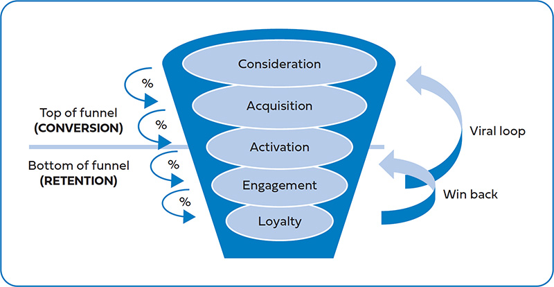
The engagement stage, when the customer or user interacts more fully and frequently with your service, follows. Now they are beginning to get value from your service but have not yet become habitual users. They are still evaluating, and you still have much to prove.
The next stage is loyalty (or advocacy). Your customer is habitually using your product, and you’re likely earning ongoing revenue streams from them. Keeping them coming back is paramount. If you retain and delight these users, they will be more likely to refer others into the “top of the funnel” (into the awareness stage, thus completing a viral loop). Or perhaps you have additional services you can upsell them.
Any elapsed or dormant user is one that stops using your service for any reason. They present an opportunity for a win-back (also called a reactivation)—the process of remarketing your service and convincing them to try it again. These can be some of the lowest-cost customers to acquire, especially if you have improved the service or launched exciting new functionality since they last engaged with you.
Conversion (the top of the funnel) commonly defines the moment the user or potential customer first becomes a revenue-generating user (direct or indirect) of the service, which may happen at the same time as, or some time after, acquisition. Retention (the bottom of the funnel) is the process of keeping existing revenue-generating users engaged and continuing to use your product.
Since users can drop out at any stage, the path from awareness to loyalty looks like a funnel: wide at the top and narrower toward the bottom. Funnels allow you to sub-segment customers into levels that reflect their depth of relationship with you, helping you to pinpoint
1. where the greatest opportunities for improvement are (which is usually where the largest percentage of dropouts occurs), and
2. the friction points, actions, and behaviors that encourage (or discourage) users to take the next step.
Track the percentage of users who graduate from one stage to the next (along with those who drop out) to identify where your greatest opportunities lie.
Strategies for Funnel Optimization
• Conduct A|B tests on messaging, landing pages, and trial offers to increase conversion rates. Outsized gains can come from seemingly small changes. (Chapter 4)
• Deliver first-time customers a superior onboarding experience to increase the likelihood they will become loyal customers. Low customer retention is often really a result of a poor activation experience. First impressions are made within hours or days.
• If your company is focused only on sales, conversion and growth, advocate for customer delighting features to improve engagement and retention. These initiatives often have longer-term payback periods and are therefore easily deprioritized.
• Your most loyal users are your greatest advocates and can be leveraged to drive word-of-mouth and viral growth. Consider giving them tools and an incentive to drive referrals.
• Lifecycle marketing (CRM, email, push notification, community, and other “off-line” programs) is an essential tool for bringing users back to your product—keeping them engaged and progressing through later stages of the funnel. Partner closely with your marketing department to invest in post-purchase retention programs, not just to drive new sales.
For example, if you have a step with a 60 percent dropout, and you successfully decrease this to 50 percent, you have moved 25 percent more customers down to the next stage. This is better than focusing on a step that already performs at 90 percent and driving it up to 99 percent (getting 10 percent more customers to the next step).
By cohorting users (that is, aggregating users into a group based on receiving the same product experience over a similar time period) you can see where your product improvements are successfully moving users further down into the funnel.
5. Understanding Customer Lifetime Value
Customer lifetime value, or simply lifetime value (LTV), is the superior metric for measuring the financial performance of a product—better even than revenue or return-on-investment. That’s because it captures the customer’s total gross margin contribution across their entire lifecycle with you, from their conversion to the day they leave your service.
Figure 11.6 illustrates a simple LTV formula. It is calculated by taking the average revenue per customer (ARPC) and subtracting the cost to deliver the service to the customer (COGS). By dividing this by the churn rate, you can calculate your product’s LTV. (This formula assumes a consistent average monthly churn rate. For the purposes of discussion, we’ll assume measurement is on a monthly basis and the same month-to-month—but that doesn’t have to be the case. For example, many enterprise B2B services renew annually.)
• Average revenue per customer (ARPC)—ARPC is the expected monthly revenue earned from each customer. It includes revenue derived from direct sales or subscriptions, from indirect advertising or third-party revenue streams, or from upsells of additional products and services to existing customers. It is sometimes referred to as ARPU (“user” instead of “customer”)—which is commonly used when users don’t directly pay for your service but you might still derive revenue from their interaction with your service.
• Cost of goods sold (COGS)—COGS factors in all variable costs associated with servicing and delivering the product to customers, such as supplier time and materials costs, customer support, retention incentives, and product returns or refunds. (Visit http://www.influentialpm.com for a more thorough breakdown of COGS and why you do not factor in fixed costs.) Subtract COGS from ARPC, and you have your monthly gross margin per customer.
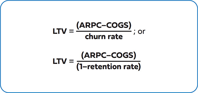
• Churn rate—As mentioned previously in this chapter, churn rate is the percentage of customers lost each month. Even the best-run consumer and SaaS services report losing 2 to 5 percent of their customer base every month.
• Customer lifetime value (LTV)—This is simply the summation of the monthly gross margin divided by the churn rate, and it represents the profitable value of an average customer over the entire relationship with that customer.
In reality, calculating your LTV is rarely as straightforward as the formula shown in Figure 11.6. To be sufficiently sophisticated, you will need to model out how cohorts of segmented customers pay on an ongoing basis for your service and determine how many of them stop paying for your service, for example, on a month 1, 2, 3, and so-on basis. It is common for users to churn in higher proportions earlier in their relationship with you, while deeply loyal users are slower to churn. For a detailed example, see the online resources at http://www.influentialpm.com.
LTV analysis is incomplete until you compare it to the customer acquisition cost (CAC) or cost per acquisition (CPA)—the initial cost of acquiring the customer. Some teams assume that acquiring users is the most critical early goal for a new product—they want to build the user base as rapidly as possible. However, to be profitable, ensure that
LTV > CAC.
Generally, LTV analysis should be broken down by channel, whether paid distribution channels (expensive), advertising and marketing channels (better), referrals (cheap), or organic and viral methods (free!). Often one channel will have a lower CAC or a lower churn rate and is, therefore, more attractive than another. LTV analysis allows you to make better decisions on when best to scale up and to partner with your marketing acquisition team on which channels to focus on.
If your LTV for a particular channel is less than the CAC for that channel, then you are losing money on each new customer. That might be okay under certain circumstances if you
• understand how to make LTV profitable over time, and
• know how your economies of scale will lower CAC and COGS, and
• are in “land-grab” mode to build a large, defensible footprint, and
More Strategies for Improving LTV and CAC
Product managers are responsible for total market success of their product and therefore must engage throughout an organization to influence long-term superior economics.
• Price-test and vary your business model (perhaps offering premium tiers or upselling opportunities) to increase ARPU. Price-testing is never easy, so be sure to research extensively proven methodologies and understand the risks.
• Offer longer terms (particularly for enterprise and subscription businesses) in exchange for substantial discounts (for instance, 3040 percent off for users who opt for a one-year commitment over month-to-month payments). Such changes lower monthly ARPU —however, they often increase LTV because they also lower churn.
• Seek superior COGS (renegotiate with suppliers, invest in development resources to lower the cost of service delivery and customer support, and automate internal business systems).
• Collaborate with marketing to optimize CAC, starting with segmenting LTV by channel and increasing the mix of lower-cost channels.
• Leverage unique differentiators such as network effects (the value derived from a community of interconnected users), personalization (customization driven from your unique understanding of user data), and other features that raise the barrier for exit—making it less likely that users will move to alternatives. (Chapter 3)
• have patient executives or investors willing to lose money while you figure out your unit economics.
Otherwise, it might be best to concentrate on creating and limiting yourself to a smaller but more loyal user base until you have control over the profitability of your business (which should be, at least, break-even).
Such is the power of LTV analysis: it can highlight where your best opportunities are, not just within your product, but within your entire business model—it’s a very powerful, actionable metric.