
Chapter 7. Making It Just Work
When your program is ready to release, you exhaustively test the code by running it through every possible scenario.
The same needs to happen with your UX. Before releasing it to users, you need to go through a final review, to ensure that you’ve done everything possible to make it easy to use. This chapter provides a framework to help you do that.
The Key to Everything
As aviation pioneer Antoine de Saint-Exupéry (1900–1944) wrote, “Perfection is achieved not when there is nothing more to add, but when there is nothing left to take away.” That applies to our user experiences as much as to aviation. Before we ship a product or publish a Web site, we need to ruthlessly examine it to see how much user effort we can remove.
Applications and Web sites are often feature driven. One group of users wants an equation editor, another wants a left-handed veeblefetzer, and so on. All say they want a simple and clean UX but, damn it, with my feature in it. The voice crying for simplicity and ease of use gets drowned out by the combination of multiple narrow interests. It’s sort of like the government budget that way.
To combat this creeping complexity, what you do in the night or week or month before shipping is not to cram in one more feature, but to make another pass through the UX and ask, “How can we simplify our users’ tasks even further? Make this app easier to use? And easier still?”
This chapter provides a framework to guide you along that path. Before you think about releasing to QA, you need to work through all of these items. Ideally, you should be running them throughout the development, as you run your code tests throughout your development process. But especially before release, you need to take a timeout and pay special attention to these items. If you want to think of them as Plattski’s Ten Commandments, feel free:
![]() Start with good defaults.
Start with good defaults.
![]() Remember everything that you should.
Remember everything that you should.
![]() Speak your users’ language.
Speak your users’ language.
![]() Don’t make users do your work.
Don’t make users do your work.
![]() Don’t let edge cases dictate the mainstream.
Don’t let edge cases dictate the mainstream.
![]() Don’t make the user think.
Don’t make the user think.
![]() Don’t confirm.
Don’t confirm.
![]() Do undo.
Do undo.
![]() Have the correct configurability.
Have the correct configurability.
![]() Lead the witness.
Lead the witness.
Start with Good Defaults
It’s not enough to build a program with the correct feature set, or even with the correct configuration points. You also need to put that program into its optimal configuration by default, so that as many users as possible can use it without thinking. That means that you have to know who your users are, because they sure as heck aren’t you. How should we determine what those default settings should be?
Sometimes you can deduce the correct default settings from your business data. Consider the UPS.com Web site discussed in the introduction, shown here as Figure 7.1. UPS forces home page visitors to select a country before they can do anything at all. This site should automatically sniff out the requesting IP address and default to the country from which it comes, as does Google, but apparently UPS won’t expend even that tiny amount of programmer time. Instead, they annoy every single user by providing no default setting, by requiring them to take action.
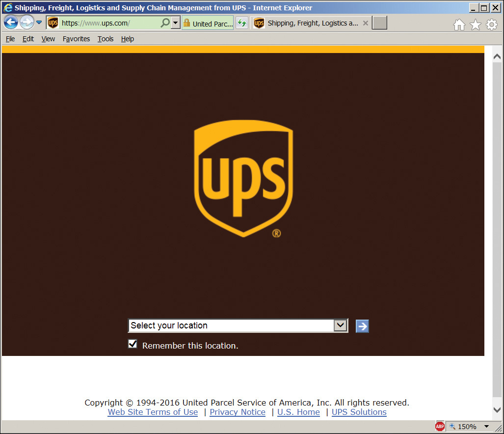
Figure 7.1 UPS.com home page requiring location choice.
If UPS won’t deduce the user’s country at runtime, here’s what its second choice should be: According to UPS.com’s own data, UPS’s average volume is 87% domestic US and 13% international. If UPS.com defaulted to US English, seven out of eight users would be happier, and the remaining one out of eight no worse off. That sounds like a good trade-off. I doubt that the UPS designers come right out and say, “Let’s annoy seven Americans so that our one annoyed foreigner won’t feel lonely,” but that’s the result of their design choices. A hard-wired default based on business data sometimes makes sense, as it does in this case.
Sometimes you choose defaults based on usage data that you’ve measured from telemetry of previous versions. For example, the default toolbar in Microsoft Word 2003 contained a Quick Print button (Figure 7.2). Instead of displaying the full print dialog with all the fancy settings, this button simply printed one copy of the whole document on the default printer. But in Office 2010, the default quick access toolbar in the far upper left doesn’t contain a Quick Print button, although it contains Save, Undo, and Redo (Figure 7.2b). The Quick Print button is easy to add, but it’s not the default. You’d think that most users would want quick printing; therefore it should be turned on by default. If the Office team has telemetry data that proves most users don’t care about quick printing, I withdraw my objection to its absence.

Figure 7.2 (a) Microsoft 2003 default Office toolbar containing the Quick Print button. (b) Microsoft Word 2010 quick access toolbar without the Quick Print button.
Sometimes you can deduce the correct default from the context of your app’s usage. This is especially true of mobile devices, which often provide information based on their current location. Here’s an example from the mobile phone commuter rail app discussed in the next chapter. The app senses its location when you bring it up. If it sees that it’s in the suburbs, it figures you probably want to see trains inbound to the city, so it automatically selects the tab showing that schedule (Figure 7.3a). If it sees that it’s in the city, it figures you probably want to see outbound trains and automatically selects the tab showing those (Figure 7.3b). That’s correct for most users most of the time. And if it isn’t, the user has to tap only once to see the other schedule. Just think how annoying this app would be if it asked every user, every time, “Which schedule do you want to see now, inbound or outbound?”

Figure 7.3 (a) The commuter rail app sees its location in the suburbs and shows the inbound schedule by default. (b) The same app sees its location in the city and shows the outbound schedule by default.
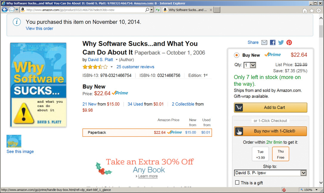
The best usage of default values that I’ve ever seen is Amazon’s patented 1-Click ordering (Figure 7.4). In addition to the usual button for adding an item to a shopping cart, Amazon puts an immediate order button right there on every item’s page. Just click it, and ka-ching! One copy of the item gets ordered, shipped to the default address by the default method, paid for by the default credit card. I had to turn this feature off because I was buying too much stuff. That is the power of good default values.
Always ask: Is your app using the best possible defaults?
Remember Everything That You Should
“I never forget a face,” quipped Groucho Marx. “But in your case, I’ll make an exception.” That’s how our programs should be. We should usually remember everything we possibly can about the last time the user used our system. There are times and places to make exceptions, for example, deliberately wiping out a browser’s search history so the next user can’t see the sites we visited. But almost always, our computer programs should remember the way we like things and automatically do them that way the next time we run them.
Consider the PatientSite patient portal (discussed in Chapter 9). The users of this site tend to be older than the population average, because that’s who gets sick most often. Older users have poorer eyesight than the population average. PatientSite therefore provides a mechanism for increasing the text size, as do many other Web sites. Figure 7.5 shows this control.
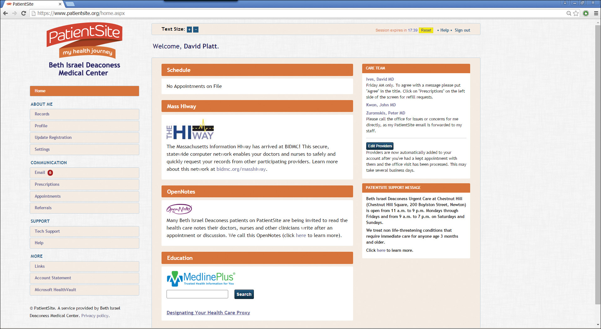
Unfortunately, PatientSite doesn’t retain this setting from one session to another. The user has to set his preferred text size with every usage. That’s wrong. If a user needs large type on Monday, it’s a pretty good bet that he’ll need large type again on Tuesday, and probably Wednesday as well. The site should remember this setting and automatically use it on subsequent encounters.
Because of the confidentiality of its medical contents, PatientSite never shows any personal data until you have logged in. By the time it shows you this home page, PatientSite already knows who you are and has access to all of your medical data. There is no technical reason that they can’t store the text size. They should do this, and so should your apps.
There’s a case to be made that the font size setting shouldn’t be done on each Web site. The thought is that when a user needs large type on site A, he probably needs it on site B and site C as well, and all the rest of the Web too. Therefore, the correct solution is the zoom setting that all browsers have. If this type size setting were removed because of that, we couldn’t squawk too much, always subject to the proviso of changing our minds because of actual user data. But as long as the setting exists on the site, it should persist from one session to the next.
Always ask: Is your app remembering everything that it should from one session to another?
Speak Your Users’ Language
“The Internet isn’t working,” says my wife. So I ask her, “Won’t your browser come up? Is your TCP connection valid? Is their site down?” She doesn’t recognize those terms. All she knows is “the Internet,” and right now it’s not giving her what she wants.
Users learn about technology, as we learn everything else, by assigning names to things. Users will remember and understand the names that make sense to them. Those names often aren’t the names that the developers gave these items when they built them.
One of the main problems that tech support technicians encounter is to decipher the behavior of the user’s computer based on the names by which the user describes the problem. I once (many years ago) confused the living daylights out of a Dell tech support rep by continually referring to “my laptop,” when all of his support material used the term “notebook” for the product I was working with.
It is not the user’s job to learn the names you assign to things, even though you wish it were. It is your job to figure out the names that the user recognizes and to speak to the user in those terms.
For example, I recently went to the Web to buy some filters for my air conditioner. When I went to check out, I had to select the shipping method. Figure 7.6 shows the confusing choices that the site gave me.
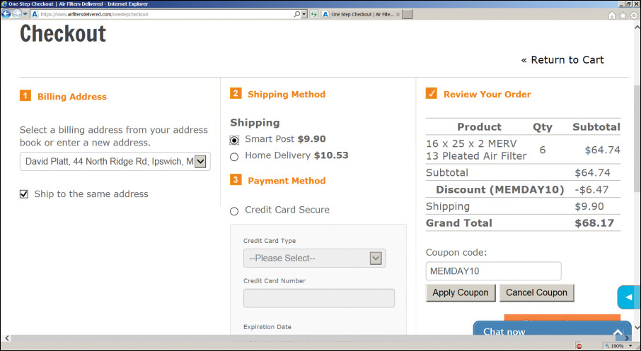
Did I want “Smart Post” for $9.90? Or did I want “Home Delivery” for an additional 63 cents? What are these? Does Smart Post not go to my home? If it doesn’t, how smart could it be, and where does it go instead? Of course I want it delivered to my home. And how long would either of these methods take? The checkout page doesn’t tell me.
The site used the shipping company’s brand names for each particular shipping service. I didn’t know those names, didn’t want to have to know those names, to this day still don’t give a flying fish about those names. Even when I went poking around the Web to decipher them, and discovered that they’re different flavors of FedEx, I still couldn’t figure out when my package would arrive with either one. I wound up picking one at random, but I can’t remember which. My stuff eventually arrived, but I wasn’t sure how or when.
A far better usage is shown in Figure 7.7 with, as usual, Amazon.com. Amazon doesn’t tell me which carrier will deliver my package; my Amazon stuff arrives via UPS, FedEx, USPS, once in a while DHL, with no discernible pattern. Amazon doesn’t show me whatever brand names that carrier might use; is it UPS Blue or Red, or USPS Express Mail or Priority Mail or Priority Mail Express? Amazon presents the shipping options to me in terms of what I care about: time and cost. Free delivery in two days. Free delivery with an extra credit if I let them take five days. Or overnight for a lot more. They’re speaking my language, and I can easily pick the alternative that is right for me now.

Always ask: Is your app speaking the users’ language, rather than expecting the user to learn yours?
Don’t Make Users Do Your Work
We see it all day, every day, in our travels through the software world: “Enter your phone number [or government ID number, or credit card number, or whatever] with no dashes or spaces.” If somehow you ignore the instruction and include those placeholders, the app gets upset and won’t do what you want. How annoying.
This is a classic example of forcing users to do work because programmers are too lazy to do it for them. For example, Figure 7.8 shows the Microsoft Store page for adding a credit card to an account. This isn’t an old or obscure case that Microsoft just hasn’t gotten around to updating yet. This is Microsoft’s flagship consumer sales portal in early 2016. Microsoft is saying, “It’s your job to translate your data into the format that our computer program needs. We won’t do it for you. If you get it wrong, we’ll show you an error message in red and say, ‘Come back and do it right, you idiot.’”
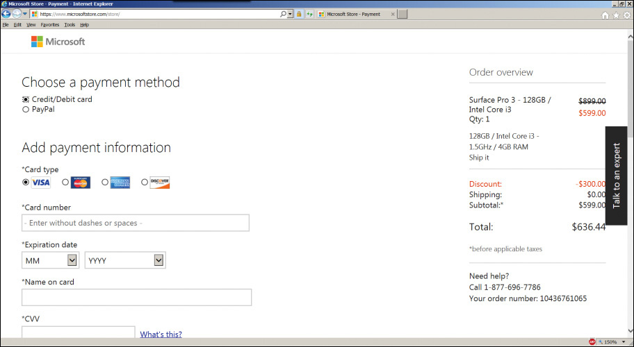
Figure 7.8 Users are forced to remove dashes or spaces from their credit card number in Microsoft Store.
Is this any way to treat a customer? It’s hard to imagine how they got that one past whatever UX review they have. By definition, they must not have had a good one. What carelessness. What—please forgive me as I use the most toxic word in the geek vocabulary—stupidity.
Suppose you were talking to a human operator (remember them?), ordering from a paper catalog (remember them?), or over a voice line (remember them?). You’d start reading the card number to the operator: “Four one two six [pause] nine . . .” and she’d interrupt: “Wait! You’re not allowed to pause between digits. Now go back and say it right.” “I’m sorry,” you say. “I’m just not with it today. OK, four one two six nine seven eight three, um,” “No, you screwed it up again!” the operator screams at you. “You’re obviously not telephone literate. Keep your money, we don’t want any customers as stupid as you.”
How long would that company stay in business? Not very long. Yet that’s what Microsoft—and in fairness to them, many, many other sites—are doing to us today. Why do we accept this?
Apple.com does it a tiny bit better. When you type a dash or a space character into a credit card number, the text box control simply ignores that keystroke. Type in 45 67-89, and the control shows 456789. At least Apple isn’t making its users do that work, though it’s a little confusing when the user compares the card in his hand to the number that he typed in.
As is usual, or at least common, the prize for the best job goes to Amazon, as shown in Figure 7.9. Amazon allows the user to type in a credit card number with any sort of formatting. Put dashes or spaces in at any location you want, even if they’re not shown that way on your actual card. Amazon automatically discards the chaff and assembles the card number internally. Amazon is so smart about it that it detects the type of credit card by its number, so you don’t even have to tell it that.
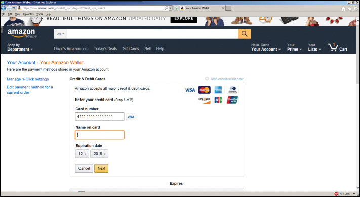
Figure 7.9 Amazon wisely accepts credit card numbers any which way. Note the selection of Visa, which Amazon deduced automatically from the card number.
Are Microsoft’s programmers any less smart than those at Amazon? No, they’re both quite good. Does Microsoft want its customers’ money any less than Amazon wants its customers’ money? It’s hard to imagine that (although see nineteenth-century mathematician Georg Cantor’s work on the different sizes of infinity). Microsoft could do this if it wanted, and it wouldn’t take very long. But somehow Microsoft has not yet taken to heart the lesson that Amazon has, which is: When you want customers’ money, it is a very good idea to make it as easy as possible for them to give it to you.
Always ask: Is your app making your users do work that you should be doing for them?
Don’t Let Edge Cases Dictate the Mainstream
Oftentimes geeks just throw features into an app because they think they’re cool, without a thorough analysis of which operations they help versus which they hinder. If pressed, the geeks insist that some user sometime might want that feature. They do not realize that a feature can easily become a cost for users who don’t care about it.
Consider the case of DiscoverBulk.com, a Web site that shows you stores that sell food in bulk. Like so many retail sites, it has a store finder, shown in Figure 7.10. I typed in my zip code and clicked the “Find Them!” button. The site came back with a map of my town but the small red legend “No stores found.” What’s going on here?
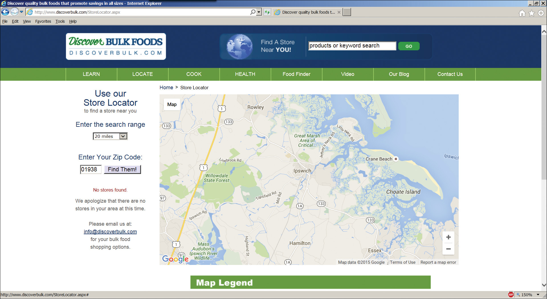
Figure 7.10 Edge case (“Is there a Discover Bulk within 20 miles?”) interfering with the main case (“Where’s the nearest Discover Bulk?”).
The answer comes from the search range control, which here has the default value of 20 miles. There doesn’t seem to be a store within 20 miles. If I bump it up to 50 miles, I still get no stores found. If I raise it to 100 miles, I see one in Waterboro, ME, 75 miles away.
What’s wrong with this? you ask. Here’s the answer: The presence of the search range control changes the question that the site answers for the user: “Is there a Discover Bulk store within 20 miles of me? How about 50?” That’s not a question a user often asks.
The user almost certainly wishes to ask the question “Where’s the nearest Discover Bulk store? How about the next nearest?” Users may or may not be willing to travel that far once they see where it is, but that’s what they want to know, the main case. Locating a store within a specific radius is something that users do much less often, hence the term edge case. On this site, the edge case complicates the main case.
Geeks will often argue with me when I show them this sort of case, saying, “You’re not willing to drive 75 miles, so this is a useful thing.” The problem is that users don’t know how far they’re willing to go until they see how far they have to. They don’t think, “Hmm, these bulk guys are somewhat interesting, but I’m willing to drive only ten miles for them. Now where the heck are they?” On the contrary: they’ll see where they are, and then they’ll decide what they want to do. Shut up, get out of the damn way, and show it.
Always ask: Are any of your edge cases complicating your main cases?
Don’t Make the User Think
Steve Krug wrote an entire book entitled Don’t Make Me Think (New Riders, 2014). Buy it and read it. Krug is right. Anytime you force the user to think, you are running the risk that she might not. Here’s an example that happened to me.
I got a marketing email from VRBO.com, from whom I was renting a summer cottage for a week. I didn’t want to keep getting marketing emails, so I looked for the unsubscribe link, which email blasters usually have. When I clicked that link, I got the page you see in Figure 7.11, asking which of its many brands I wanted them to shut up and stop bugging me about. (How about all of them?) How should I know who sent me the email? It’s not my job. They sent it to me; now they need to track the damn thing. But no, they are making me guess.

I took a guess and clicked on one of them. But when I got in there, I found no indication if I was in the right place or not. The unsubscribe box wasn’t checked. I can’t tell if I’m subscribed to this one or not (Figure 7.12). I tried the entire top row, to see if any of them had any indications, but none did.

I eventually went through the entire top row and clicked unsubscribe for each of them. But the completion screen didn’t tell me if I had actually managed to unsubscribe (Figure 7.13). Look, turkeys, when a user says shut up, it’s a really good idea not to argue.
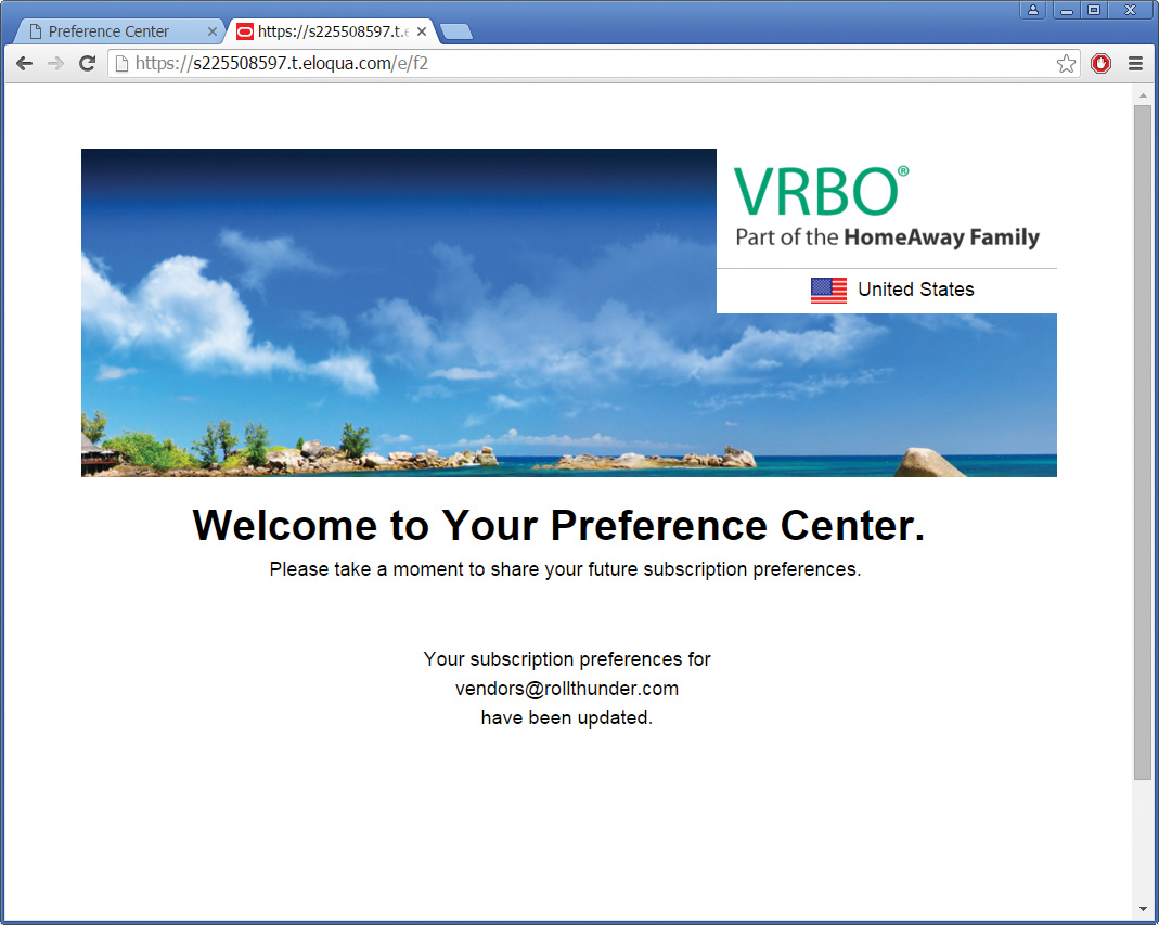
Figure 7.13 Unsubscription confirmation form making me think again, and not showing if I’m actually unsubscribed.
A marketingbozo (a word that I coined; see my April 2013 MSDN column) might argue, “But we don’t want our customers to unsubscribe. We want them to stay with us, so we purposely make unsubscription hard.” It’s not a good idea to keep people in when they’ve already told you they want out. Annoying someone into liking you is extremely difficult.
Always ask: Are we making our users think?
Don’t Confirm
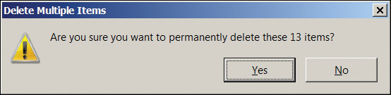
The common technique of confirmation, popping a dialog box into the user’s face and asking, “Are you sure you want to do that?” is evil (Figure 7.14). It’s unfriendly, it’s distracting, and it’s completely ineffective. Have you ever, even once, said, “Whoa! I didn’t want to do that. Thanks,” and clicked No? Have you seen anyone do that? Have you even heard of anyone doing it? I haven’t. It shouldn’t exist. Anywhere. Ever.

Figure 7.14 This confirmation box does not prevent errors. The Recycle Bin, to which the file moves, makes this operation undoable and does indeed prevent unintended loss of data.
We might just tolerate the annoyance of confirmation if it actually made us safe, but research has shown again and again that it does not. Confirmation is so vastly overused that it has become completely useless. Because the box constantly cries “Wolf!” like the shepherd boy in Aesop’s fable, no one pays attention to it, even when it’s warning you of something you really don’t want to do. You cruise through it on autopilot, clicking Yes without thinking, an action the cognitive scientists call “chaining.”
Other operations in life don’t require confirmation. Your car does not ask, “Do you really want to start the engine?” when you turn the key. The supermarket clerk does not ask, “Do you really want to buy these?” when you place groceries on the register belt. Programmers constantly ask for confirmation because they think users don’t understand the consequences of their commands. That may be true, given the poor quality of the user interface. But confirmation doesn’t solve this problem. If the user was confused when he first gave whatever command triggered the confirmation box, he’ll be even more confused when he sees it and almost always click Yes just to make it go away.
On the contrary, mistakenly believing that a confirmation box will prevent users from making mistakes gives programmers a false sense of security. It keeps them from having to clearly explain to the user what he’s doing, and providing a way to recover when he does something that he later regrets, despite having originally confirmed it.
Legend has it that the engineers who built Amazon’s astoundingly profitable 1-Click ordering mechanism originally included a confirmation box: “Are you sure you want to order this with 1-Click?” They fought against its removal and required a direct order from Jeff Bezos himself to remove the box and make it a true one-click process. Amazon’s stock price records the value of that decision (among others, of course).
But what if the user really has made a mistake? If you brought a flashlight to the checkout stand with a package of the wrong-size batteries, wouldn’t an attentive clerk ask, “Are you sure you want this size and not the one that fits the flashlight you’re buying?” A good user interface should and can save us from mistakes like that, but it won’t happen by blindly and stupidly asking, “Are you sure?” Instead, a good user interface prevents the problem initially by just working. Perhaps the Web page selling flashlights would contain a check box saying “include batteries,” checked by default. Better still, the flashlight would come with batteries already inside it, so it’d work the instant you unwrapped it and no one would ever have to worry about buying the correct size. Now that’s a design that just works.
Once in a while, you will get into an argument with someone at your company who outranks you and demands a confirmation box. In this case, if you are stuck putting it in, try to get permission for a check box that says, “Don’t show this box again,” so it doesn’t nag users forever.
Always ask: Are we ever asking the user for confirmation? Because it doesn’t work. We need something else.
Do Undo
Another reason that you aren’t asked to confirm starting your car or buying groceries is that these operations are easy to undo. You just turn off the car or return the unwanted item. The “undo” capability is the greatest design advance since the mouse. It takes an enormous amount of effort to make this feature work so that users don’t even have to think about it (“Easy is hard,” the saying goes), but the programmers who implement it are any user’s best friends. I buy them beer whenever I meet them.
The beauty of undo is that it allows users to explore a program. It’s not always easy to understand a new program’s operation from menu items and toolbar pictures. With undo, a user can try different commands, knowing that she won’t damage something that can’t be repaired with a few keystrokes. Programmers often regard incorrect user input as the act of an idiot who should have read the instruction manual. It isn’t. It is the primary mechanism by which the human species learns.
No human being is ever 100% certain about anything; just ask anyone who’s ever been married. An application with undo capability recognizes and honors a user’s humanity. One that lacks undo is insisting that a user become something other than human to use that application successfully. Which would you rather buy?
The Windows Recycle Bin and its predecessor, the Apple Trash Can, are the classic examples of undo capability. Instead of a file being immediately shredded, it gets moved to a holding location from which it can be retrieved.
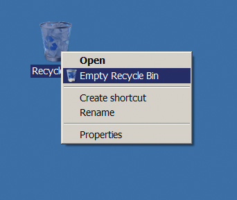
If undo is implemented correctly, there’s only one destructive operation in the entire system: emptying the Recycle Bin. Some would say that this operation should have a confirmation box, as it currently does (Figure 7.15). But even here, the confirmation dialog exists only to guard against another bad design decision, placing the Open menu item next to Empty Recycle Bin (Figure 7.16). One slip of the mouse, sliding down two spaces instead of one, and you get the latter instead of the former. That’s bad. Emptying the Recycle Bin should have a special action used for no other purpose, perhaps clicking on it while holding down some key. Better still, the Recycle Bin should automatically delete files after some configurable period of time so you’d seldom have to empty it manually. Don’t you wish that your real trash cans just worked like that?
Features such as the Recycle Bin work for ongoing sessions with desktop applications, but what about shorter interactions? How could, say, an Amazon 1-Click purchase be made undoable? It’s actually quite ingenious. Your 1-Click order is placed into your account, but it isn’t actually executed for 30 minutes after being placed. If you order something with 1-Click and then change your mind, you can just go to your orders and cancel it.
In addition to making operations undoable in the software layer, you should also think about making operations undoable in the business layer. Most merchandise can be returned to Amazon within a month, if you order something by accident or just decide you don’t like it. Even Kindle digital books have a three-day free return policy, which I’ve sometimes used when I’ve tapped the wrong button by accident. Undo can extend many levels deep.
Always ask: Have I done everything that I can to make this app’s actions undoable?
Non-Undoable Operations
Having just urged you to make everything undoable, there are certain categories of operations that cannot, by their very nature, be undone. Ejecting from an aircraft (Figure 7.17a) is one example, as is amputating a leg (Figure 7.17b).

Geeks often say, “Well, that means that we still need confirmations, saying, ‘Are you sure?’” It is true that because of their irreversible nature that it is extremely important to ensure that we are choosing these operations correctly. That is all the more reason to get away from this idea of a confirmation box, because it does not solve this important and serious problem.
Look at the photos in Figure 7.17, and you will note that these irreversible operations fall into two categories: those that are time critical, like the ejection, and those that are not, like the amputation. Let’s examine these two cases separately.
The first case, the time-critical case, is deadly. The pilot in the picture shown punched out of his F-16 less than a second before it hit the ground. He doesn’t have time to deal with a confirmation box: “Are you sure you want to eject? Really sure? Really, really sure?” So the ejection has to be instantly available.
This means that the number-one thing you have to guard against is a slip—setting off the ejection seat by accident when you do something else nearby. Figure 7.18 shows a US Air Force ejection seat. You can see that there’s a special handle to fire it. It’s distinctively marked, and it’s not near anything else. The pilot has to pull it up, so a bump won’t set it off (the pilot desperately hopes).

Figure 7.18 This ejection seat guards against slips by putting the handle between the pilot’s legs and requiring an upward pull.
We need protection against slips in software as well. In Figure 7.15, the Empty Recycle Bin item is right next to Open. That’s like putting the ejection seat handle right next to the air conditioning controls. It’s way too easy to click Empty when you meant to click Open. That’s why there’s a confirmation dialog box for Empty—not because the user doesn’t know what he’s doing, but because he might have slipped into it by mistake when he was reaching for the thing next to it.
If this operation were time critical, as is ejecting from an aircraft, that wouldn’t be acceptable. Instead, there would be a specific motion used for no other purpose, perhaps chording the mouse—pressing both buttons at once—on the Recycle Bin icon. That’s how our familiar three-finger salute, Ctrl-Alt-Delete, was chosen. Because it rebooted the computer, trashing any work that hadn’t been saved, the original designers wanted to ensure that you couldn’t do it by accident. They deliberately made it a two-handed operation.
Ejecting from an aircraft is a very expensive operation. A new F-16 costs about $20 million, not counting the cost of replacing whatever it hits on the ground. The people who fly these things are very highly and expensively trained, and very few people can qualify to be an F-16 pilot. So banging on their heads until they become more like a computer can be done, to a certain extent. Even here, aircraft piloting and management is one of the problem domains where serious study of the science of human factors got started.
Obviously, you want to try to stay away from irreversible operations that are also time critical. Think hard about your business process to minimize this set. Ejection seats for fighter pilots are one thing, but you don’t want to give them to civilian airline passengers. Plan on extensive and expensive training, frequent qualifying and requalifying, and a very small user population.
Now suppose time is not critical, at least not in the split-second sense that an ejection seat is. In this case accuracy of the irreversible operation is the controlling parameter, and if it takes somewhat longer to make sure you’ve gotten it right, that’s an acceptable trade-off. This category is much larger than the ejection seat category.
Consider the problem of wrong-site surgery. We humans have two of lots of things, such as hands and eyes, and the things of which we have only one (spines, say) generally have two sides. When a patient is draped and sedated, one anesthetized body looks a lot like the next, especially when a surgeon has worked on 12 of them already this week.
Operating on the wrong part of the patient is far more common than it ought to be. That’s my favorite good-news, bad-news joke of all time: “The bad news is that we amputated the wrong leg. The good news is that your other leg is getting better after all.”
A study of hand surgeons published in the February 2003 issue of the Journal of Bone and Joint Surgery reported that about one in 27,000 operations was performed on the wrong site. That doesn’t sound like a high incidence, but with the number of operations the survey covered, that’s 242 wrong-site surgeries. The right number would have been zero. You’d think a highly trained specialist hand surgeon ought to at least be able to operate on the correct body part every single time, but 21% of the responding surgeons reported operating on the wrong one at least once in their career. And if one out of five surgeons admits to it, even anonymously, a cynic cannot help but wonder how much higher the true percentage is.
So how has the medical community addressed that problem? The American Association of Orthopedic Surgeons started a program called Sign Your Site. Figure 7.19 shows one of their advertisements for it. In a preoperative meeting with the patient, the surgeon signs his initials on the operation site with an indelible marker. Ideally the patient will sign the surgical site as well. If the patient can’t sign, the patient’s representative does, and if that’s not possible, a nurse verifies the patient record and does the signature. The hospital has protocols in place so that markings are uniform; for example, only the operative site is marked. In the operating room, the surgeon checks for the markings before starting and another member of the surgical team verifies them. The Joint Commission for the accreditation of hospitals requires such protocols for accreditation. If surgeons are willing to admit to being human and therefore fallible, and if they’re willing to curtail their freedom because of it, you know the problem is serious.

Looking at these examples, what general principles do we see? I see two. First, that humans can hold only so many things in their heads at once. When the surgeon is about to start an operation, there are a lot of things running around in his head; he’s worried about the operation he just did and the one he’s going to do next, he’s worried about leading the team and managing all the other participants, and sometimes—not often, but sometimes—he scrambles the site. When he’s having a preoperative meeting with the patient, he’s got a lot fewer distractions. Second, we’re seeing that two heads are better than one. If both the surgeon and the patient agree on the operative site, it’s much harder for the surgeon to make a mistake.
Always ask: Have I done everything possible to avoid damaging slips?
Always ask: Have I done everything possible to bring in a second head on critical operations?
Have the Correct Configurability
One of the main advantages of computerized user interfaces is that we can vary them from one user to another, to give each what she wants. It is very tempting to allow this configurability to expand, to blossom, to metastasize, until chaos results. I’m not saying that you should never make anything configurable. I’m saying think carefully about what should and what should not be configurable, always taking into account who your users are, what problems your users are trying to solve, and what they would consider to be the characteristics of a good solution.
Why shouldn’t everything in the world be configurable? I always used to say that it should. “This thing is on the left, but I’d prefer it on the right. Why can’t I put it there? Why can’t you make it configurable? Don’t tell me what I ought to want. Shut up and do what I tell you.”
Excess configurability presents two problems. First, it’s more expensive than you think. As a developer, you think, “Sure, no problem, just an hour or two to program this or that configurability feature.” But when you implement an OR, everyone else in the development process has to implement an AND—the documentation, the tech support, the testers, the trainers, and so on. The downstream costs are enormous, at least a factor of ten higher than the initial development costs.
But even ignoring those internal economic constraints, excess configurability harms the UX. It provides the blind alleys that unsuspecting users can now stumble into, that they didn’t want and that only serve the obscure edge case. A configurable thing is not necessarily a blessing. Compare the time wasted by everyone who mistakenly gets there against the benefit of the one guy who now has what he wants.
Because you’re a geek, you probably tend to err on the side of configurability—partly because it’s hard to know what users want, so you take the copout and try to give it to them both ways, and partly because, being a geek yourself, you mentally lean toward the side of configurability. It’s hard to get that idea out of your head, no matter how hard you try.
There is no one-size-fits-all level of configurability that you should provide. It depends, as always, on who the user is. For example, Visual Studio, Microsoft’s flagship software developer environment, is configurable to hell and back again. That’s what the hyper-geeks who use it want, and Microsoft gives it to them. That’s the correct and proper level there.
But overconfigurability can be harmful. Consider Figure 7.20. It shows the floating menu bar that was part of Office 2003. If you overshot in selecting the File menu, you wound up dragging the entire menu bar around on the screen. You could use it floating around, or you could dock it on the sides or bottom of the window. That was worse than useless. Have you ever seen, or even heard of, anyone who ever did that because they wanted to? No. It was especially bad for new users. They’d see the menu floating around, know they didn’t want it, but not know how to put it back. They’d see the X at the right corner, click on it, and close the menu. It didn’t go back to its initial location, it just disappeared, and now those newbies were trying to figure out Word without a main menu. That was something that should never have been made configurable.

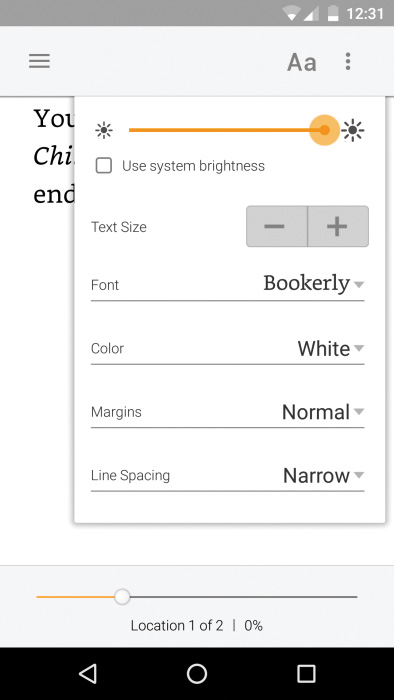
At the complete opposite end are the items that represent the essence of an application, the configurability of which is absolutely critical. The classic example is the text font and size in Amazon’s Kindle reader apps and devices, as shown in Figure 7.21. You open the app to read text, and choosing a comfortable font is very much the essence of the beast. Beginning readers, college students, senior citizens, and dyslexic people all need to read and all have different requirements. By including them, we increase the overall market for Kindle books and drive the virtuous adoption cycle upward.
Let’s leave this issue with the following thought: If something does not need to be configurable, it does need to be nonconfigurable. Or to put it another way, if it’s a toss-up, it’s not a toss-up.
Always ask: Are my configuration points important for my mainstream users?
Always ask: Are my configuration points done in such a way that users won’t get lost with them?
Always ask: Am I making something configurable that shouldn’t be?
Lead the Witness
You’ve seen it on courtroom TV shows and movies: “Objection! Leading the witness.” This means that the lawyer was asking questions that suggested the desired answer. That may be wrong in courtrooms, but it’s 100% right in UX design.
One of the most amazing things is a program’s ability to guess, under certain circumstances, what the user needs and automatically provide it. It’s great, and we should do it as much as we can.
First, the bad example. Look at CNN.com, shown in Figure 7.22. If you want to search for something, you can type what you want into the search box. But that box gives you no assistance on your input. You can’t see what’s trending, or what others are looking for, nor do you get any assistance in spelling. If you type the search term “Red Sox,” the site shows links to some stories. If you misspell it “Socks,” tough noogies—you don’t get the results you’re looking for (unless, of course, the story is actually filed under the misspelled term, which it sometimes is).

The New York Times (Figure 7.23) is just a smidge better. As you start typing, it shows things starting with what you’ve typed; so for “Red S,” it shows things like “red sun mining.”

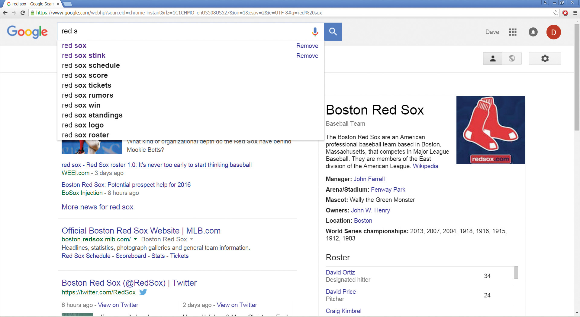
Google completely blows these guys out of the water. As you’re typing your query, it not only shows trending searches and other people’s search terms (“red sox stink”), but it’s actually pre-fetching the data (see the panel on the right in Figure 7.24). There’s the Red Sox logo, their manager, their championships, their roster, and so on. When there’s a game on, it would show the line score of the game as it progresses, and the league standings. You haven’t even finished typing what you want, and Google is providing you not with links, but with the actual data. This is absolutely amazing.
It’s even more amazing in the mobile world. It’s more important to do it here, because it’s so much harder to type a search into a mobile device, and there’s so much less space to waste on edge cases. As you type in “Red Sox,” your phone fills with data that’s relevant, as shown in Figure 7.25.

Always ask: Am I leading the witness as much as I can?
That’s the last item in the final framework. Now let’s examine its usage, and all of the steps in this book, on a couple of real-life UX case studies.