Chapter 9. Case Study: Medical Patient Portal
The field of medicine is the last major industry that the Internet has yet to penetrate. Almost all data interchange there still gets done with faxes. One young doctor told me, “My kids’ babysitter makes better use of the Internet than we do here at [a major teaching hospital].”
Let’s apply our newly learned UX skills and techniques to a Web portal for medical patients. We’ll work through a case study for Boston’s Beth Israel Deaconess Medical Center, which has such a thing. We can make it a whole lot better.
A Good First Try
Boston’s Beth Israel Deaconess Medical Center, known locally as BI, has pioneered many advances in the medical arts. Its most popular is probably the “walking epidural,” which relieves the pain of childbirth without immobilizing the patient. While BI doesn’t have the world renown of some other hospitals, it scores well among those who know; both of my daughters were born there. People around here like to say that “Massachusetts General Hospital is the best hospital in the world. BI is the best hospital in Boston.”
Note
Beth Israel Hospital merged with Deaconess Hospital in 1996 to form Beth Israel Deaconess Medical Center. Cranky old-fart locals, among whom I number myself, continue to call it BI.
Another of BI’s advances was its Internet portal for patients, www.patientsite.org. It was one of the world’s first such portals, which you can deduce from the domain name they were able to snag. It allows patients to view test results, schedule appointments, request referrals or prescriptions, and send secure email to their physicians. It was built and hosted in-house by a team led by John Halamka, MD, and went live in 2000.
It was a very good first cut at that time. Dare I say valiant? The challenges that this team had to face—medical, legal, regulatory, political, managerial, and, oh yeah, technical—were and are huge (see, for example, www.ncbi.nlm.nih.gov/pmc/articles/PMC2274878/). The fact that it exists at all is a monumental accomplishment.
Nevertheless, examined from today’s standards of usability, it needs a lot of work. Part of this is just age. Think how drastically everything else in the technological world has changed in the last 15 years. It should not surprise you that the usability trade-offs that were acceptable then no longer are. In this chapter we examine PatientSite’s user experience today and make recommendations for upgrading it to the current standard of care. BI’s PatientSite Web site was a pioneer. Applying our UX techniques to it can vault it into the forefront again.
Current State of the Art
We start using PatientSite at its entry page (Figure 9.1). Because of the confidentiality rules that apply to medical data, we have to log in every time. There is no option to stay logged in for a week, as Amazon allows. The entry screen layout is good. The picture is inviting. The text line explains to a new user what she can do with the site: “View your test results” (shown), “Make appointments,” and so on. The picture and text change slowly enough that they’re not disturbing. The login controls are standard, and the new-user registration link makes sense.

Probably the only change needed would be to omit the separate login link for providers. I’d suggest accepting both patient and provider credentials on this screen and differentiating them internally as needed. Here the site is forcing the user to do the programmer’s work, by selecting the correct login screen instead of having it done automatically based on the login ID. This particular instance is small, but we’ll see this motif again throughout the site.
After logging in, we see the home screen, shown in Figure 9.2. As our upcoming analysis will explain, parts of it are good. Parts of it are OK but could be better with some additional work. And parts of it need to be completely rethought and redone.

Let’s look at the good pieces first. The appointments schedule is at the top and center. The things that you have to do, the times and places when you have to be somewhere, are right in front of you when you first get to this page. That’s good. Also, the links on the left side are obvious as the navigation structure. That’s good too. We could argue about their groupings and some of their labels, but we’ll let that slide for now.
What here is OK but needs some work? The appointment schedule at the top says, “Click for instructions.” If we do that, we get the page shown in Figure 9.3, which shows us the department, location, best parking, and phone number. What if we don’t know where the Shapiro Clinical Center or its garage is located? How about a link for a map or directions? They’re common on most business or commercial sites today. There’s a button to print the appointment details. How about a button for uploading them to our calendar so we can see them on our mobile devices? Again, this is common today on most sites that deal with schedules.

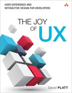
The biggest problem here is that it says, “Instructions: Click Here.” Wait a minute, didn’t we just do that? Did we have a brain fart and somehow forget? Aren’t these the instructions we got from that clicking? (Yes, no, and yes.) If we click on this link, we get the page shown in Figure 9.4, which is indeed more instructions. If these are important, as they seem to be, they shouldn’t be buried this deeply. What percentage of users actually click down deeply enough to see them? (Telemetry could tell us, but this Web site does not use telemetry to this level.) Or if they’re not important, why distract us with them at all? Ideally we’d see the entire set of instructions with the first click, with the enhancements we just discussed.
Working our way down the home screen, the most valuable real estate on any Web site, we find the rest of it wasted. The Mass HIway section, smack in the middle, is a description of a network that BI and other health care providers use to exchange data between hospitals. We don’t need to see this every time we come in. We give PatientSite consent to use this on our behalf (separate screen, not shown), or not, and then never have to think about it again. Why is something that we never care about constantly consuming the most valuable real estate on the page? This is wrong.
The same applies to the OpenNotes section at the bottom center. This describes the system whereby you can see your doctor’s note verbatim as soon as he places it in the system. This description has been here for at least several years, and as a user, I’ve never cared about it even once. Providing these notes is a good thing to do. But continually wasting this important space on the feature’s description, as with Mass HIway, is wrong.
For our final examination of PatientSite’s current user experience, let’s walk through the common case of viewing a patient’s clinical data. This is one of the main reasons users come to PatientSite. Its importance is shown by its placement (Records) as the first link in the navigation list. This was my experience:
I had a neurological test done at BI recently, and I wanted to view my results. Did I pass? Had I studied hard enough? Was my nose going to fall off or something? How would I find out about and then view my test results? The answer is: poorly. Let me show you.
I received an email on my regular email account. It said, “SignIn [sic] to PatientSite at https://www.patientsite.org to check the following messages: You have a new OpenNotes message(s).” It didn’t tell me what sort of thing I had waiting for me. OK, I can see that, privacy regulations and all. Outside of PatientSite, all they’re allowed to say is “We have something for you; please come get it.” So I went to PS and logged in.
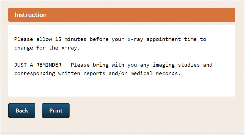
When I did, I saw exactly what you saw in Figure 9.2. There’s no obvious entry point, no starting place at which to look for my new medical data, whatever it might be. I saw the Appointments window (at the time, empty) and descriptions of Mass HIway and OpenNotes, as wasteful then as now. Where’s my new stuff? Those doctors stuck some needles in me a week ago, and the email told me to come here to see something new. But I saw no obvious indication of where it is or even what it is.
Maybe the email, the little red balloon with the 8? Could there be an email for me? Maybe. That’s what brought me here, an email, and I don’t see anything else it could be. Let me go look. Now I see the page shown in Figure 9.5. There’s one message that says, “Your Note is Ready,” dated a week after the test. There is no mention of “the results of your neuro exam,” or anything else that would tell me what each of these messages is about. Why not? Certainly it can’t be security that forbids it; I’m already logged in to PatientSite. I can’t imagine it’s the ones that say “Appointment Reminder.” The process of elimination suggests the one dated 12/17. Let me try that.
Ah, now I’m seeing an email message, as shown in Figure 9.6: “Dear Patient, We invite you to review the note . . .” It talks about an appointment or discussion. Well, I had a nasty test, involving needles, not an appointment or a discussion; and I had it on 12/09, not on 12/14, the date mentioned in the text, or on 12/17, the date of the email. Still, there’s nothing else here that looks any better. I should probably look at what it tells me to look at.

How do I do that? “To read the note, please go to ‘Records’ on the left side of the PatientSite screen . . .” OK, I’ll click on Records.
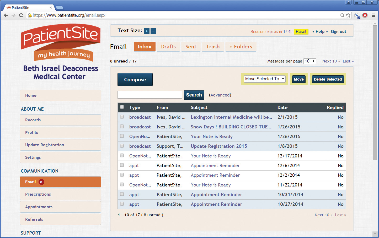
Whoa! Where did everybody go? My entire screen has changed, to a completely different layout and for no apparent reason (see Figure 9.7).
What happened to my links down the left side? There are fewer of them now, and all their names have changed. BIDMC? OK, maybe, that’s why I’m here. Mt. Auburn? That’s a street near Harvard Square that I park on sometimes; what’s it doing here? My Entries? I didn’t make any entries. I want to see the results of my neuro test. Where did all those tabs on top come from? Problems? Sure, I’ve got problems, but I don’t see anything here remotely dealing with my neuro test. How the hell can I get out of here? Try the Back button, I guess; that’s what you do in a browser to go back, right?
Oops! Confirm Form Resubmission (Figure 9.8)? WTFFF?
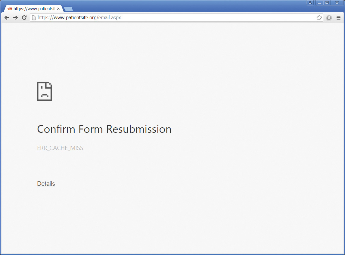
What the hell? I didn’t submit a form. I clicked on a link, didn’t like where it took me, so I clicked Back. Now I’m in limbo. Confirm something? Confirm what? Something is seriously mafungoed. Maybe the Back button again? Ah, now I’m back to the page shown in Figure 9.5. Sheesh. Now what?
If there’s one thing I learned in engineering school, it’s “When all else fails, read the directions.” OK, let’s try that again. “To read the note, please go to ‘Records’ on the left side of the PatientSite screen and select the ‘Notes’ button.” Wait. I have to remember two separate operations in my head, and the instructions disappear after I do the first one? They can’t just give me a link to the place I need to go? Or even an indication on the Records link that there’s something new there for me? Again, we see the user doing work that the programmers should have done for her. If one of my UX students did this, I’d flunk her so fast she’d change her major to Sanskrit.
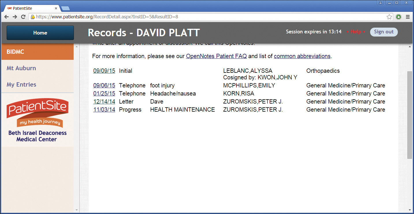
OK, here I am at the Notes screen (Figure 9.9). Letter? I didn’t have a letter done; I had a nerve conduction study. Peter Zuromskis? He’s my primary, but he’s not the guy who did the test. He’s a smart guy, he took the time to write me a letter, so I might as well have a look at what he has to say.
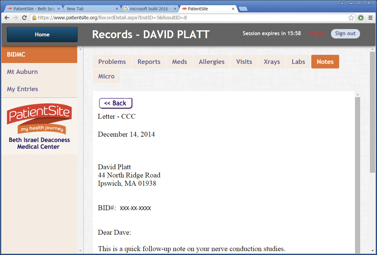
I click on the letter from Peter Zuromskis, which is indeed about the test and does explain the medical technicalities in the way primary care physicians ought to do (Figure 9.10).
That was a whole lot more trouble, thinking and guessing and deducing, than it should have been.
PatientSite went live in 2000. That was also the year my first daughter was born—at BI. She will probably have her driver’s license by the time you read this. That’s a very long time in this industry.
The first users probably accessed PatientSite through dial-up modems (remember them?), some of them through AOL (remember it?). Windows 98 (you get the idea) was cutting edge. Existence, not ease of use, was the major goal of the PatientSite developers. Simply collecting this information and putting it in front of patients was a monumental accomplishment.
The patients were happy with it then because it beat the pants off what they previously had, which was nothing at all. They didn’t mind having to do a tonsillectomy through the rectum to use the site. Learning how to do that was called “becoming computer literate.” But the standard of care for user experience has risen astronomically. (One word: “iPhone.”) Where BI once led, it now lags.
This evolution is similar to that of the automotive industry. The first automobile owners loved their Model T Fords, because having a car meant they could stop shoveling horse manure out of the barn every day. But it wasn’t long before they took the Model T’s basic functionality for granted and started demanding a better user experience: first with self-starters and heaters; then radios and automatic transmissions; today DVD, satnav, and multiple cup holders; tomorrow, independent self-driving.
The same progression is happening now across the software world. And nowhere is there more pent-up demand for a better UX than in the one-sixth of the US economy that comprises the medical industry. BI could be out on the cutting edge, with the careful application of the Plattski Protocol and not all that much coding.
Primary diagnosis: Outdated usability, due to rising standard of care.
Prescribed treatment: Full analysis and overhaul by contemporary UX standards.
Step 1: Who?
As always, we need to start with our users. Who are they?
The developers of the MBTA app in Chapter 8 had to deduce their user information from the advertisers’ data, probably based on the T’s own marketing studies, probably old and not all that detailed.
BI has exactly the opposite situation. BI has, by definition, an intimate relationship with every user who registers with PatientSite. BI knows their name and address, their age and gender, work and family situation, their insurance and related financial info. They have intimate medical information on all of their users, down to and including pictures of the inside of my colon. (See Figure 9 . . . nah, just kidding. But they do have it.) We can find out just about anything we want to know about our user population. A member of the PatientSite team said, “Our typical user is a middle-aged, college-educated, white female.” So that’s who we’ll use for our first persona. And we’ll create a second one, more speculative, to give us some notion about where PatientSite should be headed in the future.
Susan (Figure 9.11) was diagnosed with breast cancer about three months ago, at age 52. She lives in Natick, Massachusetts, with her husband, Bob. She works as a high school science teacher in the Natick public school system. She gets decent sick time through her union contract, but this cancer thing still sucks. Like many professional women nowadays, she delayed having kids until she felt herself established in life, so she has a son age 16 and a daughter age 14. Their golden retriever, Topsy, is 10 and starting to show her age as well.
Figure 9.11 Susan, a breast cancer patient who gets her care at BI. (Photo © iStock.com/nano)
Her cancer was somewhat advanced at the time of diagnosis, with three lymph nodes positive. Stage II is the technical term. She had surgery and is now undergoing chemotherapy. She will have radiation when that’s done. She is trying to keep on working through her chemotherapy, even though it’s exhausting. She has many different appointments with different providers that she has to track. Some are at a suburban satellite clinic, which she prefers, but for others she has to drive into the main hospital in the Fenway section of Boston. She has a Red Sox schedule stuck to her refrigerator door so she knows when to schedule around the killer traffic that their games generate. She has lots of prescriptions to track: different chemo pills, various side effects medicines, and so on. She has physical therapy appointments for her arm as well.
She tracks all these on an older Dell laptop. Her son insisted that she get an iPhone, and she did, but she really hasn’t mastered it yet and doesn’t live on it the way he does. She borrows his iPad once in a while, though, taking it to her chemo infusions to read books and listen to music. She orders grocery deliveries on it via Peapod, one less chore she has to do in person.
It’s always useful to create a secondary persona as well. Unless the user group is monolithic (hospital nurses, perhaps, or NFL players), it’s good to have a second. So who should it be?
Let’s not go older than Susan. While BI’s patient population probably skews toward older people, one of the main reasons that computing hasn’t caught on in the medical industry is that this population has the most difficulty using computers. They didn’t grow up with them, they got them later in life, they don’t trust them. The usage of computers in medicine likely won’t break through to the mainstream until this population dies out and a more tech-savvy cohort moves in.
Another major demographic shift is just beginning as I write these words. The first digital natives, by which I mean children who grew from birth with digital technology as part of their lives, were born around 1985. The first members of this generation to become doctors are just now finishing their residencies and beginning their practices. I expect major changes in the medical industry’s computing landscape in the near future, as this generation starts to move in.
So the second persona needs to be younger. How about making this one male? For a little ethnic diversity, how about Asian? And why would he be talking to BI? When you look at statistics, you see chronic diseases entering the demographic pipeline today in younger and younger patient populations. These patients will consume ever-greater medical resources as they age and their chronic diseases turn acute. Information technology is often touted as the solution to this. So let’s make him a type 2 pre-diabetic, to start examining how this kind of site would relate to a younger patient clientele (Figure 9.12).

Figure 9.12 Harry, a young man with pre-diabetes, getting care from BI. (Photo © iStock.com/DragonImages)
Harry Chen is 30 years old. He came to Boston to study at MIT and never left. He works in Kendall Square, at a tech start-up so secret we can’t even mention its name. He lives in Cambridge, Massachusetts.
His tech company health benefits include a complete physical once per year, and what do you know? Harry’s blood chemistry screen came back pre-diabetic. Damn. Diabetes is a lifelong, chronic thing. Harry really wants to head it off as much as possible. So he enrolled in Weight Watchers and exercise classes. He goes for quarterly blood work, to see what kind of progress he’s making on it. His father died young of a heart attack, so Harry gets yearly EKGs as well.
Harry lives on his mobile phone, an iPhone 6s. If something isn’t on his phone, it didn’t happen, and he’s not interested in it. A Windows PC is a boring thing that his parents used when they moved out to the suburbs and started taking commuter rail. All of his appointments are on his phone, his prescriptions, everything. If he needs anything in the medical realm (or any other, really), he expects to be able to tap a phone app and have it happen.
Step 2: What (and When, and Where, and Why)?
What problems do Susan and Harry need to solve, and what would they consider the characteristics of a good solution?
Modern medicine is a complicated thing, with many moving parts. Any sort of major illness, such as Susan has, or chronic illness, such as Harry is just starting to deal with, generates piles of data. The patients want to keep some sort of control over it, but it’s increasingly convoluted. If we had to write their needs on a bumper sticker, it would say, “Tracking the intersection of my complex medical situation with the rest of my complex life.” PatientSite is trying to smooth this out.
We’ll express this thought in the form of stories so that the geeks who would code this app can understand what the users need. Here’s what we come up with.
Story 1
Susan has a bad case of chemo brain and can’t remember when her next appointment is. She wrote it down on her paper calendar, but she can’t find that either. Fortunately, there’s a desktop PC in her den which is too big and heavy for her to move and lose.
She turns on the PC and clicks the PatientSite icon that her son has thoughtfully placed on the desktop. The browser remembers her user ID and password, so she doesn’t have to waste time typing them in. (They’re written on a sticky note stuck to the monitor in case the browser forgets.)
Susan finds the section for appointments and looks at her collection, scanning for where and when they are. Let’s see, the next one is this Saturday. That’s the problem with wanting to keep on working through chemo: her weekends get eaten. Her Red Sox schedule shows home games on both days this weekend, so she hopes she doesn’t have to drive in to the main BI campus. Ah, her appointment’s in the suburban office, early on Saturday. Great! Well, sort of. It’s still a chemo appointment. But at least she doesn’t have Red Sox game-day traffic on top of it.
She writes it down on a sticky note (the pad is taped to the monitor, the pen attached with a string, so they can’t disappear). She sticks it on the back of her hand to remind her to ask her husband or son to give her a ride. She wishes there were an easier way but doesn’t have the energy to explore one.
Story 2
Susan is having dose-dense chemotherapy for her Stage II breast cancer. This means that she gets the usual dosage of chemotherapy for her condition, but with less time between infusions than was previously allowed. The statistical survival advantage is small but definite. And she figures she might as well get this chemo crap over with sooner anyway.
Because her recovery time between chemo infusions is shorter, Susan is given medications to help boost her blood count. Her doctors need to monitor how well these are working, partly to plan her chemo and partly to make sure she doesn’t get sick from something else. If she has to be readmitted to the hospital now, the medical practice that cares for her will incur financial penalties from the insurers. So they have her come to the lab and get blood drawn twice in the two-week break between chemo infusions.
Susan wants to keep an eye on her blood work to know how she’s doing. In fact, she’s obsessed with it. Perhaps it’s her attempt to maintain some control, or at least the illusion of control, over her treatment process and hence her disease. Every time she gets blood work done, she checks the Web site hourly until she sees the results posted. She can’t bear to wait for the email notification, as it often doesn’t arrive until several hours after the lab results become available, and sometimes it doesn’t arrive at all.
She finishes dinner (not a whole lot of appetite) and sits down to watch some TV. Before she turns it on, she wants to check if her blood results are in from that afternoon. Where’s that damn iPad? Oh, yeah, right here between the couch cushions. How’s the charge? Good enough. She launches the Safari browser, brings up PatientSite, logs in with the saved ID and password. There are her current blood work results. Are they good? The red color indicates counts outside normal limits. Hmm, what were her numbers during her last chemo cycle? She takes a look at those. Actually today’s numbers look OK; she’s ahead of the last cycle by a point or two. She puts down the iPad, wishing this damn thing were over.
Thinking about her disease leads inevitably to thoughts of her own mortality. She decides she doesn’t want to watch the Red Sox tonight, especially because they stink this year. A hot bath, a stiff drink, and a good book sound a whole lot better. She puts down the iPad, pours a glass, and heads upstairs. She wonders if Topsy will outlive her.
Story 3
Harry was diagnosed with pre-diabetes at his initial physical. That doesn’t surprise his doctor one bit. The incidence of pre-diabetes is on the rise in younger adults.
If all of today’s pre-diabetic young adults progress to full diabetes at historic rates, the resultant medical need would collapse all of civilization. In an attempt to proactively manage pre-diabetes to arrest (or at least slow) this progression, Beth Israel is running a study using lower-cost health coaches. Harry is enrolled in this study and has been randomized into the higher-intervention arm.
To manage his care, and to see what’s working and what isn’t, BI has to collect a lot of data about Harry on an ongoing basis. They’ll get this data only if it doesn’t require much effort on Harry’s part. The ideal amount of effort is nothing at all; the second choice is nothing he’s not already doing.
Harry is given a bathroom scale connected to the Internet and told to stand on it every time he gets out of the shower. That sends his weight to BI’s database. His exercise, both from day-to-day activities and also at the gym, is automatically entered by his Apple Watch. The most difficult part for Harry is entering everything he eats, using a separate smartphone app such as SparkPeople. Harry doesn’t mind this too much, as he lives on his phone anyway and usually has it in hand when he sits down to eat. It gives him a chance to show off his new iPhone 6s and have people admire it.
Every week, Harry has a 15-minute video conversation with his health coach. (This is in direct contrast to longer, less frequent sessions, which is the main innovation being tested in this study.) Harry would never touch a PC-based Web browser unless someone held a gun to his head. So this session is done via a custom-developed mobile app on his phone. The coach reviews what he’s eaten in the last week and the amount of exercise he’s gotten. She suggests changes that he could make. After a year of this, they’ll compare how well he’s done with the progress of other patients. Maybe they can keep him healthier longer.
Step 3: How?
The biggest problem that we saw on PatientSite is that the user’s clinical information is very hard to find and read. There’s no obvious starting point, and it’s organized confusingly and displayed poorly once we do find it. The appointments are not bad but could be better.
We need to redesign the home page to make it do what home pages are supposed to do: provide immediate display of the most important data, with a logical navigation structure providing access to the rest. I sat down with Balsamiq to start working it out.
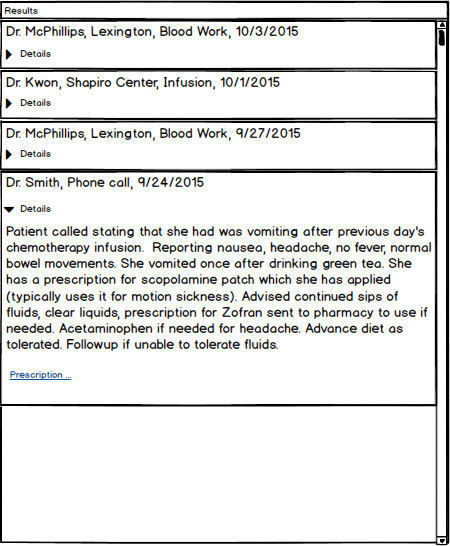
Because the user’s highest priorities are clinical information and appointments, I decided that these should live on the home page. The first mockup I did is shown in Figure 9.13. The center column contains the clinical information relating to the logged-in patient. There is a separate entry for each encounter the patient has with the medical system, displayed in chronological order. Any user who has used Facebook or an email program will find this timeline layout familiar. Because it extends, conceptually, back to the beginning of the patient’s relationship with BI, we’ll dedicate the entire center column to it.

Each encounter displays a summary so the user can decide if she wants to open it for more information. In the figure, we see from the summaries that the patient has most recently had blood work done. A few days before that, she had a chemo infusion, preceded by pre-chemo blood work, preceded by a call to her primary physician for nausea. Each encounter has a link that opens to show more details, which I’ll show in a later example. It’s conceptually similar to the layout of messages in an email program.
I’ve moved the appointment box to the top right of the screen, because it has fewer entries in it. At any given time, a user might have two, three, maybe four appointments scheduled. But the appointments disappear as they slip into the past, while the encounter list just gets longer.
If the screen gets narrow, either from a PC with a small monitor or a tablet in portrait orientation, the site will automatically adjust itself to a single column, with the Appointments window on top and the Results window below (not shown). If it ever gets really tiny, as with a phone, we might switch to a tabbed arrangement (not shown either).
Here’s how I now present the clinical data: Each encounter displays its basic data in the small block—who, when, where, and what. If the user clicks the Details arrow, it opens up, showing the details of the encounter, as shown in Figure 9.14. Any additional work that was done in this encounter is shown; in this case prescriptions, but also possibly X-rays or labs, are shown with a link.
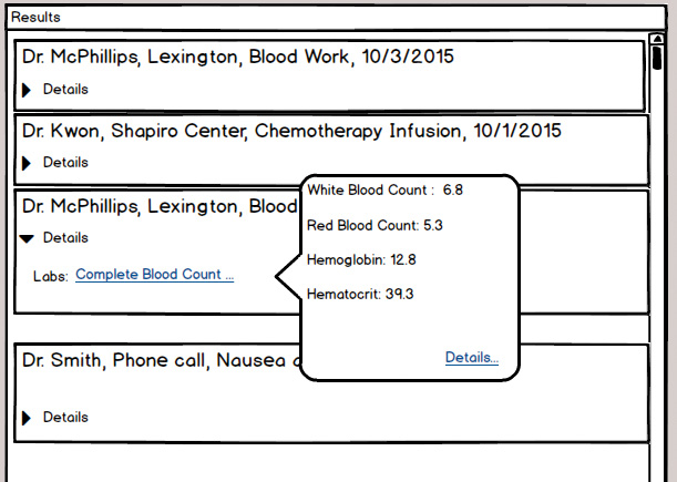
When Susan finds her most recent lab results at the top of the center column, she clicks on the Details arrow to open it, and there is a link to the tests she’s had. When she clicks on that link, she sees the results in a popup balloon. If she wants further details, or an explanation of their meanings, there’s a link for that. But with her ongoing treatment, Susan knows what these mean (Figure 9.15).
Moving now to the Appointments window, we show the soonest first, moving later in time as you scroll down the window. Each appointment box contains the information that an experienced user needs to know—when, where, and with whom. If a user has been to this location before, as Susan has, that’s all he’ll need, and he won’t click on the Details link. He can click on the Details arrow to get the rest of the information if he’s new (Figure 9.16).

Note that I didn’t use the space at the lower right corner of the home page, under the Appointments window. I’ll leave it open for further developments.
Step 4: Try It Out
As always, the first mockup isn’t intended to be final, or even all that good. It represents a straw man that we can start poking at. I tried these mockups on several users and potential users. I took one shortcut here: a former student named Aimee works in tech support at a medical practice, helping users try to use this kind of system from a commercial vendor. She knows a lot about what kinds of choices they are offered, which ones work, and which ones cause trouble. I tried some other users who fit the demographic: middle-aged college-educated white females, some who are cancer patients and some not. I did some role-playing exercises with my students and teaching assistants, asking them to behave in character. And to wrap things up, I had a good long talk with the surviving husband of the late woman after whom I patterned the Susan persona.
Every user liked the clinical data being right out front. The ones who had seen PatientSite before loved the fact that they no longer had to go digging for things. They liked the timeline arrangement. They liked the careful consideration of the different types of users who view the Appointments window—the experienced users, who need only date and time and place reminder, and the newbies, who need to click for directions and parking.
And then, of course, after they say they like this and they like that, comes the giant “Buuut . . .” That’s good. As I said in Chapter 3, you need to understand that this is a necessary and desirable part of the process. It is sometimes hard not to take things personally, but the process is very much unfolding as it should. The users are not attacking us personally. They’re developing and enhancing our ideas, sometimes coming up with better ones. We must try very hard to say, “Mmm, yes, thank you, that’s quite interesting, tell me more. What would be good for you, do you think?” rather than “No, dummy, it’s right over there, can’t you see it?”
The first thing my test users wanted was for more results to be shown in the encounter stream without having to click again. For example, why should they have to click on the Prescription link (in Figure 9.14) to see what the medication and dosage should be? They were viewing the encounter, and the prescription is part of it; why not just show at least a summary of that data? You could have a link to the full thing if you wanted. I explored that with the mockup in Figure 9.17. After showing them this new option, they said they liked it better.

A patient like Susan who is getting repeated tests wants to compare her current results to her previous results. Is she ahead of or behind last time? Does it look good enough for her to get her chemo next week? Is her white count high enough to teach school, where those little monsters boil up a cauldron of infection?
As always, any sort of comparison needs to be easy to use and require very little thinking on the part of the user. Susan does not need or want the ability to select any arbitrary interval for comparison. So I mocked up an automatic graphic display. This way she’ll be able to open the encounter and see what tests she’s had. If she clicks on the item, a graphical window displays it plotted over time (Figure 9.18). It’s automatically scaled in horizontal and vertical so that it makes sense. The test users loved this as well.

Looking at the appointment screen, the one thing that every single test user asked for was getting the scheduled appointments into their online calendars so they could view them in their mobile devices. That isn’t something that the developers of PatientSite thought about at its inception. The first iPhone didn’t come out until 2007, roughly half of PatientSite’s current lifetime, and the mobile sector didn’t become ubiquitous for about two or three years after that. But Boston is one of the techiest towns in the world; calendar sync should become possible sooner rather than later. Until I know how to get it done, I’ll provisionally put a Sync to Calendar button next to the Print button (not shown).
Sometimes users make appointments through PatientSite, and sometimes they make them through other channels. For example, as Susan is finishing one appointment, the doctor will often say something like “Make an appointment to come back in four weeks.” Susan will usually do that at the office desk before she leaves, while she’s thinking about it and has the most choices available. Those appointments appear magically in PatientSite, as they should. Susan would also like them to be sent magically to her online calendar.
As I worked with different users, I found different desires for reminders. Reducing no-shows is critical for BI from a business standpoint. The hospital already employs several channels of reminders, such as snail mail and telephone voice messages (and a cumbersome email system, described later in the discussion of security and privacy). This could easily be extended to text messaging as well. And if the app will put appointments into online calendars, which platforms should it support? Microsoft Outlook, Google+, or Apple iCalendar? Very good question.
As we worked on one major need, the information architecture redesign, we stumbled onto this other need, calendar sync and reminders, that wasn’t obvious at the beginning. This is not unusual. That’s what this rapid iteration of low-fidelity mockups leads to. We don’t have time to work calendars or reminders into the current development sprint, as I don’t have time to work it into this chapter. It needs to become a separate story—possibly as part of Susan’s intake appointment after her diagnosis. But the earlier we find it, the more chance we have of working it into the project sooner. We’ll make note of it and put it aside for the next iteration.
Finally, one patient raised the notion that we might want to examine our encounters in ways other than chronologically. For example, we might want to see all our surgeries, or our X-rays, or encounters with Dr. Smith. How could we do this?
Email programs generally provide the capability of sorting messages by standard fields—by date or by sender, occasionally by topic or presence of an attachment, rarely by anything else. Medical messages are more complex. We could have a huge search screen, with advanced options (Doctor = “Smith” and EncounterType = “X-Ray” + BodyPart = “Left Foot,” etc.). The user would have to do a whole lot of thinking to accomplish the simplest things.
It seems that the simplest searches are the best. Again, email programs usually allow for searches—“Find me all the occurrences of ‘carpool,’ or ‘flogging.’” We could very easily implement this on PatientSite: “Find me all my encounters containing occurrences of ‘appendix’ or ‘penicillin.’” Want things written by Dr. Smith? Type in “Smith.” Want X-rays and Dr. Smith? Type in “X-ray Smith” or “Smith X-ray.” It’s conceptually just like a Google search. We could include a simple search box, as shown in Figure 9.19. Here it is in the upper right corner of the Results window title bar, to indicate that Results are what the search applies to. It’s similar to the email search feature in Microsoft Outlook. We might as well start there. We’d have to experiment with that placement. Its success would depend on how often users actually used it.

It would really be great to make this search function as good as Google’s. Recall discussions in this book about Google’s auto-suggest and auto-fetch features. Imagine that our app had a search field for the encounter chain. Suppose a user wanted to see all her X-ray results. She would start typing “X.” The search box would, as does Google, suggest what most users type after starting with X, which could only be “-ray.” And while it does that, it would pre-fetch the records that conform to that field which have any mention of X-ray in them. This would be an absolute killer feature. The only question is whether BI’s developers could actually implement it, cost-effectively, with their relatively low unit volume. Perhaps, as a nonprofit, they could get Google to sponsor it and give them the code or something.
A Quick Speculation: Health Coach Mobile App
We wanted to start taking a look at the future of online health care, so we came up with Harry. Here he is, 30 years old, pre-diabetic. It would be good to change his lifestyle and habits now. But that’s a very hard thing for anyone to do. After the initial panic of his diagnosis, Harry feels fine. Any future problems are abstract and far away. He swore he’d be good, but eating food he doesn’t like and working out (which he doesn’t like either) are regimens that are very hard to stick to. How can we help shape Harry’s choices today?
We can get him to put an app on his phone. This will allow his health coach to communicate with him, ideally to guide him into the paths of righteousness. It looks like Figure 9.20.
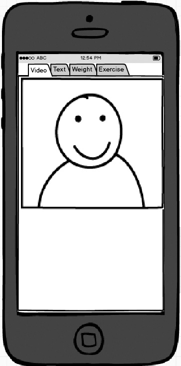
When I showed this mockup to students matching Harry’s age and style, I encountered a curious dichotomy. Half of the students thought that a video conversation with his health coach would produce the best results. When we have a direct connection to a human being, the patient might try to please that human, or at least not disappoint her. All of the older students were in this half.
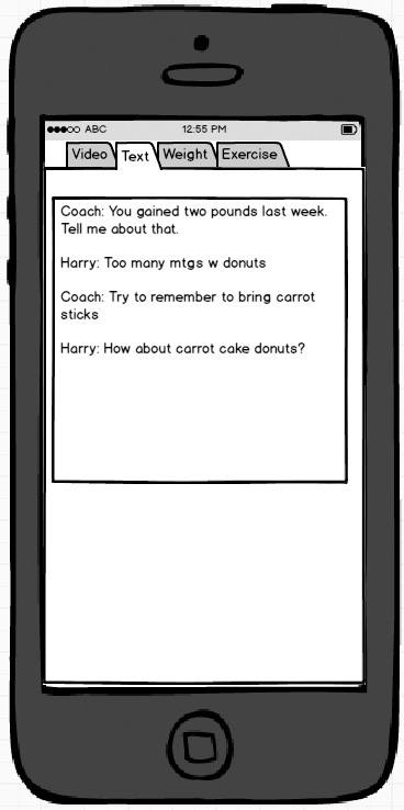
On the other hand, some, but not all, of the younger students felt that text messaging was a better means of communication. If you have to set up a meeting, both people have to be available at the same time, which is always tricky. But if the coach just sends texts (“Harry, your GPS shows you at Dunkin’ Donuts! You better be telling me it’s just for a friend.” “No, it’s just a black coffee, honest! The line was too long at Starbucks.”), they don’t have to be available at the same time. You’ll get a better response this way, says the group. Figure 9.21 shows this approach.
We agreed that more research is needed. And that’s exactly the sort of thing that they do at BI. I leave this idea confidently in their hands. Perhaps set goals and targets? Perhaps show him percentiles, maybe prizes? We are probably going to be breaking ground with this new study, and it will lead to several research papers.
Step 5: Telemetry Plan
Compared to the MBTA example in the previous chapter, PatientSite has a lot more moving parts. It’s especially important to measure exactly what our users are doing so that we can optimize their experiences.
By looking at the extensions of its pages (.aspx), we can deduce that PS is mostly written in Microsoft .NET and therefore is hosted on Microsoft Internet Information Server. Our first line of telemetry, therefore, will be looking at the page logs that this program produces. They’ll tell us how often each page gets served up.
Just this one simple data set will tell us a lot. Which pages are shown most often? After it’s served up, how many times is each page submitted, as opposed to being canceled? For example, if Referrals is served 100 times, but submitted only ten times, perhaps users aren’t getting value from it. Maybe they’re confused when they see it. How often do they use PatientSite to make appointments? How about to refill prescriptions, which users can easily do through other channels such as their pharmacy’s phone line?
Because users have to log in to PatientSite before they can accomplish anything, we know exactly who uses the system, exactly when, and exactly what they do. It would be interesting to create a histogram of usage profiles: The top 10% of users are responsible for 50% of the logins and 80% of the hits, or whatever. The bottom 50% of users account for only 10% of usage. Perhaps 33% of users create an account and then never touch it again. What could be done to maintain their interest? (A better UX, obviously.) Maybe we’d divide the users into three groups—heavy, moderate, and light—and monitor their usage patterns accordingly. We should also get some notion as to how long patients spend on their PatientSite sessions.
Now that we’ve improved the site’s usability, we can measure how well its components are working. For example, how far down the timeline do users typically scroll? How often does a user scroll back by a month? Six months? Longer? The answers are most likely: once in a while, hardly ever, and never. How often is an appointment expanded to show its details?
In the MBTA example, we avoided collecting information too intimately. The relationship between users and the MBTA is casual at best, and we didn’t want the app to get too close. (“What? A different station on Monday? You must have been at your mistress’s house.” And so on.) Users don’t trust the MBTA all that much, don’t want to, and shouldn’t be asked to.
But a user’s relationship with her medical providers is as intimate as it gets. She expects BI to collect and store her medical data so that they can provide the best care. Eyeglass prescription? Check. Blood type? You bet. Date of last period? When it’s relevant, sure. And so on. She would get angry if they didn’t have what she needed, if she got hurt because they couldn’t find some piece of data that they should have known.
A research institution such as BI is constantly looking for new ways to slice and dice data. And PatientSite provides them with an incredible amount of data for mining. Learning things from sifting the pile of data that they already have is a whole lot faster and cheaper than enrolling live patients in a clinical test. And data mining is much easier to get through the ethics committees that have to approve any sort of study, because it doesn’t involve changing any patient’s treatment; it’s just looking at what was done for patients and comparing outcomes.
We could expect to see all kinds of studies done on PatientSite’s data. For example, what types of drugs are most commonly refilled? Does it vary by the patient’s primary diagnosis? Does it have any relation to future addiction problems? Which appointments are most commonly rescheduled? And so on. The data is there. Someone will figure out something good to do with it. BI is a research institution. That’s what they do. Maybe they’ll figure out another walking epidural from it.
Plan on recording everything that you can, and then plan on slicing and dicing it in ways you never imagined. And plan on getting frequent requests to measure new things.
Step 6: Security and Privacy Plan
Medical data, such as this site handles, is about the most confidential thing you will ever deal with. Geeks who transition into the medical industry from other industries may not completely get this. They’ll wonder, “Hey, how much do I really care if someone finds out I have a wart on my big toe?” But, for example, nobody wants their spouse to find out about the dose of syphilis they brought back from Las Vegas. There’s no good way to tell which pieces are confidential, so you have to treat everything that way. It’s not a new problem: the original Hippocratic Oath, approximately 2,500 years old, contains references to confidentiality. And so it is, must be, with our programs that deal with such.
The law recognizes the need for confidentiality, placing medical data under some of the most restrictive, almost brutal, regulations. The primary law is called HIPAA, pronounced “HIP-uh.” It was passed in 1996 and thus predates essentially everything in today’s technological world. While HIPAA pays plenty of attention to locking things down, there’s not a whole lot of thought given to the opportunity cost when you can’t get to something that you need, or the users’ hassle budget and its inevitable workarounds. Go back and read Chapter 6 about security, and understand that the people who structured the regulations weren’t thinking that way.
So: what sort of security and privacy does PatientSite enforce? Because of the confidentiality of the information, it’s more like what a bank does and less like what Amazon does. First, you can’t see anything at all until you log in (unlike Amazon, which shows your most recent purchases). Your password needs to conform to HIPAA regulations (at least eight characters, at least one letter and one number, and either a special character or a mix of upper and lower cases). They do not require you to change it (which saves me a rant here). PatientSite will log you out after you have been quiescent for 18 minutes, giving you a warning when you are getting close. It does not give you an option to stay logged in.
What is the user’s hassle budget, and what kinds of workarounds will he use when it is exceeded? Users who log in to PatientSite frequently will want to have their credentials remembered somehow so they don’t have to type them in every time. Informed, diligent users will employ some sort of password manager, such as Norton Identity Safe, to accomplish this. The lazy masses, containing almost everyone in the world including myself, will simply have their Web browser remember the user ID and password, as they do for most other sites.
As always, the users’ hassle budgets depend on how easy it is to accomplish their goals in some other way. We can request a prescription refill at PatientSite if we want to. But if we’ve filled it at Walmart, we can dial the phone number on the label, key in the prescription number, and press 5 for a refill. If we have no more refills on the prescription, Walmart will automatically fax our doctor to request a new prescription. Is PatientSite easier or harder than this? It depends on whether we’re more a phone kind of person or a PC kind of person. If we have the pill bottle in our hand, we aren’t going to turn on our PC, bring up PatientSite, and do it there. On the other hand, if we’re already in PatientSite for something else, we’ll probably use PatientSite for the refill.
When PatientSite has something new to tell a patient, it sends an ordinary email to our regular email account. Because of the need for confidentiality, this email contains very little information: “Hello, there’s something new here for you; please come look at it.” Sometimes the information, when we log in and view it, is indeed confidential and deserves this treatment. But often it isn’t, and the login is wasted effort. Looking at my current PatientSite email, only eight of the 24 messages currently in it fall under this category, and I’m including tech support responses in those eight.
The rest should have been sent to my open account, saving me the trouble of logging in to get them. These include five appointment reminder messages. They currently tell me that I have an upcoming appointment, and I need to log in to see the details. I would find it much more convenient if the original open email contained the relevant information: “You have an upcoming appointment at 11:00 on Thursday with Dr. Kwon on the 2nd floor of the Shapiro Center.” HIPAA seems to say that this is allowed. My dentist leaves such detailed messages on my phone answering machine, and also in the email and text message reminders that she sends me. So does another non-BI medical practice I sometimes use. Why not PatientSite on my email (and text messages, if we ever get there)?
The other 11 of 24, almost half of my emails from BI, contain public information that has been misclassified: the hours of an upcoming flu clinic, or a notice that the building is closed today because of snow. These are not confidential at all. They could have been published in any newspaper. There’s no reason for users to have to log in through their secure channel to see these.
One user reports that “when I get a message that I’m not expecting, then I have to log in and see if it’s something I really care about it. Usually it isn’t. But since it comes from my doctor, I can’t just let it go.” Almost two-thirds of my messages fall into this category. PatientSite could do a better job than this.
PatientSite does not attempt to handle the case of one user accessing another user’s data. For example, my health insurance company’s Web site allows me to see data on myself and my minor children, but not my wife’s unless she grants me access through a permission process. In PS, one account is one patient, and nobody can see anyone else’s. In this case, the users’ workaround is simply to give their credentials to the party they want to look at them: an older patient to an adult child, or one spouse to another, or a minor to a parent. It’s probably a good call on PatientSite’s part, as the correct implementation would be difficult, and the current workaround is easy.
Step 7: Make It Just Work
We’ve done a lot of good work improving this site. Let’s go back and review our improvements against the commandments that I gave you in Chapter 7. How can we make this Web site just work?
Start with Good Defaults
PatientSite’s original layout had one very good default strategy: automatically presenting the user’s appointments top and center. Our new design enhances the default home page by automatically showing a user’s clinical records as well, most recent first.
Remember Everything That You Should
I didn’t really address this issue as I worked my way through the overhaul. I wouldn’t bother remembering items such as exactly where the user had scrolled in the clinical data. I’d definitely remember the text size setting, though, if the user chose one.
Speak Your Users’ Language
Medicine is a field of incredibly vast and rich terminology. Even its practitioners commonly make mistakes in it. For example, my own records on PatientSite contain an instance in which a radiologist wrote about my metacarpal (hand) bone, when he was clearly looking at my metatarsal (foot) bone. We need to be careful not to add another layer of confusing nomenclature for dealing with the site. Putting all of our clinical data in one section, front and center, instead of requiring our users to search, is helpful. Also helpful would be an overhaul of the navigation links—what’s the difference between Profile and Settings? We’ll add this to the backlog for our next iteration.
Don’t Make Users Do Your Work
The default presentation of the user’s clinical records greatly decreases the amount of navigating that the user has to do. Our search capability on the clinical records decreases it even more. We have greatly decreased the amount of work a user has to do.
Don’t Let Edge Cases Dictate the Mainstream
We’ve moved the mainstream case of viewing clinical data to the front and center. The edge cases no longer affect it. Good job there.
Don’t Make the User Think
Having to search around for my clinical data required a whole lot of poking and thinking and deducing. For seeing new clinical records, we’ve reduced the work to zero. For seeing older ones, we’ve reduced it to a simple scroll, and for seeing specific content, we’ve provided a search capability similar to many apps that users are familiar with. We’ve lowered the amount of thinking to a bare minimum. Good job there too.
Don’t Confirm
The parts of this site that we’ve examined don’t have any confirmation dialogs. That’s as it should be. We’ll be sure to keep it that way as we continue our overhaul.
Do Undo
The parts of this site that we’ve examined don’t perform any actions that might need to be undone. We’ll keep this in mind as we continue our overhaul.
Have the Correct Configurability
The parts of this site that we examined don’t have any sort of configurability, and I don’t see the need for any. The site does contain some configurability options, accessed via the Settings, Profile, and Update Registration links. We’ll look into configuration in our next iteration, probably starting with our overhaul of the notification system.
Lead the Witness
This site will greatly benefit by leading the witness in the search term field. I’d love to pre-fetch the data as Google does, but I wouldn’t be surprised if this was beyond the system’s capability. There is, however, no excuse today for not at least providing auto-suggestion as the user types.
It wouldn’t take that long or cost that much to make this a killer site again.