Chapter 4. Testing on Live Users
No matter how good you get at designing user experiences, you will never know how users will react until you test your designs on them. As you have to constantly test the functionality of your code throughout the development process, so you have to constantly test the usability of your program throughout the development process.
Fortunately, doing this testing isn’t all that hard or all that expensive. But omitting it can be fatal. And the earlier you start, by far the better. This chapter explains what you need to do.
Testing Constantly, Testing Throughout
“I am the wisest of all men, for I know nothing at all, except that I know nothing at all.” That quote is popularly attributed to Socrates, though no one really knows. It’s true, though. Probably the biggest shock to my psyche once I started doing this UX gig was this realization: No matter how hard I tried, I could never completely put myself into my users’ shoes. I got better at it with experience, as will you. But I now realize that I will never pluck from inside my own mind, nor will you, exactly what our users will understand and enjoy and find helpful and (ideally) buy. Our users are nurses, commuters, cancer patients, auto mechanics, middle-school babysitters. We are, by definition, burned-out computer geeks. Their shoes are just too different from ours for us to imagine a correct fit.
Does that mean that we’re screwed no matter what we do? On the contrary. Because we are wise enough to know that we don’t know, we are (ideally) wise enough to go and find out. And we are wise enough to know that the only way to find out is to try our designs on actual users. By testing on users, we can see what we’ve gotten right and what we’ve gotten wrong, what we’ve managed to grok correctly and what we’re still clueless about. We can then improve our designs based on this new knowledge and repeat the process until we get close enough to make money. It’s not that difficult.
Look at the evolution of the case study apps in Chapters 8 and 9, and the additional case studies on this book’s Web site. You can see that I started off with some ideas as to how the UX ought to work. But as soon as I showed them to users, I found that (a) things that I thought would make sense to the users didn’t make sense, and (b) the users had ideas and needs that had never occurred to me.
As we discussed in the previous chapter, our first design sketches aren’t intended to be definitive. They are meant to provoke, to incite, to stir the pot; to dredge ideas out of the users’ heads that they never knew that they knew. To encourage them to say, “No, not [this]. But now that you mention it, how about maybe some of [that]?” As we’ll see, we can get this done quite well, pretty quickly, and not too expensively.
Note
You will see in this chapter a number of ideas that I have developed starting from Steve Krug’s book on usability testing, Rocket Surgery Made Easy (New Riders, 2009). If you think you see his influence in this chapter, you are correct.
Why Isn’t Testing Done?
Whenever I encounter a UX that sucks like a vacuum cleaner, I inevitably find that it wasn’t tested properly for usability. Sometimes it wasn’t tested on the right people, or with them doing the right tasks. Once in a while it was tested too late in the development process, so there wasn’t time to correct the problems that the testers discovered. But most often, a UX sucks because it was never tested at all. How is this possible?
At first, this seems ludicrous. You wouldn’t ship code you hadn’t tested and expect it to work correctly, would you? (Don’t answer that.) You wouldn’t expect your users to be the final debuggers of your functionality, would you? (Ditto.) So how on earth can you possibly ship a UX design that you’ve never tried on actual users and expect it to work for them? You can’t, and if you are wise, you won’t. But this happens all the time, and far too many designers (and worse, managers) don’t see a problem with that.
Why? Three reasons.
First, too many developers and managers fail to recognize their own fallibility. Here’s a quote from Jared Spool’s book Web Site Usability: A Designer’s Guide (Morgan Kaufmann, 1998):
I had a recent experience with a designer who was invited to observe users of a large commercial real estate site that she had designed. She declined, saying, “I have no need to know what people think of the design. I designed it with a specific purpose in mind, and I believe that I achieved my goal. What could I learn?”
What arrogance! Well, guess what, folks? The users testing the site found it confusing, hard to navigate, difficult to search, and therefore not something they’d be likely to use. I guess if her purpose was to drive people to better sites, she succeeded.
That designer didn’t know what she didn’t know. She was unwise in the extreme. But you, dear reader, having gotten this far into this book, understand that your user is not you. You know that it doesn’t matter a damn what you think, that it only matters what your users think. And by now you’ve at least started to absorb the notion that you can find out what your users think only by getting that information from them, either via lab testing (this chapter) or via telemetry (next chapter). So this arrogance, born from ignorance of our own ignorance, will not affect us, now will it?
The second reason that UX is not tested is that doing so is perceived as expensive and difficult. Too many developers and managers think you need a full UX testing lab, with one-way glass and lots of special equipment (Figure 4.1). “It’s too expensive,” they say. “We can’t afford it, it’s beyond what we’re able to do here, and we don’t have the time anyway. So we won’t even try.”
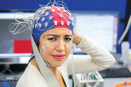
Figure 4.1 You don’t actually need expensive equipment to get the job done. (Photo © iStock.com/Latsalomao)
This perception might have been true a decade ago, but it isn’t today. The constantly falling price of all technology and the ubiquitous presence of the Internet mean that we don’t need a whole lab full of equipment. The 80-20 law applies here, as it does to most things in life. You can get 80% of the value of UX testing with just 20% of the effort, using nothing more than a PC and Skype. If you don’t have these, or aren’t willing to use them, I can’t help you.
But the biggest obstacle to UX testing is the fundamental misperception that it is a separate step in the UX process. It’s not perceived as an ongoing part of an integrated whole. Further, the word test seems to indicate that it should get done near the end of the development process (as final code testing is), while exactly the opposite is true.
Compare UX development to the process of writing a book. You start with some ideas jotted on the back of an envelope. Then you bat them around with some people you are comfortable with and refine them—“Hey, did you ever think of [this]?” Based on their comments, you add some items, delete a few, maybe move some around, and come up with an outline, for which you also get feedback. You write a few sample sections, maybe a whole chapter, always, always asking for feedback from potential readers as you progress. As Vladimir Nabokov (1899–1977, author of Lolita) said, “I have rewritten—often several times—every word I have ever published. My pencils outlast their erasers.” If he can’t get things right the first time, do you seriously think that you will?
For example, I showed every chapter of Why Software Sucks to civilian users, such as my barber, to make sure they could understand it. Here’s one true exchange:
Me (in an early draft of Why Software Sucks): “The average application programmer knows nothing about what users want.”
My barber: What’s an application programmer?
Me: Er, application programmers design the front end of programs, while system programmers design the back end.
My barber: WTF?
Me: How about, “The average programmer knows nothing about what users want.”
My barber: Why didn’t you say so?
Without realizing it, I had used jargon that wasn’t part of my readers’ world. The difference between an application programmer and a system programmer was part of my everyday vocabulary, but not part of hers. And it’s not her job to become “computer literate” to understand terms like these. It was my job to write with words she understood. I couldn’t know which ones she did or didn’t understand until I asked her. Repeatedly, iteratively, testing your UX on actual users is an integral part of the ongoing UX development process, as editing and rewriting are an integral part of the ongoing book-writing process.
Sketch, test, improve the sketch, test again, improve the sketch, and maybe add some more fidelity, and so on. Don’t consider it as a separate, get-the-damn-thing-over-with step in the process. Consider it as one of the ongoing facets of the development process.
One could therefore argue that Chapters 3 (sketching) and 4 (testing) should be merged. But they’re different enough in most developers’ thoughts today that it makes sense to keep them separate in this volume. I wouldn’t be surprised to merge them in the next edition.
Above all, remember this question and its answer: What is the best kind of UX test? Like seat belts or birth control, it’s the one that you actually use, rather than the one you sit around and think about and say, “That would have been good, but damn, we’re out of time. Maybe for our next project.”
Start Testing Early
If you’ve ever done any navigation, you know that the earlier you apply a course correction, the smaller the correction you need to make, and the lower the cost of that correction in time and fuel and aggravation. For some reason, this obvious notion has never gotten far in the UX design process. The second-biggest mistake anyone ever makes in UX testing (after not doing it at all) is starting it too late in the development process.
Microsoft likes to say, “We eat our own dog food,” meaning that they use their own programs internally before releasing them to customers. This is way too late for usability testing, because it’s way too late to change anything. The development has been done, the budgets spent, the attitudes hardened. You need to do better.
But how can we test the UX if it’s not finished? The answer is with the low-fidelity mockups you saw in the previous chapter. You start with the least detailed, sketchiest design and refine it as you get user feedback. “All this stuff together is too cramped; you can’t pick things out of it.” “OK, we’ll spread it out some, think about the relative importance of each item, maybe put some on different tabs. Here’s a quick example. Now what do you think?” And so on.
In addition to starting your testing early, you need to conduct it often. Krug recommends once per month, always at the same time (the morning of the third Thursday, or whatever). That way your devs know when it’s going to be and can plan around it. And the deadline will encourage them to make their features ready by then. For a system that is more or less in a steady state, such as Beth Israel Deaconess Medical Center’s PatientSite (see Chapter 9) once it got rolled out, this is a good frequency. However, when you are in active development, as many of my clients are, with tight deadlines, test usability more frequently. Run testing sessions at least weekly, possibly more often as you work up your designs. That keeps you from wasting time in blind alleys.
What We Learn from UX Testing
This laboratory testing of our UX complements the telemetry discussed in Chapter 5. Telemetry has a wider reach, since we can instrument our entire program. It can record data from large numbers of users. But there are two critical things that only human-on-human lab testing can do for us.
First, we can’t use telemetry until we have some sort of working software to put in front of our users. The biggest advantage of laboratory testing is that we can start it as soon as we have even scratches on the back of a napkin. As I just explained, the earlier you make a correction, the less it costs. UX testing gives us the earliest indications of how users are going to react to our programs. They like this. They don’t like that. Such-and-such is good once they find it, but they have trouble finding it, and so on. This early feedback is probably the biggest advantage of live usability testing.
The second advantage of UX testing is that we can discuss their feelings with our actual users. Telemetry could tell us, say, that 80% of users cancel dialog box A, whereas 20% of users cancel dialog box B. But only live users can tell us what they were actually thinking when they did this. Did they get to box A by mistake? What did they think that box A was going to do for them? What caused them to click Cancel rather than OK?
As they use our mockups during the test, we ask them to think out loud. This stream of consciousness contains important information: “I came here to do this; I’m looking for where it is. Here? No, that’s something else. Maybe here? That looks like it makes more sense. Not here either. Damn, where’d they put it?” And so on. We can also ask them questions about their interaction at the end of the test: “Did you see this over here? What do you think it might do?” We can’t get this information any other way. And again, having this insight early in the development process guides our steps and keeps us focused on the users’ actual needs and wants.
Finding Test Users
When you test your application’s usability, you need your test subjects to be as similar to your real users as you possibly can. It’s tempting just to show it to the people in your development shop and ask what they think. But there is no quicker road to hell than doing this. Who is your user not? You. And probably not your coworkers, either.
The types of test users and relationships that you will need depend on the type of development that you are doing. Here are some cases you might have to deal with:
Suppose you are writing customized software for a company to use in-house. We call this a “line-of-business application.” Users spend a lot of time using it, often all day, every day, and their success in their business depends on its functionality. Imagine, for example, a policy administration app for use by an insurance company’s customer service reps. You might be developing this system as part of an in-house development team, or perhaps as an outside consulting company. (I’ve seen plenty of both.)
Your development team needs to have good relations with these users. They’re the ones who are going to be stuck with this app. Their success is your success, and their failure is yours as well. They’re the ones whose productivity and comfort level are paramount.
You don’t always have a working relationship with them at the start of a project. Sometimes the target users’ supervisor, overworked like everyone these days, won’t allow them to take time from their workday to talk to you. That’s shortsighted. Sometimes the users don’t believe that good UX is even possible. They’ve had garbage shoved down their throats way too many times. They don’t realize that their participation is valuable, nay, essential, to the process. “Wait a minute, you’re the expert. Can’t you just go write your program without bothering me?” The answer is “No, not if it’s going to be any good.” The first deliverable will often start changing their minds: “Hey, it doesn’t suck as badly as the previous one. Do you think we could maybe . . . ?” When they see their requests actually listened to and implemented, and their working lives made easier because of it, they will become your staunchest allies.
The one thing you have to be extremely careful of in this type of situation is to avoid excessive dependency on the technophile user. “We need someone to be our liaison to the development team.” “Oh, get Bob, he’s the computer guy.” If you get a volunteer, it’s often because that guy is interested in technology, likes technology, wants to work with technology. He probably doesn’t realize that the rest of the users aren’t like him. (Or perhaps if he does realize that, he doesn’t care, or perhaps even revels in his self-perceived superiority.) These technophiles are not usually your primary target audience.1 You have to be very careful not to let his technophilic ideas override the need to please the larger user population—not nearly as technophilic as Bob, because they didn’t volunteer. In this case, perhaps keep Bob as your contact for day-to-day matters. He may do a better job of responding to phone calls and emails because he’s interested. But when you do the usability testing sessions, rotate the testing role over all of the users in the group. That way everyone feels listened to, and no particular ideology dominates.
1. See my article “The Silent Majority: Why VB6 Still Thrives” in the June 2012 edition of MSDN Magazine for more discussion of this issue.
Consider another case: You are building a system for external business clients. Continuing the previous example, suppose our insurance company now wants a Web application for independent insurance agents to use in accessing their customers’ policies. The easier that Web application is to use, the more the independent agents will favor your company over others for which access is more difficult. Again, the application could be built by an independent consulting company, or by the carrier’s in-house staff. How would you handle user representation in this case?
Ideally you would recruit one of the targeted insurance agencies to be your launch partner, as Boeing chooses an airline to be the launch customer airline for a new airplane. (Remember Pan Am and the first 747, or All Nippon Airways on the 787?) You would treat this launch customer as if they were in-house users—actually better than if they were in-house users, because you can’t cram things down their throats. You’d have a liaison at the target customer, sometimes called the product owner. You’d run the tests on rotating members of the user population.
Finally we come to the case of software built for individual consumers. To test this, you need to recruit individual users. It’s a lot easier to snag users for testing than it used to be. Not so long ago, you needed to have a fully instrumented UX testing lab with one-way glass so you could watch users struggle with your creations. You had to convince them to come to your lab and then transport them there, and then home when you were finished. It took much more of their time, thereby skewing your user selection toward seniors and the unemployed.
With today’s ubiquitous Internet connectivity, you can perform your testing wherever the users congregate. To get mall shoppers, you’d set up in a mall. To get seniors, you’d go to a senior center. Commuter rail riders? The commuter rail station. Students? Their school. Library patrons? (You get the idea.) You do your testing right there in their native habitat.
How many users do you need? Surprisingly few. Steve Krug says three. Jakob Nielsen says five to eight. In general, I’m in the three camp. I’d rather have three test runs with three users each than two runs with five users. I figure that if three out of three users think something is pretty good, it probably is. If zero out of three users can figure something out, your app is seriously messed up. If one out of three is OK with it, it’s probably still bad, but fix the zeros first. On the other hand, once you’ve gone to the trouble to send your moderator to an external site and set up, if you can get five users through the test, you might as well do so.
Above all, start soon. Don’t let the search for the perfect users blind you to the good-enough users. Time is your enemy.
Compensating Test Users
You need to compensate your test users for participating in your test. Exactly what form this compensation takes depends on the situation. It does not need to be large, but it does need to be immediate. “Your gift will arrive in four to six weeks” doesn’t cut it.
Something related to the business for which you are developing the software is probably a good place to start. If you’re testing a movie ticket purchasing app on movie theater patrons, how about some free movie passes? Or maybe refreshment vouchers, so they can enjoy them immediately. If you’re testing an order-ahead app for a gourmet food store, how about a gift card for that store? If you’re testing at a health club, how about an extra month of free membership? The cost of this reward is tiny compared to the time and effort of your people who are running the test, and exactly zero compared to the value of what you are learning from it. If you can’t think of anything better, a crisp new $20 bill always crinkles nicely.
If you’re in an in-house situation where cash or gifts are inappropriate, an order-in lunch for the volunteers usually gets the job done. If you’re recruiting test users at a nonprofit outfit such as a school, perhaps offer a donation to that institution: “We’ll donate $50 to the school for every user who stops by Room 303 to try our new software.” Make sure you hand the principal a check before you leave for the day, with attendant photos and publicity.
Test Area Design and Setup
Ideally you want the test area to mimic the area in which users will be using the software. If it’s for, say, bartenders in crowded restaurants, you won’t get valid results by doing the test in a quiet office. Taking your test to where the users are will help you get accurate results.
You will need to watch your users’ actions live. So hook up the testing environment with Camtasia or GoToMeeting software, or whatever other products best suit your needs. You want to see the exact usage patterns of the users as they perform their tasks. Do they, for example, move the mouse to the left first, before realizing that the control they need is on the right? And so on.
Train a camera on the users while they use the software. Their body language and facial expressions convey important information. Videos of the most vivid reactions—a user jumping for joy when using a good app, or sticking her finger down her throat when using a bad one—are just the sorts of things you need to sell your management on the efficacy of your testing and your entire UX effort.
On the other hand, the camera could conceivably make them self-conscious and change the data you collect. Start with it on and see what you get, and if you have to turn it off, then do.
Using a Moderator
You need a team member to handle the test users—to bring them in, to settle them down, to explain the test, to assist them as they go through it, then to ask questions at the end. To mediate between the development team, with its geeky attitude, and the all-too-human test users. In theatrical parlance, this person is sometimes called a “wrangler,” but in this context we’ll use the term moderator.
A usability test moderator requires a different skill set from that of most software geeks. A moderator needs empathy, the ability to relate to humans, to put them at their ease. You will find out fairly quickly who at your company is good at it and who isn’t. Call me a sexist, but I’ve found that the good ones are female more often than male.
The moderator welcomes the users into the test environment and makes sure they are comfortable. Bathroom? Coffee? Donut? Sure. The moderator walks each user through any paperwork, such as the release document that your legal department will probably require in case your app is so bad that the test user chokes on the donut and dies during your test.
The moderator then explains the testing process to the user. Most books recommend doing this by reading a prepared script, thereby removing a possible source of variability. This book does not include a script, but you can find plenty of them with a quick Google search. You will probably modify them at least somewhat for your particular setup.
The script explains to the users that we aren’t testing them. They can’t make a mistake. We’re testing our software, to see how good a job we have done in making the software easy for them. The most important thing that the users can do is to think aloud as they’re performing their task: “Where’s the login screen? Oh, there it is. What, it doesn’t like my password? Phooey.” And so on. It’s often good to remind the users, “Don’t worry about hurting our feelings. We need to find out what our users really think. Besides, we’re engineers; we don’t have any feelings.”
The moderator ideally sits behind the user during a test, doing her best to remove herself from the user’s consciousness, but off to the side a little so she can still see the screen. Ideally the moderator stays silent, though this is not always possible. The most important data comes from the user’s stream of consciousness, so encouragement to think out loud is important. The moderator will often need to say things like “What are you thinking now? Can you tell me more? Thank you, that’s great, that’s exactly the sort of thing we’re looking to hear from you.”
Sometimes users will get stuck. You wish they wouldn’t, you try to write the software so they don’t, but it happens. The moderator ideally waits for the user to say something like “I’m stuck.” Then the moderator says, “What do you think might work?” “Well, maybe [this].” “Why don’t you try [this] and see what it does?” Again, you will quickly find who has the knack to be a good moderator.
Task Design and Description
You can’t get any useful data from just asking users to “try our site and tell us how you like it.” You have to give them an objective, a specific task, such as “Check the flights from Boston to Tallahassee next week. Buy the lowest-cost flight leaving on Tuesday morning and returning on Thursday after work.” Make sure that the users have whatever supporting items they will need, for example, a user ID/password pair when login is required, or perhaps a credit card for simulated purchases.
You need to describe the task in terms of the user’s mental model rather than the site’s implementation model. Jared Spool writes of a test that he once did for Ikea.com. Ikea’s Web designers had told their test users to “find a bookcase.” Not surprisingly, all the users typed “bookcase” into the site’s search box and found it quickly. But when Spool told users, “You have 200-plus books in your fiction collection. Find a way to organize them,” the users behaved very differently. They browsed the site’s aisles instead of using the search box. And when they did search, it wasn’t for the term bookcase, it was for shelves.
Obviously, the task and the setup will vary from one application or site to another. You need to focus very carefully on exactly what you want to measure. Consider the popular music site Pandora.com, shown in Figure 4.2. The biggest problem any Web site has is explaining itself to the viewer in the second or two that the user is willing to invest before saying, “Hell with this. Too much work,” and jumping somewhere else. Imagine that the users don’t know what Pandora’s about. The key to hooking the new users is not to make them think (“Click here to create an account”), but to start catering to them—in this case, playing music that they like. The moderator might simply say, “Start playing some music,” or perhaps “Start playing some music that you like.” The user will quickly see that there’s only one thing to do. This very easy entry is one of the reasons that Pandora is as successful as it is.
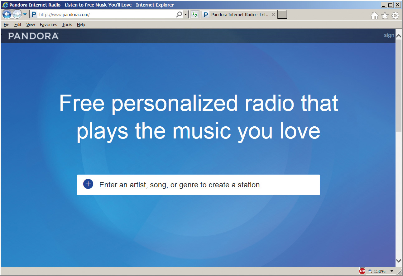
Figure 4.2 Pandora.com initial screen. It is very easy for a user to figure out.
Watching and Debriefing
You will definitely want some of your usability staff to watch the test live. They will see user actions that they’ve never thought of before. These in turn will suggest questions that they might want to ask the users. And the major advantage of in-person testing over telemetry is that you can ask those questions while the users still remember what they did and why.
It is also a very good idea to have some non-UX developers watch this interaction to start gaining at least some understanding of the users that they’re ultimately working for and need to satisfy. You will have to get management buy-in for the developers to take time off from their tasks to observe this. But a rotating schedule, so that each developer observes perhaps once every month or two, is an affordable balance. It won’t take much avoidance of blind alleys to repay that amount of time. If they are reluctant, bribe them with food.
It’s important that they watch the actual user interaction, not just the debriefing afterward. As Alan Cooper writes in About Face (Wiley, 2014), “[Usability professionals] drag programmers into dark rooms, where they watch through one-way mirrors as hapless users struggle with their software. At first, the programmers suspect that the test subject has brain damage. Finally, after much painful observation, the programmers are forced to bow to empirical evidence. They admit that their user interface design needs work, and they vow to fix it.”
Today you don’t even need a one-way mirror. So there’s no excuse not to test.
Sometimes the users enjoy meeting the developers; more commonly they don’t. The developers are sort of like surgeons, technicians who chose their profession because they don’t like talking to people. But sometimes the back-and-forth interaction can be useful, especially under the soothing (for both sides) influence of the moderator. For example:
Moderator: “Did you see [this button]?”
User: “Yes.”
The developers will want to scream, “Then why didn’t you click it, you idiot?” The moderator needs to translate that into something that the user finds inoffensive, probably something based on the program as an actor rather than the user. For example, “What did you think it might do?” or better, “What was it saying to you?” Then maybe a follow-up: “Actually that button activated the checkout process [or whatever]. Go ahead and click it now. [User does so.] We sure didn’t explain that well, did we? [No, you sure didn’t.] What could we have said that would have made it clear what this would do for you?” And so on.
At the end of the test run, your project team members have had their noses rubbed in their failings. It’s vital to grab them while they still have the smell in their nostrils. You need an immediate debriefing session, before they have time to concoct rationalizations and excuses: “Well, you obviously recruited these users from a mental institution. Let me have a chance to put them through training first.” No. We’re going to fix our UX.
You need to identify the root causes of the failures—failures, again, of your design, not of the users. Things like “The monthly pass link was off on the side, and the user couldn’t see it. And the label said ‘perpetual,’ not ‘renewal,’ which not one single user understood.”
You need to assign each identified problem to a specific person. That person is then responsible to investigate and return within 24 hours with recommendations for a solution.
User Testing Example
To demonstrate an actual usability test for this chapter, we’ll use Balsamiq to create a mockup of the PC player program provided by Live365.com (Figure 4.3). Started in 1999, Live365 was one of the first music broadcast stations on the Internet. Like so many bold Internet pioneers (anyone remember pets.com?), Live365 couldn’t adapt to today’s world, but it struggled long and valiantly. In fact, Live365 went belly up in early 2016, just as this book was entering its final editing stage. I decided to keep this section in the book as a salute to this trailblazer, from which I derived many hours of musical enjoyment.
As we’ll see, their UX definitely needed improvement. The lessons that we’ll learn from studying it come too late for Live365, but they might just save your butt, dear reader.
Anyone wanting to broadcast an audio program could upload content to Live365 and stream it to listeners anywhere on the Internet. Some broadcasters were hobbyists who enjoyed playing DJ, some were bands promoting their own music, some were airwave radio stations simulcasting their signal, and some were pure Internet stations. Live365 made money by charging broadcasters, from $5 per month for the most basic package up to $200 per month for professionals.
Listeners could tune in free with ads, or buy an ad-free VIP subscription for $5 per month. They could use a Web browser or player apps for various devices. A listener could choose from many streams but had no choice as to the contents of that stream. That was entirely up to the broadcasters. Listeners could send likes or dislikes to the DJ through the player app, but they couldn’t skip songs. If you think of Live365 as Songza without skipping, you’ll have the right mental model of the listening experience.
Why, then, if you couldn’t skip songs you disliked, would you have listened to Live365 instead of Pandora or Songza? The answer is: Since Live365 allowed anyone to broadcast a stream, listeners had a huge number of streams to choose from. Songza touts the quality of its curated streams. Live365 figured that among its very large quantity, you’d find something you like. I enjoy Songza’s curated streams. But they don’t have much of the beach music/surf rock that I enjoy. Live365 had five or six such streams, with the various creative viewpoints of their DJs. So I found myself listening to all these music sites depending on my cranky mood.
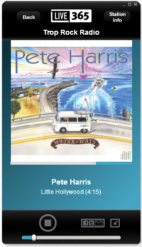
I often stream music at my PC when I’m working. I could stream it in a browser, but I prefer the dedicated player app shown previously. Live365 clearly considered this player an extra benefit, because unlike the apps for mobile devices, you could get the PC player only if you paid your VIP membership fee. The PC player had some UX deficiencies when examined by current standards, so we want to test it on some users.
Where should these test users come from? As always, we need to ask who the target market is for our software. Live365 touted the PC player as a bonus to entice ordinary members to upgrade. So our target users should ideally consist of ordinary Live365 members. If this player could have made them happier, maybe more of them would have upgraded, and maybe Live365 might still be around, right?
We could invite users to enroll as test subjects by playing a commercial in their non-VIP audio streams, offering a reward for their participation. What kind of prize should we offer them? Any user can get a trial VIP membership for free, but it lasts only five days. How about offering them a free three-month VIP membership for participating in our usability tests? We’d get test subjects, and maybe they’d get addicted to the lack of commercials and sign up when the free trial was over.
Since I’ve never been affiliated with Live365 in any way, and therefore didn’t have access to its subscribers, I fell back on my trusty all-purpose user population, otherwise known as my daughters. They stream music a lot, from a number of sources. And you know they’re not shy about stating their likes and dislikes. (I wonder where they get that from?) I brought them into my testing lab, one at a time, and ran the following session. Imagine that the paperwork has all been done and the user is ready. Here’s how one session went:
Moderator: Are you good to go ?
Subject: Sure.
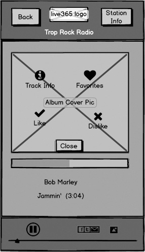
Moderator: OK, I’m going to launch the Live365 player for you. Here it is. [Launches player mockup from F5 in Balsamiq; see Figure 4.4. Also launches music stream in the background, playing through the PC speakers, so it feels like the Balsamiq mockup is actually playing.] See it OK?

Subject: Sure.
Moderator: How do you like this song?
Subject: It’s pretty good.
Moderator: Imagine you really like this song. And you want to somehow tell the DJ about it, so he would play this song and others like it more often. What would you do?
Subject: I’d click Like on the player.
Moderator: Why don’t you go ahead and do that? And remember, as I asked you earlier: it would really help us if you could think out loud while you do it.
Subject: OK. Where’s the Like button? I don’t see one. Does it even have one? Hmmm . . . [falls silent]
Moderator: Could you tell us what you’re thinking now please?
Subject: OK. Looking at the top, no; middle, no; bottom. Where’s the Like button? Is that a tiny little Facebook thing I see there?
Moderator: What do you think?
Subject: It looks like Facebook. But it’s gray. Does that mean it doesn’t work? What would happen if I clicked it?
Moderator: Why don’t you give it a try?
Subject: Now I get Facebook and Twitter and Email buttons on my player [Figure 4.5]. That’s surprising. I thought I’d go straight to Facebook from clicking that, but I guess it just brought up these choices. I’ll try Facebook now . . . [mockup Facebook page opens; see Figure 4.6]

Subject: It looks like this goes to my own Facebook. I don’t want to be in Facebook. I just want to like the damn song. OK, I’ll close Facebook. I’m back at the same place I was before. I’m still not seeing a Like button. Songza has a Like button. What’s wrong with this stupid thing?
Moderator (momentarily considers saying, “Because they’re a bunch of idiots, that’s why”; throttles the impulse and remains intentionally silent)
Subject: Let’s see, there’s this other little thing here. Some sort of triangle. No indication about what it does, but that’s about all there is to click on. Might as well try it. Ah, there’s something. [screen labeled “Other” comes up; see Figure 4.7] Where’s the Like button? I’m not seeing it. There, that one says “Like.” Why does it have a check mark instead of a thumbs up? It’s probably the same thing. I’ll click that. There, that seems to have done it.
Moderator: OK, thank you. You’ve successfully sent your like to the DJ. Just a couple of questions before we finish. Tell me, what do you think of this way of sending likes and dislikes?
Subject: I don’t like it at all. First, the buttons should be obvious, and these aren’t. I mean, it didn’t take me that long to find them, but I shouldn’t have had to dig around at all. They’re hidden. Why do they do that?
Moderator: I don’t know, but I’ll definitely pass that along. What else are you thinking?
Subject: After I found where they’d hidden the Like button, it takes two clicks for me to send a like or dislike, every single time. I’m barely willing to make the effort to click once on a Like button. Two clicks is more work than I’m willing to do. And the check mark and X symbols? Why don’t they use thumbs up and thumbs down like everyone else?
Moderator: Darned if I know either. I’ll tell them about it. Here’s your allowance, now go out and play.
Now imagine that we’re at the debriefing. The second test user (my other daughter) did and said pretty much what the first user did. Let’s consider what we learned from this test. We found the following problems:
![]() Subject had to search to find Like/Dislike buttons.
Subject had to search to find Like/Dislike buttons.
![]() Subject did not initially recognize Like/Dislike buttons.
Subject did not initially recognize Like/Dislike buttons.
![]() Subject had to click twice to send Like/Dislike message.
Subject had to click twice to send Like/Dislike message.
All three problems are obviously connected. One person should be assigned to research these problems and recommend solutions within the next 24 hours. Here are some things we might try:
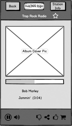
How about putting Like and Dislike buttons on the player screen? I know of no other player with Like/Dislike buttons that buries them this way. If the user’s likes and dislikes are important, the buttons should be easier to access. Did Live365 deliberately make them harder to access? Have we decided, as a matter of policy, that we want to hear from the user only if he feels strongly enough about liking or disliking to go through the effort of clicking twice? I don’t think we are, but if I’m wrong, let’s discuss it now. And while we’re at it, let’s change the icons to the thumbs up and thumbs down that other sites use. We don’t have the volume to buck Facebook’s and Google’s standards as to what icons mean. And as long as we’re moving to standard icons, how about the Share icon? It can still lead to the selection screen in Figure 4.5, but why not use the standard one?
Where should these buttons go? Space is tight in the PC player window. Does the volume slider really need all the space that it’s taking up, side to side at the bottom of the screen? YouTube uses a small speaker icon that expands when the user hovers on it and then shrinks back down when the user moves away. Let’s switch to that now. Besides saving space, it communicates better. Users are sometimes confused between the volume slider at the bottom and the progress bar right under the album.
Now that we’ve moved the Like/Dislike buttons off the Other screen shown in Figure 4.7, what are we left with? Only the Track Info button and the Favorites button. The Track Info button emails the user information about the currently playing title and artist, with links in the email from which the user can purchase the track. Email? Links? How twentieth century. If there’s one thing mobile apps are about, it’s enabling easy purchases. How about changing this to a purchase button and moving that to the main screen as well?
So now we’re left with the Favorites button, which adds the station to the user’s Favorites list if it’s not already there, or removes it if it is. Having a separate screen just for this is wasteful. How about a star on the screen, or maybe a heart, outlined to indicate unselected and filled to indicate selected? Since it applies to the station, not the track, how about putting it at the top, near the Station Info button, or maybe the name?
Figure 4.8 shows the mockup modified based on these ideas, all stemming from this simple usability test. We put the icons having to do with playing the music, the play/pause and the volume, together on the left. We put the icons having to do with liking the music, the thumbs up and down, on the right. The sharing icon, telling other people about the track, went along with these. Buying the track went along with liking it, so the shopping cart went next to the thumbs up. We put the star, for favorites, up near the top.
Of course more research is needed; it always is. But we’ve improved this app by a great deal, with fast, cheap testing of low-fidelity mockups on users. We’ll test all this at next week’s run. Or maybe I can squeeze another one in today, if my daughters aren’t too busy.
The Last Word in Usability Testing
I have always admired Frederick P. Brooks, author of the classic book The Mythical Man-Month. His ideas on software architecture and development have valuable lessons to teach us today, even though some of the anecdotes are so old that they describe programs stored on punch cards.
He has written a more recent book, entitled The Design of Design: Essays from a Computer Scientist (Addison-Wesley, 2010). It contains an anecdote that resonates with me whenever I start thinking about usability testing, and the need for starting it early. Brooks writes (emphasis mine):
My team spent some ten years realizing our dream of a “room-filling protein” virtual image. My idea was that the chemists could more readily find their way around in the complex molecule by knowing where the C-end and the N-end were positioned in the physical room. After many disappointments, we finally had a suitable high-resolution image in a head-mounted display. The chemist could readily walk around in the protein structure to study areas of interest.
Our first user came for her biweekly appointment; all went well and she moved about quite a bit. Next session, same thing. Third session: “May I have a chair?” A decade’s work shot down by one sentence! The navigation assistance wasn’t worth the physical labor.
Don’t let this happen to you. Test early, test often, and test continually.