
CHAPTER 9 COLOR
Color is a fantastic way to further add life to your drawings. Much of what we encounter and see in real life has color, and thus, using color in your sketches and drawings can bring a level of believability and realism to them. When used the right ways, color can help a material or texture feel even more believable, as well.
Color Properties
Visible light is the result of the mixing of red, green, and blue hues to produce variations of color. However, when painting or working on a computer project intended for print media, colors are based on the CMYK system, which mixes four colors – cyan, magenta, yellow, and black – to produce a variety of colors (with some limitations). When working with colors, particularly with markers, I find it easiest to refer to color as having the properties of hue, saturation, and brightness.
Hue is the appearance of the color within the visible light spectrum. An example of a hue is red, which refers to a range of color viewed in the rainbow of visible light. Colors that have names are simply referring to a hue within this spectrum of visible light.
Saturation refers to the amount of pigment present in a color hue as viewed in the spectrum of visible light. If you were to remove the saturation of pigment in a given color, the result would be black and white or a shade of gray rather than visible color. The black and white for grayscale shading is controlled or defined by brightness.
Brightness is the amount of light or dark in a color that has hue and saturation. A color without hue or saturation is simply a grayscale tone. The difference between dark red and a light red is simply brightness. The difference between light green and a dark green is both hue and brightness.
Often, I apply color to drawings with markers or pencil, and occasionally, I use paint. With markers, I find it easy to select colors and understand the color system as compared to other media because of the association with hue, saturation, and brightness. Depending on the brand of marker, this connection is a bit simpler and easier to understand.
Color Matching
Color matching can be done visually. I always recommend that if you are drawing and working with color, “check yourself before you wreck yourself.” In other words, test the colors you plan to work with along with the mixes or varieties you plan to work with before committing.
Colors can be visually opposite or harmonious in appearance. Without getting into the weeds on color theory, you can learn much when testing colors on the medium you plan to work with.
A color wheel is a great way to study color theory at a high level. Colors that are complementary are found on opposite sides of the wheel. Analogous, split complementary, secondary, and primary colors may all be found on the color wheel.

For much of my work, the process is intuitive and much like learning to see in three dimensions. The process of working with color is enhanced by observing how color interacts with objects in a physical environment.
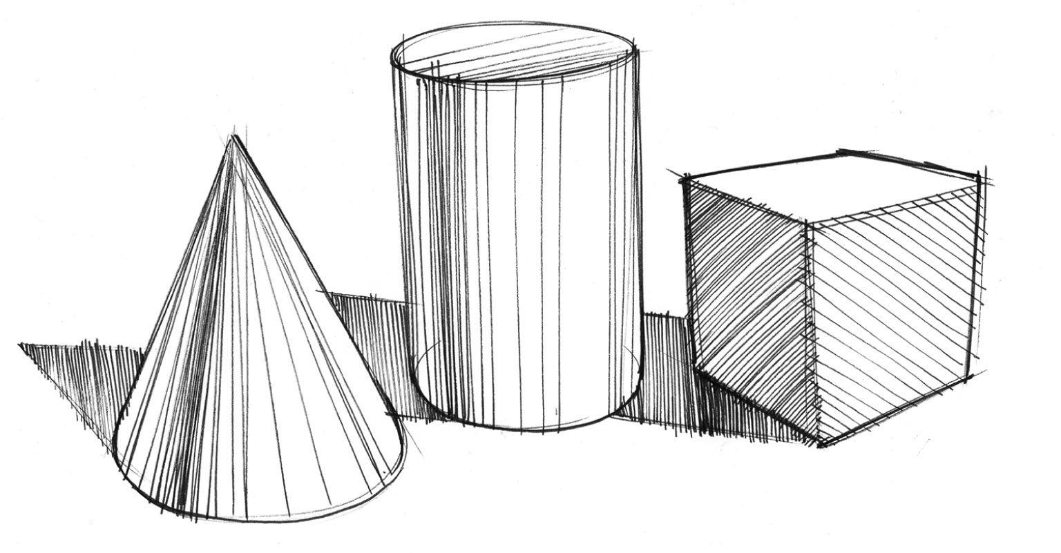
Colors, much like light, are rarely observed evenly on a physical object. Because objects exist in 3D space along with other objects also impacted by direct light, ambient light, and reflected light, color is often varied and more than just the solid hue, saturation and value of the color observed on an object. If care is taken in applying color while blending, realistic effects may be achieved while applying color. The still life image with the shoe, bottle, apple, and cup is an example of a painting where reflected light and colors influence other objects in the scene.

In this marker sketch, color can also be used to create a very vibrant and moving piece with depth and interplay of light.
When of drawing quickly, rather than blending disparate colors, I often focus on varying the amount of light and intensity of color on a surface by creating gradients and blends on the surface. If you are working with markers that apply color evenly, you can add variation to the color with airbrushing (accessories may be available for your brand of markers) or by using some additional pencil shading to vary the appearance of the color, particularly where reflected light impacts the object.
Markers
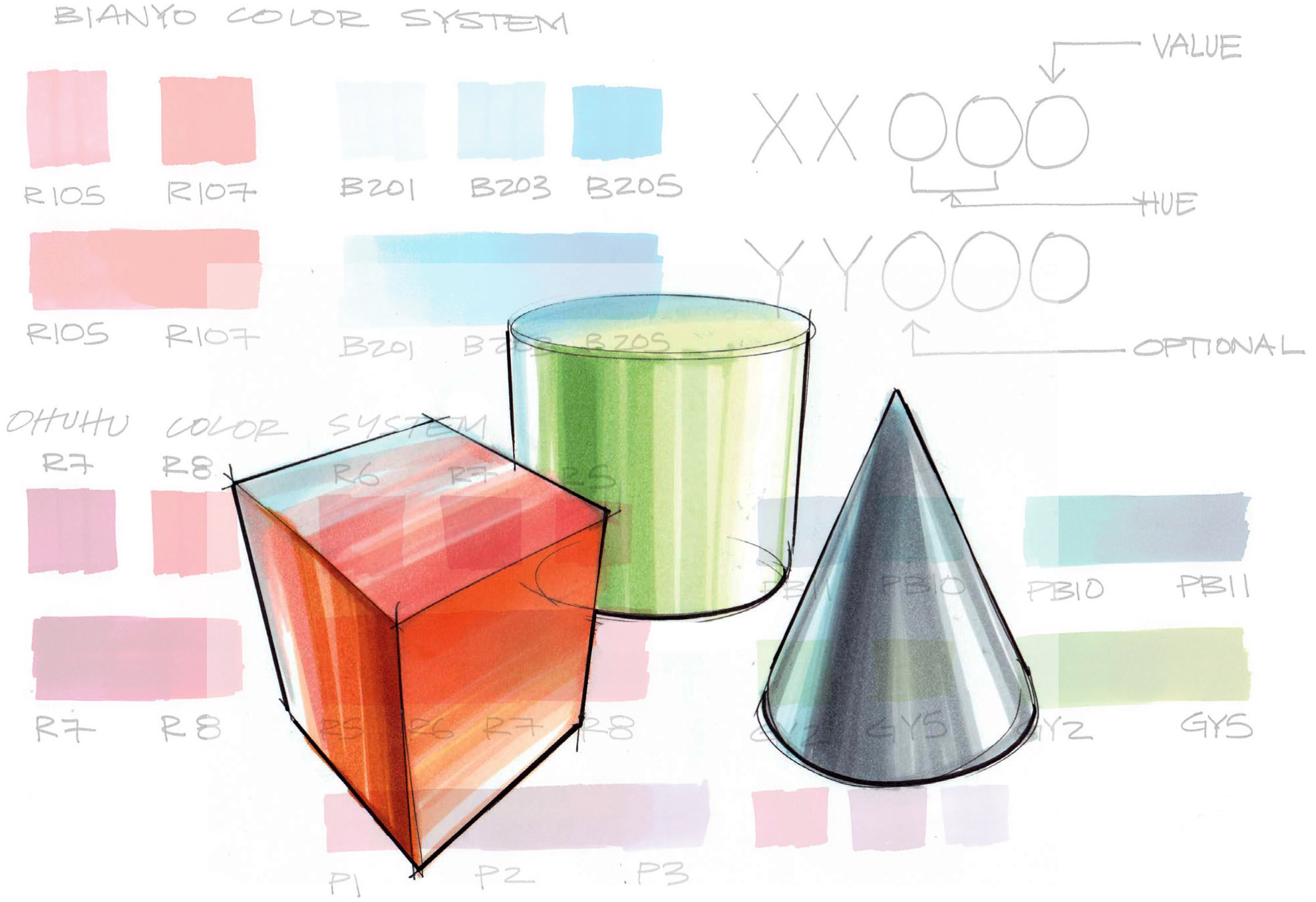
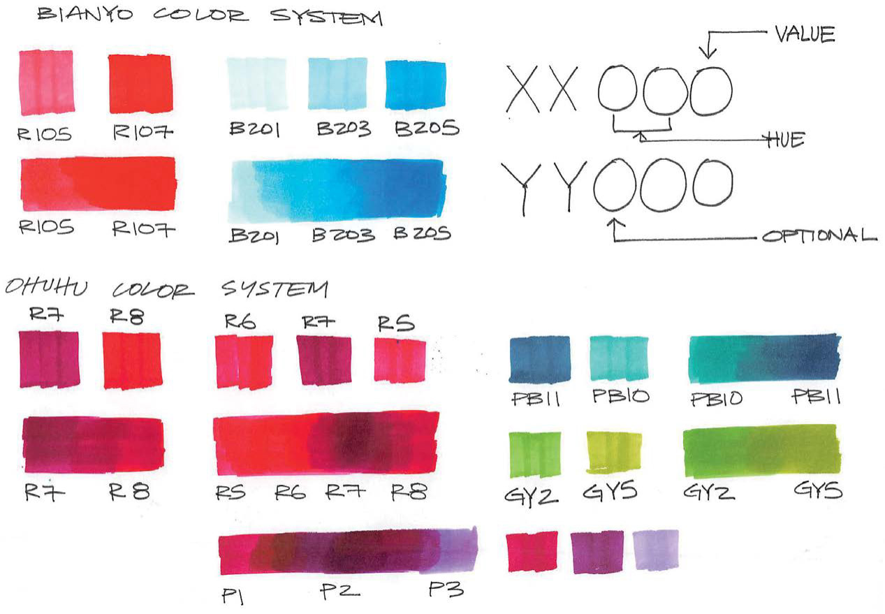
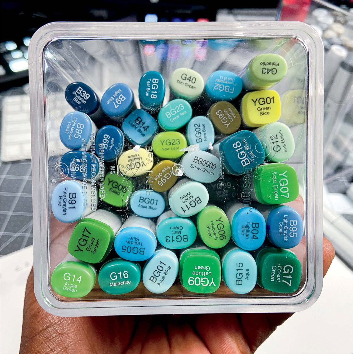
Markers are a convenient way to apply color, and they travel well for sketching on the go. Markers often are sold in sets of multiple colors that are bright and pop well. You may need to spend some time finding values and hues that fit nicely between other included values and hues in a set. The same is true for color pencils that you find in pre-packaged sets.
Much like the value shading you can do with gray markers, coloring with markers requires values that are complementary and in between whatever main colors you choose. Ideally, a color family will be of the same hue and have a 20% to 30% spread in value or brightness. This value spread allows for ideal blending and contrast, because of the way you can build up saturation when working with markers on paper. If you prefer, however, you can use a more complete set of markers with a wider range of colors and shades for even more subtle blends.
Whether water-, alcohol-, or xylene-based, marker ink is translucent. Because of this, you can build up the saturation or intensity of color your markers produce with subsequent strokes when working with paper. My advice, therefore, is always to work light until you get it right; build your color in slowly in layers. There is a limit to how saturated or intense the marker will appear, however. Test each marker to determine how much you can build up each color. Also, be sure to test how your markers react with ink and pencil work if you plan to combine mediums (see Chapter 3, “Getting Started,” for more detail.)
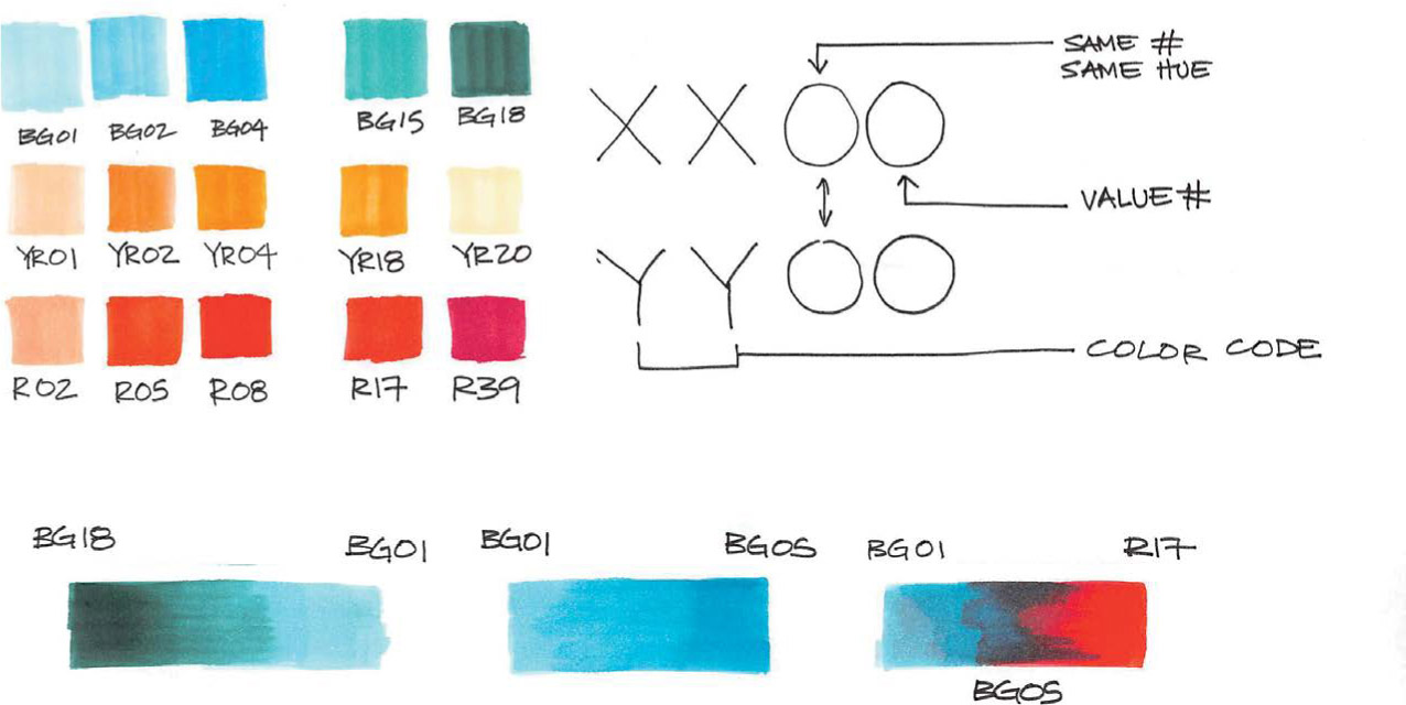
Tread carefully when blending colors from different marker brands in a drawing—especially an important one. As you can see here, color codes can vary widely between brands of markers. Take some time to experiment, and note how the color codes show up in real life, especially if trying a brand of marker you may not have much experience with. Test how marker brands combine and react to each other before combining them in your final drawing. Testing is never a waste of time; ruining a drawing because you were unfamiliar with your tools is however a waste of time and effort.
Blending
Blending your markers may seem tricky or even impossible at first, but with a little bit of technique, you can figure out how to create visually subtle and interesting color blends, even if the colors are not close in hue, saturation, or brightness. Most importantly, if you plan to blend your marker colors, ensure your color families play well with each other. Understanding how to blend your markers not only can help you come up with interesting drawings, but also give you the skills to work flexibly in other media (even digital) or on the fly with a more limited toolset.
Remember to pay attention to the hue, saturation, and value of the colors that you’re using.
Colors from a similar hue will play nicely together, however colors from different hues will be more challenging to blend. Likewise, as we discussed, you’ll have more success blending within the same marker brand than blending across brands.
When blending disparate colors, consider trying a varied stroke or borrowing a bit from pointillism or stippling to create a textured blend. A textured blend provides a decent visual transition between colors that have very incompatible hues (non-analogous or harmonious). For example, this marker sketch contains colors that would ordinarily be difficult to blend but stippling and texture ease the transition between the two vastly dissimilar colors. A smooth gradient would be much harder to achieve without applying a textured effect. Still, you usually can achieve a smooth blend when working with markers, provided there is enough room in the drawing to apply marker ink and have the inks bleed into each other.
Sometimes introducing a third color into a difficult color blend can create a smoother transition, as well. Play around to see what works for your drawing and remember each marker brand will be different. There is no hard and fast rule to the number of colors you may use in a blend or in a drawing. For time and cost savings, however, I tend to stick to three to five colors in each color family when working with markers.

Nah… You Don’t Need a Full Set
Because marker ink is translucent, you can build up the color appearance by simply waiting for the marker to dry and reapplying the stroke. For example, a 20% gray marker repeatedly applied to a piece of quality marker paper will yield a range of values.
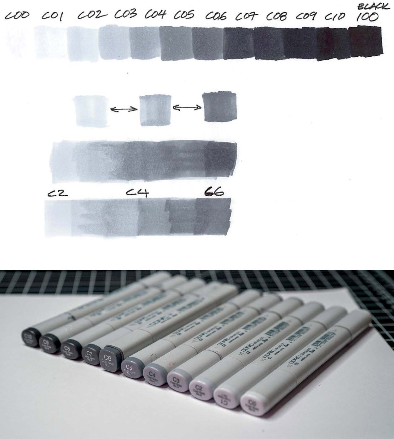
Here’s an example of all 10 markers in a series of Copic brand Cool Gray markers. Suppose you start with C02 or Cool Gray 20%. You can simply pick a marker, skip over a value to the next marker, say Cool Gray 40% (C04), and blend in between. This means that you don’t need to buy a full set of gray markers, unless you plan on creating professional illustrations for clients and need a bit of additional flexibility and variety in your marker color selections.
In the example image, I used three markers to create a blend that you could also achieve with several more markers. If you pick markers that aren’t too far apart in value, you can create your own blends and save money.
Or, Maybe You Do
Sometimes, however, having gaps in your marker value spread can work against you. When I’m creating more detailed illustrations, for example, I sometimes need to split the difference between a value or having additional color hits here and there. That’s why I have hundreds of markers. You may need to be able to represent colors more accurately in more complex sketches and illustrations.


If you find that you really love working with markers or plan on doing so professionally, a full set of markers is definitely worth the investment; at the very least, you’ll want additional colors and shades of colors that blend well. At this point, you might consider how long you’re going to have the markers, how often you use them, and whether you’ll use them out and about. Your answers will tell you if you need to go with a premium, refillable brand like Copic or something more affordable and disposable. Prismacolor markers are a great alternative to the more expensive Copic brand, but you’ll give up such features as refillable ink and replaceable nibs on both ends of the markers. Because I use my markers so frequently, I opted for Copic.
Storage
To make my blending decisions easier, I keep my markers organized by brand, as well as by color groups. For longevity, I store them in airtight containers.
Ah, yes, but what about the great debate, you ask: Do I store vertically or horizontally? In my experience, the physical orientation of markers does not make much difference in their longevity. What has proven most important is to keep the markers in an airtight container, one that doesn’t allow the ink of the marker to evaporate and dry out. Additionally, be sure to properly cap your markers after using them. Many brands have caps that click on tight; listen for that sound when you replace a cap. The airtight container is a double measure against the ink of the marker evaporating. I still have and use markers from my college years that are about 20 years old!
Marker Control, Stroke, and Technique
Many alcohol-based markers have a chisel tip on one end and another tip on the other. With the chisel tip, you can achieve a variety of strokes and effects when drawing. To create crisp highlights or shaded areas, for example, angle the marker so that the full width of the chisel tip is in contact with the paper. The flat, wide stroke this produces is useful when covering large areas, as well. You can achieve a medium-width stroke by slightly lifting the chisel’s tip from the paper while drawing. Depending on the angle and pressure, the width of your line may be narrower or wider. Try a few strokes to find a pressure, angle, and width that works for your drawing, and continue to practice until it feels natural. You can also rotate the marker to draw with the short, narrow width of the chisel tip; controlling your stroke can be a bit challenging when holing the marker in this fashion, however.

Some markers also have a brush tip that you can use for a variety of expressive strokes. The Copic Sketch markers, for example, have both chisel and brush tips, plus the high-quality tips are replaceable. Applying just the right amount of pressure with brush-tip markers will require a bit of practice, but they are a fun way to get a bit more expression in a sketch.

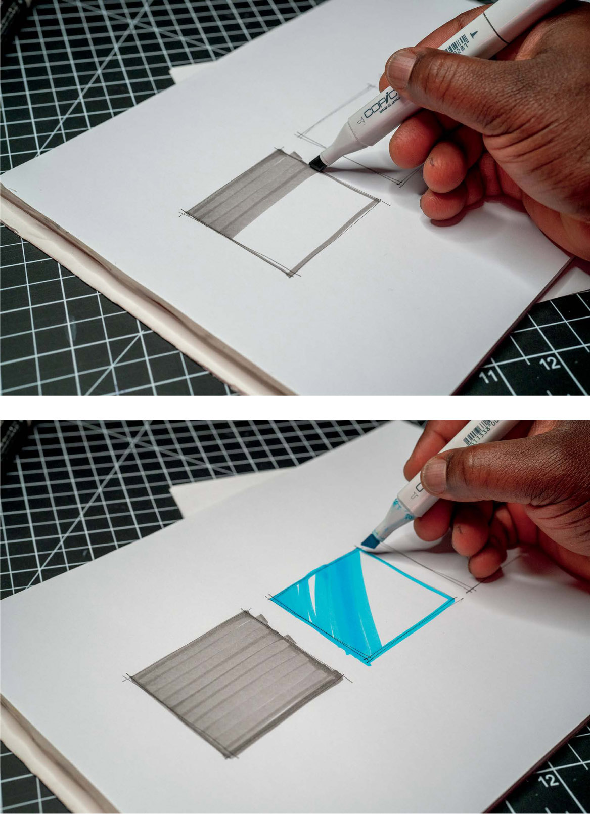
Take the time to play with your markers and understand how the tip, brand, paper, and your approach affect your drawing. Experiment with stroke direction, consistency, and contrast to create different looks and feels, as well. By varying your strokes, you can achieve different surface finishes and effects for your sketch elements. Some common marker strokes I use are the parallel stroke, fast dash, and a scrub or mixed direction stroke.
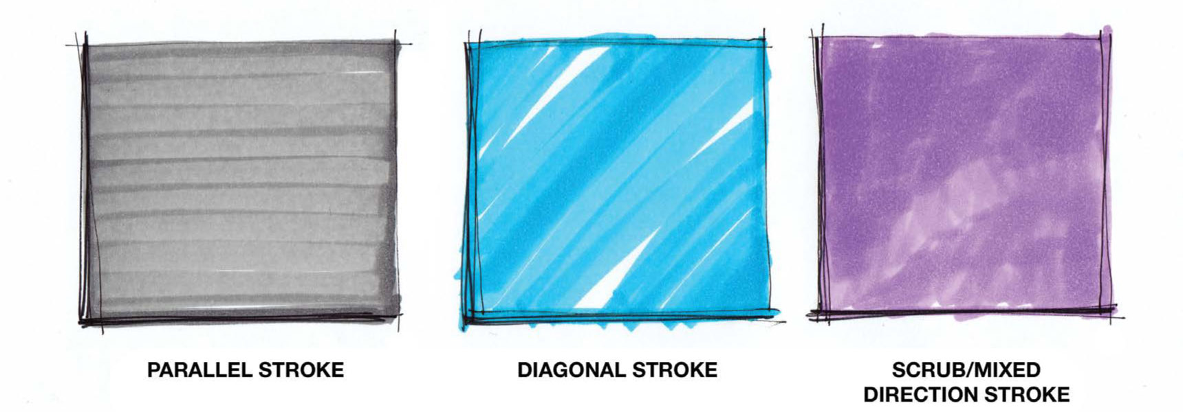
Parallel Stroke
To shade color in a way that appears mostly even, fill an area with parallel strokes. In other words, fill in the area by drawing in parallel lines with as little overlap as possible. How far you move the marker for the next line depends on the width of your marker chisel tip. Practice filling in squares and other shapes with a parallel stroke. To clean up coloring, I usually start by outlining the area with a thin marker line or finish up by applying that outline to the area. Be mindful and use a pen that will not bleed with the marker ink when applied.
Diagonal/Dash
A diagonal or dashed stroke is a way to create a more dynamic fill. I find it particularly useful when working with reflective surfaces or trying to create a sketchier look. The gaps in the fill are achieved by strategically skipping areas as you shade in an area. Think about reflections, shadows, and artifacts while shading, even if working with a two-dimensional sketch.
Scrub/Mixed Direction
A scrub or mixed-direction stroke is a good way to create fuzzy or matte surface shading with a marker. Because of the all over approach, the color that results will mimic the feeling of a matte surface. Depending on the material you wish to convey, a scrub stroke may be the best option to capture it. For example, using a scrub stroke is the basis of creating such textures as cement or fabric and can help with the visual appearance of the texture or material.

Exercise
Fill a sheet of paper with squares about 2 to 4 inches (50 to 100 mm) in size. Practice different marker stroke types and fill in the boxes. Experiment with each and even try angles to come up with your own technique.
Surface Finishes with Markers
When considering how shiny or dull to make a surface’s finish, think about what in the environment might be influencing that surface. Is there a couch reflecting on something, or is the light from a window reflecting off to the side? As you remember from Chapter 8, “Reflections,” a simple flat or curved surface will pick up reflections and distortions. While your calculation of these reflections need not be precisely accurate, the symbolism you add to your drawing should be representative of reflections you observe in real objects.
These pen and ink examples are simple, but the more confident you are, the more complex your reflections can be.
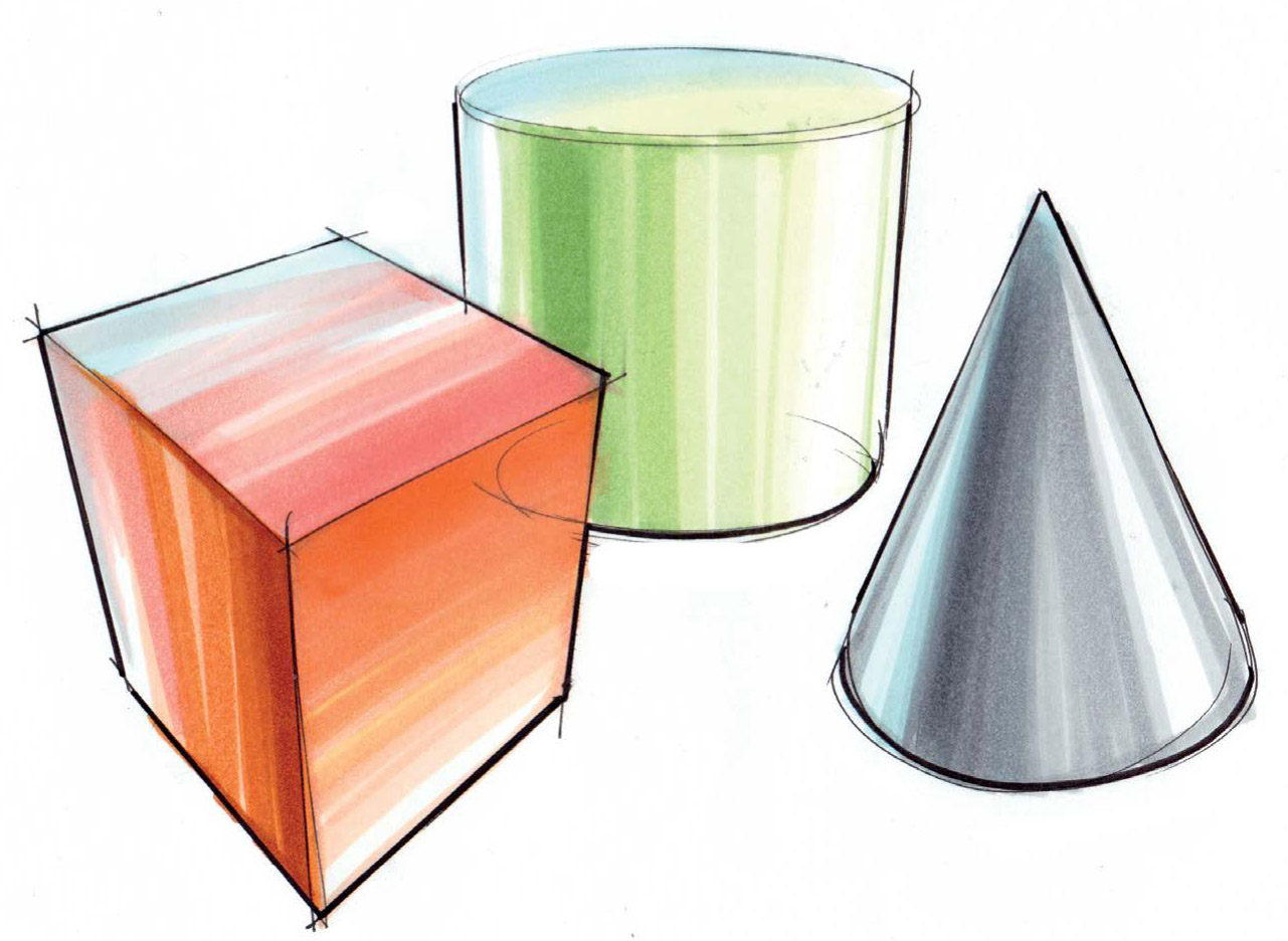
When shading with markers, it’s a little bit different because with markers there are a variety of values and colors you can use to shade. Consider, for example, a shiny cylinder that may be reflecting dark spots in the environment or a bright light off to the right side. These reflections lessen with a rougher surface or one that is dull or matte. The top of the shiny cylinder may be picking up reflections of things at the top of the room, as well as a bit of shadow. It may seem counterintuitive but try to imagine your surroundings wrapped onto the shape itself and what that might look like on a shiny surface.

Even though the second cylinder isn’t completely polished, try to pick up and express reflections in the top surface as well. Use the different marker strokes you have practiced, seeing what kind of reflective surface affects you can achieve with markers on paper.
Color and Depth
Another way to reinforce depth in perspective drawing is by using color to communicate how far or close something is to the viewer. Atmospheric perspective, as you remember, is the tendency for colors to appear less saturated the further away they are in relation to the viewer of a scene. Typically, atmospheric perspective is apparent with objects far off in the distance because of refraction and diffusion caused by the atmosphere. Colors also appear warmer when an object is closer to the viewer. Even at a small scale, the interplay between warm colors (reds to some greens and purples) and cool colors (purples to bluish greens to blues) can really make your drawings pop. Thus, it is possible to reinforce the appearance of depth in your sketch or drawing by using this principle.

With warm and cool color applied to a sketch, the object takes on a rich dynamic appearance that communicates depth. Try working with warm and cool colors on simple objects and work your way up to more complex objects. Using warm and cool grays is a good way to practice the interplay of color temperatures that can affect depth perception and volume when drawing three-dimensionally in a 2D medium. You can also experiment with blending on surfaces with varying degree to create interplay between them.
Color Demonstration: Car Sketch Rendering
To illustrate my process of applying color to show surface finishes, reflections, and general shape, let me walk you through how I would use markers to color this sketch of a car.
1. For this drawing, I decided to use a series of orange and brown Copic markers, as well as some blue marker for highlights. As you can see, the drawing is a cleaned-up version of a rough sketch. (Refer to Chapter 13, “Tighten Up,” for more information on this technique.) Rather than tracing my previous try, I opted to re-draw from scratch, focusing on clarity while maintaining expression in my lines. Roughing out the sketch was a great way to figure out the perspective taper and scaling before committing to the final design of the car. Because of perspective, drawing the car in three dimensions involved scaling and tapering lines consistent with the type of perspective I used. The ellipses were critical. They established the placement and “attitude” of the vehicle and helped me proportionally measure and place elements of the car in a three-dimensional space.

2. To apply color, I begin with my lightest marker: A Copic YR02 marker. By laying down my initial tones around the perimeter and any key areas that I may use to find the surface, I allow myself to find some regions in which I can apply color. Always use your lightest marker color for the initial outline; remember, work light until you get it right! I find that this helps me not be stressed when coloring, as any overdrawn marker strokes usually connect with the outline. The outline also provides a visual guide as to where to start and stop shading.

3. Next, I focus on what I think of as reflections coming from the environment. As the illustrator, you’re in control of what’s happening in your scene, so try to imagine where your object may be located in a scene, the light source for the scene, and other objects that may be reflected into your main subject. This requires a little bit of imagination, but you should also pull from observation of objects around you. For this example, I paid close attention to how the shape of a car influences the shapes of objects reflected in it. Watch for your own reflection when next looking at a car and how your reflection changes with the surfaces of the vehicle. While working, I leave some areas white for highlights, because marker ink, while transparent, is difficult to correct. Likewise, take care to be aware of any reflective spots that you identified and leave blank.
Once my initial tones are in place, I squint and try to eliminate some of the detail in the line drawing. Squinting causes you to focus on the overall contrast and the appearance of color rather than the detail in the drawing. Post-squint, I switch to a YR07 marker to introduce some contrast on the wheel wells and body side of the vehicle. Remember, when a surface changes direction, contrast in value will communicate three-dimensionality along with the lines you choose to use.

4. Next, I squint and work to improve the contrast in value in the sketch. For these, I use Copic YR07 and YR09 markers along with Copic E08 and E09 markers for my shadows. Remember to watch for areas to leave white for highlights.

5. Another round of squinting reveals additional areas where I can continue to improve the contrast in value in the sketch. I also add blue using a Copic B32 marker to hint at the environment in which the vehicle might be. Because the sky is blue and there is blue on the car, the inference is that the car is outdoors. The blue colors also serve as a way to introduce some atmospheric perspective through the use of color.

6. Next, I fill and block in the wheels with some darker values, reflections, and highlights to communicate the reflectivity of each material. In a marker rendering, I sometimes use tools such as an ellipse guide, circle templates, and French curves to tighten up the sketch; however, I don’t this time, because I want to keep this drawing loose and sketchy.
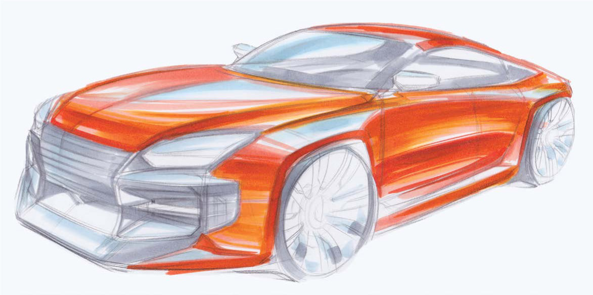
7. To finish up, I block in the interior details around the car’s cabin or “greenhouse,” and enhance the contrast and fidelity of lines. This step will help your sketch tighten up a bit and feel more consistent and cohesive overall.

Because I consider myself more of a line artist, I typically start with the original line drawing, and touch up lines toward the end of my marker sketch. This way, I create the right balance of crispness and expressiveness so that the drawing isn’t too static.