Overview
This chapter will introduce you to a new technique of writing form components in React, known as Formik. Formik will enable you to handle changes in forms, perform validation, handle error cases, and submit forms efficiently. By the end of this chapter, you will be equipped with the fundamental tools and techniques required to get started building forms with Formik, which is a scalable, performant form library in React.
Introduction
Frequently in web applications, we interact with the user to capture valuable information, such as their usernames, passwords, and preferences. Whether we want to register a new user, complete a bank statement, fill in a survey, or perform an advanced search using certain criteria and filters, or for any such similar cases, we have to use forms.
Since forms are an important aspect in any frontend development, the React team provided us with the minimum toolkit to customize forms based on our needs. There is a straightforward API called Formik, which works by leveraging existing functionality in JavaScript that allows us to write more portable and reusable code while dealing with forms.
The goal of this chapter is to convey to you a deep understanding of how forms work in React, composing resilient form elements as quickly as possible through a number of practical examples. We will cover all the various types of form handling techniques in React, from uncontrolled to controlled components, and take note of their simplicities.
We will then move on and learn more about Formik, the library that helps us to write full-fledged forms that include validation, controlling form submission, and keeping track of state. It has been built on the same principles that govern existing React components, so the learning curve is not pronounced, and we can quickly pick up the basics.
Let's get started with our first form handling technique, which is using uncontrolled components.
Uncontrolled Components
We will start with a brief understanding of how forms are handled in React. In the most basic case, React treats forms as normal HTML components. Sometimes, we might need to take a close look at that input in a form so that we can see what its current value is. The most convenient way to achieve that is by using uncontrolled components, where, in essence, we maintain separate references to the DOM elements that we can utilize to manipulate and read the elements. By uncontrolled, we mean that we do not use React to change the value of the input field, but we let the browser handle the changes when we type something. This means that we can still write forms as usual and they would work as expected, as they do with plain HTML.
Uncontrolled components are useful when developers want to deal with the final state rather than the intermediate state of the component. For example, we can have the following form that asks for a username and a password:
import React from 'react';
class PlainForm extends React.Component {
render() {
return (
<form noValidate={true} action="/login.php">
<label>
Email:
<input type="text" />
</label>
<label>
Password:
<input type="password" />
</label>
<input type="submit" value="Login"/>
</form>
);
}
}
export { PlainForm }
When we interact with this form, we can verify whether we can change our username and password fields using the noValidate attribute. When we click on the submit button, upon successful submission, we will see that the page will refresh and redirect to localhost/login.php.
However, as you may agree, this form is not very helpful as we do not have any good means to read the current input values or perform validation. In addition, there is no way to control the form-submitting process or to perform asynchronous updates.
In our case, all we need to do is to use React refs(references), covered in later chapters, which provides a way for the React library to have direct handles with the real DOM elements.
Let's see this in practice by running our first exercise.
Exercise 8.01: Creating Our First Uncontrolled Form Component
In this exercise, we are going to create our first uncontrolled form component in React using refs. Let's see how to do that:
- Create a new React app using npx create-react-app uncontrolled. Start the project and take a look at the browser window that should have opened for you automatically:
$ npx create-react-app uncontrolled
$ cd uncontrolled
$ yarn start
- Go to the src/App.js file and delete logo.svg and App.css and clear out the contents of App.js.
- Inside App.js, create a new React component, App.
- Create a new file named UncontrolledForm.js inside the src folder.
We need to keep two references to the input elements, one for the name and one for the password.
- Create a constructor property and define the two properties and their setters for each of the input fields:
constructor(props) {
super(props);
this.name = null;
this.password = null;
this.setNameRef = element => {
this.name = element;
};
this.setPasswordRef = element => {
this.password = element;
}
}
- Next, we need to attach the refs to the actual components so that React will keep their DOM handles.
- Add a ref property to each of the two fields:
<input type="text" ref={this.setNameRef}/>
<input type="password" ref={this.setPasswordRef}/>
- To actually read the current values of the inputs, we need a handler that will be called when we submit the form. Add the following handler method:
handleSubmit(e) {
e.preventDefault();
console.info('A name was submitted: ' + this.name.value);
console.info('A password was submitted: ' + this.password.value);
}
Here is the code for the complete component:
UncontrolledForm.js
3 class UncontrolledForm extends React.Component {
4 constructor(props) {
5 super(props);
6
7 this.name = null;
8 this.password = null;
9
10 this.setNameRef = element => {
11 this.name = element;
12 };
13
14 this.setPasswordRef = element => {
15 this.password = element;
16 };
17 }
The complete code can be found here: https://packt.live/3cyrff7
- Load the component UncontrolledForm in App.js, using the styles provided in the App.css file located in the project folder (https://packt.live/2y0pvwa):
import React from 'react';
import {UncontrolledForm} from './UncontrolledForm';
import './App.css';
function App() {
return (
<div className="App">
<UncontrolledForm/>
</div>
);
}
export default App;
Run the app using the following command:
$ yarn start
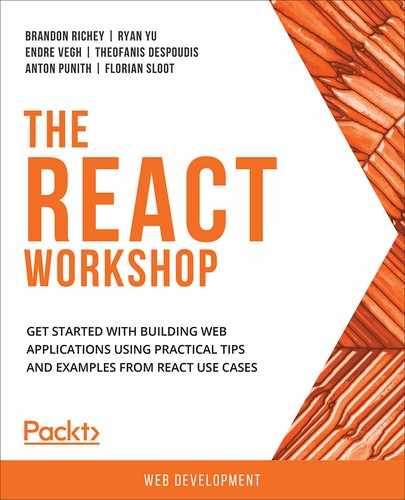
When we load this component and we interact with it, we can inspect the values in the console of the browser:
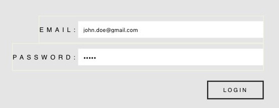
Figure 8.1: Login form
When you click on the LOGIN button, the output should be as follows in the console of your browser:

Figure 8.2: Uncontrolled component
The name and password properties of the Ref hold the current DOM input. Note that when the component loads, as the reference isn't attached to the DOM initially, it will show undefined for the input fields. Refs are always used to find the current value of a DOM element when needed.
We will be seeing more examples of Refs in the subsequent chapters. Refs have other beneficial uses; however, while handling forms, they are not recommended unless we have specific business requirements. In the majority of cases, we recommend using controlled components, which we will discuss next.
Controlled Components
A controlled input, or controlled component, is what we will be using most of the time when we want to implement forms in React.
The controlled part comes from the fact that the parent component possesses a reference to the current value that we assign to the input element. That value can be controlled using setState, while managing the state or the value can be passed as a prop from the parent component to its children components.
Let's take a look at the following code snippet:
handleOnNameChange = (e) => {
this.setState({ name: e.target.value });
};
<input type="text" value={this.state.name} onChange={this.handleOnNameChange} />
To obtain the current value of the input element and for any other updates of that element thereafter, we use the onChange event handler (or any similar handler that triggers when the actual DOM input gets updated). Then, on the event object itself, we get the current value using the e.target.value property.
Note
setState is necessary because if we don't update the state, React will not know when to re-render the new value. If we keep the value the same after each update, then we will see that the input will be locked down on the same value. Put differently, when we type, nothing happens. This is a source of widespread confusion among newcomers learning React.
Note that for certain inputs, the current value will be different; for example, checkboxes have an e.target.checked property instead.
Let's go through the following exercise to understand how a controlled form works.
Exercise 8.02: Converting Our Form Component from Uncontrolled to Controlled
In this exercise, we are going to convert an uncontrolled form component to a controlled one using React's component state management. The purpose of this exercise is to understand the minimum steps required to perform that change. Perform the following steps:
- Create a new React app using npx create-react-app controlled. Start the project and take a look at the browser window that should have opened for you automatically:
$ npx create-react-app controlled
$ cd controlled
- Go to the src/App.js file and delete logo.svg and App.css and clear out the contents of App.js.
- Inside App.js, create a new React component, App.
- Create a new file named ControlledForm.js in the src folder.
- Copy the contents of the UncontrolledForm.js file we saw in Exercise 8.01, Creating Our First Uncontrolled Form Component Now, rename the form as ControlledForm.
- In ControlledForm.js, remove the references we created in the constructor in Exercise 8.01, Creating Our First Uncontrolled Form Component as they are not needed and write the following code:
this.setNameRef = element => {
this.name = element;
};
this.setPasswordRef = element => {
this.password = element;
}
- Replace them with the state object, which will contain two properties. name and password should look like this:
constructor(props) {
super(props);
this.state = {
name: '',
password: '',
};
}
- Replace the ref properties in each one of the inputs with the value properties and pass the current state value:
<input type="text" value={this.state.name}
onChange={this.handleOnNameChange} />
- Add an onChange event handler that will use a function callback to set the current input value in the state:
handleOnNameChange = (e) => {
this.setState({ name: e.target.value });
}
Here is the code for the complete component:
ControlledForm.js
7 this.state = {
8 name: '',
9 password: '',
10 };
11 }
12
13 handleOnNameChange = (e) => {
14 this.setState({ name: e.target.value });
15 };
…
21 handleSubmit(event) {
22 event.preventDefault();
23 alert('A name was submitted: ' + this.state.name);
The complete code can be found here: https://packt.live/2LsHazH
- To use this component ControlledForm, you need to import it into App.js:
import React from 'react';
import {ControlledForm} from './ControlledForm';
import './App.css';
function App() {
return (
<div className="App">
<ControlledForm />
</div>
);
}
export default App;
Run the app using the following command:
$ yarn start
The following is the output of the form using the styles provided in the App.css file located in the project folder (https://packt.live/2AmA51i):
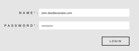
Figure 8.3: Controlled form component
When you click on the LOGIN button, an alert box will pop up displaying the username:

Figure 8.4: Uncontrolled component
Although we can clearly see that controlled components are the way we can handle forms in React, it turns out that they offer only limited functionality because there is nothing else other than manipulating simple form controls. We just assign the value to the state and we can change it using setState. How we update that state in different scenarios, for example, if we have to deal with complex forms, is up to us to configure. If we want to figure out how to perform proper validation or anything more advanced, we are essentially on our own. For simple cases, we may not need to do anything more than just using controlled components, but for real-world scenarios, we would like something more efficient. It turns out that there is a library in React called Formik that builds on top of the ideas of controlled components. Plus, it allows us to consolidate validation, form submission rules, and keep close track of the state of fields. Let's get started.
Introduction to Formik
Formik is one of those libraries that came at just the right time to resolve a long-standing issue: how we handle really complex forms in React. Complex forms can include multiple embedded forms, dynamic fields and validation, or handling asynchronous checks with the backend. Prior to Formik, there were numerous options available, for example, using Redux-Form or React-Redux-Form, which basically stored the form state in a Redux store. That worked for a while, but complexity and peculiar bugs started to come in. Having to fix a gigantic form that was working once upon a time but now is not is something that we should all be wary of as it can happen all the time. For example, when we have a form where the validation happens in different stages and the outcome of each step depends on how the previous steps validate, it becomes difficult to find even the smallest bugs. And testing this logic can become even trickier because you would need to cover all the scenarios to figure out which one fails. Therefore, it is preferable to have the code as self-explanatory as possible and easy to understand.
Formik, on the other hand, goes back to basics by storing the form state locally and not globally, which is what is currently recommended by most React practitioners. What we mean by locally is that we are not using a global store object such as Redux to store the form state and values; instead, each component uses a state object to store its current status.
As mentioned on Formik's website, it offers significant advantages over plain React forms or the aforementioned libraries.
Let's discuss the benefits of Formik before we look at practical exercises on how we can use it. When we interact with this component again, nothing changes and it performs just like the previous two components, controlled and uncontrolled, as we saw previously.
In the following section, we are going to examine Formik.
Advantages of Formik
Before we dive into the structure of a Formik component, let's have a look at a few key benefits of this library:
- Easy to integrate: Since Formik keeps the state local, it's more effortless to convert existing forms (either controlled or uncontrolled) into Formik ones. It does not compete against a state management library such as Redux or MobX, so the amount of dependencies stays small. In other words, you don't have to implement elaborate structures to develop forms.
- Easy to understand: Learning new libraries and extensions to existing ones always takes some time to read and understand the documentation. You can always come up with an example case that will not adapt to your needs, so you will have to improvise. With Formik, you don't deviate from the concepts that you already know, such as setting state and receiving props, so you will not have any issues learning how to utilize it quickly.
- Easy to configure: Formik offers several options when it comes to handling form validation, retrieving the values from and out of the state, and submitting the form. You can use Formik as an HOC when you want to pass one component to another, or as a render props pattern where the props of the parent component are passed to its children components. In addition, you can include a third-party validation library such as Yup or Spected, making it more suitable for real production cases.
Now, let's look at the anatomy of a Formik component.
Anatomy of a Formik Component
The steps required to create our first Formik component are not complex. First, we need to get access to the library. We can do this via the following command:
$ yarn add formik
Or, if you are using npm, run the following command:
$ npm install formik --save
There is also an option for a CDN script tag:
<script src="https://unpkg.com/formik/dist/formik.umd.production.js"></script>
When the library loads, it will attach a Formik property (used for building forms) to the global scope of the browser: window.object.
After this step, let's replace the code in the controlled component, ControlledForm.js, which we implemented previously, in Exercise 8.02, Converting Our Form Component from Uncontrolled to Controlled and create a new file called formikForm.js:
<form onSubmit={handleSubmit}>
<label>
Name:
<input type="text" name="name" value={values.name}
onChange={handleChange} />
</label>
<label>
Password:
<input type="password" name="password" value={values.password}
onChange={handleChange} />
</label>
<input type="submit" value="Login" disabled={isSubmitting}/>
</form>
Noticed any differences? We replaced the onChange handlers of the controlled component with only one handleChange, we used values.password and values.name instead of using state, we added a name property to each of the input elements, and added an extra disabled value to the submit button. So eventually, we removed some handlers and delegated them to Formik, and so we got rid of boilerplate code that appears most of the time when we create forms using controlled components.
If you are wondering where we get those values from, it is from the Formik component itself. Let's complete the code to see it in action. To do that, we only need to import the Formik component and wrap our form with the following code:
FormikForm.js
6 <Formik
7 initialValues={{ name: '', password: '' }}
8 onSubmit={(values, { setSubmitting }) => {
9 setTimeout(() => {
10 console.info(JSON.stringify(values, null, 2));
11 setSubmitting(false);
12 }, 400);
13 }}
14 >
15 {({
16 values,
17 handleChange,
18 handleSubmit,
19 isSubmitting,
20 }) => (
The complete code can be found here: https://packt.live/2WwAhDG
As you can see, the Formik component is like a constructor of properties and configuration. We use initialValues to define our input values that we can change and customize later and also define an onSubmit handler that will trigger when we call the handleSubmit handler that gets passed as a render property. Speaking of render variables, we have to access a couple of them, such as values, the object that we used when we defined initialValues and isSubmitting, which will change whenever we call the setSubmitting function.
If we run the preceding component, we can see that when we submit the login form, the button is disabled for a moment and the following is logged in the console:

Figure 8.5: Console output of the form element
Therefore, if we inspect the code example, the following set of events happen:
- The user types in username and password.
- The onChange event handlers update the values property.
- The user clicks on the Login button.
- The handleSubmit handler is invoked.
- The form immediately re-renders with the isSubmitting property as true to prevent double submissions; we disable the login button.
- When the submit handler is triggered, the timeout handler runs for half a second. Then, it prints out the contents of the values property in the console and uses the setSubmitting function to set isSubmitting to false.
- The form, after approximately half a second, re-renders with the isSubmitting property as false and the login button becomes clickable again.
Note
Inside the submitHandler closure, it is possible, if we are sufficiently bold, to modify the values property and print something else in the console.
For instance, if we add the following line after the setTimeout call in the FormikForm.js file:
<Formik
initialValues={{ name: '', password: '' }}
onSubmit={(values, { setSubmitting }) => {
setTimeout(() => {
console.info(JSON.stringify(values, null, 2));
setSubmitting(false);
}, 400);
values.name = "Hello";
}}
>
Then the following things happen:
- values.name will change internally to Hello.
Because there is no rendering during that time, nothing will happen over the next half-second.
- After the timeout triggers, console.info will print the new values object and the next re-render will update the input value of the element to Hello.
Therefore, it is recommended not to change or update the values object in this way as it's not predictable and may lead to weird behavior.
Let's take a closer look at how we can use initial values and handlers in Formik.
Initial Values and Handlers
The Formik component is the main entry point for our forms and contains several properties that let us configure their behavior.
In any case, we first need to define the initialValues property, which must be a plain object with string property names. The values of each property can be anything; for example, we can use an array to collect user preferences:
initialValues={{
preferences: ["Agree to Terms", "Subscribe to Newsletter"],
socialAccountPage: {
twitter: "https://twitter.com/packt",
facebook: "https://facebook.com/packt",
}
}}
In the first case, for the nested object, socialAccountPage, we need to reference the absolute path in the input fields that the following name parameter needs to match for the form to work correctly. Therefore, the socialAccountPage nested object can be modified and will look like this:
<input type="text" name="socialAccountPage.facebook" value={values.socialAccountPage.facebook}
onChange={handleChange} />
<input type="text" name="socialAccountPage.twitter" value={values.socialAccountPage.twitter}
onChange={handleChange} />
When we have an array of values, we need to use brackets to access the index of the field, for example:
<input type="text" name="preferences[0]" value={values.preferences[0]} onChange={handleChange} />
<input type="text" name="preferences[1]" value={values.preferences[1]} onChange={handleChange} />
Formik also offers a <FieldArray> component that provides advanced manipulation functions when working with lists of values.
As for the handlers, the most important one is the onSubmit handler that we saw previously, and it triggers when we submit the form. This handler passes on the values and actions objects. Here is the signature of the actions object:
export interface FormikActions<Values> {
setStatus(status?: any): void;
setError(e: any): void;
setErrors(errors: FormikErrors<Values>): void;
setSubmitting(isSubmitting: boolean): void;
setTouched(touched: FormikTouched<Values>): void;
setValues(values: Values): void;
setFieldValue(field: keyof Values & string, value: any, shouldValidate?: boolean): void;
setFieldError(field: keyof Values & string, message: string): void;
setFieldTouched(field: keyof Values & string, isTouched?: boolean, shouldValidate?: boolean): void;
validateForm(values?: any): Promise<FormikErrors<Values>>;
validateField(field: string): void;
resetForm(nextValues?: Values): void;
submitForm(): void;
setFormikState<K extends keyof FormikState<Values>>(f: (prevState: Readonly<FormikState<Values>>, props: any) => Pick<FormikState<Values>, K>, callback?: () => any): void;
}}
We have seen setSubmitting before, and there are other ones that we can use based on our specific requirements. For example:
- resetForm: This is used to reset the form back to the initialValues state.
- validateField: This is used to trigger a specific field validation.
- setTouched: This is used when we want to mark the field as touched or visited. It is useful in scenarios where we want to show an error message if that field has been edited once while the user is accessing the form and not when the form is loaded for the first time.
- setStatus: This is used when we want to attach a custom status property to our form, for example, isApproving or isValidating. This needs to be paired with an associated initialStatus property:
initialStatus={{isValidating: false}}
Other than the onSubmit handler, we also have access to the following handlers:
- onReset: Triggered just before the form is reset back to its initialValues parameter.
- validate, validateOnBlur, validateOnChange, validationSchema: Triggered in cases when we want to validate the form. We will see more examples pertaining to validation later in the chapter.
In addition to the Formik component, there is another component that offers a different API and is suitable for cases when you want to pass one component to another. These components are known as Formik higher-order components.
Formik Higher-Order Components
We saw the basics of Higher-Order Components (HOCs) in Chapter 7, Communication between Components. Now, let's see the behavior of HOCs with Formik.
withFormik is an HOC that allows us to separate the definition of the Formik component configuration from the UI layer. This is useful when we have a component where we just want to have access to the Formik properties and callback methods without actually defining form elements, or when we have an existing form and we want to delegate its callbacks to Formik without changing the UI of the original form.
Let's take a look at the template code of LoginForm.
Note
The template code is located in https://packt.live/3btLSIc.
const MyEnhancedLoginForm = withFormik({
mapPropsToStatus: () => ({ isValidating: 'false' }),
handleSubmit: (values, { setSubmitting, setStatus }) => {
setStatus({ isValidating: 'true' });
setTimeout(() => {
console.info(JSON.stringify(values, null, 2));
setSubmitting(false);
setStatus({ isValidating: 'false' });
}, 1000);
},
displayName: 'LoginForm',
})(LoginForm);
Then, add the LoginForm code in the same file as above
WithFormikExample.js
5 const LoginForm = (props) => {
6 const {
7 values,
8 handleChange,
9 handleSubmit,
10 isSubmitting,
11 status,
12 } = props;
13 return (
14 <form onSubmit={handleSubmit}>
16 Name:
17 <input type="text" name="name" value={values.name}
18 onChange={handleChange} />
19 </label>
…
26 <input type="submit" value="Login" disabled={isSubmitting}/>
27 Status: {status.isValidating}
The complete code can be found here: https://packt.live/2Wv0v9T
As you can see, the UI layer is separate from the component containing configuration and business logic.
There are several advantages associated with using withFormik as it allows some degree of reusability for our components. We can update the UI layer without touching the business layer, giving us more flexibility while organizing our code base.
Connect
This is just a utility component designed to inject the Formik context into any React component via their props. For example, let's look at the template code:
import { connect, getIn } from 'formik';
const StatusMessage = props => {
const isValidating = getIn(props.formik.status, 'isValidating');
return isValidating ? 'Is Validating' : 'Is not Validating'
};
export default connect(StatusMessage);
Now, we need to place this component anywhere inside the Formik wrapper. In our example, we have it just before the closing form tag:
Status:<StatusMessage />
</form>
The connect component allows us to turn any component into a Formik lookalike as we have access to the entire API, callbacks, and state variables.
Now that we have seen how we can work with straightforward cases of Formik, let's explore how to validate forms in React and the common challenges faced during the process.
Validating a Form
Formik makes it easy to add validation rules and checks throughout your forms and control when you can trigger them. At a basic level, it provides form-level validation checks. We only need to provide a validate property that needs to entail all the validation logic for the form.
Inside the validation function, we need to create an error object and assign properties using the same name as the values we provided in the initialValues object. That way, we can access the errors object inside the render props function and update the UI. Let's see how to add field validators to our login form through the following exercise.
Exercise 8.03: Adding Field Validators
In this exercise, we are going to add field validators to the form component, LoginForm, created in the previous section. We will use Formik's validate property to do that. We will also use Formik's ErrorMessage component to design the error messages that will be shown once a validation error is thrown. Let's see how:
- Start a new CRA app. You can choose any name for the new app:
$ npx create-react-app <name>
- Go to the src/App.js file and delete logo.svg, App.css, and clear out the contents of App.js.
- Copy App.css from the previous exercise.
- Inside App.js, create a new React functional component, App.
- Create a new file named FormLevelValidation.js in the src folder.
- Copy the existing code from the login form in the previous section:
FormLevelValidation.js
21 const FormLevelValidation = () => {
22 return (
23 <Formik
24
25 initialValues={{ name: '', password:''}}
26 onSubmit={(values, { setSubmitting }) => {
28 setTimeout(() => {
29 console.info(JSON.stringify(values, null, 2));
The complete code can be found here: https://packt.live/2AkCOZ4
- Add the individual field-level validation functions:
function validateName(value) {
let error;
if (!value) {
error = 'Name is Required';
}
return error;
}
function validatePassword(value) {
let error;
if (!value) {
error = 'Password is Required';
}
return error;
}
- Remove the existing validate property in the Formik constructor as we are going to perform validation on each field individually.
- Replace the input elements with the <Field /> element, adding the respective validate property function:
FormLevelValidation.js
41 form onSubmit={handleSubmit}>
42 <label>
43 Name*:
44 <Field type="text" name="name"
45 validate={validateName}
46 onBlur={handleBlur}
47 onChange={handleChange} />
48 </label>
49 <ErrorMessage name="name" />
50 <label>
51 Password*:
52 <Field type="password" name="password"
53 validate={validatePassword}
54 onBlur={handleBlur}
55 onChange={handleChange} />
56 </label>
The complete code can be found here: https://packt.live/2T39RaM
- To use this component, you need to import it into App.js:
import React from 'react';
import FormLevelValidation from './FormLevelValidation';
function App() {
return (
<div className="App">
<FormLevelValidation />
</div>
);
};
export default App;
- Run the app using the following command:
$ yarn start
The output is as follows:

Figure 8.6: Login form component
If you perform the preceding steps, then the form will behave as before. Now, we have gained considerable advantages as we can extract and reuse validation logic across many components.
Controlling When Formik Runs Validation Rules
By default, Formik triggers a validation phase on change, on blur, and just before the onSubmit handler is invoked. However, we can configure this behavior using the following boolean properties:
- validateOnChange: True if validation happens when we call onChange
- validateOnBlur: True if validation happens when we call onBlur
We also have the option to use the following two callback handlers provided by the render props:
- validateField: Validates the field specified by their name; for example:
validateField('name')
- validateForm: Validates the entire form whenever it is called.
To understand how the preceding fields, work, let's look at a small exercise on how to configure the validation phases.
Schema Validation
Schema validation is basically defined as an object of keys named as the initialValues property and, for each key, there is a function that performs the list of validations.
When we trigger a validation phase, Formik will use the validationSchema object to map the values object to it. Then, it will convert any errors that Yup returns into the familiar errors object and passes on the render props callback. Hence, those two libraries will work seamlessly together.
If we defined extra validation rules using the validation property, for example, then they will be called in conjunction. If any of them resolve with an error, they will combine to form the errors object. This is not recommended though, as you will see in the following example: the values keys will clash so only one of the validation messages will show.
First, install yup, which is an object schema validation library. We define some complex validation rules that we can check against the values that we passed during runtime:
$ npm install yup --save
Or, using Yarn:
$ yarn add yup
Create a new file named FormYupValidation.js and copy over all the code from the previous exercise.
Then, create a new function called LoginSchema with the following code:
import * as Yup from 'yup';
…
const LoginSchema = Yup.object().shape({
name: Yup.string().required('Required'),
password: Yup.string().min(8, 'Too Short!')
});
Here, we define a Yup object with the following rules:
- name should be a string and is required.
- password should be a string with a minimum of eight characters.
Now, assign LoginSchema to the validationSchema property:
<Formik
validationSchema={LoginSchema}
…
Finally, replace the input fields, onChange and onBlur, with the following:
FormYupValidation.js
53 <Field type="text" name="name"
54 onBlur={handleBlur}
55 validate={validateName}
56 onChange={handleChange}/>
61 <Field type="password" name="password"
62 onBlur={handleBlur}
63 validate={validatePassword}
64 onChange={handleChange}/>}
The complete code can be found here: https://packt.live/2y1hZRP
Now, if you use this form, you will see some error messages. If you enter a password with fewer than eight characters, then only the error message from Yup will show:
Figure 8.7: Error message displayed when the password is too short
As you can clearly see, mixing different validation rules can lead to confusing behavior and it should be avoided. Let's conclude our understanding of Formik by looking into the Form submission process.
Exercise 8.04: Controlling Schema Validation Phases
In this exercise, we will see how to control schema validation phases:
- Start a new CRA app. You can choose any name for the new app:
$ npx create-react-app <name>
- Go to the src/App.js file and delete logo.svg, App.css, and clear out the contents of App.js.
- Copy App.css from the previous exercise.
- Inside App.js, create a new React functional component, App.
- Create a new file named FormValidationControl.js.
- Copy the existing code from the FormLevelValidation.js file created in the previous exercise.
- Add the following properties to the Formik component:
validateOnChange={false}
validateOnBlur={false}
Doing so will trigger validation only when we submit the form.
- To manually restore the validation phases, extract the following properties from the render props and add them to the input fields:
FormValidationControl.js
41 {({
42 handleChange,
43 handleBlur,
44 validateField,
45 handleSubmit,
50 Name*:
51 <Field type="text" name="name"
52 validate={validateName}
53 onBlur={(e)=> {
54 handleBlur(e);
55 validateField('name');
56 }}
57 onChange={(e)=> {
58 handleChange(e);
59 validateField('name');
60 }}/>
The complete code can be found here: https://packt.live/2Ww7P4V
- Lastly, to make it more obvious how onChange triggers validation, add another check for the password field:
function validatePassword(value) {
let error;
if (!value) {
error = 'Password is Required';
}
if (value && value.length < 8) {
error = 'Min length of Password is 8 chars';
}return error;
}
- To use this component, you need to import it into App.js:
import React from 'react';
import './App.css';
import FormValidationControl from "./FormValidationControl";
function App() {
return (
<div className="App">
<FormValidationControl />
</div>
);
}
export default App;
- Run the app using the following command:
$ yarn start
Now, when we type our password and it has fewer than eight characters, and only when we lose focus (the onBlur event happens), the validation will trigger:

Figure 8.8: Form component with the onBlur event
In that case, we will not annoy the user who is typing the password by displaying the error message, as their interaction is in progress. Prior to that change, when the user started typing the first character, the onChange validation would trigger and display an error message. This helps in improving the UX (user experience).
Now, when we have more than a few simple checks to perform in the validation phase, or we are already using a third-party library to check parameters, there is another option available in Formik called schema validation.
Submitting a Form
The most crucial step while working with forms is the submission process. In this phase, typically, we gather all the form fields and process them to be sent to the server.
When we send the form data to the server, we want to show the interactions that are happening during that request. For example, we may want to disable the submit button so the user will not resubmit the form while the server is processing the form. We also want to include a loading indicator to indicate to the user that the request is being processed.
Finally, we want to act based on the server response. If the server accepts the request, then we may want to redirect to another page. If the server rejects the form for whatever reason, we may want to retrieve the list of errors and display them to the user. There are lots of use cases, and we would like to have customization in this process.
Formik is unopinionated when it comes to the submission phase. By default, when we trigger the onSubmit or handleSubmit actions, we need to perform the following:
- Iterate over the field names specified in the initialValues object and mark them as touched. This is to ensure that if we have a validation error, we will prevent the form from submitting and show an error message.
- Set isSubmitting to true. Doing that will pass the new state to the render props function, so we can update the UI. For example, we disable the login button by using either a css class or a property.
- Set isValidating to true. This is a secondary field that gets assigned before any validation check happens. We can leverage this field, for example, when we have asynchronous validation in place.
- Perform all validation checks.
- Either abort in the case of errors or proceed to submit the form if validation happens. In either scenario, isValidating is set to false.
- Trigger the onSubmit or handleSubmit handler. This is the user-controlled code we define. In addition to the logic we want to implement, we need to use the setSubmitting handler to update the isSubmitting value. If we don't do that, the UI will not update as the props may not change.
The following diagram depicts the entire process for each step:

Figure 8.9: Flow chart of the Formik form component
Armed with all this knowledge about how Formik works and which components it offers, let's look at writing our own small form from scratch using real-world requirements this time. We will put into practice what we have learned in this chapter.
Activity 8.01: Writing Your Own Form Using Formik
The aim of this activity is to design and write our own form component for a new user registration form. In this form, there will be a name, a unique email, a password, and a terms and conditions approval that the user has to fill. We will have a set of validation requirements for each field and we also need to perform asynchronous validation with the server before we submit the form. Our desired outcome will be a complete, user-friendly form that will be able to sign up new users, as shown in the following screenshot:

Figure 8.10: New user sign-up form
Before you begin, ensure that you have performed all the previous exercises and understood the various use cases. Here are the steps to complete the activity:
- Create a new CRA.
- Go to the src/App.js file and delete logo.svg, App.css, and clear out the contents of App.js.
- Inside App.js, create a new React functional component, App.
- Create new username, password, and email input fields.
- Create a password match field. This should match the first password field for the form to validate. If it does not match, it should display an error message. This validation rule must run onBlur.
- Create a checkbox field for accepting the terms and conditions.
- Add a Register button.
- Add required, six characters minimum, 24 characters maximum, and a string as validation rules for the Username field.
The validation rules must run onBlur only.
Hint: review the code for the validationSchema option.
- Add a required, eight characters minimum, string, and at least one digit (one lowercase character and one uppercase character) as validation rules for the password field.
The validation rules must run onBlur only.
- Add the validation rules for the email field. Use a custom test example to validate the uniqueness of the email.
- For server validation, we need to simulate a delay when checking with the server. You don't have to write code for the server; just have a list of 10 emails that you want to check against for uniqueness. If the user enters an email ID that is included in the list, it will be rejected with an error message. Add a 200ms delay when performing validation; the validation rules must run onBlur only.
Review the code to return a Promise object when defining a validation property or a schema. How can you simulate a delay using a Promise object? For the loading indicator, review which property is passed when the form is validating
- Add the required validation rule for the checkbox.
- When we submit the form, add a 200ms delay to simulate the backend processing. During that time, ensure that the register button is disabled.
This form touches on a little bit of everything we have covered in this chapter. We have used form fields, validation states, controlling when validation happens, and how to perform asynchronous validations. Feel free to spend some time on this activity before moving on.
Note
The solution to this activity can be found on page 666.
Summary
In this chapter, we have learned how forms work in React. We have examined the differences between controlled and uncontrolled components and practiced a few exercises.
We continued our journey by introducing Formik, which is a good helper library for building forms and is aligned with the fundamental concepts of React form components.
The majority of our time was taken up with the concepts of validation and state management. We discovered how we can add validation rules either via custom functions or via a schema validation engine. We looked at handlers and initial values and how we can utilize them to control the form state. We also explored the other HOC components that the library offers that allow us to hook anything into Formik's context.
At the end of the chapter, we seized the opportunity to create our own form component that represents a real-world scenario where we need to register a new hospital site management system. By utilizing our prior practical knowledge of form validation, state management, and error handling, we put into practice the skills we have learned.
Armed with this fundamental understanding of how forms work in React, we can now tackle the next fundamental concept, which is routing and handling various cases of navigation with React. In the next chapter, we will utilize React Router v4, which is the most stable routing library at the moment and will allow us to build bigger and more complex applications.