Overview
This chapter will introduce you to some use cases of Refs and how to leverage their functionalities in our code. You will be able to identify the scenarios in which to use Refs so that you can manipulate DOM elements directly. You will be able to combine Refs with other React functionalities, such as createPortal and cloneElement, and use them effectively.
Introduction
In the previous chapter, we learned about the functionalities of React Refs, and we discussed a few scenarios where refs could be used. In this chapter, we will continue to explore other such practical use cases and look at situations when we might want to use refs. A few such scenarios include binding external libraries to React, triggering animations, handling DOM actions, such as focusing on a text field, text selection, and media playback. Imagine a scenario where you have designed a React application that requires the integration of the functionalities of the Google Maps library. Refs in React make the process easier since we can access the DOM nodes of this library with the help of Refs. Since Refs are often best used in co-operation with other React utilities, we will take a brief look at a couple of such utilities, too, in particular, cloneElement and createPortal. During this chapter, we will get to know how to make use of Refs in our code and solve some problems we regularly encounter while building React applications.
Recap of React Refs Basics
Before we dive right into handling Refs, we should recap some basics regarding Refs and React in general. We will be refreshing our memory on the following topics:
- Native versus custom React components
- Encapsulation via props
This will support us in grasping the usage of Refs as a whole. Furthermore, this will help us in utilizing the knowledge acquired to solve problems related to DOM manipulations efficiently.
Native versus Custom React Components
As you might recall, there are two different types of JSX tags that we frequently write. These are the custom components that we entirely implement ourselves; for example, a specialized input field that has custom properties and is composed of other components. As a standard convention, we represent them as a capitalized JSX variable, as shown in the following code snippet:
// JSX custom Components
<MyCustomInput />
<SpecialButton />
The other type of components are elements that are native to the browser, like any HTML elements outside the scope of the React application, known as native components. These, in contrast to the convention we defined previously, are described as lowercase variables in JSX, as shown in the following code snippet:
// JSX native HTML tags
<input />
<button />
To clarify further, let's take a look at an example from the previous chapter. We used a ref and the useEffect hook to create a custom input field that automatically receives focus without user interaction. For this, we used the following code snippet previously:
import React from "react";
const AutoFocusInput = () => {
const inputRef = React.useRef(undefined);
React.useEffect(() => {
inputRef.current.focus();
}, []);
return <input ref={inputRef} />;
};
const App = () => {
return <AutoFocusInput />;
};
export default App;
As we can see from the preceding code, when we apply the native-custom-distinction, we end up with a custom component, AutoFocusInput, that internally uses the native tag, input. During the render, while turning our React components into proper DOM elements that the browser can understand and display, React dissembles all of the custom components into their native HTML representations. Now, this process and the result of it usually aren't of interest to developers unless we want access to the DOM elements' properties to manipulate them, just like we did in the preceding example using Refs.
Custom components become especially powerful when we separate concerns and abstract logic from each other. The common React way to do so is by letting data flow by using Props. Let's recapitulate how the data flows through props in the next section.
Encapsulation via Props
Props let us hide implementation details and the complexity of a component while still keeping them controllable from the outside, such as from the component's parent. The parent in this case would want to decide whether its child should be in a specific state. Naturally, the same idea applies to the elements that manage sub-components via Refs.
In the following example, which is an extension of the previous one, observe how to encapsulate the logic to manipulate the focus of the input field by passing AutoFocusInput as props. This is shown in the following code:
import React from "react";
const AutoFocusInput = props => {
const inputRef = React.useRef(undefined);
React.useEffect(() => {
if (props.autoFocus) {
inputRef.current.focus();
}
}, []);
return <input ref={inputRef} />;
};
const App = () => {
return <AutoFocusInput autoFocus={true} />;
};
export default App;
Now, in order to create a controllable version of the AutoFocusInput component, we need to pass the props from the parent component, App. Inside the component itself, we should only apply the autofocus when the autoFocus prop is true or the input field has focus.
This way, any React component that chooses to include our AutoFocusInput input field can control it via the autoFocus prop and it can do so without knowing nor caring about how to manipulate the native input's focus attribute.
Maybe you have already noticed it, but in observing the preceding steps, we concealed an imperative action and made it look like a declarative one — something we discussed in the previous chapter, Chapter 17, Refs in React.
After taking care of hiding all the complexity from the outside world, we should now focus on the inner implementation of the components that handle Refs to manipulate DOM elements in the next sections.
DOM Manipulation Helpers
As mentioned beforehand, there are two functions in particular that we usually use together with Refs to gain full access and manipulate the DOM even outside our React applications' scope. These utilities are createPortal and cloneElement. The former is provided by the React DOM package and the latter comes bundled with React itself.
The cloneElement function in React
Whenever we want to change a given React component's immutable attributes – for example, its passed props – we can fall back to React.cloneElement and create a copy of this particular component and change it as we wish.
The function's signature is very similar to the fundamental element of React React.createElement. However, instead of passing type as the first parameter, we pass an element, such as a component. The return value is the same as returned by createElement which is basically a React element. cloneElement can be defined as:
React.cloneElement(element, [props], […children]): React Element
A typical use case for cloning an element is when we want to enhance children with specific properties. In the following example, we are cloning the children passed to the RedClones component and giving them different props (a red background color in this case). Let's take a look at the following code snippet:
const RedClones = props => {
const newProps = {
style: {
backgroundColor: "red"
}
};
const redChildrenClones = React.Children.map(props.children, child =>
React.cloneElement(child, newProps)
);
return redChildrenClones;
};
const App = () => {
return (
<RedClones>
<div>A Box</div>
<p>Another Box</p>
</RedClones>
);
};
As we can see from the preceding code, firstly, we have defined RedClones as a parent component and, using cloneElement, we have created the cloned children components called redChildrenClones. We have passed the backgroundColor attribute as red to these children components.
Cloning the children gives us the ability to add any props to any number of child components of any type without knowing what kind of component the child is. This, in turn, leads to very clean and reusable logic for adding specific props when the children are wrapped by the cloner component. In our case, this means that we can set a red background without the children knowing that they should have a colored background. The output looks like this:

Figure 18.1: The result of the cloning children example
To consolidate our newly acquired knowledge in terms of adding arbitrary props via the cloneElement method, we will now practice its usage in an exercise.
Exercise 18.01: Cloning an Element and Passing It an onClick Prop
In this exercise, we will practice how to pass a cloned element to an onclick event handler as a prop. We will create two event handlers and attach the property. Let's go through the following steps to do so:
- Create a new React app using the create-react-app CLI:
$ npx create-react-app click-handler
- Move into the new React applications folder and start the create-react-app development server:
$ cd click-handler/ && npm start
- Create an App component that returns null. Also, create WithClickHandler, which does nothing apart from pass its children:
const WithClickHandler = props => {
return props.children
}
const App = () => {
return null;
};
- Let the App component return the WithClickHandler component with two native input components of the button type. One of the inputs should have the text first Button, and the other one should have the text second Button:
const WithClickHandler = props => {
return props.children
}
const App = () => {
return (
<WithClickHandler>
<input type="button" value="first Button" />
<input type="button" value="second Button" />
</WithClickHandler>
);
};
- Now, enhance the children with an onClick handler. To do so, create a new object, clickProps, with an onClick property and pass it an empty function. Then, clone each of the children using the cloneElement function and pass the new props to the clone:
const WithClickHandler = props => {
const clickProps = {
onClick: () => {}
};
const clickableChildren = React.Children.map(
props.children,
child => React.cloneElement(child, clickProps)
);
return clickableChildren;
}
const App = () => {
return (
<WithClickHandler>
<input type="button" value="first Button" />
<input type="button" value="second Button" />
</WithClickHandler>
);
};
- Finally, make the onClick function print the input's text, in other words, its value. For this to happen, you have to change the function to accept the click event as a parameter and then select the event target's value by accessing the event.target.value property:
const WithClickHandler = props => {
const clickProps = {
onClick: event => {
console.log("you clicked the", event.target.value)
}
};
const clickableChildren = React.Children.map(
props.children,
child => React.cloneElement(child, clickProps)
);
return clickableChildren;
}
const App = () => {
return (
<WithClickHandler>
<input type="button" value="first Button" />
<input type="button" value="second Button" />
</WithClickHandler>
);
};
If you run the preceding code on the browser, the output is as follows:

If you followed along, you should see two logs in your browser's console: one indicating that you clicked the first button, and the other one confirming that you clicked the second button as well.
In this exercise, you built a highly variable and reusable higher-order component that lets you append props to any number and any kind of children. You just made cloneElement solve the big problem of reusability for you, with ease.
Before combining cloneElement with React Refs, you should learn about yet another functionality that often helps to leverage the full potential of Refs – createPortal.
The createPortal function in ReactDOM
This is an excerpt from the official React documentation: "Portals provide a first-class way to render children into a DOM node that exists outside the DOM hierarchy of the parent component". Let's explore what this means with the help of an example.
Creating a portal requires a child component, which has to be a React Element, and a container, which is simply an element, that is, either an HTML element or a React Element. What gets returned is a specialized type of React Element called a React Portal:
ReactDOM.createPortal(child, container): React Portal
Note
createPortal is a function of the ReactDOM package, not the React package.
Here, you will find a demonstration of the usage of portals. We are going to mount our React application onto a div container with the ID root, just like we normally do. Additionally, we will create a portal into another div container that has nothing to do with our root mounting point.
For this example, we need to change our standard index.html file and add another div class inside. To make the portal more apparent, we give the new div element a red background and an ID of portalContainer. Let's take a look at the following HTML file, where the id of the div element contains the portalContainer element:
// index.html
<!DOCTYPE html>
<html lang="en">
<body>
<div id="root"></div>
<div id="portalContainer" style="background-color: red;"></div>
</body>
</html>
Our React component will look as follows:
import React from "react";
import ReactDOM from "react-dom";
const Portal = () => {
const portalSelector = document.querySelector("#portalContainer")
const portalChild = <span>Hello</span>;
return ReactDOM.createPortal(portalChild, portalSelector)
}
const App = () => {
return (
<div>
<Portal />
<p>World</p>
</div>
)
};
const rootElement = document.getElementById("root");
ReactDOM.render(<App />, rootElement);
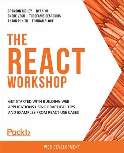
The Portal component selects the portalContainer using a query selector, creates a small custom React element, and then passes both to the createPortal function. As usual, the App component includes our custom element and a paragraph.
Look at the code and keep in mind that we put Portal before the paragraph. We assume that the order of the rendered components was congruent with their JSX representation. This means that Hello (rendered inside Portal) should be above the World paragraphs.
You can run this code in your browser and confirm our assumption:
Figure 18.3: App screenshot
Unexpectedly, the rendered output does not match our assumption regarding the order of the elements. This behavior is because the portal lives outside our React application; it was mounted onto the portalContainer, which, in the HTML markup, is located below the root mounting point of our App component.
This is the great power of React portals (and a big caveat as well). We can beam components defined inside our application to an outer scope, which means that portals enable us to create, for example, overlays, modals, or tooltips that are supposed to be placed in a location that is not directly accessible from our application. Similar use cases arise when working with composable frontends (also referred to as micro-frontends).
In the next section, let's look at an interesting exercise regarding the creation of a global overlay that will contain a greeting message and will be displayed on top of the web page.
Exercise 18.02: Creating a Global Overlay Using Portals
In this exercise, we will create a global overlay containing a salutation to the user of our application. This salutation component will also disable all the scrolling so that the user can focus on the overlay and not get distracted by scrolling elements in the background.
- Create a new React app using the create-react-app CLI:
$ npx create-react-app global-overlay
- Move into the new React applications folder and start the create-react-app development server:
$ cd global-overlay/ && npm start
- Create an App component that includes a div element with a bunch of placeholder text:
import React from "react";
import ReactDOM from "react-dom";
const App = () => {
return (
<div>
<p>Lorem ipsum...</p>
</div>
)
};
- Add two more components, called Overlay and Salutation. Inside the Overlay component, create a variable that holds the return value of a query selector, selecting the DOM body element. Additionally, make the Salutation component return a div element with some saluting words inside it:
const Salutation = () => {
return <div style={{backgroundColor:'white', width: "22vw", height: "10vh", display: "flex", justifyContent: "center", alignItems: "center", borderRadius:4}}>Welcome to the React Workshop!</div>
}
const Overlay = () => {
const bodySelector = document.querySelector("body");
}
const App = () => {
return (
<div>
<p>Lorem ipsum...</p>
</div>
)
};
Now, spawn a saluting portal inside the body element that you stored in the variable called bodySelector.
- To achieve this, you need to call the createPortal function with the container element (the body element) and the Salutation component. Don't forget to include the Overlay component in the App component:
const Salutation = () => {
return <div style={{backgroundColor:'white', width: "22vw", height: "10vh", display: "flex", justifyContent: "center", alignItems: "center", borderRadius:4}}>Welcome to the React Workshop!</div>;
}
const Overlay = () => {
const bodySelector = document.querySelector("body");
return ReactDOM.createPortal(<Salutation />, bodySelector);
}
const App = () => {
return (
<div>
<Overlay />
<p>Lorem ipsum...</p>
</div>
);
};
Now, you have created a portal and are displaying the salutation to the user, but it is not an overlay yet. Creating an overlay requires you to add styling, which will cover the entire viewport, and will center the salutation.
- For simplicity, create a new OverlayContainer component that you can apply the styles to and wrap the Salutation component inside:
const Overlay = () => {
const bodySelector = document.querySelector("body");
bodySelector.style.overflowY = "hidden";
const OverlayContainer = (
<div style={overlayStyles}>
<Salutation />
</div>
);
return ReactDOM.createPortal(OverlayContainer, bodySelector);
};
The last step is to disable the scrolling on the document. For demonstration purposes, you first need to make the App component larger than the current viewport, otherwise there would be no scrolling in any event.
- Give the outermost div element a height of twice the viewport height parameter:
const overlayStyles = {
width: "100vw",
height: "100vh",
top: 0,
left: 0,
position: "fixed",
display: "flex",
alignItems: "center",
justifyContent: "center",
backgroundColor: "rgba(0,0,0,.7)"
};
const Salutation = () => {
return <div style={{backgroundColor:'white', width: "22vw", height: "10vh", display: "flex", justifyContent: "center", alignItems: "center", borderRadius:4}}>Welcome to the React Workshop!</div>;
};
const App = () => {
return (
<div style={{ height: "200vh" }}>
<Overlay />
<p>Lorem ipsum...</p>
</div>
);
};
If you tried to scroll, you would have observed that scrolling up and down is possible.
- To prevent scrolling, we have to set the body's overflow to hidden. We already have access to the body element via our bodySelector variable:
App.js
16 const Salutation = () => {
17 return <div style={{backgroundColor:'white', width: "22vw", height: "10vh", display: "flex", justifyContent: "center", alignItems: "center", borderRadius:4}}>Welcome to the React Workshop!</div>;
18 };
19 const Overlay = () => {
20 const bodySelector = document.querySelector("body");
21 bodySelector.style.overflowY = "hidden";
22
23 const OverlayContainer = (
24 <div style={overlayStyles}>
25 <Salutation />
26 </div>
27 );
28 return ReactDOM.createPortal(OverlayContainer, bodySelector);
The complete code can be found here: https://packt.live/3d8ncpm
You should end up with a simple, yet powerful, overlay, which disables all scrolling on the body and displays a centered salutation.
The output is as follows:

Figure 18.4: Final app output
Finishing this section, you have collected all the relevant information and skills to effectively solve this chapter's activity and use Refs in more realistic use cases. You will be able to do so in a professional manner using cloneElement and createPortal.
Let's put everything that we have learned so far in the chapter together and get started with an activity.
Activity 18.01: Portable Modals Using Refs
The aim of this activity is to create a modal that covers the entire viewport and disables scrolling within it. The viewport, however, is not going to be a hardcoded DOM body element but can be passed as a Ref to the overlay modal. The overlaying component should be mounted into the Ref using a React portal.
Before you begin, make sure you start with a new create-react-app boilerplate application.
Here is the .css file that you can work with for this activity:
App.css
1 body {
2 height: 100vh;
3 }
4 .App {
5 height: 200vh;
6 position: absolute;
7 }
8 .Viewport {
9 height: 50vh;
10 width: 100vw;
11 position: relative;
12 overflow-y: scroll;
The complete code can be found here: https://packt.live/2LuvxIK
The following steps will help you complete the activity:
- Create a class-based App component, initialized with a viewPortRef Ref and a state that includes a showModal property that defaults to false.
- Create another class-based component called ModalOverlay. This component receives three props: onCloseHandler, showModal, and mountingPoint. Create yet another functional component called Modal. The Modal component includes a div element with the Modal CSS class. This div container simply wraps the props.children components.
- Inside the ModalOverlay component, create a local component called ModalPortal, which contains a div with the ModalOverlay CSS class. This div container wraps the Modal component. Inside Modal, map the children of the ModalOverlay component, clone each of the children, and pass an onClick prop that gets assigned the this.props.onCloseHandler parameter.
- Create a portal where ModalPortal is the element that should be mounted and the props.mountingPoint variable of ModalOverlay is the container for the portal. Return this portal from the ModalOverlay component's render method if props.showModal is true, otherwise, return null.
- On the App component, create a class method called toggleModal. This function should set state.showModal to its opposite.
- For the render method of App, you can use the following code snippet:
render() {
return (
<div className="App">
<button /> { /* open button */ }
<div className="Viewport" />
<ModalOverlay>
{ /* close button */ }
</ModalOverlay>
</div>
);
}
- To prevent errors, when there is no mounting point passed to ModalOverlay, you should select the DOM body element and use this as fallback instead.
The final output should look like this:

Figure 18.5: Final App
In both cases, you should get back to the default state when you click the close button (or even the text, since we passed it an onClick handler as well). From here, you can go on and experiment with some further features. Perhaps you could even combine the outcome of this activity with the ones from the previous chapters.
Note
The solution of this activity can be found on page 766.
Summary
In the last chapter of The React Workshop, we started by taking a look at some previously discussed fundamentals about Refs and React in general. Concepts such as encapsulation via props and the different ways to use Refs led to you finally gaining traction with Refs. From there, you went on to not only use Refs for practical use cases but also explored cloneElement and createPortal, which are often encountered when applying Refs in React source code.
Afterward, you explored more sophisticated concepts of React when you leveraged a higher-order component to enhance child components by cloning and adding custom props to them. On top of that, you beamed components from your React application to an outer scope using React portals. Finally, you put all the pieces together and implemented a modal that encapsulates all the logic and that is controllable via props. The modal is so flexible and reusable that it can be put anywhere in the source code and be passed a mounting point either inside or outside the actual React application.
With that, this marks the end of this book. We have spent a lot of time and gone over everything you need in your repertoire to be able to deliver high-quality React applications that incorporate all of the latest standards and techniques. We started off simple and explored the techniques to build React components with JSX and discussed the different techniques to create your own custom JSX components with React, whether through classes or functions. From there, we explored how to make your components interact with your browser and how to handle those events appropriately. We also explored the different ways to attach conditions to your React components and display multiple components based on data and state and explored how to interact with React components at each stage of a component's life cycle.
From there, we transitioned into talking more about data flows through a React application and the different types of components, as each type of component has its own preferred methods of handling data passing (whether via state, props, or contexts). We then moved on to talk about different techniques and libraries to supplement your React applications, diving into some of the most common libraries, such as React Router, to handle how to compose multiple React components into complicated applications.
We then moved on to more modern and advanced React techniques, specifically focusing on the newest React feature: Hooks. We explored the functionalities of using React Hooks before diving into the more advanced usage of Hooks, including at the level of writing our own custom Hooks to make our applications simpler, cleaner, and more reusable.
From there, we turned our attention toward one of the most common (and trickiest) portions of writing any web application with React: communicating with the outside world. Making API requests is difficult and requires a lot of special knowledge and the ability to handle a lot of different states and cases, and we focused on how to use libraries such as Axios and functionality native to JavaScript, such as async/await, to create fully-featured API-driven React components.
We closed out with how to properly attach our React components to the DOM and interact with what is displayed to the user via the browser directly through another React feature: Refs. With this, we were able to close the loop on React, interacting with the outside world, interacting with the browser, and interacting with components internally.
All of this adds up to a full library of React knowledge; everything we need to be able to build professional React applications that scale well, are clean and easy to maintain, and are the kind of applications that you would be proud to share with your peers. All that is left now is for you to go out there and build the React application of your dreams.