Overview
This chapter will introduce you to the two components types in React, class components and function components. With the knowledge acquired from this chapter, you will be able to use industry best practices to identify the component hierarchy and break the UI down into logical components. This chapter aims to form the basis of creating UIs in React, be they simple or complex, and provides you with the basic tools required to build React applications.
Introduction
In React, code is written in the form of entities called components that help us organize code modularly. This modular structure allows apps to be scalable and maintainable. React.js, as a JavaScript library, has achieved a lot of popularity in the web domain and has rightly been enjoying this success because it allows developers to build scalable apps rapidly while employing industry best practices.
In the previous chapters, we have largely worked with a specific type of component in React called class components. When the React framework emerged in the scene, the use of class-based components increased. During the early days of React, even before classes were available to us in JavaScript (ES6), React implemented its own take on classes with React.createClass. However, starting with React 0.14.0, ES6 component classes extended React.Component. And so, components can now be defined as Class components that use JavaScript classes to extend React.Component and Function components that are written as JavaScript functions. React works with React DOM, which renders these components in a chosen root element in the HTML DOM to render the React app. Let's start with the structure of React components.
Introduction to Thinking with React Components
React provides an excellent way to build scalable and highly performant applications. We have to carefully and efficiently structure these applications while we are building them. We will look at a few design principles that will help us to logically structure our app into components.
Atomic Design
While building web and mobile applications, which is a common use case for React, we tend to create a design system that consists of elements, along with the design and interaction that make up the application. Now, the more reusable the components are, the more the design becomes consistent and cohesive, and speed improves. Developers are able to work with components, which provides a good foundation to grow and make further modifications when required.
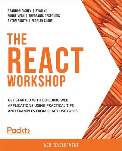
One way to compose a design system would be to use the principles of atomic design, which dictate how components should look and feel when the user interacts with them. Atomic design, as coined by Brad Frost, takes its cues from chemistry and uses it as a metaphor to explain the structure of UIs:
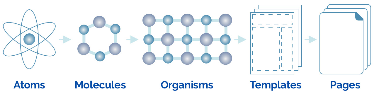
Figure 5.1: Atomic design, as coined by Brad Frost
According to modular atomic design, web components should be versatile and reusable. We begin with atoms, which are the smallest basic building blocks. In UIs, these are elements such as buttons, inputs, form controls, and labels.
Molecules are a combination of multiple atoms that, in UIs, would be grouped elements that work together, such as a search module that is a combination of a form label and a text input with a button or a simple styled list of links.
Combining various molecules gives us organisms, which are relatively complex UI components, such as a website header or navigation bar, which is made up of smaller elements, such as lists of links, dropdowns, and hamburgers for mobile navigation.
Templates that are made up of organisms begin to take shape, showing us the final design layout. These are page-level objects and articulate the desired content structure. An example would be to create a dashboard template or a home page template using the elements mentioned above.
Pages are created from templates and are higher fidelity, the final level of our interfaces. They have all the realistic content, assets, and media added and are a true reflection of what the end result will be.
With this knowledge of how an application should be designed and can be broken down into several UI elements, let's take a look at the wireframe of a shopping cart.
Pragmatic Approach
Here is a wireframe of a shopping cart:
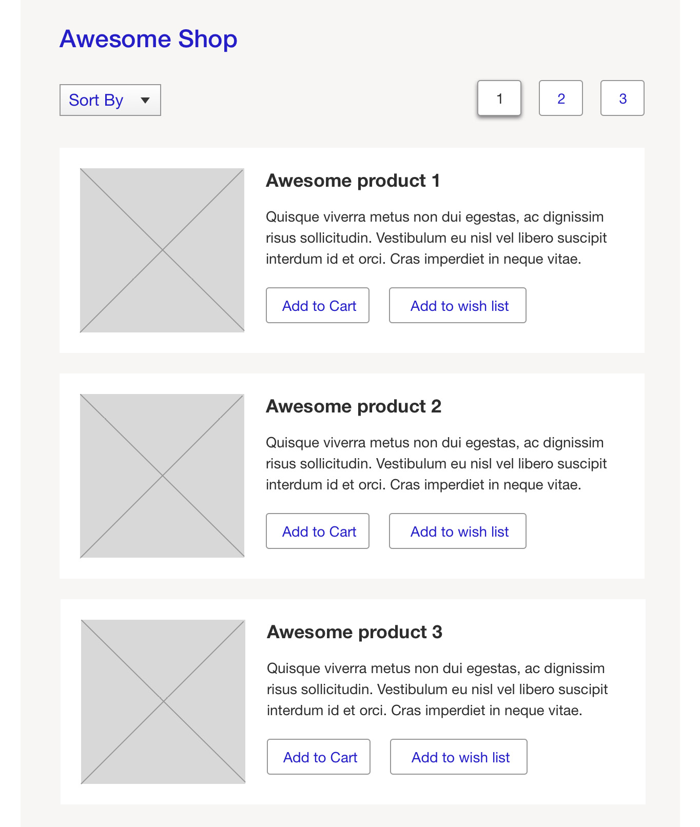
Figure 5.2: Wireframe of a shopping cart
We can see the following elements on screen:
- Page header
- Sort field
- Pagination
- Product list
The product list comprises product elements, which includes the following:
- Product title
- Product image
- Product description
- Add to Cart
- Add to wish list
We shall next break down the UI into the elements we have identified and mark them so that we are able to build reusable components. Atomic design principles help us to think about how the components should be broken down and structured. We also need to name them, which may be a common name for the UI element.
The following is the wireframe of the same shop with marked components:
Figure 5.3: Elements marked as components
Note
Components are written in pascal case, which is a naming convention where the first letter of every word in a compound word is capitalized.
The component names would be:
- PageHeader
- SortField
- Pagination
- Button
- ProductList
- Product
- ProductImage
Now, we are able to correctly identify the elements that could be transformed into a component. In the next section, let's focus on building React components.
Building React Components
Since presentation and data can be abstracted, breaking the UI down into components reduces clutter and gives more meaning to the components, which can now perform specialized tasks. Writing components as container and presentational components, also referred to as smart and dumb components, is a pattern that is commonly employed by developers in React.
Container components usually have a local state and are concerned with the implementation of data and how things work. They have minimum to no markup. These components deal with data, be it loading it, calling actions, or mutating them. When creating a shopping cart application with the wireframe shown in Figure 5.3, it would suffice to have container components at the root level, which will then retrieve and hold the data and just pass it down to its children. The child components, which are typically the presentation components, receive values to be displayed and show the required JSX on screen as output. Presentational components are usually stateless components that are concerned with the way things essentially look in the UI. They usually have some DOM markup and associated styles and could encompass both presentational and container components. They do not load or mutate data and are usually written as function components.
Data Flow
In React, the data typically flows from the root to the child components and is unidirectional. When a user interacts with the UI, for example, they click on a sort field to sort by price, an action is triggered that causes sorted data to be requested from the server and updated. A stateful container component updates the data and, as it changes, it reciprocates through all the child components. In Figure 5.3, the root-level app component holds data pertaining to products and passes it to the ProductList component, which renders the product information. When the user performs an action to fetch new data, the data is fetched and updated and then gets passed down to ProductList, which updates the view.
We have so far seen references to the terms state and props and, before going any further, we should demystify what these terms are because they are such an intrinsic part of what we do in components.
State and Props
Container components have local mutable variables called state that change when a user interacts with the component. Since data flow is unidirectional in React, the change in state is passed down to the presentation components as immutable props.
Simply put, state holds local variables that can then be edited or mutated by the component, and props are immutable variables that the component receives.
The preceding example shows a simple way to use components and we will learn in detail each aspect of the components.
Class Components
React allows us to define components as class or function components. Class components that are stateful can be created by extending React.Component and are more feature-rich than function components and provide us with a number of predefined methods that make managing data and components easy. We can also write our own methods that can be used at different stages of the component.
Let's see an example of a simple class component that shows a Hello World message:
import React, { Component } from "react";
class HelloMessage extends Component {
render() {
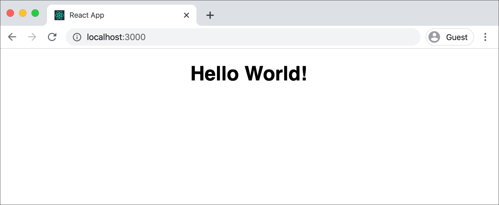
return <h1>Hello World!</h1>;
}
}
export default HelloMessage;
This can be used in a file as:
import HelloMessage from "./HelloMessage";
If you've noticed, we have used a syntax that may seem unfamiliar to developers who are new to React. React code is usually written in ECMAScript 2015 or later. ECMAScript 2015 is also commonly referred to as ES6, and we will continue to use ES6 for all our code in the chapter.
Let's further try and dissect each line of our code to understand it and what it does:
import React from "react";
The first line uses the ES6 import command to import React from react. This is essential when you have JSX syntax in the code.
Next, we create a React component, HelloMessage, as a class by extending React Component:
class HelloMessage extends React.Component
Though classes have been around in most programming languages for a long time, JavaScript classes were introduced in ECMAScript 2015. React.Component is what makes the features of a React component available to us:
render() {}
A render method is defined in the class as a built-in method in React. In React, it is called a life cycle method, which has a hook that renders the component. JSX content is returned by the render function:
return <h1>Hello World!</h1>;
The content returned by the render function is what gets displayed on the page. The HelloMessage component uses the default export available in ES6. Without affecting the output in any way, this component can also be written as a named export while also using a named import to import React.Component. We can also combine a class definition with an export, as shown in the following code:
import React, { Component } from "react";
export class HelloMessage extends Component {
render() {
return <h1>Hello World!</h1>;
}
}
Multiple named exports can exist in a module, but only one default export can be used. Developers can choose to either use named exports or default exports.
In our examples, moving on, we will use named exports and imports. The preceding component can be imported inside index.js, which uses ReactDom to render this in an HTML div element with the ID root:
import React from "react";
import "./App.css";
import { HelloMessage } from "./HelloMessage";
function App() {
return (
<div className="App">
<HelloMessage />
</div>
);
}
export default App;
The css file that could be used along with the preceding component is as follows:
.App {
text-align: center;
font-family: sans-serif;
}
The following is the output of this component on a browser:
Now that we have seen how to create a class component, let's practice this in the following exercise.
Exercise 5.01: Creating Profile Component as a Class Component
In this exercise, we will create a class component called profile class component that can receive data pertaining to a person and display it according to design.
- Open the command line to create our app.
- Run the npx command to create the react app. We have chosen the name profile-class-component:
$ npx create-react-app profile-class-component
- Navigate to the folder and run our app in development mode:
cd profile-class-component/yarn start
This should start running your app and render the initial react app screen:
Figure 5.5: Initial screen
- Now, open the code in our code editor. We will use Visual Studio Code in our example here, but it can be any editor of your choice. We will now edit the code in the src/App.js file:

Figure 5.6: Modifying code in the src folder
- Delete the src/logo.svg files.
- Create a file named Profile.js and add a class component that returns some JSX in the render function:
import React, { Component } from "react";
class Profile extends Component {
render() {
return (
<section className="profile">
Profile
</section>
);
}
}
export default Profile;
- The App.js file can now include and render Profile.js, which then changes to the following:
import React from "react";
import "./App.css";
import Profile from "./Profile";
function App() {
return (
<div className="App">
<Profile />
</div>
);
}
export default App;
- Replace the css in App.css with basic styling:
.App {
text-align: left;
margin: 50px;
}
Doing this renders the newly created Profile component on screen, but we do not have any relevant information displayed.
- In App.js, declare a user variable with the data in our app. In reality, we would usually get this information from an API.
For our example, we are using an image from UnSplash, https://unsplash.com/photos/g4PLFkpUf4Q, which provides us with images that are free to use:
const user = {
name: "Brian",
interests: "Reading, Swimming, Technology",
age: 9,
image: "https://images.unsplash.com/photo-1470071131384- 001b85755536?auto=format&fit=crop&w=200&q=80",
color: "Red",
movie: "Star Wars"
};
- Pass this data to the Profile component as an attribute:
const user = {
name: "Brian",
interests: "Reading, Swimming, Technology",
age: 9,
image: "https://i.pravatar.cc/200?img=4",
color: "Red",
movie: "Star Wars"
};
function App() {
return (
<div className="App">
<Profile user={user} />
</div>
);
}
export default App;
- Let's access this data using this.props. Hence, the user object is available as this.props.user:
import React, { Component } from "react";
class Profile extends Component {
render() {
return (
<section className="profile">
<header>
<h1>{this.props.user.name}</h1>
</header>
<div className="profile-content">
<div className="profile-image">
<img src={this.props.user.image} alt={this.props.user.name} />
</div>
<div>
<p>
<strong>Age:</strong> {this.props.user.age}
</p>
</div>
</div>
</section>
);
}
}
export default Profile;
When you start and run the application, it will begin to show the information on screen:
Figure 5.7: Initial user profile displayed
However, accessing all properties using this.props.user seems repetitive, and we can use the ES6 spread syntax instead.
- Use the ES6 spread syntax and add this in Profile.js inside the render function:
const { name, image, age, interests, color, movie } = this.props.user;
Note
In ES6, the de-structuring assignment allows us to unpack arrays and objects. If you would like to know more about this, you can visit MDN for more information: https://developer.mozilla.org/en-US/docs/Web/JavaScript/Reference/Operators/Destructuring_assignment
This allows us to use these variables in our JSX:
Profile.js
5 class Profile extends Component {
6 render() {
7 const { name, image, age, interests, color, movie } = this.props.user;
8 return (
9 <section className="profile">
10 <header>
11 <h1>{name}</h1>
12 </header>
18 <p>
19 <strong>Age:</strong> {age}
20 </p>
21 <p>
21 <strong>Interests:</strong> {interests}
The complete code can be found here: https://packt.live/2T3UqPH
- Add the styling for our Profile component and then import it. We will add some styling in a new file, profile.css:
.profile {
max-width: 500px;
margin: 10%;
padding: 20px;
border: solid 1px #eee;
box-shadow: 0 0 5px rgba(0, 0, 0, 0.3);
border-radius: 5px;
}
.profile-image {
margin-right: 20px;
}
.profile-content {
display: flex;
}
- To import this in our Profile component, add the import statement to Profile js:
Profile.js
1 import React, { Component } from "react";
2 // styles
3 import "./profile.css";
4
5 class Profile extends Component {
6 render() {
7 const { name, image, age, interests, color, movie } = this.props.user;
8 return (
9 <section className="profile">
The complete code can be found here: https://packt.live/2T3UqPH
With this implemented, our Profile component is now complete and shows the profile:

Figure 5.8: User profile class component
With this exercise, we have finished designing a full-blown class component.
Function Component
Simply put, a function component in React is a JavaScript function that returns JSX.
A simple HelloWorld function component is shown below:
function HelloWorld() {
return <div>Hello, World!</div>;
}
The function can receive variable objects as props from the parent component that can be used for evaluation and rendering.
A Hello function with props is shown below:
function Hello(props) {
return <div>Hello, {props.name}!</div>;
}
The preceding syntax can be simplified further with ES6.
Here's the function component written in ES6:
const Hello = (props) => (<div>Hello, {props.name}!</div>);
Let's examine the code we have written here to understand how this works.
const Hello
We are defining a new constant here and initializing it with a value. We have seen the const statement earlier as well. ES6 introduced block-scoped variables that can be defined with let and const. The value of the variable defined using const is constant and cannot be redefined; however, a let variable can be changed.
In the following example, the value of the greeting variable does not change, and so is defined as const, while the addressee changes value and so is defined using let. If this function is within another class or function, these values are not available outside this function since they are block-scoped:
function foo(name) {
const greeting = "Hello";
let addressee = "World";
if (name) {
addressee = name;
}
return `${greeting} ${addressee}`;
}
(props)=> (<div>Hello, {props.name}!</div>)
This is ES6 arrow notation for declaring a function that receives props as input:
You may have noticed that we have not returned the JSX using a return statement. In ES6, we may use concise body or block body. Block body is the traditional way we use an explicit return statement.
In the preceding example, however, we have chosen to use an implicit return in a concise body where only an expression needs to be specified. Here, the JSX is wrapped in braces, which signifies that this is what gets returned.
Now that we have seen how we can create a functional component, let's practice this with the following exercise.
Exercise 5.02: Changing the Loader Component as a Function Component
We will now create a simple Loader component that will show a spinner. This is usually used when loading data from an API using AJAX. We will pass a prop to it, which will then be used to decide whether we need to show a spinner. To do so, let's go through the following steps:
- Start again by opening the command-line tool and running the following command:
$ npx create-react-app loader-function-component
- After which we navigate to the folder and run our app in development mode:
$ yarn start
This should start our app and render it in our browser.
- Create a file named Loader.js and add a component with the syntax of a function component:
import React from "react";
const Loader = () => {
return <div className="spinner"></div>;
};
export default Loader;
- We will update App.js to include this new component and use it.
import React from "react";
import "./App.css";
import Loader from "./Loader";
function App() {
return (
<div className="App">
<Loader />
</div>
);
}
export default App;
- Remove unnecessary styling for our app to have some simple CSS:
.App {
text-align: center;
}
Since we have no content displayed, we do not see any output on screen.
- Return a circle in an SVG that can be styled to become our loader. Adding to our Loader.js file, our component now changes to:
Loader.js
12 <div className="spinner">
13 <svg
14 focusable="false"
15 width={spinnerSize}
16 height={spinnerSize}
17 viewBox={` ${spinnerSize} ${spinnerSize}`}
18 >
19 <circle
20 cx={spinnerSize / 2}
21 cy={spinnerSize / 2}
22 r={spinnerSize / 2 - 10}
23 />
24 </svg>
25 </div>
The complete code can be found here: https://packt.live/35Wq8DH
We are using a variable, spinnerSize, that is used to set the width and radius of a circle in the SVG. We have set it to an arbitrary value of 100.
We are now able to see a filled circle:
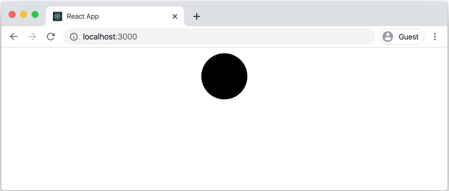
Figure 5. 9: Filled circle in App
- Add some styling to the SVG to improve its appearance. We will first change the fill and stroke in our loader.css file and also include the file in our component:
.spinner svg {
stroke: rgba(0, 0, 0, 0.4);
stroke-width: 7px;
fill: none;
}
- Import the loader.css file in Loader.js file:
import React from "react";
// styles
import "./loader.css";
…
The SVG now looks better. The output is as follows:
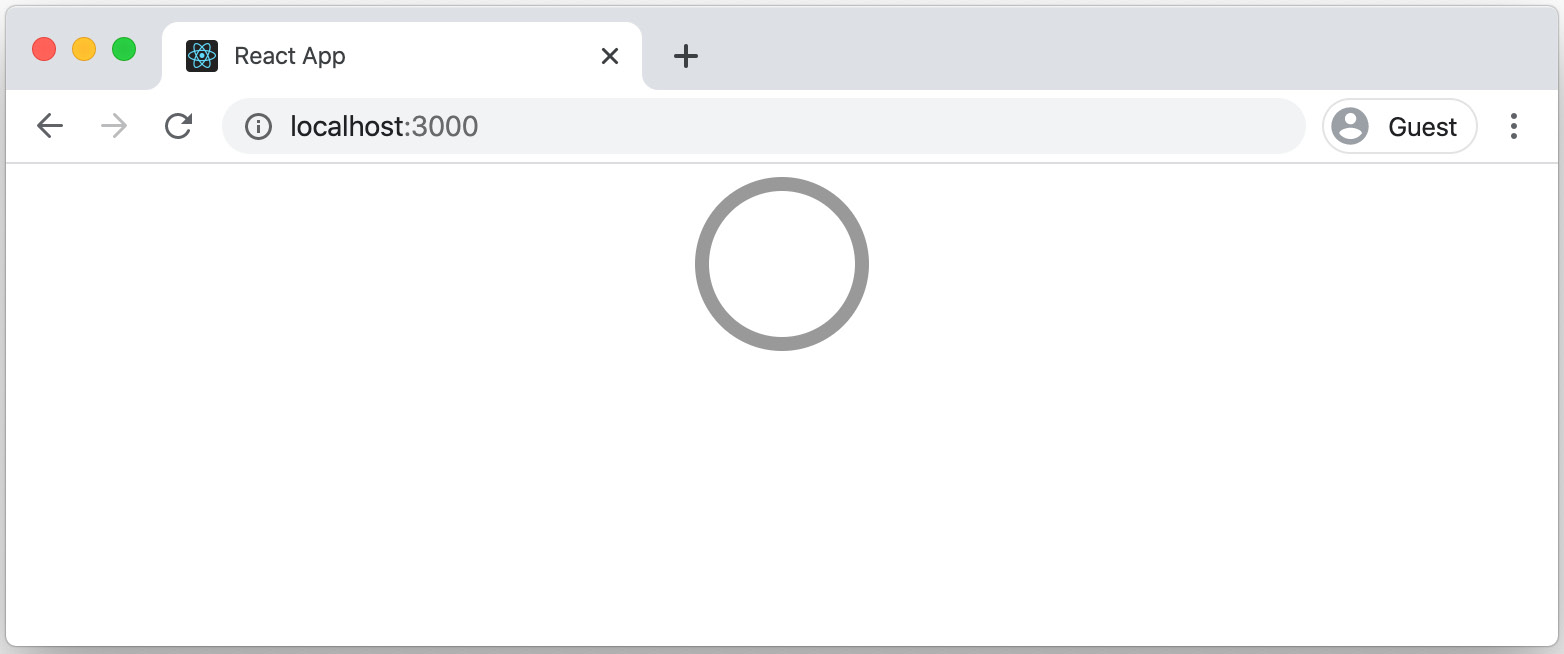
Figure 5.10: Loader component
- Add styling to our SVG. We will use SVG's stroke properties to make it look like a crescent shape with a rounded line end:
.spinner svg {
stroke: rgba(0, 0, 0, 0.4);
stroke-width: 7px;
fill: none;
stroke-dasharray: 100%;
stroke-linecap: round;
}
The output is as follows:

Figure 5.11: The display showing the component is loading
- Add a CSS animation to the SVG so that it rotates in a loop in loader.css file:
@keyframes spinnerAnimation {
to {
-webkit-transform: rotate(360deg);
-ms-transform: rotate(360deg);
transform: rotate(360deg);
}
}
.spinner svg {
stroke: rgba(0, 0, 0, 0.4);
stroke-width: 7px;
fill: none;
stroke-dasharray: 100%;
stroke-linecap: round;
animation: 0.86s cubic-bezier(0.4, 0.15, 0.6, 0.85) infinite spinnerAnimation;
}
- Add some styles to center the spinner and add some space around it:
loader.css
1 .spinner {
2 margin: 20px;
3 text-align: center;
4 }
5
6 @keyframes spinnerAnimation {
7 to {
8 -webkit-transform: rotate(360deg);
9 -ms-transform: rotate(360deg);
10 transform: rotate(360deg);
11 }
The complete code can be found here: https://packt.live/3fOfN12
With this, the loader starts animating, goes into an infinite loop, and is styled to appear in the center horizontally:

Figure 5.12: The animation of the loader component
Though it looks the part, there are a couple of improvements we can make so that it serves a purpose while building our applications. We will now pass a new prop, isVisible, and also set the size using a prop spinner, size.
- Utilize the Loader component in App.js appears as follows:
function App() {
return (
<div className="App">
<Loader spinnerSize={60} isVisible={true} />,
</div>
);
}
This should start running your app and render the initial react app screen.
- Extract and use the values provided to the component de-structuring assignment from ES6:
Loader.js
13 <svg
14 focusable="false"
15 width={spinnerSize}
16 height={spinnerSize}
17 viewBox={`0 0 ${spinnerSize} ${spinnerSize}`}
18 >
19 <circle
20 cx={spinnerSize / 2}
21 cy={spinnerSize / 2}
22 r={spinnerSize / 2 - 10}
23 />
The complete code can be found here: https://packt.live/35Wq8DH
Now that we have the value for isVisible, we need to render nothing when it is set to false. This we can do using an early return.
In React, if you return null from a component, it will not render the component and we use this here.
- Check whether the value for isVisible is set to false, and if so, we return null:
Loader.js
6 const Loader = props => {
7 const { spinnerSize, isVisible } = props;
8 if (!isVisible) {
9 return null;
10 }
11 return (
12
13 <svg
14 focusable="false"
15 width={spinnerSize}
16 height={spinnerSize}
17 viewBox={`0 0 ${spinnerSize} ${spinnerSize}`}
18 >
The complete code can be found here: https://packt.live/35Wq8DH
With this, our component is complete. When we change the size to, say 60, you can see the loader changing size. And when isVisible is set to false, it doesn't render the component on screen:

Figure 5.13: The changing size of the loader is displayed
We now have a good understanding of how to create class-based and functional components. In the next section, let's look at a few key pointers to understand the basic differences between the two.
Differences between Class and Function Components
So far, we have seen how we can define a class component by extending React.Component, and a function component that can use the power of ES6 to define a concise body with an implicit return statement to create a simple component.
Apart from sheer size, though, there are also other differences between the two that we need to consider while deciding to create a component using either of the following methods. Let's discuss the pointers one by one.
Syntax
Let's consider a simple component that receives a name as a value from a parent component and shows a hello message.
The following code is from the Hello component that is defined as a class component:
import React, { Component } from "react";
export class Hello extends Component {
render() {
return <h1>Hello {this.props.name}!</h1>;
}
}
The same component can be written as a functional component in a simple way.
The following code is from the Hello component that is defined as a function component:
import React from "react";
const Hello = (props) => (<h1>Hello {props.name}!</h1>);
We can see how the syntax differs from the preceding code examples. A class component is defined as a class and uses the extends keyword to extend the component. A function component is a JavaScript function and is defined using the arrow syntax.
Now, when you transpile the code to ES5, we see the difference in how it is implemented.
Note
Transpiling means compiling the source code in one language to another and, in our case, since we write our code in ES6 and browsers may still not understand this code, we transpile to ES5, which browsers can understand and run.
Here is the transpiled class component – Hello:
var Hello =
/*#__PURE__*/
function (_Component) {
_inherits(Hello, _Component);
function Hello() {
_classCallCheck(this, Hello);
return _possibleConstructorReturn(this, _getPrototypeOf(Hello).apply(this, arguments));
}
_createClass(Hello, [{
key: "render",
value: function render() {
return React.createElement("h1", null, "Hello ", this.props.name, "!");
}
}]);
return Hello;
}(Component);
Whereas the function component transpiles into a function that is still concise:
The transpiled Function Component – Hello is as follows:
var Hello = function Hello(props) {
return React.createElement("h1", null, "Hello ", props.name, "!");
};
With this knowledge, when we create our components, we should try to use the function component where possible because not only is it simple to code, but it is also far more efficient.
Handling State
In React, state is the local object that holds values that change within the component. In a class component, however, the state is available, and any changes made to it will cause a re-render. To do that, we have the life cycle methods, which are available only to class components, allowing us to "hook" events and change state as needed. As discussed in Chapter 4, React Lifecycle Methods, this is a powerful aspect of a class component and will perhaps be a deciding factor when we need to decide which way to go.
Following is an example where we see state initialized with the greeting Hello World! in a class component. 3 seconds after the component has loaded, we change the message to Welcome to React! using the setState() method. We can refer to the following App.js file to see how state is handled in React:
class App extends Component {
constructor(props) {
super(props);
this.state = {
greeting: "Hello world!"
};
}
componentDidMount() {
setTimeout(() => {
this.setState({ greeting: "Welcome to React!" });
}, 3000);
}
render() {
const { greeting } = this.state;
return <div className="App">{greeting}</div>;
}
}
Function components are stateless, which traditionally means they cannot have state. In body block, however, variables can be defined, and these may be evaluated for a render. When they change, this does not cause a re-render.
We have inferred that although class components are powerful, the advantage of function components is that even though they are concise and simple, they are efficient. With React 16.8, we now have a concept called Hooks that allows us to access features such as state and life cycle events in function components too.
To use state in a function component, the useState hook can be used. This takes the initial value of the state as the parameter and returns a pair of values to the current state and a function that updates it. Here is an example of using useState, a hook that allows us to use state.
Here's a state in a function component using the useState hook:
import React, { useState } from 'react';
function Example() {
// Declare a new state variable, which we'll call "count"
const [count, setCount] = useState(0);
return (
<div>
<p>You clicked {count} times</p>
<button onClick={() => setCount(count + 1)}>
Click me
</button>
</div>
);
}
Along with useState, we also have other methods, such as useEffect, useContext, and useReducer, that provide different features. We will look at Hooks in detail in later chapters of this book. For now, it is enough to know that Hooks provide enhanced features to function components.
With the skills gained from the preceding two exercises in the chapter, let's utilize them with the following activity.
Activity 5.01: Creating a Comments Section
The objective of this activity is to build a comment section that renders comments showing a set of comments along with the user's name and profile image and that have up to one level nesting, which means one comment would be nested within the other. We will need to break the UI into both class components and function components to create this.
We are provided with data as JavaScript Object Notation, or JSON, which is the preferred format for use in JavaScript applications. This can be replaced with dynamic content from a server during integration.
Again, for the profile images in our example, we are using various images from Unsplash: https://unsplash.com/s/photos/portrait?orientation=squarish
Here is the .json file provided that could be used for this activity:
comments.json
1 {
2 "comments": [
3 {
4 "name": "John Smith",
5 "text": "This is an awesome page. Lorem ipsum dolor sit amet, consectetur adipiscing elit. Aenean scelerisque, purus ac feugiat eleifend, ex.",
6 "image": "https://images.unsplash.com/photo-1522075469751- 3a6694fb2f61?auto=format&fit=crop&w=200&q=80",
7 "time": "Oct 02, 2019",
8 "comments": [
9 {
The complete code can be found here: https://packt.live/2yV13wK
The following steps will help you to complete the activity:
- Analyze the data provided to understand the schema and nested structure.
- Think of the app structure with a component hierarchy.
- Create the app and start running the app using a command-line tool.
- Replace the default component with a custom container component.
- Create a comment component that receives a comment and renders the properties.
- Add data to the container component, loop through the data to add the comment component, and pass comment data to it.
- Add styling to the comment component.
- Since the comments are nested, add a condition to check whether child comments are available and loop.
- Add styling as necessary to the components to match the intended design.
The final output should look like this:

Figure 5.14: Final comments section app
Note
The solution steps for this activity can be found on page 637.
As next steps, we can add interaction to the components for which we will need to not just use props but mutate the state and pass it down to the components. We will be able to do this once we learn to work with state and props in the coming chapters.
Summary
In this chapter, we have not just seen the way React components can be built, but also principles such as atomic design, which help us to think of structuring our components. We've learned the differences between class and function components and have also seen how we can build apps using them as reusable components. This has provided us with an essential toolkit to start building our applications of varying complexity and sizes.
In the next chapter, we will dive deeper to understand states and props for the components so that we may also add interactivity and better understand data flow.